
C H A P T E R 4
Building Dynamic UI Layouts in JavaFX
When I am working on a problem, I never think about beauty. I think only of how to
solve the problem. But when I have finished, if the solution is not beautiful, I know it
is wrong.
—Buckminster Fuller
JavaFX has facilities for creating dynamic layouts that allow you to easily create beautiful-looking user interfaces (UIs) that scale to any resolution and are backed by clean code. At your disposal you have the simple, yet elegant, binding facility; powerful custom layouts built on top of the Pane and Region classes; and the built-in layouts that include HBox, VBox, AnchorPane, BorderPane, FlowPane, TilePane, StackPane, and GridPane.
In this chapter we show how you can leverage these dynamic layout mechanisms to build complicated user interfaces with zero static positioning.
Introducing JavaFX Reversi
To demonstrate the power of dynamic layout in JavaFX, the goal of this chapter is to build a fully functional version of the popular Reversi game. Reversi is a game of strategy where players take turns on an eight-by-eight game board placing black and white pieces. The objective of the game is to have the most pieces on the board by surrounding your opponent’s pieces and flipping them over to your color.
Originally invented in 1880 by Lewis Waterman and James Mollett, Reversi gained considerable popularity in nineteenth-century England, and was one of the first titles published by German game manufacturer Ravensburger. It is more commonly known today as Othello, which is trademarked and sold by Pressman.
The rules of Reversi are extremely simple, which lets us focus on the JavaFX layout. To make things a little more challenging, we are going to bring Reversi into the twenty-first century with a modern RIA-style interface, pseudo-3D game board, and fully resizable layout.
Board Layout and Basic Rules
Reversi is a turn-based game where two players choose white and black sides. Each player gets 32 pieces to play; the first player is black.
The initial board setup has four pieces placed in alternating cells in the center of the board (see Figure 4-1).
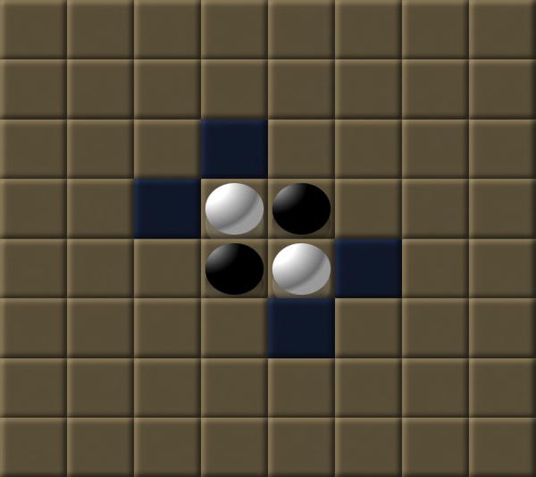
Figure 4-1. This is the starting board position for Reversi.
Black gets the first turn and can place a piece anywhere adjacent to one of white’s pieces where there is a matching black piece on the same line (vertical, horizontal, or diagonal). From the starting position, there are only four legal moves, which are highlighted in blue. All moves are equal positionwise, so let’s assume that black goes in the uppermost position. This allows black to flip the upper white piece, taking that entire column (see Figure 4-2).
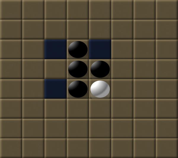
Figure 4-2. This shows the board position after black’s first move.
White gets the second turn and has three available options highlighted in blue. Let’s assume white goes in the lowermost position, flipping one black piece. Now it is black’s turn again with five available positions (shown in Figure 4-3).
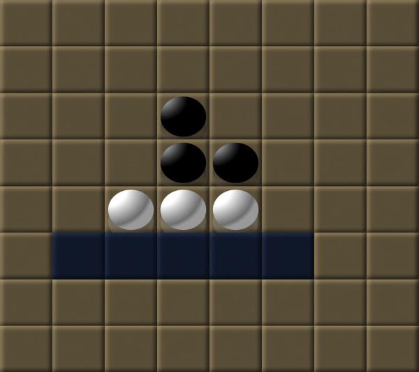
Figure 4-3. This shows the board position after the next move by white.
Play continues this way, alternating between black and white unless one player has no moves, in which case they pass on that turn. The game is over when both players have no moves, and the winner is the player with the most pieces on the final board.
Building a JavaFX Model for Reversi
Now that you are armed with knowledge of how Reversi works, it is time to translate that into a set of Java classes that represent the game model.
Your ReversiModel class needs to contain two primary pieces of information: the current board position and the player whose turn it is. Listing 4-1 shows a basic model class to get you started.
Listing 4-1. ReversiModel Class for the Reversi Application
public class ReversiModel {

  public static int BOARD_SIZE = 8;


  public ObjectProperty<Owner> turn = new SimpleObjectProperty<Owner>(Owner.BLACK);


  public ObjectProperty<Owner>[][] board = new ObjectProperty[BOARD_SIZE][BOARD_SIZE];


  private ReversiModel() {

    for (int i = 0; i < BOARD_SIZE; i++) {

      for (int j = 0; j < BOARD_SIZE; j++) {

        board[i][j] = new SimpleObjectProperty<Owner>(Owner.NONE);

      }

    }

    initBoard();

  }


  public static ReversiModel getInstance() {

    return ReversiModelHolder.INSTANCE;

  }


  private static class ReversiModelHolder {

    private static final ReversiModel INSTANCE = new ReversiModel();

  }

}
Some things to point out about this model are:
- It uses the Java singleton pattern for creating and providing access to an instance.
- The board size is defined via a constant, which makes it easy to adjust the dimensions in the future.
- The turn variable is declared as an observable object property so that we can make use of it in bind statements.
- The board is declared as a two-dimensional array containing observable object properties, allowing binding to the current game state.
- The model references an Owner class for both the board contents and the current turn.
Next we need to define the Owner enumeration that is used in the ReversiModel. As shown in the following code, you can define the Owner class as a Java enum that contains states for WHITE, BLACK, and, in the case of empty cells, NONE.
public enum Owner {

  NONE,

  WHITE,

  BLACK;


  public Owner opposite() {

    return this == WHITE ? BLACK : this == BLACK ? WHITE : NONE;

  }


  public Color getColor() {

    return this == Owner.WHITE ? Color.WHITE : Color.BLACK;

  }


  public String getColorStyle() {

    return this == Owner.WHITE ? "white" : "black";

  }

}
This enumeration class contains a few extra helper functions that we make use of later. The first is called opposite() and can be used to convert from black to white and vice versa, which is very useful for swapping turns and implementing the game algorithm later. The next two methods return a color as either a JavaFX Color object or a style String for use within style properties in the UI.
The final step is to initialize our model to the starting position for a Reversi game. The following implementation of the initBoard() method places the first four pieces in the center of the board.
private void initBoard() {

  int center1 = BOARD_SIZE / 2 - 1;

  int center2 = BOARD_SIZE /2;

  board[center1][center1].setValue(Owner.WHITE);

  board[center1][center2].setValue(Owner.BLACK);

  board[center2][center1].setValue(Owner.BLACK);

  board[center2][center2].setValue(Owner.WHITE);

}
We come back to the model later, but let’s switch over to building out the Reversi user interface by using some of the basic dynamic layout mechanisms in JavaFX.
Dynamic Layout Techniques
JavaFX provides a wide variety of layouts that are suitable for different tasks. They range from the versatile bind to the freeform Pane and Region, which allow you to create an entirely new layout on the fly. There is also a large set of built-in layouts, including HBox, VBox, AnchorPane, BorderPane, StackPane, TilePane, FlowPane, and GridPane, that can be composed to accomplish sophisticated layouts.
To demonstrate this, we show how you can build a UI shell for the Reversi application that has absolutely no static positioned components and that supports dynamic resizing.
Centering Text Using Bind
One of the most powerful facilities in JavaFX is the ability to bind variables. Earlier we showed how binding could be used to keep the UI and model in sync with no complicated events or listeners.
Another very powerful use of binding is to keep UI components in alignment by binding to their location and size. This technique can be used to align components to the edges of a window, keep nodes in relative alignment with each other, or center them inside a container, which is what we show in this example.
To accomplish this, you need to make use of several properties and methods of the Node class in combination with bind. The common Node members that you need to use when creating bound layouts are listed in Table 4-1.
To demonstrate, Listing 4-2 is a simple code example that shows how to center the “JavaFX Reversi” title within a Scene.
Listing 4-2. Example of Centering Text in a Scene
public class CenterUsingBind extends Application {


  public static void main(String[] args) {

    launch(args);

  }
  @Override

  public void start(Stage primaryStage) {

    Text text = new Text("JavaFX Reversi");

    text.setTextOrigin(VPos.TOP);

    text.setFont(Font.font(null, FontWeight.BOLD, 18));

    Scene scene = new Scene(new Group(text), 400, 100);

    text.layoutXProperty().bind(scene.widthProperty().subtract(text.prefWidth(-1)).divide(2));

    text.layoutYProperty().bind(scene.heightProperty().subtract(text.prefHeight(-1)).divide(2));

    primaryStage.setScene(scene);

    primaryStage.show();

  }

}
Some specific points to highlight about Listing 4-2 are:
- The default value for the textOrigin property of Text is BASELINE, which aligns to the bottom of the letters, not including descenders. We chose to use TOP instead, which makes the origin line up with the top of the letters. This makes Text behave similarly to most other Nodes, and is much easier to center.
- We have to add the Text node to a Group in order to add it to the Scene, which expects a container of type Parent. There are better options than using a Group, as we show in the next section, because this disables any automatic resizing.
- When getting the prefWidth and prefHeight we pass in a parameter of –1 for the counterdimension, because this does not affect the returned dimensions for Text nodes. (Text nodes have no content bias.)
Running this program produces a window where the title stays centered even if you resize the frame, as shown in Figure 4-4.

Figure 4-4. A Text node centered within a Scene using bind
Centering Revisited Using a StackPane
In the previous section you saw how to center text using the bind operator. That is one way to center text, however, we show you an alternative approach using the StackPane class, which has built-in capabilities for aligning nodes.
The StackPane class is a layout container that allows you to layer nodes on top of each other to create composite effects. For all the nodes in a StackPane to be visible, the upper nodes must be shaped or transparent so that it is possible to see through them. Table 4-2 lists some of the functions that you can use to add and align nodes in a StackPane.
The order of the children in the content sequence controls the z-order of the StackPane, with the first element (index 0) appearing on the bottom and the last (index size –1) on the top. The setAlignment functions can be used to control the alignment of nodes that do not fill all the available space in the StackPane. When the node alignment is set, that gets precedence, otherwise the default alignment for the StackPane is used. Finally, if neither is set, a default value of CENTER is used to align nodes.
To build on the previous example, we invert the text and background by adding a black Ellipse to the scene that covers most of the background and by changing the color of the Text node to white. Also, to simplify the alignment and allow layering of nodes, we use a StackPane instead of bind to lay out the nodes as shown in Listing 4-3.
Listing 4-3. Example of Using a StackPane to Overlay and Align Nodes
public class CenterUsingStack extends Application {


  public static void main(String[] args) {

    launch(args);

  }


  @Override

  public void start(Stage primaryStage) {

    Text text = new Text("JavaFX Reversi");

    text.setFont(Font.font(null, FontWeight.BOLD, 18));

    text.setFill(Color.WHITE);

    Ellipse ellipse = new Ellipse();

    StackPane stack = new StackPane();

    stack.getChildren().addAll(ellipse, text);

    Scene scene = new Scene(stack, 400, 100);

    ellipse.radiusXProperty().bind(scene.widthProperty().divide(2));

    ellipse.radiusYProperty().bind(scene.heightProperty().divide(2));

    primaryStage.setScene(scene);

    primaryStage.show();

  }

}
Notice that there is nothing special that we needed to do to align the Text in the window. The default alignment for nodes in a StackPane is to center them, which is exactly what we wanted to happen. Later we show how you can override this behavior on a per-layout or per-node basis.
Because a StackPane extends Parent, there is no need to wrap it in a Group when adding it to the Scene. Also, when adding a resizable container such as a StackPane to a Scene, it will automatically get resized when the window size changes. Some bindings were still required to keep the Ellipse properly sized. It is common to use bind together with layouts in this fashion.
The completed example is shown running in Figure 4-5.
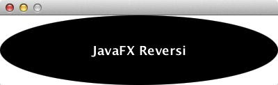
Figure 4-5. Inverted JavaFX Reversi logo using a StackPane
Aligning to Edges Using StackPanes and TilePanes
Using edge alignment, you can improve the title program to fit in with the Reversi theme. To emphasize the black and white contrast of the Reversi pieces, let’s create a design where the words are alternating colors on an alternating background.
To accomplish this visual effect, you need to do the following.
- Create a Scene that has a white background (the default).
- Add a TilePane to the Scene to split it into a left and right half.
- On the right side, add a Text node with “Reversi” aligned to the left.
- On the left side, add a StackPane with a black background.
- Add a Text node to the StackPane with “JavaFX” in white text aligned to the right.
One way of looking at this problem is that you are creating two equal size tiles that will contain text aligned towards the center of the window. The right side is simply a Text node that is aligned to the left edge, and the left side can be accomplished using a StackPane with right-aligned Text. Rather than using a Rectangle object, which would require binding to set its dimensions, we make use of the background-color style that is a feature of the Region class that all layouts extend.
To create equal size tiles, we use the built-in TilePane layout. This layout divides its content into equal-sized areas to fit all of its nodes. The available layout methods on TilePane are shown in Table 4-3.
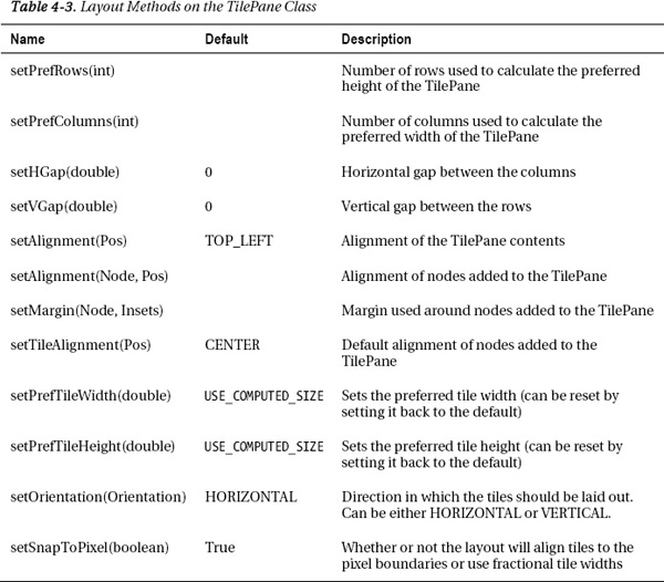
TilePane is a very versatile class with lots of options for setting the preferred tile width and height, preferred number of rows and columns, gaps between rows and columns, and the horizontal and vertical position. Most of these have reasonable defaults, such as preferredTileWidth and preferredTileHeight, that use the largest preferred width/height of all its children. Similarly, rows and columns are set automatically based on the number of tiles that fit the width and height of the TilePane.
Just like the StackPane class, TilePane also has variables for setting the default alignment and also the alignment of each individual node added. We use the latter, because we want the text aligned to the right on one side and the left on the other.
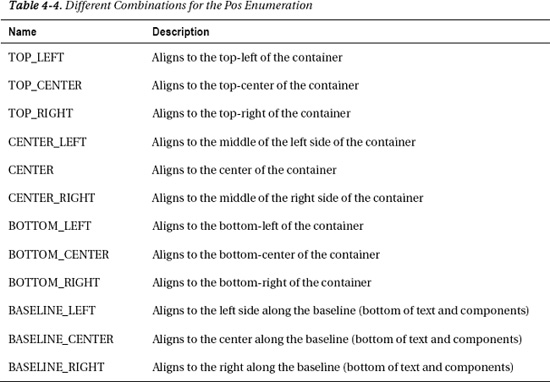
Rather than using separate horizontal and vertical positions like JavaFX 1.3, JavaFX 2.0 uses a single Pos enumeration that contains all the combinations. Table 4-4 lists all the possible values you can pass in where a Pos is expected.
We take advantage of the Pos constants of BASELINE_LEFT and BASELINE_RIGHT to align half the text to the right and the other half to the left, as shown in Listing 4-4.
Listing 4-4. Example Showing How to Use a TilePane and StackPane to Align Nodes
public class AlignUsingStackAndTile extends Application {


  public static void main(String[] args) {

    launch(args);

  }


  @Override

  public void start(Stage primaryStage) {

    StackPane left = new StackPane();

    left.setStyle("-fx-background-color: black");

    Text text = new Text("JavaFX");

    text.setFont(Font.font(null, FontWeight.BOLD, 18));

    text.setFill(Color.WHITE);

    StackPane.setAlignment(text, Pos.BASELINE_RIGHT);

    left.getChildren().add(text);
    Text right = new Text("Reversi");

    right.setFont(Font.font(null, FontWeight.BOLD, 18));

    TilePane tiles = new TilePane();

    tiles.setSnapToPixel(false);

    TilePane.setAlignment(right, Pos.BASELINE_LEFT);

    tiles.getChildren().addAll(left, right);

    Scene scene = new Scene(tiles, 400, 100);

    left.prefWidthProperty().bind(scene.widthProperty().divide(2));

    left.prefHeightProperty().bind(scene.heightProperty());

    primaryStage.setScene(scene);

    primaryStage.show();

  }

}
The completed layout makes use of a TilePane for splitting the background, a StackPane for layering nodes, and binding to make the contents resize with the Scene. To prevent wrapping artifacts on fractional tile sizes, we set the snapToPixels property to false. This allows fractional tile widths and prevents rounding errors from causing our layout to wrap to the next line.
The end result is that the layout resizes correctly when the size of the Scene is changed, including the StackPane with a black background, which always occupies half the area, as shown in Figure 4-6.

Figure 4-6. Result of running the node alignment example
Using FlowPane and Boxes for Directional Alignment
In the previous sections we showed how you can use StackPane and TilePane to create dynamic nested user interfaces, but what if you simply want to arrange nodes along a vertical or horizontal line? This is where the directional layouts, HBox, VBox, and FlowPane, come in. They allow you to lay out a string of nodes at their preferred size with or without wrapping.
To demonstrate directional node alignment, we show you how to implement the next piece of the Reversi UI: the player score box. There are two score boxes for the players, each with very similar content:
- Score: The number of pieces of the player’s color on the board
- Player Color: The color of the player’s pieces
- Turns Remaining: The number of turns remaining
Before starting on the UI, this is a good time to flush out the model with additional methods to capture these requirements. Listing 4-5 shows an example implementation of getScore and getTurnsRemaining that returns exactly what we need to populate the player score box UI.
Listing 4-5. Additional Model Methods to Implement Player Score Backend
public NumberExpression getScore(Owner owner) {

  NumberExpression score = new SimpleIntegerProperty();

  for (int i = 0; i < BOARD_SIZE; i++) {

    for (int j = 0; j < BOARD_SIZE; j++) {

      score = score.add(Bindings.when(board[i][j].isEqualTo(owner)).then(1).otherwise(0));

    }

  }

  return score;

}


public NumberBinding getTurnsRemaining(Owner owner) {

  NumberExpression emptyCellCount = getScore(Owner.NONE);

  return Bindings.when(turn.isEqualTo(owner))

    .then(emptyCellCount.add(1).divide(2))

    .otherwise(emptyCellCount.divide(2));

}
Some points to highlight about Listing 4-5 include:
- Both getScore and getTurnsRemaining return bindings that will automatically recalculate their values when the turn and board state change.
- The getScore method uses a SimpleIntegerProperty as a bound aggregator to sum the total number of cells belonging to the owner.
- The getTurnsRemainingMethod uses a conditional binding and bound arithmetic to calculate the number of remaining turns for a given owner.
Now that we have the model functions created, we can use them to build a JavaFX UI class that shows each player’s score. Because we need to create the same UI components twice, this is a good time to raise the abstraction level of the UI by creating functions that create portions of the UI. This lets us reuse the same score box for both players.
Listing 4-6 has the first half of the code and shows how to set up a simple two-column TilePane layout that contains the player score boxes.
Listing 4-6. First Half of Player Score Implementation
@Override

public void start(Stage primaryStage) {

  Scene scene;

  TilePane tiles;

  primaryStage.setScene(scene = SceneBuilder.create()

    .width(600)

    .height(120)

    .root(

      tiles = TilePaneBuilder.create()

        .children(

          createScore(Owner.BLACK),

          createScore(Owner.WHITE))

        .build()

    )
    .build());

  tiles.prefTileWidthProperty().bind(scene.widthProperty().divide(2));

  tiles.prefTileHeightProperty().bind(scene.heightProperty());

  primaryStage.show();

}
Notice that we have explicitly bound the tileWidth and tileHeight. This ensures that the tiles resize together with the window. Also notice that we have bound against the scene’s width and height rather than the tile’s dimensions. Binding against the parent’s width works properly, because the bind update happens synchronously, whereas binding against your own width and height will happen after layout is complete and produce artifacts.
For the second half, you need to use the HBox, VBox, and FlowPane classes. Table 4-5 shows a list of all the variables available, and to which layouts they apply.
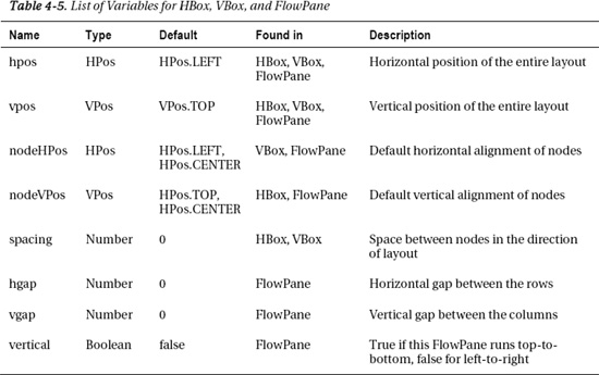
The main difference between HBox/VBox and FlowPane is that the FlowPane layout will wrap when it reaches the container width for horizontal layouts and container height for vertical layouts, whereas HBox and VBox always retain their orientation.
Listing 4-7 shows the implementation of the createScore method, which takes the model functions you wrote earlier and turns them into a visual representation. It also makes use of the alternate builder style of developing JavaFX applications. All the same properties are available on the layout builder classes, and you can often make your code shorter and more readable by using this syntax, especially for complicated layouts.
Listing 4-7. Implementation of createScore Method Using Directional Alignment
private StackPane createScore(Owner owner) {

  Region background;

  Ellipse piece;

  Text score;

  Text remaining;

  ReversiModel model = ReversiModel.getInstance();

  StackPane stack = StackPaneBuilder.create()

    .prefHeight(1000)

    .children(

      background = RegionBuilder.create()

        .style("-fx-background-color: " + owner.opposite().getColorStyle())

        .build(),

      FlowPaneBuilder.create()

        .hgap(20)

        .vgap(10)

        .alignment(Pos.CENTER)

        .children(

          score = TextBuilder.create()

            .font(Font.font(null, FontWeight.BOLD, 100))

            .fill(owner.getColor())

            .build(),

          VBoxBuilder.create()

            .alignment(Pos.CENTER)

            .spacing(10)

            .children(

              piece = EllipseBuilder.create()


.effect(DropShadowBuilder.create().color(Color.DODGERBLUE).spread(0.2).build())

                .radiusX(32)

                .radiusY(20)

                .fill(owner.getColor())

                .build(),

              remaining = TextBuilder.create()

                .font(Font.font(null, FontWeight.BOLD, 12))

                .fill(owner.getColor())

                .build()

            )

            .build()

        )

        .build()

      )

    .build();

  InnerShadow innerShadow = InnerShadowBuilder.create()

    .color(Color.DODGERBLUE)

    .choke(0.5)

    .build();

  background.effectProperty().bind(Bindings.when(model.turn.isEqualTo(owner))

    .then(innerShadow)

    .otherwise((InnerShadow) null));
  DropShadow dropShadow = DropShadowBuilder.create()

    .color(Color.DODGERBLUE)

    .spread(0.2)

    .build();

  piece.effectProperty().bind(Bindings.when(model.turn.isEqualTo(owner))

    .then(dropShadow)

    .otherwise((DropShadow) null));

  score.textProperty().bind(model.getScore(owner).asString());

  remaining.textProperty().bind(model.getTurnsRemaining(owner).asString().concat(" turns remaining"));

  return stack;

}
Notice that we used a FlowPane as the outer layout and a VBox inside to keep the Ellipse and Text vertically aligned. This ensures that the Ellipse will always stay on top of the Text but still allows the display to wrap into a vertical layout if horizontal screen real estate is limited.
We use binding both to enable and disable the special effects (DropShadow and InnerShadow) that highlight the current player’s turn, as well as to dynamically update the text based on the model. This is a very powerful use of binding that keeps the user interface in sync with the game state without requiring the use of event listeners or imperative callbacks. However, binding is not compatible with the builder syntax, so the best way to use them together is to declare the nodes you want to bind against outside the builder clause, as we have done in Listing 4-7.
The result of running the program for a horizontal layout is shown in Figure 4-7, and the resized vertical layout is shown in Figure 4-8.
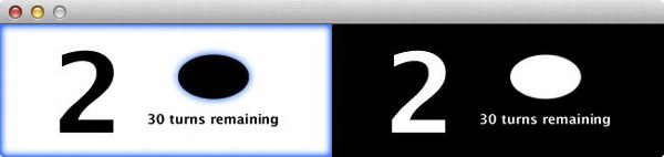
Figure 4-7. Output of running the Player Score Example in a horizontally sized window
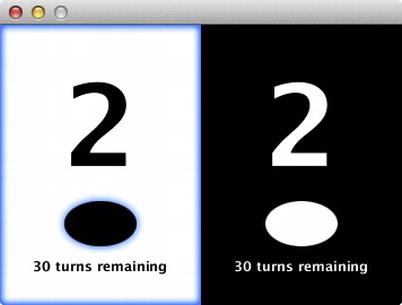
Figure 4-8. Output of running the Player Score Example in a vertically sized window
Although it may be surprising that the starting score is not zero, if you remember the Reversi starting position, there are four pieces in the center of the board, which gives each player two points. Also, the sum of all the scores and turns remaining should always add up to 64, which is true in this case.
The next step is to combine the logo and score using a BorderPane to build the minimal shell for the Reversi application.
Composing a Layout Using BorderPane
We have built up several elements of the Reversi UI, and now we need to tie them together into a single composition. In this section we demonstrate how you can use the BorderPane class to quickly put together other components in a common layout pattern. Unlike the layouts used earlier in this chapter, you should not modify the BorderPanel’s list of children, but instead use the properties for each of the content areas listed in Table 4-6.
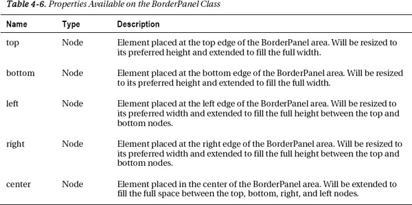
The BorderPanel’s top and bottom areas get positioned first, followed by the left and right, which can extend up to the height minus the top and bottom. Finally the center resizes to take any remaining space in the layout.
For our use in the Reversi application, we require only the top, center, and bottom content areas. The layout code to set up the BorderPanel with these three content areas is shown in Listing 4-8.
Listing 4-8. Reversi Root Stage Declaration Using a BorderPanel for Layout
@Override

public void start(Stage primaryStage) {

  primaryStage.setScene(SceneBuilder.create()

    .width(600)

    .height(400)
    .root(BorderPaneBuilder.create()

       .top(createTitle())

       .center(createBackground())

       .bottom(createScoreBoxes())

       .build())

    .build());

  primaryStage.show();

}
We are using this to create a docklike behavior where the title is aligned to the top with a fixed height and the score boxes are aligned to the bottom, also with a fixed height. All remaining space in the center is occupied by the grid. This could also have been done using bind expressions, but using a BorderPanel guarantees that the layout function will be called once per layout cycle, yielding higher performance and artifact-free layout.
Listing 4-9 shows a simple abstraction of a createScoreBoxes() function from “Using FlowPane and Boxes for Directional Alignment,” earlier in this chapter. Notice that the tileWidth is dynamically bound to the parent width using the Bindings.selectDouble() function, which breaks the dependency on the scene.
Listing 4-9. Create Score Boxes Function
private Node createScoreBoxes() {

  TilePane tiles = TilePaneBuilder.create()

    .snapToPixel(false)

    .prefColumns(2)

    .children(

      createScore(Owner.BLACK),

      createScore(Owner.WHITE))

    .build();

  tiles.prefTileWidthProperty().bind(Bindings.selectDouble(tiles.parentProperty(), "width").divide(2));

  return tiles;

}
Implementing createTitle is a similar modification of the Scene definition from the earlier section “Aligning to Edges Using Tiles.” In this case we have also increased the preferred height of the title to give it a little padding around the text. The additional changes required are highlighted in bold in Listing 4-10.
Listing 4-10. Changes Required to the Title Creation Code to Turn It into a Function
private Node createTitle() {

  StackPane left = new StackPane();

  left.setStyle("-fx-background-color: black");

  Text text = new Text("JavaFX");

  text.setFont(Font.font(null, FontWeight.BOLD, 18));

  text.setFill(Color.WHITE);

  StackPane.setAlignment(text, Pos.CENTER_RIGHT);

  left.getChildren().add(text);

  Text right = new Text("Reversi");

  right.setFont(Font.font(null, FontWeight.BOLD, 18));

  TilePane tiles = new TilePane();
  tiles.setSnapToPixel(false);

  TilePane.setAlignment(right, Pos.CENTER_LEFT);

  tiles.getChildren().addAll(left, right);

  tiles.setPrefTileHeight(40);

  tiles.prefTileWidthProperty().bind(Bindings.selectDouble(tiles.parentProperty(), "width").divide(2));

  return tiles;

}
The final task is to create the board background by implementing createBackground(). In “The Grid Layout Algorithm” section later in this chapter, we show you how to use a GridLayout to implement the Reversi board, but for now you can simply create a Region and fill it with a RadialGradient. RadialGradients are very similar to the LinearGradients you have created in past exercises, but will render the colors in an ellipse from the center outward. Because we are using the Region to create the background, we need to configure the RadialGradient using the style property, as shown in Listing 4-11.
Listing 4-11. Bound Function to Create the Reversi Board Background
private Node createBackground() {

  return RegionBuilder.create()

    .style("-fx-background-color: radial-gradient(radius 100%, white, gray)")

    .build();

}
When you run the complete program, you should see a window that looks like Figure 4-9.
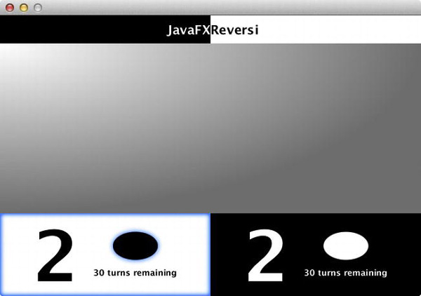
Figure 4-9. Reversi user interface with title, background, and scores
Try resizing the window and notice that the BorderPanel keeps the components edge aligned and automatically resizes them to fill all available space. This combined example demonstrates how bind and the built-in layouts can be used to compose dynamic layouts in JavaFX easily.
Creating Custom Regions
In previous sections we have made use of the Region class to provide simple styled backgrounds for our application, but the Region class underlies all of the JavaFX layouts and is capable of much more than just this.
In this section we show you how to create custom Regions in JavaFX that are fully resizable to build the Reversi playing pieces and squares that make up the game board. In the following section we show you how to build dynamic containers from scratch to take these resizable nodes and use the final layout, GridPane, to construct a dynamic playing board that resizes both the squares and the playing pieces.
Building a Custom Square Region
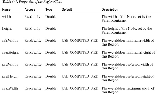
The foundation class of all the JavaFX layouts is the Region. It has standard functions on it to get bounds preferences for layout and also variables to set the width and height of the Node. In this section we show you how you can build a Reversi board square that dynamically responds to height and width changes by extending Region. The Region class has 10 properties that you can use to control the dimensions and layout, as shown in Table 4-7.

The width and height of a Region are read-only properties that you can use to get the size after layout is complete. Be careful binding directly to the width and height, because any changes that affect the size of this node or its children will not be updated until the next layout cycle, causing artifacts.
The padding property lets you set the amount of space to surround the content of the region during layout. Again, we use the snapToPixel property before to make sure the TilePane fits within the scene boundaries with no rounding errors. It is defined on the Region class and the default value of true will help reduce artifacts caused by pixel misalignment.
The remaining properties let you override the min, max, and pref width and height of this Region. They are hints to the Parent about how it should allocate space, and default to the calculated value for this Region. Once set, these properties can be reset to their calculated values by giving them a value of Region.USE_COMPUTED_SIZE. Also, the min and max properties can be assigned to the same value as the respective pref property by giving them a value of Region.USE_PREF_SIZE.
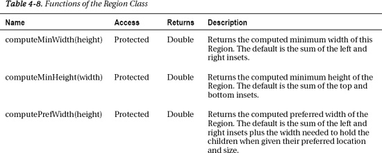
To define the calculated values for these, override the calculate* functions defined on the Region class as listed in Table 4-8.
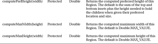
The defaults returned by the compute functions are fine, except for the preferred width and height, which both return 0 because we have no children and no insets. To get a nonzero preferred size, we can either override the computerPrefWidth/Height methods or simply call one of the setters for the preferredWidth/Height properties. The following implementation does the latter.
public class ReversiSquare extends Region {

  public ReversiSquare() {

    setStyle("-fx-background-color: burlywood");

    Light.Distant light = new Light.Distant();

    light.setAzimuth(-135);

    light.setElevation(30);

    setEffect(LightingBuilder.create().light(light).build());

    setPrefSize(200, 200);

  }

}
To provide styling to the squares in the above code, we set the style property, which accepts CSS properties for the background and borders. Because you cannot specify JavaFX lighting effects in CSS, we use the LightingBuilder to create a distant lighting effect and set it on the Region.
 Caution On platforms without hardware acceleration of effects, the Lighting effect may significantly affect performance.
To exercise this class, we create a quick StackPane wrapper holding a single ReversiSquare that resizes with the scene, as shown in Listing 4-12.
Listing 4-12. Wrapper Script to Show a ReversiSquare That Resizes with the Scene
public class ReversiSquareTest extends Application {

  public static void main(String[] args) {

    launch(args);

  }


  @Override

  public void start(Stage primaryStage) {

    primaryStage.setScene(SceneBuilder.create()

      .root(StackPaneBuilder.create()

        .children(new ReversiSquare()).build())

      .build());

    primaryStage.show();

  }

}
Running the completed class produces a distinctive board square that dynamically resizes with the window, as shown in Figure 4-10.

Figure 4-10. Single Reversi square that resizes with the window
Building a Resizable Reversi Piece
Creating a Reversi playing piece is done very similarly to how you created a square in the previous section. Your class should extend Region and have a public owner property that can be set to change the color of the playing piece to either WHITE or BLACK:
public class ReversiPiece extends Region {

  private ObjectProperty<Owner> ownerProperty = new SimpleObjectProperty<Owner>(this, "owner" , Owner.BLACK.NONE);

  public ObjectProperty<Owner> ownerProperty() {

    return ownerProperty;

  }
  public Owner getOwner() {

    return ownerProperty.get();

  }

  public void setOwner(Owner owner) {

    ownerProperty.set(owner);

  }
We used the simplified property format in this example, with a SimpleObjectProperty of generic type Owner that gets created upon object initialization. It has public methods to get the property or get and set the value and default to Owner.NONE, which should show no playing piece.
To create the style of the playing piece, we make use of a conditional bind in the constructor to change the style whenever the owner changes. In the case of a WHITE playing piece, we use a radial gradient that goes from white to gray to black (simulating a shadow). In the case of a BLACK playing piece, we use a radial gradient that goes from white quickly to black (simulating a highlight).
We can also hide the playing piece when the owner is NONE by using a second conditional bind to set the radius to 0. Finally to give the Region a circular shape, we set the background radius to a very large value (1,000 em), which gives us a rounded rectangle with zero length sides (or an oval) as shown in the following code at the beginning of the constructor.
public ReversiPiece() {

  styleProperty().bind(Bindings.when(ownerProperty.isEqualTo(Owner.NONE))

    .then("radius 0")

    .otherwise(Bindings.when(ownerProperty.isEqualTo(Owner.WHITE))

      .then("-fx-background-color: radial-gradient(radius 100%, white .4, gray .9, darkgray

1)")

      .otherwise("-fx-background-color: radial-gradient(radius 100%, white 0, black .6)"))

    .concat("; -fx-background-radius: 1000em; -fx-background-insets: 5"));

  …
The constructor code continues on to set up a reflection effect that will make the playing surface seem glossy, and also sets a preferred size with enough room around the edges to match the preferred size of the square minus a five-pixel background inset. The last step is to set the playing piece to be transparent to mouse events, so that the square underneath can pick them up instead:
  …

  Reflection reflection = new Reflection();

  reflection.setFraction(1);

  reflection.topOffsetProperty().bind(heightProperty().multiply(-.75));

  setEffect(reflection);

  setPrefSize(180, 180);

  setMouseTransparent(true);

}
For convenience we also include a constructor version that takes an initial value for the owner property:
public ReversiPiece(Owner owner) {

  this();

  ownerProperty.setValue(owner);

}
To demonstrate the finished product, you need to make a few additions to the previous sample application to overlay the Reversi piece. The easiest way to accomplish this is to refactor the Scene to use a StackPane layout to place the Reversi piece on top of the square, and put it inside an HBox so you can have side-by-side playing pieces.
We also make use of a new constraint on HBox and VBox called grow. Setting hgrow on an element added to an HBox, or vgrow on an element added to a VBox lets the element expand from its preferred size to take additional space as it becomes available. For a more detailed discussion of grow and priority, see the next section on the GridPane where it is used heavily.
The completed wrapper code using stacks, boxes, and grow constraint is shown in Listing 4-13.
Listing 4-13. Wrapper Application That Displays Two Reversi Squarses Side-by-Side with Playing Pieces on Top
public class ReversiPieceTest extends Application {

  public static void main(String[] args) {

    launch(args);

  }


  @Override

  public void start(Stage primaryStage) {

    Node white, black;

    primaryStage.setScene(SceneBuilder.create()

      .root(HBoxBuilder.create()

         .snapToPixel(false)

         .children(

            white = StackPaneBuilder.create()

              .children(

                new ReversiSquare(),

                new ReversiPiece(Owner.WHITE)

              )

              .build(),

            black = StackPaneBuilder.create()

              .children(

                new ReversiSquare(),

                new ReversiPiece(Owner.BLACK)

              )

              .build()

         )

         .build())

      .build());

    HBox.setHgrow(white, Priority.ALWAYS);

    HBox.setHgrow(black, Priority.ALWAYS);

    primaryStage.show();

  }

}
Figure 4-11 shows the completed application with both white and black pieces displayed side by side.
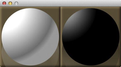
Figure 4-11. One Reversi square with a white playing piece on it, and another with a black piece
Laying Out the Tiles Using a GridPane
One of the most flexible and powerful layouts contained in JavaFX is the GridPane. It lets you arrange the children in a grid composed of rows and columns, optionally assigning constraints such as alignment, grow, and margin to individual nodes or an entire row/column. You can also do advanced layouts that will span rows and/or columns, giving you a layout container that is truly a superset of all the other containers discussed so far.
Table 4-9 lists the different properties on GridPane that you can set either per-Node or on an entire column or row (with the exception of margin).
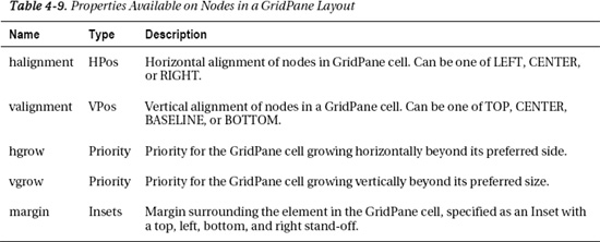
Just as with earlier layouts, these constraints can be set via a series of like-named static methods on the GridPane class that accept a node and constraint value. The first two constraints for alignment are similar to the alignment on StackPane, except they are constrained to be in either the horizontal or vertical direction. However, the cross-product of using horizontal and vertical alignment together gives you the same 12 combinations.
Margin is similar to the like-name constraint first described in the earlier section entitled, “Aligning Edges Using StackPane and TilePane.” It is also the only constraint that can be applied solely to individual nodes, but not an entire row or column.
Both hgrow and vgrow take a value of type Priority, similar to the like-name constraints on HBox and VBox, respectively. These can be given one of three possible values:
- NEVER: Will never grow beyond the preferred dimensions of the node.
- SOMETIMES: Will only grow if there is still available space after all nodes with grow priority “ALWAYS” are taken into account.
- ALWAYS: Will grow up to the maximum dimensions of the node, sharing space equally with other nodes that have a grow priority of “ALWAYS.”
Setting the grow constraint property can greatly simplify the job of laying out complex user interfaces. For example, you could use a grow constraint of NEVER on a button and ALWAYS on a TextField to ensure that the text field fills the form width, and the button is sized perfectly for the contained text.
We take advantage of the flexible capabilities of the GridPane to lay out the grid of squares and pieces for the Reversi application. The default alignment, grow policy, and margin work perfectly for the needs of our playing board, so the only thing we need to update as we add in squares is the x and y position. We don’t even need to set the size of the grid, because it will automatically scale to fit the number and position of components that get added in.
To start with, we need to update the start method in the Reversi application to put the tiles on top of the background. To accomplish this we make use of a StackPane to compose the center region of the BorderLayout as shown in Listing 4-14.
Listing 4-14. Changes to the Reversi Application to Overlay a List of Tiles (Highlighted in Bold)
@Override

public void start(Stage primaryStage) {

  primaryStage.setScene(SceneBuilder.create()

    .width(600)

    .height(400)

    .root(BorderPaneBuilder.create()

       .top(createTitle())

       .center(StackPaneBuilder.create().children(

          createBackground(),

          tiles()

       ).build())

       .bottom(createScoreBoxes())

       .build())

    .build());

  primaryStage.show();

}
The implementation of the tiles method is a direct application of what we have learned about the GridPane layout. We simply create a new GridPane using the default constructor, and then go in a couple of loops across columns and then rows to populate each of the game cells as shown in Listing 4-15.
Listing 4-15. Implementation of the Tiles Method Using a GridPane
private Node tiles() {

  GridPane board = new GridPane();

  for (int i = 0; i < ReversiModel.BOARD_SIZE; i++) {

    for (int j = 0; j < ReversiModel.BOARD_SIZE; j++) {

      ReversiSquare square = new ReversiSquare();

      ReversiPiece piece = new ReversiPiece();

      piece.ownerProperty().bind(model.board[i][j]);

      board.add(StackPaneBuilder.create().children(

        square,

        piece

      ).build(), i, j);

    }

  }

  return board;

}
Notice that we are using the GridPane add method that takes a node first, and then the x, y co-ordinates second for convenience. Also, we are making use of a nested StackPane to hold the ReversiSquare on the bottom and the ReversiPiece on top.
The single binding from model.board to each playing piece is all that is needed to have the UI reflect the current board state and update whenever the model is changed. With these simple changes, the Reversi application shows us our starting position with two black and two white pieces played, as shown in Figure 4-12.
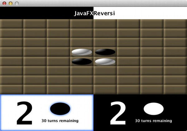
Figure 4-12. Reversi application with a GridPane to display the board and pieces
Aligning and Stretching with AnchorPane
The last built-in layout is the AnchorPane. It is a fairly specialized layout that serves two related purposes. When used with one or two nonopposing constraints, it can be used to align the child to a particular corner of the layout with a set stand-off. The other purpose is to stretch the child horizontally and/or vertically by setting opposing constraints, again with an optional stand-off from the parent edges as shown in Figure 4-13.
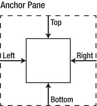
Figure 4-13. AnchorPane constraints for a child Node (solid line) in a Parent (dashed line)
The AnchorPane works by accepting a list of children that are displayed in stack order, each of which can optionally specify constraints for left, right, top, and bottom anchors. If no anchors are specified, it will position children at the top/left of the container. Once an anchor is set, it will align to a set distance away from that edge and get the minimum of the preferred size and the container size.
If opposing anchors are set on the left and right or top and bottom, the sizing behavior changes to stretching where the child width will be equal to the parent width minus the left and right anchor distances or the parent high minus the top and bottom anchor distances, respectively. It is also possible to set all four anchors, in which case the child will resize together with the parent.
With a few modifications to the Reversi application we make use of both the alignment and stretching properties of an AnchorPane to add in a new “Restart” button to the UI. The first step is to refactor the Reversi constructor to extract the existing game view into a variable and add in an AnchorPane as the root node:
@Override

public void start(Stage primaryStage) {

  Node game = BorderPaneBuilder.create()

    .top(createTitle())

    .center(StackPaneBuilder.create().children(

      createBackground(),

      tiles()

    ).build())

    .bottom(createScoreBoxes())

    .build();

  Node restart = restart();
  primaryStage.setScene(SceneBuilder.create()

    .width(600)

    .height(400)

    .root(AnchorPaneBuilder.create().children(

      game,

      restart

    ).build()

  ).build());

  …
Notice that we have also added in a second component to the AnchorPane for the restart button that we define later. The rest of the constructor goes on to set the AnchorPane constraints for the game and restart nodes so that the former scales together with the scene, and the latter is aligned 10 pixels off the top-right corner:
  …

  AnchorPane.setTopAnchor(game, 0d);

  AnchorPane.setBottomAnchor(game, 0d);

  AnchorPane.setLeftAnchor(game, 0d);

  AnchorPane.setRightAnchor(game, 0d);

  AnchorPane.setRightAnchor(restart, 10d);

  AnchorPane.setTopAnchor(restart, 10d);

}
The next step is to create the restart() method that builds the restart button and wires up an ActionEvent handler that will reset the model:
private Node restart() {

  return ButtonBuilder.create().text("Restart").onAction(new EventHandler<ActionEvent>() {

    public void handle(ActionEvent t) {

      model.restart();

    }

  }).build();

}
Finally, you need to implement the restart model function that will restart all the squares to their initial values and set the turn back to black:
public void restart() {

  for (int i = 0; i < BOARD_SIZE; i++) {

    for (int j = 0; j < BOARD_SIZE; j++) {

      board[i][j].setValue(Owner.NONE);

    }

  }

  initBoard();

  turn.setValue(Owner.BLACK);

}
Upon running the completed application you will have a fully functional restart button that is anchored to the top-right corner, as shown in Figure 4-14.
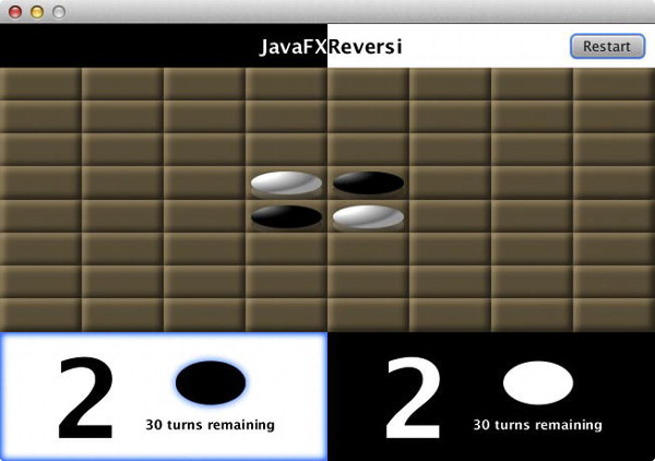
Figure 4-14. Reversi application with a restart button anchored to the top-right corner
When to Use Different Layouts
The combination of different layout techniques discussed throughout this chapter creates a very powerful capability for creating dynamic layouts. However, inasmuch as there are so many ways to accomplish the same results, it can often be confusing as to what the best practice is when creating new layouts. In this section, we discuss the benefits and disadvantages of each layout in different situations to help you more easily ascertain which best suits your application needs.
Binding was the first technique described, and is powerful enough to construct virtually any dynamic UI you can imagine. However, bind has two primary drawbacks:
- Complexity: The more nodes in the user interface, the more edges and constraints each one must adhere to in order to show up in the right location.
- Performance: Although JavaFX is very efficient about how it evaluates bind statements, too many bound variables will result in reduced performance, and also display artifacts on resizing.
That is where the built-in layouts, HBox, VBox, FlowPane, StackPane, TilePane, GridPane, and AnchorPane, come in. For the common case where a series of Nodes are stacked horizontally or vertically, using a box layout will result in less complex code than the equivalent bind. Also, unlike bind, layout containers are evaluated only once per display cycle, so you are guaranteed consistent performance regardless of the complexity of your user interface.
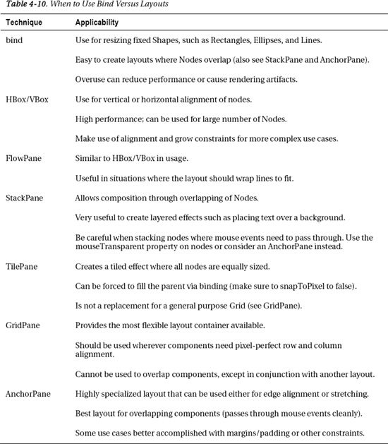
In practice, you usually need to use both layouts and bind together to create a dynamic layout. Table 4-10 explains for what situations each type of layout is most suitable.
A New Perspective on Reversi: The JavaFX 3D Scene Graph
The Reversi application is starting to shape up, but is in need of a little perspective to make it more visually appealing. JavaFX comes with 3D capabilities that let you do transformations on your scene graph objects to create more advanced visual effects. We take advantage of these 3D capabilities to make the Reversi application more visually appealing.
You cannot import full 3D models into a JavaFX application today, however, you can manipulate your 2D scene graph objects in three dimensions, allowing you to give your application a 3D look and feel. The 3D Scene Graph capabilities are available only if you have a supported graphics card, so it is important to have a 2D UI to fall back on if the client machine does not have the right hardware.
To find out if you are running a machine that supports 3D transformations, you can check the Scene 3D conditional property using the Platform class using the following code fragment.
Platform.isSupported(ConditionalFeature.SCENE3D)
If you are on a computer that supports 3D transformations, this method call will return true. Otherwise, you will get a result of false and will not be able to take advantage of 3D Scene Graph capabilities. Even in the case where it returns false, you will not get an exception when using the 3D transforms; they will simply have no effect in the appearance of the application.
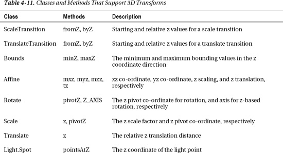
Once you know that your computer supports 3D effects, you can then manipulate your scene graph objects in three dimensions. The methods and transforms that support a third dimension are listed in Table 4-11.
Whenever you apply a 3D translation or rotation to one of the scene graph elements, it alters the displayed graphics by applying a matrix transformation on all graphics from source to destination co-ordinates. This translation is done in graphics hardware and optimized for high performance even when dealing with animations, complex graphics, or media. For example, a rectangular region that is rotated and translated in three dimensions would have a transformed co-ordinate space like one of the mappings shown in Figure 4-15.
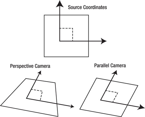
Figure 4-15. Mapping from source co-ordinates to either a perspective or parallel camera
In addition to graphics being translated into three dimensions, input and events from pointing devices get the reverse transformation from destination to source co-ordinates. This makes it possible to interact with the transformed components and controls just as you would normally do in a 2D application.
You can choose from either a ParallelCamera or a PerspectiveCamera. A ParallelCamera always displays objects at the same size regardless of distance to the camera. This is called orthographic projection, and although much easier to calculate, does not look realistic. For example Figure 4-15 on the right uses a parallel camera, where the destination co-ordinates form a perfect diamond with sides of equal length, giving it a flat look. In contrast, when using a PerspectiveCamera objects in the distance are smaller than objects in the foreground, which gives a realistic 3D effect like the example shown on the left in Figure 4-15.
The first step to using 3D capabilities in your application is to set the Camera used on the Scene. We are going to use a PerspectiveCamera to transform the Reversi board, and also supply a fieldOfView property value to control how distorted objects get as they get closer to the camera. To create the feeling of the board reaching out to the viewer, we set it to a relatively high value as shown in Listing 4-16.
Listing 4-16. Additions to the Reversi Constructor to Set the Camera Used for 3D Perspective
if (SCENE3D) {

  primaryStage.getScene().setCamera(PerspectiveCameraBuilder.create()

    .fieldOfView(60).build());

}
The other change we need to make to control the transformation of the Reversi board is to set the transforms property with a few transformations that affect the z distance. Just as in the camera code sample, we first check to make sure that 3D Scene Graph capabilities are available before applying the transformations so that we gracefully degrade to the same 2D behavior on a computer without 3D support. The code for the 3D transforms is shown in Listing 4-17.
Listing 4-17. Additions to the Tiles() Method in Order to Transform the Board in 3D Space
if (Platform.isSupported(ConditionalFeature.SCENE3D)) {

  Transform scale = new Scale(.45, .8, 1, 300, 60, 0);

  Transform translate = new Translate(75, -2, -150);

  Transform xRot = new Rotate(-40, 300, 150, 0, Rotate.X_AXIS);

  Transform yRot = new Rotate(-5, 300, 150, 0, Rotate.Y_AXIS);

  Transform zRot = new Rotate(-6, 300, 150, 0, Rotate.Z_AXIS);

  board.getTransforms().addAll(scale, translate, xRot, yRot, zRot);

}
In this code we are using a mixture of translation, rotation, and scaling to achieve the 3D perspective look that we want. When run, the new Reversi application will display a very slick-looking perspective transformed board, as shown in Figure 4-16.
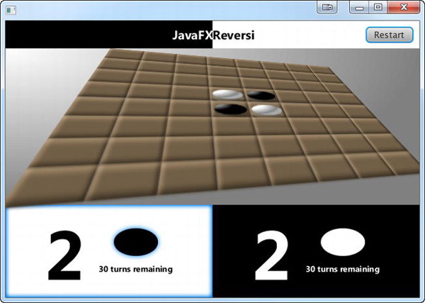
Figure 4-16. The Reversi application using a perspective transform layout
Notice that the application remains fully resizable even though you have significantly changed the layout and design of the grid. This is the advantage of using Containers to lay out complex user interfaces that need to be very dynamic.
Bringing Reversi to Life
Up to this point we have been singularly focused on layouts, which is important but doesn’t make for a very interesting game. However, the beauty of using dynamic layouts is that with a few enhancements to the game algorithm, we can turn this static application into a dynamic playable game.
Highlighting Legal Moves
The first step of a playable game algorithm is to make sure that pieces can be placed only on legal squares. Rather than simply implement an algorithm in the backend, we take this as an opportunity to add a feature to the application where it shows you all of the next available moves.
Going back to the Reversi game rules, a move is valid only in the following circumstances.
- There is not already another piece at the same location.
- The piece is placed adjacent to a piece of the opposite color, and on that same line, there is another piece of the same color on the opposite end that would allow a flip of one or more of the opposing player’s pieces.
To start with, you need to add a legalMove function to the model class that checks whether the cell is empty and then verifies all eight directions around a given Cell:
public BooleanBinding legalMove(int x, int y) {

  return board[x][y].isEqualTo(Owner.NONE).and(

    canFlip(x, y, 0, -1, turn).or(

    canFlip(x, y, -1, -1, turn).or(

    canFlip(x, y, -1, 0, turn).or(

    canFlip(x, y, -1, 1, turn).or(

    canFlip(x, y, 0, 1, turn).or(

    canFlip(x, y, 1, 1, turn).or(

    canFlip(x, y, 1, 0, turn).or(

    canFlip(x, y, 1, -1, turn))))))))

  );

}
Note We have chosen to make all the public model functions return bindings. This makes it possible to use property binding to update the UI and will efficiently defer updates until the playing board changes.
The canFlip method validates the second condition for the given direction indicated by the cellX, cellY arguments and the player whose turn is indicated. Because it would be more complicated and less efficient to use the fluent binding interface, we chose to create a custom binding instead.
Creating a custom binding involves the following.
- First override the binding class (in this case BooleanBinding) with an inner class.
- To set up the bound variables, use a static initializer that calls the bind function for each variable on which the algorithm depends.
- Override the computeValue method, and return the new calculated value of the binding.
The basic algorithm for calculating whether this is a legal move is to check the first cell in the given direction to make sure it is a different color, and if it is, continue walking cells until you find one that is the same color. If you do find one that is the same color, it is a legal move with pieces to flip, but if the next cell is the same color or there is no opposite color piece at the other end, it is not a legal move.
This means that the static initializer needs to add a property binding for every cell in the given direction, and the algorithm needs to use a loop to go through all of the cells, checking their owner, as shown in the following code.
public BooleanBinding canFlip(final int cellX, final int cellY, final int directionX, final

int directionY, final ObjectProperty<Owner> turn) {

  return new BooleanBinding() {

    {

      bind(turn);

      int x = cellX + directionX;

      int y = cellY + directionY;
      while (x >= 0 && x < BOARD_SIZE && y >= 0 && y < BOARD_SIZE) {

        bind(board[x][y]);

        x += directionX;

        y += directionY;

      }

    }

    @Override

    protected boolean computeValue() {

      Owner turnVal = turn.get();

      int x = cellX + directionX;

      int y = cellY + directionY;

      boolean first = true;

      while (x >= 0 && x < BOARD_SIZE && y >= 0 && y < BOARD_SIZE && board[x][y].get() !=

Owner.NONE) {

        if (board[x][y].get() == turnVal) {

          return !first;

        }

        first = false;

        x += directionX;

        y += directionY;

      }

      return false;

    }

  };

}
The last step in highlighting legal moves is to wire the legalMove model function up to the squares. This involves binding the style property of the ReversiSquare class to the legalMove method (changes in bold).
public ReversiSquare(final int x, final int y) {

  styleProperty().bind(Bindings.when(model.legalMove(x, y))

    .then("-fx-background-color: derive(dodgerblue, -60%)")

    .otherwise("-fx-background-color: burlywood"));

  Light.Distant light = new Light.Distant();
Tip The derive function used is a JavaFX-specific CSS function that lets you create a new color based on an existing one. The second parameter is brightness, which can range from –100% (black) to 100% white.
Also, don’t forget to add in the static model variable on which this code depends:
private static ReversiModel model = ReversiModel.getInstance();
And also to update the ReversiSquare construction in the tiles() method to pass in the x and y board co-ordinates:
ReversiSquare square = new ReversiSquare(i, j);
Now upon running the application, it correctly highlights the same four moves for black that were described in the “Board Layout and Basic Rules” section, as shown in Figure 4-17.

Figure 4-17. Reversi application highlighting the available moves for black’s first turn
Highlighting the Active Cell
The simplest example of board interaction is to highlight the current cell that the user has moused over. Rather than highlighting cells that are not playable, you can take advantage of the legalMove() function you defined in the last section to highlight only cells that are active.
For the highlight we are going to use a nested Region with a blue stroke to outline the cell the cursor is over. Although we could simply add a stroke to our existing Region, creating a separate Region makes it easier to isolate the highlight and animate it independently.
The highlight region can be quickly created as a variable in the ReversiSquare class using CSS styling and the builder pattern as shown in Listing 4-18.
Listing 4-18. Additions to the ReversiSquare create() Method to Enable Highlighting
private Region highlight = RegionBuilder.create()

  .opacity(0)

  .style("-fx-border-width: 3; -fx-border-color: dodgerblue")

  .build();
Then to add it in to the scenegraph, you can append the following line in the constructor.
getChildren().add(highlight);
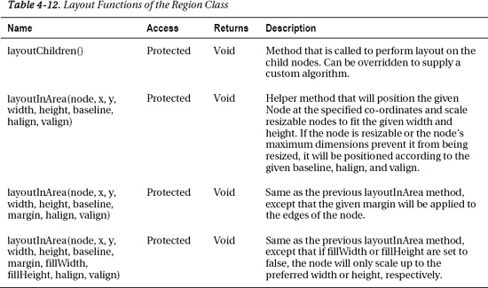
The default layout of the Region class simply sets children to their preferred size, but does not position them or allow them to fill the content area. We want the highlight to match the size of the square, therefore we need to override the layout algorithm and supply our own. Table 4-12 lists several additional functions on Region that allow us to override the layout algorithm and help with sizing and positioning of child nodes.
To make sure the size and position of the contained region match the parent, we are going to override the layoutChildren method and supply our own algorithm. The first variant of the layoutInArea helper method allows us to position and scale in one shot, which is ideal for our use case:
@Override

protected void layoutChildren() {

  layoutInArea(highlight, 0, 0, getWidth(), getHeight(), getBaselineOffset(), HPos.CENTER, VPos.CENTER);

}
To create the animation highlight, we make use of a FadeTransition that animates the opacity of the highlight created in Listing 4-18 from 0.0 to 1.0. This is used to produce a fade-in effect when the user mouses over the Node and a fade-out effect when the user mouses out. The following code shows the FadeTransition to accomplish this.
private FadeTransition highlightTransition = FadeTransitionBuilder.create()

  .node(highlight)

  .duration(Duration.millis(200))

  .fromValue(0)

  .toValue(1)

  .build();
Note Even though the starting value of the opacity was set to 0, you still need to set the fromValue property of the transition to 0 explicitly for it to work correctly in reverse.
The last step is to add in the event listeners that will fire when the user mouses over the Node. These can be added by calling the addEventHandler method with an EventHandler inner class that accepts MouseEvents:
addEventHandler(MouseEvent.MOUSE_ENTERED_TARGET, new EventHandler<MouseEvent>() {

  public void handle(MouseEvent t) {

    if (model.legalMove(x, y).get()) {

      highlightTransition.setRate(1);

      highlightTransition.play();

    }

  }

});

addEventHandler(MouseEvent.MOUSE_EXITED_TARGET, new EventHandler<MouseEvent>() {

  public void handle(MouseEvent t) {

    highlightTransition.setRate(-1);

    highlightTransition.play();

  }

});
Notice that the code plays the same animation in either case, but changes the rate of the animation based on whether it should be played forwards (1) or backwards –1). This ensures that the animation will seamlessly transition even if it is in progress.
When run, the Reversi application now animates a subtle blue outline over the highlighted Node under the cursor, as shown in Figure 4-18.
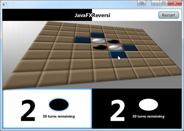
Figure 4-18. The Reversi application with a highlight animation over the active cell
Taking Turns
The last bit of missing functionality in the Reversi application is the ability for players to take turns placing pieces on the board. We already have all the infrastructure needed to accept mouse input and display pieces. All that is needed is a little glue code, plus some model enhancements to finish the game play.
Picking up where we left off in the previous section, the first step is to add an onMouseClicked event handler to the ReversiSquare init method:
addEventHandler(MouseEvent.MOUSE_CLICKED, new EventHandler<MouseEvent>() {

  public void handle(MouseEvent t) {

    model.play(x, y);

    highlightTransition.setRate(1);

    highlightTransition.play();

  }

});
This method both calls the model function to play the current turn, and also removes the highlight from the current cell, similar to the mouse exited event handler.
The play() function in the model class needs to perform several activities for each legal move:
- Set the clicked cell to be owned by the current player.
- Flip over captured pieces in any of eight possible directions.
- Change the turn to be the opposite player’s.
An example implementation of the play() method is shown in Listing 4-19.
Listing 4-19. Example play() Method That Flips Cells in Eight Directions
public void play(int cellX, int cellY) {

  if (legalMove(cellX, cellY).get()) {

    board[cellX][cellY].setValue(turn.get());

    flip(cellX, cellY, 0, -1, turn);

    flip(cellX, cellY, -1, -1, turn);

    flip(cellX, cellY, -1, 0, turn);

    flip(cellX, cellY, -1, 1, turn);

    flip(cellX, cellY, 0, 1, turn);

    flip(cellX, cellY, 1, 1, turn);

    flip(cellX, cellY, 1, 0, turn);

    flip(cellX, cellY, 1, -1, turn);

    turn.setValue(turn.getValue().opposite());

  }

}
Notice that it follows the same pattern as the legalMove() function we defined earlier to determine whether any pieces can be flipped, with the main difference being that it does not make use of binding. The implementation of the flip method also shares many similarities to the algorithm used in the canFlip() method, but again does not need to bother with creating a binding:
public void flip(int cellX, int cellY, int directionX, int directionY, ObjectProperty<Owner>

turn) {

  if (canFlip(cellX, cellY, directionX, directionY, turn).get()) {

    int x = cellX + directionX;

    int y = cellY + directionY;

    while (x >= 0 && x < BOARD_SIZE && y >= 0 && y < BOARD_SIZE && board[x][y].get() !=

turn.get()) {

      board[x][y].setValue(turn.get());

      x += directionX;

      y += directionY;

    }

  }

}
With a completed game algorithm, you can now play a full game with two players at the same computer, as shown in Figure 4-19. Notice that even the turn indicator that you set up at the beginning of the chapter is now properly flipping and indicating the current player.
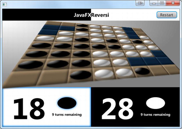
Figure 4-19. Black’s turn in the Final 2006 World Othello Championship
Besides being a great example of the game in action, Figure 4-19 is also a replay of the famous 2006 World Othello Championship between Caroline Sandberg Odsell (black) and Hideshi Tamenori (white). What should black’s next move be to win 37–27? See the Resources section for the answer.
Additional Game Enhancements
The Reversi application that was developed in this chapter is completely dynamic and flexible both in layout and structure, so it is time to take advantage of this and push the limits of your coding skills.
Here are some coding challenges that you can use to take the Reversi application from a well-designed tutorial into a full-fledged application.
- There is one rule that we neglected to implement, which is skipping turns. If, and only if, a player has no available options to play, the next player can go. Try implementing a facility that automatically detects whether there are no legal moves and skips a turn.
- Although the 3D effect is very dynamic, other than setting the rotation of the playing board we do not take advantage of this characteristic. Try implementing a start-up animation that tilts the board as the application opens.
- Playing against another player on the same computer is not nearly as interesting as playing against a remote opponent. After reading some of the later chapters on backend integration with JavaFX, try implementing a network-capable version of the Reversi application.
- Wouldn’t it be great to have a JavaFX AI for playing Reversi? Give it a try, and see if you can create an unbeatable opponent!
Summary
In this chapter you were able to fully leverage the JavaFX layout capabilities to do dynamic layout of a complex application. Along the way, you learned how to
- Align Nodes using bind.
- Use StackPane to layer Nodes and create composite layouts.
- Use TilePane to do fixed-size layouts.
- Use FlowPane, HBox, and VBox to do directional layouts with and without wrapping.
- Create a dynamic game board using binding and GridPane.
- Use AnchorPane to align and stretch overlapping nodes.
- Create custom components using Regions and CSS.
- Use 3D Scene Graph capabilities to add perspective.
- Build a rich user interface backed by a game model.
- Apply JavaFX effects and transitions.
After experiencing the advantages of dynamic layout, you will be hard-pressed to go back to static positioning of components with fixed sizes. In the next chapter we show you how to create custom UI components and charts that you can use to create even more impressive business-centric applications!
Resources
For more information about dynamic layouts, consult the following resources.
- JavaFX 2.o Layout: A Class Tour:
/http://amyfowlersblog.wordpress.com/2011/06/02/javafx2-0-layout-a-class-tour - Working with Layouts in JavaFX:
http://docs.oracle.com/javafx/2.0/layout/jfxpub-layout.htm
To learn more about the game of Reversi, please refer to the following resources.
- Wikipedia, “Reversi.”URL:
http://en.wikipedia.org/wiki/Reversi - The Othello Wiki Book Project. URL:
http://www.othello.dk/book/index.php/Main_Page
The solution for the Reversi challenge shown in Figure 4-19 can be found at the following URL: http://www.othello.dk/book/index.php/Solution_solitaire