
Chapter 2. PaintPot
This tutorial introduces the Canvas component for creating
simple, two-dimensional (2D) graphics. You’ll build PaintPot, an app
that lets the user draw on the screen in different colors, and then
update it to allow him to take his own picture and draw on that instead.
On a historical note, PaintPot was one of the first programs developed
to demonstrate the potential of personal computers, as far back as the
1970s. Back then, making something like this simple drawing app was a
very complex undertaking, and the results were pretty unpolished. But
now with App Inventor, anyone can quickly put together a fairly cool
drawing app, which is a great starting point for building 2D
games.
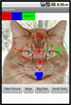
With the PaintPot app shown in Figure 2-1, you can:
Dip your finger into a virtual paint pot to draw in that color.
Drag your finger along the screen to draw a line.
Poke the screen to make dots.
Use the button at the bottom to wipe the screen clean.
Change the dot size to large or small with the buttons at the bottom.
Take a picture with the camera and then draw on that picture.
What You’ll Learn
This tutorial introduces the following concepts:
Using the
Canvascomponent for drawing.Handling touch and drag events on the phone’s surface.
Controlling screen layout with arrangement components.
Using event handlers that take arguments.
Defining variables to remember things like the dot size the user has chosen for drawing.
Getting Started
Make sure your computer and your phone are set up to use App Inventor, and browse to the App Inventor website at http://beta.appinventor.mit.edu. Start a new project in the Component Designer window and name it “PaintPot”. Open the Blocks Editor, click “Connect to Device,” and make sure the phone has started the App Inventor app.
To get started, go to the Properties panel on the right of the
Designer and change the screen title to “PaintPot” (no more Screen1 here!). You should see this change
on the phone, with the new title displayed in the title bar of your
app.
If you’re concerned about confusing your project name and the screen name, don’t worry! There are three key names in App Inventor:
The name you choose for your project as you work on it. This will also be the name of the application when you package it for the phone. Note that you can click Save As in the Component Designer to start a new version or rename a project.
The component name
Screen1, which you’ll see in the panel that lists the application’s components. You can’t change this name in the current version of App Inventor.The title of the screen, which is what you’ll see in the phone’s title bar. This starts out being Screen1, which is what you used in HelloPurr. But you can change it, as we just did for PaintPot.
Designing the Components
You’ll use these components to make the app:
Three
Buttoncomponents for selecting red, blue, or green paint, and aHorizontalArrangementcomponent for organizing them.One
Buttoncomponent for wiping the drawing clean, and two for changing the size of the dots that are drawn.A
Canvascomponent, which is the drawing surface.Canvashas aBackgroundImageproperty, which we’ll set to the kitty.png file from the HelloPurr tutorial in Chapter 1. Later in this chapter, you’ll modify the app so the background can be set to a picture the user takes.
Creating the Color Buttons
First, create the three color buttons using the following instructions:
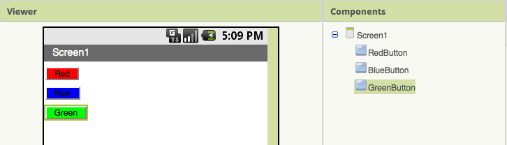
Drag a
Buttoncomponent onto the viewer and change itsTextattribute to “Red” and make itsBackgroundColorred.Click
Button1in the components list in the Viewer to highlight it (it might already be highlighted) and click Rename to change its name fromButton1toRedButton. Note that spaces aren’t allowed in component names, so it’s common to capitalize the first letter of each word in the name.Similarly, make two more buttons for blue and green, named
BlueButtonandGreenButton, placing them under the red button vertically. Check your work up to this point against Figure 2-2.
Note that in this project, you’re changing the names of the
components rather than leaving them as the default names as you did
with HelloPurr. Using more meaningful names makes your projects more
readable, and it will really help when you move to the Blocks Editor
and must refer to the components by name. In this book, we’ll use
the convention of having the component name end with its type (for
example, RedButton).
Using Arrangements for Better Layouts
You should now have three buttons stacked on top of one
another. But for this app, you want them all lined up next to one
another at the top of the screen, as shown in Figure 2-3. You do this
using a HorizontalArrangement
component:
From the Palette’s Screen Arrangement category, drag out a
HorizontalArrangementcomponent and place it under the buttons.In the Properties panel, change the
Widthof theHorizontalArrangementto “Fill parent” so that it fills the entire width of the screen.Move the three buttons one by one into the
HorizontalArrangementcomponent. Hint: You’ll see a blue vertical line that shows where the piece you’re dragging will go.
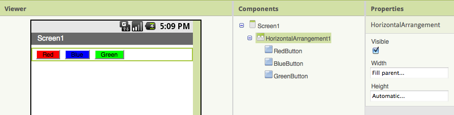
If you look in the list of project components, you’ll see the
three buttons indented under the HorizontalArrangement component to show
that they are now its subcomponents. Notice that all the components
are indented under Screen1.
Test your app.
You should also see your three buttons lined up in a row on
the phone screen, although things might not look exactly as they
do on the Designer. For example, the outline around HorizontalArrangement appears in the
Viewer but not on the phone.
In general, you use screen arrangements to create simple vertical, horizontal, or tabular layouts. You can also create more complex layouts by inserting (or nesting) screen arrangement components within each other.
Adding the Canvas
The canvas is where the user will draw circles and lines. Add
it, and add the kitty.png file
from HelloPurr as the BackgroundImage:
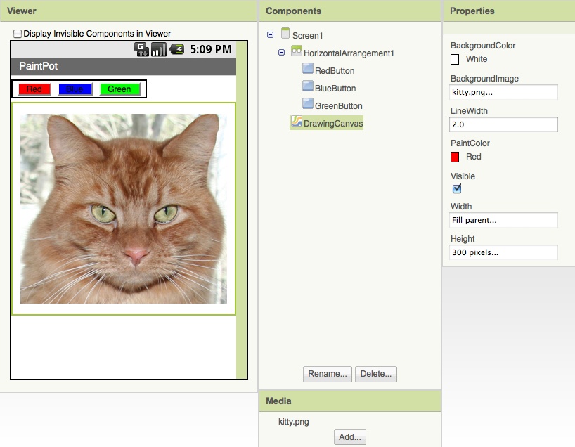
From the Palette’s Basic category, drag a
Canvascomponent onto the Viewer. Change its name toDrawingCanvas. Set itsWidthto “Fill parent.” Set itsHeightto 300 pixels.If you’ve completed the HelloPurr tutorial (Chapter 1), you have already downloaded the kitty.png file. If you haven’t, you can download it from http://examples.oreilly.com/0636920016632/.
Set the
BackgroundImageof theCanvasto the kitty.png file. In the Property editor, theBackgroundImagewill be set to None. Click the field and choose Add to upload the kitty.png file.Set the
PaintColorof theCanvasto red so that when the user starts the app but hasn’t clicked on a button yet, his drawings will be red. Check to see that what you’ve built looks like Figure 2-4.
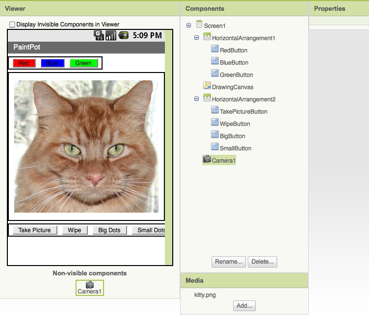
Arranging the Bottom Buttons and the Camera Component
From the Palette, drag out a second
HorizontalArrangementand place it under the canvas. Then drag two moreButtoncomponents onto the screen and place them in this bottomHorizontalArrangement. Change the name of the first button toTakePictureButtonand itsTextproperty to “Take Picture”. Change the name of the second button toWipeButtonand itsTextproperty to “Wipe”.Drag two more
Buttoncomponents from the Palette into theHorizontalArrangement, placing them next toWipeButton.Name the buttons
BigButtonandSmallButton, and set theirTextto “Big Dots” and “Small Dots”, respectively.From the Media Palette, drag a
Cameracomponent into the Viewer. It will appear in the non-visible component area.
You’ve now completed the steps to set the appearance of your app as shown in Figure 2-5.
Adding Behaviors to the Components
The next step is to define how the components behave. Creating a painting program might seem overwhelming, but rest assured that App Inventor has done a lot of the heavy lifting for you: there are easy-to-use blocks for handling the user’s touches and drags, and for drawing and taking pictures.
In the Designer, you added a Canvas component named DrawingCanvas. Like all canvas components,
DrawingCanvas has a Touched event and a Dragged event. You’ll program the DrawingCanvas.Touched event so that
it calls DrawingCanvas.DrawCircle. You’ll
program the DrawingCanvas.Dragged event to call
DrawingCanvas.DrawLine. You’ll then
program the buttons to set the DrawingCanvas.PaintColor property, clear the
DrawingCanvas, and change the
BackgroundImage to a picture taken
with the camera.
Adding the Touch Event to Draw a Dot
First, you’ll arrange things so that when you touch the
DrawingCanvas, you draw a dot at
the spot you touch:
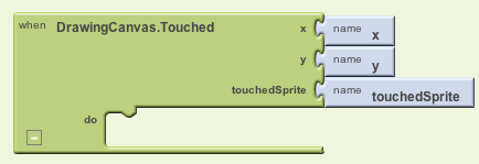
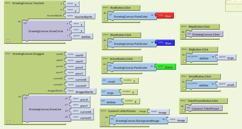
In the Blocks Editor, click My Blocks, select the drawer for the
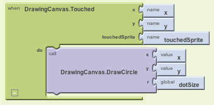
DrawingCanvas, and drag the DrawingCanvas.Touched block to the workspace. As soon as you drag the block out, the three plugs on the right automatically fill in with name blocks forx,y, andtouchedSprite, as shown in Figure 2-6.Note
If you’ve completed the HelloPurr app in Chapter 1, you’re familiar with Button.Click events, but not with
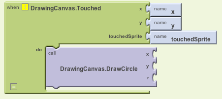
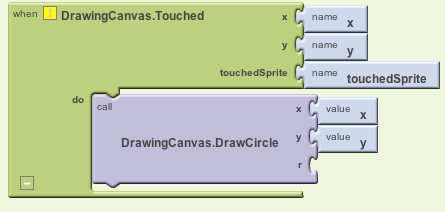
Canvasevents. Button.Click events are fairly simple because there’s nothing to know about the event other than that it happened. Some event handlers, however, come with information about the event called arguments. The DrawingCanvas.Touched event tells you the x and y coordinates of the touch within the canvas. It also tells you if an object within theDrawingCanvas(in App Inventor, this is called a sprite) was touched, but we won’t need that until Chapter 3. The x and y coordinates are the arguments we’ll use to note where the user touched the screen, so we can then draw the dot at that position.Drag out a DrawingCanvas.DrawCircle command from the DrawingCanvas drawer and place it within the DrawingCanvas.Touched event handler, as shown in Figure 2-7.
On the right side of the DrawingCanvas.DrawCircle block, you’ll see three slots for the arguments we need to fill in:
x,y, andr. Thexandyarguments specify the location where the circle should be drawn, andrdetermines the radius (or size) of the circle. The yellow warning box with the exclamation point at the top of the DrawingCanvas.Touched event handler denotes that these slots haven’t yet been filled. We’ll build the blocks to do that next.This event handler can be a bit confusing because the DrawingCanvas.Touched event also has
xandyslots; just keep in mind that thexandyfor the DrawingCanvas.Touched event tell you where the user touched, while thexandyfor the DrawingCanvas.DrawCircle event are open slots for you to specify where the circle should be drawn.Because you want to draw the circle where the user touched, plug in the
xandyvalues from DrawingCanvas.Touched as the values of thexandyparameters in DrawingCanvas.DrawCircle.Note
Do not grab the arguments of the
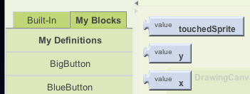
Touchedevent directly, even though this might seem logical! The fact that the arguments can even be grabbed is an unfortunate design aspect of App Inventor. Instead, you want to grab these values from the My Definitions drawer, as shown in Figure 2-8.Open the My Definitions drawer within My Blocks and find the blocks for value x and value y.
The blocks were automatically created for you by App Inventor when you dragged out the DrawingCanvas.Touched event handler block: they are references to the
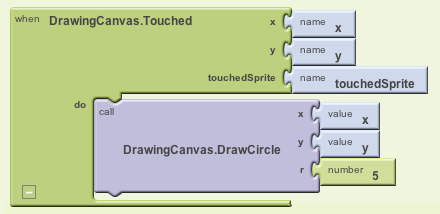
xandyarguments (or names) of that event. Drag out the value x and value y blocks and plug them into the corresponding sockets in the DrawingCanvas.DrawCircle block so they resemble what is shown in Figure 2-9.You’ll also need to specify the radius,
r, of the circle to draw. The radius is measured in pixels, which is the tiniest dot that can be drawn on the screen. For now, set it to 5: click in a blank area of the screen to bring up the shortcut menu, and then select the Math folder. Select 123 from the drop-down list to create a number block. Change the 123 to 5 and plug that in for therslot. When you do, the yellow box in the top-left corner will disappear as all the slots are filled. Figure 2-10 illustrates how the final DrawingCanvas.Touched event handler should look.
Note
Note that you could have created the number 5 block by simply typing a 5 in the Blocks Editor, followed by Return. This is an example of typeblocking: if you start typing, the Blocks Editor shows a list of blocks whose names match what you are typing; if you type a number, it creates a number block.
Adding the Drag Event That Draws a Line
Next, you’ll add the drag event handler. Here’s the difference between a touch and a drag:
A touch is when you place your finger on the canvas and lift it without moving it.
A drag is when you place your finger on the canvas and move it while keeping it in contact with the screen.
In a paint program, dragging your finger across the screen appears to draw a giant, curved line along your finger’s path. What you’re actually doing is drawing hundreds of tiny, straight lines; each time you move your finger, even a little bit, you extend the line from your finger’s last position to its new position.
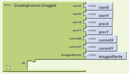
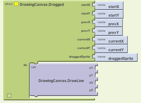
From the DrawingCanvas drawer, drag the DrawingCanvas.Dragged block to the workspace. You should see the event handler as it is shown in Figure 2-11.
The DrawingCanvas.Dragged event comes with seven arguments:
startx,startyThe position of your finger back where the drag started.
currentx,currentyThe current position of your finger.
prevx,prevyThe immediately previous position of your finger.
draggedSpriteThe argument that will be true if the user drags directly on an image sprite. We won’t use this argument in this tutorial.
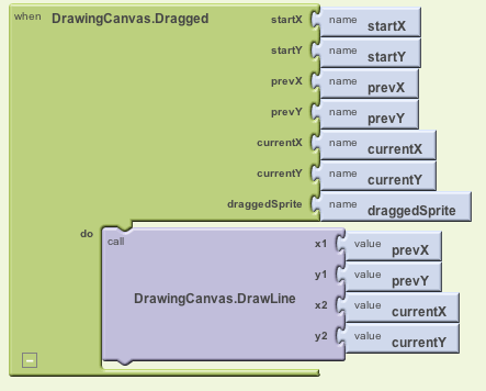
From the DrawingCanvas drawer, drag the DrawingCanvas.DrawLine block into the DrawingCanvas.Dragged block, as shown in Figure 2-12.
The DrawingCanvas.DrawLine block has
four arguments, two for each point that determines the line:
(x1,y1) is one point, while (x2,y2)
is the other. Can you figure out what values need to be plugged into
each argument? Remember, the Dragged event will be called many
times as you drag your finger across the canvas: the app draws a
tiny line each time your finger moves, from (prevx,prevy) to (currentX,currentY). Let’s add those to our
DrawingCanvas.DrawLine
block:
Click the My Definitions drawer. You should see the blocks for the arguments you need. Drag the corresponding value blocks to the appropriate slots in
DrawingCanvas.Dragged. value prevX and value prevY should be plugged into thex1andy1slots. value currentX and value currentY should be plugged into thex2andy2slots, as shown in Figure 2-13.
Adding Button Event Handlers
The app you’ve built lets the user draw, but it always draws
in red. Next, add event handlers for the color buttons so users can
change the paint color, and another for WipeButton so they can clear the screen
and start over.
In the Blocks Editor:
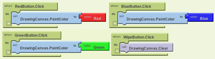
Switch to the My Blocks column.
Open the drawer for
RedButtonand drag out the RedButton.Click block.Open the DrawingCanvas drawer. Drag out the set DrawingCanvas.PaintColor to block (you may have to scroll through the list of blocks in the drawer to find it) and place it in the “do” section of RedButton.Click.
Switch to the Built-In column. Open the Colors drawer and drag out the block for the color red and plug it into the set DrawingCanvas.PaintColor to block.
Repeat steps 2–4 for the blue and green buttons.
The final button to set up is
WipeButton. Switch back to the My Blocks column and drag out a WipeButton.Click from the ButtonWipe drawer. From the DrawingCanvas drawer, drag out DrawingCanvas.Clear and place it in the WipeButton.Click block. Confirm that your blocks show up as they do in Figure 2-14.
Letting the User Take a Picture
App Inventor apps can interact with the powerful features of an Android device, including the camera. To spice up the app, we’ll let the user set the background of the drawing to a picture she takes with the camera.
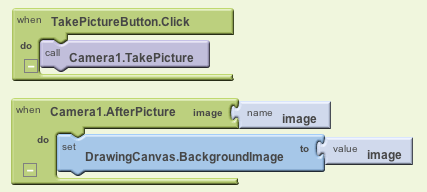
The
Cameracomponent has two key blocks. The Camera.TakePicture block launches the camera application on the device. The event Camera.AfterPicture is triggered when the user has finished taking the picture. You’ll add blocks in the Camera.AfterPicture event handler to set theDrawingCanvas.BackgroundImageto the just-taken Switch to the My Blocks column and open the TakePictureButton drawer. Drag the TakePictureButton.Click event handler into the workspace.From
Camera1, drag out Camera1.TakePicture and place it in the TakePictureButton.click event handler.From
Camera1, drag the Camera1.AfterPicture event handler into the workspace.From
DrawingCanvas, drag the set DrawingCanvas.BackgroundImage to block and place it in the Camera1.AfterPicture event handler.Camera1.AfterPicture has an argument named
image, which is the picture just taken. You can get a reference to it, value image, in the My Definitions palette; drag it out and plug it into DrawingCanvas.BackgroundImage.
The blocks should look like Figure 2-15.
Test your app.
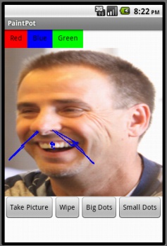
Try out this behavior by clicking Take Picture on your phone and taking a picture. The cat should change to the picture you take, and then you can draw on that picture. (Drawing on Professor Wolber is a favorite pastime of his students, as exemplified in Figure 2-16.)
Changing the Dot Size
The size of the dots drawn on the canvas is deter-mined in the
call to DrawingCanvas.DrawCircle when the
radius argument r is set to 5. To
change the thickness, you can put in a different value for r. To test this, try changing the 5 to a
10 and testing it out on the phone to see how it looks.
The catch here is that whatever size you set in the radius argument is the only size the user can use. What if he wants to change the size of the dots? Let’s modify the program so that the user, not just the programmer, can change the dot size. We’ll change it so that when the user clicks a button labeled “Big Dots,” the dot size is 8, and when he clicks a button labeled “Small Dots,” it is 2.
To use different values for the radius argument, the app needs to know which one we want to apply. We have to tell it to use a specific value, and it has to store (or remember) that value somehow so it can keep using it. When your app needs to remember something that’s not a property, you can define a variable. A variable is a memory cell; you can think of it like a bucket in which you can store data that can vary, such as the current dot size (for more information about variables, see Chapter 15).
Let’s start by defining a variable dotSize:
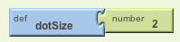
In the Blocks Editor, open the Definitions drawer in the Built-In column. Drag out a def variable block. Change the text “variable” to “dotSize”.
Notice that the def dotSize block has an open slot. This is where you can specify the initial value for the variable, or the value that it defaults to when the app begins. (This is often referred to as “initializing a variable” in programming terms.) For this app, initialize the
dotSizeto 2 by creating a number 2 block (by either starting to type the number 2 or dragging a number 123 block out of the Math drawer) and plugging it into def dotSize, as shown in Figure 2-17.
Using variables
Next, we want to change the argument of DrawingCanvas.DrawCircle in the
DrawingCanvas.Touched event
handler so that it uses the value of dotSize
rather than always using a fixed number. (It may seem like we’ve
“fixed” dotSize to the value 2
because we initialized it that way, but you’ll see in a minute how
we can change the value of dotSize and therefore change the size of
the dot that gets drawn.)
In the Blocks Editor, switch to the My Blocks column and open the My Definitions drawer. You should see two new blocks: (1) a global dotSize block that provides the value of the variable, and (2) a set global dotSize to block that sets the variable to a new value. These blocks were automatically generated for you when you created the
dotSizevariable, in the same way that value blocks for the argumentsxandywere created when you added the DrawingCanvas.Touched event handler earlier.Go to the DrawingCanvas.Touched event handler and drag the number 5 block out of the
rslot and place it into the trash. Then replace it with the global dotSize block from the My Definitions drawer (see Figure 2-18). When the user touches the canvas, the app will now determine the radius from the variabledotSize.
Changing the values of variables
Here’s where the magic of variables really comes into
play—the variable dotSize
allows the user to choose the size of the circle, and your event
handler will draw the circle accordingly. We’ll implement this
behavior by programming the SmallButton.Click and BigButton.Click event
handlers:
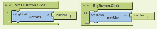
Drag out a SmallButton.Click event handler from the SmallButton drawer of My Blocks. Then drag out a set global dotSize to block from My Definitions and plug it into SmallButton.Click. Finally, create a number 2 block and plug it into the set global dotSize to block.
Make a similar event handler for BigButton.Click, but set
dotSizeto 8. Both event handlers should now show up in the Blocks Editor, as shown in Figure 2-19.
Note
The “global” in the set global dotSize to refers to the fact that the variable can be used in all the event handlers of the program (globally). Some programming languages allow you to define variables that are “local” to a particular part of the program; App Inventor currently does not.
Test your app.
Try clicking the size buttons and then touching the
canvas. Are the circles drawn with different sizes? Are the
lines? The line size shouldn’t change because you programmed
dotSize to only be used in
the DrawingCanvas.DrawCircle
block. Based on that, can you think of how you’d change your
blocks so users could change the line size as well? (Note that
Canvas has a property named LineWidth.)
The Complete App: PaintPot
Figure 2-20 illustrates our completed PaintPot app.
Variations
Here are some variations you can explore:
The app’s user interface doesn’t provide much information about the current settings (for example, the only way to know the current dot size or color is to draw something). Modify the app so that these settings are displayed to the user.
Let the user enter the dot size within a
TextBoxcomponent. This way, she can change it to other values besides 2 and 8. For more information on input forms and theTextBoxcomponent, see Chapter 4.
Summary
Here are some of the ideas we’ve covered in this chapter:
The
Canvascomponent lets you draw on it. It can also sense touches and drags, and you can map these events to drawing functions.You can use screen arrangement components to organize the layout of components instead of just placing them one under the other.
Some event handlers come with information about the event, such as the coordinates of where the screen was touched. This information is represented by arguments. When you drag out an event handler that has arguments, App Inventor creates value blocks for them and places them in the My Definitions drawer.
You create variables by using def variable blocks from the Definitions drawer. Variables let the app remember information, like dot size, that isn’t stored in a component property.
For each variable you define, App Inventor automatically supplies a global value block that gives the value of the variable, and a set global variable to block for changing the value of the variable. These blocks can be found in the My Definitions drawer. To learn more about variables, see Chapter 16.
This chapter showed how the Canvas component can be used for a painting
program. You can also use it to program animations such as those you’d
find in 2D games. To learn more, check out the Ladybug Chase game in
Chapter 5 and the discussion of animation in
Chapter 17.