
I think it’s safe to say that people should never be presented with Web forms they don’t need to fill out. This, of course, means that the primary goal of anyone encountering a form is to complete it. The hope is that they want what’s on the other side: to make a purchase, to start using a service, to manage information, etc. Because—I’ll reiterate from Chapter 1—no one likes filling in forms. Trust me, I’ve asked thousands of people while talking about form design. Only one has said she enjoys it!
This means that illuminating a path to completion by showing people how they can complete a form is crucial.
Name That Form
Part of providing a clear path to completion is telling people what form they are on and what they can accomplish by filling it out. As people are unlikely to read a detailed description of what each form they encounter does, this burden mostly falls on the form’s title. As a result, it’s crucial that form titles match the calls to action that people use to access them.
In the Fairmont Hotels in Figure 3.1, one of the calls to action on the page is a link that allows people to “Activate Account.” The form they land on after following this link, however, is titled
“Manage Your Fairmont President’s Club Profile.” Are they in the right place? Can this form be used to activate their account?
If they take the time to read the instructional text, it turns out that, in fact, they can activate their account, but these uncertainties could have been avoided altogether if the form were simply titled “Activate Your Account.”
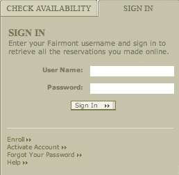
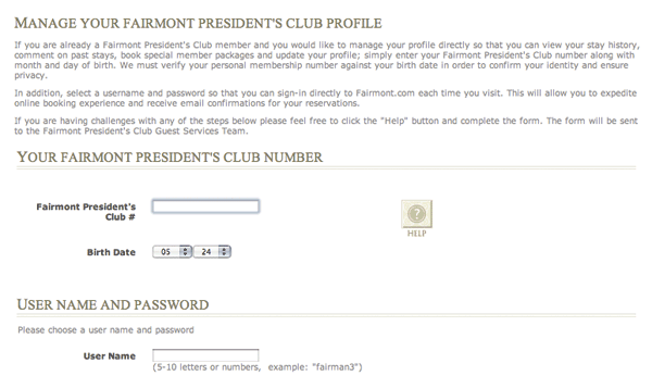
Figure 3.1
Clicking on the Activate Account link from the Fairmont Hotels front page leads to a form titled “Manage Your Fairmont President’s Club Profile.” Are you in the right place?
Start Pages
While the right title for a form can ensure that people start in the right place, we often have to provide some additional information on how to start. In cases where forms require a significant amount of information that people are unlikely to have readily available or a substantial amount of time to complete, start pages can provide valuable context.
When you’re applying for a Fidelity account online, the start page in Figure 3.2 lets you know that account statements, a driver’s license, bank account information, and more are required to successfully complete the form. You’re also told the process should take around 10-15 minutes.
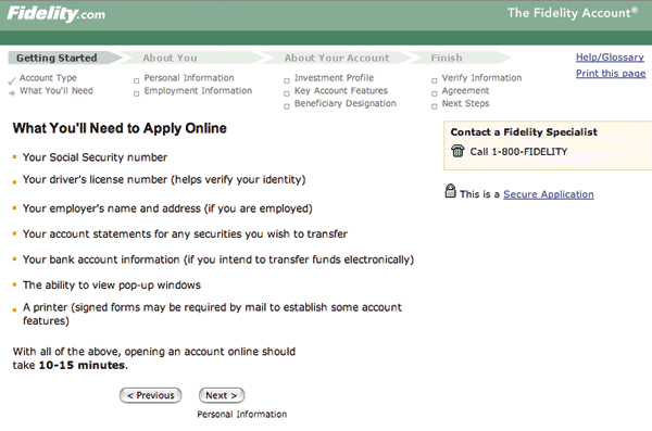
Figure 3.2
A start page on Fidelity lets you know what it takes to complete this form.
These types of start pages don’t belong before every form—especially not on forms that ask questions you are likely to have an answer to right away. Only when forms require a significant time investment, like online surveys, or when people might get frustrated when getting halfway through a form only to discover some obscure piece of information is preventing them from finishing, should you consider using start pages to help illuminate a clear path to completion.
Clear Scan Lines
While your first inclination when thinking about illuminating a path to completion in a Web form may be to tell people where they are within a multiple Web page form, I’d like to focus first on an even more basic, but often forgotten consideration: providing a clear scan line from start to finish.
Figure 3.3 shows eye-tracking data for a simple form that highlights the importance of a clear scan line. In this example, the strong vertical axis of labels, input fields, and a primary action button provides a single path through the form. This allows people to respond quickly to questions and complete their task with a minimum number of diversions.
Figure 3.3
A composite eye-tracking image (heat map) from Etre (www.etre.com) showing what people look at when filling in a simple Web form.
To illustrate this point further, consider the difference between the two PayPal checkout forms in Figure 3.4. One has a clear scan line that starts at the first information point, ends at the primary action, and allows people to take in all the information they need to review quickly. The other has a number of different visual treatments that break up the path to completion into a series of zigzagging eye movements. A single path makes it easier to process the questions a form is asking through a consistent layout. This, in turn, can increase completion rates by keeping people on task and ensuring that they see and respond to all the questions a form asks them.
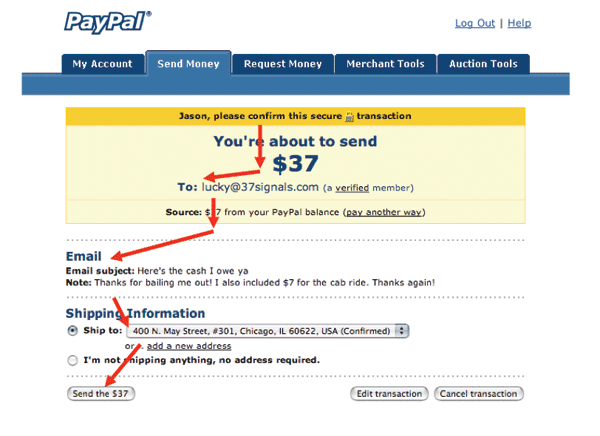
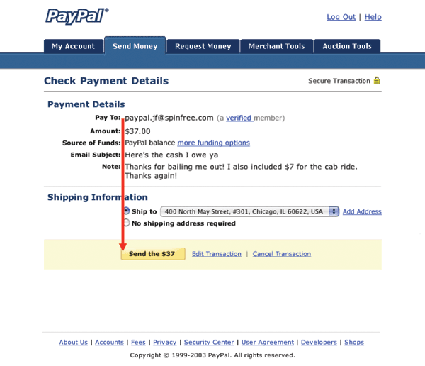
Figure 3.4
Although the top form design includes some meaningful distinctions between content, the bottom PayPal form provides a clear path to completion because people can simply follow a straight line down.
A well-designed scan line has just the right amount of visual spacing between questions to enable an even pace between each label/input pair (see Figure 3.5). In other words, it allows people to move comfortably through the form without missing any important information. The right amount of spacing depends a lot on the style of your form, but generally about 50 to 75 percent of the height of an input field between each question works best.
Figure 3.5
A well-paced flow between questions requires adequate spacing between questions.
Minimal Distractions
To keep people focused on completing a form, you also should consider which Web site elements help illuminate a clear path to completion and which elements distract from it. Even though the consistent navigation, header, or promotions that make your Web site great are appropriate on most of your site’s pages, they may not be appropriate on your forms. These additional elements can be a distraction at best and a detour at worst, particularly for critical forms like checkout in ecommerce sites or registration in social applications.
Removing interface elements not directly related to completing a form helps keep people on task and removes paths to abandonment. The difference between checkout and shopping on Amazon.com shown in Figure 3.6 is stark. Even the site’s logo, which usually allows people to return to the Amazon home page, is deactivated to minimize ways off this crucial form.
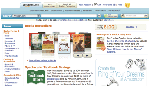
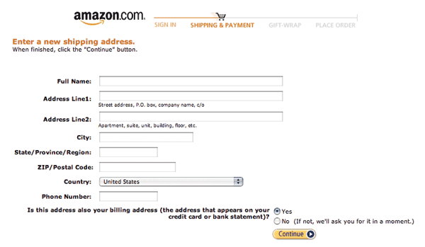
Figure 3.6
While Amazon.com may merchandise its categories and specials through its Web site, once you are in checkout, there are no frills.
Progress Indicators
When the questions that need to be answered before a Web form is complete are spread across multiple Web pages, it may be useful to communicate the status of people’s progress through the form.
To illustrate this, let’s return to the example of buying a house online. Years of realtors, lenders, buyers, sellers, and lawyers have added numerous clauses, considerations, and decisions to the proceedings. As a result, any form trying to enable home purchases online is going to have to account for a large quantity of required answers. The obvious first step is to organize the form into meaningful content groups. The next step is to illuminate a path to completion through these groups.
In addition to clearly labeled section headers, the Redfin form for buying a house in Figure 3.7 includes an overview of the number of Web pages involved (scope), an indication of what page you are on (position), and a way to save and return to your progress (status).
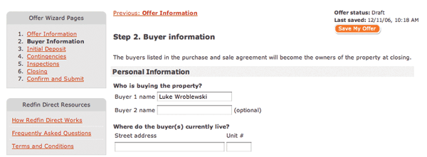
Figure 3.7
Redfin provides multiple progress indicators that indicate scope, position, and status information.
Though closely integrated, these three progress indicators perform different functions. The listing of the total number of pages gives people a sense of the scope of this form: How long will it take to complete and what are the different sections/steps? The indicator of current position lets people know where they are relative to the entire form. The form status indicates whether the offer was submitted or not and when it was last saved. For long forms, providing the option to save or doing so automatically is a great way to keep people on a path to completion.
While it’s certainly a good idea to let people know how far along in a process they are, you need to be wary of progress indicators that incorrectly represent the number of Web pages or steps required to complete a form. An all too common practice for forms spanning multiple Web pages is the inclusion of a progress indicator that does not accurately mirror the number of pages a form requires.
In this Fidelity Investments example in Figure 3.8, the number of pages of inputs required to apply for an account online is outlined in a detailed progress indicator. However, as soon as someone selects “Next,” a page not included in the process (Log In) appears.
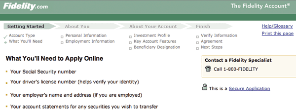
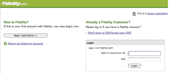
Figure 3.8
Fidelity.com features a two-level progress bar letting you know where you are in the process of filling in a long form. However, it disappears on step one (login), which is not included in the list of steps required.
This illustrates an all too common problem with progress indicators. They promise a series of well-defined, linear steps but rarely deliver. Consider a typical ecommerce checkout form like the one in Figure 3.9 on Half.com. The progress indicator states that there are three pages of inputs you can expect: shipping, billing, and place order. When it comes time to select a shipping address, however, page one is selecting from an existing list of shipping addresses. If the address you want to ship to is not listed, an additional page is required, and you need to add a new address. All of a sudden, step one becomes two steps. When selecting billing in step two, you may need to verify an online payment service provider, log in to its site, select a source of funding, or provide a new billing address. Now step two is four steps.

Figure 3.9
The three steps promised by Half.com can easily become many more.
So we’ve taken six steps to accomplish what we told our customers was going to take two steps. It’s not that giving people a sense of how many steps are required is a bad thing; but we are rarely telling them the truth. One solution is to avoid the progress indicator altogether and just get people through the form as fast as possible. The other is to provide a more high-level progress indicator that does not set expectations explicitly.
The Amazon.com checkout process in Figure 3.10 makes no explicit promises about the number of steps. Instead, the progress indicator outlines the types of information you’ll need to provide. Although some people could interpret these categories as separate pages, no specific expectations are set. People get a general sense of the kinds of information they’ll need to provide and where they are in that process.

Figure 3.10
Amazon does not promise any number of pages, just a high-level set of tasks.
Tabbing
Every time I talk about Web form design, I always ask the audience how many of them use the Tab key on their keyboard to move between the input fields of a form they are filling out. Every time, more than half the audience raise their hands. Based on this information alone, it’s a good idea to consider how people will tab between inputs to complete your form.
Consider the registration form from Office Depot in Figure 3.11. When someone is moving between input fields using the Tab key, he is likely to have a pretty jarring experience as he moves from the bottom of one column to the top of the next column. This experience would be even more disorientating in a small browser window when your last input field now sits offscreen. It also doesn’t help that the first input field at the top of the second column is a single checkbox surrounded by text. This rather small input field is not that noticeable when highlighted, so a person might be a bit confused about his current position when he tabs to it. Even within the Payment Info section, the tabbing order could be unclear as he jumps between multiple rows and columns. After he specifies Payment Type, is he going to Credit Card Number next or going to Credit Card Type?
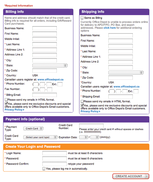
Figure 3.11
Tabbing through inputs on the Office Depot registration form could result in a lot of page jumping when changing columns.
By highlighting this example, I’m not saying that all two-column forms are poorly designed. However, I am pointing out that Web form designers should consider what the experience will be like for the large numbers of people who move between input fields using the Tab key, and they should design accordingly.
When I described the experience of filling out the Office Depot form previously, I assumed that the developers had specified an explicit order for the form using the “tabindex” HTML attribute. While the nuances of form development are beyond the scope of this book, it is useful for designers to know that forms that don’t provide an explicit order to their inputs using tabindex will simply be tabbed through in the order they appear in the HTML markup. What that means is to avoid any existential jumps between input fields, it’s a good idea to talk to a developer about specifying the order in which inputs should be accessed.
Best Practices
- Ensure that the titles of your forms match people’s expectations and succinctly explain what each form is for.
- For forms requiring substantial time or information requiring look-up, use a start page to set people’s expectations.
- Make sure that you illuminate a clear path to completion through a form by using clear scan lines and effective visual pacing that comfortably takes people from start to finish.
- For mission-critical forms like checkout or registration, remove distractions and any links or content that may lead to form abandonment.
- For forms with a known sequence of multiple Web pages, include progress indicators that communicate scope, status, and position.
- For forms without a clear sequence of pages, do not include progress indicators or use more general progress indicators instead of those that set incorrect expectations.
- Consider the experience of “tabbing” through a form when making form layout decisions.
- Use the “tabindex” HTML attribute to control tabbing order through a form.
..................Content has been hidden....................
You can't read the all page of ebook, please click here login for view all page.