Although many visual and interaction design considerations play an important role in how people complete forms, it’s often the content within the form and how we organize it that either leaves people scratching their heads or allows them to whiz through unperturbed.
What to Include
People need to parse every question you ask them, formulate their response to that question, and then enter their response into the space you have provided. The best way to speed up that process is not to ask the question at all. That means if you want to be vigilant about optimizing your forms, put every question you are asking people to the test. Do you really need to ask this question? Is it information that you can get automatically? Is there a better time or place to get an answer from people? Though this process appears tedious, you may be surprised when you discover what you can leave off your forms.
Deciding what stays on a form may mean challenging the information collected when the form was a paper document. Often, legacy questions that are no longer applicable are simply ported over when a paper form is digitized.
Agreeing as to which questions should remain on a form may also be a discussion among several departments in your company or organization. The marketing team may have specific questions to understand customers better. The engineering team may require specific information to identify unique individuals. The legal team might mandate certain terms and conditions that have to be accepted by new customers. And the list goes on.
Though all these teams may have questions they want to pose to your customers, your forms need to speak with one voice. To achieve that goal, teams will need to come together and work out which questions make it into each form. Take a look at Caroline Jarrett’s “Keep, cut, postpone, and explain” framework (outlined in the sidebar) for a way to decide what makes the cut.
Have a Conversation
Because forms facilitate conversation between a person and a company or organization, it helps to think about organizing the structure of a form as a conversation. Consider the following scenario.
You encounter a stranger who asks you: “What’s your name?” “What’s your address?” “What’s your email address?” “What’s your birth date?” Before too long you, find yourself asking: “Who is this person?” “Why does he (or she) need all this information?” “Why am I telling him (or her) all this?” Quite quickly, you become uneasy and wish the stranger would tell you something about himself or herself instead of barraging you with questions. That barrage of questions is—of course—our friend, the form.
Thinking about how a form can be organized as a conversation instead of an interrogation can go a long way toward making new customers feel welcome. I still have a vivid memory of a woman who was interviewed during a field study for a major Web retailer remarking, “This site wants to know so much about me, but I know nothing about it.”
Giving people the confidence to complete forms starts with how we ask them the questions required to complete a form successfully. Input fields are the elements on a form responsible for gathering people’s answers to our questions. Labels are the form elements responsible for asking the questions. Whenever these two elements can act as a natural part of a meaningful conversation, people are likely to respond with answers easily and readily.
Consider the difference between the following questions from two different versions of the Yahoo! registration form, as shown in Figure 2.1.
Figure 2.1
Two ways conversational language can clarify questions. “Day” and “Year” vs. “dd” and “yyyy”; “Preferred content” vs. “I prefer content from.”
Which version seems more approachable? Which one are you more likely to have an answer for? Treating inputs as part of the question being asked (the label) mirrors the way we answer questions in the real world. This becomes even more important as the questions you ask become more complex or unfamiliar.
Consider the label “Issuing Bank.” What is that asking? Now, if we rephrased it as “What bank issued you this document?” odds are that you’d have a quicker answer. Of course, both of these labels will be made clearer by their surrounding context. For example, are you filling a form about a missing financial document or a form to set up a new online account?
The terms you use in your labels also play a pivotal role in determining how quickly people can provide an answer. To continue with our banking example, do people understand the termed “issuing”? Is that vocabulary they’d use, or is it a term used by the bank? Perhaps people think instead: “Which bank gave you this document?” Using the terms your customers use to describe their actions helps frame questions in a more understandable way.
This doesn’t mean that all of the labels on a form should be reworded as sentences. There are many instances when concise, single-word labels work much better than longer, more descriptive labels. But when there’s potential ambiguity in your questions, clear conversational language often helps clear things up.
Organizing Content
In order to keep the conversation flowing smoothly, it’s a good idea to organize the questions you’re asking people into meaningful groups. Depending on their size and context, these groups could then be presented across multiple Web pages or as sections of a single Web page.
As an example, the Yahoo! registration form in Figure 2.2 groups questions about you, the account you are creating, a way for you to reaccess your account, and a few trust and safety items (terms of service and spam protection) into four distinct sections. These sections are labeled with headers that stand out from the rest of the elements on the page. The bold purple font in which they are displayed carries more visual “weight” than the other form labels, allowing you to quickly scan the form to see what type of information you’ll need to provide.

Figure 2.2
The new Yahoo! registration form uses a conversational tone to engage new members.
Longer or more complex forms may need to distribute content groups across multiple pages, as seen in online real estate site Redfin’s form for buying houses online. This overly complex process—not through any fault of Redfin—also benefits from being organized in a way that allows people to easily scan required sections they need to answer. In case someone didn’t know what he was getting into when buying a home, Redfin’s eight-page form makes it vividly clear (see Figure 2.3)! It’s worth noting that forms this long benefit from additional feedback and interactions, which we’ll discuss in later chapters.

Figure 2.3
Redfin groups the myriad of steps required to purchase a home into a series of manageable content groups. Each section has a title and some also include a bit of descriptive text.
When deciding how to organize forms, designers will often wonder if they are better off grouping all their content areas into a single Web page or dividing them into a series of pages. And if a form is divided into a series of pages, how many pages is too many? The answer, of course, is… it depends. But we can get a better answer by understanding the context for each form we design. Who is filling the form in and why? Answering this up front allows us to think about our forms as a deliberate conversation with a specific person instead of the inputs for a database.
When you approach forms as a conversation, natural breaks will emerge between topics. First, let’s talk about who you are. Now let’s discuss where you live. When these distinct topics are short enough to fit into a few sections, a single Web page will probably work best to organize them. When each section begins to run long, multiple Web pages may be required to break up the conversation into meaningful, understandable topics.
In certain situations, several sections with lots of questions may need to be asked in sequence because they don’t make sense out of context. People need to see all the questions together in order to answer each. In this case, one long Web page may very well be the best answer.
In other situations, some sections will perform best after a form is completed. For instance, optional marketing questions such as “How did you first hear about us?” or “Would you like additional information about our services?” may actually get higher response rates when asked after someone has competed a form. In one redesign I’ve seen, asking these questions after a registration form was filled out increased answers by almost 40 percent! The reason behind this may be that optional questions feel less invasive when presented as follow-up topics instead of requirements for form completion.
Because your forms aren’t alone on the Web, another way to decide how to structure your conversations with customers is to conduct a Web conventions survey to see if any patterns emerge. A Web conventions survey is simply a comparison of design solutions across a number of similar Web sites. It usually helps to look at the top performing sites in a specific category (like ecommerce) to ensure that the sites being compared share common measures of success.
A Web conventions survey may lead you to uncover common form organization structures that have emerged on the Web. For instance, mapping out what information is asked in ecommerce shopping cart forms (see Figure 2.4) reveals some interesting insights. The first page tends to be Sign In; the second, personal information. After that it’s usually shipping preferences. And so on.
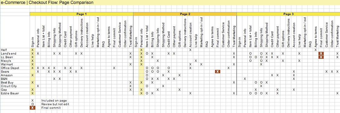
Figure 2.4
In this Web conventions survey, the questions asked by 15 ecommerce checkout forms are organized by the Web page on which they appear: page 1, page 2, and
so on.
These conventions can provide a great starting point for thinking about how to organize the conversation on your shopping cart form. Since people are likely to be familiar with these patterns, chances are they could work well in your ecommerce site. However, it’s important to work from the patterns a Web conventions survey uncovers and not simply copy what the competition is doing on their site. Usually a direct replica of someone else’s form organization won’t be the right fit for your specific situation.
Group Distinctions
In both the Yahoo! and Redfin examples we saw earlier, each content group was visually differentiated from the rest of the form: a bold purple font on Yahoo! and a bold font and subtle background color on Redfin. As these examples illustrate, communicating meaningful distinctions between content groups doesn’t require a lot of visual difference. In fact, too much contrast between content groupings often creates excessive visual noise that gets in the way of people’s ability to scan a form.
Consider the differences between the following two forms in Figures 2.5 and 2.6. One relies on yellow borders, a yellow background color, red section headers, and merged table cells to group related content. The other simply relies on a subtle background color change to separate meaningful sections of the form. Using a minimum amount of visual information helps keep the focus on a form’s content and not its presentation.

Figure 2.5
Many distinct visual elements on this form get in the way of seeing the questions the form is asking.

Figure 2.6
A subtle background color change or thin rule is often all you need to effectively group related content in a form.
But even subtle distinctions between content groups can be overused. To account for what they consider to be shortcomings of left-aligned form labels, some designers opt to use alternating background colors to group left-aligned labels with their right-aligned inputs, as seen in Figure 2.7. However, eye-tracking studies done on label placement[1] reveal that people generally don’t have problems correlating inputs to labels in a left-aligned layout (as we’ll see in Chapter 4). It just takes them longer to do so. As a result, this approach doesn’t really solve the problem. In fact, it can actually create a different issue.

Figure 2.7
Although it may be tempting to use alternating background colors to group left-aligned labels and their corresponding inputs, these elements can add a lot of visual noise to a form.
Consider the example in Figure 2.8 where two different background colors are used to distinguish labels and inputs and a horizontal rule is used to separate each label and input field pair. This approach ultimately adds an additional 15 visual elements to the layout: the centerline, each background box, and each horizontal line. These elements begin to distract our eye and make it more difficult to focus on the most important elements in the layout: the labels and inputs. As information design expert Edward Tufte points out: “Information consists of differences that make a difference.”[2] In other words, any visual element that is not helping your layout ends up hurting it. This can be seen when you try to scan the left column of labels. Your eye repeatedly pauses (see the bottom of Figure 2.8) to consider each horizontal line and the box created by each combination of line and background color.

Figure 2.8
The addition of excessive visual elements can distract from a form’s primary content: and interrupt the scan line of a form.
Of course, this doesn’t mean that background colors and rules should never be used within form layouts. They certainly have their place. But when thinking about how to distinguish between content groups, consider what the minimum amount of visual information needed is (see Figure 2.9). Chances are much more likely that it will become a distraction instead of an aid.
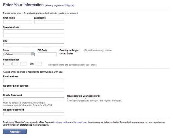
Figure 2.9
The eBay Express checkout form uses a thin rule to separate meaningful content sections. Just the minimum amount is needed to make a clear distinction.
Best Practices
- Take the time to evaluate every question you are adding to your forms. Be vigilant about removing everything that isn’t necessary.
- Strive for succinctness in all the questions (labels) you ask in your forms.
- When succinct labels may be misinterpreted, look for opportunities to use natural language to clarify the questions your forms ask people to answer.
- Ensure that your forms speak with one voice, despite questions from several different people or departments.
- Organize the content on your forms into logical groups to aid scanning and completion.
- When possible, structure your forms as a conversation. Natural breaks between topics will emerge that can help you organize your form.
- If a form naturally breaks down into a few short topics, a single Web page is likely to be a good way to organize the form.
- When a form contains a large number of questions that are only related by a few topics, multiple Web pages are probably a good way to organize the form.
- When a form contains a large number of questions related to a single topic, one long Web page is generally a good way to organize the form.
- Consider asking optional questions only after a form is completed. Chances are you’ll get more answers than if these questions were part of the initial form.
- Consider using Web convention surveys to discover patterns in how forms are organized on specific kinds of sites.
- Use the minimal amount of visual information necessary to distinguish content groups.
- Use initial capital letters to make the titles of content groups easier to scan.
[1]Matteo Penzo’s Label Placement in Forms study from UXmatters July 2006: http://tinyurl.com/fefbx
[2]Edward Tufte, Envisioning Information, 1990 Graphics Press
..................Content has been hidden....................
You can't read the all page of ebook, please click here login for view all page.