
Any question you ask people requires them to parse it, formulate a response, and then input their answer in the affordance you have provided on the form. Being vigilant about every question you ask allows you to remove questions that are not absolutely necessary, or can be asked at a better time or place, or can be inferred automatically. And the fewer questions you ask, the better the odds are of people completing your forms quickly and easily.
Removing Questions
When eBay Inc. redesigned its registration form in 2002, the company carefully considered each question and decided which ones were not absolutely necessary. It’s probably not a coincidence that some of these were also the same questions that tripped up potential customers: annual household income, gender, promotional codes, and date of birth (Figure 10.1).

Figure 10.1
eBay’s old registration form asked a number of questions that tripped up potential customers.
Moving several optional questions out of the registration form probably required some negotiation with the people vested in their answers—marketing and trust and safety teams at the company. The impact, however, was tremendous because a lot more people registered successfully and began to use eBay. And perhaps ironically, significantly more people answered the optional questions when they were asked after they registered!
Of course, not all questions on a form are unnecessary. But even when you’ve put in the effort to make sure that everything you are asking people is, in fact, required to meet user needs or business goals, there may still be an opportunity to trim unnecessary input fields.
PayPal’s payment form looks like a typical set of questions that require an answer when someone is trying to make a purchase online (Figure 10.2). People are asked to select the type of credit card they are using to pay and then provide the number for that card.

Figure 10.2
This PayPal form asks people to select the type of credit card they are using to make a purchase. Is that necessary?
However, it turns out one of these questions is unnecessary. Credit card numbers follow a consistent structure. American Express cards start with either 34 or 37. Mastercard numbers begin with 51–55. Visa cards start with 4. And so on. This information can be used to infer what type of credit card someone is using simply by looking at his credit card number.
In the redesigned form in Figure 10.3, PayPal does exactly that. When someone enters a credit card number, the appropriate card type is highlighted directly below. This eliminates the need to ask people what type of credit card they have—one less question to parse, think through, and respond to.


Figure 10.3
The redesigned PayPal form eliminates an unnecessary question by highlighting the type of credit card being used.
When you are looking for ways to reduce unnecessary inputs, it’s important to think through a number of considerations. In the PayPal example, the four kinds of credit cards PayPal accepts all follow a consistent numbering system, so the interaction works.
On the Weber checkout form in Figure 10.4, people are asked for their zip code first and then given a set of choices for their city and state. On the plus side, this interaction design removes some awkward ways of answering questions—specifically, drop-down menus for states that run 50 entries high.
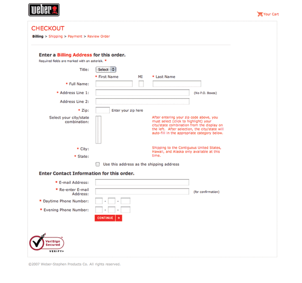

Figure 10.4
Weber’s checkout form tries to eliminate questions, but potentially ends up complicating the form more.
On the negative side, the way a simple question is asked has been made more complicated. When faced with a set of input fields that match the structure of a mailing address, people often skip over labels as they fill in the pieces. The components and layout of a U.S. mailing address are familiar to just about everyone in the United States. The Weber site breaks this structure by asking for the zip code out of order.
It also removes the redundancy inherent in asking people for a zip code and city/state. The United States Postal Services has deliberately not removed these fields from mailing labels precisely because people often mistype one or the other.
Another indicator that the question being asked has gotten more complicated is the extensive help text (rendered in red text) near the city and state selection. Odds are that Weber had to add this to help people understand what to expect from the form. The company also probably made the help text red so people would notice it since most people pass over instructional text when filling in forms unless they feel they need it. Trying to draw attention to help text in this way is not advised, as red text for anything but errors should be avoided.
International customers are also out of luck because Weber does not ship overseas. If it did, clearly this interaction would not work when specifying international addresses that do not utilize the United States zip code system.
So although the Weber example removes some unnecessary inputs, I think the jury is still out on whether this simplified the form or not.
Smart Defaults
In The Paradox of Choice,[1] author Barry Schwartz discusses the impact of having too many choices in our lives and suggests some strategies for coping with the excessive options we encounter just about everywhere. In particular, he outlines the power of smart defaults—selections put in place that serve the interests of most people—as a way to help people make good choices.
Schwartz references organ donor programs as an example. In the United States, 90 percent of Americans approve of organ donation but only 25 percent are organ donors. In several European countries, over 80 percent of people are donors. The difference comes down to a default choice. In the U.S., the organ donor option is defaulted off. Elsewhere, it is defaulted on.
There are many opportunities within Web forms to utilize the power of smart defaults to reduce the number of choices people have to make and thereby expedite form completion.
In the shipping costs portion of eBay’s “sell your item” form (see Figure 10.5), three default choices are made for sellers: standard delivery, insurance not offered, and sales tax not charged. Because these choices result in the least amount of overhead for most sellers on eBay, they are smart defaults that simplify the decision-making process. Not sure what shipping service to use? Standard delivery is the most common. Don’t know if you need to charge sales tax? Looks like you don’t have to. Smart defaults provide answers to questions for you.

Figure 10.5
Smart defaults on the eBay “sell your item” form include answers for shipping service, insurance, and sales tax.
Because of the power of smart defaults, it is tempting to opt people into situations advantageous for business but potentially less so for customers. For example, it’s common to encounter forms that opt customers into mailing lists or extra features by default (see Figure 10.6).

Figure 10.6
This form defaults people into showing their real name and getting marketing materials from the site and third parties.
If possible, try to ensure that the defaults you include in forms align with your customers’ interests. When people are defaulted into services or options they don’t like, it casts doubt and suspicion on your service. I’ve seen several instances where a default choice made potential customers wary enough to pack up their bags and not complete a form.
Perhaps the simplest form of a default selection is a preselected option within a set of radio buttons. Where appropriate, give some thought to what that initial selection is and whether or not it is the right choice for the majority of people encountering your form. Because of the power of smart defaults, chances are that many people will stick with that option.
To address this behavior, a lot of radio button inputs don’t include an initial selection (see Figure 10.7). Either the form designers aren’t sure what the right default should be, or they want people to explicitly make a selection.

Figure 10.7
A set of radio buttons without an initially selected option on Redfin.
Interaction designers would argue that this breaks the model of a mutually exclusive interaction element. After all, a set of radio buttons without an explicit selection will result in an error when a form is submitted. While this is true, people successfully make selections from sets of radio buttons without a default choice all the time. And mutually exclusive choices exist where no default option makes sense.
Consider the question of gender: male or female (see Figure 10.8)? A radio button input is hard-pressed to select a default value without sounding presumptuous. A drop-down menu with a third “Please select” option increases the number of steps needed to answer this simple question: click on the menu, drag the mouse to select a choice, let go of the mouse. Simply clicking a radio button is much easier. Perhaps the way to get the best of both worlds is by using a drop-down menu with a third option: “rather not say.” This way you’re not being overly pushy!
Figure 10.8
What’s the right default state for gender?
Smart defaults don’t work very well when there isn’t a clear option that applies to most people. The Vox registration form in Figure 10.9 defaults the birth date to Jan 1, 1975—probably not the birthday of everyone who tries to register for the site. A better solution simply would be to ask people to explicitly select the month, day, and year they were born. And while you’re at it, let them know why you are asking. eBay in Figure 10.9 tells you that it isn’t being nosey; you just can’t sell on eBay unless you are 18.

Figure 10.9
Let’s not assume we can guess everyone’s birth date.
Smart defaults can also come from people’s implicit behaviors. For instance, if you know someone is accessing your form from the United States, you might consider defaulting the “Country” input field to “United States.” If you know that 90 percent of your customers live in the U.S., you might do the same.
Personalized Defaults
Smart defaults can also be personally relevant to individuals. For instance, if I always use Federal Express as my Shipping Service when I sell items on eBay, the Shipping Service selection we saw earlier could be defaulted to my personal choice. Keeping selections active for returning customers is often referred to as making them “sticky,” which basically means sticking with the choice a customer made before.
Though some forms set a high bar for how many times a choice must be made in order to become “sticky,” many only require a single time through to set a personalized default. Expedia, for example, sets my default travel options to the last set of tickets I looked for (see Figure 10.10). The form could be even smarter if it defaulted to my last set of travel options only until it knew I bought a ticket for that trip. In all other cases, it could simply default to my most frequently used departure airport.


Figure 10.10
Smart defaults for travel options on the Expedia site, based on previous usage.
Best Practices
- Carefully examine all the questions being asked in your form for opportunities to eliminate unnecessary inputs.
- Look for patterns in how people answer questions that allow you to infer answers accurately.
- Be mindful not to complicate questions for the sake of removing inputs.
- Smart defaults can help people answer questions by putting default selections in place that serve the interests of most people.
- Because people are likely to leave default selections in place, ensure they align with most people’s goals.
- Whenever possible, include a default selection in a set of radio buttons. If no clear default exists, chances are that people will still understand they need to make a choice. But if they don’t, they’ll get an error.
- Personally relevant default selections enable return customers to complete forms faster because their answers are “sticky.”
- Think through where personalized defaults make sense. It won’t be every input on every form.
[1]Barry Schwartz, Paradox of Choice, 2004. Harper Perennial
..................Content has been hidden....................
You can't read the all page of ebook, please click here login for view all page.