
Whereas flexible inputs allow people to answer questions how they want, and additional inputs allow people to include supplementary questions they want to answer, selection-dependent inputs require people to answer follow-up questions based on their answer to an initial question—usually without having to go to another Web page.
If that sounds like a mouthful, consider the following example in Figure 12.1, on the Found Bin. People have two initial options: either they are a new user or a returning user. Depending on how they answer the question, a series of follow-up questions needs to be answered. Which input fields are shown depends on the initial selection they make—hence the name, selection dependent inputs.


Figure 12.1
A simple selection-dependent input on Found Bin displays follow-up questions based on someone's initial selection.
The number of inputs that are required after an initial selection depends on the question asked. On Found Bin only a few input fields change. On the eBay download request form in Figure 12.2, lots of questions are dependent on a person's initial choice.


Figure 12.2
Selection-dependent inputs on eBay's download request page bring up a series of follow-up questions based on an initial response.
After aneBay seller selects the Sold option in the Listings and Records drop-down list, the form presents additional input fields for selecting a date range. Were the seller to select a different option in the Listings and Records list, completing the form would require a different set of additional options.
It's worth pointing out that, in most cases, people cannot submit a form with selection-dependent inputs until they fill in the additional fields. In other words, selection-dependent inputs introduce additional requirements to forms.
Though both the eBay and Found Bin forms make use of selection-dependent inputs, they do so in different ways. Found Bin uses a set of vertical tabs enforced by radio buttons to present its initial options and then highlights the dependent inputs to the right of these choices. On its Create Download Request Form, eBay uses a single drop-down menu for the initial choice and then appends dependent inputs directly below this initial selection.
While selection-dependent inputs may seem like a basic user interface design problem, there are myriad solutions to be found addressing this problem online, indicating there's more complexity to this interaction than one might initially assume. In fact, each solution for selection-dependent inputs tends to have both clear advantages and disadvantages. But rather than sending you off into form land to fend for yourself, London-based usability firm Etre and I ran a series of studies testing a series of eight different selection-dependent input solutions.
As in our primary and secondary actions study outlined earlier in the book, we tested these variations on 23 people using eye-tracking and usability metrics. Participants were presented each of the eight designs in random order (to minimize familiarity biases) and asked to "Please complete the form fully and accurately." The solutions we tested were based on a list I had published online, so not every possible solution was tested. Sorry if I missed your favorite!
Page-Level Selection
Perhaps the simplest way to address selection-dependent inputs within a form is to divide the process into two clearly defined steps. On the Web, this most often translates to two separate Web pages (see Figure 12.3). The first page—or step in the process—presents people with an initial set of options. After they select one of the options, the appropriate set of selection-dependent inputs replaces their initial selection.


Figure 12.3
Page level selection-dependent inputs place follow-up questions on a separate Web page from the initial choice.
While the relationship between their initial selection and the dependent inputs is clear to most people, the two-step model removes valuable context (you can no longer see and easily access the options you did not choose) once users make an initial selection. This solution is also likely to be slower to complete than inline solutions that don't move between Web pages.
In our testing, page-level selection performed averagely. It achieved average satisfaction scores, a relatively low number of errors, and faired well on eye-tracking measures like number of eye fixations, total length of fixations, and average fixation length. However, this solution had the second longest completion time of all the options we tested. So if you are looking for a safe solution with average performance, and quick completion times are not a concern, page-level selection-dependent inputs might be a good match.
Horizontal Tabs
To avoid additional Web pages within forms, designers have explored several inline approaches to exposing selection-dependent inputs. In one approach, horizontal tabs arranged across the top of a panel, as shown in Figure 12.4, allow people to navigate to a section of the form that contains appropriate selection-dependent inputs. The tabs present not only the initial set of options, but also provide a strong indicator of the current selection.


Figure 12.4
Horizontal tab selection-dependent inputs reveal follow-up questions when people click on each tab.
While most people are familiar with the concept of navigation tabs on the Web, the way in which they fill in Web forms may impair the effectiveness of this approach. When completing a form, many people move from top to bottom and, as a result, may ignore horizontal options. There may also be a lack of clarity about whether horizontal tabs are mutually exclusive. Will I submit my selections on all three tabs with the form or only the selections I made on the active tab?
If we take only standard usability metrics into account, horizontal tabs performed best overall in our testing. None of our participants made any errors, they were able to complete the task quite quickly, and they provided high satisfaction scores for this design.
However, our eye-tracking data indicated that other designs were easier to process. This may have been due to the extra effort involved in scanning across the page to read the tabs. In most of the other designs, our participants' eyes were rarely required to deviate from the left of the screen to the right. Horizontal tabs clearly deviated from a clear scan line to completion (see Figure 12.5).
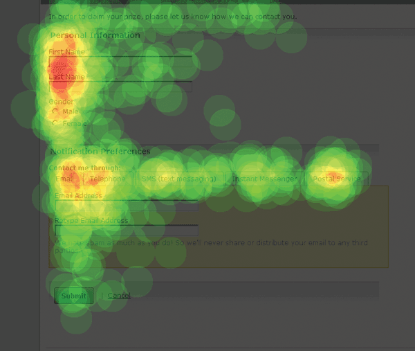
Figure 12.5
A heat map of people's eye fixations on horizontal tab selection-dependent inputs reveals how this form is parsed visually. Image provided by Etre.
One issue that did not come up in our testing of horizontal tabs but that I have seen in other usability studies was confusion over whether or not people's inputs in each of the tabs were mutually exclusive. Perhaps the strong visual indicator of which tab was active helped alleviate these anxieties and make it clearer that only the active tab's contents would be submitted.
Vertical Tabs
To compensate for the potential lack of visibility of horizontal tabs when people move from top to bottom through a form, vertically stacked tabs, as seen in Figure 12.6, are intended to be positioned directly within people's scan line.


Figure 12.6
Vertical tab selection-dependent inputs reveal follow-up questions to the right of an initial selection.
In terms of ease on the eye, vertical tabs performed best in our testing. This solution had the lowest total length of eye fixations, the lowest average fixation length, and one of the lowest average number of fixations.
Like two other solutions we tested, vertical tabs hid irrelevant form controls from people until they needed them. This factor seems to have been critical for ease on the eye and for the speed with which our participants were able to complete the forms. (The same three solutions also had the three lowest average completion times.)
Along with two other solutions we tested, vertical tabs also achieved near-perfect satisfaction ratings. These scores may result from the fact that the three solutions all display radio buttons and their selection-dependent inputs in close proximity to one another. This ensures that someone's eye doesn't have to travel too far (Figure 12.7) once a radio button has been selected, making the design more efficient.

Figure 12.7
People's eyes don't have to travel far between initial options and additional inputs in vertical tab selection-dependent inputs. Image provided by Etre.
Despite all this good news, a couple people made mistakes using this design and were a little confused as to whether the vertical tabs were mutually exclusive or not. Interestingly, people seemed less confused by the horizontal tabs, which theoretically should have bred more confusion because they break with desktop application conventions where most horizontal tabs are not mutually exclusive. The vertical tabs design also included radio buttons on each tab to help to communicate that they were mutually exclusive options.
In other usability testing I have seen, vertical tabs have out performed horizontal tabs for these very reasons. And since vertical tabs score better on satisfaction, eye-tracking metrics, and time to completion, my inclination is to prefer them to horizontal tabs.
Drop-Down List
Both the horizontal and vertical tab solutions maintain a unique interface element—in this case, a tab—for each initial option. This keeps all the initial options visible, but also requires considerable screen real estate to do so. When the number of initial options grows, these methods tend not to scale very well.
The drop-down list solution shown in Figure 12.8 utilizes a menu and grouping box to confine all selection-dependent inputs to a specific area of the form. Though this method obscures most of the initial options—as only one option is visible in the drop-down list at a time—using a single control may better communicate the scope and impact of the initial selection.

Figure 12.8
Drop-down list selection-dependent inputs allow people to select follow-up questions from a potentially long list of initial options without requiring a lot of screen real estate.
Like vertical tabs, the drop-down list solution hid irrelevant form inputs from people until they needed them. This meant drop-down list selection-dependent inputs were easy on the eyes and completed quite quickly. On the other data points we measured, the drop-down list solution performed average with relatively high satisfaction scores and only a single error made by 23 participants.
As a result, drop-down list selection-dependent inputs are likely a safe way to go when your list of initial options scales past a number that either horizontal or vertical tabs can support.
Expose Below Radio Buttons
Another inline solution for selection-dependent inputs involves vertically separating the initial options from their respective additional inputs. This approach, shown in Figure 12.9, has the advantage of always keeping all the initial options—and a person's selection among those options—visible.


Figure 12.9
Exposed below selection-dependent inputs surface follow-up questions in a consistent location below an initial set of questions.
A strong visual indication of the dependency between the initial selection and its additional inputs can help communicate their relationship more clearly.
However, the jumping effect that occurs when people change their selections and the screen updates to show a revised set of additional inputs can potentially disorientate people especially when the set of additional inputs is long.
Like vertical tabs, this solution also achieved near-perfect satisfaction ratings likely stemming from the fact that it displays radio buttons and their selection-dependent inputs in close proximity to one another.
However, in hindsight, this solution wasn't tested as well as it might have been. As part of their task, we asked participants to select Postal Service: the last radio button in the group. As a result, the additional inputs appeared directly below the active radio button. This solution is likely to have performed worse if we had asked for a different option because the visual separation of the selected radio button and its related form options would likely have caused more visual discomfort for people.
In other testing I've observed, this has been the case. After trying a few different options in the initial set of radio buttons, people lose sight of which option is active and its relationship to the selection-dependent inputs. This phenomenon becomes even more problematic when the quantity of selection-dependent options is large because the association between the initial selection and additional options becomes less clear.
Expose Within Radio Buttons
Similar to the expose below solution, the expose within solution reveals additional inputs within a set of initial options, as shown in Figure 12.10. When the set of additional inputs is quite small—one to two additional inputs—this method can maintain the context of a person's initial selection while introducing the required selection-dependent inputs where they are most relevant.


Figure 12.10
Exposed within selection-dependent inputs surface follow-up questions directly below each initial choice.
Because this solution displayed radio buttons and their selection-dependent inputs in very close proximity to one another, it also achieved near-perfect satisfaction ratings. The "expose within radio buttons" method also hid irrelevant form inputs from people until they needed them. This meant it was easy on the eyes and completed quite quickly. In fact, this was the fastest solution we tested and had the lowest number of average fixations.
However, a couple of people made errors while completing the task, and similar concerns apply here as with the exposed below radio button solution. If the number of selection-dependent inputs is substantial, this method breaks down quickly. The combination of page jumping and the movement of the initial set of options—as the elements between them are revealed and hidden—makes for a disorientating interaction that frequently has people questioning which user interface element triggers which set of options.
As a result, a clear visual association between initial selection and additional options is even more important, since we don't want people losing sight of their top-level selection. A small number of selection-dependent inputs and animated transitions when people change their initial selections also help make this method work.
Exposed Inactive
To address the disorientation caused by the movement of initial selection options when a person jumps between them, the exposed, but inactive solution shown in Figure 12.11 keeps all additional inputs visible, but makes only one set of options available at a time. The other selection-dependent inputs are unavailable and thus most commonly appear dimmed, or grayed out.
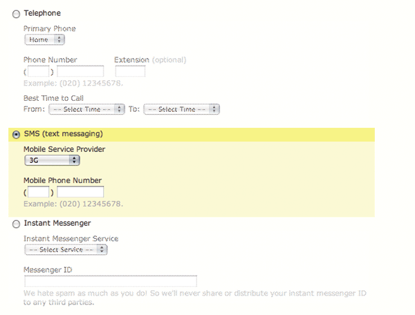
Figure 12.11
Exposed inactive selection-dependent inputs show all follow-up questions in an inactive state when not selected.
While this method does keep all additional inputs visible and within the context of an initial selection, the sheer volume of inputs that are visible quickly overwhelms people. Also, when there are many additional inputs for each initial option, the association between the person's selection and the other initial options gets lost. Adding to this effect is the fact that the visible difference between inactive and active elements is frequently too subtle for people to notice.
This solution was one of the least-liked and worst performing we tested. In fact, it had the longest completion times of any option tested. Participants were displeased with the sheer length of these pages (to put it mildly) and were annoyed at having to attend to (and subsequently dismiss) sections of the form that they didn't need to fill in.
Although this design performed quite poorly, it was superior in every metric we measured to the exposed groups solution outlined next. The only difference between these two solutions was the graying out of unused inputs, so we can pretty confidently conclude the graying out of irrelevant options improved the design. Of course, since the two exposed options were our worst performing, we can also conclude that hiding form options when they are not required is an even better solution.
Exposed Groups
To compensate for the disassociation between the set of initial options in the exposed inactive method, the example in Figure 12.12 uses visual groupings to bind each set of selection-dependent inputs beneath an initial selection.

Figure 12.12
Exposed groups of selection-dependent inputs show all follow-up questions in addition to an initial set of choices.
In this method, however, the visual weight of the many additional inputs quickly reduces the visibility of the initial set of options.
This option had the lowest success rate, highest number of errors made, and lowest satisfaction of all the solutions we tested. Our eye-tracking data revealed that participants made a whopping 18 more fixations when using the exposed groups solution than they did using the inline exposure solution (see Figure 12.13).
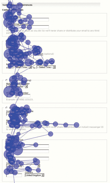
Figure 12.13
Exposed groups of selection-dependent inputs resulted in a lot of eye fixations.
Image provided by Etre.
Due to the excessive problems found with this solution, I think it is a safe bet to avoid it.
Best Practices
Well, I warned you that selection-dependent inputs have lots of considerations, didn't I? Now that we're through that deluge of data, what have we learned?
- Page-level selection-dependent inputs are probably your best bet when the number of additional options for each initial choice is large. Though you need two Web pages to break up the form, the dynamic hiding and showing of additional inputs won't confuse people, and they won't need to question whether or not their choices are mutually exclusive.
- Vertical and horizontal tabs actually perform quite well in all-around usability, satisfaction, and eye-tracking metrics but come with the gnarly problem of mutual exclusivity. I've gotten conflicting data on which of these options resolves this issue so they both seem to be stuck with it. If you can get around mutual exclusivity through clever interaction or visual design, good performance is yours to be had with these solutions.
- When you have a long list of initial options (more than 4 or 5) each with its unique set of selection-dependent inputs, using a drop-down list and visual grouping for the additional options is likely a good way to go.
- If you only have a few additional inputs for each initial option, exposed below radio buttons or exposed within radio buttons might be your best option. I've seen both of these options cause confusion with excessive page jumping and disassociation between initial choices, so tread carefully. But if you really only have 1–3 additional fields per initial choice, I'd go with exposed inline radio buttons. Just make sure you use clear visual associations and transitions, if possible.
- All options exposed as inactive or all options exposed are basically nonstarters because people are quickly overwhelmed by too many options that don't map to their goals.
- Overall, hiding irrelevant form controls from people until they need them results in forms that are easy on the eyes and completed quite quickly.
- Overall, displaying initial options and their selection-dependent inputs in close proximity to one another seems to lead to high satisfaction ratings.
- In all cases, maintain a clear association between the initial selection options. Don't let people lose sight of their initial top-level choice.
- In all cases, clearly associate selection-dependent inputs with their trigger. All the examples outlined in this section do so with either yellow backgrounds or gray outlines.
- In all cases, avoid excessive page jumping that disassociates selection-dependent inputs from the initial set of options.
..................Content has been hidden....................
You can't read the all page of ebook, please click here login for view all page.