
While help text can be used to tell people how to successfully complete a form, it isn’t the most important thing we have to tell them. That honor falls to error and success messages. Error messages let people know when they cannot continue completing a form and how they can remedy the situation. Success messages tell people what they wanted to hear from the moment they starting filling in a form—they’re done!
Like help text, errors and success are messages for people. As a result, a lot of the best practices and dynamic systems we looked at in Chapter 7 for help text also apply to the error and success messages discussed here.
Errors
Despite our best efforts to structure questions and input fields in meaningful ways, sometimes people will misunderstand or rush through our forms and mistakes may happen. Of course, we want to minimize the potential for these types of errors as much as we can—that’s what most of this book is about! But when mistakes do happen, we should be prepared to deal with them quickly and gracefully.
Step one for dealing with errors is letting people know they happened. Though this may seem like a trivial point, all too often error messages don’t get the attention they deserve. When present, an error message is arguably the most important element on the page. It prevents people from achieving their primary goal of completing a form. As a result, the visual presentation of an error needs to match its importance.
Consider the example from Fairmont Hotels in Figure 8.1. Believe it or not, there’s an error preventing someone from completing this form. Let me know when you find it. And while you’re at it, let me know when you find the form that led to the error!
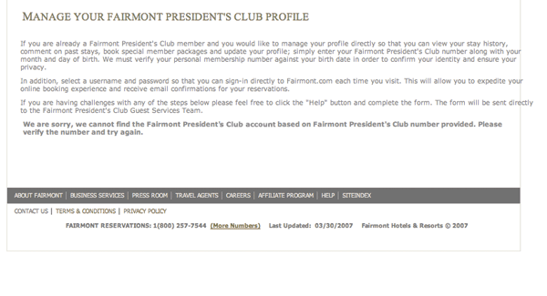
Figure 8.1
Where’s the error on this Fairmont Hotels form?
Not only is the error message comingled with three paragraphs of instructions, it is also displayed in the same font face and color as the rest of the text on the page. The only difference is that the error text is bold. No wonder you didn’t notice it.
Perhaps more concerning than the visual presentation of this error message is the lack of a clear way to resolve the error itself. The message tells us to “Please verify the number and try again.” But where is the number? How do I try again? Surfacing the error message next to the responsible elements would have made a solution much more understandable and actionable.
Let’s consider how Fairmont Hotels could provide clear feedback that people could use to resolve this error. In the redesigned Fairmont Hotels form page in Figure 8.2, you’ll notice a few things. First, there’s a prominent message indicating that an error has occurred. There are several ways to distinguish important messages from the rest of a form; in this example, we’ve chosen a contrasting color (red), a distinct visual element (warning icon), and a prominent placement (top of the page).
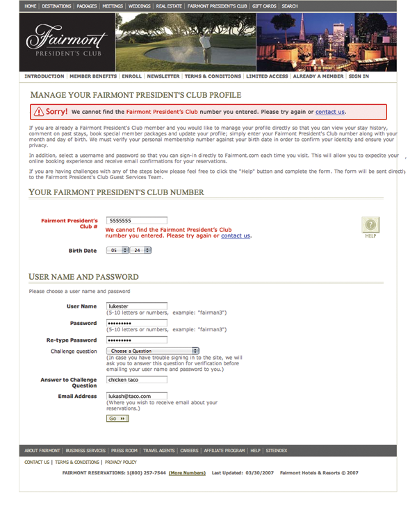
Figure 8.2
A redesigned version of the Fairmont Hotels error page makes it much clearer that there is an error preventing people from continuing.
Of course, you aren’t limited to this exact visual presentation. Anything that has a very strong contrast with the rest of the page and looks like an error (typically red text and a warning icon) could be appropriate. Differences in size, shape, position, texture, or color can be used alone or together to create additional emphasis. The key requirement is that the error be immediately noticeable because it is blocking someone’s progress.
The redesigned form also contains two clear ways to resolve the existing error. The input field that is responsible for the problem is not only visible on the page but also prominently marked. Both the top-level message and this input field have clear instructions that encourage people to either try another answer or seek help if they can’t.
The inclusion of instructions next to the input field responsible for the error provides people with a remedy where they need it most: where the error can be fixed. Consider an alternative where the fact that an error occurred is shown in a modal dialog window (Figure 8.3) that has to be dismissed before someone can proceed. Once that dialog is gone, so is the indication of which input needs to be corrected and how.
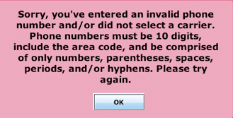
Figure 8.3
This error message lacks a title that associates it with an input field, is difficult to read because of the centered, bold font, and has to be remembered when dismissed. Not a very effective way to remedy errors.
In the redesigned Fairmont Hotels form (Figure 8.2), the input field responsible for the error uses a “double visual emphasis” to stand out from the rest of the form elements. In this case, the label is red, and we’ve added red instructions just below the input field. This doubled-up approach is important because simply changing the text color of the label might not be enough to be noticed by color-blind people. So to ensure that everyone knows where an error happened, we double the visual emphasis. We could have opted for an icon and red text or a background color and instructions to highlight the inputs responsible for the error as well. Any form of double emphasis could work, as the examples in Figure 8.4 show.
Figure 8.4
Several options for indicating errors with “double visual emphasis.”
However, when you do decide on a visual treatment for the inputs responsible for an error, make sure that the style you select matches the style of any primary error messages on the form. Clear visual similarities between errors and error messages help people connect the dots.
Perspective: James Reffell
Director, Search User Experience, Yahoo! Inc.
- The customer has entered something that the system can’t accept, so the customer can’t continue (for example, a mismatching username and password). This kind of message should clearly and succinctly tell the customer what happened, how to fix it, and then move on.
- Something very, very bad has happened to the system, so the customer can’t continue (e.g., an essential server just got smote by lightning). This kind of message should be very apologetic and should give the customer some alternate way of contacting you.
- Educational messages
- Marketing messages thinly disguised as educational messages
- The “something bad has happened, and while theoretically the user could continue, it might be a bad idea” message
- Site-specific messages (e.g., “You’re outbid!” on eBay)
- A clip-art picture of a mouse with a pencil (don’t ask!)

Now, what happens when there is more than one error on a form? Or when no particular input fields are responsible for the problem, such as when a server goes down or a payment cannot be authorized? In most cases, the same structure still works well.
- A prominent message indicating an error has happened
- Double visual emphasis for any input fields responsible for the error (if they exist)
- Clear explanations and actions that allow people to quickly resolve the error present in both places
The eBay Want It Now form in Figure 8.5 shows how a prominent message, double visual emphasis, and clear resolution instructions in both places could be presented when a form contains many errors.
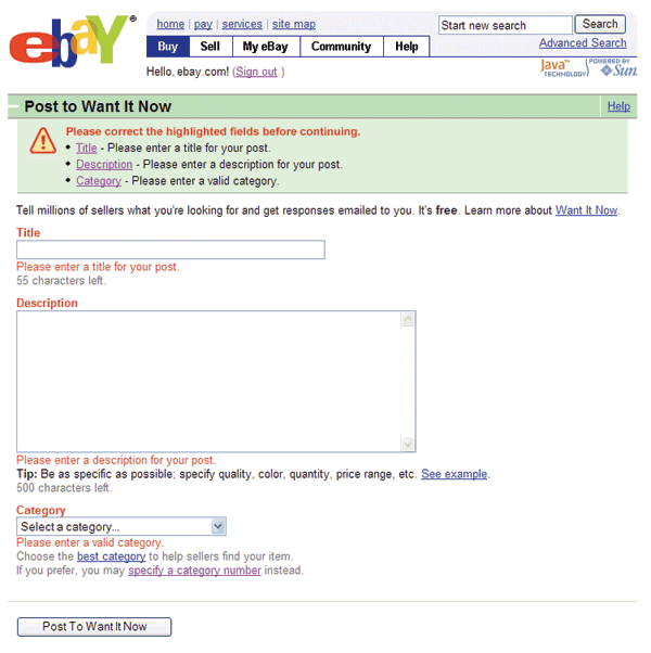
Figure 8.5
A clear message and ways to resolve multiple input errors on eBay.
I’ve heard some designers argue that this approach creates too much clutter on a form and in cases where every input field has an active error, this can certainly be the case. However, situations like this are quite rare because most people don’t provide invalid answers to every question when trying to complete a form.
Instead, the more common case is when one or two input fields are preventing someone from completing a form. In these instances, it is quite useful to be able to locate the responsible input field(s) quickly and easily—especially on long forms, as the example from QLC in Figure 8.6 indicates. Notice that the visual similarity (color, border, font) between the error message and responsible input fields creates a clear connection between the two.
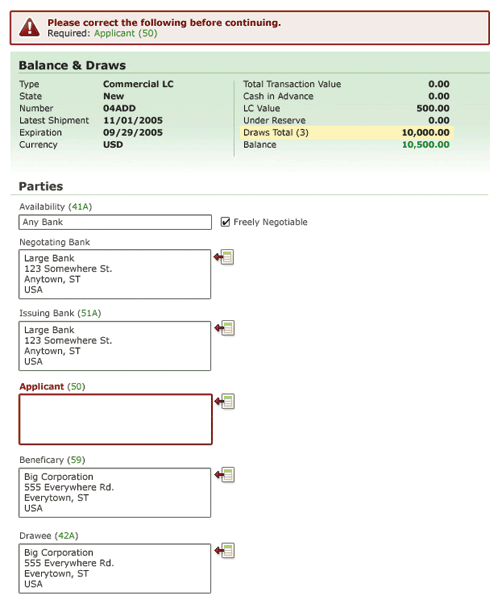
Figure 8.6
On long forms, such as this one from QLC, a prominent error message and double visual emphasis on invalid input fields helps people quickly notice and remedy errors.
However, there may be situations where “less is more” and a single prominent error message can do the trick. On short forms, like Figure 8.7 from Jotspot Live, a prominent message explains which input field is responsible for the error and provides a hint on how to resolve it. Personally, I feel the form could be improved with a double visual emphasis on the responsible input field so that people could find it quickly, and it could also include some additional instructions on how to remedy the error, such as “What do I do if this is my email address and it is already registered?”
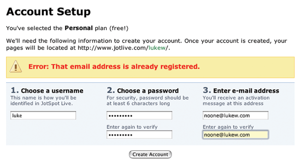
Figure 8.7
A single prominent message lets people know an error happened on Jotspot Live. Though how to resolve it isn’t as clear.
If you do choose only to utilize a prominent message and not highlight the responsible input fields, be certain that you clearly distinguish the error message from the rest of the form. This sign-up form from Boingo in Figure 8.8 does not use enough contrast, opting instead to use the same font face and color as the form title and input labels. This makes the fact that an error happened much less obvious.
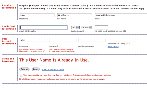
Figure 8.8
Boingo’s error message blends in with its surroundings and, as a result, can be hard to notice.
It doesn’t help that Boingo has used red text for all the labels on this form, which makes it much harder to distinguish an error that is also rendered in red text. Because red text has the clearest association with errors for most people, I always recommend not using it for labels or help text to avoid any potential confusion.
Another potential solution for short forms is to rely on double visual emphasis for each invalid input and not utilize a top-level error message at all (see Figure 8.9). Though this may work with shorter forms, it could create issues on longer forms when the responsible input fields appear offscreen because they are “below the fold” of a monitor’s viewable area. In such cases, people might have a hard time knowing an error is blocking their progress.
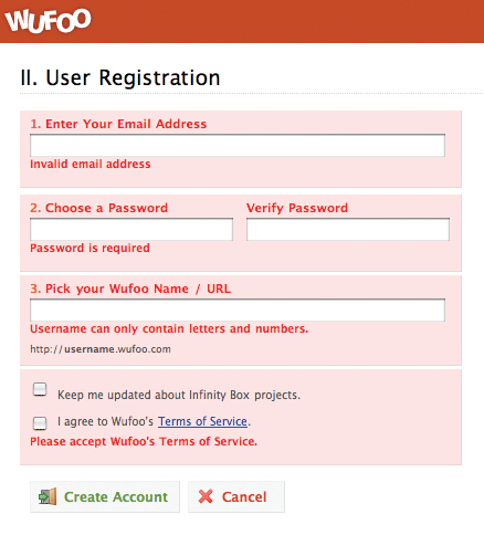
Figure 8.9
On this short form, Wufoo does not utilize a top-level message and instead embeds instructions on how to remedy each error with each input field. Distinguishing the label from remedy instructions (right now both are bold) could help make these errors easier to scan.
One potential way to address this is to jump to the point of the first error on a form. That way, the first thing someone sees is an input field that needs to be corrected. When multiple input fields are invalid, however, this method doesn’t give people an overview of all the errors present on the form. They are simply taken to the first and may or may not know others exist. A top-level error message, on the other hand, could clearly list all the errors that need to be addressed before someone can proceed.
Success
Finally, the moment we’ve all been waiting for. Someone completes our form with no errors. Success!
But now what?
Before we get ahead of ourselves, let’s make sure people know they’ve hit this milestone. They answered all our carefully selected questions using the input fields we provided. So how about a pat on the back? Think of success messages as just that—a way to let people know they accomplished their goal. They became a customer, they added or edited their data, they bought the item they wanted. Congrats.
Although not as important as an error message, a success message should be noticeable enough to give people the quick praise they deserve. As a result, many of the distinctions that applied to error messages can also work for success messages: different colors, shapes, fonts, sizes, and more. The key difference between error and success messages, however, is that error messages cannot be ignored or dismissed—they must be addressed. Success messages, on the other hand, should never block people’s progress—they should encourage more of it.
The success message on Pownce’s Invite Your Friends form in Figure 8.10 provides a noticeable confirmation that a form was completed successfully. The message is shown in context on the same form that was just completed. This context is probably appropriate because someone who just invited a friend is likely to want to invite additional friends. The success message doesn’t get in the way. In fact, it even provides a way to get out of the way by including a link to close the message and remove it from the page.
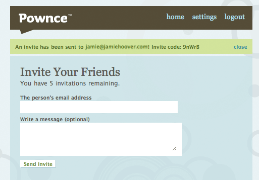
Figure 8.10
Pownce uses a short success message that does not get in the way of further action and clearly explains the result of people’s actions.
Pownce’s success message contains information that people can use to confirm their intended actions took place. It not only tells you that an invite was set, it specifies to whom, and it provides a way to access that information again (with an invite code). That’s valuable information to keep visible on the screen. In other cases, the only confirmation needed is that a form was completed successfully or that an action took place. In these situations, it may be appropriate to automatically remove success messages, preferably with animation.
Because human beings are instinctively drawn to motion—we had to avoid saber-toothed tigers somehow—animated messages that transition off a page can let people know their actions have been successful. The most common transitions utilized for this are fades, dissolves, or roll-ups.
In 37signal’s project management application, Basecamp (Figure 8.11), when a new message is created—by filling in a form, of course, people are taken to a list of existing messages where an animation indicates where the message they created appears. This context is appropriate for this action because people just added a message to this list. That’s where they can read it, edit it, delete, and comment on it.
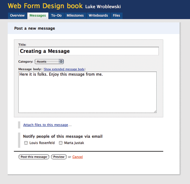
Figure 8.11
When you are adding a new message to Basecamp, a fading background color around your addition lets you know you have been successful.
In other situations, the most appropriate context may actually be the form someone just filled in. For a records database of customer information, providing a success message on the form that your customer just updated gives that person an opportunity to review changes, make other changes, or locate other records to update.
No Dead Ends
Success messages can also include useful follow-up actions related to the task someone just completed (see Figure 8.12). Booked a flight online? Perhaps you want to forward your itinerary to family? Making these actions part of a success message on the page gives people clear and actionable next steps. Never leave ‘em hanging!
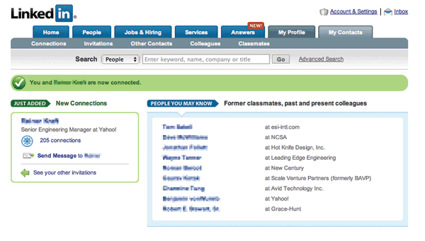
Figure 8.12
After you have connected with someone on the professional networking site LinkedIn, the success page provides several relevant next steps.
Best Practices
- Clearly communicate when an error is blocking someone from completing a form. Error messages are arguably the most important element on a form when present. Make sure they appear that way!
- Display error messages in context so they can be resolved quickly.
- Provide actionable remedies that enable people to resolve errors easily.
- Top-level error messages should indicate an error has occurred and how it can be resolved. If multiple errors exist, they should be listed in the top-level message.
- If any input fields are responsible for an error, clearly mark them with a double visual emphasis to ensure they are noticeable.
- Visually associate any responsible form elements with a top-level error message to clearly communicate they need to be resolved in order to continue.
- Reserve red text and warning icons for error messages.
- On short forms, it may be possible to omit either a top-level message or indicators for responsible input fields. If you choose this approach—do so thoughtfully.
- Clearly communicate when a form has been completed successfully and what happened as a result using success messages.
- Provide success messages in context so as not to block any further progress.
- Consider dynamic success messages to highlight the results of a successful form submission.
- Avoid success message page dead ends.
..................Content has been hidden....................
You can't read the all page of ebook, please click here login for view all page.