Establishing A Common Language
Data, and Measures, and Information, OH MY!
It is important to establish a simple, easy-to-understand language so that everyone, regardless of their experience or education, can understand the benefits metrics can provide. I believe a lack of a common language causes more problems in business (and life) than anything else. Developing a shared vocabulary is the first step in ensuring success.
I intend to use very common words, plain English as it were, to help make what seems complex into something very simple and straightforward.
Let’s start with a story to get in the proper frame of mind.
The Three Little Pigs Go Large
There I was, trying to remember a fairy tale so I could get my three-year-old to sleep. She demanded a story, but being on the road without any of her books meant I had to remember one. Well, I have a terrible memory for stories—but an unfailing memory for lessons I’ve taught. So, like any good father, I improvised. What better way to get her to fall asleep than to tell a story about metrics?
The Story
After effectively dealing with their landlord (Mr. Wolf), the three little pigs settled into a life of luxury and over-indulgence. Three years passed, finding the pigs each living in squalor, dangerously overweight (even for a pig), and in failing health. Each visited his respective doctor. Each doctor came to the same prognosis: this pig was on the fast track to an early barbecue. The pigs did not eat well, sleep enough, exercise, nor did they pay attention to the signs their bodies were giving them. The doctors knew the pigs must change their lifestyles or they would die.
The First Little Pig
Unfortunately for the pigs, the doctors were also very much different. The first little pig’s doctor told him that his health was failing and that he would have to change his lifestyle. The little pig needed to get serious about his health. The doctor sent the little pig away with a diet plan, an exercise plan, and an appointment to return in 12 months.
The first little pig was dutifully scared by his doctor’s warnings, so he worked hard to change. He stopped eating unhealthy foods. He exercised daily. He even started going to sleep early. After one month, the first little pig felt great. He hadn’t felt this good in years! He decided to celebrate. He went out with the lamb twins and partied all night. He had a feast that was followed by an ice cream eating contest (which he won). At about 3 AM he made it home and fell asleep, content on his bed. The next day he forgot to exercise. It was easy to get out of the habit. Eventually, he only exercised on weekends, reasoning that he was too busy during the week. By the end of the next month he was eating poorly again—not as badly as before—but not as good as he should have.
At the end of the year, when the first little pig returned to the doctor, he was shocked to hear that the doctor was disappointed.
“But Doc, I did what you said,” the first little pig pleaded. “I exercise and I eat better. I even go to sleep earlier. I know I’m healthier . . . I feel better than I did last year.”
“Yes, but your weight did not improve enough. You may be eating better, but not well enough. You may be sleeping more, but still not enough. Your health is deteriorating overall … and I fear that you are going to die if you don’t change your ways.”
The doctor gave the first little pig a new diet and exercise program. He even signed the first little pig up for a spinning class and prescribed medication. The doctor gave the little pig another appointment for the following year and wished him well. The first little pig was dutifully frightened by all of this and swore by his chinny chin chin (which was pretty large) that he’d do better.
This time the first little pig stayed on course. He exercised regularly and ate only healthy foods. When he was hungry he ate carrots, or celery, or non-fat yogurt. He attended the spinning classes every week, like clockwork. Unfortunately, with no way to measure his progress, the first little pig didn’t know how well he was doing. After seven months, he felt better, but his anxiety about his health created so much stress that he had a stroke. While he had improved his health, he had not improved it enough to weather the physical needs a stroke put on his system. He died a month later. The first little pig’s doctor was sad to learn of his death. He shed a tear as he removed the upcoming appointment from the calendar.
The Second Little Pig
The second little pig’s doctor understood the importance of metrics. He was a good doctor who communicated well with his patients. He felt like a father to his patients and sought to help them become healthier. When the doctor looked over the second little pig’s charts, he was dismayed. How to help the little pig change course? How could he help him get healthy? He liked metrics and thought the little pig would do well if he had some goals. The doctor designed a plan with three measures: weight, blood pressure, and cholesterol levels. He explained to the little pig that he was at risk for serious health problems. He told the little pig to lower his weight by 100 pounds, get his blood pressure down to recommended levels, and reduce the bad cholesterol levels to acceptable standards. He even gave the little pig a chart to track the three measures. When the little pig asked him for advice on how to achieve these goals, the doctor offered the little pig six pamphlets, two books, and a list of web sites that he could go to for identifying programs for getting healthy. The doctor scheduled follow up appointments every three months for the next year.
The second little pig worked very hard on his program. He posted the chart on his refrigerator. He changed his eating habits, started an exercise program, and tried meditation. He bought a blood pressure monitor, a high-quality scale, and a nifty kit for checking cholesterol levels. He didn’t mind the expense—his health was worth it. He measured his blood pressure, weight, and cholesterol when he woke up—and twice more during the day. At his first quarterly checkup, the doctor was happy with his progress. They went over the numbers and decided the second little pig was on the right track. The pig was elated. He decided to step it up a bit. He thought about gastric bypass surgery, but opted instead for eating tofu six days a week. The seventh day, he would eat mixed vegetables. He stepped up his exercise program. He started on a cholesterol-lowering drug he learned about from his spam e-mail. (He loved spam.)
The second little pig’s behaviors became more reckless as he neared his second checkup. He went on a water diet three days before and spent the morning of his appointment in a steam bath to shed the water weight. His doctor was amazed. The pig had lost a total of 60 pounds, improved his blood pressure, and lowered his cholesterol levels to within 10 percent of recommended levels. The doctor applauded his efforts and predicted success by his next appointment, three months hence.
Two months later the second little pig’s kidneys failed and he died. The pig hadn’t understood the overall goal or how to measure his overall health. He had spent the last eight months chasing a small set of numbers instead of developing “good health.” He managed to improve his three areas of measurement, but neglected other areas of his health to do so.
The Third Little Pig
The third little pig’s doctor also believed in metrics. He was also good with his patients, but he was different than the second little pig’s doctor. He had faith that his patients could deal with the whole truth and that they should know what was behind the metrics. The doctor told the third little pig that his overall health was at risk—mostly due to his lifestyle. The doctor explained how weight, blood pressure, and cholesterol levels are pretty good indicators of health, but can’t be used as the only ways to determine true health. A lot would depend on the little pig paying attention to his body and communicating with the doctor when things felt “funny.” The little pig wondered what metric “feeling funny” was and the doctor explained that it wasn’t a metric. It was simply the little pig talking to the doctor.
“So what do I do with the measures?”
“You collect them, track them, and we use them as indicators to see if there’s anything we’re missing and if you’re making progress.”
“So, I have to improve these numbers?” the pig asked as he took the chart.
“No. You have to get healthy. Those numbers will just give us an idea if you’re on the right track.”
The third little pig snorted. “What’s the difference?”
“Well, there are many indicators. Blood pressure, weight, and cholesterol levels are just three. I do want you to improve these areas, but not at the cost of other areas, such as how well you sleep, if you get enough exercise, stress tests, memory, nutrition, etc. The goal is to be healthy—not only clinically, but emotionally.”
“So, I don’t have to improve these numbers?”
“No, you could feasibly get healthier without improving some of those specific measures.”
“So, what’s the plan?”
“Good question, little pig!” The doctor laid out a simple improvement plan for the little pig. He also showed the third little pig how to take his blood pressure, weight, and cholesterol levels. He had the little pig fill out a daily journal and a weekly online diary. The weekly online diary included the data he collected, a “how I feel today” meter, and a section where he was supposed to log what he had done that week to get healthy. The doctor promised to check the online diary, and if there was anything that seemed out of place, he’d contact the little pig.
“I hope you don’t think I’m micro-managing you,” the doctor said. “I just want to keep informed on your progress. It’s very important to me that you get healthy.”
“No, I like it,” the third little pig said, knowing that his doctor cared. “But why don’t you give me a whole battery of tests every month?”
“That’s more than we need. I wouldn’t put you through all those tests unless something in the measures indicates a need for it. That way I don’t waste your time or your money.”
By the six-month mark, the third little pig was looking better, feeling better, and based on his doctor’s evaluation, doing better. By the ninth month, he was doing great. He looked really good. He garnered a lot of compliments from friends and coworkers. He was on his way.
The End
I’m sure my version won’t become an accepted sequel to the traditional fable, but it served its purpose. My daughter fell asleep about halfway through.
We’ll start with some basic terms that will allow us to communicate more clearly. Data, measures, information, and metrics are distinctly different, but fully intertwined entities. Each builds upon the other. Metrics are made up of other metrics and information. Information is made up of measures, and measures are comprised of data.
Figure 2-1 illustrates disparate entities that many times are mistakenly associated with or thought of as metrics.
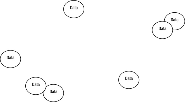
Figure 2-1. Data relationship map
Data is most commonly defined as “individual facts, statistics, or items of information.” This definition, however, is overly generous. It implies accuracy. Moreover, it implies a level of usefulness that is not inherently present in data. Data, for our purposes, is the simplest form of information possible and is usually represented by a number or value; for example: six, twenty-two, seventy, true, false, high, or low. By itself, data is essentially useless because it fails to relate any meaningful information. As in Figure 2-1, some data can be “related” as represented by overlapping bubbles, but this is not part of the definition of data.
Data is the simplest form of information possible. It is usually represented by a number or value.
Data can be wildly unrelated (the bubbles far apart) or they can be correlated through a common purpose. When analyzing data, a relationship map can provide a visual representation of the data’s relationship to other data. Many times a relationship is mistakenly assumed to exist between data because the data comes from a common source or was gathered with a single purpose in mind. For example, if we looked at “time to respond” and “time to resolve” data, they may seem to be related. The source may be the same—a trouble-ticket tracking system. The type of data (time) may also give the impression it is related more than it is. Frequently sets of data, regardless of the source or purpose, are not related. Assuming there is a relationship among unrelated sets of data causes us to come to incorrect conclusions. Response and resolution times, for example, don’t affect one another, and they communicate different things.
Figure 2-2 illustrates the next level of information: measures and how data is related.
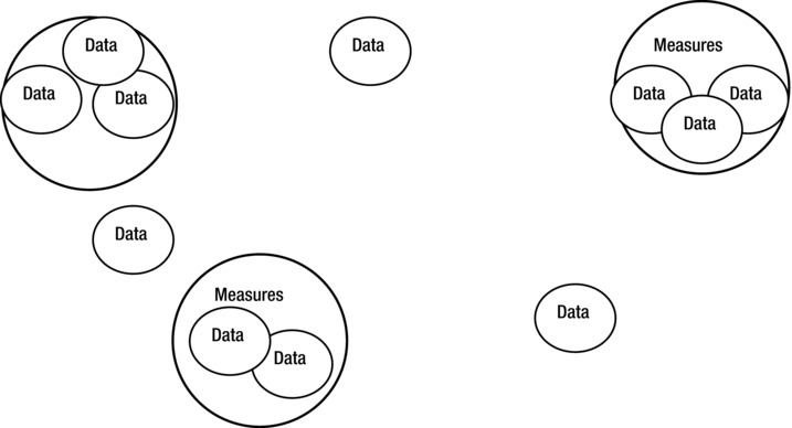
Figure 2-2. Measures and data relationship map
Measures begin to give us a more useful picture by incorporating some level of detail. The detail may include units of measure (in 50%, “percent” is the unit of measure and the data is 50) and information regarding how the data relates to other data. To state “70 percent” is more useful than to simply state “70.” Even better, we may have “70 percent of 63 users.” Each measure is made up of one or more datum. These measures, like the data, can have different levels of interrelations. One of the bubbles (top left in Figure 2-2) depicts a grouping of data that lacks a parent measure. This data is grouped because it is related, but it doesn’t lead to a more meaningful measure. Demographics and height and weight are examples of this—data that may be useful, but doesn’t necessarily feed into a larger measure.
Other data are floating independently within the map. These are rogue data (any term that means “no connections” works) that may or may not have a use later.
Measures bring more clarity to the data by grouping them in true relationships and adding a little context. Still, without clear connections to an underlying purpose or root question, measures are nothing more than dressed-up data.
Measures bring more clarity to the data by grouping them in true relationships and adding a little context.
Figure 2-3 illustrates the first useful level of information—and that’s just what we call it, “information.” Information groups measures and data (as well as rogue data) into a meaningful capsule.
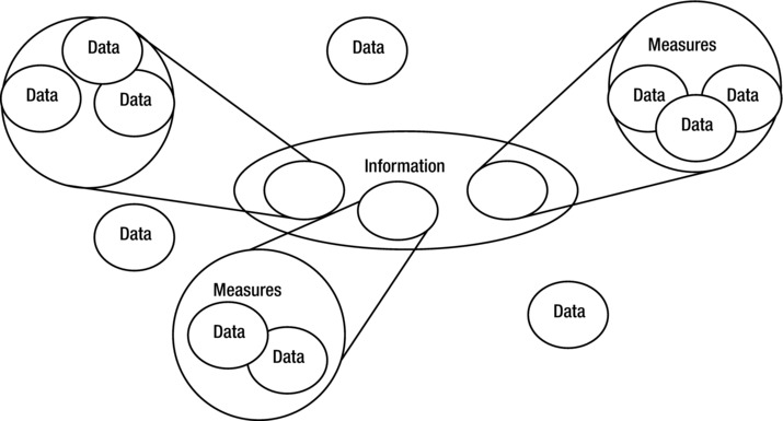
Figure 2-3. Data, measures, and information relationship map
Information takes measures and data and adds context. Notice that some data is not included in the information. Some data, regardless of how well it is collected, no matter how well you plan, may be superfluous. In the end, you may determine that the data does not fit or does not help to answer the root question you are working on. Information pulls in only the data and measures needed.
The context information brings to the data and measures is essential to moving indiscernible numerical points to an understandable state. With measures, we know that we are talking about percentages and that it is related to a number of users. Information adds context in the form of meaning, thus making the measures understandable: “Seventy percent of 63 users prefer the ski machine over the stair stepper.”
Information adds context in the form of meaning, thus making the measures understandable.
While information within the right context can be especially useful, a metric may be what is truly needed.
Before we go on to the next piece of the puzzle, it may help to look at an example of how actual information (data and measures) fits into the diagram. Figure 2-4 shows an example using information around Speed to Resolve.
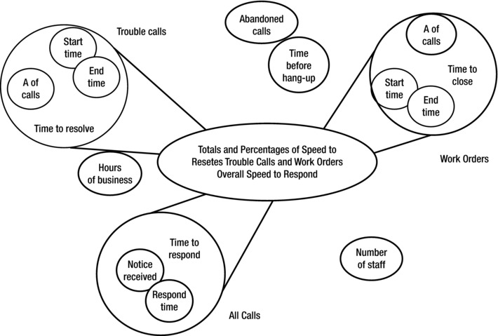
Figure 2-4. Speed to Resolve relationship map
Metrics
Figure 2-5 illustrates a full story, a metric. It’s a picture made up of information, measures, and data. It should fulfill the adage, “a picture is worth a thousand words.”
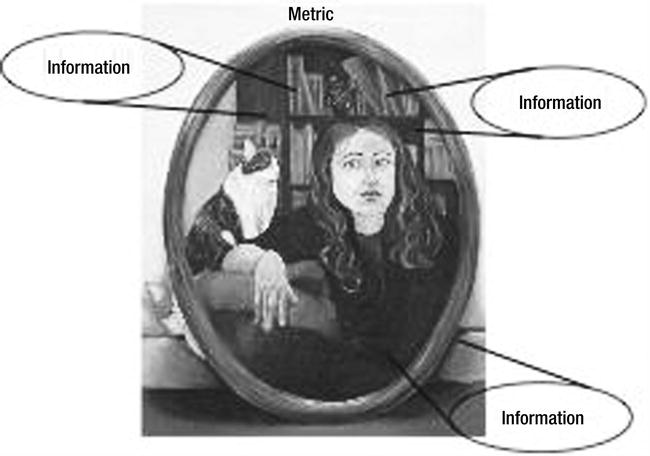
Figure 2-5. Metrics as a picture. Illustration by Alyssa Klubeck
We finally reach the all-important definition of “metric.” A metric is more than simply grouping multiple pieces of information together. Well, not really much more.
A metric, by my definition, is made up of information, measures, and data. Metrics can also include other metrics. The main difference between metrics and information is that a metric tells a complete story, fully answering a root question. And it should tell the “right” story. If the metric tells the story completely wrong, it’s not much use. Along with the data, measures, and information, the metric includes prose. While a picture may be worth a thousand words, a picture without an explanation is still open to multiple interpretations.
A metric tells a complete story, fully answering a root question.
If you’ve done a good job with the metric because your charts, graphs, and tables are telling a well-formed story, it will be much harder for misinterpretation. But, it’s still possible. Unless you feel confident that those viewing your metrics don’t have their own agendas, aren’t likely to misinterpret, and are totally open-minded, I highly recommend rounding out the picture with words.
This need for prose is not a new concept. My daughter took an art appreciation class in college. I was not surprised to find that there was a textbook that accompanied the class. Each work of art had pages of text on the artist, some background on why the artist created it, the length of time it took to create it, the medium that was used, and the circumstances behind it becoming relevant. But all this shocked me because when I was in high school, I remember my art teacher explaining how art had no definitive meaning outside the way each viewer interpreted it. This was especially true of modern art (which I still don’t understand). Rather than leave the interpretation to the audience, these textbooks had the all-important explanation of the message behind the painting spelled out right there. Each painting, sculpture, and drawing had one. Each etching, carving, and prehistoric wall-painting had one. An explanation of what the artist was trying to “tell” us with his thousand-word image.
If it’s useful to explain the meaning behind a work of art, how much more necessary is it to capture the meaning of a metric? And wouldn’t it be best to have the meaning explained by the artist herself? This explanation is, of course, an interpretation of the metric. It’s true that if you ask five people to interpret a metric, you may get five different answers—but you’ll want your interpretation to be the one presented with the picture. If metrics are used properly, your interpretation will not be taken as “truth,” but for what it is: one way to view the meaning of the metric.
“Seventy percent of 63 users prefer the ski machine over the stair stepper for the aerobic portion of their exercise program. The wait time for the ski machine is 25 minutes on average. Typically, there is no wait time on the stair steppers. There are 3 ski machines and 12 stair steppers.” This is getting close to being a “good” metric. If a picture (chart or graph) is added, it may get even closer. The goal of the metric is to tell a complete (and useful) story, in response to a root question.
The question is actually the driver of a good metric. You can’t have a good metric without the root question. When we look at our ski machine vs. stair stepper metric, we don’t know the usefulness of the metric because we don’t know what the question is. We can jump to conclusions and worse, we can leap to a potentially regrettable decision.
Should we buy more ski machines? Get rid of some of the stair steppers? Should we make the limit for time on the ski machine less? Should we create an exercise class based on the stair stepper? It should be obvious that the proper answer is not obvious. Part of the confusion may be due to the lack of a question. Why did we collect the data? Why did we do the analysis that led us to the metric? It’s impossible to tell a complete story without a root question.
Root Questions
In my book Why Organizations Struggle So Hard to Improve So Little (Praeger, 2009), my coauthors, Michael Langthorne and Donald Padgett, and I compare metrics to a tree. In this view, the data are the leaves, the measures are the twigs, the information is the branches, and the metrics are the trunk of the tree. All of these exist only with a good set of roots. These roots represent the root question. This analogy is a great way of showing the relationship between the components of the metric.
Figure 2-6 shows another view of the components that make up a metric. It’s fitting that it looks like an organic structure.
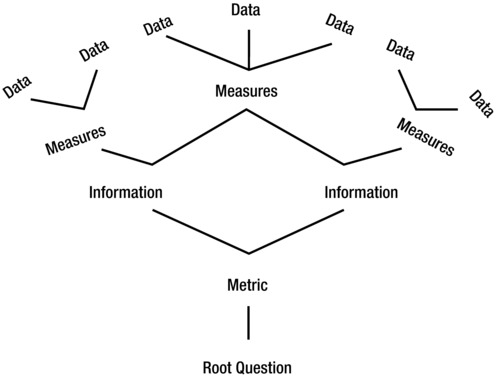
Figure 2-6. Metric components
Without a good root question, the answers that you derive may lead you in the wrong direction. Answers are only useful when you know the question. The root question is so integral to the metric that it has to be part of the definition of a metric.
A metric tells a complete story using data, measures, information, and other metrics to answer a root question.
The root question is essentially the most important component of a metric. It is the map we use to help determine our direction. It identifies the goal of our journey. There are instances where you may, with good reason and to good result, collect data without a root question, but for the practical use of metrics, this is unacceptable. It would be like taking off on a journey without a destination in mind. No purpose, no plan, and no direction—just get in your car and start driving.
Later you may realize that you forgot your driver’s license, your money, and even your shoes. You may realize that you’d already traveled too far to make it back with the amount of fuel remaining in your tank. You may realize that the only logical course of action is to continue on, although you don’t know where you will end up. You are more likely to end up where you don’t want to be. Since the only right place would be the destination that you forgot to determine, it is much more likely that you will end up someplace other than that right place. And, when you fail to reach the destination (which in the end you may or may not have identified), you will blame the car. It didn’t get enough miles to the gallon.
You won’t blame the lack of forethought. Even if you get more gas and you figure out where you want to go, you’ll not go back home for your wallet, license, or shoes. You’ve invested too much. Instead, you’ll continue on and try to reach the destination from where you are, not wanting to admit that everything you’d done to that point was wasted effort.
If you’re like most of us and need to make the most of what you have, embarking on this meandering journey is more than wasteful. The lack of direction will seed a level of despair and resentment in you and your coworkers, your superiors, and subordinates. It can destroy the spirit of your organization.
The root question provides you with focus and direction. You know where you are headed. You know the destination. You know the purpose of the metrics and the question you are trying to answer.
A correctly worded and fully thought-out root question, allows you to determine the right answer(s). Without a root question—the right question—the answer you derive will be the result of a meandering journey. This answer will likely do more harm than good.
Even a well-worded root question will fail to lead to good results if the question is not the right question.
To put it all together, let’s look at a full example. A metric is a complete story told through representation of information. Information in turn, is a compilation of measures, used to convey meaning. Measures are the results built from data, the lowest level of collectable components (values or numbers). The following is a simple example:
- Data: 15 and 35
- Measures: 15 mpg and 35 mpg
- Information: Miles-per-gallon achieved using unleaded gasoline in a compact car: 15 mpg in the city, 35 mpg on the highway
- Metric: The metric that would logically follow would be a picture (charts or graphs in most cases) that tells a story. In this case the story may be a comparison between the fuel efficiency of different compact car models (miles per gallon), combined with other indicators used to select the right car for you.
- Root Question: What is the best car for me?
The use of data, measures, and information are more relative than hard and fast. I don’t mean to dictate inflexible definitions that will keep you from getting to the metric. The goal is to develop metrics—answers—to our questions.
The data could include the miles-per-gallon tag. Measures could include “in the city” and “on the highway.” Information could distinguish between the various cars’ make and model. The major point to take away is that additional meaning (and context) are provided as we progress from data to measures to information. Also, metrics make a full story of this and much more information.
The metric, like its components, are tools that can be used to answer the root question. We will address the proper use of these tools later. For now, it’s enough to have a common understanding of what the components are and how they relate to each other.
The Data-Metric Paradox
There is an interesting paradox involving the components of metrics and their relationship to the root question used to derive them.
Data, the easiest to understand, identify, and collect, should be the last item to develop. The most complex and difficult component, the root question, has to come first. As our analogy of the hapless driver on the meandering journey showed, we must first identify our destination and purpose. Rather than start with the simple to build the complex, we must start with the most complex and use it to identify the simple.
The three little pigs also ran into this paradox. The first pig’s doctor was happy with data and measures, but ignored the bigger, more important requirement. He lost his patient, but did it with “healthy” numbers. Business can do the same. You can have good data points (sales per customer, profit/sale, or repeat customers) and still go out of business.
We have to start with the complex to uncover the simple—start at the root question and drive unerringly toward data.
The best way to create a metric is to move from the question to the metric to the information to the measures and, finally, to the data.
Unfortunately, most times we attempt it in the opposite direction, starting with the simple (data) trying to expound on it to develop the complex (root question). This process seldom succeeds. But when we start at the complex, forming a picture of what the question is and how the answer will look, it becomes easy to work down to the data.
Data, measures, information, and metrics all serve the same master: the root question. They all have a common goal: to provide answers to the question. Because of this, the question defines the level of answer necessary.
Let’s pose the following question: How far is it to Grandma’s house? You don’t need a metric to provide the answer to this question. You don’t even need information. A measure (for example, the number of miles) will suffice. And you will be fully satisfied. For data to be sufficient, you have to ask the question with enough context to make a simple number or value an adequate answer. How many miles is it to Grandma’s house? How much longer will it take to get to Grandma’s house? In these cases, data is all you need. But data is rarely useful in and of itself.
Let’s pose another question: Do we have time to do any sightseeing or shopping along the way and still make it in time for Grandma’s turkey dinner? To answer this, we require information. The measures and data might include the following:
- The time Grandma is serving dinner
- The current time
- The number of sightseeing or shopping stops along the way
- The estimated time to sightsee/shop per stop
The root question will determine the level of the answer. If the question is complex enough and needs answers on a periodic basis, chances are you will need to develop a comprehensive metric. A question along the lines of “How is the health of (a service or little pigs)?” may require a metric to answer it, especially if you want to continue to monitor the health on a regular basis.
The vagueness of the question makes it more complex. Clarity simplifies.
When designing a metric, the most important part is getting the right root question. This will let us know what level of information is required to answer it. It will govern the design of the metric down to what data to collect.
Let’s recap the components of a metric and their definitions:
- Data: Data, for our purposes, is the simplest possible form of information and is usually represented by a number or value; for example, six, twenty-two, seventy, true, false, high, or low.
- Measures: Made up of data, measures add the lowest level of context possible to the data. Measures can be made up of other measures.
- Information: Information is made up of data and measures. Information can be made up of other information. Information provides additional, more meaningful context.
- Metrics: Metrics are made up of data, measures, and information. Metrics can be made up of other metrics. Metrics give full context to the information. Metrics (attempt to) tell a complete story. Metrics (attempt to) answer a root question.
- Root Question: The purpose for the metric. Root questions define the requirements of the metric and determine its usefulness.
Recap
This chapter introduced a common language for metrics and their components. It also introduced the Data-Metric Paradox, in which we learned that we have to start with the most complex to drive to the simple. We have to start with the root question to get us safely to the proper level of information necessary to answer the question. It’s possible the question may not require a metric, or even information. When tasked by management to create a metric (or a metric program) we have to slow down and ask what the root questions are. We have to be willing and able to accept that the answer may not lie in creating a metric at all.
