
As we emphasized in our introductory chapter on applying machine learning (ML) algorithms with a simplified process flow, in this chapter, we go deeper into the first block of machine learning process flow—data exploration and preparation.
The subject of data exploration was very formally introduced by John W. Tukey almost four decades ago with his book on Exploratory Data Analysis (EDA) . The methods discussed in the book were profound and there aren’t many software programs that include all of it. Tukey put forth certain very effective ways for exploring data that could prove very vital in understanding the data before building the machine learning models. There are a wide variety of books, articles, and software codes that explain data exploration, but we will focus our attention on techniques that help us look at the data with more granularity and bring useful insights to aid us in model building . Tukey defined data analysis in 1961 as:
Procedures for analyzing data, techniques for interpreting the results of such procedures, ways of planning the gathering of data to make its analysis easier, more precise or more accurate, and all the machinery and results of (mathematical) statistics which apply to analyzing data.[1]
We will decode this entire definition in detail throughout this chapter but essentially, data exploration at large involves looking at the statistical properties of data and wherever possible, drawing some very appealing visualizations to reveal certain not so obvious patterns. In a broad sense, calculating statistical properties of data and visualization go hand-in-hand, but we have tried to give separate attention in order to bring out the best of both. Moreover, this chapter will go beyond data exploration and cover the various techniques available for preparing the data more suitable for the analysis and modeling, which includes imputation of missing data, removing outliers, and adding derived variables. This data preparation procedure is normally called initial data analysis (IDA) .
This chapter also explores the process of data wrangling to prepare and transform the data. Once the data is structured, we could think about various descriptive statistics which explain the data more insightfully. In order to build the basic vocabulary for understanding the language of data, we discuss first the basic types of variables, data formats, and the degree of cleanliness. And then, the entire data wrangling process will be explained followed by descriptive statistics. The chapter ends with demonstrations using R. The examples help in seeing the theories taking a practical shape with real-world examples.
Broadly speaking, the chapter will focus on IDA and EDA. Even though we have a chapter dedicated to data visualization, which plays a pivotal role in understanding the data, EDA will give visualization its due emphasis in this chapter. We attempt to decode Tukey's definition of data analysis with a contemporary view.
2.1 Planning the Gathering of Data
The data in the real world can be in numerous types and formats. It could be structured or unstructured, readable or obfuscated, and small or big; however, having a good plan for data gathering keeping in mind the end goal, will prove to be beneficial and will save a lot of time during data analysis and predictive modeling. Such a plan needs to include a lot of information around variable types, data formats, and source of data. We describe in this section many fundamentals to understanding the types, formats, and sources of that data.
A lot of data nowadays is readily available, but a true data-driven industry will always have a strategic plan for making sure the data is gathered the way they want. Ideas from Business Analytics (BI) can help in designing data schemas, cubes, and many insightful reports, but our focus is on laying a very general framework from understanding the nuances of datatypes to identifying the sources of data.
2.1.1 Variables Types
In general, we have two basic types of variables in any given data, categorical and continuous. Categorical variables include the qualitative attributes of the data such as gender or country name. Continuous variables are quantitative, for example, the salary of employees in a company.
2.1.1.1 Categorical Variables
Categorical variables can be classified into Nominal, Dichotomous, and Ordinal. We explain each type in a little more detail.
Nominal
These are variables with two or more categories without any regard for ordering. For example, in polling data from a survey, the variable state, or candidate names. The number of states and candidates are definite and it doesn't matter what order we choose to present our data. In other words, the order of state or candidate name has no significance in its relative importance in explaining the data.
Dichotomous
A special case of nominal variables with exactly two categories such as gender, possible outcomes of a single coin toss, a survey questionnaire with a checkbox for telephone number as mobile or landline, or the outcome of election win or loss (assuming no tie ).
Ordinal
Just like nominal variables, we can have two or more categories in ordinal variables with an added condition that the categories are ordered. For example, a customer rating for a movie in Netflix or a product in Amazon. The variable rating has a relative importance on a scale of 1 to 5, 1 being the lowest rating and 5 the highest for a movie or product by a particular customer.
2.1.1.2 Continuous Variables
Continuous variables are subdivided into Interval and Ratio:
Interval
The basic distinction is that they can be measured along a continuous range and they have a numerical value. For example, the temperature in degrees Celsius or Fahrenheit is an interval variable. Note here that the temperature at 0o C is not the absolute zero, which simply means 0o C has certain degree of temperature measure than just saying the value means none or no measure.
Ratio
In contrast, ratio variables include distance, mass, and height. Ratio reflects the fact that you can use the ratio of measurements. So, for example, a distance of 10 meters is twice the distance of 5 meters. A value 0 for a ratio variable means a none or no measure.
2.1.2 Data Formats
Increasing digital landscapes and diversity in software systems has led to the plethora of file formats available for encoding the information or data in a computer file. There are many data formats that are accepted as the gold standard for storing information and have widespread usage, independent of any software, but yet there are many other formats in use, generally because of the popularity of a given software package. Moreover, many data formats specific to scientific applications or devices are also available.
In this section, we discuss the commonly used data formats and show demonstrations using R for reading, parsing, and transforming the data. The basic datatypes in R as described in Chapter 1—like vectors, matrices, data frames, list, and factors—will be used throughout this chapter for all demonstrations.
2.1.2.1 Comma-Separated Values
CSV or TXT is one of the most widely used data exchange formats for storing tabular data containing many rows and columns. Depending on the data source, the rows and columns have a particular meaning associated with them. Typical information looks like the following example of employee data in a company. In R, the read.csv function is widely used to read such data. The argumentssep specifies the delimiting character and header takes TRUE or FALSE, depending on whether the dataset contains the column names or not.
read.csv("employees.csv", header =TRUE, sep =",")Code First.Name Last.Name Salary.US.Dollar.1 15421 John Smith 100002 15422 Peter Wolf 200003 15423 Mark Simpson 300004 15424 Peter Buffet 400005 15425 Martin Luther 50000
2.1.2.2 Microsoft Excel
Microsoft Excel file format (.xls or .xlsx) has been undisputedly the most popular data file format in the business world. The primary purpose being the same as CSV files, but Excel files offer many rich mathematical computations and elegant data presentation capabilities. Excel features calculation, graphing tools, pivot tables, and a macro programming language called Visual Basic for Applications. The programming feature of Excel has been utilized by many industries to automate their data analysis and manual calculations. This wide traction of Excel has resulted in many data analysis software programs that provide an interface to read the Excel data. There are many ways to read an Excel file in R, but the most convenient and easy way is to use the package xlsx.
library(xlsx)read.xlsx("employees.xlsx",sheetName ="Sheet1")Code First.Name Last.Name Salary.US.Dollar.1 15421 John Smith 100002 15422 Peter Wolf 200003 15423 Mark Simpson 300004 15424 Peter Buffet 400005 15425 Martin Luther 50000
2.1.2.3 Extensible Markup Language : XML
Markup languages have a very rich history of evolution by their first usage by William W. Tunnicliffe in 1967 for presentation at a conference. Later Charles Goldfarb formalized the IBM Generalized Markup Language between the year 1969 and 1973. Goldfarb is more commonly regarded as the father of markup languages. Markup languages have seen many different forms, including TeX, HTML, XML, and XHTML and are constantly being improved to suit numerous applications. The basics for all these markup language is to provide a system for annotating a document with a specific syntactic structure. Adhering to a markup language while creating documents ensures that the syntax is not violated and any human or software reader knows exactly how to parse the data in a given document. This feature of markup languages has found a wide range of usage, starting from designing configuration files for setting up software in a machine to employing them in communications protocols.
Our focus here is the Extensible Markup Language widely known as XML. There are two basics constructs in any markup language, the first is markup and the second is the content. Generally, strings that create a markup either start with the symbol < and end with a >, or they start with the character & and end with a ;. Strings other than these characters are generally the content. There are three important markup types—tag, element, and attribute.
Tags
A tag is a markup construct that begins with < and ends with >. It has three types.
Start tags: <employee_id>
End tags: </employee_id>
Empty tags: </>
Elements
Elements are the components that either begin with a start tag and end with an end tag, both are matched while parsing, or contain only an empty element tag. An example of element:
<employee_id>John </employee_id>
<employee_name type=”permanent”/>
Attribute
Within start tag or empty element tag, an attribute is a markup construct consisting of a name/value pair. In the following example, the element designation has two attributes, emp_id and emp_name.
<designation emp_id="15421" emp_name="John"> Assistant Manager </designation>
<designation emp_id="15422" emp_name="Peter"> Manager </designation>
Consider the following example XML file storing the information on athletes in a marathon.
<marathon><athletes><name>Mike</name><age>25</age><awards>Two times world champion. Currently, worlds No. 3</awards><titles>6</titles></athletes><athletes><name>Usain</name><age>29</age><awards>Five time world champion. Currently, worlds No. 1</awards><titles>17</titles></athletes></marathon>
Using the package XML and plyr in R, you can convert this file into a data.frame as follows:
library(XML)library(plyr)xml:data <-xmlToList("marathon.xml")#Excluding "description" from printldply(xml:data, function(x) { data.frame(x[!names(x)=="description"]) } ).id name age1 athletes Mike 252 athletes Usain 29awards titles1 Two times world champion. Currently, worlds No. 3 62 Five times world champion. Currently, worlds No. 1 17
2.1.2.4 Hypertext Markup Language : HTML
Hypertext Markup Language, commonly known as HTML, is used to create web pages. A HTML page, when combined with Cascading Style Sheets (CSS), can produce beautiful static web pages. The web page can further be made dynamic and interactive by embedding a script written in language such as JavaScript. Today's modern web sites are a combination of HTML, CSS, JavaScript, and many more advanced technologies like Flash players. Depending on the purpose, a web site could be made rich with all these elements. Even when the modern web sites are getting more sophisticated, the core HTML design of web pages still stands against the test of times with newer features and advanced functionality. Although HTML is now filled with rich style and elegance, the content still remains very central.
The ever-exploding number of web sites has made it difficult for someone to find relevant content on a particular subject of interest and that's where companies like Google saw a need to crawl, scrape, and rank web pages for relevant content. This process generates a lot of data, which Google uses to help users with their search queries. These kind of process exploits the fact that HTML pages have a distinctive structure for storing content and reference links to external web pages if any.
There are five key elements in a HTML file that are scanned by the majority of web crawlers and scrappers:
Headers
A simple header might look like
<head><title>Machine Learning with R </title></head>Headings
There are six heading tags, h1 to h6, with decreasing font sizes. They looks like
<h1>Header </h1><h2>Headings </h2><h3>Tables </h3><h4>Anchors </h4><h5>Links </h5><h6>Links </h6>Paragraphs
A paragraph could contain more than few words or sentences in a single block.
<p>Paragraph 1</p><p>Paragraph 2</p>Tables
A tabular data of rows and columns could be embedded into HTML tables with following tags
<table><tbody><thead><tr>Define a row </tr></thead></tbody></table><table> Tag declares the main table structure.<tbody> Tag specifies the body of the table.<thead> Tag defines the table header.<tr> Tag defines each row of data in the tableAnchor
Designers can use anchors to anchor a URL to some text on a web page. When users view the web page in a browser, they can click the text to activate the link and visit the page. Here’s an example
<a href="https://www.apress.com/">__ Welcome to Machine Learning usingR!</a>
With all these elements , a sample HTML file will look like the following snippet.
<!DOCTYPE html><html><body><h1>Machine Learning usingR</h1><p>Hope you having fun time reading this book !!</p><h1>Chapter 2</h1><h2>Data Exploration and Preparation</h2><a href="https://www.apress.com/">Apress Website Link</a></body></html>
Python is one of most powerful scripting languages for building web scraping tools. Although R also provides many packages to do the same job, it’s not very robust. Like Google, you can try to build a web-scrapping tool, which extracts all the links from a HTML web page like the one shown previously. We will show a very basic example of reading a local HTML file in R named html_example.html with the previous information. It’s easy to extend this to any web page.
library(XML)url <- "html_example.html"doc <-htmlParse(url)xpathSApply(doc, "//a/@href")href"https://www.apress.com/"
2.1.2.5 JSON
JSON is a widely used data interchange format in many application programming interfaces like Facebook Graph API, Google Maps, and Twitter API.
An example of a JSON file is when you get data from the Facebook API. It might also be used to contain profile information that can be easily shared across your system components using the simple JSON format.
{"data":[{"id": "A1_B1","from":{"name": "Jerry", "id": "G1"},"message": "Hey! Hope you like the book so far","actions":[{"name": "Comment","link": "http://www.facebook.com/A1/posts/B1"},{"name": "Like","link": "http://www.facebook.com/A1/posts/B1"}],"type": "status","created_time": "2016-08-02T00:24:41+0000","updated_time": "2016-08-02T00:24:41+0000"},{"id": "A2_B2","from":{"name": "Tom", "id": "G2"},"message": "Yes. Easy to understand book","actions":[{"name": "Comment","link": "http://www.facebook.com/A2/posts/B2"},{"name": "Like","link": "http://www.facebook.com/A2/posts/B2"}],"type": "status","created_time": "2016-08-03T21:27:44+0000","updated_time": "2016-08-03T21:27:44+0000"}]}
Using the library rjson, you can read such JSON files into R and convert the data into a data.frame. The following R code displays the first three columns of the data.frame.
library(rjson)url <- "json_fb.json"document <-fromJSON(file=url, method='C')as.data.frame(document)[,1:3]data.id data.from.name data.from.id1 A1_B1 Jerry G1
2.1.2.6 Other Formats
Apart from all these widely used data formats , there are many more formats supported by R. It’s possible to read data directly from databases using ODBC connections. R also supports data formats from other data analytics software like SPSS, SAS, Stata, and MATLAB.
2.1.3 Data Sources
Depending on the source of data, the format could vary. At times, identifying the type and format of data is not very straight forward, but broadly classifying, we might gather data that has a clear structure. Some might be semi-structured and other might look like total junk. Data gathering at large is not just an engineering effort but a great skill.
2.1.3.1 Structured
Structured data is everywhere and it’s always the easiest to understand, represent, store, query, and process such data. So, if you dream of an ideal world, all data will have rows and columns stored in a tabular manner. The widespread development around the various business applications, database technology, business intelligent system, and spreadsheet tools has given rise to enormous amount of clean and good looking data. Every row and column is well defined within a connected schematic tables in a database. The data coming from CSV and Excel files generally has this structure built into it. We will show many examples of such data throughout the book to explain the relevant concepts.
2.1.3.2 Semi-Structured
Although structured data gives us plenty of scope to experiment and ease of usage, it’s not always possible to represent information in rows and column. The kind of data generated from Twitter and Facebook has significantly moved away from the traditional Relational Database Management System (RDBMS) paradigms , where everything has a predefined schema, to a world of NoSQL (Chapter 9 covers some of the NoSQL systems), where data is semi-structured. Both Twitter and Facebook rely heavily on JSON or BSON (Binary JSON) . Databases like MongoDB and Cassandra store this kind of NoSQL data.
2.1.3.3 Unstructured
The biggest challenge in data engineering has been dealing with unstructured data like images, videos, web logs, and click stream. The challenge is pretty much in handling the volume and velocity of this data generation process on top of not finding any patterns. Despite having many sophisticated software systems for handling such data, there are no defined processes for using this data in modeling or insight generation. Unlike semi-structured data, where we have many APIs and tools to process the data into a required format, here, a huge effort is spent in processing this data to a structured form. Big data technologies like Hadoop and Spark are often deployed for such purposes. There has been significant work on unstructured textual data generated from human interactions. For instance, Twitter Sentiment Analysis on tweets (covered in Chapter 6).
2.2 Initial Data Analysis (IDA)
Collection of data is the first mammoth task in any data science project, and it forms the first building block of machine learning process flow presented in Chapter 1. Once the data is ready, then comes what we call the primary investigation or more formally, Initial Data Analysis (IDA) . IDA makes sure our data is clean, correct, and complete for further exploratory analysis. The process of IDA involves preparing the data with the right naming conventions and datatypes for the variables, checking for missing and outlier values, and merging data from multiple sources to develop one coherent data source for further EDA. Commonly IDA is referred to as data wrangling.
It’s widely believed that data wrangling consumes a significant amount of time (approximately 50-80% of the effort) and it’s something that can't be overlooked. More than a painful activity, data wrangling is a crucial step in generating understanding and insights from data. It’s not mere a process of cleaning and transforming the data but it helps to enrich and validate the data before something serious is done with it.
There are many thought processes around data wrangling; we will explain them broadly with demonstrations in R.
2.2.1 Discerning a First Look
The process of wrangling starts with a judicious and very shrewd look at your data from the start. This first look builds the intuition and understanding of patterns and trends. There are many useful functions in R that help you get a first grasp of your data in a quick and clear way.
2.2.1.1 Function str()
The str() function in R comes in very handy when you first look at the data. Referring back to the employee data we used earlier, the str() output will look something like what’s shown in the following R code snippet. The output shows four useful tidbits about the data.
The number of rows and columns in the data
Variable name or column header in the data
Datatype of each variable
Sample values for each variable
Depending on how many variables are contained in the data, spending a few minutes or an hour on this output will provide significant understanding of the entire dataset.
emp <-read.csv("employees.csv", header =TRUE, sep =",")str(emp)'data.frame': 5 obs. of 4 variables:$ Code : int 15421 15422 15423 15424 15425$ First.Name : Factor w/ 4 levels "John","Mark",..: 1 4 2 4 3$ Last.Name : Factor w/ 5 levels "Buffet","Luther",..: 4 5 3 1 2$ Salary.US.Dollar.: int 10000 20000 30000 40000 50000
2.2.1.2 Naming Convention : make.names()
In order to be consistent with the variable names throughout the course of the analysis and preparation phase, it’s important that the variable names in the dataset follow the standard R naming conventions. The step is critical for two important reasons,
When merging the multiple datasets, it’s convenient if the common columns on which the merge happens have the same variable name.
It’s also a good practice with any programming language to have clean names (no spaces or special characters) for the variables.
R has this function called make.names(). To demonstrate it, lets make our variable names dirty and then will use make.names to clean them up. Note that read.csv functions have a default behavior of cleaning the variable names before they loads the data into data.frame. But when we are doing many operations on data inside our program, it’s possible that the variable names will fall out of convention.
#Manually overriding the naming conventionnames(emp) <-c('Code','First Name','Last Name', 'Salary(US Dollar)')# Look at the variable nameempCode First Name Last Name Salary(US Dollar)1 15421 John Smith 100002 15422 Peter Wolf 200003 15423 Mark Simpson 300004 15424 Peter Buffet 400005 15425 Martin Luther 50000# Now let’s clean it up using make.namesnames(emp) <-make.names(names(emp))# Look at the variable name after cleaningempCode First.Name Last.Name Salary.US.Dollar.1 15421 John Smith 100002 15422 Peter Wolf 200003 15423 Mark Simpson 300004 15424 Peter Buffet 400005 15425 Martin Luther 50000
2.2.1.3 Table(): Pattern or Trend
Another reason it’s important to look at your data closely up-front is to look for some kind of anomaly or pattern in the data. Suppose we wanted to see if there were any duplicates in the employee data, or if we wanted to find a very common name among employees and reward them for a fun HR activity. These tasks are possible using the table() function. Its basic role is to show the frequency distribution in a one- or two-way tabular format.
#Find duplicatestable(emp$Code)15421 15422 15423 15424 154251 1 1 1 1#Find common namestable(emp$First.Name)John Mark Martin Peter1 1 1 2
This clearly shows no duplicates and the name Peter appearing twice. These kind of patterns might be very useful to judge if the data has any bias for some variables, which will tie back to the final story we would want to write from the analysis.
2.2.2 Organizing Multiple Sources of Data into One
Often the data of our problem statements doesn't come from one place. A plethora of resources and abundance of information in the world always keep us thinking, is there data missing from whatever collection is available so far? We call it a tradeoff between the abundance of data and our requirements. Not all data is useful and not all our requirements will be met. So, when you believe there is no more data collection possible, the thought process goes around, how do you now combine all that you have into one single source of data? This process could be iterative in the sense that something needs to be added or deleted based on relevance.
2.2.2.1 Merge and dplyr Joins
The most useful operation while preparing the data is the ability to join or merge two different datasets into a single entity. This idea is easy to relate to the various joins of SQL queries. A standard text on SQL queries will explain the different forms of joins elaborately, but we will focus on the function available in R. Let’s discuss the two functions in R, which help to join two datasets.
We will use another extended dataset of our employee example where we have the department and educational qualification and merge it with the already existing dataset of employees. Let’s see the four very common type of joins using merge and dplyr. Though the output is same, there are many differences between merge and dplyr implementations. dplyr is somewhat regarded as more efficient than merge, but the merge() function merges two data frames by common columns or row names, or does other versions of database join operations, whereas dplyr provides a flexible grammar of data manipulation focused on tools for working with data frames (hence the d in the name).
2.2.2.1.1 Using merge
Inner Join: Returns rows where a matching value for the variable code is found in both the emp and emp-equal data frames.
merge(emp, emp_qual, by ="Code")Code First.Name Last.Name Salary.US.Dollar. Qual1 15421 John Smith 10000 Masters2 15422 Peter Wolf 20000 PhD3 15423 Mark Simpson 30000 PhD
Left Join: Returns all rows from the first data frame even if a matching value for the variable Code is not found in the second .
merge(emp, emp_qual, by ="Code", all.x =TRUE)Code First.Name Last.Name Salary.US.Dollar. Qual1 15421 John Smith 10000 Masters2 15422 Peter Wolf 20000 PhD3 15423 Mark Simpson 30000 PhD4 15424 Peter Buffet 40000 <NA>5 15425 Martin Luther 50000 <NA>
Right Join: Returns all rows from second data frame even if a matching value for the variable Code is not found in the first.
merge(emp, emp_qual, by ="Code", all.y =TRUE)Code First.Name Last.Name Salary.US.Dollar. Qual1 15421 John Smith 10000 Masters2 15422 Peter Wolf 20000 PhD3 15423 Mark Simpson 30000 PhD4 15426 <NA> <NA> NA PhD5 15429 <NA> <NA> NA Phd
Full Join: Returns all rows from the first and second data frame whether or not a matching value for the variable Code is found.
merge(emp, emp_qual, by ="Code", all =TRUE)Code First.Name Last.Name Salary.US.Dollar. Qual1 15421 John Smith 10000 Masters2 15422 Peter Wolf 20000 PhD3 15423 Mark Simpson 30000 PhD4 15424 Peter Buffet 40000 <NA>5 15425 Martin Luther 50000 <NA>6 15426 <NA> <NA> NA PhD7 15429 <NA> <NA> NA Phd
Note in these outputs that if a match is not found, the corresponding values are filled with NA, which is nothing but a missing value. We will discuss later in IDA how to deal with such missing values .
2.2.2.1.2 dplyr
library(dplyr)Inner Join: Returns rows where a matching value for the variable Code is found in both the emp and emp-equal data frames.
inner_join(emp, emp_qual, by ="Code")Code First.Name Last.Name Salary.US.Dollar. Qual1 15421 John Smith 10000 Masters2 15422 Peter Wolf 20000 PhD3 15423 Mark Simpson 30000 PhD
Left Join: Returns all rows from the first data frame even if a matching value for the variable Code is not found in the second.
left_join(emp, emp_qual, by ="Code")Code First.Name Last.Name Salary.US.Dollar. Qual1 15421 John Smith 10000 Masters2 15422 Peter Wolf 20000 PhD3 15423 Mark Simpson 30000 PhD4 15424 Peter Buffet 40000 <NA>5 15425 Martin Luther 50000 <NA>
Right Join: Returns all rows from second data frame even if a matching value for the variable Code is not found in the first.
right_join(emp, emp_qual, by ="Code")Code First.Name Last.Name Salary.US.Dollar. Qual1 15421 John Smith 10000 Masters2 15422 Peter Wolf 20000 PhD3 15423 Mark Simpson 30000 PhD4 15426 <NA> <NA> NA PhD5 15429 <NA> <NA> NA Phd
Full Join: Returns all rows from the first and second data frame whether or not a matching value for the variable Code is found.
full_join(emp, emp_qual, by ="Code")Code First.Name Last.Name Salary.US.Dollar. Qual1 15421 John Smith 10000 Masters2 15422 Peter Wolf 20000 PhD3 15423 Mark Simpson 30000 PhD4 15424 Peter Buffet 40000 <NA>5 15425 Martin Luther 50000 <NA>6 15426 <NA> <NA> NA PhD7 15429 <NA> <NA> NA Phd
Note that the output of the merge and dplyr functions is exactly the same for the respective joins. dplyr is syntactically more meaningful but instead of one merge() function, we now have four different functions. You can also see that merge and dplyr are similar to implicit and explicit join statements in SQL query , respectively.
2.2.3 Cleaning the Data
The critical part of data wrangling is removing inconsistencies from the data, like missing values, and following a standard format in abbreviations. The process is a way to bring out the best quality of information from the data.
2.2.3.1 Correcting Factor Variables
Since R is a case-sensitive language, every categorical variable with definite set of values like the variable Qual in our employee dataset with PhD and Masters as two values needs to be checked for any inconsistencies. In R, such variables are called factors, with PhD and Masters as its two levels. So, a value like PhD and Phd are treated differently, even though they mean the same. A manual inspection using the table() function will reveal such patterns. A way to correct this would be:
employees_qual <-read.csv("employees_qual.csv")#Inconsistentemployees_qualCode Qual1 15421 Masters2 15422 PhD3 15423 PhD4 15426 PhD5 15429 Phdemployees_qual$Qual =as.character(employees_qual$Qual)employees_qual$Qual <-ifelse(employees_qual$Qual %in%c("Phd","phd","PHd"), "PhD", employees_qual$Qual)#Correctedemployees_qualCode Qual1 15421 Masters2 15422 PhD3 15423 PhD4 15426 PhD5 15429 PhD
2.2.3.2 Dealing with NAs
NAs (abbreviation for “Not Available”) are missing values and will always lead to wrong interpretation, exceptions in function output, and cause models to fail if we live with them until the end. The best way to handle NAs is either to remove/ignore if we are sitting in a big pool of data or if we couldn't afford to lose anything from the precious small dataset we have got, we impute, which is a process of filling the missing values.
The technique of imputation has attracted many researchers to devise novel ideas but nothing can beat the simplicity that comes from the complete understanding of the data. Let’s take up an example from the merge we did previously, in particular the output from the right join. It’s not possible to impute First and Last Name, but it might not be relevant for any aggregate analysis we might want to do on our data. Rather, the variable that’s important for us is Salary, where we don't want to see NA. So, here is how we impute a value in the Salary variable.
emp <-read.csv("employees.csv")employees_qual <-read.csv("employees_qual.csv")#Correcting the inconsistencyemployees_qual$Qual =as.character(employees_qual$Qual)employees_qual$Qual <-ifelse(employees_qual$Qual %in%c("Phd","phd","PHd"), "PhD", employees_qual$Qual)#Store the output from right_join in the variables impute_salaryimpute_salary <-right_join(emp, employees_qual, by ="Code")#Calculate the average salary for each Qualificationave_age <-ave(impute_salary$Salary.US.Dollar., impute_salary$Qual,FUN = function(x) mean(x, na.rm =TRUE))#Fill the NAs with the average valuesimpute_salary$Salary.US.Dollar. <-ifelse(is.na(impute_salary$Salary.US.Dollar.), ave_age, impute_salary$Salary.US.Dollar.)impute_salaryCode First.Name Last.Name Salary.US.Dollar. Qual1 15421 John Smith 10000 Masters2 15422 Peter Wolf 20000 PhD3 15423 Mark Simpson 30000 PhD4 15426 <NA> <NA> 25000 PhD5 15429 <NA> <NA> 25000 PhD
Here, the idea is that a particular qualification is eligible for paychecks of a similar value, but there certainly is some level of assumption we have taken, that the industry isn't biased on paychecks based on which institution the employee obtained the degree. However, if there is a significant bias, then a measure like average might not be a right method; instead something like median could be used. We will discuss these kinds of bias in greater detail in the descriptive analysis section.
2.2.3.3 Dealing with Dates and Times
In many models, date and time variables play a pivotal role. Date and time variables reveal a lot about the temporal behavior, for instance, sales data of a supermarket or online store could give us details like most important time of the day with sales volume at peak, sales trend of weekday versus weekend, and much more. Often, dealing with date variables is a painful task, primarily because of many available date formats, time zones, and daylight savings in few countries. These challenges makes any arithmetic calculation like difference between days and comparing two date values even more difficult.
The lubridate package is one of the most useful packages in R, and it helps in dealing with these challenges. The paper, “Dates and Times Made Easy with Lubridate,” published in the Journal of Statistical Software by Grolemund, describes the capabilities the lubridate package offers. To borrow from the paper, lubridate helps users:
Identify and parse date-time data
Extract and modify components of a date-time, such as years, months, days, hours, minutes, and seconds
Perform accurate calculations with date-times and timespans
Handle time zones and daylight savings time
The paper gives an elaborate description with many examples, so we will take up here only two uncommon date transformations like dealing with time zone and daylight savings.
2.2.3.3.1 Time Zone
If we wanted to convert the date and time labeled in Indian Standard Time (IST) (the local time standard of the system where the code was run) to Universal Coordinated time zone (UTC), we use the following code:
library("lubridate")date <-as.POSIXct("2016-03-13 09:51:48")date[1] "2016-03-13 09:51:48 IST"with_tz(date, "UTC")[1] "2016-03-13 04:21:48 UTC"
2.2.3.3.2 Daylight Savings Time
As the standard says, “daylight saving time (DST) is the practice of resetting the clocks with the onset of summer months by advancing one hour so that evening daylight stays an hour longer, while foregoing normal sunrise times.:
For example, in the United States, the one-hour shift occurs at 02:00 local time, so in the spring, the clock is reset to advance by an hour from the last moment of 01:59 standard time to 03:00 DST. That day has 23 hours. Whereas in autumn, the clock is reset to go backward from the last moment of 01:59 DST to 01:00 standard time, repeating that hour, so that day has 25 hours. A digital clock will skip 02:00, exactly at the shift to summer time, and instead advance from 01:59:59.9 to 03:00:00.0.
dst_time <-ymd_hms("2010-03-14 01:59:59")dst_time <-force_tz(dst_time, "America/Chicago")dst_time[1] "2010-03-14 01:59:59 CST"
One second later, Chicago clock times read:
dst_time +dseconds(1)[1] "2010-03-14 03:00:00 CDT"
The force_tz() function forces a change of time zone based on the parameter we pass.
2.2.4 Supplementing with More Information
The best models are not built with raw data available at the beginning, but come from the intelligence shown in deriving a new variable from an existing one. For instance, a date variable from sales data of a supermarket could help in building variables like weekend (1/0), weekday (1/0), and bank holiday (1/0), or combing multiple variable like income and population could lead to Per Capita Income. Such creativity on derived variables usually comes with lot of experience and domain expertise. However, there could be some common approaches on standard variables such as date, which will be discussed in detail here.
2.2.4.1 Derived Variables
Deriving new variables requires lot of creativity. Sometimes it demands a purpose, situations where a derived variable helps to explain certain behavior. For example, while looking at the sales trend of any online store, we see a sudden surge in volume on a particular day, so on further investigation we found the reason to be a heavy discounting for end-of-season sales. So, if we include a new binary variable EOS_Sales assuming a value 1, if we had end of season sales or 0 otherwise, we may aid the model in understanding why a sudden surge is seen in the sales.
2.2.4.2 n-day Averages
Another useful technique for deriving such variables, especially in time series data from the stock market, is to derive variables like last_7_days, last_2_weeks, and last_1_month average stock prices. Such variables work to reduce the variability in data like stock prices, which can sometime seem like noise and can hamper the performance of the model to a great extent.
2.2.5 Reshaping
In many modeling exercises, it’s a common practice to reshape the data into a more meaningful and usable format. Here, we show one example dataset from World Bank on World Development Indicators (WDI). The data has a wide set of variables explaining the various attributes for developments starting from the year 1950 until 2015. A very rich data and large dataset.
A small sample of development indicators and its values for the country Zimbabwe for the years 1995 and 1998:
library(data.table)WDI_Data <-fread("WDI_Data.csv", header =TRUE, skip =333555, select =c(3,40,43))setnames(WDI_Data, c("Dev_Indicators", "1995","1998"))WDI_Data <-WDI_Data[c(1,3),]
DevelopmentIndicators (DI):
WDI_Data[,"Dev_Indicators", with =FALSE]Dev_Indicators1: Women's share of population ages 15+ living with HIV (%)2: Youth literacy rate, population 15-24 years, female (%)
DI Value for the years 1995 and 1998:
WDI_Data[,2:3, with =FALSE]1995 19981: 56.02648 56.334252: NA NA
This data has in each row a development indicator and columns representing its value from the year starting 1995 to 1998. Now, using the package tidyr, we will reshape this data to have the columns 1995 and 1998, into one column called Year. This transformation will come pretty handy when we will see the data visualization in Chapter 4.
library(tidyr)gather(WDI_Data,Year,Value, 2:3)Dev_Indicators Year Value1: Women's share of population ages 15+ living with HIV (%) 1995 56.026482: Youth literacy rate, population 15-24 years, female (%) 1995 NA3: Women's share of population ages 15+ living with HIV (%) 1998 56.334254: Youth literacy rate, population 15-24 years, female (%) 1998 NA
There are many such ways of reshaping our data, which we will describe as we look at many case studies throughout the book.
2.3 Exploratory Data Analysis
EDA provides a framework to choose the appropriate descriptive methods in various data analysis needs. Tukey’s, in his book Exploratory Data Analysis, emphasized the need to focus more on suggesting hypothesis using data rather than getting involved in many repetitive statistical hypothesis testing. Hypothesis testing in statistics is a tool for making certain confirmatory assertions drawn from data or more formally, statistically proving the significance of an insight. More on this later in the next section. EDA provides both visual and quantitative techniques for data exploration.
Tukey's EDA gave birth to two path-breaking developments in statistical theory: robust statistics and non-parametric statistics. Both of these ideas had a big role in redefining the way people perceived statistics. It’s no more a complicated bunch of theorems and axioms but rather a powerful tool for exploring data. So, with our data in the most desirable format after cleaning up, we are ready to deep dive into the analysis.
Let’s first take a simple example and understand these statistics. Consider a marathon of approximately 26 miles and the finishing times (in hours) of 50 marathon runners. There are runners ranging from world-class elite marathoners to first-timers who walk all the way.
Table 2-1. A Snippet of This Data
ID | Type | Finishing Time |
|---|---|---|
1 | Professional | 2.2 |
2 | First-Timer | 7.5 |
3 | Frequents | 4.3 |
4 | Professional | 2.3 |
5 | Frequents | 5.1 |
6 | First-Timer | 8.3 |
This dataset will be used throughout to explain the various exploratory analysis.
2.3.1 Summary Statistics
In statistics, what we call “Summary Statistics ” for any numerical variables in the dataset are the genesis for data exploration. These are Minimum, First Quartile, Median, Mean, Third Quartile, and Maximum. These numbers explain a great deal about the data. It’s easy to calculate all these in R using the summary function.
marathon <-read.csv("marathon.csv")summary(marathon)Id Type Finish_TimeMin. : 1.00 First-Timer :17 Min. :1.7001st Qu.:13.25 Frequents :19 1st Qu.:2.650Median :25.50 Professional:14 Median :4.300Mean :25.50 Mean :4.6513rd Qu.:37.75 3rd Qu.:6.455Max. :50.00 Max. :9.000quantile(marathon$Finish_Time, 0.25)25%2.65
For categorical variables, the summary function simply gives the count of each category as seen with the variable Type. In case of the numerical variables, apart from minimum and maximum, which are quite straight forward to understand, we have mean, median, first quartile, and third quartile.
2.3.1.1 Quantile
If we divide our population of data into four equal groups, based on the distribution of values of a particular numerical variable, then each of the three values creating the four divides are called first, second, and third quartile. In other words, the more general term is quantile; q-Quantiles are values that partition a finite set of values into q subsets of equal sizes.
For instance, dividing in four equal groups would mean a 3-quantile. In terms of usage, percentile is more widely used terminology, which is a measure used in statistics indicating the value under which a given percentage of observations in a group of observations fall. If we divide something in 100 equal groups, we have 99-Quantiles, which leads us to define the first quartile as the 25th percentile and the third quartile as the 75th percentile. In simpler terms, the 25th percentile or first quartile is a value below which 25 percent of the observations are found. Similarly, 75th percentile or third quartile is a value below which 75 percent of the observations are found.
First Quartile:
quantile(marathon$Finish_Time, 0.25)25%2.65
Second Quartile or Median:
quantile(marathon$Finish_Time, 0.5)50%4.3#Another function to calculate medianmedian(marathon$Finish_Time)[1] 4.3
Third Quartile:
quantile(marathon$Finish_Time, 0.75)75%6.455
The interquartile range is the difference between the 75th percentile and 25th percentile, would be the range that contains 50% of the data of any particular variable in the dataset. Interquartile range is a robust measure of statistical dispersion. We will discuss this further in the later part of the section.
quantile(marathon$Finish_Time, 0.75, names =FALSE) -quantile(marathon$Finish_Time, 0.25, names =FALSE)[1] 3.805
2.3.1.2 Mean
Though median is a robust measure of central tendency of any distribution of data, mean is a more traditional statistic for explaining the statistical property of the data distribution. The median is more robust because a single large observation can throw the mean off. We formally define this statistic in the next section.
mean(marathon$Finish_Time)[1] 4.6514
As you would expect, the summary (mean and median are often counted one as a measure of centrality ) listed by the summary function's output are in the increasing order of their values. The reason for this is obvious from the way they are defined. And if these statistical definitions were difficult for you to contemplate, don't worry, we will turn to visualization for explanation. Though we have a dedicated chapter on it, here we discuss some very basic plots that are inseparable from theories around any exploratory analysis.
2.3.1.3 Frequency Plot
A frequency plot is showing the number of runners in each type. Such simple plots explain the distribution of a categorical variable. As seen in the plot, we how many first-timers, frequents, and professional runners participated in the marathon.
plot(marathon$Type, xlab ="Marathoners Type", ylab ="Number of Marathoners")
Figure 2-1. Number of athletes in each type
2.3.1.4 Boxplot
A boxplot is the alternative to the summary statistics in visualization. Though looking at numbers is always useful, an equivalent representation of the same in a visually appealing plot could serve as an excellent tool for better understanding, insight generation, and ease of explaining the data.
In the summary, we saw the values for each variable but were not able to look how the finish time varies for each type of runner. In other words, how type and finish time are related. Figure 2-2 clearly helps to illustrate this relationship. As expected, the boxplot clearly shows that professionals have a much better finish time than frequents and first-timers.

Figure 2-2. Boxplot showing variation of finish times for each type of runner
boxplot(Finish_Time ∼Type,data=marathon, main="Marathon Data", xlab="Type of Marathoner", ylab="Finish Time")2.3.2 Moment
Apart from the summary statistics, we have other statistics like variance, standard deviation, skewness, kurtosis, covariance, and correlation. These statistics naturally lead us to look for some distribution in the data.
More formally, we are interested in the quantitative measure called the moment. Our data point represents a probability density function that describes the relative likelihood of a random variable to take on a given value. The random variables are the attributes of our dataset. In the marathon example, we have the Finish_Time variable describing the finishing time of each marathoner. So, for the probability density function, we are interested in the first five moments.
The zeroth moment is the total probability (i.e., one)
The first moment is the mean
The second central moment is the variance; it’s a positive square root of the standard deviation
The third moment is the skewness
The fourth moment (with normalization and shift) is the kurtosis
Let’s look at the second, third, and fourth moments in detail.
The literature on exploratory data analysis is so rich with all the exemplary works of J.W. Tukey, that it’s very hard for his admirers to not refer his work. So here is another one from his classic, The future of Data Analysis:
We were together learning how to use the analysis of variance, and perhaps it is worth while stating an impression that I have formed-that the analysis of variance, which may perhaps be called a statistical method, because that term is a very ambiguous one - is not a mathematical theorem, but rather a convenient method of arranging the arithmetic. Just as in arithmetical textbooks—if we can recall their contents—we were given rules for arranging how to find the greatest common measure, and how to work out a sum in practice, and were drilled in the arrangement and order in which we were to put the figures down, so with the analysis of variance; its one claim to attention lies in its convenience.
So, fundamentally, after mean, variance will form the basis for many other statistical methods to analyze and understand the data better .
2.3.2.1 Variance
Varianceis a measure of the spread for the given set of numbers. The smaller the variance, the closer the numbers are to the mean and the larger the variance, the farther away the numbers are from the mean. Variance is an important measure for understanding the distribution of the data, more formally it’s called probability distribution. In the next chapter, where various sampling techniques are discussed, we examine how a sample variance is considered to be an estimate of the full population variance, which forms the basis for a good sampling method. Depending on whether our variable is discrete or continuous, we can define the variance.
Mathematically, for a set of n equally likely numbers for a discrete random variable, variance can be represented as follows:

And more generally, if every number in our distribution occurs with a probability pi, variance is given by:

As seen in the formula, for every data point, we are measuring how far the number is from the mean, which translates into a measure of spread. Equivalently, if we take the square root of variance, the resulting measure is called the standard deviation, generally written as a sigma. The standard deviation has the same dimension as the data, which makes it convenient to compare with the mean. Together, both mean and standard deviation, can be used to describe any distribution of data. Let’s take a look at the variance of the variable Finish_Time from our marathon data.
mean(marathon$Finish_Time)[1] 4.6514var(marathon$Finish_Time)[1] 4.342155sd(marathon$Finish_Time)[1] 2.083784
Looking at the values of mean and standard deviation, we could say, on average, that the marathoners have a finish time of 4.65 +/- 2.08 hours. Further, it’s easy to notice from the following code snippet that each type of runner has their own speed of running and hence a different finish time .
tapply(marathon$Finish_Time,marathon$Type, mean)First-Timer Frequents Professional7.154118 4.213158 2.207143tapply(marathon$Finish_Time,marathon$Type, sd)First-Timer Frequents Professional0.8742358 0.5545774 0.3075068
2.3.2.2 Skewness
As variance is a measure of spread, skewness measures asymmetry about the mean of the probability distribution of a random variable. In general, as the standard definition says, we could observe two types of skewness:
Negative skew: The left tail is longer; the mass of the distribution is concentrated on the right. The distribution is said to be left-skewed, left-tailed, or skewed to the left.
Positive skew: The right tail is longer; the mass of the distribution is concentrated on the left. The distribution is said to be right-skewed, right-tailed, or skewed to the right.
Mathematicians discuss skewness in terms of the second and third moments around the mean. A more easily interpretable formula could be written using standard deviation.

This formula for skewness is referred to as the Fisher-Pearson coefficient of skewness. Many software programs actually compute the adjusted Fisher-Pearson coefficient of skewness, which could be thought of as a normalization
to avoid too high or too low values of skewness:

Let’s use the histogram of beta distribution to demonstrate skewness.
library("moments")Warning: package 'moments' was built under R version 3.2.3par(mfrow=c(1,3), mar=c(5.1,4.1,4.1,1))# Negative skewhist(rbeta(10000,2,6), main ="Negative Skew" )skewness(rbeta(10000,2,6))[1] 0.7166848# Positive skewhist(rbeta(10000,6,2), main ="Positive Skew")skewness(rbeta(10000,6,2))[1] -0.6375038# Symmetricalhist(rbeta(10000,6,6), main ="Symmetrical")

Figure 2-3. Distribution showing symmetrical versus negative and positive skewness
skewness(rbeta(10000,6,6))[1] -0.03952911
For our marathon data , the skewness is close to 0, indicating a symmetrical distribution.
hist(marathon$Finish_Time, main ="Marathon Finish Time")
Figure 2-4. Distribution of finish time of athletes in marathon data
skewness(marathon$Finish_Time)[1] 0.3169402
2.3.2.3 Kurtosis
Kurtosis is a measure of peakedness and tailedness of the probability distribution of a random variable. Similar to skewness, kurtosis is also used to describe the shape of the probability distribution function. In order words, kurtosis explains the variability due to a few data points having extreme differences from the mean, rather than lot of data points having smaller differences from the mean. Higher values indicate a higher and sharper peak and lower values indicate a lower and less distinct peak. Mathematically, kurtosis is discussed in terms of the fourth moment around the mean. It’s easy to find that the kurtosis for a standard normal distribution is 3, a distribution known for its symmetry, and since kurtosis like skewness measures any asymmetry in data, many people use the following definition of kurtosis:

Generally, there are three types of kurtosis:
Mesokurtic: Distributions with a kurtosis value close to 3, which means in the previous formula, the term before 3 becomes 0, a standard normal distribution with mean 0 and standard deviation 1.
Platykurtic: Distributions with a kurtosis value < 3. Comparatively, a lower peak and shorter tails than normal distribution.
Leptokurtic: Distributions with a kurtosis value > 3. Comparatively, a higher peak and longer tails than normal distribution.
While the kurtosis statistic is often used by many to numerically describe a sample, it is said that, “there seems to be no universal agreement about the meaning and interpretation of kurtosis”. Tukey suggests that, like variance and skewness, kurtosis should be viewed as a “vague concept” that can be formalized in a variety of ways.
#leptokurticset.seed(2)random_numbers <-rnorm(20000,0,0.5)plot(density(random_numbers), col ="blue", main ="Kurtosis Plots", lwd=2.5, asp =4)kurtosis(random_numbers)[1] 3.026302#platykurticset.seed(900)random_numbers <-rnorm(20000,0,0.6)lines(density(random_numbers), col ="red", lwd=2.5)kurtosis(random_numbers)[1] 2.951033#mesokurticset.seed(3000)random_numbers <-rnorm(20000,0,1)lines(density(random_numbers), col ="green", lwd=2.5)kurtosis(random_numbers)[1] 3.008717legend(1,0.7, c("leptokurtic", "platykurtic","mesokurtic" ),lty=c(1,1),lwd=c(2.5,2.5),col=c("blue","red","green"))

Figure 2-5. Showing kurtosis plots with simulated data
Comparing these kurtosis plots to the marathon finish time, it’s platykurtic with a very low peak and short tail.
plot(density(as.numeric(marathon$Finish_Time)), col ="blue", main ="Kurtosis Plots", lwd=2.5, asp =4)
Figure 2-6. Showing kurtosis plot of finish time in marathon data
kurtosis(marathon$Finish_Time)[1] 1.927956
2.4 Case Study: Credit Card Fraud
In order to apply the concepts explained so far in this chapter, this section presents simulated data on credit card fraud. The data is approximately 200MB, which is big enough to explain most of the ideas discussed. Reference to this dataset will be made quite often throughout the book. So, if you have any thoughts of skipping this section, we strongly advise you not to do so.
2.4.1 Data Import
We will use the package data.table. It offers fast aggregation of large data (e.g., 100GB in RAM), fast ordered joins, fast add/modify/delete of columns by group using no copies at all, list columns, and a fast file reader (fread). Moreover, it has a natural and flexible syntax, for faster development. Let's start by looking at how this credit card fraud data looks.
library(data.table)data <-fread("ccFraud.csv",header=T, verbose =FALSE, showProgress =FALSE)str(data)Classes 'data.table' and 'data.frame': 10000000 obs. of 9 variables:$ custID : int 1 2 3 4 5 6 7 8 9 10 ...$ gender : int 1 2 2 1 1 2 1 1 2 1 ...$ state : int 35 2 2 15 46 44 3 10 32 23 ...$ cardholder : int 1 1 1 1 1 2 1 1 1 1 ...$ balance : int 3000 0 0 0 0 5546 2000 6016 2428 0 ...$ numTrans : int 4 9 27 12 11 21 41 20 4 18 ...$ numIntlTrans: int 14 0 9 0 16 0 0 3 10 56 ...$ creditLine : int 2 18 16 5 7 13 1 6 22 5 ...$ fraudRisk : int 0 0 0 0 0 0 0 0 0 0 ...- attr(*, ".internal.selfref")=<externalptr>
The str displays variables in the dataset with few sample values. Following are the nine variables:
custID: A unique identifier for each customer
gender: Gender of the customer
state: State in the United States where the customer lives
cardholder: Number of credit cards the customer holds
balance: Balance on the credit card
numTrans: Number of transactions to date
numIntlTrans: Number of international transactions to date
creditLine: The financial services corporation, such as Visa, MasterCard, and American Express
fraudRisk: Binary variable, 1 means customer being frauded, 0 means otherwise
2.4.2 Data Transformation
Further, it’s clear that variables like gender, state, and creditLine are mapped to numeric identifiers. In order to understand the data better, we need to remap these numbers back to their original meaning. We can do this using the merge function in R. The file US State Code Mapping.csv contains the mapping for every U.S. State and the numbers in state variables in the datasets. Similarly, Gender Map.csv and credit line map.csv contain the mapping for the variables gender and creditLine, respectively.
Mapping U.S. State
library(data.table)US_state <-fread("US_State_Code_Mapping.csv",header=T, showProgress =FALSE)data<-merge(data, US_state, by ='state')
Mapping Gender
library(data.table)Gender_map<-fread("Gender Map.csv",header=T)data<-merge(data, Gender_map, by ='gender')
Mapping Credit Line
library(data.table)Credit_line<-fread("credit line map.csv",header=T)data<-merge(data, Credit_line, by ='creditLine')
Setting Variable Names and Displaying NewData
setnames(data,"custID","CustomerID")setnames(data,"code","Gender")setnames(data,"numTrans","DomesTransc")setnames(data,"numIntlTrans","IntTransc")setnames(data,"fraudRisk","FraudFlag")setnames(data,"cardholder","NumOfCards")setnames(data,"balance","OutsBal")setnames(data,"StateName","State")str(data)Classes 'data.table' and 'data.frame': 10000000 obs. of 11 variables:$ creditLine : int 1 1 1 1 1 1 1 1 1 1 ...$ CustomerID : int 4446 59161 136032 223734 240467 248899 262655 324670 390138 482698 ...$ NumOfCards : int 1 1 1 1 1 1 1 1 1 1 ...$ OutsBal : int 2000 0 2000 2000 2000 0 0 689 2000 0 ...$ DomesTransc: int 31 25 78 11 40 47 15 17 48 25 ...$ IntTransc : int 9 0 3 0 0 0 0 9 0 35 ...$ FraudFlag : int 0 0 0 0 0 0 0 0 0 0 ...$ State : chr "Alabama" "Alabama" "Alabama" "Alabama" ...$ Gender : chr "Male" "Male" "Male" "Male" ...$ CardType : chr "American Express" "American Express" "American Express" "American Express" ...$ CardName : chr "SimplyCash® Business Card from American Express" "SimplyCash® Business Card from American Express" "SimplyCash® Business Card from American Express" "SimplyCash® Business Card from American Express" ...- attr(*, ".internal.selfref")=<externalptr>- attr(*, "sorted")= chr "creditLine"
2.4.3 Data Exploration
Since, the data wasn't too dirty, we managed to skip most of the data-wrangling approaches steps described earlier in the chapter. However, in real-world problems, the data transformation task is not so easy; it requires painstaking effort and data engineering. We will use such approaches in later case studies in the book. In this case, our data is ready to be explored in more detail. Let’s start the exploration.
summary(data[,c("NumOfCards","OutsBal","DomesTransc","IntTransc"),with =FALSE])NumOfCards OutsBal DomesTransc IntTranscMin. :1.00 Min. : 0 Min. : 0.00 Min. : 0.0001st Qu.:1.00 1st Qu.: 0 1st Qu.: 10.00 1st Qu.: 0.000Median :1.00 Median : 3706 Median : 19.00 Median : 0.000Mean :1.03 Mean : 4110 Mean : 28.94 Mean : 4.0473rd Qu.:1.00 3rd Qu.: 6000 3rd Qu.: 39.00 3rd Qu.: 4.000Max. :2.00 Max. :41485 Max. :100.00 Max. :60.000
So, if we want to understand the behavior of the number of transactions between men and women, it looks like there is no difference. Men and women shop equally, as shown in Figure 2-7.
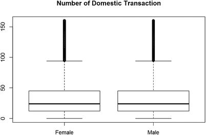
Figure 2-7. The number of domestic transactions sorted by male and female
boxplot(I(DomesTransc +IntTransc ) ∼Gender, data = data)title("Number of Domestic Transaction")
tapply(I(data$DomesTransc +data$IntTransc),data$Gender, median)Female Male24 24tapply(I(data$DomesTransc +data$IntTransc),data$Gender, mean)Female Male32.97612 32.98624
Now, let’s look at the frequencies of the categorical variables .
Distribution of frauds across the card type are shown here. This type of frequency table tell us which categorical variable is prominent for the fraud cases.
table(data$CardType,data$FraudFlag)0 1American Express 2325707 149141Discover 598246 44285MasterCard 3843172 199532Visa 2636861 203056
You can see from the frequency table that highest frauds have happened to Visa cards, followed by MasterCard and American Express. The lowest frauds are reported from Discover. The number of frauds defines the event rate for modeling purposes. Event rate is the proportion of events ( i.e., fraud) versus the number of records for each category.
Similarly, you can see frequency plots for fraud and gender and fraud and state.
table(data$Gender,data$FraudFlag)0 1Female 3550933 270836Male 5853053 325178
Frauds are reported more from males; the event rate of fraud in the male category is 325178/(325178+5853053) = 5.2%. Similarly, the event rate in the female category is 270836/(270836+3550933) = 7.1%. Hence, while males have more frauds, the event rate is higher for female customers. In both cases, the event rate is low, so we need to look for sampling so that we get a high event rate in the modeling dataset.
2.5 Summary
In upcoming chapters, we explain how to enrich this data to be able to model it and quantify these relationships for a predictive model . The next chapter will help you understand how you can reduce your dataset and at the same time enhance its properties to be able to apply machine learning algorithms.
While it’s always good to say that more data implies a better model, there might be occasions where the luxury of sufficient amount of data is not there or computational power is limited to only allow a certain size of dataset. In such situations, statistics could help sample a precise and informative subset of data without compromising much on the quality of the model. Chapter 3 focuses on many such sampling techniques that will help in achieving this objective.
2.6 References
The Future of Data Analysis. John Tukey. July, 1961.
Dates and Times Made Easy with Lubridate. Garrett Grolemund et. al.