
It’s easy to understand why self-service data analysis and visualization have become popular these past few years. It made users more productive by giving them the ability to perform their own analysis and allowing them to interactively explore and manipulate data based on their own needs without relying on traditional business intelligence developers to develop reports and dashboards, a task that can take days, weeks, or longer. Users can perform ad hoc analysis and run follow-up queries to answer their own questions. They’re also not limited by static reports and dashboards. Output from self-service data analysis can take various forms depending on the type of analysis. The output can take the form of interactive charts and dashboards, pivot tables, OLAP cubes, predictions from machine learning models, or query results returned by a SQL query.
Big Data Visualization
Several books have already been published about popular data visualization tools such as Tableau, Qlik, and Power BI. These tools all integrate well with Impala and some of them have rudimentary support for big data. They’re adequate for typical data visualization tasks, and most of the time that’s all typical users will ever need. However, when an organization’s analytic requirements go beyond what traditional tools can handle, it’s time to look at tools that were specifically designed for big data. Note that when I talk about big data, I am referring to the three V’s of big data. I am not only referring to the size (volume) of data, but also the variety (Can these tools analyze structured, unstructured, semi-structured data) and velocity of data (Can these tools perform real-time or near real-time data visualization?). I explore data visualization tools in this chapter that are specifically designed for big data.
SAS Visual Analytics
SAS has been one of the leaders in advanced analytics for more than 40 years. The SAS software suite has hundreds of components designed for various use cases ranging from data mining and econometrics to six sigma and clinical trial analysis. For this chapter, we’re interested in the self-service analytic tool known as SAS Visual Analytics.
SAS Visual Analytics is a web-based, self-service interactive data analytics application from SAS. SAS Visual Analytics allows users to explore their data, write reports, and process and load data into the SAS environment. It has in-memory capabilities and was designed for big data. SAS Visual Analytics can be deployed in distributed and non-distributed mode. In distributed mode, the high-performance SAS LASR Analytic Server daemons are installed on the Hadoop worker nodes. It can take advantage of the full processing capabilities of your Hadoop cluster, enabling it to crank through large volumes of data stored in HDFS.
SAS Visual Analytics distributed deployment supports Cloudera Enterprise, Hortonworks HDP, and the Teradata Data Warehouse Appliance. The non-distributed SAS VA deployment runs on a single machine with a locally installed SAS LASR Analytic Server and connects to Cloudera Impala via JDBC. i
Zoomdata
Zoomdata is a data visualization and analytics company based in Reston, Virginia. ii It was designed to take advantage of Apache Spark, making it ideal for analyzing extremely large data sets. Spark’s in-memory and streaming features enable Zoomdata to support real-time data visualization capabilities. Zoomdata supports various data sources such as Oracle, SQL Server, Hive, Solr, Elasticsearch, and PostgreSQL to name a few. One of the most exciting features of Zoomdata is its support for Kudu and Impala, making it ideal for big data and real-time data visualization. Let’s take a closer look at Zoomdata.
Self-Service BI and Analytics for Big Data
Zoomdata is a modern BI and data analytics tool designed specifically for big data. Zoomdata supports a wide range of data visualization and analytic capabilities, from exploratory self-service data analysis, embedded visual analytics to dashboarding. Exploratory self-service data analysis has become more popular during the past few years. It allows users to interactively navigate and explore data with the goal of discovering hidden patterns and insights from data. Compared to traditional business intelligence tools, which rely heavily on displaying predefined metrics and KPIs using static dashboards.
Zoomdata also supports dashboards. Dashboards are still an effective way of communicating information to users who just wants to see results. Another nice feature is the ability to embed charts and dashboards created in Zoomdata into other web applications. Utilizing standard HTML5, CSS, WebSockets, and JavaScript, embedded analytics can run on most popular web browsers and mobile devices such as iPhones, iPads, and Android tablets. Zoomdata provides a JavaScript SDK if you need the extra flexibility and you need to control how your applications look and behave. A REST API is available to help automate the management and operation of the Zoomdata environment.
Real-Time Data Visualization
Perhaps the most popular feature of Zoomdata is its support for real-time data visualization. Charts and KPIs are updated in real time from live streaming sources such as MQTT and Kafka or an SQL-based data source such as Oracle, SQL Server, or Impala.
Architecture
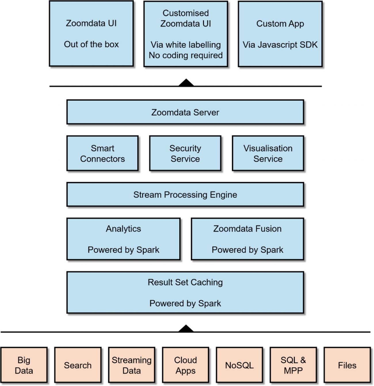
High-level architecture of Zoomdata
Deep Integration with Apache Spark
One of the most impressive features of Zoomdata is its deep integration with Apache Spark. As previously discussed, Zoomdata uses Spark to implement its streaming feature. Zoomdata also uses Spark for query optimization by caching data as Spark DataFrames, then performing the calculation, aggregation, and filtering using Spark against the cached data. Spark also powers another Zoomdata feature called SparkIt. SparkIt boosts performance of slow data sources such as S3 buckets and text files. SparkIt caches these data sets into Spark, which transforms them into queryable, high-performance Spark DataFrames. v Finally, Zoomdata uses Spark to implement Zoomdata Fusion, a high-performance data virtualization layer that virtualizes multiple data sources into one.
Zoomdata Fusion
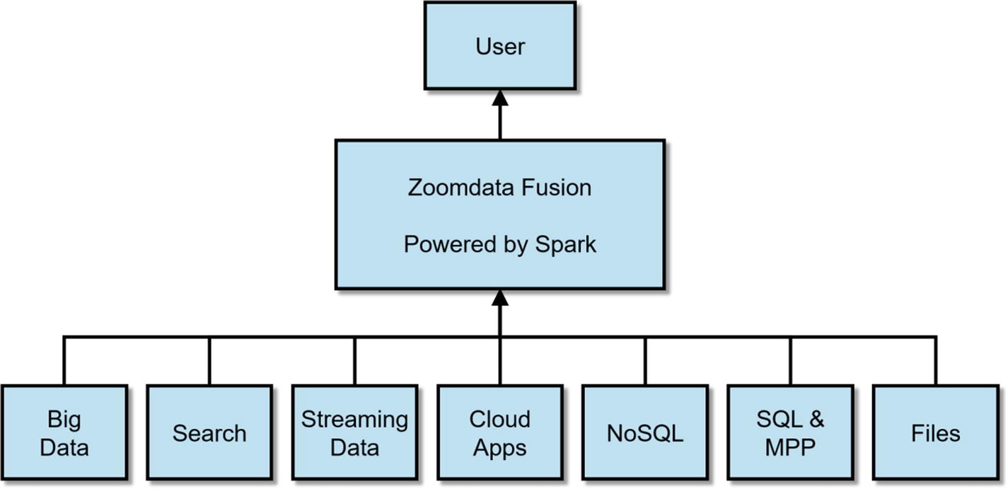
Diagram of Zoomdata Fusion
Data Sharpening
Zoomdata was awarded a patent on “data sharpening,” an optimization technique for visualizing large data sets. Data Sharpening works by dividing a large query into a series of micro-queries. These micro-queries are then sent to the data source and executed in parallel. Results from the first micro-query is immediately returned and visualized by Zoomdata as an estimate of the final results. Zoomdata updates the visualization as new data arrives, showing incrementally better and more accurate estimates until the query completes and the full visualization is finally shown. While all of these are happening, users can still interact with the charts and launch other dashboards, without waiting for long-running queries to finish. Underneath, Zoomdata’s streaming architecture makes all of these possible, breaking queries down into micro-queries and streaming results back to the user. vii
Support for Multiple Data Sources
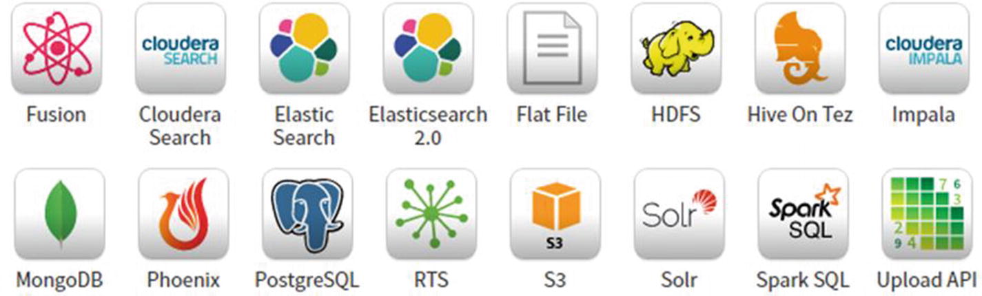
Partial list of Zoomdata’s supported data sources
Note
Consult Zoomdata’s website for the latest instructions on how to install Zoomdata. You also need to install Zoomdata’s Kudu connector to connect to Kudu, which is available on Zoomdata’s website as well.
Zoomdata login page
Zoomdata homepage

Available data sources
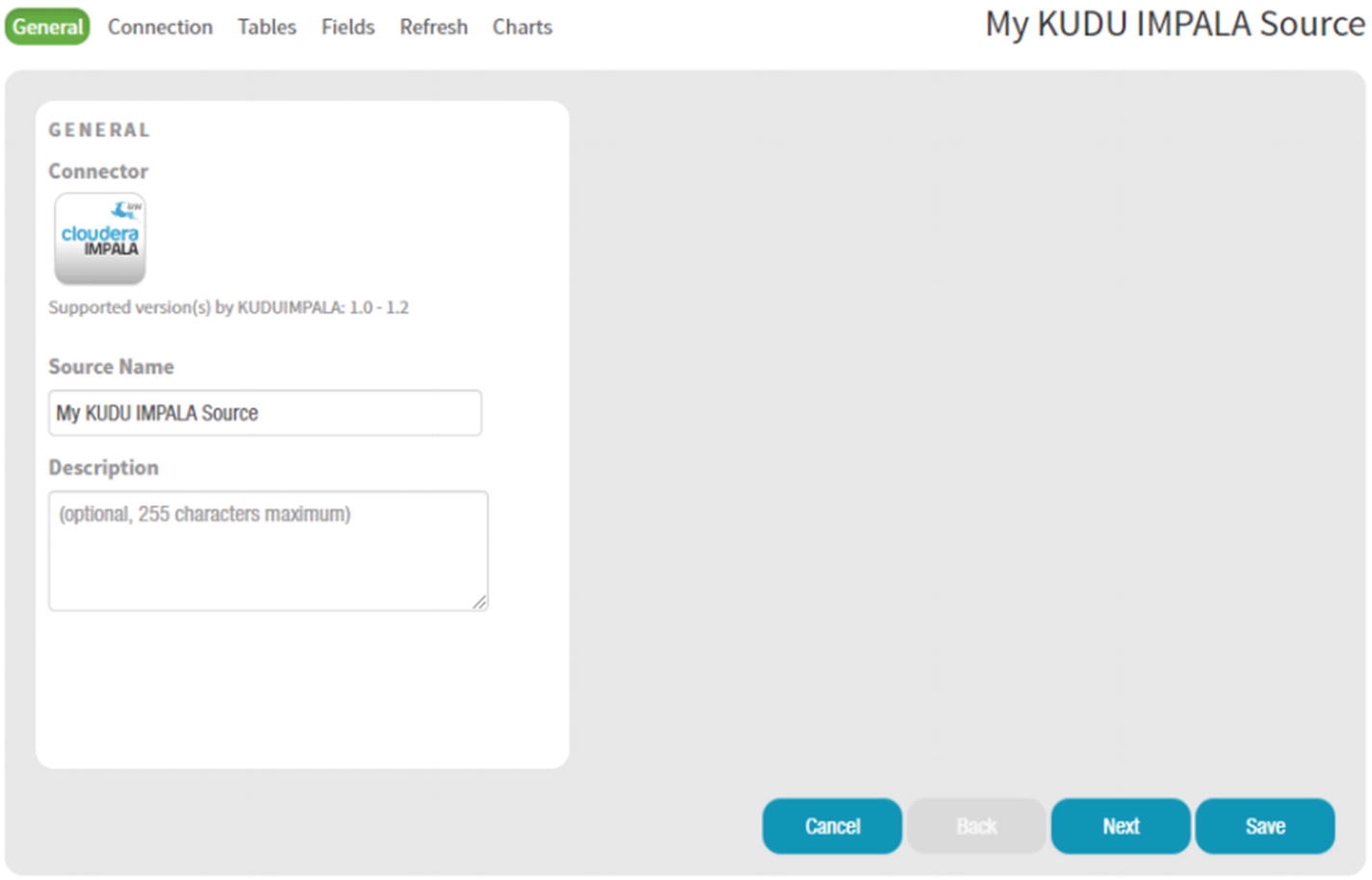
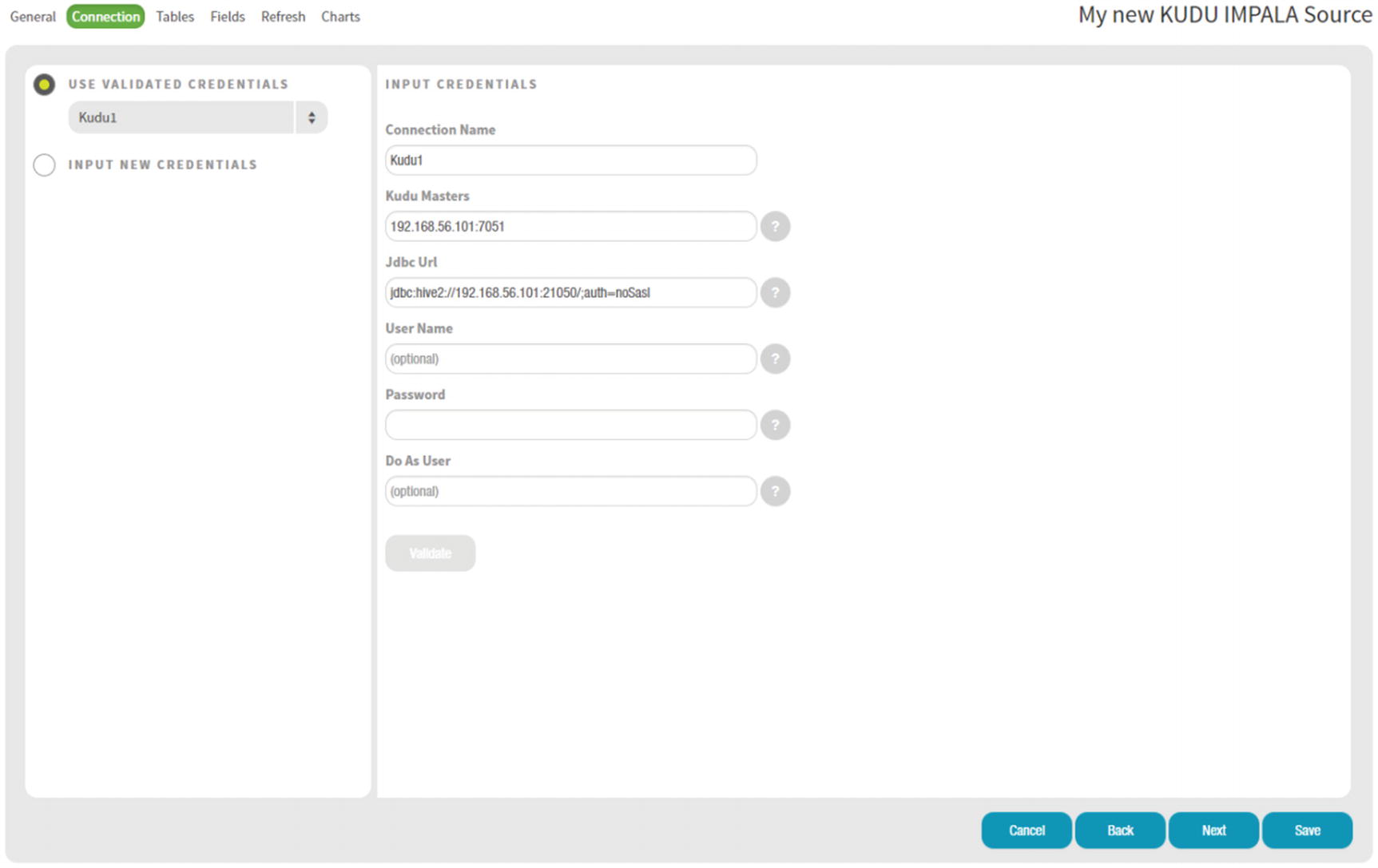
Kudu Impala Connector page
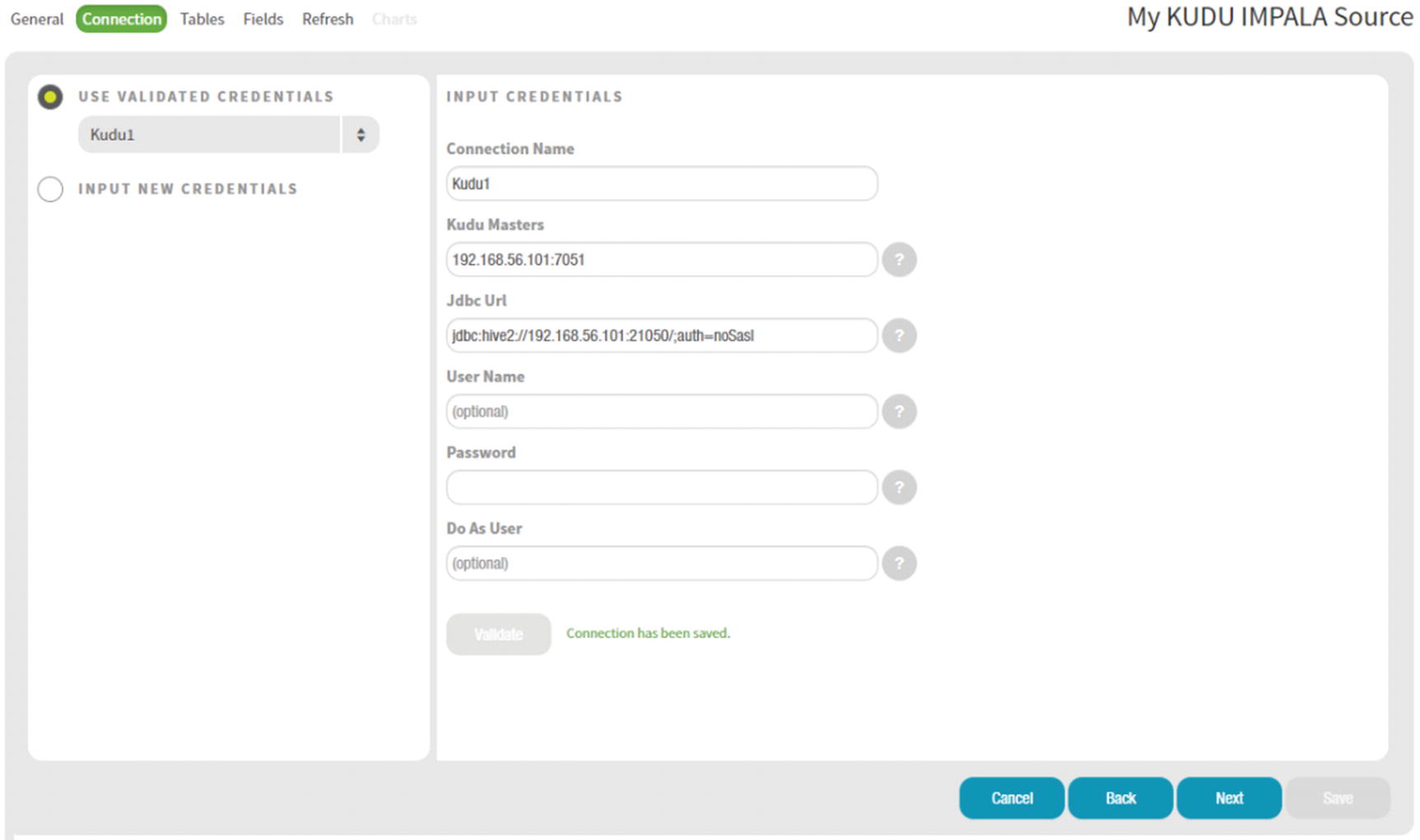
Kudu Impala Connector Input Credentials
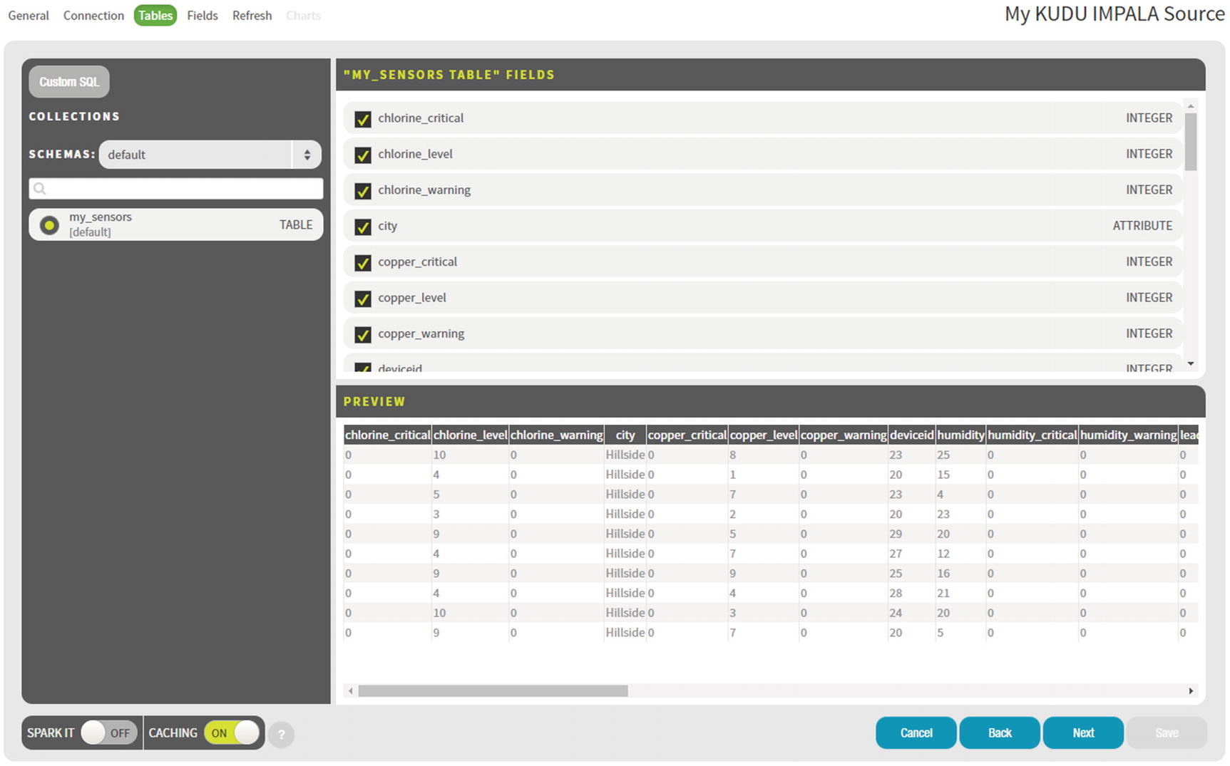
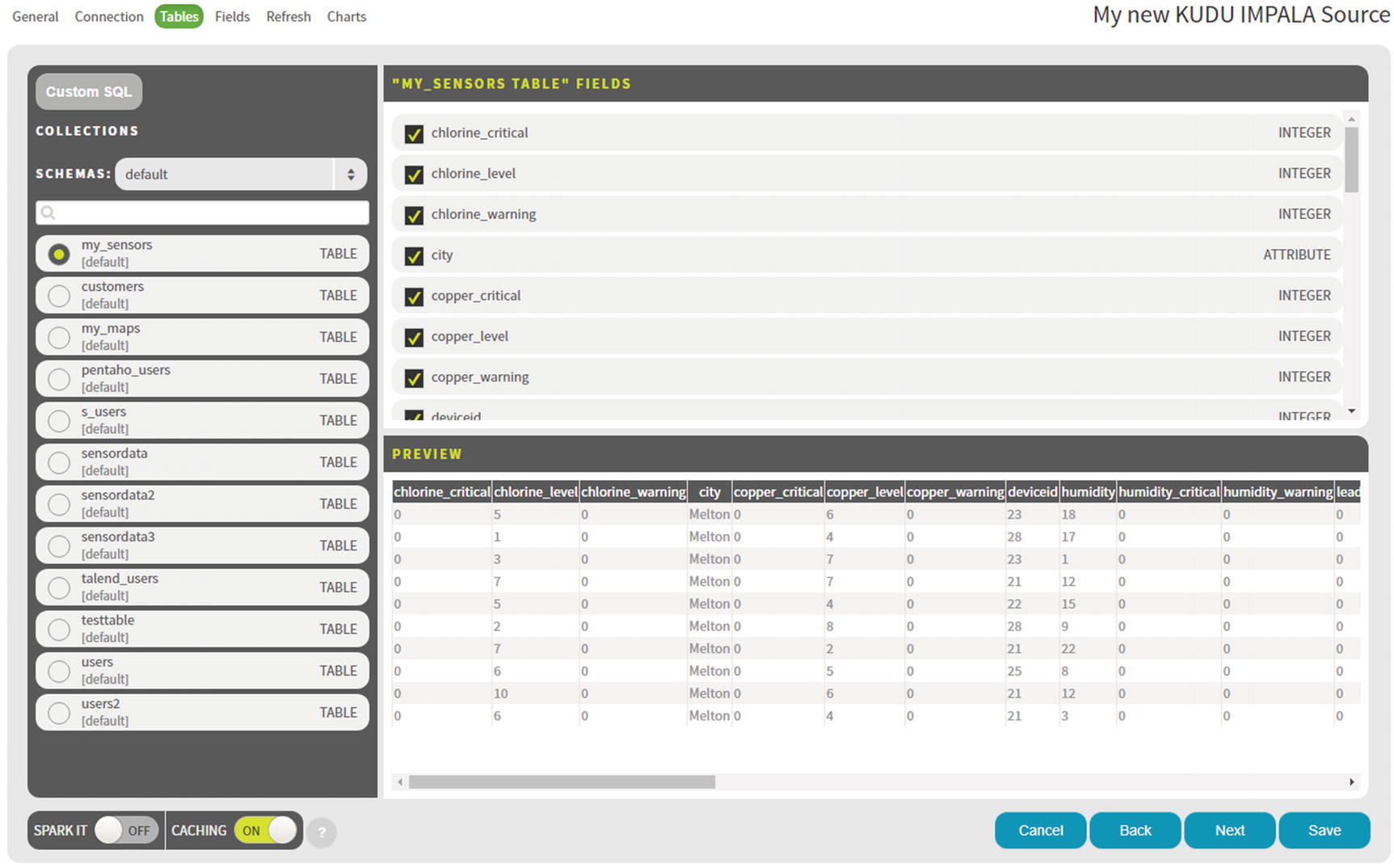
Data Source Tables
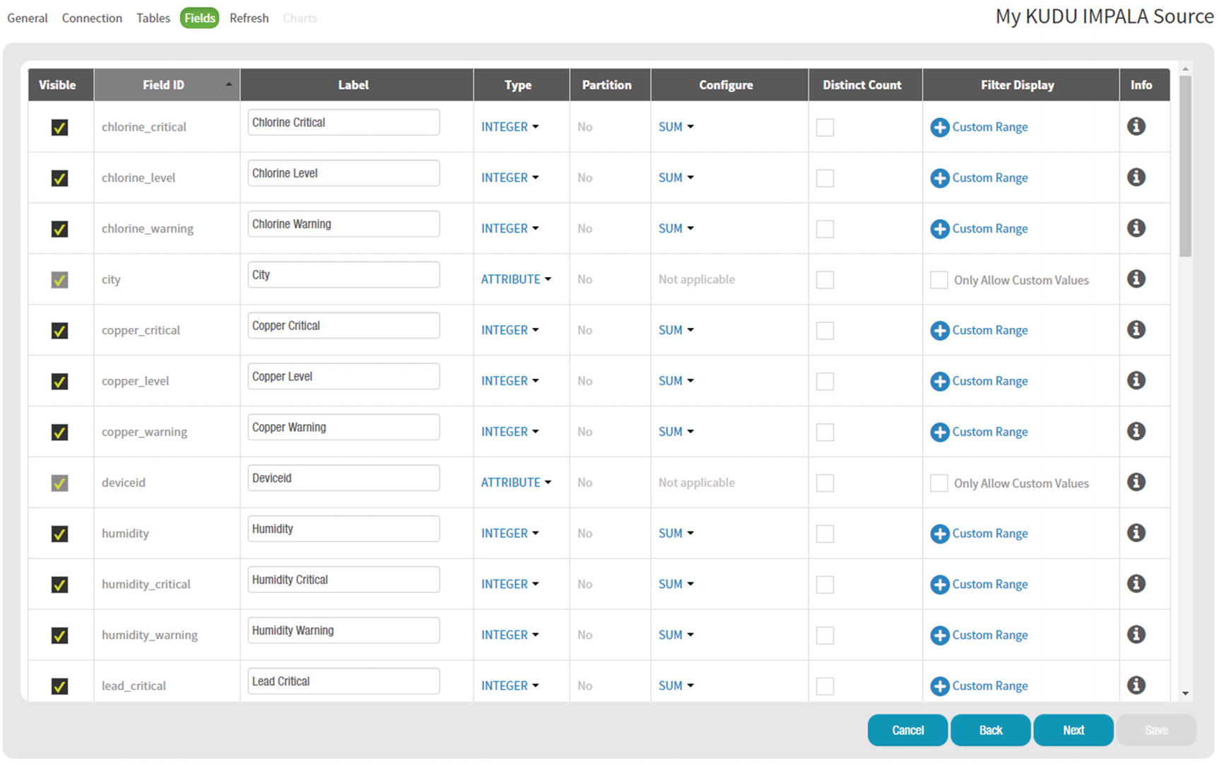
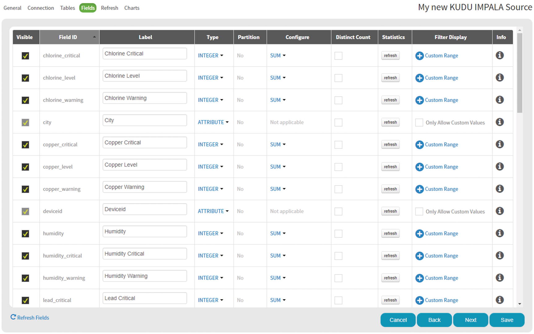
Data Source Fields
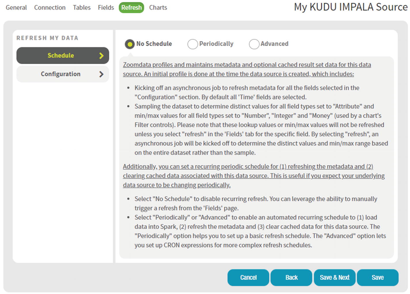
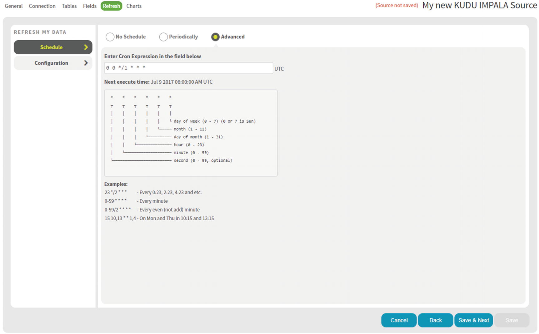
Data Source Refresh
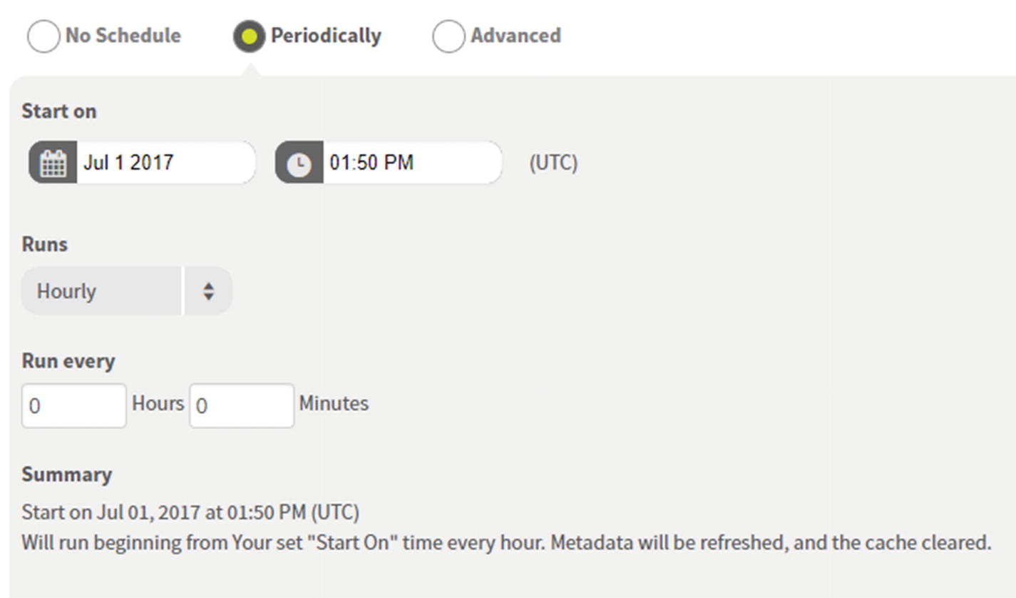
Data Source Scheduler
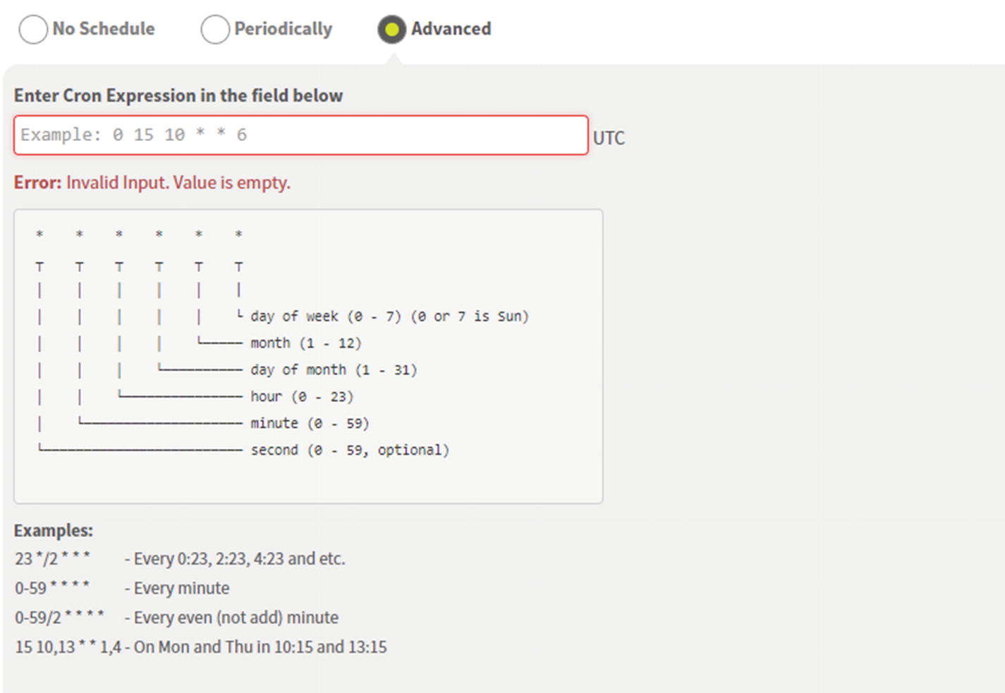
Data Source Cron Scheduler
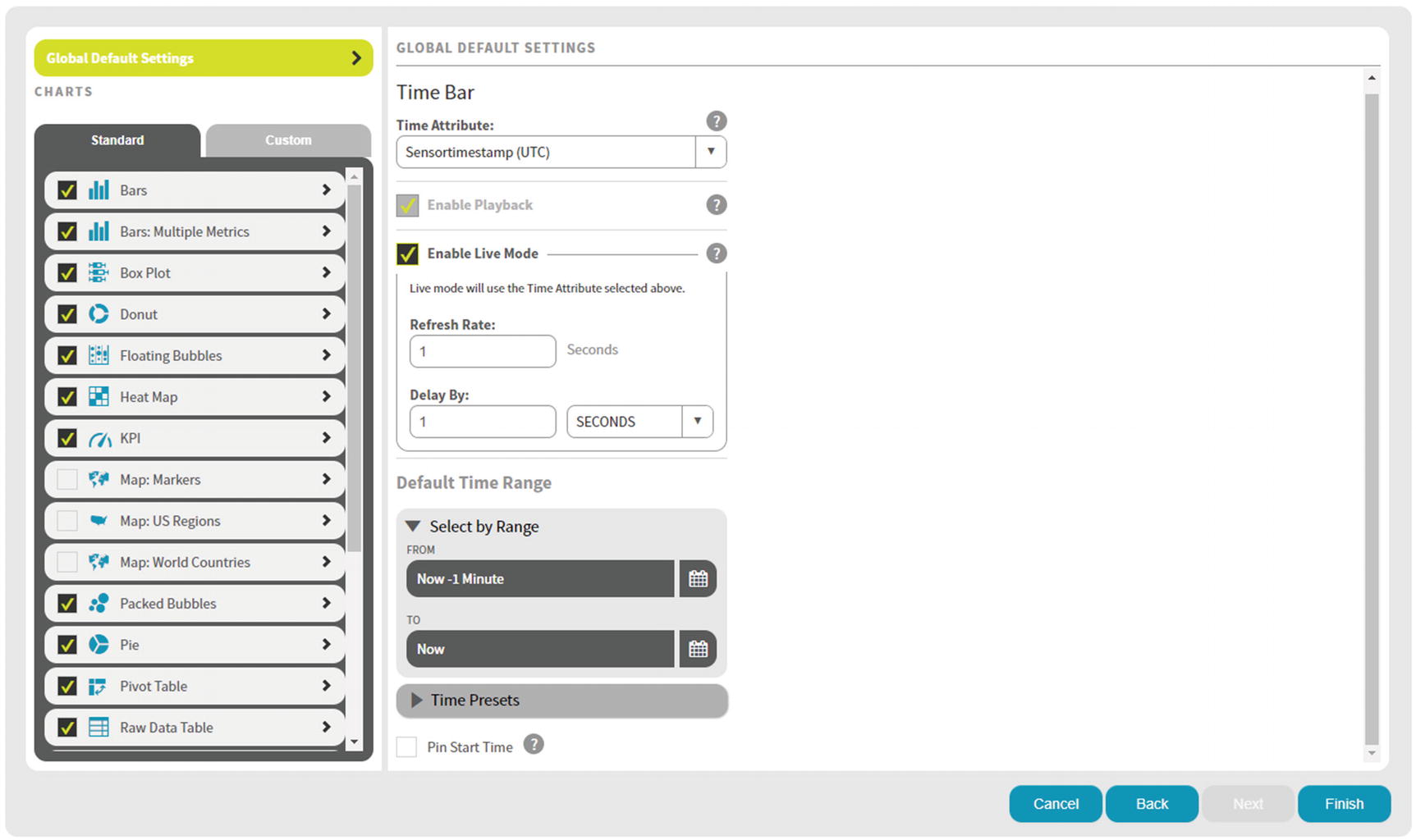
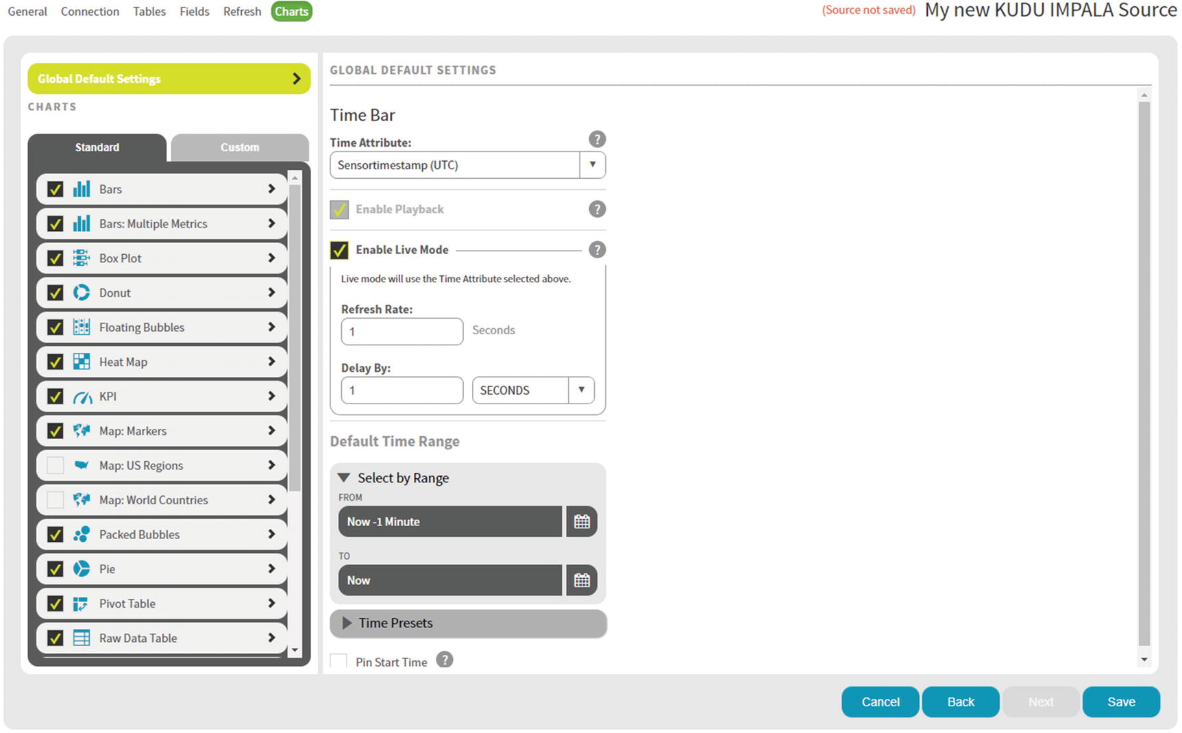
Time Bar Global Default Settings
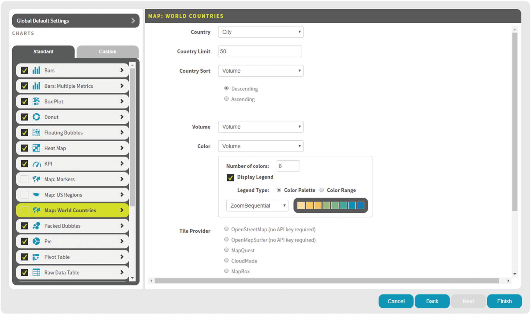
Map: World Countries – Options
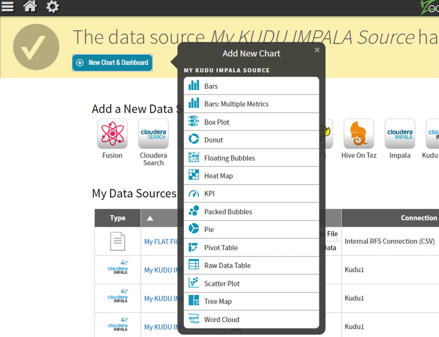
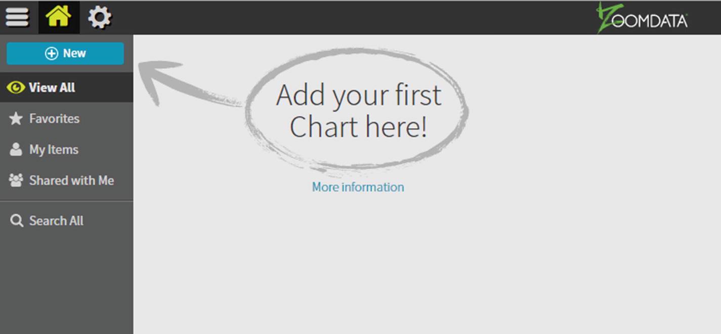
Add New Chart
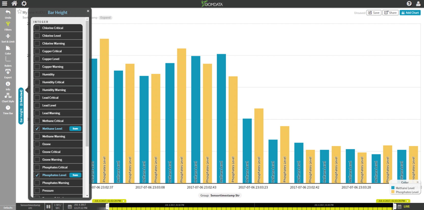
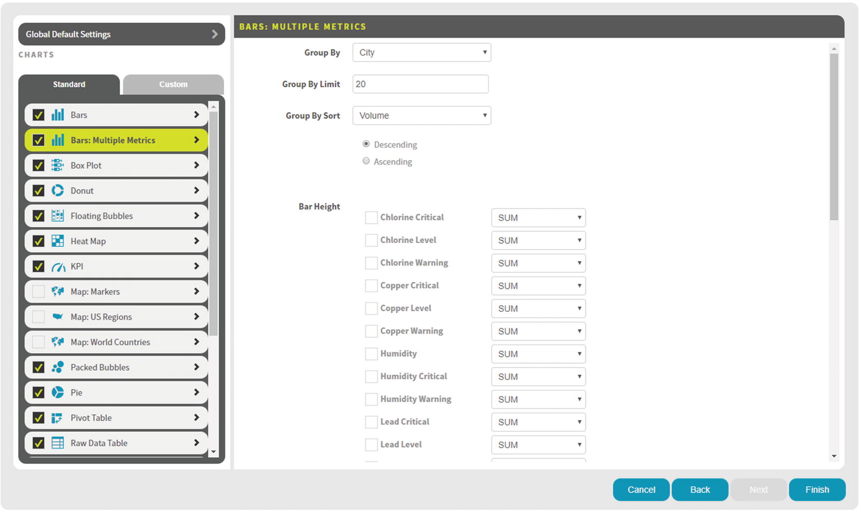
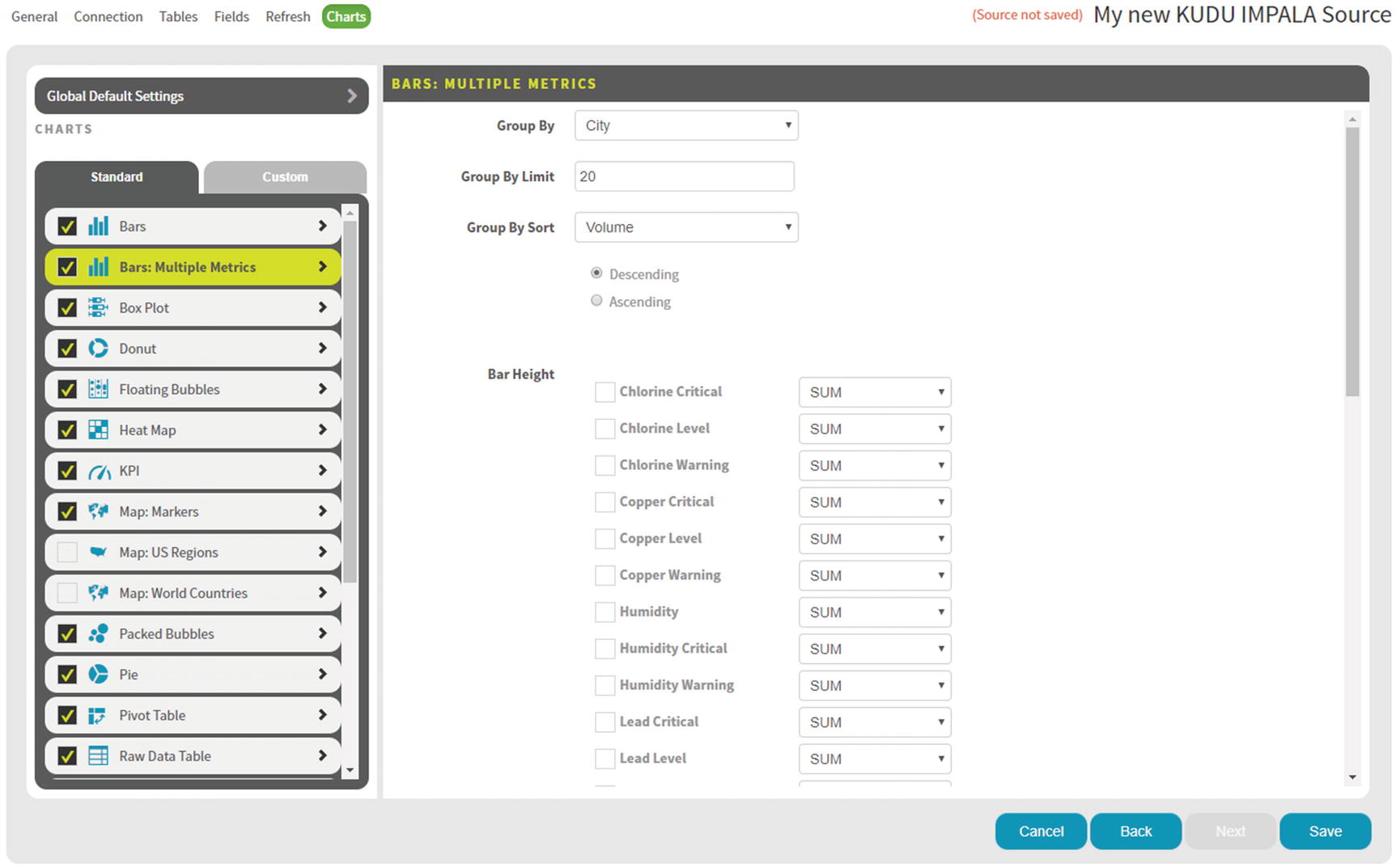
Bar Chart
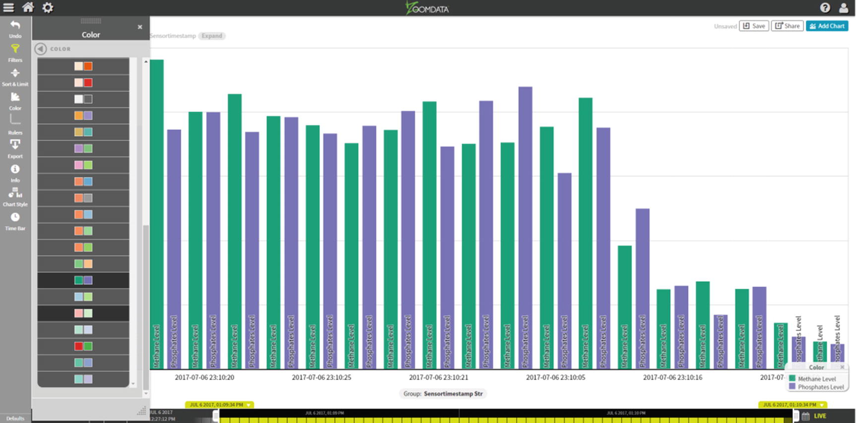
Bar Chart – Color
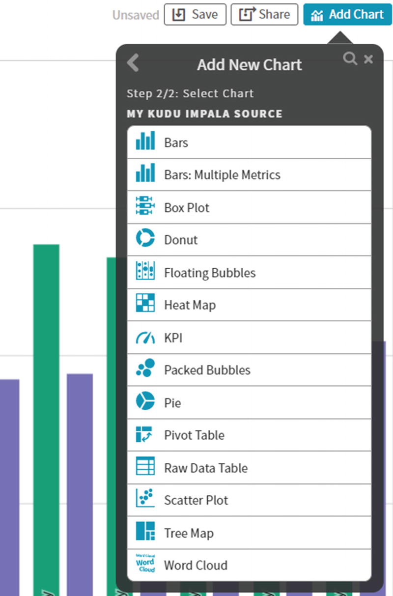
Add New Chart
Multiple Chart Types
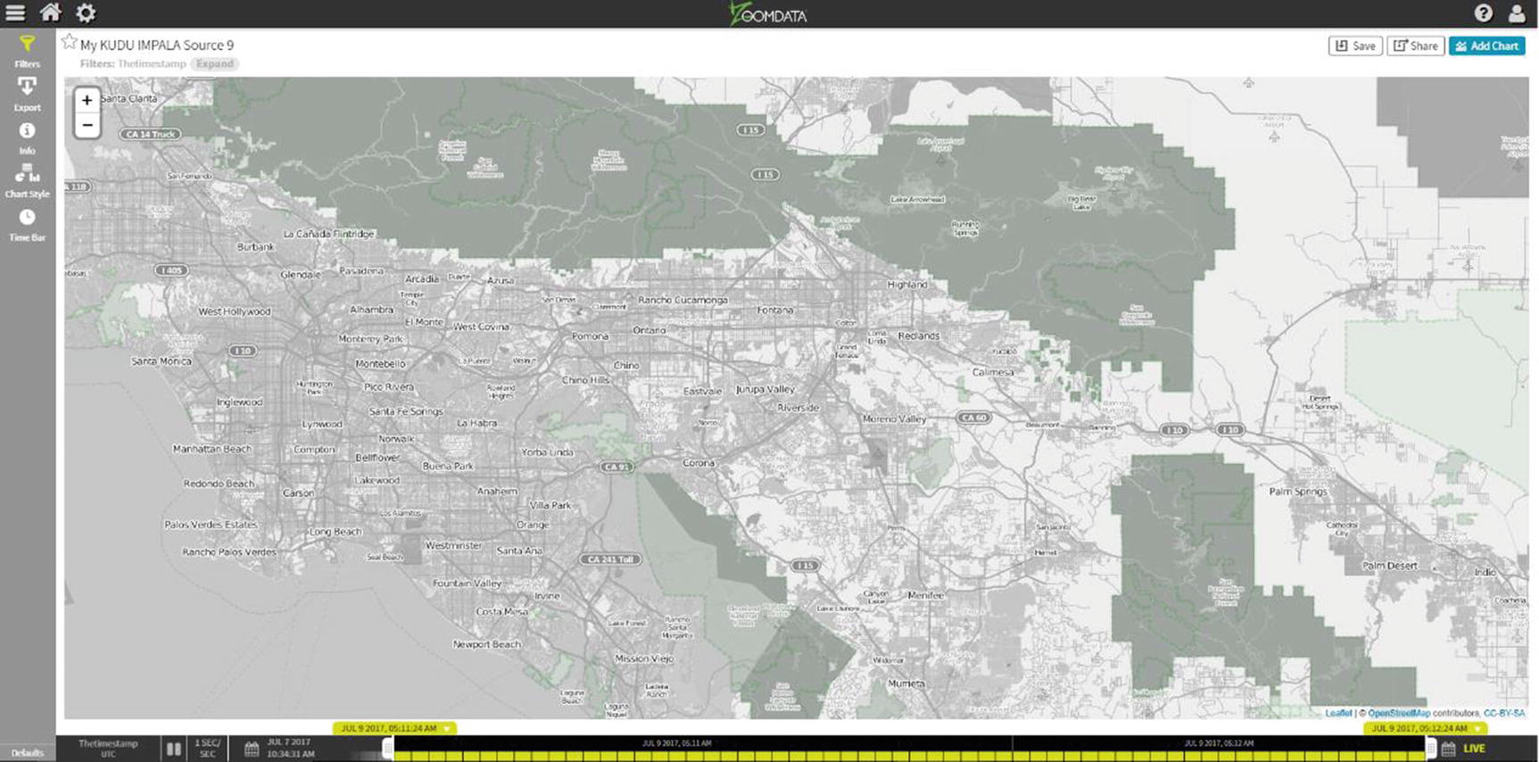
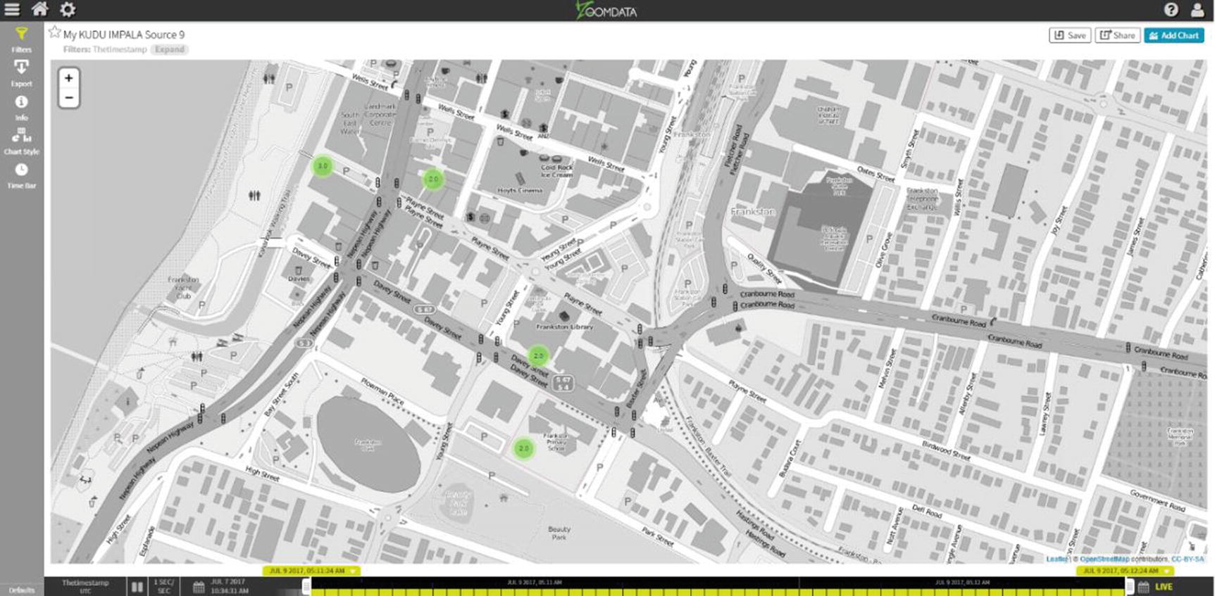
Zoomdata Map with Markers
Real-Time IoT with StreamSets, Kudu, and Zoomdata
One of the most exciting big data use cases is IoT (Internet of Things). IoT enables the collection of data from sensors embedded in hardware such as smart phones, electronic gadgets, appliances, manufacturing equipment, and health care devices to name a few. Use cases range from real-time predictive health care, network pipe leakage detection, monitoring water quality, emergency alert systems, smart homes, smart cities, and connected car to name a few. IoT data can be run through rules engines for real-time decision making or machine learning models for more advanced real-time predictive analytics.
For our IoT example, we will detect network pipe leakage and monitor water quality for a fictional water utility company. We’ll use a shell script to generate random data to simulate IoT data coming from sensors installed on water pipes. We’ll use Kudu for data storage, StreamSets for real-time data ingestion and stream processing, and Zoomdata for real-time data visualization.
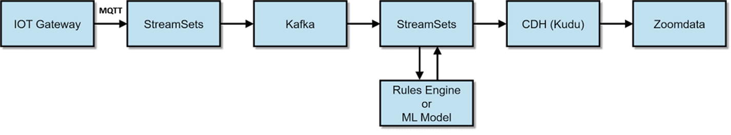
A Typical IoT Architecture using StreamSets, Kafka, Kudu, and Zoomdata
Create the Kudu Table
Zoomdata requires the Kudu table to be partitioned on the timestamp field. To enable live mode, the timestamp field has to be stored as a BIGINT in epoch time. Zoomdata will recognize the timestamp field as “playable” and enable live mode on the data source (Listing 9-1).
Table for the sensor data. Must be run in impala-shell
Test Data Source
We’ll execute shell script to generate random data: generatetest.sh. I introduce a 1 second delay every 50 records so I don’t overwhelm my test server (Listing 9-2).
generatetest.sh shell script to generate test data
The script will generate random sensor data. Listing 9-3 shows what the data looks like.
Sample test sensor data
Design the Pipeline
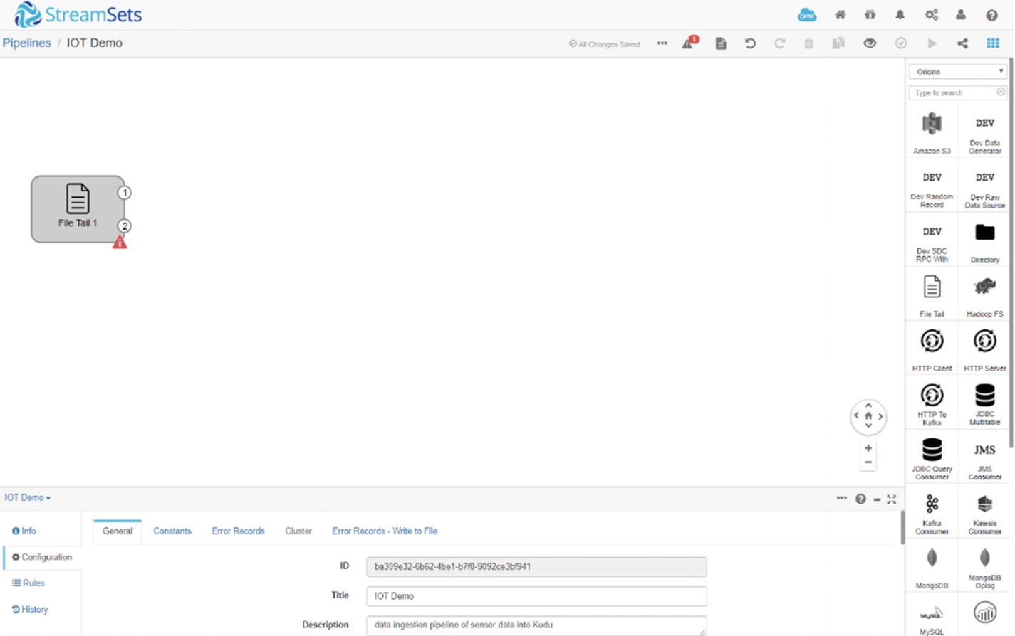
StreamSets file tail origin
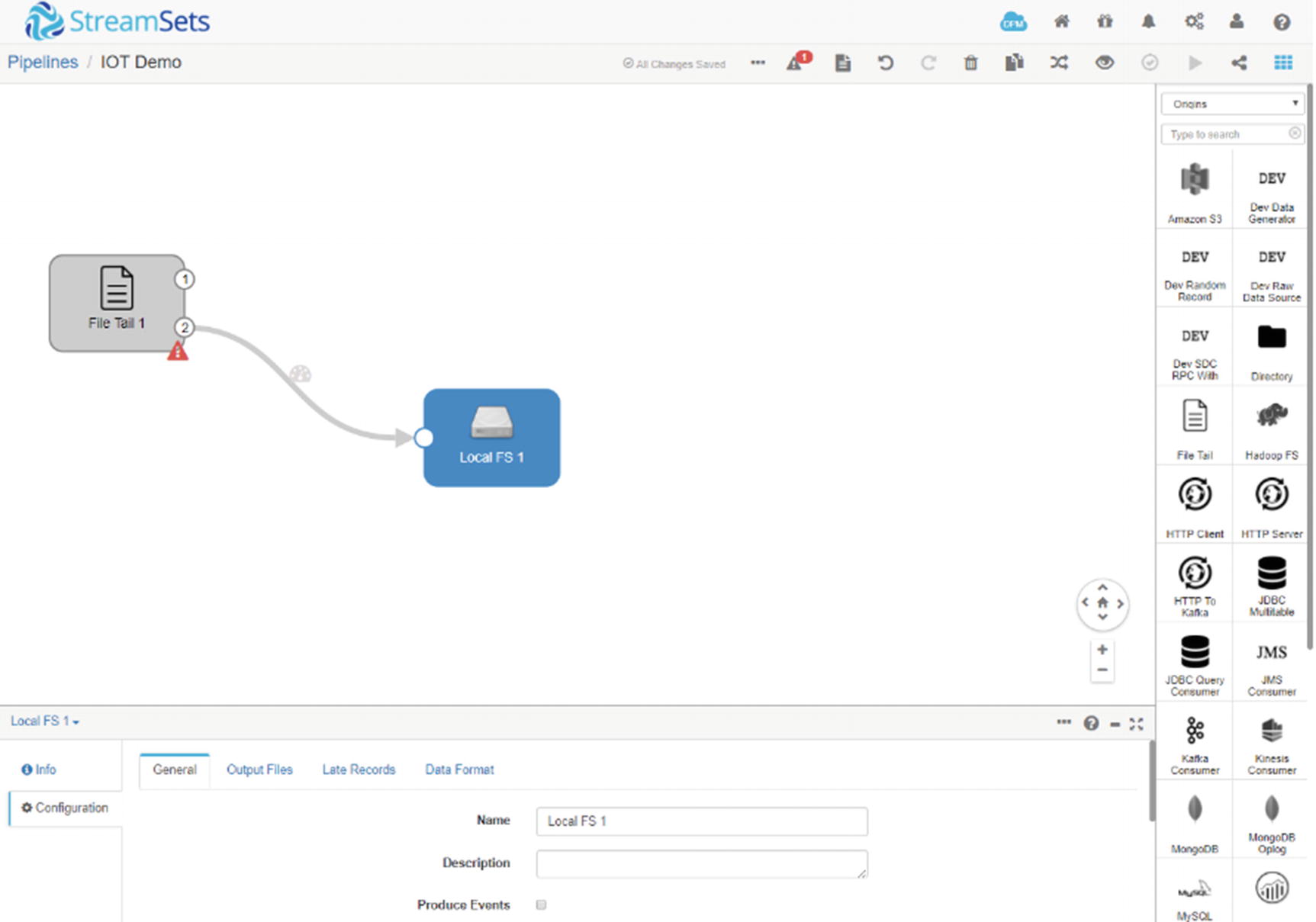
StreamSets local file system
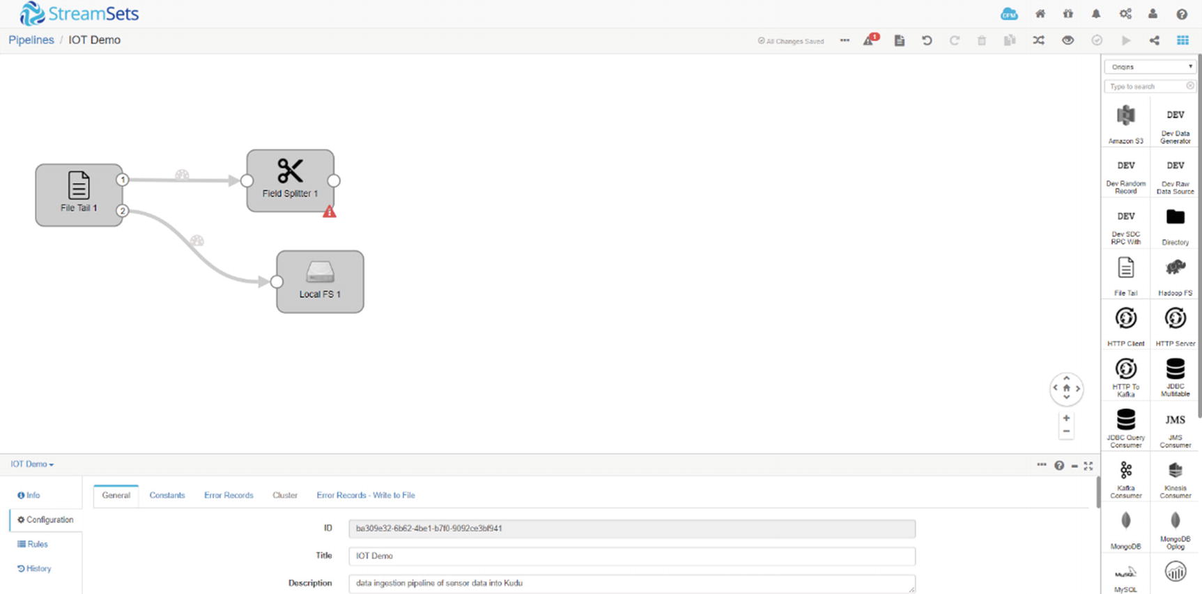
StreamSets field splitter
New SDC Fields
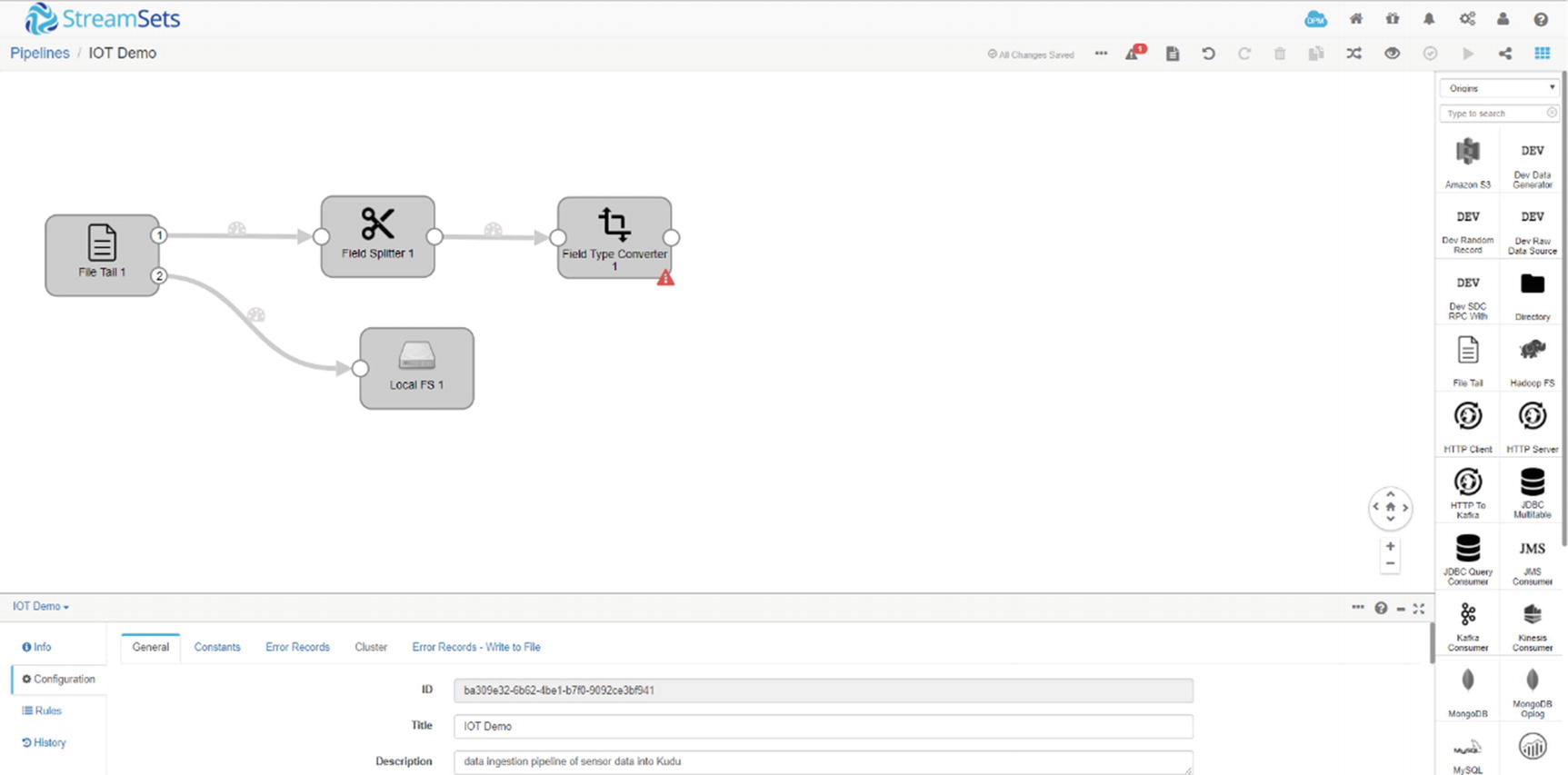
StreamSets field converter
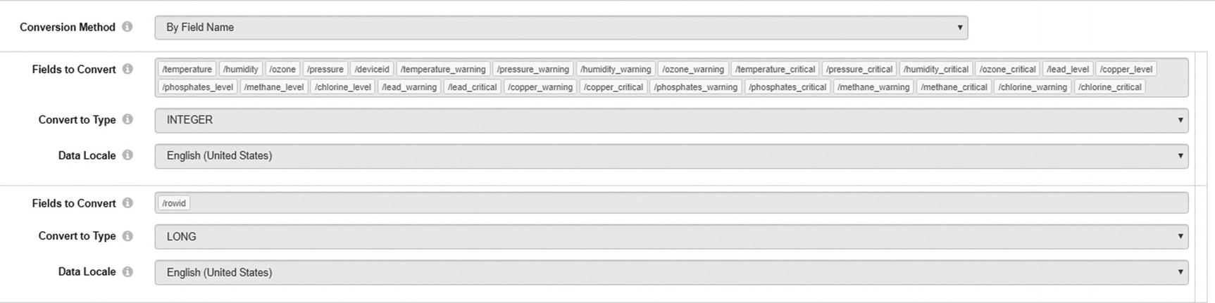
StreamSets field converter
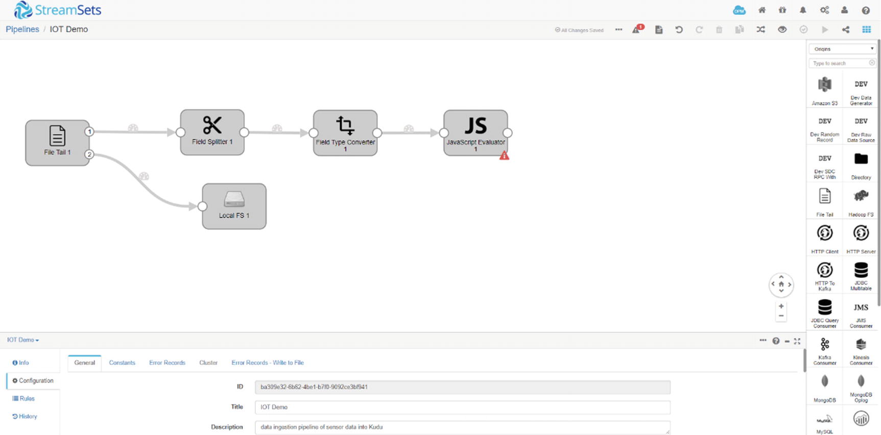
StreamSets Javascript Evaluator
Javascript Evaluator code
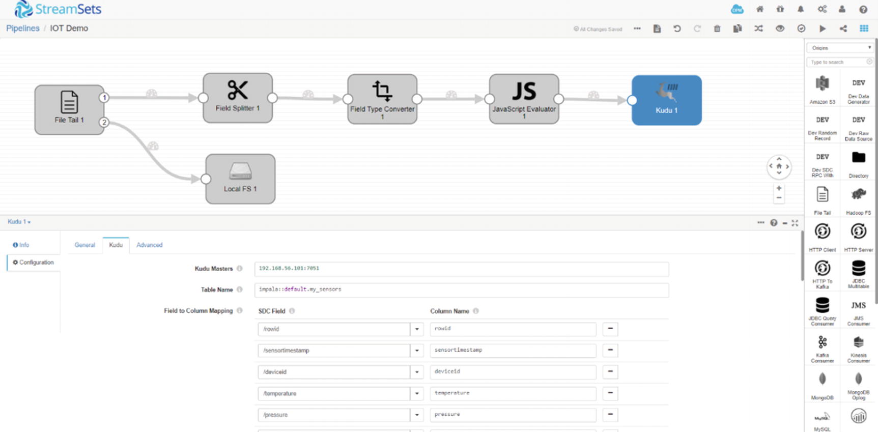
StreamSets Kudu destination
That’s it on the StreamSets end.
Configure Zoomdata
Zoomdata data source
Zoomdata data connection input credentials
Zoomdata data connection tables
Zoomdata data connection fields
Zoomdata data connection refresh
Zoomdata time bar
Zoomdata time bar
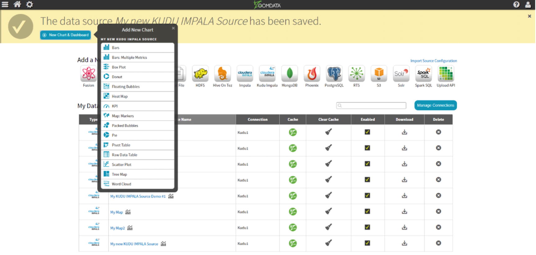
Zoomdata add new chart
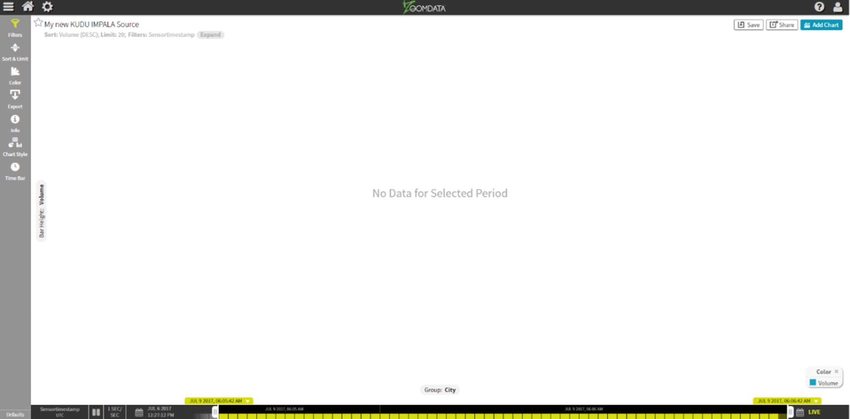
An empty chart
Let’s start generating some data. On the server where we installed StreamSets, open a terminal window and run the script. Redirect the output to the File tail destination: ./generatetest.csv >> sensordata.csv.
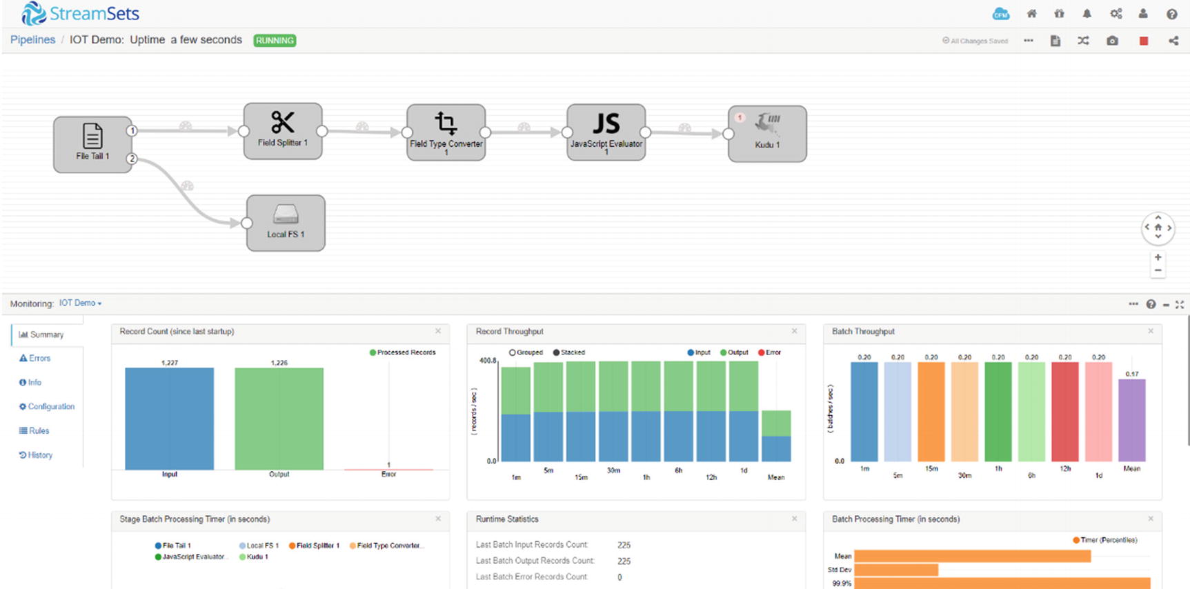
StreamSets canvas
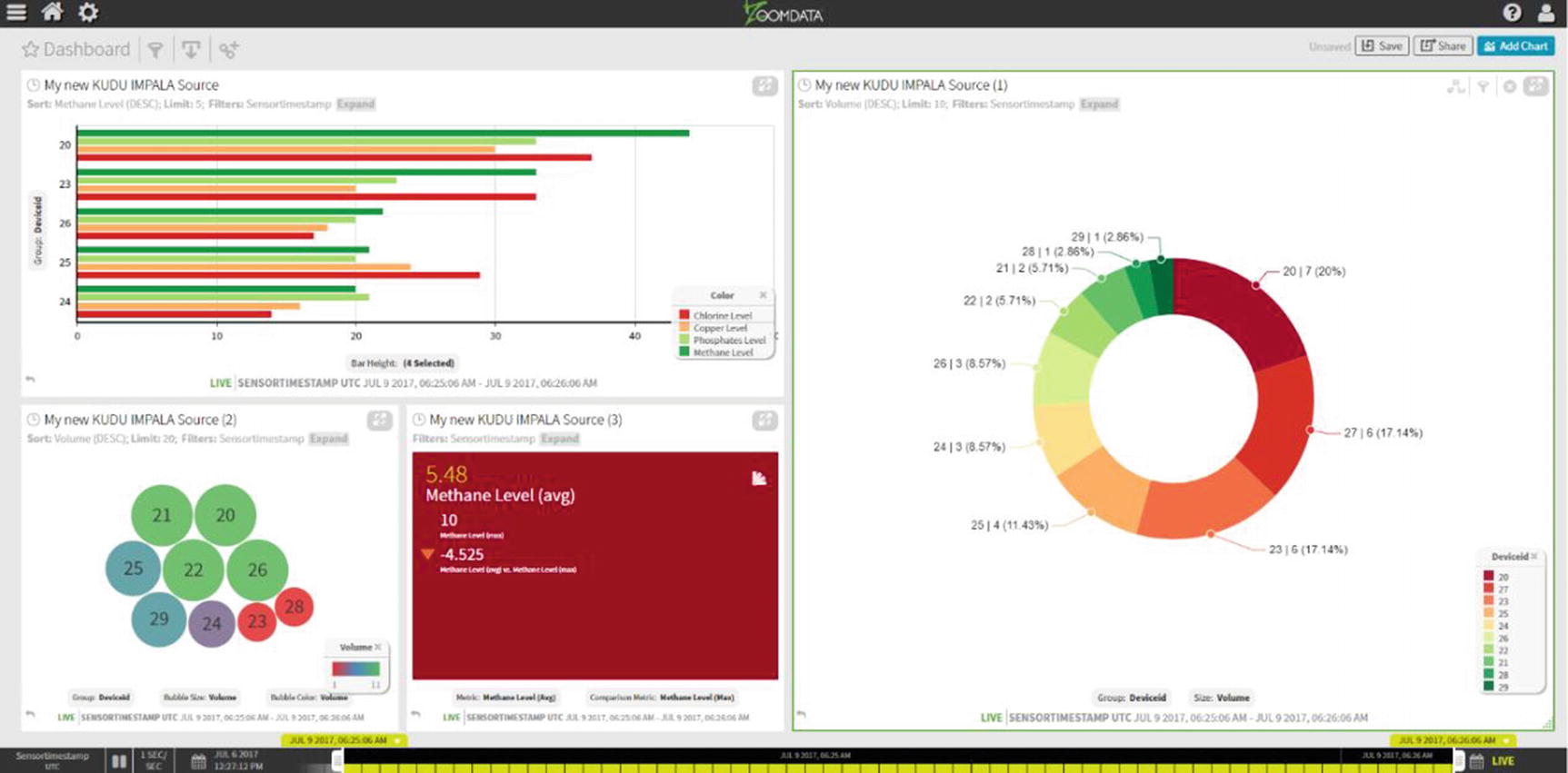
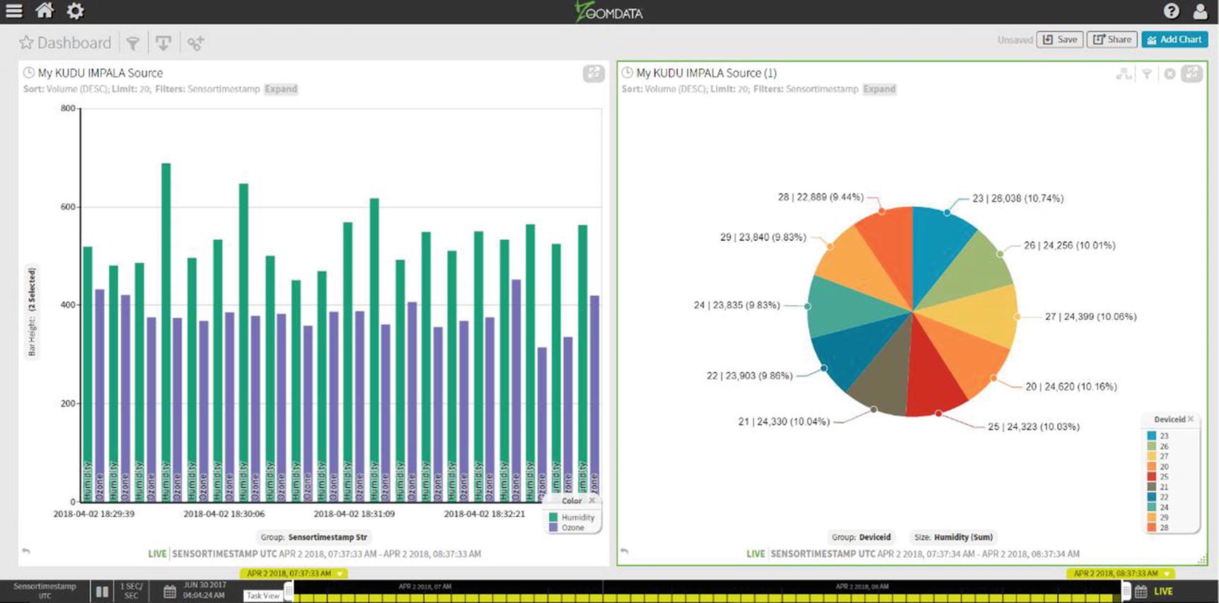
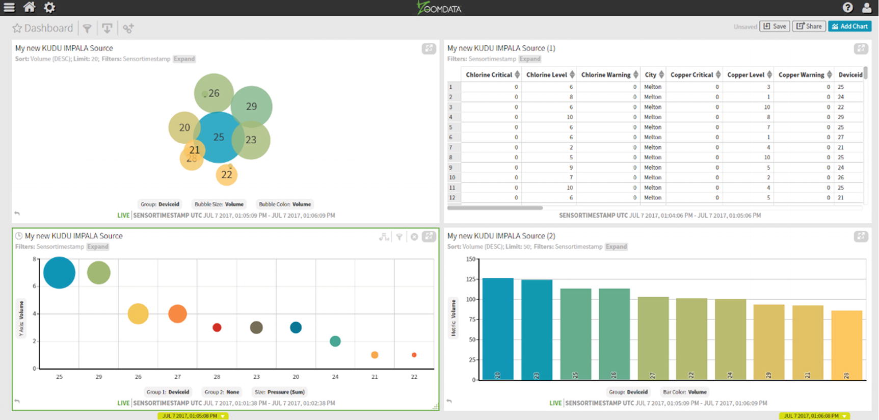
Live Zoomdata dashboard
Congratulations! You’ve just implemented a real-time IoT pipeline using StreamSets, Kudu, and ZoomData.
Data Wrangling
In most cases, data will not come in the format suitable for data analysis. Some data transformation may be needed to convert a field’s data type; data cleansing may be required to handle missing or incorrect values; or data needs to be joined with other data sources such as CRM, weather data, or web logs. A survey conducted says that 80% of what data scientists do is data preparation and cleansing, and the remaining 20% is spent on the actual data analysis. x In traditional data warehouse and business intelligence environments, data is made fit for analysis through an extract, transform, and load (ETL) process. During off-peak hours, data is cleansed, transformed, and copied from online transaction processing (OLTP) sources to the enterprise data warehouse. Various reports, key performance indicators (KPIs), and data visualization are updated with new data and presented in corporate dashboards, ready to be consumed by users. OLAP cubes and pivot tables provide some level of interactivity. In some cases, power users are granted SQL access to a reporting database or a replicated copy of the data warehouse where they can run ad hoc SQL queries. But in general, traditional data warehousing and business intelligence are fairly static.
The advent of big data has rendered old-style ETL inadequate. Weeks or months of upfront data modeling and ETL design to accommodate new data sets is considered rigid and old-fashioned. The enterprise data warehouse, once considered an organization’s central data repository, now shares that title with the enterprise “data hub” or “data lake,” as more and more workloads are being moved to big data platforms. In cases where appropriate, ETL has been replaced by ELT. Extract, load, and transform (ELT) allows users to dump data with little or no transformation unto a big data platform. It’s then up to the data analyst to make the data suitable for analysis based on his or her needs. ELT is in, ETL is out. EDW is rigid and structured. Big data is fast and agile.
At the same time, users have become savvier and more demanding. Massive amounts of data is available, and waiting weeks or months for a team of ETL developers to design and implement a data ingestion pipeline to make these data available for consumption is no longer an option. A new set of activities, collectively known as data wrangling, has emerged.
Six Core Data Wrangling Activities
Activity | Description |
|---|---|
Discovering | This is the data profiling and assessment stage. |
Structuring | Set of activities to determine the structure of your data. Creating schemas, pivoting rows, adding or removing columns, etc. |
Cleaning | Set of activities that includes fixing invalid or missing values, standardizing the format of specific fields (i.e., date, phone, and state), removing extra characters, etc. |
Enriching | Set of activities that involves joining or blending your data with other data sources to improve the results of your data analysis. |
Validating | Set of activities to check if the enrichment and data cleansing performed actually achieved its goal. |
Publishing | Once you’re happy with the output of your data wrangling, it’s time to publish the results. The results could be input data to a data visualization tool such as Tableau or as input for a marketing campaign initiative. |
Note that the data wrangling activities are iterative in nature. You will usually perform the steps multiple times and in different orders to achieve the desired results.
If you’ve ever used Microsoft Excel to make numeric values look like a certain format or removed certain characters using regular expressions, you’ve performed a simple form of data wrangling. Microsoft Excel is actually a pretty good tool for data wrangling, even though it wasn’t strictly designed for such tasks. However, Microsoft Excel falls short when used on large data sets or when data is stored in a big data platform or a relational database. A new breed of interactive data wrangling tools was developed to fill the market niche. These data wrangling tools take interactive data processing to the next level, offering features that make it easy to perform tasks that would normally require coding expertise. Most of these tools automate transformation and offer relevant suggestions based on the data set provided. They have deep integration with big data platforms such as Cloudera Enterprise and can connect via Impala, Hive, Spark HDFS, or HBase. I’ll show examples on how to use some of the most popular data wrangling tools.
Trifacta
Trifacta is one of the pioneers of data wrangling. Developed by Stanford PhD Sean Kandel, UC Berkeley professor Joe Hellerstein, and University of Washington and former Stanford professor Jeffrey Heer. They started a joint research project called the Stanford/Berkeley Wrangler, which eventually became Trifacta. xii Trifacta sells two versions of their product, Trifacta Wrangler and Trifacta Wrangler Enterprise. Trifacta Wrangler is a free desktop application aimed for individual use with small data sets. Trifacta Wrangler Enterprise is designed for teams with centralized management of security and data governance. xiii As mentioned earlier, Trifacta can connect to Impala to provide high-performance querying capabilities. xiv Please consult Trifacta’s website on how to install Trifacta Wrangler.
I’ll show you some of the features of Trifacta Wrangler. Trifacta organizes data wrangling activities based on “flows.” Trifacta Wrangler will ask you to create a new flow when you first start the application.
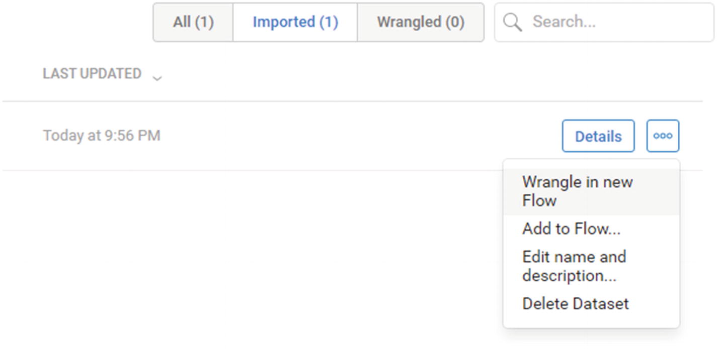
Wrangle in new Flow
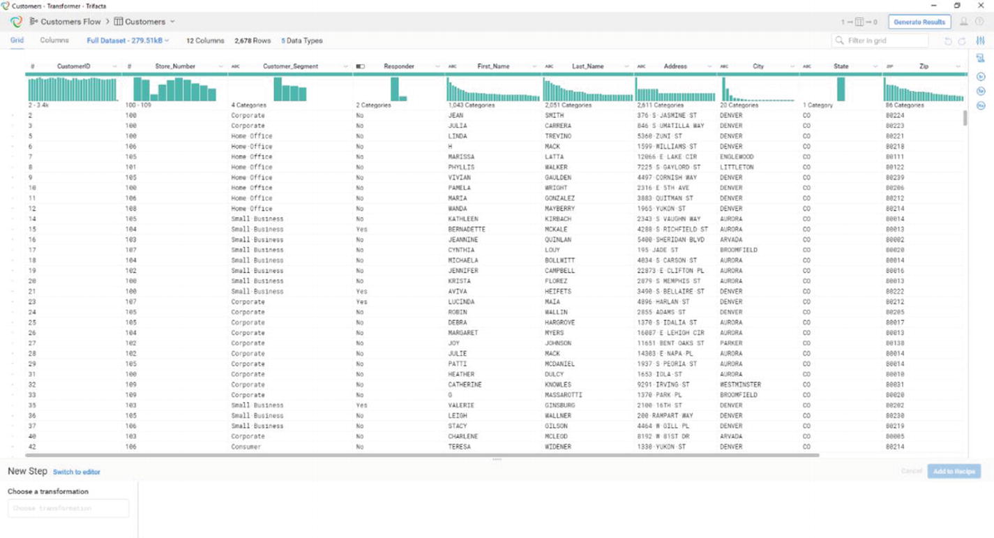
Trifacta’s transformer page
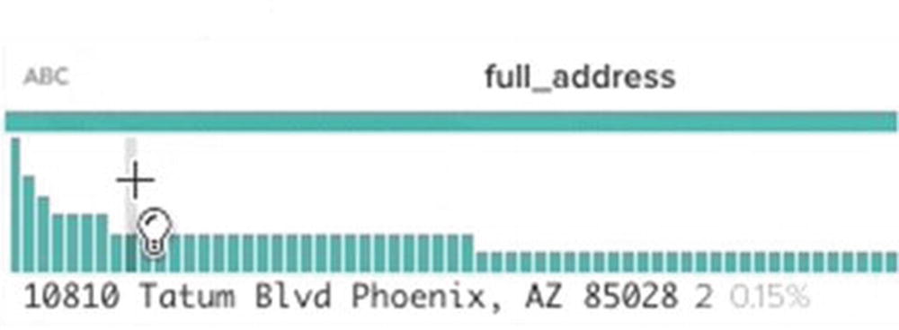
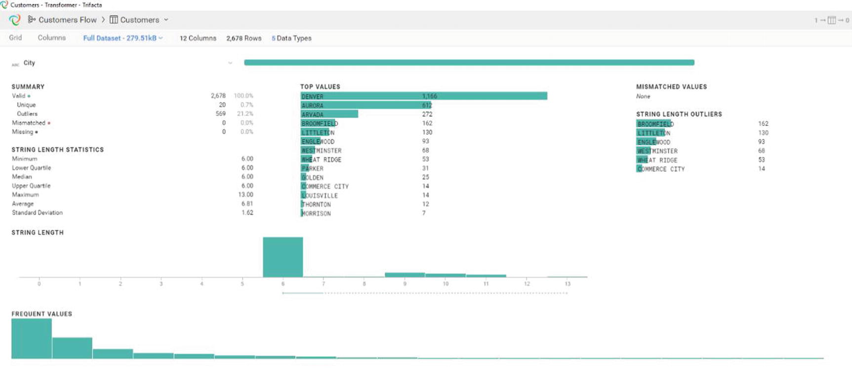
Histogram showing data distribution
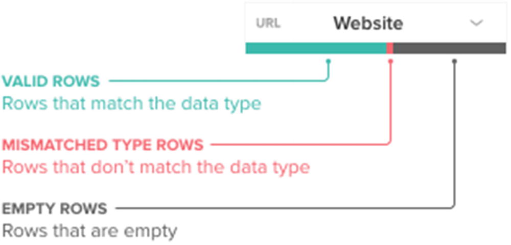
Data quality bar
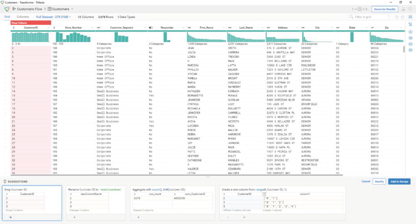
Trifacta’s suggestions
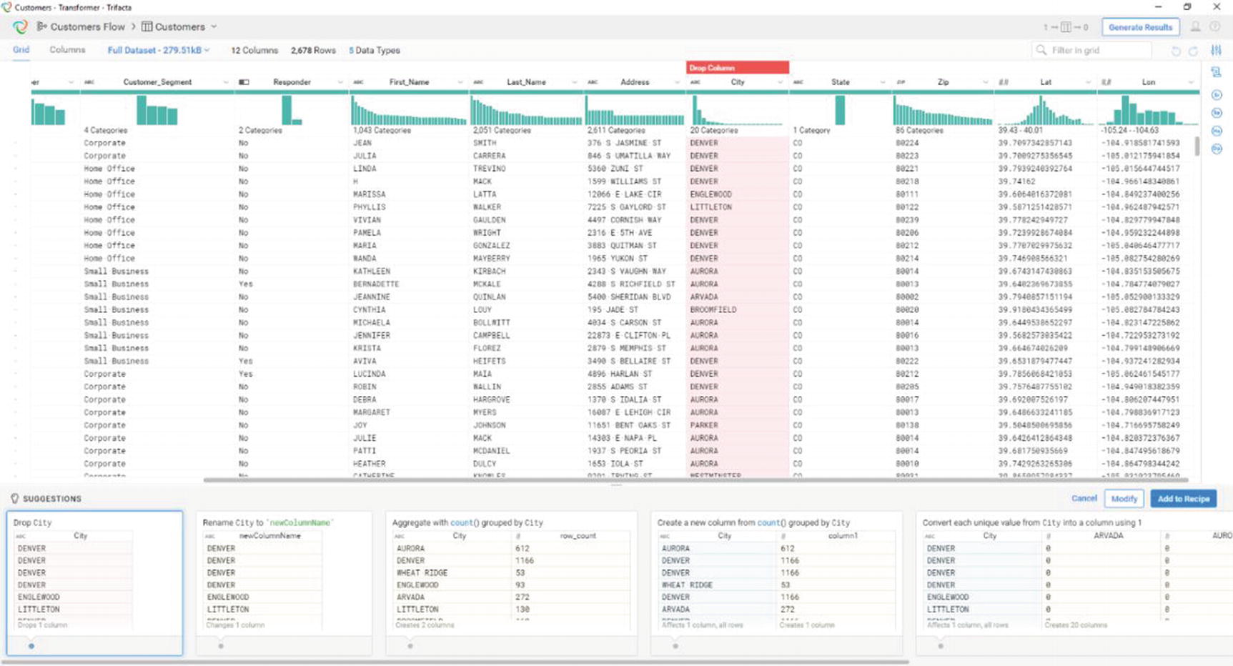
Trifacta has different suggestions for different types of data
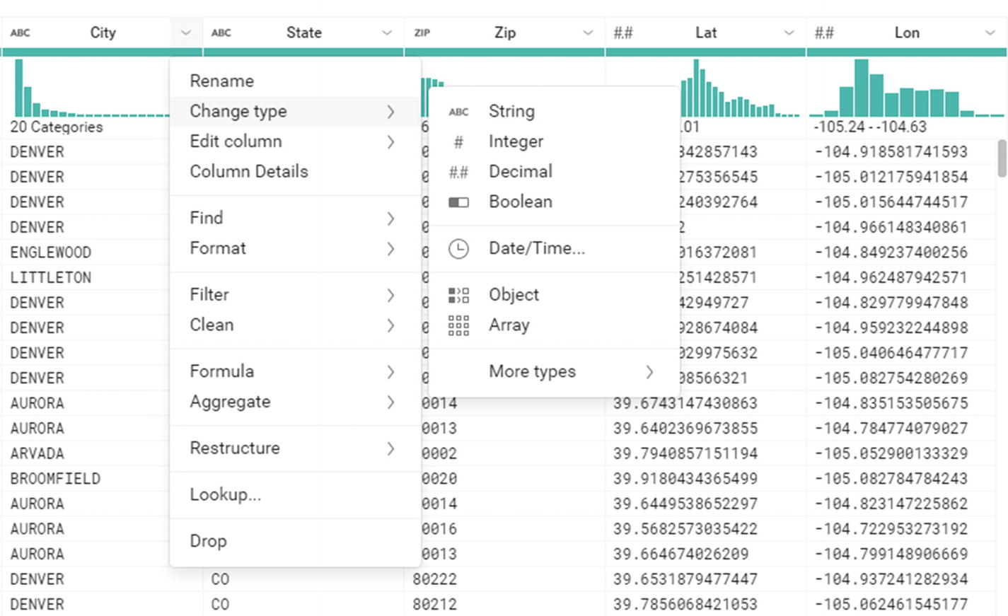
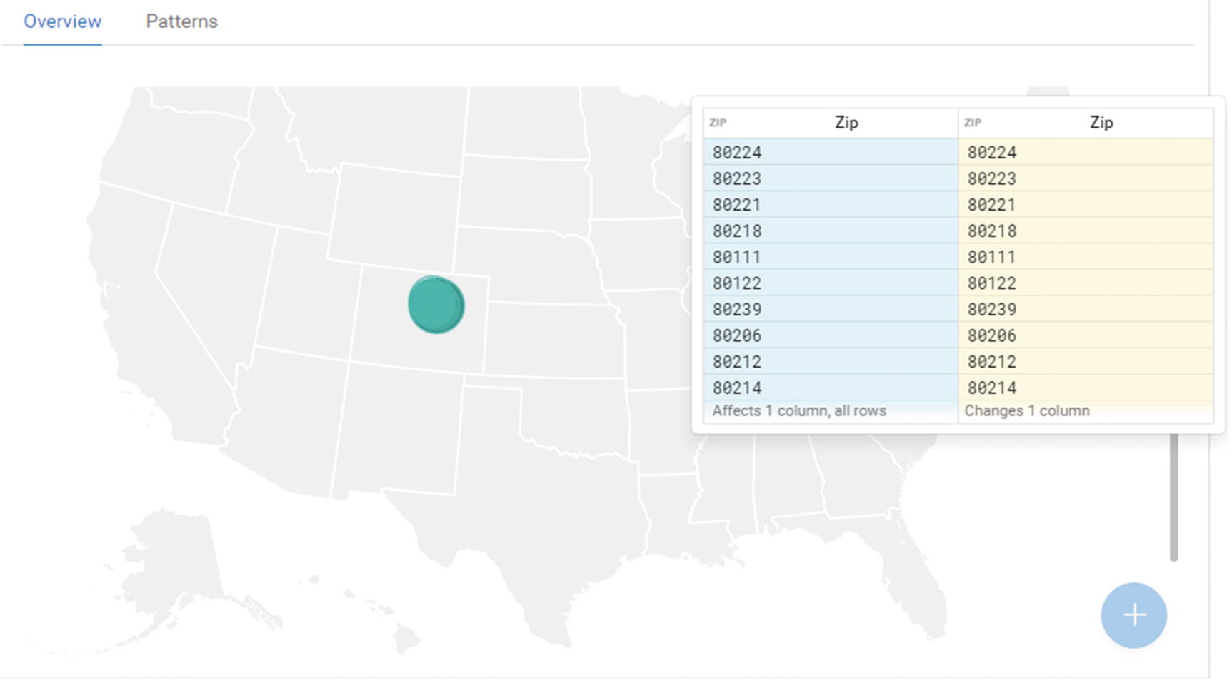
Additional transformation options
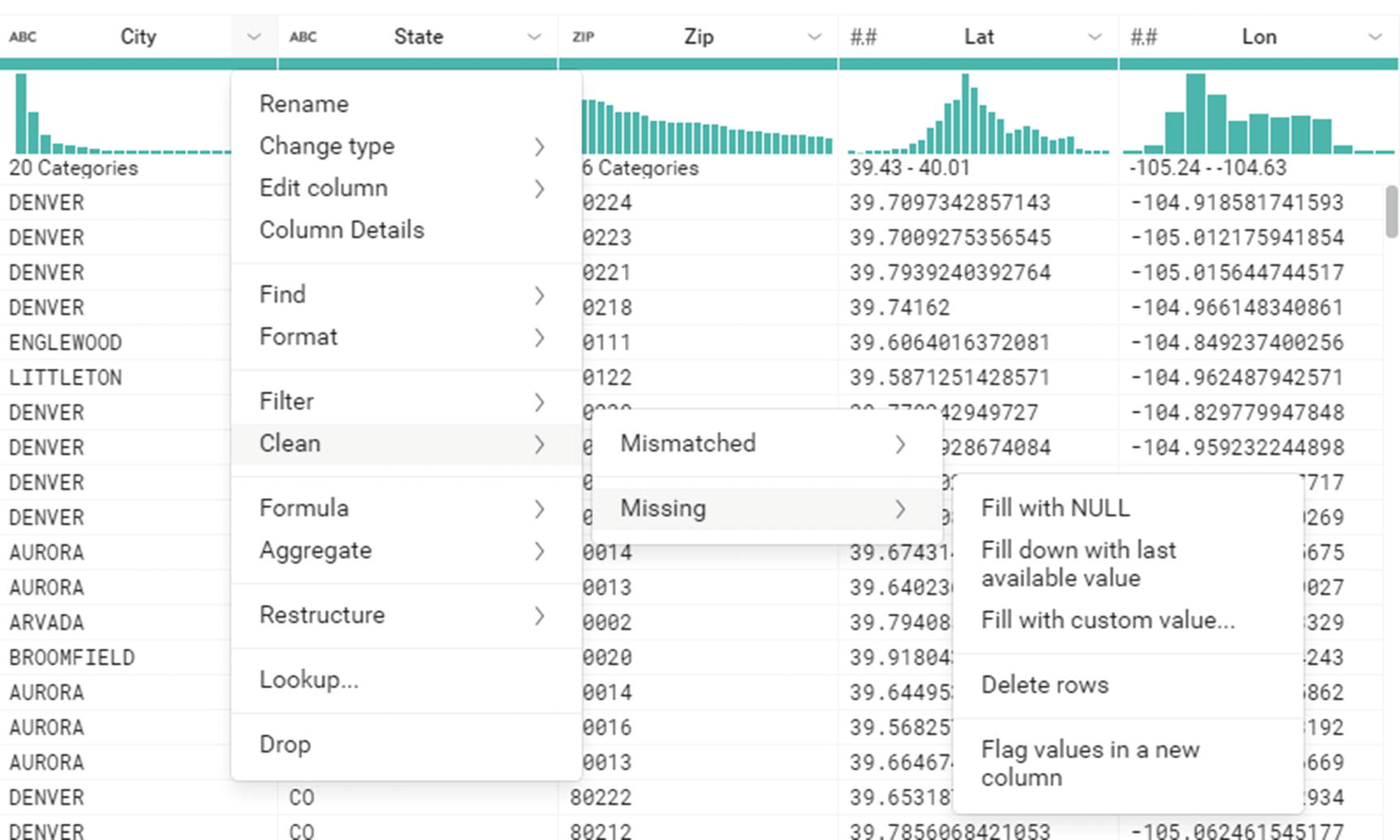
Additional transformation options
The final output from the Job Results window
The final output from the Job Results window
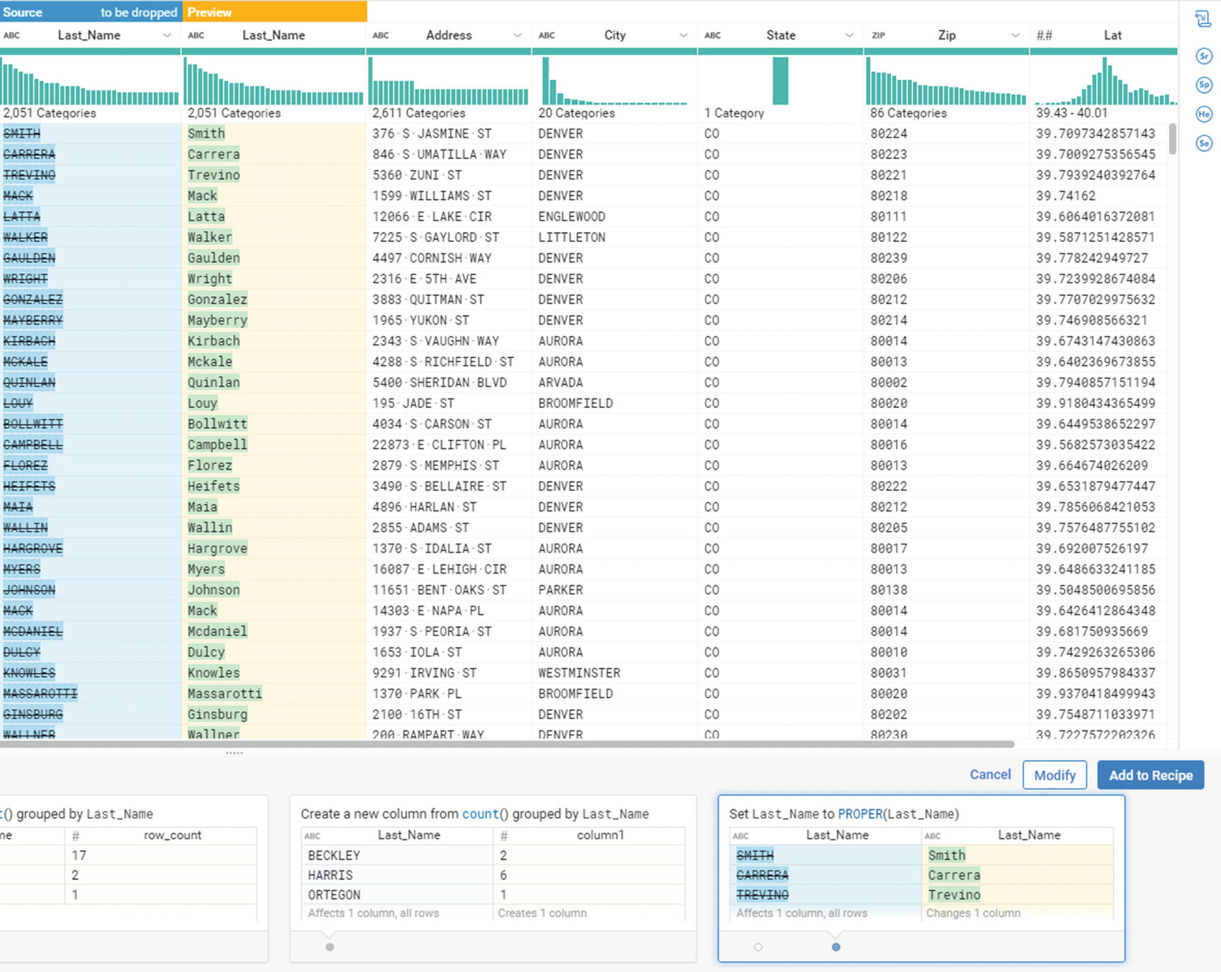
Apply the transformation
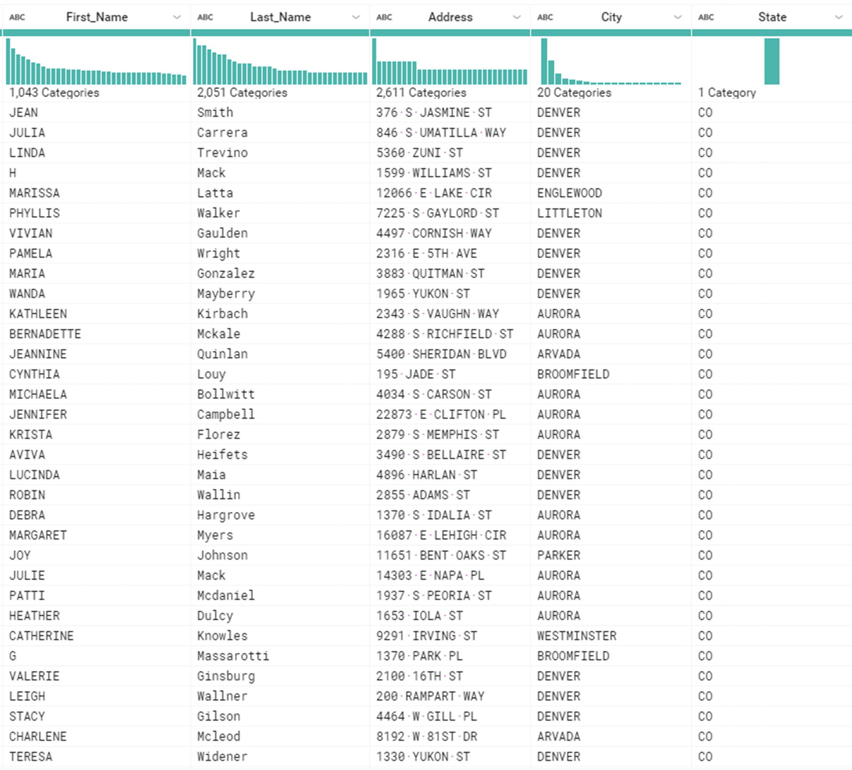
The transformation has been applied
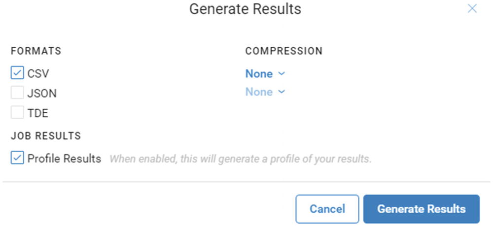
Generate Results
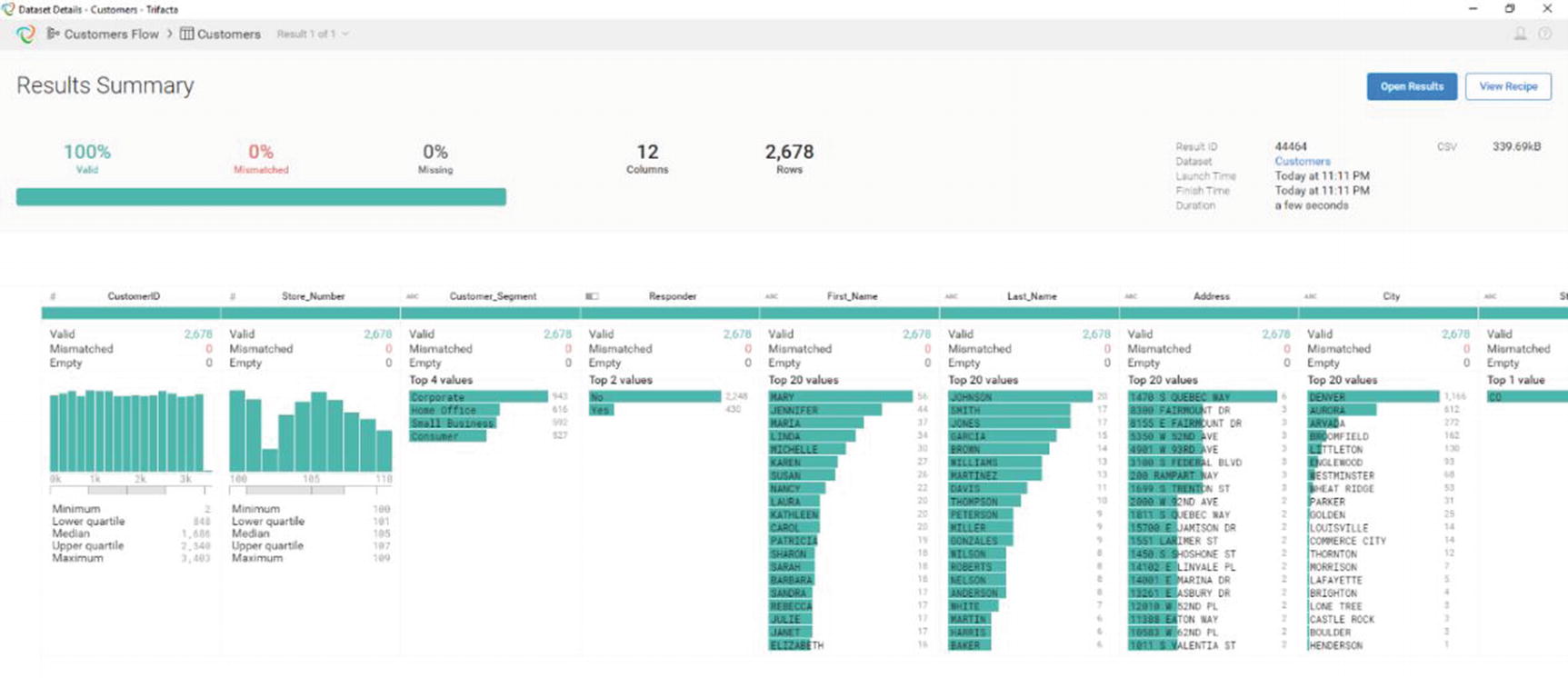
Result Summary
A “Result Summary” window will appear. It will include various statistics and information about your data. Review it to make sure the results are what you expect. Trifacta doesn’t have built-in data visualization. It depends on other tools such as Tableau, Qlik, Power BI, or even Microsoft Excel to provide visualization .
Alteryx
Alteryx is another popular software development company that develops data wrangling and analytics software. The company was founded in 2010 and is based in Irvine, California. It supports several data sources such as Oracle, SQL Server, Hive, and Impala xv for fast ad hoc query capability.
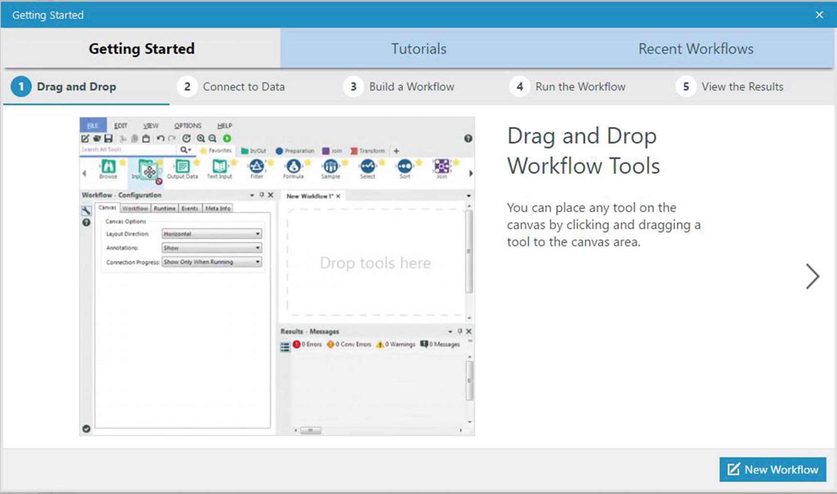
Getting started window
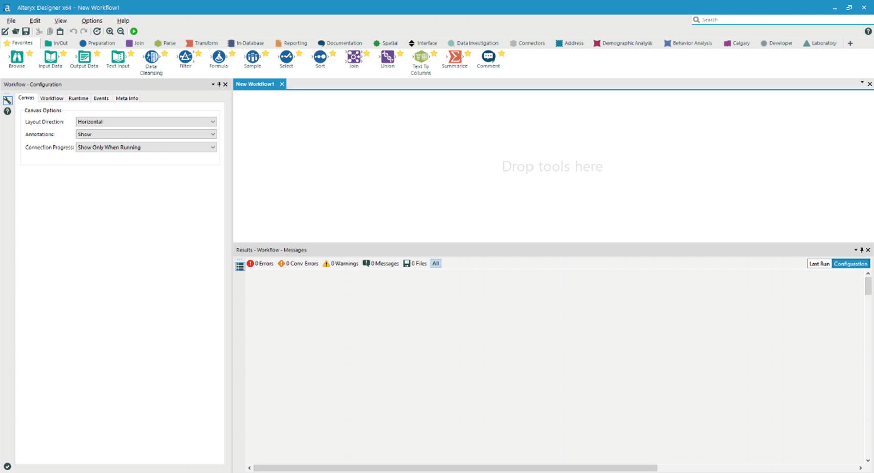
Alteryx main window
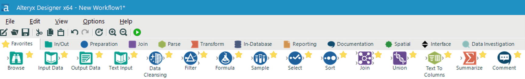
Tool Palette – Favorites
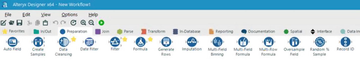
Tool Palette – Preparation
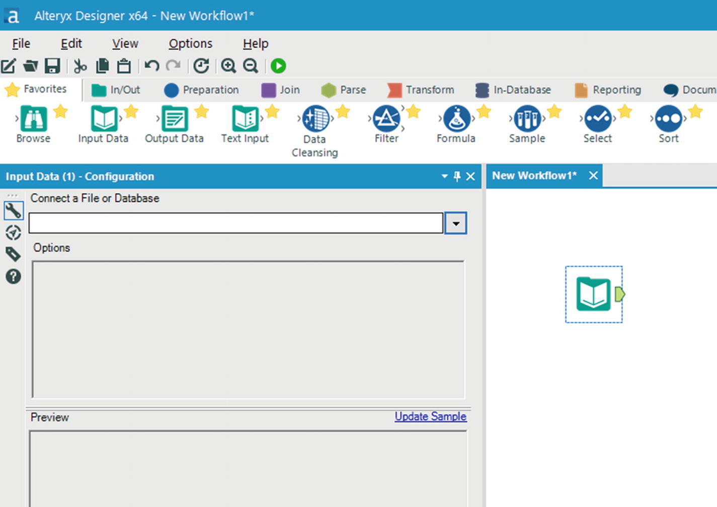
Input Data Tool
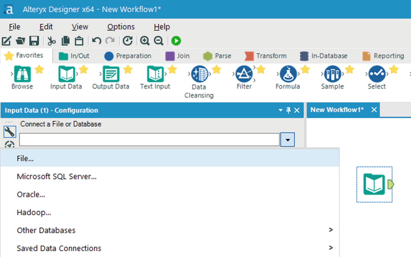
Select file
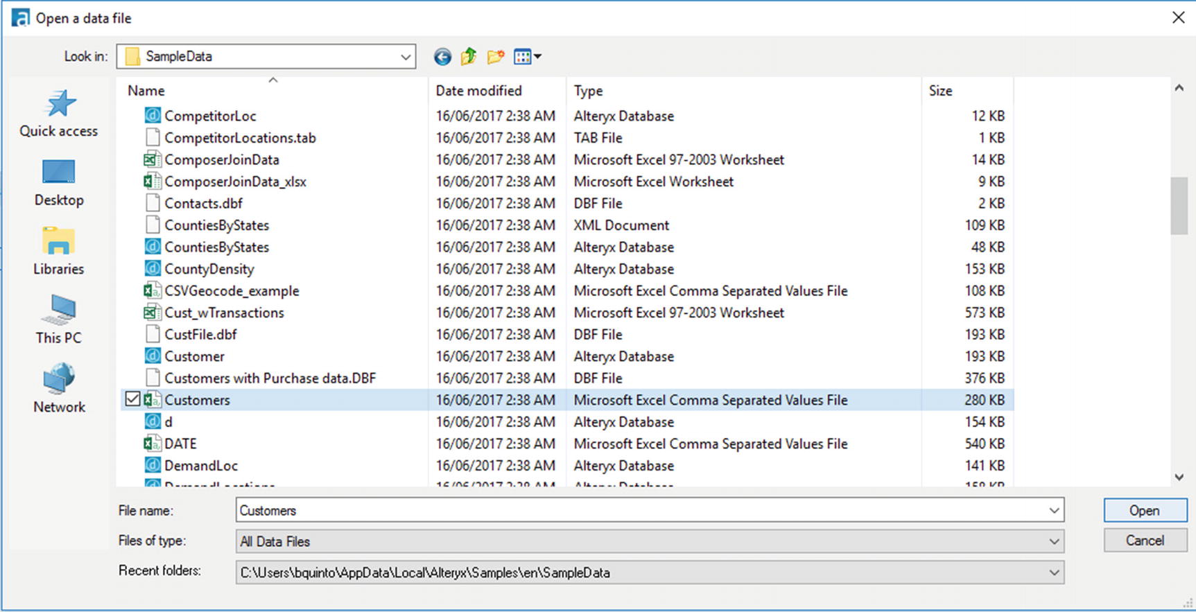
Select Customers.csv
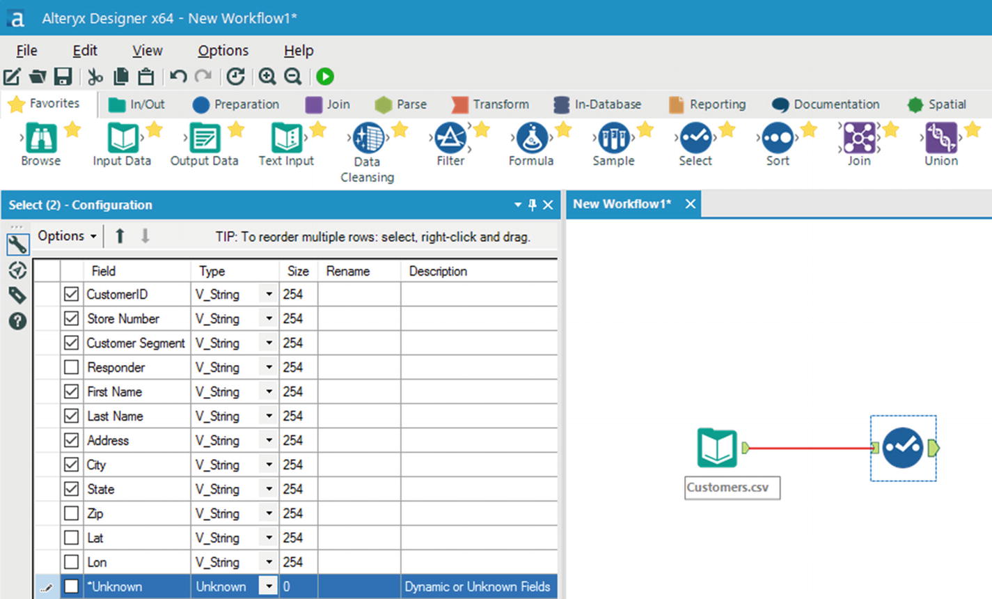
Select tool
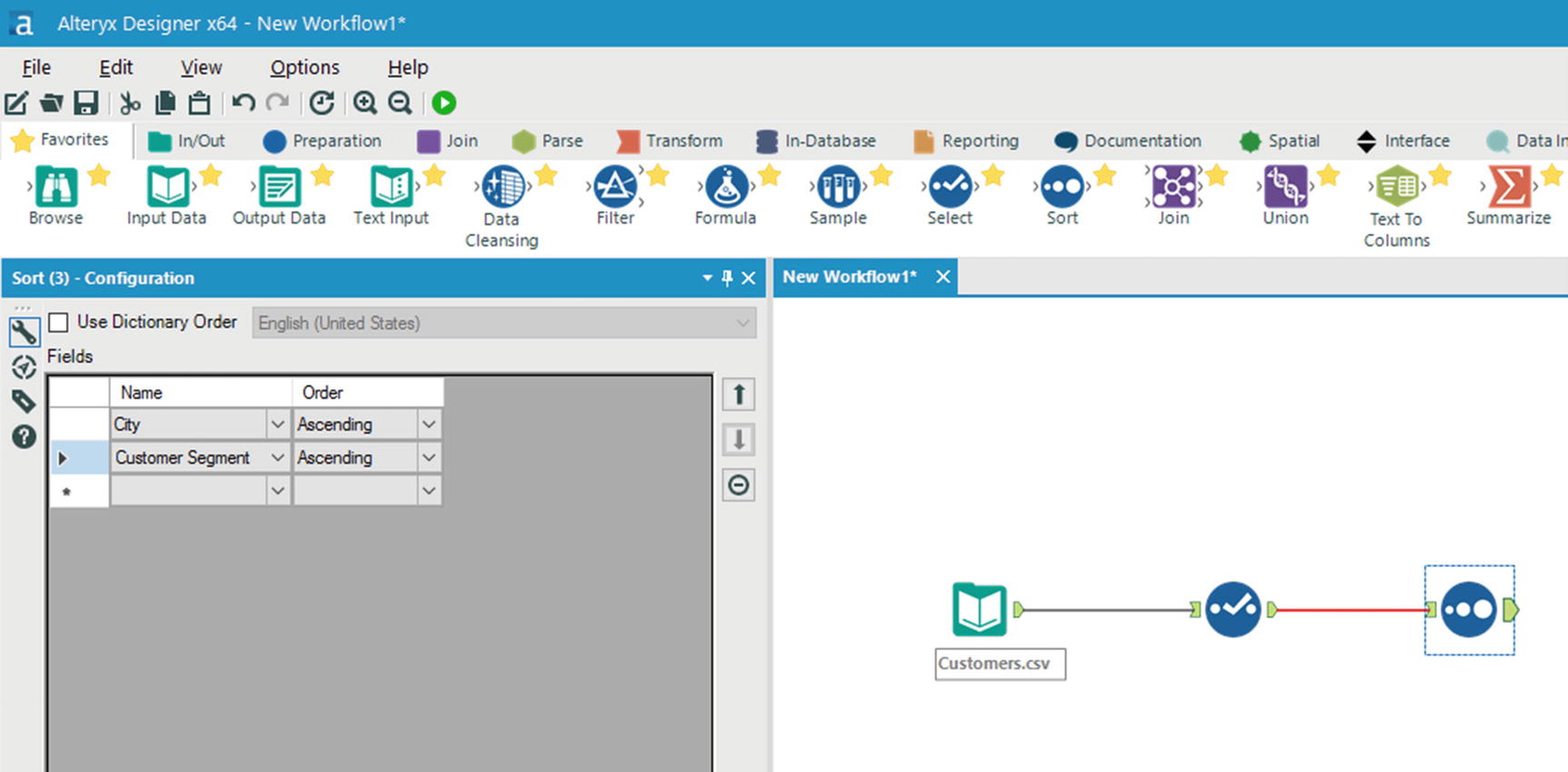
Sort Tool
We could go on by adding more tools and make the workflow as complex as we want, but we’ll stop here for this example. Almost every Alteryx workflow ends by browsing or saving the results of the workflow .
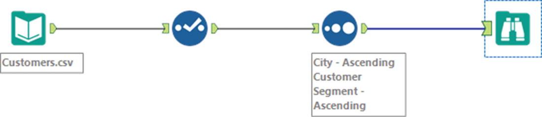
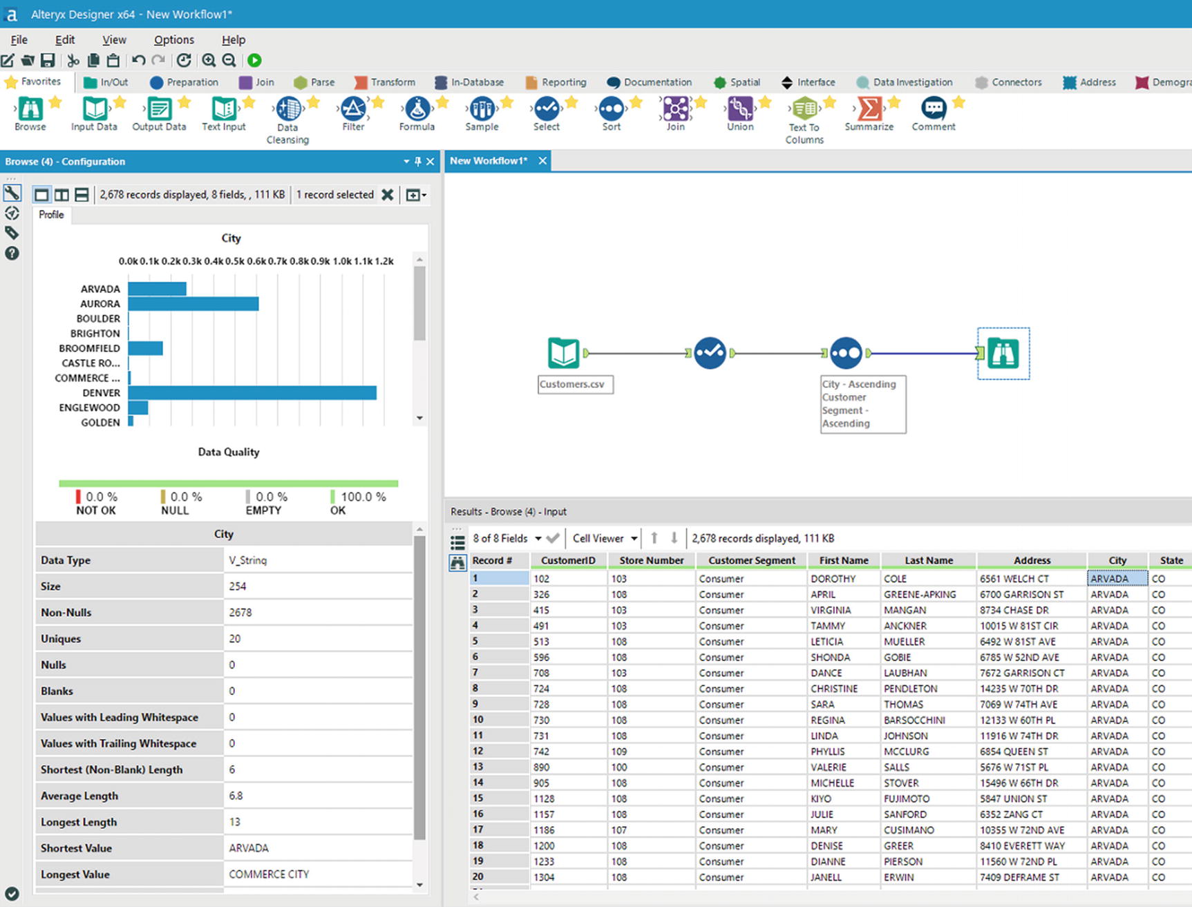
Browse data tool
Run the workflow by clicking the green run button located in the upper corner of the window, near the Help menu item. After a few seconds, the results of your workflow will be shown in the output window. Inspect the results and see if the correct columns were selected and the sort order is as you specified earlier.
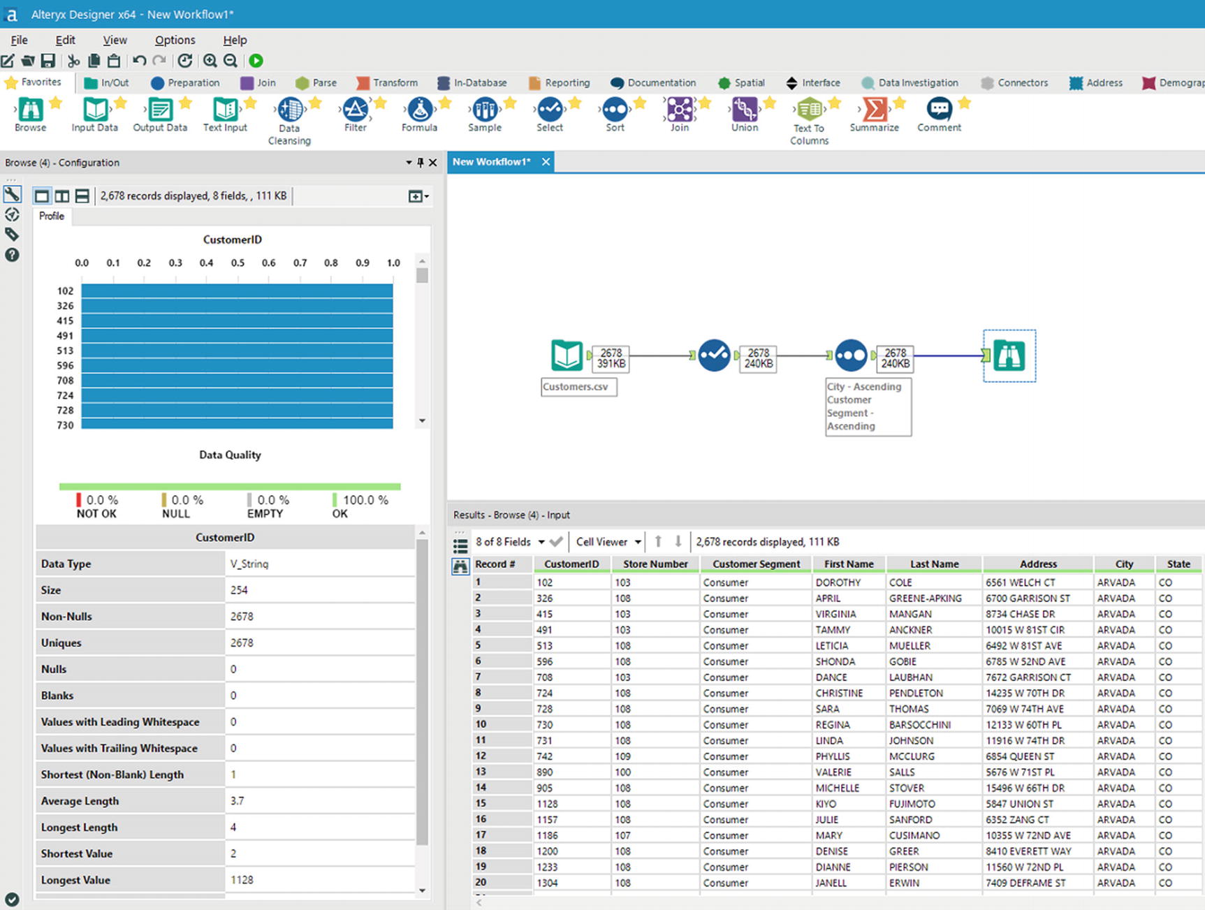
Browse data
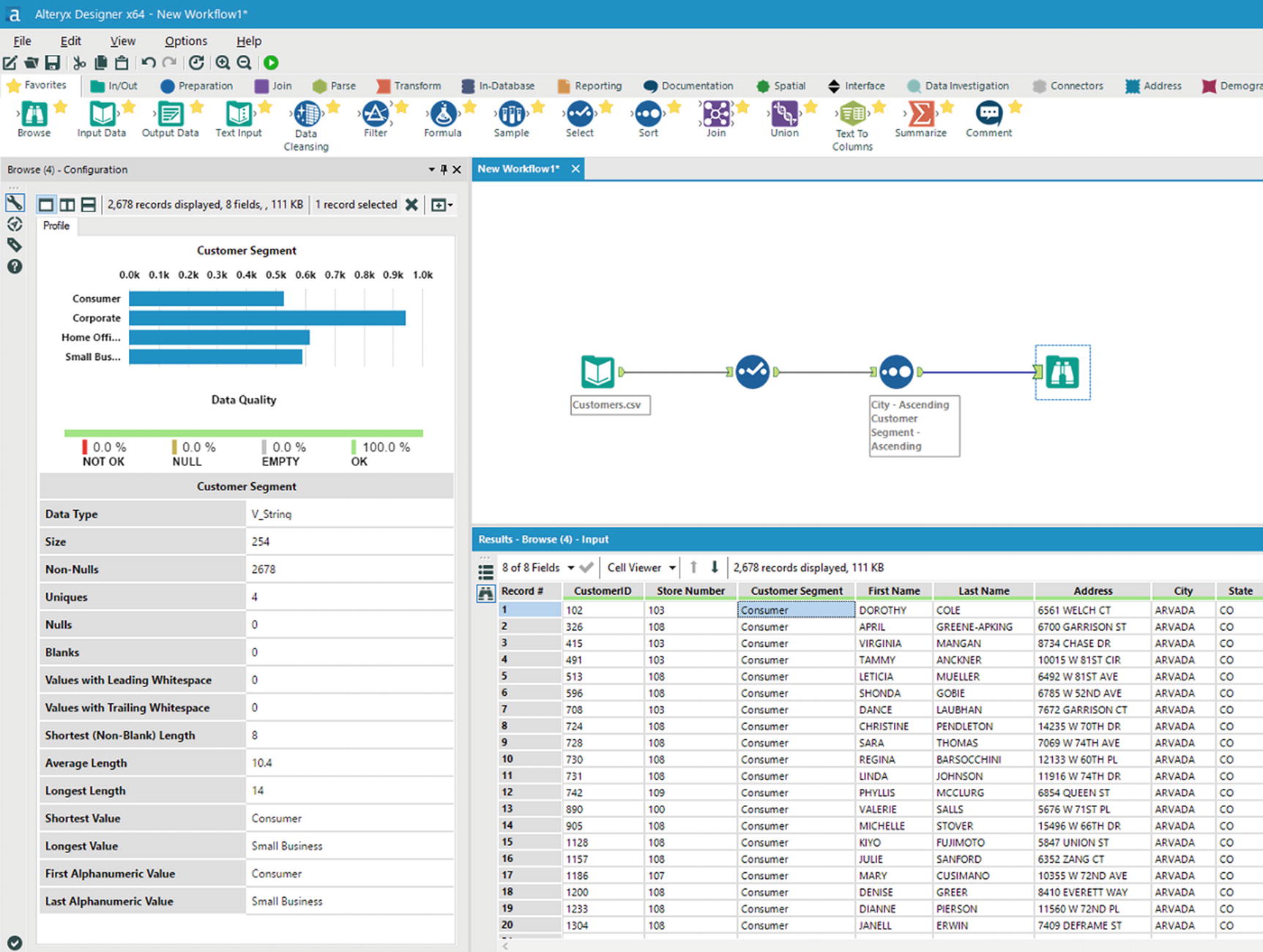
Data quality – Customer Segment field
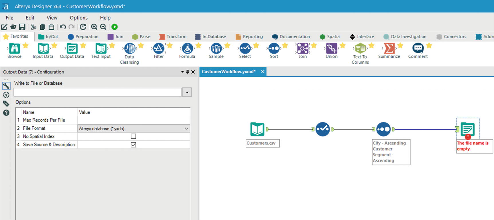
Output Data tool
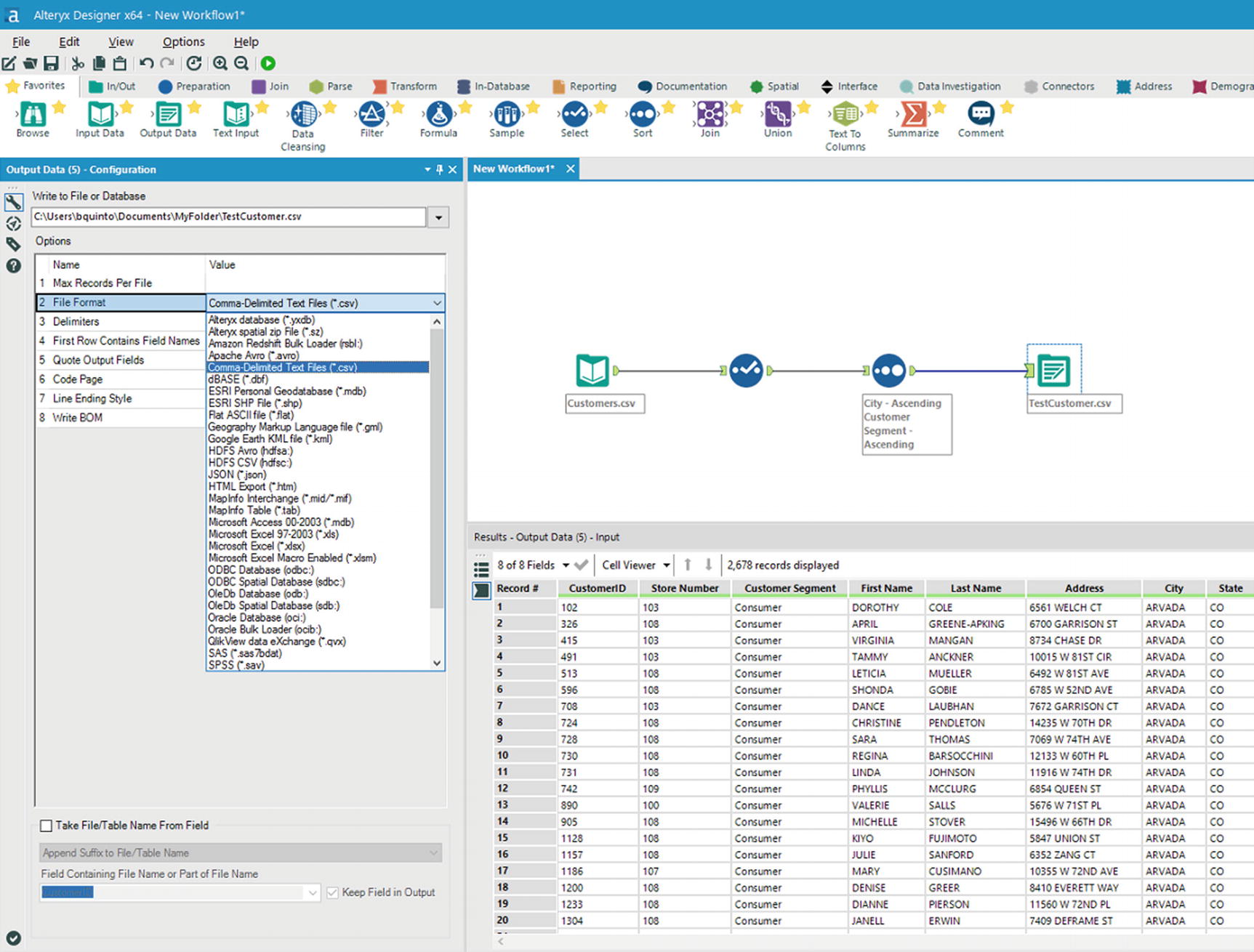
Select file format
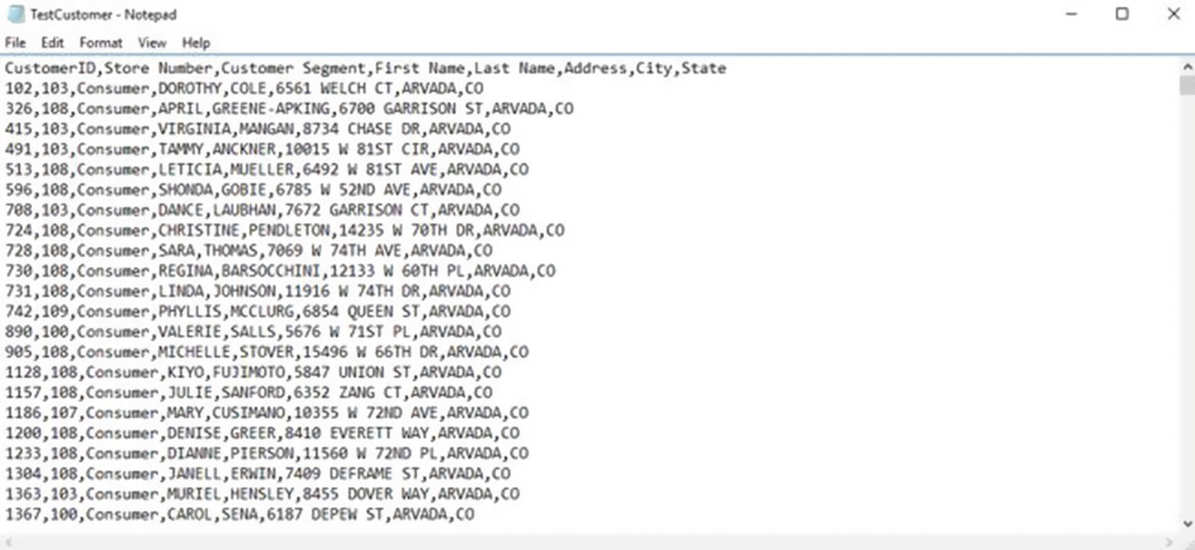
Validate saved data
Congratulations! You now have some basic understanding of and hands-on experience with Alteryx.
Datameer
Datameer is another popular data wrangling tool with built-in data visualization and machine learning capabilities. It has a spreadsheet-like interface and includes over 200 analytics functions. xvi Datameer is based in San Francisco, California, and was founded in 2009. Unlike Trifacta and Alteryx, Datameer has no connector for Impala, although it has connectors for Spark, HDFS, Hive, and HBase. xvii
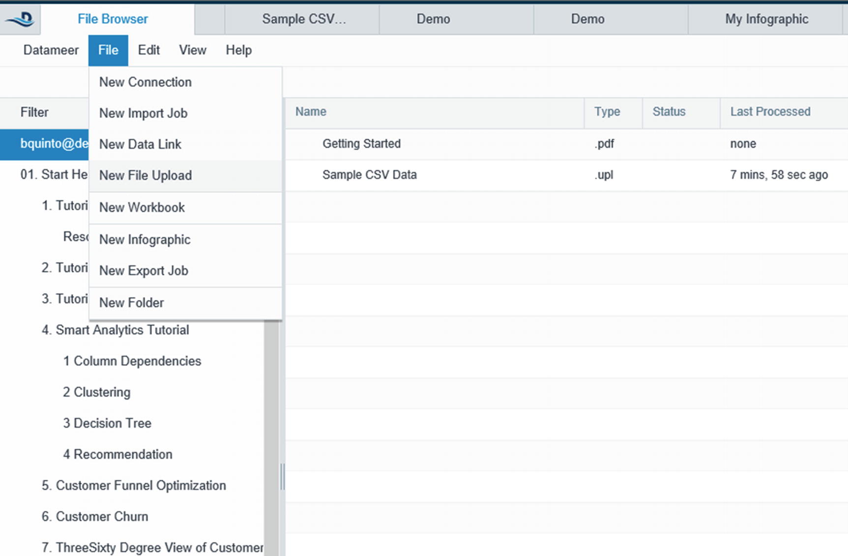
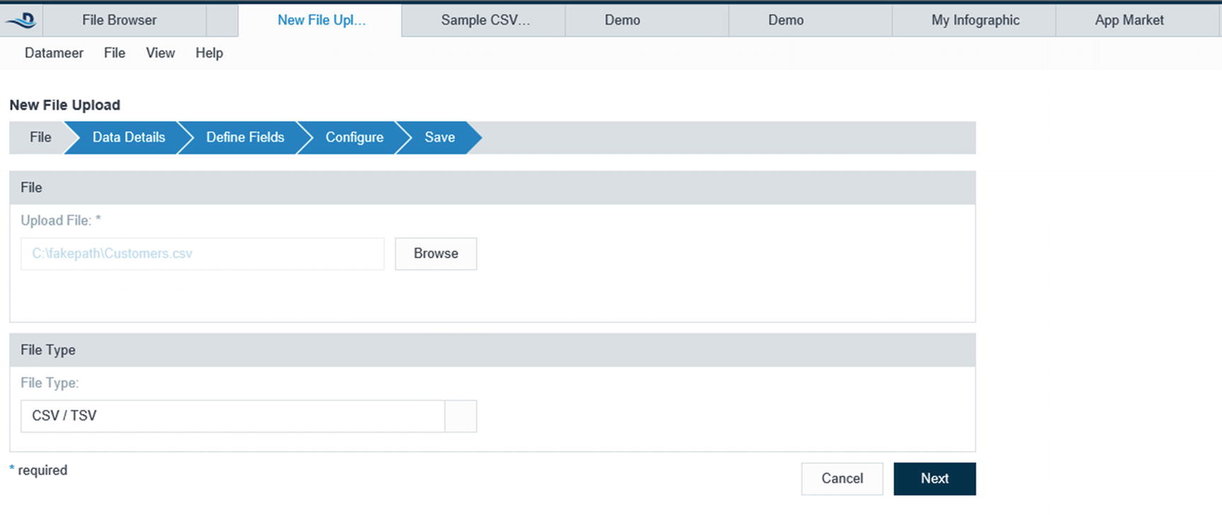
Upload data file
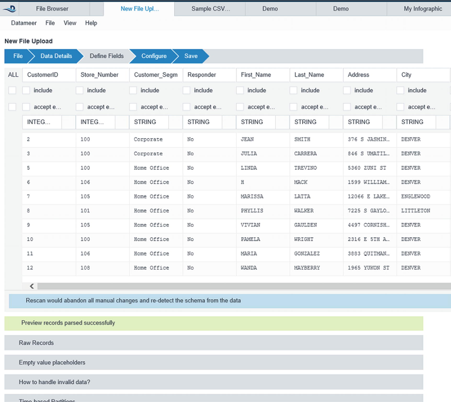
Configure the data fields
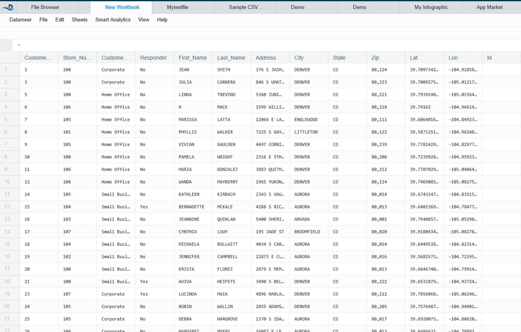
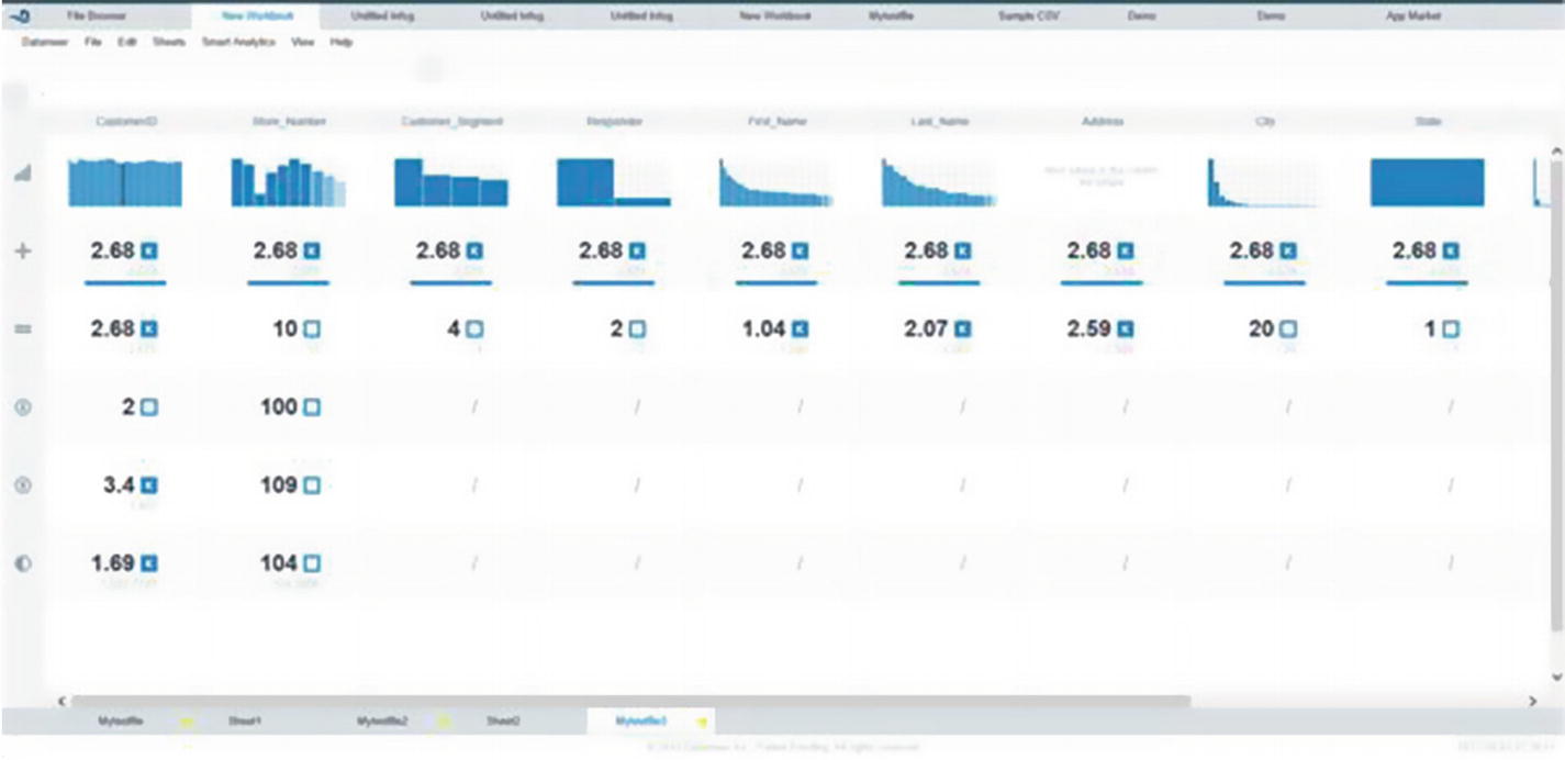
Spreadsheet-like user interface
Datameer Flipside for visual data profiling
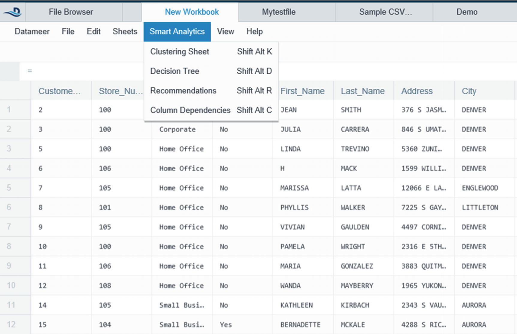
Smart Analytics
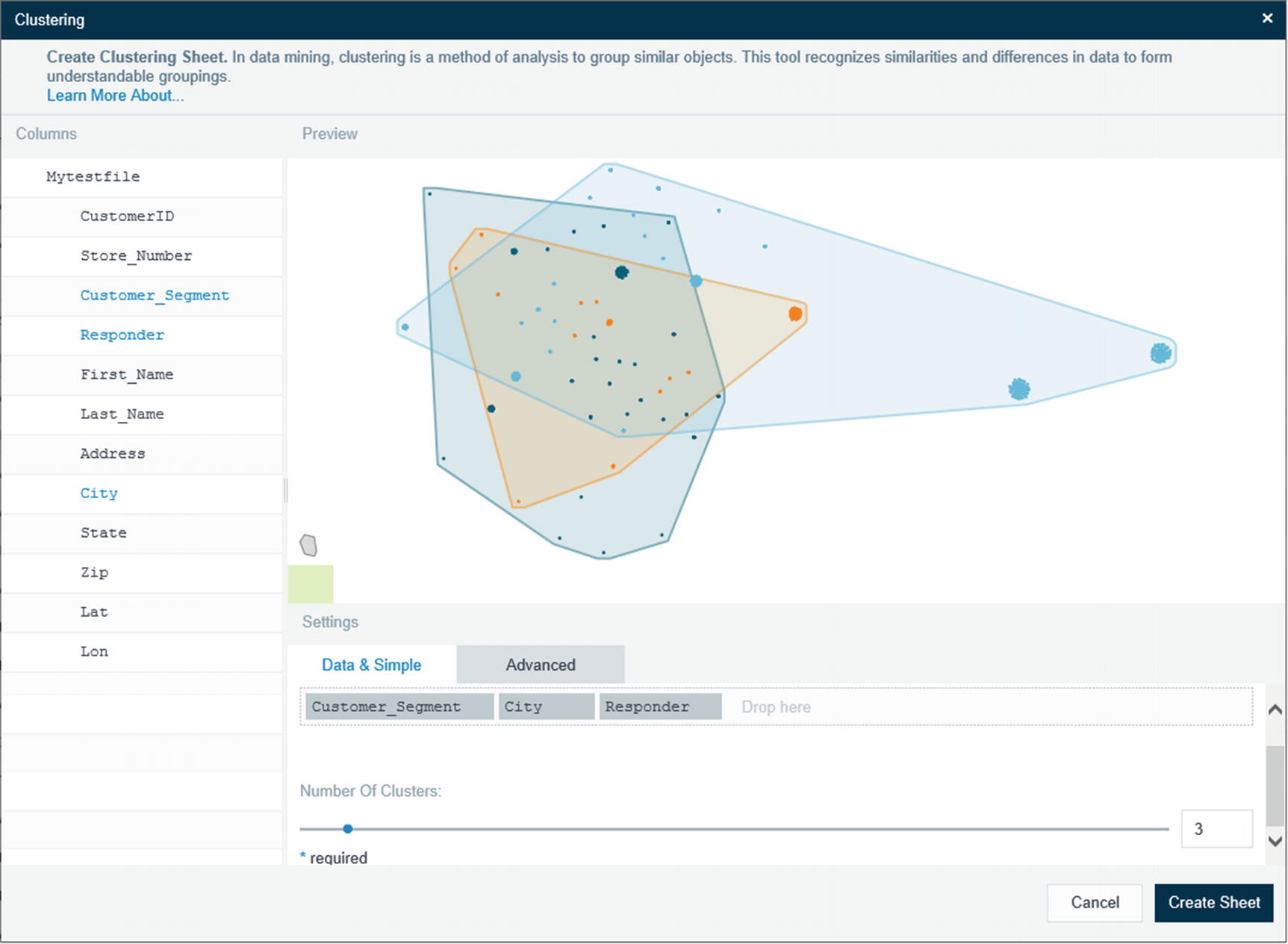
Clustering
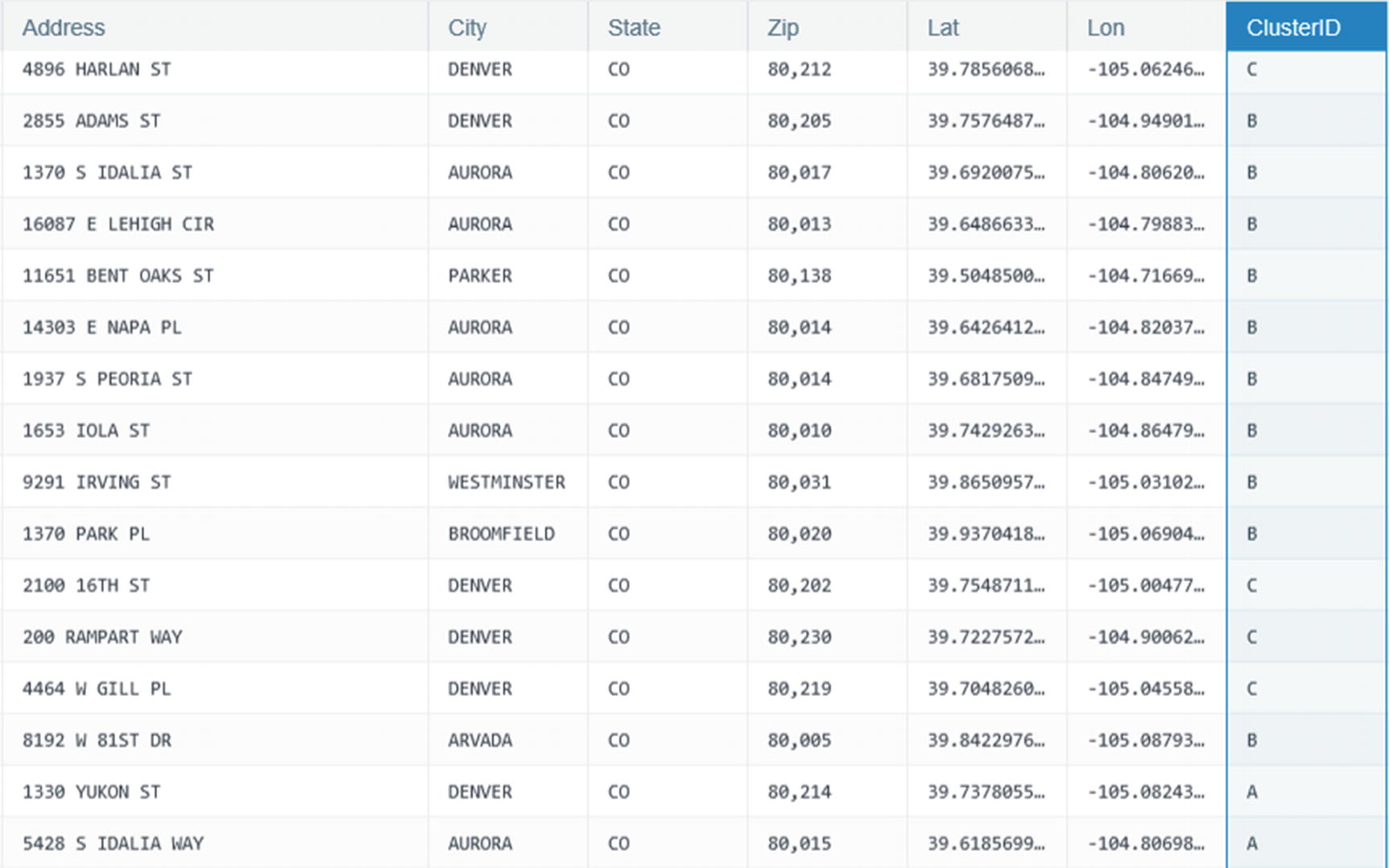
Column ID showing the different clusters
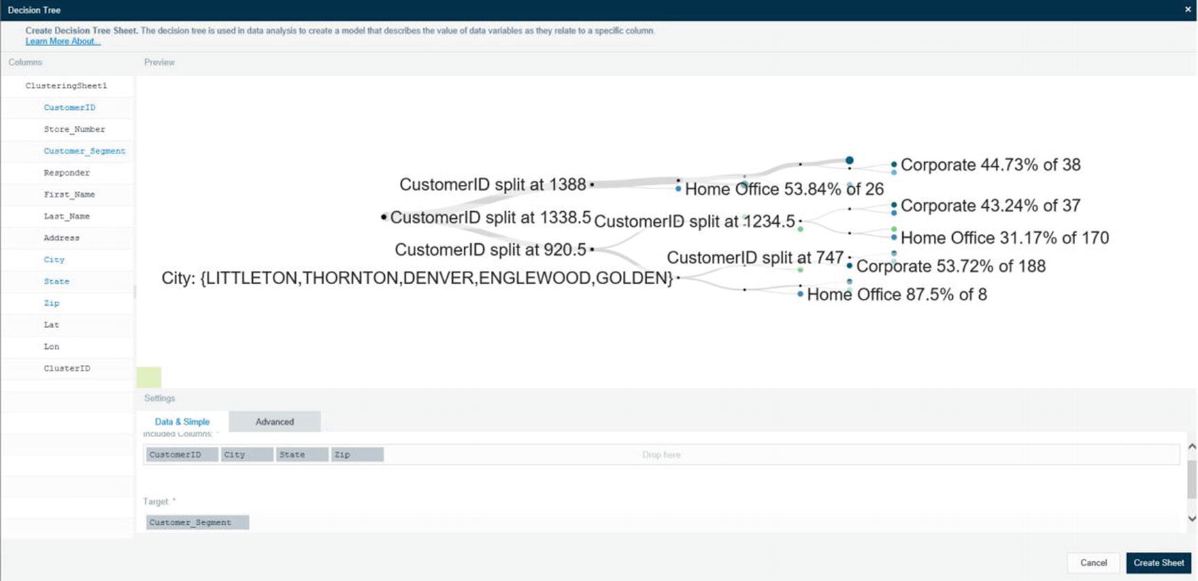
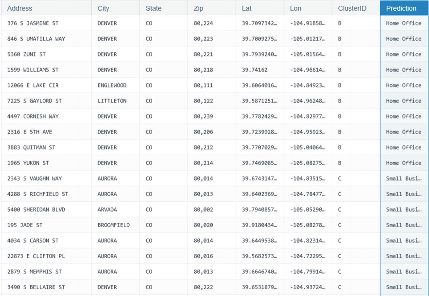
Prediction column
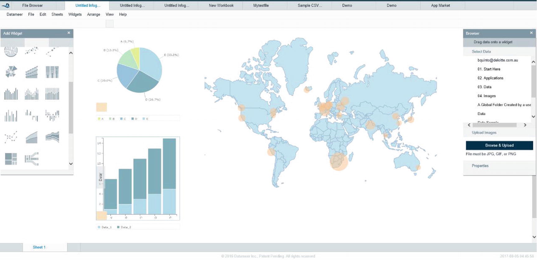
Datameer data visualization
Summary
Make sure your big data visualization tool can handle the three V’s of big data (volume, variety, and velocity). If you’re just in the process of selecting a tool for your organization, consider if the tool will be able to handle terabyte/petabyte-size data sets. Will your data source be purely relational or will you be analyzing semi-structured and unstructured data sets as well? Do you have requirements to ingest and process data in real time or near real time? Try leveraging your existing BI and data visualization tools and determine if they can fulfill your requirements. You may be connecting to a Hadoop cluster, but your data set may not be that large. This is a common situation nowadays, organizations using big data platforms as a cost-effective way to consolidate expensive reporting servers and data marts.
Data wrangling tools have become popular these past few years. Users have become savvier and more demanding. Who better to prepare the data than the people who understand it best? If your organization has power users who insist on preparing and transforming data themselves, then it might be worthwhile looking at some of the data wrangling tools I covered in the chapter.
References
- i.
Christine Vitron, James Holman; “Considerations for Adding SAS® Visual Analytics to an Existing SAS® Business Intelligence Deployment”, SAS, 2018, http://support.sas.com/resources/papers/proceedings14/SAS146-2014.pdf
- ii.
Zoomdata; “ABOUT ZOOMDATA”, Zoomdata, 2018, https://www.zoomdata.com/about-zoomdata/
- iii.
Zoomdata; “Real-Time & Streaming Analytics”, Zoomdata, 2018, https://www.zoomdata.com/product/real-time-streaming-analytics/
- iv.
Zoomdata; “Real-Time & Streaming Analytics”, Zoomdata, 2018, https://www.zoomdata.com/product/stream-processing-analytics/
- v.
- vi.
Zoomdata; “Real-Time & Streaming Analytics”, Zoomdata, 2018, https://www.zoomdata.com/product/stream-processing-analytics/
- vii.
Zoomdata; “Data Sharpening in Zoomdata”, Zoomdata, 2018, https://www.zoomdata.com/docs/2.5/data-sharpening-in-zoomdata.html
- viii.
Zoomdata; “Real-Time & Streaming Analytics”, Zoomdata, 2018, https://www.zoomdata.com/product/stream-processing-analytics/
- ix.
Coderwall; “How to get the correct Unix Timestamp from any Date in JavaScript”, Coderwall, 2018, https://coderwall.com/p/rbfl6g/how-to-get-the-correct-unix-timestamp-from-any-date-in-javascript
- x.
Gil Press; “Cleaning Big Data: Most Time-Consuming, Least Enjoyable Data Science Task, Survey Says”, Forbes, 2018, https://www.forbes.com/sites/gilpress/2016/03/23/data-preparation-most-time-consuming-least-enjoyable-data-science-task-survey-says/#3bfc5cdc6f63
- xi.
Tye Rattenbury; “Six Core Data Wrangling Activities”, Datanami, 2015, https://www.datanami.com/2015/09/14/six-core-data-wrangling-activities/
- xii.
Stanford; “Wrangler is an interactive tool for data cleaning and transformation.” Stanford, 2013, http://vis.stanford.edu/wrangler/
- xiii.
Trifacta; “Data Wrangling for Organizations”, Trifacta, 2018, https://www.trifacta.com/products/wrangler-enterprise/
- xiv.
Trifacta; “The Impala Hadoop Connection: From Cloudera Impala and Apache Hadoop and beyond”, 2018, https://www.trifacta.com/impala-hadoop/
- xv.
Alteryx; “Alteryx enables access to Cloudera in a number of ways.”, Alteryx, 2018, https://www.alteryx.com/partners/cloudera
- xvi.
Datameer; “Cloudera and Datameer”, Datameer, 2018, https://www.cloudera.com/partners/solutions/datameer.html
- xvii.
Datameer; “Connector”, Datameer, 2018, https://www.datameer.com/product/connectors/