As an interlude between our discussions on the design stack, I want to present what I’ve affectionately been referring to in my head as “the Post-it Chapter”—namely, because everything in here involves a heck of a lot of Post-its.
“Design documentation” is, conceptually, an extremely nuanced subject to address. The form our documentation takes will depend on what stage of design we find ourselves at, how “design-savvy” our clients or stakeholders are, what our relationships with our colleagues (especially those in research, product, and engineering) are like, and much, much more.
Some design documentation, like design specs and design briefs, are simply just words or lists, maybe with some links or references to external sources like research findings or wireframes. Other forms (often the best forms) of documentation are often photos of jumbled and chaotic whiteboard brainstorming sessions. At the tail end of our projects, design documentation usually takes the form of pattern libraries, either as stand-alone documents or as a living, breathing part of a design system.
Furthermore, and rather unintuitively, there’s a relatively stark, but often overlooked difference between documentation of your designs and documentation that assists with your design work. The first is used to sell and to communicate (as designers, we need to sell our work; it’s part of the job) your work, whether that’s a write-up of your thinking behind a certain feature or a complete Keynote presentation of your final prototype. The second is used as a means of informing your process (this is what this chapter covers). If you’re interested in how to sell your work or in any way worried about communicating your decisions, Mike Monteiro wrote Design Is a Job for you.
One could quite easily present a case for design itself to be considered a form of documentation. Design acts as an abstraction between a system and a human. It’s not much of a reach to consider that abstraction as just another form of documentation. While I find this rather reductionist (and I’m also not about to argue with my own straw man), I think there’s a level of truth behind the notion. Throughout our design process, we’re producing work that blurs the boundaries between idea, execution, and documentation. Take wireframes as an example. They’re a representation of an idea in a way that communicates our vision, without the extra layers of design required to call them an execution of sorts. We can quite easily turn wireframes into interactive prototypes, whether that’s through a digital tool like Figma or InVision or through good, old-fashioned, paper prototyping. However, no matter what we do with our wireframes, they’ll never be the finished thing. In this sense, they’re a means of progression from one level of granularity to another.
I see wireframes as documentation, and I think this is important to state—not to denigrate wireframes (or any early stage design work), but to elevate documentation.
In the world of tech, documentation is often seen as a chore—an afterthought that we believe our process mandates in the name of smoother collaboration or to convince our bosses that we know what we’re doing. When I write code, I loathe documentation. It usually means going through and writing tests, or adding comments, or endlessly updating a README file with every change I make. Equally, when I design, I loathe documentation. It usually means explaining what I see as “obvious” design decisions or looking around for a useful link that justifies my intuition to make a success message bounce using over-the-top spring physics. Because I’m a professional.
Yet, documentation doesn’t need to be a boring, box-checking exercise—especially as part of the design process. It’s my goal in this chapter to convince you, as I’ve convinced myself, that the documentation we proactively produce throughout our process can invariably improve our work and break down some of our more complex lines of enquiry down into digestible and actionable insights. Documentation bridges the gap between one phase of design and the other. Treating personas as a document of our research results lets us confidently go into storyboarding, or thumbnailing and wireframing, or whatever else our process might involve. Similarly, seeing wireframes as a means of documenting ideas or pattern libraries as means of documenting design principles and visual language should raise the profile of documentation in our process.
Documentation is a way of removing the mystery from our work—a means of distilling ideas down into digestible and ascribable forms. We won’t be producing reports or retroactively justifying our decisions. We’ll be creating a diverse landscape of reference that demystifies our process and gives definition to the fuzzy intangibles that we often struggle to work with. And we’ll be doing it by using lots of Post-its.
Thinking in Systems and Moments
One of the fuzziest concepts I feel I’ve presented in this book, that we’re yet to truly deep dive into, is the concept of ’system’ thinking and ’moment’ thinking. In chapter 7, I presented the arguments that digital environments should be the focus of our work, that design is both a communicator and a function of system state, and that we will often need to shift our thinking quickly between high-level system thinking, and lower-level, moment-to-moment thinking. I think the best way to discuss these concepts is to simply tell you how I document them, with some explainers along the way. Spoiler alert: it’s probably stuff you already do, without realizing it, because you’re smart and great.
System Thinking
Let’s limit the scope of our definition of “system” for a while. Until now, I’ve been purposefully vague with my use of the term because it can encompass any part of the product we’re making or the company we’re making it for. For now, let’s say that when we talk about our system, we’re simply talking about our digital product (forget about our infrastructure, support teams, sales process, and marketing material, even though it’s important to stress that they are constituent parts of a broader system, alongside our product). In this sense, our system is the sum of the constituent underlying workings of this product, the features we have to present, and the state that we have to design around.
Accessing the phone’s camera and photo feed
Taking a new photograph
Editing a photograph
Saving a copy
Uploading a the photograph to our server
Viewing other people’s photograph
Following and unfollowing people
“Liking” someone’s photograph
Seeing who “liked” yours
Our work, then, as designers, is to communicate this system in a way that allows people to achieve their goals. We take a potential system, we learn about the problem space in which it’s going to exist, and we turn it into something useable, perhaps even delightful. Simple, right?
Except, we’re dealing with humans, and our system exists as a series of 0s and 1s, as a complex flow of data from one point to another, and as a concoction of API calls and permission requests and package loss and compression algorithms. People don’t get systems. They might get one part of a system, but the rest may be lost on them. A professional editor might understand things like HSL and exposure sliders, but be completely lost if we expected them to “just get” our compression algorithm. Furthermore, what about someone who has no idea about compression or photography? How do they interact with something that simply presents all the features of a system with no abstraction?
The answer is, well, they don’t. This is why we have jobs. As designers, we translate and abstract away our system language and functionality into people language (or brain language, if you want to be super cool). Does someone who wants to share a few photos of their kids at the zoo want to directly manipulate a RAW file with complex sliders like HSL and calibration? Or do they just need a pleasant filter and a quick auto-enhance? But what of the professional who does want those options? How do we keep them both happy? Does anyone, professional or otherwise, care about our compression algorithm? No? Okay, so we don’t talk about it—we let it do its thing in the background.
This methodology puts design forward as a translation of sorts. Our system has a certain way of receiving input and getting things done, but that method is not intuitive or compatible with the mental models or cultural conventions that exist in the minds of people. “Send the text entered into this textbox to our server and attempt to store it in the comments database” becomes “Send.” “Access the phone’s camera but make sure it always inconveniently defaults to the front-facing camera so they see their own delightful thumb head” becomes a camera icon.
This translation of our system language into a human language (and we’re including iconography, implicit grouping, and visual design as “language”) is, for me, the core of our work as designers. We take our system, we learn about the people and processes that exist in our problem space, and we make sure they can achieve their goals with it.
Don Norman consistently uses the concepts of system image and conceptual model to discuss these realms. Norman’s way of abstracting this is to suggest that designers take their own understanding of the system (the designer’s conceptual model) and create a system image that another person then communicates with. With this approach, the success of the system image (the designed product) is dependent on the designer’s conceptual model being understood—that is, there are no gaps between the designer’s models and the audience’s. This is Norman’s attempt at conveying design as a conversation, and I think it’s a wonderful starting point for discussions around system thinking .
Documenting Systems
It should come as no surprise that in order to effectively translate our system, we need to understand it. We also, by proxy, need to understand the people who will be interacting with it and the environments in which they’re likely to do so. When we talk about documenting a system, I feel the best abstraction we have is the concept of the system’s state—another discussion point from Chapter 7. When it comes to understanding people and their environments, however, much more interactive and interesting forms of documentation arise.
We’ve already discussed user personas, which I believe are likely the most ubiquitous form of design documentation. (User personas, in essence, are a documentation of research results, an abstraction of our audience.). Turn back to Chapter 7 if you need a refresher on them. Aside from personas, empathy maps and mental models are incredibly useful tools for documenting the emotional, cultural, and environmental factors that permeate our design process.
State Diagrams
A state diagram is essentially a big list of the underlying variables that constitute our system. It’s essentially a parallel of what a developer would consider if they were creating a front-end store or a database schema.
(Okay, so hear me out. I know I promised that we were going to explore the fun side of documentation. And now here I am, talking about databases and variable lists. We’re getting the boring one out of the way first. I promise.)
As dull as state diagrams sound, they represent an integral insight into the underlying function of a system or product. In Chapter 7, we discussed design acting as a function of state, where the current state of our system determines what we display and how we display it. Understanding what makes a system tick is the first step in deciding how we translate it.
The granularity of our state documentation will depend massively on the phase of the design process we’re at and whether we’re working on an existing product or kicking off a new idea from scratch. If we decide to mock up a state diagram early on, we must be prepared for it to change dramatically as we remove and reconfigure our product. If we’re mocking one up later in the process, we’ll likely be tempted to work at a more granular level. Just remember that you don’t need to be writing pseudo-code here. You just need to explain in broad terms the data that underpins your work.
An early stage representation of state
This state diagram is likely a far cry from a complex database schema (if you would prefer to visualize state that way, go for it!), but it has all the hallmarks of a good conceptual model. Breaking a system down into its constituent parts and logic is the name of the game here, and this is why I’d suggest doing this kind of exercise with a developer whenever possible. While I’m loathe to play into the stereotype that developers aren’t creative (they literally create something out of nothing—it’s creativity) and that designers aren’t technical (we sometimes use ProMarkers for coloring—they’re technical), there is no escaping that part of a developer’s job description is this very approach: breaking stuff down into variables and logic.
If you’re part of a team that has access to developers, either as an in-house team or an agency, I’d love to assume your process involves getting developers involved with the problem definition early on. If not, chat to your product team and find out why. If you’re a freelancer and you’re not sure if the client has sorted development yet, ask them! And if you build your own designs, then awesome—you already have the ability to pick your ideas apart like this. Got a developer willing to help (or got yourself warmed up for a data-heavy exercise)? Then break out the Post-its and get to it.
First things first: define the scope of your documentation. You’re not always going to be doing this for the full representation of your system. If you’ve got a pretty complex system, it’ll make a lot more sense to focus on one or two main “chunks” of state first. You might even be working backward from a “moment” you’ve storyboarded out (more on that a little later) and creating a state for a specific linear flow.
If your system is going to be complex (if you’ve got more than a few chunks of state in your mind at this point, you can bet it is), focus on your key features first.
Say we were working on our animation application from Chapter 7. We might want to forget about account creation, onboarding, file imports, and integrations for now, and just focus on nailing our understanding of the animation creation and editing interactions. Perhaps we’ve got a quick wireframe of a potential animation edit panel together and a rough understanding of what information underpins that. It’s time to document it.
Booleans can be true or false. They answer yes/no questions like “Is this person logged in?” They represent the building blocks of your system logic. Most of your state diagrams will revolve around booleans.
Numbers are, well, numbers. They can be integers, doubles, floats, or all kinds of other types. But we don’t really care at this level—numbers will answer questions like “What value is the saturation slider currently at?”
Strings are text characters. The name of an animation will be a string, as will a customer’s e-mail address.
Objects are a data structure that is represented by keys and values. We could have a “customer” object that has a name, an e-mail, a list of hobbies, and their age, for example. They’re basically a means of saying, “All these different variables represent a specific thing.”
Lists are a collection of variables or objects. They’re usually called arrays. Lists are ways of grouping discrete bits of information together. Your shopping list could be represented as an array of strings, that looked something like this:
["apples", "mountain dew", "cream for weird foot thing", "doritos", "Mindful Design by Scott Riley", "bath bombs"].
It’s a way of keeping relevant information together.
Don’t worry too much about learning these items in detail. You’re not being tested on your knowledge of variables, and you are absolutely not creating a spec or a schema for a developer to follow. That’s not our job. Even if we code our own stuff, that comes later. Just work these general ideas into your vocabulary and don’t be worried about using a reference or asking for feedback or help while you put your diagrams together.
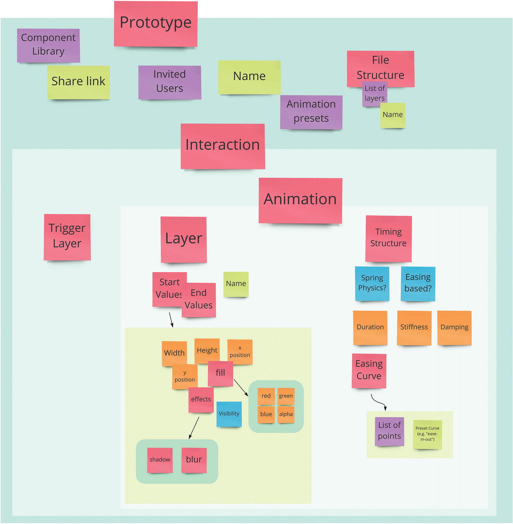
The broad data that our animation tool might need when creating an animation
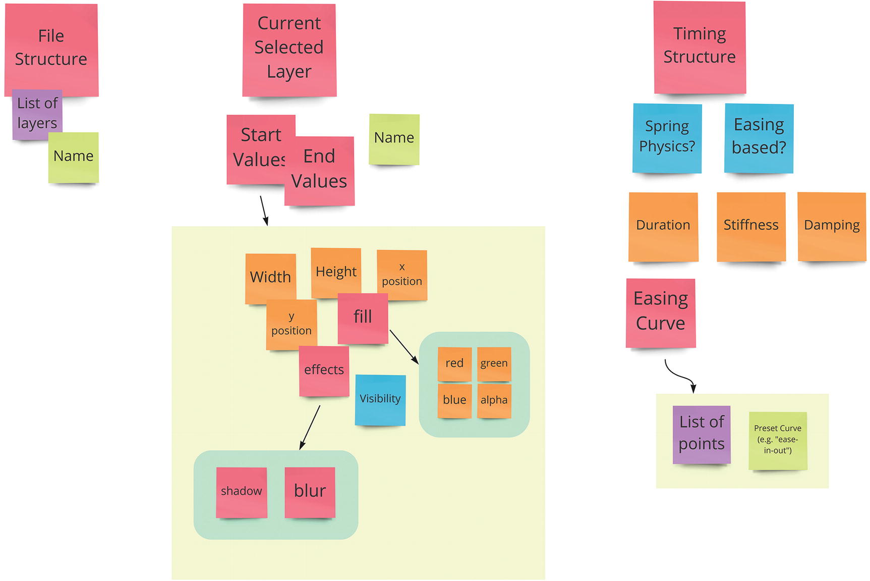
A more-detailed state diagram
If you’re eagle-eyed, you’ve probably noticed that I’ve used different-colored Post-its. This is serious design work now. These represent different variable types; pink is an object, purple a list, green a string, orange a number, and blue a boolean. If you’re reading this on an e-reader with a black-and-white display, you can access these diagrams at any time in this chapter’s folder in the Resources repository on a color device. If you’re color-blind or work with people who are, try to avoid using problematic colors or consider getting sticky notes of differing shapes.
As well as codifying the variable type, there’s a level of hierarchy. Our “fill” variable, for example, is made up of four numbers (red, green, blue, and alpha).
I must stress, it’s okay to be messy here, and it’s totally fine to be a little wrong. Think of this almost as a mind map for a non-sentient thing.
This is a state diagram I would be happy to work with, and here’s why: it lets me know the kind of data I need to design for and how it will likely need to be grouped. If I know that a layer’s start width, for example, is a number, then I’m already able to run some sort of mental filter on it. Experience tells me that numbers are often controlled by sliders, but also by number inputs with increment and decrement controls. Observation research showed that people expect to be able to type directly into an input or to change a number input in multiples of 10 by holding down shift and pressing an arrow key. Seeing state mapped out in this way lets us apply the lenses of mental models and convention to how we might want to display and manipulate this data.
This leads us to the real utility of state diagrams. They expose us quickly to the types of interactions and display patterns we might need to account for. As we discussed in Part 1 of this book, convention plays a huge part in design. State diagrams let us know not only the type of data we’ll be exposing, but also the context we’ll be exposing it in. “Someone is editing a number field” is useful in that it gives us the type of data, but the notion of “someone is editing a number field that represents the red value in an RGBA color format” gives us the context and relationship that we really need.
A state diagram gives us a handy reference point for the type of data we’ll be working with and it goes hand-in-hand with the next piece of documentation: mental models.
Mental Models
Mental models have been a recurring theme throughout this book and with valid reason. They’re the lens through which a person will perceive our work. Mental models tell us what someone believes about a system, not necessarily the system’s “real” workings. Mental models distort reality. They’re rife with heuristics and prediction errors, loaded with biases, and subject to random shifts in logic and structure at any given moment. Just like the human minds of which they are products.
The search for a conceptual model that accounts for all the idiosyncrasies and shifting emotional frames of reference of every mental model we encounter is the alluring folly of design. Just as it’s impossible to create a logo that is universally appealing to everyone who encounters it, so too is it impossible to produce an interface that perfectly resonates with the brainwaves of every human that interacts with it. So, just like the mind, we deal in statistical averages. Prototypical mental models that give us insight into the expectations and motivations of the people who form them are similar to user personas. They’re a usable abstraction of “real” mental models. So, we create an abstraction of the common mental models we see when we investigate our problem space. Mental model models. Which is definitely not confusing.
Abstracting Mental Models
Mental models should tell us two broad things; first, what people expect to be able to do with the kind of product we’re making, and second, what conventions and habits exist that frame these expectations. We can then use these models to decide which patterns and conventions are compatible with our system and which we might want to deviate from.
As we work with mental models, we’ll invariably encounter a point where we need to assess the scope of our work. A person’s mental model of a given scenario is affected in unpredictable and infinitesimal ways by a never-ending list of external and internal forces. Documenting such a thing is frankly impossible. So we abstract up a little. For our practical reasons, a mental model becomes, essentially, a list of heuristics, hypotheses, and expectations that someone brings into any session with our products.
There are currently a number of common practices for documenting mental models. Indi Young’s 2008 book, Mental Models: Aligning Design Strategy with Human Behavior, is a great starting point that discusses how mental models have historically permeated through business and design decisions. However, I’m going to go out on a limb and say that I think the vast majority of current implementations just aren’t compatible with the approach to design I’m proposing in this book. Traditional mental models are commonly broken down into “steps” and—I think you know where I’m going with this—generally only accompany a linear path through decision-making.
With our focus on systemic thinking and eschewing the idea of linear-by-default, I think it’s much better to approach mental models in a more holistic way. The mental models we produce should be a somewhat thorough representation of what people bring to our interface. This includes their preconceived notions of what they think a product might help them achieve, their past experiences with products in similar problem spaces, their real-world environments, and their potential motivations. A good mental model (and we’ll want to create several for each project—one for each persona) will work alongside personas and empathy maps to help inform how and why we translate our system the way we do. If design is a conversation, mental models tell us the metaphors we can use, the frames of reference for our discussions, and the cultural conventions that we need to be aware of, lest we offend, confuse, or misrepresent.
To draw up a mental model, we need solid research results. Again, observation research and ethnographic interviews are key in this regard. If we’re able to watch and potentially interview people in their usual working environments, we’re able to form well-rounded mental models that cover these bases.
Expectations and beliefs
Approaches and habits
Conventions
These three categories, similar to the 2x2 grid for taking notes from Chapter 7, will provide invaluable insight into every part of the design process. Expectations and beliefs tell us any pre-existing ideas that people have about the tools and processes in our problem space. Approaches and habits let us know how people currently get stuff done, any rituals or idiosyncrasies they might perform, and the ingrained processes they might follow. Conventions tell us what the various tools in our problem space have in common.
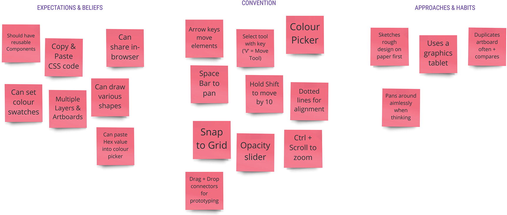
An example mental model
This data will likely come from different sources. It’s difficult to understand what people’s expectations of your product are if you’re asking them off the back of a competitor research session, for example. Given this, it’s quite likely that you’ll be filling in these mental models throughout the early stages of design.
Approaches, habits, and hacks can all be documented early. Again,, observation research and interviews are your go-to here.. Ensuring you collect this data in as “real” an environment as possible is key.
Conventions are often the result of competitor analysis, and research and can be performed at any time. Simply get hold of as many products in the same problem space as yours and jot down their similarities. Watching others use these tools can often be extremely eye-opening, so make sure you’re not just limiting your research to your own use of the products.
Finally, expectations and beliefs will often get filled in later in our process. It’s hard to decipher someone’s expectations for a product that doesn’t exist, and their beliefs are something that we’ll have to delicately tease out when we conduct more in-depth interviews. This will be useful once you start testing prototypes. Many usability issues arise from expectations not being met, so any time you see someone struggling with a specific part of an interface, try to find the underlying conflict between expectation and reality. Is someone trying to press a disabled button? Trying to click-and-drag to draw with a “pen” tool? Hitting a submit button multiple times because they’re not given any feedback? Explore how these might be manifestations of mental model gaps—even the obvious fixes (for example, our disabled state doesn’t look “disabled enough”) will be rooted in some form of convention or expectation.
Mental models give us a contextual reference point for how we might communicate our system’s state and possibilities. If design, in part, acts as a translation of system language into a form of visual (or otherwise representative) language, our mental models let us know how best to pick our “words.” In our case, our state diagram from earlier had a “fill” variable that was an object that consisted of “red,” “green,” “blue,” and “alpha” number variables. Our mental model shows us that a color picker is a convention found across every other design tool we tested. Our competitor testing shows that people used this kind of tool often. With all of that information in hand, we’d very likely want to explore the idea of having a color picker to allow for the changing of these variables.
While this may seem a rather obvious conclusion to draw, it serves as an example of the kind of thinking that reconciling the expectations and conventions of our mental models against the cold data of state diagrams.
The Ubiquity of Mental Models
It’s worth pointing out that while we’re actively concerned with the mental models people may form of our products, people form mental models for pretty much everything in their lives. They have mental models for how they get dressed, for checking social media, for how their TV works, for playing the guitar, for crossing a busy road, and for riding a bike. Mental models are abstractions and heuristics that inform what we believe about a product or system.
In Part 1, I gave the example of an operating system using folders and files as a metaphor for a system storage. This is a long-standing mental model, to the point where a folder icon is almost as ingrained in our cultural conventions as “red means stop.” This abstraction frees people of the weight of understanding a technology or an idea. By presenting people with a nested folder structure as opposed to burdening them with somehow understanding of the storage idiosyncrasies of computers or servers, we’re able to abstract away the complexities of a system.
It’s important, then, to understand some of the common mental models people have, even those that you wouldn’t necessarily see as immediately useful for your specific project. For example, let’s say that we wanted to let designers save their animations for later use. By understanding the mental model of folders, as an abstraction of showing a potentially nested and navigable item structure, we’re able to discuss or validate it as a potential solution for displaying stored animations.
Once you understand that mental models exist, you’ll notice them everywhere. Any time you see a complex system abstracted out into metaphor or simplified through removal, you’re witnessing a mental model in action. If you’ve ever presented someone with a prototype and watched on as they’ve ham-fistedly tried to tap on 14 things they think are interactive, but are just dummy content or, frankly, poorly designed static elements, then you’ve witnessed a disparity in mental models.
Ever see a toddler raised on tablets and smartphones try to tap and swipe a physical book? That’s a clash of mental models. The product does not match the model that our high-tech infant has brought to the experience. To those of us who were raised on good old-fashioned real paper books that smelled yellow and had genitals drawn in the margins, we might see this interaction as a harbinger of doom, of technology’s tightening grasp on the minds of our young. This is, however, a simple prediction error of sorts. Very quickly, our toddler friend might start thumbing through the pages, responding to the images, and making their own stories and inferences from the pictures found within. The realization that the book did not respond to gestural input (I swipe my iPad, why can’t I swipe this?) is usually a pretty quick one. Often, there’s an adult there to show them how books work. Suddenly, a new model of how a physical book works starts to form.
What I want to stress, is that, just like how our brains shape our realities—how we’re able to see the river, the bridge and the birds in the nonfinito style of Monet’s Impression, Soleil Levant—so do our mental models shape the reality of a system. If we think we can do something a certain way or if we expect that a certain element will respond in a certain way to a certain interaction, then until we discover otherwise, that is the reality of a system to us. When our mental models clash with a designer’s conceptual model, we’re experiencing something new. Whether this newness is novel, confusing, disappointing, or just an outright inconvenience depends on the gap between our models and, fundamentally, the efficacy of the new interaction.
Gestural interactions and touch devices were quickly adopted once people started realizing the benefits that gestural interaction had over analogue input devices. While these devices challenged mental models and many people were left confused, they survived through the early days of cumbersome interactions and unrefined models to the point where these devices are ubiquitous.
As we discussed in Chapter 3, when talking about learning, we can treat a gap in models as a chance to educate and encourage adoption of the concept we’re presenting. The key thing here is knowing that what we’re presenting might not be compatible with the models that others will bring to it and figuring out how we bridge that gap. While our work relies heavily on the conventions and metaphors that have proliferated through digital interactions, if we believe our conceptual model is better, we can teach it and provide a path for people to integrate our concept into their mental model going forward.
The key idea with mental models is that they document current expectations. While the need to have these plainly stated is important, we should never feel pressured to follow them. But having them documented gives us the confidence to challenge them. Similarly, it rules out the dreaded just because moments in design. If we want to present an alternative to a traditional color picker, for example, then we should be able to discuss why we’re deviating from a common paradigm. A huge part of this reasoning will come from an analysis of the current models and conventions.
By documenting mental models, you’re not just creating a big list of things that your product should do. You’re creating a list of things that you have to justify moving away from if you decide to do so.
On Flipping Mental Models
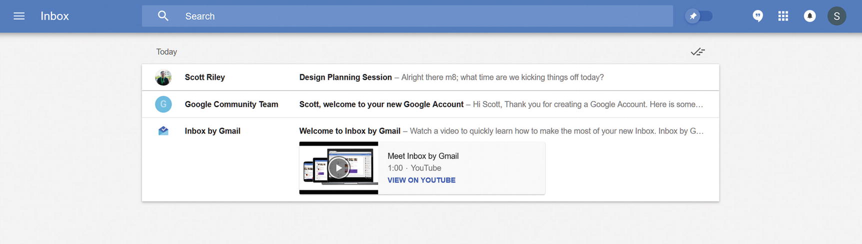
Google Inbox’s “flipping” of mental models
Inbox takes the tried and tested mental model of an e-mail inbox and, well, throws it in the bin. Back in the halcyon days of early e-mail, your inbox behaved like a physical mailbox. You would receive the occasional bit of jovial correspondence from someone in your contacts, mull it over with a cup of coffee, perhaps have a little chuckle at the typo in the sixth paragraph, make a decision as to whether to reply or not, and then go about your day, excited to return home and check if your good friend had replied to your hilarious retort or if your great-aunt had sent you another hilarious picture of a squirrel in mittens. E-mail was personal. The visual and conceptual language played to that. Inboxes, for the longest of times, were predominantly made up of a list of e-mails, with unread e-mails highlighted and a separate panel for the content of your currently selected email.
Then social media happened. Smartphones happened. Company mailing lists happened. Online shopping, online dating, online reading, online everything happened. People had accounts for everything, and everything was sending e-mails. Fast-forward to the modern day and e-mail is far removed from its initial incarnation. E-mails are no longer these happy pings you got once or twice a day. They’re an avalanche of spam and notifications and noise, and they represent an ever-growing list of anxiety-inducing reasons to throw your phone in the sea.
E-mail is no longer a reading exercise. It’s a painful chore and a reminder that every single thing on the Internet wants all of our attention immediately. What do we do with painful chores? Well, if you’re me, you let them pile up continuously for weeks on end before you have a mental breakdown and clean your entire house while listening to Enya and sobbing. But if you’re like many people, you’ll make a to-do list and push through them, marking items off as you go. Inbox decided, on our behalf, that e-mails are now better seen as to-do items, and it’s played out beautifully.
The to-do mental model is evident throughout Inbox’s approach. Gone is the endless, uncategorized list of e-mails; gone is the focus on reading full content and replying directly. Inbox presents us with a bundled, categorized list of e-mails, and the primary action is that of “marking as done.” The visual language—“check” icons for marking as done, “clock” icons for snoozing till later, and an “all done” empty state that celebrates getting through your list—is that of a to-do application.
Inbox’s underlying system is still that of a modern-day e-mail provider app—one can still view their e-mails in Google’s “standard” Gmail app—but the features presented and the language used to present them are that of an entirely different model.
The design brief for Inbox might have revolved around, as a crude example, a mission to make e-mails easier to get through. The problem space of “it’s difficult to get through a big list of tasks” is one that is going to naturally be littered with to-do and “get-things-done” applications, to which people will naturally bring their own models, conventions, metaphors, and approaches. By dissecting the mental models people bring to these products instead of focusing on the tired mailbox metaphor, the Inbox team was able to ship an e-mail concept far more suited to the demands and load modern e-mail paradigms place on the human mind.
Try and jot down a mental model for some common experiences that aren’t really related to your product. Education is a good one, as people of varying ages, backgrounds, and cultures have very different beliefs on what a learning experience will, or should, be. Typical mental models for learning might be made up of things like “grades that show how well I’ve done,” “centralized syllabi for what I should learn,” “semi-frequent exams as a means of proving knowledge,” and “a strict teacher who takes no crap.”
As an exercise, take one of these concepts and modify or remove it. Let’s say we wanted to remove grades from education. How would we do that? If we simply said, “Okay, no grades,” then we remove the classic means of understanding our progress and portraying our mastery. So perhaps we’d want to swap it with something else. We could take a cue from Duolingo, where grades are replaced with EXP points.
In fact, Duolingo, which we explored in Chapter 5, is a great example of a modulated mental model. While fundamentally existing as an educational product and relying quite heavily on the ideas of mostly linear syllabi and frequent demonstrations of learned concepts, Duolingo asks us to apply the mental model of a game to its progression model. I can think of many reasons to want to remove grades from education, but Duolingo realized that if it were going to do that, it’d need something in place to track progress.
In fact, gamification is, at least in part, the act of replacing one mental model—the traditional model of what you’re trying to gamify—with that of games. The EXP metaphor is straight out of tabletop RPGs and has carried over into tabletop and video games of all permutations. By exploring the models that make up modern-day gaming and figuring out how to replace or augment an existing model with these findings, we can start to see gamification as less of a buzz-wordy catch-all for trophies and badges, and more as an intrinsic model that brings its own convention, hypotheses, and biases with it. It also makes it a lot easier to spot areas where gamification is being attempted just because.
All of this is to say that—even if you’re dealing in a problem space that has truly ingrained and obvious metaphors and mental models—defying expectations, reframing your problems, and applying the conventions of a different model to areas of your work can be a genuinely impactful practice. The exercise of writing down as many variations of “what if [e-mail] was [a to-do list]” as you can think of is, unto itself, a beneficial creative exercise. And it just might end with an innovation you never expected.
Empathy Maps
Empathy maps are, in addition to user personas and mental models, the final piece in the rather fuzzy puzzle of things that distill people down into useful Post-it diagrams. Personas provide us with a brief insight into a fake person’s life, interests, and technology preferences; mental models give us an overview of a fake person’s thought processes, heuristics, and hypotheses; and, finally, empathy maps let us take our fake people, put them into fake real situations, and draw some conclusions about what they might say, think, hear, and do.
Just like personas, empathy maps are a means of documenting the ever-important ethnographic research we do. My personal rule is to create at least one empathy map for each persona created, making sure that the situations we put them in are as much of an aggregate of our findings as the ethnographic and pseudo-personal information we use. If a bunch of our research participants worked from busy coworking spaces, for example, then we’d make sure some of our empathy maps “happen” there.
To me, an empathy map is all about simulating a persona’s response to a specific concept in a specific environment. So, take one of your personas, think of a common environment they might work in, and start mapping.
A traditional empathy map will be split into four quadrants: what our protohuman says, thinks, does, and feels. Over time, new formats for empathy maps have emerged, with think and feel and say and do being merged into single categories, and hear and see being added. The secret here is this categorization almost doesn’t matter. The quadrant approach is an extremely useful visualization technique, and the categorization it offers is equally as helpful, but a little pragmatism goes a long way in design documentation. The main goal when preparing for your mapping session is to think of some categories that you feel are most useful to your current project.
Personally, I really like using say, think and feel, tasks and actions, hear and see as starting points because they represent the building blocks of how our story might unfold. Importantly, though, I’ll add three extra sections to a map: motivators, distractions, and pain points, as well as an area to jot down the high-level goals this person might have. Other maps might add pain and gain sections while others might break out habit and routine into its own section—especially if the designers are mapping out personas for a product that digitizes a previously analogue process.
When I look at an empathy map, I want to be able to imagine a story unfold from it. Regardless of what sections and categories are used, regardless of whether the map is made by one designer or a 16-person, half-day Post-it bonanza, the key factor is that it sets up the parameters for a story: our imaginary person finds themselves in an imaginary place and has an imaginary conversation with our product.
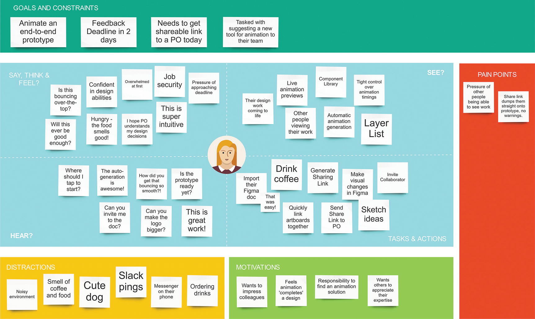
An empathy map for an example persona, showing their various perceptual responses, distractions, motivators, and pain points
This approach to mapping does a number of things. First, it sets the scene: Alex is in their local coffee shop, they have a tight deadline, and they need to get something over to a PO today. They’ve also been tasked with proposing an animation solution to the rest of their team.
Our main four quadrants give us insight into much of the surrounding events and stimuli that accompany this situation. Actions such as “drink coffee” sit alongside “send share link to PO”; feelings like hunger or coffee cravings are in the same space as their feelings on our product, as well as their intrinsic, self-deterministic thoughts. Empathy maps should paint a wide-reaching picture of the stimuli, mental processes, actions, and reflections that might occur when someone sets out to achieve a goal within our system.
It’s especially important here to consider environmental factors alongside internal thought processes and product-specific features. Empathy maps should be as much about what you’re competing with—and what expectations you need to live up to—as they are about your product’s appeal or the efficacy of its features. Nevertheless, it’s totally fine—and encouraged—to be optimistic with some of your Post-its. If you believe your product is going to make someone say “Wow, this is so fast!,” then by all means, add it in there! An empathy map should present a balanced range of responses, including what we think will excite people.
Distractions, in my opinion, are a must for any empathy map. They show, at a glance, the various factors of an environment that our product is competing against for attention. This lets us, hopefully, see our work as something that exists as part of an extensive and diverse ecosystem of priorities and desires. In terms of a busy coffee shop, an open-plan office, or a busy coworking space, we’re going to be faced with myriad distractions. From on-screen notification pop-ups, to someone else’s phone with the same notification sound as ours, to the smell of that one dude who refuses to stop microwaving fish—these all have the potential to drag us away from what we’re doing. And I don’t care how great you or your boss or your client thinks your product is going to be, I guarantee it won’t stand up to the momentous occasion of meeting an adorable new office dog. Distractions, perhaps most importantly, also let us get a feel for how much cognitive load we’ll really have to work with. Going back to Chapter 1, you’ll recall that so much of our thought processes and day-to-day interactions are rife with distraction and daydreaming. In ensuring our map’s environments account for this day-to-day attentional undulation, we’re able to keep our ideas rooted in the chaos and unpredictability of the real world.
Finally, in making room to discuss motivations, we’re able to see a more rounded representation of the intrinsic notions people might bring to our product. While goals tend to focus on the utility and final outcome of our product, motivations are self-deterministic. A goal of Instagram, for example, might be “upload my latest travel photo,” but motivations speak for the emotions and desires behind this goal. Perhaps we upload it to impress our friends with how much we travel, or we want to keep it in an easily accessible place for reminiscing. Maybe we’re more concerned with the artistic qualities of the photograph and we’re uploading it to show off our photography and editing skills. Or perhaps we just think it should exist in the world and we’re excited for other people to look at it. Conflating intrinsic motivations with task-centric goals often leads to a limited and insular understanding of an audience, where their supposed motivations read like a salesperson’s checklist rather than the complex and diverse desires, motivators, and notions of self we harbor as human beings.
Remember, too, that you’re not here to sugarcoat any potentially problematic or toxic attitudes that might be prevalent in your audience. There’s no reason why your empathy maps shouldn’t include selfishness, neuroticism, or narcissism. In our case, our audience is all designers, so, of course, there’s none of that. However, most real people have flaws, heuristics, and biases. If your research shows that certain parts of your demographic are prone to shouting, “I am a design god,” at spontaneous moments during the workday, then throw it in the “say, think, and feel” quadrant. The same goes for displays of self-deprecation, impostor syndrome, workplace anxiety, emotional triggers and the myriad other negative mental phenomena we navigate on a daily basis.
Putting It All Together
Documenting our systems involves documenting our audience. For me, the combination of personas, mental models, and empathy maps serve this purpose without being overly intensive to create or overly obtuse to share and understand at a glance. Coupling this ethnographic documentation with a core state diagram lets us see the cold hard data of our system’s inner workings against a diverse backdrop of convention, emotion, distraction, motivation, expectation, and belief.
If you’re strapped for time or money when it comes to documenting and you only have time for one of these tasks, go with empathy maps. There’s often a lot of overlap between mental models and empathy maps—especially with regards to habits and biases—and they can often completely replace personas in the right circumstances and with the right team structure. If you do skip on persona creation and mental models, I would suggest taking at least an hour to dissect the conventions in your problem space. It’s probably the most valuable bit of mental model documentation and can be done in a pinch by simply exploring every tool in your problem space you can get your hands on. You’ll never beat watching people with various levels of expertise use their products of choice, but you’ll at least be able to pick up the primary similarities (a sure sign of convention) between these products.
The goal of documenting a system in this way is to understand the raw information and functionality that you’ll be working with from as many angles as possible. Mental models let us know what conventions, expectations, and beliefs might affect how our system is translated. Personas give us some initial demographic separation and provide a challenge to our initial assumptions of how our system might be communicated. Finally, empathy maps let us theorize how our product might be perceived and used—and what the underlying goals and motivators for this use might be—in a real-world situation, as well as the potential distractions of competing stimuli.
Later in our projects (and later in this book), we’ll want to come back to system documentation in the form of artifacts like pattern libraries, design systems, and design principles ,but before then we’ll “zoom in” a little and start thinking about our moment-to-moment flows and granular interactions. In Chapter 9, we’ll start looking at how we can take this understanding of our systems and audiences and put together flows and interactions that are just as rooted in the idiosyncrasies and diversity of the human mind.