We have spent a good while extoling the virtues of systematic approaches to design by diving into an exploration of the more granular, moment-to-moment interactions that form the building blocks of our interfaces feels opportune.
While I believe that adopting a systematic mindset and that finding ways to communicate that are referential to overarching systems are increasingly important skills for designers to practice, there’s no denying that a huge part of our work—and our value—lies in the finer details. Even through the definitely cynical lens that a comparatively long and eclectic career in this industry has gifted me, there’s still very little I enjoy more than applying the finishing touches to a tiny interaction.
As the influence of technology—and by proxy design—grows and pervades into more areas of our lives, so too does the weight of the responsibility that we assume. Being responsible for large, impactful decisions, especially those that indubitably affect other humans, can be a source of malaise and anxiety for all of us. And, while this book espouses heavily the need to be cognizant and proactive about the impact of our work, ours is also a craft rife with intrinsic reward and avenues of escapism. For me, this is never more evident than when I’m designing these smaller moments, attempting to imbue taps and clicks and swipes with the character and responsiveness that can often be the infinitesimal differentiator between a moment that feels right and one that leaves us nonplussed, confused, or just outright frustrated.
This chapter will focus on the more granular side of the design stack—the processes that usually come after we’ve done enough research, documentation, wireframing, and prototyping to progress on with implementation. Of course, no design process is a truly linear activity; discoveries in the latter stages can always force us to revisit the phases we previously deem “done.” There does, however, appear to be—in every process I’ve tried, observed, and implemented—a moment.
More specifically, that moment.
That moment is when we, our team and our stakeholders, realize that we’ve discovered our broad solution. We’ve defined our problems, explored the problem space, and researched our audience and competitors. We’ve produced countless Post-it-based diagrams, scribbled dozens of potential wireframes, prototyped our lives away, revisited our problem definition 14 times, played with Post-its again, created a CSI-style wall of incomprehensible linked-together notes and personas and brainstormers, and, suddenly, we take a step back, and realize we’ve got it. What it is, at least in a tangible form, is as varied as our processes, projects, and people—but what it represents is the shift from problem definition to solution implementation.
This shift is probably the most obvious change in mentality and approach that we’ll see in a project. The zoomed-out, disposable, and low-fidelity work we’ve been producing is catalogued and documented, and we switch into implementation mode . This is where we get to do what visual and UI designers will tell you is the real design work and what UX-only designers, front-end developers, your CEO, and most of your family will tell you is coloring in. (I say this mostly in jest, but the amount of times this moment is seen as a strict baton pass from one team to another, especially in large companies, is a genuine concern—and partly why this book assumes you’re at least interested in most sides of a design role.)
So, we’re ready to go. We’ve got it. We know what we’re going to build and the problems it’s going to solve. We have rough wireframes and a bunch of research data to back the project. It’s time to zoom in to 1,200% and start tweaking button gradients, right? Not quite. Naturally, being the spoilsport that I am, I want to take one last step back, and—I hope you’re prepared for this—break out more Post- its.
Thinking in Moments
As Chapter 7 alluded to, the zoomed-in companion to our zoomed-out system thinking lies in considering the moments that might arise in our interfaces. If our “environments” represent the overarching qualities of our system, communicate what is possible, frame interactions, and generally act as an open and explorative means of discovery or expression, then our moments represent the interactions themselves. They act as the set pieces of our work.
It’s worth stating outright that your interface might quite easily just be seen as one moment. A good portion of this book has been spent encouraging and exploring the value in open and copious digital environments, but forced ambiguity and contrived expansiveness are as damaging to a limited-scope product as peremptory defaulting to constrained, linear flows is to a wider-ranged product. If you’re working on a product that focuses on making one single action as efficient or enjoyable as possible, you might see your work as one, tightly defined moment. For most interfaces, however, we’ll be dealing with some kind of balance and undulation between system focus and moment-to-moment focus.
Before we progress into documenting and planning these moments, I want to attempt to elucidate what I mean when I refer to a moment of an interface.
If we view our environment—the “default” scope of our interface—as an explorable area that communicates many (or all) of the actions that can possibly be performed at any given time, a moment is the shift from communicating the possibility of action to the purposeful performing of it. A moment, as a response to implied intent, shifts the focus of our interface from one of communication and exploration to that of task positivity and focus.
Finally, moments can themselves be treated as systematic, essentially being made up of smaller “sub-moments.” In a sense, they’re the components of interaction design. Just as in a pattern library, a larger “modal” component might be made up of an “overlay,” a “panel,” and a “button” component, so too might an “onboarding” moment be made up of “check username availability” and “avatar upload” moments. If you’re reading this and it sounds like I’ve just given “user flows” an unintuitive new name, then, well, you’re almost right!
For me, moments exist as discrete, end-to-end combinations of interactions. You could quite easily take a standard user flow approach and document a moment with it, and, in many instances I would encourage doing so. A moment is a concept—it’s a way of saying “this particular combination of interactions represents an important point in the life cycle of our product’s use.” User flows are documentation, and they represent only one way we can document our moments.
Conducting an inventory of sorts for the moments you expect to appear throughout your interface can be an extremely valuable task, especially as a means of bridging the gap between the more explorative phases of your process and the more practical implementation-focused phases. Your moment list will provide a high-level overview of all the key set pieces in your product and can go on to inform many of your most important design decisions.
Finding Your Moments
Moments are the set pieces of a system. Think of them like the key plot points or action scenes of a story. Forming a list of these moments is, generally, a pretty straightforward task. Think of the places where you feel as though your product will stand out. Your fundamental calls to action, times where a feature solves a particularly widespread or painful problem, and actions that guide people through a tricky path are all candidates for the “moment treatment.”
Creating your account
Following your first X accounts
Finding your friends
Landing on your timeline for the first time
Uploading a post
Uploading your first post
Creating a story
Creating your first story
While Instagram is generally a somewhat explorative application (in that, most people browse Instagram more than they post to it), its potential moment list is still pretty long.
You’ll notice that performing actions for the first time are listed as separate moments to the standard moments. It’s quite common to see apps hand-hold us through our first forays into key moments—something that we explored in some detail in Chapter 3 when we discussed in-app guidance and onboarding. I’d recommend doing similarly wherever possible—especially for your complex moments. Treating the first time someone enters a particularly key moment separately from its subsequent occurrences lets us consider how we might want to guide someone through a learning experience, for example, or how we might want to go a little overboard celebrating the success of the action. While uploading an image to Instagram, for most of us, is likely not much of a learning experience, the first time we do so absolutely is.
As we also discussed in Chapter 3, in-app guidance or constrained onboarding flows often serve to overly limit a moment. While we’d eventually want people to begin expressing themselves through editing their photographs or telling their stories—to ditch the training wheels, so to speak—until they’re comfortable doing so, the leading hand of in-app guidance can be a valuable ally. By separating first-time moments from their repetitive counterparts, we’re not only able to see the moments that might benefit from such guidance more easily, but we might also find ourselves designing much more open, expressive ways of performing the non-first moments.
Your idea of what constitutes a moment in your product is absolutely open to interpretation. Your key set pieces are going to vary depending on your problem space, your audience, and how your company or client wishes to monetize their service. However, most moments display some—and often all—of the following traits.
Moments Tell a Story
By deviating from a default explorative interface to a more specific or more constrained set of actions, moments essentially have their own start and end, points of friction, moments of resolution, and consistent thread throughout. While our default interface views may well be sprawling, open, and full of possibilities, the moments within them are where these possibilities come to fruition.
Moments Make Us Money
Whether literally through being a checkout flow or payment process, or figuratively due to their role as a key feature and selling point of our systems, moments often generate revenue. If a flow ends in money in a bank account or the achievement of a feature that you list on your marketing page, it’s probably a key moment.
Moments Constrain Our Interface
Moments will usually limit our interface to a subset of possible actions or contort it temporarily into an entirely new set of possible actions.
Now, this list could describe almost any interaction in any interface. A single button click could easily meet all these requirements and, realistically, micro-interactions are moments—they just might not be the moments you want to prioritize. You’ll have to apply your own scope and granularity to forming this list. Larger teams and limited products will likely have more granular moment lists; smaller teams and more expansive products will likely result in broader, zoomed-out lists.
Once you’ve defined the parameters for what constitutes a moment in your interface, you can list them. Whether you type this list in a notes app, throw it on a digitized Post-it board, or write it in six-foot letters on a wall is totally up to you. The only thing to avoid is projecting linearity into your list.
It’ s very easy to get caught in the trap of assuming certain moments will be performed conveniently in sequence—someone will create their account, then add their profile image, then follow their friends, then view their timeline, and so on. Unfortunately, this happens far less often than we would hope. For this reason alone, I like to write my moments down on Post-its and jumble them up occasionally.
This process should not take too long—I’ve never had it take longer than 30 minutes and most sessions are done within 10—and it’s often a case of documenting what’s already in a design brief or a client’s head. For products that encroach more into service design, where you’ll generally be working with multiple interlinked products and sub-services, it might make more sense to draw up a list of moments for each of these and then consider moments of transition as well.
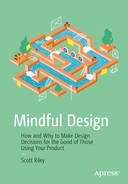
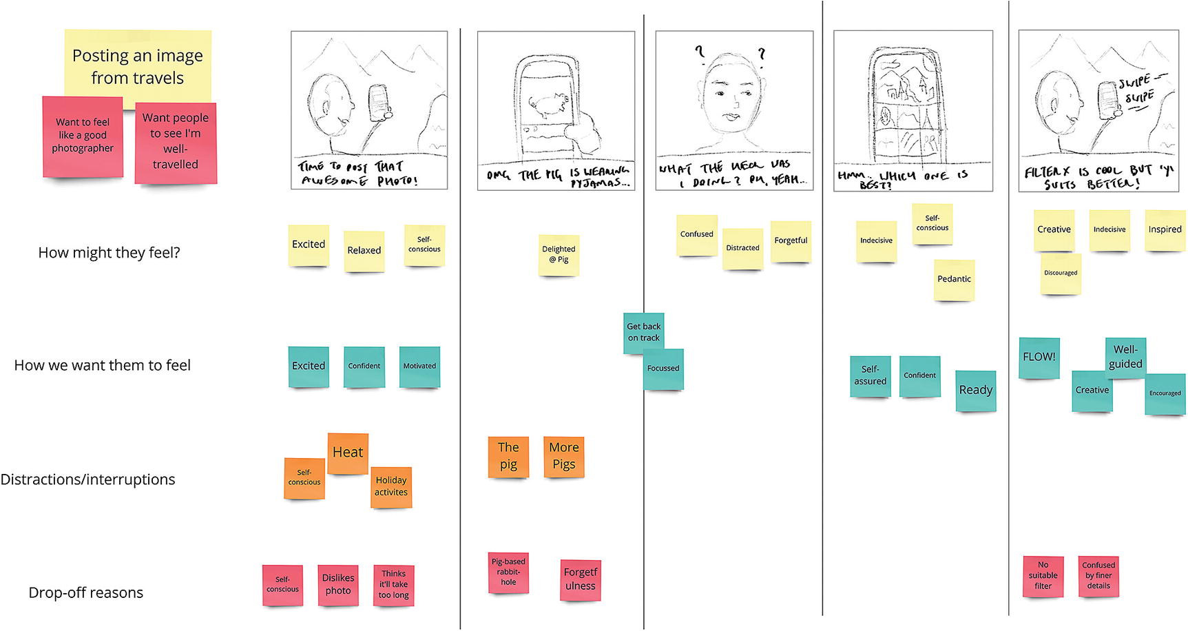
A subset of what we might see as Instagram’s key moments
How integral to the core product is this moment? Uploading an image on Instagram, for example, is critical for the product. No images means no product. Adding a bio or a profile picture would be lower on the list.
How integral to your audience’s motivations is this moment? Creating something new in a creative application and displays of mastery or skill while learning are obvious candidates for key moments. If you understand these desires and motivations through ethnographic research—and they’re not used as a crutch or with malicious intent—then moments that allow for, and celebrate, the realization of these can be extremely powerful.
How much does this moment contribute to the overall expectations of our product? Through your marketing site, word of mouth, social networking, sales pitches, and any other medium that revolves around selling your product and its features, people will start to build up a whole host of expectations. Moments that might seem somewhat innocuous at first can, in hindsight, be critical moments in realizing these expectations.
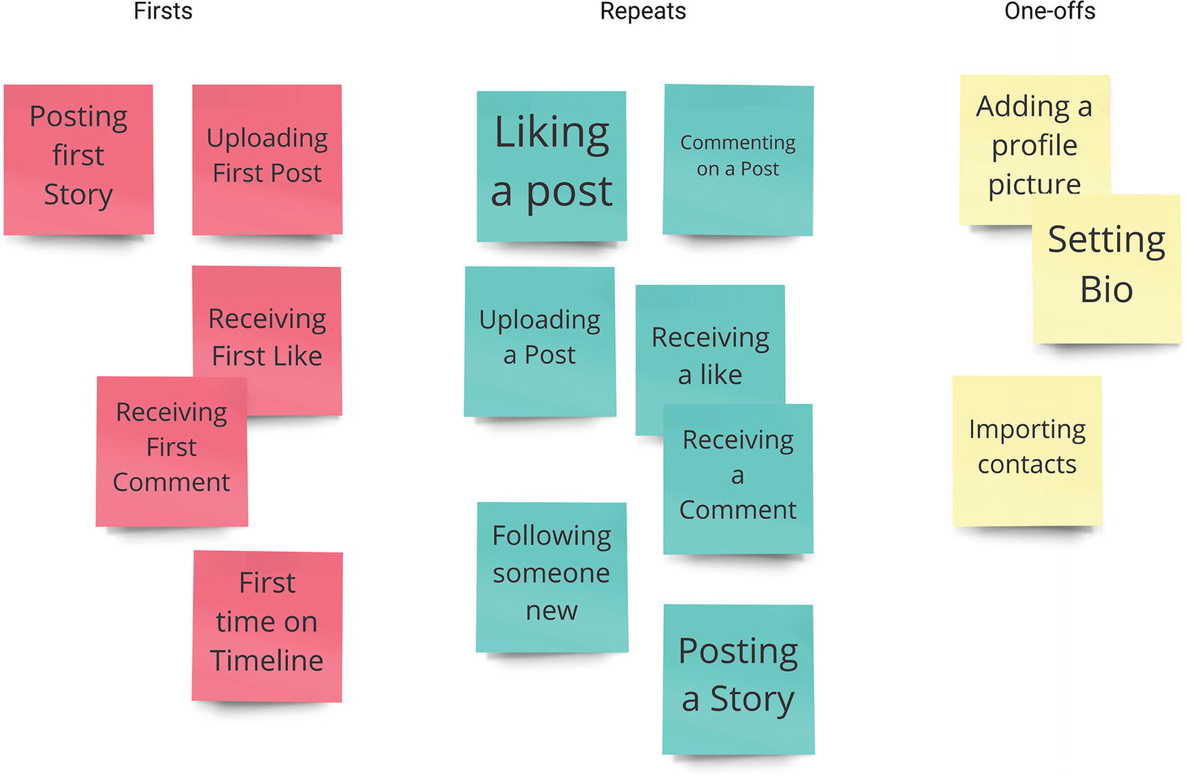
How much does this moment deviate from common convention or your audience’s mental models? Moments that involve high degrees of learnability—or esoterica—are likely to be key moments by virtue of them still existing in your interface. In Chapter 3, we discussed drawing a feature complexity diagram like the one shown in Figure 9-2. Through the process of drawing this diagram, we should already have a solid idea of the unintuitive features of our interfaces that we need to teach.
A filled-in feature complexity map. Features that are important but complex will likely represent key moments.
The purpose of listing our moments is not to provide an exhaustive feature list or a widespread justification for our product—it’s important not to overthink things. Many times I’ve spent too long on such an exercise and the whole point—to produce a succinct list of the most impactful moments—is lost, replaced instead by a tangled mess of smaller features that slowly become impossible to prioritize. When in doubt, think in broad strokes.
Once we’ve gotten our Goldilocks-style list of not-too-vague-not-too-granular moments, we can look to categorizing the items.
If you look back at Figure 9-1, you’ll notice I’ve used the categories “Firsts”, “Repeats” and “One-offs.” “Firsts” represent the moments that we want to use to highlight someone’s first performance—“Firsts” are especially important for features that might need a certain degree of guidance or repeated features that are integral to our core offering that we’d want to celebrate and offer positive reinforcement for. “Repeats” are actions that we’d expect many people to perform many times. In the case of our rough Instagram-style moment list, this category will include actions such as liking other people’s posts, posting to our story, and posting for ourselves. Generally, these recurring actions will often represent the core loop of system usage. Finally, “One-offs” represent actions that will likely only be performed at certain points, or at least very rarely. While many of these actions might well be key moments, they’re simply occurrences that just don’t happen regularly enough to be seen as part of a core loop or common usage. Actions such as adding a profile image, updating payment details, changing your bio, and updating an e-mail address are all candidates for important moments that don’t occur regularly.
Once we’ve got our moment list together, prioritized, and categorized them, we can finally document and design them.
Documenting Your Moments
If you’re a seasoned designer—or if you’re studying design from an angle that involves UX, CX, or any other acronym the industry has invented that ends in an “X” since the time of writing, you’ve probably encountered dozens of methods of documenting a flow. Some people swear by journey maps while others prefer a good old-fashioned flowchart. Others, myself included, like to take a story-based approach—using storyboards and scenarios to map our moments out. If you’re particularly fond of an approach for plotting out flows or journeys, I’m not here to change your mind!
I did, however, mention earlier that moments weren’t simply an unintuitive new name for user flows. While the tried and tested methods of documenting flows are almost analogous to mapping out moments, there are three key considerations that I feel have the potential to impact how we document our moments.
Moments Rely on Intent
Whether we derive intent from the performing of a specific action (clicking a “Pay Now” button should, we’d hope, indicate intent to pay for some items) or through a manifestation of state (which I’ll discuss in detail shortly),we need to be able to somewhat accurately infer intent. It seems almost completely obvious, but ensuring we have sufficient input to suggest intent is an often overlooked task. It’s a surefire way to make sure you question if any of your calls to action or framing scenarios are vague.
Moments Are (Mostly) Stand-alone
Having a moment that relies on a whole host of preceding moments is one of the easiest indicators that we’re attempting to turn an explorative process into an overly linear flow. By documenting our moments in a way that makes them initiable from almost any scenario, we’re able to provide a clear path—or story—through our individual moments without requiring a sequential chain reaction of interactions. There’s absolutely nothing wrong with actions that are only performable given specific conditions, and progressive disclosure is often an integral aspect of our work, but there’s a big difference between saying, “Someone can only add a bio if they’ve set up their username,” and saying, “Someone must add a bio after they’ve set up their username.”
Moments Change State
Once a moment has played out, our system’s underlying state will be changed in some way. By its very nature, interaction design revolves around undulations in state, and our moments often build up climactically to these changes. Take an image upload and edit process as an example. Our starting state might be a timeline with a list of posts. We initiate the “post-new-image” moment by clicking a camera icon. We go through the process of editing, tagging, and describing our image, and the upload succeeds. While it’s possible we’ll be returned to our timeline once the upload succeeds, our system state has changed, we’ve posted an image, and our timeline should update to reflect that. We might also wish to show a success message, or, if it’s someone’s first time uploading, highlight any actions that can be performed on their own image that they can’t on the images of others, such as editing their post, or tagging other people.
Understanding these final changes in state might seem somewhat obvious, but I’m consistently surprised at how often I see designers—including myself—prematurely deem a moment or flow as over without considering the true final impact of the actions performed within.
In essence, moments tell stories. They have a beginning—one that is usually borne out of a need to achieve a goal or solve a problem, often with moments of friction, conflict, adversity, and resolution—and they have an ending—the effects of which ripple through the fabric of our interface. While the cliché of “design is storytelling” has permeated the industry and, frankly, been discussed half to death, it’s hard to escape the structural underpinnings shared by interaction design and storytelling.
To me, interaction design’s core lies somewhere in this parallelism. Conducting not only what someone encounters from the start to the end of a moment, but how the reverberations of its resulting actions permeate through the rest of an interface is the art of interaction design. Done right, even the simplest moment can become an integral plot point as its elements and components shift in tune to action and manipulation.
It’s for these reasons that I believe communicating and documenting our moments in a story-based medium to often be the most enriching part of a design process. This stage is where we take everything from our feature list to our empathy maps and start piecing together how our work might be used in real-world contexts. In communicating how the key moments of our work fit in and around the day-to-day lives of people in a realistic and granular way, we create a bridge between researching, planning, and making.
Moment Stories
While storyboarding (and story mapping, journey mapping, and a whole host of other mappings) is nothing new in design, there’s a nuance to the approach that I feel many of us can easily overlook. It’s extremely easy to view any moment as a series of simple, matter-of-fact steps—to communicate it through the lowest common denominator by simply annotating these steps and then rushing straight into wireframing and prototyping. There’s very little point to a story-based approach to documentation that doesn’t account for emotion.
To view a moment as a story, we need to understand what makes it a story. This is more than having a beginning, middle, and an ending—although we will need those—and is more rooted in the fact that there is emotional fluctuation, creating interest or impetus. There are moments of friction or adversity that need to be overcome. There are points of dissonance that make us feel tension and resolutions that make everything feel right again.
A Moment’s Beginning
Before a moment really begins, it has to be presented and framed. Framing an interaction involves purposeful representation of the possibilities of your interface at its current permutation of state. This is where the signifiers, cultural conventions, and affordances from Chapter 2 come in to play. Essentially, our interface needs to communicate the possibility of action, whether that’s through a button designed to look clickable; an underlined, differently-colored link in a body of text; or a toggle switch in a form.
When we frame an interaction, we’re looking for intent. As we explored earlier, the more certain we can be that someone wishes for a moment to unfold, the more confident we can be in shifting our interface to accommodate this. Intent comes from framing. While a clear visual language can dramatically help with this, it is often our interfaces’ microcopy that most affects how confident we can be in translating action to intent. A Let’s Go button, for example, does not communicate intent as well as an Upload button. Getting the right balance between the amount of context and the visual or cognitive weighting of a specific action trigger is key to framing interactions.
We’ll discuss framing in more detail a little further into this chapter, but for now, let’s just acknowledge that without solid framing, we limit how confident we can be that someone actually intended to instigate our moments.
Once we’re confident our moment is framed well, we can think about the “real” beginning.
Moments begin as goals. Just as a movie might begin by introducing us to the goals and motivators behind our protagonist’s journey, so too should we be aware of a person’s goals when they begin a moment within our interface. From this point on, the thread we weave throughout our moment is there to serve this goal. In addition to the explicit goals that might be evident for our moments, we’ll also want to consider the motivators that might affect it. We discussed in Chapter 8 the utility for empathy maps to accommodate both overarching goals and the underlying intrinsic motivations. Our moment documentation is no different. Goals are the what (“editing and uploading a photograph” is a goal; motivations are the why)— “feeling validated,” “showing people how much I travel,” “for the sake of artistic expression,” and so on. Our moments, then, represent how we get there.
Just as any good novel presents a protagonist with obstacles and conflicts, so too should the stories of our moments. The “middle” of our moments, insomuch as they can be wedged into a typically linear story flow, represent the progression through and ultimate culmination of the obstacles and problems that stand between someone and their goal.
Points of Friction
As we explored in Chapter 4, tension, resolution, surprise, and familiarity are all key factors that should be balanced throughout any form of progressive media. Interaction design is no different. Interaction design stands out most when we consider that the source of tension—those obstacles, problems, or schematic violations—are usually external forces; they’re the momentary distractions, the duress of cognitive load, and the day-to-day stresses of simply being human in this age of information. Music, movies, and novels get away with manufacturing their points of tension themselves. In the name of entertainment and engrossment, as designers we’re mostly left with how people’s environments, mental models, and emotions find ways to disrupt their moments of flow.
That’s not to say that there will never be points of friction intrinsic to our designs—there will almost always be awkwardly placed requests for account creationor the need to trawl through a relatively dull form to get to where we need to go—but that intentionally designing for tension is something that would require a great deal of thought and consternation.
As well as external sources of friction, technological constraints also present clear examples of unwanted tension. Network speeds largely dictate how long an interaction that relies on communicating with a server or another device will take. Hardware limitations can lead to certain interactions stuttering or generally feeling slow and clunky. Some moments of technology-based friction are simply unavoidable, and the best we can do is ensure that our products function well on older hardware or continue to function to the best of our abilities when a network connection drops. Catering to these unavoidable points of friction with the same dedication to communication we put into our “happy paths” is also key.
A request to a server failing—while often a clear source of drop-offs and poor conversion rates—doesn’t always have to result in the instantaneous end of a moment. Well-formatted and clearly communicated error handling, with clear instructions as to how to resolve a situation, could be seen as a moment unto itself.
While an understanding of intent, goals, and motivations is key to any approach to interaction design, it is the reality that so many points of friction will invariably be encountered that makes story-based documentation so applicable for modern design. By considering these various points, we’re accepting that both our own requirements and the real-world situational, environmental, emotional, and cognitive factors in someone’s life can be sources of tension, friction, and affliction.
The Moment of Truth
While the climactic rise from goal to completion might not be as palpable or as epic in an interface as it is in a movie, video game, comic book, or novel, it still exists. Now, it’s true that very few people would describe their day-to-day interactions with products in the same ways they would describe the sheer exhilaration of the Battle of Helms Deep (or Happy Gilmore’s final showdown with Shooter McGavin if you’re me)—there’s still a genuine point of climax in interface moments.
If we consider the “middle” of our interaction story as the “work” stage of a “signal, work, reflection” cycle, it’s clear that, upon reaching a climactic point of a flow, someone has put effort into getting there. While hardly a trip to Mordor (although I’m sure we’ve all used interfaces that have felt less taxing), this work and effort still culminate in one final plot point.
If we stick with posting on Instagram as an example for this framework, the point of culmination is when we’ve uploaded, edited, and described our photograph. We’ve started with a goal (post a photo) and intrinsic motivators (I want people to see what I’m up to or I want to share a photo because I think it shows my skills as a photographer), we’ve done the work (picked a filter, edited the finer details, given our photo a short description), and we’ve done so through moments of friction (other apps’ notifications begging for our attention, a crying kid who is tired of being neglected for social media, the creative anxiety of sharing your work with the world) along the way. We’re finally able to hit that Share button.
In essence, this point of climax can be seen as a moment unto itself. It represents all the hallmarks of our larger moments in microcosm. The action to complete our moment needs to be framed well, and we need to be confident that it’s what someone intended to do. There are potential points of friction, network issues, server errors, and even just a too-long wait, and there’s an ending that allows for reflection, further action, or both—which brings us nicely to our moments’ endings.
A Reflective Ending
Good endings show the value of the actions someone has just performed. When presented with tasks, work, conflict, or friction, we can quite quickly lose track of why we started this task in the first place. What was the point of it all?
By guiding people through these moments, like a skilled conversationalist telling a story, you’re able to build toward a crescendo point, where the “main action” occurs, that Post button is hit, our glorious photo is uploaded and ready for people to view... but then what?
A moment isn’t over at its crescendo, and abruptly ending a moment at this point can become an insidious habit. All forms of progressive media are heightened by a denouement of some sorts—a narrative structure that involves tying up the loose ends of discrete plot points, releasing the tension of an enthralling crescendo, allowing for moments of respite, and reflection to ease out of the narrative.
Interaction design should be no different. The tiny stories that we weave into our moments—as well as how they contribute to longer, overarching story arcs that we might want to tell through continued interaction with all parts of our system—need good, reflective endings.
This denouement of sorts is an important stage. It’s where we’re able to show value and causality, to present someone with the results of their work and say, “Hey, you did this?” It is here where the reverberations of an action can be felt, a short few moments where someone is able to watch the effect of their work permeate through an interface. And while this short moment of reflection or celebration may seem ostentatious, without it we’re depriving people of satisfactory endings, of being able to see that what they’ve just done—whether it’s sending a form full of data or creating a masterpiece in a digital painting app—has results, an impact, a real ending.
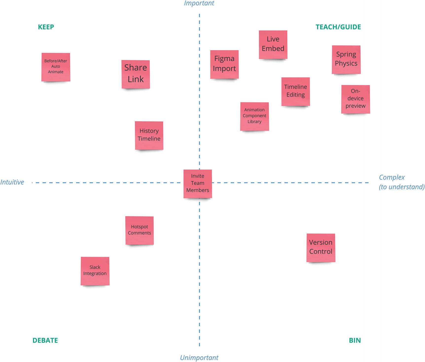
In the world of interaction design, we often talk about “delight”—to the point, frankly, that the word has almost lost all meaning. The closest we get, in my opinion, to instigating this delight is by designing these moments of reflection. Instagram does this by showing us our photograph in our timeline after we’ve completed the posting process. This might seem like a matter-of-fact, obvious thing to do, but that doesn’t detract from the fact that we’re presented with a satisfactory ending. Through browsing Instagram as a “consumer” (a word which will never sit right with me) of its content, we’ve seen other people’s photographs in this format, we understand that our timeline is the stage for these captured moments (and ads for weird clothes that no one wears and detox tea that no one drinks, but we’ll forget about ads in the name of romanticizing interactions), and now we see ourselves on our timeline, knowing that others will see our same post, in the same format, on theirs.
Uploading a post to Instagram, clockwise from top left: choosing and adding a photograph, editing the photograph, adding the final post details, seeng the post presented in your timeline
These four steps are a distillation of the entire story behind posting an image. It took me less than a minute to complete, but many millions of people every day enact their own versions of this out.
Posting a photo might seem, initially, to be a trivial and ubiquitous interaction. A simple checklist item on your never-ending task list. You’ve probably used, or designed, something that involves some form of uploading—adding a profile picture on a social network, uploading a screenshot to Slack, attaching documents to a bug tracker or task manager, an so forth. However, if file uploading or image posting represents a core moment in our interface, we’d do well to remember that stories lie behind the seemingly obvious stages of the interaction. Stories that start with goals and motivations encounter points of friction along the way, build up to a climactic moment, and finally ease out allowing moments of reflection and resolution.
Storyboarding Moments
As far as early-stage communication of the intrinsic emotion behind moments and interactions, storyboarding is—in my opinion—a priceless method of documentation. Storyboarding allows us to present a condensed version of the moment story we’re trying to tell while still communicating the fundamental goals, motivations, points of friction, climax, and ending that constitute our moments.
A storyboard
In product design, storyboards work exactly the same. Often compiled to show a more abstracted story of someone’s general end-to-end experience with a product, they’re just as applicable in our communicating of smaller, discrete moments. When we consider the push toward more open and explorative defaults, with story-driven, linear moments forming the crux of performable actions, it often makes sense to only storyboard our more concrete modes and to fall back on state documentation and design systems to communicate our system’s broader qualities.
A common barrier to trying storyboards is the idea that you need to be somewhat artistically skilled to produce a usable storyboard. While it’s pretty daunting at first to imagine clients and colleagues pouring over your artwork, it’s important to acknowledge that storyboards made entirely of stick figures and poorly drawn environments are far more commonplace than the overdesigned examples you might be used to seeing. Get over your fear of drawing and remember that we’re not here to produce a best-selling graphic novel. We’re here to communicate a story in a rough, visual way.
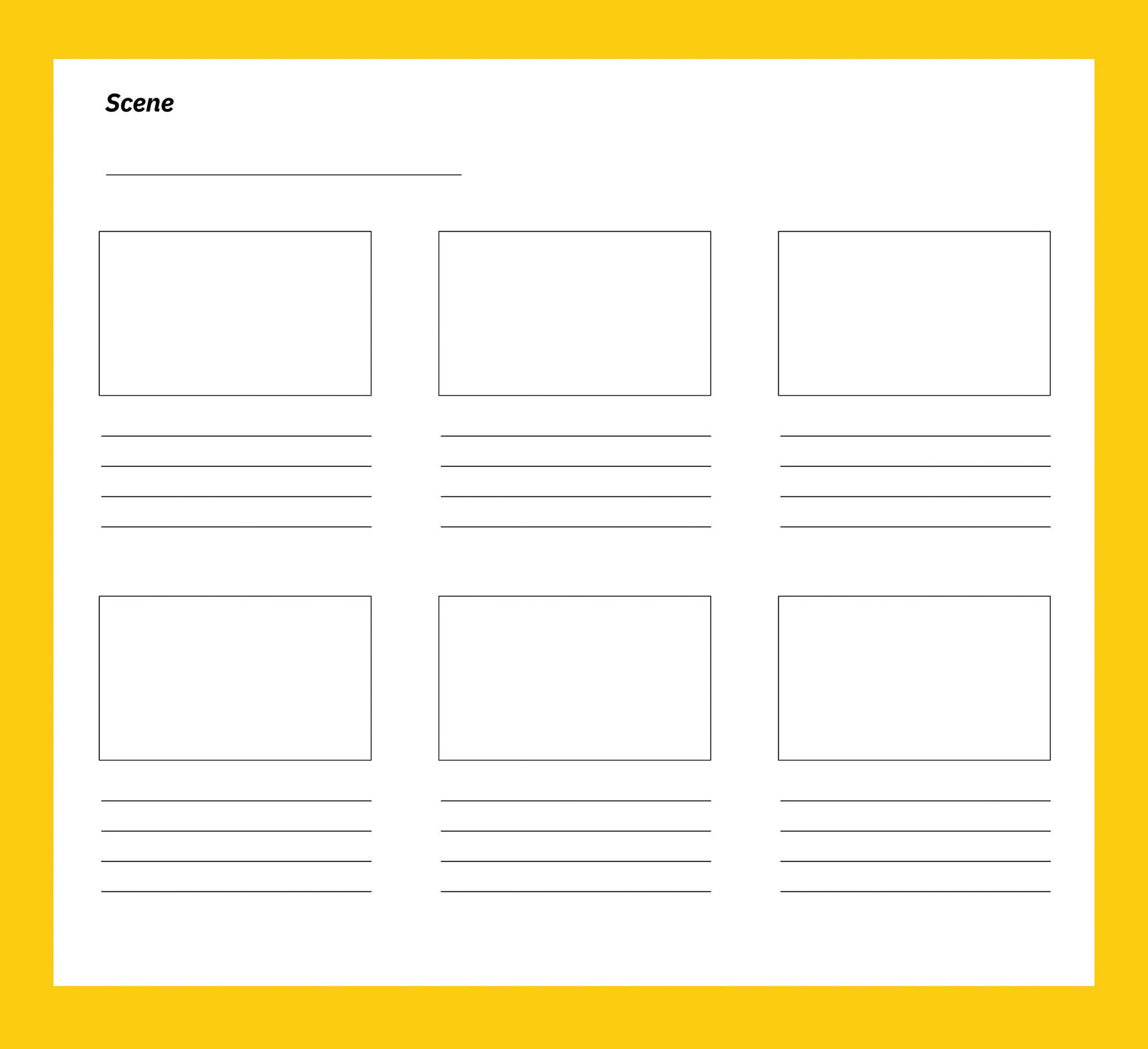
A blank storyboard template
Once we have our template drawn, printed, or loaded into a digital drawing app (you can plot your storyboards out on a whiteboard and use full-sized sheets of paper per panel if you’d prefer a bigger canvas), we can get started with our storyboarding.
Pick a Moment and an Empathy Map
Given that storyboards should take environmental, emotional, and motivational contexts into consideration, empathy maps are a great tool to bring in to a session. Write down the goals and motivations behind the moment that you’re storyboarding. For example, when storyboarding our “new post” moment, we might list “upload and edit a photograph from our vacation” as a goal, and “I want people to appreciate my photography,” and “I want people to see me as a well traveled and cultured” as intrinsic motivators. Illustrate this as your first panel and jot down some context outside the panel’s frame.
Plot Out the Story Flow
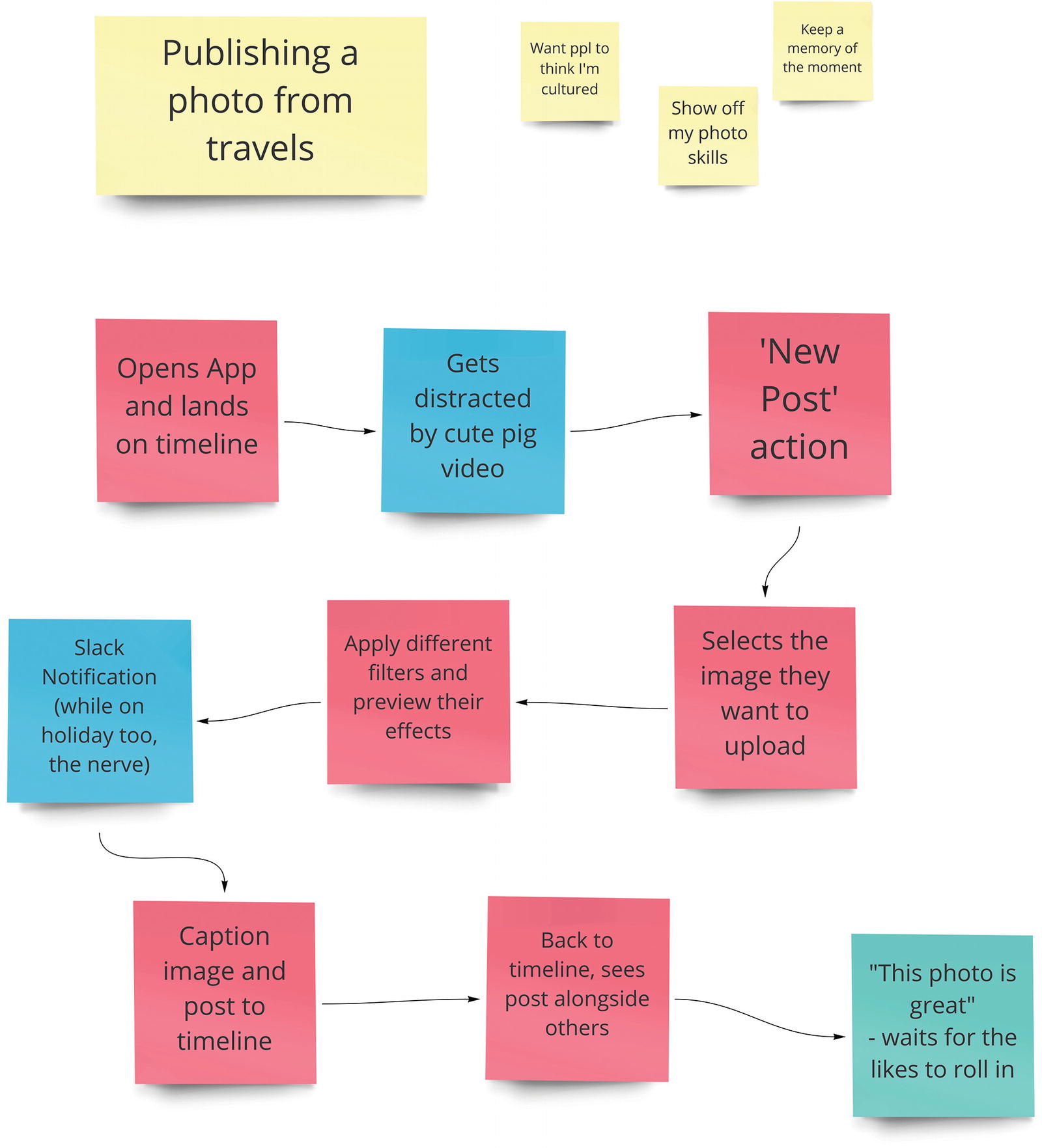
A basic text-based story plan
Tell the Story
Take your rough flow and turn it into a sequential, comic-like storyboard. Pay particular attention to the points of friction and the climax of your story. If a particular feature along the way might represent an obstacle or stumbling block, make sure it gets its own panel. As we explored earlier in this chapter, points where mental models are deviated from, long processing, or upload times and generally demanding tasks are all prime examples of potential moments of friction.
Consider how your character (the persona associated with your empathy map) might respond to these moments of friction based on their goals, motivations, and environmental issues. Again, good ethnographic research and well-rounded, challenging personas and empathy maps are vital here. The more confident we are in these, the more confident we can be in our storyboards representing atomic moments of use.
When telling your story, use speech bubbles and thought bubbles to show what your character might be thinking or saying. We can often lift these directly from our empathy maps. Other times, we’ll have to hypothesize when it comes to more specific, context-dependent dialogue. Again, we’re not trying to be prodigious scrip writers here; simple, condensed thoughts and phrases are totally fine. Consider, too, working in any verbatim quotes you’ve acquired from your research interviews. Any opportunity we find to bring a real human being’s wording or feelings in as a reference point is one that should be snapped up without deliberation.
End the Story Properly
Make sure you consider beyond the climactic point of your moment and have at least one panel reserved for the point of reflection and reverberation discussed earlier in this chapter. Furthermore, try not to lose track of the fact that the true endings of our moments often manifest themselves in the real world.
While our goals might be specific to the app or service with which we hope to accomplish them, our motivations often exist far beyond the borders of our applications and the devices on which they live. It’s extremely easy to fall into the trap of limiting design thinking to purely within the constraints of the product or medium for which we’re designing. While this degree of selective focus is a genuinely essential ability—being able to identify, implement, and manipulate the conventions, common signifiers, and implications of the medium we’re designing for is a core design skill—it can often lead to harmful presuppositions if we adopt it too early in our process.
An ending that shows not only the value of the tasks that have been performed but also the changes caused and the motivations realized in their performance is often key to a satisfactory storyboard. One that takes the time to consider the real-world implications of a particular interaction is paramount.
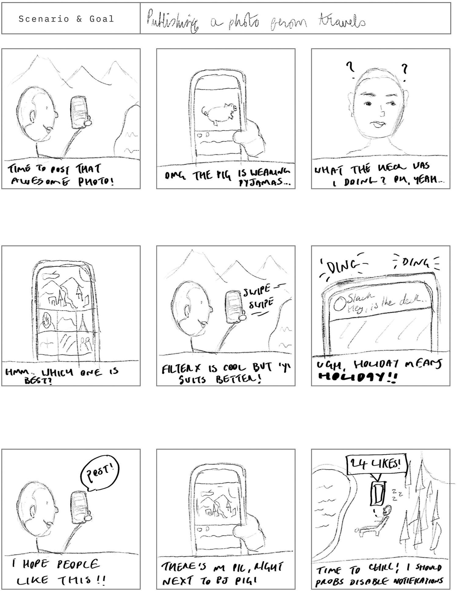
A completed storyboard that might be representative of posting to an image-sharing social platform
While extremely rough, this storyboard communicates the plot points from the previous step and ensures that potential distractions are accounted for. Note that, while nine panels are a good starting point, many stories will span more than one sheet and many more still won’t fill a single page.
Annotate
How might people be feeling, thinking, or saying right now? Remember your points of friction, goals, and motivations and try to ensure that the emotions you jot down are representative of your research.
How might interruptions and distractions occur? For each frame, try to annotate some of the potential distractions and interruptions you uncovered in your research or testing phases. Annotating potential distractions lets you weave the real world into your stories and, more importantly, keeps relevant the need to consider that your moments need to be continuable after a distraction. Relying on the context of a previous action or some copy earlier in the flow can often lead to interactions that are extremely well designed when performed in one sitting, but essentially crumble if someone is distracted part-way through.
Why might someone drop off here? Every point in a moment is a potential drop-off point—as I’m sure anyone who has worked on funnel analytics could attest to. While many of your drop-off points will be inherently tied to your interruptions (getting back into the flow of a moment after being dragged out of it is often just too much to ask), we should also consider the reasons intrinsic to our moment that might cause someone to abandon their goals. More obvious examples for this include sign-up forms (asking for meaningful data takes a conversation beyond causal), payment flows (asking for money absolutely changes the tone), and long waits and concepts that are too complex or obtuse to understand. Annotating potential drop-off points allows us to take our moments into wireframing and prototyping with an established idea of the problems we might face. Might something be too far removed from our mental model? Make sure we take the time to describe it well. Is asking for payment information wont to deter someone from continuing through a moment? Make sure we frame the value of what they’re paying for and try to ensure the payment form isn’t just dropped on someone halfway through an otherwise casual conversation, like a cartoon anvil on the head.
Moment Mapping
While annotating directly on your storyboard is totally fine, you might find that there’s just not enough room in the margins to fit your notes in. Additionally, while annotating your storyboards, as a solo exercise, is a valuable use of your time, it’s often even better to use this as a chance for collaboration. A diverse group of people contributing to this annotation is—as is the case with any part of our process that involves speculating about emotion, mindset, problems, and distractions—always going to serve us well.
My preferred approach to annotating is—wait for it—whiteboards and Post-its. If you’ve drawn out your storyboards digitally, print each frame off at A4 size and stick them up on a whiteboard. If you’ve drawn them out by hand, stick the page up and number each frame. If you’ve drawn them out by hand on full-size A4 pages because you knew you were going annotate them on a whiteboard—good job!
One possible way to set your storyboards up for annotation
This approach lends itself nicely to a group brainstormer. While I believe that storyboarding itself should be conducted by a limited group (especially for our moment stories), annotating storyboards is a fantastic way of getting larger teams invested in these stories. Start by briefly running through the overall stories you’ll be annotating—remember, we’re thinking key moments here. If you have many stories (multiple key moments and multiple empathy maps can see your story list stack up fast), you might want to pick just a couple that you feel would truly benefit from this workshop-style approach to annotation.
After regaling our colleagues with a brief run-through of our moment story, we can start annotating. Work from the first panel and try to keep a brisk pace while still being casual and not bulldozing through your stories. A minute or two per panel is often enough, but absolutely spend more time on the juicier points if discussion opens up. (A panel that essentially represents a yes/no answer is going to be extremely light in the way of notes compared to, say, a panel where we ask someone for their payment information.)
It might take a while for the room to warm up to this approach, so treat this session like a story itself. Start by stating the goals and always bring your simplest story in first. While you may be chomping at the bit to get everyone annotating your nine-panel epic onboarding story, remember that you’ve spent a great deal of time with your head in these stories and many of your colleagues or clients might be coming in cold. Warming up with a simpler story to get conversation flowing and to allow for mistakes and misinterpretation is often a shrewd move. End by explaining how the work done that day will impact the rest of the project, how you hope everyone involved now has a better understanding of why we’re focusing on the moments we are, and that you’re super excited to get on using these stories to inform your prototypes.
Like any group brainstorming session, you’ll want to go away after the meeting and prune the ideas and suggestions that arose. While nobody wants to see their ideas discarded (and this is why we do it after the meeting, as opposed to looking a developer straight in the eye and tearing their Post-it up in front of them), an integral part of our jobs is ensuring that our work is representative and grounded. If the CEO thinks that someone will feel “delighted and in complete awe” at the “seeing-pricing-for-the-first-time” panel in a story, we’ll need to find a way to ease that out in favor of the more realistic “concerned-about-financial-impact” and “wondering-if-this-product-is-actually-worth-it” suggestions we might have. (In this case, feel free to do the whole staring-while-tearing-a-Post-it-up power play—it’s only the CEO.)
Leave the Post-its on the whiteboard (physical or otherwise) and thank everyone for their time. End the meeting, grab a coffee and a water (please hydrate, meetings are hard), and gather your design and product colleagues for phase two: pruning.
Pruning is something we should do after every brainstorming session, and I recommend doing it straight after. It makes for a pretty draining day, but you’ll be pruning a brainstorm while the context behind everyone’s suggestions is still somewhat fresh in your head. The purpose of pruning is to take any unrealistic suggestions and either get rid of them entirely or turn them into more realistic ones. As the team (or person) with the deepest understanding of your research (and if that doesn’t describe you, try to make sure it does next time!), you’re in the perfect position to make a judgment call on what is signal and what is noise.
The more you prune, the better you’ll get at spotting red flags—small traits that set alarm bells off in your head. An obvious red flag is the kind of unbridled optimism that anyone who might describe a company as “my baby” (founders, CEOs, investors who like to overstep boundaries, etc.) might display. Being overly attached to a product’s success to the point where one believes it to be a flawless solution, devoid of any potential malaise, represents a special kind of myopia. In fact, one of the most important skills you can learn as a designer (that, unfortunately, tends to only come with experience) is the ability to quell this kind of optimism-ad-nauseum without appearing as if you’re a prodigal spoilsport who only exists to ruin dreams and scare children.
Other red flags include opinions from people who have lived a life of sheltered, abundant privilege, who have yet to prove capable of genuine empathy (apologies, but unless you’re working on an app to dodge mansion tax or a croquet-court finder, then coddling the opinions of ever-comfortable people can be one of the fastest ways to sink a product), suggestions that revolve completely around revenue, ideas that rely on manipulation, and proposals that appear completely rooted in “competitor X does this.” (Tread lightly with that last one, though, as competitor research is a hugely valuable insight into convention and mental model consistency.)
The result, post-pruning, of our storyboard and story-mapping exercises should be a set of succinct maps that not only communicate potential scenarios and stories but are also imbued with many of the environmental, emotional, and motivational details we uncovered in our research phase. While a story for each combination of empathy map and key moment might seem daunting at first, it’s important to stress that these activities can be performed surprisingly quickly. It’s also feasible, should you be strapped for time, to replace a number of common UX deliverables—such as journey maps, user scenarios, and flow diagrams—completely with moment-specific, annotated storyboards.
Storyboarding and annotating, while best suited to an early-stage, pre-wireframe phase of our process, can also act as a great means of evaluation. If you have a particular feature that appears to be underperforming—either through high drop off rates from analytics or through poor performance in testing—storyboarding its current incarnation can reveal plot points that would otherwise be difficult to spot or elucidate. Using that to then create a more representative storyboard to lead into a feature redesign can be a surprisingly efficient means of improving existing products—or at least discovering areas where a redesign could be beneficial.
The Anatomy of an Interaction
One of the many benefits of this moment-based approach to interaction design is that the framework scales. Whether that’s scaling upward to think about how the discrete, broad components of a wide-reaching system interact or scaling downward to the finer details of micro-interactions, describing, drawing and annotating the stories that accompany interactions is—in my experience at least—an extraordinarily valuable habit to introduce to a design process.
While there is absolutely a “sweet spot,” of sorts, for moment story documentation—lying somewhere between a discrete usage session and the story of a single key moment—the principles and theories can be applied at surprisingly varied levels of granularity.
Given this, it would be easy (and admittedly tempting) to ask you to apply the above logic at a different level of granularity for some just-add-water interaction design framework. However, while moment stories are a valid starting point for smaller interactions, I’d like to explore in a little more detail how these single, smaller interactions fit into our work.
Interaction design—that is, the specific design of smaller interactions, not the overarching industry term for “the arbitrary areas of design that an interaction-focused designer is responsible for implementing”—is increasingly becoming more and more important. As technology advances and operating systems and browsers become more capable of supporting rich interactions and myriad input and output methods, the central role that interaction design plays in any product is becoming more evident.
Good interactions make use of a wide array of design disciplines. Visually, they need to be on-brand and consistent, and they should adequately signify possibility. From a motion-design standpoint, easing harmoniously between interaction states is integral to ensuring a smooth interactive flow. Everything from copy and microcopy to cognitive load to the easing curve or spring physics used when animating an element needs to be constantly balanced throughout interactions—and that’s before we even consider how this often has to be done with limited space and.
But what is an interaction? It’s not the element itself—a button, of course, is not an interaction. It’s not quite the words in or around the element, although describing an action is important to causality and communicating possibility. Nor is an interaction the specific animation or string of animations that occur after an action is attempted. Interactions are abstract, undulating entities. They simultaneously exist as a communication of action possibility, as a manipulator of state, and as a representation of current state. However, this eulogizing essentially leaves us with Schrodinger’s Interaction —something that can only be defined based on its current observable state, which is just a little too pretentious, even for this author.
Instead, interactions can be seen as micro-moments. They’re things that play out progressively dependent on human action and our system’s state. Interactions push our stories along, one-by-one—every button click, every swipe, hover, or scroll helping us further toward our goal. If we see our moments as the stories of our work, then interactions act simultaneously as plot points and segues, providing the key action points for progression as well as controlling the transitions between different states as this progression occurs.
So, what makes a good interaction? Given that we know interactions are somewhat abstract things, liquid in their definition, we can be sure that context will play a deciding factor in the efficacy of any interaction we design. If something is supposed to be extraordinarily intuitive, then an interaction that has us stopping to think is likely a poor choice. Likewise, if an interaction is supposed to slow things down and have us purposefully interact with a feature at a deeper level (as we discussed in Chapter 3, this is an essential characteristic of learnable concepts) then an interaction that essentially involves clicking a Continue button is likely to be just as ill-suited.
Aside from ensuring that tools remain contextually appropriate, there are several common factors we can consider that should at least equip us with the ones necessary to get started planning and evaluating the interactions we design. A good framework for discussing these factors is to treat interactions as a form of conversation—which, if you agree with the earlier chapters of Part 2 of this book, they essentially are. Furthermore, by adopting a story-based approach to broader moments and a conversational approach to smaller interactions, we’re able to imbue a pretty consistent context into our early-stage design work. If you’d rather steer clear of the story and conversation metaphors entirely, though, that’s completely fine—just abstract the ideas in this chapter up a level and apply them to your preferred methods of communicating your design decisions.
A good interaction, then, relies on the next areas we will discuss.
Framing
Just as we discussed earlier in this chapter, a moment, plot point, interaction, or any narrative or conversational tool is nothing without effective framing. To repeat the sentiment, the more confident we are that someone has communicated intent, the more confident we can be throughout the rest of our interaction.
Framing allows someone to preemptively envision what a certain interaction might do. The obvious example here is button text—with one of the key (albeit most-ignored) tenets of interaction design being that button text should describe the action it performs. Poor framing is, in my experience, one of the most avoidable, yet predictable errors in interaction design. However, it’s not always as simple an issue as taking an inventory of your microcopy. After all, plenty of wordless interactions (I’m willing to bet that clicking a camera icon and subsequently a wordless, circular button to take a glorious selfie is one of the most practiced and ingrained interactions modern society has with their devices) are completely satisfactory.
In order to frame interactions well, we must rely on many of the concepts already explored in this book. Gestalt rears its wonderfully practical head again here—perceptual grouping and consistency between elements is incredibly important to communicating action possibility and causality. Signifiers and convention also play hugely important roles in interaction framing. Buttons that are obviously usable, separation of decorative icons and clickable icons (especially common on smaller screen interfaces where space is precious), obvious states for items like check boxes or toggle switches, and myriad other considerations all have a potential impact on how well-framed an action is.
The key phrase here is action possibility . While entire interface states can often be devoted to convincing, pushing, or nudging (or whatever over manipulative verb we’re controversially comfortable using this week) people into performing an action, seeing an interface primarily as an open venue and a communicator of action possibilities offers respite from constant persuasion and illusions of control. Now, I’m not suggesting we shy away from a hierarchy of actions—that is, in fact, often a recipe for disaster—just that if we frame actions well enough (part of which involves communicating their hierarchy based on the current state), we can present an explorative interface when we feel its applicable to do so.
Acknowledgment
During a conversation, when someone provides their input, they usually expect it to be recognized. Even if we have nothing to offer to a particular conversation point or we need to pause and think, we’ll generally at least acknowledge that something has been said. Interaction design is no different. When we do something—whether that’s click a Submit button at the end of a long form or a simple swipe to change an image’s filter—we want to be told that our message has been received.
Now, in my experience, it’s extremely rare to find someone who expects digital interactions to be instant. Most of us are all too familiar with loading spinners, progress bars, and general slow responses and, even as network speeds and average device specifications continue to improve year after year, the very nature of Internet communication means there will almost always be some kind of delay to interactions that rely on network communication. Fast acknowledgement does not have to mean fast server response times (although that invariably helps) or instant app loading.
What many of us do expect to be close to instant, however, is this acknowledgement. Think about a conversation where you’ve been asked something that’s required you to think a little. Maybe you’ve been asked a tough question or you’re trying to remember something that’s relevant to the conversation. In such a situation, we can find ourselves doing all kinds of strange gestures and facial expressions to signify we’ve acknowledged someone’s input. The old trope of people looking “off and to the right” when trying to remember something is a classic example, but everyone is different. Some people will nod along to show (or feign—you know who you are) interest and presence while others will verbally “mm-hmmm.” When we need a moment to think, some of us might pull that strange scrunched-up pouty face or stare up at the sky. The fancy among us might even prod our chin or press a finger to pursed lips to really hammer home our consternation.
In fact, we rely so much on these verbal and visual cues, that we specifically exaggerate them. As someone who personally suffers from social anxiety, my brain constantly looks for rejection and disinterest in the behavior and expression of others. While I struggle to remember plenty of conversations (especially ones about deadlines, sorry), I can vividly remember the few rare occasions where something I’ve said has been met with an emotionless blank stare. As we discussed in Chapter 1, ruminations can often associate themselves with what, at the surface level at least, may seem to be banal experiences. Yet, a propensity to panic in the face of a blank response or lack of acknowledgement is not a trait exclusive to those of us who live with anxiety. Inherently, we all have a need for conversation and, with that, comes a need for acknowledgement.
Interactions should work no differently. If our system has to speak to another (our front end to an API, for example), one of the worst things we can do while that time passes is nothing. Simple loading spinners is ubiquitous in modern applications for this very reason. Perform the digital equivalent of a typical “I’m thinking...” gesture lets someone know, pretty much instantly, that their input has at least been acknowledged.
Lack of acknowledgement is yet another subtle but insidious error that often goes unchecked in design work. The phenomenon of “rage clicking” is inherently tied to this.
Rage clicking, as the phrase might imply, involves clicking (or tapping) on one, more, or all areas of an interface in the hopes that something might happen. Seeing someone rage clicking around your interface is probably as close to a personally heartbreaking moment as design can produce. It’s when you know you’ve screwed up to the point where someone would literally rather apoplectically wear their finger down on a keypad in the hopes that anything will happen rather than think rationally about what is (or isn’t) happening. Rage clicking, essentially, is a total confirmation that we’ve done our job wrong. Yet, while single-handedly justifying the need for emotional support animals in design studios across the country, it does present us with clear evidence that our framing is poor (someone is clicking something that isn’t clickable) or that our acknowledgement is worse (our interface is basically staring blankly into someone’s eyes and hoping the ground swallows it hole).
Acknowledgement also serves a secondary goal in our interface and that is communicating a lack of action possibility in its absence. If we consistently acknowledge someone’s input from their first moments of interaction and if they try to interact with something that is purely decorative or descriptive (e.g., clicking a decorative icon believing it to be an icon button), then the lack of response—within an otherwise responsive system—can provide a last-ditch anti-signifier: “You can’t do anything with this.” This, of course, relies on “any action will be acknowledged” being part of someone’s schema for our application, which means we need to be responsive early and consistently. It does, however, represent an interesting knock-on effect of consistently acknowledging actions as soon as they’re attempted.

The before (left) and during (right) states of a button that acknowledges input
This approach is effective for a number of reasons. First, a loading spinner is an extremely common convention, found in the vast majority of mainstream apps, and it communicates a clear message. Second, by replacing the button text, we’re acknowledging an action in the same context that it occurred—yet another point for perceptual grouping. Finally, by replacing the action’s text, we’re subtly and temporarily removing the action possibility from our interface.
As I mentioned, our approach to designing these in-between states will change drastically. In some cases, we might want to go all-in and have a full-screen overlay with a spinner to be completely sure someone’s action has been acknowledged. Other times, a subtle progress bar at the very top of an interface can do just fine. Probably the most integral factor to this will be the time we expect someone will be kept waiting.
Waiting
Waiting is the undesired inevitability of interaction design. As anyone who has worked in the service industry can attest to, most people have a rather ingrained disdain for being kept waiting—yet, as interaction designers, we do have the somewhat fortunate safety net of expectation in our corner. Indicators show that a specific action is taking its sweet time to process (our good friend the loading spinner, progress bars, etc.). They are some of the most ubiquitous design elements around, and they should tell us how common waits are in digital interfaces.
Yet, these expected waiting periods are also ripe for subversion—an interface that we perceive to be faster than others is one that stands out more often than not. Exclamations of “Wow, that’s fast!” and similar displays of shock and awe that an interface takes less than a perceived age to communicate with a back-end server are still some of the most common forms of praise that people bestow on interfaces. While often outside of our control, maximizing the speed at which various nodes of our systems communicate with one another is an incredibly important task.
However, simply shaving off precious milliseconds of loading time isn’t the only way we can subvert the waiting process. For some categories of interaction (video sharing, uploading high-quality images, processing extremely large files), long waits are an inevitability. By eschewing the sadly common practice of disabling interaction with the wider interface and allowing other areas of our interface to be explored, we’re able to essentially negate the impact of long waits.
Say, for example, we were working on a browser-based, UI design tool. A key feature of this will likely be uploading images. After all, is a marketing site without a full-page header image really a marketing site? Traditionally, image uploading has been a painfully drawn-out interaction in web sites and web applications, often forcing us to simply sit and twiddle our thumbs while waiting for an upload to succeed. However, with the advancements that browsers and operating systems continue to make, this really doesn’t have to be the case. Let’s say that, on an average connection, the average image that people upload for use in their designs takes one minute to upload. Not totally implausible given that designers often work with extremely high-resolution images while mocking up their work
Option 1—the easy option—is to fall back on the tried and tested common practices for image uploading. Click a button, select an image, and ... well ... wait.
Option 2—which is thankfully becoming more and more popular—is to process this upload in the background while keeping the entirety of the interface usable for the duration. This would let us drop our image in and spend that precious minute deciding which generic geometric sans serif from Google fonts we should use this time. We could even take this a step further and load in a placeholder or low-res preview of the selected image while the full image continues to upload—allowing designers to move and size the image into place without worrying about progress percentages or watching a loading spinner for a minute straight.
Finally, consider the concept of perceived wait . Perceived wait is, far above and beyond the actual waiting time, our major concern when designing interactions that might be a lot more involved than a basic “send-this-10kb-of-data-to-an-API-server-and-process-the-response” model. Many studies have been conducted on perceived wait in environments as diverse as hospitals, airports, and theme parks.
In a 1996 study of emergency-room waiting times, David A Thompson, MD, and colleagues concluded that “perceptions regarding waiting time, information delivery, and expressive quality predict overall patient satisfaction, but actual waiting times do not.” (Thompson, Yarnold, Williams, Adams, 1996). Thompson and colleagues, in a survey-based study, show that, while perceived wait had an impact on satisfaction, actual waiting time did not.
More anecdotally, we can look at how Disney manages their theme-park lines to account for the importance of perceived wait.
In Disney theme parks across the world, people wait in line—often for times approaching an hour (and sometimes longer still)—to ride a rollercoaster for 20 seconds. And while the psychology behind thrill-seeking (and rollercoaster riding in general) is genuinely interesting, I’m afraid it’s the lining-up part of things we’ll be examining right now.
While there are many logistical and systemic optimizations that can be performed to reduce actual waiting times in theme-park lines, a wait that feels shorter than it really is can often be the deciding factor in satisfaction—and Disney is a master of this. Our problem, it would seem, with waiting is that we’re just so easily bored. The time between formulating a plan (get on this ride) to achieve a goal of ours (feel like our stomach is turning inside out because we’re awfully strange animals) and having that plan actually unfold can, understandably, be excruciating. Disney—and to be fair, almost every other theme park in the world—understands that by filling this “empty” waiting time with smaller attractions and distractions, many people may be distracted enough to forget that they’re actually even waiting in line.
The lines for some of Disney’s larger attractions unfold through winding paths, littered with greeters and performers, food and drink stalls, and even video-game stations. By presenting people with these distractions, Disney benefits from people’s thoughts being diverted from “I wonder how long this is going to take?” to “I wonder if those are Gaston’s real muscles or if it’s just part of the suit?”
Fallout: New Vegas (Bethesda Softworks) helps to improve perceived wait by presenting facts and tips to the player as the game world loads
For longer waiting times that cannot be relegated to background tasks, perceived wait is something that we can actively look to manage. By giving people something to do, or at least to read, while a longer process plays out, we can mitigate the negative impact of long waits. Of course, while shorter waiting times are always valuable, sometimes we have to throw our hands up and admit that we’re constrained by the technology we design for. When reducing actual wait times is either not possible or past a point of diminishing returns, look to managing perceived wait.
Respond
Finally, once our exhaustive-yet-exceptionally-well-designed waiting period is over, our interfaces must respond to the action that’s just been performed.
There’s not much to this section that hasn’t already been covered in the earlier exploration of moment endings. An interaction’s response is how we let someone know whether their intended action worked or not—which is an abstraction of telling them whether or not (or to what degree) their goal was achieved.
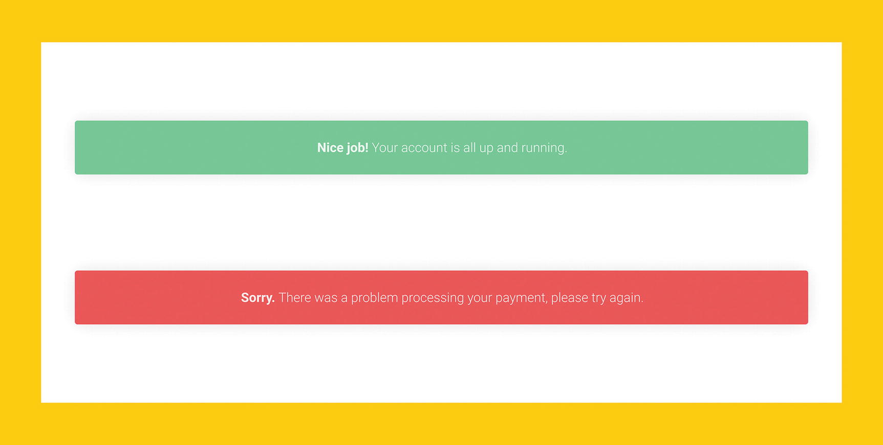
Examples of different messages that we might display in response to an attempted action

A sequential flow that could quite easily be an entire microinteraction contained in a single element
Just as a moment’s ending should offer some form of reflection, so too should an interaction’s response. If the interaction has fundamentally changed state in any way, then finding a way to reflect this will be a major factor in our response. In Chapter 2, we explored how animation can assist greatly in indicating state changes as the result of an interaction. I’d recommend a quick re-skim of that chapter if some of these concepts doesn’t sound too familiar!
Finally, action responses will, in many scenarios, need to communicate new action possibilities that might have arisen from the performing of the previous action. For example, the response state of adding a new to-do item might need to present new actions for marking that to-do as done, archiving it, or placing it somewhere different in our list. However, I’d like to use the remainder of this section to discuss what I believe to be the most important action, across the board, that should be communicated in any interaction’s response state: undo.
Throughout this book, I’ve tried to be as open as possible to different approaches to design, workflow, process, and implementation. As a field, digital design is, comparatively, in its infancy, and I truly believe there is no place for dogma or bullheaded absolution in such a fast-growing industry backed by an ever-changing landscape. However, this is where I break my own rule and espouse an absolute: Always let people undo their major actions.
No matter how well-framed, how wonderfully acknowledged, and how extensively optimized our interactions are, nothing can truly prevent mistakes. For too long, digital interfaces laid mistakes squarely at the feet of humans (or, to be less passive, designers of these interfaces deferred blame to the people they’re supposed to be making things for) and forced us into constrained and intimidating “Are you absolutely positively sure?” moments to (poorly, I might add) mitigate the erroneous performing of destructive or highly volatile actions.
“Are you sure...” is a framing device. It, in a roundabout way, lets people know that a specific action is not to be taken lightly and that bad things can happen if someone performs it. Now, I’m not suggesting that this approach to framing needs to disappear, but I feel it’s imperative to acknowledge how much of a roadblock this truly can be to creativity, self-expression, or just simply avoiding a state of sheer panic over a button press. My personal rule is to treat a modal as a lazy design decision unless I know I’ve explored all over avenues, and to me, “Are-you-sure?” modals are even lazier. No matter how much we convince ourselves that enough defensive measures will stop someone clicking the “Yes-I-want-to-delete-my-entire-digital-history-let’s-go” button accidentally, I promise you that with enough use, someone will click that button. Accidentally.
Preemptive modals are a poor and lazy safety net for us—designers and developers. Undo is an empowering safety net for the people we design for.
As we discussed in Chapter 3, an undo feature implies that mistakes are fine and expected. In an interface that allows for or attempts to foster creativity and self-expression, this is absolutely integral, but even in our general, everyday-use applications, it can save us. Since Google Inbox implemented “undo” for message sending, I’ve been saved from probably a dozen truly embarrassing e-mail moments, ranging from calling someone by the completely wrong name to pasting in a link that was absolutely, assuredly not the link I was supposed to be sending to a client. While these situations might not have resulted in total catastrophe, written communication on the web is hard work, and often even just knowing you’ve sent an e-mail with a pretty major typo in it can weigh heavily on your mind post-sending.
By implementing the undo functionality, we’re implementing a subtle degree of peace of mind. We’re offering a statement that, even when you really do mess up, you can always escape back to the previous state like nothing ever happened.
Zooming In and Out
Jumping from moment-level thinking, where everything revolves around stories and interactions, into system-level thinking, which is much broader and rooted in self-determination, expression, and openness, can initially feel like a strange habit. However, if you’ve ever worked on a design system alongside the actual screens of an interface, you’re already familiar with this approach. And if you haven’t—don’t worry! I’ve found that it’s something that comes naturally with practice.
Essentially, I’m asking you to consider operating at two different levels of granularity simultaneously. At the higher level, we have a more conceptual idea of what our system should be—the various moving parts that might make it up, the personality and character we want it to convey, and the overarching goals and motivations people bring to it. At the lower level, we have a more concrete task of piecing together the discrete moments that make achieving these goals and realizing these motivations are possible. Of course, in between, we have a rather substantial grey area, and many of our tasks won’t fit neatly into “just system” or “just moment” work.
While early-stage documentation of systems and moments can be quite different, as the design process moves along, these notions blur more and more into a single entity: the interface. By the time we start on our prototypes, our system and moments should feel less like two discrete entities and more like one unified whole that is inherently different from the sum of its parts. At certain points, our interface will act as an exploratory conveyor of action possibility. At other points, it will contract and constrain into stories, told through action and conversation, with reverberative endings that lead straight back into a new, modified canvas for exploration.
It would also be remiss of me to not point out that you absolutely don’t need to start your thinking at a system level. In many cases, starting with your key moments and working outward just makes sense. Key moments and interactions, especially those we expect to be repeated, will represent the core loop of our interface. Getting this core loop right will often be the most important design task we perform.
Similarly, don’t overrule starting out at system level because you’re worried that you’ll sacrifice smaller interactions. For multi-faceted or creativity-focused applications, the overall feel and macro-level state changes will often be the key area of focus before delving into some of the subtleties of moments and micro-interactions.
To return to the movie metaphor—action movies have different priorities to Sundance winners. Horror movies are focused around totally different key points to Wes-Anderson- or David-Lynch-style “artsy” movies. None of these genres is any less representative of the overall art of filmmaking as the other (regardless of what the snobs might yell), but they are judged against totally different standards.
Our expectations for an action movie lie in its set pieces. The depth of story and character building are often sacrificed in the name of explosions, gunfights, and car chases. Of course, tone and artistic expression matter—they’re just traditionally lower down the list of priorities. Conversely, movies that rely heavily on tone, consistency, and artistic expression will prioritize the more systematic areas of production. Wes Anderson is almost as famous for his stunning color schemes as he is his irreverent plotlines and esoteric dialogue. Many of Anderson’s movies lean heavily on creating a consistent and engrossing environment with plotlines that feel more loose and consequential, rather than a deliberate, linear push along a traditional narrative arc through action sequences and climactic moments.
All of this is to say that the scope of our application is going to determine where we place the bulk of our focus. Budgets aren’t unlimited and deadlines aren’t completely liquid concepts. There absolutely will be moments where we compromise one area for another, and that’s totally fine. If we have a limited budget and our audience wants Top Gun, we’d be well served by starting working on our dogfights and on -liners, not by blowing 90% of our budget on creating The Grand Budapest Hotel but with Planes and Explosions.
My goal of Part 2 is to present you with some of the tools, metaphors, and abstractions to learn and analyze both from a top-down, system point of view and a bottom-up, moment-to-moment one—it’s up to you to decide the balance. Besides, I used up all my dogma with the whole undo argument.