11. Creating, Deleting, and Updating Events on FullCalendar Using RTK
Devlin Basilan Duldulao1 and Ruby Jane Leyva Cabagnot1
(1)
Oslo, Norway
In the last chapter, we set up Redux Toolkit and learned how to dispatch an asynchronous action to the Store. We’ve also started to build our Calendar component.
We will continue where we left off – creating, deleting, and updating events on the Calendar component using Redux Toolkit. And for this, we’re going to use the FullCalendar library to add user forms to create, delete, and update an event.
To give you a sneak peek at the finished look of the application, Figures 11-1 and 11-2, as well as Listing 11-1, provide the UI of our app at the end of this chapter.
Figure 11-1
Screenshot of Full Calendar at the end of Chapter 11
Let’s get started with installing some third-party libraries that we will need to build our Full Calendar component.
Open your terminal and install the following packages, as shown in Listing 11-1.
npm i moment @date-io/moment@1 @fullcalendar/core
npm i @fullcalendar/daygrid @fullcalendar/interaction
npm i @fullcalendar/list @fullcalendar/react
npm i @fullcalendar/timegrid @fullcalendar/timeline
Listing 11-1
Importing Additional Libraries
Let’s quickly review each library that we’ve installed:
moment.js: A JavaScript date library for parsing, validating, manipulating, and formatting dates. A note on this famous library’s project status: Even though it is now in maintenance code – meaning the creators are not planning to add more features to the library – the patches and bug fixes will continue. It has over 18 million downloads and is still on the uptrend as of early 2021.
There are also a lot of JavaScript libraries that you can use for manipulating dates. But learning moment.js can likewise help you understand other React applications because many React libraries are likely using this popular date library.
If you go to npmjs.org and look for these libraries, you’ll see their following definitions:
@date-io/moment: Part of date-io-monorepo and contains the unified interface of the moment. We’ll be needing version 1.
@fullcalendar/core: Provides core functionality, including the Calendar class.
@fullcalendar/daygrid: Displays events on Month view or DayGrid view.
@fullcalendar/interaction: Offers functionality for an event drag-and-drop, resizing, dateClick, and selectable actions.
@fullcalendar/list: View your events as a bulleted list.
@fullcalendar/react: It’s a connector. It tells the core FullCalendar package to begin rendering with React Virtual DOM nodes instead of the Preact nodes it uses typically, transforming FullCalendar into a “real” React component.
@fullcalendar/timegrid: Displays your events on a grid of time slots.
@fullcalendar/timeline: Displays events on a horizontal time axis (without resources).
After you’ve successfully imported all the libraries and modules, let’s update the root component.
Updating the Root Component
First, let’s add these modules in index.tsx, as shown in Listing 11-2.
import MomentUtils from '@date-io/moment';
import {MuiPickersUtilsProvider} from '@material-ui/pickers';
Listing 11-2
Importing Modules in the Root Component index.tsx
In the same root file, we’ll use the MuiPickersUtils to wrap everything starting from SnackbarProvider, as shown in Listing 11-3.
export function App() {
return (
<BrowserRouter>
/*required props called utils and we're passing the MomentUtils */
/*{start: number; end: number} - this is the shape of the model that we can define here right away, although we can also write it separately in the models' folder. */
selectRange(state, action: PayloadAction<{ start: number; end: number }>) {
createEvent: The parameter for createEvent is an object of EventType, and to produce a new event, we are just going to push it in an existing array. This would generate a new object in the array of EvenType.
selectEvent: Takes a string, and we’re modifying two states here.
updateEvent: Takes an event type, and then we need to get the position (findIndex) of this EventType that we’re passing. This is updating an existing object.
deleteEvent: We are passing a string, and then we’re doing a filter. The filter returns a new array without the id (string) we selected.
selectRange: Takes an object with a start and end – both of type number.
openModal: Does not require any parameter; it’s just updating the state to true.
closeModel: Does not require any parameter; it’s just updating the state back to false, selectedEventId, and selectedRange to null.
Next, we will export some non-async actions in the same file calendarSlice.ts, as shown in Listing 11-5
Adding the Non-async Actions
/* Export these actions so components can use them. Non-asynchronous actions. HTTP client is not needed. */
Again, let’s see what is going on in Listing 11-5.
selectEvent: This is a higher-order function that takes an id and returns a dispatch for execution.
The id is coming from the selectEvent. The function selectEvent is named the same as the dispatch selectEvent to avoid confusion when importing it to the components.
selectRange: The function also has the same name as the action selectRange.
And let’s continue adding our asynchronous event actions in calendarSlice.ts, as shown in Listing 11-6.
Adding Asynchronous Event Actions in calendarSlice.ts
In Listing 11-6, we added three more events – createEvent, updateEvent, and deleteEvent:
createEvent: We’re exporting and using the createEvent function, which takes an EventType object. We are running dispatch asynchronously as we await the axios.post, which takes the EventType, from the Endpoints.events. The required body parameter is an event.
We deconstructed the response object because we only need one property, the data.
We’re passing the data in the createEvent action and dispatching it.
updateEvent: It also takes an update of EventType and runs the dispatch asynchronously and awaits the axios.put, and it returns an EventType.
deleteEvent: Here, we only need an id. After running the async dispatch and deleting it in the database, we’re also filtering it out from the UI.
FOR YOUR ACTIVITY
If you notice, there’s no try-catch block in the createEvent, updateEvent, and deleteEvent.
For example, in the deleteEvent, if there’s no try-catch and the axios.delete fails, the dispatch will continue to run and remove the object in the UI even if the object in the database has not been erased. So now, the state in the UI and that in the database would be mismatched.
For your activity, implement a try-catch in the three async events. See what we did with the getEvents. Don’t also forget to implement the setLoading and setError actions.
After doing the activity, we’ll update the index.tsx of the CalendarView.
Updating the CalendarView
We will import the Page component template and the Container and makeStyles modules from Material-UI Core, as shown in Listing 11-7.
import { Container, makeStyles} from '@material-ui/core';
import Page from 'app/components/page';
Listing 11-7
Importing Named Components in CalendarView
Then let’s replace the return <div> with the newly imported Page and Container. We’ll add some styling, too, on the height and padding, as shown in Listing 11-8.
const CalendarView = () => {
const classes = useStyles();
const dispatch = useDispatch();
/* destructuring it because we only need the events, loading, error */
const { events, loading, error } = useSelector(
(state: RootState) => state.calendar,
);
useEffect(() => {
dispatch(getEvents());
}, []);
return (
<Page className={classes.root} title="Calendar">
<Container maxWidth={false}>
<h1>Calendar Works!</h1>
{loading && <h2>Loading... </h2>}
{error && <h2>Something happened </h2>}
<ul>
{events?.map(e => (
<li key={e.id}>{e.title} </li>
))}
</ul>
</Container>
</Page>
);
};
export default CalendarView;
const useStyles = makeStyles(theme => ({
root: {
minHeight: '100%',
paddingTop: theme.spacing(3),
paddingBottom: theme.spacing(3),
},
}));
Listing 11-8
Updating the Styling of the CalendarView Component
After this, let’s add a Header component for the CalendarView. Create a new file Header.tsx:
calendar ➤ CalendarView ➤ Header.tsx
Creating the Header Component
In Listing 11-9, we are importing the named components for Header.tsx.
import React from 'react';
import { Link as RouterLink } from 'react-router-dom';
import clsx from 'clsx';
import { PlusCircle as PlusCircleIcon } from 'react-feather';
import NavigateNextIcon from '@material-ui/icons/NavigateNext';
import {
Button,
Breadcrumbs,
Grid,
Link,
SvgIcon,
Typography,
makeStyles,
Box,
} from '@material-ui/core';
Listing 11-9
Importing the Named Components in Header.tsx
We’ll follow it up right away with our Header function component, as shown in Listing 11-10.
/*nullable className string and nullable onAddClick function */
And lastly, the useStyles from makeStyles of Material-UI Core, as shown in Listing 11-11.
const useStyles = makeStyles(theme => ({
root: {},
action: {
marginBottom: theme.spacing(1),
'& + &': {
marginLeft: theme.spacing(1),
},
},
}));
export default Header;
Listing 11-11
Adding the Styling Margin for the Header Component
Next, we’ll use the newly created Header component in the index.tsx of the CalendarView, as shown in Listing 11-12.
import Header from './Header';
...
return (
<Page className={classes.root} title="Calendar">
<Container maxWidth={false}>
<Header />
<h1>Calendar Works!</h1>
Listing 11-12
Using the Header Component in the index.tsx of the CalendarView
Refresh the browser, and you should see the same.
Figure 11-3
Screenshot of the UI after using the Header component in the index.tsx
So baby steps again. We can see that it’s working. We can now proceed with the Add Edit Event form. Inside the CalendarView folder, create another component and name it AddEditEventForm.tsx.
Creating an Add Edit Event Form Using Formik
In the AddEditEventForm, among others, we’ll be using moment.js,Formik, and yup validation. In this case, we don’t need to do a separate file for the Yup validation.
Open the file AddEditEventForm and add the following named components, as shown in Listing 11-13.
import React from 'react';
import moment from 'moment';
import * as Yup from 'yup';
import { Formik } from 'formik';
import { useSnackbar } from 'notistack';
import { DateTimePicker } from '@material-ui/pickers';
import { Trash as TrashIcon } from 'react-feather';
import { useDispatch } from 'react-redux';
import {
Box,
Button,
Divider,
FormControlLabel,
FormHelperText,
IconButton,
makeStyles,
SvgIcon,
Switch,
TextField,
Typography,
} from '@material-ui/core';
/*the async actions we created earlier in the calendarSlice */
import {
createEvent,
deleteEvent,
updateEvent,
} from 'features/calendar/calendarSlice';
import { EventType } from 'models/calendar-type';
Listing 11-13
Adding the Named Components in AddEditEventForm
The new addition here from Material-UI is the DateTimePicker. If you check out the Material-UI website, you’ll see a lot of date-time picker components you can reuse, and you don’t have to create your own from scratch.
Next, let’s write the type definition for our component AddEditEventForm, as shown in Listing 11-14.
/* the ? indicates it is a nullable type */
type Props = {
event?: EventType;
onAddComplete?: () => void;
onCancel?: () => void;
onDeleteComplete?: () => void;
onEditComplete?: () => void;
range?: { start: number; end: number };
};
Listing 11-14
Creating the Type or Shape of the AddEditEventForm
In Listing 11-14, we have the Props, and we’re using it in the AddEditEventForm component, as shown in Listing 11-15.
const AddEditEventForm = ({
event,
onAddComplete,
onCancel,
onDeleteComplete,
onEditComplete,
range,
}: Props) => {
const classes = useStyles();
const dispatch = useDispatch();
const { enqueueSnackbar } = useSnackbar();
/*event is coming from the parent of the AddEditEventForm */
const isCreating = !event;
const handleDelete = async (): Promise<void> => {
try {
await dispatch(deleteEvent(event?.id));
onDeleteComplete();
} catch (err) {
console.error(err);
}
};
Listing 11-15
Creating the AddEditEventForm Component
As you’ll notice in Listing 11-15, AddEditEventForm is using Props, as well as the dispatch Snackbar, while handleDelete is an async function that dispatches the deleteEvent action and passes the event.id.
We are not done yet, of course. Next, let’s use Formik to create our form. Since we are using TypeScript, we must initialize the following three Formik props: initialValues, validationSchema, and onSubmit.
We will start first with the initialValues and the ValidationSchema using Yup as shown in Listing 11-16.
return (
<Formik
initialValues={getInitialValues(event, range)}
validationSchema={Yup.object().shape({
allDay: Yup.bool(),
description: Yup.string().max(5000),
end: Yup.date().when(
'start',
(start: Date, schema: any) =>
start &&
schema.min(start, 'End date must be later than start date'),
),
start: Yup.date(),
title: Yup.string().max(255).required('Title is required'),
})}
Listing 11-16
Creating the Two Formik Props: initialValues and validationSchema
initialValues: The getInitialValues is added in Listing 11-17.
validationSchema: Usually, the validation schema is saved in another file, especially if it’s a long one, but in this instance, we’re already writing it here because it’s just a small validation object.
In short, it is common to put in a separate file the initialValues and the validationSchema and just use them in a component where you need them.
Okay, next, let’s add another required Formik prop: onSubmit.
onSubmit={async (
/* where the input values (i.e. from TextField) are being combined. */
disabled={isSubmitting} ➤ /* this is to prevent double clicking */
color="primary"
className={classes.confirmButton}
>
Confirm
</Button>
</Box>
</form>
)}
</Formik>
);
};
export default AddEditEventForm;
Listing 11-17
Creating the onSubmit on the AddEditEventForm
And here is Listing 11-18, the getInitialValues for the Formik prop initialValues.
const getInitialValues = (
event?: EventType,
range?: { start: number; end: number },
) => {
if (event) {
const defaultEvent = {
allDay: false,
color: '',
description: '',
end: moment().add(30, 'minutes').toDate(),
start: moment().toDate(),
title: '',
submit: null,
};
return { ...defaultEvent, event };
}
if (range) {
const defaultEvent = {
allDay: false,
color: '',
description: '',
end: new Date(range.end),
start: new Date(range.start),
title: '',
submit: null,
};
return { ...defaultEvent, event };
}
return {
allDay: false,
color: '',
description: '',
end: moment().add(30, 'minutes').toDate(),
start: moment().toDate(),
title: '',
submit: null,
};
};
Listing 11-18
Creating the getInitialValues of Formik
In Listing 11-18, we have the getInitialValues – a function that takes the event and range of the value. This function is showing a default event or a range of events.
After creating the Formik props, we go back to the index.tsx of the CalendarView to make some updates.
Updating the CalendarView
Let’s import closeModal and openModal in the calendarSlice, as shown in Listing 11-19.
import {
getEvents,
openModal,
closeModal,
} from 'features/calendar/calendarSlice';
Listing 11-19
Importing Modules in calendarSlice
In the same index file of the CalendarView, we use the following: isModalOpen and selectedRange in useSelector. We will also create a handleAddClick and a handleModalClose, as shown in Listing 11-20.
Creating an Event Selector in the index.tsx of CalendarView
In Listing 11-23, we have the selectedEventSelector – a function that takes a state, RootState, and the calendar, and what we’re passing from the calendar are the variable events and selectedEventId.
Now we’ll call the useSelector and pass selectedEventSelector, as shown in Listing 11-24
Using the useSelector in the index.tsx of CalendarView
Still in the same index file, we’ll do some refactoring inside the Container.
We will replace the current h1 tags with the Dialog, isModalOpen, and AddEditEventForm, as shown in Listing 11-25.
<Container maxWidth={false}>
<Header onAddClick={handleAddClick} />
<Dialog
maxWidth="sm"
fullWidth
onClose={handleModalClose}
open={isModalOpen}
>
{isModalOpen && (
<AddEditEventForm
event={selectedEvent}
range={selectedRange}
onAddComplete={handleModalClose}
onCancel={handleModalClose}
onDeleteComplete={handleModalClose}
onEditComplete={handleModalClose}
/>
)}
</Dialog>
</Container>
Listing 11-25
Adding Dialog and AddEditEventForm in index.tsx of CalendarView
In Listing 11-25, we have the Dialog – a Material-UI modal component – and we’re defining the size here and using the event onClose and open dialog. And also the isModalOpen, if true, shows the AddEditEventForm. In the AddEditEventForm props, we are passing selectedEvent, selectedRange, and handleModalClose.
Checking the UI of CalendarView
Let’s see how it works in the UI. Refresh the browser and open Chrome DevTools. Click New Event. You should see the pop-up modal dialog entitled Add Event.
Figure 11-4
Screenshot of the modal dialog Add Event in the browser
Try creating an event and click the Confirm button. You’ll see the data events being successfully returned in the Chrome DevTools, as shown in Figure 11-5.
Figure 11-5
Screenshot of event requests in Chrome DevTools
Checking the Chrome DevTools
Note also that the modal dialog automatically closes. In the Chrome DevTools, check the Headers, and you’ll see the Status Code 201 created. This means we’re able to create an object and save it in the database.
Checking the Redux DevTools
Next, open the Redux DevTools. Make sure to choose Calendar – React Boilerplate on the top dropdown arrow.
The Redux DevTools records dispatched actions and the Store’s state. We can inspect our application’s state through its time-travel debugging feature at every point in time without the need to reload or restart the app.
Figure 11-6
Screenshot of event requests in Redux DevTools
We’re interested in looking at the Diff where you can see the state is changing from setLoading to createEvents to closeModal and so on.
You can see the events or array of events you can access from the store, you can also look for any error message, etc. All the actions are being recorded, and we can play it back via the time-travel debugging feature of the Redux DevTools.
Creating the Toolbar
We will create a Toolbar component, Toolbar.tsx, under the CalendarView folder.
First, we import the named components, as shown in Listing 11-26.
import React, { ElementType, ReactNode } from 'react';
import clsx from 'clsx';
import moment from 'moment';
import {
Button,
ButtonGroup,
Grid,
Hidden,
IconButton,
Tooltip,
Typography,
makeStyles,
} from '@material-ui/core';
import ViewConfigIcon from '@material-ui/icons/ViewComfyOutlined';
import ViewWeekIcon from '@material-ui/icons/ViewWeekOutlined';
import ViewDayIcon from '@material-ui/icons/ViewDayOutlined';
import ViewAgendaIcon from '@material-ui/icons/ViewAgendaOutlined';
import { ViewType } from 'models/calendar-type';
Listing 11-26
Adding Named Components in Toolbar.tsx
In Listing 11-26, we imported moment and the standard style modules from Material-UI Core. The new ones are the different icons from Material-UI icons.
We also imported the ViewType from models/calendar-type.
In the same Toolbar.tsx file, we’ll create the type or schema of our model Toolbar and type for ViewOption, as shown in Listing 11-27.
type ViewOption = {
label: string;
value: ViewType;
icon: ElementType;
};
type Props = {
children?: ReactNode;
className?: string;
date: Date;
/* the ? means it's a nullable void function
onDateNext?: () => void;
onDatePrev?: () => void;
onDateToday?: () => void;
onAddClick?: () => void;
/* takes a view object and returns nothing or void */
onViewChange?: (view: ViewType) => void;
view: ViewType;
};
Listing 11-27
Creating the Type or Schema of Toolbar
In Listing 11-27, we have the type Props, and it has date and view as required type properties, while the rest are nullable types. The type ViewOption takes three required props: label, value, and icon. We will use the ViewPoint in a short while. We are just preparing it here now.
And so, we’ll now use the Props that we’ve defined in the Toolbar component, as shown in Listing 11-28.
const Toolbar = ({
className,
date,
onDateNext,
onDatePrev,
onDateToday,
onAddClick,
onViewChange,
view,
...rest // the rest parameter
}: Props) => {
const classes = useStyles();
Listing 11-28
Using the Props in the Toolbar Component
In Listing 11-28, you will notice the rest parameter. This allows us to take multiple arguments in our function and get them as an array.
Rest parameters can be used in functions, arrow functions, or classes. But in the function definition, the rest parameter must appear last in the parameter list; otherwise, the TypeScript compiler will complain and show an error.
Next, we’ll make the return statement in the same Toolbar component file.
We’re wrapping everything in a Grid and adding the ButtonGroup.
We’re formatting the date using the moment, and we’re also mapping the four objects in the viewOptions, as shown in Listing 11-29, and returning the Tooltip keytitle and IconButton.
Adding Styling Components in the index.tsx of CalendarView
The additional styling components in Listing 11-31 are just several border colors for the calendar, along with some margins and paddings.
Now in the same index file of the CalendarView, we will import the moment library and the modules from the FullCalendar library, as shown in Listing 11-32.
import moment from 'moment';
import FullCalendar from '@fullcalendar/react';
import dayGridPlugin from '@fullcalendar/daygrid';
import timeGridPlugin from '@fullcalendar/timegrid';
import interactionPlugin from '@fullcalendar/interaction';
import listPlugin from '@fullcalendar/list';
import timelinePlugin from '@fullcalendar/timeline';
Listing 11-32
Importing Named Components in index.tsx of CalendarView
Then let’s add and use some modules from the calendarSlice and React Hooks, as shown in Listing 11-33.
import React, { useEffect, useState, useRef } from 'react';
import {
getEvents,
openModal,
closeModal,
selectRange,
selectEvent,
updateEvent
} from 'features/calendar/calendarSlice';
Listing 11-33
Importing Additional Modules from calendarSlice and React Hooks
Again, in the same index file, we’ll create some local states, as shown in Listing 11-34.
Creating local states in index.tsx of CalendarView
Let’s have a look at what’s happening in Listing 11-34. We have the useRef to access DOM elements and persist values or states in the succeeding or next renders. Hover your mouse over the useRef, and you’ll read that it is a React.MutableRefObject<FullCalendar>. It means that we have access to the APIs or interfaces of this FullCalendar.
useMediaQuery: We’re using it for detecting small browser screens such as that of a mobile device.
After that, we will create additional handle functions below the handleModalClose, as shown in Listing 11-35.
/* calendarRef is a reference to the element FullCalendar*/
const handleDateNext = (): void => {
const calendarEl = calendarRef.current;
/*the getApi here is part of FullCalendar. If you 'dot space' the 'calendarEl,' you'll see the interfaces or APIs available. */
Creating Additional Handle Events in the index.tsx of CalendarView
We’re still not yet done here. We need to add the paper module from Material-UI and the FullCalendar for the UI styling.
Locate the Dialog tag in the return statement; we’ve written that the Dialog is only visible when the isModalOpen is true. So after the Header component and before the Dialog, we will put the FullCalendar, as shown in Listing 11-36.
return (
<Page className={classes.root} title="Calendar">
<Container maxWidth={false}>
<Header onAddClick={handleAddClick} />
<Toolbar
date={date}
onDateNext={handleDateNext}
onDatePrev={handleDatePrev}
onDateToday={handleDateToday}
onViewChange={handleViewChange}
view={view}
/>
<Paper className={classes.calendar}>
<FullCalendar
allDayMaintainDuration
droppable
editable
selectable
weekends
dayMaxEventRows
eventResizableFromStart
headerToolbar={false}
select={handleRangeSelect}
eventClick={handleEventSelect}
eventDrop={handleEventDrop}
eventResize={handleEventResize}
initialDate={date}
initialView={view}
events={events}
height={800}
ref={calendarRef}
rerenderDelay={10}
plugins={[
dayGridPlugin,
timeGridPlugin,
interactionPlugin,
listPlugin,
timelinePlugin,
]}
/>
</Paper>
<Dialog
maxWidth="sm"
fullWidth
onClose={handleModalClose}
open={isModalOpen}
>
Listing 11-36
Rendering the FullCalendar in the UI of the index.tsx of CalendarView
If you notice in Listing 11-36, some of the properties (i.e., allDayMaintainDuration, droppable,editable, etc.) are without the equal = sign; it means they are by default set as true.
This is shorthand for writing allDayMaintainDuration={true}, and this also means that they are all boolean.
But for the headerToolbar, we had to state the false value explicitly. We’re setting it to false because we have our Toolbar component that we will add shortly.
Checking the FullCalendar in the UI
Let’s test everything out in our browser. Refresh it, and you should be able to see the Full Calendar and the test events we’ve created earlier.
Figure 11-7
Screenshot of the Full Calendar
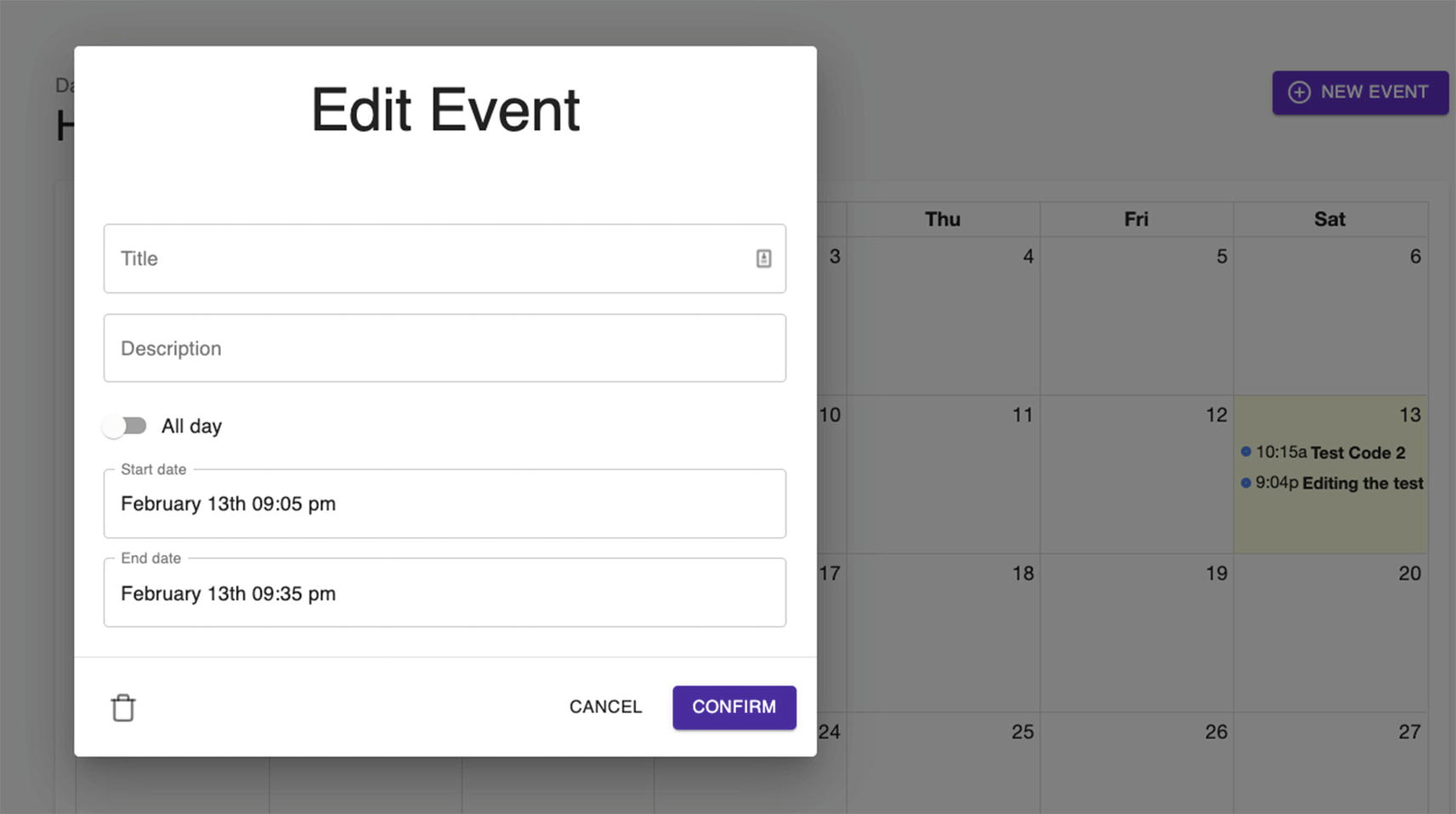
Click the event shown and try to edit it. You should be able to make the changes successfully, as shown in Figure 11-8.
Figure 11-8
Edit Event form of the Full Calendar
Checking the Chrome DevTools and Redux DevTools
Take a peek at the Redux DevTools and you’ll see that it’s also being updated, and see the 200 OK Status Code in the Chrome DevTools.
Test also the delete icon at the bottom left of the Edit Event form, and you should be able to delete the chosen event.
Once you have deleted it, check the Network in the Chrome DevTools again to see the Request Method: DELETE and Status Code: 200 OK.
Figure 11-9
Deleting an event
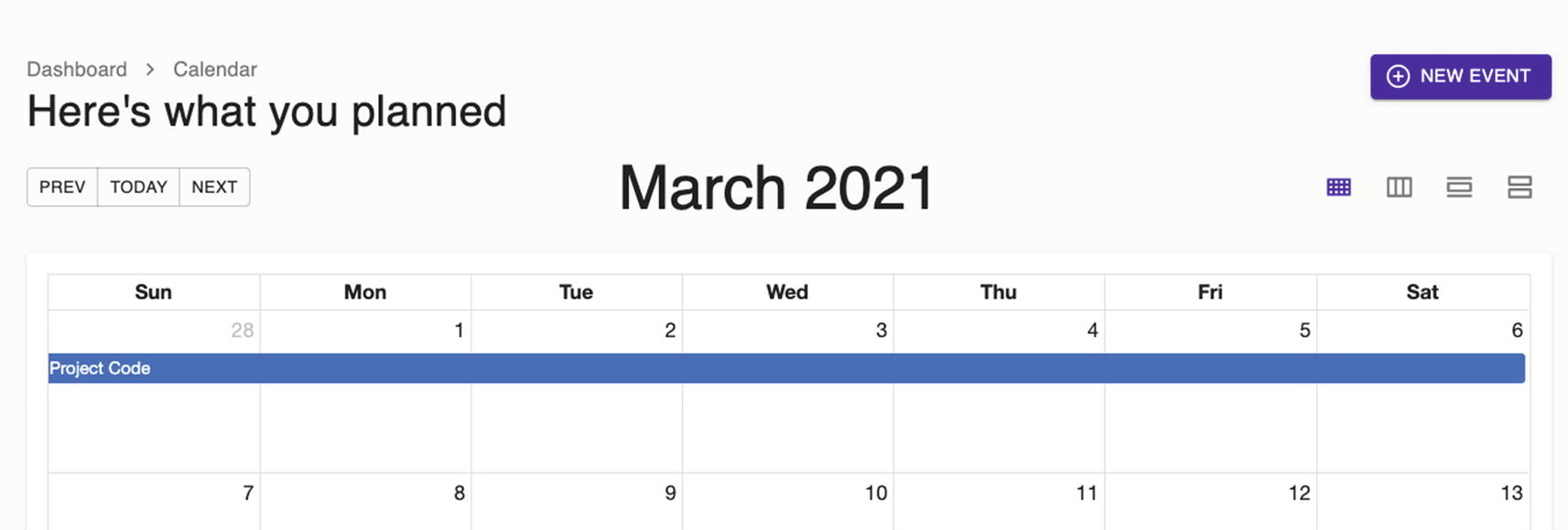
How about creating an event that has about a two-week range in two consecutive months? In Figure 11-10, we can see that we have successfully added an event for a multi-month calendar.
Figure 11-10
Creating an event in a multi-month calendar
We were able to create the multi-month event from February to March. However, you’ll notice that we can’t navigate to the next month.
This is because we still need to add one more thing, which is the Toolbar. So let’s import it now in the index.tsx of CalendarView.
We will import the Toolbar component and use it below the Header component, as shown in Listing 11-37.
import Toolbar from './Toolbar';
...
<Header onAddClick={handleAddClick} />
<Toolbar
date={date}
onDateNext={handleDateNext}
onDatePrev={handleDatePrev}
onDateToday={handleDateToday}
onViewChange={handleViewChange}
view={view}
/>
Listing 11-37
Adding the Toolbar Component in the index.tsx of CalendarView
Check the UI, and you should see the changes as shown in Figure 11-11. You should be able to navigate now to the previous or the subsequent months.
Figure 11-11
Screenshot of the updated UI following the addition of Toolbar
Summary
In this chapter, we’ve continued building our application. We installed the FullCalendar library and learned how to create, delete, and update events on our Calendar component using Redux Toolkit. Hopefully, you have a better understanding now of the implementation flow of Redux Toolkit.
In the next chapter, we will build the login and registration forms. We will need the help of our fake Node json-server and json-server-auth, along with some more styling components from the excellent Material-UI.


 Rest parameters can be used in functions, arrow functions, or classes. But in the function definition, the rest parameter must appear last in the parameter list; otherwise, the TypeScript compiler will complain and show an error.