
Chapter 15. Style Guides
As our stylesheets evolve from a list of declarative statements to a system of variables, functions, and logic, we need to make sure that our documentation system evolves as well. Hologram equips us with everything we need to create a robust system of documentation for our design system. It allows us to annotate our system directly in the Sass or JavaScript files where we are writing our code. The annotation is automatically collected by Hologram and turned into a browsable website with rendered examples, as well as correlating code examples. This means that we aren’t maintaining two separate codebases—the style guide is integrated into the actual design system. It is easy to see if code has been written without sufficient documentation.
On top of system documentation, Hologram allows us to create standard Markdown files that will be browsable within our style guide. These give us a great place to write onboarding docs, project rules and procedures, contact information, or anything else that needs to be captured, organized, and displayed for the team.
Let’s take a quick look at the setup of Hologram and then jump into some documentation examples.
Hologram is a Ruby gem, so we’ll start out by installing the gem to our system:
$ gem install hologram
Hologram Configuration
With the gem installed, we configure Hologram by creating a YAML file with the following:
destination:./docsdocumentation_assets:./doc_assetscode_example_templates:./code_example_templatesdependencies:./buildsource:./sass
Let’s take a closer look at each piece of code:
destination- This will be the folder in which Hologram builds our static style guide. If we are making this accessible to the outside world, this will be our public folder, and will hold everything we need to serve up our style guide.
documentation_assets- These are the static assets we’ll be using to build our style guide. We’ll need to specify the templates we are using to build the HTML, as well as any CSS or JavaScript we want to use to enhance the user’s experience. This will include things like code highlighting, example layout, and navigation styles. If you aren’t interested in building yet another site just to document your first one, you can always use one of the already built templates listed at the bottom of the Hologram GitHub page.
code_example_templates-
Code examples and how they render in the browser are the heart and soul of this style guide. Hologram provides a very easy way to customize the markup surrounding our examples. Here is the default markup that Hologram uses, which you could alter however you need:
<divclass="codeExample"><divclass="exampleOutput"><%= rendered_example %></div><divclass="codeBlock"><divclass="highlight"><pre><%= code_example %></pre></div></div></div>Notice the two variables of
rendered_exampleandcode_example. The rendered example is your example printed directly onto the page, whereas the code example is passed into a<pre>tag, properly escaped, and wrapped with code highlighting classes. Figure 15-1 shows an example set of rendered and example code.
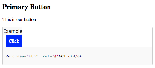
Figure 15-1. A quote component rendered in a Hologram style guide
dependencies- Similar to
documentation_assets,dependenciesdescribe a list of assets to be included in the style guide folder. These paths should include your compiled CSS, JavaScript, fonts, images, and any other asset needed to properly display and interact with your style guide content. source- Lastly, we need to tell Hologram where to look for the documentation we want in our style guide. This array of sources can and should include your Sass/CSS, JavaScript/CoffeeScript, HTML templates, and icon font folders, as well as folders that might contain onboarding, workflow, or testing procedure information. Let’s look at an example of documentation, what the values mean, and how it is rendered in the style guide.
Hologram Documentation Block
This example would be inside of your _buttons.scss file. The hologram content is put inside of a CSS comment, starting with the word “doc”:
/*doc---title: Primary Buttoncategory: Base CSS---This is our button```html_example<a class="btn" href="#">Click</a>```*/.btn{color:white;background:blue;padding:10px;border:none;text-decoration:none;}
Let’s take a look at each piece of this code.
Being Markdown, it enables us to include chunks of code, either inline or in blocks. Hologram comes with a custom Markdown renderer that uses a few block keywords (html_example, js_example, haml_example, and others) that will not only display the markup with syntax highlighting, but will also render the markup onto the page.
Figure 15-2 shows this button rendered in the Hologram style guide.
title- This is the human-readable title for this piece of documentation.
category- Each category in your style guide will get its own page and entry in the navigation. You can put as many entries as you want into each category. The default template gives you jump links down to each documentation title.
- Documentation body
- After the closing triple dash is the body of the documentation. This section is processed as Markdown, so we can easily include headings, lists, links, images or even tables without using a single HTML tag. But if we wanted to use HTML, that’s completely fair game as well.
The Hologram Process
When Hologram runs, it looks through all the files in your source directory and pulls anything wrapped in /*doc */ into the style guide, using the YAML frontmatter to define its title and category. The end result is a build folder containing all of the dependencies (CSS, JavaScript, images) and an HTML file for each of your style guide categories.
Each page contains all of the documentation that matches that category, converted from Markdown and code blocks into standard HTML. The pages are then wrapped in the header and footer templates, pulling in CSS, JavaScript, fonts, and navigation elements. You can customize these templates to your heart’s content, and if you are going to be spending much time in this style guide, you’ll probably end up rewriting most of it, bringing in your own branding and styles.
Having our documentation block wrapped in comments is great because it means we can put our documentation right next to the code we are trying to document, but it will never affect the actual code used to style our design system. CSS comments are also easy to transport inside your module’s CSS, and are very easy to strip out when you want to push out production code.
Hologram Conclusion
We are now able to write chunks of Markdown documentation right in our project source files. Hologram collects them all and converts them into a small website that we are able to customize, adding functionality like search or filtering, or styling to match corporate branding standards. Our documentation doesn’t even have to be in the same file as the code it is documenting; we could break it out into a separate file next to our code. We have a separate docs file for each component that sits in the same folder as our styles. We also have documentation that has nothing to do with our Sass or JavaScript, and is simply information on project setup and workflow. We quickly found numerous uses for Hologram documentation, and I’m sure you’ll find it just as useful as we did.
SassDoc
Hologram is a very free-form documentation system. It really doesn’t care about its context, or what file the documentation is placed in. It also is a bit of a blank slate when it comes to theme. It’s really only what you make it out to be.
SassDoc, on the other hand, is the complete opposite. SassDoc, a tool for documenting your Sass’s variables, mixins, extends, and functions, is very aware of the code that is directly after each comment block. It is also very opinionated in how the documentation is presented and styled. Hologram only organizes documentation into groups, but SassDoc automatically maps the relationship between your variables and functions, or your mixins and extends. If you are writing a large, Sass-based design system or a Sass framework, and you don’t want to be writing all of your documentation by hand, then SassDoc is the tool for you! So let’s look at how to get started with SassDoc.
Installing SassDoc
SassDoc is a NodeJS-based documentation system, and has plug-ins for Grunt, Gulp, and Broccoli. You can also run SassDoc from the command line with nothing other than a Sass file in your project. The output will always be the same, so for simplicity I’ll demonstrate the command-line option. This way you can start playing with SassDoc right away without making changes to your project.
We start off by installing SassDoc as a global NPM package (again, this makes trying out SassDoc easier, but if you are going to use this in production you probably won’t be using the global version):
$ npm install sassdoc --global
With SassDoc installed into your global NPM folder, you are now able to run the sassdoc command directly on your sass folder:
sassdoc sass
And that’s it! SassDoc will search through all of the files in your sass folder and extract anything you have tagged with SassDoc’s special documentation syntax. It will then use all of that information to build out a fully featured static documentation site. Let’s dive right into SassDoc’s syntax, and see what our documented code looks like once processed.
Using SassDoc
SassDoc uses a three-slash Sass comment to let us signify that the following code needs to be included into our documentation. All you need to do is place /// on the line above a mixin, extend, function, or variable, and SassDoc will do the rest. Here’s an example using just a couple variables:
///$button-padding:1em;$button-font-size:1.2em;
In the preceding example, the $button-padding variable will be pulled into SassDoc, but the $button-font-size will not. SassDoc is smart enough to just grab the immediately following variable. Even if you put both variables on the same line in the file, SassDoc will still only import the first one. If you want to import both, just do the following:
///$button-padding:1em;///$button-margin:1.2em;
With nothing more than two variables, six slashes, and a terminal command, SassDoc creates the documentation shown in Figure 15-3.
Wow! We didn’t create a single template file or write a single line of CSS and we already have extremely professional-looking documentation built out of static HTML, CSS, and JavaScript. With a simple push to GitHub pages, you now have documentation that displays a list of your system’s variables. But SassDoc does way more than that! We’re just getting started.

Figure 15-3. A rendered SassDoc style guide
Exploring SassDoc
Let’s create another variable and look at some of the annotation types SassDoc ships with:
/// A number between 0 and 360 used to find __foreground color__/// @type Number/// @access private$foreground-adjust:180!global;
The variable shown here is preceded by SassDoc’s triple-slash notation, but there are also a few lines of annotation that will be pulled in along with the variable name and value.
The first line of the doc block is always the description that SassDoc will display above the variable. This can be multiple lines, and is compiled as Markdown, so it supports headings, lists, links, and anything else you want to throw at it. Just make sure that each line is preceded by the three slashes.
After the description, we are free to use one of SassDoc’s numerous annotation types. First up is the @type annotation. If this variable is simply a reference to another variable, or possibly the result of a function, it is helpful to describe whether this variable is a string, number, Boolean, or map. You can actually use any text string you like to describe the @type, so write what will be most useful for the reader.
The next annotation we’ve used here is @access. This annotation has two possible values: private and public. If you come from a traditional object-oriented programming background, you’ll be familiar with the idea that you can set variables and functions as private, which means they are only accessible from within that object and cannot be called by other parts of the system. Sass doesn’t actually have this type of technical restriction, but if you are creating variables, functions, mixins, or extends that only have internal uses, you should set the @access to private. This makes no functional change to your system, but it does tell users not to use this variable in their stylesheets, as it could be changed, removed, or refactored at any time.
As you can see in Figure 15-4, our @access private has set a [Private] flag on the variable title, our description is rendered with all of its Markdown glory, and our type is specified below.

Figure 15-4. Our $foreground-adjust variable rendered in SassDoc
Digging Deep into SassDoc
Now that we’ve seen the basics for documenting our Sass design system, let’s jump ahead and see how this looks when we have a more complete set of variables, functions, mixins, and extends. The following is a slightly contrived button mixin accompanied by everything it needs to output our button CSS:
/// Our global button padding/// @access private$button-padding:1em!global;/// Our global button font-size/// @access private$button-font-size:1.2em!global;/// A number between 0 and 360/// @type number/// @access private$foreground-adjust:180!global;/// Function to return a foreground color basedonabackgroundcolor///@accessprivate///@param{color}$color-Thebackgroundcolor///@return{color}/// @example/// @function get_foreground(blue);/// // yellow@functionget_foreground($color){@returnadjust_hue($color,$foreground-adjust);}/// Our core button styles/// @access private%btn-core{padding:$button-padding;text-decoration:none;font-size:$button-font-size;}/// Our basic button mixin/// @access public/// @param {Color} $bg_color [red] - Background Color@mixinbutton($bg_color:"red"){background:$bg_color;color:get_foreground($bg_color);@extend%btn-core;}
Sitting among variables, functions, and extends, our @mixin button is the only publicly exposed part of this system. This ensures that our users will only call this mixin, and will never @extend %btn-core, call the get_foreground function, or use any of our variables. When we decide to refactor our button mixin, we know that we can remove or change any of these private elements without fear of breaking our code.
Our button mixin is using the @param annotation, which lets us document the various inputs that our mixin takes, and will display them in a nice, consistent format. The @param line is formatted like the following:
@param{type}$param_name[defaultvalue]-description
Internal Dependencies
One of the more powerful parts of SassDoc is its ability to automatically list internal dependencies. Without the %btn-core silent extend, our button mixin would break. Our button mixin is actually dependent on the get_foreground function as well, and SassDoc is able to track all of those dependencies and list them right at the bottom of the mixin documentation.
Putting everything together, Figure 15-5 shows what the button documentation looks like.

Figure 15-5. Our button mixin rendered in SassDoc
The %btn-core placeholder doesn’t use any new annotation types, but as it is a dependency of our button mixin, and is dependent on a few of our variables, those relationships are spelled out automatically for us, as shown in Figure 15-6.
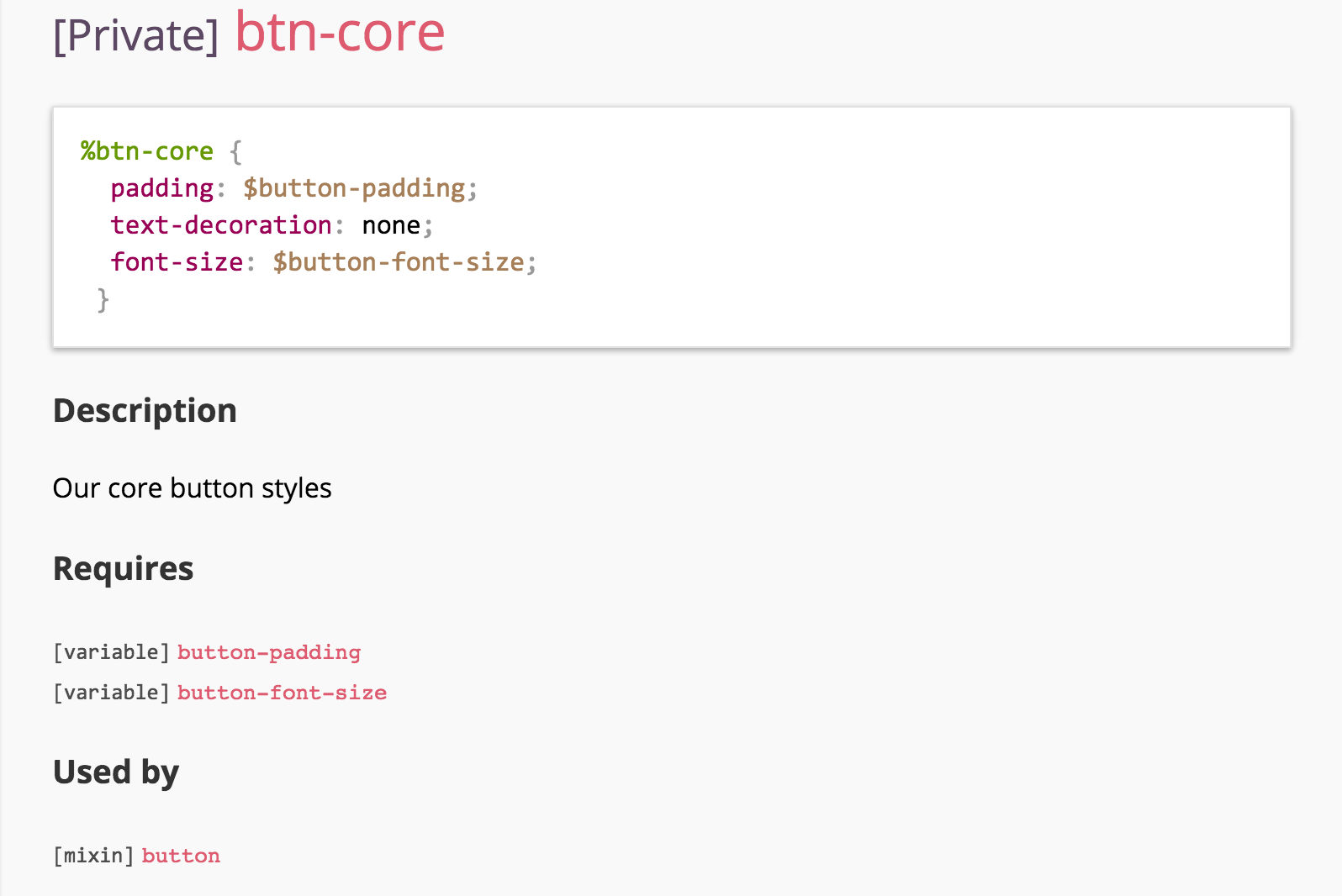
Figure 15-6. Our %btn-core extend, rendered in SassDoc
As shown in Figure 15-7, our get_foreground() function shows an example of the @return annotation, allowing us to describe what type of value we can expect to be returned from the function. It is also using the @example annotation that lets us write an indented block of code demonstrating how the function is used and what return we’d expect if we followed that example. Notice also the “Requires” and “Used by” sections. These automatically generated relationships are incredibly valuable, and as each one of them is a link to the mixin or variable definitions, it makes your documentation incredibly easy to navigate.

Figure 15-7. Our get_foreground function rendered in SassDoc
Conclusion
As the examples in this chapter demonstrate, static documentation systems can be a powerful way of capturing the ins and outs of your design system. Hologram provides the tools to create a very open and customizable set of documentation pages. Whether you are writing onboarding docs or capturing the proper markup for a call-to-action button, Hologram will give you the flexibility to write, catalog, and present it in style.
If you are looking for a documentation tool to create a more opinionated and standardized view of your Sass system, then SassDoc is the perfect tool to get you up and running. Even though it is still a static documentation tool, it brings a level of automation to your documentation by connecting system dependencies.
In no way are these two tools exclusive either. Many modern style guides are composed of several tools used to present each part of the system in the best possible manner. What these two systems do have in common, though, is that they rely on a significant amount of user input to achieve their true potential. As static documentation tools, they provide a way for us to write about the things we are building, and have all of that information gathered, cataloged, and indexed.
On the other side of the spectrum is a code-driven documentation system. In a code-driven environment, our documentation is driven purely by the code that we write. We’ll talk about a couple examples of that in the following chapters.
..................Content has been hidden....................
You can't read the all page of ebook, please click here login for view all page.