
Chapter 7. Red Hat Code
The fall of 2014 saw the launch of the Redhat.com website. I’d only been on this multiyear project since the spring prior, so while I was pretty familiar with the code architecture at launch, I’d had little opportunity to shape it. The scope of the project and our looming deadline meant I spent most of my time getting the work done, and little time wondering if that work I was doing truly met the needs of the organization.
In the end, the site launched, and by all measures it was a success. The UI was efficient, the site loaded quickly, and few argued that the site wasn’t attractive. But I can still recall that fateful afternoon when I was asked a very simple question: “How modular is our design? We’d like to be able to share small parts of our theme with other company websites.”
It took me a little while to recover from the chuckle that welled up inside of me. You see, being intimately familiar with the markup, JavaScript, and CSS written for this project, I knew that this design was the antithesis of modular! We did a lot of great work on this theme, but creating a modular design was never even a consideration.
Dependency Bloat
If someone were looking to render a single band of content with our styles, they would first need to load the following:
- Bootstrap CSS: 114 KB (uncompressed)
- This site didn’t leverage too much of the Bootstrap library, but all of the CSS was written with the assumption that Bootstrap had already washed all over it. Pull those styles out, and the page becomes completely broken.
- Core Site CSS: 500 KB
- Though each band of content typically had a single file associated with it, the styles from that single file were never the single source of truth for that band. Styles cascaded in from several different locations and were often overridden based on location or page class.
Location-Dependent Nightmare
The markup approach that the project used was to style from the band down. We had several types of bands, and most of the styles were scoped to and repeated inside of that band class. Here is an extreme example of an H3 inside of a hero band:
.about-contact.hero1.container>section.features-quarter>section.f-contacth3
Not only is this style scoped to a single page (about-contact), but we need to make sure that the features-quarter section is the direct descendant of the container class so that we aren’t accidentally styling descendants of the wrong section element! This top-down styles approach meant that every change we did required longer and longer, more specific selectors. It also meant that none of the contents of a band could be easily rearranged or replaced, as the markup order was incredibly strict.
Sure, we could pull out a single band and consolidate all of the required styles into a single file, but doing so would basically mean completely re-creating the component Sass partial from scratch, and we’d still have a problem with trying to make the markup modular.
So, when I was asked about how modular our design was, and if we could start sharing out styles to other departments, there was only one thing that I could say. I said that we’d have to completely rewrite the markup and the CSS for anything we wanted to share, and while we were at it, we should update the markup on our site as well.
I was quite certain that such a drastic departure from our current design approach would have me laughed right out of the room. Therefore you can understand my surprise when they not only said “yes,” but we were given several weeks to work out the new system while the newly launched site was in code freeze. So here we had a fully fleshed-out design, a very capable development team, and carte blanche to create a modular, scalable, and sustainable design system that could be deployed into a live, highly trafficked, high-profile site as we built it. All I could think was, when can we start?!
Breaking the Design Down
As I said before, the original approach we took was to design from the top of the band down. The appearance of the contents and the way that it was laid out were completely determined by the type of band we were using. We had logo walls, a hero band, testimonials bands, blog teaser bands—you name it. Each of those bands had its own Sass partial, and all of the styles were scoped under the band name.
In a way, this worked well. You usually knew where to go to update a given band’s styles. But the problem was that we had to continually create more bands every time we needed to support a new design or layout. We might have had a well-established visual language, but that had never been translated into a design system that could be used to create new patterns.
So the first task we undertook was breaking the design down into its smallest possible pieces. We knew that once we had the building blocks of this design system, we could create anything that the visual language needed to communicate. The first step was to look at our designs and break them down into repeatable layout patterns.
As we took a look at several of our most common band types, we noticed that most of them shared a number of common layout patterns (see Figure 7-1). We had content with a sidebar, content in equally sized columns, galleries of images or icons that spanned five per row, and black and white cards that held their content inside a bit of padding and a background.

Figure 7-1. The various layouts of our design system
We quickly realized that if we created a method for reusing these few simple layout concepts, we could create the layout for every single band in our entire website. We wouldn’t need a logo wall band with a specified layout, and an insights band with a different layout. We could create a single band that had many layout options. We could also create card layouts that did nothing more than apply padding and a black or white background for the contents inside of them.
Cataloging Components
In the same way that we broke out all our various layouts, we started taking a look at the contents of each of these layouts and realized we could reproduce a majority of them with just a small handful of components.
A component, as compared to a layout, describes the visual appearence of a small piece of content. Components are meant to be dumb and flexible. They have zero opinion about their backgrounds, their widths, or their external padding and margins.
The power of this relationship between layouts and components is evidenced by the fact that you can drop any three components into a three-column layout and it’ll look like they were meant to go there, all without a single extra bit of code. Each component will fill the entire width of the column it was placed in, and the first line of the block quote will be level with first line of the blog entry, which will line up with the image in the third column (see Figure 7-2).

Figure 7-2. No component has top margins, so three different components will all line up
Once we realized that this powerful system was based on a few simple, yet highly important, rules and relationships, we set out to codify them into a more official form. We wanted to make sure that as we introduced new layouts and components to the system, each merge request would conform to a series of rules. We called these our Road Runner Rules.
The Road Runner Rules
Just prior to our contemplating these new rules, my Twitter stream had been bombarded by a story about Chuck Jones and a list of nine rules that he’d purportedly written for the writers and animators of the Road Runner cartoon. This list set forth the rules under which the entire Road Runner universe was meant to run. Rules like “The road runner cannot harm the coyote, except by going ‘beep beep’” and “No dialog, ever, except ‘beep beep’” helped guide the animators and writters of each cartoon to create a consistent and cohesive universe.
Whether the story was authentic or not, it was this consistent and cohesive universe that I wanted to create for my own team. I knew that the only way we could avoid writing a swift road-runner kick to the coyote’s jaw, followed by a fowl cry of “can’t catch me, sucker!” would be to distill the rules that govern our design system into a small, palatable list of Road Runner Rules.
Writing Your Own Rules
When I came up to write my list of Road Runner Rules, I started with almost twice as many rules as we have now. As I got into the double digits, I found that with each rule I wrote, I would think of two or three more.
With the thought of making a set of rules old enough to buy me a drink, I realized that I wasn’t making rules anymore, but rather I was writing the documentation for our entire system. And the problem with that was that I already had written our documentation!
I didn’t need to describe how the coyote would order products from an Acme catalog and that they would show up seconds later in his mailbox, only to be his ultimate downfall. I needed to enforce that “no outside force [could] harm the coyote,” except for his ineptitude or the failure of those Acme products.
What I needed was a small set of immutable rules, not a fully developed set of instructions. Apparently what I needed were some rules for my rules!
Now I know you’re probably thinking that this is either excessively meta or an exercise in absurdity. But just like a good-looking style guide has its unique design and rules, and a solidly written data schema is written to the spec of its parent schema, our Road Runner Rules needed to be written with their own set of governing rules.
These are the rules we eventually came up with:
-
Only include immutable rules, not general instructions
-
Always boil each rule down to its simplest expression
-
Always state the rule first, then explain “If not, then what?”
-
Every rule should include one of the following: always, never, only, every, don’t, or do
These rules would help us avoid writing general instructions containing several sentences that never actually got to the point. Astute readers will also note that all four of these rules conform to the Road Runner Rules as well.
So revision after revision, our team reworded, rewrote, and deleted items off the list until our design system had the following list of rules:
-
A layout never imposes padding or element styles on its children. It is only concerned with their horizontal or vertical alignment and spacing.
-
Themes and other data attributes never force changes in appearance; they are always a context that layouts, components, and elements can subscribe to.
-
A component always touches all four sides of its parent container. No element will have top or left margins, and all last children (right or bottom) will have their margins cleared.
-
The component itself never has backgrounds, widths, floats, padding, or margins. Component styles only target the elements inside.
-
Every element has a single, unique, component-scoped class. All styles are applied directly to that selector, modified only by contexts and themes.
-
Elements never use top margins. The first element touches the top of its component.
-
JavaScript is never bound to any element class. Functionality is “opted in” via data attributes.
These rules cover not only the specific relationship between layout and component, but also other areas of the design system including themes, elements, and JavaScript. Let’s dive into some of the more interesting decisions we made regarding our approach to HTML and CSS.
A Single Selector for Everything
I’ve spent too much of my life creating generic, universal classes that could be applied to any element, only to realize how difficult they were to maintain as the project grew. Because the classes were universal and could be used on just about anything, it was often easier to create a new class than it was to update the original one. Therefore, one of the things I was most determined to do was create single, unique, flat classes for every element. You can read a bunch more about this by revisiting Chapter 6, but this principle was a key part of fulfilling the needs of the rule that requires every element to have a single, unique, component-scoped class.
Single Responsibility Principle
In some circles, the single responsibility principle, applied to CSS, means that each class has a small, focused responsibility, and that one class will set the box model properties of an element, while another sets the typography, and a third sets the color and background.
For our system and set of rules, the single responsibility principle means that every class I create is made to be used for a single purpose, in a single place. Therefore, if I make a change to .rh-standard-band-title, I can be confident that the only effect this will have on our site is to change the appearance of the title inside of the rh-standard-band.
This also means that if we decide to deprecate rh-standard-band, we can completely remove all of the associated CSS without fear of breaking some other component that “hijacked inheritance” and became reliant on that CSS. It’s because of this desire to not “use and abuse the cascade” that I made sure that every class is used only for the single purpose for which it was created (Figure 7-3).
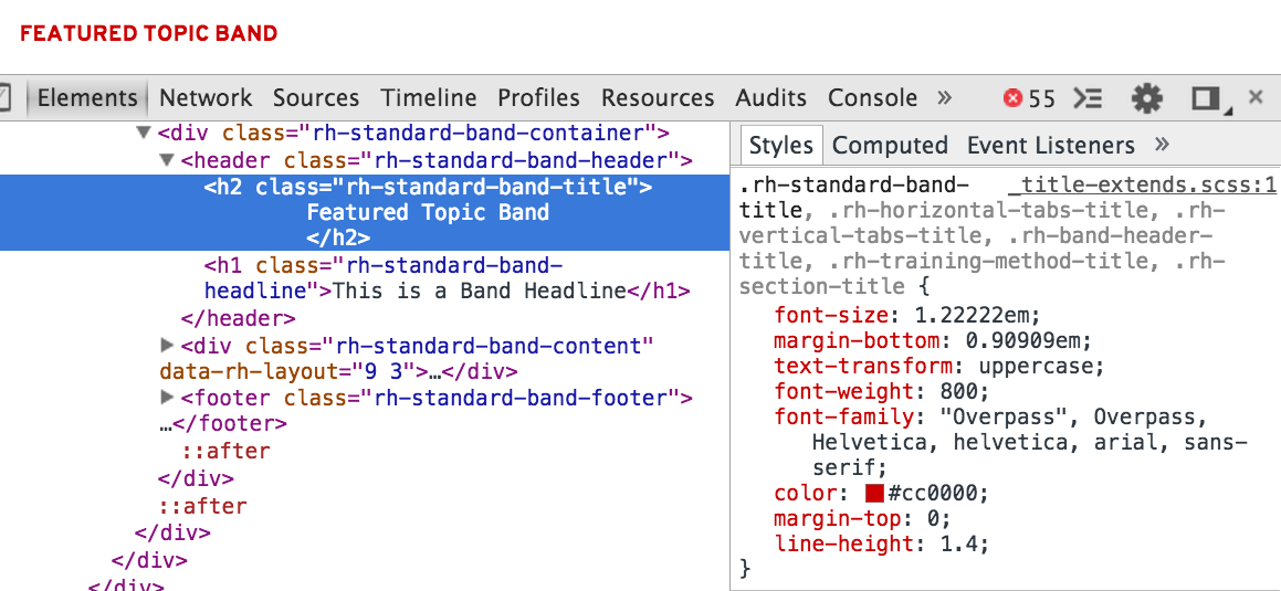
Figure 7-3. Each class is created for a single purpose
Single Source of Truth
Once we have a page full of single-classed elements we can be pretty confident that our changes to .rh-standard-band-title won’t affect any other part of the system, but what is to say that our .rh-standard-band-title can’t be affected by something else? This is why it is so important to maintain a single source of truth for every component, and by extension, every element on the page. This means not relying on any H2 styles, or “header H2,” or any other selector outside of the Standard Band Sass file to style this element.
This is not to say that our title can never be altered or modified by an outside force. What this does mean is that anything that these modifiers or contexts do to an element will be defined in the same place as the element’s original styles, not in some other location. So while I have no objections to .some-context .rh-standard-band-title, these styles will always be defined in the Standard Band Sass partial, and never anywhere else.
Opt-in Modifiers
As I already mentioned, I have no objections to having modifiers on my components, but in every single instance these modifications need to be opt-in. What this means is that if I define Modifier A for Component B, then Modifier A would have no effect on any Component C unless it opted in to that modifier.
Before we dive into an example, let me explain one architectural choice I made in regards to modifiers and contexts. While BEM, SMACSS, and OOCSS all have conventions for modifiers, themes, or skins, they all require adding modifying classes to the block or element. I decided to take a different approach that wouldn’t require any additional classes. I was really determined to, as Ben Frain puts it, “let the thing be the thing.” I never wanted anyone to confuse the “thing’s” class and its modifier. So I decided that all modifiers and contexts would be put inside data attributes instead, like this:
<divclass="foo"data-bar="baz">...</div>
This separation had another benefit beyond distinguishing purpose and role. Classes are very one-dimensional: either the class is present or it is not. A data attribute, on the other hand, is two-dimensional, having the attribute itself and the value passed into it. To compensate for the missing dimension, you’ll often find classes using a namespace to define which group they belong to. A data attribute has an explicit namespace, and can therefore pass any necessary value into it. It may be a few more characters, but using data attributes makes it really obvious that our component has a property of data-align and that it can be set to a variety of values.
OK, now back to that example.
The rh-card--layout is a layout tool that we use to wrap content inside of padding and a background. This card (Figure 7-4) has a black background because we’ve stated that data-rh-theme="dark" sets a black background on the card within our card Sass partial. In the same way, we’ve defined that data-rh-justify="center" will center all of the content in the card.
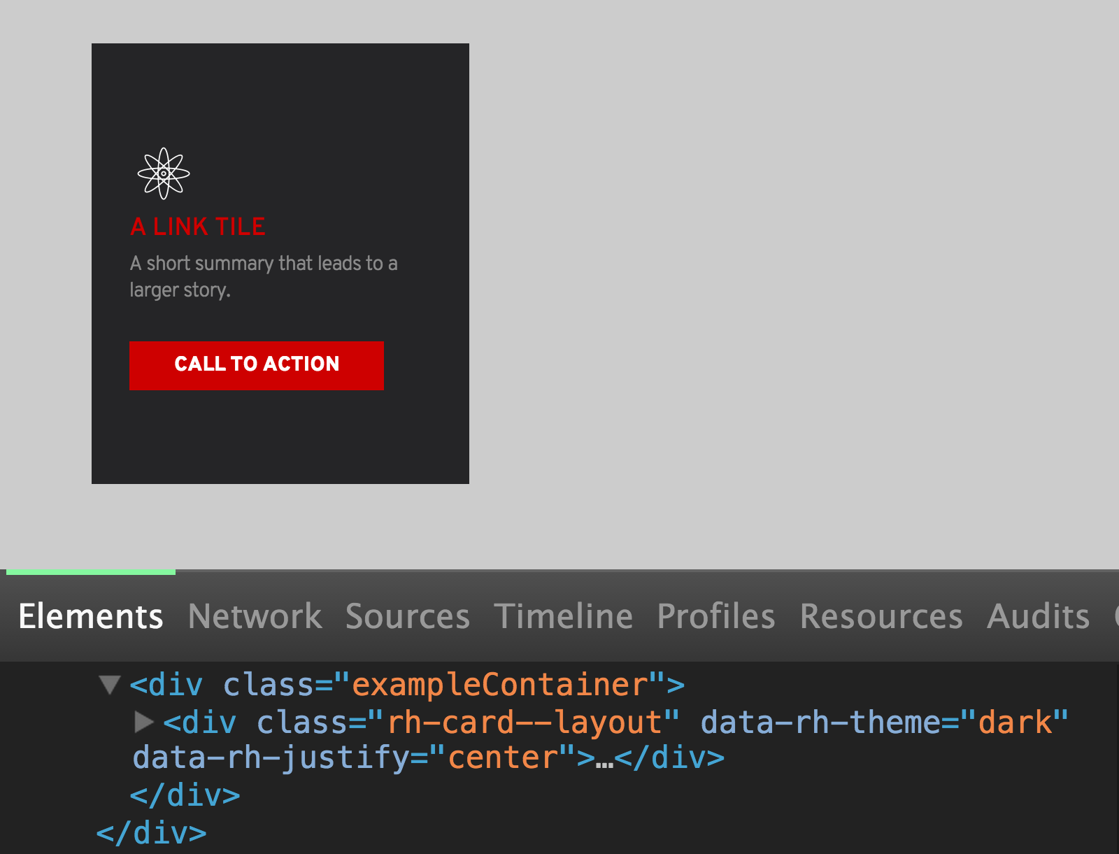
Figure 7-4. A basic card with a black background and a dark theme
<!--card.scss-->.rh-card--layout{padding:30px;&[data-rh-theme="light"]{background:white;}&[data-rh-theme="dark"]{background:black;}&[data-rh-justify="center"]{...}&[data-rh-justify="top"]{...}&[data-rh-justify="justify"]{...}}
Along with center we’ve also specified other justify values, including top and justify (Figure 7-5).

Figure 7-5. A card with vertically justified content
So with a single switch in a data attribute, we can switch the appearance of this card based on values specific to the card’s Sass partial.
Now one thing that we have not defined in the card Sass partial is alignment. We typically leave left/right/center alignment as an option for individual components using data-rh-align, so we’ve intentionally chosen to not opt in to that property. This means that no matter what modifiers other components or layouts might use, they will have zero effect if applied to the card (see Figure 7-6).
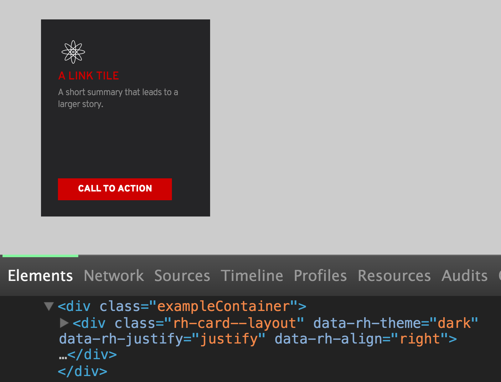
Figure 7-6. The card is not affected by properties not explicitly prescribed
Opt-in Context
One of the mantras of our design system is that a component should look the same regardless of where you place it. But just as we want our components to be resilient and predictable, we also want them to be smart and flexible. This is the reason that we came up with context styles.
A context style means that a component can define the way it behaves when it is inside of some other parent element, or when that parent has a specific data attribute. Again, we aren’t setting all H2s in our sidebar to be green, but if we had a .widget-title that needed to be green when it was inside the sidebar, we could do that! Let’s look at our card example again.
Inside of the card, our data-rh-theme property actually acts as a modifier and a context. It’s a modifier in that it changes the card background from black to white (Figure 7-7), but it is also a context for the elements inside of it.
Figure 7-7. This dark theme card has a white icon
When we switch from the dark to the light theme, you can see that not only does the background change color (the modifier), but the icon changes color as well from white to black (Figure 7-8). Now I’m not saying that our new theme is forcing all of the child text elements to change color (the title and button didn’t change at all). This is an opt-in style on the icon, written right inside of the link-tile Sass file (Figure 7-9).
These opt-in contexts allow us to create variations for any component without affecting the original component. They provide controlled variation, scoped to the component classes, defined solely inside of the component Sass partial.
This does mean doing a little bit of repetitive work if we want the same modifier or context to affect multiple components. But I have never regretted this decision as our system grew. Not only have we made it easier to reuse modifiers and contexts through mixins and extends, but having a finite number of component variations helps us avoid hard-to-find bugs and improves our ability to create comprehensive visual regression coverage. Because all modifiers and contexts are defined in the Sass partial, we can look at any component and know without a doubt all of its possible visual variations.

Figure 7-8. This light theme card has a black icon
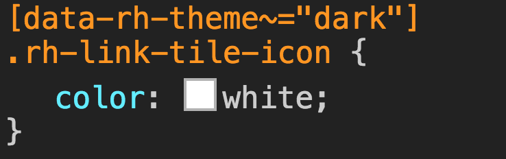
Figure 7-9. The icon subscribes to the dark context to turn white

Figure 7-10. The icon subscribes to the light context to turn black
Semantic Grids
With a solid foundation for our components, the next thing we needed to do was figure out how to combine them together into different layouts. In the past, when we were less modular, we wrote styles for each unique band, including the band layout. When we had a band full of logos, we gave the band a class name and then explicitly applied a layout to that band. The problem with this approach is that nothing, other than the entire band, was reusable. If we had another band that used the same layout but different content, we’d need to create an entirely new band, along with styles for the layout.
So now that we’d broken down our logo wall to a collection of images, buttons, and headers, we needed similarly modular layouts that can be reused any time we wanted. What this meant was that we needed to put the layout back into the DOM, something we had fought so hard against when moving away from bootstrap grid.
Fortunately, there is middle ground between the bootstrap grids of old with their containers, rows, and column containers, and applying unique layouts to the .logo-wall band, and every other new combination of content that needed layout.
Our solution was to create a collection of common grid patterns that could be applied to a layout via a data attribute (Figure 7-11). With the attribute set on the parent element, all of the child elements would fall into whatever grid type they were placed into. This allowed us to keep our separation between layouts and components, while still providing a solution for setting our grid in the markup.

Figure 7-11. A single data attribute allows us to set the layout on a large group of images
In the preceding example, you can see that we are applying a data-rh-layout attribute to the band content region (one of the band’s major content areas). This attribute once again shows how data attributes are great at organizing numerous context values. With this single attribute we can pass in dozens of different layouts, each used to set the widths and margins of the contained components.
In this case, with gallery5 passed in, the CSS is applying roughly a 20% width to all of its child elements. By placing all of the grid information in the parent element, we are able to drop any combination of components into the content region without ever adding a class, or wrapping it in some row or column container. So when we want to change this logo wall from a five-column to a four-column layout, the only thing we need to do is change a single attribute on the parent element (Figure 7-12).

Figure 7-12. By changing a single data attribute we can change the layout of these logos
With a single attribute change, we have modified the entire layout of the band. We didn’t have to write new CSS (modular) and we didn’t have to apply classes to the content (semantic). It’s a win-win! Now we have an inventory of galleries and common layout combinations of our 12-column grid (6 6, 3 9, 4 4 4, etc). These layouts cover 99% of the content we need to create. If we find that we need something more unique, we can create a custom grid layout, document it, and make it available for anyone to apply to their content.
Now that we have a set of modular and customizable containers that can house our components and apply layouts to them, we can start building our logo walls, featured events, blog teasers, and every other band our site requires.