Chapter 6. Finding Your Brand’s Aesthetic
Almost half of our brain is involved in processing visuals.1 Color, typography, photography, textures, and many other elements are being continuously decoded in our minds. We see an image and immediately begin forming impressions about the meaning behind it. Over time, we come to recognize the brands we love in the character of their visuals. Whether that visual is the brand’s logo, social media graphic, or site banner, it becomes an indicator of what the product stands for. Powerful content creation involves understanding the symbolism at play every time you share a graphic along with your brand story.
In this chapter, we analyze how design elements such as color and typography can shape your brand’s narrative. Then, you will complete a visual style assessment to unveil your brand’s aesthetic.
How Color Affects Brand Perception
As visual beings, our eyes are drawn to the interaction of different hues, which are powerful enough to create emotions, convey moods, and represent brands.
We react to color in a natural, often subconscious way. Users will rarely be able to express how color affected them, but make no mistake: it has, does, and will continue to shape their experience.
To help you make the best use of color in content creation, I will share a few scientific findings around color meanings. Many of these studies come from psychologists, who have found powerful behavioral and attitudinal triggers in certain hues. Although the scientific method isn’t free of flaws, the insights in the list that follows have all been carefully selected and are published in reputable academic journals, backed by rigorous experimentation protocols, and defended by leading experts:
- Red, orange, and yellow
- These three colors evoke so-called active emotions, or feelings that involve physical arousal. The opposite of active emotions are passive ones, and those imply some kind of sedation.2
- Red
- Relative to other colors, red leads men to view women as more attractive and more sexually desirable.3
- Yellow
- Yellow also has been independently linked to happiness and excitement because it evokes the sun and summertime.4
- Blue
- Blue is associated with low anxiety levels, calm, and comfort. Now, based on what you just read about arousal and activation, you will understand the following: red provokes more anxiety than blue, and that affects the way users perceive wait times. A study found that users exposed to a blue background screen while waiting for a download perceived it as quicker than did participants exposed to the red background screen.5 In line with this idea, a group of researchers demonstrated that red (versus blue) can activate an avoidance (versus approach) motivation and subsequently can improve performance on detail-oriented (versus creative) cognitive tasks. Blue effectively enhanced performance on a creative task.6
- Furthermore, in a study on environmental color, more positive retail outcomes occurred in blue rather than red environments. More simulated purchases, fewer purchase postponements, and a stronger inclination to shop and browse were found in blue retail environments.7 It comes as no surprise, then, that the results of a study on website structure and color showed that websites of blue hue, medium brightness, or medium and high saturation received the highest overall aesthetics ratings.8
- Black
- Black is consistently seen as defiant, and not associated with words like tender, calm, and cheerful.9 Researchers at the University of Illinois found that yellow, white, and gray are associated with weakness, whereas red and black are associated with strength.10 Researchers found that red leads to attractiveness via perceived sexual receptivity, whereas black leads to attractiveness via perceived fashionableness.11 In a classic study on color and affective stereotypes, cluster analysis showed that red, orange, and yellow were associated with outgoing exuberance; red, yellow-green, and purple, with hostility; and purple, gray, and black, with asocial despondency.12
- Green
- This color evokes mainly positive emotions such as relaxation and comfort because it reminded most of the respondents of nature.13 In a study on brand personality and logo colors in the fashion industry, researchers found that blue logos were associated with competence (confident, corporate, reliable), whereas green logos were associated with ruggedness (outdoorsy, rugged, masculine).14 The color green-yellow had the lowest number of positive responses because it was associated with vomit and elicited the feelings of sickness and disgust.
- Color can affect the way in which we process faces. French researchers found that a red background resulted in more negative face perception than a green background, whether the poser was female or male.15
- Purple
- In a fashion industry study, logos in purple were significantly associated with sophistication, including traits like “feminine,” “glamorous,” and “charming” (Ridgway and Myers, 2014). In a study on the bio-psychological effects of color, many subjects felt calmed by purple.16
- Brown
- Evokes stability. When asked about colors that matched a certain brand’s qualities, respondents associated stability with blue/brown, fun and energy with yellow, and excitement with red/purple.17
Table 6-1 summarizes these findings for future reference.
| Color | Associations backed by scientific evidence |
|---|---|
| Red | Attractiveness Sexual desire Arousal Excitement |
| Orange | Arousal Excitement Fun |
| Yellow | Happiness Excitement Summer Arousal |
| Blue | Calm Comfort Efficiency Low anxiety Competence |
| Black | Defiance Strength Fashionableness Despondency |
| Green | Relaxation Comfort Ruggedness Masculinity Positive face perception |
| Purple | Sophistication Charm Glamour Femininity Calm |
| Brown | Stability Formality |
Creating Compelling Color Combinations
If your content marketing machine is well oiled, you will have systematized the use of color and have a palette on hand that gives you the ability to move quickly through design decisions. This means that you will need to decide which colors make sense for your marketing palette and how to combine them to project certain moods.
Some designers specialize in crafting color palettes for brands, which involves synthesizing insights from fields as diverse as psychology, vision, and business. There are, however, ways to approach the topic practically. Fortunately, color theory has been studied enough to provide us with a few combination principles to start the process. Essentially, there are five types of color combinations: monochromatic, analogous, complementary (opposite), split complementary, and triad. To make matters simpler, we will focus on the first three types.
A monochromatic color combination uses different shades of a single hue. Light blue, blue, and dark blue is a monochromatic color combination, for example.
An analogous combination is made up by hues that are next to each other on the color wheel—think pink, purple, and blue.
A complementary (or opposite) combination is formed by hues that lie directly opposite each other on the wheel. Orange and blue is a classic example.
In general, the farther two colors lie from each other in the color wheel, the more contrast they will create when placed next to each other. Makes sense, right? After all, they are far away for a reason. Placing nearby (analogous) hues next to each other creates less contrast, as well as using different shades of the same hue (monochromatic). That being said, you can create great color combinations that are analogous or monochromatic if you play with each hue’s intensity. A really light blue placed against an extremely dark navy will create high contrast despite being a monochromatic palette.
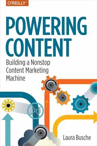
Defining a system of color combinations is a smart way to optimize for good results every single time. To begin easily, check out any of the available color palette generators. Three that I have found to be user-friendly are Adobe Color CC (formerly known as Kuler), Pantone’s mobile app (Figure 6-1), and Coolors.
Figure 6-1. Pantone’s mobile color app
Choosing a Color Palette for Your Brand
Sticking to a single color palette for all brand graphics is a great way to preserve visual cohesion. We will discuss that idea in depth near the end of the chapter, but it is important to realize that color is instrumental in tying your brand visuals together. A good rule of thumb to follow is to select five main brand colors out of which you further segregate as follows:
Two become your most basic brand palette. These are often used in the logo.
One is a vibrant hue used for highlights.
Two are neutral tones that complement the rest of the palette without adding visual strain.
Of course, you can always extend those five colors by playing with shades and tints. Shades involve mixing the original color with black for a darker appearance. Tints are about adding white, which increases lightness. Applications such as Adobe Color CC and Coolors build schemes with five colors, and prove incredibly useful in testing out these palettes quickly.
As you think about color, understand that the hues you are selecting will live beyond their solid form. Your brand colors will also intervene in the types of patterns, textures, illustrations, photographic filters, and moods reflected in your visuals. To create truly cohesive brand content, your color palette must be an underlying thread weaving every piece together.
Typography and Brand Personality
Typography refers to the art and science of arranging type. Traditionally, typographers had to arrange words, letters, numbers, and symbols by hand for publication. Because modern computers did not exist, they were forced to place (set) individual blocks of movable type in a specific order to form sentences and phrases. Typesetters stored hundreds of letter blocks that would allow them to build templates for text. A typeface is the complete family of variants in a single style (e.g., Times New Roman). Meanwhile, the font is a specific size and width within that family (Times New Roman, 12 point, bold). For the purposes of this book, I will use the terms font family (typeface) and font (specific variant) to avoid confusion.
Fortunately for us, digital typography is now accessible to pretty much everyone—experimenting with typefaces, placement, spaces, and size is just a click away. That kind of availability is both a blessing and a curse. Having so many options can easily confuse someone who has not defined what the content reading experience should be like. If you have not defined your brand’s aesthetic, looking at a catalog of 1,500 fonts can quickly become overwhelming. The trick to smart typographic decisions when designing content is the same as that of many other disciplines: preparation.
To make sound choices to enhance your content, there are two building blocks: understanding the implications of certain type choices for the user experience, and knowing your brand’s particular preferences with regard to typography.
Fonts Are Associated with Different Personality Traits
In a study on perception, script or funny fonts were associated with content aimed at children or artists. Serif and sans-serif fonts (e.g., Times New Roman and Arial, respectively) were seen as more stable, practical, mature, and formal (Shaikh et al., 2006). A separate study showed that Times New Roman was perceived as more satirical (angry and funny) than Arial (Juni and Gross, 2008). Yet another study compared the effect of using Gigi, Calibri, and Comic Sans in email copy. Users perceived the author of the email using Gigi as less professional, less trustworthy, and less mature (Shaikh et al., 2007).
Choosing Your Brand’s Typography Scheme
When you understand the implications of certain font choices, deciding on a font family and a typography scheme to use in your brand content becomes much easier. You will begin to develop a feel for what works based on the values, voice, and vision of the brand. Let’s look a bit closer at each:
- Values
- Certain fonts convey specific values and attitudes toward life. Is your brand big on minimalism, productivity, or extravagance? Do you embrace eclecticism and modernity, or a more conservative outlook on life? Specific font families can send that message for you.
- Voice
- Fonts also express a certain mood that is immediately associated with the brand sharing the message. Are you outstandingly joyful, formal, pragmatic, dramatic, or enthusiastic? Those traits can come through in your font choices for brand content. If your brand manages various tones within that general voice, feel free to assemble a group of fonts versus going for a single font family.
- Vision
- Think beyond your brand’s current status. Where do you see this product/service going in the next 5, 10, or 20 years? Although you will probably change many design elements between now and then, it is important to begin projecting a brand aesthetic that matches your most ambitious goals and not the status quo. Fonts can help communicate that future aspiration to your audience in a silent yet powerful way.
Remember the visual hierarchy idea I introduced earlier? A typography scheme will help stylize your written content and help viewers understand what is most important and least important on the page. Look at the following example of how size and styling can help establish the importance of a piece of text:
Once you decide which typographic schemes work best, you will be able to insert these guidelines in the Content Style Guide we will create in Chapter 12.
Exercise: Unveiling Your Brand’s Visual Style
You will find a list of words that describe opposing visual styles below. For each line, mark an X to indicate how closely the term resembles your brand’s sense of visual style. The closer your mark is to the word, the stronger you feel about how it relates to your aesthetic. If you wanted to indicate that your brand reflects a remarkably bohemian (versus corporate) style, you would mark the box closest to “Bohemian”:
| Bohemian | X | Corporate |
If you feel less strongly about it, consider marking boxes that are closer to corporate on the same line.
| Bohemian | X | Corporate |
Over to You
Time to check one box in each of the following lines. Ignore the letters and numbers for now.
| 1 | 2 | 3 | 4 | 5 | |||
| A | Bohemian | Corporate | |||||
| B | Outdoorsy | Glamorous | |||||
| C | Informal | Elegant | |||||
| D | Laid back | Driven | |||||
| E | Subtle | Exuberant | |||||
| F | Delicate | Bold | |||||
| G | Understated | Dramatic | |||||
| H | Monochrome | Multicolor | |||||
| I | Flowy | Sharp | |||||
| J | Rugged | Clean | |||||
| K | Handmade | Digital | |||||
| L | Rustic | Pixel-perfect |
Analyzing Results
A moment ago, I said, “Ignore the letters and numbers.” Now is when you stop ignoring them. Look at the numbers above the marks you made and add them as follows:
Add your numbers for lines A through D. This is your visual character score.
Add your numbers for lines E through H. This is your visual contrast score.
Add your numbers for lines I through L. This is your visual geometry score.
In my experience using this tool, any given brand’s aesthetic can be described as a combination of three elements: character, contrast, and geometry. Whereas character points to the brand’s visual personality, contrast tells the story of how it deals with color and typography to create tension. Does the brand’s content yell, “Look at me!” consistently, or is it much more of a minimalist appeal? Finally, geometry helps you to understand which types of shapes best represent your aesthetic. Essentially, there is a clear divide between the crisp, symmetric look that many brands want to project and the more jagged, weathered feel that others do.
You can use Table 6-2 to interpret your scores. Just find the number you added up (for A–D, E–H, and I–L) and match it to the element to which it corresponds. As you find your spot, remember that none of these styles are prescriptive—in reality, there is a wide spectrum that might combine several of them. They do, however, reveal your brand’s aesthetic tendencies; thus, they will prove useful when you’re designing new pieces of visual content.
| Score | Visual character | Visual contrast | Visual geometry |
|---|---|---|---|
| 4–11 | Your brand’s visual character leans toward casual. Aim for informal, unstructured design elements that project freshness and spontaneity. | Your brand’s visual contrast is low. Images are easy on the eyes, and there isn’t much tension with color or sizes. Use ample whitespace. | Your brand’s visual geometry favors organic shapes. Your aesthetic is best represented using textures, aged looks, and uneven shapes. |
| 12–20 | Your brand’s visual character leans toward formal. Aim for graphics that signal efficiency, status, or productivity. | Your brand’s visual contrast is high. Images are striking and eye-catching. Visual tension is created with saturated colors and bold typography. Layouts are often busy. | Your brand’s visual geometry favors sharp shapes. Your aesthetic is best represented using filled-in, well-defined figures and precise strokes. |
Eight Brand Visual Styles: Find Yours
Depending on the combination of results you just got, you will find your brand falling under one of the eight visual styles shown in Table 6-3.
| Visual character | Visual contrast | Visual geometry | Visual style name |
|---|---|---|---|
| Casual | Low | Organic | Earthy naïve |
| Casual | Low | Sharp | Urban hipster |
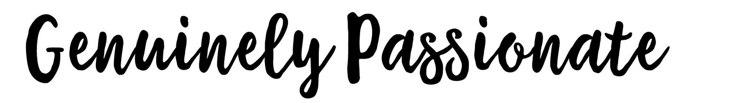
| Casual | High | Organic | Genuinely passionate |
| Casual | High | Sharp | Practical joy |
| Formal | Low | Organic | Bespoke chic |
| Formal | Low | Sharp | Clean performance |
| Formal | High | Organic | Classic credibility |
| Formal | High | Sharp | Consistent satisfaction |
Visual Styles in Action
Were you able to find your brand’s visual style? Table 6-4 offers specific ideas regarding inspiration sources, typography, and color choices. I hope these pointers make it much easier to create visual content that matches your brand’s true essence.
| Visual style name | Design tips | Real-life example |
|---|---|---|
 |
Try out subtle handwritten fonts and graphics with muted, warm colors. Search for hand drawn, handwritten, nature, or hand lettering fonts. | Panera Bread |
 |
Thin, modern fonts that reflect youth with neutral color palettes. Search for art deco, hipster, geometric display, geometric grotesque, monoline, or modern fonts. | Chipotle |
 |
Vibrant, eye-catching, hand drawn fonts combined with high contrast backgrounds. Search for brush, graffiti, or script fonts. | Peet’s Coffee & Tea |
 |
Solid font families with a playful vibe. Overlay with lively, saturated color palettes. Search for humanist sans-serif fonts. | Dunkin Donuts |
 |
Elegant textured serifs with uneven edges. Pair with pastel or neutral tones and plenty of whitespace. Search for vintage serifs, handmade serifs, or hand drawn thin script fonts. | Anthropologie |
 |
Thin geometric sans-serifs. Search for Swiss style, neutral, corporate fonts. Go for shades of gray and plenty of whitespace. | Calvin Klein |
 |
Flowy, bold script fonts in highly saturated dark colors. True blacks or primary colors. Embellished or energetic backgrounds. Search for signature, street art, and bold script fonts. | Ray-Ban |
 |
Thick, condensed sans-serifs with sharp edges. Search for thick, narrow, collegiate, or poster fonts. Combine with rich, highly saturated colors. | DKNY |
1 Elaine N. Merieb and Katya Hoehn, Human Anatomy & Physiology, 7th ed. (Boston: Pearson International Edition, 2007)
2 Tom Clarke and Alan Costall, “The Emotional Connotations of Color: A Qualitative Investigation,” Color Research & Application 33, no. 5 (2008): 406-10. http://doi.org/10.1002/col.20435.
3 Andrew J. Elliot and Daniela Niesta, “Romantic Red: Red Enhances Mens Attraction to Women,” Journal of Personality and Social Psychology 95, no. 5 (2008): 1150-164. http://doi.org/10.1037/0022-3514.95.5.1150.
4 Naz Kaya and H.H. Epps, “Relationship Between Color and Emotion: A Study of College Students,” College Student Journal 38 no. 3 (2004): 396–405.
5 Gerald J. Gorn et al., “Waiting for the Web: How Screen Color Affects Time Perception,” Journal of Marketing Research 41, no. 2 (2004). http://bit.ly/2rbJdPy.
6 R. Mehta and R. Zhu, “Blue or Red? Exploring the Effect of Color on Cognitive Task Performances,” Science 323, no. 5918 (2009). http://doi.org/10.1126/science.1169144.
7 Joseph A. Bellizzi and Robert E. Hite, “Environmental Color, Consumer Feelings, and Purchase Likelihood,” Psychology and Marketing 9, no. 5 (1992): 347-63. http://doi.org/10.1002/mar.4220090502.
8 Mirjam Seckler, Klaus Opwis, and Alexandre N. Tuch, “Linking Objective Design Factors with Subjective Aesthetics: An Experimental Study on How Structure and Color of Websites Affect the Facets of Users’ Visual Aesthetic Perception,” Computers in Human Behavior 49 (2015). http://doi.org/10.1016/j.chb.2015.02.056.
9 David C. Murray and Herdis L. Deabler, “Colors and Mood-tones,” Journal of Applied Psychology 41, no. 5 (1957). http://doi.org/10.1037/h0041425.
10 F. M. Adams and C. E. Osgood, “A Cross-Cultural Study of the Affective Meanings of Color,” Journal of Cross-Cultural Psychology 4 no. 2 (1973): 135–156; http://bit.ly/2rEWvVT.
11 Adam D. Pazda, Andrew J. Elliot, and Tobias Greitemeyer, “Perceived Sexual Receptivity and Fashionableness: Separate Paths Linking Red and Black to Perceived Attractiveness,” Color Research & Application 39, no. 2 (2013). http://doi.org/10.1002/col.21804.
12 B.S. Aaronson, “Some Affective Stereotypes of Color,” International Journal of Symbology 2, no. 1 (1970): 15-27.
13 Naz Kaya and H.H. Epps, “Relationship Between Color and Emotion: A Study of College Students,” College Student Journal 38 no. 3 (2004): 396–405.
14 Jessica Ridgway and Beth Myers, “A Study on Brand Personality: Consumers’ Perceptions of Colours Used in Fashion Brand Logos,” International Journal of Fashion Design, Technology and Education 7, no. 1 (2014). http://bit.ly/2rbIs8Q.
15 Sandrine Gil and Ludovic Le Bigot, “Grounding Context in Face Processing: Color, Emotion, and Gender,” Frontiers in Psychology 6 (2015). http://bit.ly/2rpPGa7.
16 M. Kido “Bio-psychological Effects of Color,” Journal of International Society of Life Information Science 18 no. 1 (2000): 254-62. http://bit.ly/2qB1zuh.
17 Niki Hynes, “Colour and Meaning in Corporate Logos: An Empirical Study,” Journal of Brand Management 16, no. 8 (2009). http://doi.org/10.1057/bm.2008.5.