
CHAPTER 5
Charting in Excel 2007
Excel 2007 provides us with an easy-to-use chart-creation tool that quickly lets us create and modify or enhance the charts we build. Microsoft has rebuilt the UI to include tools that make chart type selection quick and easy. There are tools to allow us to quickly change, remove, or add chart elements like titles, legends, data labels, and more. And charts now look even better through the use of ClearType fonts that improve readability.
Getting Started
As with many of the previous features we've explored, we'll manually create a few different charts and record macros to take a look at some of the chart object properties and methods. Then we'll write our own code to create charts for our users.
- In the Download section for this book on the Apress web site, find the file named
Chart01.xlsxand open the workbook. - Since we know we'll be inserting code into this workbook, let's save it in the macro-enabled format, as
Chart01.xlsm. - Activate the Monthly Total Sales Amount worksheet.
The Chart01.xlsm file shown in Figure 5-1 contains three worksheets containing Northwind sales data, including sales by category, sales amounts by product, and total sales for products in the beverage product line.
- On the Developer ribbon, choose Record Macro from the Code section.
- Name the Macro MakeBeverageSalesChart, as shown in Figure 5-2.
- Click OK to run the Macro Recorder.
- Select the data in cells A1:E7, as in Figure 5-3.
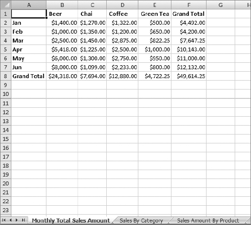
Figure 5-1. Northwind sales data on the Monthly Total Sales Amount worksheet
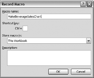
Figure 5-2. Recording the MakeBeverageSalesChart macro
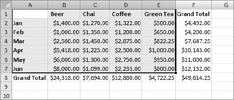
Figure 5-3. Data selected for charting
Note You'll notice that we did not select the row or column containing the total sales amounts. Excel will include them in the chart, which will throw our vertical (value) axis amounts off.
- On the Insert Ribbon, go to the Charts section, and click the Column chart type dropdown list to display the many column chart types available to you.
- In the 3-D Column section, choose the first (leftmost) item, the 3-D Clustered Column chart type, as shown in Figure 5-4.
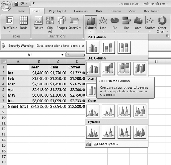
Figure 5-4. Column chart type selection menu
- Stop the Macro Recorder.
The new chart is inserted in the worksheet. Notice in Figure 5-5 that Excel has highlighted the data ranges associated with each chart element (legend, values, and horizontal axis label ranges).
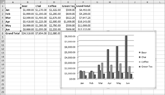
Figure 5-5. The Beverage sales chart
In addition to inserting the chart, Excel also added a context ribbon. Context ribbons provide commands relative to the currently selected object. In this case it's a chart, but it could be an inserted image or any other object that can be acted upon. Context ribbons are noted by a title bar above the ribbon area. Figure 5-6 shows the Chart Tools context ribbon. It contains three of its own ribbons: Design, Layout, and Format.
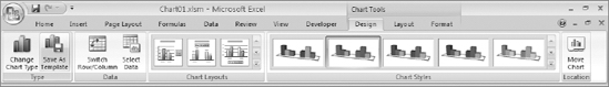
Figure 5-6. The Chart Tools context ribbon
Excel's default charting behavior is to display the data values by column (by product in this example). The vertical and horizontal axes may not show the data with the orientation you expected. Assuming that is the case here, let's record a macro so we can see the command Excel applies to switch the chart's data orientation from column to row.
- On the Developer ribbon, click Record Macro.
- Name the macro ChartByRow.
- Select the chart by clicking anywhere inside of it.
- Select the Design ribbon from Chart Tools.
- From the Data section of the Design ribbon, select the Switch Row/Column command (Figure 5-7).
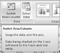
Figure 5-7. The Switch Row/Column command on the Data tab
- Stop the Macro Recorder.
The chart should now look like Figure 5-8.
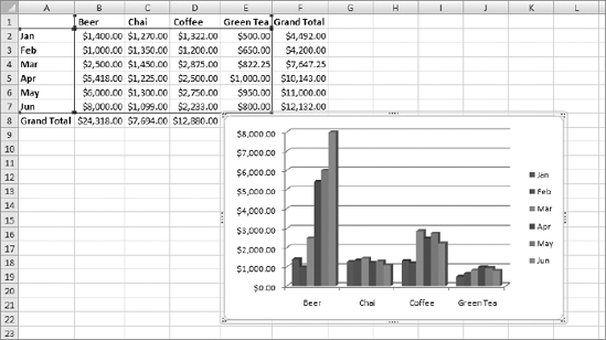
Figure 5-8. Beverage sales chart with rows and columns switched
The original chart in Figure 5-5 showed us the sales grouped by month, and was helpful in showing which product lines had strong sales in a given month. By choosing the Switch Row/Column command, we can quickly view the monthly sales trend for each product. Is it a coincidence that beer sales went up as summer approached?
Looking at the Code
Let's take a look at the code we've generated so far. The MakeBeverageSalesChart macro created a 3-D bar chart for us using a data range we selected. The ChartByRow macro switched the data orientation of the chart from the default, column, to row.
Sub MakeBeverageSalesChart()

'

' MakeBeverageSalesChart Macro

'


'

    Range("A1:E7").Select

    ActiveSheet.Shapes.AddChart.Select

    ActiveChart.SetSourceData Source:=Range( _

        "'Monthly Total Sales Amount'!$A$1:$E$7")

    ActiveChart.ChartType = xl3DColumnClustered

End Sub
The first line of code selects the data range for the chart. The next line adds a chart and activates it via its Select method. Charts are members of the Shape class, and the AddChart method returns a Shape object.
ActiveSheet.Shapes.AddChart.Select
The AddChart method has a few optional arguments (listed in Table 5-1) and no required arguments.
Table 5-1. AddChart Method Arguments
| Name | Data Type | Description |
Type |
xlChartType |
Type of chart (bar, line, pie, etc.) |
Left |
Variant |
Distance from the left edge of the chart to the left edge of Column A |
Top |
Variant |
Distance from the top edge of the chart to the top edge of the worksheet |
Width |
Variant |
Width of the chart |
Height |
Variant |
Height of the chart |
The Type property is of data type xlChartType. This enumeration includes all of the chart types Excel ships with, as shown in Table 5-2.
Table 5-2. The xlChartType Enunmerations
The next line of code assigns the selected range of data to the chart's Source property:
ActiveChart.SetSourceData Source:=Range(

        "'Monthly Total Sales Amount'!$A$1:$E$7")
The last line of the MakeBeverageSalesChart macro sets the type of chart directly using the ChartType property of the ActiveChart object:
ActiveChart.ChartType = xl3DColumnClustered
The ChartType property is the same property from the optional arguments of the AddChart method we saw in the second line of this macro. I've always been a proponent of using less code when possible. You could shorten the MakeBeverageSalesChart subroutine by leaving the direct assignment of the ChartType property out and setting the ChartType when calling the AddChart method.
The modified version of this code looks like Listing 5-1.
Listing 5-1. Modified MakeBeverageSalesChart Macro
Sub MakeBeverageSalesChart()

'

' MakeBeverageSalesChart Macro

'

'

    Range("A1:E7").Select

    ActiveSheet.Shapes.AddChart(xl3DColumnClustered).Select

    ActiveChart.SetSourceData Source:=Range(

        "'Monthly Total Sales Amount'!$A$1:$E$7")

End Sub
Now let's look at the code we created to switch the chart data orientation from column to row in the ChartByRow macro:
Sub ChartByRow()

'

' ChartByRow Macro

'


'


    ActiveSheet.ChartObjects("Chart 1").Activate

    ActiveChart.PlotBy = xlRows

End Sub
You'll recall the first thing we did was select our chart. The first line of this code calls the ChartObjects.Activate method to activate the chart named Chart 1 (the default name given to our chart). A ChartObject represents a chart embedded on a worksheet. The ChartObjects object contains a collection of all the ChartObject objects on a chart sheet, dialog sheet, or worksheet. (I realize the word object was used an awful lot in that last sentence, but let me remind you that I did not name these objects!)
Like any other Collection object, ChartObjects in our ChartByRow macro refers to Chart 1 by name, but it also could have referred to it by its index in the collection, as follows:
ActiveSheet.ChartObjects(1).Activate
The next line of code is where the work is being done:
ActiveChart.PlotBy = xlRows
The ActiveChart.PlotBy property sets or returns a value of the XlRowCol enumeration. Table 5-3 lists the values of the XlRowCol enumerated items.
Table 5-3. XlRowCol Enumeration
| Name | Value |
xlRows |
|
xlColumns |
|
Summarizing with Pie Charts
In Chart01.xlsm, select the Sales By Category worksheet. Here you'll see a list of product categories with sales quantities by month, as in Figure 5-9.
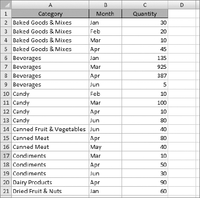
Figure 5-9. The Sales By Category worksheet
This data provides us with a great format to display each category in a pie chart to see how overall sales looked by month for each product line. Before you begin charting data like this, it's a good idea to make sure the data is sorted correctly to make your selections for charting easier.
- Put the cursor anywhere in the data table on the Sales By Category worksheet.
- On the Data ribbon, choose the Sort command, as shown in Figure 5-10.
Figure 5-10. The Sort command on the Data ribbon
The Sort dialog box appears, as shown in Figure 5-11.
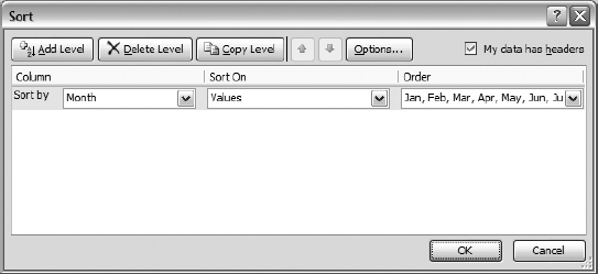
Figure 5-11. The Sort dialog box
In this case, Excel made a guess that we want to sort by the Month column (and we are going to override this).We want to sort by Category first, and then by Month.
Note As I was testing this code, I had various results in what Excel decided would be the "Sort by" column. These results ranged from Month, as shown in Figure 5-11, to Category, to a blank value. Your results may vary
- Choose Category from the "Sort by" list under the Column listing, as shown in Figure 5-12.
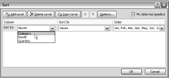
Figure 5-12. Choosing Category as the first sort field
- Choose A-Z from the Order drop-down list, as shown in Figure 5-13.
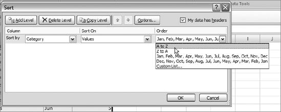
Figure 5-13. Choosing the sort order for Category
- Click the Add Level button on the Sort dialog box to add a new blank sort item to the sort list, as shown in Figure 5-14.
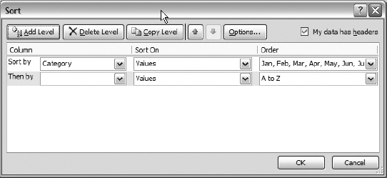
Figure 5-14. New item added to the sort list
- In the "Then by" drop-down list, select Month, as shown is Figure 5-15.

Figure 5-15. Adding Month to the sort list
- Select Custom List from the Order drop-down, as in Figure 5-16. If we choose either alpha sort option, the months will sort alphabetically by name rather than ascending or descending order by month.
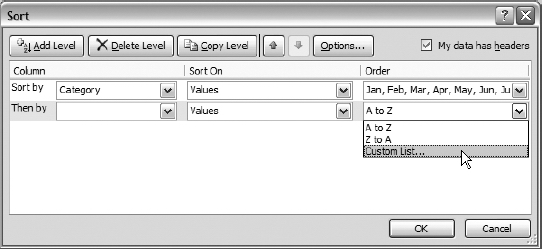
Figure 5-16. Choosing Custom List
- The Custom Lists dialog box will appear. Choose the item labeled Jan, Feb, Mar, and so on, as shown in Figure 5-17.
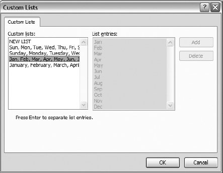
Figure 5-17. Custom Lists dialog box
- Click OK to return to the Sort dialog box.
- Click OK to close the Sort dialog box and sort the data.
The data should now look like that in Figure 5-9.
Creating the Pie Chart
In this example, we are going to create a pie chart based on the data for one product category. The chart will show the monthly sales for the category. Then we'll explore options to reuse the code and automate the creation of pie charts for each product line.
- Select the Sales By Category worksheet.
- Create a new macro and name it MakePieChart.
- Select the data range that contains the data for the Baked Goods & Mixes category (A2:C5), as shown in Figure 5-18.
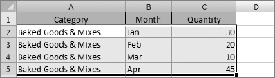
Figure 5-18. Selection for pie chart
- On the Insert ribbon, select Pie from the Charts section, as shown in Figure 5-19.

Figure 5-19. Selecting a 2D pie chart from the ribbon
The pie chart is displayed, but as Figure 5-20 shows, it is not exactly what we might have expected. Excel combined the first two columns of data and created the legend from them. The data itself is fine. With a couple of quick adjustments, we will modify the legend to show the month name only, and we'll add a title to the chart showing the product category.
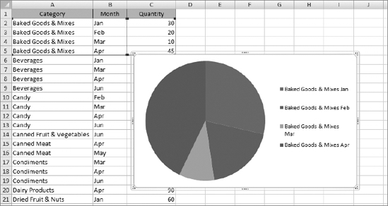
Figure 5-20. The new pie chart as created
- With the Macro Recorder still running, select the pie chart if it's not already selected.
- Go to Chart Tools
 Design ribbon, and choose the Select Data command, as shown in Figure 5-21.
Figure 5-21. The Select Data command
- The Select Data Source dialog box will appear, as shown in Figure 5-22.
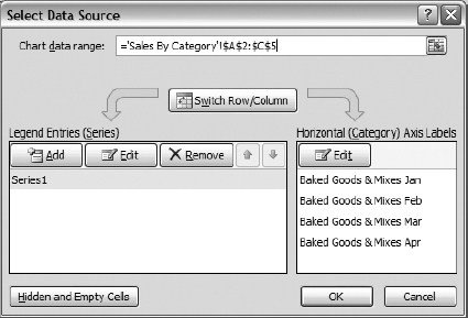
Figure 5-22. The Select Data Source dialog box
The Select Data Source dialog box contains functions to set the data range for the chart, to switch row/column orientation, to assign a range that contains the data values for the chart series, and to assign a range that contains the legend information.
We see in Figure 5-22 that the Chart data range, ='Sales By Category'!$A$2:$C$5, is correct, and we do not want to switch the row/column orientation. We need to correct the legend information display, and we want to use the category information to add a title to the chart.
- In the Legend Entries (Series) section, at the bottom left of the Select Data Source dialog box, select Series 1 from the list.
- Click the Edit button to display the Edit Series dialog box (shown in Figure 5-23).
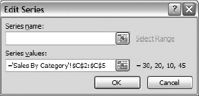
Figure 5-23. The Edit Series dialog box
- To add the title, in the Series name text box, type ='Sales By Category'!$A$2 (or use the range selector to navigate to cell A2 and let Excel insert the range reference for you). Figure 5-24 shows the Edit Series dialog box with this value entered.
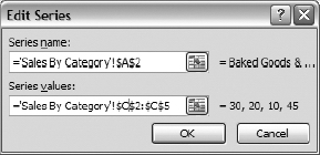
Figure 5-24. Series name range reference added to the Edit Series dialog box
- Click OK to store the range reference.
- In the Horizontal (Category) Axis Labels section, at the bottom right of the Select Data Source dialog box, click the Edit button to show the Axis Labels dialog box, as shown in Figure 5-25 (no selection is necessary).
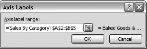
Figure 5-25. The Axis Labels dialog box
- In the "Axis label range" text box, type in ='Sales By Category'!$B$2:$B$5 to tell Excel to show only the month names in the legend (or use the range selector to select cells B2:B5 and let Excel insert the range reference for you).
- Click OK to store the range reference.
The Select Data Source dialog box should look like Figure 5-26.
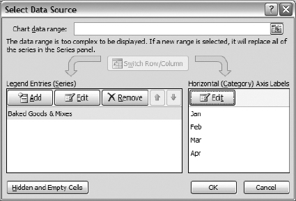
Figure 5-26. The Select Data Source dialog after edits
- Click OK to close the Select Data Source dialog box and save the changes to the chart.
- Stop the Macro Recorder.
Figure 5-27 shows the updated chart with the category as the chart title and the month names for the legend.
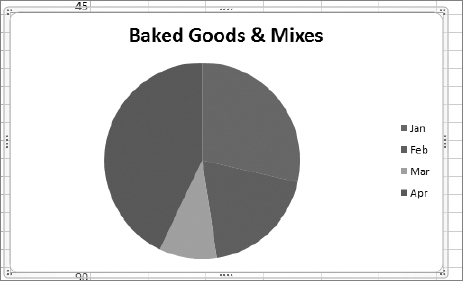
Figure 5-27. The updated pie chart
A Look at the Code
Now let's take a look at the code behind the process we just walked through. As you might expect, the first few lines look very similar to the MakeBeverageSalesChart macro, right up to the point where we set the chart type:
Sub MakePieChart()

'

' MakePieChart Macro

'


'

    Range("A2:C5").Select

    ActiveSheet.Shapes.AddChart.Select

    ActiveChart.SetSourceData Source:=Range("'Sales By Category'!$A$2:$C$5")

    ActiveChart.ChartType = xlPie

    ActiveChart.SeriesCollection(1).Name = "='Sales By Category'!$A$2"

    ActiveChart.SeriesCollection(1).XValues = "='Sales By Category'!$B$2:$B$5"

End Sub
The two lines of code following ActiveChart.ChartType = xlPie, where we set the chart type, define the name or title of the chart and the legend values (in this case the range B2:B5).
Let's look at the line of code that sets the name of the data series in our pie chart:
ActiveChart.SeriesCollection(1).Name = "='Sales By Category'!$A$2"
The SeriesCollection(index) object collection contains the data series for the chart. The index represents the order in which the series was added to the chart. In the case of our pie chart, there is only one series. Here we are setting the name to the first value in the Category column of our data range.
The last line of code changes the legend to simply show the month value without appending the category to each legend item.
ActiveChart.SeriesCollection(1).XValues = "='Sales By Category'!$B$2:$B$5"
More Pie for Everyone
So we've created a pie chart and modified some of its properties to make the data displayed more meaningful. We've got quite a few categories on our Sales By Category worksheet. Can we use what we've learned and the code we've created to generate charts for the remaining categories? Of course!
Excel does not always place charts in the most appropriate place on a worksheet, so before we begin, let's be sure to move the Baked Goods & Mixes chart to the right of the data range on the Sales By Category worksheet by dragging and dropping it, as shown in Figure 5-28.
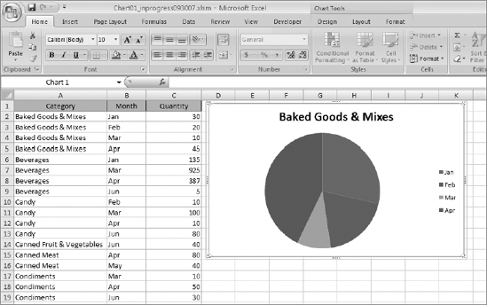
Figure 5-28. Chart moved next to data range
Next we'd like to chart the Beverages product category in a manner similar to the Baked Goods & Mixes pie chart. The simplest way to start is to copy the code from the MakePieChart macro we just recorded and modify it to use the data range A6:C9, which contains the Beverage category sales information.
- If it's not already open, open the VBE by going to the Developer ribbon and selecting Code Visual Basic, or by pressing Alt+F11.
- If it's not already open, open Standard Module1.
- Copy the MakePieChart macro.
- Paste the copy below MakePieChart and rename it MakePieChart2.
- Modify all range references to refer to the data range containing the Beverage category sales information, as shown in Listing 5-2.
Listing 5-2. MakePieChart2 Subroutine Modified to Chart the Beverage Category
Sub MakePieChart2()

    Range("A6:C9").Select

    ActiveSheet.Shapes.AddChart.Select

    ActiveChart.SetSourceData Source:=Range("'Sales By Category'!$A$6:$C$9")

    ActiveChart.ChartType = xlPie

    ActiveChart.SeriesCollection(1).Name = "='Sales By Category'!$A$6"

    ActiveChart.SeriesCollection(1).XValues = "='Sales By Category'!$B$6:$B$9"

End Sub
As in our original example, we are selecting a range of data (A6:C9), and then adding a chart and setting the source data range to the selected range. Then we set the chart type to Pie (
xlPie) and set the name and legend values. - Run the MakePieChart2 macro.
As shown in Figure 5-29, Excel still insists on placing the pie chart on top of our data range. In fact, if we had not moved the Baked Goods & Mixes pie chart, the new chart would be sitting on top of it (and it still is partially covering our existing chart)!
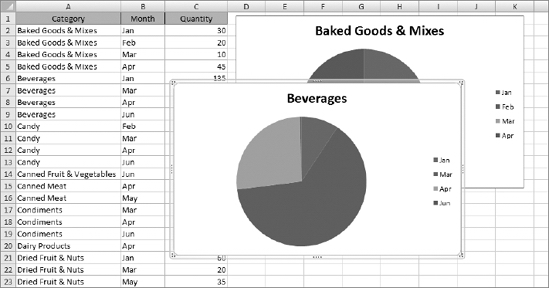
Figure 5-29. Excel places any new chart on our data range.
Not to worry. You'll recall that when we created our first chart using the Macro Recorder, Excel used the AddChart method to insert the chart. We looked at the optional arguments for that method in Table 5-1. These optional arguments include the type of chart and its top, left, width, and height settings (in pixels). We can use these optional arguments to place the new chart immediately below the existing chart, and align it with it as well.
- Delete the Beverages pie chart from the Sales By Category worksheet.
- Select the chart by clicking it on its borders.
- Press the Delete key on your keyboard.
- On Standard Module1, create a new subroutine and name it
PlaceChart. - Add the following variable declarations to the
PlaceChartsubroutine:
Dim arrChartInfo(3) As Variant

Dim spacer As Integer
The
arrChartInfo(3)variable will hold an array that contains information about the existing chart (Chart 1), such as its name and top, left, and height values. We'll use thespacervariable to place some empty space between our charts. - Add the following code after the variable declarations:
With ActiveSheet.ChartObjects(1)

    arrChartInfo(0) = .Name

    arrChartInfo(1) = .Top

    arrChartInfo(2) = .Left

    arrChartInfo(3) = .Height

  End With


  spacer = 25
Within the
With...End Withblock, we are setting the array elements equal to theName, Top, Left, andHeightproperties of theChartObjects(1)item, which is of course the existing (and only) chart on the worksheet at the moment. We could also have referred to the chart by name, as inActiveSheet.ChartObjects("Chart 1").For this example, we're setting the
spacervariable to a value of25, but you can use any value that suits your purpose. - Press Enter twice to insert blank lines in the code after
spacer = 25. - Copy the code from the MakePieChart2 macro and paste it after the blank lines.
The completed
PlaceChartsubroutine should look like Listing 5-3.Listing 5-3. The Completed PlaceChart Subroutine
Sub PlaceChart()

Dim arrChartInfo(3) As Variant

Dim spacer As Integer


  With ActiveSheet.ChartObjects(1)

    arrChartInfo(0) = .Name

    arrChartInfo(1) = .Top

    arrChartInfo(2) = .Left

    arrChartInfo(3) = .Height

  End With


  spacer = 25

'

' The following code is from MakePieChart2 Macro

'

    Range("A6:C9").Select

    ActiveSheet.Shapes.AddChart(, arrChartInfo(2),

                              (arrChartInfo(1) + arrChartInfo(3) + spacer))

                              .Select

    ActiveChart.SetSourceData Source:=Range("'Sales By Category'!$A$6:$C$9")

    ActiveChart.ChartType = xlPie

    ActiveChart.SeriesCollection(1).Name = "='Sales By Category'!$A$6"

    ActiveChart.SeriesCollection(1).XValues = "='Sales By Category'!$B$6:$B$9"


End Sub - Return to the Sales By Category worksheet and run the
PlaceChartprocedure.
Figure 5-30 shows the result of our placement efforts.
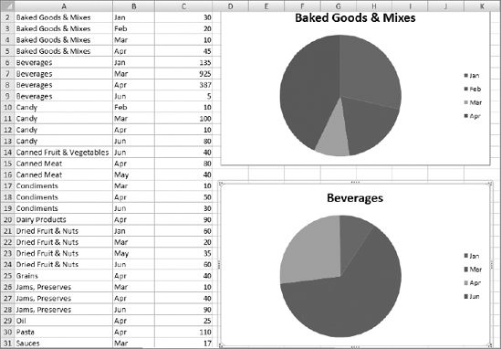
Figure 5-30. Beverages chart aligned with Baked Goods & Mixes chart
Fantastic! We modified the original MakePieChart code by changing the range references and referring to the location of the original chart to determine where to put the new chart. But let's make this code a bit more dynamic. Our users aren't going to give us ranges of data to chart, they most likely will want to create them on the fly as needed.
In our next example, we are going to give the user the ability to select a range of data to be charted. In addition, we'll make the placement of the chart more dynamic as well. In our last example, we knew we wanted to refer to the first chart on the worksheet. Now that we've got more than one chart on the worksheet, we'll need to grab the location of the last chart inserted and place our new chart below that.
Dynamically Placing a Chart
In the VBE, on Standard Module1, create a new subroutine called PlaceChartDynamic. Copy the code from the PlaceChart procedure and paste it into PlaceChartDynamic.
Before we begin our exercise, we're going to move the opening lines of code into their own function. This subroutine begins by getting location information about the chart we want to use as a placement reference, but is not directly involved in creating a chart. It's always a good idea from a maintenance perspective to keep our functional operations separate, so we are going to create a function that returns the location of a chart in an array.
Storing Chart Location in an Array
- On Standard Module1, create a new function named
GetChartInfo(). - Add the following argument to the function:
Private Function GetChartInfo(MyChart As ChartObject) As Variant
The argument
MyChartwill pass aChartObjectinto our function. From this object, we'll return the location information inGetChartInfo. - Add a variable:
Dim varReturn As Variant. This will hold the return value for our function. - Move the code shown in bold in the following code block from the
PlaceChartDynamicsubroutine intoGetChartInfo, under the variable declaration we just added.
The GetChartInfo code should look like this:
Private Function GetChartInfo(MyChart As ChartObject) As Variant

Dim varReturn As Variant

Dim arrChartInfo(3) As Variant

  With MyChart

    arrChartInfo(0) = .Name

    arrChartInfo(1) = .Top

    arrChartInfo(2) = .Left

    arrChartInfo(3) = .Height

  End With

End Function- Add the following code to assign the array to the return variable, and finally to assign
varReturnas the return value of the function:
varReturn = arrChartInfo


GetChartInfo = varReturn
The completed function should look like that in Listing 5-4.
Listing 5-4. The GetChartInfo Subroutine
Private Function GetChartInfo(MyChart As ChartObject) As Variant

Dim varReturn As Variant

Dim arrChartInfo(3) As Variant

  With MyChart

    arrChartInfo(0) = .Name

    arrChartInfo(1) = .Top

    arrChartInfo(2) = .Left

    arrChartInfo(3) = .Height

  End With

  varReturn = arrChartInfo


  GetChartInfo = varReturn

End Function
Completing the PlaceChartDynamic Procedure
The PlaceChartDynamic subroutine currently looks like Listing 5-5, and is ready for a few modifications, including using the GetChartInfo method we just created.
Listing 5-5. The PlaceChartDynamic Routine Is Ready for Modifications
Sub PlaceChartDynamic()

Dim spacer As Integer


  spacer = 25


    Range("A6:C9").Select

    ActiveSheet.Shapes.AddChart(, arrChartInfo(2),

                                (arrChartInfo(1) + arrChartInfo(3) + spacer))

                                .Select

    ActiveChart.SetSourceData Source:=Range("'Sales By Category'!$A$6:$C$9")

    ActiveChart.ChartType = xlPie

    ActiveChart.SeriesCollection(1).Name = "='Sales By Category'!$A$6"

    ActiveChart.SeriesCollection(1).XValues = "='Sales By Category'!$B$6:$B$9"

End Sub
Add the following variable declarations to PlaceChartDynamic:
Dim varChartInfo As Variant

Dim iChartIndex As Integer
The varChartInfo variable will hold the array returned from the GetChartInfo function and will be used to place our new chart. iChartIndex will hold the index value of the last chart added to the worksheet.
Let's take a look at the remaining code in the PlaceChartDynamic procedure to get an idea of the changes we'll make to make this routine much more flexible.
We see numerous hard-coded range references. Our new code will have to
- Find the last chart added and use its coordinates to insert the new chart below it
- Define the data range for the chart
- Define the cell that contains the name of the product category to display in the chart title
- Define the range containing the month values for the chart legend
Let's attack these one at time. First, let's get the chart location information from the GetChartInfo function.
Getting the Coordinates from the Existing Chart
Add the following lines of code:
iChartIndex = ActiveSheet.ChartObjects.Count

varChart = GetChartInfo(ActiveSheet.ChartObjects(iChartIndex)
The ChartObjects.Count property will return the value of the last chart added. Then we use that index to get the chart information.
As I noted at the end of the last example, we are going to let the user define the range to chart by selecting the data for a particular product category.
Defining the Data Range and Legend Information
Before we modify the remaining code and its range references, let's add a few variables to hold the range references from the user-defined selection.
- Add the following variables:
Dim sDataRange As String

Dim sTitleRange As String

Dim sLegendRange As String
- Since the user will select the data for us, we can remove the following line of code:
Range("A6:C9").Select
- Put your cursor in the blank line created by removing the code in step 2, and add the following code:
sDataRange = Selection.Address

sTitleRange = Selection.Cells(1, 1).Address

sLegendRange = Selection.Cells(1, 2).Address & ":"

             & Selection.Cells(1, 2).Offset(Selection.Rows.Count - 1).Address
The Selection object (which is of the generic Object type) holds a Range object in this case. Using the Range's Address and Cells properties, we can determine the address of the entire range of the selection, the cell containing the title text (always the first cell in the data range), and the range of cells containing the legend information (always column B for each row in the selected range).
- Moving to the next line of code, we are going to replace all references to the
arrChartInfoarray that we are no longer using with a reference to the return value of theGetChartInfofunction,varChartInfo.
ActiveSheet.Shapes.AddChart(, arrChartInfo(2),

                            (arrChartInfo(1) + arrChartInfo(3) + spacer))

                            .Select
When finished, the line of code that adds and places the new chart will look like this:
ActiveSheet.Shapes.AddChart(, varChartInfo(2),
                            (varChartInfo(1) + varChartInfo(3) + spacer))
                            .Select
Setting the Data Range and Legend Information
Now we'll modify the line of code that sets the chart's data range.
- Put your cursor on this line of code:
ActiveChart.SetSourceData Source:=Range("'Sales By Category'!$A$6:$C$9")
- Modify it to read as follows:
ActiveChart.SetSourceData Source:=Range("'Sales By Category'!" & sDataRange)
- Leave the next line of code as is:
ActiveChart.ChartType = xlPie
- Now we'll set the title range. Put your cursor on this line of code:
ActiveChart.SeriesCollection(1).Name = "='Sales By Category'!$A$6"
- Modify it to read as follows:
ActiveChart.SeriesCollection(1).Name = "='Sales By Category'!" & sTitleRange
- All that's left is to set the legend text data range. Put your cursor on the last line of code:
ActiveChart.SeriesCollection(1).Name = "='Sales By Category'!" & sTitleRange
- Modify it to read as follows:
ActiveChart.SeriesCollection(1).XValues = "='Sales By Category'!"
                                                   & sLegendRange
The completed subroutine should now look like Listing 5-6.
Listing 5-6. The Completed PlaceChartDynamic Subroutine
Sub PlaceChartDynamic()

Dim spacer As Integer

Dim varChartInfo As Variant

Dim iChartIndex As Integer

Dim sDataRange As String

Dim sTitleRange As String

Dim sLegendRange As String


  iChartIndex = ActiveSheet.ChartObjects.Count

  varChartInfo = GetChartInfo(ActiveSheet.ChartObjects(iChartIndex))


  spacer = 25


  sDataRange = Selection.Address

  sTitleRange = Selection.Cells(1, 1).Address

  sLegendRange = Selection.Cells(1, 2).Address & ":"

                & Selection.Cells(1, 2).Offset(Selection.Rows.Count - 1).Address


  ActiveSheet.Shapes.AddChart(, varChartInfo(2), _

                              (varChartInfo(1) + varChartInfo(3) + spacer))

                              .Select

  ActiveChart.SetSourceData Source:=Range("'Sales By Category'!" & sDataRange)

  ActiveChart.ChartType = xlPie

  ActiveChart.SeriesCollection(1).Name = "='Sales By Category'!" & sTitleRange

  ActiveChart.SeriesCollection(1).XValues = "='Sales By Category'!"

                                                                    & sLegendRange

End Sub
Testing the Code
Now that we've got our code rewritten to be much more flexible, let's select a data range and create a formatted chart placed below the last chart on the Sales By Category worksheet.
- Select the data for the Candy product line (cells A10:C13), as shown in Figure 5-31.
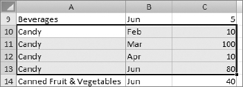
Figure 5-31. Data selected for dynamic charting
- Run PlaceChartDynamic by going to the Developer ribbon and choosing Code Macros.
- The new chart is inserted below the Beverages chart and is aligned to its left side, as shown in Figure 5-32.
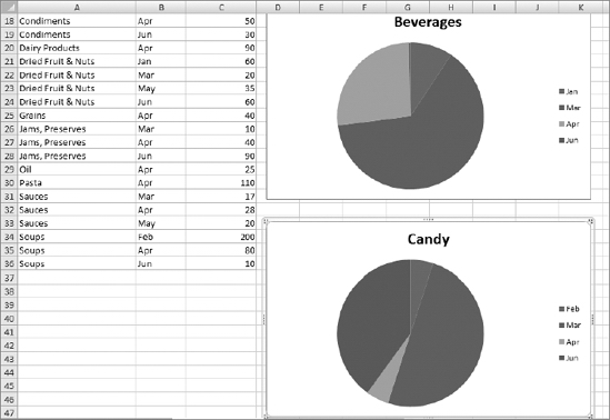
Figure 5-32. The Candy chart is properly formatted and inserted below the Beverages chart.
Summary
In this chapter, we've been exploring charting in Excel. We began by recording a macro while manually creating a bar chart. We examined the AddChart method, which adds a new chart to a worksheet, and we saw the SetSourceData method, which assigns a range of data to the chart. We saw in Table 5-2 the many types of charts Excel makes available to us. We also looked at the PlotBy property, which allows us to switch a chart's data orientation from row to column and vice versa.
We then looked at pie charts, and as we did, we also learned a bit about sorting data in Excel. Next, we learned how to use some of the AddChart method's arguments to place a chart at a given location on a worksheet. And finally, we expanded on that idea to create dynamic code that lets the user select a data range to chart, and we built routines to create a chart from that data, placing it below the last chart on the worksheet.
Charts are a great way to make large sets of data more understandable for analysis by compressing the data into a visual image. In the next chapter, we'll look at another one of Excel's excellent analysis tools: PivotTables.