


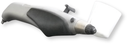
Airbrushing Tools and Materials
The pros and cons of different airbrushes can be discussed at length, but it’s really about what works best for you. If you can find an airbrush that can spray larger amounts of paint and deliver detailed strokes without causing hand cramps, you will be able to work comfortably and effectively. Many airbrush artists have different airbrushes for different needs.
Some variables to consider in selecting an airbrush include:
• Ergonomics - The weight displacement and comfort of the airbrush compared to the weight and shape of your hand.
• Project Scale - Whether you will need to blast a high volume of paint, create detail, or both.
• Trigger Sensitivity - How the airbrush responds to pressure on the trigger can increase or decrease your level of control.
Cleaning Tools
Teflon key rings are a must for cleaning the detailed components of an airbrush. They are usually very durable and solvent resistant, and they hold up well to many different types of liquid airbrush cleaners. You can sometimes substitute a toothbrush or other brushes with small bristles.

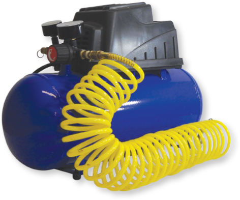
Air Compressors
An air compressor from a hardware store will likely be cheaper and last longer than a standard airbrush compressor from a craft store. These compressors provide pressures up to 100 psi or higher and are very portable.
Accessories
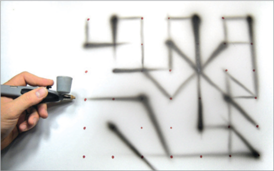
Clear contact paper (A) is useful for masking for large areas. Standard masking tape (B) allows you to quickly create tape walls that prevent overspray from traveling as well as to easily isolate or cover certain areas before or after applying paint. A utility knife (C) is useful for adding texture with subtractive highlighting, which involves removing paint from the surface.

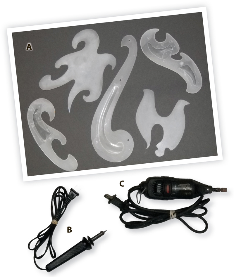
Templates
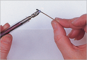
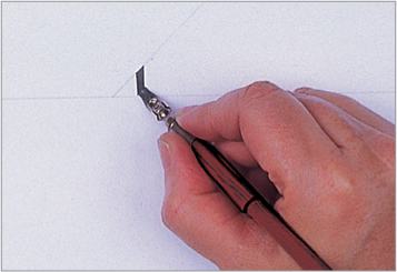
Cutting your own French curves and freehand templates (A) out of plastic sheets or Mylar allows you to create whatever shape or contour the project requires. Use a stencil burner (B) to cut out the templates then refine the edges with a rotary tool (C) and sanding sponge so the paint doesn’t bleed under the templates as you’re spraying. Work on a metal cookie sheet or piece of glass so the stencil burner doesn’t harm your tabletop surface.
More Airbrushing Tools and Materials
Electric Eraser
An electric eraser is another tool to consider using for subtractive highlighting, which creates complexity and realism if done properly.

Paintbrushes
Keep an array of paintbrushes on hand to tighten and refine details, such as painting eyebrows on a portrait or rendering the crack on a piece of stone. Adding this higher level of detail ultimately leads to a good balance in your compositions.

Paints
The type of paint used in airbrushing varies by personal preference. Water-based airbrush acrylic paint or everyday acrylic paint enhanced with water and reducer work well. Any type of paint needs to have a thin consistency similar to skim milk in order to flow through the airbrush with continuity. Use 2 oz. bottles to mix 50% paint, 25% water and 25% reducer to achieve the desired consistency. Shake the contents before spraying.

Ventilation Box
A ventilation box, positioned chest level or higher, with a fan and air filter inside can help protect your lungs from the overspray circulating in the air as you work.

Projector
An opaque projector greatly increases the speed of transferring an image to the painting surface. The difference in projectors typically lies in the quality or thickness of the lens. A thicker lens will allow you to get a clearer, more precise projection and will also cost you more. Many professional illustrators and fine artists use projectors to meet deadlines and keep their labor costs down. It is a very valuable tool.


Basic Airbrushing Techniques
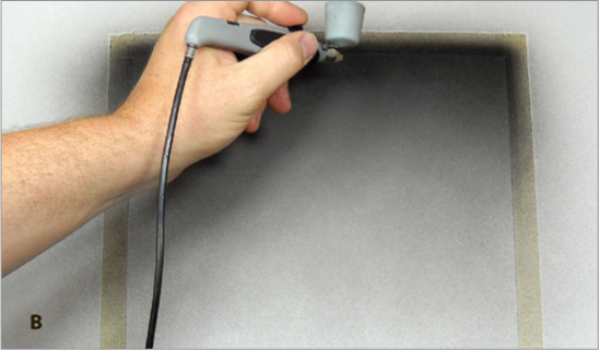
Instruction will only go so far in teaching the dynamics of airbrush control. Repetition and practice, as well as patience and perseverance, are vital to understanding the technique. You will need to acclimate yourself to the weight of the airbrush, the softness of the trigger, and the peripheral view of how close you are to the surface.
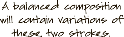
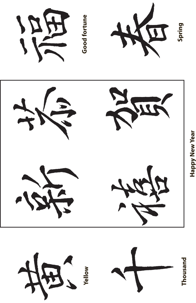
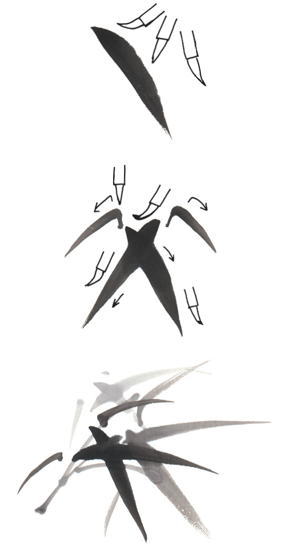
Dagger and Feather Strokes
The dagger stroke (A) is the universal stroke in airbrushing. All control is learned from the mastery of this stroke.
There are three components:
1. The angle of the airbrush while spraying (normally a 10-30 degree angle when shading and tapering, and straight-on when sketching and establishing placement of the object or letter).
2. The speed in which you spray. This will vary the continuity and tapering of the stroke.
3. The amount of pressure on the trigger of the airbrush. The feather stroke (B) is a thicker, softer dagger stroke rendered with your airbrush lifted farther from the surface.

Line Discrepancies
There are three predominant discrepancies to look for when troubleshooting the continuity of the paint or airbrush. These discrepancies can work together or alone to create problems. It’s also important to note that, even if none of these conditions are present, you could have purchased bad paint, the surface may need different preparation, or the room temperature could be effecting the saturation.

Caterpillaring (A) is often the result of paint that has been mixed too thin. Working on a non-porous surface, such as glass or metal, can also cause this effect. You should always spray lightly and evenly on hard surfaces that tend to repel paint. A blow dryer will help keep the surface warm and assist the adhesion of the paint.
Spattering (B) happens when your paint is too thick or your pressure is starting to dissipate and getting low. An ideal operating pressure for spraying is about 50 psi and higher for 70 percent of airbrushes. More expensive airbrushes tend to function more efficiently at 40 psi; the internal components are more hypersensitive to higher pressures.
Trailers (C) are intermittent dots in your lines that indicate the accumulation of “tip dry” or paint that has formed through the atomization process of the brush. To avoid this, scrape off the tip of the airbrush about every five minutes or so using your fingernail. This will free the airflow. Trailers can also indicate that your paint needs a flow enhancer or reducer to improve the continuity of the spray.

Airbrushing Fundamentals
Remembering to work from bigger to smaller and lighter to darker will help you achieve the right balance of shading, tone, and intensity.
Bigger to Smaller
Working larger will enable you to taper your strokes with greater ease and help you fade and blend your colors. You will also have more room for spraying and be able to better understand your spatial awareness (i.e., how close you are to the surface). Working smaller allows for more detail and refinement but is also more stressful on your hands.
Lighter to Darker
Start each image by working very lightly and subtly. This entails working farther from the surface. Slowly and progressively build to darker tones by working closer to the surface. It is always easier to fix something as long as you have not sprayed too heavily. If the image gets too dark too soon, you may have to go back and make painstaking corrections.
Create a pattern of synchronized dots and practice your strokes by connecting two or more of the dots in a single stroke. This will help you develop horizontal and vertical control. Notice that the angle (10-30 degrees) of the airbrush allows you to vary the tapering of the stroke. You may also use two hands if you like. Using two hands will displace the weight of your arms in a more balanced manner as you are moving up and down or side to side.
Lines and Shadows


This basic exercise will help you understand the velocity of how much paint and air your airbrush is releasing. (A) First, work closely to the surface (about an inch away) and practice making these interlacing loops. You’ll notice that working this close to the surface gives you a darker tone. (B) Now, lift the airbrush farther away to render a softer, lighter drop shadow. Angle the brush to the right of the original line and repeat the movement. Pay attention to the position of the airbrush to develop a better understanding of where the airbrush is vs. where the paint lands.
Gradient
Block off a rectangle on a painting surface with masking tape. (A) Working about 3-5 inches from the surface, wisp the airbrush across the top of the rectangle. Continue wisping in the same direction as you work your way down, pulling back to a maximum of about 10 inches as you transition out the tone. (B) Then work about an inch or so from the surface (this is called piercing) to refine the gradient and further enhance the dark to light transition. Continue wisping in the same direction, either from left to right or right to left, to establish an even tone, also known as shading acuity.

Calligraphy Tools and Materials
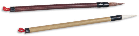
Nibs
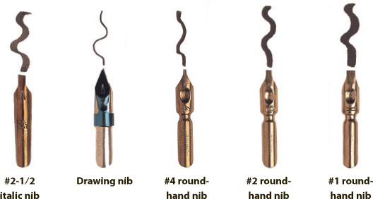
Nibs (also called “points”) are writing tips that are inserted into the end of a pen holder. Nibs come in a variety of shapes and sizes, depending on the task they are designed to perform—each releases the ink differently for a unique line quality. For example, the italic nib has an angled tip for producing slanted letters, whereas the roundhand nibs feature flat tips for creating straight letters. Keep in mind that nib numbers can vary in size from brand to brand.
Reservoir
A reservoir (pictured at right) is a small metal piece that slides over the nib to help control the flow of ink from the nib for smooth writing. Each brand of nib will have its own particular reservoir.

Ink
Non-waterproof black carbon ink is the best ink to use for basic lettering. Many fountain pen inks and bottled, colored inks are dye-based and will fade quickly, so it’s best to use gouache for adding color.

Pen Holder
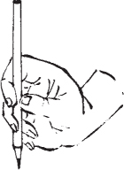
The broad end of a pen holder has four metal prongs that secure the nib. The tool should be held like a pencil, but always make sure to hold it so that the rounded surface of the nib faces upward as you stroke.

Paper
Hot-press (smooth) watercolor paper is a great choice for general lettering, whereas cold-press (medium) watercolor paper is ideal for illumination projects. You will want to have a supply of practice paper, such as layout bond or translucent paper, that you can place over guidelines or graph paper. Printmaking paper and other fine art papers also may also be used. With all fine-grade papers, keep in mind that the paper needs the right amount of sizing (a coating that makes the paper less absorbent) to work well for lettering. Too little sizing will cause the ink to spread; too much will cause the ink to sit on top of the paper.


Assembling the Calligraphy Pen
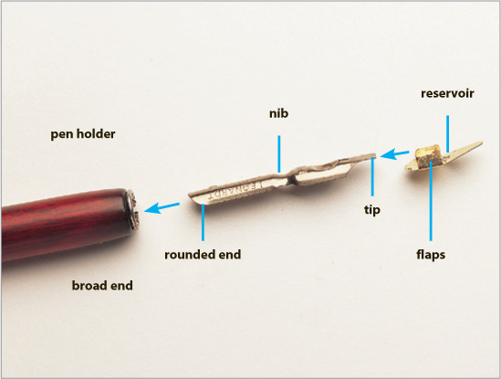
Parts of the Pen The photograph above shows the three components needed to assemble the pen: the pen holder, the nib, and the reservoir. As indicated by the arrows, the nib slides into the pen holder, and the reservoir slips over the nib.

The Pen Holder The pen holder grips the nib with four metal prongs. These prongs are made of thin metal and can be manipulated to better hold the nibs after they warp from use. Gently press the prongs toward the outer ring of the pen holder for a tighter fit.

Inserting the Nib Slide the rounded end of the nib into the area between one of the metal prongs and the outer ring of the pen holder until it fits snugly and doesn’t wobble. If your nib wiggles, remove it, rotate the pen holder a quarter turn, and again slide in the nib. The pen at left shows the nib from beneath, and the pen on the right shows the nib from above.

Attaching the Reservoir The gold-colored reservoir slips over the nib, cupping the underside to create a “pocket” for the ink and touching the nib near the tip to control the ink flow (left). The two flaps of this piece slide over the sides of the nib, as shown on the right. (Note that the drawing nib comes with an attached reservoir.)

Setting up a Calligraphy Work Area
Arranging Materials
Right-handed scribes using a dip pen should place everything on the right; however, when filling a pen with a brush, your palette or ink should be on the left. Left-handed scribes should reverse the position of the materials.

Right-handed Scribes

Left-handed Scribes
Developing Good Habits
To maintain your comfort level, take frequent breaks to relax your hands, back, and eyes. As you are lettering, move the paper from right to left to keep your working hand centered in front of your eyes. Clean your pen by dipping just the tip of the nib in water and wiping it dry, even if you’re just stopping for a few minutes.
Preparing the Board Surface
Tape a few sheets of blotter paper, newsprint, or paper towels to the board to form a cushion under the paper. This gives the pen some “spring” and will help you make better letters. You also can work on top of a pad of paper for extra cushion. To protect the paper, place a guard sheet under your lettering hand, or wear a white glove that has the thumb and first two fingers cut off. This protects the paper from oils in the skin, which resist ink.
Positioning the Work Surface
A sloping board gives you a straight-on view of your work, reducing eye, neck, and shoulder strain. The work surface affects the flow of ink—on a slant, the ink flows onto the paper more slowly and controllably. To prevent drips during illumination, you will need to work on a relatively flat surface. Practice lettering at different angles.


Getting Started in Calligraphy
Dip pens require a little preparation and maintenance, but when properly handled, they are long-lasting tools. Before you jump into writing, you’ll need to learn how to assemble, load, manipulate, and clean a dip pen. Have a stack of scrap paper handy, and take time to become familiar with the unique character of the marks made by each nib.
Preparing New Pen Nibs New nibs are covered with a light coating of oil or lacquer and need preparation to make the ink or paint flow properly. Wash new nibs gently with soapy water, or pass the tip of the nib through a flame for a few seconds, as shown; then plunge it into cold water.

Adjusting the Reservoir After slipping the reservoir onto the nib, adjust it (using fingers or pliers) so that it’s about 1/16” away from the tip (too close interferes with writing; too far away hinders the ink flow). If it’s too tight, you’ll see light through the slit while holding it up to a light source.
Understanding Pen Angle The angle of the flat end of the nib to a horizontal line is known as the “pen angle.” It determines the thickness of the line as well as the slant of stroke ends and serifs (small strokes at the end of letters). For most lettering, you’ll use an angle of 30 to 45 degrees.

Loading the Pen It is best to use a brush or dropper to load the nib; if you dip your nib into the ink, your strokes may start out as ink blobs. Regardless of how you load your pen, it’s always “a good idea to test your first strokes on scrap paper.

Making Even Strokes First get the ink flowing by stroking the pen from side to side, making its thinnest line, or rocking it from side to side. Keep your eye on the speed and direction of the pen as you move it. Apply even pressure across the tip to give the stroke crisp edges on both sides.

Techniques for Left-Handed Scribes To achieve the correct pen angle, you can either move the paper to the left and keep your hand below the writing line or rotate the paper 90 degrees and write from top to bottom. (You’ll smear the ink if you write with your hand above the writing line.)

Practice Basic Shapes Start by making simple marks as shown above, and keep the pen angle constant to create a sense of rhythm. Pull your strokes down or toward you; it is more difficult to push your strokes, and doing so may cause the ink to spray from the nib. Practice joining curved strokes at the thinnest part of the letter, placing your pen into the wet ink of the previous stroke to complete the shape. This is easiest when your pen angle is consistent.

Draw Decorative Marks Medieval scribes often used the same pen for lettering as they used to decorate the line endings and margins of their texts. The broad pen can be used like any other drawing tool; practice drawing a variety of shapes to learn more about the pen’s unique qualities. For instance, turn the paper to create the row of heart-shaped marks.

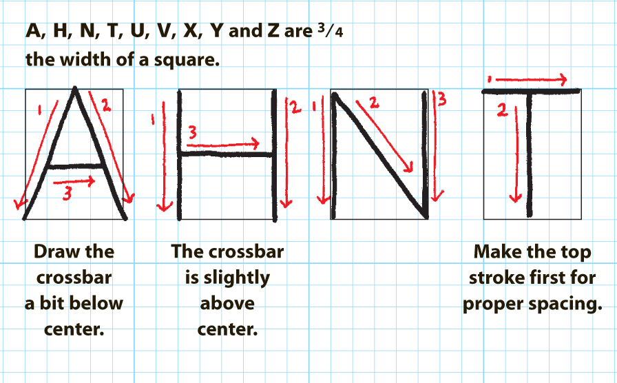
Calligraphy Basics
This diagram will familiarize you with the basic calligraphy terms. As you can see below, the various stroke curves and extensions of calligraphic lettering all have specific names—refer to this page when learning how to form each letter. Below you’ll also see the five basic guidelines (ascender line, descender line, waist line, base line, and cap line), which will help you place your strokes.

Forming the Letters
The term ductus refers to the direction and sequence of the strokes, which are indicated throughout with red arrows and numbers around the letter examples above. Broad pen letters are formed with a series of separate strokes, so it’s important to follow the recommended ductus while learning; however, with experience, you’ll develop your own shortcuts to forming the letters.
Learning Proper Terminology
The terms “uppercase” and “lowercase” come from the era of hand-set type, when individual metal letters were stored in shallow cases; therefore, these terms should not be used in calligraphy. It’s better to use the terms “majuscules” (for uppercase letters) and “minuscules” (for lowercase letters). Also avoid using the term “font,” which generally refers to computer-generated letters; when referring to different hand-lettered alphabets, use the term “style” or “hand.”

Preparing Calligraphy Paper
No matter what your skill level, you’ll usually need guidelines present when doing calligraphy. Without these helpful marks, your writing can lose the rhythm, consistency, and visual alignment that make calligraphy so pleasing to the eye. Follow the steps below to prepare your writing surface with all the necessary guidelines. Remember that you can easily erase light pencil lines when finished, removing any trace of them from your completed work.

Make a Paper Ruler On a small piece of paper, mark a series of short pen-width lines, as shown. Turn the pen 90 degrees and begin at the base line, forming a set of stacked squares. Using the pen width as the unit of measurement will keep your letter height in proportion with the line thickness. Each practice alphabet has a designated pen width (p.w.) height, indicating the number of squares needed.

Mark the Guidelines Place the paper ruler along the edge of your paper and use it to position horizontal guidelines across the paper. A T-square is easier to use than a regular ruler, as you can draw guidelines that are perfectly perpendicular to the vertical edge of your paper. Mark the base line, waist line, ascender line, descender line, and cap line (if working with majuscules).

Basic Calligraphy Form: Skeleton Miniscules
Mastering the skeleton hand gives you the basic skills for learning all the other hands. This hand features the basic underlying structure (or skeleton) of the letterforms. Practicing these letters will train your hand to remain steady while drawing straight and curved lines. These letters were created with the drawing nib, which makes a thin stroke, but you can use a fine-line marker or a pencil for practice if you wish. As you re-create the letters of this hand, as well as any other hand, remember that part of the charm and appeal of hand lettering is the imperfections. Hand-lettered alphabets throughout won’t align exactly on the guidelines. (This hand is shown at 85% of its actual size.)
Minuscules
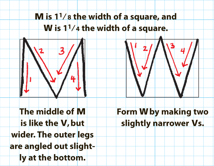
Learning the subtleties of the letter shapes will make the difference between creating plain-looking letters and beautiful ones. Notice that the o fills the entire width of a square (equal to 4 grid boxes by 4 grid boxes). Other round letters are about 7/8 the width of that square, and most of the other minuscules (except for the i) are 3/4 the width of the square. Proportion and alignment, as well as consistency, all play a part in giving your writing a clean look and producing characters that are easy to read. As you can see, certain letters share common shapes. Practice the different styles using these letter families. By practicing the letters in these groups, you will learn the forms faster.


Form these letters using the drawing nib. This hand is shown at 85% of its actual size.

Basic Calligraphy Form: Skeleton Majuscules
Majuscules
When drawing majuscules, also called “Romans” by calligraphers, understanding the correct proportions will allow you to consistently form handsome-looking letters. Note that the shape of the o, which is the “mother” of every alphabet, will determine the shapes of almost all the other letters.


Chinese Brush Tools and Materials
In Chinese Brush painting, the paintbrush, paper, ink, and ink stone are called “The Four Treasures” of an artist’s studio. Below is a list of these and other necessities you’ll need to get started.
Paints
Chinese pigments are made from semi-precious stones, minerals, and/or plants, and they are available in both tube and cake colors. Most Chinese Brush artists mix them with a bit of water; the less water, the more intense the color.

Brushes
Chinese brushes are similar to watercolor brushes, but they have finer tips. Wolf-hair brushes are the most versatile of the Chinese brushes. They have stiff, highly resilient bristles that are used for painting leaves and branches, especially those of orchids and bamboo. Goat-hair brushes are soft, pliant, nonresilient brushes that are used for depicting soft things, such as animal fur, petals, and large areas of color. New brushes have sizing in the bristles: a substance that keeps the bristles’ shape. Soak your brushes in water to remove the sizing before use.
Other Materials
Watercolor paper is great for Chinese brush painting because it’s versatile and easy to paint on; the paper absorbs the paint just enough without allowing the colors to bleed. As you progress, you may want to buy some rice paper, the primary painting surface of Chinese brush painters for more than 2,000 years.
Paper towels come in handy for drying and blotting brushes and for testing colors. You may wish to use a paperweight to hold your paper still while you paint and to prevent it from curling. Also, it’s a good idea to keep two jars of clean water nearby: one for rinsing your brushes, and one for adding water to your palette.

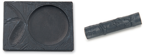
Ink Stick and Stone
To use an ink stick and stone, put one teaspoon of fresh water in the well of the stone. Quickly grind the ink stick in a circular motion for about three minutes until the water becomes thick and dark black. Before each use, make sure the stone is clear of dry ink. Always use fresh water each time you paint, and always grind the same end of the ink stick.
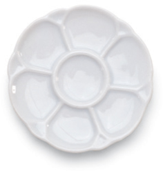
Palette
Use a ceramic mixing palette so you can mix multiple washes at once.
Brush Rest
Place the tips of your brushes on a ceramic brush rest to keep the bristles protected between uses. Never let the bristles stand in water.


Chinese Brush Fundamentals
Handling the Brush
To create the expressive brushstrokes used in Chinese painting, it’s important to be comfortable and to hold the brush correctly. Sit up straight and lay the paper on your table or work surface. Place a piece of white felt or newspaper under the paper to keep it from moving and to protect your table. Then practice making the various strokes shown below, holding the brush in the vertical and slanted positions, as needed. These positions may seem awkward at first, but once you get used to them, you will be able to form the strokes correctly.
Each stroke requires one fluid movement—press down, stroke, and lift. All of your brushstrokes should move in a definite direction; you should always be either pulling or pushing your brush. Use your second finger to pull and your third finger to push. Hold the brush gently, letting it lightly caress the paper. Pressing too hard emits too much ink and makes it difficult to control. Practice applying only the slightest pressure to affect the shape and width of your brushstrokes.
Vertical Hold Hold the brush perpendicularly to the paper. Grasp the handle just below center, placing it be-tween your thumb and index finger and resting the lower part on the nail of your ring finger. Rest your middle finger on the handle just below your index finger. Support your third finger with your pinkie, and brace the handle with your thumb.

Slanted Hold Hold the brush so it’s almost parallel to the paper and use your thumb and fingers to control the movement of the brush, as shown. The width of the stroke is determined by the angle of and the pressure on the brush. The shape of the stroke is determined by the movement of the brush: press and lift, push and pull, turn and twist, or dash and sweep.

Slanted Strokes Hold the brush almost parallel to the paper and, in one fluid movement, press down, stroke, and lift, using your thumb and fingers to control the movement of the brush. Use slanted strokes to paint large areas, broad shapes, and washes.

Vertical Strokes Hold your brush perpendicularly to the paper. Stroke from top to bottom, thickening your line by gradually pressing the brush down on the paper. Use this stroke for outlines, branches, clothing, and other detailed lines.
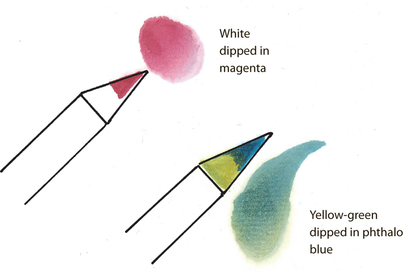
Color Mixing There are two basic methods for mixing colors on your brush: dipping and tipping. For dipping, fully load your brush with the first color; then dip the bristles halfway into the second color. For tipping, touch only the tip of the bristles into the second color. Each time a color is applied, rotate the brush on the side of the dish to blend. (Note: You can lighten any mixture by dipping your brush in clean water.)


Chinese Brush Basic Strokes
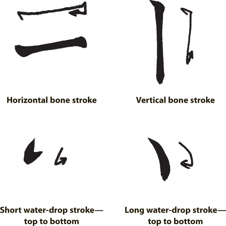
Chinese painting strokes were developed from traditional calligraphic strokes thousands of years ago. The relationship between the two art forms is still apparent today, as shown in the examples on this page. There are two basic strokes based on calligraphy: the water-drop stroke, which is made by holding the brush in the slanted position, and the bone stroke, which is made by holding the brush vertically. Below are eight different strokes that incorporate either the water-drop stroke, the bone stroke, or both. Practice these strokes over and over on newsprint until you master them.
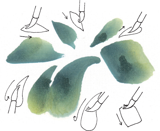
Leaf and Petal Strokes Some of the same basic strokes shown below are also used to paint petals and leaves. Practice these strokes with a wolf-hair brush.

Basic Strokes Try to keep your wrist and hand flexible as you practice. Follow the arrows for making each brushstroke, working either from top to bottom or bottom to top. For thicker lines, press down harder on the brush; for thinner lines, use a lighter touch. Once you can accomplish these strokes with ease, try painting some of the Chinese symbols shown below. Notice that each symbol is simply a combination of basic strokes.

Getting Started in Chinese Brush
Bamboo
Bamboo is one of four plants in the traditional study of Chinese brush painting techniques, along with the orchid, plum blossom, and chrysanthemum. These four plants—called “The Four Gentlemen”—represent the noble virtues of Chinese life, which include strength, beauty, honor, and longevity. The straight, hollow bamboo stalks symbolize the Buddhist and Taoist ideals of an emptied heart and mind, cleansed of earthly desires and reflecting a modest personality.
Monochromatic Painting
A painting done in only one color is called “monochromatic.” In a monochromatic ink painting, black ink is separated into seven distinct shades, from deep black to white, as shown in this simple bamboo demonstration. Zhong Ren, a Buddhist monk still known for his Zen philosophy of “simplicity,” created this medium during the North Song dynasty (A.D. 960—1127) to express his love of nature in a simple form.

Composition Keep your bamboo paintings simple and balanced. Paint three sets of leaves close together on one deer’s horn-shaped branch (see below), angling each set in a different direction.

Value Scale This chart shows seven distinct shades, or values, of black. You can create these values by adding varying amounts of water to black ink; the more water, the lighter the value.

Stalk For the base of the stalk (below), hold a wolf-hair brush upright, press the bristles down, and stroke from the bottom to the top. Each section of the stalk should be straight and of even width, with equal distance between each knot. As you stroke upward over the stalk, hesitate at each knot without lifting your brush off the paper.

Branches Using light gray ink and bone strokes, paint one branch growing out of each knot. Hold a wolf-hair brush upright, start at the bottom, and stroke upward. Then for the deer’s horn shape, paint three slightly curved bone strokes, placing the middle line lower than the other two lines. For the joint, load a wolf-hair brush with dark black ink, remove the excess liquid, and paint dark knots along the stalk, as shown at right.
Leaves Load a wolf-hair brush with a light value of ink, and dip the tip in dark black ink. Press down and, using your middle finger, gradually pull up as you stroke downward. Paint the two larger leaves so they cross at the top. Add two side leaves and a short stem to the set.