


Introduction to Color
A fundamental knowledge of color can assist you in clearly expressing yourself in your art. Color helps communicate feelings, mood, time of day, seasons, and emotions. Knowing how colors work, and how they work together, is key to refining your ability to communicate using color.
The Color Wheel
A color wheel is a visual representation of colors arranged according to their chromatic relationship. The basic color wheel consists of 12 colors that can be broken down into three different groups: primary colors, secondary colors, and tertiary colors.
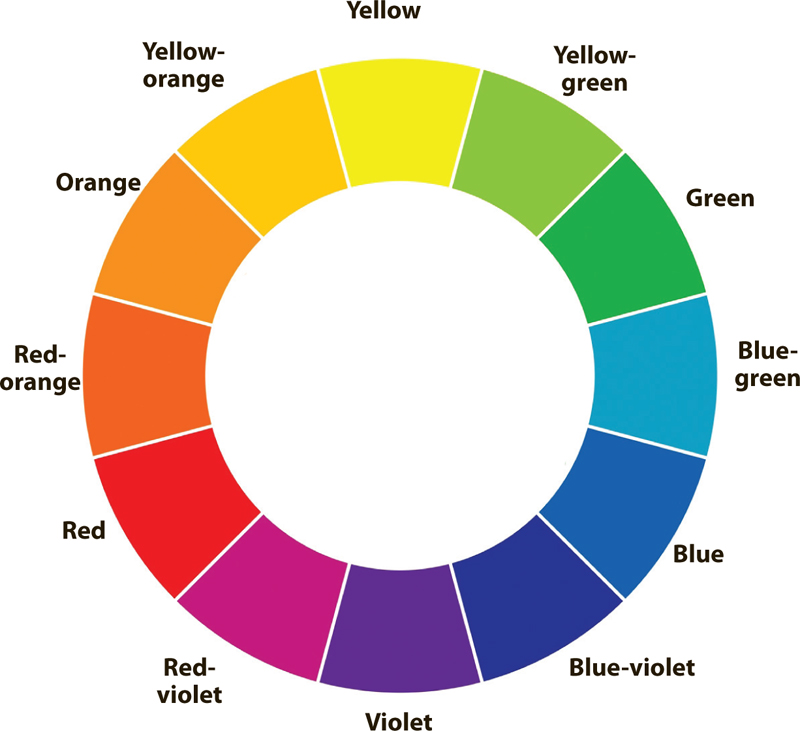
One of the easiest things to create is a 12-color color wheel with just the three primaries: red, yellow, and blue. All colors are derived from these three. Beginners should mix a color wheel with both the primaries and secondaries. This can help you understand how to create additional colors, see how colors interact, indicate if you have too many colors (do you really need five reds?), and see your palette of colors in spectrum order.

Color wheel made with three primaries

Color wheel made with primaries and secondaries

The Basics of Color
Primary Colors
The primary colors are red, yellow, and blue. These colors cannot be created by mixing any other colors, but in theory, all other colors can be mixed from them.
Secondary Colors
Secondary colors are created by mixing any two primary colors; they are found in between the primary colors on the color wheel. Orange, green, and purple are secondary colors.

Tertiary Colors
If you mix a primary color with its adjacent secondary color, you get a tertiary color. These colors fill in the gaps and finish the color wheel. Tertiary colors are red-orange, red-violet, yellow-orange, yellow-green, blue-green, and blue-violet.

Color Schemes
Choosing and applying a color scheme (or a selection of related colors) in your painting can help you achieve unity, harmony, or dynamic contrasts. This page showcases a variety of common color combinations. Explore these different schemes to familiarize yourself with the nature of color relationships and to practice mixing colors.

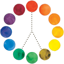
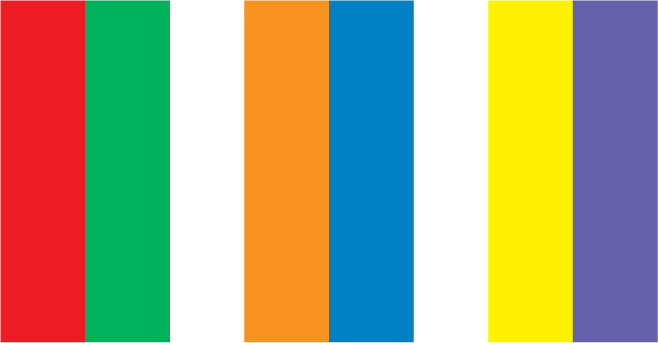
Complementary Color Schemes Complementary colors are opposite each other on the color wheel. Red and green (shown above), orange and blue, and yellow and purple are examples of complementary colors. When placed adjacent to each other in a painting, complements make each other appear brighter. When mixed, they have the opposite effect, neutralizing (or graying) each other.

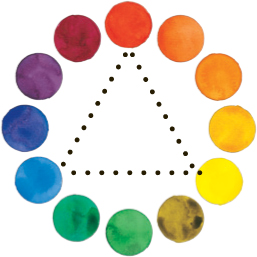
Triadic Color Scheme This scheme consists of three colors that form an equilateral triangle on the color wheel. An example of this would be blue-violet, red-orange, and yellow-green (shown above).

Tetradic Color Schemes Four colors that form a square or a rectangle on the color wheel create a tetradic color scheme. This color scheme includes two pairs of complementary colors, such as orange and blue and yellow-orange and blue-violet (shown above). This is also known as a “double-complementary” color scheme.

Analogous Color Schemes Analogous colors are adjacent (or close) to each other on the color wheel. Analogous color schemes are good for creating unity within a painting because the colors are already related. You can do a tight analogous scheme (a very small range of colors) or a loose analogous scheme (a larger range of related colors). Examples of tight analogous color schemes would be red, red-orange, and orange; or blue-violet, blue, and blue-green (shown at left). A loose analogous scheme would be blue, violet, and red.
Split-Complementary Color Schemes This scheme includes a main color and a color on each side of its complementary color. An example of this (shown at left) would be red, yellow-green, and blue-green.

Color Temperature
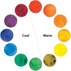
Divide your color wheel in half by drawing a line from a point between red and red-violet to a point between yellow-green and green. You have now identified the warm colors (reds, oranges, and yellows) and the cool colors (greens, blues, and purples). Granted, red-violet is a bit warm and yellow-green is a bit cool, but the line needs to be drawn somewhere, and you’ll get the general idea from this. In a painting, warm colors tend to advance and appear more active, whereas cool colors recede and provide a sense of calm. Remember these important points about color temperature as you plan your painting.
Mood and Temperature
We are all affected by color, regardless of whether we realize it. Studies show that color schemes make us feel certain ways. Warm colors, such as red, orange, yellow, and light green, are exciting and energetic. Cool colors, such as dark green, blue, and purple, are calming and soothing. Use these colors schemes as tools to express the mood of the painting. In fact, you’ll find that you don’t even need a subject in your painting to communicate a particular feeling; the abstract works below demonstrate how color is powerful enough to stand on its own.

Warm Palette What is this painting of? Who knows! It doesn’t matter. The point here is to express a mood or a feeling. Here the mood is hot, vibrant passion. Energetic reds and oranges contrast the cool accents of blue and purple.
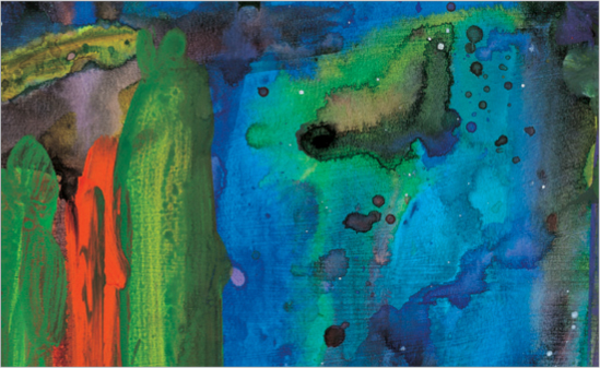
Cool Palette A much different feeling is expressed in this painting. It is one of calm and gentle inward thought. The red-orange accents create an exciting counterpoint to the overall palette of cool greens and blues.
Color isn’t the only thing that affects mood. All parts of the painting contribute to the mood of the piece, including the brushstrokes and line work. Keep these points in mind as you aim for a specific feeling in your paintings.

Upward Strokes (heavier at the base and tapering as they move up) suggest a positive feeling.

Vertical Strokes communicate force, energy, and drama.

Downward Strokes (heavier at the top and tapering as they move down) suggest a more somber tone.

Horizontal Strokes denote peace and tranquility.

Conveying Mood with Color
In addition to warm and cool palettes, bright and dark palettes also work well for conveying a mood. A bright palette consists of light, pure colors with plenty of white paper showing through. This gives the effect of clean, positive, uplifting energy. Darker, saturated colors covering most of the paper suggest a more serious tone—a mood of quiet somberness and peace.

Bright Palette The pure, warm colors with plenty of white paper showing through expresses the cheer of this light-hearted scene. Complementary colors (e.g., red against green or yellow against purple) also help enliven the story.

Dark Palette The darker colors in the cool range communicate a heavier mood. Here I used an analogous color scheme of cool, darker colors to indicate the quiet end of the day and the approaching night.
A painting should be primarily one temperature—either warm or cool. There should be a clear, simple message in each painting with a minimum of variables. Also, you don’t want to confuse the viewer with uncertainty. However, warm accents in a cool painting (and vice versa) are certainly acceptable and encouraged. Remember, you want your statement to be exciting but clear.

Accenting Warm and Cool Palettes These two examples feature warm and cool colors almost exclusively. The warm painting (above) suggests a hot summer day with energy in the air.

The cool painting (above) recedes into quiet and suggests a winter afternoon. Notice that in each case, complementary accents emphasize the color theme with contrast.

Color Properties
The properties of color are hue, value, and intensity. When you look at a color, you will see all three properties. Hue is the name of the color, such as red, yellow, or blue. Value refers to how light or dark a color is. Intensity is the color’s brightness or dullness.
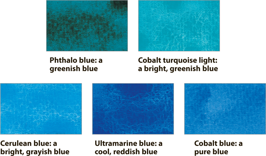
Hue
Hue refers to the color name. Here are some examples of blue hues.
Value
Value refers to the lightness or darkness of a color (or of black). Variations of color values are an important tool for creating the illusion of form and depth in your paintings. Colors have their own inherent value; squint at a color wheel and you’ll see light colors, such as yellow, and dark colors, such as purple. In addition, each color has its own range of values. With watercolor, add water to lighten the value (creating a tint of the color), or add black to darken the value (creating a shade of the color).
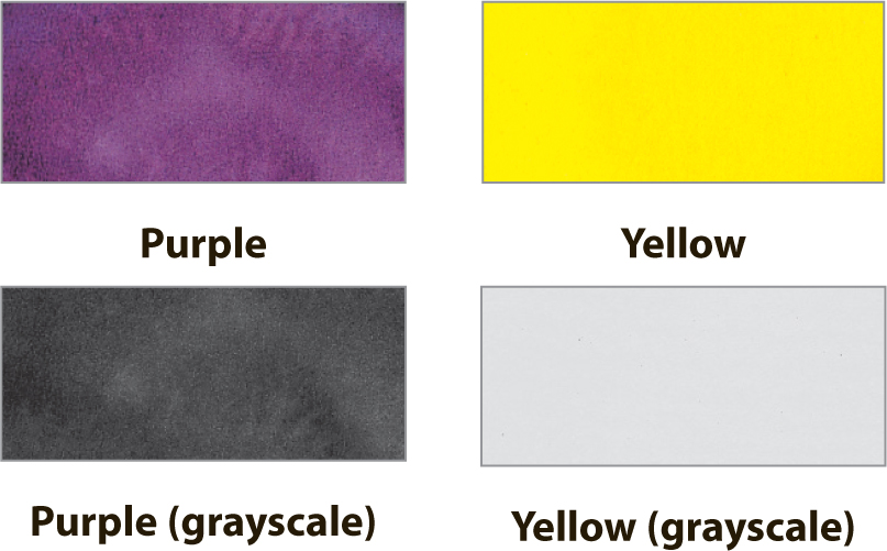

Assessing the Value of Color Above are colors from the color wheel (top row) and how they appear in grayscale (bottom row). Viewing them in this manner reveals the true value of each color without any visual distractions. As you can see, purple is very dark, yellow is very light, and red and green are similar medium values.
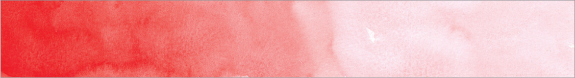
Creating Value Scales Get to know the range of lights your paint colors can produce by creating a few value scales. Working your way from left to right, start with a very strong wash of your color and add more water for successively lighter values.
Intensity
Intensity refers to the purity (or saturation) of the color. Colors right out of the tube (or as they appear on the color wheel) are at full intensity. To change the intensity of watercolor paint, you can dull the color (or gray it) by adding its complement, gray, black, white, or water. Although adding black or water changes the value of the color, it also neutralizes it, dulling it and making it less intense.

Ultramarine blue right out of the tube at full intensity

Ultramarine blue dulled with water

Ultramarine blue dulled with burnt umber

Color and Value
For most paintings to be successful, there should be a good value pattern across the painting, which means a clear and definite arrangement of dark, middle, and light values. This will create an effective design, which is pleasing to the eye. It also helps communicate the point of your painting in a clear and uncluttered manner. Keep in mind that these values should not be equal in a painting but rather predominantly light or dark. Equal amounts of light and dark result in a static image that lacks movement, drama, and—most important—interest.

Predominantly light painting

Predominantly dark painting
A good exercise is to make a black-and-white print of your painting. Does it read well? Can you see a separation of elements and objects without having to rely on the colors? If so, good job—your values are working for you. Too often we rely on the colors to get the point across, and we are disappointed when it doesn’t happen.
To demonstrate the importance of value, the same painted scene appears three times (see below). The painting at the far left uses the appropriate colors and values. The middle painting uses the correct colors, but its values are similar to one another. The painting at the right uses the correct values, but all the wrong colors. Which of these makes a better painting—the image at center or the image at right? (Hint: The one with the correct values, at right).

Correct colors, correct values

Correct colors, incorrect values

Incorrect colors, correct values

Complementary Colors
When placed next to each other, complementary colors create lively, dramatic contrasts that can add interest and excitement to a painting. In contrast, you can also mix in a little of a color’s complement to dull the color. For example, mute a bright red by adding a little of its complementary color, green.
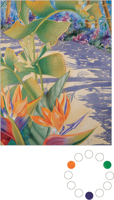
Pairing Complements When complementary colors appear together in nature, they create striking scenes—for example, red berries among green leaves, an orange sun against a blue sky, or the yellow center of a purple iris.
Contrasting Colors
When light values are placed next to dark values, the effect can be strong and dramatic. Pairing contrasting complementary colors in a painting creates a visual vibration that excites the eye.

GERI MEDWAY
Making elements “POP” In this floral painting, notice the way placing a yellow iris against a background of greens, blues, and purples gives the colors a jewel-like quality and adds vibrancy. The contrast between the complementary colors, yellow and purple (paired with harmonious blue and green), makes the irises “zoom” forward.

BRENDA SWENSON
Lighting the Subject Another benefit to working indoors is lighting control. Artificial lighting lets you work at night or on rainy days. And with artificial light, you can manipulate the direction and strength of the light source for interesting shadows. You may want to use natural light—such as light from a window—when indoors; but natural light can interfere with artificial light, so it’s best to use only one.

Color Schemes in Paintings
Color schemes are combinations of colors that create an appealing visual dynamic. There are many types of color schemes, several of which are shown below. Some schemes create contrast and excitement; others create harmony and peace. Keep in mind that each scheme affects the subject of a painting differently, so it’s important to assess your goals and select a color scheme before you begin painting. Also, note that color schemes are a general way of categorizing the dominant colors used in a painting; not every single color used in a painting has to be straight from the selected color scheme.

JOAN HANSEN
Complementary Color Scheme The dominant colors in this painting are yellow-orange and blue-violet, which lie opposite each other on the color wheel. The artist has placed these two colors adjacent to one another throughout the still life, which makes the complements appear especially vibrant.
JOAN HANSEN
Triadic Color Scheme This scheme combines three colors that are evenly spaced apart on the color wheel. Using all three of these colors in equal weight can overwhelm the viewer, so it’s best to allow one color to be more prominent (such as the green in this painting).

GERI MEDWAY
Analogous Color Scheme This harmonious scheme combines colors that are adjacent to one another on the color wheel, so they are all similar in hue. In this particular instance, the artist has muted (or grayed) all of the colors to communicate the quiet and solitude of diffused, early morning light.

JOAN HANSEN
Tetradic Color Scheme This color scheme involves two pairs of complements (such as red-orange/green and yellow-orange/blue-violet), creating a square or rectangle within the color wheel. The complements vibrate against one another and produce a colorful scene full of life. Notice how this dynamic makes the flowers seem to “pop” from the background.

ROSE EDIN
Split-Complementary Color Scheme This scheme combines a color (in this case, blue) with two colors adjacent to its complement (yellow-orange and red-orange). The scheme retains a hint of the vibrant interplay of a complementary scheme but includes more variety in hue.

Depicting Shadows and Light
Once you’ve become comfortable with mixing colors and composing a scene, you’re ready for the next step: making two-dimensional objects appear three-dimensional. Flat objects can appear to have depth and dimension when they possess a range of light, dark, and medium values—also referred to as “highlights,” “shadows,” and “local color” (the actual color of the object itself). Use contrasts in color values to define the forms of your subjects, as well as to create visual interest in your paintings.
Form and Cast Shadows
There are two main categories of shadows that play roles in giving depth and interest to objects. Form shadows (the shadows on the surface of an object) are responsible for giving an object a sense of depth and dimension, whereas cast shadows (the shadows the object throws onto other surfaces) can anchor or ground the object in space.

Form vs. Cast Shadows You can distinguish form and cast shadows by studying their differences: Here the cast shadow is darker than the form shadows; the edges of the cast shadow are harder than those of the form shadows; the cast shadow shares the same hue as the surface it falls upon, not the object that casts it; and the cast shadow suggests the shape of the pear while “grounding” it in space.
Choosing a Light Source
Both form shadows and cast shadows are affected by the light source’s angle, distance, and intensity. Intense light results in darker cast shadows; and the lower the light source, the longer the cast shadows will become. Keep in mind that the darkest shadows will always be on the side of the object opposite the light source. When painting indoors or setting up a still life, try using a portable lamp with an adjustable neck to experiment with different lighting angles and effects.

LORI LOHSTOETER
Using Strong Lighting In this still life, the strong, low lighting from the side intensifies form shadows, creating dynamic contrasts and interesting shapes.

Experimenting with Cast Shadows Whether long or short, cast shadows can be an interesting element in a composition. In this photo, the light source is high and slightly behind the orange, creating a shorter cast shadow toward the front of the orange.

Lowering the Light Source Here the light source is low and coming from the left, so the cast shadow is long and falls to the right of the orange.

Creating Visual Interest with Light
Besides creating the illusion of form and dimension, the interplay between light and shadow also can be used to pique a viewer’s interest in a scene. Because contrasting values attract the eye, incorporating subtle, natural contrasts between light and dark can add vitality and drama to a painting. For example, sunlight filtering through the leaves of a tree forms a variety of fascinating shapes that engage the viewer’s interest. And sometimes patterns of light and shadow can be so compelling that they become the focus of the painting in lieu of the physical elements of the scene!

TOM SWIMM
Engaging the Viewer The irregular patches of sun and a range of warm values make this scene compelling and inviting.
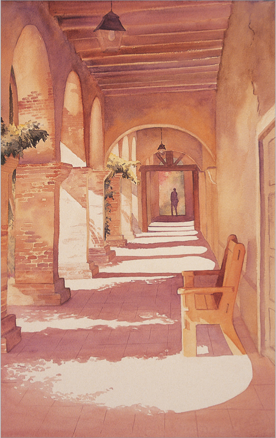
BARBARA FUDURICH
Catching the Eye A range of warm values and the play of light and shadow make this scene compelling and inviting. The shadows cast on the ground by the leaves and archways create a pattern that draws the eye into the painting and leads it down the pathway to the shadowed human figure.
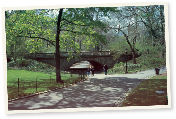

Focusing on Shadows This snapshot captures the natural, delicate balance between light and shadow. For the painting, simplify the shadows but try to retain the delicate lace-like quality that makes them so interesting.

Depicting Time of Day
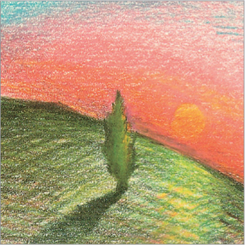
Light and shadow play a vital role in suggesting the time of day in a painting. The color temperature of light changes during the day, going from cool, light yellow in the morning to harsh white during the middle of the day. As the day passes, the light changes to a golden hue and turns to red before resolving into the cool evening colors of purple and blue. Your palette should respond to these changes in light. The shadows in your scene offer another way to communicate the time of day; for example, long, cool shadows are characteristic of morning, whereas short, colorless shadows evoke a midday feel.

Sunrise At sunrise, everything has a fresh, warm cast. As the cool night gives way to morning, colors are primarily yellow. Shadows are long and cool blue in color. This example shows a complementary color scheme, pitting the yellow-orange of the morning sun against the blue-purple of night shadows.

Midday At midday, the sun is directly overhead (at least in the summer), and all the colors are warm but washed out. There is little depth and interest in the colors. Shadows are basically nonexistent. Emphasize the brightness by allowing plenty of bright white paper to show through.

Sunset As sunset approaches, colors take on a golden cast, and shadows once again lengthen. As gold turns to orange and red, the shadows become warmer and redder. Colors once again become deep and rich. Sunset is similar to sunrise, but the colors have a warmer (redder) cast.

Dusk At dusk, everything becomes cool and dark. The sky still has a little light at the horizon, but it is primarily purple, deepening to blue. All objects appear as silhouettes rendered in dark blues, purples, and dark reds. Because there is no real light source, there is no shadow.

Night At night, all the light comes either from city light reflected in the sky, from street lights, or from building windows. The sky is a dark blue-black. Light comes from windows as bright white (the paper), changing to yellow, then red, then purple, and finally to blue to meld with the deep tones of nightfall.

Dawn On a clear morning, the sun rises in yellows and oranges. The air has cooled overnight, and moisture has settled the day’s dust. Through this cleaner air, we see less red and more yellow.

Midday At noon, dust has been stirred up, making the atmosphere more dense than in the morning. At this time of day, colors look faded, and shadows are darker and more intense.
Dusk After a bustling day of city life, dust has built up in the atmosphere, so it has become very dense. For that reason, sunsets are often redder or pinker than sunrises.

Shadows and Reflections
Shadows
Believe it or not, color is often used in rendering shadows. Cool mixes of cobalt blue and opera or ultramarine blue and alizarin crimson are perfect for rendering shadows. Shadows across green grass are best represented by a mixture of phthalo blue and burnt sienna. In addition, shadows add clarity and depth to a scene. They also suggest a time of day and can be used to create drama and mood.
Shadows on White When painting white walls, use the same color underpainting for both the walls in shadow and in the sky, integrating the elements for harmony. This painting features ultramarine blue and alizarin crimson for the wall shadows above and at left, using strong, diagonal lines for extra excitement. The darkest shadow appears next to the brightest wall.

Foreground Shadows Exaggerating the length of the shadow along the ground, especially across the foreground, suggests late afternoon where all colors are saturated and the day is winding to a close. It also frames the subject and directs your eye upward. Remember to be consistent with the direction of light so all shadows come from the same place!
Reflections
Reflections are another great way to add energy and interest to a scene—and the best way to do this is through bright color accents, such as juxtaposing complementary colors: a red person against a green tree or a golden-yellow person against a purple shadow. To suggest the flow of water or irregularity of puddles, make horizontal strokes through the reflection. In city night scenes and lakes, the reflection extends down farther than the height of the object. Remember: If the reflection is distinct, the water is calm. Rivers and busy water have broken bits of color.

