Chapter 13. ApplicationBar and context menus
This chapter covers
- Working with the application bar
- Dynamically changing buttons
- Displaying a context menu
The Windows Phone comes with its own edition of the XAML framework found in WPF, Silverlight, and Windows 8. This means that if you know how to build XAML applications, you know how to build Windows Phone applications. By this point in the book, you’ve already used many of the XAML controls in the Windows Phone SDK. This chapter is the first of six chapters that take a closer look at XAML controls and discuss how to use them on the phone platform.
Windows Phone has redefined how an application displays a toolbar and menu. Applications use the new ApplicationBar control to show up to four shortcut icons for the most common operations on the page. If additional options are available but don’t fit in the bar containing shortcuts, or a different level of granularity must be provided, developers can add textual menu items as well. In this chapter we cover how to create a basic menu that can be used in your applications.
We venture beyond the standard Windows Phone SDK and show how to implement a context menu with a set of controls from the Windows Phone Toolkit. The Windows Phone Toolkit ContextMenu mimics the tap-and-hold context menu behavior seen in many of the built-in phone applications.
You’ve used the ApplicationBar control throughout the book, including in several examples in earlier chapters, but your use of these controls was basic. In this chapter we take a deeper look at ApplicationBar and Pivot controls and introduce the ContextMenu control. We accomplish this with a sample application that demonstrates features of the application bar we haven’t discussed, such as disabling buttons and menu items, dynamically adding and removing items, and using different display modes.
13.1. Working with the ApplicationBar
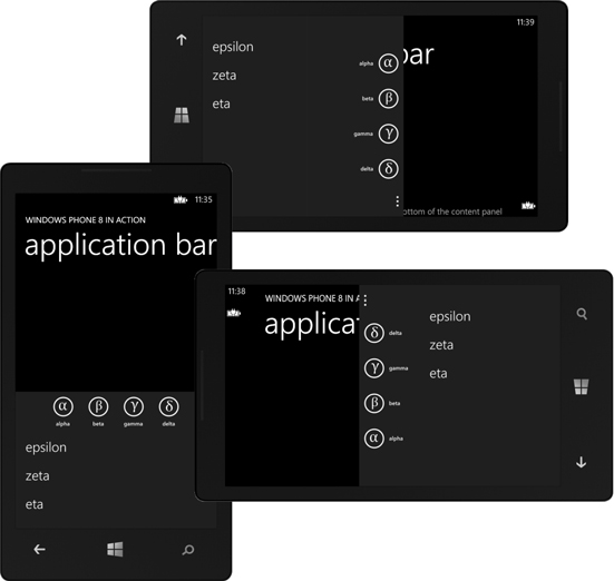
The ApplicationBar is the new toolbar and menu paradigm created for the Windows Phone. It provides a toolbar for buttons with an expandable menu. The application bar is always placed at the bottom of the screen in portrait orientation and on the side of the screen in landscape orientation (see figure 13.1). The application bar is usually associated with a page and isn’t global to the application.
Figure 13.1. The application bar with expanded menu in portrait, landscape left, and landscape right orientations
Note
If you want to reuse the same application bar on multiple pages, you can declare an ApplicationBar as a resource in your project’s App.xaml file and then assign it to a page’s ApplicationBar property using the Static-Resource markup extension.
The application bar is always positioned on the side of the screen where the Start button lives. Tapping the three dots at the edge of the application bar expands it to show the defined menu items. There are a maximum of 4 buttons and 50 menu items.
13.1.1. Building an application bar
We’ll use a new sample application to demonstrate using an application bar in a XAML application. Create a new project, named ApplicationBar, using the Windows Phone App project template. Once the project is created, open up MainPage.xaml and add the markup declaring a new application bar. The following listing shows the XAML used to declare the application bar shown in figure 13.1.
Listing 13.1. Declaring application bar buttons and menu items

An application bar is created as a property of the PhoneApplicationPage using XAML’s property element syntax  . An application bar is represented by the ApplicationBar class, found in the Microsoft.Phone.Shell namespace, which is aliased in XAML as shell. The ApplicationBar contains two collection properties named Buttons and MenuItems. The MenuItems collection is populated by declaring ApplicationBarMenuItem objects inside the MenuItems element
  . The Buttons collection is populated by declaring ApplicationBarIconButton objects as the content of the ApplicationBar
  .
.
The ApplicationBarIconButton class exposes IconUri, Text, and IsEnabled properties. IconUri must be provided and is a relative Uri to an image file that’s been added to the project with a build action of Content. We discuss image files later in the chapter. The Text property is also required.
Note
The alpha.png, beta.png, gamma.png, and delta.png files used in listing 13.1 can be found in this book’s sample code. You can download the sample code from Manning’s website at www.manning.com/binkley.
The ApplicationBarMenuItem class has only Text and IsEnabled properties. The Text property is required, and a value must be specified when the menu item is declared.
ApplicationBarIconButton and ApplicationBarMenuItem both provide a Click event that can be wired up to an event handler in XAML. The Click events are basic event handlers and don’t send a RoutedEventArgs or any other custom EventArgs type. If you need to know which button or menu item was clicked, you can use the event handler’s sender parameter. In listing 13.1, the same Click event handler was wired up to each of the buttons and menu items. In the following listing, the Click event handler is implemented.
Listing 13.2. Click event handler for application bar items
void item_Clicked(object sender, EventArgs e)
{
    var button = sender as ApplicationBarIconButton;
    if (button != null)
    {
        MessageBox.Show(button.Text, "Button Clicked",
            MessageBoxButton.OK);
    }
    else
    {
        var menuItem = sender as ApplicationBarMenuItem;
        MessageBox.Show(menuItem.Text, "Menu Item Clicked",
            MessageBoxButton.OK);
    }
}
The click event handler first checks whether the sender is a button or a menu item. The value of the Text property is retrieved from the sender. A MessageBox informs the user that the application bar item was clicked. Like any other event, the XAML editor has features that can be used to automatically create the event handler in the code-behind file. This is one of the features supported by the Windows Phone Developer tools.
13.1.2. Tooling support
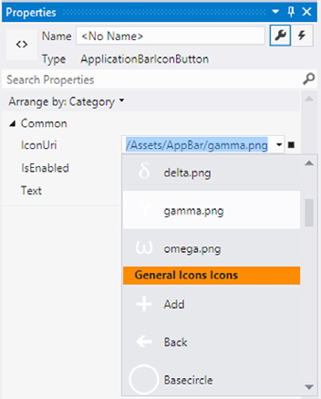
Visual Studio has good support for building an application bar with visual and property editors. The visual editor will display an application bar, complete with the appropriate icons, and will allow you to create and select the ApplicationBar and its buttons and menu items in the Document Outline panel, shown in figure 13.2. The property editor for the buttons, shown in figure 13.3, has a convenient icon selector that allows you to pick from local icons or one of the icons provided in the Windows Phone SDK. When you choose an SDK icon, Visual Studio automatically adds the icon file to the /Assets/AppBar folder in your project.
Figure 13.2. Visual Studio’s designer support for the ApplicationBar. The ApplicationBar, or any of its menus or buttons, can be selected in the Document Outline.

Figure 13.3. Visual Studio’s property editor, displaying icons that already exist in the project and the stock icons that ship with the SDK. When a stock icon is selected, Visual Studio automatically copies the icon to the project.
The ApplicationBar and its button and menu item classes aren’t Framework-Elements or even DependencyObjects. This means they don’t participate in data binding, can’t be located using the FindName API or the VisualTreeHelper, and don’t appear in the visual tree. This also means that although you can apply an x:Name attribute to the buttons and menu items, and member fields will be generated for them, the fields won’t automatically be wired up in InitializeComponents.
You can use the x:Name attribute to get the member variables generated and then wire them up yourself in code-behind. First, add a name to the Alpha button and the Epsilon menu item:
<shell:ApplicationBarMenuItem x:Name="menuItem1"
    Text="epsilon" Click="item_Clicked" />
<shell:ApplicationBarIconButton x:Name="button1"
    IconUri="/icons/alpha.png" Text="alpha" Click="item_Clicked" />
Assign the generated member fields to the button and menu item instances, which you do in the MainPage constructor:
public MainPage()
{
    InitializeComponent();
    button1 = (ApplicationBarIconButton)ApplicationBar.Buttons[0];
    menuItem1 = (ApplicationBarMenuItem)ApplicationBar.MenuItems[0];
}
The ApplicationBar instance is accessed via the ApplicationBar property of your MainPage class. The property is inherited from the PhoneApplicationPage class and will be null unless you have added an ApplicationBar via XAML or code. Set your button1 field to the first item in the Buttons collection. You must perform the cast to ApplicationBarIconButton because the Buttons property is an IList. Do the same thing for the menuItem1 field, using the MenuItems collection and casting it to ApplicationBarMenuItem.
Note
Using a hardcoded index value to wire up the fields is fragile. If the buttons are reordered in MainPage.xaml, you could end up using the wrong button instance if the index value isn’t changed in the code-behind.
In this section we’ve shown how to declare and build an application bar using the Windows Phone Developer Tools. You’re probably asking yourself a couple of questions. How can I change the bar and its items while an application is running? How should I alter my screen designs to accommodate the application bar? We address both issues in the next section.
13.1.3. Changing the application bar appearance
The application bar takes up 72 pixels of space, and you need to account for that space in your page designs. You can claim more space by changing the application bar’s opacity. In this situation, the application bar won’t steal space from your application page but will still be visible floating above the page. Be careful because the semitransparent application bar may obscure your user interface. Figure 13.4 demonstrates how setting the ApplicationBar.Opacity property to 0.5 causes the application bar to obscure the page behind it.
Figure 13.4. Application page obscured by a semitransparent application bar

Another way to reclaim screen real estate from the application bar is to use minimized mode. In minimized mode, the application bar doesn’t draw any buttons, as shown in figure 13.5, and draws only the ellipses. When the user taps the ellipses, it expands to display the icon buttons and menu. You put the ApplicationBar in minimized mode by setting the Mode property to the ApplicationBarMode.Minimized enumeration value. Using the ApplicationBarMode.Default value returns the application bar to normal. Minimized mode only affects how the application bar is drawn in portrait layout. The application bar is always drawn full-size in landscape layout, even when the Mode property is set to Minimized.
Figure 13.5. The application bar in default (left) and minimized mode (right)

The application bar contains an IsVisible property that you can use to show or hide the control while the application is running. This is useful if your application has a period of activity during which the application bar isn’t required, but when that activity ends, you need to display the application bar. You can demonstrate this behavior by adding a CheckBox to your application that can be used to control the visibility of the ApplicationBar:
<StackPanel>
    <CheckBox Content="ApplicationBar.IsVisible" IsChecked="True"
        Click="appBarVisible_Clicked" />
</StackPanel>
In the click event handler, set the IsVisible property to be the Checkbox’s IsChecked value:
void appBarVisible_Clicked(object sender, RoutedEventArgs e)
{
    var checkBox = (CheckBox)sender;
    ApplicationBar.IsVisible = checkBox.IsChecked.Value;
}
Unlike XAML UIElements, visibility is specified using a Boolean instead of the Visibility enumeration.
The ApplicationBar also has an IsMenuEnabled Boolean property that controls whether the menu items are displayed when the bar is expanded. You may have some situations where you don’t show the menu and other situations where you do.
13.1.4. Dynamically updating buttons and menu items
Individual buttons and menu items can be enabled or disabled at runtime using their IsEnabled properties. Add a CheckBox to demonstrate changing the IsEnabled property of your Alpha button:
<CheckBox Content="button1.IsEnabled" IsChecked="True"
    Click="button1Enabled_Clicked" />
The event handler for the check box sets the button’s IsEnabled property to the CheckBox’s IsChecked value:
void button1Enabled_Clicked(object sender, RoutedEventArgs e)
{
    var checkBox = (CheckBox)sender;
    button1.IsEnabled = checkBox.IsChecked.Value;
}
Though not shown here, the same technique can be used with ApplicationBar-MenuItems. An example is available in this project’s sample source code.
There may be situations where instead of disabling a button or a menu item, you’d rather remove the item from the application bar altogether. The Buttons and MenuItems collections implement IList’s Add, Remove, and Insert methods, which you can use to add and remove items from the application bar. Use the same CheckBox technique to remove or add a button from the Buttons collection:
<CheckBox IsChecked="True" Content="Show button1"
    Click="button1Show_Checked" />
In the event handler, you insert the button at the beginning of the collection when the check box is checked. When it’s unchecked, you remove the button from the collection:
void button1Show_Checked(object sender, RoutedEventArgs e)
{
    var checkBox = (CheckBox)sender;
    if (checkBox.IsChecked.Value)
        ApplicationBar.Buttons.Insert(0, button1);
    else
        ApplicationBar.Buttons.Remove(button1);
}
In this instance, you’re inserting and removing a button that was created when the page was first loaded. You could choose to destroy the button and create a brand-new instance if necessary.
Note
Even though the Buttons collection’s Add and Insert methods accept a parameter of type object, an exception will be thrown if anything other than an ApplicationBarIconButton instance is passed to the methods.
The user interface is updated as soon as the button is added or removed. You can use a similar technique to add and remove ApplicationBarMenuItems. The user doesn’t see any changes to the menu until the application bar is expanded.
By default, the application bar is displayed in the current theme colors. If your application doesn’t use the system theme, you’ll likely want to change the application bar colors to match your application. The ApplicationBar class provides the BackgroundColor and ForegroundColor for this situation. The application bar will automatically apply the colors to the button icons if the icons are properly designed.
13.1.5. Designing button icons
Icons should be 48 * 48 and contain only white or transparent pixels. When the dark theme is active, the application bar displays your image pretty much as is. When the light theme is active, or you’re using a custom foreground color, the application bar blends all non-transparent pixels with the foreground color. You shouldn’t use colored icons, because your buttons will end up with odd-looking icons. The application bar will automatically draw the button’s bounding circle. The icons shouldn’t contain the bounding circle and should fit within it.
Text and icons for the button can be changed from code-behind. You may want to change the text and icon if you’re toggling some state in your application. For example, an application that plays background music may offer a Mute button and change the text and icon once the user has enabled mute.
Change your sample application to toggle button1 between Alpha and Omega. Update MainPage.xaml to hook up button1 to a new event handler:
<shell:ApplicationBarIconButton x:Name="button1"
    IconUri="/icons/alpha.png" Text="alpha" Click="button1_Clicked" />
Change the text and icon in the event handler, as shown in the next listing. The event handler code will use the button1 field and will also use icon files named alpha.png and omega.png.
Listing 13.3. Toggle button icon and text

The application bar will update the buttons as soon as the changes are made in code. ApplicationBarMenuItems can also have their Text property updated in the code-behind. The new menu item text will be visible the next time the ApplicationBar is expanded.
When the ApplicationBar is expanded or collapsed, the StateChanged event is raised. The event sends an ApplicationBarStateChangedEventArgs instance to the event handler. This event args class exposes the IsMenuVisible Boolean property, which tells you whether the menu is visible. The StateChanged event is useful if you need to pause some activity in your application when the menu is shown and resume the activity when it’s hidden. You may think this event handler would be the ideal place to update the IsEnabled property for all your menu items, but it’s not. Any changes to the menu items in the event handler won’t be seen by the user until the next time the application bar is expanded.
The ApplicationBar and ApplicationBarIconButtons can be updated in the StateChanged event handler, and these changes will be immediately reflected in the UI. For example, you may change the foreground and background colors when the menu is opened.
The application bar is the new menu and toolbar control for Windows Phone applications. You should use the application bar in place of a row of buttons to provide access to the most common features. Less-used features should be accessed via the application bar’s menu. You can declare buttons and menu items in XAML or define them in the code-behind, and the application bar can dynamically update to match the state of the application.
ApplicationBar buttons aren’t ideal for every situation. Often you need a menu that offers options specific to a particular item or context. In that scenario a context menu is the perfect paradigm.
13.2. ContextMenu
Earlier in the book we introduced the Windows Phone Toolkit, which is another set of user interface components that mimic controls seen in the native Windows Phone user interface but isn’t provided with the SDK. ContextMenu is one of the controls left out of the SDK but implemented by the Windows Phone Toolkit. The toolkit is available for free from CodePlex (http://phone.codeplex.com) and can be added to your project with the NuGet Package Manager. You can also download a zip file that includes the full source code along with a sample application.
The Windows Phone Toolkit is packaged in a single assembly named Microsoft.Phone.Controls.Toolkit.dll. You need to add a reference to this assembly before using any of the toolkit components. When working with toolkit components in XAML, include an XML namespace declaration:
xmlns:toolkit="clr-namespace:Microsoft.Phone.Controls;assembly=Microsoft.Phone.Controls.Toolkit"
In the preceding section you learned how to create menu items on the application bar. Though this is a good place to put access to application-level features, sometimes you need a menu specific to a single object in the user interface. The Windows Phone Toolkit provides a context menu implementation you can use for these situations.
The ContextMenu and the related ContextMenuService provide the toolkit implementation of a context menu. A context menu is displayed when the user performs a tap-and-hold gesture on a user interface component. When the context menu is shown, it shrinks the page, giving the appearance that the menu pops out of the application. This zoom effect, shown in figure 13.6, is optional and is controlled by using the IsZoomEnabled property.
Figure 13.6. A context menu demonstrating the zoom effect and a complex menu item header

The ContextMenuService class provides the dependency properties that allow a ContextMenu to be declared in XAML using attached property syntax. The ContextMenu can be attached to any user interface element. The following listing demonstrates how to attach a ContextMenu to a TextBlock.
Listing 13.4. Adding a ContextMenu to a TextBlock

Add a ContextMenu using attached property syntax . Then add two MenuItems, providing each with a name and using the Header property to declare the menu text . Wire up the Click event of both MenuItems to the same event handler, a method called contextMenuItem_Click:
void contextMenuItem_Click(object sender, RoutedEventArgs e)
{
    var menuItem = (MenuItem)sender;
    MessageBox.Show(menuItem.Name, "Menu Item Clicked",
        MessageBoxButton.OK);
}
The click event handler casts the sender property to a MenuItem. A MessageBox informs the user that the menu item was clicked. Individual menu items can be enabled or disabled at runtime using their IsEnabled properties.
The display of a MenuItem can be customized by declaring custom markup for the Header or by creating a HeaderTemplate. In the following listing, you create a MenuItem that displays a checkmark next to the menu item text.
Listing 13.5. A MenuItem with complex header content
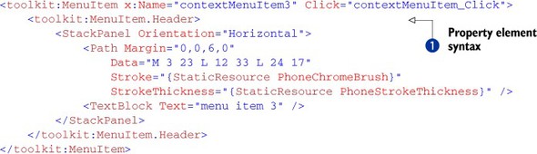
You declare the Header using property element syntax . The Header content is a horizontal StackPanel containing a Path and a TextBlock. The Path draws the shape of a checkmark and uses theme resources for the Stroke and StrokeThickness properties.
13.3. Summary
In this chapter you learned how to use the application bar as a toolbar and menu for your application. We showed how the Windows Phone Toolkit’s context menu can display specific options to the user when a user interface element is selected. These controls help you build applications that match the design of the built-in applications such as the Email and Calendar applications.
In the next chapter we’ll take our first look at the Panorama control, used to power the built-in Music + Videos and Office Hubs. We’ll wrap up with a thorough examination of the Pivot control.