
Categorical Platform Overview
The Categorical platform can produce results from a rich variety of organizations of data, as reflected in the tabbed panels that enable you to specify the analyses that you want. The Categorical platform has capabilities similar to other platforms. The choice of platform depends on your focus, the shape of your data, and the desired level of detail. The strength of the Categorical platform is that it can handle responses in a wide variety of formats without needing to reshape the data. Table 3.1 shows several of JMP’s analysis platforms and their strengths.
|
Platform
|
Specialty
|
|
Distribution
|
Separate, ungrouped categorical responses.
|
|
Fit Y By X: Contingency
|
Two-way situations, including chi-square tests, correspondence analysis, agreement.
|
|
Pareto Plot
|
Graphical analysis of multiple-response data, especially multiple-response defect data, with more rate tests than Fit Y By X.
|
|
Variability Chart: Attribute
|
Attribute gauge studies, with more detail on rater agreement.
|
|
Fit Model
|
Logistic categorical responses and generalized linear models.
|
|
Partition, Neural Net
|
Specific categorical response models.
|
Example of the Categorical Platform
This example uses the Consumer Preferences.jmp sample data table, which contains survey data on people’s attitudes and opinions, and some questions concerning oral hygiene (source: Rob Reul, Isometric Solutions).
1. Select Help > Sample Data Library and open Consumer Preferences.jmp.
2. Select Analyze > Consumer Research > Categorical.
3. Select I am working on my career and click Responses on the Simple tab.
4. Select Age Group and click X, Grouping Category.
5. Click OK.
6. Select Crosstab Transposed from the Categorical red triangle menu.
7. Select Test Response Homogeneity from the Categorical red triangle menu.
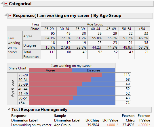
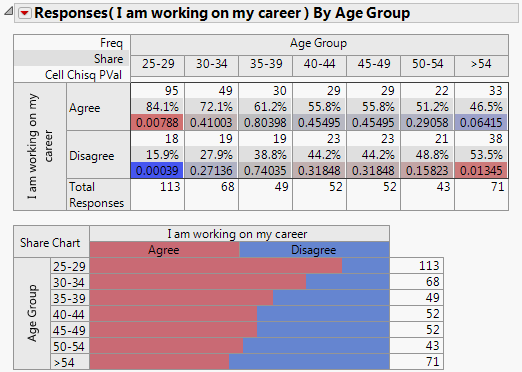
Figure 3.2 details the responses indicating that a respondent is currently working on his or her career and the age group. Of those responding positively, the highest majority working on their career were in the age group 25-29 at 84.1%. The highest majority of those responding oppositely were in the age group > 54 at 53.5%.
Figure 3.2 Survey Results by Age Group
Launch the Categorical Platform
Launch the Categorical Platform by selecting Analyze > Consumer Research > Categorical.
Figure 3.3 Categorical Platform Launch Window
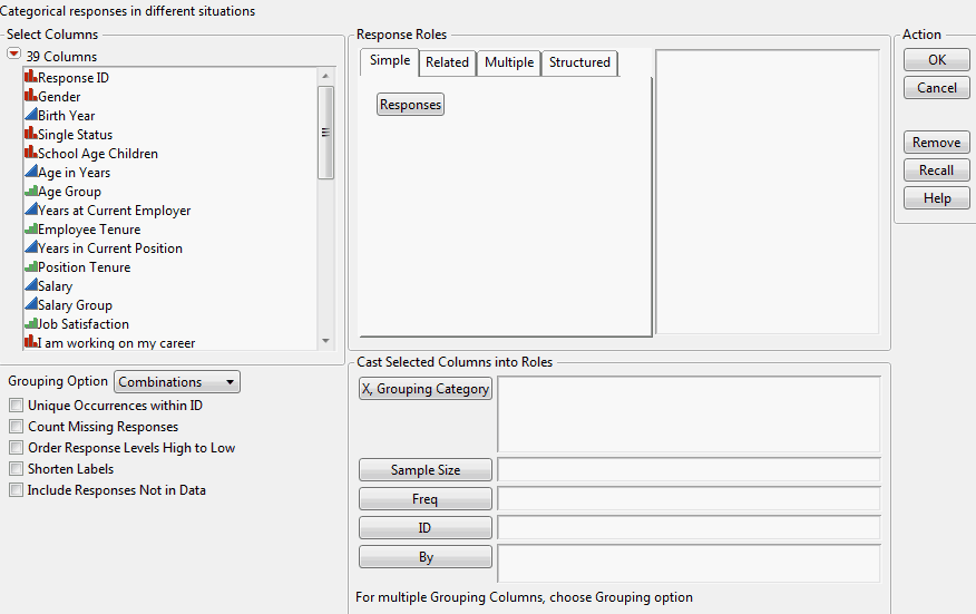
The launch window includes tabs for a variety of response roles (Simple, Related, and Multiple) and a Structured tab where you can create your own structured responses. The following sections describe the different response types and effects.
Response Roles
Use the response roles buttons within the tabs to choose selected columns as responses with specified roles. You can also drag column names to the response list. The response roles are summarized in Table 3.2.
Simple Tab
The default tab, Simple, contains a single button, Responses. This is appropriate for all basic analyses that do not have a special structure. You can drag column names from the Select Columns list to the Response list, or you can select columns and then click Responses. If a column has a Multiple Response column property, JMP automatically changes the handling of the column to recognize this property.
Related Tab
The Related tab contains a set of response columns that all have the same type of categories in them:
Aligned Responses
Performs the analysis like the default analysis, but shows the results more compactly by aligning the analyses side-by-side into one larger table.
Repeated Measures
Indicates that the columns reflect responses made by the same individual at different times, and you are interested in the changes between the times.
Rater Agreement
Is useful when each column is a rating for the same question, but by different individuals (raters) and you want to study how much the raters agree on their responses.
Multiple Tab
The Multiple tab is for multiple responses; when a question can involve checking off more than one choice. There are a variety of ways of storing multiple response data, so there are several buttons in the tab to accommodate the various means:
Multiple Response
Means that you have several columns acting like fill-in-the-blank columns to specify the multiple responses.
Multiple Response by ID
Indicates that you have several rows in a table corresponding to the multiple responses in one column, and the individuals are identified by an ID column.
Multiple Delimited
Signifies that you have one column that has several responses in it separated by a comma.
Indicator Group
Denotes that there is a column for each possible response, and each column is an indicator (for example, it has only two values, like 0 or 1).
Response Frequencies
Also has a column for each possible response, but has frequency counts instead of an indicator.
Free Text
Is used for comment fields where the analysis counts the frequency of each word used. Free Text gives word counts in both word order and frequency order, and the rate of non-empty text. For more information about Free Text, refer to “Free Text Report Options”.
Structured Tab
The Structured tab enables you to construct complex tables of descriptive statistics by dragging column names into green icon drop zones to create side-by-side and nested results. You can nest a variable within or beside another variable according to the structure that you want for the top and side of the table. Continue to drag columns, either beside or nested within another column, to specify the structure. For more information about structured reports, refer to “Structured Report Options”.
Figure 3.4 Structured Tab
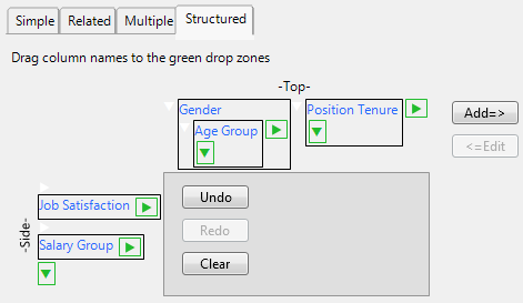
To create a structured table:
1. Drag a column name to the green drop zone at the Top or Side of the table. The drop zone is highlighted in pink.
2. Add more variables by dragging a column name the appropriate green drop zone. You can also drag a column name between two columns.
To remove a selection, click the selection and then select Undo.
To add a selection back that you just removed, select Redo.
To clear all of the selections, select Clear.
3. When you are finished creating the table, click Add=> to add the variables to the response list.
To make a revision once you have added your selection to the response list, click the selection and then select <=Edit.
4. Complete the remainder of the launch window as necessary and click OK.
The Categorical report window appears.
5. Should you want to make a change to the table, select Relaunch Dialog from the Categorical red triangle menu. The launch window reappears where you can make edits to your selections.
A few guidelines with Structured effects:
• Structured always assumes that the innermost terms on the Side are responses, and that all other terms are sample level grouping factors.
• You can analyze multiple response terms in the form of delimited multiple response columns, but you must indicate that it is a multiple response by having a Multiple Response column property. Use the Col Info window to add this property, as needed.
|
Response Role
|
Description
|
Example Data
|
|
Simple Tab
|
||
|
Responses
|
Separate responses are in each column, resulting in a separate analysis for each column.
|
 |
|
Related Tab
|
||
|
Aligned Responses
|
Responses share common categories across columns, resulting in better-organized reports.
|
 |
|
Repeated Measures
|
Aligned responses from an individual across different times or situations.
|
 |
|
Rater Agreement
|
Aligned responses from different raters evaluating the same unit, to study agreement across raters.
|
 |
|
Multiple Tab
|
||
|
Multiple Response
|
Aligned responses, where multiple responses are entered across several columns, but treated as one grouped response.
|
 |
|
Multiple Response by ID
|
Multiple responses across rows that have the same ID values.
|
 |
|
Multiple Delimited
|
Several responses in a single cell, separated by commas.
|
 |
|
Indicator Group
|
Binary responses across columns, like selected or deselected, yes or no, but all in a related group.
|
 |
|
Response Frequencies
|
Columns containing frequency counts for each response level, all in a related group.
|
 |
|
Free Text
|
Counts the frequency of each word used in a comment field.
|
 |
|
Structured Tab
|
||
|
|
Drag variables to green drop zones to create your own structured table.
|
|
Cast Selected Columns into Roles
The lower right panel of the Launch window has the following options:
X, Grouping Category
Defines sample level groups to break the counts into. By default, it tabulates each combination of X values, but uses the Grouping Option below for other combinations.
Sample Size
Defines the number of individual units in the group for which that frequency is applicable to, for multiple response roles with summarized data. For example, a Freq column might indicate 50 defects, where the sample size variable would reflect the defects for a batch of 100 units.
Freq
Specifies the column containing frequency counts for each row for presummarized data.
ID
Only required and used when Multiple Response by ID is selected.
By
Identifies a variable to produce a separate analysis for each value that appears in the column.
Other Launch Window Options
Several launch options are presented in the lower left panel of the window that can be specified before the analysis. The options can also be selected later from the Categorical red triangle menu, and have the effect of rerunning the platform with the new setting. The default settings for some of the launch options can be changed in the Categorical red triangle menu. For more information, refer to “Set Preferences”.
Grouping Option
Specifies whether you want to use the X columns individually or in a combination. Use this option only to specify more than one X (Grouping) column, and denote whether you want to treat the Xs one at a time, or in a fully nested grouping, or both. For example, if the X Columns are Region and Age Group, you can get separate tables for Response by Region and Response by Age Group (each individually) or get a nested table with each age group within each region (combinations), or both.
Combinations gives frequency results for combinations of the X variables.
Each Individually gives frequency results for each X variable individually.
Both gives frequency results for combinations of the X variables, and individually.
Unique Occurrences within ID
Allows duplicate response levels within a subject to be counted only once. An ID variable must be specified.
The following options can be specified on the launch window as well as from the Categorical report red triangle menu. They are also available as Preference settings. For more information, refer to “Statistical Options” and “Set Preferences”.
Count Missing Responses
Changes the behavior to tabulate missing values as categories, while still excluding them from statistical comparisons. When you have missing values, this specifies whether you want to see them tabulated beside the nonmissing data, or just excluded. Missing values can be either standard (numeric NAN or character empty) or a code declared as missing with the column property Missing Value Codes. Note that if a column contains only missing values, the missing values are counted regardless of the state of this option.
Order Response Levels High to Low
Changes the response order but keeps the X order from low to high. The default ordering is low to high. You can control the ordering with a column property (Value Ordering), but if you always want to see the high values first, then select this option. Often, ordered categories are ratings, and you want to see the positive ratings first. In the red triangle menu, this option is under Category Options.
Shorten Labels
Shortens labels by removing common prefixes and suffixes. Sometimes surveys code a lengthy label that contain a common prefix or suffix. For example, “Occurred 5 to 10 times in the last year” might be a level, but the phrase “in the last year” is repeated for each value label, and you do not need to see it repeated in the report. This option trims the common prefixes and suffixes. It also changes multiple blanks into single blanks. The option only applies to value labels, not column names.
Include Responses Not in Data
Includes a count for values that were not in the data. Sometimes when you conduct a survey and give choices, one of the choices is not selected. If you still want to see the choices that are not in the data, use this option. It determines the missing categories from the value labels in the column.
Supercategories
When ratings are involved in a data set (for example, a five point scale), you might want to know the percent of the responses in the top two or other subset of ratings. Such a group of ratings can be defined in the data through the column property, Supercategories.
The term Supercategories refers to the extra slots in a table to aggregate over groups of categories. The Supercategories property supports four keywords: Group, Mean, Std Dev, and All. Mean and Std Dev calculate statistics for value scores, and All aggregates across all levels. For example, a “Top Two” Group supercategory could aggregate the two top categories in a response, as specified. Although we support Mean, Std Dev, and All, we do not recommend using them because they are available as built-in statistics as well as supercategories.
Create Supercategories by selecting a column and then selecting Column Info > Column Properties > Supercatagories. On the column properties window, select a column, enter a Supercategory Name, and click Add.
The Supercategories Options red triangle menu item provides the following commands for a selected category:
Hide
Omits columns for each category from the report. Only a column for the supercategory is included.
Net
Prevents individuals from being counted twice when they appear in more than one supercategory. Net is available only for a multiple response column.
The following red triangle options are also provided:
Add Mean
Includes mean statistics in the report.
Add Std Dev
Includes standard deviation statistics in the report.
Add All
Includes total responses in the report. By default, the Total Responses column is always included.
Note: Supercategories are supported for all response effects except Repeated Measures and Rater Agreement. Some response effects do not support Mean and Std Dev slots, because the effects do not have a natural score.
The Categorical Report
The Categorical platform produces a report with several tables and bar charts depending on your selections. You might or might not see all of the following options depending on which response type and options you selected. Frequencies, Share of Responses, and Rate Per Case appear in a single table by default. A Share Chart also appears by default (unless you used the Structured tab in the launch window). You can choose to view a Frequency Chart or Transposed Frequency Chart.
You can view or hide each option (Frequencies, Share of Responses, Rate Per Case, Share Chart, Frequency Chart, or Transposed Freq Chart) from the Categorical red triangle menu. Data from Consumer Preferences.jmp is displayed in Figure 3.5.
Figure 3.5 The Categorical Report
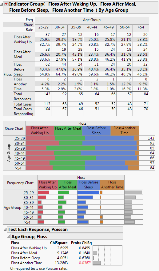
The topmost item in the table is a Frequency count (Freq), showing the frequency counts for each category with the total frequency (Total Responses) and total units (Total Cases) at the bottom of the table.
In this example, the number of responses and cases for each age group by the 7 segments are displayed.
The Share of Responses (Share) is determined by dividing each count by the total number of responses. The number represents the percent of the response among all the responses in the sample (frequency divided by response total). This is either a column percentage or row percentage depending on whether your table has the responses on top or down the side (transposed).
For example, examine the second row of the table for Floss After Waking Up. The 37 responses who floss when they wake up were 25.9% of all responses (37/143*100).
The Rate Per Case (Rate) divides each count in the frequency table by the total number of cases. If you have multiple responses per case (subject), there are two types of percentages; the rate per case is frequency as a percent of total cases, whereas the share of responses is the frequency as a percent of the total responses. Rate is available only for multiple responses.
For example, in the third row of the table (Floss After Waking Up), the 37 respondents are from 113 cases, making the rate per respondent 32.7%.
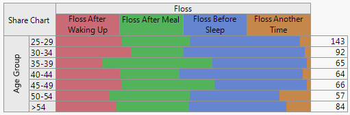
Share Chart
The Share Chart presents a divided bar chart. The bar length is proportional to the percentage of responses for each type. The column on the right shows the number of responses.
Figure 3.6 Share Chart
Frequency Chart
The Frequency Chart shows response frequencies. The bars reflect the frequency count on the same scale and the number of responses are displayed to the right. To view the frequency chart, select Frequency Chart from the Categorical red triangle menu.
Figure 3.7 Frequency Chart
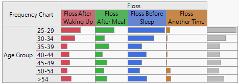
The Transposed Freq Chart option produces a transposed version of the Frequency Chart. Marginal totals are given for each response, as opposed to each X variable.
Categorical Platform Options
The Categorical red triangle menu provides commands that customize the appearance of the report and provide the means to test and compare your results. The following options appear in the menu depending on response roles and options selected. You might or might not view all of the options depending on your selections.
Report Options
The default report format is the Crosstab format, which gathers all three statistics for each sample level and response together. The Crosstab format displays the responses on the top and the sample levels down the side, with multiple table elements together in each cell of the cross tabulation.
Figure 3.8 Crosstab Format
The Crosstab format has a transposed version, Crosstab Transposed, which is useful when there are a lot of response categories but not a lot of sample levels. Crosstab Transposed displays the responses down the side and the sample levels across the top, with multiple table elements together in each cell.
The Structured analysis always uses the Crosstab Transposed form, but in a more complex arrangement. The Free Text analysis has its own specialized reports. For more information about Free Text, refer to “Free Text Report Options”.
Selecting the Legend red triangle menu shows or hides the legend for the response column on the Share Chart.
Statistical Options
The main question of interest in any table is whether shares or rates vary from each group of sample levels, and specifically which groups are significantly different.
There are two families of tests and comparisons, which correspond to single category responses and multiple responses:
• With single responses, a given response is just one response category, and the question is whether the share of responses is different across sample levels.
Single responses are tested with a chi-square test of homogeneity. However, there are two types of this test: the Likelihood Ratio Chi-square and the Pearson Chi-square. It is a matter of personal preference and training which one you prefer. An option, Chi-square Test Choices, on the Categorical red triangle menu, enables you to show one or the other, or both. For more information, refer to “Test Options”.
• With multiple responses, each individual can select several categories, and the question is whether the rate is different across sample levels.
For multiple responses, each response is treated in a separate account, with a probability of the count for each subject as a Poisson distribution (allowing for multiples of the same category). Each response is tested to determine whether the parameters are the same across sample levels.
The following options appear in the Categorical red triangle menu depending on context:
|
Command
|
Supported Response Contexts
|
Details
|
|
Test Response Homogeneity
(requires multiple response data)
|
• Responses
• Aligned Responses
• Repeated Measures
• Response Frequencies with Sample Size
• Structured
|
Are the probabilities across the response categories the same across sample levels?
Marginal Homogeneity (Independence) Test, both Pearson and Chi-square likelihood ratio chi-square. For more information, refer to “Test Response Homogeneity”.
|
|
Test Multiple Response
(requires multiple response data)
|
• Multiple Response
• Multiple Response by ID (with Sample Size)
• Multiple Delimited
• Response Frequencies with Sample Size
• Structured
|
For each response category, are the rates the same across sample levels?
Poisson regression or binomial test on sample for each defect frequency. For more information, refer to “Test Multiple Response”.
|
|
Agreement Statistic
|
Rater Agreement
|
How closely do raters agree, and is the lack of agreement symmetrical?
Kappa for agreement, Bowker and McNemar for symmetry. For more information, refer to “Rater Agreement”.
|
|
Transition Report
|
Repeated Measures
|
How have the categories changed across time?
Transition counts and rates matrices. For more information, refer to “Repeated Measures”.
|
|
Cell Chisq
|
Responses
|
How do I further analyze the results to obtain more information?
For more information, refer to “Cell Chisq”.
|
|
Compare Each Sample
|
• Responses
• Aligned Responses
• Repeated Measures
• Response Frequencies (if no Sample Size)
• Structured
|
Do levels of the response category differ significantly?
For more information, refer to “Compare Each Sample”.
|
|
Compare Each Cell
|
• Single and Multiple Responses
• Structured
|
Do pairs of levels within the two response categories differ significantly?
For more information, refer to “Compare Each Cell”.
|
|
Test Options
|
• ChiSquare Test Choices
• Show Warnings
• Order by Significance
• Hide Nonsignificant
|
How do I further analyze the results to obtain more information?
For more information, refer to “Test Options”.
|
There are a series of options that add more detail for each group of sample levels. The options that appear depend on your selections and the details of your analysis:
Total Responses
Shows the sum of the frequency counts for each group of sample levels.
Total Cases
For multiple response columns, shows the number of cases (subjects), which are different from the number of responses.
Total Cases Responding
For multiple response columns used in Structured tables, counts each person who responded at least once. People who did not respond at all are not included.
Mean Score
Calculates the response means, using the numeric categories, or value scores. This is enabled for columns that use numeric codes, or for categories that have a Value Scores property. To make the Mean Score interpretable, you can assign specific value scores in the Column Info window with the Value Scores column property. For more information and an example, refer to “Mean Score Example”.
Mean Score Comparison
Compares the mean scores across groups of sample levels, showing which groups are significantly different. A pairwise multiple comparisons Student’s t test is used for the mean score comparison, based on the specified comparison groups. For more information about the letter codes, refer to “Comparisons with Letters”. For more information about specifying the comparison groups, refer to “Specify Comparison Groups”.
Std Dev Score
Calculates the standard deviation of the value scores.
Order by Mean Score
Orders the mean score calculations. The option only appears when there are no X columns in the analysis.
Save Tables
Saves the report to a new data table. For more information, refer to “Save Tables”.
Filter
Filters data to specific groups or ranges. Opens the Local Data Filter panel allowing you to identify varying subsets of data. The filtered rows do not appear in the reports. Sample levels with 0 values are always hidden. To show the filtered rows in reports, select Include Responses Not in Data in the launch window. You can also select the Set Preferences red triangle menu, and then select Include Responses Not in Data. For more information, refer to Using JMP.
Contents Summary
Collects all of the tests and mean scores into a summary at the top of the report with links to the associated item.
Format Elements
Enables you to specify formats for Frequencies, Shares and Rates, and how zeros are displayed. By default, Frequencies are Fixed Dec with 7 Width and 0 Decimals and Shares and Rates are Percent with 6 Width and 1 Decimal.
Arrange in Rows
Arranges the reports across the page as opposed to down. Enter the number of reports that you want to view across the window.
Set Preferences
Enables you to set preferences for future launches and sessions. For more information, refer to “Set Preferences”.
Category Options
Contains options (Grouping Option, Count Missing Response, Order Response Levels High to Low, Shorten Labels, and Include Responses Not in Data) that are also presented on the launch window that could be specified before the analysis. The options can also be selected here and have the effect of rerunning the platform with the new option setting. For more information, refer to “Other Launch Window Options”.
Force Crosstab Shading
Forces shading on crosstab reports even if the preference is set to no shading.
Relaunch Dialog
Enables you to return to the launch window and edit the specifications for a structured table. For more information, refer to “Structured Tab”.
Script
Contains options that are available to all platforms. See Using JMP.
Test Response Homogeneity
Test Response Homogeneity is the standard chi-square test (for single responses) across all sample levels. There is typically one categorical response variable and one categorical sample variable. Multiple sample variables are treated as a single variable.
The test is the chi-square test for marginal homogeneity of response patterns, testing that the response probabilities are the same across samples. This is equivalent to a test for independence when the sample level is like a response. There are two versions of this test, the Pearson form and the Likelihood Ratio form, both with chi-square statistics. The Test Options menu (ChiSquare Test Choices) is used to show or hide the Likelihood Ratio or Pearson tests. If Show Warnings is turned on, the report displays if the frequencies are too low to make good tests.
As an example:
1. Select Help > Sample Data Library and open Car Poll.jmp.
2. Select Analyze > Consumer Research > Categorical.
3. Select country and click Responses on the Simple tab.
4. Select marital status and click X, Grouping Category.
5. Click OK.
6. Select Test Response Homogeneity from the Categorical red triangle menu.
Figure 3.9 Test Response Homogeneity
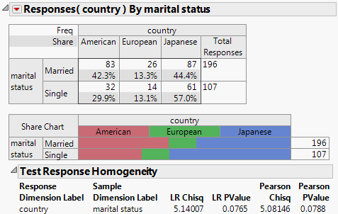
The Share Chart indicates that the married group is more likely to buy American cars, and the single group is more likely to buy Japanese cars, but the statistical test only shows a significance of 0.08. Therefore, the difference in response probabilities across marital status is not statistically significant at an alpha level of 0.05.
Test Multiple Response
Test Multiple Response is the standard chi-square test for multiple responses, with one test statistic for each response category. When there are multiple responses, each response category can be modeled separately. The question is whether the response rates are the same across samples.
The Test Multiple Response red triangle menu provides the following options:
Count Test, Poisson
For each response category, the frequency count has a random Poisson distribution. The rate test is obtained using a Poisson regression (through generalized linear models) of the frequency per unit modeled by the sample categorical variable. The result is a likelihood ratio chi-square test of whether the rates are different across sample levels. This test can also be done by the Pareto platform, as well as in the Generalized Linear Model personality of the Fit Model platform.
Homogeneity Test, Binomial
For each response category, the frequency count has a random binomial distribution. Select this test when the response can be true only once for each respondent (for example, in a “check all that apply” questionnaire).
To test multiple responses, follow these steps:
1. Select Help > Sample Data Library and open Consumer Preferences.jmp.
2. Select Analyze > Consumer Research > Categorical.
3. Select Brush Delimited and click Multiple Delimited on the Multiple tab.
4. Select brush and click X, Grouping Category to compare the sample levels across the brush treatment variable.
5. Click OK.
6. Select Test Multiple Response and then Count Test, Poisson from the Categorical red triangle menu.
Figure 3.10 Test Multiple Response, Poisson
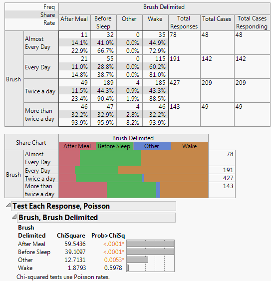
The p-values show that After Meal and Before Sleep are the most significantly different. Wake is not significantly different with this amount of data.
7. Select Test Multiple Response and then Homogeneity Test, Binomial from the Categorical red triangle menu.
Figure 3.11 Test Multiple Response, Binomial
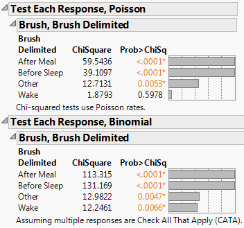
The Homogeneity Test, Binomial option always produces a larger test statistic (and therefore a smaller p-value) than the Count Test, Poisson option. The binomial distribution compares not only the rate at which the response occurred (the number of people who reported that they brush upon waking) but also the rate at which the response did not occur (the number of people who did not report that they brush upon waking).
Cell Chisq
For single responses, Cell Chisq displays the cell-by-cell composition of the Pearson chi-square overall, and also shows which cells have relatively more (red) or less (blue) than expected if they were the same across sample levels. The value shown is the p-value for the chi-square. The color is bright when they are significant, and grayer when less significant, denoting visually where the significant differences are.
As an example:
1. Select Help > Sample Data Library and open Consumer Preferences.jmp.
2. Select Analyze > Consumer Research > Categorical.
3. Select I am working on my career and click Responses on the Simple tab.
4. Select Age Group and click X, Grouping Category.
5. Click OK.
6. Select Crosstab Transposed from the red triangle menu.
7. Select Cell Chisq from the red triangle menu.
Figure 3.12 Cell Chisq
Relative Risk
The Relative Risk option is used to compute relative risks for different responses. The risk of responses is computed for each level of the X, Grouping variable. The risks are compared to get a relative risk. This option is available when the X, Grouping variable has two levels, and one of the following is true:
• The response variable has two levels.
• The response variable is a Multiple Response and the Unique occurrences within ID box is checked on the Categorical launch window.
A common application of this analysis is when the responses represent adverse events (side effects), and the X variable represents a treatment (drug versus placebo). The risk for getting each side effect is computed for both the drug and placebo. The relative risk is the ratio of the two risks.
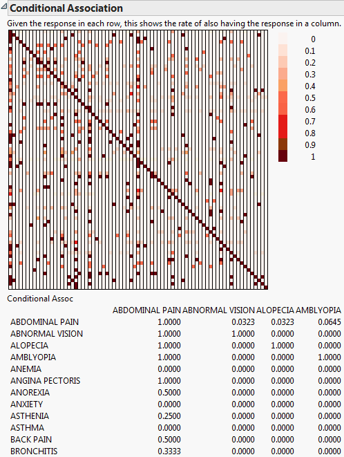
Conditional Association
The Conditional Association option is used to compute the conditional probability of one response given a different response. A table and color map of the conditional probabilities are given. This option is available only when the Unique occurrences within ID box is checked on the Categorical launch window. A common application of this analysis is when the responses represent adverse events (side effects) from a drug. The computations represent the conditional probability of one side effect given the presence of another side effect. For AdverseR.jmp, given the response in each row, Figure 3.13 shows the rate of also having the response in a column. Figure 3.13 only displays a few variables in the table due to size constraints.
Figure 3.13 Conditional Association
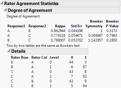
Rater Agreement
The Rater Agreement analysis answers the questions of how closely raters agree with one another and if the lack of agreement is symmetrical. For example, open Attribute Gauge.jmp. The Attribute Chart script runs the Variability Chart platform, which has a test for agreement among raters.
Figure 3.14 Agreement Comparisons
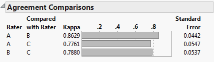
Launch the Categorical platform and designate the three raters (A, B, and C) as Rater Agreement responses on the Related tab on the launch window. In the resulting report, you have a similar test for agreement that is augmented by a symmetry test that the lack of agreement is symmetric.
Figure 3.15 Agreement Statistics
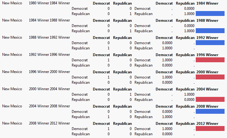
Repeated Measures
Repeated Measures declares that the columns reflect responses made by the same individual at different times, and you are interested in the changes between the times. Individual reports are displayed for each item, with a transition report at the end demonstrating the transition counts and rate matrices.
As an example:
1. Select Help > Sample Data Library and open Presidential Elections.jmp.
2. Select Analyze > Consumer Research > Categorical.
3. Select 1980 Winner through 2012 Winner and click Repeated Measures on the Related tab.
4. Select State and click X, Grouping Category.
5. Click OK.
6. Scroll to the bottom of the report window and open the Transition Report outline.
Scroll through the responses to see how each State has voted over the years. Note that New Mexico has varied between Democratic and Republic over the years.
Figure 3.16 Repeated Measures
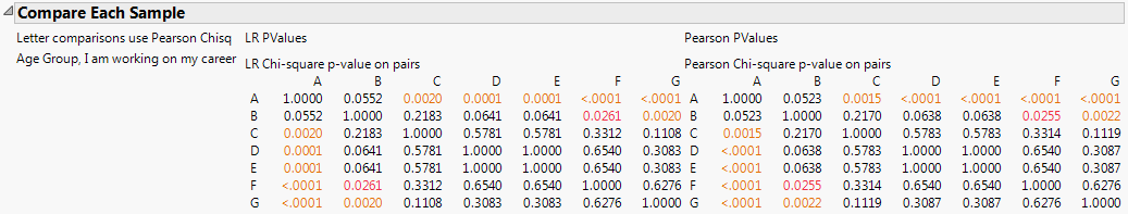
Compare Each Sample
For a given response, Compare Each Sample tests whether the response probability for each of its levels differs from the response probabilities for its other levels. In simple situations, the Compare Each Sample report consists of symmetric matrices of p-values, as shown in Figure 3.17.
In addition, a new row or column, entitled Compare, appears in the Crosstabs table. The Compare row is placed at the bottom of the table, or the Compare column is placed at the far right. (Whether a row or column is appended depends on whether Crosstab or Crosstab Transposed is specified.) The Compare row or column contains letter codes showing which sample levels differ significantly. For more information about the letter codes, refer to “Comparisons with Letters”.
Figure 3.17 Compare Each Sample
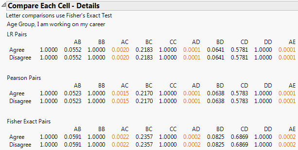
Compare Each Cell
For a given response and a given X variable, Compare Each Cell tests, for each level of the X variable, whether the response probabilities differ across the levels of the response. In other words, Compare Each Cell tests response probabilities across the cells in a given row of the Crosstabs table. The Compare Each Cell report gives p-values in a tabular format. The letters across the top indicate the response levels tested for the given level of the X variable. An example is shown in Figure 3.18.
In addition, when a cell differs significantly from other cells, a letter code is inserted into the appropriate cell in the Crosstabs table. For details on the letter codes and on their placement in cells, refer to “Comparisons with Letters”.
Figure 3.18 Compare Each Cell (cut off after column AE)
Comparisons with Letters
The Compare Each Cell, Compare Each Sample, and Mean Score Comparisons commands use a system of letters to identify sample levels. The first sample level is “A”, the second “B”. For more than 26 sample levels, numbers are appended after the letters. The letters are shown in the sample level headings when a comparison command is turned on.
If two sample levels are significantly different, the letter of the sample level with lesser share is placed into the comparison cell of the other category that is significantly different. To find out if a given group of sample levels, for example “B”, is significantly different, then you have to look both in the comparison cell for column “B” for other letters, and also in all the other cells across the groups of sample levels for a “B”.
Lowercase letters are also used for comparisons that are slightly less significant, according to Table 3.4. These comparisons suffer when the count for that sample level group (the Base Count) is small, and asterisks start to appear in the comparison cells to warn you.
The comparison features are controlled by four options set in Preferences or through a script. For more information, refer to “Set Preferences”.
|
Uppercase alpha level
|
0.05
|
The significance level for which uppercase letters show differences.
|
|
Lowercase alpha level
|
0.10
|
The significance level for which lowercase letters show differences.
|
|
Base Count minimum
|
≤ 29
|
The count for a sample level that leads to a ** warning.
|
|
Base Count warning
|
30 to 99
|
The count for a sample level that leads to a * warning.
|
Test Options
The Test Options menu on the Categorical red triangle menu has the following options depending on your selections:
ChiSquare Test Choices
Single responses are tested with a chi-square test of homogeneity; either the Likelihood Ratio Chi-square or the Pearson Chi-square, or both. Options are: Both LR and Pearson, LR Only, or Pearson Only. You can set an option in Preferences.
Show Warnings
Shows warnings for chi-square tests related to small sample sizes.
Order by Significance
Reorders the reports so that the most significant reports are at the top. This option only applies to reports with one homogeneity test.
Hide Nonsignificant
Suppresses reports that are deemed non-significant. This option only applies to reports with one homogeneity test.
Save Tables
The Save Tables menu on the Categorical red triangle menu has the following options depending on your selections:
Save Frequencies
Saves the Frequency report to a new data table, without the marginal totals or supercategories.
Save Share of Responses
Saves the Share of Responses report to a new data table, without the marginal totals.
Save Rate Per Case
Saves the Rate Per Case report to a new data table, without the marginal totals.
Save Transposed Frequencies
Saves the Transposed Freq Chart report to a new data table, without the marginal totals.
Save Transposed Share of Responses
Saves a transposed version of the Share of Responses report to a new data table
Save Transposed Rate Per Case
Saves a transposed version of the Rate Per Case report to a new data table.
Save Test Rates
Saves the results of the Test Multiple Response option to a new data table.
Save Test Homogeneity
Saves the results of the Test Response Homogeneity option to a new data table.
Save Mean Scores
Saves the mean scores for each sample group in a new data table.
Save tTests and pValues
Save t-tests and p-values from the Mean Score Comparisons report in a new data table.
Save Excel File
Creates a Microsoft Excel spreadsheet with the structure of the crosstab-format report. The option maps all of the tables to one sheet, with the response categories as rows, the sample levels as columns, sharing the headings for sample levels across multiple tables. When there are multiple elements in each table cell, you have the option to make them multiple or single cells in Microsoft Excel.
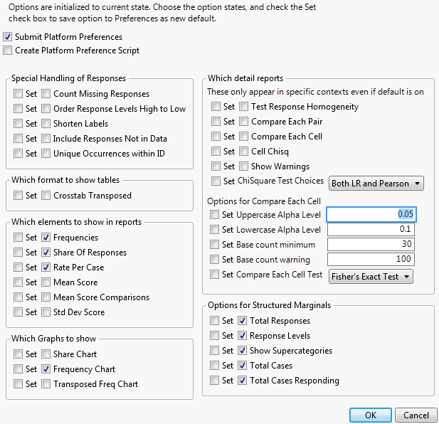
Set Preferences
You can specify settings and set preferences within the Categorical platform. Several options are available on the launch window and can be specified before the analysis. Some of the options can also be selected from the Categorical red triangle menu, and have the effect of rerunning the analysis with the new setting.
The options are initialized to the current state. Select the appropriate options and select either Submit Platform Preferences or Create Platform Preference Script to submit the options to your preferences as the new default. When the Categorical platform is launched, the preferences associated with the current preference set are enacted.
Preferences can be administered and shared through a script. The best way to share a preference set widely is to create an add-in, so that if the preference settings are reset to the initial state, the add-in could restore the preferred set.
Figure 3.19 Set Preferences Window
Free Text Report Options
Free Text is used for comment fields where the analysis counts the frequency of each word used. Free Text gives word counts in both word order and frequency order, and the rate of non-empty text. The following example uses the Consumer Preferences.jmp sample data table, which contains survey data relating to oral hygiene preferences. A comment field was included in the survey asking for reasons why the participant did not floss.
1. Select Help > Sample Data Library and open Consumer Preferences.jmp.
2. Select Analyze > Consumer Research > Categorical.
3. Select Reasons Not to Floss and click Free Text on the Multiple tab.
4. Click OK.
5. Select Score Words by Column from the first Free Text Word Counts for Reasons Not to Floss red triangle menu and then select Floss. Click OK.
Figure 3.20 Free Text Report Example
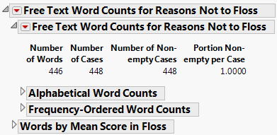
Figure 3.20 details the free text word counts the respondents included as reasons why they do not floss. From the analysis, you can determine the number of words, cases, non-empty cases, and portions of non-empty cases. You can also view the word counts alphabetically, in terms of frequency, or by the mean scores. There are more commands to further customize the analysis on the Free Text red triangle menu on the report:
Score Words by Column
Calculates for each word the average score for another column for the rows that the word appears. If you save a word table later, it will have these scores in the saved data table, plus a Treemap script to colorize by these scores.
Save Indicators for Most Frequent Words
Prompts you for the number of words to make indicators for, and then creates the indicator columns for the most frequent words in the data table indicating if that word appeared.
Save Word Table
Creates a new table of all the words, their frequency, and the scores with respect to any of the columns scored.
Remove
Removes the table from the report.
Structured Report Options
The Structured tab enables you to construct complex tables of descriptive statistics by dragging column names into green icon drop zones to create side-by-side and nested results. The following example uses the Consumer Preferences.jmp sample data table. From this data, suppose that you wanted to compare job satisfaction and salary against gender by age group and position tenure.
1. Select Help > Sample Data Library and open Consumer Preferences.jmp.
2. Select Analyze > Consumer Research > Categorical.
3. Select the Structured tab.
4. Drag Gender to the green drop zone at the Top of the table on the Structured tab.
5. Drag Age Group to the green drop zone just below Gender.
6. Drag Position Tenure to the green drop zone at the Top of the table next to Gender.
7. Drag Job Satisfaction to the green drop zone at the Side of the table.
8. Drag Salary Group to the green drop zone at the Side of the table under Job Satisfaction.
Figure 3.21 Structured Tab Report Setup
9. Click Add=>.
10. Click OK.
Figure 3.22 Structured Tab Report Example
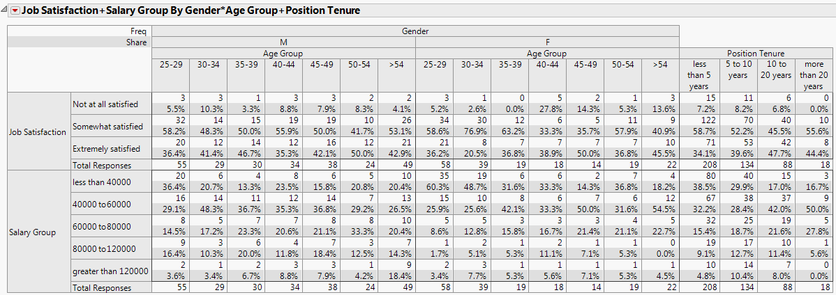
Figure 3.22 shows that the majority of both the male and female respondents were somewhat satisfied with their jobs, with the highest percentage of males being in the 25-29 age group, while the females were in the 30-34 age group. Most of those who were somewhat satisfied had been in their current position for less than 5 years.
The following options are available from the structured report’s red triangle menu:
Show Letters
Forces the table to display the column letter IDs, which usually come out automatically when you do a compare command.
Specify Comparison Groups
Enables you to specify groups when the group of sample levels that you want to test and compare are not the same as the innermost term’s structure. To use this option, you must look at the letter IDs, and then enter sets of letter IDs, separated by a slash, representing each group, separating multiple groups from each other by commas. For example, the default grouping might be “A/B/C, E/D/F”, but you want to test A with E, B with D and C with F, so you specify the groups as “A/E, B/D, C/F”. This determines which letters appear in the comparison fields. In addition, a summary report shows the overall tests for each column group.
Remove
Removes the table from the report.
Additional Examples of the Categorical Platform
The following examples come from testing a fabrication line on three different occasions under two different conditions. Each set of operating conditions yielded 50 data points. Inspectors recorded the following types of defects:
• contamination
• corrosion
• doping
• metallization
• miscellaneous
• oxide defect
• silicon defect
Each unit could have several defects or even several defects of the same kind. We illustrate the data in a variety of different examples all within the Categorical platform.
Multiple Response
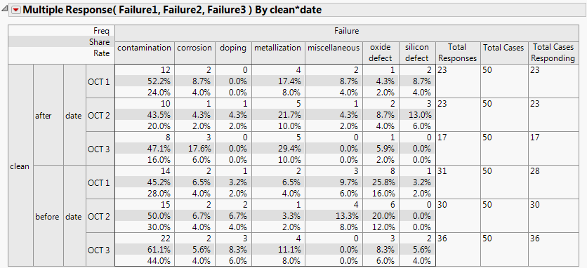
Suppose that the defects for each unit are entered via a web page, but because each unit rarely has more than three defect types, the form has three fields to enter any of the defect types for a unit, as in Failure3MultipleField.jmp.
1. Select Help > Sample Data Library and open Quality Control/Failure3MultipleField.jmp.
2. Select Analyze > Consumer Research > Categorical.
3. Select Failure1, Failure2, and Failure3 and click Multiple Response on the Multiple tab.
These columns contain defect types and are the variables that you want to inspect.
4. Select clean and date and click X, Grouping Category.
5. Click OK.
Figure 3.23 lists failure types and counts for each failure type from the Multiple Response analysis.
Figure 3.23 Multiple Response Failures from Failure3MultipleField.jmp
Response Frequencies
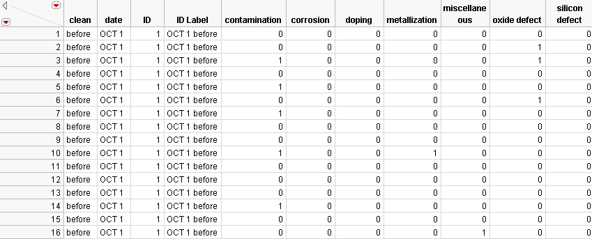
Suppose the data have columns containing frequency counts for each batch and a column showing the total number of units of the batch, as in Failure3Freq.jmp.
Figure 3.24 Failure3Freq.jmp Data Table
1. Select Help > Sample Data Library and open Quality Control/Failure3Freq.jmp.
2. Select Analyze > Consumer Research > Categorical.
3. Select the frequency variables (contamination, corrosion, doping, metallization, miscellaneous, oxide defect, silicon defect) and click Response Frequencies on the Multiple tab.
4. Select clean and date and click X, Grouping Category.
5. Select Sample Size and click Sample Size.
6. Click OK.
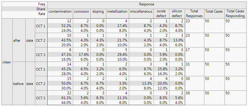
The resulting output in Figure 3.25 shows a frequency count table, with a separate column for each of the seven batches. The last two columns show the total number of defects (Total Responses) and cases (Total Cases).
Figure 3.25 Defect Rate Output
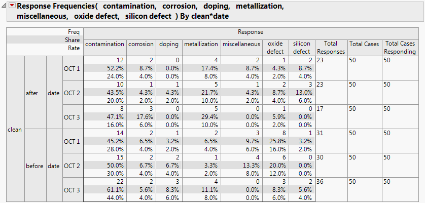
Each Frequency Group contains the following information:
• The total number of defects for each defect type. For example, after cleaning on Oct 1st, there were 12 contamination defects.
• The share of responses. For example, after cleaning on Oct 1st, the 12 contamination defects were (12/23) accounting for 52.2% of all defects.
• The rate per case. For example, after cleaning on Oct 1st, the 12 contamination defects are from 50 units (12/50) making the rate per unit 24%.
Indicator Group
In some cases, the data is not yet summarized, so there are individual records for each unit. We illustrate this situation with the data table, Failures3Indicators.jmp.
Figure 3.26 Failure3Indicators.jmp Data Table
1. Select Help > Sample Data Library and open Quality Control/Failures3Indicators.jmp.
2. Select Analyze > Consumer Research > Categorical.
3. Select the defect columns (contamination, corrosion, doping, metallization, miscellaneous, oxide defect, silicon defect) and click Indicator Group on the Multiple tab.
4. Select clean and date and click X, Grouping Category.
5. Click OK.
When you click OK, you get the same output as in the Response Group example (Figure 3.25).
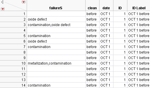
Multiple Delimited
Suppose that an inspector entered the observed defects for each unit. The defects are listed in a single column, delimited by a comma, as in Failures3Delimited.jmp. Note in the partial data table, shown below, that some units did not have any observed defects, so the failureS column is empty.
Figure 3.27 Failure3Delimited.jmp Data Table
1. Select Help > Sample Data Library and open Quality Control/ Failures3Delimited.jmp.
2. Select Analyze > Consumer Research > Categorical.
3. Select failureS and click Multiple Delimited on the Multiple tab.
4. Select clean and date and click X, Grouping Category.
5. Select ID and click ID.
6. Click OK.
When you click OK, you get the same output as in Figure 3.25.
Note: If more than one delimited column is specified, separate analyses are produced for each column.
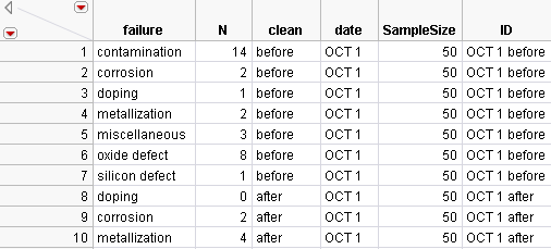
Multiple Response by ID
Suppose each failure type is a separate record, with an ID column that can be used to link together different defect types for each unit, as in Failure3ID.jmp.
Figure 3.28 Failure3ID.jmp Data Table
1. Select Help > Sample Data Library and open Quality Control/ Failure3ID.jmp.
2. Select Analyze > Consumer Research > Categorical.
3. Select failure and click Multiple Response by ID on the Multiple tab.
4. Select clean and date and click X, Grouping Category.
5. Select SampleSize and click Sample Size.
6. Select N and click Freq.
7. Select ID and click ID.
8. Click OK.
When you click OK, you get the same output as in Figure 3.25.
Mean Score Example
You can calculate response means in your data using Value Scores. To make the Mean Score interpretable, you can assign specific value scores in the Column Info window with the Value Scores column property. For more information about column properties, refer to Using JMP.
In this example, you can assign Value Scores to calculate the Net Promoter Score (Reichheld, HBR 2003), which summarizes an 11-level rating with a favorability score between -100 and 100. Anything with a value of 6 or below is regarded as a detractor.
1. Run the following script:
New Table("Rating Example",
Add Rows(300),
New Script("Categorical",Categorical(Responses(:Rating),Mean Score(1))),
New Column("Rating",Numeric,Ordinal,
Set Property(
"Value Scores", {0=-100,1=-100,2=-100,3=-100,4=-100,5=-100,6=-100,7=0,8=0,9=100,10=100}),
Formula(Random Category(
0.05,0,0.05,1,0.05,2,0.05,3,0.05,4,
0.05,5,0.05,6,0.05,7,0.05,8,0.3,9,0.25,10)),
Set Selected
)
);
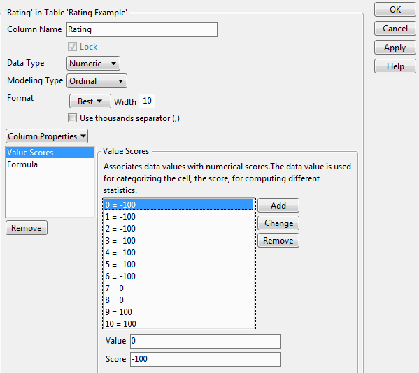
2. A data table with 300 rows of random rating data is created. Value scores were also defined for the Rating column. To view the scores, right-click the Rating column and select Column Properties > Value Scores.
Figure 3.29 Column Properties - Value Scores
3. Select Analyze > Consumer Research > Categorical.
4. Select Rating and click Responses on the Simple tab.
5. Click OK.
6. Select Mean Score from the Categorical red triangle menu.
Figure 3.30 Rating Example Report
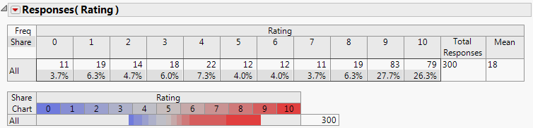
Based on the defined value scores, a mean score of 18 was determined. Your results might be different as the Rating column values are random.
..................Content has been hidden....................
You can't read the all page of ebook, please click here login for view all page.