
Example of the Uplift Platform
The Hair Care Product.jmp sample data table results from a marketing campaign designed to increase purchases of a hair coloring product targeting both genders. For purposes of designing the study and tracking purchases, 126,184 “club card” members of a major beauty supply chain were identified. Approximately half of these members were randomly selected and sent a promotional offer for the product. Purchases of the product over a subsequent three-month period by all club card members were tracked.
The data table shows a Promotion column, indicating whether the member received promotional material. The column Purchase indicates whether the member purchased the product over the test period. For each member, the following information was assembled: Gender, Age, Hair Color (natural), U.S. Region, and Residence (whether the member is located in an urban area). Also shown is a Validation column consisting of about 33% of the subjects.
For a categorical response, the Uplift platform interprets the first level in its value ordering as the response of interest. This is why the column Purchase has the Value Ordering column property. This property ensures that “Yes” responses are first in the ordering.
1. Select Help > Sample Data Library and open Hair Care Product.jmp.
2. Select Analyze > Consumer Research > Uplift.
3. From the Select Columns list:
‒ Select Promotion and click Treatment.
‒ Select Purchase and click Y, Response.
‒ Select Gender, Age, Hair Color, U.S. Region, and Residence, and click X, Factor.
‒ Select Validation and click Validation.
4. Click OK.
5. Below the Graph in the report that appears, click Go.
Based on the validation set, the optimal Number of Splits is determined to be three. The Graph is shown in Figure 6.2. Note that the vertical scale has been modified in order to show the detail.
Figure 6.2 Graph after Three Splits
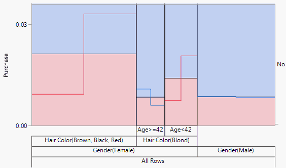
The graph indicates that uplift in purchases occurs for females with black, red, or brown hair and for younger females (Age < 42) with blond hair. For older blond-haired women (Age ≥ 42) and males, the promotion has a negative effect.
Launch the Uplift Platform
To launch the Uplift platform, select Analyze > Consumer Research > Uplift. Figure 6.3 shows a launch window for the Hair Care Product.jmp sample data table. The columns that you enter for Y, Response, and X, Factor can be continuous or categorical. In typical usage, the Treatment column is categorical, and often has only two levels. If your Treatment column contains more than two levels, the first level is treated as Treatment1 and the remaining levels are combined in Treatment2.
Figure 6.3 Launch Window for Uplift
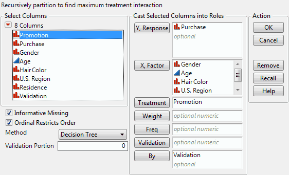
You can specify your own Validation column, or designate a random portion of your data to be selected as a Validation Portion. If you click the Validation button with no columns selected in the Select Columns list, you can add a validation column to your data table. For more information about the Make Validation Column utility, see Basic Analysis.
Note that the only Method currently supported by Uplift is Decision Tree.
The Uplift Model Report
The report opens by showing the Graph and the initial node of the Tree, as well as controls for splitting.
Uplift Model Graph
The graph represents the response on the vertical axis. The horizontal axis corresponds to observations, arranged by nodes. For each node, a black horizontal line shows the mean response. Within each split, there is a subsplit for treatment shown by a red or blue line. These lines indicate the mean responses for each of the two treatment groups within the split. The value ordering of the treatment column determines the placement order of these lines. As nodes are split, the graph updates to show the splits beneath the horizontal axis. Vertical lines divide the splits.
Beneath the graph are the control buttons: Split, Prune, and Go. The Go button only appears if there is a validation set. Also shown is the name of the Treatment column and its two levels, called Treatment1 and Treatment2. If more than two levels are specified for the Treatment column, all but the first level are treated as a single level and combined into Treatment2.
To the right of the Treatment column information is a report showing summary values relating to prediction. (Keep in mind that prediction is not the objective in uplift modeling.) The report updates as splitting occurs. If a validation set is used, values are shown for both the training and the validation sets.
RSquare
The RSquare for the regression model associated with the tree. Note that the regression model includes interactions with the treatment column.
N
The number of observations.
Number of Splits
The number of times splitting has occurred.
AICc
The Corrected Akaike Information Criterion (AICc), computed using the associated regression model. AICc is only given for continuous responses. For more details, see Fitting Linear Models.
Uplift Decision Tree
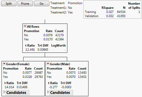
The decision tree shows the splits used to model uplift. See Figure 6.4 for an example using the Hair Care Product.jmp sample data table. Each node contains the following information:
Treatment
The name of the treatment column is shown, with its two levels.
Rate
Only appears for two-level categorical responses. For each treatment level, the proportion of subjects in this node who responded.
Mean
Only appears for continuous responses. For each treatment level, the mean response for subjects in this node.
Count
The number of subjects in this node in the specified treatment level.
t Ratio
The t ratio for the test for a difference in response across the levels of Treatment for subjects in this node. If the response is categorical, it is treated as continuous (values 0 and 1) for this test.
Trt Diff
The difference in response means across the levels of Treatment. This is the uplift, assuming that:
‒ The first level in the treatment column’s value ordering represents the treatment.
‒ The response is defined so that larger values reflect greater impact.
LogWorth
The value of the logworth for the subsequent split based on the given node.
Figure 6.4 Nodes for First Split
Candidates Report
Each node also contains a Candidates report. This report gives:
Term
The model term.
LogWorth
The maximum logworth over all possible splits for the given term. The logworth corresponding to a split is -log10 of the adjusted p-value.
F Ratio
When the response is continuous, this is the F Ratio associated with the interaction term in a linear regression model. The regression model specifies the response as a linear function of the treatment, the binary split, and their interaction. When the response is categorical, this is the ChiSquare value for the interaction term in a nominal logistic model.
Gamma
When the response is continuous, this is the coefficient of the interaction term in the linear regression model used in computing the F ratio. When the response is categorical, this is an estimate of the interaction constructed from Firth-adjusted log-odds ratios.
Cut Point
If the term is continuous, this is the point that defines the split. If the term is categorical, this describes the first (left) node.
Uplift Report Options
With the exception of the options described below, all of the red triangle options for the Uplift report are described in the documentation for the Partition platform. For details about these options, see the Partition Models chapter in the Specialized Models book.
Minimum Size Split
This option presents a window where you enter a number or a fractional portion of the total sample size to define the minimum size split allowed. To specify a number, enter a value greater than or equal to 1. To specify a fraction of the sample size, enter a value less than 1. The default value for the Uplift platform is set to 25 or the floor of the number of rows divided by 2,000, whichever value is greater.
Column Uplift Contributions
This table and plot address a column’s contribution to the uplift tree structure. A column’s contribution is computed as the sum of the F Ratio values associated with its splits. Recall that these values measure the significance of the treatment-by-split interaction term in the linear regression model.
Uplift Graph
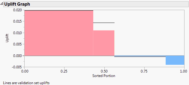
Consider the observations in the training set. Define uplift for an observation as the difference between the predicted probabilities or means across the levels of Treatment for the observation’s terminal node. These uplift values are sorted in descending order. On its vertical axis, the Uplift Graph shows the uplift values. On its horizontal axis, the graph shows the proportion of observations with each uplift value.
See Figure 6.5 for an example of an Uplift Graph for the Hair Care Product.jmp sample data table after three splits. Note that, for two groups of subjects (males and non-blond women in the Age ≥ 42 group), the promotion has a negative effect.
The horizontal lines shown on the Uplift Graph delineate the graph for the validation set. Specifically, the decision tree is evaluated for the validation set and the Uplift Graph is constructed from the estimated uplifts.
Figure 6.5 Uplift Graph
Save Columns
Save Difference
Saves the estimated difference in mean responses across levels of Treatment for the observation’s node. This is the estimated uplift.
Save Difference Formula
Saves the formula for the Difference, or uplift.
..................Content has been hidden....................
You can't read the all page of ebook, please click here login for view all page.