The need for effective information design spans every medium, and includes print, interactive, packaging, and environmental projects. The following case studies represent some of the most accomplished work being done in the field today.
5 PRINTED MATTER CASE STUDIES
Whether you’re perusing a magazine, reading a manual for a new piece of equipment, or looking at product packaging in a store, words are ubiquitous. With so much printed matter around us, sometimes it’s difficult to separate the useful information from the extraneous. The most successful information design in print entices people to read and clearly communicates key messages.
Clear, Clean, and Sophisticated. Located in Brooklyn, the boutique studio tackles a range of projects, including identity design, exhibits, books, magazines, and websites. Not only are their clear, clean, and sophisticated information visualizations incorporated into most of the studio’s projects, the team is often asked to create information graphics for some of the leading media outlets in the country, including the New York Times, the Atlantic, and Google.
Thinking About Systems. In reflecting about other through lines in their work, Cheng and Gephart say thinking about systems is fundamental to every project. Even an identity assignment is considered from a systems point of view.
“What we like most is translating complex information into visually effective and intelligent design solutions.” —MGMT. design
Planning begins with honing the key takeaways. Graphics help to convey structure and hierarchy to reinforce meaning and memorability—whether it be the chapter structure in a book, the navigation for a website, or the flow of an exhibit. When it comes to working in 3-D spaces, they particularly enjoy collaborating with architects who believe in the power of graphics to reinforce pacing.
Multisensory and Multidisciplinary. The partners say they enjoy projects requiring print, online, and environmental articulation. Gephart says, “The most satisfying projects are the ones where the work can be experienced in many different ways.”
Dimensionalizing Data. Informed by their complementary skill sets, the firm has been exploring how “dimensionalizing” data in a physical space can make takeaways more visceral and engaging. Cheng says, “Otherwise there can be a huge tendency for ‘statistical apathy.’ ” And when it comes to online projects, they find that motion can draw people to further engage with data—critical when it comes to thinking about how projects will be expressed in social media platforms.
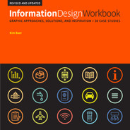
The studio worked with TED, the renowned global nonprofit devoted to “spreading ideas” to create a signature “look and feel” for their boxed set of books. The books are “long enough to explore a powerful idea but short enough to read in a single sitting” and cover topics as diverse as the creative mind, the science mind, the business mind. The curated sets have been described as “provocative, intelligent, and playful.”
Extracurriculars. The studio tends to live, eat, and breathe this kind of passion, with a range of activities they refer to as portfolio “extracurriculars.” This includes posters designed to reach first-time voters and collaborative studio research projects, called “visual digressions,” inspired by real world events.
Design Engines Humming. They’ve also created an ongoing series of self-assigned information graphics to share with colleagues and friends. Cheng says, “Design engines humming and looking for an outlet, we had the ambitious plan to generate one infographic per day. The rules were simple: we would stick to a consistent format and font, but other than that everyone is free to pick any topic they feel needs elucidating. While the plan turned more into ‘One Some Days’ rather than ‘One a Day,’ we like to keep things lively in the studio and get excited by projects where we are creating the content as well as designing.”
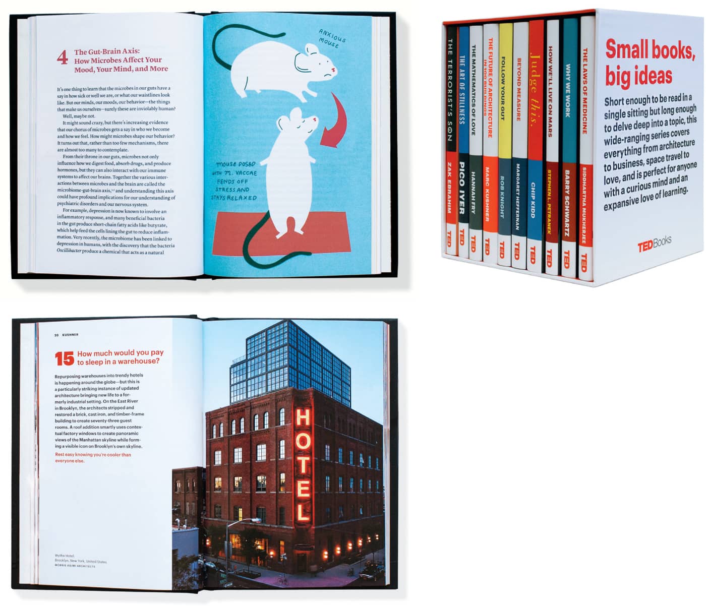
To help the Natural Areas Conservancy get the word out about nature in New York City, MGMT. design created a brochure and a pocket guide. The brochure includes a map of every park and natural area in the five boroughs, and the pocket guide adapts the info-graphic animations the designers created for the website into a format visitors can carry.
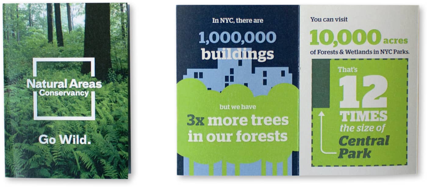
An exhibition at the National Building Museum explored the causes and impacts of eviction. Based on the book Evicted: Poverty and Profit in the American City by Matthew Desmond, MGMT. design collaborated with Matter Architecture Practice to develop an immersive experience of built structures to organize the content, dimensional info-graphics that highlight the stark portrait of poverty today, and audio interviews presenting the voices of those impacted by the housing crisis.
The Grid Reigns Supreme. To ultimately bring a reimagined editorial approach to life, Hayman is a big believer in using a strong, grid-based approach, and a limited palette of fonts and color when it comes to designing publications. “Flyers for secondhand suit stores are now full of color,” he says, “so color doesn’t have as much value as it used to. While designers might feel that a restrained type and color palette is restrictive or even boring, a reader often has only minutes to scan a publication. Consistent formatting can guide them through it and separate the editorial pages from the ads. And a pared-down palette allows the liveliness of photos, illustrations, and information graphics to come through.” In addition, Hayman is a master of creating “type color,” the term designers use to describe the effect of a palette of typographic weights and cuts, carefully curated to provide visual relief. These typographic interjections provide readers with multiple ways “in” to a section or article. Bold headlines, pull quotes, and captions invite readers to linger on the page. Even decorative initial or drop, caps (hearkening back to medieval manuscripts) can encourage visitors to explore. “The magazine may be next to the bed for a couple of weeks,” he says. It’s important to find ways to invite readers to dive back in.”
“The visual solutions need to reflect substantial changes being made in the editorial approach, so it’s not just a cosmetic change.”
—Luke Hayman

“I love working with editors. I like when we can take a magazine apart and put it back together again—where we can find new ways to tell stories.” —Luke Hayman
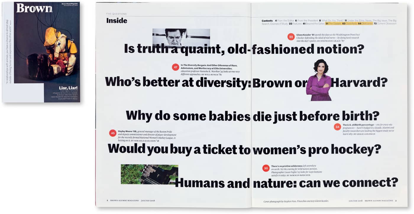
While at Pentagram, Luke Hayman has worked on major consumer publications, but he has also worked with several prestigious universities, including Brown, to reinvent the genre of the alumni magazine.
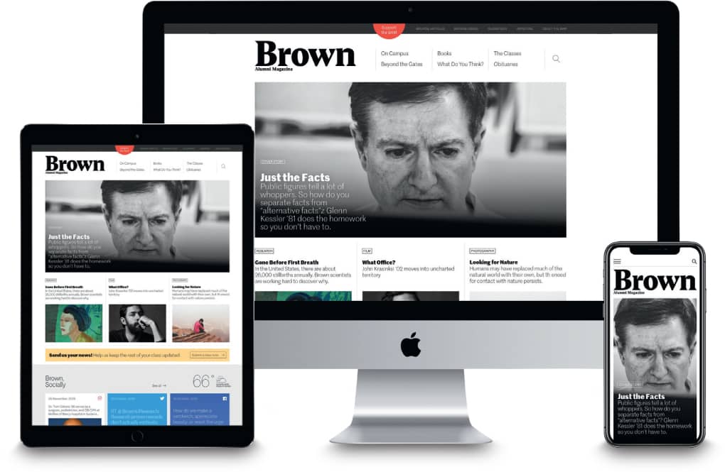
The redesigned website for the publication translates the look and feel of the magazine to deliver a dynamic digital presence.
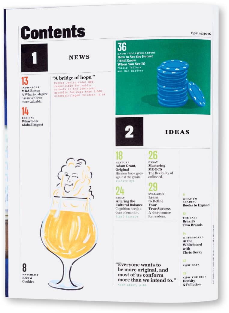
The Wharton School of the University of Pennsylvania is renowned for producing leaders across all spheres of business. The design of the table of contents for the newly redesigned alumni magazine provides quick clues to help readers navigate each issue.
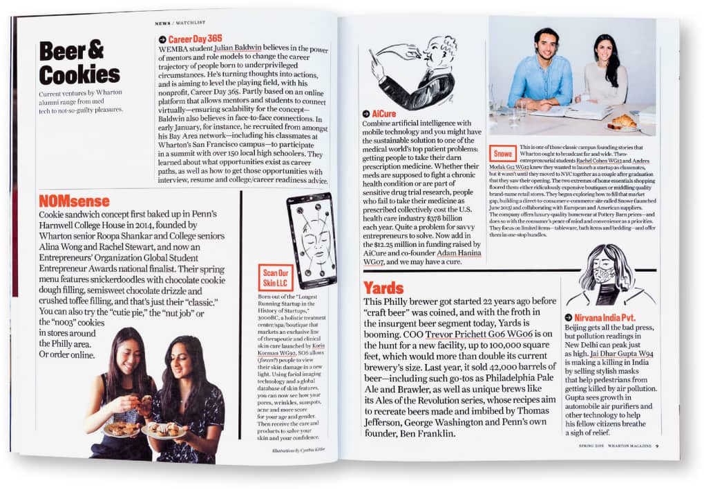
The new design adds visual texture and detail with spot illustrations, pull quotes, and typographic variety, to make the publications richer and more active, and to offer more entry points for the reader.
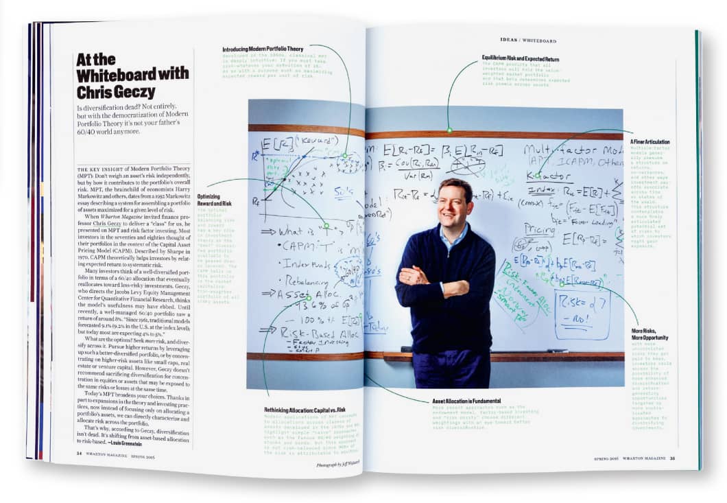
The goal for the redesign of the magazine was to better highlight graduates’ ground-breaking ideas.
Migrating to New Platforms. While there’s still an appetite for the carefully curated and tactile experience a print magazine provides, the reality is that advertisers and consumers alike are seduced by the sound, animation, and click-throughs made possible with the web. And the fact is, Hayman’s publication projects routinely extend to the web. In some cases, his team is asked to concurrently redesign the online and print versions. In others, the team’s “look and feel” and detailed guidelines for implementation will inspire and drive the reinvention of the online experience after the fact. Hayman notes, “You keep both formats in mind as you design.” The result is memorable clarity and personality.
Executing these editorial projects can be so intensive that Hayman and his team often feel “embedded” with the publications’ internal teams, and that’s another important factor in a publication’s redesign. “The interesting thing about a magazine,” he adds, is that it’s a system. The framework has to be both solid and flexible enough so in-house teams can implement, and be inventive over time, despite notoriously impossible deadlines. “After all,” he says, “a magazine is a living organism.”
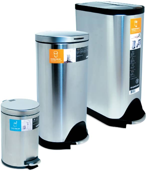
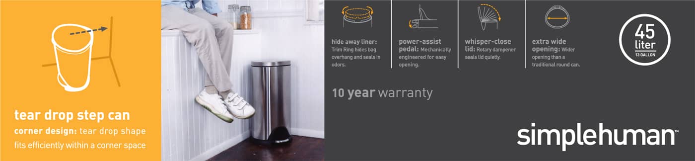
Performance Driven. With a focus on consumer products, Smart Design’s packaging and branding efforts are informed by years of design experience. The designers understand that, just like the product itself, packaging needs to meet performance objectives. With little control over how the product would be displayed in large retail environments chock-full of competing products, they needed to create packaging that would stand out from the clutter. As Smart Design cofounder Tom Dair says, “Most retail packaging is overly complex and gimmicky. We knew we could make the packaging stand out by paring back the imagery and text to the essential elements.”
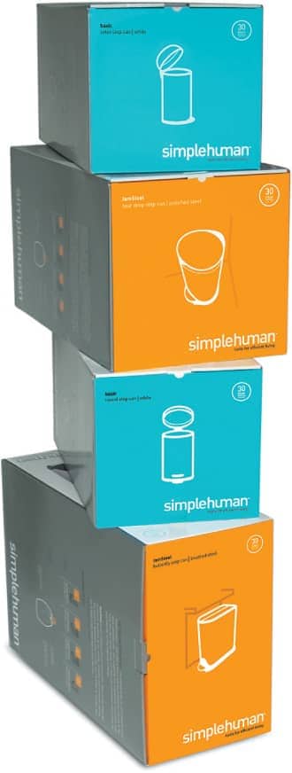
As a contrast to the clean white backgrounds and the nuetral colors in the product photography, a clean, vibrant color palette was developed to attract attention.
Since most retail environments are self-serve, the packaging had to attract and educate. This was particularly important given that simplehuman didn’t have a big budget for print or broadcast advertising. The packaging was both the billboard and the sales representative.
Knowing consumers are time-stressed and hassled about making purchasing decisions, the goal was to have the package highlight the product’s areas of innovation. Smart Design was careful to use benefit statements rather than listing features. Dair says, “If you focus on product features, you’re leaving it up to the consumer to figure out how the features become beneficial.”
“Good design, good typography is a function of information and inspiration, of the conscious and unconscious, of yesterday and today, of fact and fantasy, work and play, craft and art.” —Paul Rand
Some products sold at higher price points, so it was important to differentiate the product from competitors to help the consumer clarify the different features/benefits in the simplehuman line.
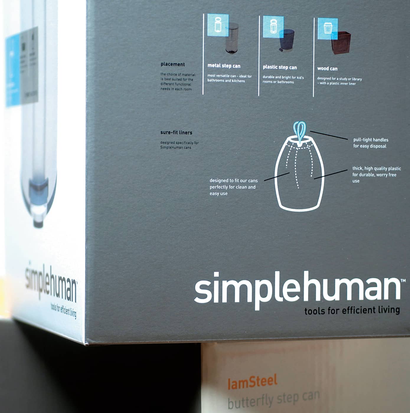
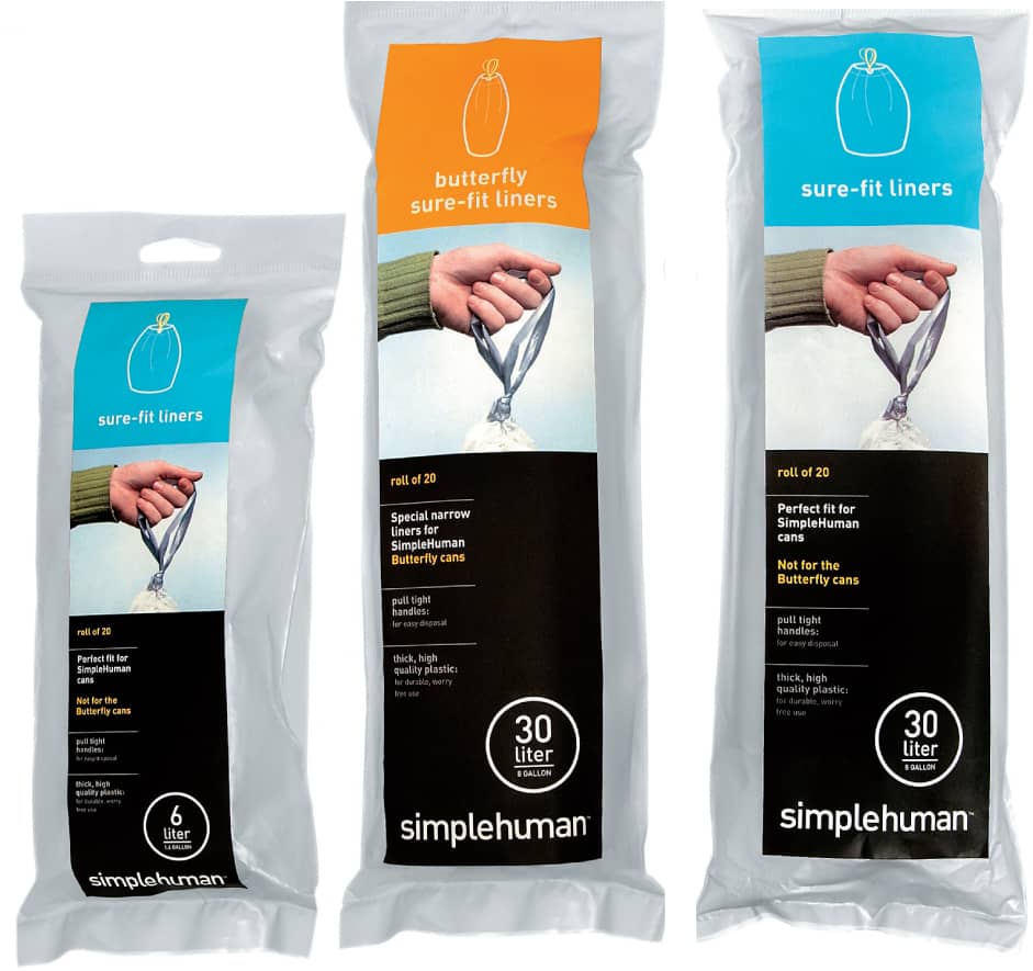
Modular System. In addition to cartons, the designers developed a system for detailed but elegant labels attached to the product itself, so customers could get information even if retailers took the products out of the boxes to save display space.
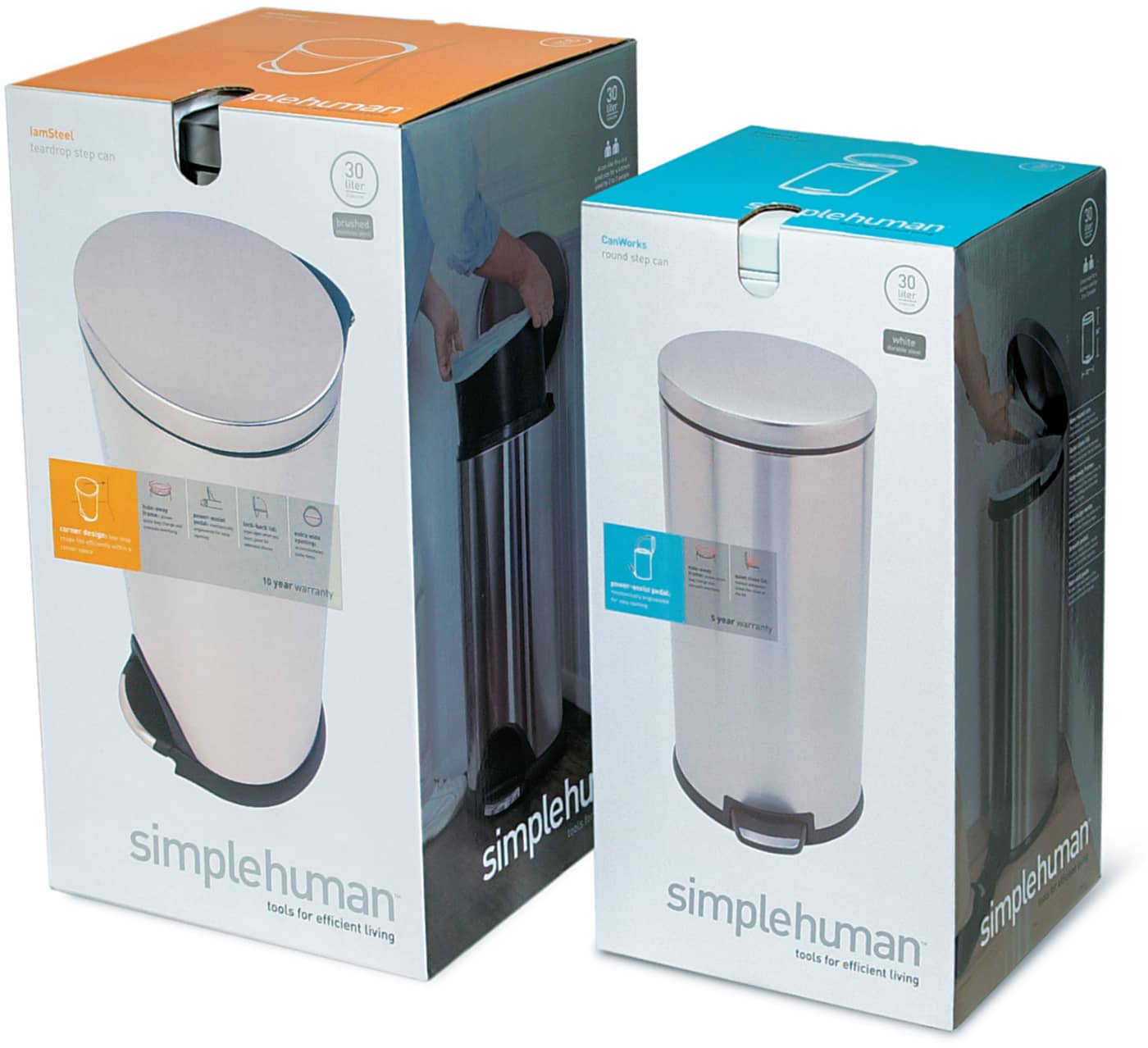
In order to convey a look that is sleek and modern but also simple and friendly, the front panel features a “hero shot” of the product with a simple overlay of elegant type. There was a heavy emphasis on white space to help it stand out in the cluttered retail environments.
In addition to boxes, Smart Design developed a system for detailed but elegant labeling for the product itself, so customers could get information even if retailers took the products out of the boxes to save display space.
Because simplehuman was committed to developing additional product lines, it was important to create a modular approach to the visual language. The design had to be unified but flexible, and work for accessories as well.
Success has meant that simplehuman’s in-house design department continues to implement the system. The product line looks cohesive, even with packaging that’s quite different in terms of size, shape, and materials.
As Dair says, “You’re helping to set the consumer’s expectation. Luckily, these are great products. We didn’t have to create a lot of vapor around them. We just needed to reflect the company’s commitment to creating tools for efficient living.”
Simple line drawings draw attention to bulleted lists so consumers can review product benefits at a glance.
The product line looks cohesive —even with packaging that is quite different in terms of size, shape, and materials.
It’s All About the User Experience. Mohawk commissioned the New York City–based firm And Partners to build a suite of timeless reference tools that would be pertinent to junior designers, as well as those with far more experience. Used as printed “ambassadors” by Mohawk’s sales reps, the brochures would encourage people to look for more detailed content on the Web.
Begin with Content. With this in mind, And Partners’ founder, David Schimmel, decided to build the system “from the ground level.” And Partners reviewed Mohawk’s white papers and topic wish list with a writer they knew well. Based on this review, the firm suggested a newly prioritized and logical structure for the series. The writer continued to work with Mohawk’s production and marketing teams to develop the content, and became a “focus group of one.” If she found something that was difficult to understand, this probably meant the text should be clarified. The team constantly asked, “How much information can we include to make the pieces useful but still accessible?” Schimmel says, “We didn’t start designing until the content was nailed. Designing is a lot easier to do when you know what you’re saying. And having a piece where the design and the writing are integrated is the best way to get good information design.”
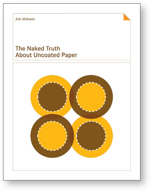
Simple, elegant, geometric illustrations on the covers branded the series.
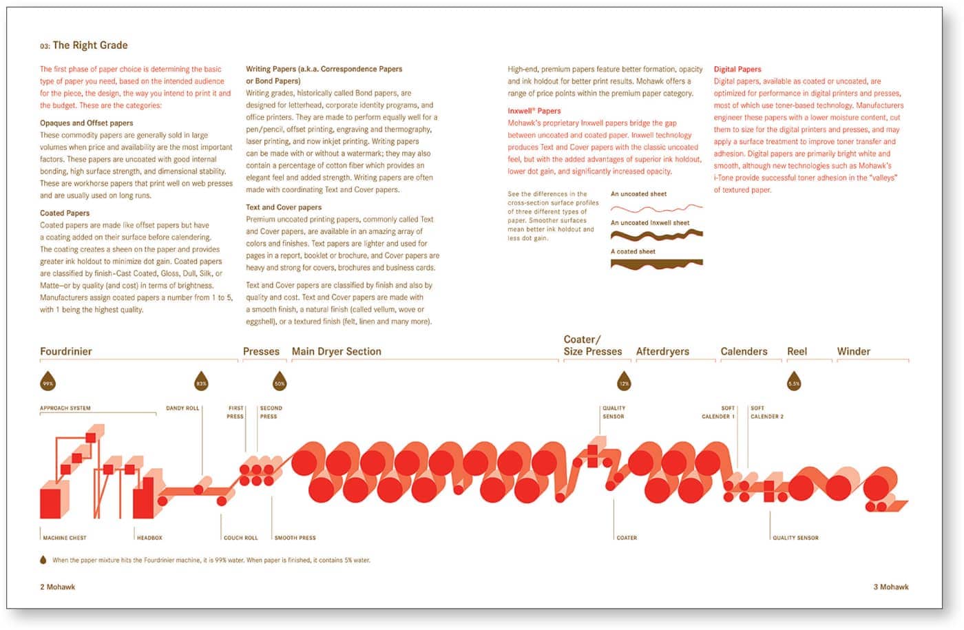
Small illustrations were used for visual relief and to attract attention. Drawings and diagrams were consistently used to clarify content.
Elegant Primers. The design team began to work with sample sections to present design schemes. Because they wanted the pieces to feel practical but look beautiful, each piece was designed in two colors, within an overall series palette. This simple palette also helped to guarantee the pieces would be easy to reproduce by various printers across the U.S.
The designers also wanted to use design elements to reinforce a sense of information architecture, so readers wouldn’t be required to read any of the pieces from beginning to end. The design needed to function just as well for someone just flipping through.
To keep the pieces from feeling too technical, fields of color were used to “mix it up,” providing contrast to pages with a lot of detail. Small illustrations add visual relief and attract attention. Consistent drawings and diagrams clarify content.
As the designers proceeded, they developed the system with a solid grid as well as detailed style sheets so it could be implemented by other design firms down the road.
Sellout Crowd. The response from the marketplace was enthusiastic. One of the first pieces was immediately reprinted to meet demand. Specific feedback indicated that designers loved how the pieces were straightforward, practical, and easy to use. And they appreciated the simple, elegant, geometric illustrations on the covers that branded the series, making it easy to find the brochures on a crowded bookshelf.

In order for readers to feel that these pieces provide objective information, the designers have developed a color-coded system so that any text related to product advantages is highlighted in a second color. This helps readers identify the types of content they want to read.
The majority of paper promotions are extremely elaborate and color saturated. In order to put an emphasis on content, most of the Mohawk brochures were simply produced in two colors. This also helped to ensure the system would be easy to reproduce by printers across the U.S.

Graphic icons draw the eye to product benefit statements.
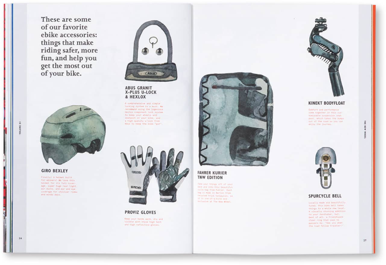
Fine Tuning. Whatever the project type, the studio carefully orchestrates a variety of visual elements in order to create pieces that are both inviting and informative. Artful illustrations and photography provide clues that speak to community and lifestyle. Typography, equal parts disciplined and elegant, helps readers find the information they need, whether that’s in service of researching electronic bicycles or helping people discover a long-form article about an up-and-coming artist’s work.
Brett Newman, Hybrid’s creative director, says, “It’s all about getting people to engage with the content in the right frame of mind. If you’re making a big purchase, you need to be able to make an informed decision, so we might use graphic devices that let you easily compare bike models, or parse the differences in carbon dioxide emissions between a bike and a car—all things that require clearly presenting quantifiable data. But we might pair all that with evocative lifestyle photos to convey things in a more qualitative way, for instance, Will this bike model work for my kids?”
“People are drawn into the images and will then stay to connect more deeply to the content.” —Brett Newman
Newman says, “We need an incredibly strong connection between imagery and typography. People are drawn into the images and will then stay to connect more deeply to the content.” Newman goes on to say that the designers who are most successful at artfully conveying layered information—either in print or online—are those versed in the classic principles of graphic design, now hundreds of years old, whether it be employing balance, scale, or contrast to convey clear hierarchies. “You want to provide different starting points,” he says. “You want to provide information for skimmers as well as deeper dives for people who like to read—in print or online.” But, he says, “it always starts with the same question, What do we really need to communicate here?”
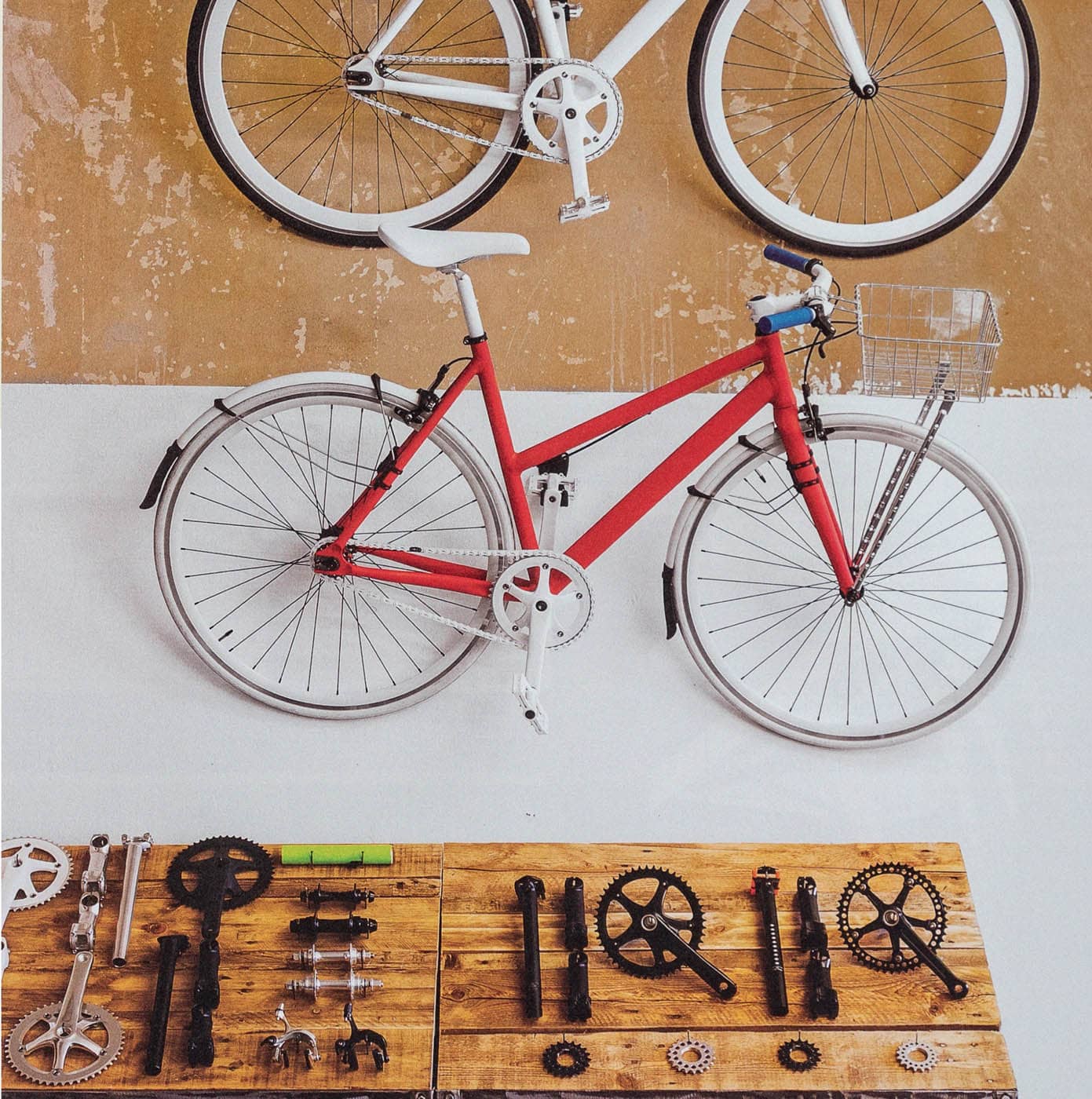
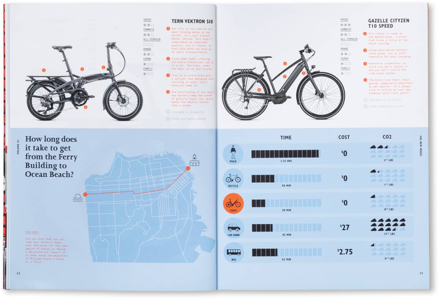
The New Wheel refers to itself as “the optimistic bike shop.” With a couple of stores in northern California, the founders are committed to a careful selection of technology and top-notch service. Hybrid Design produced the company’s catalog so customers can easily compare available models.
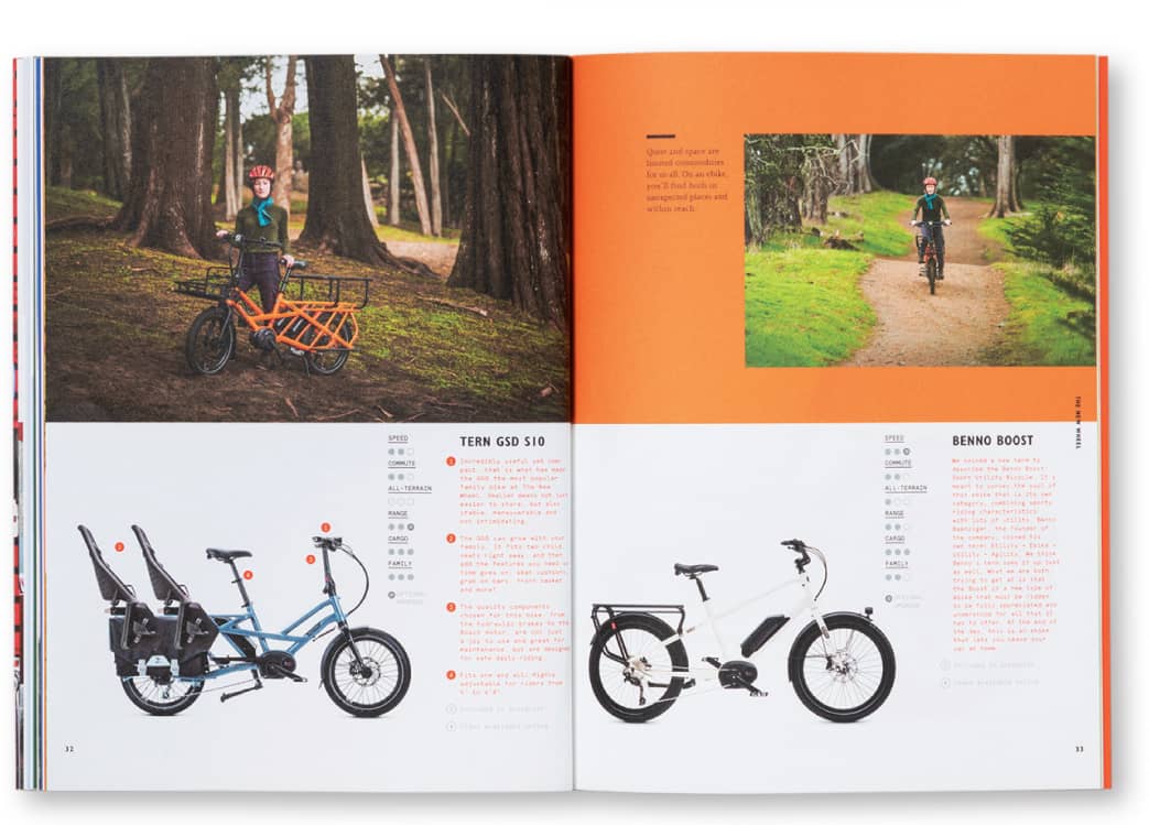
In addition to product-specific details, lifestyle photography helps suggest a sense of community—a critical component of the company’s mission.
Helping to introduce a relatively new product category, designers worked to find ways to quickly convey key aspects of the technology.
Executive creative director Dora Drimalas adds, “A communications piece is not unlike a human interaction. You don’t want to start with things that are too complex.
If you were asked to train someone for a job, you wouldn’t try to make them learn everything at once. You can almost picture it as a funnel. You start broader and then let people drill down once they’re oriented and want to learn more. We want to be mindful of human cognition as we think about helping people move through information.”
Both Newman and Drimalas say that bringing teams with diverse skill sets to the table from the very beginning, and then at different points in the project, pays off, especially when projects are on tight time frames. Newman says there is lots of back-and-forth on every project. Sometimes it’s the writing that drives the piece. Often it’s the visuals. He says they sometimes start with rough sketches, or page maps and wireframes. They might even build things with 3-D shapes to help the team explore the best ways to structure a piece. Newman describes the process as symbiotic and sometimes prone to happy accidents. But if the team celebrates happy accidents, they also celebrate the constant refinement required to get even happier results.
Coalesse, a division of Steelcase, is a U.S.-based furniture company that creates products with the goal of encouraging collaboration and bringing new life to the workplace.
By creating a brand magazine, Hybrid Design employs a variety of communication techniques to invite customers to explore the company’s offerings.
Circumscribed by Contracts. So many of our human endeavors require a contract, whether it’s getting married, taking a new job, merging a multinational business, or even making funeral arrangements! And yet, Passera notes, “You can pick any contract, and at a glance, they just look and read the same. Why so much sameness in different documents for different users with different needs and skills, produced by different organizations to regulate different transactions with different goals? At best, we are forgoing the opportunity to create a meaningful touch point. At worst, we are leaking economic and relational value!”
In her design practice, she has worked with multinational companies and nonprofit associations to create contracts that are “good for business, legally sound, technically smart, and human-friendly.”
“Designers can uniquely advocate for the end users to help ensure contracts actually improve people’s lives. We shouldn’t cop out on that responsibility.”
—Stefania Passera
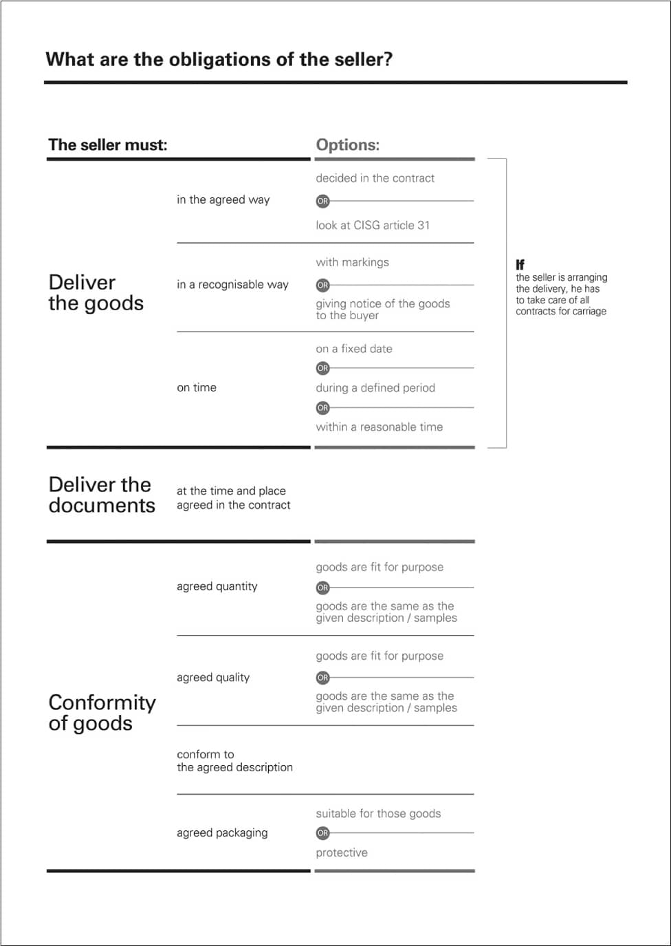
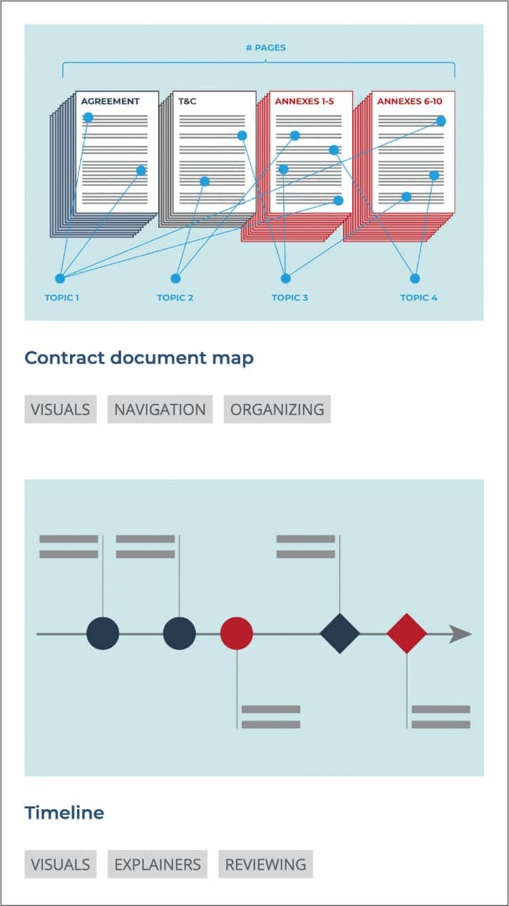
She points out, “Most relationships that have gone awry can be linked to misunderstandings, misinterpretations, and a failure to accurately describe the scope of a contract.” She adds, “Enter contract visualization—the use of diagrams, images, and visually structured layouts to make contracts more searchable and understandable.”
Sharing User Research. On the road to a PhD, Passera conducted rigorous user testing to evaluate best practices in contract design. She continues to publish research today. The research shows over and over again that, with strategic simplification and good information design, people are able to read contracts faster and make fewer comprehension mistakes. Passera notes, “This is consistently true with contract professionals and laypeople. And it is true for native speakers and nonnative speakers (think about the consequences for global business!).”
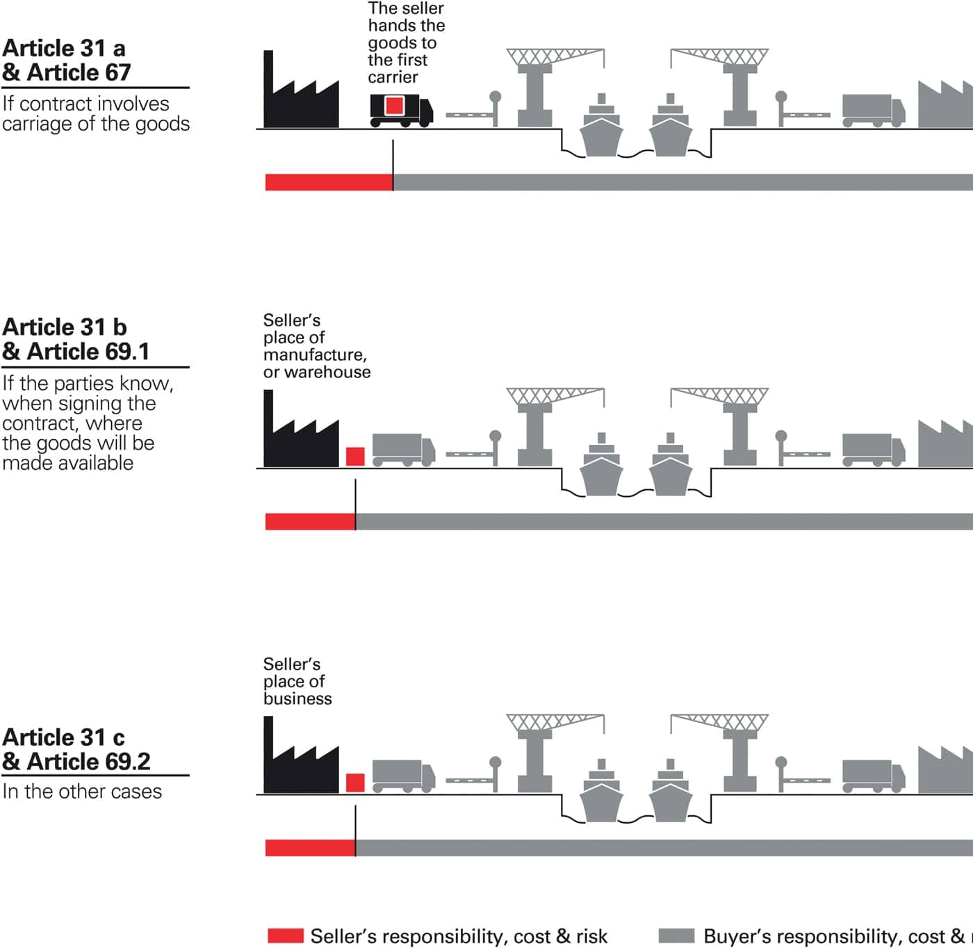
“If we use the principle of ‘overview first, then details on demand,’ we can help readers avoid cognitive overload. What they need is information that can be readily translated into decisions and actions.”
—Stefania Passera
Minimizing Friction. Passera helps clients create less “friction” in the contract negotiation process. She says large organizations will spend months cultivating customers, or potential partnerships, only to have things get stalled, or even worse, derailed, once they get into drafting a contract. She notes that Stanford Law School professor Jay Mitchell suggests you should start sketching and visualizing from the very beginning when you are planning a transaction and the contract that captures it. He suggests it can help parties align their goals and proactively discuss troubles before they escalate.
While Passera enjoys what she can bring to the front end of the design process for clients, she’s motivated to make the projects sustainable. That can mean creating templates for client teams to implement in-house, often using Microsoft Word and PowerPoint. She notes, “Before even starting on the design, you have to ask, Who is going to use this? And how will it need to be updated?” She says, “Creating templates isn’t the most enjoyable part of what I do, but it is one of the ways I can have the most long-term impact.”
Designers Have a Unique Skill Set. As a coauthor of the Legal Design Manifesto and a board member of the International Institute for Information Design, Passera notes, “Designers can uniquely advocate for the end users to help ensure contracts actually improve people’s lives. We shouldn’t cop out on that responsibility.”
In collaboration with Helena Haapio and the International Association for Contract and Commercial Management, Passera created a robust, online resource library of contract design patterns with practical examples of how the patterns can be implemented in real life. These visual solutions provide proven, user-friendly alternatives to the parts of contracts that are most often difficult to grasp.