4 DESIGN TOOLKIT
All the key principles of good design apply when it comes to information design projects, whether they’re print, environmental, or interactive. Some of the basic tools that designers have been trained to use are particularly effective in solving information design challenges.
The following sections explore the ways designers have used devices like color, structure, scale, and rhythm, as well as motion and sound, to develop powerful information design solutions.
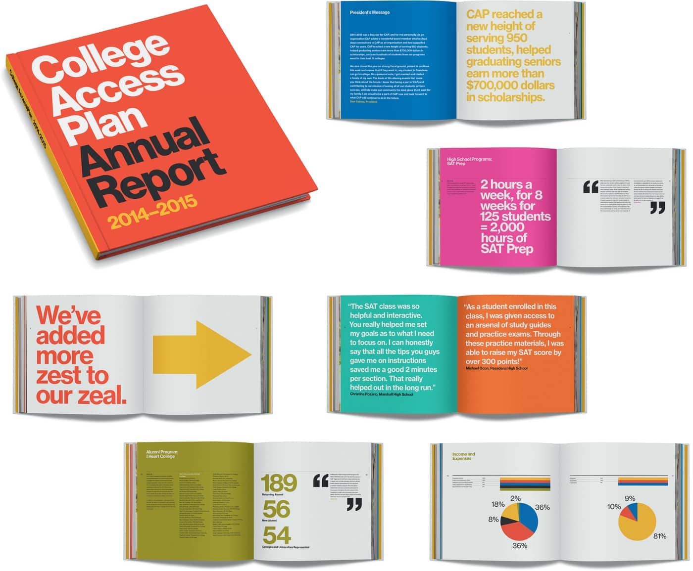
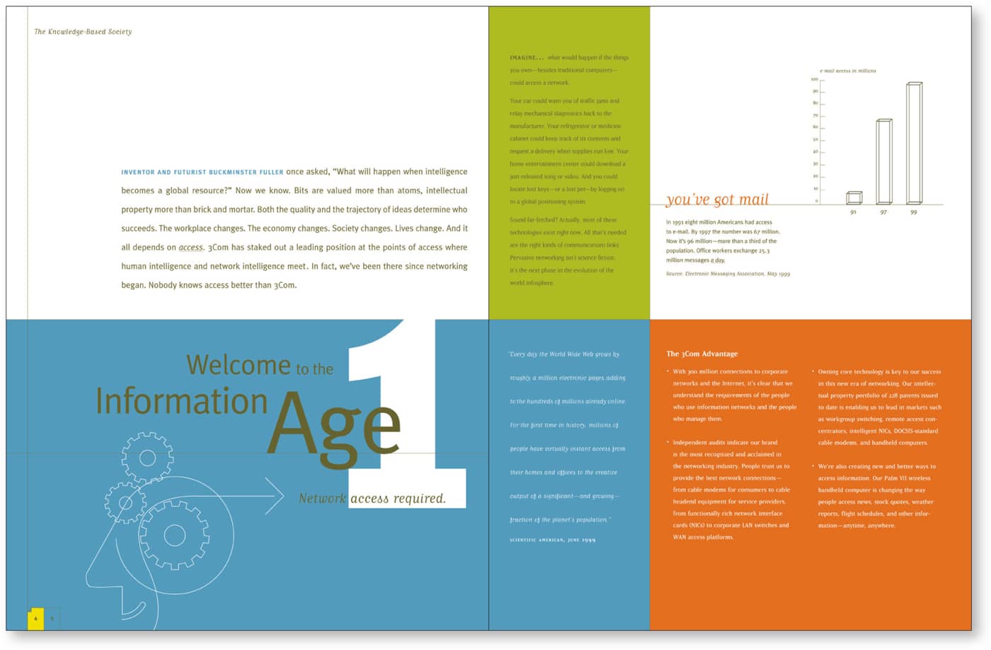
An extremely important tool for an information designer, color is a very effective way to convey differentiation. (Remember when you first learned a red light means stop, and a green one means go?) Color can also provide a sense of wayfinding, allowing readers to scan text and quickly isolate elements such as subheads and bullets. Arcade, a design and architecture publication based in the northwestern U.S., uses a single bold accent color each issue, integrating it into type styling, graphic illustrations, and wayfinding devices. Push Design Clear hierarchies are established by using different fields of color to contain different types of content in this poster for a lecture series. Cheng Design “Hierarchical variables can be expressed by means of size and intensity, and distinguish-ing variables by means of color and form.” —Paul Mijksenaar The strategic use of color blocks in an attention-grabbing palette helps to segment information and key messages across branded materials for Girls Leadership. Volume Inc. In this website for a museum exhibit, bold color contains and highlights the content for easy navigation. Louise Sandhaus Design/Durfee Regn Sandhaus This annual report for College Access Plan, a nonprofit organization that prepares underserved students to succeed in college, uses one typeface and a range of vivid colors to highlight data and help readers navigate between sections. Sean AdamsColor

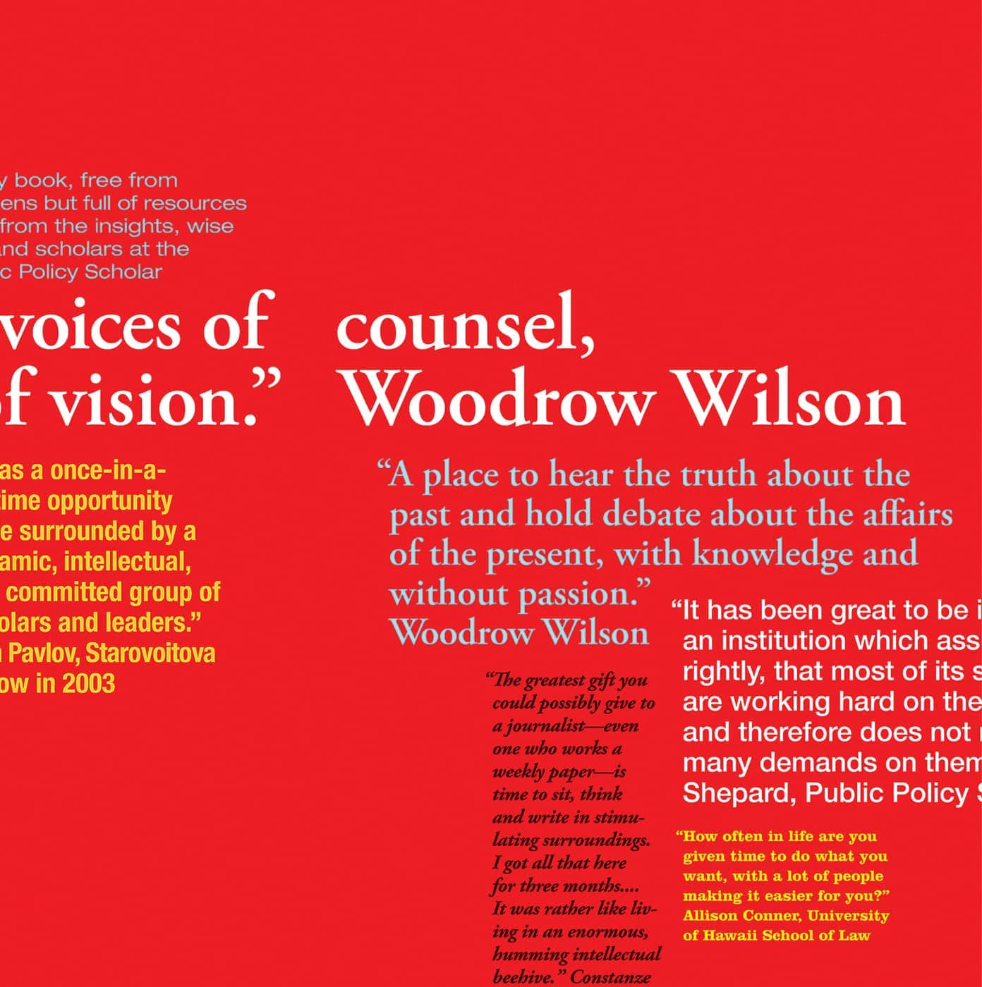
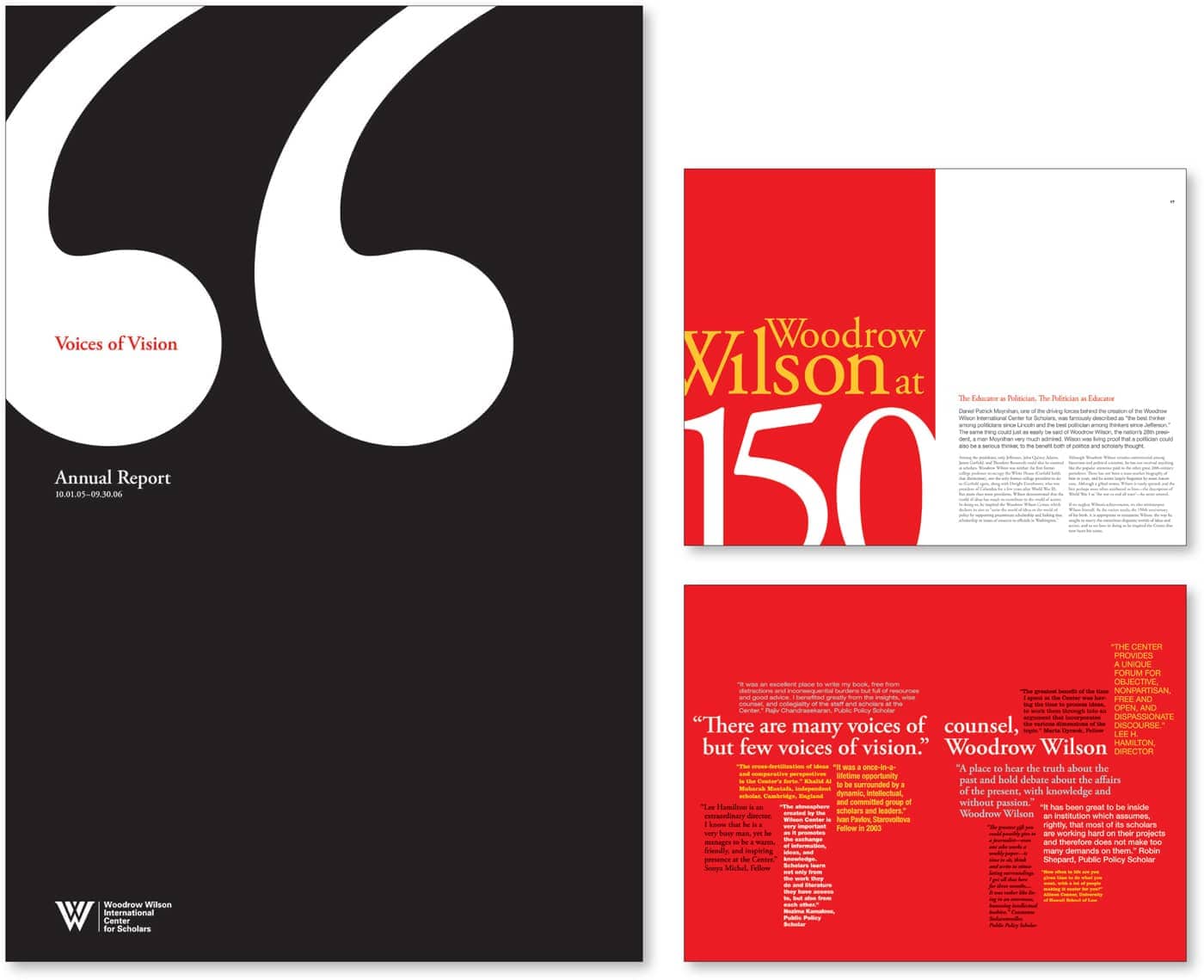
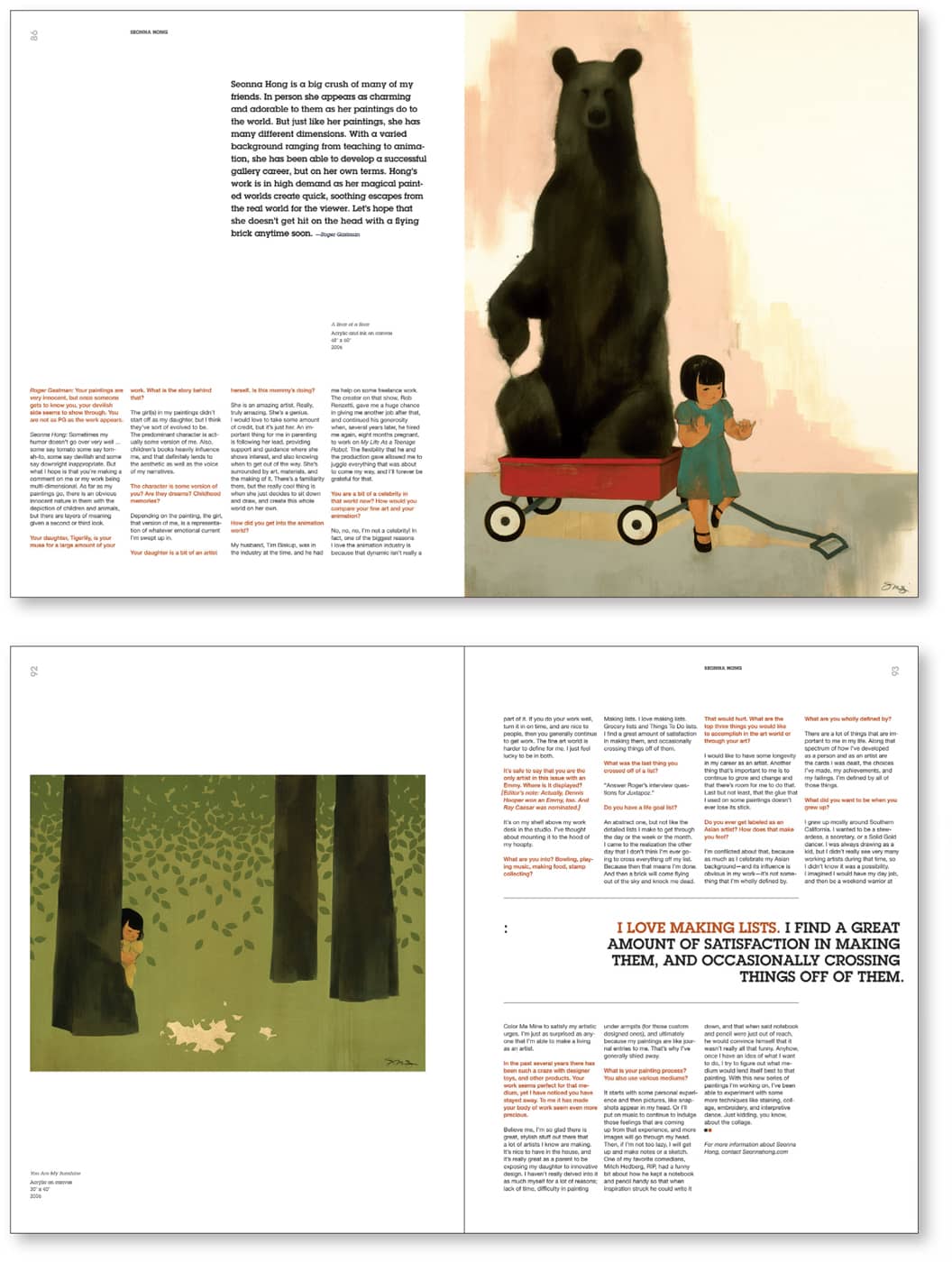
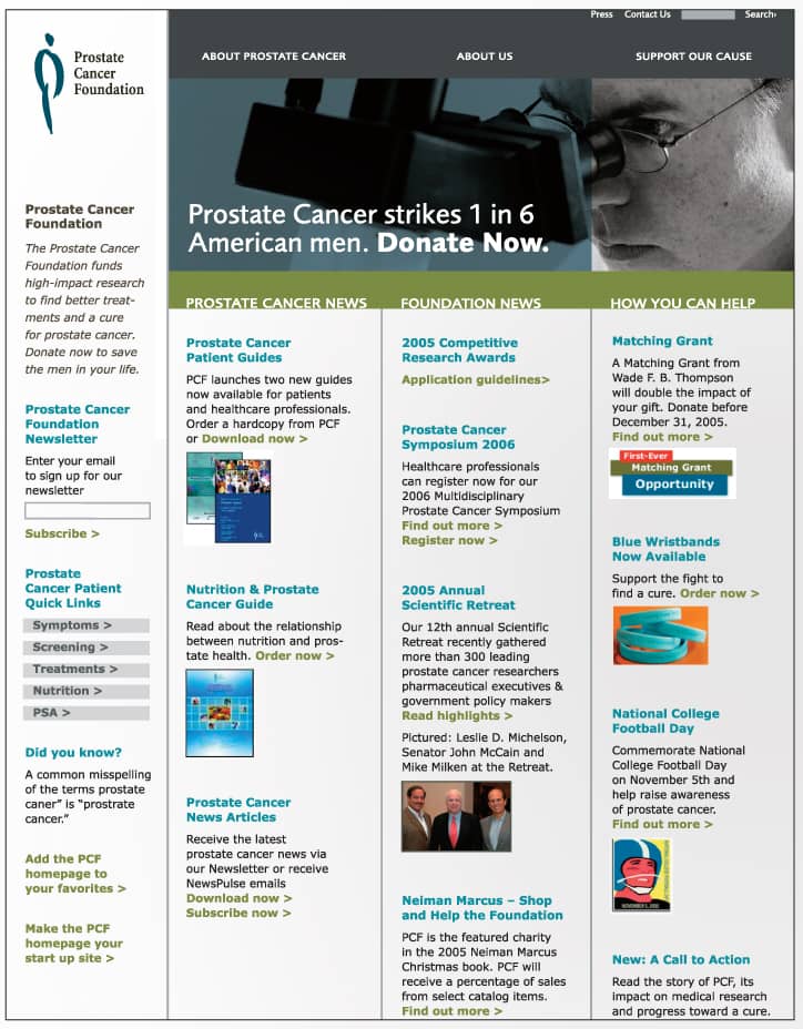
The styling of type is another key way to differentiate types of information and establish a sense of hierarchy. You might highlight one or two type elements in a simple invitation—or work with a carefully chosen palette of typefaces to clarify varied types of content in a complex reference book or a financial services website. Complementary typefaces in a variety of sizes and weights accent content in an effective and visually dynamic way in this annual report for the Woodrow Wilson Center. Design Army Type styling differentiates several types of information shown here in Worldchanging, a book that reports on new, positive developments in science, engineering, architecture, business, and politics. Sagmeister Inc. “The function of the designer is to increase the legibility of the world.” —Will Burtin Bold pull quotes are strategically placed in this redesign of Juxtapoz magazine, featuring artwork by Seonna Hong. Hybrid Design Boldfaced content headers help readers quickly find what they need on a text-intensive home page for the Prostate Cancer Foundation website. KBDAType Styling

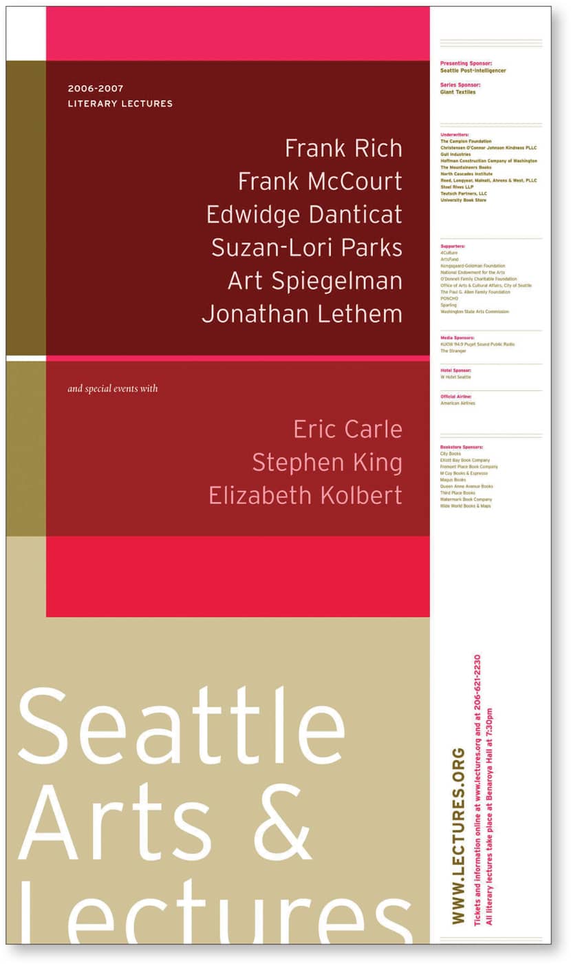
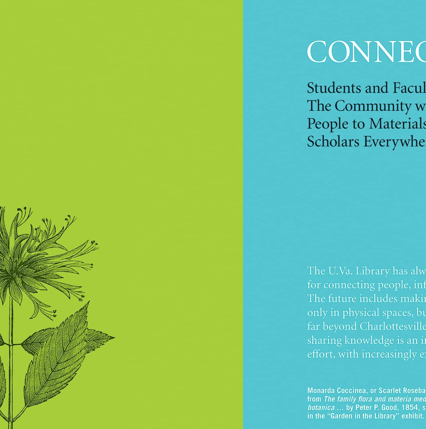
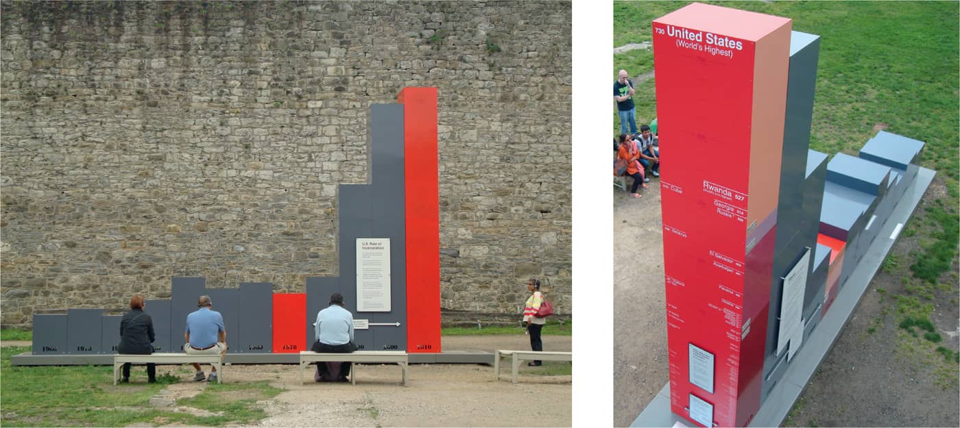
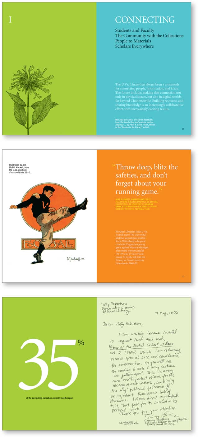
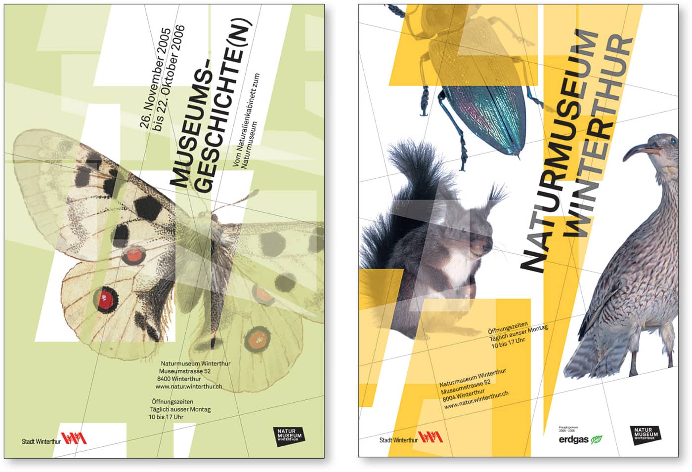
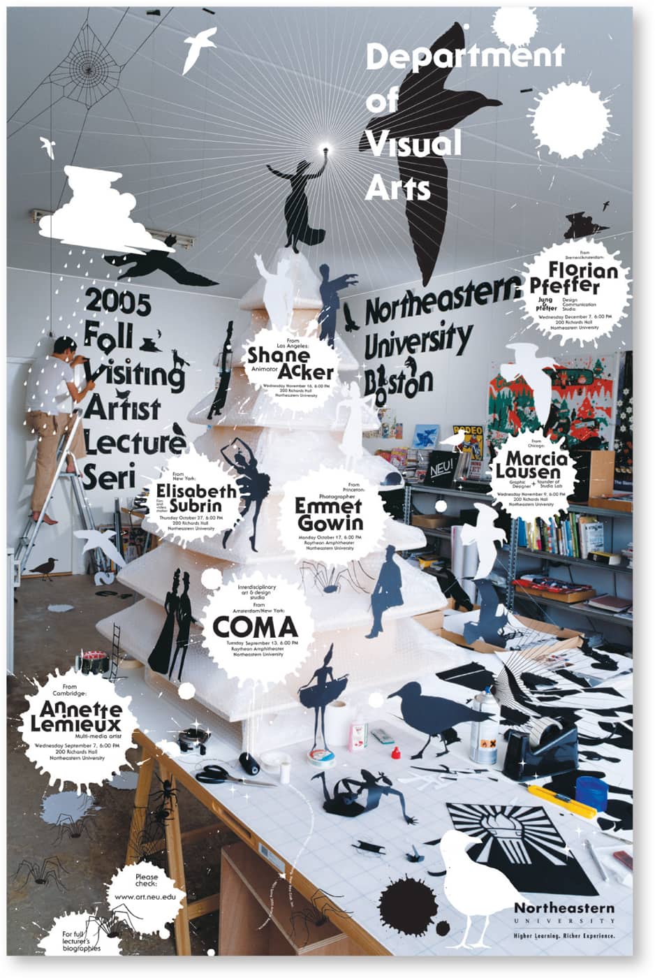
As a way to read quickly, human beings scan patterns and differences. Changes in the weight and scale of artwork and typographic elements can signal that certain pieces of information have been prioritized. This technique can be used very effectively in combination with color and type styling to clarify complex hierarchies. This poster announces the Architectural League of New York’s annual competition for young architects, with the chosen theme of “scale.” The title of the show appears in 35-point type in a 35-inch (88.9 cm)-diameter black dot. Pentagram Sixteen feet high and weighing 3,500 pounds, this 3-D infographic is hard for visitors to miss. It graphically conveys three sets of compelling statistics, depending on the viewer’s position. From the south, The Big Graph illustrates the unprecedented growth in U.S. incarceration rates since 1900. From the north, it illustrates the racial breakdown of the American prison population in 1970 and today. From the east, The Big Graph charts every nation in the world, both by rate of incarceration and by policies around capital punishment. Eastern State Penitentiary Historic Site Large, capitalized type knocked out against a dark background communicates the most important information for this poster announcing the speaker lineup for an upcoming lecture series. Supporting text is smaller and contained in a separate part of the composition. Cheng Design Varied typography creates a rich visual language in these spreads from the University of Virginia Library’s annual report. Design Army “Graphic design is a form of translation.” —Simon Johnston Weight and scale help to distinguish types of information in a series of museum posters. Fauxpas Grafik This book’s design is surprisingly varied despite the use of a single typeface. Weight and scale establish hierarchies. thomas.matthewsWeight and Scale


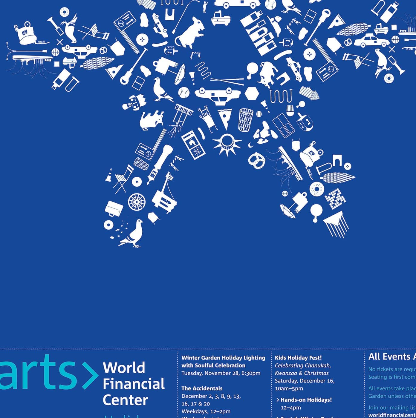
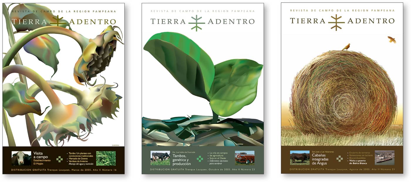
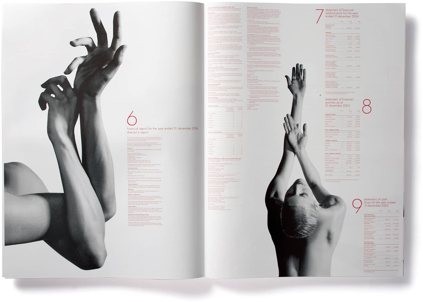
Bauhaus pioneers helped codify the use of the grid as a compelling communications tool. Carefully planned grids and white space can help a reader navigate through complex information. In addition, the very structure of the project—whether it’s the physicality of a print piece, the pacing of a multimedia project, or the organization of an exhibit—can convey additional meaning. These foldout newsletters for the World Financial Center use a recurring structure to consistently accommodate different types of information for each issue of the publication. Open This website’s structure allows the client to update content easily without sacrificing the integrity of the original design. KBDA Magazine covers for Tierra Adentro use a consistent grid, ensuring that regular readers can find the information that is of most interest to them. Guerrini Design Island Structured, offset columns of type complement the organic black-and-white photo silhouettes in this annual report for the Sydney Dance Company. The placement of the silhouettes creates a sense of movement that helps the viewer navigate through the information. The numbering system encourages a sense of momentum. Frost*collective A consistent but variable grid gives readers an easy-to-scan and highly readable approach to this catalog for San Francisco–based electric bike retailer, The New Wheel. (See case study on this page.) Hybrid Design A unique binding system that features different page sizes lets readers easily explore technical information, essays, and photography in this brochure for a high-end paper company. KBDAStructure

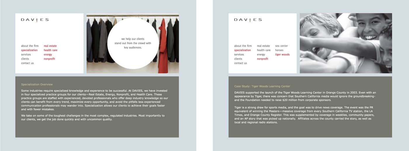


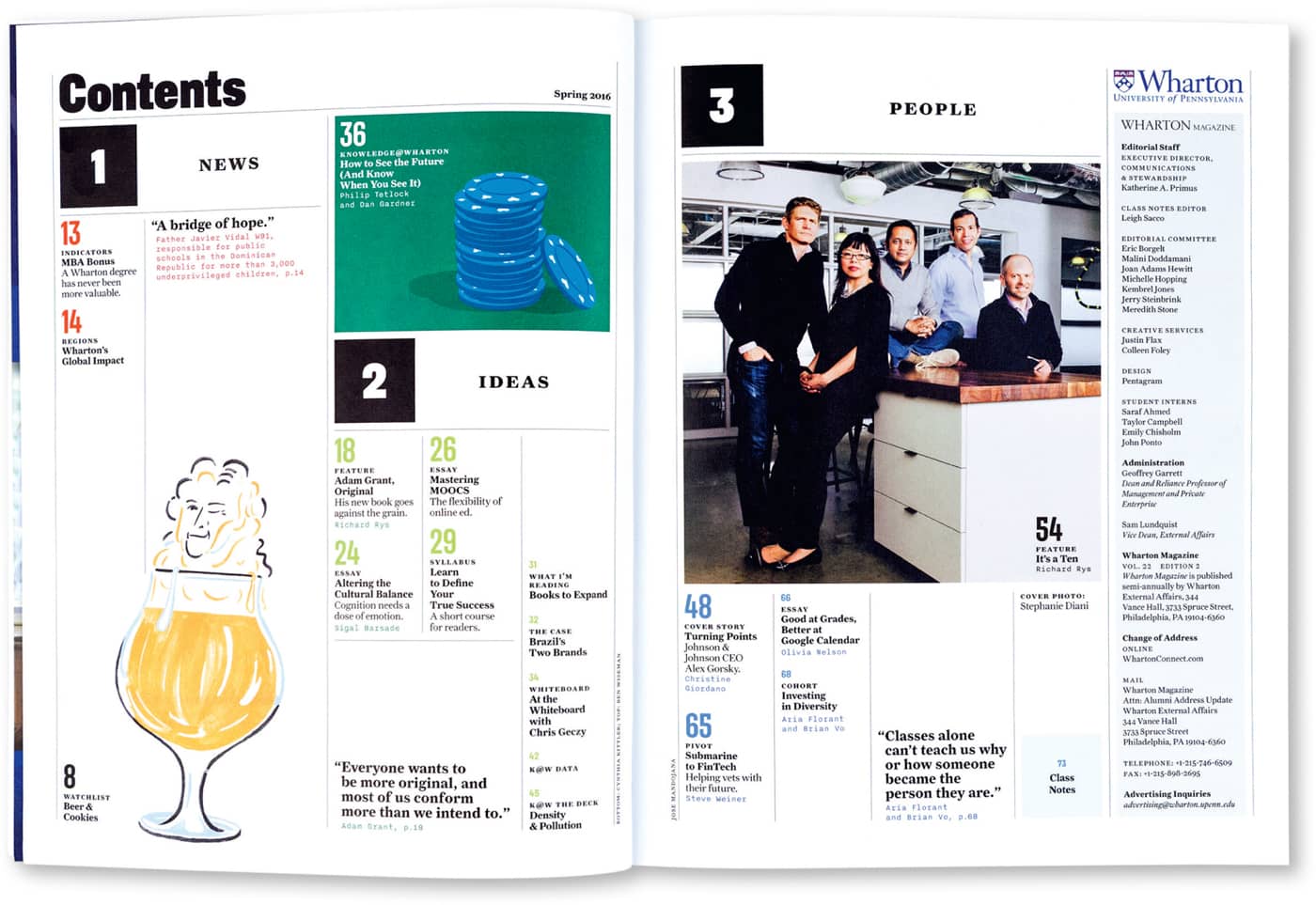
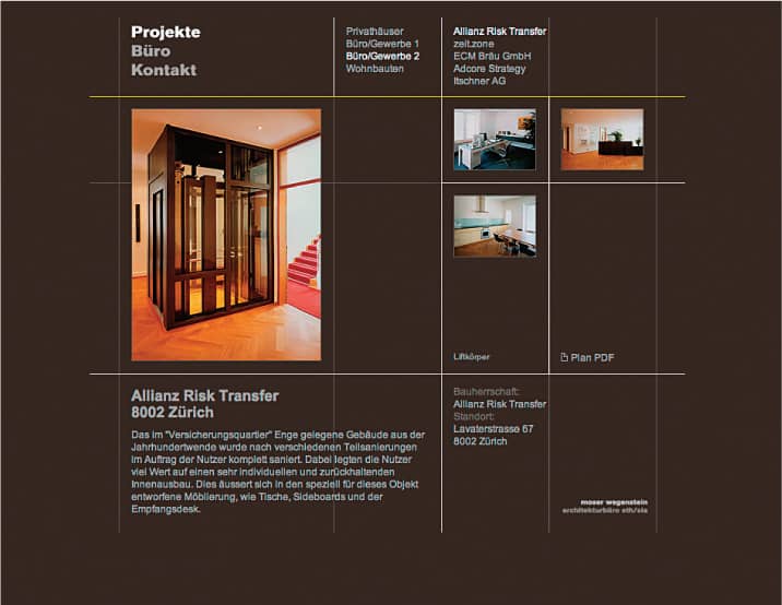
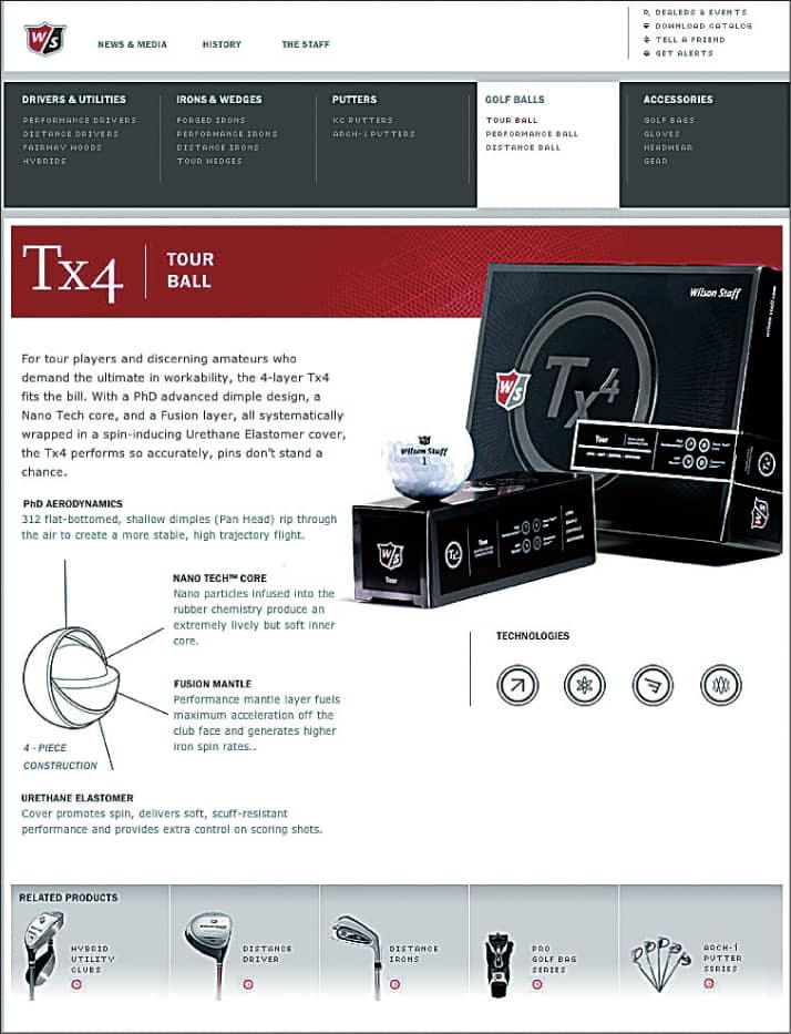
Clustering information can help readers quickly locate the information they are seeking, whether it be in a simple poster or a complex multi-media project. Multiple entry points allow a reader to absorb information as visual sound bites. The grouping of information can also signal hierarchies of importance, particularly when used in conjunction with changes in color, weight, and scale. Color fields contain different types of content in this annual report for a U.S.-based technology company. Each spread focuses on a key market trend, expressed through “sound bites” such as charts, testimonials, and bulleted strategy statements. Each content type is identified by typographic shifts in size, weight, and style. KBDA These quarterly newsletters cluster information in a consistent way to maximize readability and coherence despite a great deal of content in a limited amount of space. Axis41 In the redesign of Wharton Magazine, the alumni publication of University of Pennsylvania’s business school, a structured but flexible grid opens up the pages in clean, clear layouts that let the content breathe. (See case study on this page.) Pentagram An elegant grid helps to organize types of information in this website for a German architecture office. Fauxpas Grafik The pages of Wilson Staff’s consumer website are organized into several different areas to accommodate visitors with different levels of interest in and knowledge about the featured golf products. VSA Partners Using a single typeface in one weight, this packaging design employs careful grouping to create clear separation of text elements. Liska + Associates This quarterly magazine uses a flexible system of boxes that groups different information types as a recurring motif. 50,000feet/CSA “Changes in the visual organization of a document can lead to changes in how people perceive its content.” —Karen A. SchriverGrouping


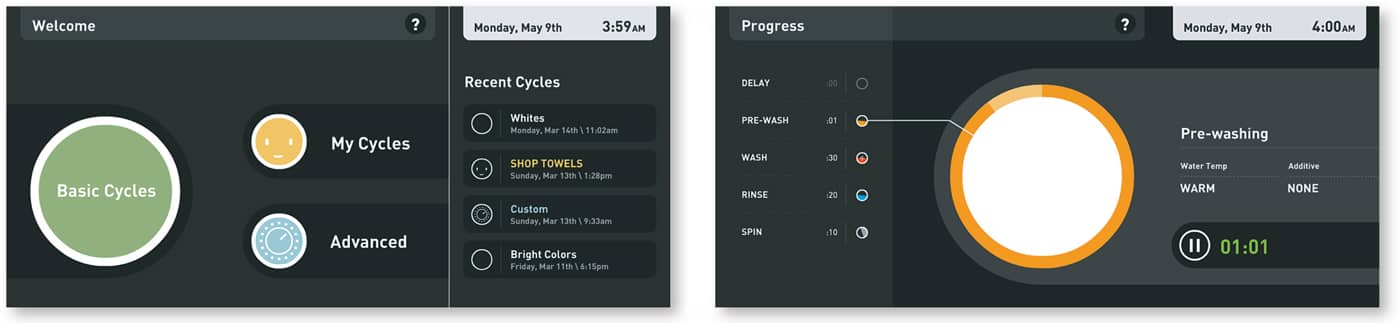
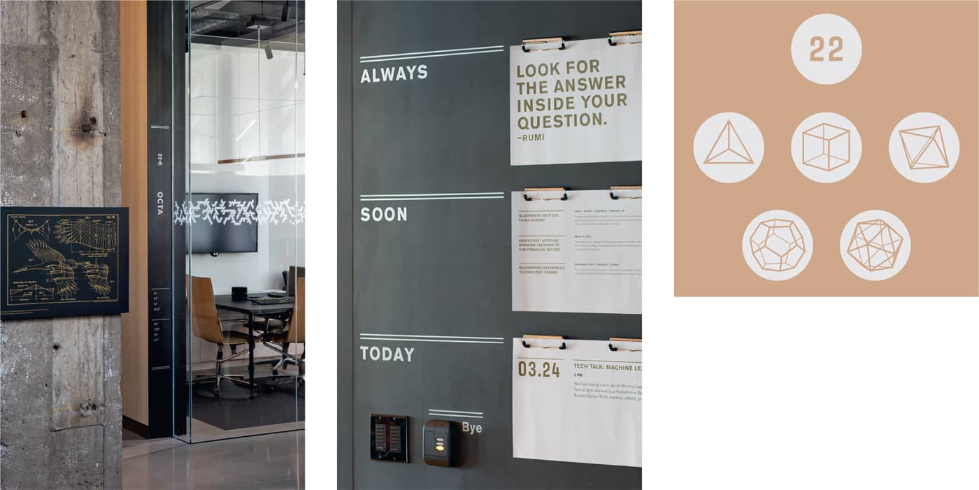
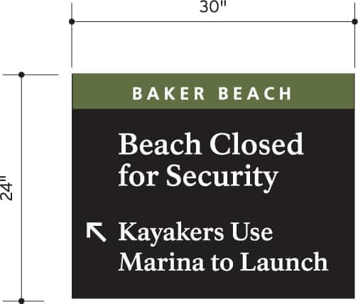
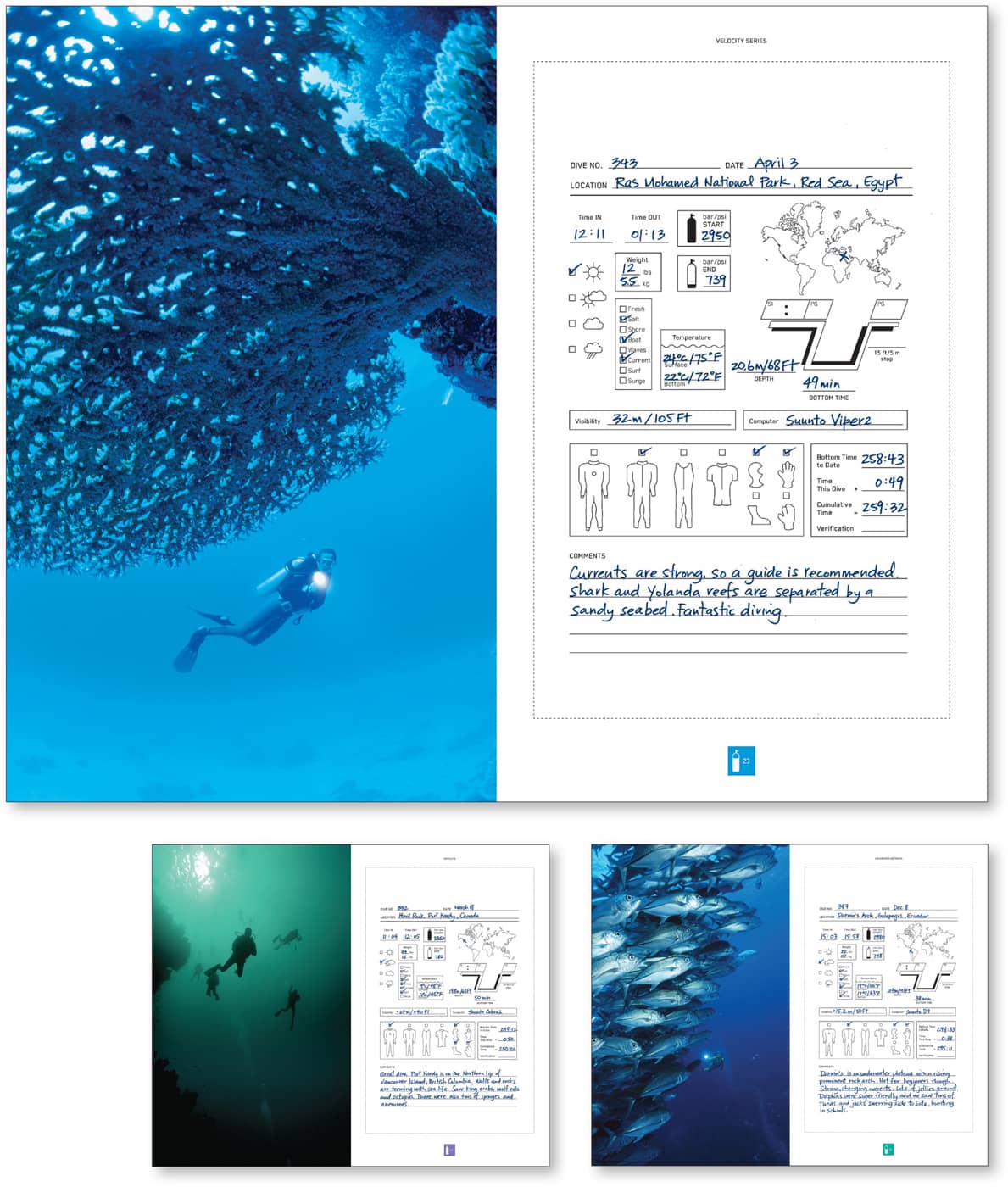
The intricately adorned initial caps found in medieval manuscripts are early examples of the ways graphic artists have always employed graphic elements to help readers navigate through content. Lines, rules, bullets, and other devices are tools designers still use to purposefully attract the eye. These devices can also provide direction and punctuation. The annual report for Genome Canada uses graphic illustrations to help clarify otherwise arcane information for its readers. Kolegram/Iridium This prototype for a washer/dryer interface employs simple icons and graphics to make the interface easy to understand. K. J. Chun “The ability to find something goes hand-in-hand with how well it’s organized.” —Richard Saul Wurman Despite the complexity, an elegant sense of balance and careful attention to detail create visual interest and coherence in this two-page ad. 50,000feet/CSA Graphic shapes draw attention to messages on this website for Strathmore Papers. VSA Partners The wayfinding system at Bloomberg’s tech hub is based on symbols from ancient Greek times. Meeting room names are derived from this system and visually play out in vinyl graphic banding applied to each space. A system of templates allows for daily schedule updates. Volume Inc. Keyline boxes sort complex technical information in this BARE catalog of diving products. Rethink Graphic elements such as rules and scale drawings help to organize detailed instructions for signage in Golden Gate Park. Hunt DesignGraphic Elements


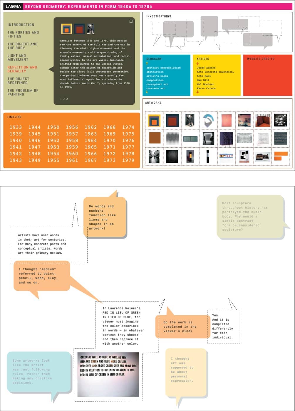
Reader studies show that the marriage of text and image is one of the most powerful ways to help a reader retain information. Publications know a “flip through” reader may not read paragraphs of text, but will very likely read a caption for an intriguing image. Designers can also help distill information by creating effective graphics. Playful illustrations, diagrams, and icons give dog lovers access to information in this humorous adaptation of the familiar owner’s manual. Headcase Design Key messages are seamlessly integrated into the photographic background, as well as splattered in the foreground of this poster. Harmen Liemburg Deep-sea photographs provide an evocative counterpart to the technical information arrayed on the right side of these catalog spreads for BARE wetsuits. Rethink “Information design is clear thinking made visible.” —William Lutz Annotated illustrations by Wendy MacNaughton, inspired by graphic novels, are paired with photos with quick bites of information to invite visitors to approach and engage with exhibit components throughout the Nature Lab at the Natural History Museum of Los Angeles County. (See case study on this page on Wendy MacNaughton.) KBDA Martin Lipman’s quirky photography of folded paper illustrates the key themes of this annual report for the Forest Products Association of Canada. McMillanImagery


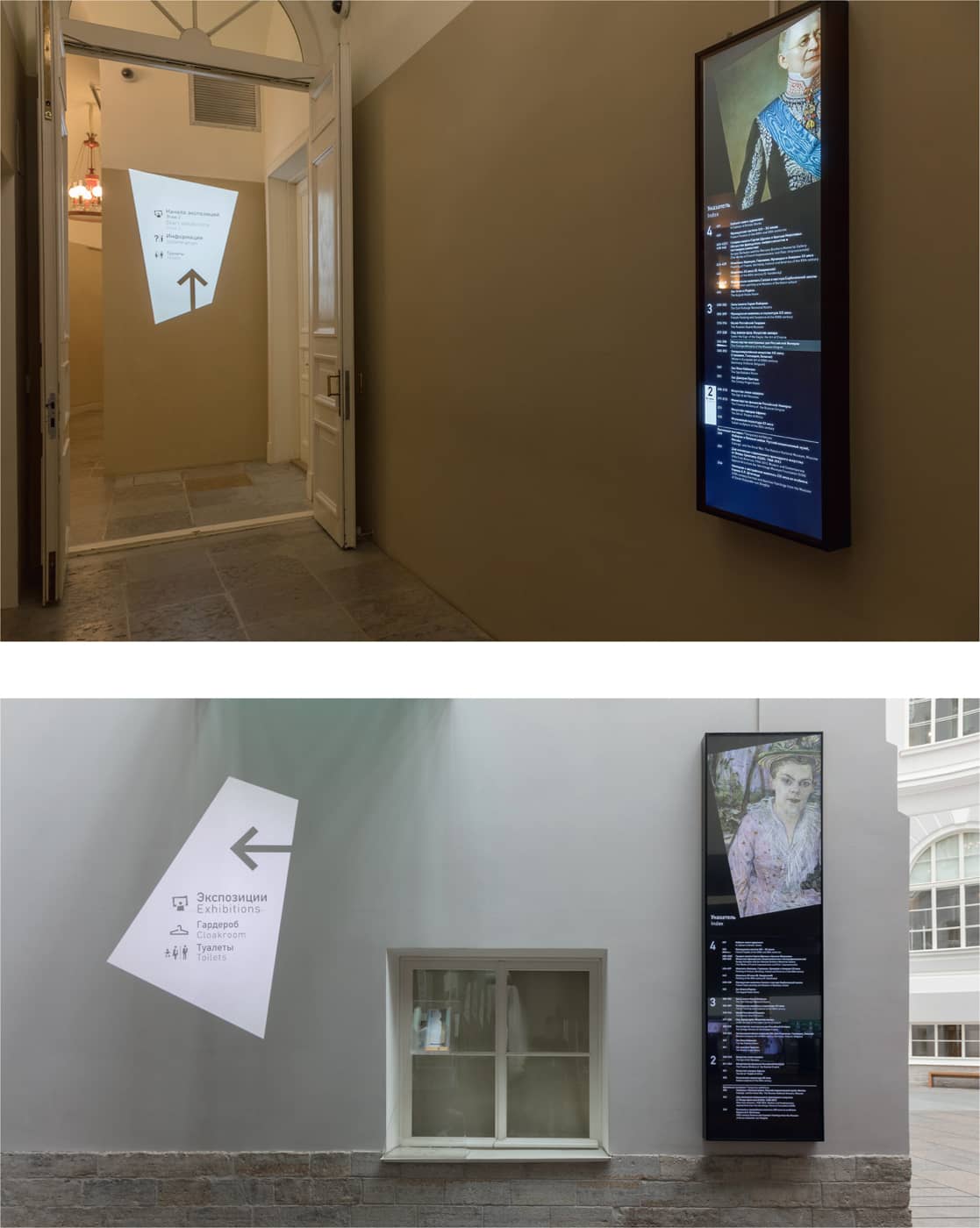
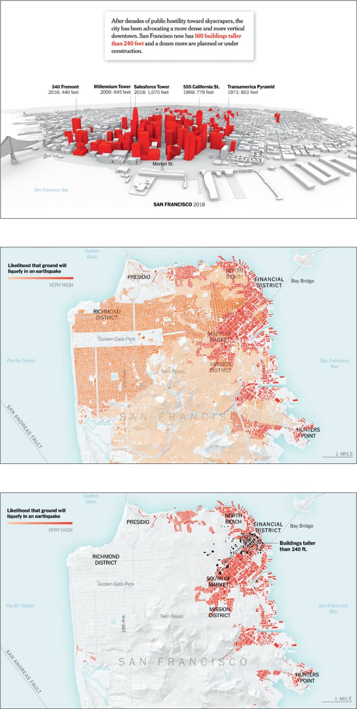
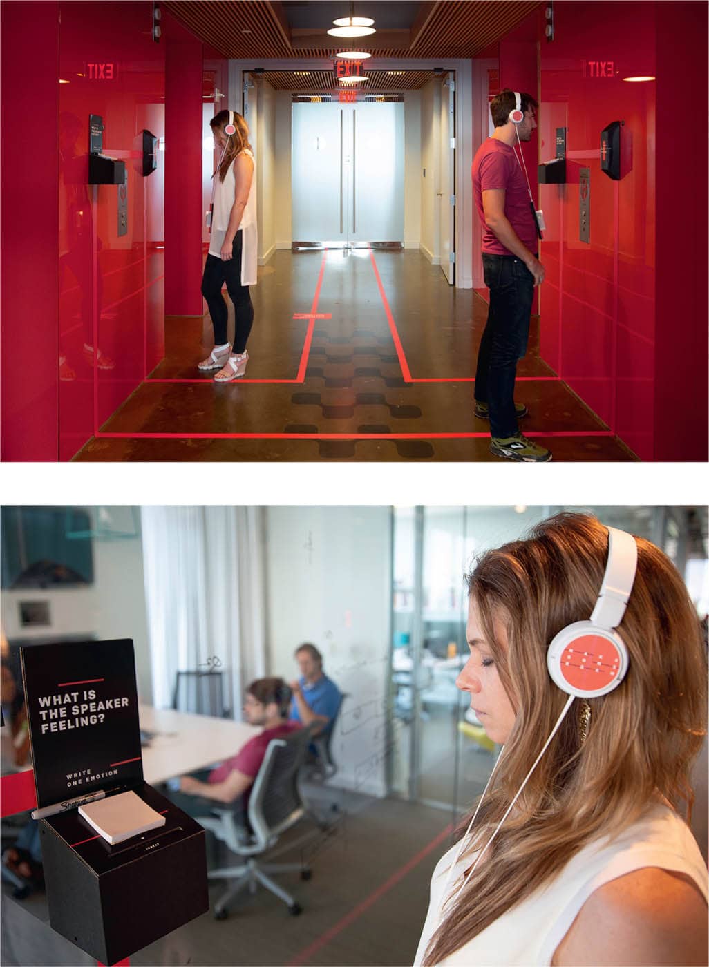
Interactive media provides two additional tools—sound and motion. Research has consistently shown that many people absorb information more aurally, while others rely more on visual cues. Combining sound with graphic devices can have a powerful effect. Motion draws an audience’s attention and creates a sense of narrative that leaves a memorable impression. This online interactive feature about whether San Francisco’s building codes are stringent enough to withstand predicted seismic activity uses dynamic map graphics based on data from the City and County of San Francisco, the California Geological Survey, and the United States Geological Survey to demonstrate levels of liquefaction risk in different parts of the city. (See case study on this page.) The New York Times While evidence of workforce discrimination is statistically obvious, the daily experience of exclusion can be difficult to see. Traditional diversity training programs haven’t moved the needle. In an immersive company-wide intervention called “Make Some Room,” audio stories from actual employees, and a beacon-triggered mobile app, turned the offices of a global company into interactive storyscapes. Participants encountered candid, firsthand accounts of bias experienced by their peers. Subsequent facilitated group discussions helped participants consider ways to move from empathy to tangible action. The program was designed to scale, with the goal of reaching 16,000 employees worldwide. The Knoll Archive documents Knoll’s heritage and contributions to the design field in an interactive digital experience. The site lets users access material through three different interfaces: a timeline, a web of connections, and a grid. As the user shifts between views to look at sketches, images of products and interiors, as well as designer portraits, the sense of motion on screen suggests the experience of sifting through archival materials to discover new insights. As part of the digital strategy for the General Staff Building in Saint Petersburg, Russia, digital index screens display famous works of art, which are animated in conjunction with wayfinding indicators to help show what’s on view in different parts of the building. Animated projections also lead visitors towards the museum galleries and temporary exhibitions. (See case study on this page.) MijksenaarSound and Motion

Second Story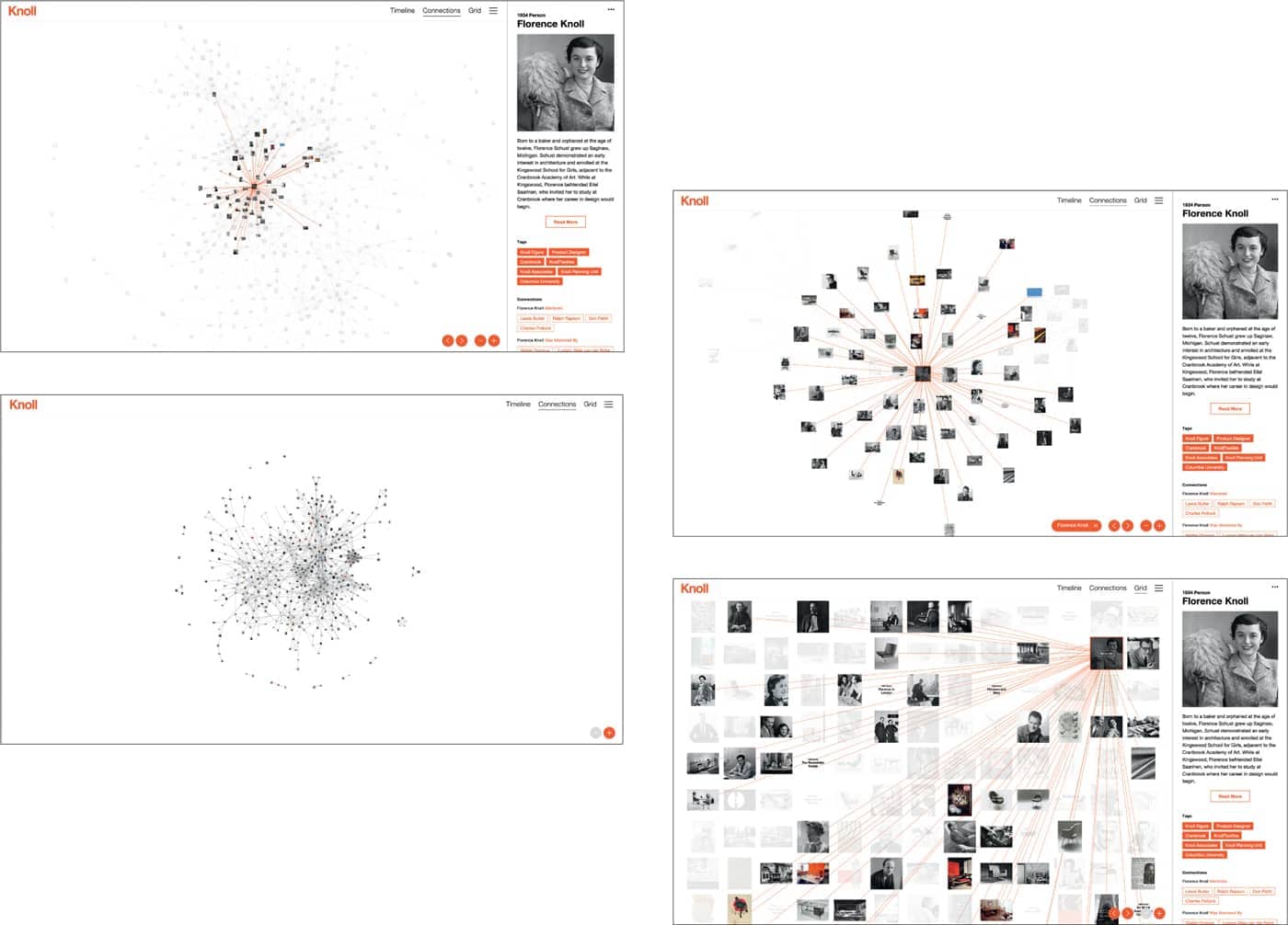
Schema