6 INFORMATION GRAPHICS CASE STUDIES
Humans show a remarkable need to visualize, understand, and catalog the world around them. We have been mapping geographic landscapes for centuries. We create charts and diagrams to analyze data and draw conclusions from it. Well-executed information graphics create a sense of context and reveal relationships between sets of information, allowing for new and more nuanced conclusions.
Handling Data. Michele Mauri, Scientific Director of DensityDesign Lab, serves on the faculty at the design school while spear-heading the lab’s ongoing research efforts led by PhD students and postdoctoral researchers. He notes, “The early days of the lab were defined by the fact that the world was suddenly awash in data, so there was a huge need to create tools that would let people start to ‘handle’ that data. Although producing, collecting, and sharing information has certainly become much easier, robust methods and effective visual tools are still needed to observe and explore the nature of complex issues worldwide.”
Unveiling Hidden Connections. The lab’s work focuses on the visual representation of complex social, organizational, and urban phenomena to provide tools for researchers and scholars in adjacent fields. The tools help those researchers visualize numeric data, interpret qualitative information, create maps, and build visual taxonomies. The goal is be able to generate diagrammatic visualizations that can describe and unveil the hidden connections among complex systems. Mauri says, “We want to provide data visualization tools that will help people see things in new ways that might not otherwise be apparent.”
“We want to provide data visualization tools that will help people see things in new ways that might not otherwise be apparent.”
—Michele Mauri

Stream graphs are ideal for displaying high-volume data sets to discover trends and patterns over time across a wide range of categories. They are particularly good for studying the relative proportions of a whole. This graph, developed within the EU-funded EMAPS project, shows the absolute and relative visibility of countries that were part of the the United Nations Framework Convention on Climate Change, 1995–2013. (Partial view here.)
“Creating a data visualization is not a mechanical operation but rather a series of design choices. This means designers have a kind of ‘authorship,’ which brings up serious questions about ethics and ethical consequences.” —Michele Mauri
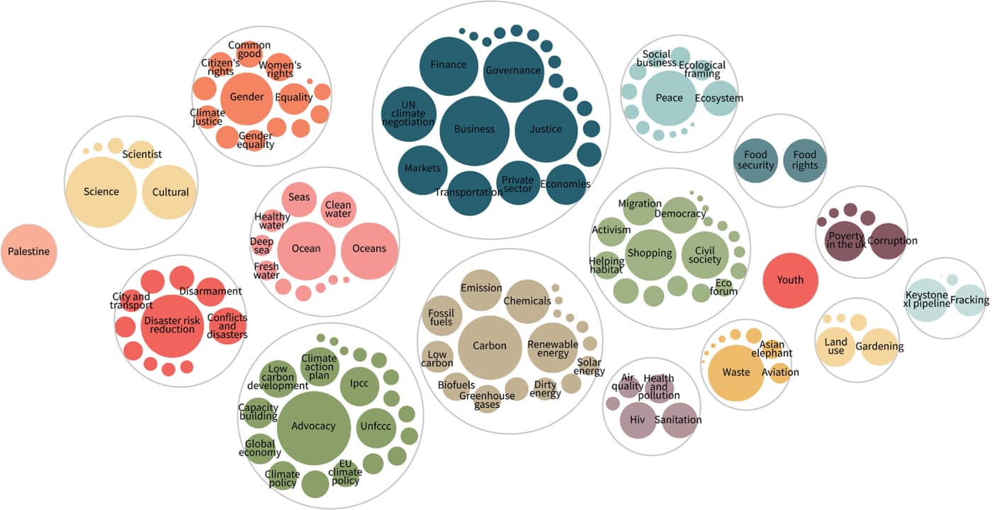
In a three-year, EU-funded project called “EMAPS,” teams of researchers from six different European countries explored the potential and the risks of using the web and social media as sources of information for communication between scientists and the public. DensityDesign Lab’s role in the project was the design of the interfaces and the data visualizations. This visualization depicts the ways international NGOs categorize climate change both as an environmental and a humanitarian issue.
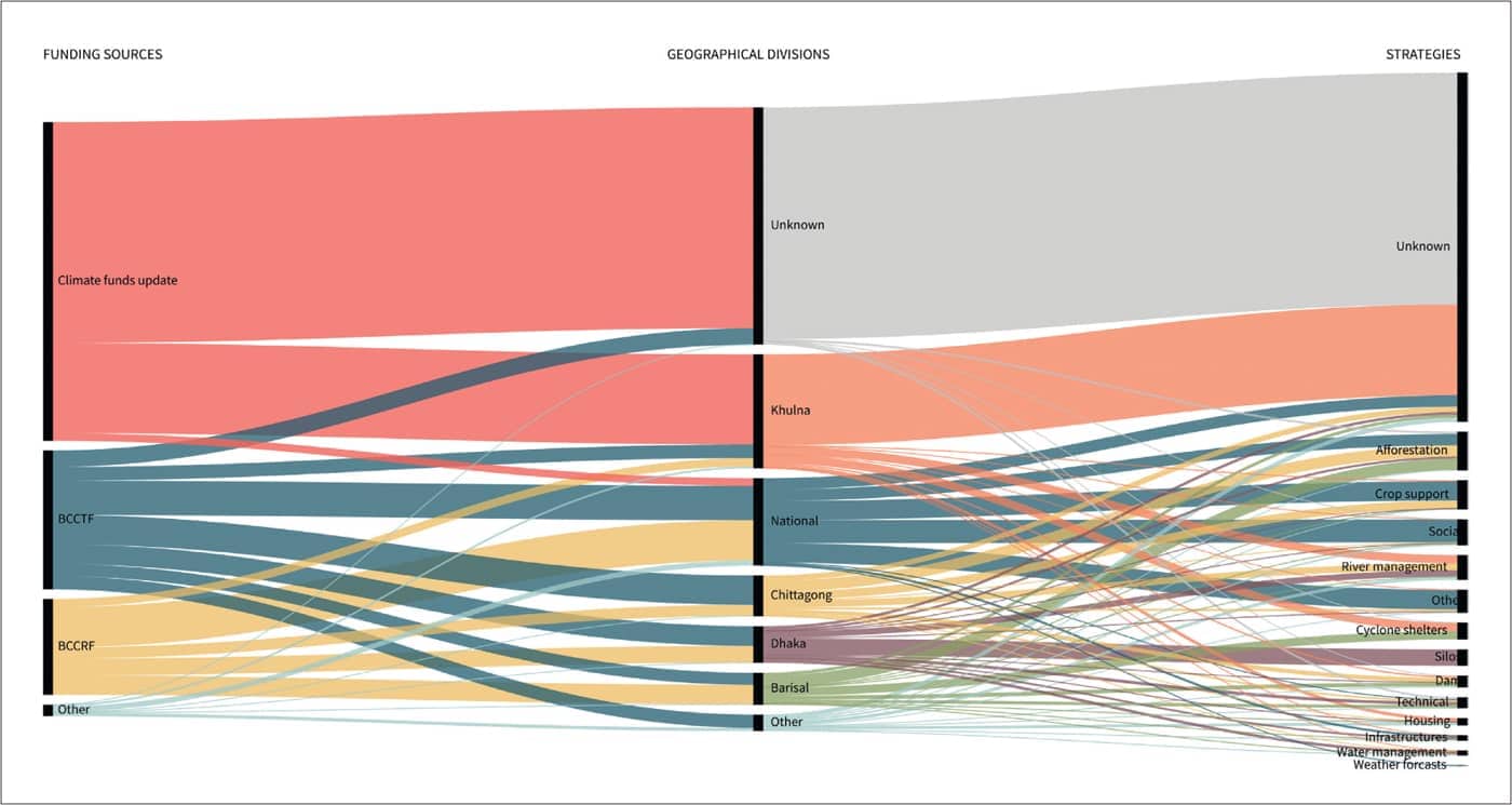
Alluvial diagrams are a type of flow diagram developed to represent changes in network structures over time. Alluding to the visual appearance and their emphasis on flow, alluvial diagrams are named after alluvial fans naturally formed by the soil deposited from streaming water. This alluvial diagram tracks the funding flow from three major European funders for different strategies to mitigate climate risk in different regions of Bangladesh.
Designers and Translators. In addition to forging new methodologies and tools, the team believes it’s also critical to raise questions about the future of the field. Mauri notes, “Information designers act as translators. Creating a data visualization is not a mechanical operation but rather a series of design choices. This means designers have a kind of ‘authorship,’ which brings up serious questions about ethics and ethical consequences. For instance, do we present information clearly? Do the choices we made about what we did or didn’t include reflect a kind of bias? Are we helping to make things visible that, in fact, shouldn’t be made more visible?”

The Public Data Lab, an international group of researchers (social scientists, media scholars, journalists, and statisticians) initiated a project to explore the ways fake news originates and circulates, to better understand the phenomenon. DensityDesign Lab helped coordinate the production of final artifacts to communicate the most relevant results in a published study called A Field Guide to Fake News. This network diagram documents the Facebook pages researchers found to be the most prone to publishing fake news, and further clarifies which ones are the most shared.
He goes on to ask, “And as more and more data is automatically collected on social media sites such as Twitter or Facebook, who is using that data, and for what ends, especially given that much of this information is being processed by algorithms?”
Problem Solving. DensityDesign Lab continues to collaborate with researchers and organizations around the world. The team is committed to creating open-source tools, and they look for methodologies that preserve multiple interpretations of complex phenomena.
Mauri says the projects that are the most compelling are the ones where information visualization can enable the larger public to take action on important topics such as urban planning and global sustainability.
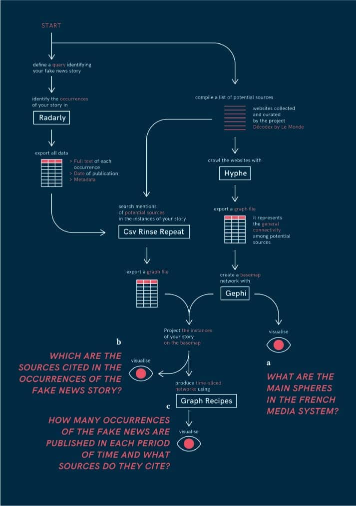
In a book entitled, A Field Guide to Fake News the international research team documented the methods used to collect and analyze the relevant data for the study. Each aspect of the analysis is diagrammed to map the tools and actions that were used to build each of the visualizations.
Searching for the Aha Moment. After all the collecting, Gormley says the hardest task is “peeling away the density of data.” As he works, he writes the words “What is the story?” in large letters at the top of his worksheets as a constant reminder to find the very essence of the narrative. “We feel there’s always an ‘aha moment’ as we sift through the data, where we find the story to be told,” says Gormley. After all the winnowing, it’s likely that only 25 percent of the total data will be used for any given subject. HistoryShots uses its website as a way to add value, publishing a lot of the information that would have been too overwhelming to incorporate into any one print.
“We feel there’s always an ‘aha moment’ as we sift through the data, where we find the story to be told.” —Larry Gormley
An Iterative Process. Since the first print in 2004, HistoryShots has been collaborating with the graphic design firm White Rhino. The team has worked together long enough that roles are not hard and fast. Gormley brings drafts and sketches. He relies on White Rhino to help “kick the tires” and make suggestions for the best ways to depict and organize various aspects of the data/storytelling. As a team, they will often go through a dozen graphic scenarios before they feel they’ve found the right way to organize the data. It’s often the relationship between disparate types of data that creates the biggest revelations.


This poster maps the history of the Union Army during the American Civil War. Divided vertically by date, and horizontally by the three major theaters of the war, many variables are charted, including the size, history, and commanding generals of the thirty-one Union armies. In addition, the name, location, date, and casualty figures are provided for the ninety-five most important battles.

This detail from the map above shows the level of typographic complexity included in each of the posters.
The goal is to tell the story with an economy of means, and with as little text as possible. “We try to get it to a place where there’s no need for explanation,” says Kimberly Cloutier, one of the designers at White Rhino. They informally test the graphics to make sure they “read.”
The Devil’s in the Details. White Rhino believes that using a more subdued color palette can sometimes make the information easier to absorb. They’ve found that too much color can be distracting with such density. Without relying on bright colors for information hierarchy at such a small scale, the attention to typography becomes even more critical. And the team is very diligent about specifying inks, papers, and even the kind of press that must be used because reproducing the fine detail is so critical.
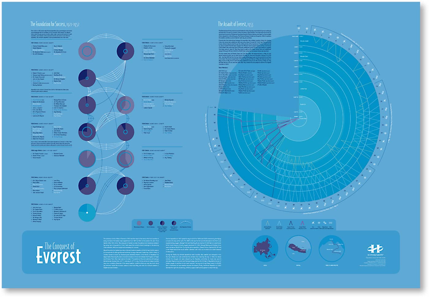
This print maps the conquest of Mount Everest from 1921 to 1953. The information on the left shows the year, sponsor, duration, dates, height reached, and members of each of the major expeditions. The graphic also tracks the history of climbers who went on more than one expedition. On the right is a detailed graph of the numerous ascents and descents of the 1953 team as they blazed trails and ferried supplies up the mountain. Weather conditions for each day are also provided.
Each of the prints is targeted to a specific audience. For instance, it might be a person deeply interested in the Civil War, or someone fascinated by the many attempts made to scale the top of Everest. On the other hand, the team has also found there are many types of people attracted to the work. “There are so many people fascinated by mapping,” says Gormley.
The team says the collaboration between White Rhino and HistoryShots has been successful because it is based on a mutual obsession with the projects. They add, “We just never run out of steam.”
Finding Her Native Tongue. MacNaughton ultimately left advertising. She went far afield to attend graduate school in social work. She notes, “Social work is a field with a very carefully defined code of ethics. I was so hungry for that.”
Post-grad school, MacNaughton worked for several nonprofit organizations. She ended up as director of strategy for a small ad agency working with nonprofit social service clients, in a role that actually drew on all her training.
By that point, it had been ten years since she’d done any drawing or painting. But after six months of communing twenty minutes, twice a day, she says, “I looked around the subway car one day and thought, These people look exactly like figure drawing models.” So with a cheap black pen and the notebook she used for work, she started making quick sketches of her fellow riders. Pretty quickly, the writer in her started adding notations.
“I wouldn’t know where else to go besides telling stories. But quite honestly, I don’t know what isn’t storytelling.”
—Wendy MacNaughton
She’d add water color details at night. Because water color dries quickly, she was forced to circumvent her usual perfectionism and keep the drawings loose. By drawing so quickly every day, she was teaching herself a new skill. She remembers thinking one day, “Wow. This finally feels like my native tongue.”

A recurring motif, which MacNaughton calls “diagrams, charts, and other attempts to make sense of the world,” were often included in her regular full-page feature for California Sunday Magazine titled “Meanwhile.”
“I’ve learned you need to spend quality time with people to make it real. I want to make sure the subjects have agency in how their stories are told. It’s critical for me to feel the pieces are true collaborations.” —Wendy MacNaughton

MacNaughton spent a month drawing at a public library, talking to “patrons, guards, workers, custodians—you name it.” The resulting documentary is told exclusively through drawings and the subjects’ own words.

She also told the story of a math teacher who traveled to the Central Idaho Dark Sky Reserve and, in his own words, thinks about how his Washington D.C.–based students may never get the chance to see stars in their natural state.

MacNaughton did a fourteen-installment column for the New York Times Sunday Business Section. Her editor described it as exploring the “people, places and things we usually overlook.” One of those people was Don Walker, a bootmaker MacNaughton happened to meet in Spring City, Utah.

MacNaughton did in-depth graphic reporting about eight San Quentin inmates serving life sentences. Her reporting captured what happened when they completed an eight-month volunteer program to support fellow inmates with end-of-life hospice care.
“From the beginning,” she says, “I found myself focusing on the people, objects, and places that are often so invisible in our culture. I’m ultimately wired to tell stories. But I’ve learned to slow way down. I’ve learned you need to spend quality time with people to make it real. And with social work’s code always ringing in the back of my mind, I want to make sure the subjects have agency in how their stories are told. It’s critical for me to feel the pieces are true collaborations.”
She continues, “While I love publishing in magazines and newspapers, I’d love to explore sharing the work on billboards and bus shelters—or maybe even film. Whatever best serves the subject and the story.”
A Simple Hello. MacNaughton is often asked to teach workshops on graphic journalism. She says, “Most people are afraid to draw, and a lot of people are afraid to write. On top of that, many people are afraid to talk to strangers. But drawing lets people see what they normally might not, and in fact, lets them observe their own cognitive bias. The very act of storytelling allows people to have conversations they might otherwise have been afraid to have.
While MacNaughton is often focused intently on individual stories, she’s also trying to help people connect to the larger issues and statistics behind the stories. I believe that if we can learn to see more, and to listen more closely, real change is possible,” she says.
A Constantly Curious Mind. Over the last twenty years MacNaughton has helped to define the field of graphic journalism. She’s published eleven books to date, three of which have been on the New York Times bestseller list. In addition to graphic journalism commissions, her curious mind makes her a sought-after collaborator for information-rich, award-winning projects ranging from cookbooks to science exhibits.

Lenny was one of the eight San Quentin inmates MacNaughton got to know while doing “Meanwhile in San Quentin.”

On one of her most demanding assignments, the New York Times asked MacNaughton to spend a week at Guantánamo Bay War Court, drawing the people involved in the September 11 trial. She says, “It was a challenge in every way imaginable.”
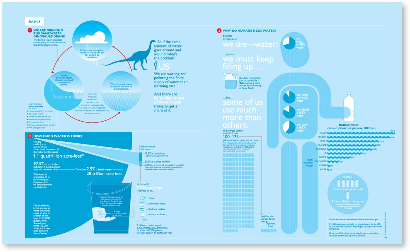
The Human Face. Photographer Rick Smolan has a history of creating global photography projects that put a human face on geopolitical issues. These projects have collectively generated billions of media impressions worldwide, and four of his books have been New York Times bestsellers.
In planning the Blue Planet Run book, Smolan knew information graphics could help explain the complex issues in a way that readers would absorb. Smolan approached Nigel Holmes to create graphic spreads to introduce each of the book’s eight chapters. In a sense, these spreads served as visual summaries.
Explanation Graphics. As a young illustration intern at the London Sunday Times, Holmes was famously told by one of his bosses that he had a “knack for explaining things to people.” And, in fact, he has had a long history of explaining things. After a very long stint as the graphics director at Time magazine, he created his own firm, Explanation Graphics, and the name tidily states exactly what he’s done for just about every major news publication in the world. Many of his peers credit him with transforming the way publications and corporations have come to use graphics to convey important information.
“I always have to figure out which bits are better said in pictures and which are better said in words. And then I have to think about how to do both concisely.”
—Nigel Holmes
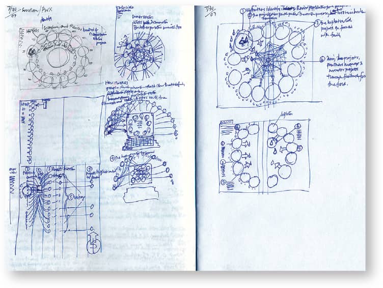
Holmes was drawn to working on the Blue Planet Run project. He threw himself into research, reading everything he could about the issue. He says that in order to create a good piece of work he will often start with four times more information than he’ll ultimately use. The editing is critical.

“The designer, Michael Rylander, and I decided very early in the process that a fairly minimal and monochromatic approach to the illustrations would work best in a richly photographic book. Blue was the obvious choice.” —Nigel Holmes
Holmes says, “I like the physical act of drawing and I always come back to it.”

Holmes created a framing device to give the spreads a graphic consistency as they were scattered throughout the large-format book.
The Power of the Pictorial. Once Holmes was immersed in the data, he began to sketch. “I’m interested in pictures of information. You’ve got to get people interested, and people are intrigued by pictures,” he says. But writing has also become more and more important in his work. He says, “I’ve been making my work a lot simpler lately. It allows me to spend more time thinking and less time drawing. I’m trying to get better at integrating the words so you have to read both things. I always have to figure out which bits are better said in pictures and which are better said in words. And then I have to think about how to do both concisely.”
“In a way, my drawings are becoming like pieces of type. Some are drawn for particular assignments. Some are taken from my files. I’ve been building a vocabulary I can use. They’re a shorthand I can use to replace words.” says Holmes.
Graphic Narratives. Holmes talks about the passion he had for comics as a kid. His approach to the Blue Planet Run project clearly draws on that love for graphic narrative, as well as all the expertise Holmes has gained from years of wrestling with complex content. It’s all been in the service of getting something concise but fantastically informative.
He explains, “I’ve gotten to the stage now where I don’t want to waste time. I want to make everything count. I want to do projects that can make a difference.”
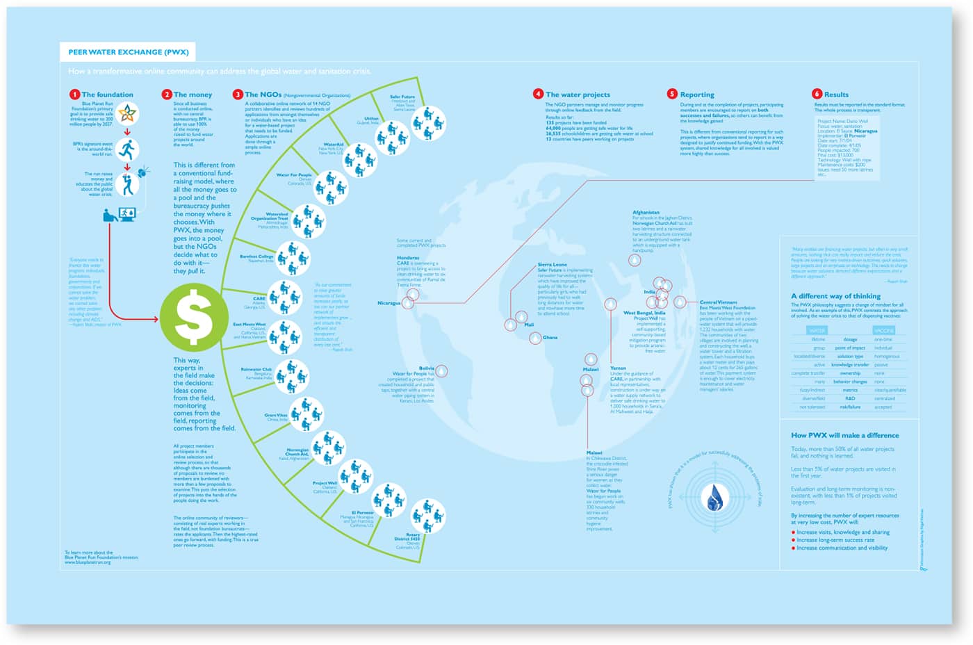
Holmes knew the layout of each spread would need to be unique as he grouped the relevant pieces of information.
Part of a Polymathic Team. When asked if her background makes her an outlier at the Times, she notes that very few people come to the team with traditional journalism degrees. “People have practiced as web developers and cartographers,” she says. “They have degrees in math, physics, and statistics. Almost all our projects are collaborative by design, and we succeed because of the diverse skill sets we bring to the problem.”
She adds that every project begins with careful reporting. “We’re part of the Times’s newsroom, so we’re covering the news—whether it’s related to foreign policy, elections, or health care issues—we cover it all. We conduct interviews and collect visual clues. Once the information has been gathered, we work together to determine how to best present the evidence.”
“Readers want to quickly understand the story and discern the most important takeaways, so careful editing is a huge part of our process. If something is technically cool, but isn’t clear, it’s a failure.” —Anjali Singhvi
Singhvi says she almost always starts projects with pen and paper. She says, “In the early days I would get stuck due to the complexity of the data. Sketching helps me identify the most critical information to convey. I can then explore the best way to sequence things, and whether it is or isn’t important to add layers.”
Clarity Is the Holy Grail. Singhvi further explains that the team uses software to explore how modeling and multimedia can help tell the story in immersive ways. “We’re constantly iterating and experimenting, but at the same time, we want to make sure the focus is the content,” she says.
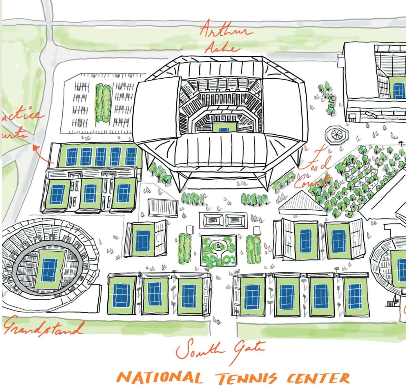
An evocative sketch sets the stage for an architectural review of a newly opened U.S. Tennis Center in New York. (See next pages to see how motion graphics were used to animate the story.)
“To really understand a data set, you need to process it yourself. Seventy-five percent of our time is spent reporting, gathering, and distilling information.” —Archie Tse, Graphics Director, the New York Times

As readers scroll down the page of the online story about the newly opened U.S. Tennis Center in New York, a series of loose sketches appear to animate at various scales to viscerally evoke a spectator’s point of view.

For an in-depth look at the health implications of air pollution around the world, the graphics team created animated graphs, maps, and interactive prompts to help the story come to life. These techniques are designed to promote both clarity and engagement.
Technical Concepts for General Audiences. “The challenge in creating the blast furnace infographic,” explains Tumas, “was to turn something extremely complex into an understandable, attractive informative graphic, and to give a less sophisticated audience a better understanding of the technological innovations taking place within the company.”
Another challenge in the project was working with the engineers. “It was clear that the engineers were the ones with the knowledge. We were just there to communicate it in a more appropriate manner. Specialists, whether they’re doctors, physicians, or engineers, can be the most difficult clients. It is hard to make them understand that it is often necessary to omit many technical details. We weren’t creating a thesis, but a graphic for everyday people.”
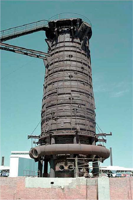
The project began with gathering reference materials showing aspects of the furnace.
The Road to Infographics. Tumas got his start working at Grupo Multimedios America in the design department on their newspaper, El Cronista. “The newspaper was my first encounter with the emerging discipline of infographics,” says Tumas. “These types of graphics—very primitive, but with great impact—fascinated me.”
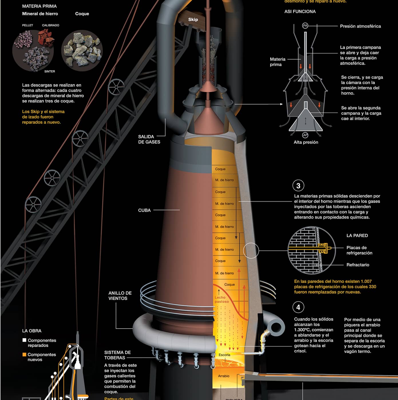
Tumas’s final infographic illustrates how the furnace works and highlights new or modified furnace parts. Yellow highlighting and text on the graphic describe what was done to put the furnace back in operation, while white text and graphic elements explain how the furnace works.
He then became an infographic designer at the newspaper Clarin, and later became department chief. “I created my first info-graphics prototypes at El Cronista, but it was at Clarin that I was able to develop this discipline.” Tumas eventually went on to work at National Geographic magazine.
Tips from the Infographic Design Trenches. Tumas has learned a few things since he started doing infographics in the early ’90s and has a few tips to share.
Learn Business Hierarchies. With complex projects, a designer often has more than one client contributing ideas. “With the blast furnace project there was a parade of engineers, each with their own agenda. It was hard to please all of them,” Tumas explains. “However, once we learned their hierarchies, it helped. If Juan was higher in the food chain, we would often defer to him in the process.”
Keep the Client Close. “Interact as much as you can with your client,” Tumas says. “Create the feeling of ownership in the client and make sure they stay as excited as you are during the process. The worst thing that can happen is a client becoming distanced from the project.”
Negotiate Text Length. What do you do when a client delivers too much text to fit the graphic? Tumas has a negotiation process he sometimes uses. “We would plan for five lines of text and then give them a mock-up with only three lines. ‘That’s too short!’ they would say and give us ten lines of text. We would show a final version with five lines of text and make the client believe we had compromised two more lines, even though we had planned five lines from the beginning,” Tumas says.

This diagram of the production process was created as part of the research.
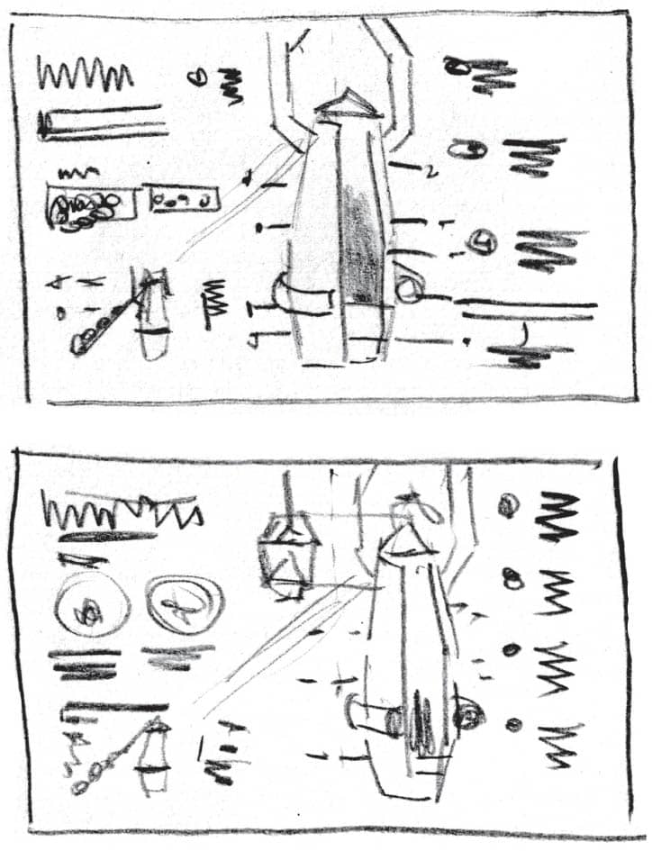
The first sketch (top) was based on a two-page symmetrical layout and required printing over the centerfold. The second sketch (bottom), which was less successful, had the furnace located to the side to avoid the centerfold. Finally a sketch was done of the double page in a portrait format (above right). While the magazine hadn’t used this format before, it agreed that this was the best way to present the information.

A 3-D rendering (shown at left) was created using modeling software before the full-color illustration, above, was finalized.