8 ENVIRONMENTAL CASE STUDIES
Where do you need to go, how do you find it, what do you do when you get there? Signage and wayfinding ensure that people aren’t in a perpetual state of disorientation in the world at large. With exhibit design, information becomes theater. Successful environmental design takes substantial amounts of information, shapes a story, and determines the best ways to engage with audiences as they move through a space.
Going Home. Going Big. Matthews returned to Seattle to teach and start another firm. In the decade since then, her studio has created comprehensive branding and communications campaigns, but as time has passed, the firm has also been asked to apply those skill sets to large-scale environmental projects.
Getting to “Geek Out.” Matthews points out that it’s not just a matter of scale that draws her to these kinds of projects. She says, “My favorite projects let us learn a lot about an entirely new subject. Working on exhibitions lets us ‘geek out.’ Our job is to help the team figure out how to make that content come to life in a space. Editing is one of the most important aspects of that job. How can we help the team best deliver on the storytelling and the most powerful messages?”
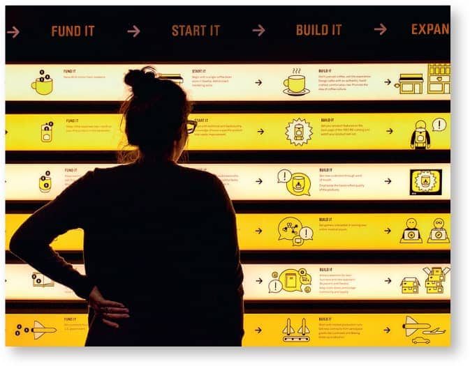
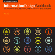
The Bezos Center for Innovation in Seattle highlights the most innovative companies and inventors in the region. Because there weren’t a lot of physical artifacts, the Studio Matthews team had to tell the story graphically.
Pulling the Visitor In. Matthews notes that one of the most important tasks her team has to address is the hierarchy of information in the space. She says, “It’s something we talk about constantly because there are many types of audiences to keep in mind. Some people are so knowledgeable about the subject of the exhibition, and they want to dive deep. But you’ll have other visitors who really want to skim the material. They just want a taste. We develop strategies so that if you can only glance at something, you’ll get important pieces of information. You have to think about what visitors will see at 100 feet away, at 10 feet away, and at a foot away. If we’ve intrigued you to want to explore more deeply, we’ve done our job.”

“It’s very important for designers to realize they have the power to reach a lot of people.”
—Kristine Matthews
The Importance of Collaboration. “So many of our favorite projects are in collaboration with really talented architects,” Matthews says. “Every exhibition space presents one-of-a-kind challenges. If everyone is open-minded about the possibilities, you can create truly unique solutions. Because I was never officially trained as an exhibition designer, I’m often inclined to ask, ‘Why couldn’t we do that?’ Collaborating with stellar colleagues means, often enough, some of the team’s most adventurous ideas prevail.”
Studio Matthews created a visual language of icons and illustrations for the Bezos Center for Innovation and collaborated with lead designers and architects Olson Kundig on 3-D strategies to encourage audience participation. Throughout, the exhibition invites visitors to contribute their own opinions, ideas, and personal stories.
Inspiring Next-Gen Exhibits. Matthews says, “When teaching exhibition design, I ask students to think about creating ‘You had to be there!’ moments. In other words, how can we give visitors the chance to experience things they can’t experience any other way—whether it’s a unique sense of place, a special kind of physical interaction, or a unique experience they can share with others.”
As the ultimate challenge, Matthews also asks her students to think about a major issue or problem in the world—to create designs that won’t just provide information but will actually prompt visitors to help fix the problem. She says, “It‘s very important for designers to realize they have the power to reach a lot of people. If we can create work that feels original and fresh, we can get people to look at things that they might otherwise ignore. We need to cultivate the tools we have in order to create impact.”

A 360-degree timeline and a 9-foot-tall graphic novel depict stories of Seattle’s global pioneers, including Starbucks, Boeing, and Amazon. A rotating What’s Next? exhibit reminds visitors that the best ideas are still to come.
Ask at the Information Booth. “When we start a new project, we always start by asking for the customer satisfaction surveys,” Mijksenaar says. “Larger organizations have this data because they continually survey. At the very least, we will talk to the customer service representatives or the folks who work at the information booth. We try to determine the ten questions visitors most often ask. This will indicate the main problems with the current system.”
The Big Picture. “As a designer, you have to think in time and see things in sequence. You have to see information as a narrative form. This is true whether you’re designing signage for an airport or a form to be used by the post office. But people need to have a sense of overview first; they want to get a feeling for what is going on, for what will happen at the end, before they drill down into the sequence. Good teachers have always known this,” Mijksenaar says.
“As a designer, you have to think in time and see things in sequence. You have to see information as a narrative form.”
—Paul Mijksenaar
In addition to a good sense of sequence, Mijksenaar believes effective information designers have to know how to build a bit of tension. He invokes the way Hitchcock directed his films. “You have to build up information to keep people’s interest so they stay attentive.”
Going Down the Wrong Path. Mijksenaar speaks passionately about some misconceptions people have about using pictograms in public spaces. He says designers expect them to be self-explanatory. Mijksenaar believes icons can be handy tools to reinforce concepts people already understand, but he points out if you don’t know what an ATM is, it won’t do you any good to see an icon for one. He says this is particularly important in environments such as hospitals, where people are often clueless about what they’re trying to locate.
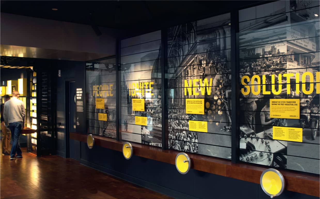
Signage in the terminals at the Amsterdam Airport Schiphol provides clear wayfinding information for travelers.
“We try to determine the ten questions most often asked by visitors. This will indicate the main problems with the current system.”
—Paul Mijksenaar
The Wild World of Color. Mijksenaar has recently been rethinking the role that color plays in his work. “Color is one of the most powerful design tools we have. It attracts the most attention. But it has limitations. People can’t recall more than seven colors at a time, so this can be a problem in assigning hierarchies and meaning,” he explains. “And the problem is that designers will often use color to simultaneously convey different things. Sometimes it’s about aesthetics or branding or to establish categories. Because people have experienced color in a confusing way, they will often ignore it. So my approach has been to only use color if there’s a need for it. We work from the bottom up when we map the information, and in the past, I would always recommend using scale to convey hierarchy.”

All maps at Amsterdam Airport Schiphol are oriented according to the viewer’s perspective. Destinations that appear on the left side of the map can be found to the viewer’s left, and destinations at the top of the map can be found straight ahead of the viewer. On the reverse side of this directory, the whole map is mirrored.
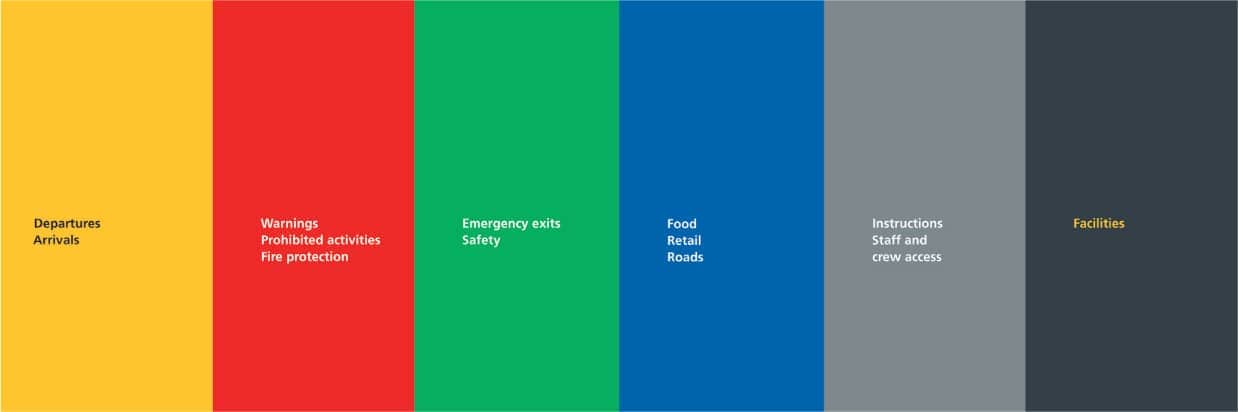
Mijksenaar has been responsible for all the signage at Amsterdam Airport Schiphol since 1990. Color coding indicates specific types of information. For example, yellow signs provide information on arrivals and departures while blue signs refer to shopping and restaurant/café facilities, and green notes emergency exit routes.
But Mijksenaar has softened his stand on color in the last couple of years. “I’ve come to realize that some of my hesitance to use color was actually a conflict in myself. I was trained as an information architect. Instead of thinking of how to make things attractive, I was trained to think only of hierarchies of information. I like gray. But after twenty-five years of doing this, I’ve realized that people love color, and that in addition to providing information, providing satisfaction is a function in itself.” He adds, “This work is rewarding because you actually get feedback from the users. People will tell us, ‘Now we can find our way!’”

The use of International Union of Railways (UIC) pictograms provides cues, especially for inexperienced travelers navigating the Dutch rail system.
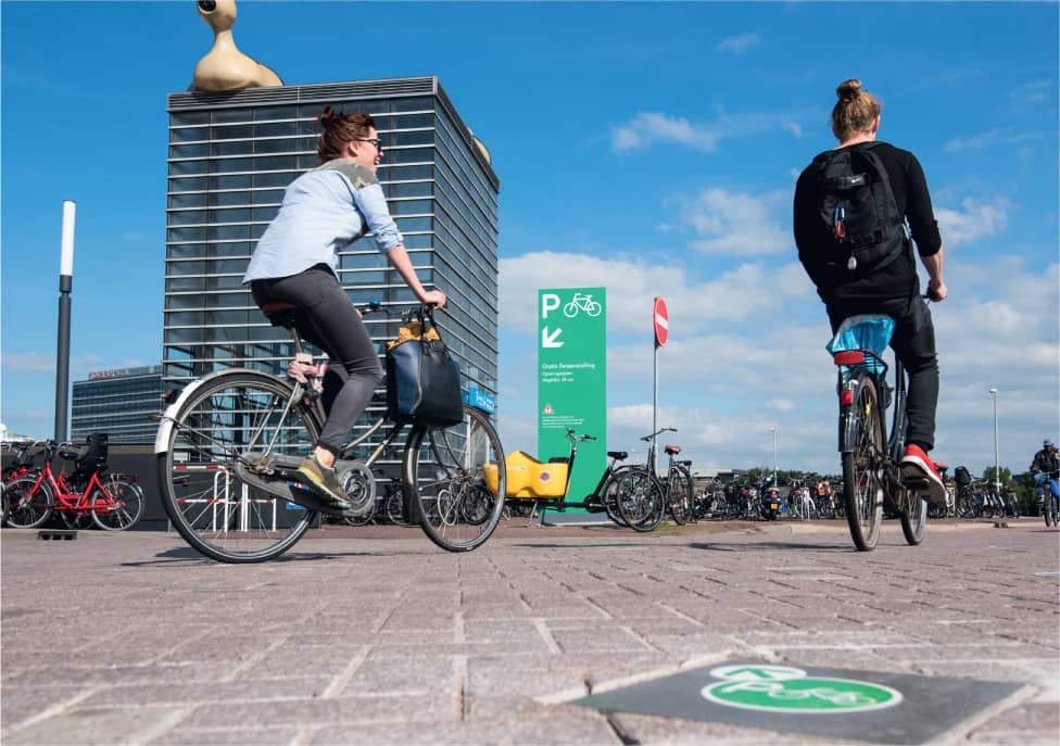
As more and more people in Amsterdam used bicycles as their preferred mode of transportation, it became a challenge to ensure sufficient bike parking. Mijksenaar worked with the city to help make bicycle parking spaces easier to find and the bicycle parking rules easier to understand. The project resulted in a 41 percent increase in citizen awareness.
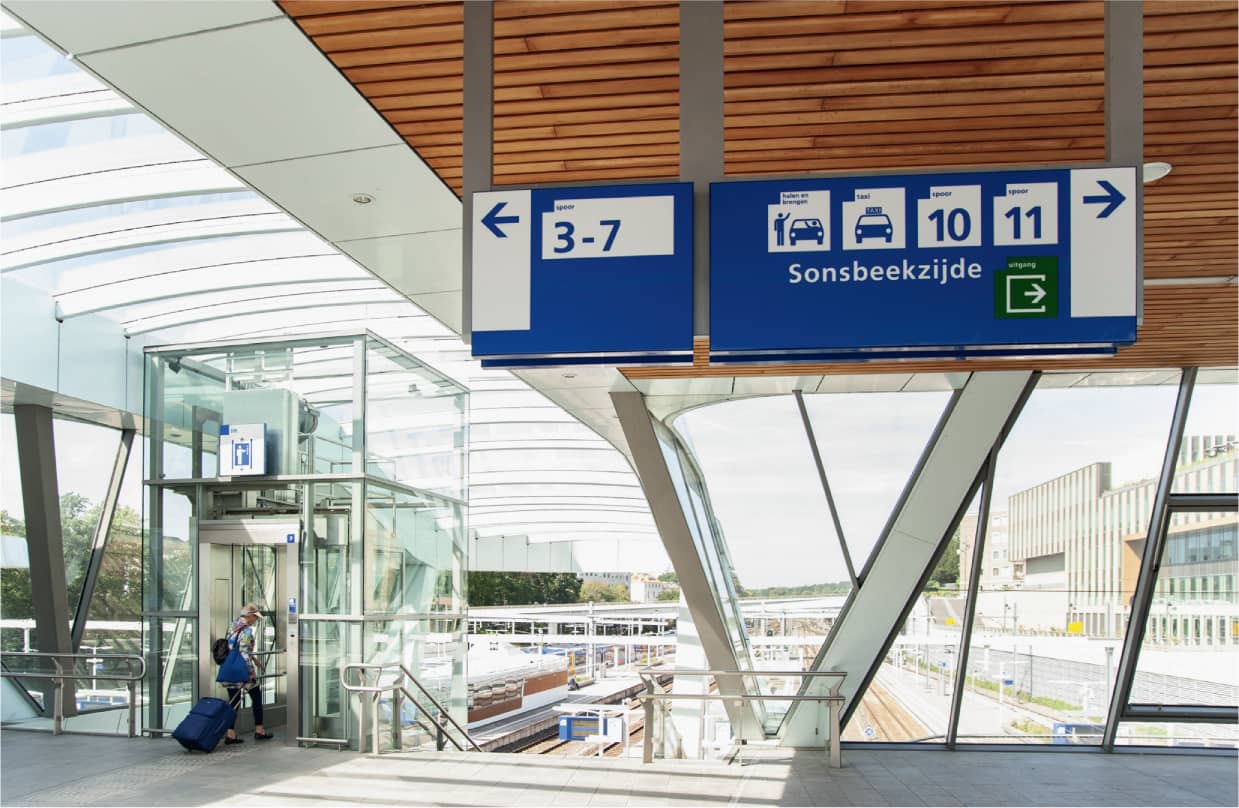
Mijksenaar has worked with Dutch Railways since 1998 on ways to update the wayfinding system for all its train stations. The new system accommodates all station types, from small regional train stops to larger city transportation hubs.
A Multidisciplinary Approach. Elers says, “All through school, we worked on branding, product, and interior design projects. Once we left school, it was only natural to create a firm that would tackle a wide range of assignments. Everyone on our team works across disciplines.”
Exhibit design is the ultimate multidisciplinary challenge, and designers employ a multitude of ways to communicate with visitors. “We employ graphics, sound, light, furnishings, objects, and multimedia—even virtual reality.” Elers says, adding, “I’m particularly comfortable working on exhibit design projects because there are so many possibilities.”
Dagnija Balode, the third partner and CEO for the firm, says that the success of each exhibit is predicated on content strategy. Balode says, “Building a house requires a solid foundation. It’s the same with planning an exhibition. You have to have a very clear understanding of which ideas are most critical to convey, but you need to be just as focused on the emotions you want to evoke.” The studio not only collaborates with outside experts such as writers and historians as it develops content plans, it has also partnered with psychologists to help the team plan for the visitors’ emotional experience.
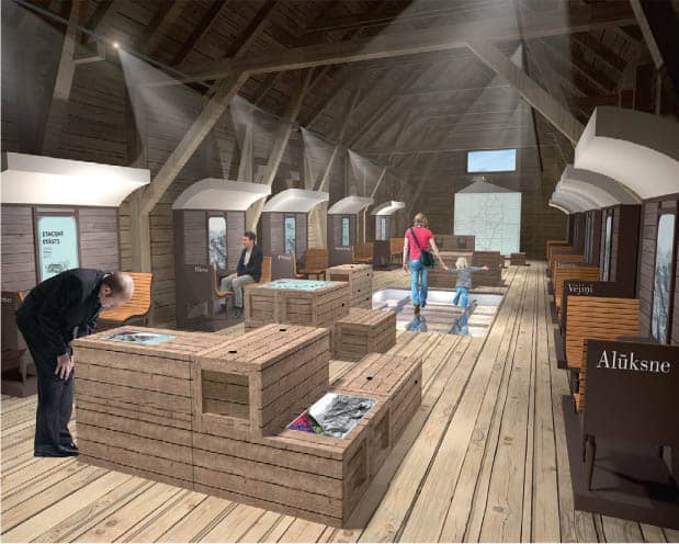
This site-specific, immersive exhibition was designed to celebrate a unique narrow-gauge railway line in Europe.
Creating Strategic Pathways. Mindful of the conceptual and emotional goals for each exhibit, the team considers the 3-D design process akin to “dramaturgy,” the theory and practice of dramatic composition. As they think about how to best help people move through the story, they think about creating pathways for visitors that begin before they even enter the building. They ask, “How can we best help potential visitors learn about the exhibit, whether it be through promotional graphics or social media? How can we best greet them upon arrival?”

Elers says, “I think of this as the ‘skip, skip, skip’ generation because people need to quickly determine whether something is interesting enough for them to explore further. The design team works hard to be able to deliver the most important messages in quick bites. Visitors need to be able to figure out in the first three seconds whether something is going to be interesting. If we catch their attention with a headline or quote, we can then provide ways to let them go deeper by uncovering additional layers. Team H2E notes that content experts on the client teams are used to writing in-depth articles and books on their areas of expertise, so they tend to think about exhibitions like big, open books. Holgers says, “We have to say, ‘We’re so sorry, we don’t make books. We make exhibitions.’ ”

Historical documents such as tickets and timetables inspired the graphic identity for the project. The choice of typography, colors, and graphic motifs carefully evoke a sense of time and place. Black-and-white graphics are a foil for the color in the video windows that provide a sense of passing landscape.
Embedding media in unexpected places and using the 3-D structures and furnishings as unexpected containers for content help create seamless experiences. Balode notes, “Each element plays a critical role in the storytelling. Every aspect is in service to communicating key ideas. Our favorite projects allow us to create truly immersive environments by collaborating with interdisciplinary teams from around the world. We want to do even more of that!”
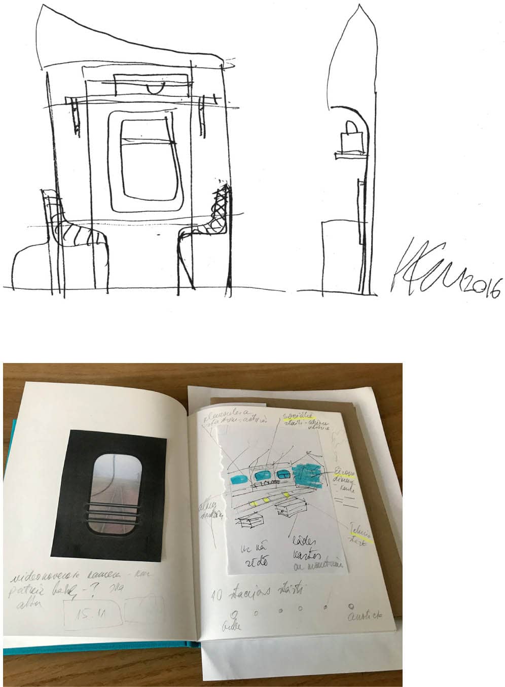
The designers’ challenge was to transform a former baggage shed to create impressions of movement and draw visitors into a sense of journey. The design team organized the intimate space by creating ten passenger benches, each named after a stop along the railway line. Video monitors integrated into the railcar “windows” let visitors (passengers) observe slowly moving landscapes, historical events, and personal memories.
A Systems Approach. With offices in New York City and Honolulu, the team notes they are often reengaged by clients who move on to new jobs with ever more complex information challenges. Harakawa says, “We’ve partnered with many of our clients for twenty years or more.”
This pattern explains how Two Twelve expanded beyond the environmental projects they were known for. Clients consistently rely on the firm’s systems approach. She notes, “You need a systems approach that is based on the perspective of the user to create solutions that really meet their needs. It’s also critical for planning how solutions will need to evolve over time. We need to plan for ongoing implementation, upkeep, and new technology. Insights from forty years of being in business, and planning, are two of the ways we can consistently provide value.”

We think of wayfinding and information design as the same kind of problem. Our job is to take a logical approach to a complex journey, or to complex information, and break it down step-by-step so the information is easily digestible. Ann Harakawa
All of Two Twelve’s designers work on a broad range of project types. Communication design projects might have shorter time frames. The environmental projects may last years. Because Two Twelve is committed to working on initiatives in the civic, healthcare, transportation, and education sectors, the team is consistently asked to help the public navigate in an increasingly complex world. Harakawa adds, “We’re often asked to help clients imagine something that doesn’t yet exist.”

Customer Experience Maps. With each project, the Two Twelve team asks, What will a better experience look like? It’s understanding user needs, as well as the nuances of the content and desired outcomes, that lets the team recommend ways to enhance the experience—whether it’s a voter guide for New York or a ninety-station transit system in Washington. With these kinds of projects, different stakeholder groups will often see the challenge through the lens of their specific expertise. Two Twelve can help create a customer experience road map everyone can rally behind. They’ll ask, “Are we planning for a commuter who stops at the same station every day or a tourist who will need much more context? What kind of information will each of these visitors be looking for? What decision points can we identify? What will the pain points be?”

How do you transform one stadium into a unique home for two national football teams? The new MetLife Stadium posed complicated issues: rival NFL teams call the stadium home, and there can be 82,500 passionate football fans entering and leaving games at once. Two Twelve created a comprehensive system that guides visitors from the parking lot to their seats. Bold pedestrian wayfinding graphics clarify circulation, and a clear parking strategy relieves traffic, especially on the way out.
Finding the Hidden Logic. Harakawa notes that the very best designers are deeply invested in understanding content so they can break it down step-by-step to structure and sequence the information from the perspective of the user. After forty years, the team believes there’s always a hidden logic embedded in information. They say the logic is often lying in plain sight, but involves untangling complex problems with many stakeholders.
They also know it’s mission critical to challenge their assumptions every step of the way. They test early wireframes and storyboards. They test colors to make sure people with limited vision aren’t impeded. They almost always create full-scale mockups so they can test with visitors on-site. They sometimes even work with partners to conduct the testing to avoid biased results. The team never stops asking, How can we make this better for everyone? How can we create a more equitable experience?
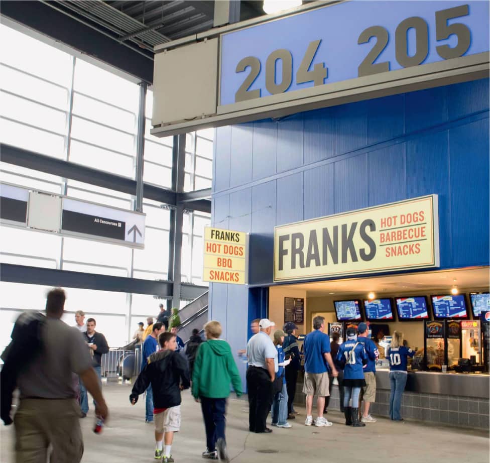
With a uniquely flexible signage solution, the venue can quickly swap the entire color scheme with lighting in order to brand the venue in the Giants’ blue or the Jets’ green.
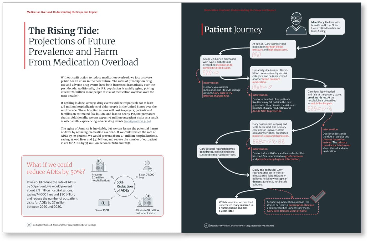
The Lown Institute, a nonprofit with the mission of advancing bold ideas for an equitable health care system, hired Two Twelve to help communicate the dangerous rise in the number of medications taken by older Americans. The resulting comprehensive report is a persuasive call to action.

Recognizing that the principles of wayfinding can be leveraged to help people move through complex information as well as through complex spaces, the New York City Campaign Finance Board hired Two Twelve to design its voter guide. The nonpartisan guide is sent to approximately five million registered voters.
Two Twelve’s designers developed visual strategies to help differentiate information that requires voters’ immediate attention from more general information. The goal was to empower individuals to sort, process, and understand the content quickly and clearly.
“We never stop asking, ‘How can we make this better for everyone? How can we create a more equitable experience?’ ” —Two Twelve
Getting Everyone to the Table. Ganteaume and cocurator Paul Chaat Smith (Comanche) worked together for almost a decade on the concept for the Americans exhibit. Elena Guarinello joined as the exhibit developer to help them further hone the concept so they could look for a design partner to bring the concepts to life. After a detailed search, NMAI partnered with Studio Joseph, an architecture practice in New York. Studio Joseph, in turn, brought New York City– and Copenhagen–based graphic design studio NR2154 to the table. From the outset, NMAI asked the design team to question assumptions and make bold recommendations.
“U.S. society tends to view Native Americans as somehow existing more in the past than the present. This is a unique thing the museum has always wanted to battle.”
—Paul Chaat Smith, Cocurator
Dramatic Display Triggers Memories. After an iterative process, diagramming storylines and considering a wide range of architectural schemes, the team finally landed on a hub-and-spoke configuration for the exhibition. A large central gallery serves simultaneously as a visually dramatic entrance, a generous “living room,” and a spine for the exhibition, with floor-to-ceiling objects illustrating the many ways images of Indigenous peoples have been employed over the centuries: early government seals, fruit crate labels, a Native American Barbie, an Indian brand motorcycle, and even a Tomahawk missile. The array of images, deliberately displayed to trigger personal memories, illustrates the historical phenomenon curator Paul Chaat Smith observes, where the American Indian “became a kind of national mascot.”

“The images, words, and stories are a powerful way to understand a country forever fascinated, conflicted, and shaped by its relationship with American Indians.” —Paul Chaat Smith, Cocurator

Inside the exhibition’s visually powerful central gallery, visitors are surrounded by hundreds of objects and images from three centuries of American life as well as clips from television shows and movies. Visitors can learn more about each object and image at an interactive table created by Bluecadet.
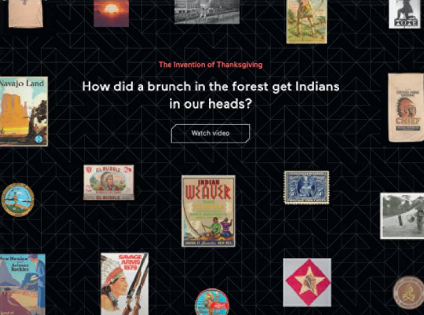
Interactive screens and films provide ways for visitors to explore the exhibit’s key themes, including a wry but profound animated short entitled, The Invention of Thanksgiving.

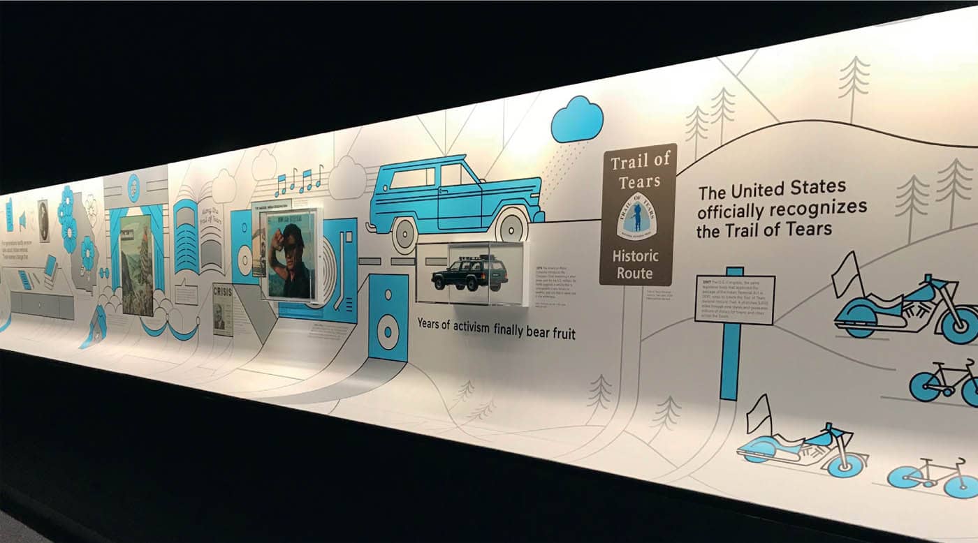
Each of the three side galleries is introduced with provocative statements such as, “Trail of Tears: Not what you think. Not even close.” The team carefully tested messaging with visitors throughout the exhibit development process.
Intuitive Flow. The three side galleries radiate out from the center space. Each provides an in-depth look at a historical event that gave some of these recurring symbols their prominence. Studio Joseph principal Wendy Evans Joseph and associate Monica Coghlan note that working with early conceptual renderings of the space near the beginning of the process helped the team start to imagine how the 3-D space could best provide an intuitive sense of flow for visitors. “It’s important to design so visitors feel they can ‘trust’ the experience. This encourages them to explore. As architects, we think spatially all the time. The graphics team was also very good at thinking sculpturally,” says Joseph. “As astute designers, we have to be able to think about visitors coming around the corners in the exhibits. While you need to plan for some flat, ‘frontal moments,’ the visitor experience is more like being inside a collage, so you have to constantly think with that sense of perspective.”

The curatorial team committed to an unconventional, conceptual approach, which meant forgoing traditional chronological structures. Graphic illustrations help visitors understand the course of history from past events to present day.
Each of the three “story” rooms has a unique feel—some stories are represented with objects and others are told more graphically. The side galleries are organized as a “circuit,” Coghlan explains, “In each, you’re presented with a story. A graphic ribbon helps you see how the story unfolds and ultimately informs our world today.”
NMAI’s curators and museum leaders always knew they wanted the exhibit to feel as relevant for Native peoples as for non-Native. And they were committed to delivering the content in an inventive, conceptual way. The Studio Joseph team notes that the curators’ uniquely pithy writing helped drive the graphic approach. Guarinello notes, “We knew from early visitor testing that we were raising some taboo topics, and that visitors were a bit reticent about how to navigate the subject matter, but the forthright tone in the writing and the boldness of the graphics invites visitors to share their highly personal, emotional stories.”
While each gallery has a unique hue, the dark walls throughout unify the experience, and help to make each of the objects and graphics visually pop.
Where to Begin? When Sadler and Lejeune first started at Metro, it seemed as if every project they approached was like turning over a stone and finding another twenty projects that needed to be tackled. Metro was using twelve to fifteen logos, and the signage system employed wildly inconsistent fonts and icons. Sadler and Lejeune knew effective guidelines would need to work for a number of different audiences in order to make a new system really “stick.”
Today there is a specialized “sister” studio in the signage and environmental graphic design (SEGD) unit managed under Metro’s Arts & Design department. SEGD oversees all station identification, wayfinding, and fleet styling. Their environmental standards are used by internal teams as well as outside design firms consulting with Metro. These align with the brand standards used in all of Metro’s marketing for a seamless customer experience.
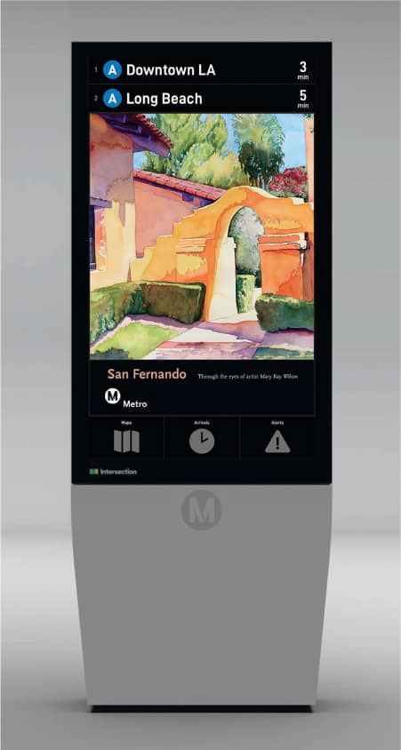
Digital displays help travelers navigate different station types and enable Metro to share artwork and pertinent customer information. (Digital displays and technology developed by Intersection Media, LLC. Artwork by Mary Kay Wilson.)
Decision Points. Working at a government agency with over 11,000 plus employees, key stakeholders, including engineers, architects, civil rights specialists, project managers, safety and security personnel, and more rely on Metro’s signage standards as an essential resource.
Any public transportation agency needs to convey a great deal of information to help customers navigate the system and understand regulations. The Metro team is constantly evaluating how to make the signage easy to interpret and digest with careful, consistent messaging, and attention to placement, forms, and materials. A sign is not always the most effective communication tool, so a key component of the program is the ongoing effort to reduce unnecessary signage. This helps minimize clutter and defray costs of fabrication and maintenance.

The Need to Iterate. The Metro team came to realize that the process of creating standards worked best by tackling a situation, fixing it, and then documenting it. “The best guidelines come from a project you’ve successfully completed. You stand back and say, ‘Well, that worked, but this didn’t,’ the team observed. “It’s essentially a never-finished document. You have to get the right people in the room to find out how they actually do their jobs and what the problems are. If you listen to their input, they’ll understand you’re trying to make their jobs easier, not harder. You can actually create a pride of ownership.”

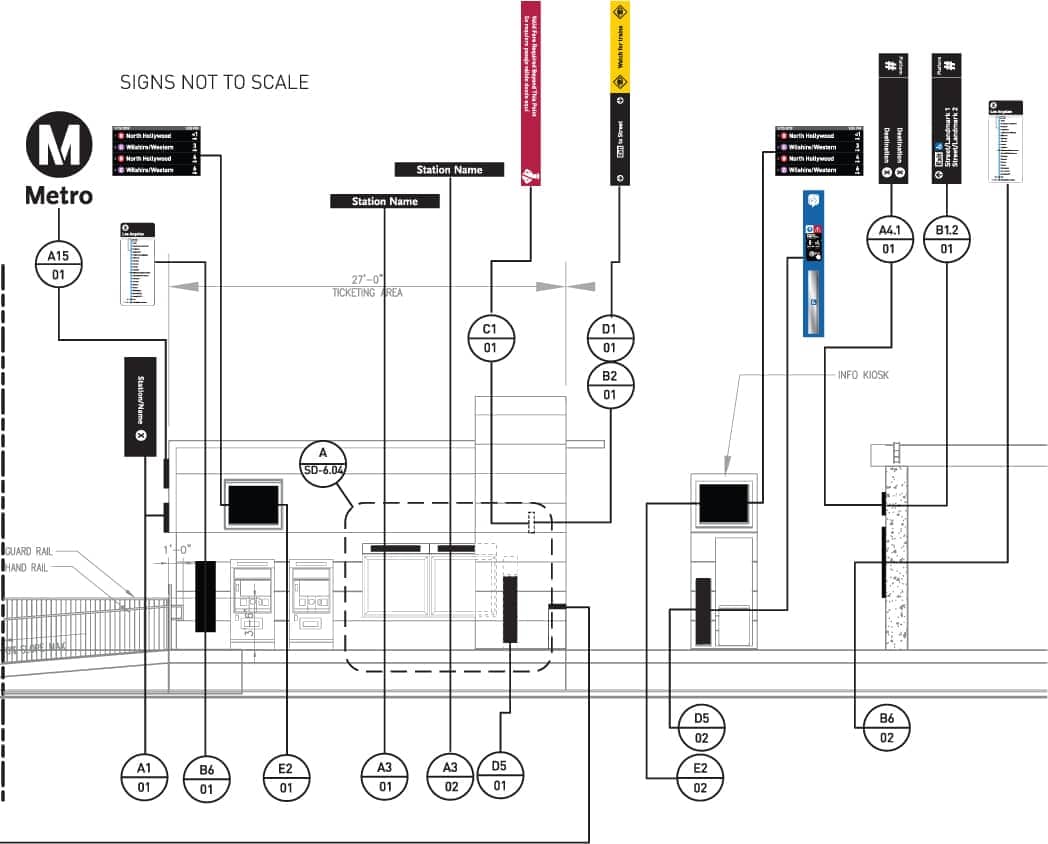
By carefully mapping key decision points in the customer journey, Metro can identify the most effective placement for different signage types. All signage is produced with Metro’s guidelines to create a seamless customer experience. (Digital displays and technology developed by Intersection Media, LLC.)
Consistency and Refinement. Sharleen McLaughlin, Metro’s current lead designer for environmental graphics, has overseen a next generation of guidelines and new naming conventions during a time of exponential growth. The multimodal system now serves almost 1,500 square miles (3,885 sq km). It will soon connect with one of the world’s busiest airports and continue to expand service. The strong fundamentals in the initial guidelines have let the design team respond to new demands and opportunities while maintaining consistency across the system.
McLaughlin says, “Our signage standards are an essential component to maintain brand consistency while working with a variety of teams for different projects. These standards are not only visual graphic aids but are a compilation of copious lessons learned throughout the years.”
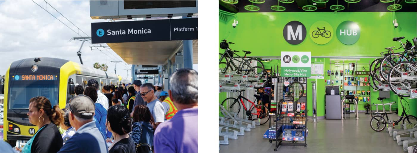
Consistent branding helps unify a multimodal system that encompasses bus, rail, and bike fleets. With the goal of reducing the number of car trips in the region, Metro’s bike hubs provide easy bike parking and repair so commuters can easily bicycle to transit stops.
Key stakeholders, including engineers, architects, civil rights specialists, project managers, safety and security personnel, and more, rely on Metro’s signage standards as an essential resource.