3 PROCESS: PROTOTYPES AND TESTING
A thoughtful and considered approach to information design can make all the difference in the success of a project. The following sections explore best practices in the field today and give practical tips and advice on creating planning documents and testing your design.
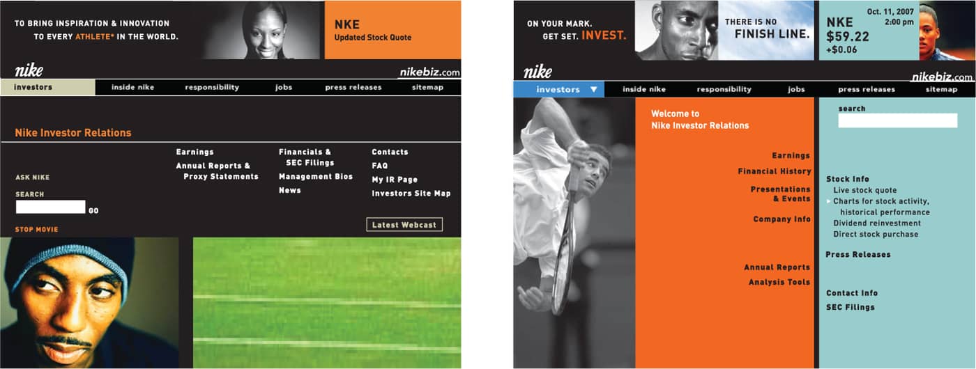
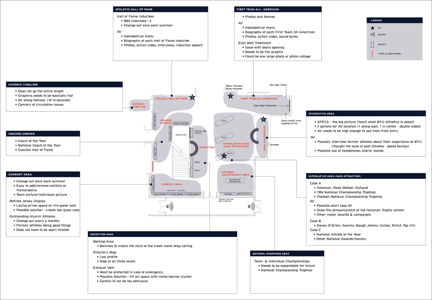
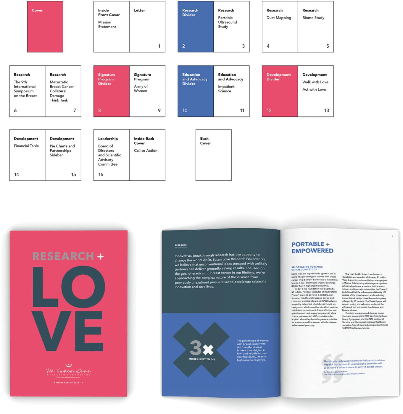
“Design, after all, has the unique capacity to shape information by emphasizing or understating, comparing or ordering, grouping or sorting, selecting or omitting, opting for immediate or delayed recognition, and presenting it in an entertaining fashion.” —Paul Mijksenaar Because information design projects often have a deeper level of complexity and volume of information than other design projects, you will probably need to create one or more supporting documents to aid you in the process before you begin visual design. Supporting structural-overview documents such as sitemaps and page maps (both of which are, in essence, flowcharts) can help you gather and organize information elements and help you figure out information flow. It’s true that flowcharts and other overview charts can seem dry, boring, or even confusing to the untrained eye. However, in cases where an information design project contains many parts or levels of information, a flowchart or other diagram that visually outlines the structure of the project can often be a huge help in creating order out of apparent chaos. With projects that include deep layers of information (such as websites, exhibitions, complex publications, or other information-dense projects), you’ll be doing your visual design team a huge disservice if there is no overall map of the project from a structural point of view. Working on a complex project without a big-picture overview is enough to make even the most patient designers run screaming. A sitemap or similar flowchart outlining all project components is one of the first documents you may need, and it should be created long before visual design begins. Basically the sitemap (or a similar overview map if you’re working on something other than a website) should give a visual outline of all the components and informational elements of the project. It’s a high-level, organized laundry list of everything that should be included in the project. Sitemaps are foundational tools of information architecture, related to the master planning documents that architects have traditionally used when designing extremely complex building projects such as hospitals or university campuses. The use of a main navigation bar in the Nike investor relations microsite was determined by the overall sitemap, but this did not preclude designers from experimenting with several different designs for the home page. KBDA This sitemap documents the content and site requirements for the first level of Brigham Young University’s Student Athlete Center. The 10,000-square-foot (929 sq. m), three-level athletic hall of fame encapsulates 100 years of BYU sports. The plan helped the design team determine the best allocation of space for the exhibits. Infinite Scale Design Group A streetscape enhancement project for the City of South Pasadena was designed to reinforce a sense of place and encourage pedestrian traffic. This map helped the community evaluate the proposed placement of sign types—destination wayfinding, historic documentation, and storytelling. KBDA Coherent Diagrams: Elegant Solutions. Sitemaps are most commonly found in the world of web and interactive design. In this context, a sitemap is an invaluable tool for helping the project team figure out the overall site structure, navigation flow, and navigation nomenclature. A well-organized sitemap gives you an at-a-glance view of the entire site, with all its main sections, pages, and sublevel pages. Organizing the data is the first step. Once the initial diagram is in place, components can be shuffled and reordered, and categories changed, all with the goal of meeting overall project objectives. Sitemap-style documents aren’t only useful for websites, although in terms of information design projects, they’re most often used for deliverables that have an interactive, screen-based component. However, there are many other types of projects that might make use of a sitemap or similar flowchart. Interactive games, museum exhibits, and even banking kiosk projects might be served by having a sitemap. Similar to a site map for a digital project, a page map is generated for print projects such as books and magazines. Page maps help teams map the flow of a multipage piece to come to agreement about ordering and hierarchy of information. For example, the goal for this annual report for a highly respected U.S.-based nonprofit, was to pair engaging patient stories with statistics from the foundation’s medical research. The page map shows how the design team used color dividers to clearly define the pacing of the book. Without a budget for artwork, key statistics were boldly illustrated for visual impact. BLOSS Sitemaps allow teams to anticipate a range of user experiences by planning for hierarchy, user pathways and decision points. These bird’s-eye views show how pages are prioritized, linked, and labeled. It’s a critical tool for getting consensus and approvals early in the process before starting on the look and feel. It can also be a helpful tool for early user testing. Ash Arnett If you have a project with several layers of information, you could probably use a sitemap-style framework, especially if the project has multiple information flows or sequences that need to be mapped out. An innovative and thoughtful approach to an information design project in big-box retail, for example, could illuminate new approaches to customers’ experiences of the aisles, shopping categories, and wayfinding in a store. Sitemaps and Team Consensus. A sitemap helps ensure that a sound plan is approved and in place before the team proceeds to subsequent project phases of design, programming, content development, and build-out. With design projects that include many layers of information, you definitely don’t want to jump into the design phase without a solid framework. Designing a complex, information-intensive project without a plan tends to lead to haphazard solutions. It’s often said that the only constant is change, and this is especially true of information design projects. Having an organized map of the project allows you and the client to capture details about the project’s evolution so you can plan for revisions and future versions of the design. “Designers can learn from library science. In trying to deliver information, what are the cognitive frameworks or resistances to absorbing information? We’re always trying to make information delivery as painless and seamless as possible—even to the point that the person has no conscious perception of how the information is being delivered.” —Micki Breitenstein Discussion and Signoff. The sitemap, or another similar map/planning document, is often the first document the client will see after the creative brief. Clients may not understand the sitemap immediately and will probably need some handholding from you. That’s okay. The point here is to catalog everything at a high level for the purpose of discussion with the client and team. At this point in the project, a lot could change in terms of the informational structure and content. Trust us, it’s much better to change an elemental flowchart document than page after page of actual screen design. Don’t be surprised, however, if your sitemap goes through several iterations. Once the client and design team have a plan in front of them, they will have new ideas, discover opportunities, and debate options. The sitemap allows this discussion to take place in an organized fashion. Sitemaps can be revised and revised again. Several versions are often necessary and healthy for the project. Try not to start the next phase of the project before the sitemap is approved, though, or you could find yourself wasting precious hours revising more time-intensive design documents. Sitemaps and similar flowchart overview documents can come in all shapes and sizes. You can create a simple index/listing in a word processing program. You can create a sitemap from index cards displayed on a board. You can sketch one on a napkin. You can draw it using an illustration program or using an interactive flowchart app. Sitemaps can be simple black and white, or full color and animated. Your project content and the needs of your team should guide you. Like many maps and diagrams, a good sitemap needs to have a key that explains the meaning of each element. The final, approved site map needs to guide the team on how to prepare and track all content elements throughout the life of the project. This chapter provides samples of some typical and not-so-typical sitemaps to give you an idea of how you might apply this type of document to your project.Structural Overviews
GUIDES TO UNDERSTANDING THE BIG PICTURE
WHAT IS A SITEMAP?

HOW IS A SITEMAP USED?

WHAT SHOULD A SITEMAP LOOK LIKE?
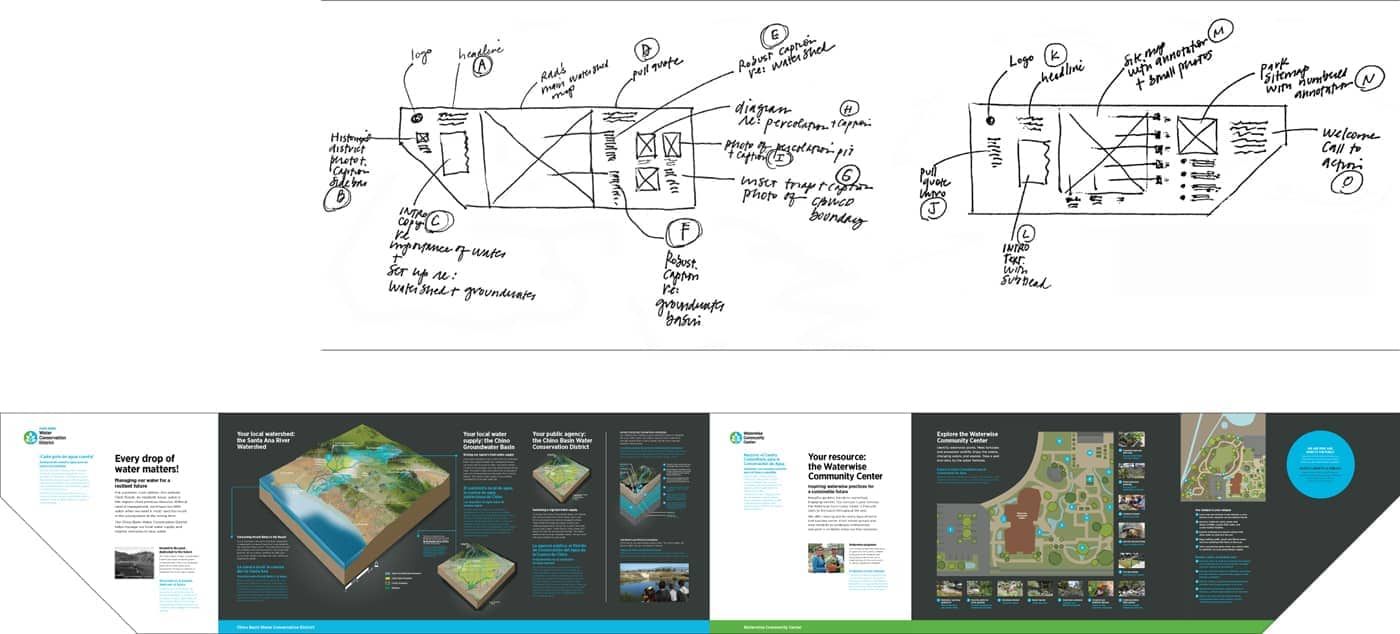
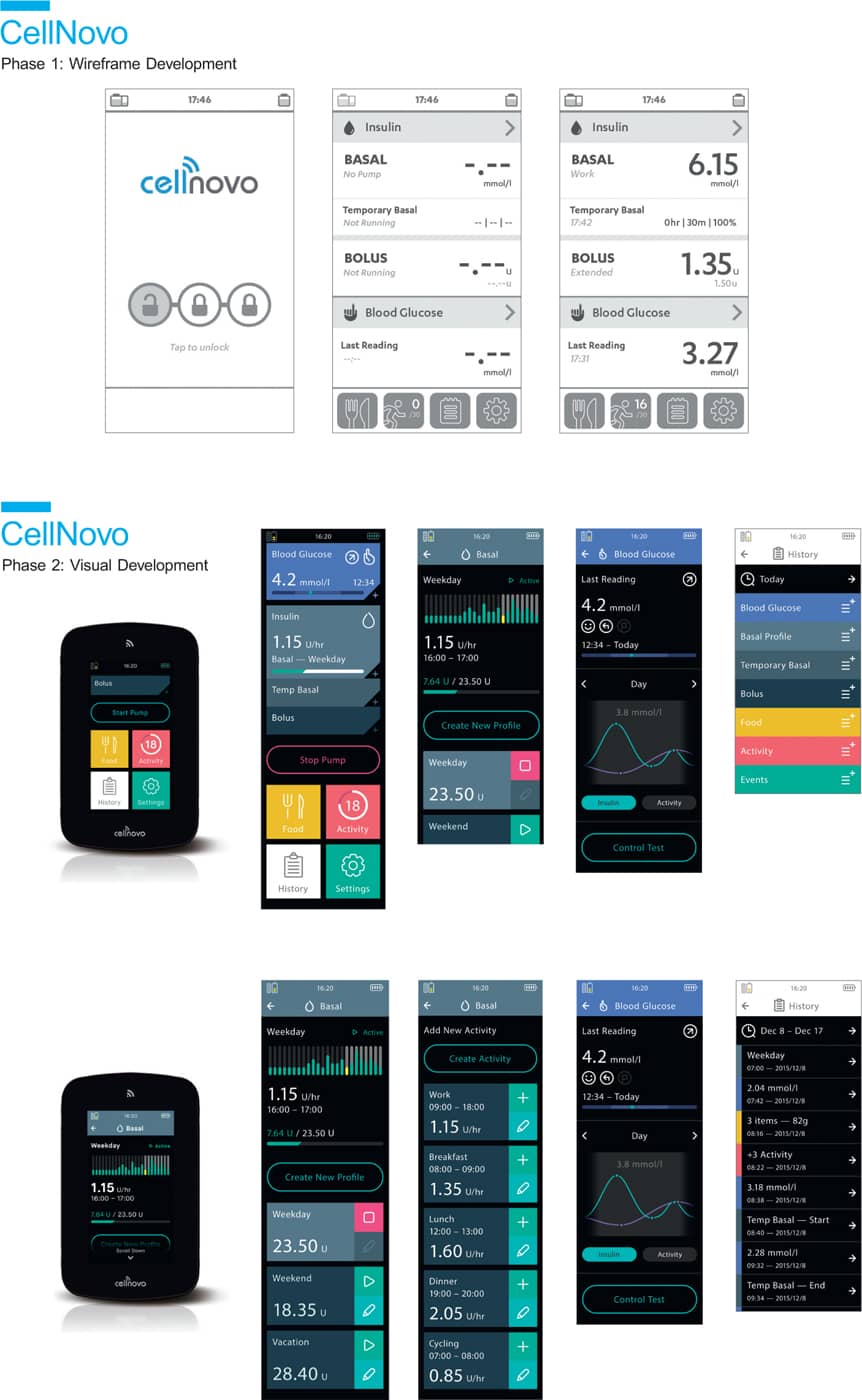
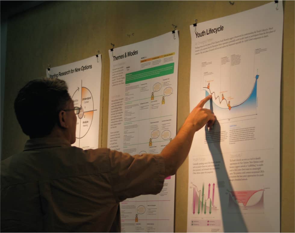
“Psychologists and experts in the field of human perception tell us that human beings take in data through the senses and turn it into something that is memorable and has meaning. This can then become permanent knowledge. Designers have to find ways to make the information meaningful.” —Krzysztof Lenk Big-picture overviews are extremely helpful and often necessary, but they may not allow for the level of detail that your team will need to determine the right approach for the visual design of the project. If the sitemap or structural overview is a kind of skeleton, wireframes add a bit more flesh and muscle. Like sitemaps, wireframes (sometimes also referred to as schematics) are often found in the worlds of environmental and interactive design, and are also used for complex print projects. Like sitemaps, wireframes are planning documents and, thus, are not concerned with design details such as typography, shape, and color. At this point, you’re still in the planning stages and using broad strokes. Like a blueprint for a house, the wireframe acts as a detailed guideline for layout and functionality within the information design piece. With the sitemap, you generally figure out the hierarchy of information and determine the master plan for the piece. In essence, you decide which rooms will be included in the house, and the flow of traffic between them. The wireframes begin to give shape to the structure and provide detail for all the rooms and features within the structure. You begin by asking questions: Are all the rooms the same size or different? Does each room have the same function? How much wall space will there be? How much furniture do we need to accommodate in each room? How many doors and windows are there, and how do those doors and windows function? Are they standard doors, sliding doors, or French windows? In work sessions with clients, Funnel Incorporated creates preliminary whiteboard sketches to get a sense for the information that will be required for each project. This helps everyone “get the story right.” From this whiteboard sketch (left) for a diagram that explains printing technologies, designers then created a rough sketch (right) to explore options for layout and look and feel. Content specifics are added at the next phase. (See following page.) Funnel Incorporated Wireframes map out which elements in the design are most and least important to determine the focal points for the design of the house. Which rooms are the central showcase areas for the house? Which part of a room is its focal point (fireplace, sofa, great work of art)? (Since this is a precursor to visual design, you won’t have chosen the fireplace style, the sofa, or the art; you’re just making the space for it. Wireframes allow you to plan without making specific choices about shape, color, or other visual components.) While the sitemap or structural overview provides a bird’s-eye view, wireframes flesh out the finer details of a complex information design project. They help answer questions: How much content will we need to consider as we create the design? What kinds of specific information do we need to design around? Do we need headers and subheaders for the content? How much main text is there? Are there pieces of related content that live alongside the main content but in a separate area of the layout? What other types of information does the design need to accommodate, and how should we display that information? Will we need lists? Diagrams? Charts? Illustrations? Few, if any, of these issues can be planned properly on a structural overview diagram like a sitemap. There’s simply not enough detail in that kind of overview document. Wireframe sketches allow you to envision all these details. This final version of the Funnel design shows how preliminary elements of the sketch evolved into the end deliverable. Planning in advance helped to organize the complex information in terms of flow, hierarchy, layout, and storytelling. Funnel Incorporated Wireframes help teams anticipate content elements that will need to be designed. Wireframes can be low fidelity, such as hand-drawn sketches; mid fidelity, usually produced with a digital wireframing tool to provide a bit more detail; or high fidelity, providing pixel-specific layouts with considerable detail, such as those shown here. KBDA “Information is the beginning of meaning. Information is data put into context, with thought given to its organization and presentation.” —Nathan Shedroff A wireframe is, in a sense, a sketch that allows the design team and client to see a detailed view of how the content will be organized on just a few given pages or sections of your project. For websites, you might choose a series of representative site pages (often called page types) for your set of wireframe sketches. For instance, for a website, you might start with the home page and a few drill-down pages. Book or magazine content sketches might show rough templates for how the typical feature or department content will be organized into headers, introduction text, body text, and sidebars. Without wireframes, you can spend a lot of time and budget creating highly detailed design deliverables only to find that not all of the project parameters have been thought through. If you’re designing a website home page based on three spotlight areas for content, and suddenly the client wants five spotlights, it’s much easier to revise and update a simple wireframe sketch than to rework a fully realized layout. Wireframes help ensure your design planning is thorough and deliberate. By the time your team is ready to begin visual design, you’ll have thought of most, if not all, of the issues related to the organization and display of the information you need to include in your project. Wireframe documents tend to look like their moniker: plain, wirelike drawings with basic text labels. Nothing too fancy. Nevertheless, there are no hard-and-fast rules for creating wireframes. You can draw them using a variety of tools and methods, depending on project content and goals. The main goal is to catalog all the information in layout form but without spending time and thought applying any specific visual design elements. Wireframes don’t have to be ugly (why should anything you create be ugly?), but it doesn’t make sense to spend an inordinate amount of time making them beautiful. For one thing, people might wrongly assume your gorgeously nuanced wireframes are reflective of the final look and feel for the piece. Wireframes should be sketches that are clear, thorough, and free from extraneous graphic elements and details. Some information designers use color in their wireframes sketches. If you use color, limit your palette to one or two colors that you use to emphasize certain information. By primarily sticking to black and white or grayscale, you won’t run the risk of confusing your clients into thinking they’re looking at visual design deliverables. And you won’t be inadvertently starting or pre-empting the visual design process before that phase has begun. Most of the time, wireframes will look absolutely nothing like the final design. And, ideally, during the next phase of the project when you present the visual design options, you will have diverse visual solutions that look radically different from each other, all based on the same set of wireframes. Hand-sketched content wireframes for an outdoor exhibit about water conservation help the team map bilingual content elements onto a preliminary representation of the panel layout. This low-fidelity sketching approach gives project stakeholders an efficient tool to rework and eventually approve the most effective information delivery strategy before proceeding with visual design development. KBDA A wireframe (top) was given to the design team for this mobile diabetes-management system, yielding multiple visual design approach options for the client’s consideration. Karten Design Make It Just Real Enough. Wireframes should look enough like the final piece so a layperson can understand, with a little explanation, what they’re looking at. As we’ve discussed, you don’t have to come close to a final design at this stage. But, for example, if you’re creating a website wireframe, you’ll want to make the document look enough like a website so that the person gets the gist. You probably want to use the same dimensions as a typical web screen and use some detailing to clarify navigational elements. If you’re creating wireframes for signage, it helps to give the diagram a few recognizable visual cues, like a signpost or sign frame, to help viewers instantly understand that the sketch represents a sign. Wireframes give you a way to map out the piece in advance and to reach team consensus regarding the form and content of your final design. The wireframe stage of a complex information design project can go through many, many iterations. Once you have team and client approval, the design team will then use the wireframe sketches as a detailed reference guide as they begin to address the visual design. Continued Research with Wireframes. It’s a good idea to test key elements of your information design at the wireframe sketch stage with target audience members. Even before you’ve spent time and effort on the detailed visual aspects of the design, you can test your thinking. The client and design team may be making assumptions that you can avoid if you ask end users for their feedback at this stage in the process. By showing the wireframe sketches, you can ask users if they understand how the information in your project is categorized, organized, and named. You can find out if you’ve inadvertently made choices that cause confusion for users. Wireframes can allow you to find out quite a bit about how audiences will react to the information design piece even before you and your team have spent the time and budget on look and feel. Carbone Smolan Agency (CSA) worked to develop a comprehensive way for Morgan Stanley to publish its global equity research reports. After thorough research, CSA created wireframes to illustrate possible options for organizing the content. 50,000feet/CSA Thoughtful visuals can help decision makers imagine the future state of a product or experience. These visual tools can also be used to document those discussions to help socialize the ideas with additional stakeholders. Ash ArnettCreating the Blueprints
WIREFRAMES FLESH OUT A PROJECT

DON’T BUILD WITHOUT A BLUEPRINT


WHAT SHOULD A WIREFRAME LOOK LIKE?
THE BEAUTY OF INTERPRETATION
ACHIEVING CLIENT CONSENSUS

You’ve done your audience research. You know your users and have a good overall sense of what they will need when interacting with your design. You know your client’s mission and goals for the project. Based on all of this initial research, you have chosen a direction for the project and have started the design process and made some headway. You may even have some innovative design solutions on the table. But how can you be sure that you’re not designing just for yourself or in a vacuum? How can you confirm that important information is being effectively communicated? “If you’re going to inflict something, it’s polite to see if it’s useful. It’s an act of a civil society to involve people to ensure that the outcome is useful.” —David Sless Also referred to as usability testing, user testing is a bit of a misnomer because it implies that your users are being tested themselves when really it’s the design that’s being tested. Testing is really just another form of research. With the initial research, you set the direction, gather requirements, and lay the foundation for the project. Testing throughout the design development cycle ensures that the design becomes more and more focused toward getting it right. Testing is like having guardrails along the interstate. The guardrails aren’t the actual road, but they make sure you don’t drive off a cliff. But testing shouldn’t be a separate, isolated, and annoying step, an afterthought that no one wants to do or pay for. With user-centered design, you build the user feedback loop into your design process, right from the start. Cedars-Sinai Medical Center, an enormous medical complex in Los Angeles, was notoriously difficult to navigate. Design firm Two Twelve, improved the experience for visitors by overhauling the wayfinding signage for the 1.6 million-square-foot (148,645 sq m) medical complex. Extensive user testing with full-scale prototypes was conducted on-site to ensure the efficacy of the system. Two Twelve Isn’t testing expensive and time consuming? These are two assumptions clients—and designers themselves—often make when deciding not to test. Sometimes a design team falls into the trap of thinking they’ll convince the client to test after the project is well underway (or at the very end of the project, when many design decisions have already been made). At that point, however, introducing a testing phase will probably be seen as an unnecessary expense. The client has invested a lot of time and money in you as a design expert. So why not rely on your expertise? Everyone on the team has invested a great deal of time and energy in the current design solution. Testing for the very first time so late in the game seems like a chore. Worse yet, what if all that creativity and energy have been focused in the wrong direction? If there are problems, sometimes we just don’t want to know. Testing—especially informal testing—needn’t have a huge impact on your overall timeframe for the project, if you build iterative testing into your process. You can (and should) also conduct more formal user testing at the end of the project, but by that time you’ll be testing a design that has already been through a process of refinement based on real user feedback. Testing Saves Money. The value proposition of testing is that if you do it from the beginning, the project may cost a bit more, but it will end up saving money in the long run. The likelihood of getting it right in version 1.0 of your project will go up exponentially when you do research testing. Environmental graphic design decisions should always be tested in context prior to final fabrication. The design team working on La Brea Tar Pits and Museum’s exterior didactic signs reviewed full-scale paper mockups on-site to confirm the effectiveness of the scale and positioning of graphic elements and the panels themselves. Testing in this public outdoor setting also yielded valuable input on draft content from passersby, who served as impromptu representatives of audience stakeholder groups. KBDA “Information is only useful if it can be understood.” Human-centered design is a problem-solving process grounded in empathy and iteration. Anything can be prototyped—from programs and services, to spaces and events, from print communications to digital tools and products. By mimicking what the final product will be like to use, prototypes are the best way to gather evidence instead of opinions. Greater Good Studio Testing Isn’t Make-Work. The best approach is to stop thinking of testing as an extra option, and present it as a necessary, integrated part of the process, one that will help you and the client ensure that the project is successful for the client’s audience. Testing and Politics. “Testing takes some of the politics out of the decision-making process during projects,” explains Kathryn Campbell, U.S. research and consumer insights specialist. Is there something that you think isn’t a good idea, that perhaps the client insists on integrating into the project despite your protests? Don’t argue, test! Is there an innovative solution you’d like to try, something that you think will be helpful for users that perhaps goes against what has come to be considered standard practice? Don’t guess and don’t think you have to design based on the strictest rules; you can test your ideas. The results may surprise you. Qualitative data gained from testing prototypes can be particularly useful in validating concepts, like Nikki Sylianteng’s early experimentation in simplifying the design of parking signage in New York City. Research has shown that ten participants reviewing prototypes can uncover 80 percent of the problems with a design approach. Nikki Sylianteng Make It Standard Practice. The best approach is to build testing into your project plan from the very beginning. Clients are likely to be more receptive if you explain that testing is simply part of your regular production process. “The world in which we live has become a cultural smorgasbord, and we all live permanently on the verge of indigestion. We have to have some help in sifting through the endless choices.” —Joe Jackson, Musician Test Iteratively. Test early and often. Iterative testing means you don’t wait to test until you’ve spent weeks or months on the project. At project inception, find a selection of representative users and set up a regular testing schedule. Set aside a couple of hours each week for a simple, informal test. Don’t try to test everything at once. With dense information, there are often too many elements that you’re still in the process of trying to figure out. Test individual segments of your design. Test whatever is ready at the time. If you’re working on a website, test just the navigation titles one week. The next week test a set of icons. The next week you could test just the on/off states of the buttons, and so on. Simple Paper Prototypes. Testing tools don’t have to be fancy. Especially during the early stages of the project, test with paper prototypes. You don’t need to videotape the test (although if you have the resources, you can). The most important thing is to get user feedback during the design process. Take good notes and/or perhaps record audio to catalog their responses. Have the design team spend time discussing the feedback. Then make some decisions on how the feedback will impact the next iteration of the design. Advanced Prototypes. Once you’ve mapped out a good portion of the user experience of the information design, you can conduct more elaborate testing. If you’re testing a website, you might test an entire path leading from the home page to subpages and a particular interactive tool. Even during advanced testing with interactive prototypes, it’s best to keep things relatively simple for each user-testing scenario by testing one path or one piece of functionality at a time. How Finished Should Your Prototypes Be? Testing a prototype that is still in a very abstract stage of design (for instance, website wireframes without any design elements) can be a real challenge for end users. “Those of us who have ended up in design careers,” says Campbell, “tend to vastly overestimate how conceptual most people are. Most people are, cognitively, fairly literal. It doesn’t mean they’re unintelligent. Think about how hard it is to convey to the client that a wireframe isn’t really design. You have to make things look like the real thing or people get confused.” The mobile app for this Smart Cane leverages data from the cane’s sensor for patients, their caregivers, and clinicians, who would all use the app in conjunction to track patients’ mobility and recovery. The UX team designed these robust prototypes to test across multiple user channels—e.g., for a doctor (top) and a physical therapist (bottom), each evaluating different highlights from the same patient’s data—to gain feedback from these varied user groups. Karten Design However, if you’re in the early stages of a project at a point where most design issues have not been resolved and you decide to create a prototype that looks very “finished,” you run the risk of testers, clients, and even designers confusing your testing materials with actual methodical, strategic visual design. People can get attached to the look that was quickly thrown together for the sake of a test. Plus, when something looks like it could be the final design, you run the risk of having clients and users focus and give feedback on the visual elements you’re not even testing, instead of on the information design issues for which you need feedback. Bottom line: Make your testing prototypes look enough like the final product so it’s clear to users that it’s a website or even a subway map. Just don’t spend so much time on making the testing prototype look so complete as an artifact that users mistake it for a design that is further along in the process than it actually is. Campbell says, “I like to have the very last prototype that I test look darn final. But that’s the very last test.” First you’ll need to know your main audience types. (See Defining Audiences in Chapter 2 for more information about determining audience types.) Typically your client should be able to provide you with a list of customers or appropriate users from their database. You can also get help gathering your test subjects by hiring a recruiting agency. These agencies contact potential testers, offer incentives, and even set up the test in a testing lab. Online experiences can be tested with a variety of online testing platforms. (See Online Testing Tools.) A Helsinki-based design consultant specializing in contract and legal design overhauled this law firm’s business terms, helping the firm deliver on its brand promise of clear communication in plain language. In addition to being visually consistent with the firm’s bold, colorful brand palette, the redesign relies extensively on icons, and on a friendly, informative, and direct style. User testing showed how explanatory diagrams and tables could help communicate certain parts of the terms in an ultraclear and actionable way. Stefania Passera “Design is the intermediary between information and understanding.” —Hans Hoffman The Natural History Museum of Los Angeles developed a 14,000-square-foot (1,300 sq m) permanent exhibit to explore 500 years of Los Angeles history. Large-scale, colorful graphics were designed to introduce each of the six sections of the exhibit and convey takeaway messages. AdamsMorioka On-site visitor testing informed additional refinements to the exhibit’s large-scale intro panels in order to improve wayfinding and learning outcomes. This included more emphatic placement of headlines, additional text hierarchies, and adding visual anchors to help visitors connect the themes to objects in the surrounding cases. KBDA Full-scale mock-ups were installed in the galleries so the design team could observe visitor flow, and test reading comprehension. KBDA How Many Testers Do You Need? For the Allergan pharmaceuticals site, What’s Next Interactive tested a site on three specific user types identified as the most important in terms of site traffic: doctors, patients, and job seekers. How many users participated in the testing? Approximately six people from each user group. “Because of my background in traditional market research, I wasn’t poised to believe this,” says Campbell. “But you really only need to test your design on a few people. After about six interviews with a particular set of users, you find out about all the big issues for that user type.” When you want to test your design but don’t have access to live testers or want a broader range of opinions, a survey may be an effective course. There are some basic tools that help you create and distribute surveys online. Or you can keep it really simple and email PDF or JPEG images of alternative designs to a wide sampling of users, asking for their preference. On the other hand, if you want to know something specific, such as which button users will most likely push, which information they see as most important, or whether they understand a set of icons, it’s probably best to test one on one with a smaller sampling of representative users. “You can only understand something new relative to something you already understand, whether visually, verbally, or numerically.” —Richard Saul Wurman When Allergan asked KBDA to create new packaging for its line of intraocular lenses, research showed effective information design could help differentiate their products. The surgical nursing staff was hard-pressed to identify correct lens types in their high-stress, low-lit operating room environment. The stakes were high because the appropriate choice of lenses was crucial to the patient’s recovery. Approaches were carefully tested with users. It was determined that using a combination of color coding and graphic icons produced the most reliable results. KBDA Dozens of online platforms now allow teams to conduct real-time user testing. Panels of real users, sorted by type, can quickly provide detailed behavioral insights. “Testing takes some of the politics out of the decison-making process during projects.” —Kathyrn Campbell For instance, with A/B/n testing, multiple versions of a webpage can be compared to see how consumers respond. In addition to websites, these tools can be used to test and validate mobile apps and email marketing. Design teams can run “click testing” with wireframes early in the process. Later teams can run split tests with the finished design to test minute variations. Detailed feedback allows teams to evaluate information architecture, user interface, messages, and design choices at every stage of the process, with test results carefully segmented by audience type. This highly respected U.S.-based environmental organization regularly tests the way it communicates online. In addition to testing its overall messaging, it tests the way it engages donors. The variation on the bottom right increased donations by 400 percent over two years, using graphic clues and enhanced messaging to highlight the call to action. A respected U.S. environmental organization wanted to encourage monthly donations. Online testing was key. An alternative design that prioritized information about monthly giving raised five times more than the original. A version with an arrow highlighting the monthly option further increased results. A third iteration including “social proof” messaging—“86,045 donors have already signed up”—increased donations even further. And the final test, removing distractions from the sign-up form, saw an additional 14 percent increase in monthly donations. Total improvements informed by testing resulted in significant funds over time. KBDAUser Testing
DON’T GUESS, TEST!

RESIST THE URGE NOT TO TEST

—Muriel Cooper, Information Designer
THE TESTING PRACTICE
PROTOTYPES AND TESTING TOOLS

HOW TO FIND TESTERS


SURVEYS VS. LIVE USER TESTING

ONLINE TESTING TOOLS FOR OPTIMIZATION
