9 CATALYTIC CASE STUDIES
Designers can help chart a more humane future by contributing their skills to some of the world’s most demanding challenges. Whether it’s clarifying information so individuals and local communities can make informed decisions, or creating tools to help large teams address mission-critical choices for global organizations, design can be a powerful catalyst and tool. The following interviews introduce just a few key examples.
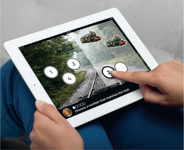
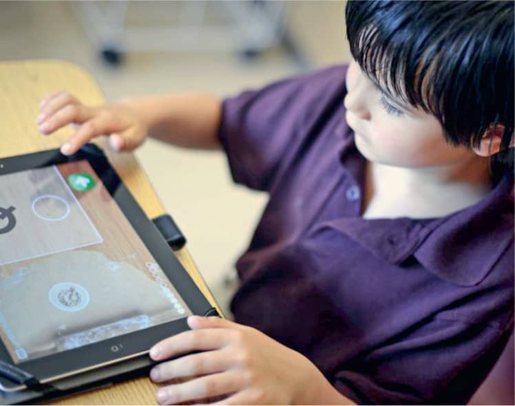
The iPad has become a revolutionary learning tool for the 1 in 68 children diagnosed with autism-spectrum disorders. These children often feel more comfortable with screens than with people. In partnership with Infiniteach, Greater Good Studio designed an app to help children with autism build skills, learn, and grow. See case study on following page.
How does the studio begin its projects?
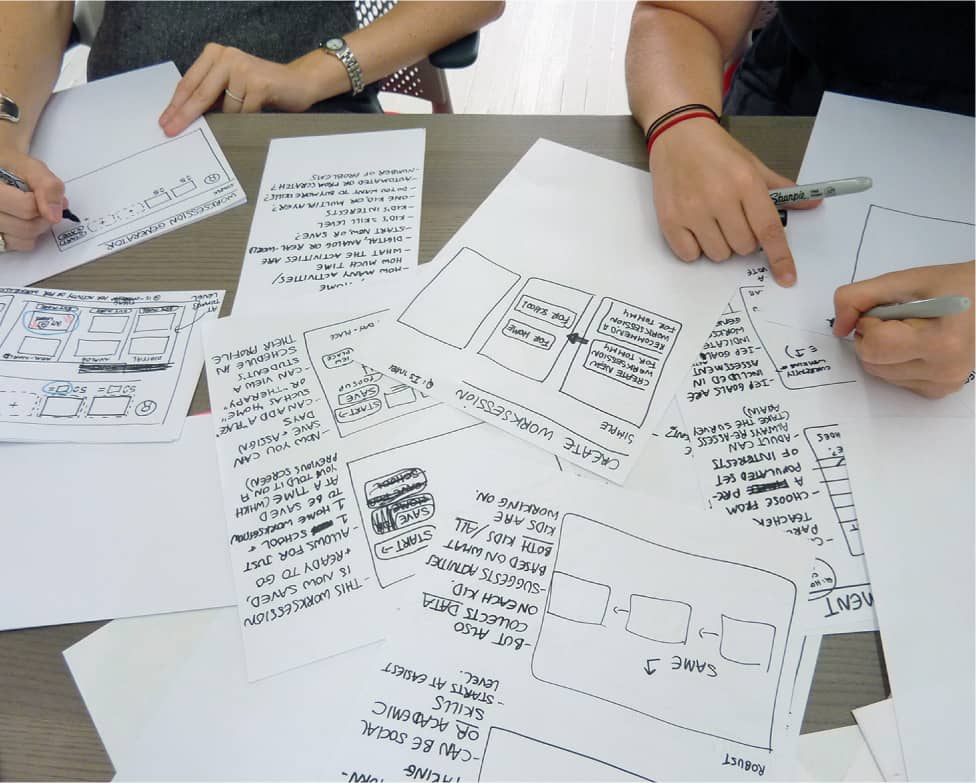
SC: Human-centered design is a problem-solving process grounded in empathy and iteration. It’s also a powerful framework for creating alignment among people from diverse backgrounds. Because of this, every project begins with intense listening and observation. Beyond active listening cues such as nodding our heads, we’ll come back with visuals to make the findings tangible. And if the results don’t feel like we got it quite right, we’re committed to listening all over again.
What makes visuals particularly useful?
SC: Talking can often be a recipe for miscommunication. But by making something concrete—even with a series of Post-its or a sketch on a table—it’s no longer mine or yours, it’s ours. If we can make the intangible tangible, folks can have productive conversations about what’s possible. In fact meaningful feedback is much more attainable when you’ve made “stuff” that others can understand and respond to. Designers are practiced in thinking about concrete solutions and bringing lots of them to the table, because we’re asked to do that all the time.
“I think designers are uniquely practiced in dealing with ambiguity and making the intangible tangible.”
—Sara Cantor
What are some of the most important lessons you’ve learned from this practice?
SC: A lot of time, the communities we work with have been let down over and over. So, in many cases, we are starting from a trust deficit. Institutions in this country tend to honor learned expertise versus lived experience. Our job is to elevate lived experience to the same plane as learned expertise. We don’t want to just learn from you as a beneficiary of the work. We want you to help make the decisions that will be most valuable to you. We approach our meetings and convenings with the goal of leveling the playing field of power.
When we present visuals that synthesize the feedback, it’s key to show we didn’t just listen to one person in the room. And that we’re not just reflecting the perceived content experts. Our goal is to map ways something can move forward that represents the multitude of voices.
Ethnographic interviews showed that parents and teachers spent an enormous amount of time trying to create and customize learning tools for students. Based on that research, the Greater Good Studio team sketched a wide range of possible features.
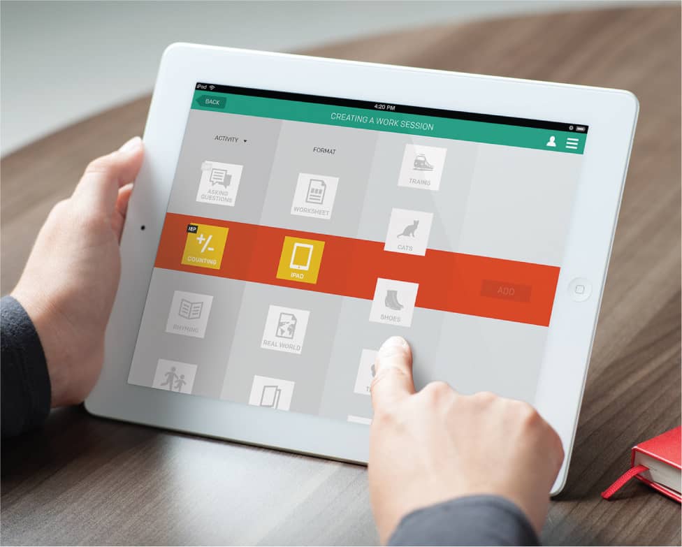
Children with autism often become deeply interested in certain topics—perhaps dogs or trains—and evidence shows that lessons are more effective if they revolve around those passions. Greater Good Studio paid particularly close attention to the interaction design because children with autism thrive under consistent rules.
The app consistently tracks progress, creating stronger connections among the child, parents, teachers, and therapists.
“Good design is often what makes a product or program successful. Not because of how it looks, but because it has features or touch points that were cocreated with the end user.” —Sara Cantor
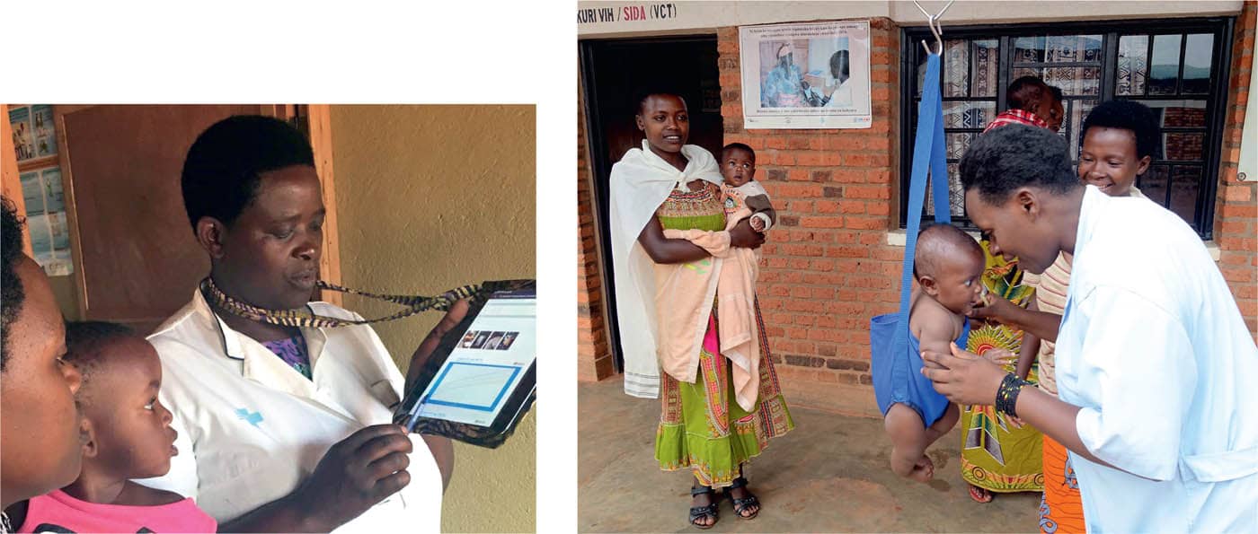
TIP Global Health creates health care delivery systems to address maternal and child health challenges in Rwanda. In order to improve health outcomes for mothers and children, TIP wanted to develop an app that would deliver point-of-care digital health records for families.
Greater Good Studio collaborated with TIP, working alongside nurses, mothers, and staff to ensure the tool would meet each stakeholder’s needs. Every step in the development process was designed to reflect deep respect for the expertise of the local communities.
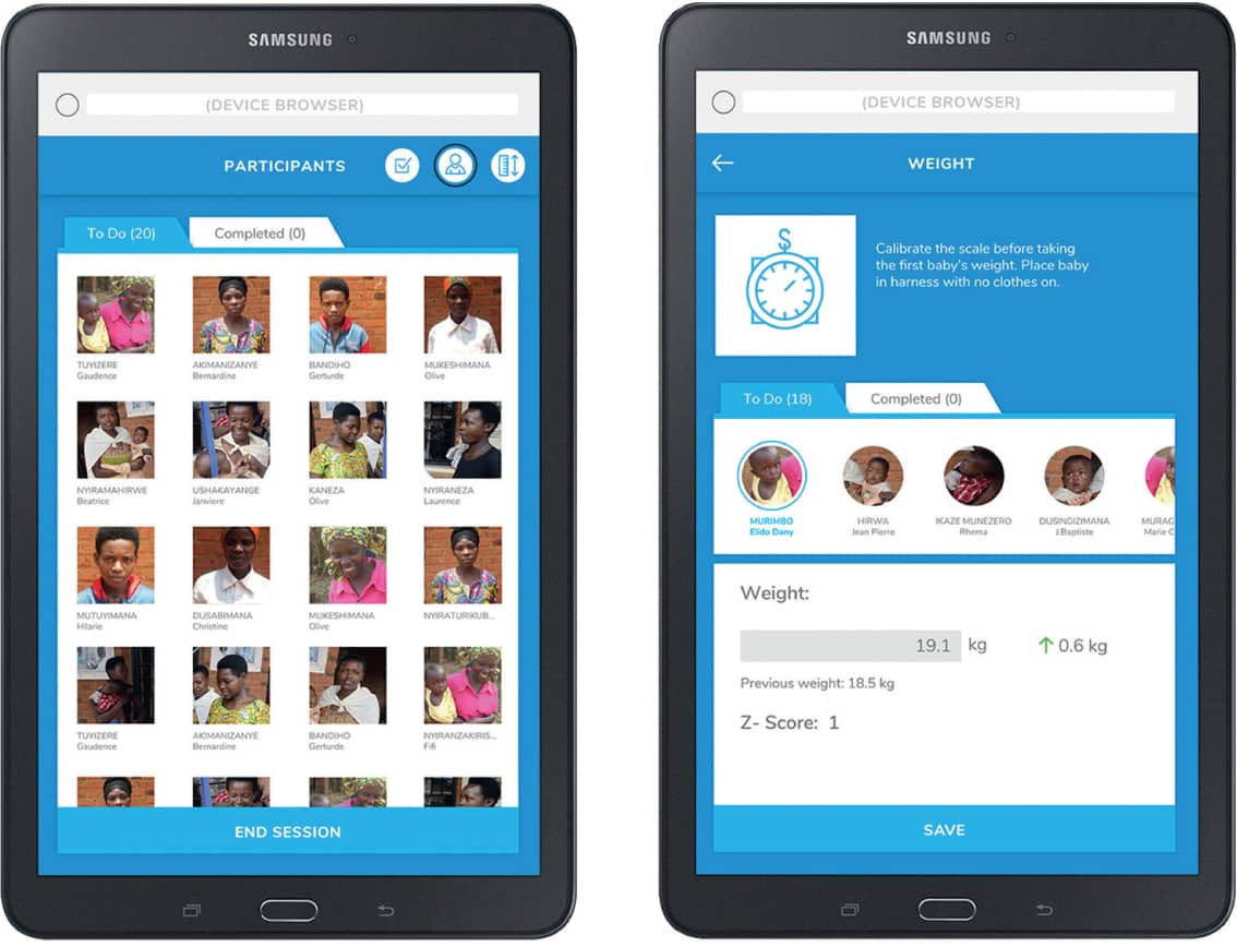
Based on careful observation, Greater Good Studio created initial rough prototypes, and after getting feedback, several rounds of refinement. The result is a tablet-optimized, responsive web app that works on-and offline, as internet access is not always reliable in remote areas of Rwanda. Photos and measurements from each session offer mothers a visual record of their child’s development, and give nurses a tangible tool for targeted health education. Just one metric of success is that research shows children who have had three or more medical visits with the app have a 27 percent decrease in severe malnutrition. The goal now is to expand across the country.
The first part of this Q&A is based on conversations with Mike Morrison, a PhD candidate in Industrial-Organizational Psychology at Michigan State University, and Derek Crowe, a PhD candidate in biomedical genetics at the University of Rochester.
How did you first become interested in improving science communication?
MM: II was a website designer/developer for 10 years before starting my PhD. Sadly what I observed is that science has the most tragically and disastrously bad interfaces I’ve ever seen, with prolonged human suffering as a consequence. Whether it’s looking at more options for open-source publishing, creating alternatives to the typical hand-me-down science poster templates, or adapting social media tools, we have to find ways to accelerate knowledge dissemination.
DC: In addition to my early background in biomedical engineering, I had a background in web design, as well as letterpress printing. Because I’m passionate about “sci-com,” in addition to my own lab research, I developed a course on visual communications for scientists at the university. You have to help people think about using tools such as a grid, visual hierarchy, white space, and typography to increase readability. That said, a well-crafted takeaway message is the most critical place to start.
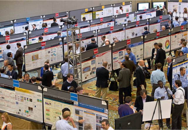
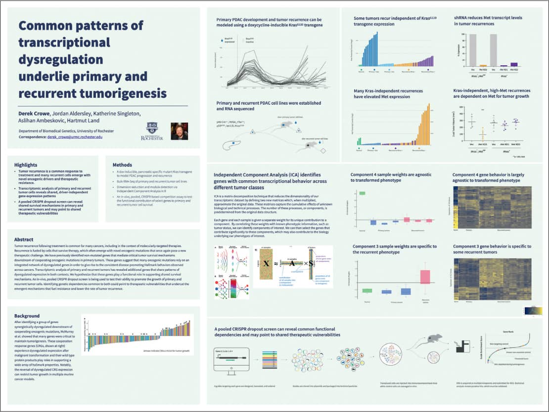
Scientific conferences, typically held in large hotel conference centers, often feature huge conference rooms lined with scientific posters to encourage researchers to share their latest work. Attendees walk up and down aisles trying to discern what’s worth slowing down to review. Advocates for better science communication want to inspire scientists to embrace best practices in information and user experience design to reinvigorate this decades-long tradition. Photo: Dennis Schroeder/NREL
“Better tools make it easier to get to better insights. This will make scientists’ work more fulfilling. And if we make science more user friendly, we’ll also make it easier for the rest of the world to fall in love with science.” —Mike Morrison
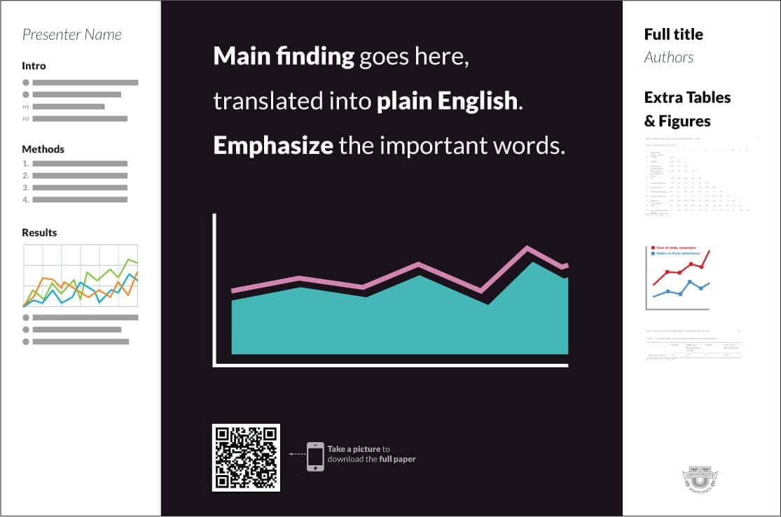
Researcher Mike Morrison created an open-source template for science posters that encourages scientists to summarize their key research takeaway in a single sentence. The template includes sidebars for detailed data, and the opportunity to include a QR link for more information. Morrison has also created lively how-to videos about the templates with links to usability data, as well as animated videos with best practices for sharing research via Twitter.
Researcher Derek Crowe observed that Morrison’s pared down poster templates inspired great praise, as well as tremendous controversy among scientists. In response, he created templates that incorporate Morrison’s messaging recommendations with additional options for layouts based on best practices in information design. In addition to the open-source templates, Crowe created an online digest that captured the many points of view on the topic of reimagining the format.
The second part of this Q&A is with Karen Cheng, professor of visual communications design at the University of Washington.
How did you come to work at this intersection of design and science?
KC: While I got my bachelor’s degree in chemical engineering, I was always drawn to design. Now, as a design professor and researcher, I’ve found ways to bridge those two areas of interest. In a recent project, I collaborated with an engineering colleague to launch the Design Help Desk, a tutoring center where science students, faculty, and staff can work with design students to improve their visuals for presentation and publication. Consistently positive results, documented in a study funded by the National Science Foundation, have helped garner ongoing university support for this program.
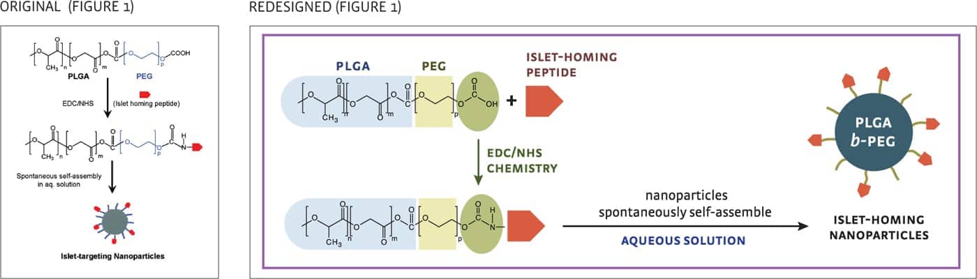
The vertical composition of the original version uses space inefficiently, and similar components (PGLA and PEG) are difficult to identify. In the redesigned version, the GA was reformatted as a left-to-right row. Graphic shapes and color were used to identify similar structures.
Figure 1
Reprinted with permission from Nano Letters. Kaustabh Ghosh, Mathumai Kanapathipillai, Netanel Korin, Jason R. McCarthy, and Donald E. Ingber.
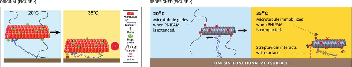
In the original version, the most important information (how the molecule starts and stops moving) is not emphasized. The redesign emphasizes and explains the key molecular interactions with the text labels and captions.
Figure 2
Reprinted with permission from Nano Letters. Till Korten, Wolfgang Birnbaum, Dirk Kuckling, and Stefan Diez.
Copyright © 2012. American Chemical Society.
Can design impact be quantified in science communications?
KC: My colleagues and I recently conducted a study on the impact of visual design when scientists incorporated design best practices in published papers. We focused on the graphical abstract (GA), an overview figure (illustration) designed to attract potential readers and visually summarize what the research paper is about. Figures are often the first part of a scientific paper reviewed by the editor, and if the paper is accepted, often the first part examined by a researcher’s peers. Results of the study showed redesigned GAs consistently improved readers’ understanding of the paper, and enhanced the perception of the authors’ intelligence, and the rigor of the science. This is just one example of how design can improve a researcher’s ability to share work.
How do you support collaborations between designers and community organizations?
CG: We consistently partner with designers who are hoping to create tools to address social justice issues. And we’re purposeful about getting the collaborations off to a good start. As part of the original grant process, community groups are asked to define their key audiences, communication challenges, and intended outcomes.
We then work with the community groups, and their constituents, to confirm we’ve heard things correctly, document everything in a “scoping document.” We then help shape the key information that will need to be included. We also facilitate the conversations between the design team and the community organizers so everyone can agree how they’re going to work together. Everything needs to be in support of the community organization’s goals.
What is most challenging for design teams?
CG: We ask designers to constantly monitor their own unconscious biases. We’ve had experiences where a designer might propose a color palette or an illustration style that constituents find subtly inappropriate or disrespectful. Creating “space” for conversations about this is so critical to the ultimate success of the project.
“We’re always thinking about best practices for learning. And we know people can’t learn when they’re scared or worried.”
—Christine Gaspar
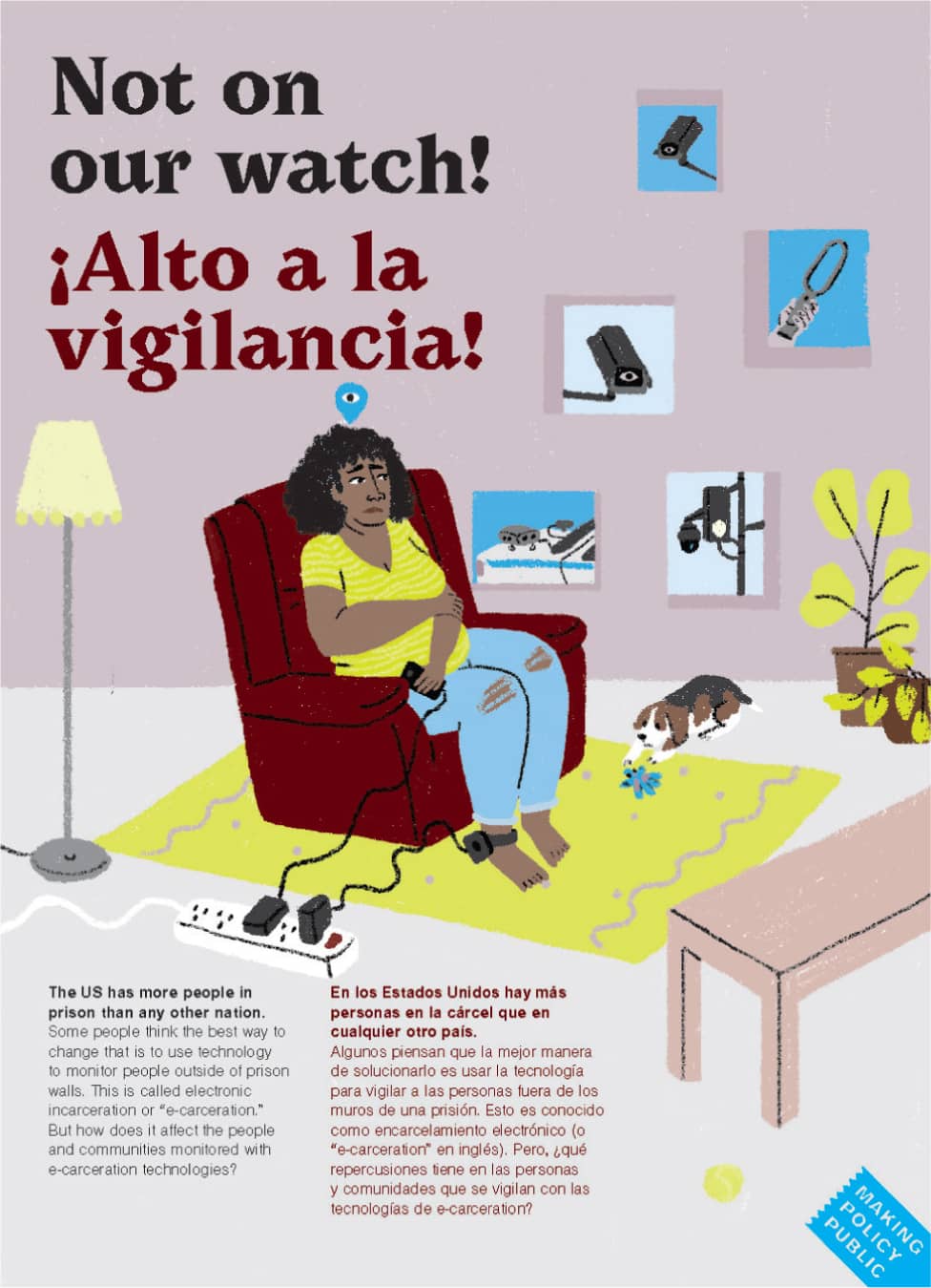
As part of its Making Policy Public program, the Center for Urban Pedagogy (CUP) partners with policy advocates and graphic designers to produce foldout posters that explain complicated policy issues like “Not on Our Watch.”
Communities in the U.S. are looking for ways to reduce the number of people who are incarcerated or in detention. Authorities believe one alternative is electronic incarceration—the use of surveillance technology to track and control people in their own communities.
To help communities understand how e-carceration works and how it can perpetuate a system of mass surveillance of communities of color, CUP teamed up with nonprofit Freedom to Thrive and designers Shreyas R. Krishnan and Kruttika Susarla to create this foldout poster.
Available in English and Spanish, and distributed across the U.S., the poster illustrates the concept of “e-carceration” and highlights community actions that offer alternatives to the current systems of incarceration and surveillance.
“We’re helping people build cognitive maps. Research shows that when people can remember key concepts, it helps them recall subdetails as well.”
—Christine Gaspar
How do you test solutions?
CG: We ask designers to share visual references early, so constituents can give their input about tone before the actual design process even begins. Working with constituents from the beginning allows us to evaluate the effectiveness of the content and the visuals at every stage in the process.
What makes these tools effective?
CG: It’s so important to empower communities to help shape public policy conversations that are critical to their day-to-day lives. And that’s hard for anyone, let alone someone who might have a variety of barriers to feeling confident about speaking up. Our job is break the information down in a way that helps people feel they understand the issues so they’re comfortable participating.
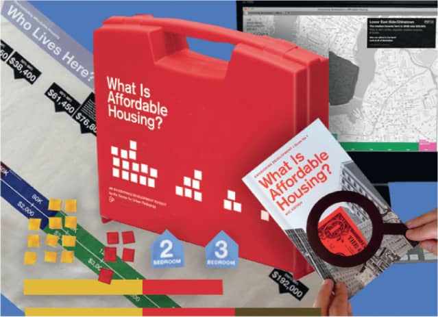
There are barriers to public participation in New York City’s land use processes that can discourage even committed community advocates. CUP works with planning experts and community partners to create toolkits to help facilitate public workshops. The toolkits are tactile and interactive so people can learn by doing and listening to each other.
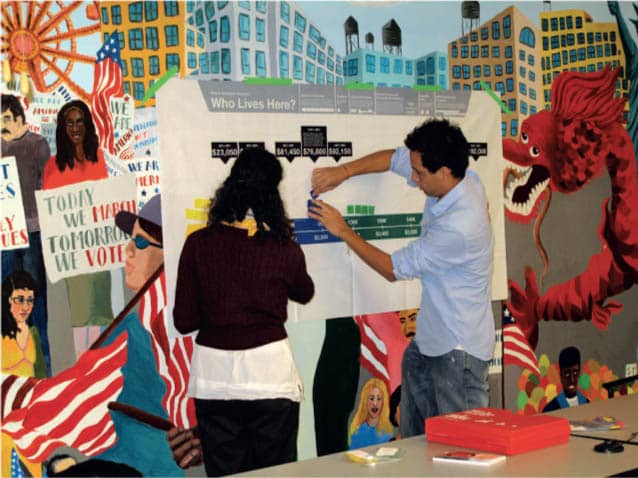
CUP designed the toolkit in collaboration with designer Glen Cummings of MTWTF and an advisory group of dozens of community organizations and advocacy groups.
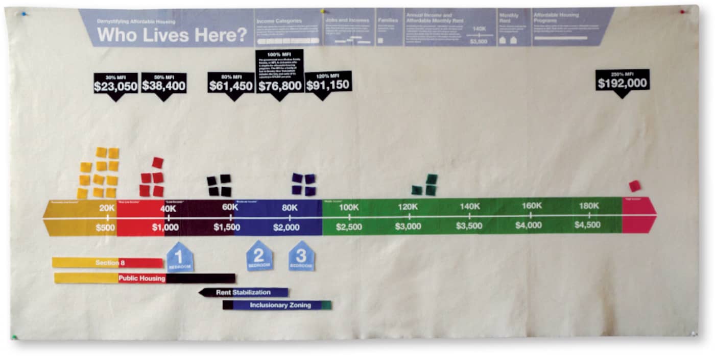
This kit breaks down affordable housing policy into easy-to-understand visuals. A felt chart lets communities look at income demographics, rents, and proposed developments in their neighborhoods. A guidebook explains New York’s affordable housing programs and provides step-by-step instructions on how to run a workshop.
How did you gravitate to using information design as a tool for emergency preparedness?
CJ: After my own brush with death, I came to understand much more about a phenomenon known as “cognitive paralysis,” or freezing in the face of danger. I was compelled to see if smart design could help people prepare for emergencies, when split-second decisions are a matter of life and death. This propelled me to go to graduate school in the U.K., where there is a long history of employing design in public education campaigns.
How did you start working with communities?
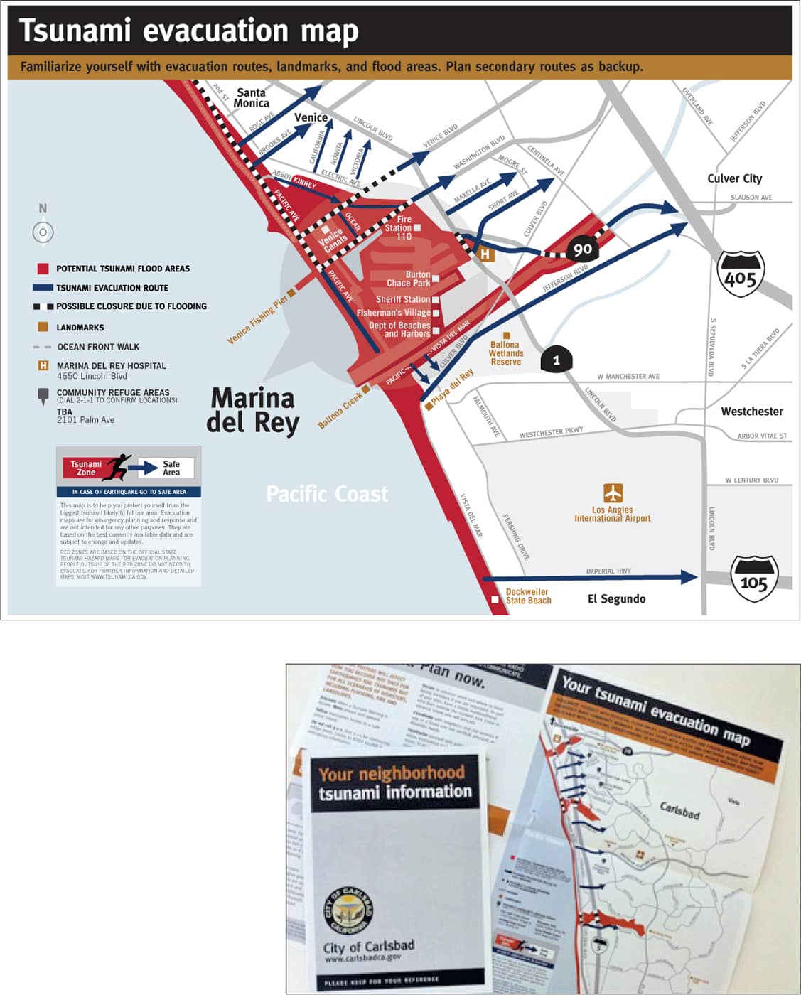
CJ: As part of my thesis for graduate school, I worked with a small coastal city in California to develop communication tools to help citizens plan for a possible tsunami. This caused me to take a deep dive into mapmaking, and an equally deep dive into audience research so I could evaluate how to make the tools as effective as possible. Since then I’ve worked with a dozen cities and counties to create toolkits to plan for floods, fires, earthquakes, and other disasters. I also work with the Federal Emergency Management Agency (FEMA) here in the United States.
“It’s imperative to share this kind of information with people over and over in order to create ‘muscle memory.’ ”
—Claudine Jaenichen
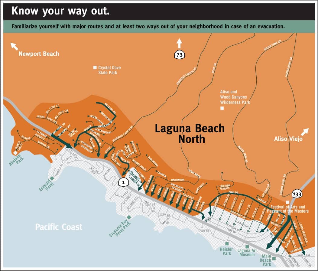
Jaenichen says it’s critical for communities to get the information into people’s lives in a variety of ways on a regular basis. This includes tools like signage and print mailers. Jaenichen notes, “Communities tend to default to posting the information on digital platforms because it’s easier to scale and update—but research shows that’s not enough. Digital communications are too easy to delete, and they’re not tangible enough. We need to create redundancies, using every communications tool possible.
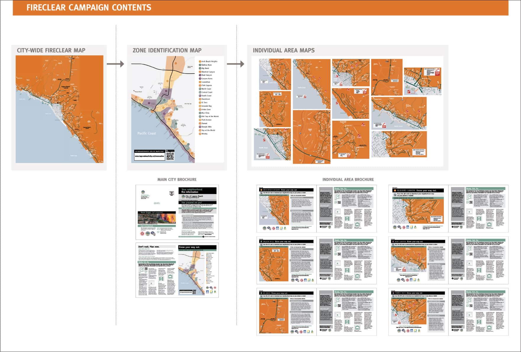
Jaenichen creates a “branded approach” for every public information campaign. Testing shows that using consistent colors and typography across the campaign helps to reinforce recognition and memorability.
The maps shown may not reflect the most recent and updated changes. Please do not refer to these maps in emergency situations.
“I’m exploring how proprietary software and AI might help to make the work more scalable for communities.”
—Claudine Jaenichen
What did you learn from the audience research process that surprised you?
CJ: Testing lets us observe cognitive processing and it provides evidence for how information is best remembered. We know processing is severely challenged when someone is under duress, so most importantly, testing has shown us how critical it is to deliver information consistently and repetitively before an emergency happens. Airline evacuation instructions are one of the very best examples for how to do it. There’s a card with instructions delivered in words and pictures tucked into every seat. A member of the crew reads it aloud and might even pantomime it. Usually there’s an accompanying video. And they make sure to repeat all of this on every single flight. They’ve built in redundancy to make it part of muscle memory.
Jaenichen appreciates the chance to collaborate with designers worldwide on best practices. She serves on the executive board for three international associations: the International Institute of Information Design (IIID), the Communication Research Institute (CRI), and Design Network for Emergency Management.
She notes, “A critical frontier is thinking about more accessibility—planning materials for people with sight or hearing impairments, language barriers, or mobility challenges. This is one of the things I want to inspire my students to think about on a daily basis.
| AUDIO information was the HARDEST for people to remember after two minutes and four minutes. It was the LEAST remembered twenty-four hours later. |
| VISUAL information took the MOST PROCESSING to remember after two minutes and four minutes. It was the MOST remembered twenty-four hours later. |
| WRITTEN information was the BEST for people to remember after two minutes and four minutes. It was the SECOND best format for people to remember twenty-four hours later. |

Jaenichen’s audience research tested how information is best remembered. She used two minutes as the initial metric because it’s the average time a person spends reading marketing materials sent in the mail. After two minutes the reader typically discards the mailer or keeps it and responds to the call to action. A four-minute test was added to see if more information was retained with additional time. The research informed Jaenichen’s recommendations for communication techniques
Graphic: KBDA
This Q&A reflects conversations with graphic facilitators Anthony Weeks and Lin Wilson.
Why is graphic facilitation so effective?
The goal is to take something very complicated and abstract and give it form. Visual metaphors act as anchors to help people retain the conversation. This is particularly effective when so many people are visual learners. Capturing the key points in an ongoing dialogue helps people feel heard. You can stand back and see where there’s agreement and where there’s a need to drill down to get more clarity. It ultimately helps people make decisions.
What makes someone a good practitioner?
There’s a methodology, and those of us who have been in the field are training others. It requires quick cognitive processing to get to the real-time synthesis and distillation. You have to train your brain to filter out the irrelevant filler information and listen for the nuggets that really matter. A graphic recorder focuses on capturing the information, but a graphic facilitator also runs the meeting and facilitates the conversation. Some people are good at working with people and distilling ideas, but they may only be able to draw stick figures. That can still be very effective. At the other end of the spectrum, some people are brilliant designers or illustrators, but not good listeners. In the end, the process has to be more important than the final product. The goal is to help teams make critical decisions.
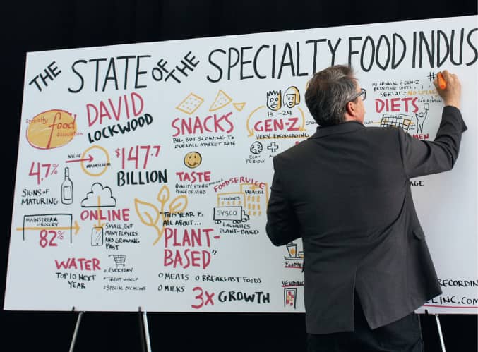
Accomplished information designer Lin Wilson notes, “Live drawing is such an effective tool that global consulting firms now include graphic facilitators on many of their teams. The practice is just as important for nonprofits and civic organizations, and there are even innovative uses in fields like mental health.”
How do people use the finished piece?
People take pictures as a record of the immediate experience, so they can share it with their teams. Often the pieces will be incorporated in follow-up reports or used as a catalyst for teams working on more detailed roadmaps for implementation. Sometimes we’re asked to further refine the visuals so they can be incorporated in marketing tools for external audiences. If you’re going to inspire change, you need to be able to tell a concise but compelling story.
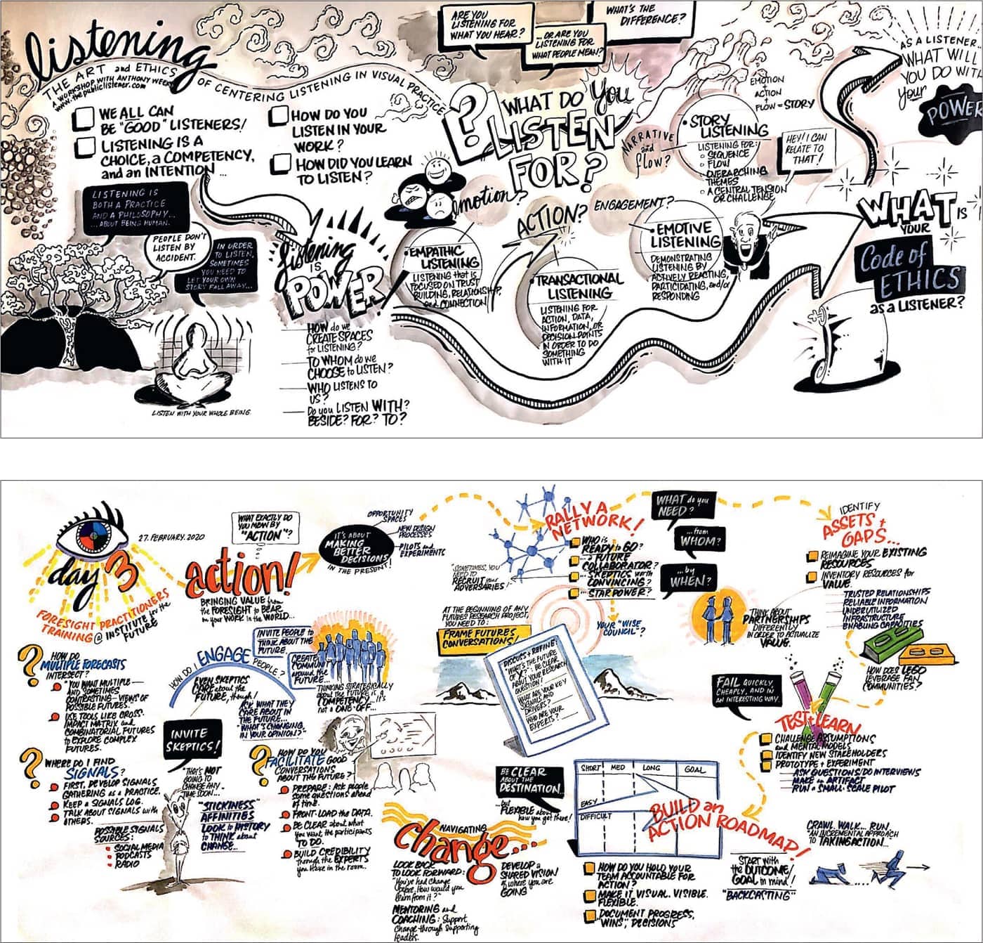
Graphic facilitator Anthony Weeks has a background in social work and documentary film. He notes, “I call myself a public listener. I approach it less as a scribe, and more like a filmmaker, looking for connective tissue. It’s about seeing ideas in relationship. It requires simplification without being simplistic. It’s helpful to take periodic breaks to reflect and use the graphic as a way of asking the group, ‘Are we going where we need to go?’”
Weeks notes, “After sitting through multiple presentations, audiences think, ‘I can’t take anymore!’ But having this real-time capture helps people feel it’s a special occasion. People will often come up afterwards to tell me the piece is beautiful. But a much better compliment is when they say they feel they were heard.”
“More and more, clients are asking to be trained in this work and in the basics of visual thinking. They now realize it’s such a powerful tool.” —Lin Wilson
The work below is from scientific illustrator Alex Cagan.
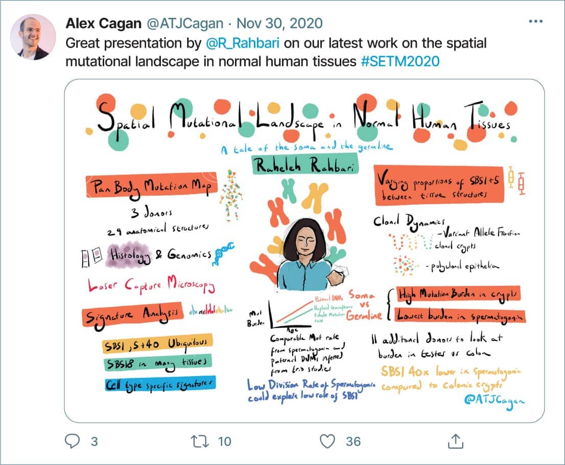
While working on his PhD, Alex Cagan, a postdoctoral genetics researcher and science illustrator in the U.K., brought an iPad to a conference for taking notes. While following concurrent sessions on Twitter, he realized he could help contribute if he made his notes and drawings more legible. People responded and were sharing widely on Twitter, so he kept it up. Cagan says, “Being able to celebrate scientists’ hard work is one of my main motivations.”
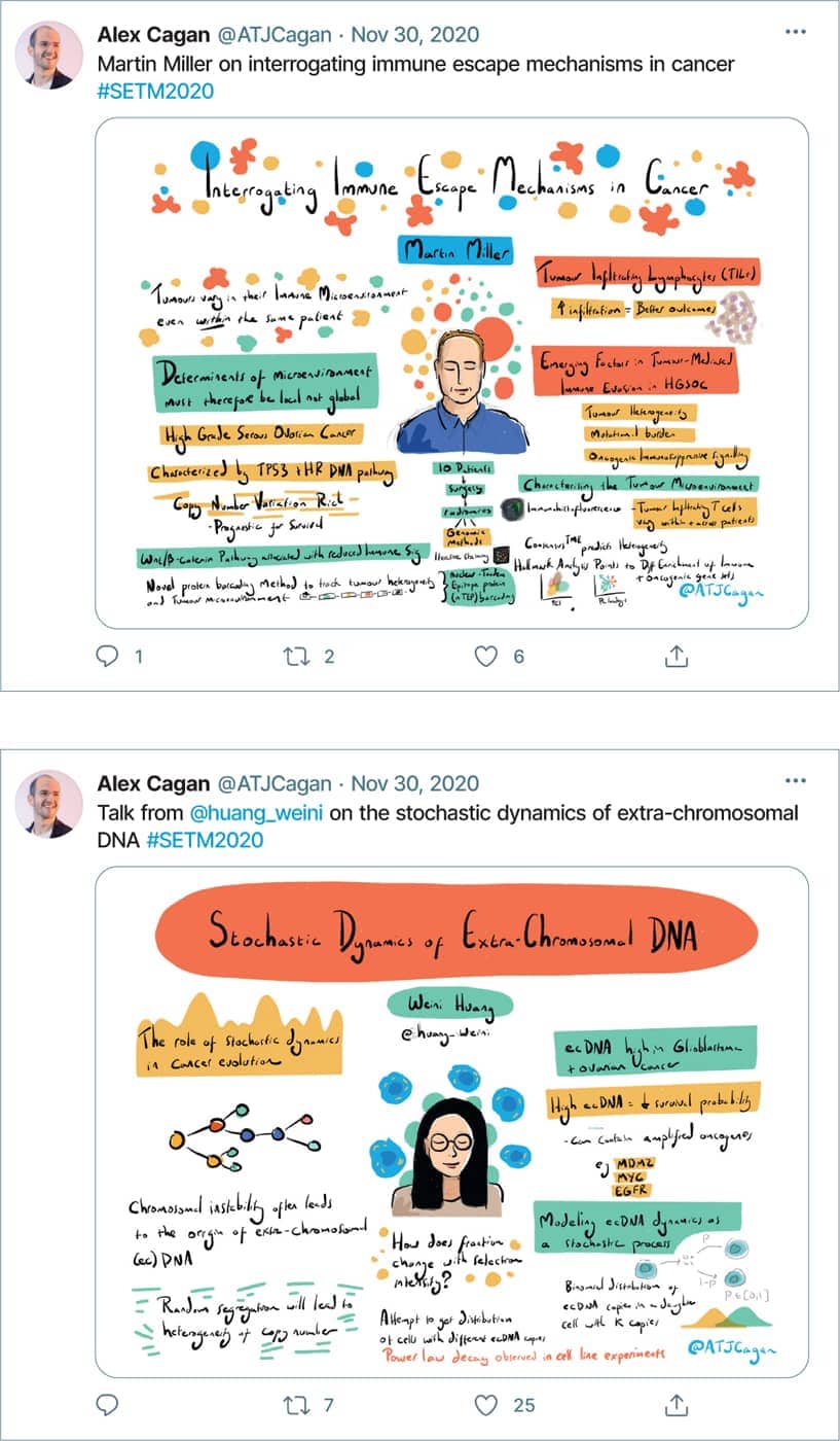
Cagan regularly illustrates scientific conferences now, posting summaries in real time. This helps people who can’t attend sessions and serves as a record of the conference. He also shares the work with conference organizers who will project the illustrations for audiences between live presentations. Because he is capturing a broad range of scientific topics, Cagan works to make the illustrations as accessible as possible. “I’d love to see the arts be used more in scientific communications, to communicate research in a more engaging way.”
What problem were you asked to solve?
JC: Millions of patients visit accident and emergency (A&E) departments in the U.K. every year. Patient frustration was often difficult to manage, so aggressive behavior and violence had become an increasingly pervasive problem. The resulting costs in terms of staff absences, lack of productivity, and additional security had been steadily growing. The Design Council (a nonprofit in the U.K. that champions design as a resource for solving problems in the public sector) cofunded the project to see if design could help mitigate the problems.
How did your team approach the project?
JC: The initial in-depth ethnographic research (interviews and careful observation) revealed two clear patterns. First there were often common characteristics in those most inclined to act out—whether it was intoxication or drug abuse. But the biggest commonality of all was the rampant frustration found in these environments, where people were already highly emotional. Our team set out to carefully map the visitor journey and identify the most common triggers.
“Working with a public entity meant it was imperative to make everything affordable, easy to implement and maintain.”
—Jack Cheatle
“The recommendations are now being implemented by teams in other locations who use it to reimagine how the entire operation might be improved.”
—Jack Cheatle
What were your key findings and recommendations?
JC: One of the key findings was patients’ feeling of disorientation aggravated their levels of frustration about the process. Based on recurring feedback, we recommended creating a large-scale graphic that would help visitors get oriented at a glance. We recommended additional graphics patients could reference along the journey in order to further manage expectations. Copywriters helped us consistently use clear, simple messaging. We also worked with staff to enhance communications practices.
What were the results?
JC: Because the NHS is a public entity, it was critical to make everything affordable, easy to implement and maintain. We also created toolkits other sites could download and implement. An independent evaluation, conducted after the first two pilots, found 88 percent of patients felt the new tools clarified the process. Even more significantly, there was a 50 percent reduction in aggressive behavior. The tools are now being implemented at sites across the country.
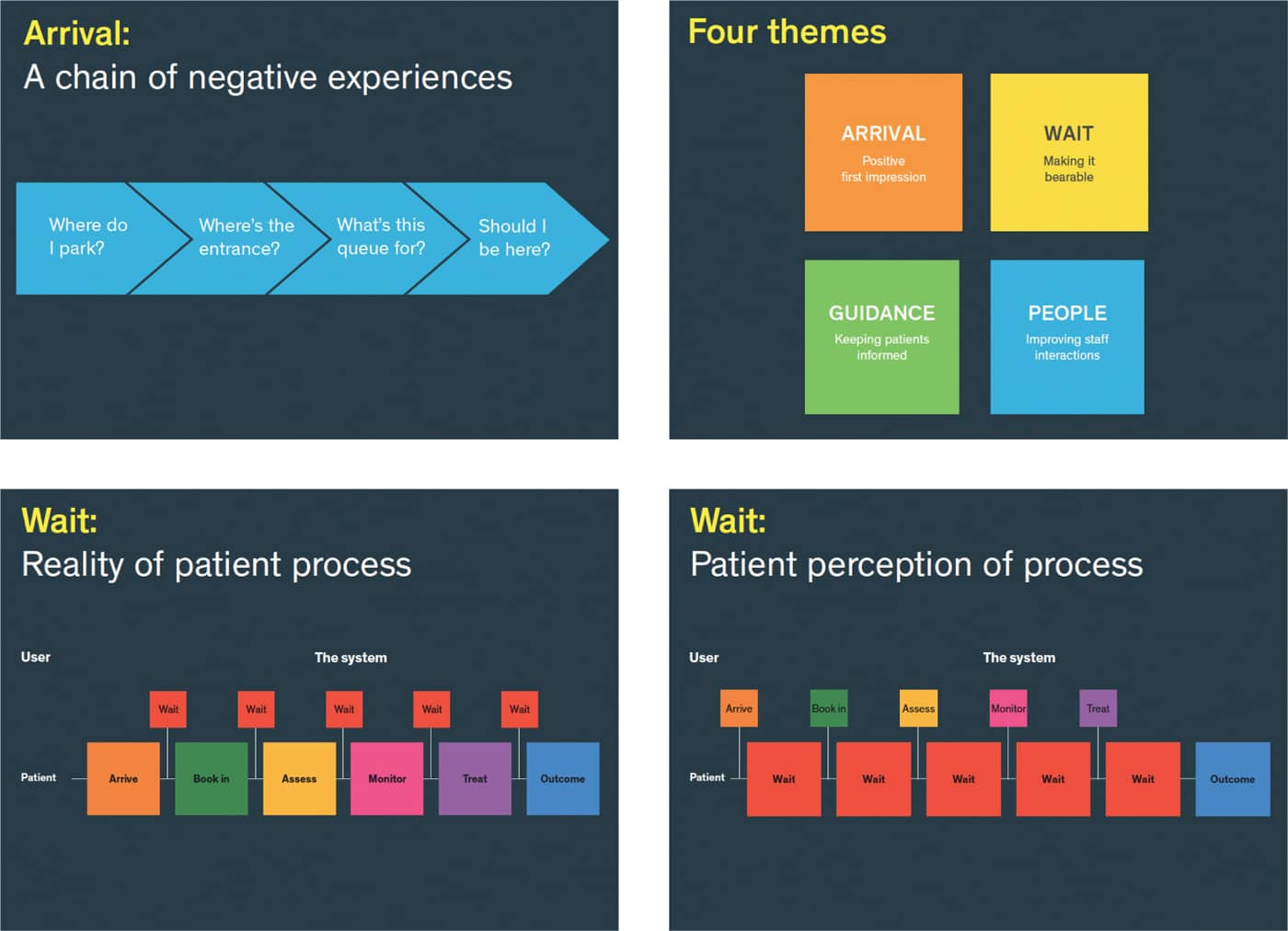
Based on in-depth observation, the interdisciplinary team carefully mapped the patient experience. They found the arrival sequence was particularly stressful for patients. They also found there was a huge gap between patient expectations and the time and patience the visit actually required. Managing expectations and giving patients more context at every step in the journey proved key to improving outcomes.
Pearson Lloyd’s subsequent recommendations focused on a three-pronged set of design solutions to meet the needs of patient and staff: onsite graphics to keep patients informed, staff training to improve interactions, and a free toolkit for ongoing implementation.
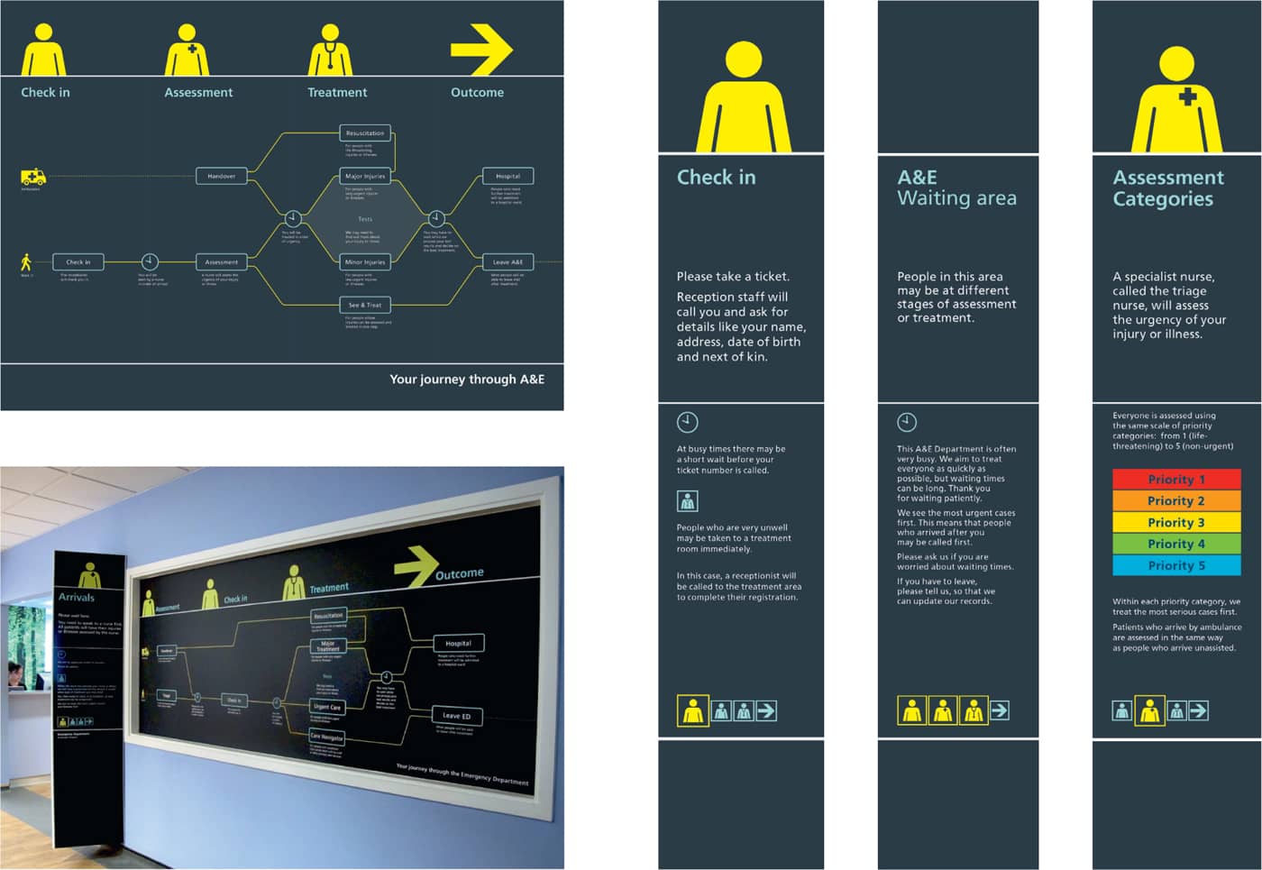
A customer journey map was created as a large-scale wall graphic to help set expectations for patients, and was also used as a foldout paper handout. The color palette was developed in conjunction with accessibility experts to help patients who are visually impaired.
Large format graphics were also placed at different stations to answer recurring questions:
- Where am I now?
- What’s the most important thing I need to know here?
- Why am I waiting?
- How long will I wait?
- Where am I in the process?
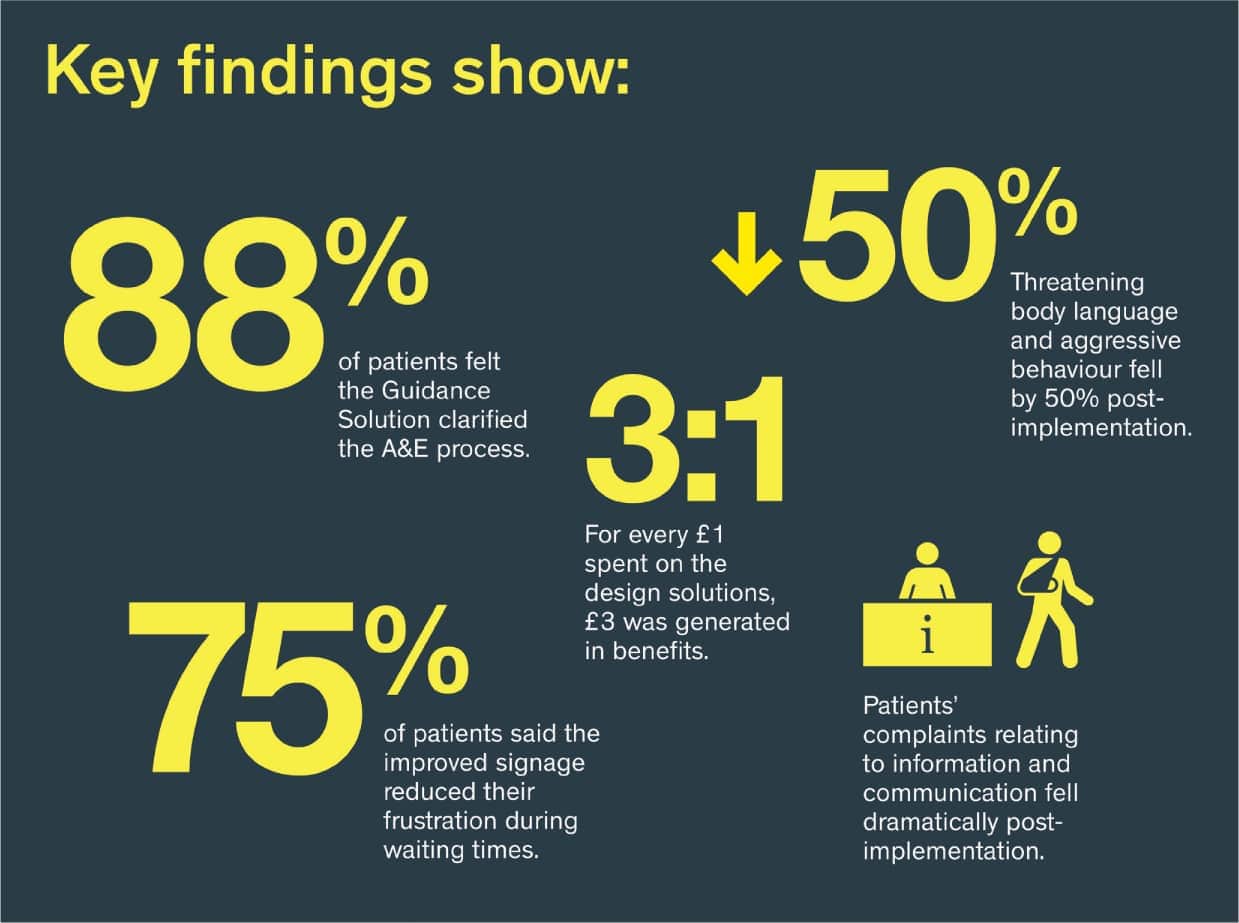
Third party researchers evaluated the two pilots and found:
- Patients felt information graphics clarified the process
- Patients felt signage reduced frustration
- Threatening behavior fell
- Patient complaints fell
- For every pound (dollar) spent, 3 pounds (dollars) were generated in benefits.
After two pilot projects, the team has implemented the program in eighteen Trusts across the U.K., and started work on a similar project in Australia.