CHAPTER 5 REFINE TO IMPRESS AND PERSUADE GETTING TO THE “FEELING BEHIND OUR EYES”
WHICH OF THESE visualizations is a prototype and which was created for a presentation to the CEO?
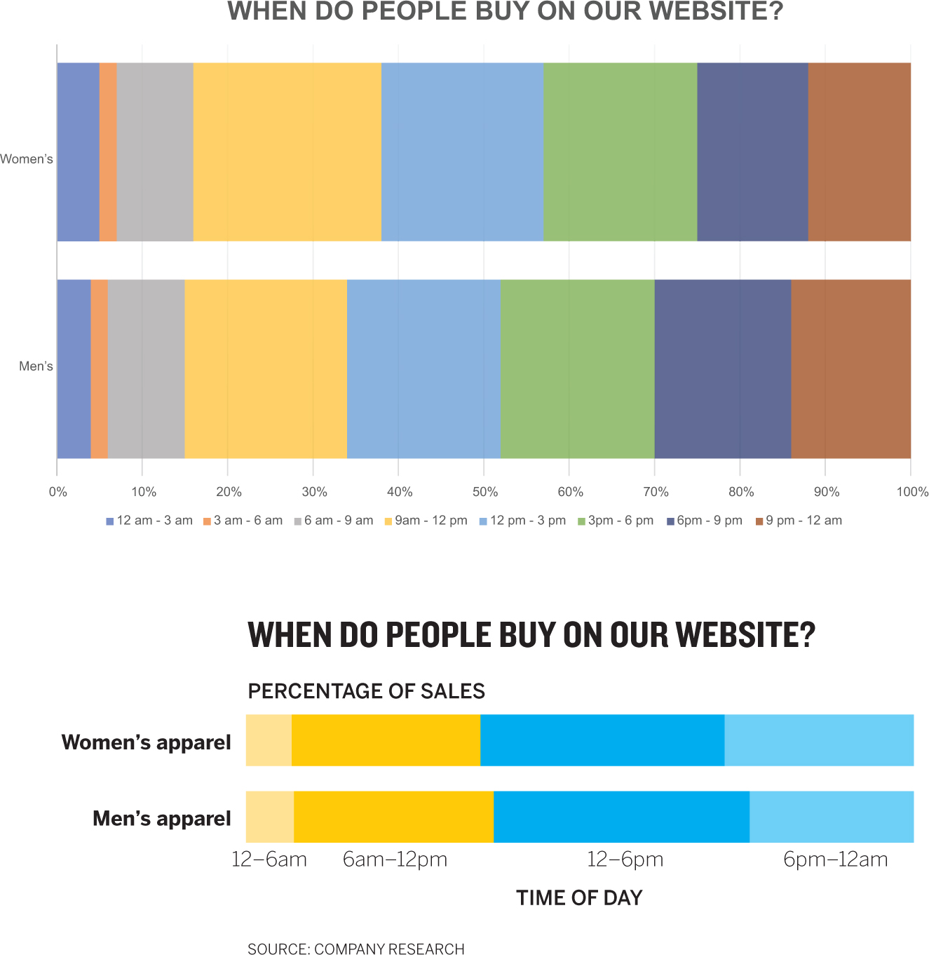
The top chart is obviously the prototype, generated in Excel with just a few clicks. Most of us would say the bottom chart (designed in Adobe Illustrator) looks better, is “airy” or “streamlined” or “clean,” whereas the top one is “busy” or “blocky” or “messy.”
In that great book on writing that I’ve referred to before, Style: Toward Clarity and Grace, Joseph Williams describes impressions of good and bad writing as “a feeling behind our eyes.”1 Charts get behind our eyes in the same way, and it’s important to understand why, and what design principles and tactics lead us to have bad feelings about the first chart and good ones about the second.
It can’t be reiterated enough that those good and bad feelings aren’t a function of which chart is prettier. Aesthetic value is a by-product of effectiveness. For example, look at the charts above again and try to answer these questions:
- Do more people buy women’s apparel before or after noon?
- Does the site get more buyers before breakfast or after dinner?
The charts are the same type and contain the same data, but the design of the second one is easier to use. Good design serves a more important function than simply pleasing you: It helps you access ideas. It improves your comprehension and makes the ideas more persuasive. Good design makes lesser charts good and good charts transcendent.
“THE FEELING BEHIND OUR EYES”
But just as Williams would tell you that following some rules (many of which are arbitrary) can’t alone lead to good outcomes in writing, creating and strictly adhering to a list of rules for designing charts similarly won’t work.
Another metaphor will help what we’ll do in this chapter: music theory. It does not dictate what you can and can’t do when you make music. Instead, it explains why you might feel what you do when music “hits your ears.” It can suggest techniques that lead to typically good outcomes and why some techniques sound “bad” or “off,” but it never suggests you’re not allowed to do that thing that sounds off. In short, music theory is not prescriptive, it’s descriptive. It gives a common language to the feelings music creates.
We’ll approach dataviz design the same way. I won’t be telling you what specific colors to use, the right number of tick marks for your axes, or where to put your key. The answer to all those questions is, of course, “That depends on your context.”
Instead of prescribing rules and procedures, I’ll try to describe the design principles that lead you to have certain feelings about charts—why it looks “clean” or “chaotic.” Why you might “get it” right away, almost without thinking, or why you might feel like you don’t know where to start. Why one feels persuasive and another unmoving.
By understanding some principles around three concepts—structure, clarity, and simplicity—you’ll be well on your way to upping your design game with your charts.
Structure. When the feeling behind your eyes is that a chart is “clean” or “crisp” or “orderly” or alternatively “messy” or “muddled” or “chaotic,” much of that feeling is coming from how the chart maker thought about the chart’s structure. The chart on the right looks cleaner and more professional, even if we’re not sure why. Here are the techniques that give us that impression:
Consistent hierarchy. Generally well-structured charts include three essential elements, placed in a reasonably predictable vertical order:
- Title (and sometimes a subtitle)
- Visual field (visuals, axes, labels, captions, legend)
- Source line
You should be able to map those elements onto any well-designed declarative chart.
How to design each of these elements and where to place them comes later. For now, just take an inventory. It may seem basic, but sticking to this consistent structure will be useful. Regularly including all those elements makes charts portable, reusable, and sharable. Your boss may want to put it in a presentation he’s making for the executive committee, and he can do so with confidence that it won’t raise questions he can’t answer about what an unlabeled axis represents. The social team can put it on the company feed. If you want to reference this chart months or years later, its provenance won’t be in doubt because you’ve included a source line.
Consistent placement and weighting of elements. The structure outlined above is so common in chart making that you hardly notice it. It disappears into a convention we’re all used to seeing: The title, for the most part, sits atop all, directly over the subtitle, which precedes the visual field. Sourcing is a small text line at the bottom. In the visual field, axes tend to be bottom and left, and legends often rest on the right side or in another vacant part of the field where they won’t disrupt the visual. Regardless of the shape, most charts’ proportions are divided up in about the same way as shown in the diagram below. The visual field should dominate the structure. The other elements serve the visual. Remember, we don’t read charts the way we read words. Your audience’s eyes go to the picture first, not the title, but you don’t want to lose elements that will help your audience make sense of the visual space. Compare the first pair of charts in this chapter to see the difference between elements such as titles, keys, and labels that aren’t well proportioned and ones that support and enhance the visual. Notice how you naturally move between the elements to confirm what you’re seeing in the chart rather than struggle to make the connection or hold the information in your head that you need to make sense of the chart.

Well-designed charts we see every day are structured this way, regardless of if they’re presented horizontally, as in a presentation, vertically on a phone screen, or as a square in a social media feed.
Don’t go measuring charts to get your space allocation just so; use these proportions as a guideline. This is also a good basis for building chart templates; being consistent with your sizing and placement of elements over the course of several charts adds to an audience’s sense of orderliness and professionalism as well.
Consistent alignment. Professional designers see the world in grids. They divide their design spaces into evenly sized and evenly spaced columns and rows. When you see something that you sense is well designed or professional looking, that’s neat, part of that feeling comes from the fact that it was designed with a grid system.
Well-aligned charts don’t need sophisticated grids. They will use as few points of alignment as possible because more discrete alignments make charts feel busier. Adding center justification to a title, for example, creates multiple alignment points for elements that could share one. Unaligned labels in the visual field create a sense of haphazardness. The title, subtitle, and legend, for example, could all align to a single, left reference point. The difference in the sense of orderliness in the two Oil and Gas charts is plain, and you can see why when you mark their points of alignment. The one on the left has six; the one on the right has two.

Do you need a grid system for your visuals? Many charts already have one: the axes. They are valuable guides that you can use as baselines for your labels and other elements. But it’s good practice to look for elements that are floating to see if there’s an opportunity to align them to other elements. And look to align elements between charts or on presentation slides as well. Many people are surprised at how much cleaner their charts look from adjusting alignment alone.
Limited eye travel. Keeping elements that work together proximate also supports a clean structure. Keys and legends, for example, can force a lot of back-and-forth eye travel to match values with visual elements. They also force the user to hold the values in their minds as they connect key to visual. Still, keys and legends are useful and sometimes necessary, but it’s often best to connect values directly to their visual counterparts.
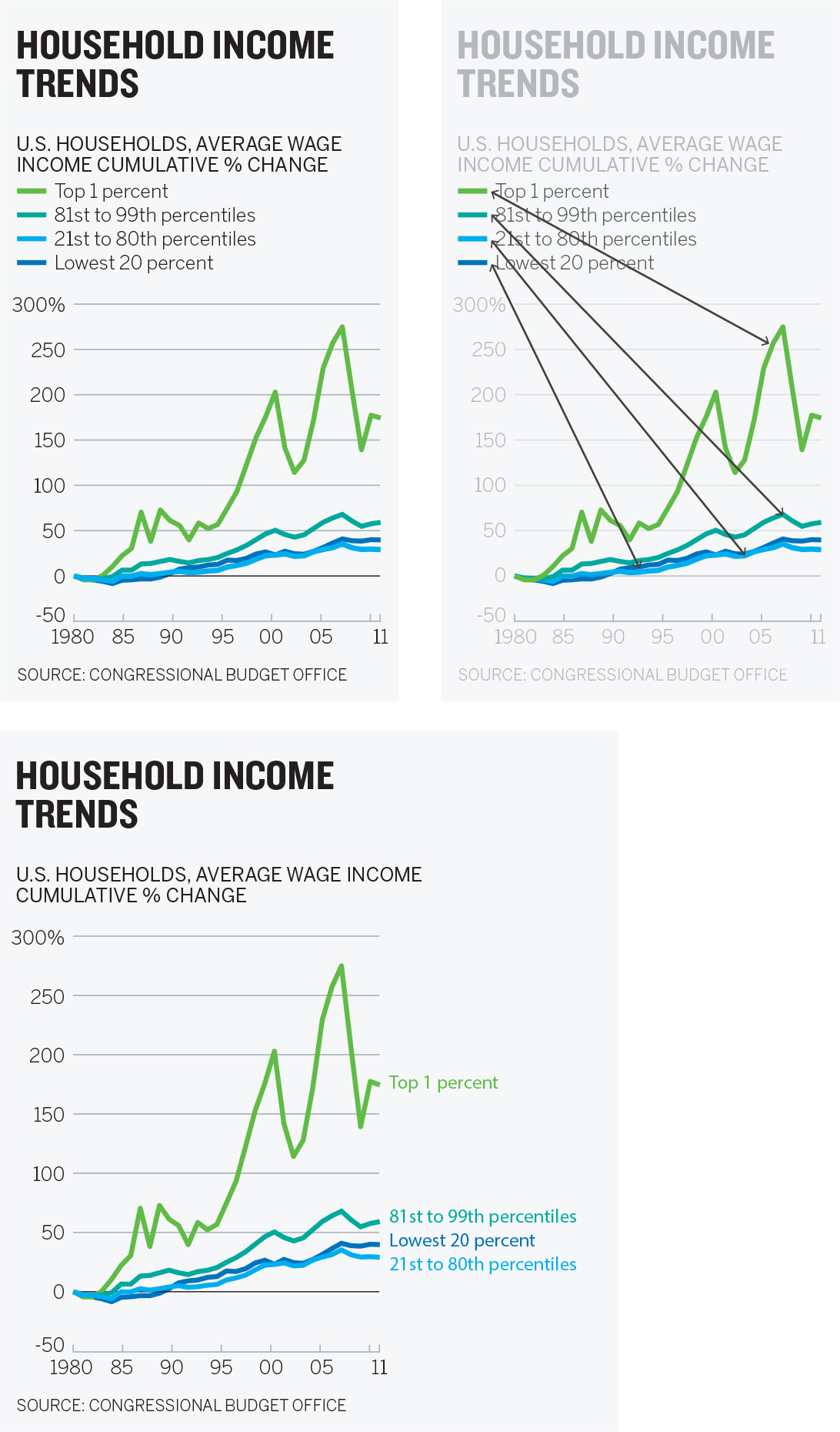
The last Household Income Trends chart feels simpler. Your eye travels across the visual and arrives at the label, which itself is color coded, connecting the elements more naturally than a key can. Compare that to the work it takes to try and learn the variables in the first chart, where you have to dart eyes back and forth between the key and the visual.
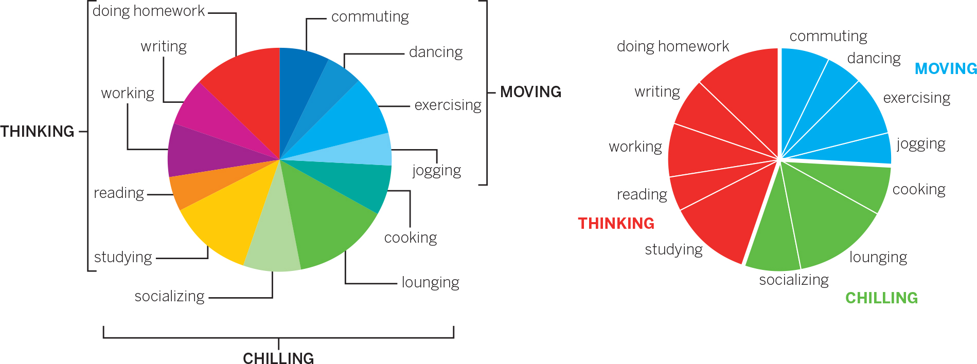
Another way to limit eye travel and keep the structure of charts neat is to make pointers and other marks as short and straight as possible, or even eliminate them altogether. Curves and elbows in lines pull your focus away from more-important elements. And the further away the label, the harder it is to connect it to its visual counterpart. Compare these two pie charts:
Clarity. Does the chart make sense to you, or are you stuck wondering what you’re supposed to see? You may have experienced what the data visualization pioneer Kirk Goldsberry calls a “bliss point”—that Aha! moment when a visualization instantly and irresistibly delivers its meaning to you in a way that feels almost magical, as if it required no effort on your part. Such moments come from a design that achieves clarity. Which of these charts sparks that bliss point?

The chart on the right is an astonishing achievement in clarity, part of a set designed by Tynan DeBold, of the Wall Street Journal. The chart on the left, which delivers the same information, was presented in the New England Journal of Medicine for a specialized audience. It’s a good chart for its context, but does not achieve the same effect. How does DeBold’s chart achieve such clarity?
Nothing is extraneous. Other than labels, only three words accompany this visual, yet it’s instantly understandable. DeBold’s restraint is remarkable. For example, he doesn’t add a “States” label to the y-axis, or “Year” to the x-axis, because we don’t need those words to understand the labels. He even goes so far as to omit “Cases” from the title. (The chart ran as part of an article that briefly notes before a series of graphics like this that they represent “cases per 100,000 people,” but even without that the meaning is clear.) Admittedly, this is an extreme example. But it serves to illustrate how clarity can be achieved by removing nonessential information.
Each element is unique and serves the visual. DeBold’s chart contains seven elements: title, x-axis labels, y-axis labels, legend, visual, line of demarcation, and caption. Each one does a job that none of the others does. There’s zero redundancy.
Most charts aren’t so purposefully clear. They lack clarity because elements are used to describe the chart’s structure rather than support the idea being conveyed. Titles or subtitles repeat axis labels. Captions describe what the visual shows. These are signs of a chart that plots data but isn’t advancing an idea as well as it could, or a chart maker who lacks confidence that the visual can convey the idea on its own.
Supporting elements that have a finer purpose—that augment rather than just repeat—enhance clarity. Start by making sure elements serve to describe the chart’s idea rather than its structure. Think of a piece of music: Which title helps you understand the idea behind it better: Concerto No. 4 in F Minor or The Four Seasons: Winter?2
One way to create clarity is to make the title or the subtitle the question that the visualization answers. Go back to our core question: What am I trying to say or show? This Facebook/BuzzFeed chart to the right is an excellent visualization.

But would you more quickly understand what it’s showing if its title and subtitle were, say:
Finding the Sweet SpotHow many items make listicles go viral?
The actual number of shares on the y-axis—what the original title refers to—is the data that helps show the idea of virality. This new title refocuses viewers on that idea, helping them get to what they’re looking for more quickly. The words in the title give deliberate clues: “Sweet spot” prompts us to “find” the active region in the visual field. Convention tells us that a sweet spot will be active, positive, dense, so we make a connection between the deep red blotch we see first and the title.
If, instead, we wanted people to notice what types of articles don’t go viral, we could change the text:
Viral Dead SpotsListicles get shared less when they include toomany or too few items.
Same visual, completely different effect on viewers as they check the visual and then reference the title and subtitle for context. One final note: The original title of this chart isn’t always a bad idea. Sometimes you want a more objective or passive tone that simply describes the data. (This is especially true for analysts, who are meant not to make judgments on the data but only to show it.) As ever, knowing the context is key.
It’s unambiguous. If you were quickly approaching the intersection where this sign is posted, and you had to get to Cambridge, would you be able to get in the correct lane in time?
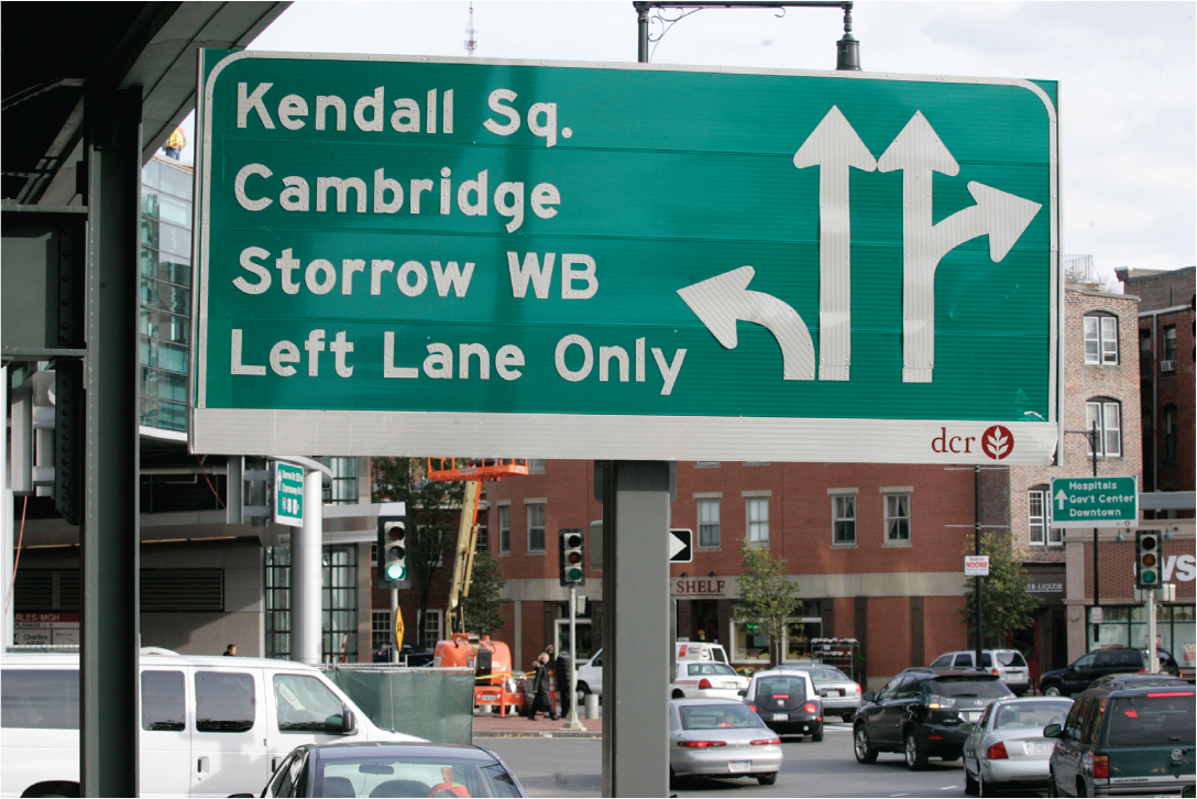
Its ambiguity is paralyzing. Instead of using the sign to guide you, you have to take time to assign meaning to the sign itself. You’re forced to slow down, shift your focus from driving to thinking about the sign, while trying to continue moving forward. You might feel your mind racing, or you might get panicky. Maybe people are beeping at you. It’s stressful.
Ambiguity in visualizations generates a similarly stressful effect (without the beeping). We approach a visual at speed, prepared to parse it quickly, and then ambiguous elements force us to stop, refocus, and think about the visual and how it’s built rather than the idea. In DeBold’s polio graphic, there’s no way to misinterpret any element. Compare that with the medical journal version, in which the legend is vertical, snug against the heat map. Is it an axis? What about the lavender line? It’s unlabeled. What does it mean? How does the small line chart above the chart relate? Why are there seemingly three y-axes? We’re stuck reading the sign instead of using it to get where we’re going.
It doesn’t flout metaphors or conventions. DeBold’s polio chart uses colors in a way that our brains swiftly grasp: Red is more intense, blue is less so. He has created a low-res heat map that plots 2,250 data points (50 states by 45 years). But he’s done something clever: He’s tacked on a blue-to-pale-gray gradation at the low end of the scale, desaturating the blue until it’s nearly colorless, or “empty,” at zero. With that he has tapped into another convention we’re used to: Less color saturation equals less value.
These two conventions combine to create the stunning effect of polio’s literally disappearing. Compare this with the journal version, in which midnight blue equals zero. The disappearing effect is there, but dark blue transitioning to a darker blue doesn’t feel as powerful or immediate. It could just as easily convey full saturation. The lavender line of demarcation for when the vaccine was introduced is harder to see. It doesn’t elicit a before-and-after narrative as effectively.
Remember all the conventions lodged in our brains as heuristics from chapter 2: North is up. Red is hot. Time goes left to right. Strong designs do not upend these conventions unless there’s a good reason for it.
Simplicity. Does the chart look airy, elegant, and pleasing, or cluttered, busy, and complex? Do you naturally know where to look or do you spend time figuring out what to focus on? The sense of spaciousness, minimalism, beauty, or lyricism we may feel when we see a dataviz comes from its simplicity.
Clarity and simplicity are related but subtly different. Clarity concerns effective communication: Does the idea come through? Simplicity focuses on effective presentation: Are you showing only what’s necessary for the idea to come through? When both are achieved, they hold together like a binary star system, serving each other. Simplicity contributes to clarity, and clarity enhances the sense of simplicity.
But simple isn’t always clear, and clear doesn’t have to be simple. Which of the two charts below takes longer to understand?


Although the chart on the top is simpler, it probably took longer for you to understand—if you understand it at all. It’s less clear. The labels fight with their visual counterparts. How much value does the first bar have? Why are there no values on the y-axis? Why are the bars different colors? If the middle bar represents 17% more likely, how can the only slightly larger third bar represent 42% more likely? (In fact, the bars represent some chance of leaving a job that we don’t know, because it’s not shown; the second and third labels represent the difference in height between compared to the first one.)
The chart on the bottom is not nearly as simple. It plots nearly 70 trend lines each across 365 x-axis points (one for each day of the year). Still, the point of it is absolutely clear. It uses color effectively. The title and labels are unambiguous.
We tend to think of simplicity as the absence of stuff—that if we just keep taking away more and more information, we’ll achieve simplicity. That’s true to a point. But excessive simplicity leads to a lack of clarity. What you really need to think about is relative simplicity—how little you can show and still convey your idea clearly. Follow the maxim usually attributed to Einstein: “Everything should be made as simple as it can be, but not simpler.”3
Which of the following charts about sales rep performance is simpler?


The chart on the top looks final and reasonably clear. But simple and clean probably aren’t the feelings you get behind your eyes. The simplicity of the version on the bottom is impressive, given that it manages to convey the same point with so many fewer elements. What makes that version simpler?
It removes stuff. Leave only what’s valuable to communicating your message. Edward Tufte mathematized this idea as the “data-ink ratio”—the higher the share of ink on the page that’s devoted to necessary elements, the better.4
Tufte’s concept sounds precise, but he’s really just saying don’t waste ink on decoration or redundancy. In text editing, this is more colorfully referred to as “removing the deadwood.” It’s a sound principle. But the trouble with such aphorisms is that “necessary” is a slippery, subjective thing. What is valuable to communicating your message depends, as always, on context. Who is the visual for? Do you already have their attention? How much detail do they need? How and where will they use the visual? Do they have seconds or minutes to look at it? Are you trying to inform them or persuade them? Have they seen this kind of chart before? Are they familiar with the data? How will it be displayed? The answers to these context questions (and many more) will affect what’s necessary to include.
It’s also hard to edit yourself. If you didn’t think some element was necessary, you probably wouldn’t have included it in a prototype in the first place. It takes discipline to “kill your babies,” as text editors sometimes say.
A good way to force yourself to look critically at what you’ve included is to evaluate the elements one by one, using this simple question flow:

If you’ve been through a talking and sketching process, and your answer to What am I trying to say or show? is written down, you can use that to determine whether an element is necessary. The manager who created the earlier Rep’s Past Performance chart did write down his statement: Past sales aren’t a good predictor of future performance. Highest performers are more valuable than you think, and lower performers are less valuable than you think.
With this in mind, we can spend a few minutes applying the question flow to every element in the original version of his chart.
A title is nearly always necessary. But is this one unique? No. In fact, one of the captions repeats it nearly verbatim. Keep the title, kill the caption. Is there a simpler way to present the title? Not really. It can stay as is. The subtitle is a tougher call. It sums up the statement of purpose well. But is it really necessary? It’s not unique: It recapitulates the visual. The captions below the x-axis also repeat the same idea. That’s three ways to say the same thing. So, let’s kill the subtitle.
The information in the visual field is necessary, unique, and couldn’t be made much simpler. Keep it as is. We’ve already decided that the caption is redundant, but it does contain bits of unique information, about the formula for future value and the source of the data at a B2B company. This is minor information that doesn’t need to distract from the visual the way it does currently. It can be moved to the source line. The other two captions, about over- and underperforming, are necessary to describe the division between the two types of salespeople, which was a core idea the chart maker wrote down.
Axes are nearly always necessary on data plots, but how many demarcations they should contain is both endlessly debatable and a major factor in how simple a chart feels. The “airiness” of a simple visualization is often achieved by diminishing or removing a chart’s background structure—reference lines, ticks, value intervals. Look at the three gold price charts below (we’ll come back to the sales performance chart).

The chart without gridlines and fewer labels feels simplest, but is that kind of minimalism always a good thing? Think about display media: A chart presented on paper or on a personal screen—a format in which viewers can spend time with it—may benefit from more detail that allows the viewer to reference individual values and explore the chart in depth. But for a chart in a presentation—when you want the audience to understand the visual in seconds—fewer structural elements will reduce distractions and make it easier to focus on the broad ideas.
Ask yourself, What do I want viewers to do with this chart? If the overall shape of the trend is what matters, be more aggressive taking away reference points such as grid lines and axis labels. Communicating the idea that “the price of gold is going down” probably doesn’t need detailed stratification on the y-axis. But if you’re hoping to have a conversation about monthly gold price trends, more reference points may be helpful so you can more easily connect months to approximate values. Imagine, for example, using the right-most chart and saying to your audience, “Look what happened to prices in May.” That’s much harder to see here than on the middle chart. Then again, the prototype at left has so many dollar values on the y-axis that it’s hard to follow them across the grid.
Back to the sales performance chart: The x-axis is unique and necessary—each pair of bars needs a label. But do we need more or fewer values on the y-axis? If we reduced it to just low, middle, and high values, would that adversely affect its ability to convey the idea? Probably not. The manager’s statement of purpose shows that comparing the relative value between two time periods matters more than specific dollar values. The y-axis can be simplified.
In general, though, labels present another challenge to simplicity. A common technique for many managers is to label every visual element on the page with its specific value:
The labels begin to overtake the visual. But why are they there? Are we meant to focus on the specific values, or on the overall shape of the thing we’re looking at? Are we meant to look at the data or read it? A visualization is an abstraction. Labeling every value is a concretization. If you feel that it’s necessary to show every value, and for your audience to have access to all specific values, a table may be a better option:

The manager who made the previous chart may argue that the table isn’t as effective because it doesn’t provide instant recognition of an upward trend and the growing share of mobile screen use. That manager is correct and has unwittingly argued against her labeling every value in the chart: If the trend and the growing share are most important, the specific values shouldn’t be put there to steal our attention from the overall trend.
The manager needs to ask, Is each individual value important to expressing my idea? and Do specific data points have to be available to discuss the idea? If the answer to either question is yes, a table should be made available. The manager can provide a visual as well, but he’s now free to make the chart much simpler. Compare the original chart with the suite of three below, which make every value available and give viewers at-a-glance trends:

There’s no right answer here without knowing the context. But it’s true that more labels will reduce simplicity and demand that the viewer make decisions about what’s important. Overall, be aggressive in your efforts to reduce marks on the page. You can almost always take away more than you think—and more than you want to. Test very sparse versions of your chart on colleagues; you may be surprised at how little you need to include to convey your idea.
It’s not redundant. Removing repetitive elements, as we just did, helps simplify, but so does removing redundant design within elements. Here are a title and subtitle for a chart:
WHAT IS MIDDLE CLASS?
Family income by city, 2013
This is clear and crisp text. But design-wise, the title is highly redundant. To make it stand out, it’s been given five special treatments: size, boldface, underline, color, and all caps. Does it catch your eye? Yes. Does it need so many signals that it’s special? No.
The subtitle has two distinguishing elements: size and italics. But if the text is smaller and appears right below the title, it must be the subtitle. Italics are superfluous here.
This is called belt-and-suspenders design. You don’t need both to hold up your pants, so pick one. In general, a design will feel simpler if you apply as few unique attributes as possible. Here’s the same title and subtitle but with only one difference assigned in each case—size, weight, or color:

You might even argue that the line space between the two levels of information is redundant. If you want more space for your visual, you could put the title and subtitle on the same line and still achieve the proper relationship between them:
What Is Middle Class? Family income by city, 2013
Most of the charts in this book use both size and weight to distinguish title type. Two distinguishing characteristics are quite common with titles. As a design choice, it’s fine. We present the examples with only one distinguishing characteristic to drive home the point that you don’t need to overemphasize elements to get them to do their job. This kind of discipline becomes even more important as you add elements to the data visualization. That sense of simplicity is lost as you create unique visual attributes for axes labels, captions, pointers, and other elements. Instead of giving each its own unique design features, it can help to create classes of information that share design attributes: Captions, legends, and labels can share a text style, for example. Lines, arrows, boxes, and other marks can use consistent weight and style. In many cases, they can be eliminated in favor of simple alignment, which achieves the same end without marks on the page.
Its use of color is restrained. Simplicity suffers when you make charts too colorful because you want them to be eye-catching or you have lots of data categories to plot. To make meaning from a chart, viewers can’t help but focus on color differences and wonder what they mean. That’s how the brain processes the information. It wants to assign meaning to each color. What’s more, the brain can’t hold many different distinct colors simultaneously as it evaluates information. More than, say, four or five colors at most and the brain wants to start grouping like colors together. Even if your blue line and teal line aren’t related variables in your chart with 12 different line colors, the mind is trying to put them together.
The more color differences, the more mental work to figure out what the distinctions represent. Challenge each addition of a color to a chart: Why do I need to make this distinction? Can it be combined with other information as a group with a single color?
Think of color in your charts as a fraction that you need to reduce. A colorful chart is like the fraction four-sixteenths. That ratio is more clearly expressed as two-eighths, and most simply expressed as one-fourth. Find the lowest common denominator that still preserves the distinctions you need to convey your idea. For example, the first chart in this chapter included eight distinct three-hour time periods. I’ve shown iterations on that chart below to show how color reduction increases effectiveness. Eight unique colors result in a complicated looking chart with many elements fighting for our attention. Reducing that to four colors in six-hour chunks—enough categories to convey the idea well—helps, but the colors still fight with one another. We can push it even further. Clustering the data as just two colors: yellow for before noon and blue for afternoon, with the less common nonworking hours in paler hues, creates an obvious improvement in clarity.

Another note: Gray is your friend. It creates an information hierarchy. We typically think of gray information as background or secondary by comparison with information presented in color. It provides context without disrupting the main idea by fighting for too much attention.5 Retaining axis lines but making them gray preserves their usefulness but lets them recede behind the important visual information. Background data that provides context also benefits from being made gray. The Mount Mansfield Snow Stake Depth chart earlier in this chapter is a masterful example of using color and gray to represent foreground and background information.
Color choice, too, should follow convention.6 Contrasting data? Contrasting colors. Complementary data? Similar colors. Groups of data? Same or similar colors. Data ranges? “Empty” colors (low saturation, paler, whiter) for lower values and “full” colors (higher saturation, richer, darker) for higher values.
COURAGE
You’ve already heard most of the wisdom about simplicity: It’s the ultimate sophistication (Da Vinci); style depends on it (Plato); less is more (Robert Browning via Ludwig Mies van der Rohe); simple is hard (variations attributed to hundreds of people). All that is true, of course. But for managers, here’s a new aphorism: Simplicity is courageous.
A manager’s impulse often is to show everything, which leads to dense, difficult-to-read charts that don’t so much convey an idea as turn hundreds or thousands of spreadsheet cells into a visual. In part, this is the curse of knowledge—we think it’s important to represent all the data that we know about and that we’ve produced. Dense, complex charts, we think, convey something about the person who created them: I know my stuff. Look at all this data. Look how hard I’m working.
This deep-seated belief that more is better, that complex equals smart, must be eradicated. That’s not what makes charts good.
Standing up at an important meeting to present a few clear, simple charts probably seems scary. Andrew Abela hears this when he’s working with executives on their presentation skills. “When it comes to simplicity and clarity, there’s a correct fear and a false fear,” he says. “The correct fear is you do need to convey the right information, the right detail.” That’s what this book wants to help you do. “But then there’s the false fear that if you don’t show everything, they won’t understand or they won’t think you’re working hard.” In some ways, the first fear leads to the second: I’m scared I might not show the right information, so I’ll show all the information. “I’ve been doing this a long time,” Abela says, “and I will tell you now, nothing makes an executive happier than seeing someone show up with just a couple of excellent charts. They tell me, ‘Finally, someone confident enough to just show me what I need and not bombard me with 60 slides.’ ”
“Once,” he continues, “I helped a manager prepare for a presentation to the CEO, and even though he was nervous about it, we decided he should make the entire presentation based on one great chart that he had created. The CEO was so impressed. They spent three hours talking about that one visualization.”
THE ART OF PERSUASION
A manager at a not-for-profit is preparing to stand in front of 20 potential donors with deep pockets and many options for where to take their philanthropy. She’s launching a program to fight suburban poverty, which she will tell them is a significant, growing problem. But she knows her audience will need more than that to be persuaded to back her initiative. She’s already anticipating skeptical questions, such as “Why suburban poverty? It can’t be as bad as urban poverty, can it?” These people will want to see evidence. She looks at a chart that will provide it:

A good effort. It’s simple and well designed. All the information is there. Although poverty is growing in both cities and suburbs, it has grown more in the suburbs. Still, she’s unsatisfied by her effort. The first thing she sees is that poverty is growing; it takes a minute to find the suburban poverty story. So, she tries to build a more persuasive visualization and comes up with this:
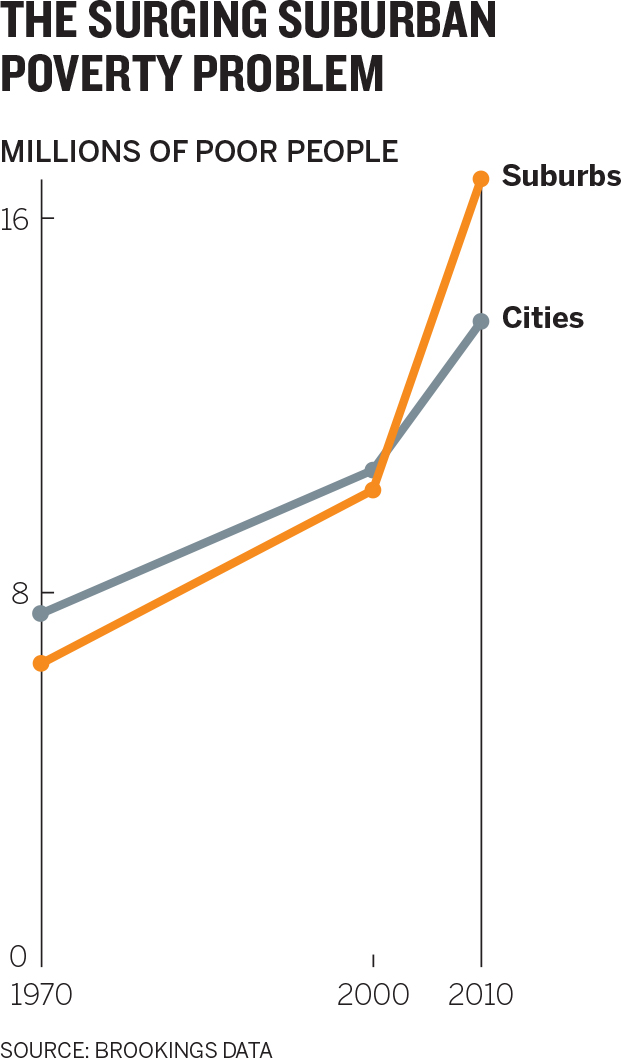
She’s thrilled with this version, which is more accessible and far more convincing. The surge in suburban poverty comes through immediately, and almost directly after that, so does the idea that more poor people now live in suburbs than in cities. This will surprise and move her audience.
How did she get from her original, perfectly accurate but unsatisfying bar chart to something she’s certain will help her line up donors for the program?
MAKING A CASE
It’s often not enough to make a chart that’s simply accurate. You’re trying to reveal truths dormant in data; to make a case; compete for attention, resources, and money; make a pitch to clients; recruit new customers; sway an opinion or help to form one. You don’t just want people to believe the chart is true—you want it to lead to action, suggest a way forward.
Persuasion science defines three strategies we use to influence behavior or thinking: economic (carrots and sticks), social (everybody else is doing it), and environmental (relaxing music at the dentist). Visualization falls for the most part into the third category. Steve J. Martin, a heavyweight in the field and a coauthor of several books on influence and persuasion, provides a legion of examples from his and others’ research of how environmental persuasion strategies work.7 For example, a professor doubled the number of people who were willing to participate in a survey by attaching a handwritten note to the request.8 Hotels increased the reuse of towels by 25% when they changed the wording of placards next to the towels.9 People serve themselves less food when the color of a plate contrasts with the color of the food.10
The mechanisms by which information visualizations persuade us are similarly subtle and equally powerful. “Whilst we’d like to think that our decisions are the result of effortful cognition, the reality is somewhat different,” Martin writes. “Much of our behaviour is driven by unconscious cues present in our environment.”
We’re veering away from the data scientists now. It’s often their job, or at least they see their own jobs as an effort to show all the data—to be as objective as possible and present everything that’s available for analysis. This makes sense when we’re doing exploratory visualization. It’s for fact-finding, hypothesis-testing, and analysis. This chapter focuses on those times when visual communication needs to sway an audience and effect change.
Even if we don’t think much about it, we recognize the distinction between conveying information and persuading, and we allow for both types of communication. A play-by-play announcer calls the action, describing mostly what’s actually happening on the field; a color commentator influences our sense of the game’s narrative. A house for sale can be accurately described as “2,400 square feet with 4 bedrooms and 2 baths on 1.2 acres” or, to make you want it more, as “a huge, open-concept Colonial with a brand-new modern kitchen, on a secluded, wooded lot with spectacular views.” What you may call a used car, the person hoping you’ll buy it calls pre-owned. Newspapers publish both reported stories and op-eds about the same topic. Compare the sentences below:
|
Reported story |
Op-ed | |
|---|---|---|
|
The budget again seeks to retire the popular A-10 “Warthog” close air support aircraft for savings of $382 million, a move sure to anger Congress, which rejected a similar proposal last year.11 |
I appreciate the budget pressures that the Pentagon faces these days. But those arguments have serious flaws—and if we retire the A-10 before a replacement is developed, American troops will die.12 |
Is the reported story better than the op-ed? No, a qualitative comparison is impossible. One is informative, the other persuasive, and they use different rhetorical techniques.13 The reported story describes facts, and speculation (Congress will get angry) is bolstered by evidence (it was rejected before). The editorial, though, uses the first person, joins the audience (“we”), and feels more personal and conversational (“these days”). A significant claim (“troops will die”) is stated without evidence. Neither text is better or worse than the other; each is good in its context (and, conversely, not good in the other’s).
The same holds true for dataviz. When you have a point of view, you can employ techniques—manipulations—to heighten the effect. The unconscious cues—color, contrast, space, words, what you show and, as crucially, what you leave out—all work to make the idea more accessible and increase the chart’s persuasiveness. Below is the dataviz equivalent of the news story/op-ed comparison.

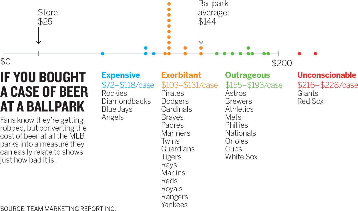
If you wanted to persuade someone that beer is too expensive at baseball games, it’s clear which chart you’d use.14 But if the commissioner of baseball wanted to understand the costs associated with attending games, then such persuasion would be inappropriate. Admittedly, this transformation is extreme; it was conceived as an exercise in making data as persuasive as possible, a kind of op-ed experiment. But persuasion doesn’t need to veer into blatant editorializing. Most of the time, managers just want to make a point more clearly and forcefully than an accurate, well-designed, but passive chart does.
THREE STEPS TO MORE-PERSUASIVE CHARTS
What often makes a chart persuasive is how easily people’s attention goes to the main idea.15 Persuasion scientists refer to this as the availability of salient information. If you make an idea easy to access, viewers will often find it more appealing and persuasive.16
Which chart does a better job of persuading you that the West Coast sales team is a problem?
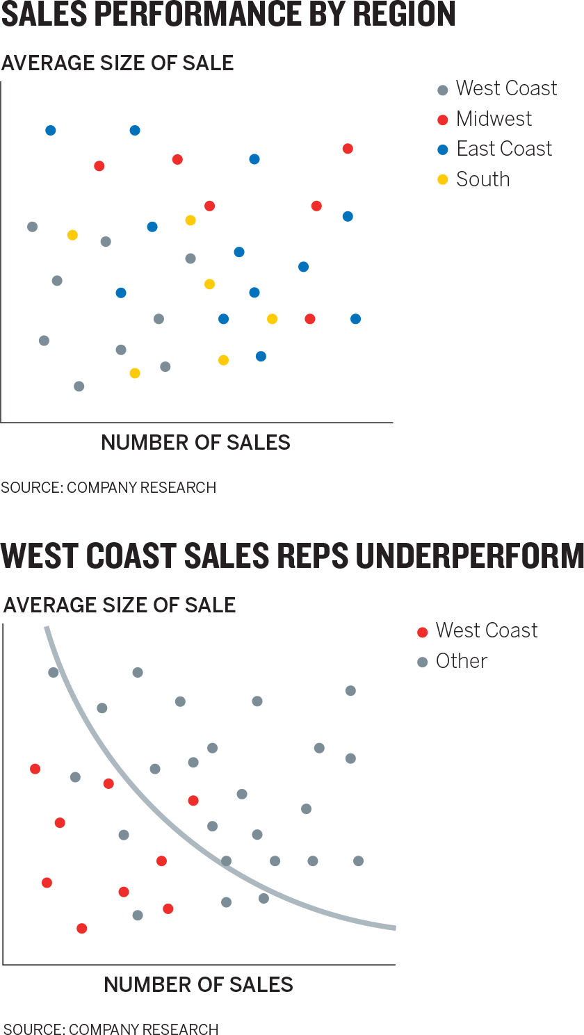
The top chart may seem more informative because it includes more-detailed information. But persuasion is not about how detailed and precise you are; it’s about how easy you make it to see the most important thing. The chart on the bottom is more persuasive.
The manager who made this chart employed many of the same techniques used by the manager at the not-for-profit who charted the growth of suburban poverty. When you’re trying to increase persuasiveness, focus on these three things:
- Hone the main idea.
- Make it stand out.
- Adjust what’s around it.
Hone the main idea. The context-setting process outlined in chapter 4 for arriving at your defining statement will put you on the path to persuasion. Look again at the urban/suburban poverty chart and the one that follows and try to imagine what statements might have been made during the talk and listen phase to inform the creation of those charts. They might be something like this:
|
Nonpersuasive |
Persuasive | |
|---|---|---|
|
I want to compare suburban and urban poverty populations, decade by decade. |
I need to convince people that suburban poverty is a huge and growing problem that has rapidly overtaken urban poverty. |
To find your persuasive voice, you can go through a mini round of talk and listen with a counterpart. (If you’re already at the talk and listen stage, add this in.) Change your prompt. Instead of asking What am I trying to say or show? try I need to convince them that … The former is still the best first prompt for your conversations (and for more-objective visualization projects). You may arrive at a more persuasive approach from that question alone. But if you don’t, and your charts aren’t having the persuasive effect you hoped for, the statement may help. Examples:
|
What am I trying to say or show? |
I need to convince them that … | |
|---|---|---|
|
I am trying to show the distribution of costs of buying a beer at baseball stadiums. I am trying to show the relationship between increased automation in manufacturing and fewer jobs being available. Automation increases profits but creates a need for new jobs that are hard to fill. I am trying to show how increasing hours spent on work isn’t increasing productivity and may be decreasing it. I am trying to show that getting vaccinated is safe and effective. I am trying to show that the gardening population is a large, growing, diverse, and underserved market. |
I need to convince them that beer is unbelievably expensive at every single baseball stadium. I need to convince them that although profits are higher, robots are killing manufacturing jobs and creating a massive skills gap that offsets those short-term gains. I need to convince them that all this extra work we do is backfiring. It’s hurting the company’s productivity, not helping. I need to convince them that vaccines save lives, not getting vaccinated leads to unnecessary deaths, and the risks from vaccines are vanishingly small. I need to convince them that growth in the gardening market is real and comes from people who are hungry for apps, younger, and more technically savvy than they think. |
Notice how in each case, the second prompt gives rise to more-emotional language. You’ve shifted from visualizing an idea (I want you to know something) to trying to persuade someone that the idea is good (I need you to believe something). Words that describe statistical trends (increasing, declining, underserved) naturally give way to words that describe feelings (hurting, helping, hungry).
One caveat: It’s easy to slip into unhelpful editorializing when using the I need to convince them that … prompt. The manager looking at the gardening market, for example, may have arrived at I need to convince them that they’re wrong about gardeners and they’re missing a major opportunity. That’s not a useful starting place for sketching and prototyping. It reflects his feelings about his audience and the results he foresees if he fails—not the ideas he wants to communicate in his charts.
Still, talking through his frustration with a colleague might help steer him toward a more useful statement of persuasion, especially if the colleague asks that pesky question “Why?”
I need to convince them that they’re wrong about gardeners and they’re missing a major opportunity.
Okay, why are they wrong?
Because gardeners use apps and shop online. They’re not these Luddites who can’t work an iPad. Hell, 7 out of 10 gardeners are under 55.
That’s the missed opportunity?
Yes. Most of the growth in gardening is with people under 35. Obviously they use apps. Even older gardeners are more tech-savvy than people assume. They shop online more than the average person. That’s what I need to show.
Now he has documented some usable information and found a revised, persuasive statement that he can begin to sketch.
Make it stand out. With a sharper statement, sketching and prototyping will naturally veer toward more-persuasive forms. But you can amplify the persuasive effect even further with a couple of design decisions and techniques. Specifically, you can emphasize and isolate your main idea.
Emphasize. There, I just did it. Boldface and color are forms of visual emphasis. Did you say to yourself, This bolded word is important; I should pay attention to it? Probably not. But you did assign meaning to it, without even thinking about it. You treated it differently from the words you’re reading now. You’re more likely to remember it because I emphasized it.
Just as text allows for multiple forms of emphasis, such as boldface, italics, ALL CAPS, underline, color, and highlights, visuals use a variety of techniques to emphasize key information and ideas: Color. Highlights. Pointers. Labels. Tell me what I’m supposed to see. Make it easy for me to get it.

It doesn’t take much to emphasize an idea. Color, simple pointers, or demarcations will draw the eye.
The most obvious and common form of emphasis is color. Use rich color to bring forward and diminish other information with lighter or contrasting colors. The not-for-profit manager went through several color iterations in trying to make her main idea the most accessible one. Each iteration attempts to make the surging suburban poverty trend the first thing we see and to use the comparative information, urban poverty, to support rather than compete with that idea. Here’s why the manager rejected each previous iteration:
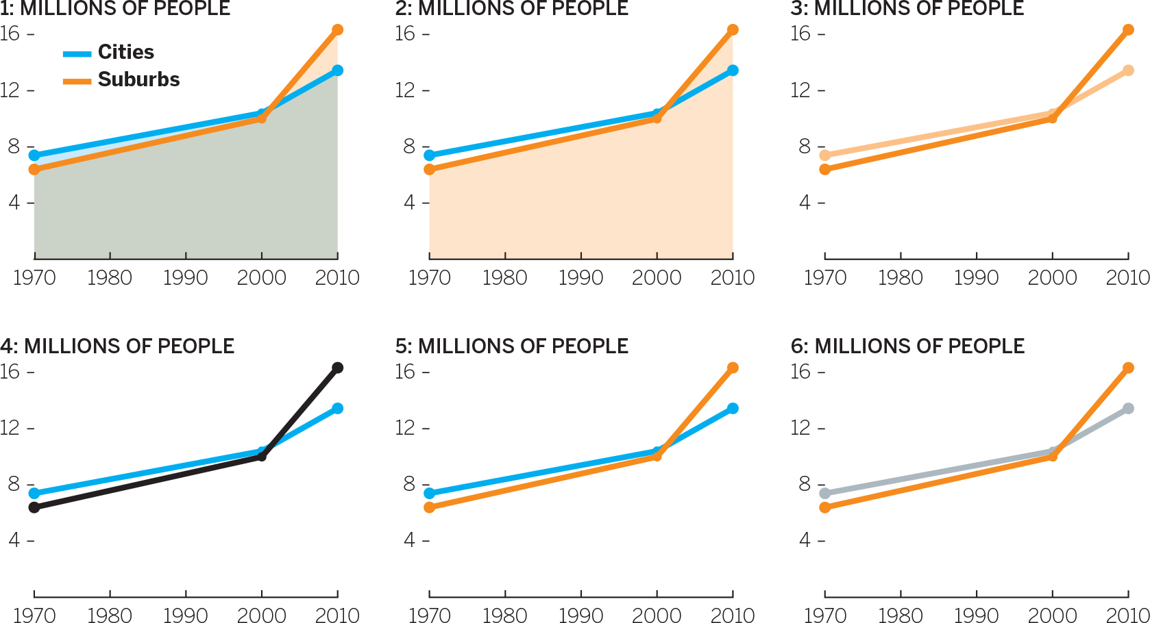
- The overlay of semitransparent colors creates a third color that dominates the chart and draws attention to the filled area, not the lines.
- This clearly highlights suburban poverty more, but why is one shaded and one not? The shaded area is still distracting.
- Darker and lighter hues of the same color suggest two variables in a group, not a comparison. She wants to contrast, not complement.
- Black on white provides the most contrast, but black and blue don’t contrast so much that the black line pops.
- Better! But the blue is still fighting for attention.
- Final color choice.
Demarcations may seem almost unnecessarily simple, but they can be extremely influential. The curved gray line of demarcation on the chart that maps West Coast sales performance shown earlier makes it impossible to see the team as anything other than performing below expectations. Pointers can also nudge an audience toward the narrative we want to convey. Without the dotted line and label, it would be hard to understand what was happening in the Netflix Customers chart.

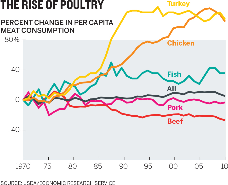
Demarcations can also be used to editorialize. By exceeding the border of the visual field, the author of the Rise of Poultry chart is making a value judgment about the reasonable limits within which the data should fall. The two lines that flout convention by going outside the border draw our eye immediately—they are meant to persuade us that the values represented by these lines are too much or above the expected range. (Similarly, in the editorial chart showing the cost of beer at MLB stadiums, the axis stops before it reaches the highest value: This suggests that the cost of beer at Giants and Red Sox games is, literally, off the charts.)
The West Coast sales-reps scatter plot uses another, less obvious way to make an idea more accessible. When charts are meant to represent some number of people or individual units, it’s useful to show those units (or multiples of them) rather than a more abstract statistical representation of the whole set. In that chart, each dot represents a person. The same information could be conveyed more abstractly but would be less persuasive because it takes us further away from thinking about the individuals and their performance:

Even if the relative smallness of the West Coast bars were emphasized, this chart would be less persuasive than the chart that plots individuals’ performance. That’s because statistics are abstract things, and our minds would prefer to focus on more tangible, relatable things.17 For example, which of these more convincingly shows the extreme unlikeliness that a high school basketball player will make it to the NBA, the pie or the unit chart?
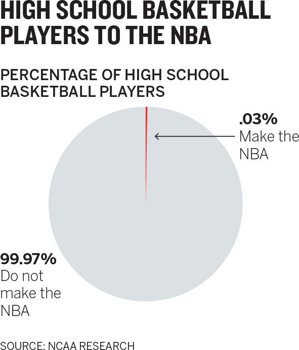
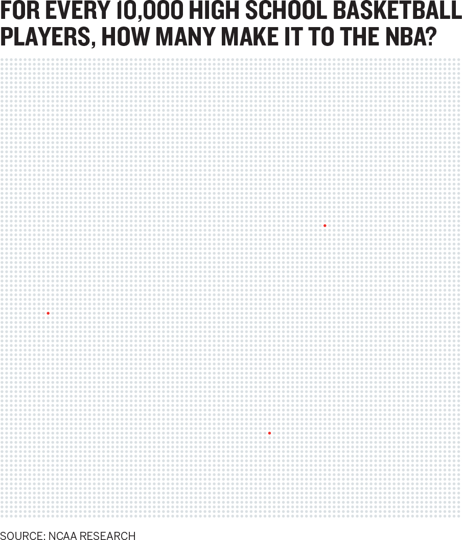
The dots turn data into units that we can relate to—people—better than we can relate to a number like 0.03%. (It probably took you a moment to locate the three red dots. In this case, the random placement of them and the lack of accessibility helps, illustrating as it does that those individuals are so rare that you must work to find them in the crowd.)
The way unit charts convey a sense of individuality have made them a popular way to communicate ideas about people. They’re also effective when visualizing risk and probability (as in the NBA example, or in some other common examples, death rates).18 Another potentially powerful use of unit charts is to represent money. We often show budgets and spending as proportional breakdowns. Showing individual units of money allocated to various groups might persuade us to think more carefully about where we put those literal units of money.
High-resolution displays have also helped popularize unit charts, because they can display tiny points as clearly as print can. How such a chart will play on a large screen in a presentation is worth considering beforehand.
Isolate. As much as we can emphasize the main idea, we can also isolate it by de-emphasizing other aspects of the visualization. Every element that earns a unique attribute, such as color, is fighting for attention with the main idea to which we want to draw people’s eyes. The fewer the unique elements, the easier it is for viewers to know where to look and to understand what they see.
Software programs that generate charts don’t automatically create influential emphasis. They tend to assign colors to every variable without accounting for which ones you want your audience to focus on first or most, or how color and categorization can be used to create primary and complementary information.

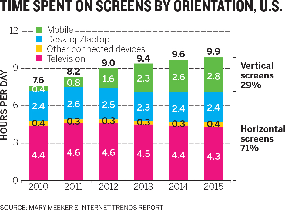
When every variable gets a bright color; no one variable stands out. Which idea is most available in the first Nonmortgage Debt Outstanding chart? Many people first see the green line because it’s somewhat separate from the others. But this chart is in fact meant to persuade us that there’s a student debt crisis. Now you may see it, but that idea was less available than it should have been. Isolating that variable creates a more persuasive chart.
For all the power of software programs and online services to generate reasonably good looking visualizations, they’re not yet capable of injecting such persuasive design cues. That makes sense: Software renders data. People present ideas. It’s still up to us to intervene with decisions and techniques that bring our ideas into high relief. The writing program I’m using right now can’t anticipate which words I want bolded or italicized. It’s up to me to decide which need emphasis and then apply the right kind at the right time.
Adjust what’s around it. The most aggressive way to make an idea pop is to change the reference points—the variables that complement or contrast with the main point. We can remove, add, or shift them.
Remove reference points. A chart similar to the one below was tweeted with the message “The age divide in what people want from products.”19

How available is the age divide in this chart? Do you see it? Are you persuaded there is an age divide? What about with this chart?

Removing reference points made the idea pop. Think of this as a more aggressive form of isolation. Instead of diminishing color or grouping elements together, you eliminate some information altogether. In the Opposing Desires chart, the middle two age groups have been removed because they don’t help illustrate the idea of an age divide. This chart also groups bars by age rather than by feature requests. That makes sense because the main idea is an age divide; those are the categories we want to compare first.
Add reference points. It may seem that removing information will always make the main idea more available because it has less visual information fighting with it. But sometimes adding reference points works too. For example, a case can be made that vinyl LPs are making a major comeback. There’s also a persuasive case to be made that vinyl LPs are not making a major comeback. New reference points incontrovertibly alter the persuasive message—in this case from one story to its opposite.
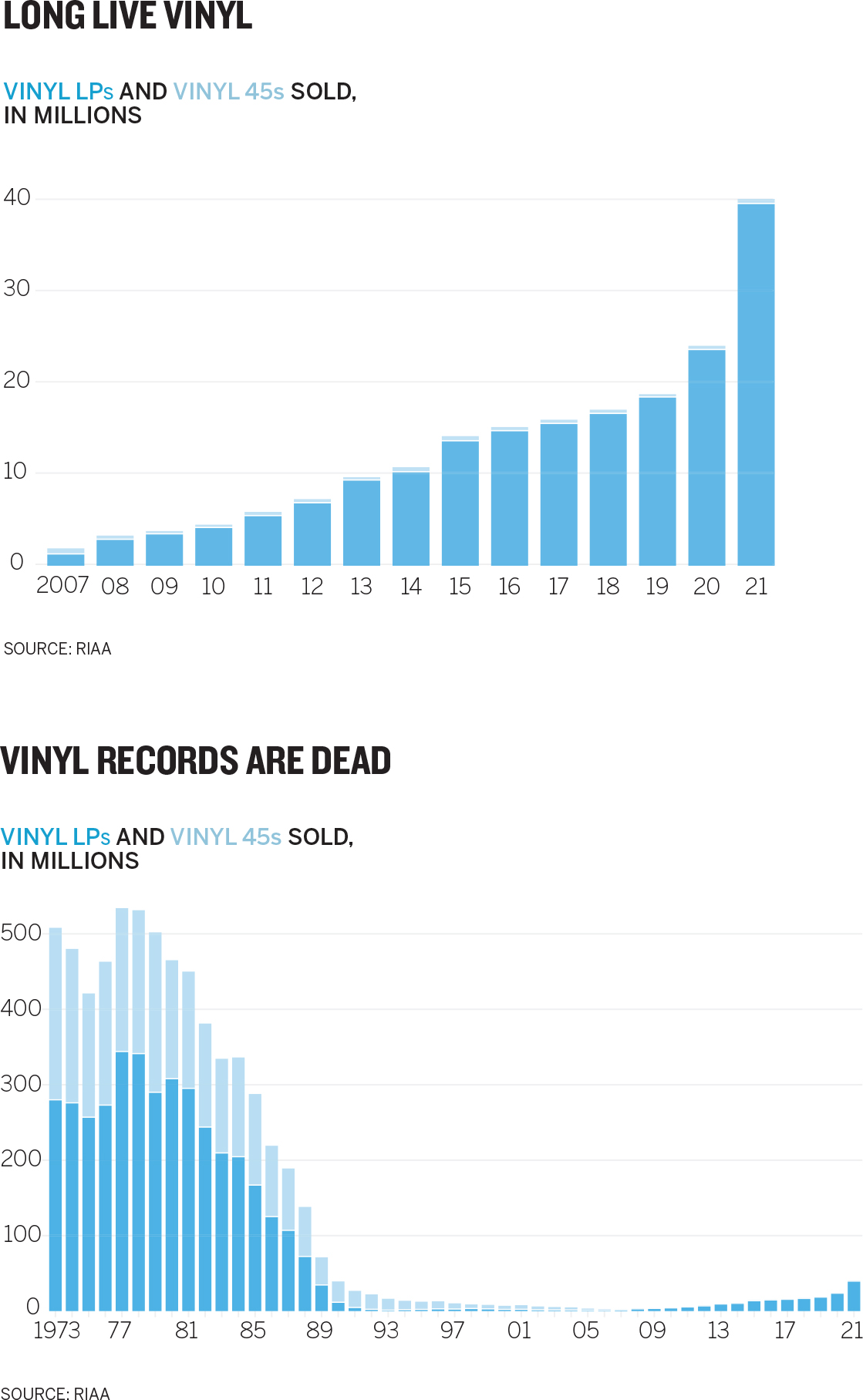
Shift reference points. Another way to change the narrative, and therefore the persuasive direction of the idea, is to shift a comparison entirely.

It may be true that vinyl is experiencing a minor resurgence within the context of vinyl albums. But when that trend is compared with a new reference point—total album sales in all formats—we can see right away that it’s still only a tiny piece of the business.
This strategy is especially effective when the new reference points are familiar ones. The beer prices at MLB stadiums charts shown earlier compared the costs of one small beer at each ballpark. Unfortunately, a small beer is not the same size at all stadiums. To compare prices fairly, you’d have to calculate the cost per ounce. But how much is an ounce of beer? One sip? Two? The reference point is not easily accessible. We don’t typically think about (or pay for) beer by the ounce. We do, however, pay for cases of beer. By shifting to roughly the amount we expect to pay for a case, something the audience will be able to easily access in their mind, the chart makes a faster, deeper connection with the audience.
Here’s another example: A manager wants to make the case that the tech team should automate two menial processes. Each task takes only a few seconds, but both must be done constantly. He wants to show that performing the task dozens of times a day adds up over time. So he adds up all the time and plots it, as shown below.

Hours per year is a respectable reference point, but it’s not terribly dramatic—there are thousands and thousands of hours in a year, so about a hundred doesn’t seem like that many. But if the manager shifts the reference point as done here, his boss may be persuaded to take action.

Workdays—now that’s something the boss gets right away. Who wants to lose workdays to menial tasks? What’s more, rather than focusing on hours lost to the tasks, the manager is focusing on who loses the hours. A new narrative forms: Susan spends almost three weeks a year just on these menial tasks. (Notice, too, that the manager changed the bars into a unit chart, with five-day blocks composing a week. This creates another easily accessible unit—a workweek—to help persuade.)
YOU’RE NEVER NOT PERSUADING
We like to think that we’re most persuasive when we provide comprehensive information and then lay out a detailed, accurate argument for our point of view. More content is more convincing.
But that’s often not the case. Persuasion doesn’t necessarily increase in lockstep with the volume of evidence or the breadth and depth of the data. In fact, some evidence suggests that providing too many supporting claims for your idea can have the opposite of a persuasive effect.20 Persuasive charts tend to be simpler and to convey one or two ideas powerfully rather than many ideas equally—depending, as always, on context.
And no matter what kind of chart you need to create, you are never not persuading. A chart itself is a persuasion strategy—a manipulation that exploits the overwhelming power of the visual perception system to communicate something more convincingly than text can. Even a basic declarative chart is a form of persuasion, a deliberate attempt to not take a stance and persuade an audience you are impartial.
People don’t particularly like the idea that they’re being persuaded all the time; they think that happens to others but not to them. Not true. That experiential part of the brain that relies on heuristics, metaphors, and experience to color interpretations of the world is a powerful influence, even when we look at data visualizations. If you internalize this fact, you can work with it, rather than fight it, and understand that your job is not to avoid persuasion—you can’t do that—but to be responsible with your persuasion. That’s next.
In the time I’ve spent with people talking about data visualization, the concern they express above all others is that they’ll need to learn to be a designer to make good charts. They often say this as if they’ll literally need to take design classes and learn about color theory and negative space and other “designy” concepts.
Not true. It can’t be stressed enough that well-designed, persuasive charts are still primarily a function of good context. The simple concepts in this chapter merely provide ways to bring that context to its fullest realization.
It won’t take long until some of these approaches to design and persuasion in visualization become second nature, and you’re routinely turning out good charts that create good feelings behind our eyes.
RECAP REFINE TO IMPRESS AND PERSUADE
The goal of good chart design isn’t to make visualizations more attractive; it’s to make them more effective and easier to understand. While most of us sense good design when we see it, we don’t always know why. Here are some techniques to create that sense of good design in your charts:
1. To make charts feel neat or clean, focus on design structure:
• Include three elements: title (and sometimes a subtitle), visual field, and source line. Within the visual field include axes, labels, and sometimes captions and legends.
• Use consistent weights: title (about 12% of your visualization); subtitle (8%); visual field (75%); source line (5%).
• Align elements: place them along as few horizontal and vertical lines as possible.
2. For charts that just make sense or feel instantly understood, focus on design clarity.
• Remove extraneous elements. Be aggressive. Take away as much as possible while maintaining the meaning.
• Use text to support the visual. Highlight the idea instead of describing the chart’s structure.
• Remove ambiguity. Make sure each element has a single purpose that can’t be misinterpreted.
• Use conventions and metaphors. Take advantage of ideas we don’t need to think about to understand, such as red is “hot” and north is “up.”
3. To make charts that look elegant or beautiful, focus on design simplicity.
• Show only what’s needed. Every element should be necessary, unique, and rendered as simply as possible.
• Avoid belt-and-suspenders design. One form of emphasis per element is enough.
• Minimize the number of colors you use. Gray works for contextual and second-level information and for structural elements such as grid lines.
• Limit eye travel. Place labels and legends proximate to what they describe.
REFINE TO PERSUADE
It’s often not enough to make a chart that’s simply accurate. Managers may need to reveal truths that are dormant in the data to help make a case—to compete for attention, resources, and money; to pitch clients; to recruit new customers; to sway an opinion or help form one. To make charts more persuasive, use these three techniques:
1. Hone the main idea.
Adjust your prompt. Instead of asking What am I trying to say or show? start by saying I need to convince them that … This will expose where and how you can focus your energy on persuading an audience. For example:
|
What am I trying to say or show? |
I need to convince them that … | |
|---|---|---|
|
I am trying to show the relationship between unbundling products and declining revenue. |
I need to convince them that unbundling our software suite will devastate revenue streams. |
2. Make it stand out.
Use simple design techniques to reinforce your main idea.
• Emphasize the main idea by adding visual information that calls attention to it. For example, use unique colors, pointers, labels, and markers to draw the audience’s focus.
• Isolate the main idea by reducing the number of unique attributes for all other elements. For example, group them together; make them gray to bring the main idea into high relief.
3. Adjust what’s around it.
Manipulate the variables that complement or contrast with the main point to make it pop.
• Remove reference points. Eliminate information and plotted data that distract or dilute the main idea.
• Add reference points. Add plotted data to the chart to expose otherwise hidden context.
• Shift reference points. Change the plotted data used in comparison with the main idea to create new context.