
Now that you know why you should customize plugins, it is time to add some customized plugins to your Bootstrap project as shown in the following steps:
- First open
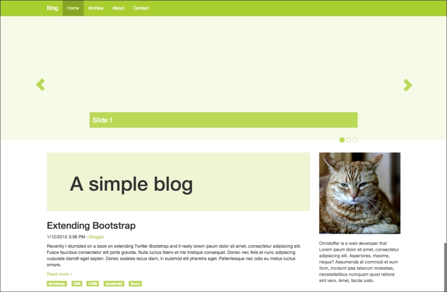
index.htmland add the following code snippet directly after the<nav>element at the top of the page:<div id="carousel" class="carousel slide" data-ride="carousel"> <ol class="carousel-indicators"> <li data-target="#carousel" data-slide-to="0" class="active"></li> <li data-target="#carousel" data-slide-to="1"></li> <li data-target="#carousel" data-slide-to="2"></li> </ol> <div class="carousel-inner"> <div class="item active"> <div class="carousel-caption">Slide 1</div> </div> <div class="item"> <div class="carousel-caption">Slide 2</div> </div> <div class="item"> <div class="carousel-caption">Slide 3</div> </div> </div> <a class="left carousel-control" href="#carousel" data-slide="prev"><span class="glyphicon glyphicon-chevron-left"></span></a> <a class="right carousel-control" href="#carousel" data-slide="next"><span class="glyphicon glyphicon-chevron-right"></span></a> </div> - Next, open
custom-theme.lessand add the following code snippet:.carousel { // create a new shade of @brand-primary. background: lighten(@brand-primary, 35%); max-height: 560px; margin: -20px 0 40px; width: 100%; } .carousel-indicators { bottom: -23px; text-align: right; li { // set width and height equal to 15px. .square(15px); background: #fff; border-color: @brand-primary; // "&" refers to the parent element (li). &:hover { border-color: lighten(@brand-primary, 10%); } &.active { .square(17px); background-color: @brand-primary; } } } .carousel-inner > .item { max-height: 560px; overflow: hidden; > img { margin-top: -100px; width: 100%; } } .carousel-caption { background-color: @brand-primary; font-size: 1.5em; padding: 10px; text-align: left; text-shadow: none; } .carousel-control { color: @brand-primary; font-size: 3em; opacity: 1; text-shadow: none; &:hover { color: lighten(@brand-primary, 10%); } &.left, &.right { background: none; } } - Now, if you recompile your styles, you should see the result as shown in the following screenshot. Customizing the plugins is just like customizing any Bootstrap components; find out which styles you need to override and do so.
Next, we will take a look at how we can make the plugins do more.
..................Content has been hidden....................
You can't read the all page of ebook, please click here login for view all page.