
The easiest way to customize a theme is to override its styles. It is preferable that you use Google Chrome because of its outstanding Developer Tools, but you are free to use any tool that you feel comfortable with. However, the examples in this book use Chrome developer tools, so it may be easier to follow if you use this as well. Perform the following steps to customize your theme:
- Start by opening your browser and toggle the developer tools by pressing F12 on Windows or Alt + Command + C on OS X. You should see something like the following screenshot:
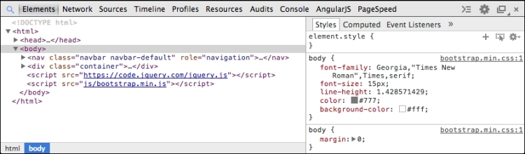
- Before you start overriding styles, let us take a quick look at the developer tools. You only need to use the Elements tab that consists of the DOM structure (on the left) and the styles (on the right). In order to override a specific style, you need to find its current definition. This is where the developer tools come in. While this might seem unnecessary to some, it is very important that you look up the definition for the style that you are overriding in order to make sure that your selector actually overrides the style wanted.
To override styles, you should create a new style sheet named
custom.cssand include it directly afterbootstrap.min.cssinindex.html; this is shown in the following code snippet:<head> <title>A simple blog · </title> <meta name="viewport" content="width=device-width, initial-scale=1.0"> <link href="css/bootstrap.min.css" rel="stylesheet"> <link href="css/custom.css" rel="stylesheet"> </head>
- First, you could get rid of those rounded corners; they are a bit outdated anyway. Use the Inspect tool in the developer tools to find
jumbotron.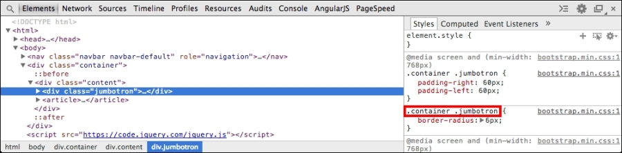
Sometimes, you may have to scroll down quite a bit in order to find the style that you want to override.
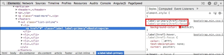
- As you can see from the preceding screenshot, the jumbotron styles are defined with a
.container .jumbotronselector inbootstrap.min.css. To remove its rounded corners, you need to define a new style using the same selector incustom.css:.container .jumbotron { border-radius: 0; } - While you are at it, you might as well remove the rounded corners from the labels in the following manner:
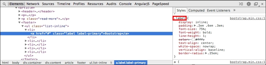
Note that the labels are defined with a
.labelselector, so you need to define the following style incustom.cssto remove the rounded corners:.label { border-radius: 0; } - Now that you have done some minor customizations, it is time you do some major ones. Let us change the primary color from the light red color that the Journal theme uses to one of my favorite colors,
#bada55, which is a lime green color. Use the same technique to find the selector for each element.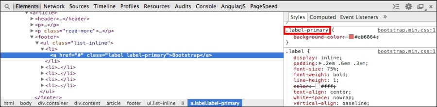
Label colors are defined with a
.label-primaryselector, so add the following code tocustom.css:.label-primary { background-color: #bada55; } - The labels in the example are links, so you will need to override some more styles or they will still turn red when hovered or focused on. Use the Toggle Element State tool, which can be found in the top-right corner of the Styles tab, to emulate a state in order to see the styles for it:
- You need to add the following additional styles to
custom.css:.label-primary[href]:hover, .label-primary[href]:focus { background-color: #bada55; } - There is still one more thing left to do, that is, change the color of the links. Link styles are usually defined at a global level, so there is no specific class that you need to use as a selector. However, in order to change the behavior of all the states, you need to use some additional rules. Add the following code to
custom.css:a, a:active, a:focus, a:hover, a:visited { color: #bada55; } - Now, if you now reload the page, it should look something like the following screenshot:
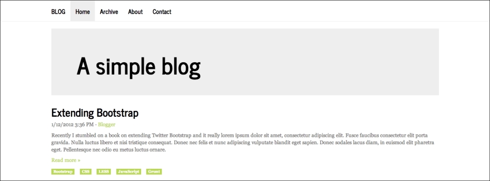
This is just a fraction of what you can do when it comes to customization of Bootstrap themes through overriding styles in CSS. Feel free to use your imagination to customize the example further. Next, you will learn some best practices to bear in mind when customizing Bootstrap themes through CSS.