
The easiest way to customize Bootstrap through LESS is to customize its variables. To do this, you need to perform the following few modifications to your project:
- Create a new LESS file named
custom-variables.lessin thelessdirectory. Openmain.lessand add the following line to import the new file:@import "custom-variables";
You can now override Bootstrap variables easily by redeclaring them in
custom-variables.less, and Bootstrap will use the overridden values instead of the defaults when it is compiled into CSS. - Open
custom-variables.lessand add the following line:@brand-color: #bada55;
This will override the primary color in Bootstrap with the same greenish color that you used in the previous chapter. As you can see, instead of overriding a lot of rules, we simply need to change the value of a single LESS variable in order to apply the customization to all of the elements that use the primary color across Bootstrap. It is also worth mentioning that back when you used CSS, you only added rules for those components that were used on the page. It would take a lot more rules to override all of the elements to use your own primary color.
- It is time to get rid of your
custom.cssand use LESS to apply the customizations instead. Create a new LESS file namedcustom-theme.lessin thelessdirectory and copy the following content fromcustom.cssto it, after which you can deletecustom.css:.container .jumbotron { border-radius: 0; }. .label { border-radius: 0; } - Now, add the following line to import your theme at the end of
main.less:@import "custom-theme";
When you now recompile
main.lessand reload your project, you will see that you have reapplied all the customizations to it from earlier, as shown in the following screenshot:
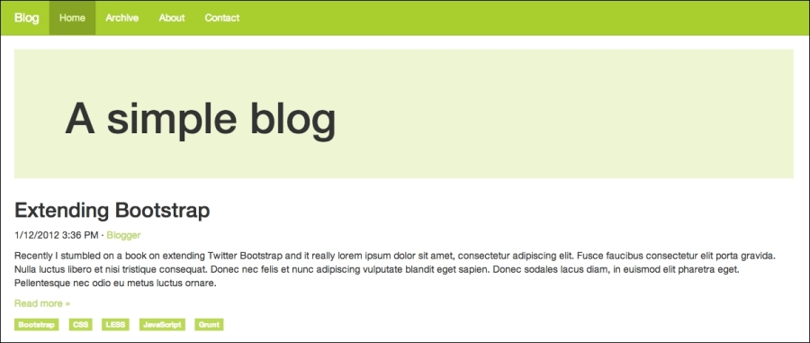
- Now that you are at it, you could add some more advanced customizations to your project. Let us start by customizing the colors a bit. Add the following to
custom-variables.less:@navbar-default-bg: darken(@brand-primary, 10%); @navbar-default-brand-hover-color: #fff; @navbar-default-link-color: #fff; @navbar-default-link-active-color: lighten(@brand-primary, 25%); @navbar-default-link-active-bg: darken(@brand-primary, 20%); @jumbotron-bg: lighten(@brand-primary, 30%);
- Save the file, compile your styles, and reload your project. You should see the following screenshot:
- Let us step up the game a bit by adding some more HTML to the page. Replace the contents of your outermost div element
.container divwith the following code:<div class="row"> <div class="content"> <div class="jumbotron"> <div class="container"> <h1>A simple blog</h1> </div> </div> <article> <header> <h2>Extending Bootstrap</h2> <p><time pubdate="pubdate">1/12/2012 3:36 PM</time> · <a href="#">Blogger</a></p> </header> <p>Recently I stumbled on a book on extending Twitter Bootstrap and it really ...</p> <p class="read-more"><a href="#">Read more »</a></p> <footer> <ul class="list-inline"> <li><a href="#" class="label label-primary">Bootstrap</a></li> <li><a href="#" class="label label-primary">CSS</a></li> <li><a href="#" class="label label-primary">LESS</a></li> <li><a href="#" class="label label-primary">JavaScript</a></li> <li><a href="#" class="label label-primary">Grunt</a></li> </ul> </footer> </article> </div> <aside class="sidebar"> <img class="sidebar-avatar" src="http://lorempixel.com/400/400/cats" alt="Avatar"/> <p class="sidebar-bio">Christoffer is a web developer that Lorem ipsum dolor sit amet, consectetur adipisicing elit. Asperiores, maxime, neque? Assumenda at commodi et eum illum, incidunt ipsa laborum molestias, necessitatibus numquam quod ratione sint vero. Amet, facilis iusto. </p> </aside> </div> - Add the following style to
custom-theme.less:.content { .make-md-column(9); article { margin-bottom: 40px; } } .sidebar { .make-md-column(3); } .sidebar-avatar { display: block; margin-bottom: 20px; max-width: 100%; } .sidebar-bio { color: @gray; }Now if you compile your styles and reload the project, it should look something like the following:
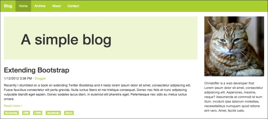
Let us walk through what you just did. You added some HTML and CSS for the sidebar and used two mixins to turn the .content and .sidebar elements into grid elements. A grid in Bootstrap consists of 12 columns by default, so adding .make-md-column(9) to .content makes it span three quarters; leaving one quarter for the sidebar and adding .make-md-column(3) to .sidebar makes use of the rest of the space.
Bootstrap comes with a large collection of useful mixins, such as gradients, CSS3 properties, various components, and grid, for various purposes. All of these are great once you learn how to use them; they are listed as follows:
- Gradients: Bootstrap supports many kinds of gradients, such as horizontal, vertical, directional, radial, striped, and both horizontal and vertical gradients with three colors. When you use Bootstrap mixins for gradients, you do not need to worry about browser compatibility because Bootstrap adds all browser-specific rules automatically, even for Internet Explorer 8.
- CSS3 properties: Bootstrap comes with mixins for the most commonly used CSS properties, such as box-shadow, transition, transform (rotate, scale, and translate), perspective, animation, backface-visibility, box-sizing, use-select, content-columns, and hyphens. These CSS3 mixins also work across all browsers.
- Component: Component-specific mixins are handy when you want to perform more advanced customizations to Bootstrap components. Components such as panels, alerts, tables, list groups, buttons, labels, the navbar, and progress bar have their own mixins in Bootstrap.
- Grid: Bootstrap uses mixins to build its grid. It is considered as a good practice to avoid vendor-specific classes such as
.col-md-6in your HTML in order to allow for the separation of structure and layout. You can achieve this by adding custom classes to your elements and using mixins such as.make-md-column(6)to make them act like grid columns instead.