
Bootstrap uses LESS to build up its grid from the ground up, so it is fairly easy to customize it. More columns can be added to it or the size of the gutter can be changed by changing the value of a few LESS variables.
Change the number of columns in your Bootstrap project to 24 to demonstrate this by performing the following steps:
- Open
custom-variables.lessand add the following line:@grid-columns: 24;
- Recompile your styles and reload the page; you will notice your content that uses columns now only occupies half of the page. In order to compensate for it, you need to change your column definitions in
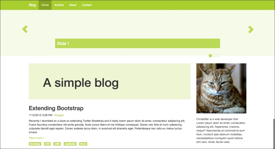
custom-theme.lessas shown in the following code snippet:.sidebar { .make-md-column(6); ..... } .content { .make-md-column(18); }Once you have recompiled your styles and reloaded the page, you should see that your content looks like it did before, as shown in the following screenshot:
Next, take a look at how to change the size of the grid gutters by performing the following steps:
- Open
custom-variables.lessagain and add the following line of code:@grid-gutter-width: 50px;
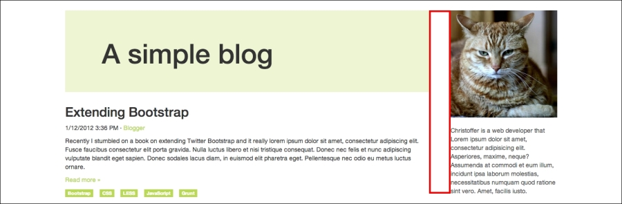
- Recompile your styles and reload the page to see that the space between each column is now 20 pixels larger than before, as shown in the following screenshot:
Now that you know how to do the most basic customization to the grid, it is time to look into customizing the responsive breakpoints of the grid.
..................Content has been hidden....................
You can't read the all page of ebook, please click here login for view all page.