Now we've seen normal, also known as Gaussian, distribution functions already in this book. You can actually visualize those in Python. There is a function called pdf (probability density function) in the scipy.stats.norm package function.
So, let's look at the following example:
from scipy.stats import norm
import matplotlib.pyplot as plt

x = np.arange(-3, 3, 0.001)
plt.plot(x, norm.pdf(x))
In the preceding example, we're creating a list of x values for plotting that range between -3 and 3 with an increment of 0.001 in between them by using the arange function. So those are the x values on the graph and we're going to plot the x-axis with using those values. The y-axis is going to be the normal function, norm.pdf, that the probability density function for a normal distribution, on those x values. We end up with the following output:

The pdf function with a normal distribution looks just like it did in our previous section, that is, a normal distribution for the given numbers that we provided, where 0 represents the mean, and the numbers -3, -2, -1, 1, 2, and 3 are standard deviations.
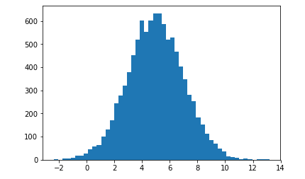
Now, we will generate random numbers with a normal distribution. We've done this a few times already; consider this a refresher. Refer to the following block of code:
import numpy as np
import matplotlib.pyplot as plt

mu = 5.0
sigma = 2.0
values = np.random.normal(mu, sigma, 10000)
plt.hist(values, 50)
plt.show()
In the above code, we use the random.normal function of the NumPy package, and the first parameter mu, represents the mean that you want to center the data around. sigma is the standard deviation of that data, which is basically the spread of it. Then, we specify the number of data points that we want using a normal probability distribution function, which is 10000 here. So that's a way to use a probability distribution function, in this case the normal distribution function, to generate a set of random data. We can then plot that, using a histogram broken into 50 buckets and show it. The following output is what we end up with:

It does look more or less like a normal distribution, but since there is a random element, it's not going to be a perfect curve. We're talking about probabilities; there are some odds of things not quite being what they should be.
