Histograms are useful in surveying the distribution of data. For example, we can plot data on a histogram when we want to see some age groups distributed in a population, light exposure in a photograph, or the amount of precipitation in each month in a city.
In Matplotlib, we call the plt.hist() function with a linear array. Matplotlib will automatically group the set of data points into bins and plot out the frequencies for each bin in bars. We can also specify the bin size by plt.hist(array,bins=binsize).
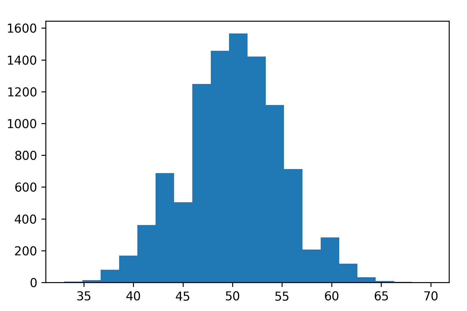
Here is an example of plotting a randomly generated binomial distribution:
import numpy as np
import matplotlib.pyplot as plt

np.random.seed(8)
x = np.random.binomial(100, 0.5, size=10000)
plt.hist(x,bins=20) # or plt.hist(x,20)
plt.show()
The histogram produced is as follows:

