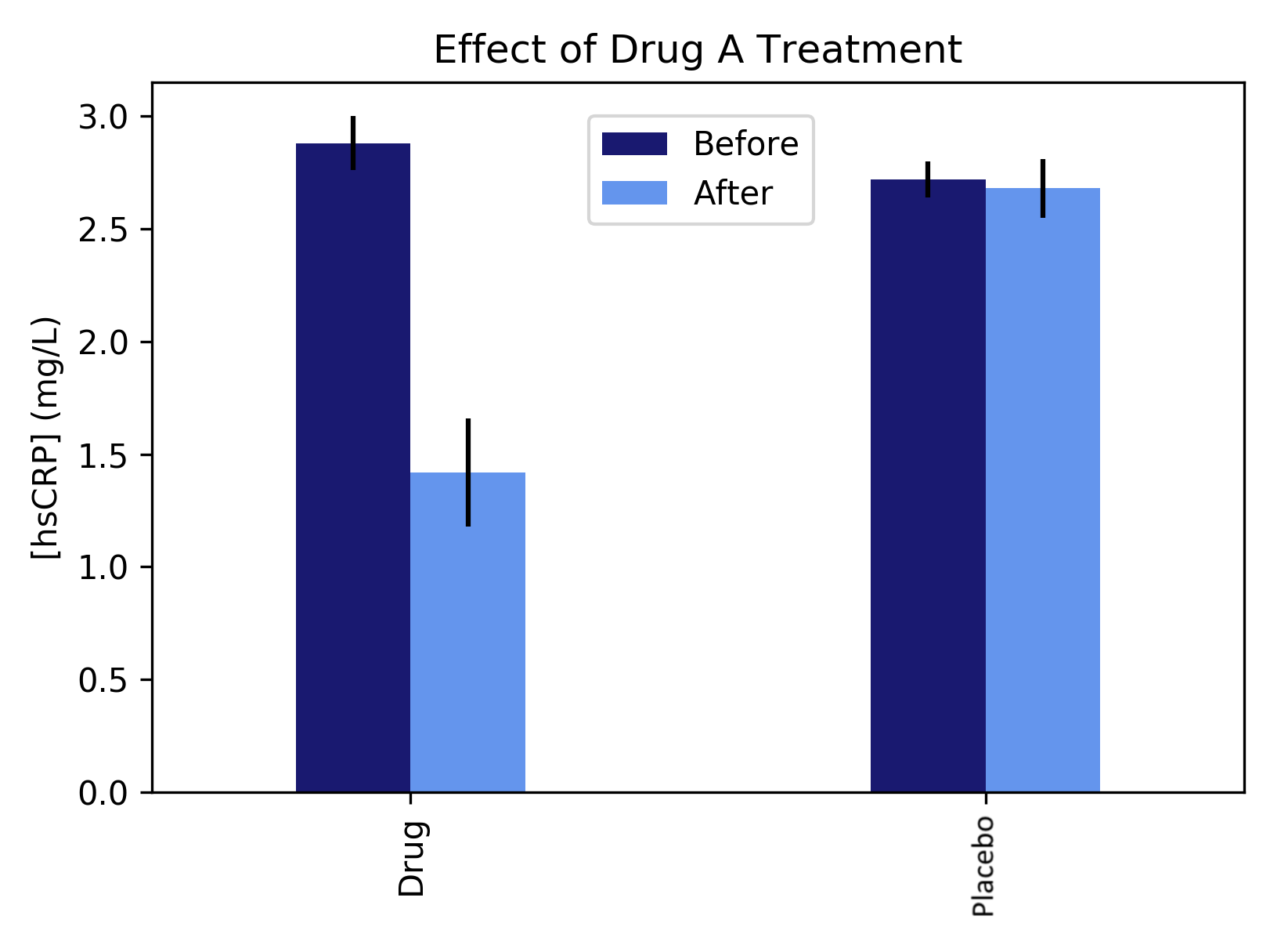
We can easily create bar plots with multiple data series with Pandas df.plot(). This API also allows us to easily add error bars by supplying the xerr and yerr parameters. Let's have a look at an example that demonstrates the usage of this function along with bar property adjustment.
The following code snippet draws a multibar plot to show the performance of an imaginary drug to treat inflammation, by comparing the level of an inflammatory protein before and after treatment of a drug and placebo as control:
import pandas as pd
import matplotlib.pyplot as plt

# Prepare the data series
labels_drug = ['Drug (Before)', 'Drug (After)']
labels_placebo = ['Placebo (Before)', 'Drug (After)']
drug = [2.88,1.42]
placebo = [2.72,2.68]
yerr_drug = [0.12,0.08]
yerr_placebo = [0.24,0.13]

df = pd.DataFrame([drug,placebo])
df.columns = ['Before', 'After']
df.index = ['Drug','Placebo']

# Plot the bar chart with error bars
df.plot(kind='bar',width=0.4,color=['midnightblue','cornflowerblue'],
        yerr=[yerr_drug,yerr_placebo])

plt.title('Effect of Drug A Treatment')
plt.xlabel('Condition')
plt.ylabel('[hsCRP] (mg/L)')
plt.xticks(rotation=0) # to keep the xtick labels horizontal
plt.legend(loc=(0.4,0.8))

plt.show()
Here, you get a paired bar chart for two conditions. It seems the drug may have some effect compared to the placebo control. Can you think of more examples of data to draw multibar plots?

Besides using Pandas, we can also call multiple plt.bar() commands to draw multiple series of bar charts. Note that we will have to shift the coordinates so that the bars do not overlap each other.
