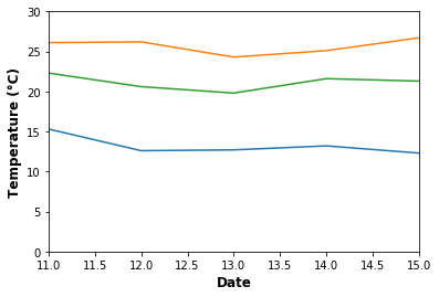
To give meaning to the values on the x and y axes, we need information about the nature and type of data, and its corresponding units. We can provide this piece of information by placing axis labels with plt.xlabel() or plt.ylabel().
Let us continue with our example plot of multi-city temperatures. We shall add plt.xlabel('Temperature (°C)') and plt.ylabel('Date') to label the axes to produce the following plot:

Similar to many other Matplotlib functions involving text, it is possible to set the text properties, such as font size and color within the plt.xlabel() and plt.ylabel() functions, by passing the properties as parameters. Here, we specified a bolder font weight for the labels for some hierarchy:
plt.xlabel('Date',size=12,fontweight='semibold')
plt.ylabel('Temperature (°C)',size=12,fontweight='semibold')
As you can see, Matplotlib supports inline adjustment of fonts for many text elements. Here, we have specified a bolder font weight for the labels for some hierarchy:

