While we have seen a scatter plot of random dots before, scatter plots are most useful with representing discrete data points that show a trend or clusters. Each data series will be plotted in different color per plotting command by default, which helps us distinguish the distinct dots from each series. To demonstrate the idea, we will generate two artificial clusters of data points using a simple random number generator function in NumPy, shown as follows:
import matplotlib.pyplot as plt

# seed the random number generator to keep results reproducible
np.random.seed(123)

# Generate 10 random numbers around 2 as x-coordinates of the first data series
x0 = np.random.rand(10)+1.5

# Generate the y-coordinates another data series similarly
np.random.seed(321)
y0 = np.random.rand(10)+2
np.random.seed(456)
x1 = np.random.rand(10)+2.5
np.random.seed(789)
y1 = np.random.rand(10)+2
plt.scatter(x0,y0)
plt.scatter(x1,y1)

plt.show()
We can see from the following plot that there are two artificially created clusters of dots colored blue (approximately in the left half) and orange (approximately in the right half) respectively:

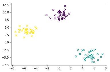
There is another way to generate clusters and plot them on scatter plots. We can generate clusters of data points for testing and demonstration more directly using the make_blobs() function in a package called sklearn, which is developed for more advanced data analysis and data mining, as shown in the following snippet. We can specify the colors according to the assigned feature (cluster identity):
import matplotlib.pyplot as plt
from sklearn.datasets import make_blobs

# make blobs with 3 centers with random seed of 23
blob_coords,features = make_blobs(centers=3, random_state=23)

# plot the blobs, with c value set to map colors to features
plt.scatter(blob_coords[:, 0], blob_coords[:, 1], marker='x', c=features)
plt.show()
As the make_blob function generates dots based on isotropic Gaussian distribution, we can see from the resultant plot that they are better clustered as three distinct blobs of dots centralized at three points:

scikit-learn is a powerful Python package that provides many different simple functions for data mining and data analysis. It has a versatile suite of algorithms for classification, regression, clustering, dimension reduction, and modeling. It also allows data preprocessing and pipelining multiple processing stages.
For getting familiar with the scikit-learn library, we can use the datasets preloaded in package, such as the famous iris petals, or generate datasets according to the specified distribution as shown before. Here we'll only use the data to illustrate a simple visualization using scatter plot, and we won't go into the details just yet. More examples are available and can be found by clicking on this link:
http://scikit-learn.org/stable/auto_examples/datasets/plot_random_dataset.html
The previous example is a demonstration of an easier way to map dot color with labeled features, if any. The details of make_blobs() and other scikit-learn functions are out of our scope of introducing basic plots in this chapter.
Alternatively, readers can also read the scikit-learn documentation here: http://scikit-learn.org.
