
4
Designing Eye-Catching Graphics through Useful Features
Canva has many great features, but some of the best are the simple ones that you may miss when creating your graphics. They help with consistency, saving time, resizing quickly, and positioning your elements correctly. Many of them are along the top bar of a template, so in this chapter, we’re going to look at each one in more detail.
In this chapter, we are going to cover the following main topics:
- Grouping elements
- Align and spacing text
- Rulers and margins for print
- Locking elements
- Changing the transparency
- Resizing your designs
- Positioning elements front to back
- The Background Remover tool
By the end of this chapter, you will be able to use all of the template features, understand what each one does, and know how to use the Background Remover tool.
Grouping elements
Grouping multiple elements together allows you to move and position them quickly, keeping them all in the same place. The grouping option appears once you have selected an element, text box, or image. You can move individual images around or group them, but if you’ve placed images into a grid, then you cannot group grids together.
In this example, I have highlighted the Available courses text box and the text boxes underneath. Canva will automatically group them together for you, but once you click off, they ungroup. To leave them grouped, highlight all required text boxes and select the Group option in the top bar, to the right, next to the Position option.
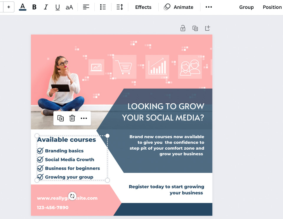
Figure 4.1 – Grouped text boxes
They will now stay grouped until you select to ungroup them by selecting the same option on the top bar, as seen in the following screenshot:
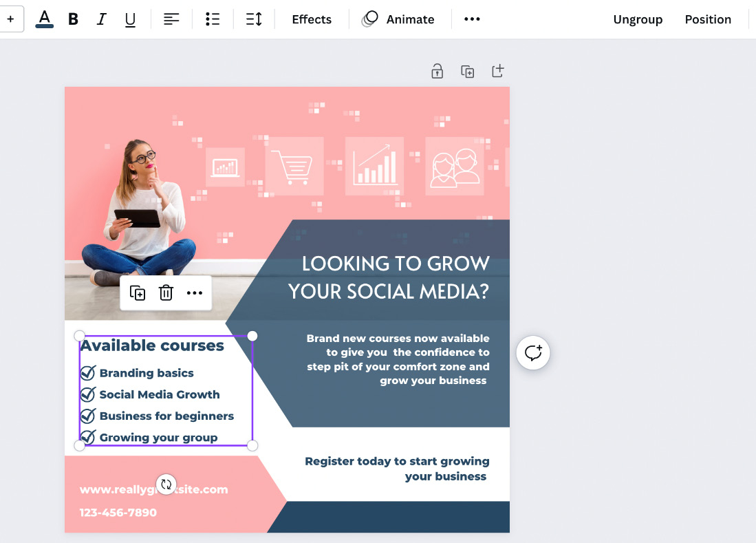
Figure 4.2 – Text boxes grouped with the Ungroup option now available
Grouping elements, text boxes, and images in a Canva design works well when you have multiple pages and want to copy select parts of the design without transferring the entire page.
Grouping elements is a useful feature that works well alongside aligning and spacing your text, so let’s look at that next.
Aligning and spacing text
Using the Alignment and Spacing features will help give your designs a uniform look, increase consistency, and make them visually pleasing.
To align anything within your design, and this works with all elements, images, and text boxes, you need to drag your mouse across them to highlight the elements and text boxes as a group, then select the Position tab in the top bar. This will give you lots of options for alignment, as shown in the following example:
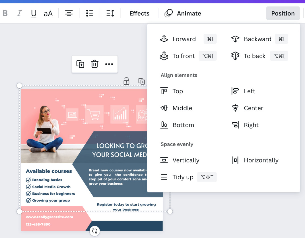
Figure 4.3 – Alignment options drop-down menu
In this section, we are looking at the bottom two groups of options.
You can now align the various elements selected, by selecting the Top, Middle, Bottom, Left, Center, and Right options; it will align every element that has been highlighted. You can also give each element equal spacing using the bottom options Vertically and Horizontally, and the Tidy up feature will give everything equal spacing all around. This is brilliant for individual elements, but what if you wanted to align or give the text within a text box more space?
To align text, you need to select the text box in question and then the Spacing option in the top bar, as shown in the following example:
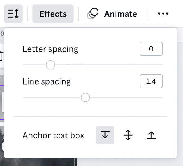
Figure 4.4 – Letter and line spacing options
The Spacing option gives you three choices: you can adjust the space between letters, which is perfect for smaller fonts or fonts that have the letters naturally close together; Line spacing gives you more or less space between the lines of text; and lastly, Anchor text box allows you to choose in which direction the text flows while adding more text to the box. This helps make sure other parts of your design are not covered with the new text.
There is a feature on the top bar to change the alignment of your text; it looks like four lines and changes with the alignment of the current text, as shown in the following screenshot:
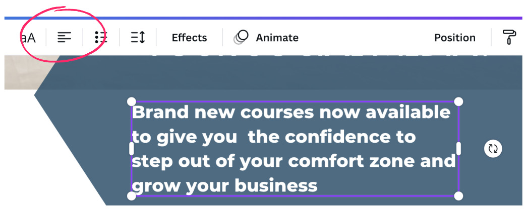
Figure 4.5 – Alignment tool
For example, the text box in the preceding screenshot has the text aligned to the left and the alignment feature also has the four lines aligned to the left; keep clicking the button and the alignment will change.
So, now that we can align and space our lines of text correctly, let’s look at rulers and margins. They work well with the preceding elements, so they are important features to cover.
Rulers and margins for print
Rulers and margins are great for printable designs, such as books, magazines, and leaflets, but they are also helpful in getting things in the right place. For example, if you want everything on your design 100 px in from the edge, you can add a ruler line to guide your elements into the right positions. The rulers, margins, and print bleed can be found in the File option at the top of the page.
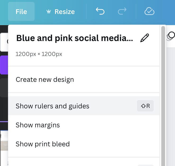
Figure 4.6 – Rulers, margins, and print bleed options
By selecting each of these options, they activate automatically on your design. Rulers allow you to create as many lines as you would like on your design. These lines are related to the type of template you have created. So, for example, if you have created an A4 document in millimeters, the ruler will measure in millimeters, or for a social media template in pixels, the ruler will measure in pixels. To create a ruler line, click on the ruler along the far edge and drag it inwards; it will show you the measurement in the purple box so that you can place it correctly, as shown in the following example:
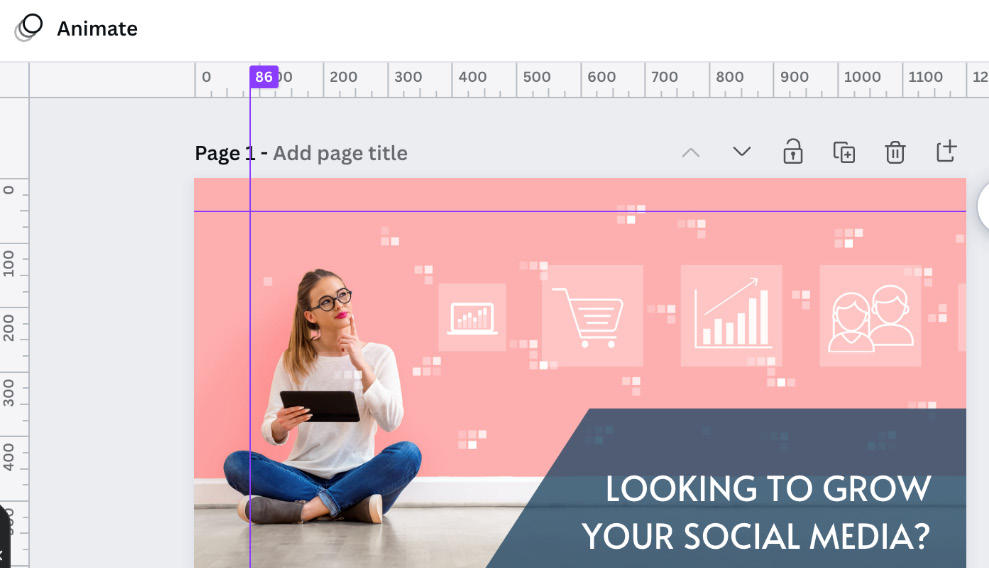
Figure 4.7 – Ruler lines on a design
Activating margins will give you a border to work within. This helps you to keep all the important information safe from being cut off during printing, as shown in the following figure:
Figure 4.8 – The margin feature
This is a good feature to activate if you are creating a book, as you don’t want the text too close to the book’s spine.
Lastly in this section is the print bleed, again another feature needed for printing. It gives you an extra border around the outer edge. This is the area that is trimmed off when printed, so it makes sure that any color that needs to go to the edges does so. This feature is shown in the following example:
Figure 4.9 – 3 mm print bleed
Print bleed is generally, as a rule of thumb, 3 mm wide, but please check this with your printing company to make sure you have their correct requirements first. Once you’ve set up your margins and rulers and started adding elements in place, it may be useful to know how to lock them so they don’t move. Let’s look at this next.
Locking elements
The Lock feature allows you to create more complex designs and move things around without displacing elements you don’t want to move. Lock them in place, and they won’t move until you unlock them. To lock an element or multiple elements, select it or highlight the group and select the padlock in the top-right corner.
Here I have selected the blue background arrow shape and locked it in place. You can see it’s locked as a small padlock appears in the bottom corner, as shown in the following screenshot:
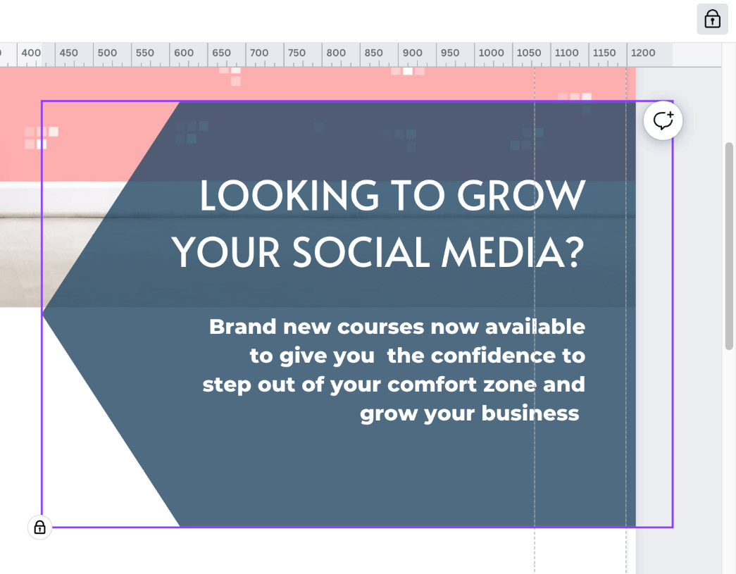
Figure 4.10 – The lock feature
With text boxes, you have the additional feature of the padlock. When it’s clicked once, it locks the text box in place but gives you the option to edit the text. Click the padlock again and it will be fully locked, meaning you cannot edit the text until it’s unlocked. The following example shows this feature:
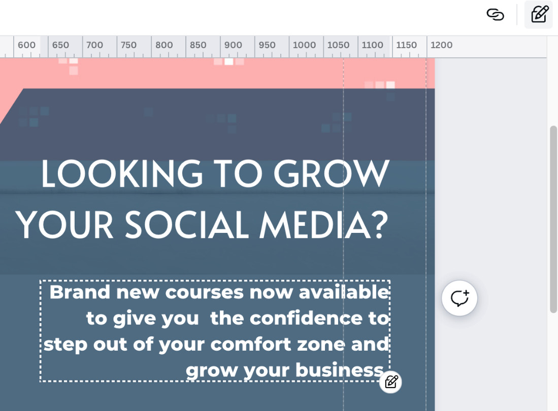
Figure 4.11 – The lock feature with additional text editing
This is shown by the icon changing to a padlock and pencil. Click again and it changes to just a padlock. This is a great feature when you have a lot going on in your design, but what about when you want to add text to an image or a block of color? Let’s look at how to adjust the transparency in Canva.
Changing the transparency
Transparency is one of the features I think I use the most; it’s great for social media posts where you have an image and would like to overlay text. So often, text on an image becomes unreadable due to the heavy use of color, but adding a shape with the transparency adjusted really brings out the text.
In this example, I have an image underneath and have adjusted the transparency of the arrow so that you can read the information on top but also still see the image beneath:

Figure 4.12 – Transparency
To adjust the transparency in Canva, select the small box that looks like a chess board in the top-right corner, as the following screenshot shows:
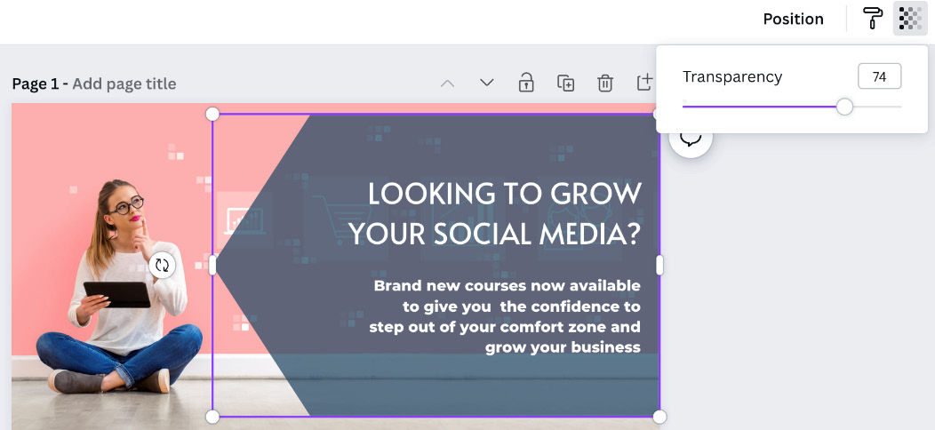
Figure 4.13 – The transparency slide bar
This gives you a slide bar to adjust the transparency on any element, image, or text box – a really useful feature for great-looking designs. So, let’s look at how you can resize that design to suit a different social platform; Canva has a PRO tool just for this.
Resizing your designs
Being able to resize a design means staying consistent across all social channels, your website, posters, and adverts – in fact, any materials within your business.
Canva has provided the magic Resize tool, which is a Pro feature, and very much worth having Pro for. At the click of a button, you have your design in any other template size, as shown in the following example:
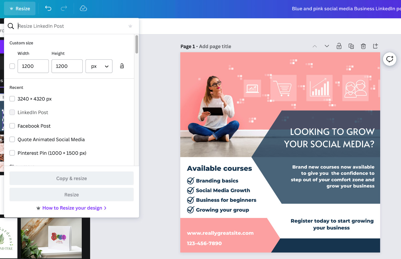
Figure 4.14 – The magic Resize drop-down feature
The Resize button is on the top blue bar. You can search for the type of template, add in your own custom dimensions, or scroll through the options, then click either Copy & resize, which will keep your original, or Resize, and it will change the size of your current design.
Depending on the template type you choose, you will need to adjust your design elements, text, and images to fit, as the Resize tool only changes the template size, not the information on it.
All of the features we have covered so far are great on their own, but only if you can place your elements correctly. If you can’t access an element you’ve added because it’s hidden behind another, you will struggle using features such as transparency or locking. Let’s look at how to overcome this next.
Positioning elements front to back
Canva works with layers; all elements, text boxes, and images are layered upon one another within the template. These layers can be adjusted so that you can add backgrounds, text boxes on top, and elements in between, building up your design.
To change the layering, select the Position tab and the top options will allow you to bring your element forward or backward one layer at a time or straight to the front or back, as shown in the following example:
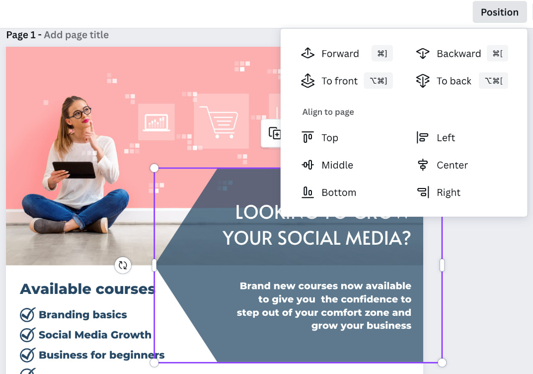
Figure 4.15 – Element layering using the Position options
Have a go with these options, as often, just moving an element by one or two layers can have a great effect on a design.
Lastly, we’re going to look at what is probably the most popular feature on Canva, the Background Remover tool.
The Background Remover tool
The Background Remover tool has got to be, hands down, the most popular feature of Canva Pro; it always comes up as a favorite. It allows you to remove the background of any image within your designs. It also gives you the option to add or remove parts that have been missed in the background removal process.
It can be found in the Edit image section, as shown in the following screenshot:
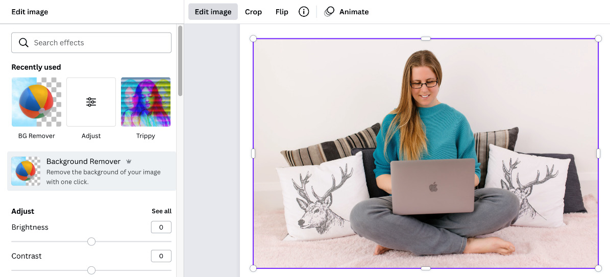
Figure 4.16 – The Background Remover tool
As seen in the following example, it takes everything out of the background, leaving your main focal point:
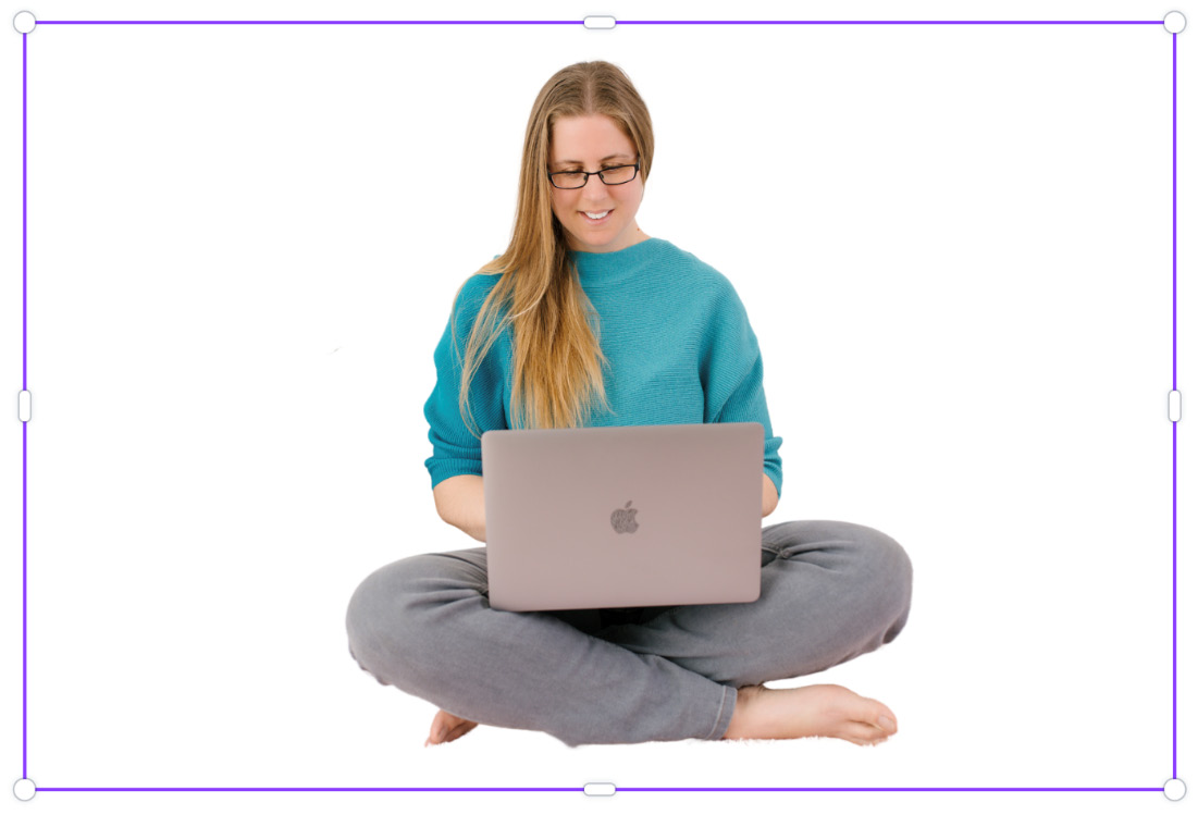
Figure 4.17 – An image with the background removed
Sometimes, if the background colors are similar to the main subject, parts can get left in or removed in error, so you have the Erase and Restore tools, which give you an adjustable brush size to paint back or remove parts of your image, as shown in the following screenshot:
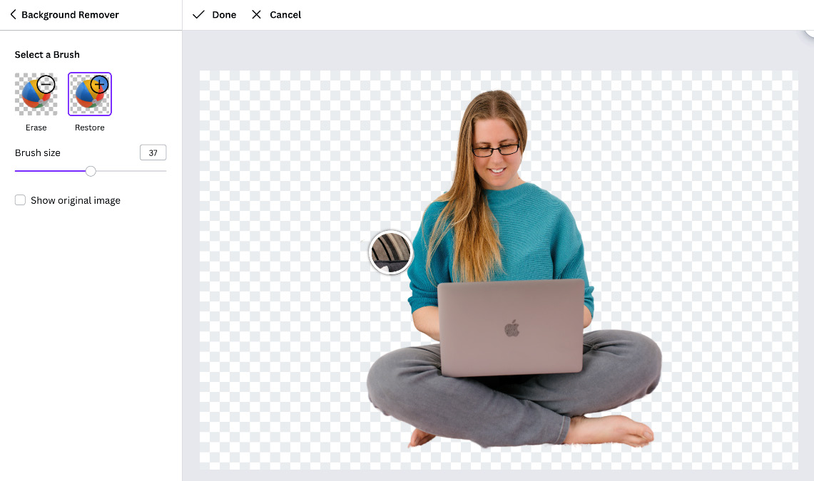
Figure 4.18 – Background Remover Restore and Erase brushes
Once you are happy with the removal process and have adjusted any parts that need adding back in or taking out, select Done at the top, and you are ready to use it within your design.
Lastly, if you would like to use an image within Canva rather than your own, have a look at the Cut-out section, as this gives you a lot of imagery that already has the background removed. The option for this is in the Photos tab and then the advanced options section, which is the three lines with circles in the right corner, as seen in the following screenshot:
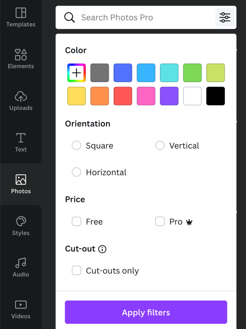
Figure 4.19 – Cut-out option for Canva images
We’ve now come to an end, so let’s take a look at what we’ve learned in this chapter, packed full of useful features.
Summary
In this chapter, you have learned about several small features fundamental to designing in Canva. We’ve looked at how to group and move multiple elements and learned how to align and space out your text. You can now adjust the transparency, lock elements in place, and know how to use the Background Remover tool. You’ve also learned how to resize your design for different social channels and now have a good understanding of how Canva works in layers, and how to move these layers to create an effective design.
So far, you have learned a lot about creating designs in Canva, so now it’s time to look at the all-important topic of branding and get you set up in the next chapter.