
9
Making Social Media Graphics with Canva
This is a fun chapter, as we’re going to create some social media graphics. These are all useful designs that will get you using many features in Canva, whether for social media, physical printed products, such as business cards, or advertisements, so have a good read-through of this chapter first, and then open up Canva on your computer and follow along.
In this chapter, we are going to create the following graphics:
- A profile frame
- A Facebook banner
- An animated Instagram story
- A business card
- A magazine or leaflet advert
By the end of this chapter, you will be able to use all of the features needed to create social media graphics and will have a range of designs you can start using for your business.
Creating a profile frame
A profile frame is a graphic you can add to your social media accounts; it’s often the first thing someone will see when looking at your business or profile page, so it’s a good idea to use it to showcase you and your business.
There is a Facebook profile size template you can use in Canva; this should also be suitable for other platforms where you can add a profile image. It is 1500 x 1500 pixels in size.
To find this size, click on the Create a design tab at the top of your Canva account and type in or search for Profile Frame; it will appear in the dropdown. Once you have found it, you may notice a lot of templates suitable for frames appear on the left-hand side. This is because you have chosen to view a specific style and Canva will bring up the templates for that style:

Figure 9.1 – Profile image frame templates
A profile frame is designed to have an image in the background. For social media, a natural-looking photo of yourself is the most appropriate one. As people buy from people, they like to see who is behind the business, so you don’t have to use your logo here. Once you have a nice image of yourself, you are ready to create your frame.
Profile frames suit a circular design, so we are going to create one from scratch using a colored circle. Search in the Elements tab for Circles and a large selection of different styles will appear. For this tutorial, we are going to use a basic chunky circle such as this one:

Figure 9.2 – Circle element
The first thing to do is to change the color of the circle to suit your branding. After you have done this, add a textbox and populate it with your business name:

Figure 9.3 – Circle element and text box
Now, we get to use the curved text feature. This is a great feature and perfect for profile frames. Select your text box and then click on the Effects tab at the top. At the bottom of the text styles that have now appeared on the left, select Curve. This will curve your text for you, place the curved text over the top of the colored circle, and stretch it out to fit. You can use the Curve slide bar to adjust the ratio of the curve:

Figure 9.4 – Circle element and Curve text feature
Change the color of the text to white if you’ve used a darker color for the circle so it stands out, and then search for frame and add a circle frame from the Elements section. You will drag and drop your photo into this:

Figure 9.5 – Adding an image to a frame design
You can see that it’s beginning to come together. Increase the size of the photo by dragging out the corners to cover the colored circle and then use the Positions tab to send it to the back – it will now fit your new frame.
You can add elements or your logo to the frame as well, but please be aware that many profile spaces for these images are round and will cut off the corners of the template, so don’t add anything to the four corners.
You can now download your finished design to use:

Figure 9.6 – Finished profile frame
I’ve added a colored element to the preceding example, which uses my brand colors. Along with a profile frame, you will probably need a banner image. This can be created to match your profile frame and will give it a professional look and feel, so let’s have a look at creating one next.
Creating a Facebook banner
Facebook banners are a great way to advertise your business; it’s the space at the top of your group, page, or personal profile and it is free to populate with an image. However, there are often sizing issues with banners. I get asked a lot about them and how to size them correctly.
If you use the sizing in Canva for Facebook banners, then when uploaded, it will look slightly blurry. This is because Facebook compresses all images, even though you’ve used the correctly sized template according to Canva and Facebook.
How do you overcome this?
You will need to create a custom-sized template for your page or group banner. We will look at this in a moment, but first, I’d like to mention profile banners, as these are slightly different:

Figure 9.7 – Current mobile profile frame with a circular profile image on the left
One thing to be aware of when creating your personal profile banner for Facebook is that they often tend to move your circular profile image from the left to center and then back again, sometimes covering the information on your banner with your profile image. This is especially prominent on mobile devices, as the profile image covers more of the banner than on a desktop. You may find it best to have two banners at the ready, one with your information in the center and one with the information on the right, so you can swap them over if the profile image moves.
Groups and page banners
First of all, it’s good to get the correct size from Facebook, so have a look on Google for the most recent sizes.
At the time of writing, the following applies:
- 820 x 312 pixels on computers
- 640 x 360 pixels on smartphones
As you can see, both desktop and mobile are different, so this needs to be taken into account as well.
Once you have your sizes, take the widest width and tallest height, giving you 820 x 360 pixels, and triple these numbers.
So, you have 2,460 x 1,080 pixels – these are the numbers to use to create your custom template. This will help cover both mobile and desktop and by tripling them, it will help to make a sharper image after Facebook compresses it upon uploading.
This image gives you an overview of the sizes:
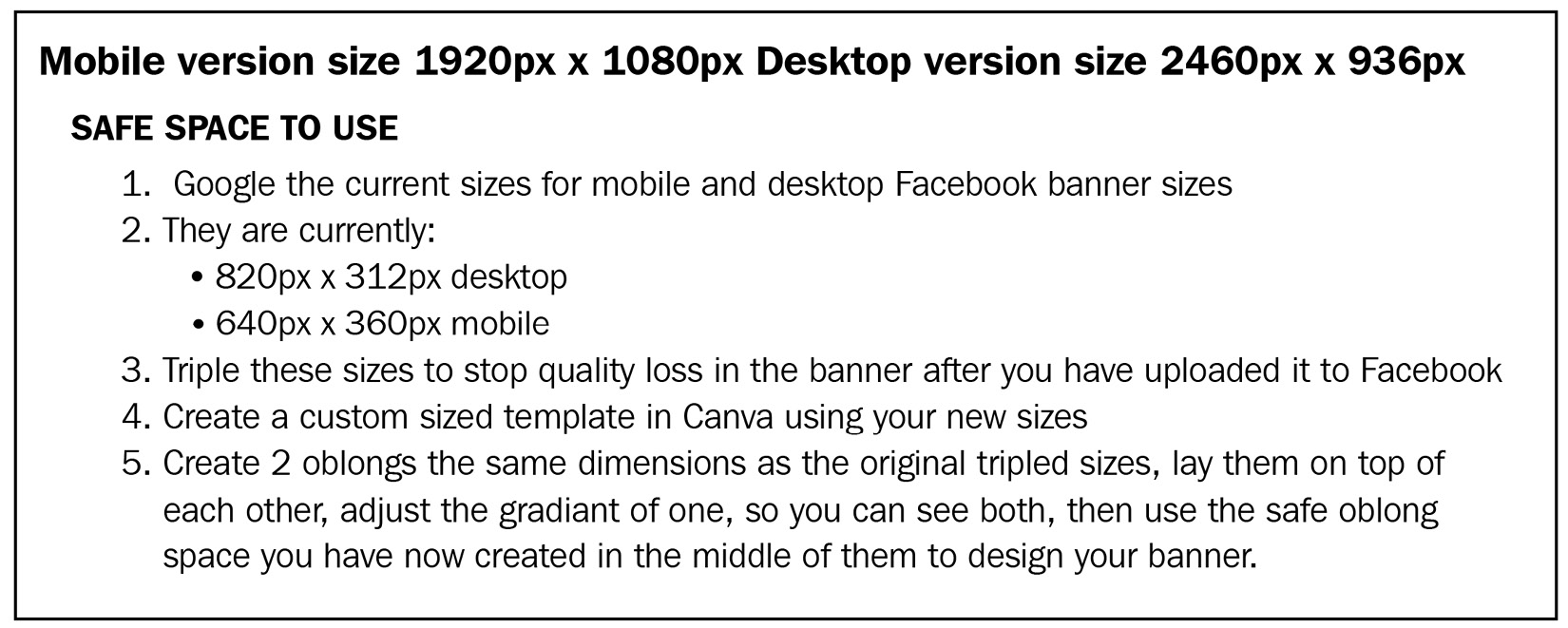
Figure 9.8 – Facebook banner size guide
Click on Create a design and add these numbers to create your custom template.

Figure 9.9 – Creating a custom template for Facebook banners
Before you start creating, you need to determine where the safe space is so that you can add all of your important information here, knowing it will be visible on both desktop and mobile screens.
To do this, you need to add two squares. Take the two numbers you have above for desktop and mobile and triple them so they will now work on your new template:
- 2,460 x 936 pixels on computers
- 1,920 x 1,080 pixels on smartphones
Add a square from the Shapes section and drag out the corners to the first dimensions. As you drag out the corners, you can see the numbers in the black box:

Figure 9.10 – Adding a square to a Facebook banner
Add another square shape and do the same with the second dimensions – overlay them both in the center of your template. At this point, adjust the Transparency settings of one so you can see the other underneath:

Figure 9.11 – Changing the transparency of a square
You can now see a square has appeared in the middle between your two larger squares; this is the safe area to design your banner. Add a light-colored square over this area and lock it in place so that it will not move until you have finished designing your banner:

Figure 9.12 – Locking a square shape on a Facebook banner
At this point, you can delete the two squares you added at the beginning; you don’t need these anymore. You can now start to add in your information, images, and elements, making sure the important things are kept within the light-colored square:

Figure 9.13 – Facebook banner design
Here, I have added two textboxes, both kept within the light-colored square, and an image.
Next, add an element or color block at the top and bottom. This goes outside of the central box because the outer edges are still visible on either mobile or desktop:

Figure 9.14 – Simple Facebook banner design in progress
Alternatively, add in a background image that can stretch the entire span of the template:

Figure 9.15 – Patterned background Facebook banner in progress
Once you’ve finished, it’s time to unlock the light-colored square, delete it, and see what your design looks like:
Here, we have two finished designs, one simple and clean:

Figure 9.16 – Finished simple Facebook banner
The other is more creative and fun, but both show the important information on all devices:

Figure 9.17 – Finished Facebook banner design with a patterned background
Use your branding when creating your Facebook banner, and make sure any images work with your business. Adding an image of yourself works well and followers can relate to you if they can see you. Make sure you keep your information in the middle.
So, that’s our Facebook account sorted. Let’s look at creating a story for Instagram using animation.
Creating an animated Instagram story
Instagram stories are extremely popular and gain a lot of engagement; these are a good type of design to create and promote your business. You can also animate your story with elements, animation features, or video. Stories on both Instagram and Facebook work better when they have an aspect of movement to them.
You can use an Instagram story template on Facebook as well.
Let’s look at the different types.
Adding animation using the Canva features option
Search for the Instagram story template size using the Create a design option. By now, you probably know that there are lots of templates for this size to the left of the design. You can either use a template or create your own from scratch using the elements, textboxes, and images.
If you are creating from scratch, remember to make use of your branding. Use your color palettes, fonts, and branded imagery to stay consistent throughout your design.
Follow along to create this Instagram story in Canva:

Figure 9.18 – Finished Instagram story design
- Search for and add a grid from the Elements section to your template. Make sure it is the one with four image spaces – this will automatically resize to fit the template:

Figure 9.19 – Selecting the four-grid element in Canva
- Then, select the upper-right frame and change the color to white. After this, either upload your own images or search for images in the Canva Photos library. If you are a product business, use images of your own products. For service-based businesses, search for Flatley in the Photos library. Many are suitable for services:

Figure 9.20 – Adding images to the grid
- In the white, top-right corner, add a textbox. In this box, add either your business name, product, or service, use the all-capitals feature, and then add another textbox beneath it and add some information. You can then add a third textbox with how to contact you, using your website or social media handle. The text sizes should decrease in size order.
You now have a finished design to add your animation to:

Figure 9.21 – The finished design
To add animation, click on the Animate tab at the top. You can now add animation to the whole design – hover over each option and it will show you how it will look on your template. Choose the one you like, and you can use this on your socials to promote your business.
If you prefer to have a more subtle animation, you can select a part of your design, a textbox, for example, and then click Animate to just animate that part, leaving the rest of the design static. Otherwise, you can add an animated element, which we are now going to look at.
Adding animated elements
We can use the same design as we have in the previous section, but rather than clicking on the Animate tab, we’re going over to the Elements section and searching for animated lines. I like these – they work well around text and help parts of the design stand out.
Scroll down until you find this element – it is free to use – and add it to your design:

Figure 9.22 – Selecting an animated element
Reduce the size using the circles in the corners and move it to the side of one of your textboxes, whichever one you want to stand out the most, and then duplicate it, flip it, and move it to the other side of the textbox:

Figure 9.23 – Adding animated elements
Tip
As these are animated, you cannot change the color of these in Canva, so you need to find an animated element that has a color relevant to your branding or template color palette.
You can now see how long your template will play for in the top-left corner and can watch it before downloading by clicking the play icon on the upper right:

Figure 9.24 – Showing the play icon and animation length
These are both great ways to add a touch of animation to your story template, but you can also add a video. We will be looking at videos in greater detail in Chapter 10, Leveraging Video and Animation within Your Business Marketing, so let’s look at creating the next design in this chapter: a business card.
Creating a business card
Business cards are still being used, even in the modern world of technology and everything else being moved online. If you go to networking events, for example, or have a face-to-face meeting, being able to give someone a business card will help keep you and your business top of mind.
It doesn’t have to be complex or include absolutely everything. As long as you make it clear who you are and what you do, and give them a way to contact you easily, that will be just fine.
Start by using the Business Card size template from the Create a design tab. It will give you multiple options to create different shaped designs but stick to the classic size, which is the first option in the dropdown.
As this design is to be printed, make sure you select Show print bleed so that it will be there ready when needed, either printed by a third-party printer or through Canva itself, which we will be looking at in Chapter 12, Tips and Tricks for Printing:
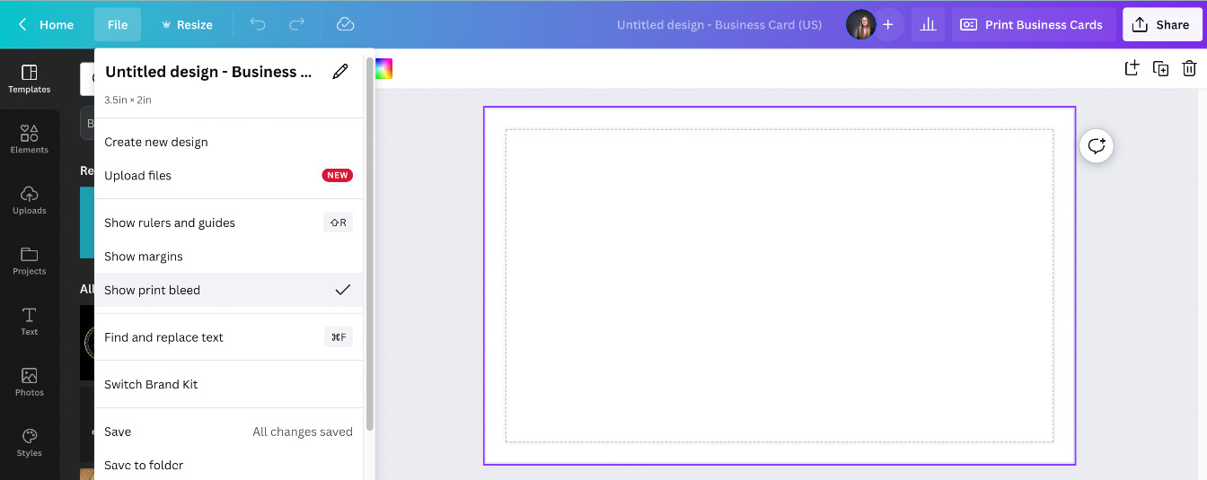
Figure 9.25 – Blank business card template
Start by adding the information you would like on your business card. Add the following into individual textboxes so that you can change the font and text size of each section, in this order:
- Your name
- Your business name
- A short description of what you do
- Your contact email address
- Web address or social media handle
Align them to the left. Once added, increase the size of your name, and decrease the size of your contact details, making your name and business name the focal points of the business card:

Figure 9.26 – Business card details
It’s looking a little plain on this side, so add an element in the corner, and you can even add a splash of your brand color to the side by using a shape and changing the color. I’ve also added a line element to the side where the textboxes align:

Figure 9.27 – Business card design
Once you have the main information side done, it’s time to add another page to this design and create the front of your business card. Select the plus symbol next to the main page at the bottom and it will produce another page:

Figure 9.28 – Adding another page to a business card design
This will be the front, so it should either have a textbox with your business name or you can use your logo.
For a simple but effective front, use the same color as you have used on the back, and then add a square shape from the Elements section stretching across the design. Leave this white, and then add a textbox with your business name along this shape:

Figure 9.29 – Front page of a business card design
To finish, search for a pattern in the Elements section – for example, search for leaf pattern, add one to your design, stretch it to cover the entire page, and turn it white. Lastly, select the Position tab and send it to the back:

Figure 9.30 – Front and back of the finished business card design
When you’re ready to print your business card, on the download option, select PDF print. This will then give you the option to select the following:
- Crop marks and bleed – These show the printer where to trim the paper
- Flatten PDF – Merges all individual elements into one
- Select the CMYK option (the color option for all printers) in the Color Profile dropdown
All are often required by printers, so Canva has added these options for you. However the CMYK option is a Pro only feature.

Figure 9.31 – Crop, Flatten, and CMYK drop-down options
So far, you have created designs for your social media channels and gotten a business card ready, but what about advertising your business? Adverts in magazines, leaflets, and local fliers are a great way to promote your business, so let’s have a look at this style of design next.
Creating a magazine or leaflet advert
Magazine or leaflet adverts can really help with promotion, giving you another platform to showcase what you do.
As with business cards, when you create your advert, keep in mind that it may be printed for a physical magazine, so turn on your print bleed and select the Crop marks and bleed, Flatten PDF, and CMYK options when downloading it.
Now, the sizing of this one is more down to the publisher that you will be sending it to; they may have certain sizes that they require your article or advertisement to be in. This is where you would need to create a custom design. There is a possibility they will request it in inches or millimeters, so you can use the dropdown to change the measurement:

Figure 9.32 – Different custom design sizes
Once you have your blank design template, it’s time to start creating your advert. Keep it simple and clear, staying consistent with your branding throughout. This is a place where you are promoting your business, so every aspect needs to be on brand.
Let’s create something similar to this:

Figure 9.33 – Basic advert design
If you don’t know the size that’s needed, search for advert in the Create a design section. It will bring up a poster size; you can use this as a basis and then resize it once you have the correct measurements.
Search for gradient in the Elements section and select one to add as a background, preferably one that you can change the colors of to your own branding, and then add a single grid to the bottom half of the template, which is where you will add your main image, making sure it overlaps with the edge of the template:

Figure 9.34 – Advert gradient background and image placement
To find the ribbon element across the middle, search in the Elements section for corporate ribbon. Lots of different types will appear. These particular elements are Pro, but there are a lot of different free elements available as well. Use the element to cover the line between the grid square and gradient color here, stretching it across the width of the design:

Figure 9.35 – Selecting a corporate ribbon element
These elements are also color-changing, so you can add your brand colors to them. Once you have the background of the design in place, you need to add textboxes – one at the top with your business name, for which you should increase the size and use the all-capitals feature, and one beneath for your short business description:

Figure 9.36 – Adding textboxes
Next, it’s time to add the images. Search for Circle frame in the Elements section and add two of these to your design. These are free to use. Drag and drop in your images, either from the Photos library or your own that you have uploaded:

Figure 9.37 – Adding a main image and two smaller images
Lastly, you need to add contact details. To do this, find the square shape with rounded corners in the Elements section, and then use the white lines at the top to reduce the height to form a button shape:

Figure 9.38 – Selecting a shape to create a button background
Change the color of this shape to match your brand and then add a textbox with your contact information – this could be your phone number, web address, email address, or social media handle, whichever is the best for someone to contact you via:

Figure 9.39 – The finished design
You can add more information to this as and when it’s needed, without having to always start from scratch, but this gives you the basis to start with.
Tip
If you want to make your contact details stand out more, add icons – for example, add a phone icon to go next to your phone number.
I hope you’ve enjoyed this chapter and have created some amazing graphics that you can now use for your business.
Summary
Wow, this has been a packed chapter! By now, you should have several graphics created that you can use for your business, including a profile frame, a Facebook banner, an animated Instagram story, a business card, and a magazine or leaflet advert. While you’ve been creating these, you have also learned how to correctly size a Facebook banner and that the platform compresses images. You’ve also learned how to create a profile frame using a circle element. You’ve seen two different ways to add animation to a design and how to create a business card ready for print by knowing how to add bleed marks and crop marks and how to flatten a PDF. We’ve also looked at creating an advert-style poster, which involves looking for different types of elements to use.
Earlier on in this chapter, I mentioned you could add videos to your design as part of the Animation section, so that’s exactly what we are going to be looking at in the next chapter.