9
Slideshow, Map, and Web Modules
Whether it's a presentation for a client, mailing excerpts from your portfolio, or just preparing something for friends and family, Lightroom makes preparing a slideshow as easy as pressing a button. In this chapter, we will look at the possibilities of utilizing the Maps module, even without geotagging. Lastly, we will explore the Web module, where we can create an online gallery without knowing a word of code.
In this chapter, we will cover the following topics:
- The Slideshow module
- The Map module
- The Web module
The Slideshow module
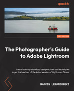
This is one of the overlooked modules in Lightroom, but it provides a handy tool for presenting and reviewing photographs.
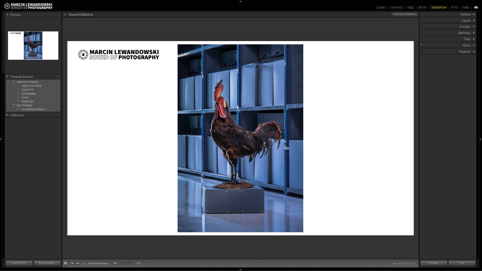
Figure 9.1 – The Slideshow module view
The left-side panel
The top of the left-side panel displays Preview, which, in the case of Slideshow, shows the currently viewed photograph as a miniature of the slide page.
Under Preview, we find two more tabs. On the bottom is the familiar Collections tab. In the middle sits the Template Browser tab with a small number of default Lightroom templates, which represent the capabilities of the Slideshow module very well. Click through them to see how much variety they offer.
At the bottom of the left panel, we can find two export buttons to which we will return after we learn about the right-side panel settings:
- Export PDF…
- Export Video…
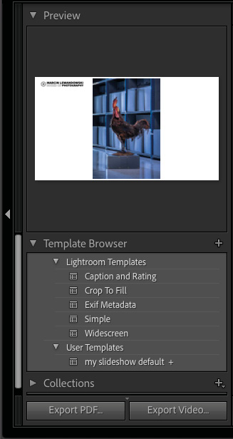
Figure 9.2 – The left-side panel detail
Right panel tabs
Let's have a look at the tabs in the right-side panel of the Slideshow module.
Options
The first tab, Option, has some submenus. Let's see what each of them does.
Figure 9.3 – The Options tab
Zoom to Fill Frame
This works like the Zoom to Fill option in the Print module. It will crop an image to the aspect ratio of the photo frame we set in the following tab titled Layout. Of course, it works much better with horizontal photos. Whenever I have a mixture of horizontal and vertical photos, I refrain from using the Zoom to Fill Frame option to keep a consistent viewing experience.
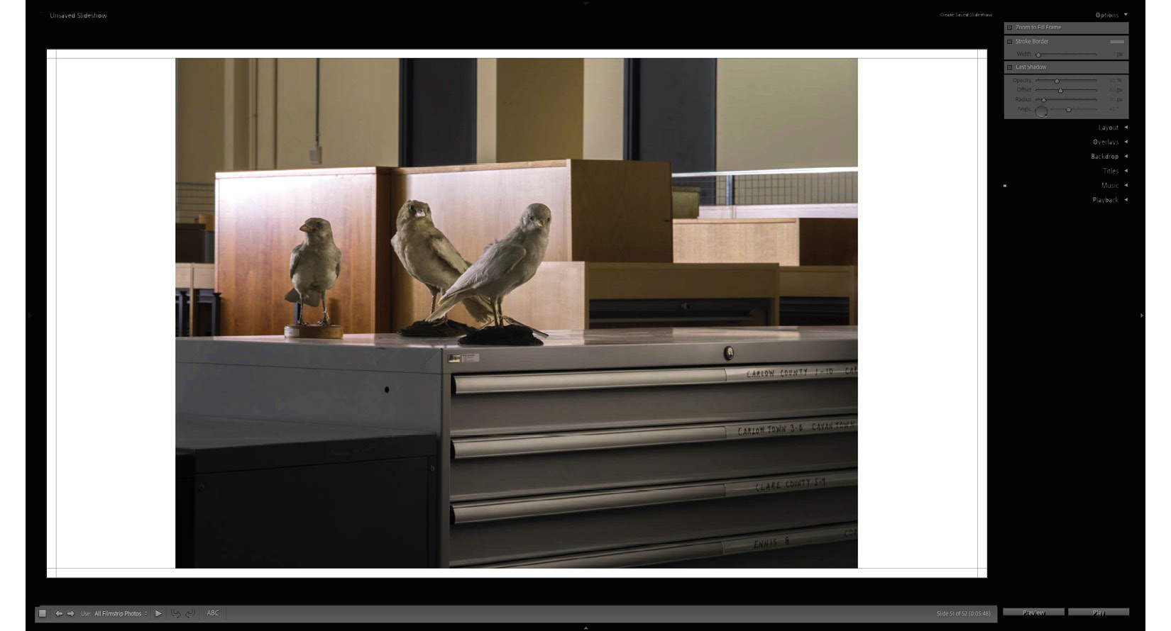
Figure 9.4 A
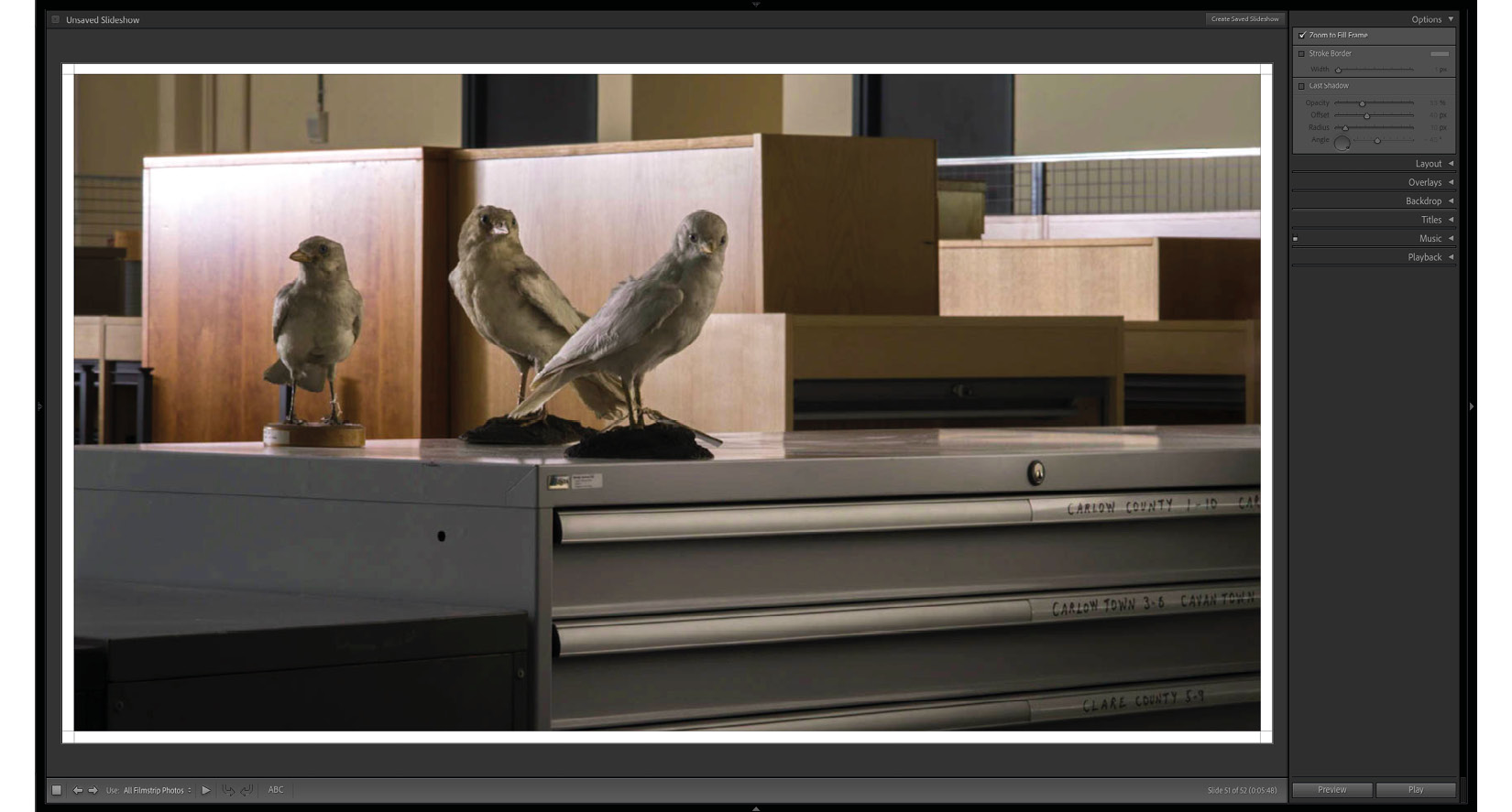
Figure 9.4 B
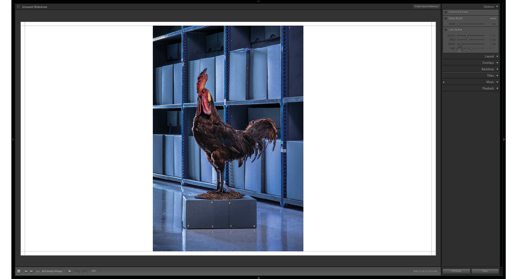
Figure 9.4 C
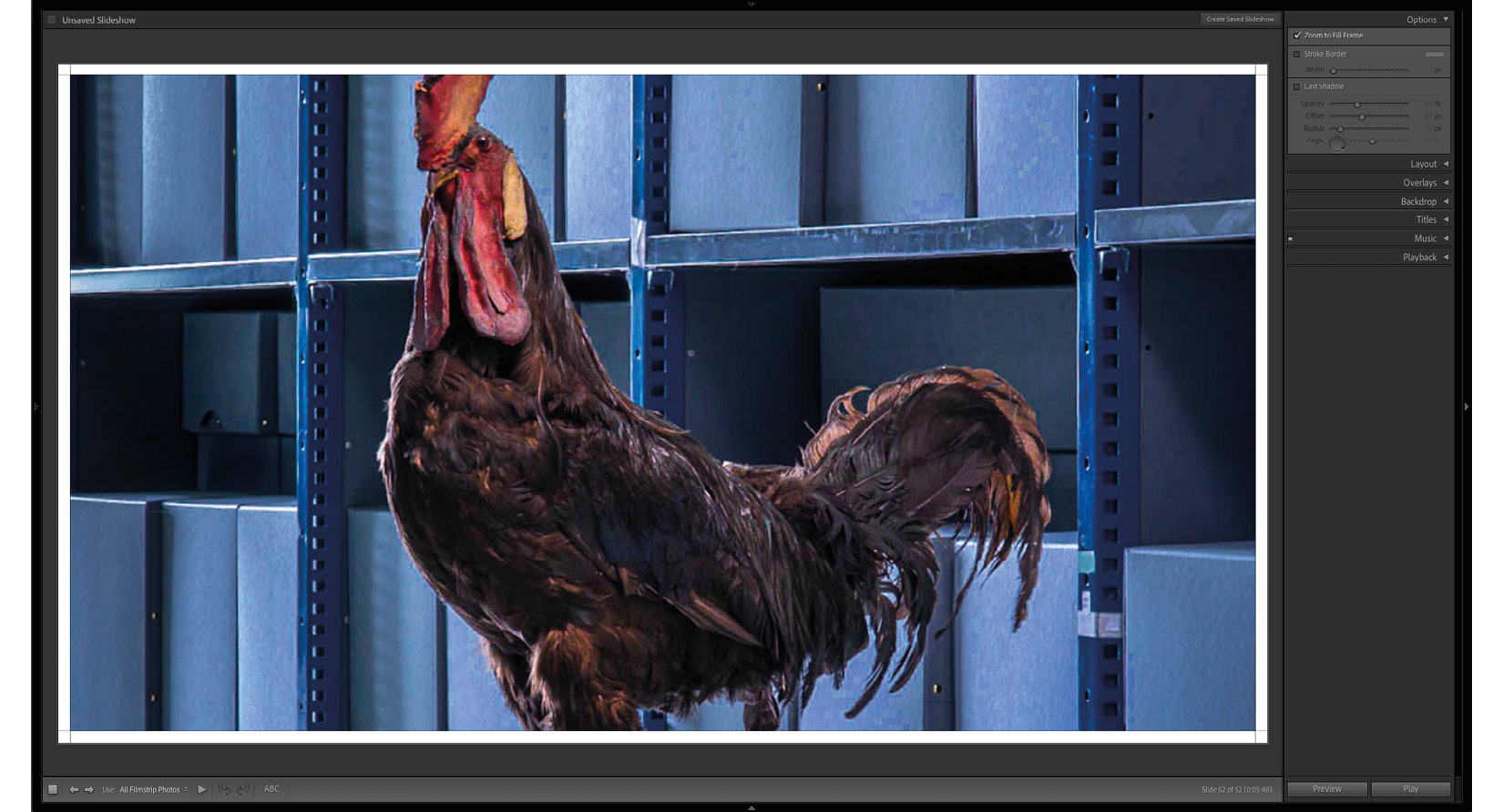
Figure 9.4 D – The first two illustrations show a horizontal photo without and with Zoom to Fill Frame enabled, followed by a vertical photo without and with Zoom to Fill Frame enabled
Stroke Border
This option will paint the border of our chosen width around the displayed image. If we select the Zoom to Fill Frame option, the border will match the internal part of the frame we have set.
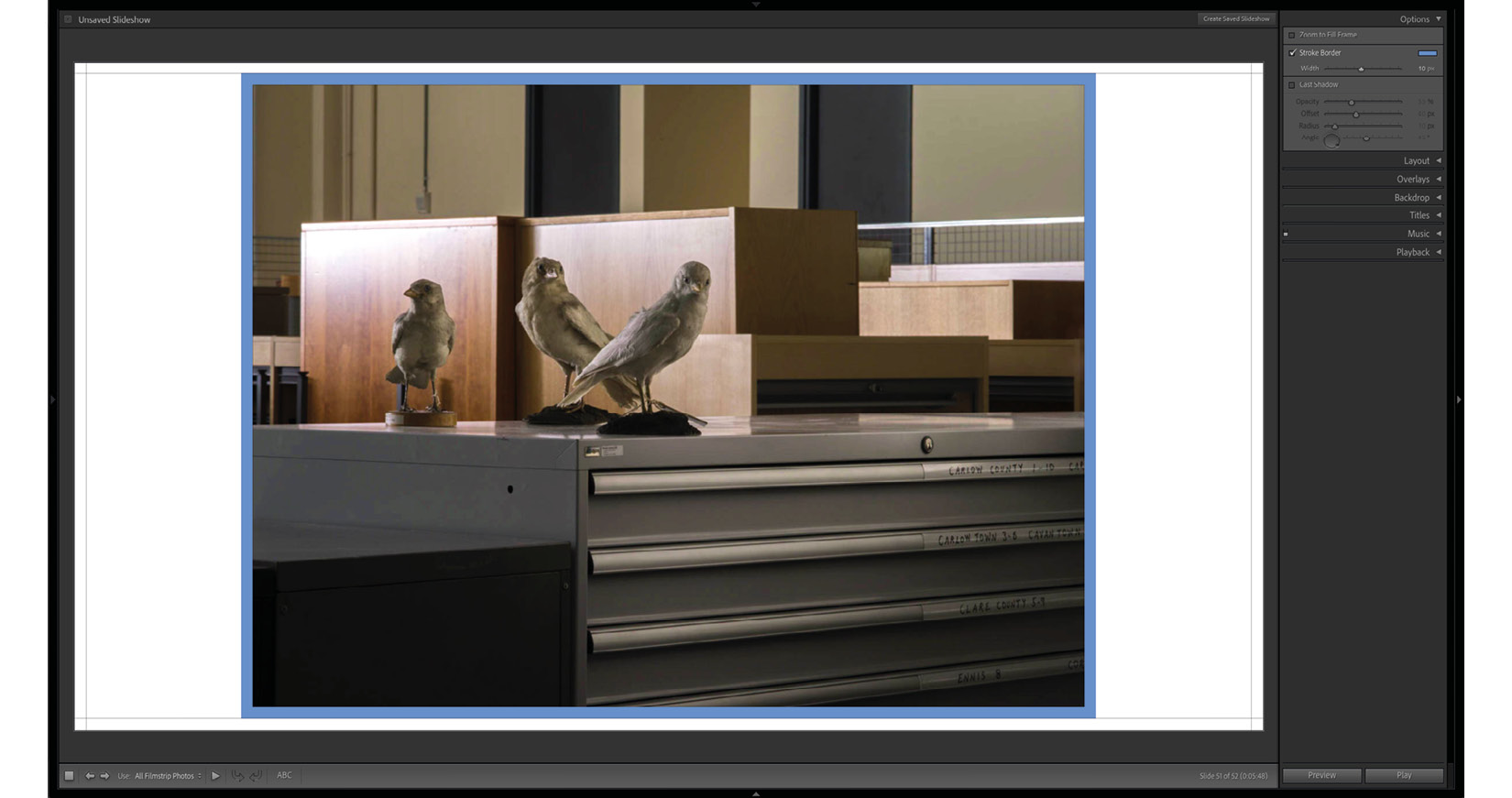
Figure 9.5 A
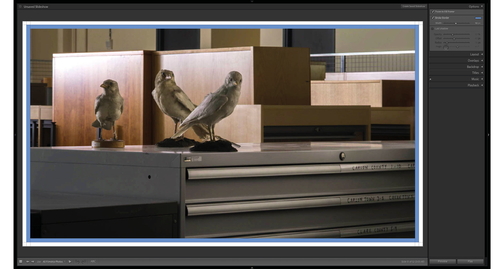
Figure 9.5 B – Stroke Border without and with the Zoom to Fill Frame enabled
Cast Shadow
The last option to play around within the Options tab allows us to add a little bit of a 3D feel to our slides by having them cast a shadow on the underlying page. Opacity is an obvious function – 100% opacity means no transparency and 0% opacity is full transparency, making it invisible. Offset will move the shadow from directly behind the image when it is set to 0 px, to 100 px in the direction we set in the last option of this tab, Angle. We can set the angle by manually inputting the value, moving the slider, or playing with the angle wheel. We can naturally mix and match these three approaches by, for example, approximately setting the wheel and then correcting to the closest rounded value. Finally, we are left with one more option, Radius. Think of this as a setting that's mixing spread with a feather. A 0 radius value will cast a hard, sharp-edged shadow. In contrast, a 100 radius value will display a soft shadow, with a gradient slowly dissolving into the background at a distance of 100 px. Anything in between will have a smooth edge in the width we set as the radius.
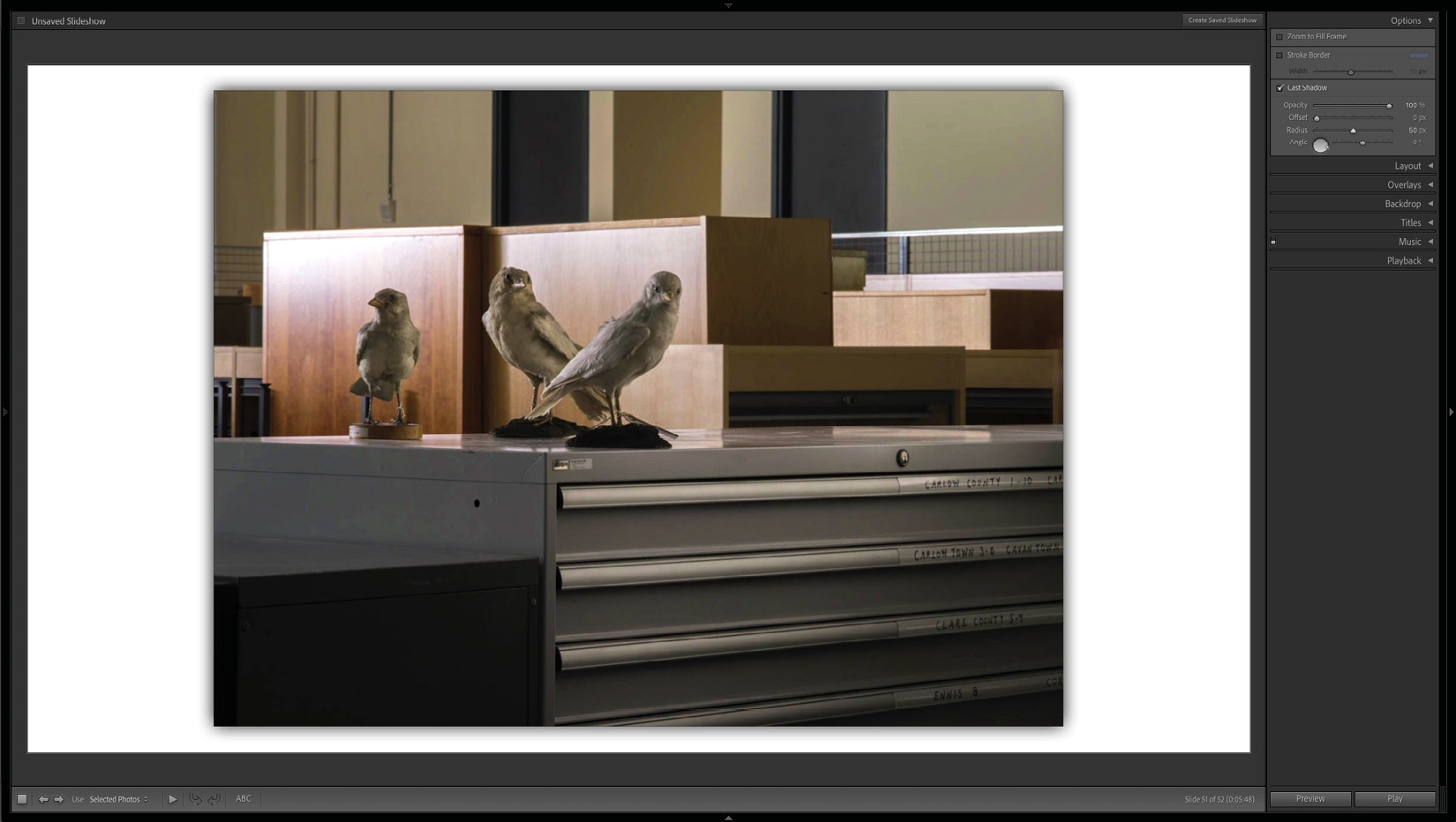
Figure 9.6 A
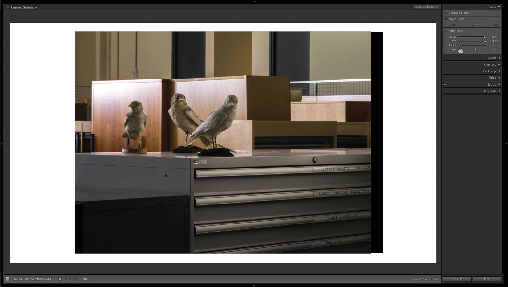
Figure 9.6 B
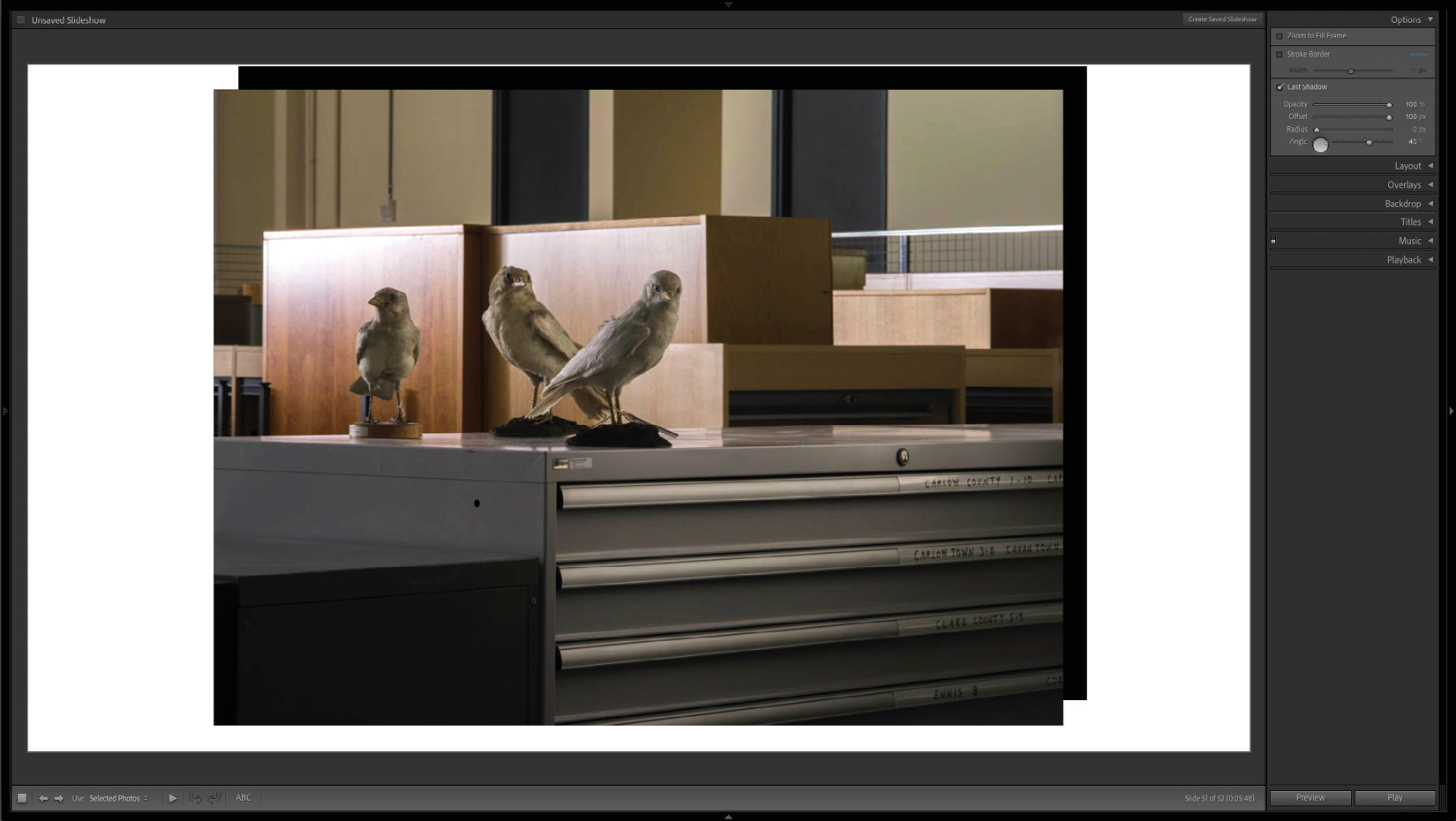
Figure 9.6 C
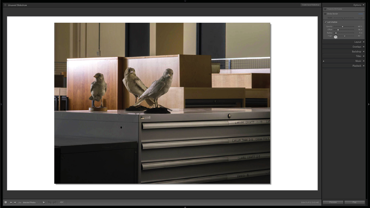
Figure 9.6 D – Examples of Cast Shadow use
Layout
Show guides can be helpful, especially when we mix vertical and horizontal images. It might help us better visualize where the edges of photographs will fall, especially when initially setting up a template for the currently edited slideshow.
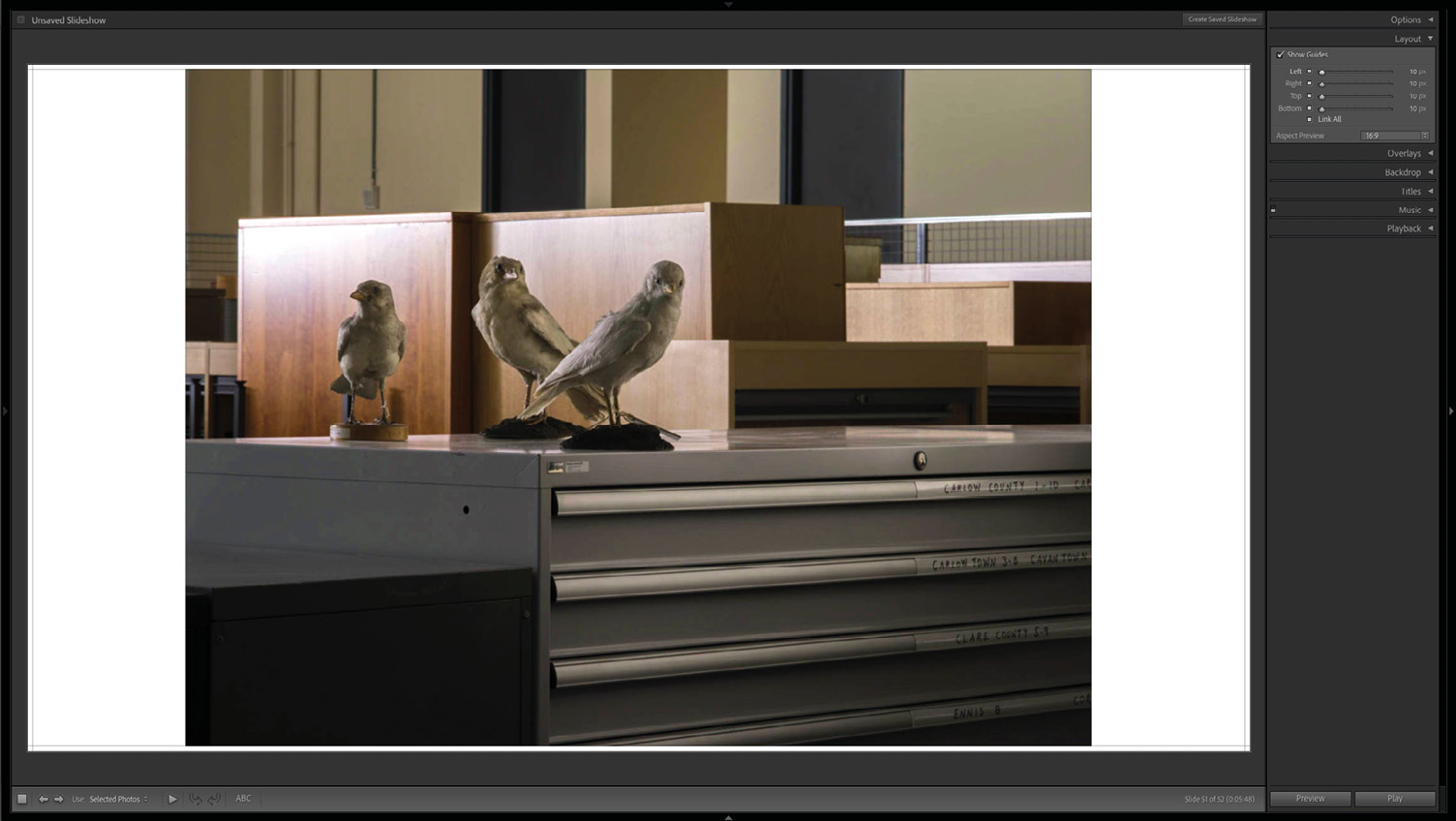
Figure 9.7 – Show Guides enabled
Setting margins can be linked so that we can adjust them simultaneously. This linking is symbolized by all of the small squares next to sliders that are highlighted in light gray. If we want to adjust the slides separately, we can either deselect the Link All function by clicking on the little square and choosing which side we want to modify, or we can deselect any of the boxes responsible for each side, and the selected, highlighted sides will remain linked.
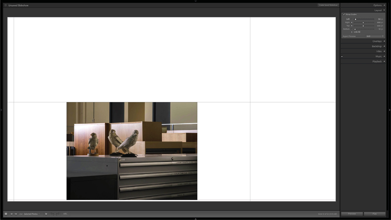
Figure 9.8 A
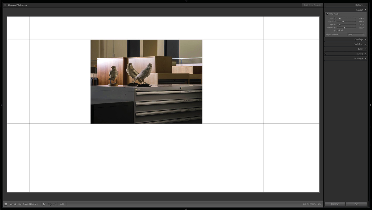
Figure 9.8 B – Disabling the linking of margins for two of the four edges and adjusting all edges separately
Aspect Preview
Many of the screens on which people will view our slideshow will have a 4:3 aspect ratio, especially work laptops. Here, we can set our desired aspect ratio to the aforementioned 4:3, wide-angle 16:9, or simply to the aspect ratio of the screen we are currently working with.
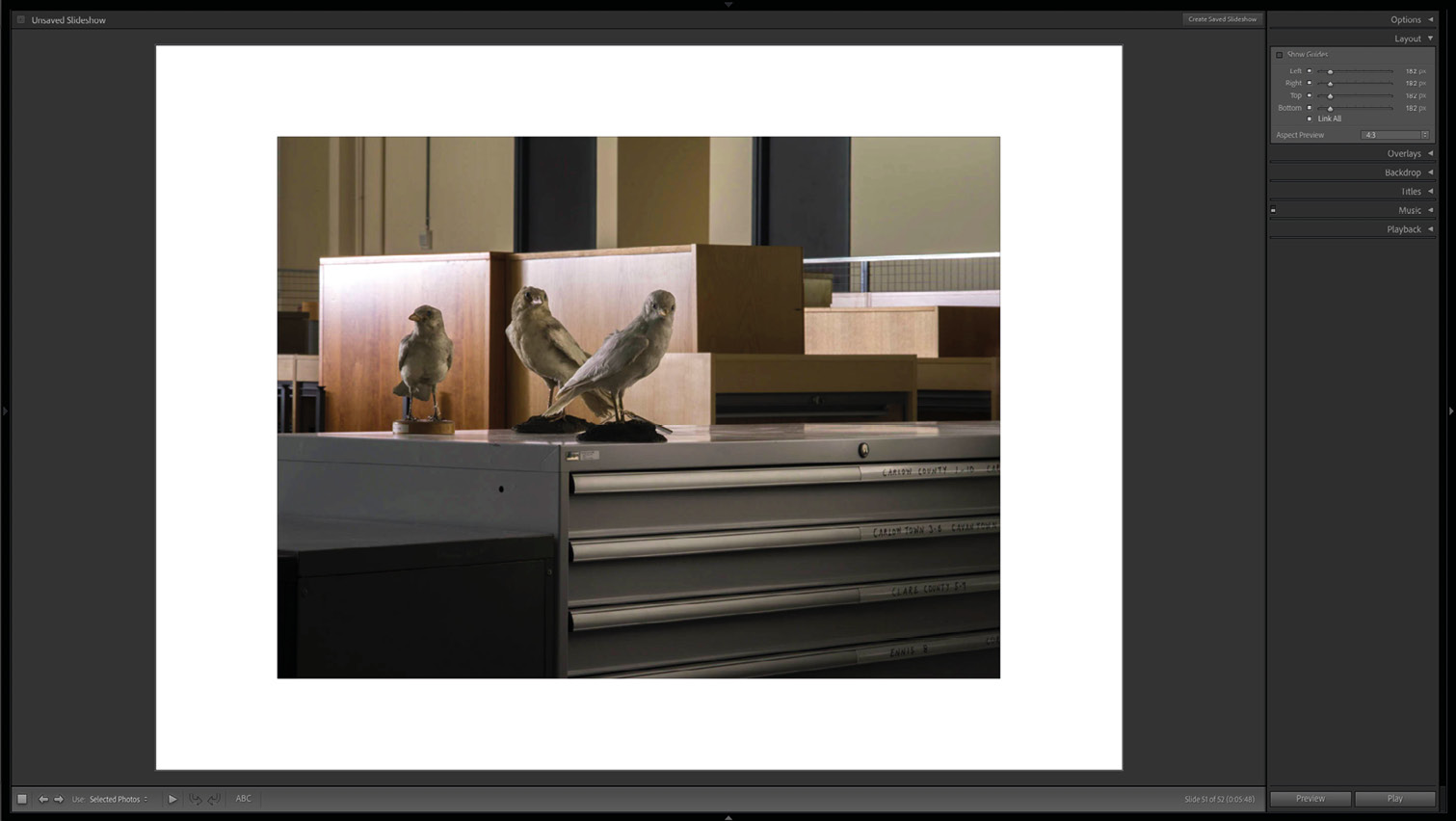
Figure 9.9 A
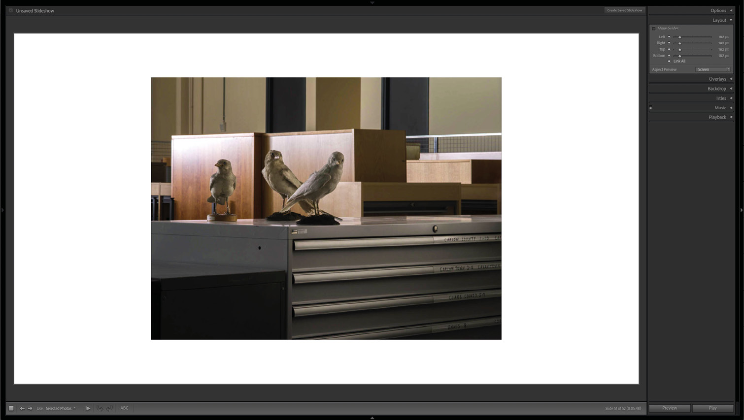
Figure 9.9 B – 4:3 and 16:9 aspect ratios
Overlays
This toolset is helpful if we want to ensure that images are watermarked and that everything is strongly branded.
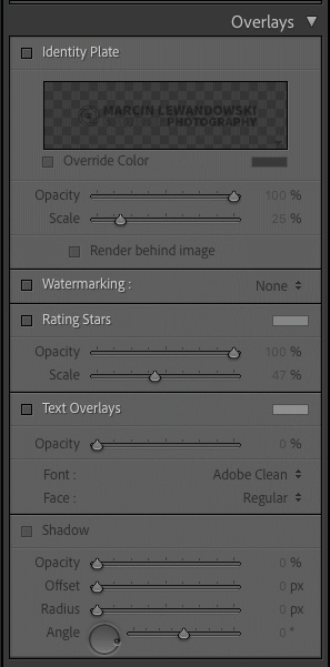
Figure 9.10 – The Overlays tab
Identity Plate
Setting an identity plate is as simple as possible, and we can choose to either upload a graphic file or create a stylized text plate. Clicking on the small arrow in the bottom-right corner of the Identity Plate window and selecting Edit… will open a small Identity Plate Editor. It looks just like the one we described in the Print module, as well as in the opening chapter (Chapter 1, An Overview of Lightroom Classic). When we choose to make a text identity plate, the Override color function under the preview will become available. We can then select any color for our identity plate without opening the Identity Plate Editor.
The next two sliders change the opacity and scale. Finally, Render behind the image will move the identity plate behind our image, so it's not obstructing it.
Once we have the identity plate set up, we can move it around the page slide by clicking and dragging it around. We can also change its size by dragging its sides and corners instead of working with sliders. After that, the identity plate will stay in the same position and have the same size across all slides.
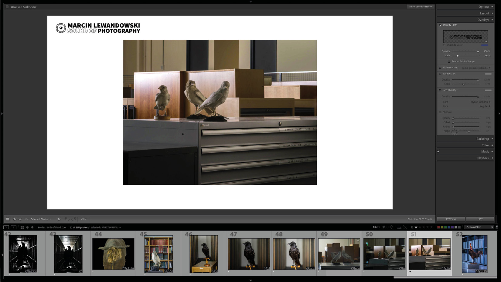
Figure 9.11 – The graphic identity plate
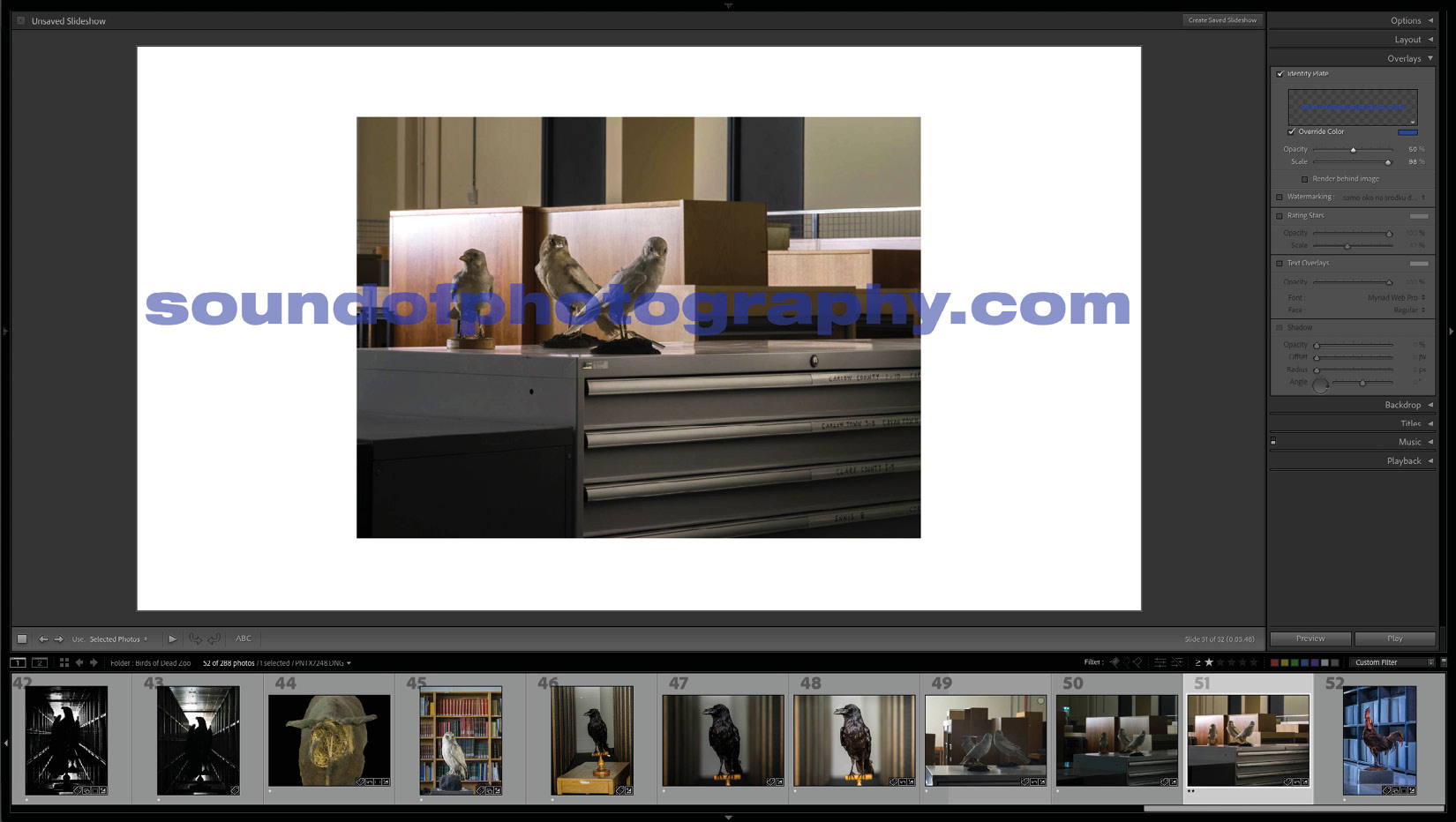
Figure 9.12 – The text identity plate at 50% opacity

Figure 9.13 – The text identity plate at 100% opacity, rendered behind the image
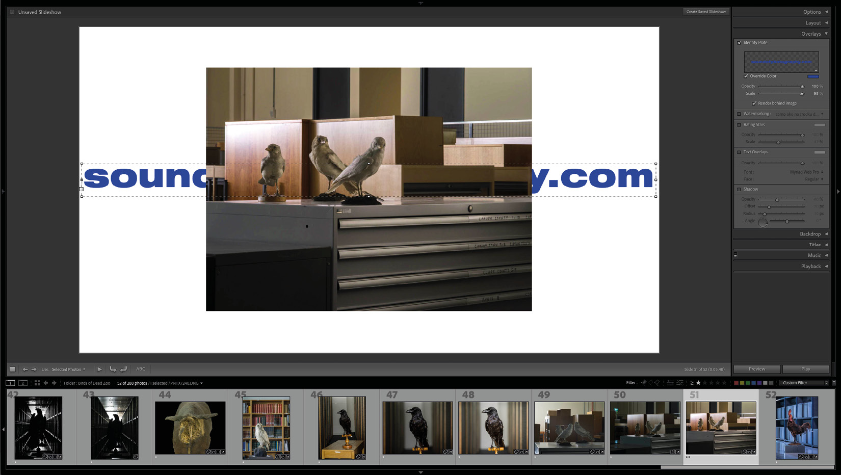
Figure 9.14 – The text Identity Plate at 100% opacity, rendered behind the image, selected, and ready to be moved and resized
Watermarking
This uses the same watermarks that we created in Export > Watermark Editor (as covered in Chapter 7, Get Them All Out Of Lightroom – Exporting For Work and Leisure). Choosing Edit Watermarks will open the Watermark Editor, where we can create a new watermark or change an existing one.
Rating Stars
Ticking this box will add our current star rating to the slides. We can choose size, color, and opacity by adjusting the sliders to our liking or by clicking and dragging the rating stars around the slide to find a position that we like. Once we have the rating selected within our slide, we can adjust its size by dragging its corners – this size change will be reflected in the slider's position. We can also move the rating around by using directional keys on the keyboard. Using just the directions will nudge it slightly. If we want to move it a bit more, we need to use "Alt" + "directional keys" – this will move it by a slightly more considerable amount. The "Alt" + "directional keys" shortcut works with any movable objects within Lightroom.

Figure 9.15 – The graphic identity plate in the top-left corner of the slide, the text watermark in the bottom-right corner of the photograph, and the rating stars in the bottom-right corner of the slide
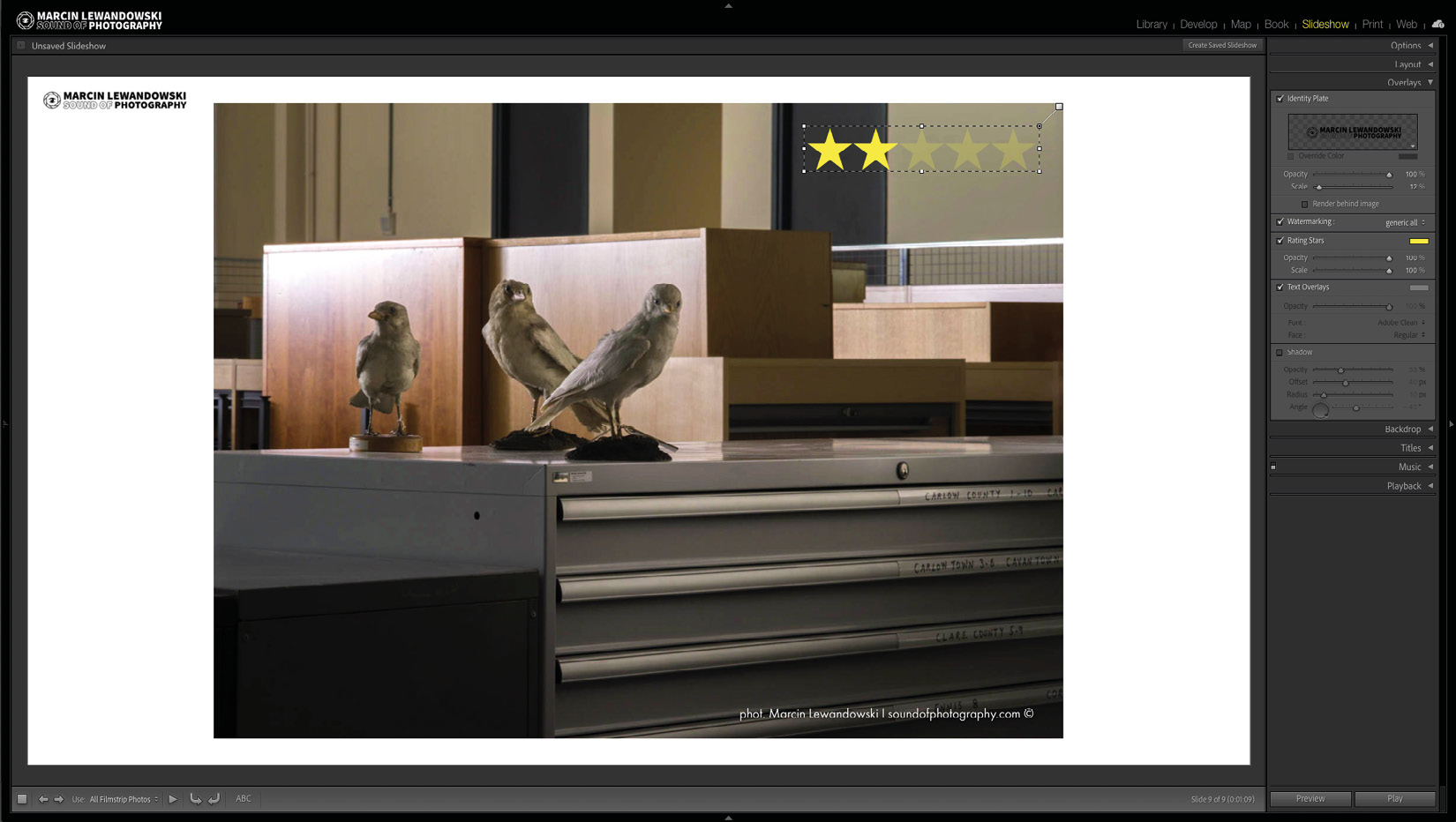
Figure 9.16 – The rating stars moved to the top-right corner of the photo, their size increased, and their color changed to yellow
Text Overlays
Here, we can add custom text to each slide. If we would like the same text note to appear on each slide, we must go to the toolbar below our slide, click on ABC, and choose Custom Text (if your toolbar is hidden, remember to use the "T" keyboard shortcut to make it visible). Here, we can add any text we want. This text can be moved around and scaled to our liking; we can also change the font, color, and opacity. If instead of the same text appearing on each photograph, we would prefer a separate caption, instead of choosing Custom Text in the ABC menu, we must choose one of the other available options. We can also build a template to include a full selection of parameters by selecting Edit… and using the Text Template Editor, where we can drag and drop a wide selection of settings available within our photographs' metadata. We can now save it as a preset available for later use or click Done and get back to the Slideshow module to edit our slideshow further.
Lastly, we can add a shadow and adjust it the same way we did in the top tab of this module – Options. There's one more thing – we can create multiple text overlays by clicking away from the current text overlay so that it is no longer selected, and by clicking the ABC icon on the toolbar once more. We can repeat this process multiple times.
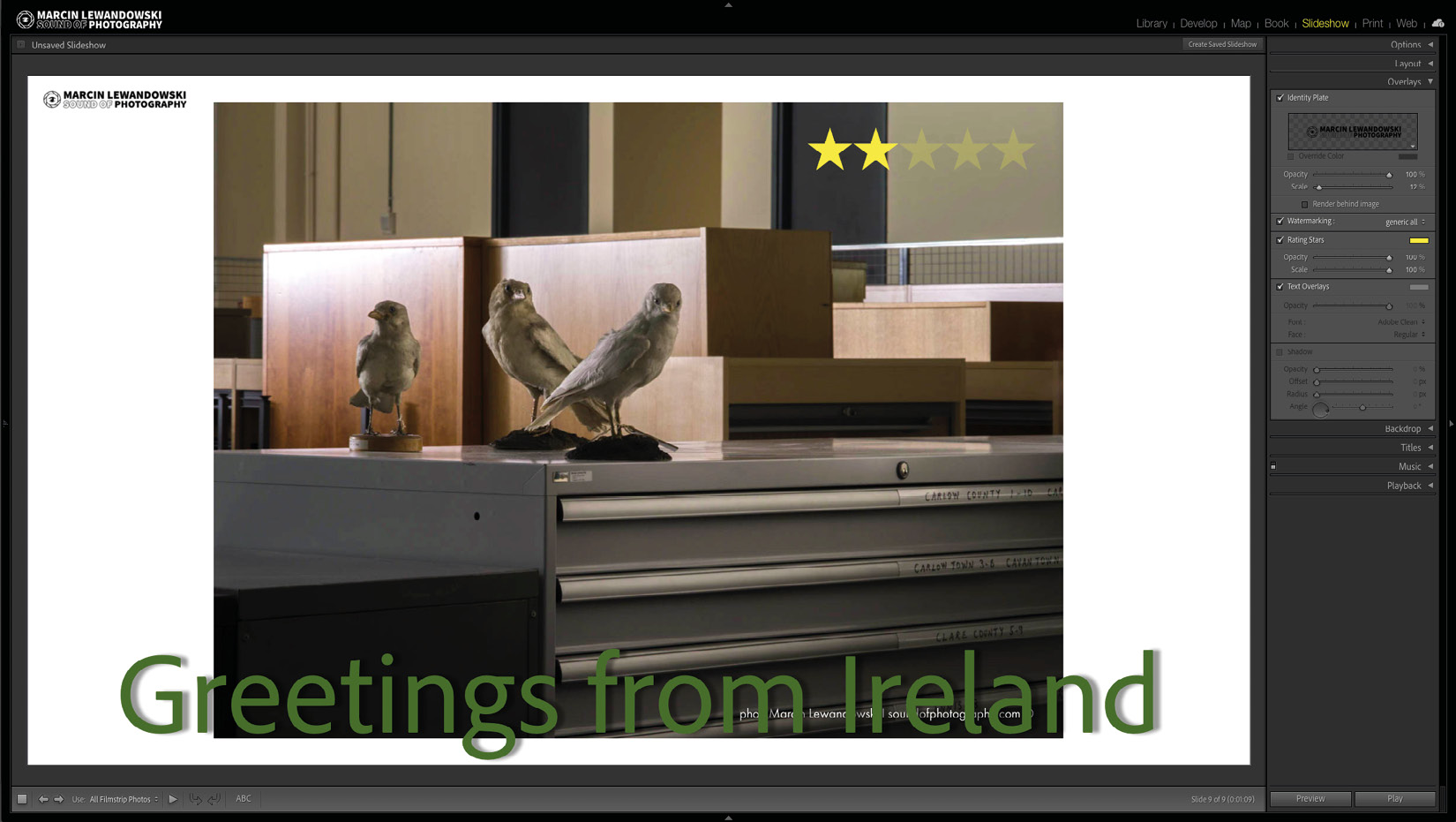
Figure 9.17 – Text overlays – manually entered
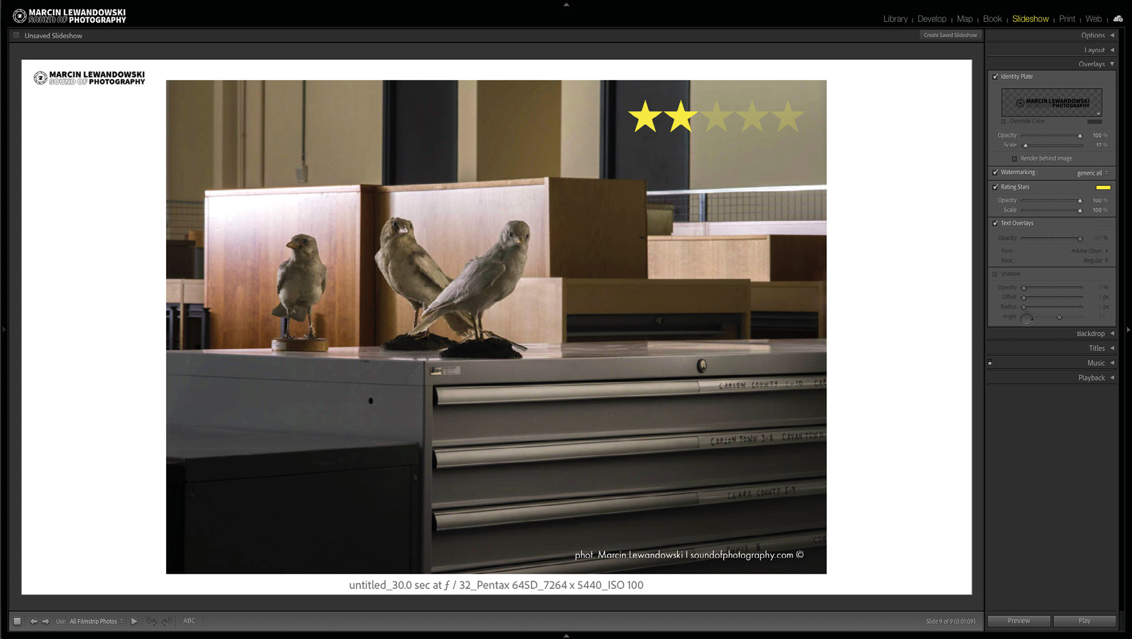
Figure 9.18 A
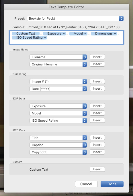
Figure 9.18 – Text overlays – a caption created from metadata, including exposure time, aperture, camera used, cropped file dimensions, and ISO setting, and a snapshot of the preceding settings in the Text Template Editor
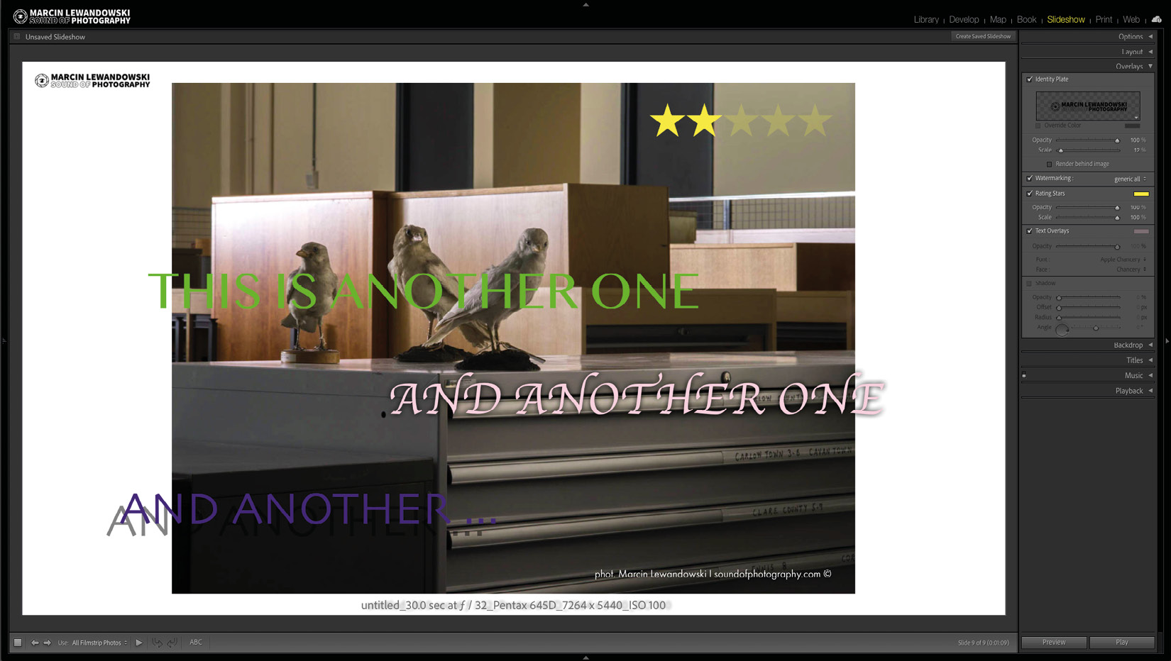
Figure 9.19 – Text overlays – multiple manually entered text fields
Backdrop
With the tools available in this tab, we can change the background for our slides, and we can do so using the following three settings.
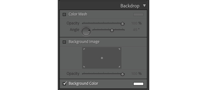
Figure 9.20 – The Backdrop tab
Color Wash
This will add a gradually changing color behind the images at an angle we choose. First, we must select the Color Wash option and choose the desired color. Afterward, we can play around with the opacity and angle until we are happy with the results we see.
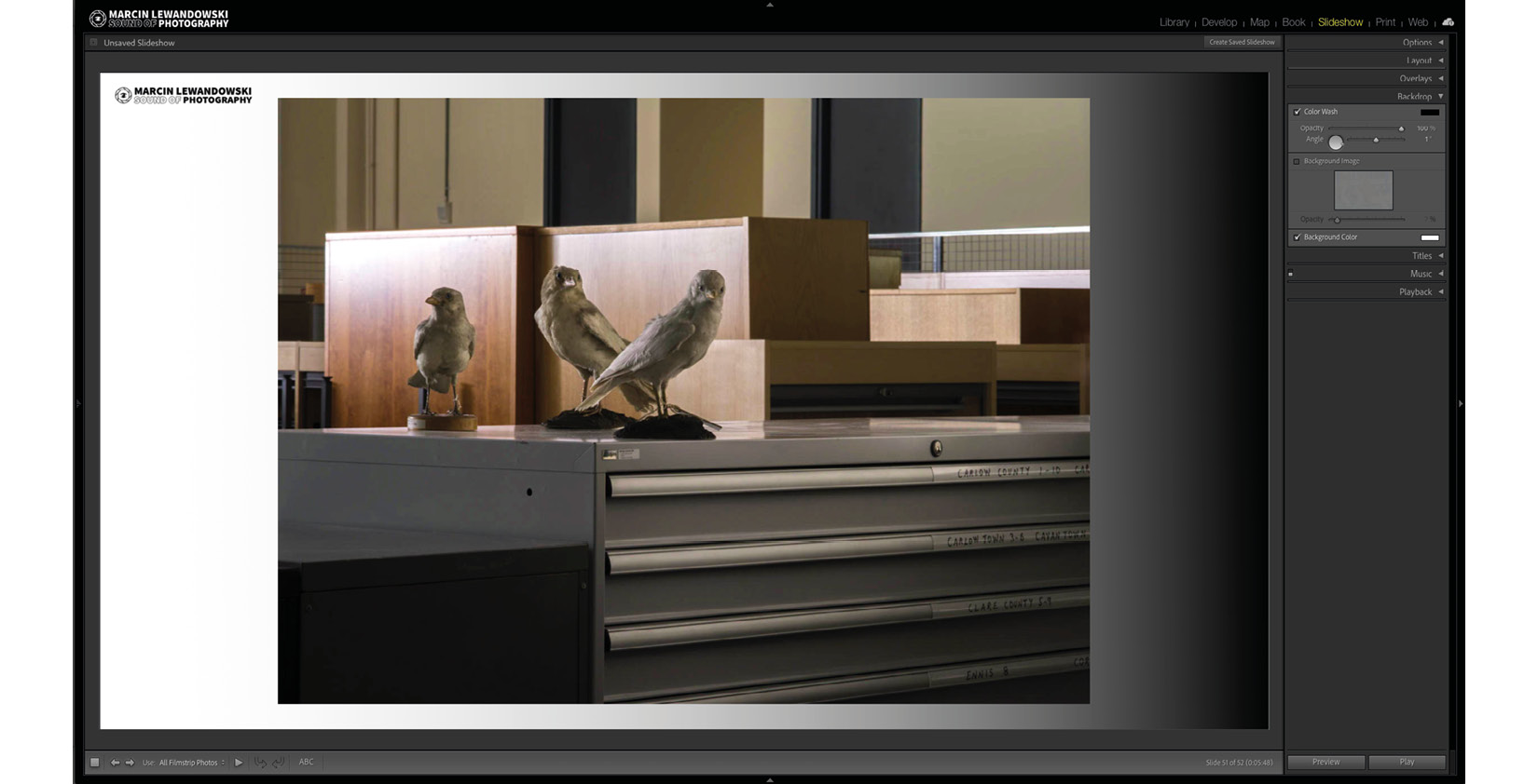
Figure 9.21 A
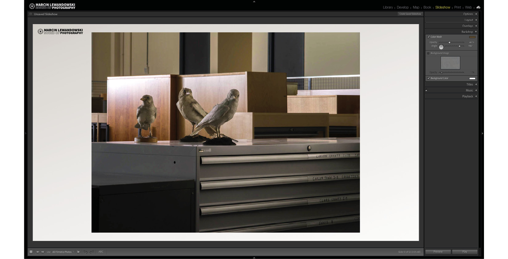
Figure 9.21 B – Color Wash examples
Background Image
Let's say we prefer to have an image instead of a plain background. In that case, we can select the Background Image box and drag any image from the Filmstrip into the empty box to have that image as a background for our slideshow. This will work in conjunction with Color Wash, and we can choose to have both, either, or none selected for a different type of look. It is all about finding a way to present images in the slideshow.
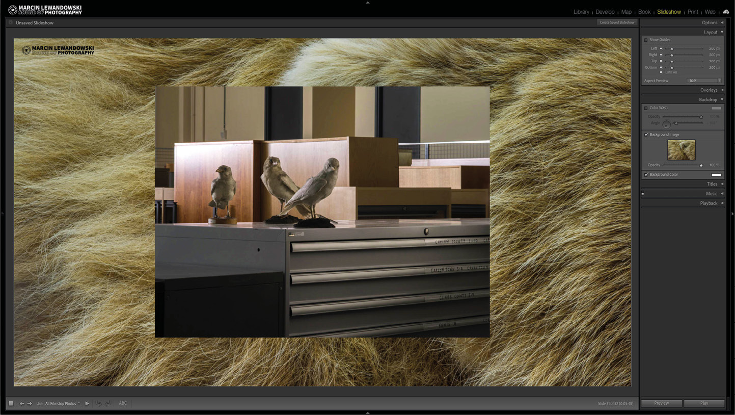
Figure 9.22 – Background Image
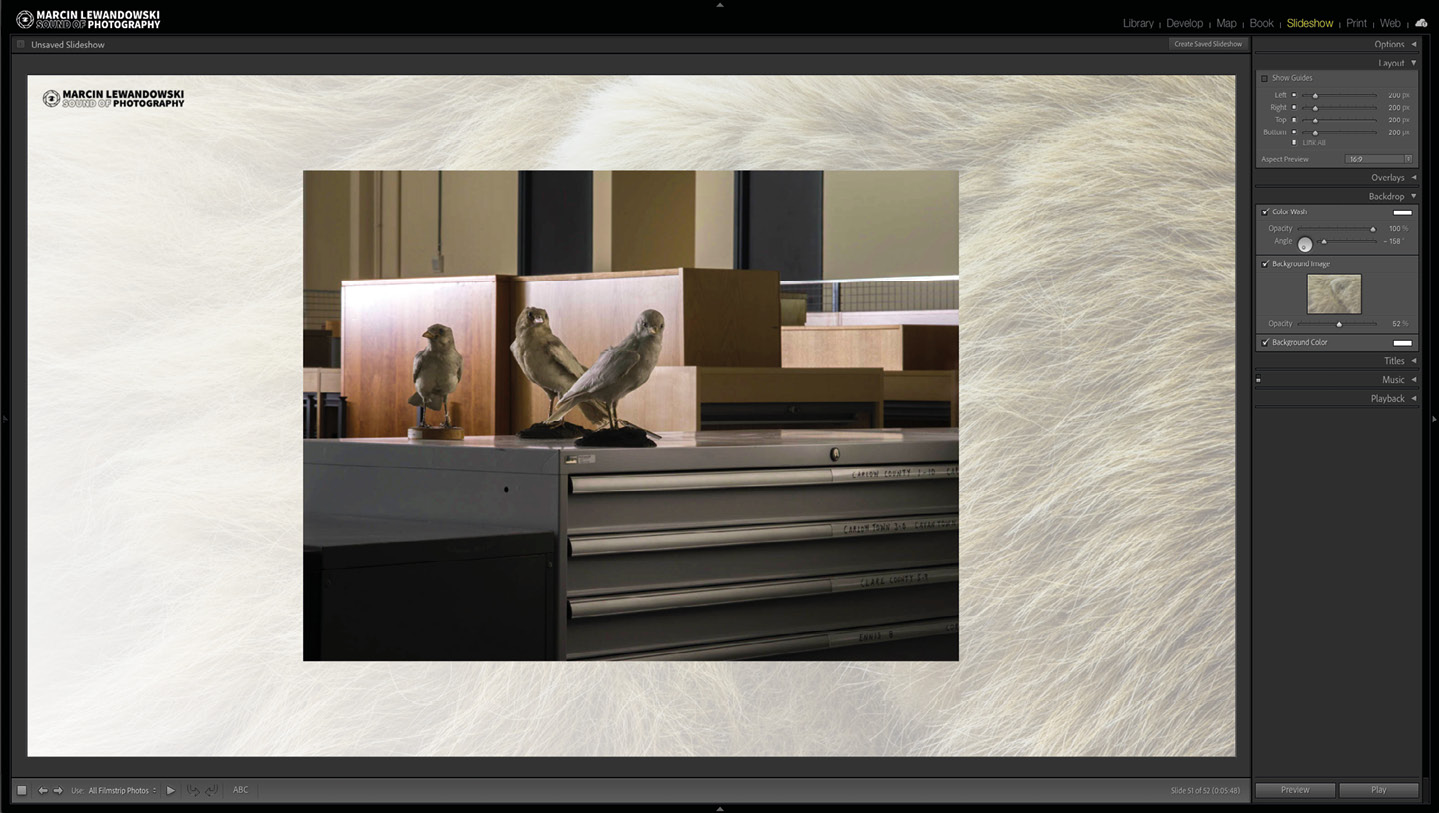
Figure 9.23 A
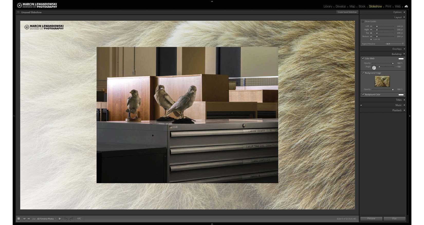
Figure 9.23 B
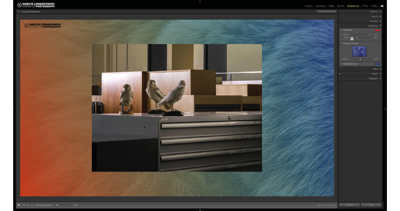
Figure 9.23 – Different Background Image and Color Wash combinations in conjunction with a blue background on the last image
Background Color
The last option in this tab is to choose a color for the background of our slides, which, as a default, will be black. Change of background color will also influence the look of the color wash and background image if their opacity is set to anything other than 100%.
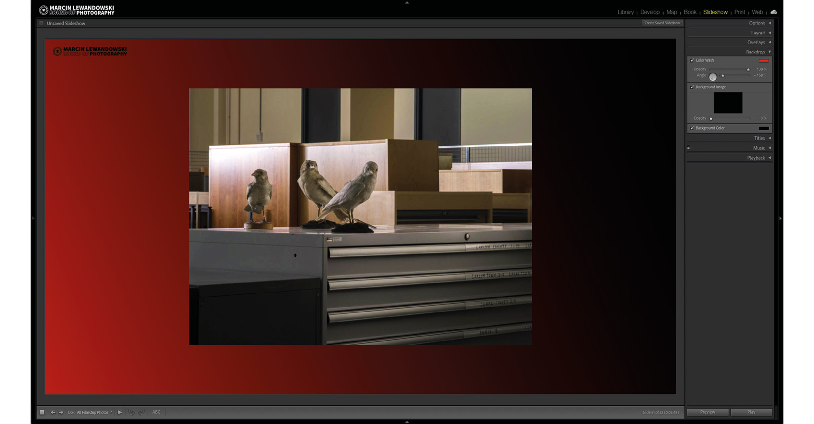
Figure 9.24 A
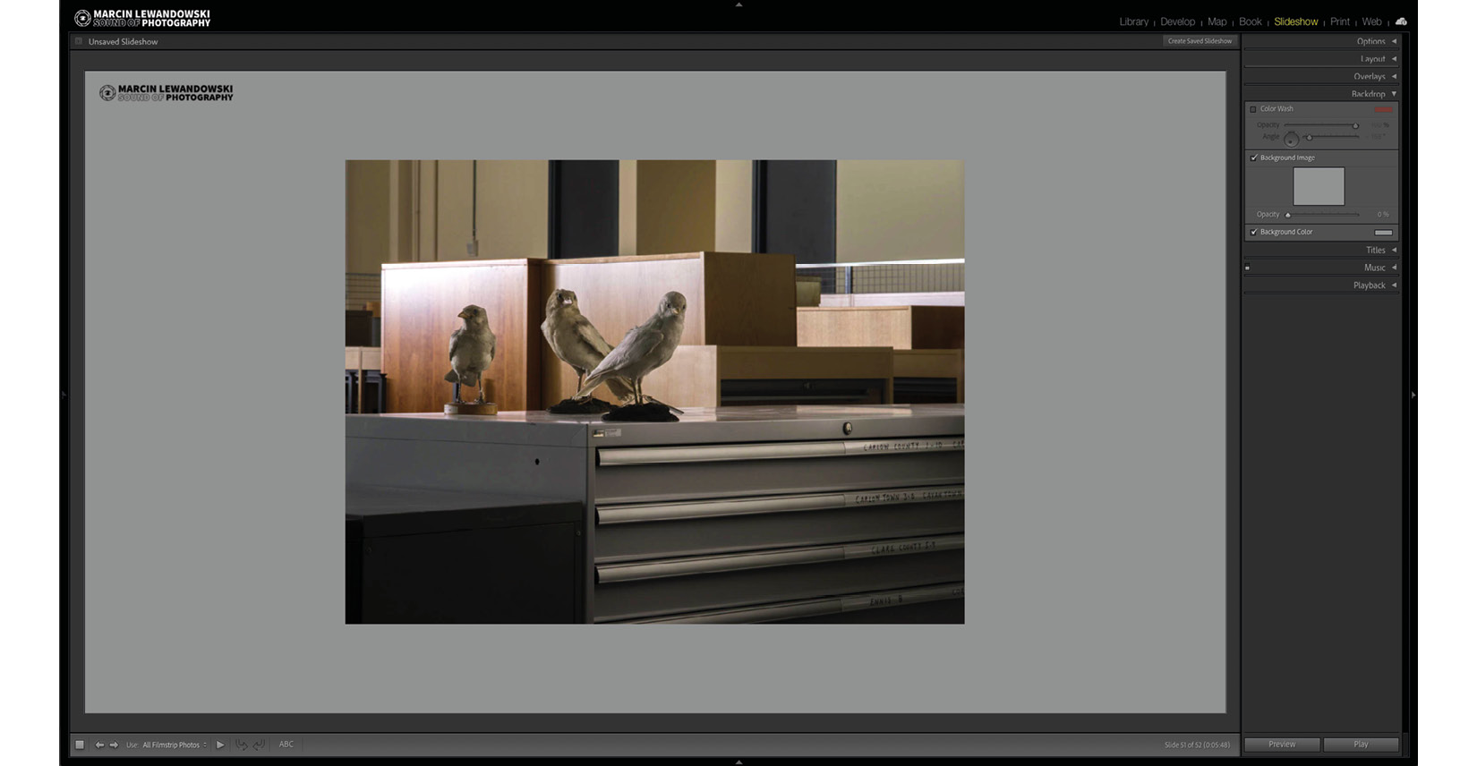
Figure 9.24 B – Background Color with and without Color Wash
Titles
We can add an extra slide at the beginning and end with a custom logo or text in the Titles tab. Selecting Intro Screen will add a chosen identity plate in the middle of the opening slide. Selecting Ending Screen will add an identity plate as the last slide. We can choose different background colors and identity plates for the intro and ending screens.
Additionally, if we decide to have a text identity plate instead of a graphic one, we will be able to specify the color of the text without interfering with the identity plate design we are using.

Figure 9.25 A
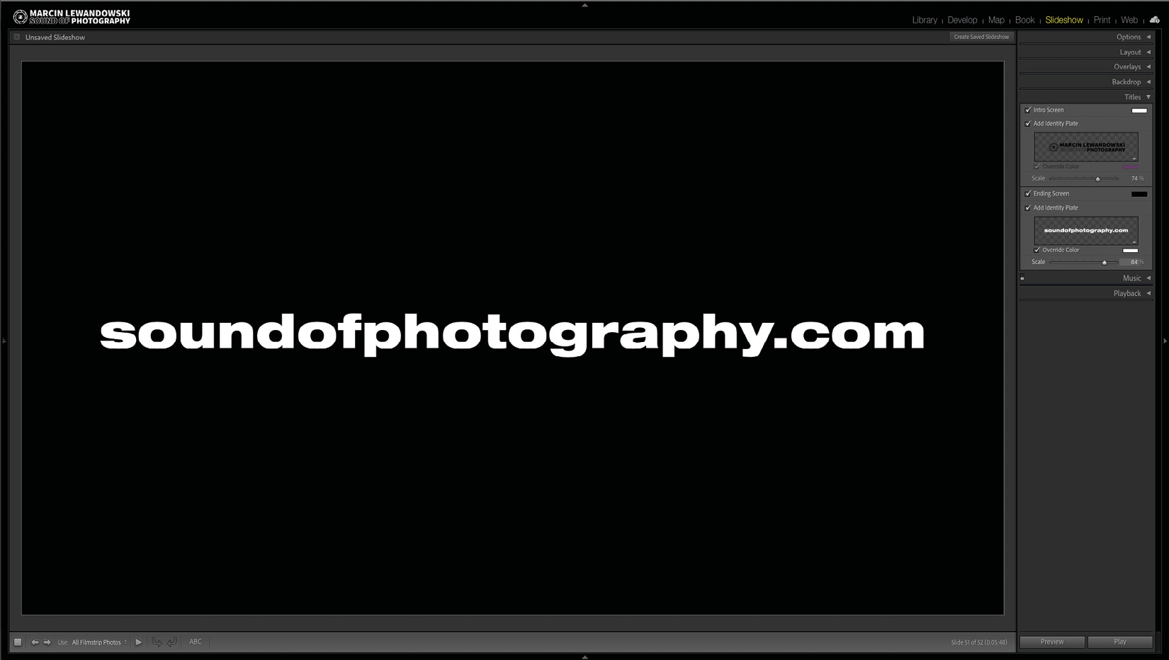
Figure 9.25 A
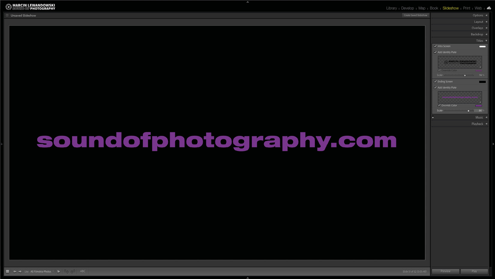
Figure 9.25 C – The graphic intro screen and text ending screen examples
Music
Here, we have an option to add music to our slideshow. We can add one track or create a whole playlist of up to 10 tracks and drag them up and down to form the desired order. To add a music track to our slideshow, we need to click on the + symbol and choose one track from our hard drive; the - symbol will do the opposite and delete the selected track.

Figure 9.26 A
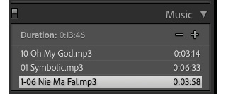
Figure 9.26 B – The Music tab – empty and with a sample playlist with three tracks
Playback
With the sequencing, look, and feel of the slideshow completed, we finally get to a tab where we can choose how the slideshow will progress from slide to slide and from the beginning to the end.
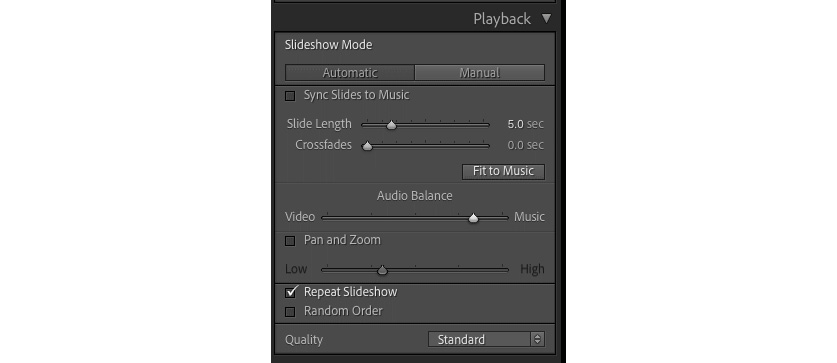
Figure 9.27 – The Playback tab
Any options we choose here will influence how the exported slideshow will work. The first two buttons (Automatic and Manual) let us decide whether we want the slides to progress automatically or only if the slideshow viewer chooses by pressing the keyboard's forward and backward arrow buttons. If we choose Manual, most other options will be unavailable, giving us access to choose whether we want to repeat the slideshow, run it in random order, and choose the slideshow's final quality. If we wish for the slideshow to run automatically and we already picked the soundtrack for it in the previous tab, here, we can set the slideshow to sync slides to music. When a track has a clearly defined rhythm, Lightroom might do a pretty good job keeping transition in sync with the beat, but I find both music-related features (Sync Slides to Music and Fit to Music) hit-and-miss options, making it quite unpredictable and, therefore, unreliable. Choosing this option will also not allow us to choose how long each of the slides will be shown between transitions, which is a drawback. If we decide not to use Sync Slides to Music, we can manually choose the slide length and how long it will crossfade between slides. We can also choose how long the crossfading transition will be between the slides. I feel that a slide length of around 4–7 seconds feels right, and I prefer a very short Crossfade effect or none at all. Fit to Music will adjust the slide length to match the duration of the music we picked. Audio Balance works only if we include any video clips in our slideshow. We can choose which audio will be more audible by moving the slider toward Video or Music. Lastly, we can determine whether we would like to add the Pan and Zoom effect and its strength. With the Pan and Zoom effect enabled, we can't choose which photographs will zoom in and which ones will zoom out, so if you want total control over how the slideshow is presented, you should probably leave it disabled, which is what I do. In the next part of the Playback tab, we can choose whether we want to repeat the slideshow, which will run it continuously, and if we would like it to run in random order. Lastly, we will choose the quality of the slideshow played from within Lightroom. It will take a lot of time for Lightroom to prepare a high-quality slideshow compared to Draft. If we have hundreds of photographs from a modern camera (with a high MP count), it can be a difference of many minutes, especially if we are not using a fast computer with lots of RAM and a powerful graphics card. The quality of the exported slideshow is set separately, and we will come back to it in just a moment.
The two buttons at the bottom of the right-side panel
There are two buttons at the bottom of the right panel – Preview and Play. The Preview button will play the slideshow in the Slide Editor window, while Play will play the slideshow with the whole screen filled.

Figure 9.28 – The Preview and Play buttons
The toolbar
The toolbar (the "t" keyboard shortcut) offers a few additional buttons that are helpful in building our slideshow.

Figure 9.29 – The toolbar buttons
The toolbar buttons are as follows, from left to right:
- The square button will stop Preview when clicked once; after the second click, it will return to the first slide.
- The forward and backward arrows will move between slides.
- With the Use button, we can choose which photos available in the Filmstrip we would like to use.
- The play button will start a preview – this works exactly the same as the Preview button at the bottom of the right-side panel.
- The rotate buttons will rotate any add-ons, such as text or identity plates, in increments of 90 degrees.
- ABC is for adding text to our slides, which we have already discussed.
Exporting the slideshow
As we mentioned at the beginning, there are two buttons at the bottom of the left-side panel – Export PDF… and Export Video….

Figure 9.30 – The export buttons
Export PDF… presents us with an export menu where we can choose the quality of our exported slideshow. Choosing a higher quality will result in bigger files, while a lower quality will decrease that size. Common Sizes gives us a choice of commonly used Width and Height ratios, including our screen size. We can also set the width and height manually to any value we want, which will override the Aspect Preview value we picked in the Layout tab and fill the photographs with this newly chosen one. We can also choose whether we automatically want the created PDF to open in a full-screen view.
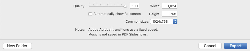
Figure 9.31 – The Export PDF… options
Export Video… offers four presets, from a low-resolution 480 x 270 preset through 720p to full HD.
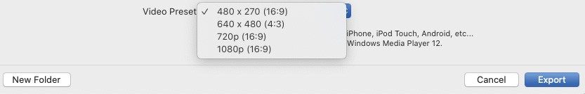
Figure 9.32 – The Export Video… options
This concludes this part of this chapter about the Slideshow module. Now, you should be confident in choosing the desired look for your slideshow, tweaking it to perfection, and exporting it in a format of your choice.
In the next part of this chapter, we will look closely at the Map module.
The Map module
The Map module welcomes us with a map of the world, which will be in its night view with no options available if we are offline. The Map module only works if we are connected to the internet.

Figure 9.33 – The offline Map module
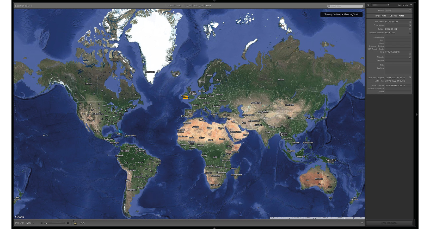
Figure 9.34 – The online Map module in Hybrid view
Left-Side Panel
Let's look at the left side of the Map module next.
Navigator
The top of the left-side panel houses the familiar Navigator pane. In the case of the Map module, it will display a fragment of the world map, with a white rectangle showing the area we are currently viewing in the main window.
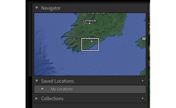
Figure 9.35 – The left-side panel tabs
Saved Locations
Saved Locations allows us to create a list of locations we want to be able to come back to quickly. To create a saved location, click on the small + symbol. This will open a New Location menu where we can choose the location name and folder for the new location we are creating. Options offers to specify the radius of this new location – it will default to the radius filling our current map view. We can also choose to make this new location private; any files within this location will never export with location information. Clicking on any location in Saved Locations will show a circle matching our settings for that location. Clicking on the small arrow on the right side of its name will go to that location on the map.
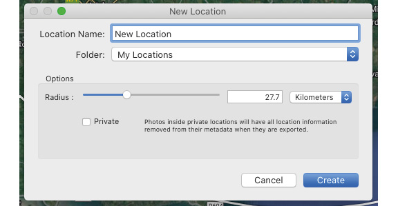
Figure 9.36 – The New Location menu
Collections
We should be very familiar with Collections at this point.
Location Filter
The top of the map has four options that will filter the Filmstrip photographs:
- Visible On Map will only show images tagged with GPS coordinates currently visible on the map.
- Tagged will show only images tagged with GPS coordinates.
- Untagged will only show photos without the GPS coordinates.
- None will turn off any applied filters.

Figure 9.37 – The Location Filter menu
To see our photographs distributed on the map, we must choose a folder or a collection. The map will show any pictures with GPS coordinates as small pins in two shades of orange. Dark orange is reserved for unselected photographs (photographs not selected from the Filmstrip). The lighter shade of orange is dedicated to selected photographs (photographs selected in the Filmstrip). Clicking on any geotagged photo in the Filmstrip will open the map on that location. If, for example, we open a folder from a trip to a different city where we were taking GPS-tagged photos and we want to pinpoint a location, once we click on a picture in the Filmstrip, the map will show us the exact spot where we took the photo.
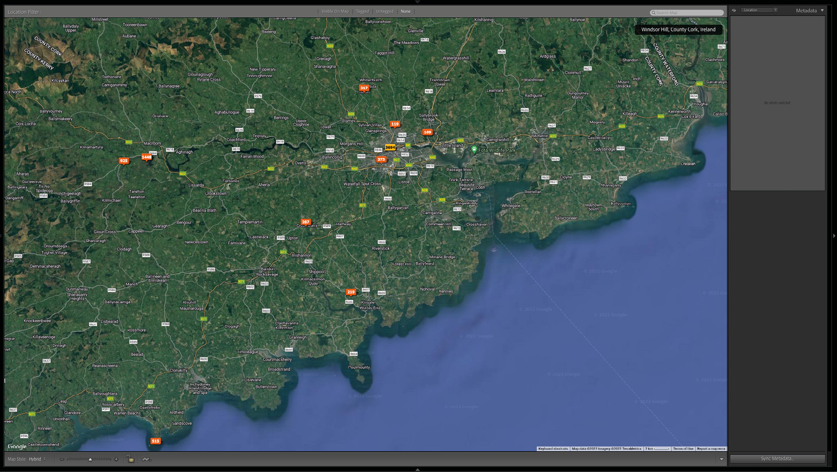
Figure 9.38 – The sample folder view on the map
We can edit the GPS coordinates of any photograph or group of photographs in a few different ways.
Clicking on the orange tag visible on the map will select photographs from the tagged location on the Filmstrip. When we press "Backspace" on the keyboard, Lightroom will ask us whether we want to delete coordinates for the selected photo. In case of choosing a group of photographs, Lightroom will ask whether we want to delete GPS coordinates for all of them.
Right-clicking on any tag will give us an option to create a collection or delete GPS coordinates. We can also change or delete GPS data in the metadata location, conveniently opening in the right-side panel. To change coordinates, we can either type them directly into the GPS field or, when we have several photographs selected, click on the Sync Metadata… button. This will sync all selected photographs' GPS with the currently active photograph.
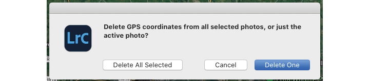
Figure 9.39 – Deleting GPS coordinates
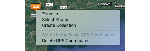
Figure 9.40 – Right-clicking on the location tag
Last but not least, we can add missing GPS coordinates to any photographs by simply dragging them from the Filmstrip onto any location on the map.
In the toolbar under the map (the "T" keyboard shortcut), we can choose which style of the map we could like to use. If you are using tracklogs from a third-party app, you can load them by clicking on the jagged wave button and choosing Load Tracklog….
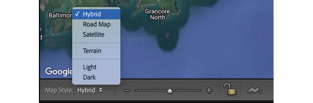
Figure 9.41 – The toolbar with the map style list opened
The preceding overview gives a good idea about working with the Map module. In the last part of this chapter, we will look at creating a simple web gallery in the Web module.
The Web module
We can build a simple web gallery in the Web module and export it as an HTML web gallery or upload it directly onto our server.
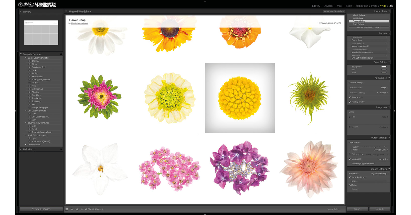
Figure 9.42 – The Web module
I'll be perfectly honest with you – there are better tools for creating web galleries, and what Lightroom has to offer might feel a bit outdated, especially when compared to what's available online, even for free. Having said this, the option to quickly build and export a web gallery (or upload directly to a server) is available directly from within Lightroom. In this chapter, we will look at the Web module's potential.
Before we start playing around with the settings, we must choose a folder or a collection of images that we want to work with and sequence them in the order we would like them to appear. In the toolbar under the main window, we can specify which photographs we would like to choose:
- All Filmstrip Photos
- Selected Photos
- Flagged Photos
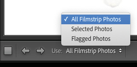
Figure 9.43 – The Use menu
We can change between these settings whenever we want and, of course, drag and drop any Filmstrip images around to form a sequence we like.
The left-side panel
The Template Browser option in the left-side panel of the Web module lets us choose from one of the available templates. Note that each of the different types – Classic, Grid, Square, and Track Gallery – all have one of their template's names ending with (default); this is the most basic template and gives us more or less a blank canvas to work with, within each of these styles. When we hover over the template names, Preview will show us how the canvas looks in its unedited version.
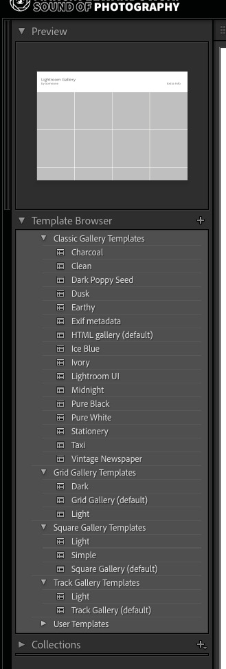
Figure 9.44 – The left-side panel
The right-side panel
Knowing that we have access to these templates, let's turn our attention to the right-side panel of the Web module and look at the tabs it contains:
- Layout Style
- Site Info
- Color Palette
- Appearance
- Image Info
- Output Settings
- Upload Settings
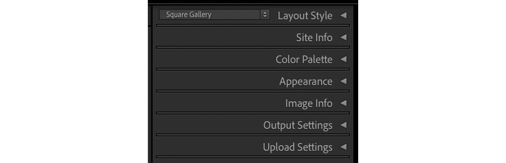
Figure 9.45 – The right-side panel tabs
The Layout Style tab gives us a choice between four different gallery types. These types are as follows:
- Classic Gallery
- Grid Gallery
- Square Gallery
- Track Gallery
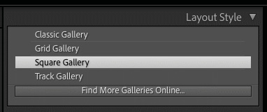
Figure 9.46 – The Layout Style tab
We will now look at the main differences and similarities between these four gallery types.
The only three tabs that will have the same settings, no matter which gallery we choose, are the following:
- Image Info: There are two lines of information we can add through this tab. Even though they are titled Title and Caption, they can extract whatever we want and need from a picture's metadata. For both of these settings, we can choose from a list of presets or create custom titles and captions by clicking on Edit…. We can build a desired string of text by inserting it from the list available in the Text Template Editor, which works on the same principle as the Filename Template Editor in the Export menu.
- Output Settings: Output settings are elementary. They allow us to set the quality of the exported images and whether metadata is exported within the pictures. We can also choose whether we want them to be watermarked and what level of sharpening we wish to apply to the exported gallery images.
- Upload Settings: You will only use this tab if you want to upload a created gallery directly onto your server. It might be a useful option if this is how you manage your website. All you need to do is to choose the Configure FTP File Transfer option, which will be a familiar list of details if you work your website this way. If you are not sure how to configure it, I suggest contacting your website provider and asking for the settings required by the Configure FTP File Transfer menu.
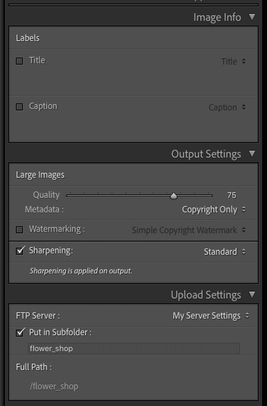
Figure 9.47 – The Image Info, Output Settings, and Upload Settings tabs
After learning about the standard settings for all four types of galleries, let's look at what the other tabs offer us in terms of gallery customization.
Classic Gallery allows the most considerable amount of information in the Site Info tab; it can also be set up to link our identity plate to a web address of our choice. It's also the only type of gallery allowing the use of an identity plate. Classic Gallery is also the only gallery that will enable us to specify the size of the grid – this can be set up in the Appearance tab. The minimum number of rows and columns we can set up is 3 x 3. Color Palette controls the coloring of each adjustable element. We can view the changes in real time and run wild, letting our inner designer go mad. Classic Gallery allows us also to set the image page's size (a full image that opens after clicking on a thumbnail). Unfortunately, this is a constant size, and it's not a responsive design. The image will always open and remain in the specified size, no matter what screen it is displayed on. The Appearance tab also allows us to set the photo borders' thickness for both the thumbnail and image pages.
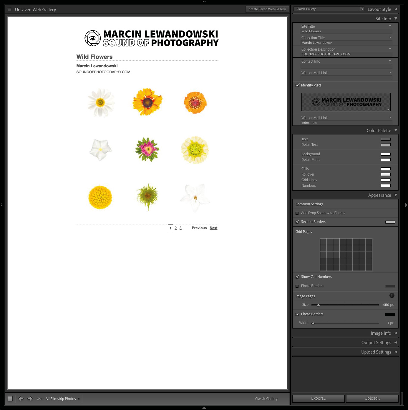
Figure 9.48 – A sample Classic Gallery view and tabs, with settings unique to the Classic Gallery
Grid Gallery offers a more simplified approach, with only three Site Info fields, four Color Palette choices, and a different approach to Appearance. Instead of grid size, we can choose between the pagination style and the number of items per page. We do not influence the size of the photograph displayed on the Image pages. This is a responsive design gallery; it will adjust the image to fit into any screen it is displayed on. The same responsiveness applies to the thumbnail grid.
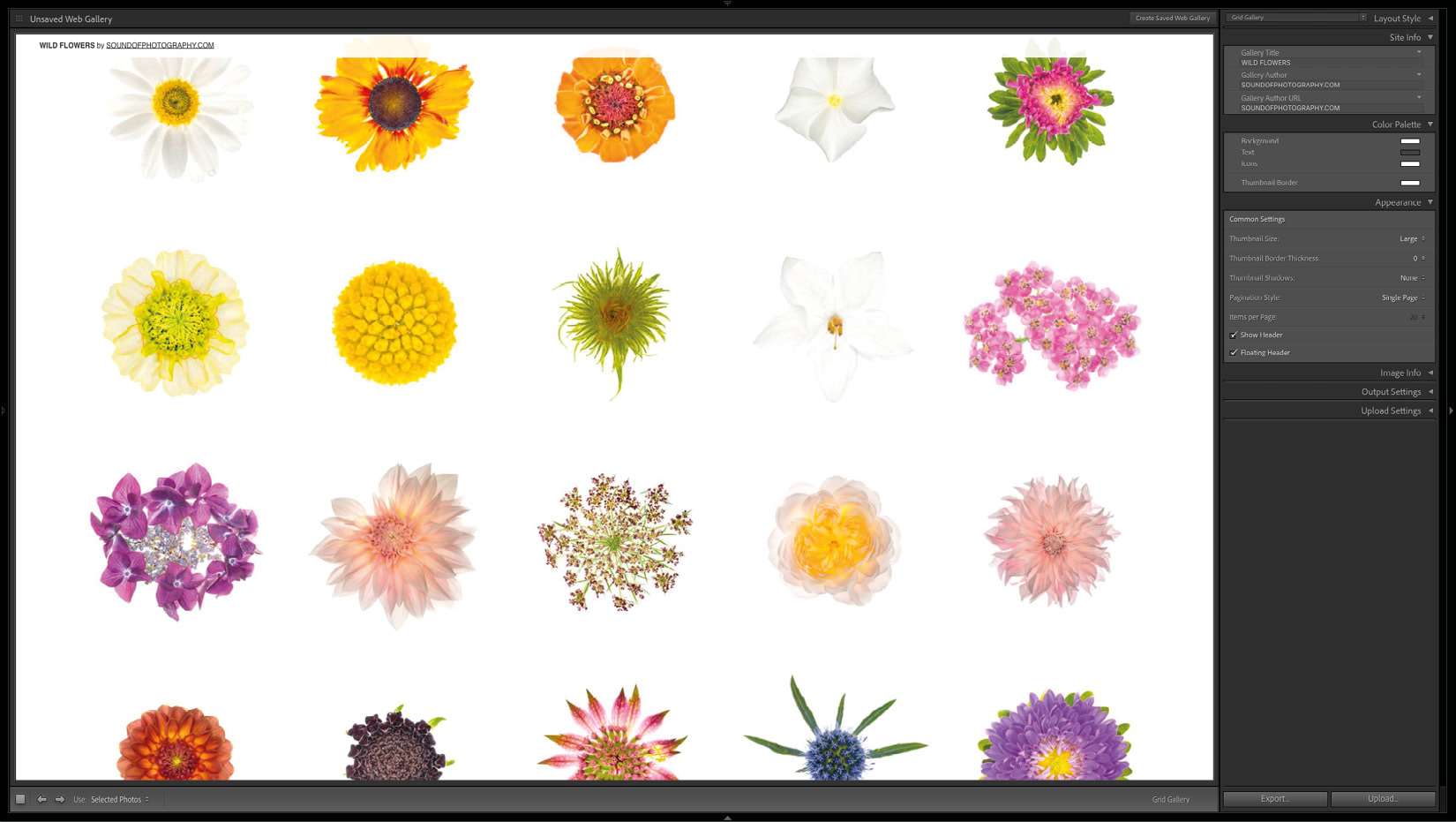
Figure 9.49 – A sample Grid Gallery with large thumbnails and floating header
Square Gallery has the least amount of settings. Thumbnails within this gallery will always appear square. The only real influence we have over the look of the thumbnails page within the Square Gallery is the size we choose for the thumbnails. As with the Grid Gallery, it's a responsive design.
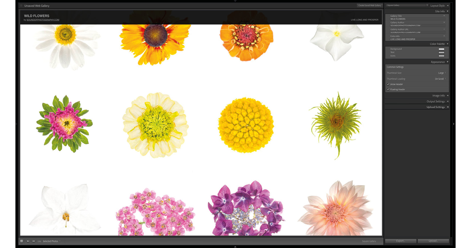
Figure 9.50 – A sample Square Gallery with large thumbnails and a floating header
The last choice is Track Gallery, which will display thumbnails as a uniform, continuous, and responsive flow of the images we chose for our gallery. With this design, we can only change the height and spacing of the rows with thumbnails.
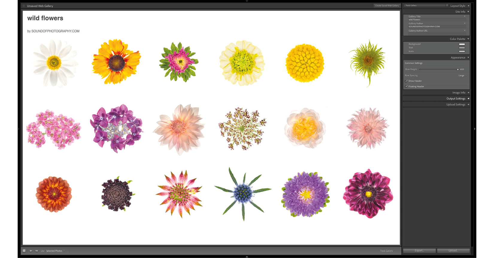
Figure 9.51 – A sample Track Gallery with the maximum size of thumbnails and the maximum spacing between rows of photos
If we want to see how our design looks and works in a browser, we can always hit the Preview in Browser… button at the bottom of the left-side panel, which will open the page we created in our default browser.
Figure 9.52 – The Preview in Browser... button
Even though it's not the latest and greatest in terms of web design, the Web module offers a simple solution with no extra added cost; all we need is some server space. We can maintain a website with no additional or hidden charges and with lighting speed, all from within the same piece of software. Once we create a user template with the design we like, we can upload new galleries to our page by clicking the Upload… button.
Summary
In this chapter, we learned about three modules – Slideshow, Map, and Web. Some of this information will become an indispensable part of many photographers' workflows; some of it they will never revisit. For example, I use the slideshows to look at how photographs look when viewed one after another before sending anything to clients or family and friends. I'll often sit down, relax, and watch them a few times. If anything feels out of place or unnecessary, I'll delete it from the final edit. Conversely, I practically never use the Map module, even though I see its tremendous potential. I started adding GPS positions to my work folders, but it's still just a gimmick in my workflow. Lastly, the web gallery is an option I considered at some stage, thinking that with enough tweaking, it could have a contemporary enough look, but it just didn't fit my workflow. Maybe it will fit yours.
In the next chapter, which is also the last chapter of this book, we will learn about additional Lightroom functionality, such as adding a second screen or projector and working with a tethered camera. We will also look at the basics of Lightroom CC and Lightroom for mobile. We will close the chapter with a quick look through everything that we learned throughout this book.