
13
Integrating Advanced Features: Extensions, Scripts, and AI
So far, everything we’ve covered in this book has been focused on features of Tableau that work “out of the box.” And these features are very powerful! However, Tableau is also incredibly flexible, and you can extend the functionality greatly through extensions, custom scripts (such as Python or R), and even by integrating AI through Tableau CRM Analytics (formerly Einstein Analytics) in Tableau!
As in other chapters, we’ll cover both concepts and practical examples. Many of the more advanced examples will require setting up your environment to run external repositories, services, and platforms such as a web server or SDK (Software Development Kit). It is outside the scope of this book to provide in-depth instructions on how to set up these components and the exact steps may change over time.
Instead, you will be directed to the appropriate resources and documentation to set up any additional resources required. The examples will include details that assume you have completed the required setup. Sections with examples requiring advanced setup will state the requirement up front so that you are able to decide whether you wish to follow the example or merely read the content.
In this chapter, we’ll cover the following topics:
- Using and creating dashboard extensions
- Using analytics extensions and using advanced scripts
- Creating CRM Analytics predictive models and leveraging them in Tableau
We’ll start by covering dashboard extensions and then move on to analytics extensions and scripts before finally covering predictive models using CRM Analytics.
Tableau Dashboard Extensions
In Chapter 8, Telling a Data Story with Dashboards, we observed that the Dashboard Extension object was one of many objects that can be added to a dashboard. Now we’ll consider the details of what an extension is, how to use extensions, and even how to create a dashboard extension.
What Is a Dashboard Extension?
A Tableau Dashboard Extension, also known simply as a Dashboard Extension, is a web application that integrates into a dashboard, providing extended capabilities beyond the built-in features of Tableau. Extensions can perform many functions on a dashboard, such as providing an interface for user input, rendering graphical feedback, and integrating external applications.
Whether you will simply be using extensions or are interested in developing your own, it is important to understand how dashboard extensions work. Obviously, if you will be developing extensions, you will need a deeper understanding! Take a moment to examine the following diagram, which illustrates the fundamental architecture around an extension:

Figure 13.1: The basic architecture of a Tableau Dashboard Extension
We’ll consider more of the technical details as we proceed through the next few sections, but in general, an extension is simply code such as HTML, JavaScript, and potentially other code (such as PHP or .NET) that can be executed on a separate web server. This code accomplishes several things (numbered in Figure 13.1):
- The code provides a user interface that can be added to a dashboard using the Dashboard Extension object on the dashboard. For example, you may have controls or input objects for the user to manipulate. Or you may provide the user with graphical feedback based on backend processing. Occasionally, there won’t be an interface (for example, an extension that passively collects dashboard usage data) but in most cases, there will be some kind of user input or graphical output. A dashboard extension object is always required to use an extension. But in cases where the interface is not needed, it may be hidden from the end user.
- The code will also make use of the Tableau Dashboard Extensions API—a programmatic interface for objects and actions on the dashboard. This enables the dashboard extension to do many things, such as read data from parameters and views on the dashboard, perform certain tasks when specific actions are triggered, or even programmatically change values on a dashboard.
- The code may optionally execute backend code, access external systems and APIs, read and write to external databases, and more. This provides a wide range of possibilities for integrating Tableau into processes and applications across an organization. For example, a dashboard user might select bars representing errors and enter a new value in the Dashboard Extension object. The backend code might use these actions and data to update an external process to correct the errors or send an alert to the appropriate person.
With this foundation, let’s move on to consider how to use and ultimately create dashboard extensions.
Using a dashboard extension
We’ll work through a simple example to demonstrate how you can add, configure, and use an extension in a dashboard. Specifically, we will use the Image Map Filter extension (created by Tableau and Salesforce), which will allow us to use an image of a hospital floorplan as an interactive filter selection. You’ll find the complete example in the Chapter 13 Complete workbook.
When you first open a workbook that uses dashboard extensions, you may receive a prompt to allow the extension. This is a security feature that allows you to disable an extension you do not trust.
To follow along with this example, use the Chapter 13 Starter workbook, locate the Hospital Rooms dashboard, and then drag and drop the Extension object into the dashboard as illustrated:
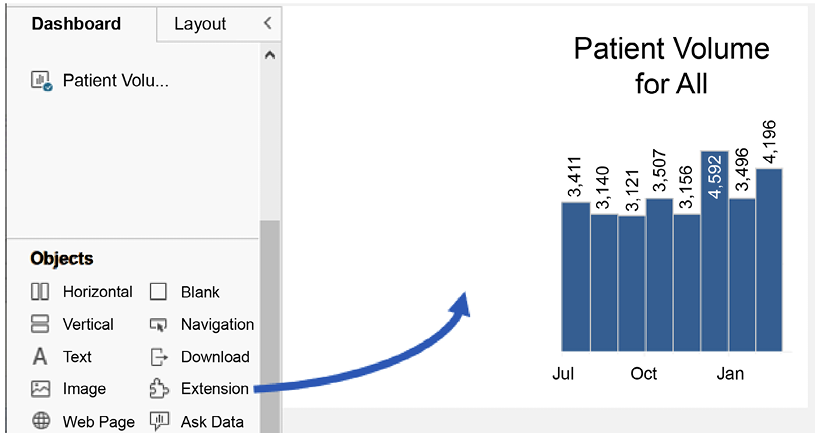
Figure 13.2: Drag and drop the Extension object into the dashboard
Dashboard extension objects are just like other objects and may be added to a dashboard as either floating or tiled objects.
Most dashboard extensions provide user interaction — either input, output, or both — and you will want to find an appropriate spot to show them in the flow of the dashboard. However, some dashboard extensions may operate in the background and you may not want them to ever be visible to the end user. If you wish to hide an extension (or any object, for that matter) from an end user, consider floating the object on the dashboard, switching to the Layout tab on the left, and setting X, Y, Height, and Width all to a value of 1.
Dropping the extension object into a dashboard will bring up the Add an Extension dialog, which looks like this:
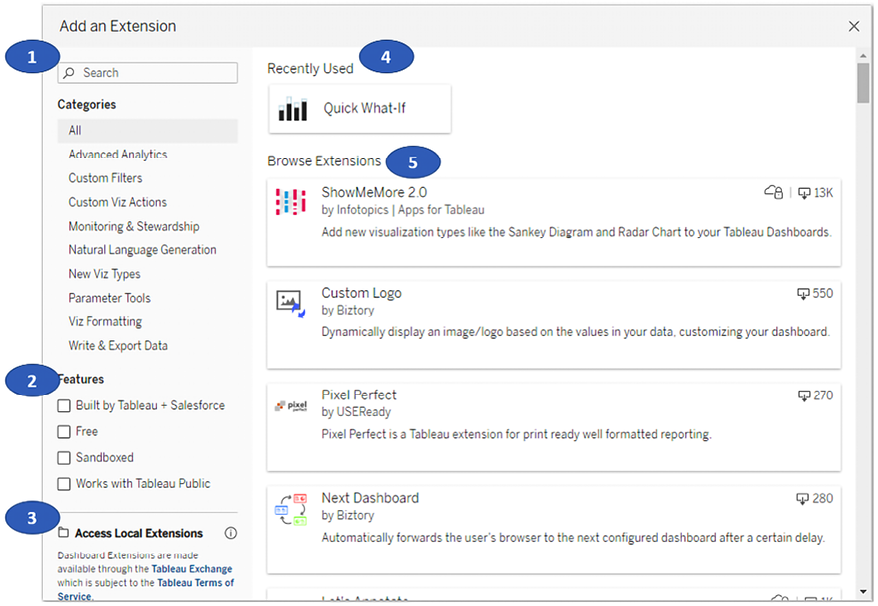
Figure 13.3: The Add an Extension dialog
The Add an Extension screen allows you to select which extension you wish to add to the dashboard. By default, you will see a list of extensions hosted on the Tableau Exchange, an online repository of extensions that have been created by Tableau (Salesforce) or third-party developers. The screen consists of various sections, numbered in Figure 13.3 and explained here:
- The left panel allows you to search for an extension by name or keyword(s). You may also narrow the list by selecting one of the Categories.
- You may further narrow down the list of extensions by checking one or more Features. This includes narrowing the focus to those created by Tableau (Salesforce), extensions that are free instead of paid, extensions that are sandboxed, or extensions that are allowed to work with Tableau Public.
Salesforce acquired Tableau in 2019, which is why you often see the label Tableau (Salesforce) or Tableau + Salesforce.
- If you wish to use your own extension or one that has not been published to Tableau Exchange, then click Access Local Extension. We’ll use this in the Creating an extension section later in this chapter.
- If you have any Recently Used extensions, they will be shown here for quick access.
- The list of extensions below Browse Extensions shows you the name of each extension, the author, a brief description, and the number of uses. You may select an extension by clicking it.
To continue this example, check the Built by Tableau + Salesforce feature on the left and then locate and click the extension named Image Map Filter in the list. Upon selecting a feature, you’ll be shown a much longer description and specifications, like this:
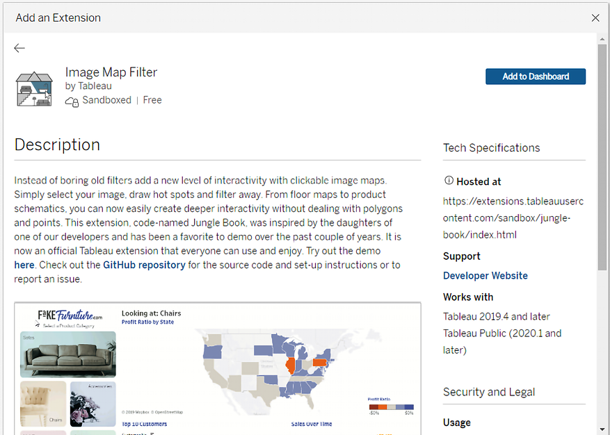
Figure 13.4: The description and specifications for the Image Map Filter dashboard extension
Take a moment to read the description and tech specifications. If you selected the wrong extension, or realize the selected extension does not meet your needs, you can close the window. Otherwise, click the Add to Dashboard button to add the extension to the dashboard.
Always double-check the tech specifications to ensure compatibility with your version of Tableau, the URL where the extension is hosted, and for any security or legal documentation. Because dashboard extensions potentially have access to the data shown in your dashboard, make sure you trust the organization that developed the extension and that you don’t have any legal or security concerns about adding the extension to your dashboard. Your organization’s Tableau Server administrator has the option to enable or disable extensions on Tableau Server. You’ll want to know your organization’s policies prior to designing dashboards with extensions.
When you first add an extension to a dashboard, you’ll often be prompted to configure the extension. In this example, the configuration screen should show by default. If it does not, or if you need to configure the extension later, you can use the caret drop-down of the extension object to access the configuration options. In this example, the configuration screen looks like this:
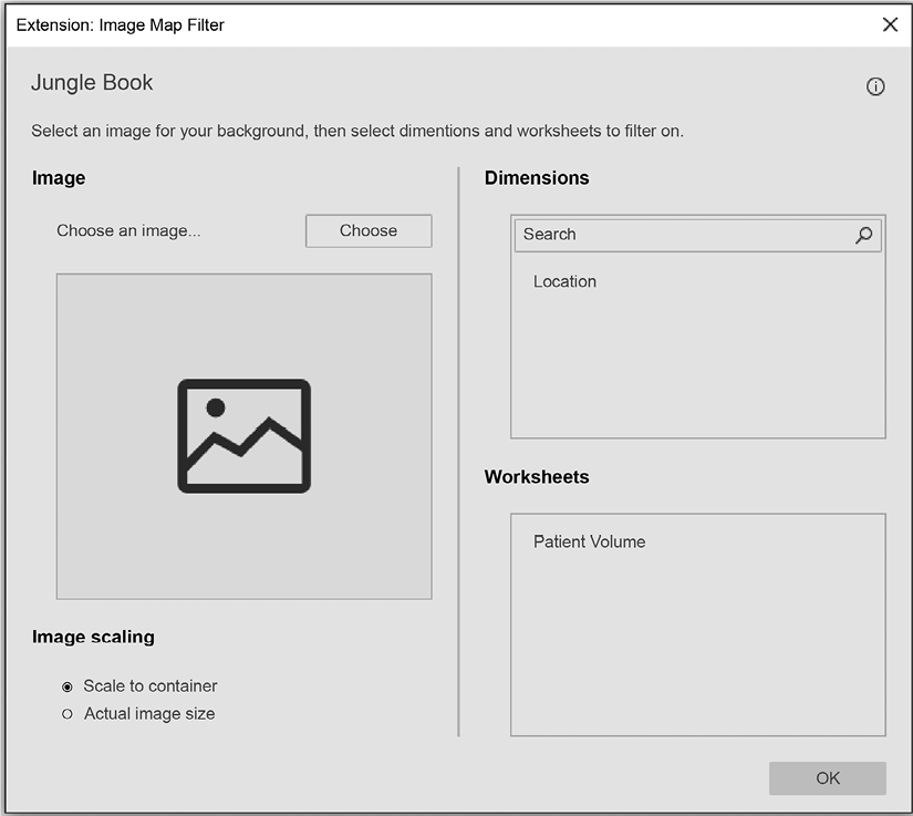
Figure 13.5: The description and specifications for the Image Map Filter dashboard extension
Each extension will have different configuration options, and some may not have any at all. In this case, perform the following steps to complete the configuration:
- Under Image, click Choose and select
Hospital.pnglocated in theChapter 13directory. - Leave the Scale to container option selected. This will allow the image and the clickable hotspots to resize based on the container in the dashboard.
- As Patient Volume is the only worksheet on the dashboard and it only contains a single dimension, Location, you will only need to select those items under Dimensions and Worksheets. Selecting these specifies that the image will filter the selected worksheet using the selected dimension. On more complex dashboards, you would need to take care to match up the correct sheets and dimensions.
- Click OK to set the configuration options.
The dashboard will now look like this:
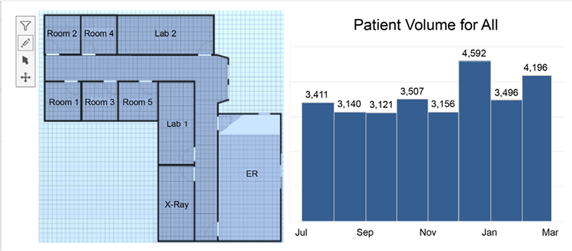
Figure 13.6: The dashboard with the configured dashboard extension
Notice the toolbar on the extension. This allows you to switch between filtering, drawing, selecting/editing, and moving. Continue the example with the following steps.
- Using the drawing icon, select a rectangle shape.
- Draw the square around an individual room.
- Match the room up with the correct filter option.
- Steps 5 through 7 are illustrated in Figure 13.6:
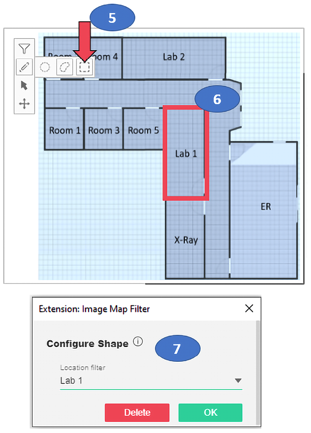
Figure 13.7: Drawing a shape around each room and matching them with the corresponding filter option
- Repeat steps 6 and 7 for each room until all rooms in the floor plan image have been matched with all the filter options.
- Once all shapes are mapped, switch to filtering by clicking the funnel icon:
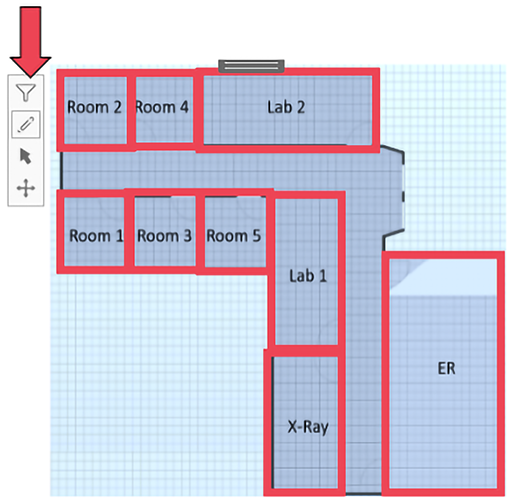
Figure 13.8: Switch to filtering once all shapes are mapped
- Test the extension by clicking on various rooms. You should see the patient volume chart update appropriately. You have extended the capability of your dashboard and given your end users a new way of interacting with the dashboard that, in many ways, is more intuitive and fun than selecting a location from a dropdown.
- New extensions are added often, so continue to explore and discover new ways of extending the functionality of your dashboards!
But what if you need unique capabilities that go beyond the extensions Tableau or third parties have created? You might consider creating your own extensions – and that’s what we’ll consider next!
Creating an extension
In some cases, you may have specific requirements that are not met by a third-party extension. In these cases, you may wish to create your own extensions. For this example, we’ll put together an extension that dynamically displays an image based on the value of parameters.
Completing this example will require downloading, installing, and configuring several components, which are detailed in the Setting up your environment section.
While the example is simple, it is very practical. There are many cases where a dataset might contain a list of dozens or hundreds of URLs for images hosted in an online repository where it would be impractical or impossible to use custom images or other out-of-the-box Tableau approaches to showing the images.
As we’ve seen, using a Tableau dashboard extension will require some knowledge of HTML and JavaScript as well as an understanding of the Tableau Extensions API. This example will provide a broad overview and you will be able to follow along at a high level even without expertise. In fact, all the code is already written as the goal is not to teach you the details of any coding. Instead, the goal is to show you all the pieces, allow you to put it together, and offer explanations along the way. Of course, you may want alter and extend the code as much as you want!
Setting up your environment
If you wish to follow along with the example, you will need to install various components and configure your environment to host and run custom dashboard extensions. If you choose not to configure your environment, you will not be able to use the custom extension. However, you may still wish to read through the remainder of this section to better understand how extensions work and how you might create one in the future.
To replicate the example in this section and run a Tableau dashboard extension, you’ll need to install several components. This includes downloading, installing, and running a local web server as described in this section. It is highly recommended that you read through the online documentation completely and it is assumed that you will have installed and configured all the required components following that documentation, which is located here: https://tableau.github.io/extensions-api/docs/trex_getstarted.html.
Using the link in the preceding information box, follow the online instructions to download and install the following components:
- Git: A version control system that will, among other things, allow you to install and start a local web server.
- Node.js and npm: A JavaScript runtime and package manager that will download, install, and run the local web server.
- The Tableau Extensions API SDK: A software development kit for the Tableau Extensions API that will provide you with resources required for extension development. It will also contain sample code that will give you useful examples.
You may have to run Git Bash as an administrator on some systems.
- Once you have installed and configured Git, Node.js, and the Tableau Extensions API, you will additionally need to copy the
ShowImagedirectory and files from theLearning TableauChapter 13directory to theextensions-api-mainSamplesdirectory where you installed the API SDK.
You’ll want to make sure the web server is running whenever you use the extension on a dashboard. If it is not running, use the Git Bash interface to navigate to the extensions-api-mainSamples directory and issue the command npm start.
The files and code that define the dashboard extension
Look at the files contained in the extensions-api-mainSamplesShowImage directory. We’ll examine some key details surrounding these files, but for now, you’ll see the following:
ShowImage.trex: A manifest file that tells Tableau where the extension is hosted and also includes information such as a description, the author, and the organization that created the extension.ShowImage.html: An HTML file that, in this example, will display an image to the user. In general, the HTML file provides an interface to the user — either showing output or capturing input. The HTML file will contain a link to a.js(JavaScript) file.ShowImage.js: A JavaScript file, which, in this example, will read values from parameters on the dashboard and dynamically interact with objects in the HTML file to display an image. In general, the JavaScript file will give you programmatic control via the Dashboard Extensions API (to access objects and values on the dashboard) and via the HTML file (to get input and show output to the user in the extension control).
You may wish to use a simple text editor (such as Notepad), a more advanced text editor (such as Notepad++), or even a development platform (such as Visual Studio) to view and edit code files.
Let’s examine each of these files in a bit more detail to see what they contain and how they function.
The manifest file
We’ll start with the manifest file, ShowImage.trex. The manifest file is an XML document that contains everything needed to tell Tableau where the extension is hosted and give users information such as a description and the author of the extension. Open the file in an editor of your choice if you wish to see the entire file. Here, we’ll only examine especially relevant snippets.
First, notice the description and author tags:
<description>Show Image Based on Parameters</description>
<author name="Joshua N. Milligan" email="[email protected]" organization="VizPainter" website="https://www.vizpainter.com"/>
These tags describe the author, email, organization, and website associated with the extension. You’ll wish to set the correct details for any extension you create.
Next, consider the source-location tag:
<source-location>
<url>http://localhost:8765/Samples/ShowImage/ShowImage.html</url>
</source-location>
The URL contained in this section of code is especially important as it points to the HTML file that will be hosted in the dashboard. In this case, the URL points to the local web server installed in our environment. Assuming you set up your environment according to the defaults, your location should be the same. Ultimately, you may decide to host your extension on a dedicated server in your organization or in the cloud. At that point, you will need to update the manifest to point to the new location.
The HTML file
In this example, the HTML document is named ShowImage.html. This example uses a very simple HTML document with some links to external JavaScript files and an image with a blank source, which will be updated via the JavaScript. Examine the full file in an editor and then consider the most important snippets:
<script src="../../lib/tableau.extensions.1.latest.js"></script>
This reference points to the latest version of the Extensions API. Assuming you configured and started the web server based on the location of your Tableau Extensions API download, your reference should not need to be altered.
Next, we have a reference to the JavaScript file we’ll use for our code:
<script src="./ShowImage.js"></script>
This line references the ShowImage.js file that contains all the code we’ll need to update the image based on parameter values in the dashboard.
Finally, within the body of the HTML, there is one final tag:
<img id="imgImage" src=''/>
This defines the image and initializes it with a blank source. We’ll update this object in the JavaScript code based on parameter values in the dashboard.
The JavaScript file
Finally, let’s consider some of the relevant sections of the JavaScript file, ShowImage.js. This is a very simple JavaScript file that makes use of the Tableau Extensions API to read parameter values and apply the appropriate values, based on the name of the parameter, to the image in the HTML document.
First, we have a function to update the image based on the parameter values:
function updateImage (p) {
  if (p.name=='ImageURL'){
    document.getElementById("imgImage").src = p.currentValue.formattedValue;
  }
  else if (p.name=='ImageWidth'){
  document.getElementById("imgImage").style.width = p.currentValue.formattedValue +      "px";
  }
}
This function takes in a parameter object, p, and then checks the name of the object. If the parameter’s name is ImageURL, then it sets the src attribute of the HTML image to the value of the parameter. If the parameter’s name is ImageWidth, then it sets the width style to the parameter value with "px" (pixels) appended.
This example highlights the fact that many extensions will require certain naming conventions to be used in a dashboard. Specifically, this extension requires a parameter named ImageURL to set the URL for the image. The extension will function without a second parameter named ImageWidth, but only a parameter with that exact name can be used to set the image width.
Next, we have a function that is called whenever a parameter value changes:
function onParameterChange (parameterChangeEvent) {
  parameterChangeEvent.getParameterAsync().then(function (param) {
    updateImage(param);
  });
}
We’ll see next how the the onParameterChange function is set as an event listener. For now, understand that the function is called whenever a value of a parameter changes in the dashboard. When a parameter’s value changes, the previously examined updateImage function is called with the changed parameter as an argument.
Finally, notice the document.ready function, which will be called after the HTML document has loaded, giving us a chance to initialize everything we need:
$(document).ready(function () {
 tableau.extensions.initializeAsync().then(function () {
  tableau.extensions.dashboardContent.dashboard.getParametersAsync().then(function (parameters) {
   parameters.forEach(function (p) {
    p.addEventListener(tableau.TableauEventType.ParameterChanged, onParameterChange);
    updateImage(p);
   });
  });
 });
});
When the HTML document is loaded and ready, this block of code will be executed. First, the Tableau extensions initialization is called, after which tableau.extensions.dashboardContent.dashboard.getParametersAsync() gets an array of all parameters in the dashboard. For each of those parameters, the onParameterChange function is added as an event listener and the updateImage function is called, which will update either the image source or the width depending on which parameter is passed in.
All of these functions work together such that when the extension is first loaded in the dashboard and whenever a parameter value changes, the image will be updated. Let’s see it in action!
The dashboard extension in action
In the Chapter 13 Complete and Chapter 13 Starter workbook, you’ll find a Learning Tableau Editions tab that is ready for our ShowImage extension.
Make sure you have started the local web server, so the extension content is available for the Tableau dashboard.
Drag the Extension object into the blank area of the dashboard and in the Add an Extension pop-up window, select Access Local Extensions in the lower-left corner:
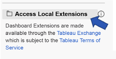
Figure 13.9: Adding a local extension
You will then be asked to locate the appropriate .trex manifest file. Browse to the ShowImage.trex file located in the Tableau Extensions API directory structure (extensions-api-mainSamplesShowImage). If you are prompted to Allow the Extension, select OK.
The ShowImage folder is included in the code files, but make sure you are working with the copy you made in the extensions-api directory structure. Reference the instructions in the Setting up your environment section if necessary.
At this point, the extension should be active and working. Test it by selecting one of the editions of Learning Tableau to see an image of the cover:

Figure 13.10: The dashboard with embedded ShowImage extension
As you examine the dashboard, you’ll notice the two parameters that match in name with what is expected by the JavaScript file: ImageURL and ImageWidth. The view triggers a parameter action that updates the value of the parameter, and that in turn triggers the JavaScript function that updates the image.
In fact, any change of the parameter value will trigger the image update function, so you could type in the URL of an image or adjust the width slider manually, which would also cause the image to update.
You’ve just put together and used a simple extension! We’ve only scratched the surface of what’s possible!
Dashboard extensions aren’t the only possible way to extend Tableau’s functionality. Next, we’ll consider analytics extensions, which, like dashboard extensions, provide unlimited potential for what’s possible.
Tableau analytics extensions
Tableau analytics extensions allow you to use a connection from Tableau to an external analytics service or platform to perform complex operations and use the results in calculations, visualizations, and dashboards. Tableau analytics extensions allow you to connect to analytics services, such as:
- TabPy: Tableau’s Python server
- RServe: An open-source R server
- Einstein Discovery: Salesforce’s predictive/AI analytics engine
- Analytics Extensions API: An application programming interface allowing you to connect to numerous analytics tools and platforms. This allows you to use connectors you create programmatically or prebuilt connectors. For example, you can connect to MATLAB using the Analytics Extensions API.
- Much like dashboard extensions required a separate web server to host the extension, analytics extensions will require a separate service or platform. For example, to run Python scripts in Tableau, you’ll need to connect to an instance of TabPy. If you want to run R scripts, you’ll need to have a connection to an RServe server. In general, Tableau will execute analytics extensions as illustrated in the following diagram:

Figure 13.11: Analytics extensions are implemented based on aggregated results from the data source
In this section, we’ll look at an example of using a Python script with TabPy to illustrate how to use analytics extensions. In the next section, we’ll look at Einstein Discovery (CRM Analytics), which is an analytics extension, but deserves special consideration.
Scripting with Python
Both R and Python are programming languages that allow the use of advanced analytics, including statistical functions, predictive models, and AI. Python in particular has gained strong popularity among data scientists, analysts, and others who work with data. In this section, we’ll use a very simple Python script in Tableau. Of course, you’ll be able to accomplish much more as you progress in your abilities!
Completing this example will require downloading, installing, and configuring Tableau’s Python server, TabPy. The next section, Setting up TabPy, will point to online resources and documentation that will guide you through the process.While this example highlights the ability to use Python scripts in Tableau, the process for using R scripts is very similar. Instead of installing TabPy, you would install RServe (an R server). The connection process and the process of writing scripts mirrors the example given in this section.
We’ll briefly look at setting up TabPy as the engine for processing the Tableau scripts and then implement a simple Python script to clean up some data in our dataset.
Setting up TabPy
For this example, we’ll assume an installation on your local machine, but the TabPy service may be installed in a location that’s accessible from Tableau Desktop (and Tableau Server, if you will be using it).
Follow the online documentation to set up TabPy. The basic commands for installing the prerequisites and TabPy are listed in this section, but be aware that the steps may change in future versions and the online documentation is the most complete and authoritative source. You will find documentation on installing and configuring TabPy here: https://tableau.github.io/TabPy/docs/server-install.html.
If you installed Git as described in the Setting up your environment section of Creating an extension, you’ll be able to issue the necessary commands to install and run TabPy from a Git Bash prompt. If you did not install Git previously, you’ll need to do so to follow this example.
The basic commands to set up TabPy are:
- To install pip, a package installer for Python, issue this command:
python -m pip install --upgrade pip - To install TabPy, issue this command:
pip install tabpy - To run TabPy, issue this command:
tabpy
Once TabPy is running, note the port number indicated in the Git command-line window after issuing the tabpy command.
From Tableau Desktop, use the menu to select Help | Settings and Performance | Manage Analytics Extension Connection….
A dialog box will ask you to Select a connection type:
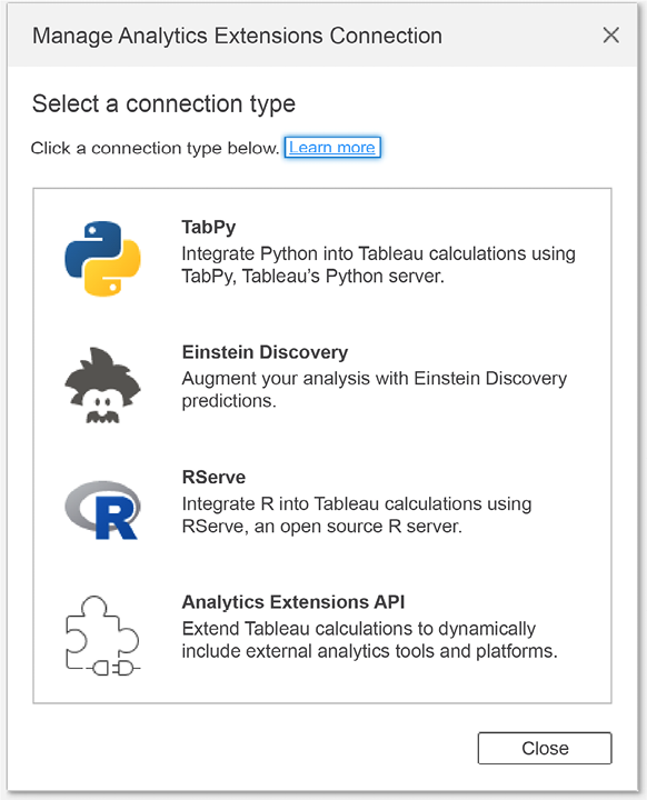
Figure 13.12: The Manage Analytics Extensions Connection dialog allows you to configure options for various analytics extension types
Select TabPy and then enter a Hostname of localhost and a Port of 9004 (or the port number on your system, if it differs):
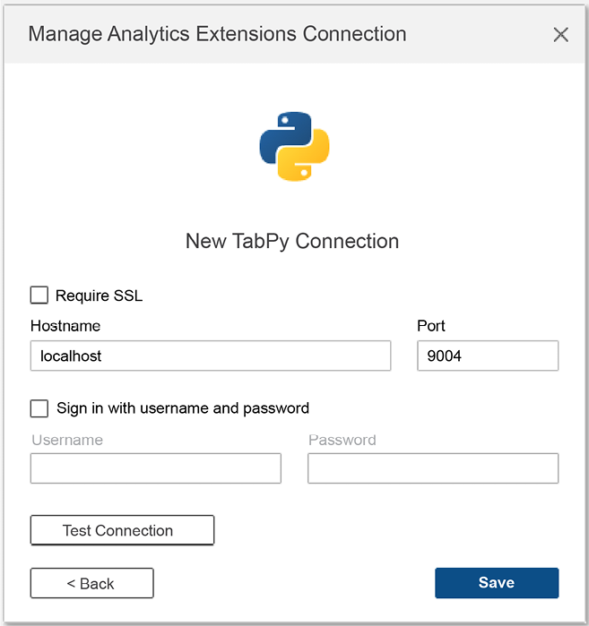
Figure 13.13: Setting up a new TabPy connection with hostname and port information
Once you click Test Connection and verify everything is working, click Save. You may close the dialog.
With TabPy installed and running and a connection established in Tableau Desktop, we’re now ready to see a Python script in action!
Using a Python script in Tableau
To follow along with the example, navigate to the Episode Ratings sheet in the Chapter 13 Complete or Chapter 13 Starter workbooks.
When you first open a workbook containing a connection to an external service via analytics extensions, you’ll be prompted with a security warning. As with dashboard extensions, you’ll want to be aware that data may be transferred to the external service. Make certain you trust the workbook and its source.
In the workbook, you’ll find a simple view of episodes of the original Star Trek series along with IMDb ratings:
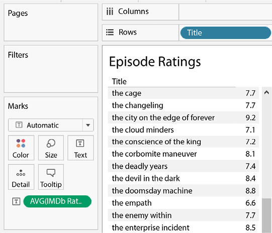
Figure 13.14: Episodes of Star Trek along with IMDb ratings
One thing you may notice is that the episode titles are all lowercase. For a great user experience for those using visualizations or dashboards based on this data, it would be nice to display the titles in title case.
We’ll use a Python script to transform the string to title case. It would be possible to write a complex calculation using regular expressions in Tableau to accomplish this task. However, the purpose of this example is to introduce you to writing a Python script and integrating it into your Tableau workflow. Beyond this simple example, there are many data cleansing and analytics tasks that Python is capable of handling that Tableau alone is not.
The Python script itself is contained in a single calculated field. If you are viewing the Complete workbook, find the calculated field named Episode and select Edit. If you are using the Starter workbook, create a calculated field named Episode. The contents of the calculation look like this:
SCRIPT_STR(
"
import re
exceptions = ['a', 'an', 'the', 'at', 'by', 'for', 'in', 'of', 'on', 'to', 'up', 'and', 'as', 'but', 'or', 'nor', 'with', 'is']
if _arg1 is None:
 return None
title = _arg1[0]
word_list = re.split(' ', title.lower())
capitalized_title = [word_list[0].capitalize()]
for word in word_list[1:]:
 capitalized_title.append(word if word in exceptions else word.capitalize())
return ' '.join(capitalized_title)
",
MIN([Title]) )
This calculation defines a Python script that is executed via TabPy to return a title case version of a string value that is passed into the script. We’ll dissect the Python script itself, but first, let’s note some important aspects of the Script_ functions in Tableau:
- The calculated field uses the
SCRIPT_STR()function. TheScript_functions in Tableau allow you to pass a script to an external engine and return a result. The exact function you use depends on the data type of the result returned from the script. In this case, we expect a string result. In other cases, you may need to useSCRIPT_BOOL,SCRIPT_INT, orSCRIPT_REALif you expect a Boolean, integer, or real number result, respectively. - The
Script_functions all take two or more arguments. The first argument is a string containing the script that will be executed via the analytics extension. The second, and optionally third, fourth, fifth, and so on, are values you wish to pass into your script. These values will be referenced in the script as_arg1,_arg2,_arg3, and so on. They will be passed in as objects, so you’ll most often obtain the value of the object as an attribute using code such as_arg2[0]. - The
Script_functions are treated as table calculations in Tableau. This means all values you pass into the script will be aggregations at the level of detail defined by the view. This is whyMIN([Title])is used rather than just[Title]. Furthermore, you may need to specify the scope and direction of the table calculation to ensure the values are passed into the script as you expect.
Now, let’s turn our attention to the Python script itself to understand how it works. We’ll walk line by line through the code, starting with the first:
import re
This line imports Python’s regular expression library, which we will use to parse the string.
We’ll also define a list of exception words that should not be capitalized in the middle of a title:
exceptions = ['a', 'an', 'the', 'at', 'by', 'for', 'in', 'of', 'on', 'to', 'up', 'and', 'as', 'but', 'or', 'nor', 'with', 'is']
The exceptions variable contains the list of exception words. The next lines exit the function if Title is null:
if _arg1 is None:
 return None
You’ll recall that we passed in Title as the first argument. If it is Null, the Python script will also return Null.
Next, we’ll assign the value to a Python variable named title. This is primarily for convenience and readability:
title = _arg1[0]
Notice that we used _arg1[0] because we want the string value of the first (and, in this example, only) argument passed into the script.
Next, we split the title into each individual word and store it as a list in a variable named word_list:
word_list = re.split(' ', title.lower())
You’ll notice that we use the regular expression library we imported in the first line of code to accomplish the split. We also use the lower() function to ensure that all words in the title are lowercase prior to implementing any capitalization logic.
Next, we define a variable that will ultimately contain the list of title case words that will be returned to Tableau:
capitalized_title = [word_list[0].capitalize()]
We initialize the list with the first word capitalized, because the first word of every title is capitalized without exception.
Next, we loop through the remaining words in the title and capitalize them so long as they are not an exception word:
for word in word_list[1:]:
 capitalized_title.append(word if word in exceptions else word.capitalize())
Each correctly cased word is appended to the capitalized_title list.
Finally, after looping through all the words in the title, we return the title cased list as a single string where all the words are joined back together with a space as a separator:
return ' '.join(capitalized_title)
The end result is that Tableau will pass in an episode title and the Python script, executed via an analytics extension to TabPy, will return the correct title case as a result:
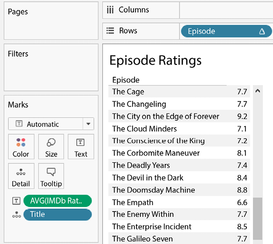
Figure 13.15: Episodes of Star Trek along with IMDb ratings
You’ll notice that Episode is a table calculation indicated by the delta symbol on the field and that the original Title is still in the view (on Detail in the Marks card). Title must be in the view so that it can be passed into the Python script, and Episode is computed at the cell level so that each individual title is passed in.
Beyond this simple example, there are so many incredible things you can do with Python (and similarly R). As you learn and grow, you’ll uncover a wealth of statistical tools, predictive libraries, and the ability to accomplish incredible feats of analytics.
Next, we’ll turn our attention to Einstein Discovery and the ability to incorporate AI into your Tableau analyses.
AI with CRM Analytics (Einstein Discovery)
Nearly every dataset contains historical records that could be used to make future predictions. For example, let’s say you:
- Have a dataset of customer purchases for the last two years and you want to identify factors that predict which customers will make repeat purchases.
- Have every service record for every part you’ve manufactured, and you want to predict which parts are most likely to fail most often and you also want to understand why.
- Have a dataset that matches customer satisfaction scores with details of their transactions and you want to understand the factors that lead to low satisfaction or high satisfaction.
In each of these cases, and countless more, you could leverage the capabilities of machine learning and AI to make predictions based on your data and your goals.
CRM Analytics (formerly Einstein Analytics) from Salesforce is AI-enabled analytics that identifies patterns in your data, enabling you to make predictions and take action based on results you define. It does this using a set of statistical models and machine learning.
Salesforce recently rebranded Einstein Analytics as CRM Analytics. However, in some places (most notably the Tableau interface) the Einstein name remains. In this chapter we’ll attempt to be consistent in referring to the overall platform as CRM Analytics (occasionally noting the previous Einstein Analytics name) but will use the term Einstein Discovery when describing Tableau extensions and integration into the platform.
CRM Analytics allows you to leverage the capabilities without writing code. Tableau then allows you to use both dashboard extensions and analytics extensions to take advantage of the power of AI available through CRM Analytics.
The examples in this section will require a Salesforce account with a license for CRM Analytics. You may complete the examples using a limited-time demo account, which you may sign up for here: https://www.salesforce.com/products/crm-analytics/overview/.
Before we jump into the examples, let’s consider the data we’ll use.
The data used in the examples
The examples will make use of a dataset containing a list of passengers on board the ill-fated RMS Titanic. The data includes details about the passengers’ destination, ticket numbers, cabins, sex, class, and whether they survived the sinking of the ship.
The Titanic dataset is an alteration of several readily available online sources. Historical accuracy is not guaranteed.
You’ll find three files in the Learning TableauChapter 13Titanic directory:
titanic.csv: A file containing details for 1309 passengers. This file is not used in the examples but is provided as the full dataset.titanic.training.csv: A file containing 1008 passenger records. This file will serve as the core dataset for CRM Analytics to evaluate and create predictive models. In a real-world scenario, you would use historical data along with known outcomes that will be used to generate a predictive model.titanic.testing.csv: A file containing 301 passenger records. This file will serve as the dataset that will be tested against the predictive models created by CRM Analytics. In a real-world scenario, this would be the current data on which you wished to make predictions and take action.
With either your full Salesforce account or with a demo account created at the link listed above, we’ll now create an CRM Analytics / Einstein story that makes predictions and gives insight into the data.
Please consult your Tableau/Salesforce rep to understand specific licensing requirements for your organization for real-world applications.
Creating the Einstein Discovery story
To start this example, we’ll create an Einstein Discovery story — an analytical framework that will guide you through predictive analysis using AI.
Once you have logged into Salesforce, create your story by following these steps:
- In the upper left, use the Apps button (which looks like a series of dots) to select Analytics Studio:
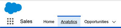
Figure 13.16: The Analytics tab in the Salesforce menu
- In the upper right of the Analytics screen, select Create | Dataset. This will prompt you to choose a source of data for the analytics:
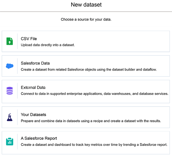
Figure 13.17: Selecting a new dataset for the analytics
- Choose CSV File and upload
titanic.training.csvfrom theLearning TableauChapter 13Titanicdirectory. Once the file has been processed, you’ll be given details and options concerning the file, like this:
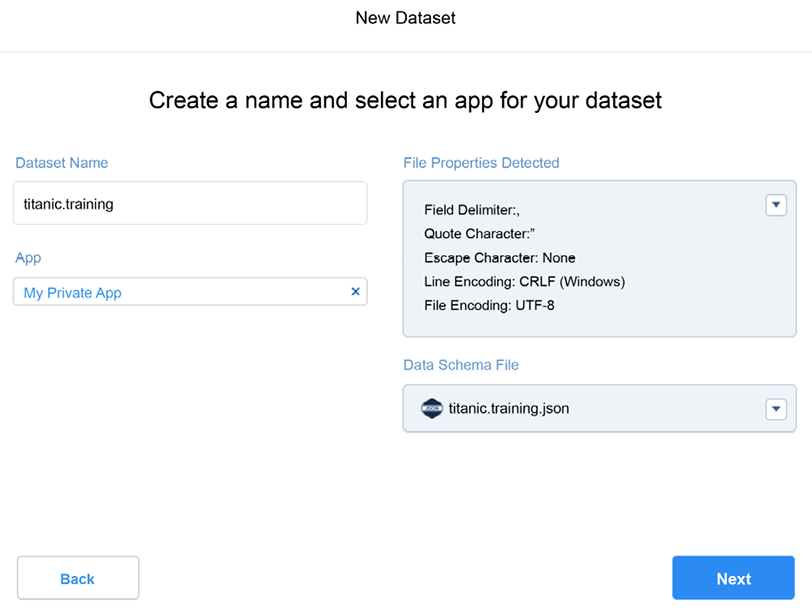
Figure 13.18: Specifying the options for your new dataset
- Leave all options as the default values and click Next.
- You will then be given a preview of the file’s fields and contents. As we know, it is an attribute of a passenger instead of a measure. Select Class and change the Field Type to Dimension:
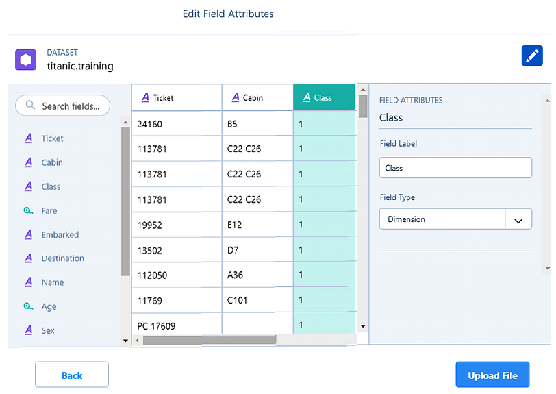
Figure 13.19: Editing field attributes
- Click Upload File. You will be given a progress indicator as CRM Analytics / Einstein uploads and parses your dataset. Wait until the file upload is complete.
- Once your dataset has uploaded, you may continue by creating a Story. From the Analytics Studio screen, select Create | New Story. Then select Create from Dataset on the popup window and click Continue:
Figure 13.20: Dataset options
- Locate and select the
titanic.trainingdataset from the list of datasets. - You will then be guided through multiple options about the story goal, name, and location. In our case, we have a column named
Survived?with a value of 0 or 1 that indicates whether a passenger survived. In our story, we want to maximize the cases where a passenger survives.You’ll want to set the options for the story as shown here:
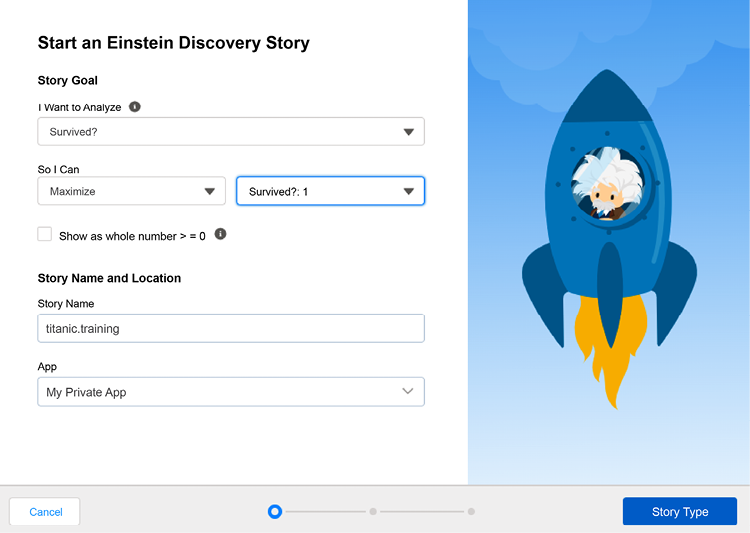
Figure 13.21: Starting and configuring our Einstein Discovery story
- Click the Next button. You will be prompted about the type of story you want to create:
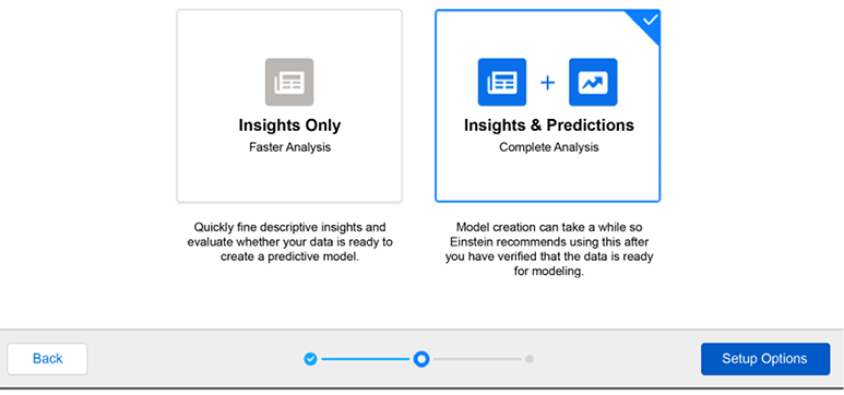
Figure 13.22: Selecting the story type
- As our dataset is small and relatively simple, select Insights & Predictions to allow Einstein to generate all the models and then click Next
- On the Configure Story Columns screen, keep Automated as the default and click Create Story.
Even with our small dataset, we will find some issues with the data that we’ll need to adjust. Generally, Insights Only is a good selection as it allows you to validate your dataset and make adjustments prior to waiting for model creation.
- Einstein will give you progress updates as it parses the data, conducts statistical tests, transforms the data, detects patterns, and prepares to show you results. When the story is complete, we’ll review the settings by selecting Edit Story in the upper right.
- If you are prompted to provide a description of the update, you may leave it blank.
The Story Settings page will look similar to this:
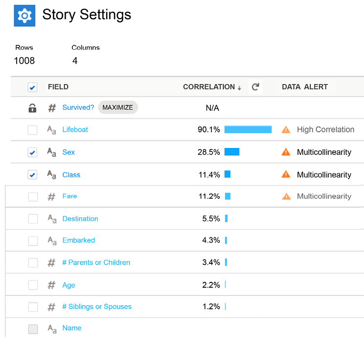
Figure 13.23: Story settings, correlation, and alerts
Einstein is giving you insight into which fields are useful (or not) in determining the Survived? outcome. Notice that each field is given a percentage of how closely it correlates to the survival condition. Einstein also shows some alerts that give you indication of potential problems.
Consider a couple of the alerts:
- The Lifeboat field is marked with High Correlation. This makes sense because if a passenger got in a lifeboat, then it is highly likely they survived. However, even though there is a high correlation, the lifeboat is not a root cause of survival so the field is not very useful in finding deep insights. We’ll uncheck the field so it is not used in the model.
- The Class and Fare fields are marked as Multicollinearity because they correlate to survival in almost identical ways. This makes sense because the fare paid by a passenger was based on whether they purchased a first, second, or third class ticket. However, it means that we should only keep one of the fields. In this case, we’ll only leave Class checked.
Finish the story creation by following these steps:
- Click Update Story. If prompted for a description, you may leave it blank.
- We are now ready to deploy the model for use in Tableau (and elsewhere, if desired). Locate the Model tab toward the upper right and select Deploy Model.
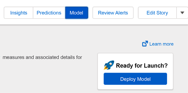
Figure 13.24: Deploying an Einstein Discovery model
- On the next screen, click Get Started. This will initiate a series of screens designed to deploy the model.
- On the Model Details screen, keep all default values.
- On the Connect to an Object screen, select Deploy without connecting to a Salesforce Object.
- On the Segment Data screen, keep the default of Don’t segment.
- On the Select Actionable Variables screen, you’ll need to determine which variables are ones you can adjust or change. In our Titanic dataset, we can’t change the historical realities. But in a real-world scenario, there are actions you can take and variables over which you have some control. Here, we’ll select Class as our actionable variable because, in theory, a passenger could choose to upgrade their ticket:
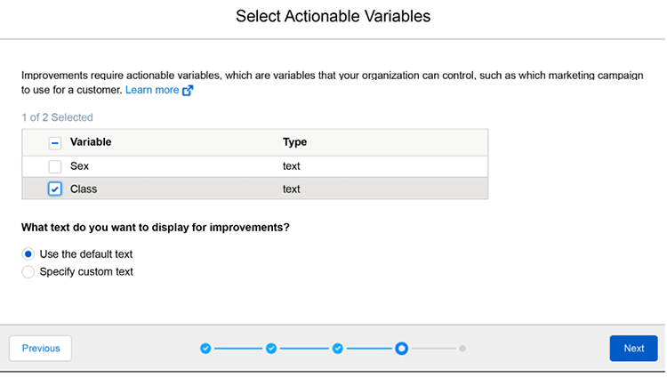
Figure 13.25: Selecting actionable variables
- Leave all other default selections and click Next.
- On the final screen, you’ll review all deployment settings and click Deploy.
With your Einstein Discovery story created and the model deployed, you are ready to use it in Tableau. We’ll dive into that next!
Leveraging AI with Einstein in Tableau
There are two primary ways to integrate Einstein AI into your Tableau views and dashboards:
- First, you can connect to Einstein as an analytics extension and use table calculations. This gives you a lot of flexibility to use the prediction results from Einstein. You can use them in other calculations, compute averages, set parameter values, and much more. The possibilities for rich predictive content are endless!
- Second, you can use a dashboard extension that reads data from your dashboard and provides feedback on prediction results and reasons.
We’ll consider both of these approaches in this example. Locate and open the dashboard named Chapter13.Einstein.twbx in the Learning TableauChapter 13Titanic directory. It won’t display correctly until you connect the Einstein analytics extension and alter a table calculation based on your Salesforce account and the story you created in the preceding section. Please follow the instructions that follow to connect and configure the extensions.
Using the Einstein analytics extension
We’ll start by enabling the analytics extension. Follow these steps to enable access to Einstein via calculation in Tableau:
- With the
Chapter 13 Einstein.twbxworkbook open, from the menu, select Help | Settings and Performance | Manage Analytics Extension Connection… - On the Manage Analytics Extension Connection screen, select Einstein Discovery
- On the Connect to Einstein Discovery screen, select Enable
You now have enabled Tableau to communicate with the Einstein analytics extension. You may now use your Einstein model, but you’ll have to determine Salesforce’s unique key to correctly reference it. Fortunately, Salesforce makes it very easy to integrate your model in Tableau — even going so far as generating a table calculation for you.
To generate this calculation in Salesforce, ensure you are logged into your Salesforce account where you deployed the model and locate the model. If you followed the instructions in the preceding sections, it should be named Predicted Survived?.
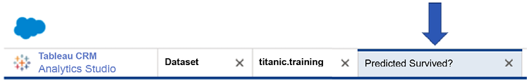
Figure 13.26: Selecting your Einstein model
Once you have selected your model, you will find Create Tableau Table Calculation as a under the Advanced tab on the right side of the screen:
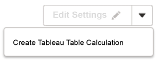
Figure 13.27: Generating the table calculation from within Salesforce
This will reveal a table calculation that you can copy and then paste into Tableau.
Within Salesforce, you will also find options to export R code for an Einstein model. You could potentially use the R script with RServe in a similar way to the Python script we examined previously.
With the table calculation copied, return to Tableau and continue to follow the steps to integrate your Einstein Discovery model into Tableau:
- Switch to the Individual Predictions tab and edit the calculation for the Survived Prediction field.
- Clear out all code present for the calculation and paste the table calculation generated by Salesforce as the code defining the field. Your code will be similar to the following, but will have a different, unique ID:
SCRIPT_REAL('{
"modelOrPredictionDefinitionId": "1OR8c000000L1hcGAC",
"columns": ["Class", "Sex"]
}', ATTR([Class]), ATTR([Sex]))
The SCRIPT_REAL() function will call the analytics extension and return a real (decimal) number. The modelOrPredictionDefinitionId is a unique ID used by Salesforce to identify your specific Einstein Discovery model. The ID referenced in this text and in the included workbook are not valid and will need to be changed (they will be correct in the code you generated in Salesforce).
If you receive a message indicating a failure to connect to the analytics extension, double check firewall and anti-virus settings to ensure nothing is blocking the connection.
The results of the calculation are a numeric representation (0 to 100) of the probability an individual with the given class and sex would survive the sinking of the Titanic, as calculated by Einstein.
Once you have pasted your code into the code editor and clicked OK, you may be prompted to log into Salesforce and the initial processing of data may take some time as Einstein flows the data through its models. Subsequent refreshes will be much faster.
Once your calculation matches the model you deployed, you should see results similar to this:
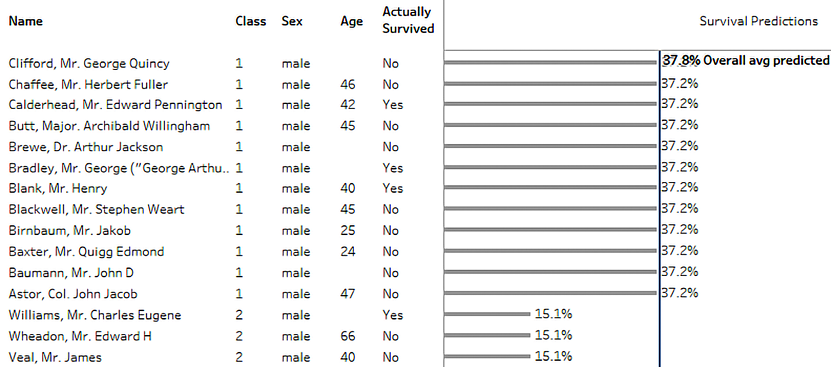
Figure 13.28: Einstein predictions of survival based on Class and Sex
Einstein’s predictions for each individual are shown to the right with an overall average prediction for all individuals shown as a reference line.
Notice that the actual result does not always match Einstein’s prediction. This is expected in predictive models and you must be very careful when using predictive models and making assumptions about individuals.
Having seen the analytics extension used to leverage Einstein, let’s turn our focus to the dashboard extension and even put everything together.
Using the Einstein dashboard extension
Switch to the Titanic Survival Predictions tab and continue with these steps to add an extension that leverages your Einstein model:
- Drag and drop an Extension object into the blank area on the dashboard.
- On the Add an Extension screen, search for and select Einstein Discovery.
- Configure the extension with a Prediction Definition of Predicted Survived? and set the Worksheet from which Einstein will retrieve data to Individual Predictions.
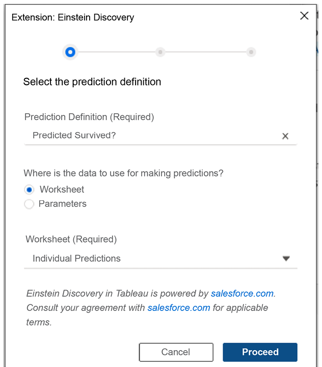
Figure 13.29: Configuration of Einstein Discovery dashboard extension
- Click Proceed.
- The extension should detect the relationship between the model fields and worksheet fields, but ensure Class and Sex are matched appropriately. Then click Proceed.
- On the final configuration screen, set the label to Predicted to Survive and the Prediction Score Unit to %. Take a moment to review all other settings but accept default values. Finally, click Done:
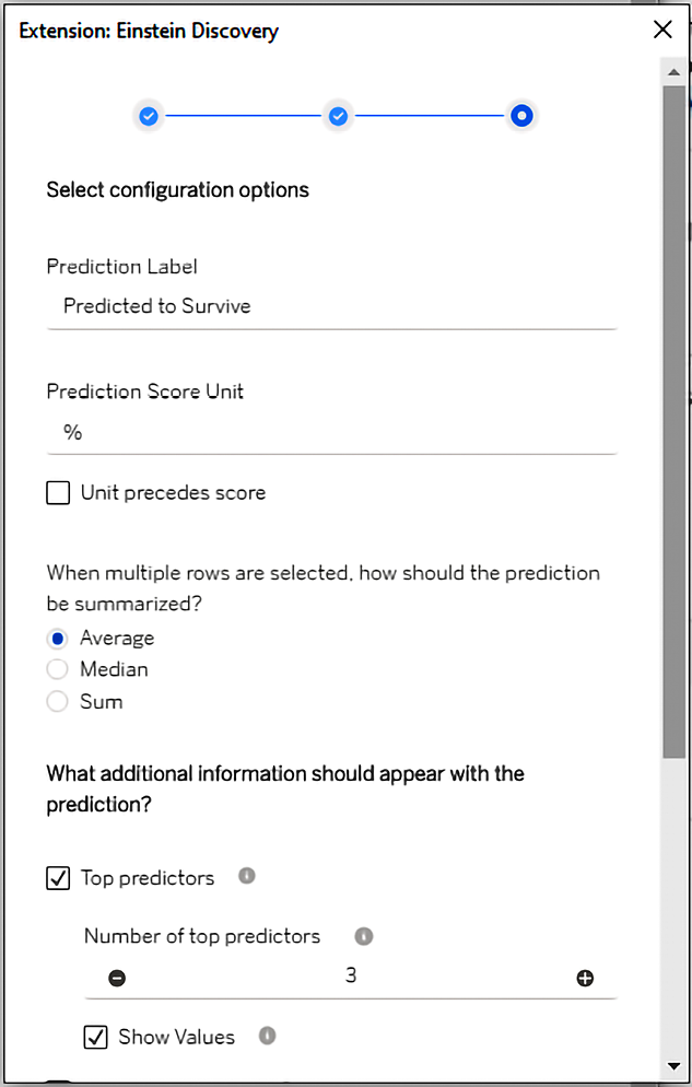
Figure 13.30: Setting label and units on final configuration screen
Your dashboard should look similar to this:
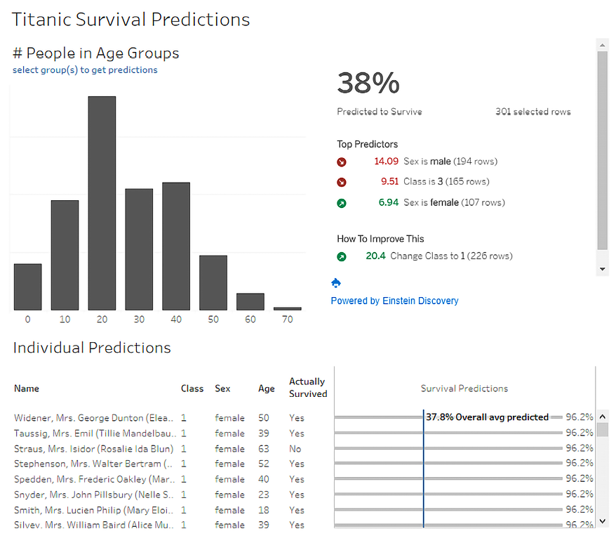
Figure 13.31: Final interactive dashboard that integrates Einstein predictions
The bottom view of individual predictions serves as the source of data for the Einstein model. The results of the model are displayed in the extension in the upper right. In addition to displaying the percent predicted to survive, Einstein also gives the top predictors and specific advice on how to improve the predictions.
Notice that the dashboard includes a filter action that is triggered by selecting one or more age bands in the histogram. As it filters the bottom view, which is the data source for the Einstein model, you will see the prediction results change based on your interaction:
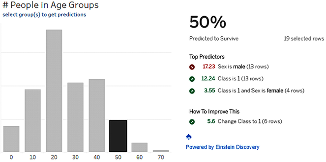
Figure 13.32: Interaction can be used to change the data evaluated by the model
In this way, you can build fully interactive dashboards that allow the end user to interact with the predictive model and uncover new insights and take proactive action to drive positive results. Imagine the possibilities for your organization!
Summary
The ability to extend Tableau is amazing! With dashboard extensions, you have an ever-growing library of Tableau/Salesforce and third-party extensions. These can extend the user interface, provide integration with backend systems and platforms, and enhance the user experience in many ways. We even looked at an example of writing your own dashboard extensions. The ability to write custom code and host it on your own servers gives you the ultimate flexibility and control as you extend Tableau’s capabilities.
Analytics extensions give you the ability to run R and Python scripts and connect to other analytics engines. You are also able to leverage the amazing predictive capabilities of CRM Analytics / Einstein Discovery and use AI to detect patterns, uncover insights, and guide your decisions and actions based on your data!
In the next chapter, we’ll turn our attention to relating various datasets together in Tableau using the data model, joins, and blends. We’ll see how data from various tables, files, and databases can be brought together and related in ways that allow you to perform seamless analytics.
Join our community on Discord
Join our community’s Discord space for discussions with the author and other readers: https://packt.link/ips2H
