
Chapter 8: Exploring UiPath Selectors
Selectors are one of the major and most important topics when it comes to automation. Selectors are automatically created using standard XML code, which identifies the user interface elements. The XML code consists of several nodes, which is a combination of tags and attributes in a structured and hierarchical order.
In this chapter, you will learn what selectors are, how they work, and how to use the correct selector types and settings when automating. You will learn about the user interface, how to perform element exploration, and how to fine-tune selectors to improve the accuracy of element identification.
In this chapter, we will cover the following topics:
- Tags and attributes of selectors
- Selector Editor
- UI Explorer
- Full versus partial selectors
- Dynamic selectors
- An example implementation of dynamic selectors using Packtpub.com
Technical requirements
This chapter requires that you have UiPath Studio and UiPath Robot installed, along with a basic understanding of Studio's user interfaces. Please refer to Chapter 2, UiPath Ecosystem, to learn about the basics of Studio.
Tags and attributes of selectors
In this section, we'll learn more about how to use the tags and attributes of selectors. As we mentioned previously, selectors consist of a group of nodes of a specific element in a detailed hierarchical order. This is very similar to the address order we use for identification; that is, country > city > ZIP code > street name > street number > apartment number. The structure of selectors can be represented as follows:
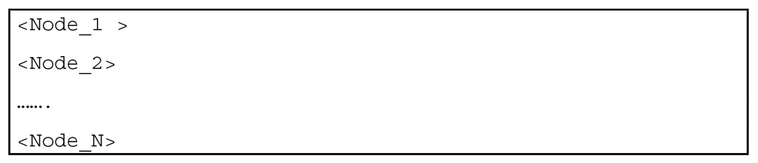
Figure 8.1 – Structure of selectors
<Node 1> will primarily be the parent node or root node; the last node, <Node n>, will be the one you are likely to be be interested in because it usually represents the UI element and the previous nodes are the parents of that element. Each node has attributes to help you identify the element in the user interface such as windows, tables, links, text boxes, buttons and so on and it's essential to understand the attributes of each node to apply constant values to accurately identify the correct element. Let's look at an example of such selectors:
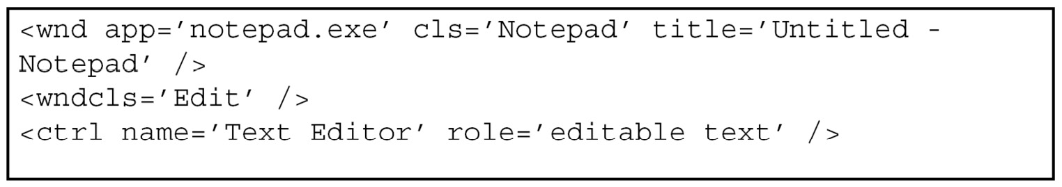
Figure 8.2 – Example of selectors
In the <Node 1> code section, wnd (Window) is a tag and app='notepad.exe' cls='Notepad' title='Untitled – Notepad is an attribute. Similarly, in <Node 2>, Ctrl (Control) is a tag and name='Text Editor' role='editable text' is an attribute.
Now that you are aware of selectors and their usage, you need to how to edit them so that you can identify the target element based on your requirements. We will learn how to edit selectors in the next section.
Selector Editor
Selectors are usually stored inside the Properties panel of the activities used in the workflow and can be accessed via Input > Target > Selector, in the Properties window as shown in the following screenshot:
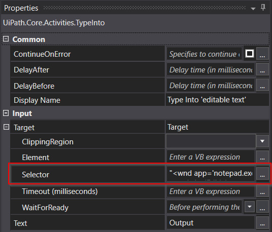
Figure 8.3 – Selector in Properties
The Selector Editor tool helps you view the selectors that have been used and edit their attributes to fine-tune the selector for better reliability. To access the tool, you can either click on the three dots in the Properties panel, as highlighted in the previous screenshot, or click on the Edit Selector option via the Options menu for any specific activity. In this case, the activity used in Type Into, as shown in the following screenshot:
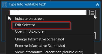
Figure 8.4 – Edit Selector
A new window will appear, where you have multiple options. Each has significance in terms of overcoming any selector challenges. Let's explore these options one by one; they are shown in the following screenshot:
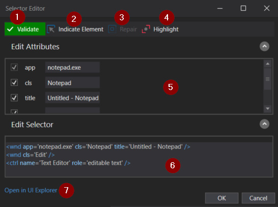
Figure 8.5 – Selector Editor
The various options are as follows:
- Validate
The Validate button displays the status of the selector based on the availability of the target UI element that's displayed on the screen. It has three different states:
- A green Validate button with a tick (as shown in the following screenshot) indicates that the target element is valid and can be executed:
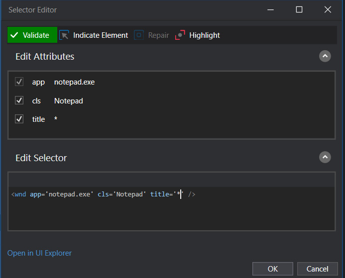
Figure 8.6 – Valid selector
- A red Validate button with a cross indicates that the target element is invalid and cannot be executed:
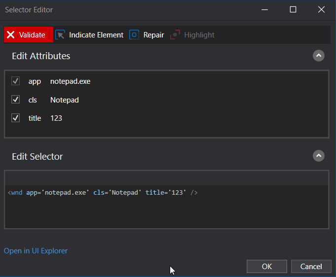
Figure 8.7 – Invalid selector
- A yellow Validate button with a question mark indicates that the selector that corresponds to the target element has been modified and needs to be revalidated to correct its status:
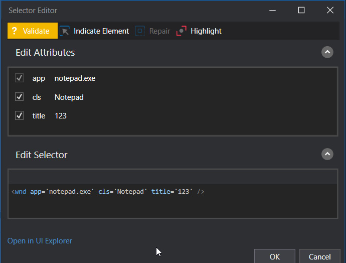
Figure 8.8 – Revalidate the selector
- Indicate Element
This is used to select the new UI targets or to overwrite the previously selected targets on the screen.
- Repair
This button is enabled when the selector is invalid and is used to repair the existing selector by indicating the same target UI element on the screen.
- Highlight
This button is used to ensure that the modified selector is still valid for the target element. Once clicked, the target element will be highlighted on the screen.
- Edit Attributes
This option lists all the target element attribute's tag names and attribute values.
- Edit Selector
This box contains the XML fragment that provides the tag names and attribute values of the target element. These can be edited to help fine-tune the selector.
- Open in UI Explorer
This is a separate tool that can be used to refine the selector options and is only displayed for valid selectors.
In this section, we looked at the various options within the Selector Editor and how to manipulate selectors and attributes using the basic options provided. For more advanced editing options, we can look at UI Explorer.
UI Explorer
UI Explorer is used to analyze and edit selectors, particularly when the existing selectors are not stable enough for automation. "Not stable enough" means that the properties of the selectors of the target application keep changing on every execution. UI Explorer has several options to overcome these challenges by fine-tuning the properties of the selector to make it more reliable. Let's explore these options one by one. Click on Open in UI Explorer, as shown in Figure 8.5, to open UI Explorer, as follows:
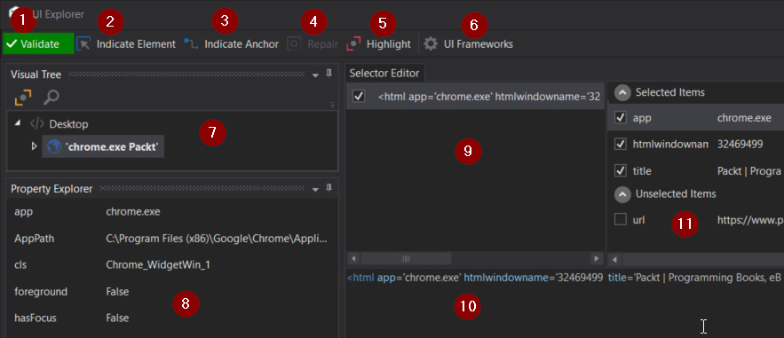
Figure 8.9 – UI Explorer
Let's look at the available options in more detail:
- Validate
Click on this button if you want to verify the validity of your Selector. The target element must be on the screen before you click this button.
- Indicate Element
Click on this option to select the target element and generate the selector with all the necessary properties.
- Indicate Anchor
This option is used to identify the target element by using the relative elements surrounding the target element.
- Repair
This button is enabled when the selector is invalid and is used to repair the existing selector by indicating the same target UI element on the screen.
- Highlight
This option is used to highlight the target on the screen for the current selector to ensure it is working.
- UI Frameworks
The Framework settings options are changed based on the application being used. There are three types of frameworks:
- Default
This specifies the default settings, which typically work with all types of user interfaces.
- Active Accessibility
This option is used for legacy applications such as mainframes or if the Default option did not work as expected.
- UI Automation
This is used for any new applications or if the other two types did not work as expected.
- Visual Tree
This section gives you the option to explore the elements of the target user interface in a folders and subfolders tree structure. To make the analysis more effective, a Highlight option is provided so that you can examine the UI elements from the tree.
- Property Explorer
This section gives the option to explore the available properties of the target application.
- Edit Selector
This section contains the XML fragment that has the tag names and attribute values of the target element. These can be edited to fine-tune the selector.
- Edit Attributes
This section is used to edit the attributes of the selected items in the node.
- Select Unselect Attributes
This section displays the list of selected and unselected attributes of the selector. This gives us the option to analyze the selector by selecting and unselecting attributes.
In this section, we explored the different options that are available within UI Explorer to enhance the selector so that it can handle dynamic target elements. In the next section, we'll compare the different selector types and how they can be applied in different scenarios.
Types of selectors
The selector types depend on the type of recorders or activities that are being used inside the UiPath workflows. There are two types:
- Partial selectors
- Full selectors
Let's look at them in more detail.
Partial selectors
Partial selectors are generated when you use the Desktop Recorder. It does not contain information about the top-level window. Partial selectors are enclosed inside a container. While we're on the same application screen and interacting with multiple elements, it is a good option to use partial selectors. With partial selectors, the top element (which is grayed out) is inherited from the parent. Let's look at an example where an Attach Window activity is being used in a Notepad application and the selector of the Click activity looks as follows, where the first line can't be edited:
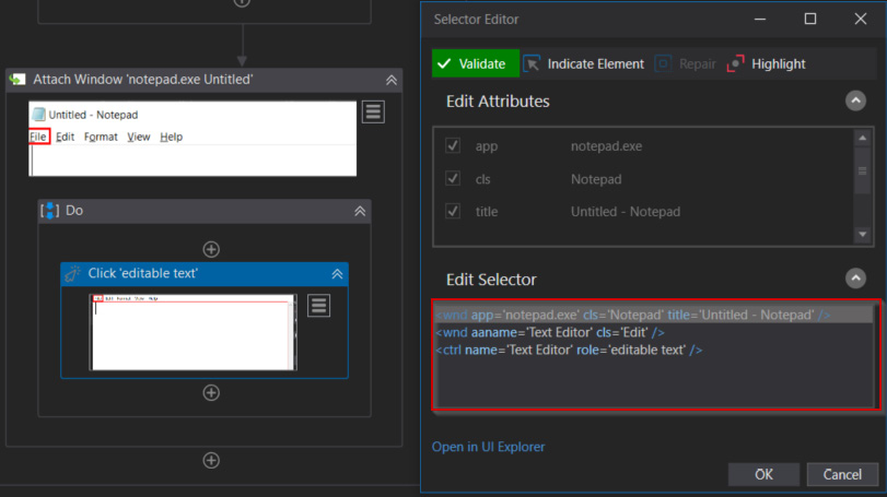
Figure 8.10 – Partial selector
If you want to edit the attributes of the top-level window, you may need to take a different recording approach known as full selectors, which we will look at in the next section.
Full selectors
Full selectors are generated when we are using the Basic Recorder. Full selectors contain all the necessary nodes, including the top-level window. This contains the application node and the final node, which are required to identify the UI element.
Full selectors should be used when you're switching between multiple windows or activities.
For example, when you're switching between multiple applications for data such as Notepad, Word, or Excel, you should use full selectors:
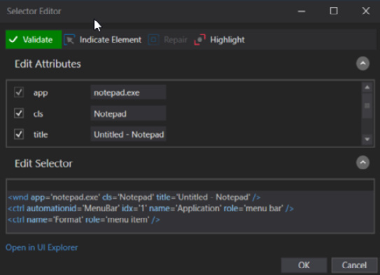
Figure 8.11 – Full selector
The following table shows the differences between partial selectors and full selectors:
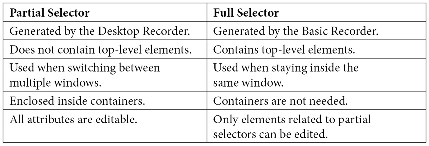
Figure 8.12 – Comparison of partial selectors and full selectors
In this section, we looked at the differences between partial selectors and full selectors. In the next section, we will learn about dynamic selectors and see how they can be implemented by looking at a real-life example.
Dynamic selectors
Before we begin discussing dynamic selectors, let's look at static selectors. Static selectors are used to indicate an element in the user interface that does not change its properties or that the element is stable enough. So, we do not need to change the properties in the Selector Editor window, such as the tags and attributes of the selector. A dynamic selector is used to easily identify the target element, which changes its selector properties more frequently at runtime. A dynamic selector is created using a variable or argument instead of the static attributes in the selector tags. Instead of hardcoding the values of the target element, the attribute values can be represented using a variable or an argument to handle the target dynamically. The syntax of the dynamic selector is shown here:
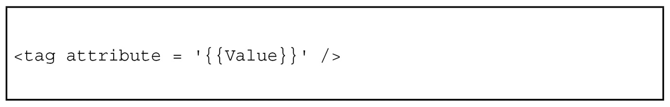
Figure 8.13 – Syntax of the dynamic selector
Dynamic selectors can be analyzed and modified inside the Edit Selector window. This window displays all the basic options, such as Edit Attributes and Edit Selector, so that you can dynamically modify the selector. However, for more advanced options, such as Visual Tree, Property Explorer, and Selected Items, you can use UI Explorer to easily identify the dynamic properties.
The following table shows the differences between static selectors and dynamic selectors:
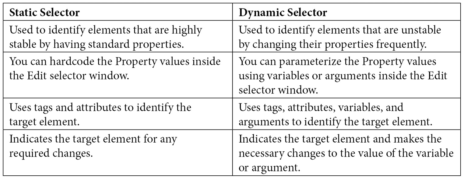
Figure 8.14 – Comparison of static selectors and dynamic selectors
Now, let's look at a real-life example that's available on the PacktPub website about dynamically reading the names of three books using a single selector. To understand this example better, we will analyze the web page, selectors, and their properties using UI Explorer.
Dynamic scenario
The following is a typical example of using dynamic values. The book name keeps changing over a certain period and the UiPath robot should dynamically read the name of the book. In this example, we'll have the robot read the names of the first three books. Let's get started:
- Launch the PacktPub website by going to https://www.packtpub.com/, as shown in the following screenshot:

Figure 8.15 – PacktPub website

Figure 8.16 – All Books
- Verify that the Books page is displayed, as shown in the following screenshot:

Figure 8.17 – The Books page
- Launch UiPath Studio and create a Process. Name it DynamicSelectors_Packt and click Create, as shown in the following screenshot:
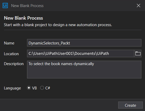
Figure 8.18 – New Blank Process
- Using a Click activity, inspect the selectors of the first, second, and third books. Observe the similarities and the differences, as shown in the following screenshot:
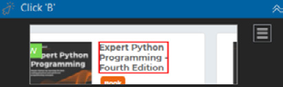
Figure 8.19 – Click activity
- Open Edit Selector by clicking on the respective button:
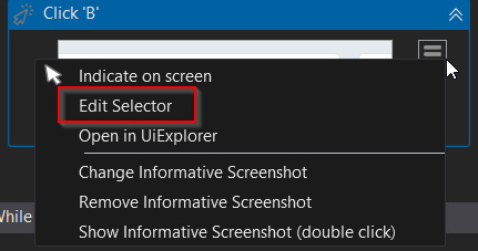
Figure 8.20 – Edit Selector
- Observe the Edit Attributes and Edit Selector options. Here, you can modify the selectors so that they dynamically identify the targets:
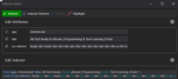
Figure 8.21 – Selector Editor
- Open UI Explorer and observe the similarities and differences between the first, second, and third books. Based on your analysis, you will see that the idx value keeps changing when you select css-sselector (2) and unselect aaname (1), which is the name of the book:
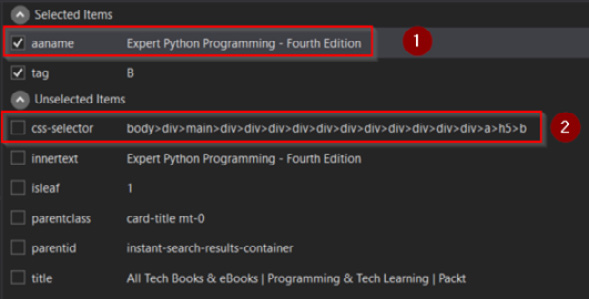
Figure 8.22 – Edit selector
- Now, let's finalize the dynamic selector by clicking the Save button in UI Explorer. The following selector values will be displayed:
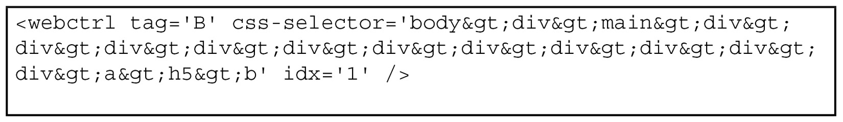
Figure 8.23 – Selector values
If the highlighted idx='1' value needs to be changed for you to select the next book, then we need to parameterize this value.
- Parameterize the idx value using the following selector options. Select the idx value and right-click and select Create variable, as shown in the following screenshot:
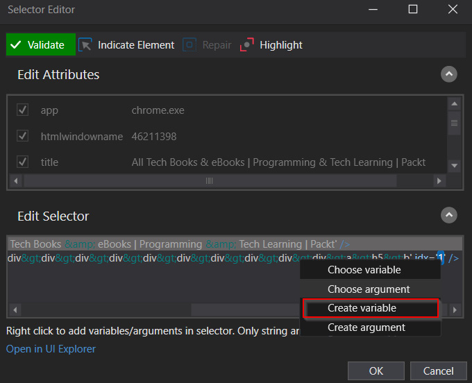
Figure 8.24 – Selector values
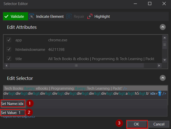
Figure 8.25 – Parameterized values
- The selector will look similar to the following and will be ready to select the values dynamically. However, we must change the values accordingly:
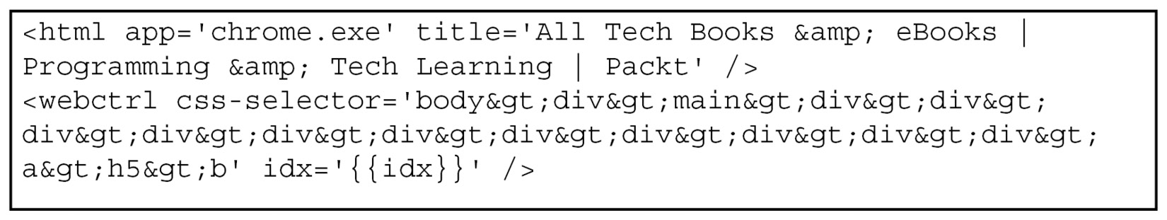
Figure 8.26 – Parameterized selectors
- Inside the UiPath Studio sequence, specify the PacktPub website using the Attach Browser activity, as shown in the following screenshot:
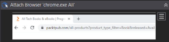
Figure 8.27 – The Attach Browser activity
- Create a While Loop activity to go through all three books with the idx<=3 condition (1) and copy the selector that you created in Step 8 to the Get Text activity (2). Then, write the result that you obtained using the WriteLine activity and increment (3) the value to read the name of the next book, as shown in the following screenshot:
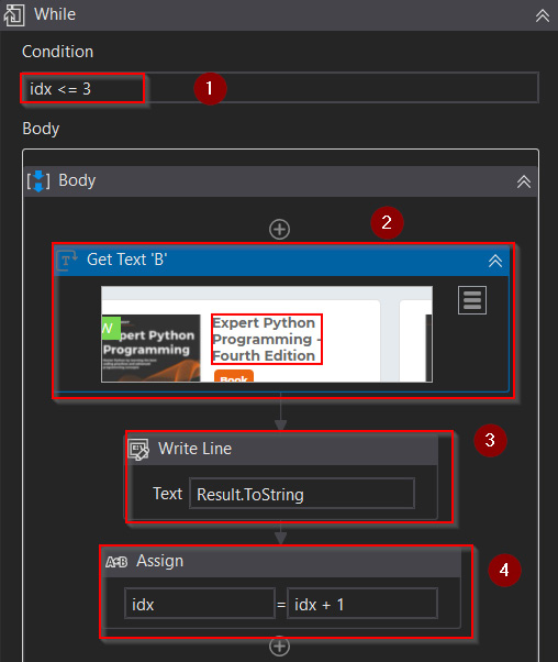
Figure 8.28 – Extracting book names
- Execute the robot using the Run option under Debug File or press Ctrl + F5, as shown in the following screenshot:
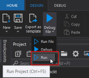
Figure 8.29 – Run Project
- Observe the output that's been generated in the Output section, as shown in the following screenshot:
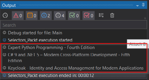
Figure 8.30 – Verifying the result
With that, we have successfully implemented dynamic selectors using a practical example from the PacktPub website to dynamically retrieve the names of books. You can apply the same concepts to different scenarios so that you can work with dynamic target elements.
Summary
In this chapter, we looked at selectors, including how to work with tags, attributes, and selector properties. Then, we explored the differences between static, dynamic, partial, and full selectors. After that, we learned about UI Explorer and how to work with the selector properties in challenging situations. Finally, we looked at a practical example of using dynamic selectors to implement the concepts we learned about in this chapter.
In the next chapter, you will be manipulating data using Excel and data tables. Here, you will use selectors to retrieve data from applications that communicate with Excel and data tables.