
Chapter 13: Optimizing Premium and Embedded Capacities
In the previous chapter, we looked at ways to deal with high data and user scale. The first option we provided was to leverage Power BI Premium because it has higher dataset size limits than Power BI's shared capacity.
In this chapter, we will take a much closer look at the Premium (P and EM) and Embedded (A) capacities. Even though they are purchased and billed differently, with a couple of minor exceptions, they offer the same services on similar hardware and benefit from the same optimization guidance. Therefore, we will continue to refer to just the Premium capacity for the remainder of this chapter and will call out Embedded only if there is a material difference. We will treat the Premium Per User (PPU) licensing model the same way.
We will learn how there is more to differentiate Premium than just the increased dataset limits. This is because the Premium capacity offers unique services and advanced features that are not available in the shared capacity. However, the caveat is that these extra capabilities come with additional management responsibilities that fall upon the capacity administrators. Hence, we will review the available services and settings, such as Autoscale, and discuss how they can affect performance.
Then, we will learn how to determine an adequate capacity size and plan for future growth. One important technique is load testing to help determine the limits and bottlenecks of your data and usage patterns. We will also learn how to use the Premium Capacity Metrics App provided by Microsoft to identify areas of concern, perform root cause analysis, and determine the best corrective actions.
Microsoft released Premium Gen2 (that is, the second generation) to general availability in October 2021. This release improved areas of the service. We will cover the significant new Gen2 capability, which is its ability to automatically scale a capacity using additional CPU cores that are held in reserve. Note that while the first generation of Premium is still being used in production by customers, Gen2 is the default and Microsoft announced that they would automatically migrate customers to the new service starting March 2022. Therefore, we will not cover the first generation in this book.
In this chapter, we will cover the following topics:
- Understanding Premium services, resource usage, and Autoscale
- Capacity planning, monitoring, and optimization
Understanding Premium services, resource usage, and Autoscale
Power BI Premium provides reserved capacity for your organization. This isolates you from the noisy-neighbor problem that you may experience in the shared capacity. Let's start by briefly reviewing the capabilities of the Premium capacities that differentiate it by providing greater performance and scale:
- Ability to Autoscale: This is a new capability that was introduced in Gen2 that allows administrators to assign spare CPU cores to be used in periods of excessive load (not available for PPU).
- Higher Storage and Dataset Size Limits: 100 TB of total storage and a 400 GB dataset size (100 GB in PPU).
- More Frequent Dataset Refresh: 48 times per day via the UI and potentially more via scripting through the XMLA endpoint.
- Greater Refresh Parallelism: You can have more refreshes running at the same time, ranging from 5 (Embedded A1) to 640 (Premium P5/Embedded A8).
- Advanced Dataflows Features: Premium dataflows have performance enhancements, such as the enhanced compute engine.
- On-Demand Load with Large Dataset Storage Formats: Premium capacities do not keep every dataset in memory all the time. Datasets that are unused for a period are evicted to free up memory. Premium capacities can speed up the initial load in memory when using the large dataset format that we described in Chapter 10, Data Modeling and Row-Level Security. This on-demand load can speed up the initial load experience by loading the data pages that are required to satisfy a query. Without this feature, the entire dataset needs to be loaded into memory first, which can take a while for very large models in the tens of GB. For datasets that are bigger than 5 GB, you can see up to a 35% increase in report load times. The benefit is greater with very large models in the 50 GB+ range.
Other capabilities in Premium are not directly related to performance. We'll list them here for awareness. Note that the final three items are not available for PPU:
- Availability of Paginated Reports: Highly formatted reports based on SQL Server Reporting Services that are optimized for printing and broad distribution.
- XMLA Endpoint: API access to allow automation and custom deployment/refresh configurations.
- Application Life Cycle Management (ALM): You can use deployment pipelines, manage development, and evaluate app versions.
- Advanced AI Features: Text analytics, image detection, and automated machined learning become available.
- Multi-region deployments: You can deploy Premium capacities in different regions to help with data sovereignty requirements.
- Bring Your Own Key (BYOK): You can apply your encryption key to secure data.
Now, let's explore how Premium capacities manage resources and what to expect as demand and load increase.
Premium capacity behavior and resource usage
When an organization purchases Premium capacity, they are allocated virtual cores (v-cores) and a certain amount of RAM. All the workloads running on that capacity share these resources. For example, a paginated report can be executing queries and processing data at the same time as a dataset refresh operation is occurring.
With the first release of Premium, customers needed to pay close attention to the available memory and concurrent refresh operations. They needed to understand how capacities prioritized different types of operations, namely the following:
- Interactive Operations (fast running):
- Dataset workload: Queries, report views, and XMLA Read are considered
- Dataflow workload: Any execution is considered
- Paginated report workload: Report renders are considered
- Background Operations (longer running):
- Dataset workload: Scheduled refresh, on-demand refresh, and background queries after a refresh are considered
- Dataflow workload: Scheduled refreshes are considered
- Paginated report workload: Data-driven subscriptions are considered
- AI workloads: Function evaluations are considered
- API calls to export the report to a file
These terms are still relevant for Premium Gen2. However, Microsoft has changed the way limits apply in Gen2, so we will describe these changes here.
Important Note
In the original release of Premium, the total amount of memory that could be allocated to the capacity was shared by all the workloads and could never be exceeded. For example, with a P1, all concurrent activity on the capacity could not consume more than 25 GB of memory.
With Gen2, the utilization model was changed so that heavy background operations would not penalize users by consuming all the available resources. The capacity memory limit now applies per dataset, not across all workloads. This means that for a P1, you can have multiple active datasets consuming up to 25 GB of memory. Note that the available CPU cores may still be a limiting factor because of limited threads not being available, which means they can't be assigned to refresh mashup containers. This is where Autoscale can help, which we will discuss later in this chapter.
Microsoft achieved increased scale and parallelism with Gen2 by having more capacity behind the scenes than what can be purchased by customers. For example, a P1 capacity may be running on a physical machine that is more like a P3 in size. Microsoft runs groups of these large nodes, which are dedicated to specific Premium workloads. This allows them to load balance by spreading work as evenly as possible. The Microsoft documentation states that the system only runs a workload on a node where sufficient memory is available.
Let's begin by looking at the settings we can adjust to control scale and performance. The following screenshot shows the Capacity Settings area of the Power BI Admin Portal for a Gen2 capacity. The Workloads section contains settings relevant to performance:
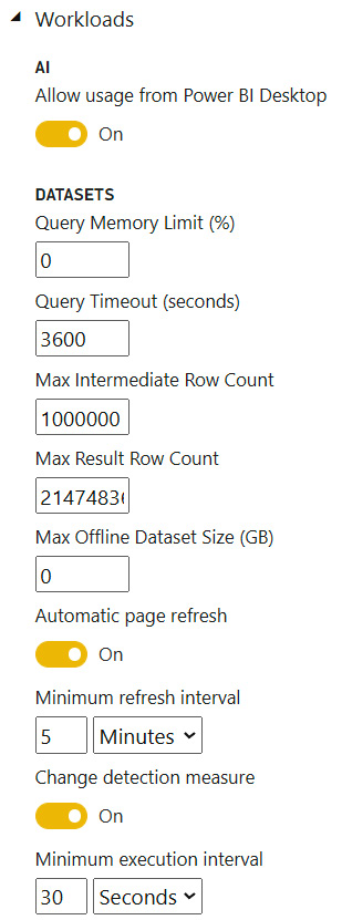
Figure 13.1 – Premium settings relevant to performance tuning
The settings you can adjust to manage these performance and scale issues are shown in the following list. You can set specific limits here to safeguard against issues in dataset design or from ad hoc reports that are generating complex, expensive queries:
- Query Memory Limit (%): This is the maximum percentage of memory that a single can use to execute a query. The default value is 0, which results in a default capacity size-specific limit being applied.
- Query Timeout (seconds): The number of seconds a query is allowed to execute before being considered timed out. The default value represents 1 hour and 0 disables the timeout.
- Max Intermediate Row Count: For DirectQuery, this limits the number of rows that are returned by a query, which can help reduce the load on source systems.
- Max Result Row Count: Maximum number of rows that can be returned by a DAX query.
- Max Offline Dataset Size (GB): Determines how large an offline dataset can be (size on disk).
- Minimum refresh interval (for Automatic Page Refresh with a fixed interval): How often a report with automatic page refresh can issue queries to fetch new data. This can prevent developers from setting up refresh cadences more frequently than it is necessary.
- Minimum execution interval (for Automatic Page Refresh with change detection): This is like the previous point but applies to the frequency of checking the change detection measure.
Next, we will learn how capacities evaluate load and what happens when the capacity gets busy.
Understanding how capacities evaluate load
Premium Gen2 capacities evaluate load every 30 seconds, with each bucket referred to as an evaluation cycle. We will use practical examples to explain how the load calculations work in each cycle and what happens when the capacity threshold is reached.
Power BI evaluates capacity utilization using CPU time, which is typically measured in CPU seconds. If a single CPU core is completely utilized for 1 second, that is 1 CPU second. However, this is different from the actual duration when it's measured from start to finish. Taking our example one step further, if we know that an operation took 1 CPU second, this does not necessarily mean that the start to finish duration was 1 second. It could mean that a single CPU core was 100% utilized for 1 second or that the operation used less than 100% of the CPU over more than 1 second.
We will use a P1 capacity for our examples. This capacity comes with four backend cores and four frontend cores. The backend cores are used for core Power BI functions such as query processing, dataset refresh, and R server processing, while the frontend cores are responsible for the user experience aspects such as the web service, content management, permission management, and scheduling. Capacity load is evaluated against the backend cores only.
Knowing that Power BI evaluates the total load every 30 seconds, we can work out the maximum CPU time that's available to us over this during the evaluation cycle of a P1. This is 30 seconds x 4 cores = 120 CPU seconds. So, for a P1 capacity, every 30 seconds, the system will determine whether the workloads are consuming more or less than 120 CPU seconds. As a reminder, with Gen2, it is possible by design for a P1 capacity to temporarily consume more than 120 CPU seconds since spare capacity is available. What happens at this point of CPU saturation depends on your capacity configuration.
Before we describe this in more detail, it is useful to know how CPU load is aggregated since interactive and background operations are treated differently. Interactive operations are counted within the evaluation cycle in which they ran. CPU usage for background activity is smoothed over a rolling 24-hour period, which is also evaluated regularly in the same 30-second buckets. The system smooths background operations by spreading the last 24 rolling hours of background CPU time evenly over all the evaluation cycles. There are 2,880 evaluation cycles in 24 hours.
Let's illustrate this with a simple but realistic example. Suppose we have a P1 capacity that has just been provisioned. Two scheduled refreshes named A and B have been configured and will complete by 1 A.M. and 4 A.M., respectively. Suppose that the former refresh will take 14,400 CPU seconds (5 per evaluation cycle), while the latter will take 5,760 CPU seconds (2 per evaluation cycle). Finally, suppose that users start running reports hosted on the capacity around 9 A.M. and they do not hit the capacity threshold. The following diagram shows how load evaluation works for this scenario and how the available capacity changes over time. We have marked four different evaluation cycles to explain how the operations contribute to the load score. The example scenario we've described covers a period that's smaller than 24 hours. Let's visualize this behavior and load:
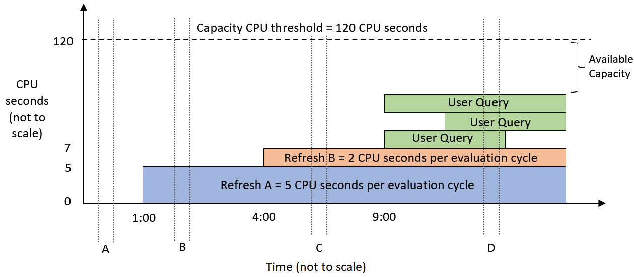
Figure 13.2 – Load evaluation for a P1 capacity at different times (A to D)
Note
In Figure 13.2 and Figure 13.5, since the background refresh activity is spread out over 2,880 evaluation cycles, it is correct to show the load that's been incurred by those operations being constant over time once they have been completed. For the interactive operations shown in green, the CPU load will vary over time for each operation. However, for simplicity, we have illustrated interactive operations as if they generate constant load.
Let's walk through the four evaluation cycles to understand how the capacity load is calculated at each of these points:
- Evaluation Cycle A: At this point, the capacity is brand new and completely unused. There is no prior background activity to consider in this evaluation cycle.
- Evaluation Cycle B: This occurs after refresh A has completed but before refresh B has started. The background load for refresh A is 14,400 CPU seconds divided into 30-second buckets, which gives 5 CPU seconds per evaluation cycle. Since there are no other activities, the total load during this cycle is 5 CPU seconds.
- Evaluation cycle C: This occurs after refresh B has been completed. The background load for refresh B is 5,760, which smooths to 2 CPU seconds per evaluation cycle. This time, the background activities from refresh A and B are both considered because they are both within 24 hours of the current evaluation cycle. Even though both refreshes are already complete at this point, their smoothed activity carries forward, so the total load on the capacity is 7 CPU seconds.
- Evaluation Cycle D: Now, we have both the background activity and interactive activity occurring at the same time. The total load on the capacity is the background contribution of 7 CPU seconds, plus the actual work that's been done by the queries in that cycle. The number is not important for this example. The main point is that the total activity in the evaluation cycle is less than 120 CPU seconds.
Next, we will explore what happens if we reach an overload situation. This term is used to describe a capacity that needs more CPU resources than what's been allocated.
Managing capacity overload and Autoscale
For a P1 capacity, overload means that the total load (including smoothed background activity) is exceeding 120 CPU seconds during an evaluation cycle. When this state is reached, unless Autoscale is enabled, the system starts to perform throttling, also called interactive request delay mode. The system will remain in delay mode while each new evaluation cycle exceeds the available capacity. In delay mode, the system will artificially delay interactive requests. The amount of delay is dynamic and increases as a function of the capacity load.
This delay mode is new with Gen2. Previously, it was possible to overload a capacity to the point where it became completely unresponsive. With Gen2, this behavior has been changed to prevent this from happening. Delaying new interactive requests when overloaded may seem like it would make the problem worse, but this is not the case. For users who experience delayed requests, the experience will be slower than if the capacity was not overloaded. However, they are still much more likely to have their requests completed successfully. This is because delaying operations gives the capacity time to finish ones that are already in progress, preventing them from being overloaded to the point where new interactive actions fail.
The following diagram illustrates how request delays work. Observe that in cycle A, we needed more capacity than was allocated, indicated by the queries stacking up higher than the 120-second capacity threshold. Therefore, in cycle B, any new interactive requests are delayed, which protects the capacity and reduces the degradation of the user experience:
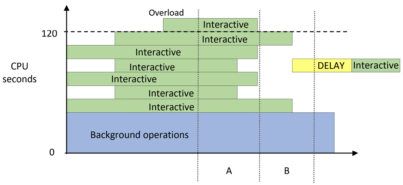
Figure 13.3 – Interactive operations in cycle B delayed due to the overload in cycle A
If you often experience overload, you should consider scaling up to a larger capacity. However, a larger capacity represents a significant cost increase, which may be hard to justify when the scale issues are transient and unpredictable. You could also manually scale out by spreading workspaces around multiple capacities so that a single capacity does not experience a disproportionately high load. If you only have one capacity available to you, distributing load in this way is not an option.
We will investigate overload more when we cover monitoring and optimization in the next section. First, let's look at another way to mitigate peak load.
Handling peak loads with Autoscale
An efficient way to manage excessive load in Premium capacities without incurring upfront costs is to use the Autoscale capability that was introduced with Gen2.
Important Note
Autoscale is not available for Power BI Embedded (A SKU) capacities in the same way it is for Premium. For Embedded, you must use a combination of metrics and APIs or PowerShell to manually check resource metrics and issue the appropriate scale up or down commands. See the following link for more information: https://docs.microsoft.com/en-us/power-bi/developer/embedded/power-bi-embedded-generation-2#autoscaling-in-embedded-gen2.
Autoscale in Premium works by linking an Azure subscription to a Premium capacity and allowing it to use extra v-cores when an overload occurs. Power BI will assign one v-core at a time up to the maximum allowed, as configured by the administrator. V-cores are assigned for 24 hours at a time and are only charged when they're assigned during these 24-hour overload periods. The following screenshot shows the Autoscale settings pane, which can be found in the Capacity Settings area of the admin portal:
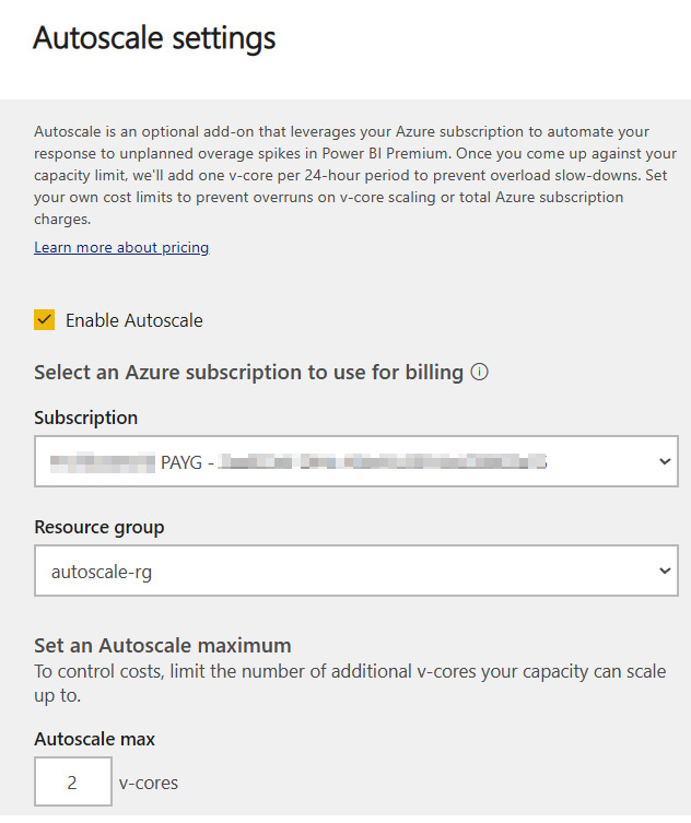
Figure 13.4 – Autoscale settings to link an Azure subscription and assign v-cores
The following diagram shows how the overload scenario we described in Figure 13.3 would change if Autoscale was enabled. We can see that a v-core was assigned in the next evaluation after an overload occurred, which increased the capacity threshold. It is also important to note that the interactive operation that occurred after the overload was not delayed:
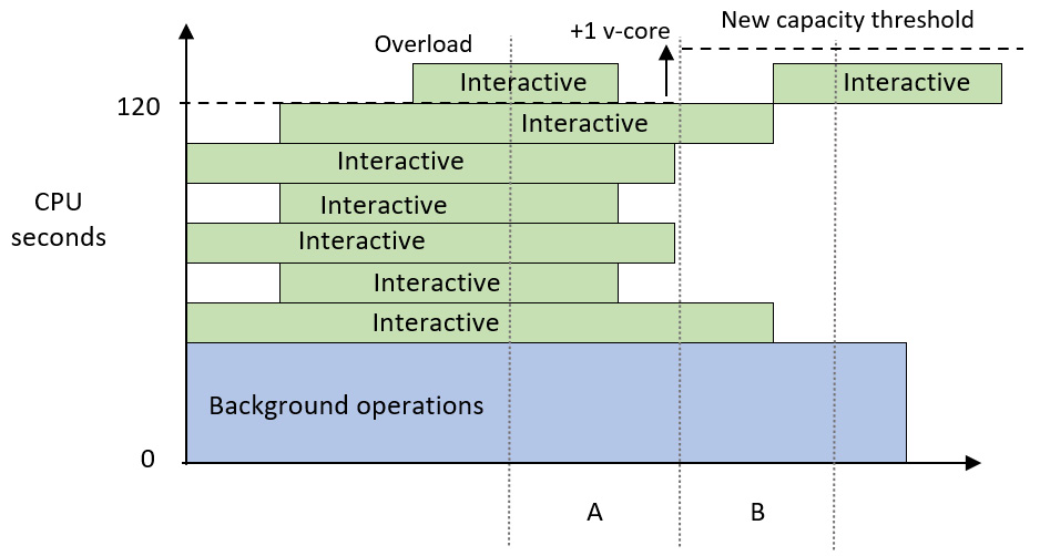
Figure 13.5 – Autoscale assigns an additional core and avoids delays
Now that we have learned how capacities evaluate load and can be scaled, let's learn how to plan for the right capacity size and keep it running efficiently.
Capacity planning, monitoring, and optimization
A natural question that occurs when organizations consider purchasing Premium or Embedded capacity is what size to provision. We know that there are different services available in Premium and we can safely assume that workload intensity and distribution vary between organizations. This can make it difficult to predict the correct size based on simple metrics such as total users. Capacity usage naturally increases over time too, so even if you have the right size to begin with, there may come a point where you need to scale. Therefore, in the next few sections, you will learn about the initial sizing and then how to monitor and scale when necessary.
Determining the initial capacity size
Earlier in this chapter, we mentioned that Power BI capacities are available in varied sizes through different licensing models. We will assume that you will choose the appropriate Stock-Keeping Unit (SKU – that is, the unique product type) based on your organizational needs. We would like to provide a reminder here that feature-based dependencies may force you to use a certain minimum size if you are considering the A series of SKUs from Azure, or the P and EM series available via Office. For example, paginated reports are not available on the A1-A3 or EM1-EM3 capacities, and AI is not available on EM1 or A1.
It is useful to have these capacity limits in mind when you start planning. At the time of writing, these capacities and limits are as follows
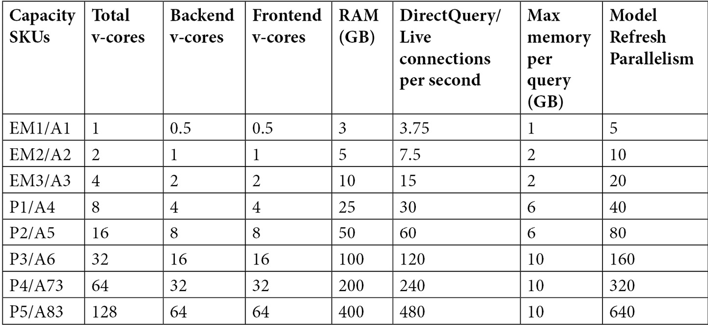
Figure 13.6 – Available SKUs and limits for reserved capacities
Now, let's look at what to consider when sizing a capacity. We will consider all of these in the next section on load testing:
- Size of Individual Datasets: Focus on larger, more complex datasets that will have heavier usage. You can prototype datasets in Power BI Desktop and use DAX Studio and VertiPaq Analyzer to estimate the compressibility of data to predict the dataset's size. Ensure that the capacity you choose has enough room to host the largest dataset.
- Number and Complexity of Queries: Think about how a large number of users might be viewing different reports at the same time. Consider centralized organizational reports, and then consider adding a percentage on top for self-service content. You can estimate this percentage from how broadly the organization wishes to support self-service content. You can determine the number and complexity of queries from typical report actions using Desktop Performance Analyzer and DAX Studio.
- Number and Complexity of Data Refreshes: Estimate the maximum number of datasets you may need to refresh at the same time at various stages of your initiative. Choose a capacity that has an appropriate refresh parallelism limit. Also, bear in mind that a dataset's total memory footprint is the sum of what's used by its tables and data structures, executing queries, and background data refreshes. If this exceeds the capacity limit, the refresh will fail.
- Load from Other Services: Bear in mind that dataflows, AI, paginated reports, and potentially other services in the future all use capacity resources. If you plan to use these services, build them into your test plan.
- Periodic Distribution of Load: Capacity load will vary at different times of the day in line with work hours. There may also be predictable times of extra activity, such as month-end or holiday sales such as Black Friday in the USA. We suggest that you compare regular peak activity to these unique events. If the unique events need far more resources compared to normal peak times, it would be better to rely on Autoscale than to provision a larger capacity upfront.
With a little effort, it is possible to get well-informed estimates from the considerations mentioned in the previous list. The next step of capacity planning is to perform some testing with some of your content to evaluate the scalability of your solutions and observe how the capacity behaves. We will explore this next.
Validating capacity size with load testing
Once you have a proposed capacity size, you should perform testing to gauge how the capacity responds to different situations. Microsoft has provided two sets of PowerShell scripts to help simulate load in different scenarios. These tools take advantage of REST APIs that are only available in the Premium capacity. You can configure the tool to execute reports that are hosted in a reserved capacity under certain conditions. We should try to host datasets and reports that represent realistic use cases so that the tool can generate actionable data. This activity will be captured by the system and will be visible in the Capacity Metrics App, which we will describe later in this section. We will use this app to investigate resource usage, overload, and Autoscale.
First, let's review the testing tools provided by Microsoft. Both suites are available in subfolders at the same location on GitHub: https://github.com/microsoft/PowerBI-Tools-For-Capacities. These are described as follows:
- LoadTestingPowerShellTool: This tool is simple. It aims to simulate a lot of users opening the same reports at the same time. This represents a worst-case scenario that is unlikely to occur, but it provides value by showing just how much load the capacity can manage for a given report in a short amount of time. The script will ask how many reports you want to run; then, it will ask you to authenticate with the user you want to test for each report and which filter values to cycle through. When the configuration is complete, it will open a new browser window for each report and continuously execute it, looping over the filter values you supply.
- RealisticLoadTestTool: This is a more sophisticated script that requires additional setup. It is designed to simulate a realistic set of user actions, such as changing slicers and filters. It also allows time to be taken between actions to simulate users interpreting information before interacting with the report again. This script will also begin to ask you how many reports you want to test and which users to use. At this point, it will simply generate a configuration file called PBIReport.json in a new subfolder named with the current date and time. Then, you need to edit that file to customize the configuration. This time, you can load specific pages or bookmarks, control how many times the session restarts, specify filter or slicer combinations with multiple selections, and add "think time" in seconds between the actions. The following sample file is a modified version of one that's been included with the tool and clearly illustrates these configurations:
reportParameters={
"reportUrl":"https://app.powerbi.com/reportEmbed?reportId=36621bde-4614-40df-8e08-79481d767bcb",
"pageName": "ReportSectiond1b63329887eb2e20791",
"bookmarkList": [""],
"sessionRestart":100,
"filters": [
{
"filterTable":"DimSalesTerritory",
"filterColumn":"SalesTerritoryCountry",
"isSlicer":true,
"filtersList":[
"United States",
["France","Germany"]
]
},
{
"filterTable":"DimDate",
"filterColumn":"Quarter",
"isSlicer":false,
"filtersList":["Q1","Q2","Q3","Q4"]
}
],
&"thinkTimeSeconds":1
};
Note that the scripts have prerequisites:
- PowerShell must be executed with elevated privileges ("Run as administrator").
- You need to set your execution policy to allow the unsigned testing scripts to be run by running Set-ExecutionPolicy Unrestricted.
- Power BI commandlet modules must be installed by running Install-Module MicrosoftPowerBIMgmt.
However, these scripts have limitations and caveats that you should be aware of:
- The scripts work by launching a basic HTML web page in Google Chrome, which contains code to embed the Power BI reports you want to specify for testing. If you want to use a different browser, you must modify the PowerShell script to reference that browser with the appropriate command-line arguments.
- If you have spaces and long folder names in the path that contains the scripts, the browser may launch with incorrect parameters and not load any reports.
- The LoadTestingPowerShellTool version only works with a start and end number to govern the range of numerical filters. If you enter text-based filters, the script will execute but the browser may not load the report.
- The script saves a user token from Azure Active Directory, which it uses to simulate users. Access tokens expire in 60 minutes. Reports will run for 60 minutes once initiated and stop with an error once the access token expires.
- Since the browser instances run on the machine where the script is executed, all the client-side load will be borne by that machine. Take care with how many reports you run in parallel. The recommendation is to match the number of cores on your computer. Hence, with an 8-core machine, you can safely run 8 reports in parallel. More may be possible, but you should check your local CPU usage so that you don't overload the client machine. This presents a major challenge for load testing because it limits the number of users you can simulate. Unfortunately, there is no easy way to solve this problem. You need to run the tests on machines with more cores available and multiple machines in parallel. One option is to provision virtual machines in the cloud just for testing. Microsoft Visual Studio and Azure DevOps include built-in web load testing frameworks that can automate aspects of load testing, though these are now deprecated in favor of Azure Load Testing. More information is available here: https://docs.microsoft.com/en-us/azure/load-testing/overview-what-is-azure-load-testing.
Now, let's review the suggested practices for performing such tests. When you're preparing content for load testing, we recommend doing the following:
- Test some datasets that are near the maximum size allowed by the capacity.
- Test a range of reports with different complexities. We suggest low, medium, and high based on the number of visuals and the duration of queries. There is no absolute number here; it will vary by organization. Your tests should involve different combinations of sequential and parallel report runs.
- Create different users with different RLS permissions and run the tests under their context.
- Schedule or run on-demand refreshes during tests. The tool does not support this, so you can do this as usual in the Power BI web portal. This will generate background activity that can be reviewed in the metrics app. It's a good idea to run refreshes individually when the capacity is not loaded, then in parallel with other refreshes and report activity. You can compare the parallel results to the single run best case to see if a busier capacity can still complete refreshes in a reasonable time.
- Remember to consider load from other services, such as dataflows and paginated reports. While the tool does not support this, you can run dataflow refreshes or data-driven paginated report subscriptions in the Power BI web portal or use APIs during testing.
Next, we will introduce the capacity metrics app and learn how to use it to identify and diagnose capacity load issues.
Monitoring capacity resource usage and overload
Power BI allows a capacity administrator to configure customized notifications for each capacity. These are available in the capacity settings and allow you to set thresholds that will trigger email alerts. We recommend configuring the items shown in the following screenshot to be proactively notified when problematic conditions are met:
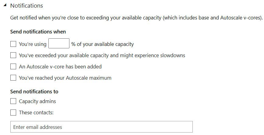
Figure 13.7 – Capacity notification settings
We suggest configuring the first notification so that it's around 85%. This will help you identify load peaks before they become a problem. This gives you time to plan for an increased capacity scale or identify content that could be optimized to reduce load. The rest of the checkboxes in the preceding screenshot are self-explanatory.
All your planning is not worth much if you cannot examine the effect that organic growth, design choices, and user behavior have on the capacity. You will need a way to determine load issues at a high level, then investigate deeper at varying levels of granularity. Microsoft provides a template app called Premium Capacity Utilization and Metrics that can help with this. It is not built into the service and must be manually installed from the AppSource portal. You can access it directly here, though note that you must be a capacity admin to install it: https://appsource.microsoft.com/en-us/product/power-bi/pbi_pcmm.pbipremiumcapacitymonitoringreport.
Currently, the app contains 14 days of near-real-time data and allows you to drill down to the artifact and operation levels. An obvious example of an artifact is a dataset, and the operations that are performed on it could be data refreshes or queries.
The official documentation describes each page and visual of the report sequentially and in detail. We will not repeat this, but we will illustrate how to use the report to investigate a few scenarios. We performed our testing on a one-core EM1. This size was selected because it is small enough to be overloaded from a single eight-core client machine. After uploading some datasets, we performed the following tests over a few hours:
- Between 5 A.M. and 5:30 A.M., we opened and interacted with reports manually.
- Between 7 A.M. and 7:45 A.M., we ran continuous load tests on the capacity without Autoscale. The testing tool was configured to load 12 parallel browsers. Two of those browsers ran a report with an expensive query that takes about 15 seconds to complete under ideal conditions. We also performed some manual refreshes in the background. We noticed that, over time, the reports started taking longer and longer to load.
- At around 10 A.M., we added one Autoscale core and generated some more load.
- At around 10:30 A.M., we increased the Autoscale limit to 4 and generated a more intense load by executing 16 browsers in parallel, with four complex reports. Data refreshes were also performed manually.
- Before 11 A.M., we decreased the level of activity by stopping the browsers that were running complex reports.
Now, let's look at the capacity metrics report to trace the activity. We want to see if we can identify where we experienced load, interactive delay mode, and how Autoscale worked.
The following screenshot shows the overview page of the metrics app. We have highlighted some interesting areas here, all of which have been numbered and will be described shortly:
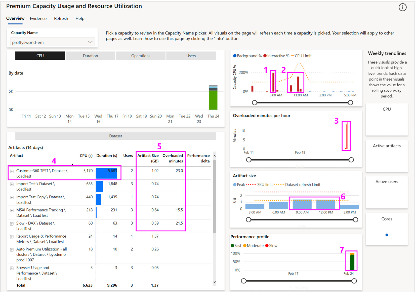
Figure 13.8 – The Overview page of Capacity Metrics
Before we review the numbered items in the preceding screenshot, we would like to provide some initial guidance about our example:
- We only provisioned the capacity before testing to limit costs. Thus, we only have data for a day, which explains why the CPU chart at the top left is mostly empty. This is broken down by artifact, and it is worth noting that we do see one artifact that seems to use a lot of the CPU in proportion to others. This chart can be switched using the buttons above it, to show different metrics.
- The weekly trend sparklines on the right-hand side of the report are empty for the same reason as mentioned previously.
- Since we do not have historical activity, no Performance Delta is available. This is a relative score with negative values, which means that the performance of the artifact is degrading over time and should be investigated via the Artifact Detail page shown in Figure 13.12. Rows with negative performance delta scores will be shaded in orange to make them more obvious.
- The report has a Help link in the top navigation area, which will open a detailed guidance page in the same report. Help pages have been included for each report page.
- The report has also implemented visual help tooltips, so you can hover over the question mark icon near the top right of the visual to get contextual help. This can be seen in the following screenshot, which is the help for the Artifacts (14 days) visual at the bottom left of the report:
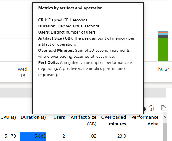
Figure 13.9 – Example of a visual help tooltip
Now let's review the numbered items shown in Figure 13.8. We will explore each of these areas in more detail:
- In the CPU capacity trend chart, we can see that we exceeded our 100% capacity threshold (dotted line) after 7 A.M, which corresponds to the extra load we generated. This could explain the gradual slowdown in report performance we observed.
- These two clumps of activity represent the lessened load and the extra high load we generated after scaling to one and then four extra v-cores.
- Here, it looks like we had 2 hours recently where we experienced an overload. We can click these bars to cross filter the table on the left to see which artifacts were being used during that hour.
- This visual provides useful information as we can see the impact each artifact has on resources and users. Here, we can see that one dataset, called Customer360 TEST, is taking up the majority of the CPU. You can drill into the operations here for more context.
- You should regularly review the Artifact Size and Overloaded Minutes metrics. This gives you a snapshot of the largest artifacts and which ones are experiencing the most overload. In our case, with the EM1 capacity, the maximum memory that's available to a dataset is 3 GB, so we know that the dataset can be hosted successfully. We may need to perform some actions when the size approaches the capacity limit. Remember that the memory footprint of a dataset includes the refreshes and memory that's been used by queries. If the dataset is approaching the capacity limit, we may not be leaving enough memory available to avoid overloads.
- This visual shows the peak memory that's used across all the dataset artifacts in 3-hour periods. Here, we can see that we hit our parallel refresh limit for two of those periods. In such cases, we should investigate which refreshes occurred and if there were overlaps that delayed any refreshes enough to impact business.
- This visual groups operations into Fast (< 100 ms), Moderate (100 ms to 2 s), and Slow (>2 s). We would like to see as little slow activity as possible, and the trend should be constant or decreasing. If it is increasing, you should explore the data to see if specific artifacts are contributing to the trend or if natural content growth and users are the culprits.
Now that we have gained initial insights, let's explore the data in more detail to determine which artifacts and operations contributed to the visualizations that were highlighted in Figure 13.8.
Investigating overload
The first thing we can do is get more granularity from the top two charts on the overview page. We drilled down on February 24 in the left CPU visual, which breaks this into an hourly view. It also automatically drills into the right visual to show CPU usage at 30-second granularity, which aligns with the evaluation cycles we discussed earlier.
The results are shown in the following figure. Note that we rearranged the charts here for better visibility. We hovered over one of the tall bars going beyond 100% between 7 A.M. and 8 A.M. while we had only one core assigned to show you how much extra capacity was needed in that cycle. You can also see where we increased capacity by one core and then four cores, taking the total available up to 150%. Finally, you can see how the extra load we generated at the end of the tests required more than 150% for a short period:
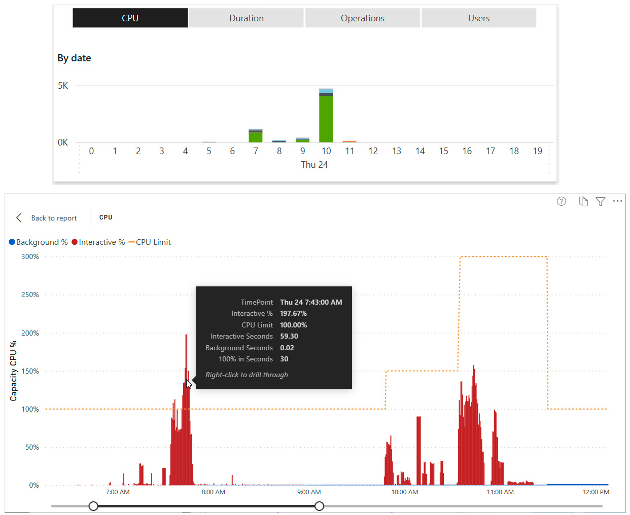
Figure 13.10 – Drilling down to 30-second granularity and highlighting the overload
Important Note
You would expect adding one core to an EM1 capacity would double the available CPU power to 200%. However, you will notice that adding an extra core takes us to 150% while adding four extra cores takes us to 300%. This is because Autoscale cores are split equally between backend and frontend processing. When you add one core to an EM1, you are adding only 50% more backend CPU power, which is where all the capacity metrics are derived.
Next, we clicked on the bar highlighted in the preceding figure to cross-filter the report and see which artifacts contributed to the activity in that overloaded window. We expanded the artifact view to show the operations for the two most expensive items, as shown in the following screenshot:
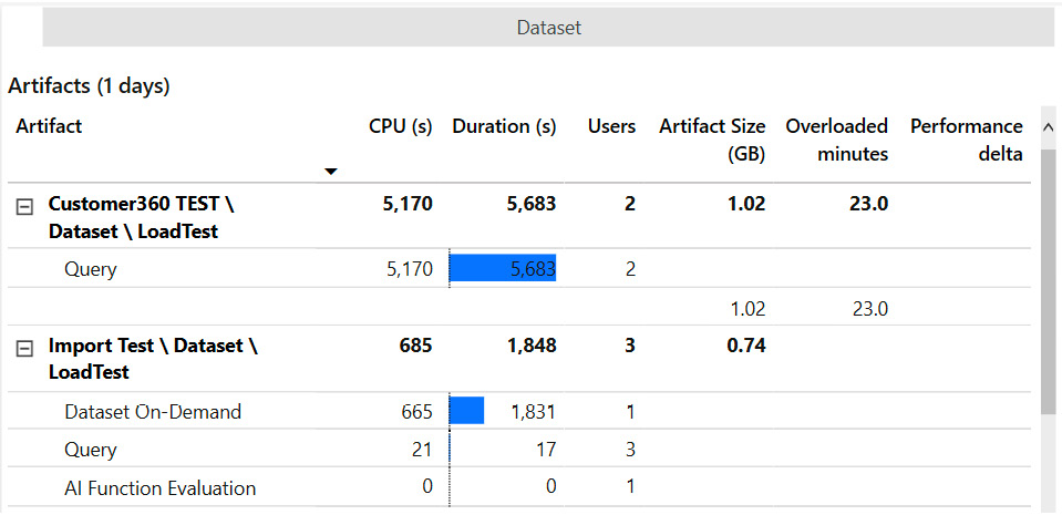
Figure 13.11 – Artifact and operation details
From the path structure shown on the left, we can see that both artifacts are datasets in the LoadTest workspace. We can see that the first dataset only served queries and experienced an overload. The second had other operations too and had a much lower CPU impact.
Next, we right-clicked the Customer360 TEST dataset and drilled to a page called Artifact Detail, as shown in the following screenshot. This page helps you spot unusual spikes in activity and trends in activity. Spikes should be investigated using other drills, which we will introduce shortly.
The following screenshot shows us hourly breakdowns for this dataset by different metrics and operations. You should check if there is any correlation in increased activity at any hour. The goal is to work out whether the increase was due to more users than usual, other activity on the capacity in that period, or another change, such as more data or updated reports/datasets:
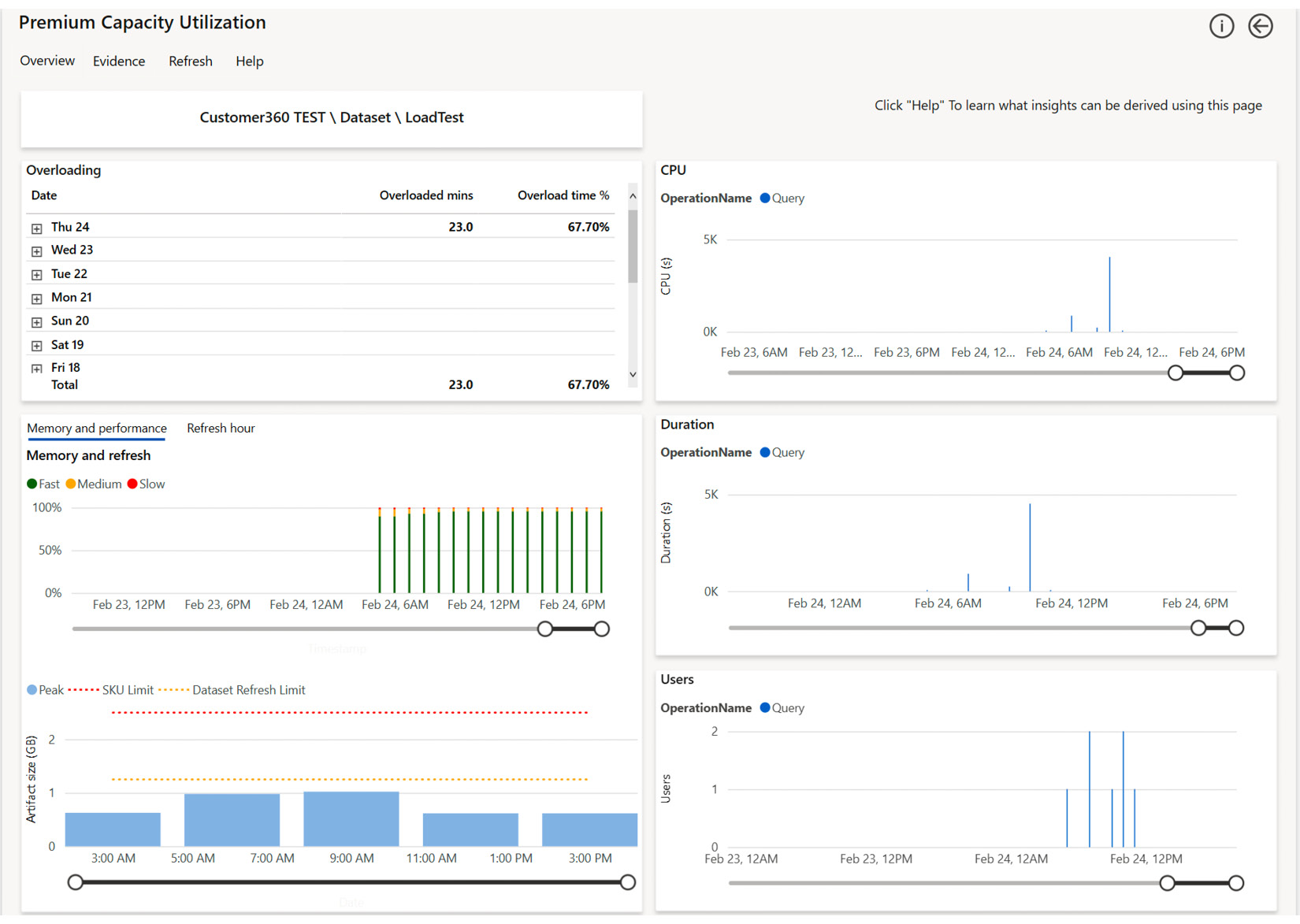
Figure 13.12 – The Artifact Detail page showing trends by hour for a single artifact
Now, let's go ahead and investigate our busy periods in more detail. To do this, we will return to the overview, right-click the 7:43 A.M. spike in the Capacity CPU % chart, and select the TimePoint Detail drill, as shown in the following screenshot:
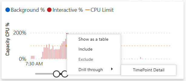
Figure 13.13 – Drilling to the Timepoint Detail page
The TimePoint Detail page reveals useful granular information, as shown in the following screenshot. It displays about an hour of capacity activity with the selected time point in the middle, shown as a vertical red bar. Observe that Interactive Operations are separated from Background Operations. The interactive operations are scoped to the hour, while the background operations are from the previous 24 hours since they all contribute to load. The % of Capacity metric tells us what proportion of the total capacity was used by the operation. We can also see how long it took and if any interactive delay was added, listed as Throttling (s) in the report.
At this point in our analysis, we would expect some collaboration between capacity admins and content owners to determine if the throttling is impacting users and to what extent. If users are impacted and we saw that the background operations contributed a lot, we could look at the scheduling refreshes at different times to lessen the total smoothed background activity and reduce the chance of an overload occurring. In our case, the background activity is minimal, so we could consider content optimization and/or scaling:
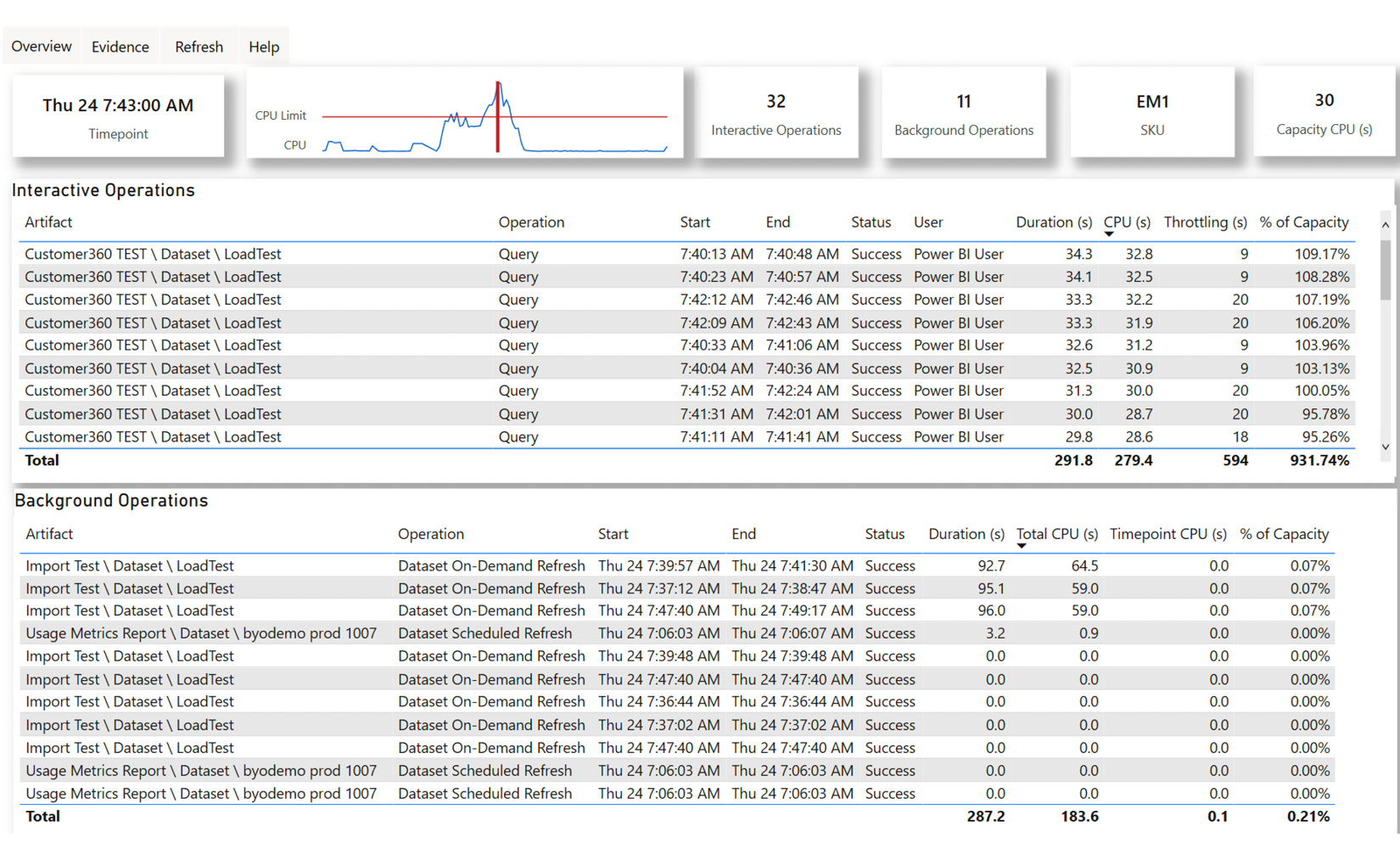
Figure 13.14 – Timepoint Detail for the 7:43 A.M. evaluation cycle
Next, we will investigate the Evidence page, as shown in the following screenshot. This page is scoped to overloaded artifacts and only shows data if an overload has occurred. This page offers an Overloading score per artifact. You will notice in our example that the top three artifacts all experienced overloaded minutes in the same range of around 15 to 23 minutes. However, notice that the Overloading score for Customer360 TEST is about 200,000 compared to only a few hundred for the other two. The absolute value of the score is meaningless. It is computed by considering how frequently the artifact contributed to overloads and how severe the load was. You should tackle the artifacts with the highest relative score first. In our case, since we saw so much query activity on this dataset and cannot change the background load, we could consider moving the dataset to a different capacity or scaling up:
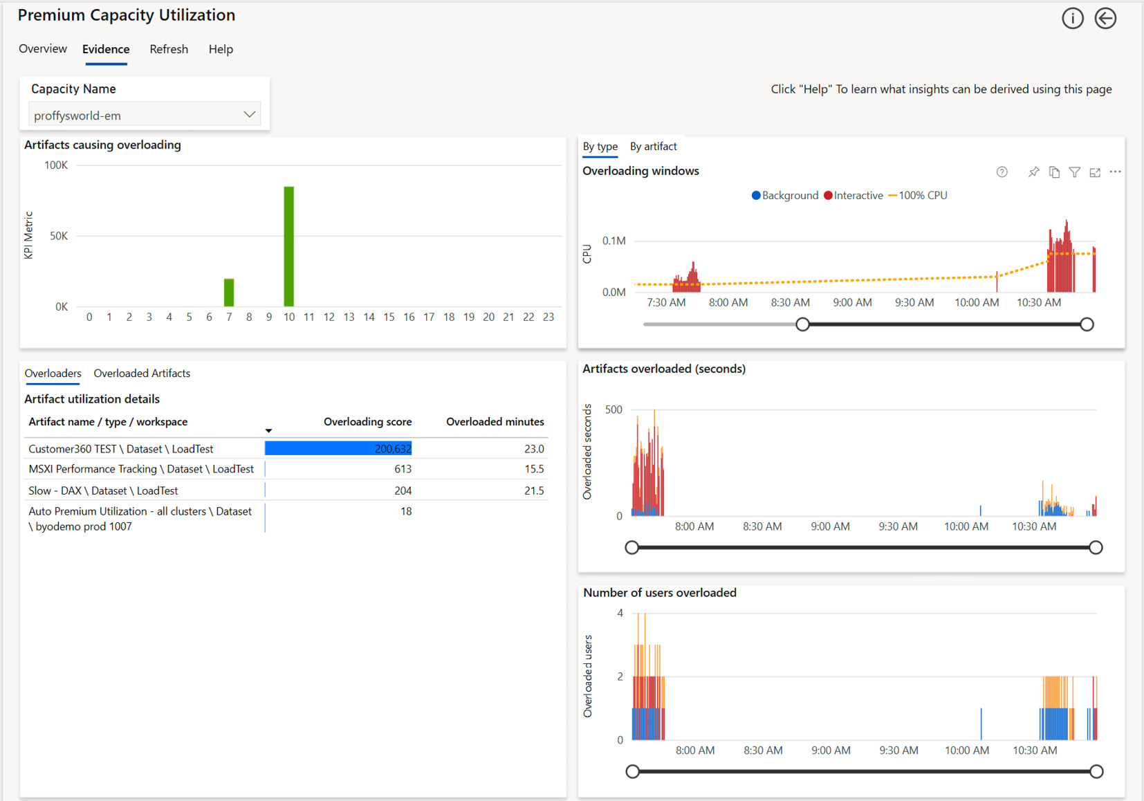
Figure 13.15 – The Evidence page focusing on the artifacts involved in the overload
The only remaining page to consider is the Refresh page, as shown in the following screenshot. It can be reached by drilling from an artifact in a visual, or by accessing it directly from the navigation links. In the latter case, it will cover all artifacts, which is what we will show in the example that follows. You can use this page to understand refresh load by day or hour by artifact.
We suggest using the Duration (s) and Ratio metrics from the table to work out the best candidates for further investigation. You want to optimize the longest-running refreshes that have the highest ratio, which is the CPU used divided by the duration. Optimizing here can mean improving the performance of the M queries and/or changing schedules or capacities:
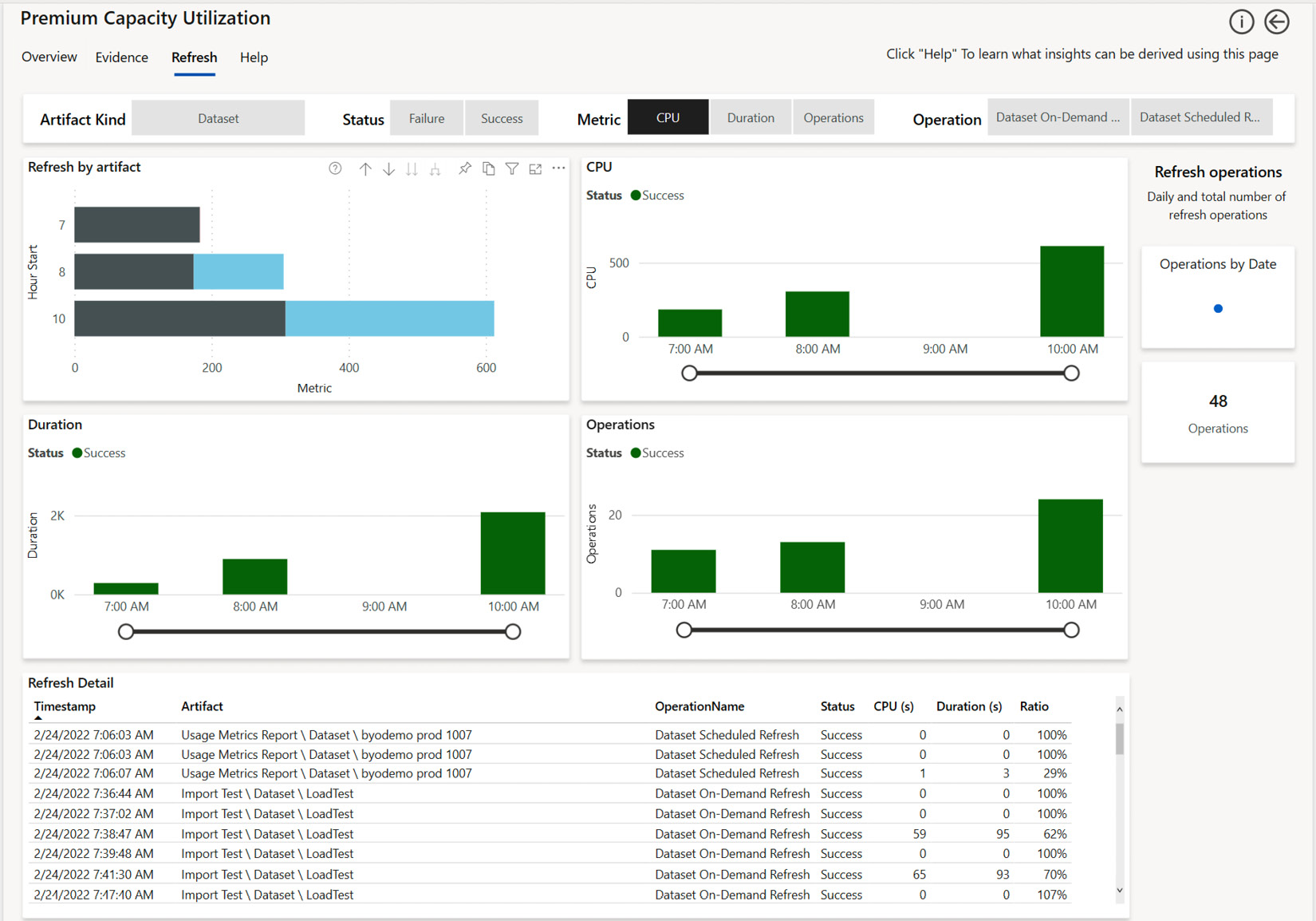
Figure 13.16 – The Refresh page showing trends and individual details of each refresh
We will conclude this section by looking at the 10:00 A.M period onwards when we had one and then four Autoscale cores available. Even with Autoscale, we did experience some overload initially. This can be seen in the following screenshot, where it's represented by the second bar in the Overloaded minutes per hour visual. We will use the Timepoint Detail page to make some observations on capacity behavior and tie it back to the tests we performed.
The following screenshot includes a tooltip that shows that we had about 153% usage in the 10:44:00 AM cycle. Here, we can see that some queries did experience throttling but notice how the numbers are all around 8 or 9 seconds. Compare this to Figure 13.14, where we had delays of 20 seconds for the same dataset. Let's explain what is happening here. Before 10.44 A.M., we can see an increase in activity. As we reached the total 150% CPU that's available with the extra core, the system injected some delays while it was allocating more cores. This is because the available cores are not used until they need to help with overloads:
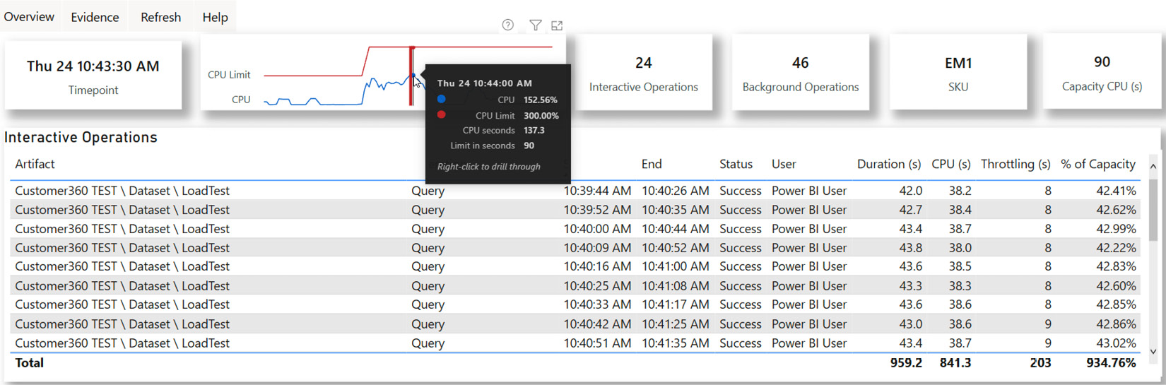
Figure 13.17 – Timepoint Detail showing the load pattern with one Autoscale v-core active
Now, we will look at a slightly later period. We will focus on the 10:56:30 AM time point in the following screenshot. Observe that the same queries are no longer throttled. Even though the generated load was less than 100% here, we would not expect any throttling:
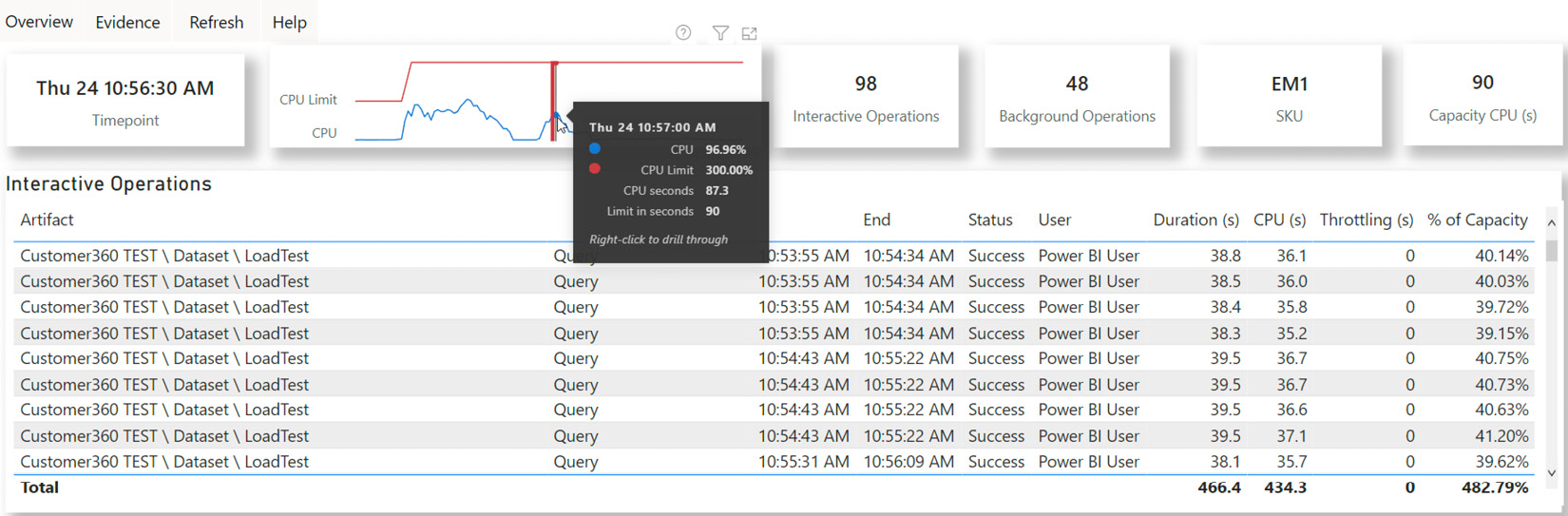
Figure 13.18 – Timepoint Detail showing the load pattern with four Autoscale v-cores active
We are almost ready to review what we've investigated and the actions to take when using the capacity metrics app.
Important Note
The actions that we will describe here assume that the architecture, datasets, RLS, data transformations, and reports have already been optimized. All too often, people choose to increase capacity to solve performance issues. This incurs cost and should not be the first choice unless you are confident that your content cannot be improved much. It is reasonable to scale temporarily to unblock users while working on performance improvements in parallel. Another argument against always scaling first is that it does not promote recommended design practices and performance governance.
If you suspect that you need to optimize content, we recommend focusing on the most popular datasets and reports that have the worst performance relative to others in the capacity. This reduces the CPU and memory load and frees up more capacity. Also, improve the longest-running refreshes that have a high proportion of background CPU usage. The guidance that was provided in the previous chapters can help you here.
Let's summarize this section with some guidance on the steps you should take when you see overloads in a report:
- Begin by identifying the largest artifacts that contribute to overloading, with an emphasis on those that are used by a higher proportion of users.
- Look at the trends for the artifacts to see if this problem is isolated or periodic. Also, check if there is a visible increase in activity, users, or overloaded minutes over time. Gradual uptrends are an indication of organic growth, which could lead to a decision to scale up or out.
- Investigate the periods of high load to see what other activity is occurring on the capacity. You may be able to identify interactive usage peaks in the same periods across different datasets. You could move some busy artifacts to a capacity with more available resources or choose to increase the capacity's size or enable Autoscale.
Note
Embedded A SKUs are PaaS services that are purchased and billed through Azure. They support native integration with Azure Log Analytics. This integration is an alternate source of capacity activity and provides near-real-time traces and metrics, such as those available from Log Analytics for Azure Analysis Services. The Embedded Gen2 version has been modernized and contains more data points, but there is no associated reporting, and you will bear the Azure costs and maintenance effort. You can find out more about setting this up here: https://docs.microsoft.com/power-bi/developer/embedded/monitor-power-bi-embedded-reference.
Now, let's summarize what we've learned in this chapter.
Summary
In this chapter, we have come closer to the end of our journey of performance optimization in Power BI. We focused on reserved capacities that are available as Power BI Premium and Embedded offerings. We learned that you could purchase and license the offerings differently, but that they share most functionality across SKUs. This means that the same performance optimization guidance applies to capacities consistently.
We introduced Power BI Premium and covered the unique features it offers that help with performance and scaling large datasets. Then, we introduced Gen2, which is the latest and now default offering from Microsoft. Since Gen2 is Generally Available, we did not cover the previous generation due to huge improvements in design and reduced maintenance. After that, we took a brief look at capacity settings such as query timeouts and refresh intervals, which you can use to prevent expensive operations from severely affecting the capacity.
Then, we discussed how Gen2 has a different model for evaluating capacity load and how the memory limits have changed to provide better scalability, especially with data refresh. This included learning how a capacity can delay requests in an overloaded state.
For overload situations, we suggested that Autoscale would be a great option to avoid capacity resource starvation, while not having to pay for extra capacity upfront. You learned how the capacity gauges load in 30-second evaluation cycles. These cycles look at the sum of activity from all the operations in that period to determine if an overload has occurred. An overload occurs when the CPU time that's required by the operations in the 30-second window is more than the allocated v-cores can support.
Next, we looked at capacity planning and showed you how to determine the initial capacity size using estimates regarding the dataset's size, refresh frequency, and other metrics. We introduced the load testing suites based on PowerShell that Microsoft publishes, including limitations and caveats. We showed how to use these tools to simulate continuous maximum load with many reports being open at once. We also described how to use the testing tool to simulate more realistic scenarios involving slicers, filters, page changes, and bookmark usage.
We concluded this chapter by learning about monitoring capacities. First, we introduced the alerting settings you can use to notify administrators when the capacity reaches the resource thresholds, Autoscale cores are assigned, or when they reach the maximum. Then, we described how to provision a small EM1 capacity to perform load testing and how to generate the load over a few hours. We introduced the Premium Capacity Metrics and Utilization app and showed how it can be used to identify high-level capacity overload issues and which artifacts and operations contributed. We also showed how to interact and drill to get a lot of useful information about artifact behavior and the impact of overloads.
After that, we suggested how to approach capacity scaling and optimization and stressed that underperforming solutions should be carefully reviewed and optimized for performance instead of always relying on scaling up or out. Forcing this governance is the point of this book, and it can improve your solution's quality in general. However, something that's more important for some organizations is that it can also save you money by only scaling when necessary. The main point was to look for patterns such as trends and periodicity and work out what else was happening on the capacity in that period to figure out which workload, artifact, and operations contributed most.
In the next and final chapter of this book, we will learn how to optimize the process of embedding Power BI content in custom web applications.