
6
Population Genetics
Population genetics is the study of the changes in the frequency of alleles in a population on the basis of selection, drift, mutation, and migration. The previous chapters focused mainly on data processing and cleanup; this is the first chapter in which we will actually infer interesting biological results.
There is a lot of interesting population genetics analysis based on sequence data, but as we already have quite a few recipes for dealing with sequence data, we will divert our attention elsewhere. Also, we will not cover genomic structural variations such as Copy Number Variations (CNVs) or inversions here. We will concentrate on analyzing SNP data, which is one of the most common data types. We will perform many standard population genetic analyses with Python, such as using the Fixation Index (FST) with computing F-statistics, Principal Components Analysis (PCA), and studying population structure.
We will use Python mostly as a scripting language that glues together applications that perform necessary computations, which is the old-fashioned way of doing things. Having said that, as the Python software ecology is still evolving, you can at least perform the PCA in Python using scikit-learn as we will see in Chapter 11.
There is no such thing as a default file format for population genetics data. The bleak reality of this field is that there is a plenitude of formats, most of them developed with a specific application in mind; therefore, none are generically applicable. Some of the efforts to create a more general format (or even just a file converter to support many formats) had limited success. Furthermore, as our knowledge of genomics increases, we will require new formats anyway (for example, to support some kind of previously unknown genomic structural variation). Here, we will work with PLINK (https://www.cog-genomics.org/plink/2.0/), which was originally developed to perform Genome-Wide Association Studies (GWAS) with human data but has many more applications. If you have Next-Generation Sequencing (NGS) data, you may question, why not use the Variant Call Format (VCF)? Well, a VCF file is normally annotated to help with sequencing analysis, which you do not need at this stage (you should now have a filtered dataset). If you convert your Single-Nucleotide Polymorphism (SNP) calls from VCF to PLINK, you will get roughly a 95 percent reduction in terms of size (this is in comparison to a compressed VCF). More importantly, the computational cost of processing a VCF file is much bigger (think of processing all this highly structured text) than the cost of the other two formats. If you use Docker, use the image tiagoantao/bioinformatics_popgen.
In this chapter, we will cover the following recipes:
- Managing datasets with PLINK
- Using sgkit for population genetics analysis with xarray
- Exploring a dataset with sgkit
- Analyzing population structure
- Performing a PCA
- Investigating population structure with admixture
First, let’s start with a discussion on file format issues and then continue to discuss interesting data analysis.
Managing datasets with PLINK
Here, we will manage our dataset using PLINK. We will create subsets of our main dataset (from the HapMap project) that are suitable for analysis in the following recipes.
Warning
Note that neither PLINK nor any similar programs were developed for their file formats. There was probably no objective to create a default file standard for population genetics data. In this field, you will need to be ready to convert from format to format (for this, Python is quite appropriate) because every application that you will use will probably have its own quirky requirements. The most important point to learn from this recipe is that it’s not formats that are being used, although these are relevant, but a ‘file conversion mentality’. Beyond this, some of the steps in this recipe also convey genuine analytical techniques that you may want to consider using, for example, subsampling or Linkage Disequilibrium- (LD-) pruning.
Getting ready
Throughout this chapter, we will use data from the International HapMap Project. You may recall that we used data from the 1,000 Genomes Project in Chapter 3, Next-Generation Sequencing, and that the HapMap project is in many ways the precursor to the 1,000 Genomes Project; instead of whole genome sequencing, genotyping was used. Most of the samples of the HapMap project were used in the 1,000 Genomes Project, so if you have read the recipes in Chapter 3, Next-Generation Sequencing, you will already have an idea of the dataset (including the available population). I will not introduce the dataset much more, but you can refer to Chapter 3, Next-Generation Sequencing, and, of course, the HapMap site (https://www.genome.gov/10001688/international-hapmap-project) for more information. Remember that we have genotyping data for many individuals split across populations around the globe. We will refer to these populations by their acronyms. Here is the list taken from http://www.sanger.ac.uk/resources/downloads/human/hapmap3.html:
|
Acronym |
Population |
|
ASW |
African ancestry in Southwest USA |
|
CEU |
Utah residents with Northern and Western European ancestry from the CEPH collection |
|
CHB |
Han Chinese in Beijing, China |
|
CHD |
Chinese in Metropolitan Denver, Colorado |
|
GIH |
Gujarati Indians in Houston, Texas |
|
JPT |
Japanese in Tokyo, Japan |
|
LWK |
Luhya in Webuye, Kenya |
|
MXL |
Mexican ancestry in Los Angeles, California |
|
MKK |
Maasai in Kinyawa, Kenya |
|
TSI |
Toscani in Italy |
|
YRI |
Yoruba in Ibadan, Nigeria |
Table 6.1 - The populations in the Genome Project
Note
We will be using data from the HapMap project that has, in practice, been replaced by the 1,000 Genomes Project. For the purpose of teaching population genetics programming techniques in Python, the HapMap Project dataset is more manageable than the 1,000 Genomes Project, as the data is considerably smaller. The HapMap samples are a subset of the 1,000 Genomes samples. If you do research in human population genetics, you are strongly advised to use the 1,000 Genomes Project as a base dataset.
This will require a fairly big download (approximately 1 GB), which will have to be uncompressed. Make sure that you have approximately 20 GB of disk space for this chapter. The files can be found at https://ftp.ncbi.nlm.nih.gov/hapmap/genotypes/hapmap3_r3/plink_format/.
Decompress the PLINK file using the following commands:
bunzip2 hapmap3_r3_b36_fwd.consensus.qc.poly.map.gz
bunzip2 hapmap3_r3_b36_fwd.consensus.qc.poly.ped.gz
Now, we have PLINK files; the MAP file has information on the marker position across the genome, whereas the PED file has actual markers for each individual, along with some pedigree information. We also downloaded a metadata file that contains information about each individual. Take a look at all these files and familiarize yourself with them. As usual, this is also available in the Chapter06/Data_Formats.py Notebook file, where everything has been taken care of.
Finally, most of this recipe will make heavy usage of PLINK (https://www.cog-genomics.org/plink/2.0/). Python will mostly be used as the glue language to call PLINK.
How to do it...
Take a look at the following steps:
- Let’s get the metadata for our samples. We will load the population of each sample and note all the individuals that are offspring of others in the dataset:
from collections import defaultdict
f = open('relationships_w_pops_041510.txt')
pop_ind = defaultdict(list)
f.readline() # header
offspring = []
for l in f:
toks = l.rstrip().split(' ')
fam_id = toks[0]
ind_id = toks[1]
mom = toks[2]
dad = toks[3]
if mom != '0' or dad != '0':
offspring.append((fam_id, ind_id))
pop = toks[-1]
pop_ind[pop].append((fam_id, ind_id))
f.close()
This will load a dictionary where the population is the key (CEU, YRI, and so on) and its value is the list of individuals in that population. This dictionary will also store information on whether the individual is the offspring of another. Each individual is identified by the family and individual ID (information that can be found in the PLINK file). The file provided by the HapMap project is a simple tab-delimited file, which is not difficult to process. While we are reading the files using standard Python text processing, this is a typical example where pandas would help.
There is an important point to make here: the reason this information is provided in a separate, ad hoc file is that the PLINK format makes no provision for the population structure (this format makes provision only for the case and control information for which PLINK was designed). This is not a flaw of the format, as it was never designed to support standard population genetic studies (it’s a GWAS tool). However, this is a general feature of data formats in population genetics: whichever you end up working with, there will be something important missing.
We will use this metadata in other recipes in this chapter. We will also perform some consistency analysis between the metadata and the PLINK file, but we will defer this to the next recipe.
- Now, let’s subsample the dataset at 10 percent and 1 percent of the number of markers, as follows:
import os
os.system('plink2 --pedmap hapmap3_r3_b36_fwd.consensus.qc.poly --out hapmap10 --thin 0.1 --geno 0.1 --export ped')
os.system('plink2 --pedmap hapmap3_r3_b36_fwd.consensus.qc.poly --out hapmap1 --thin 0.01 --geno 0.1 --export ped')
With Jupyter Notebook, you can just do this instead:
!plink2 --pedmap hapmap3_r3_b36_fwd.consensus.qc.poly --out hapmap10 --thin 0.1 --geno 0.1 --export ped
!plink2 --pedmap hapmap3_r3_b36_fwd.consensus.qc.poly --out hapmap1 --thin 0.01 --geno 0.1 --export ped
Note the subtlety that you will not really get 1 or 10 percent of the data; each marker will have a 1 or 10 percent chance of being selected, so you will get approximately 1 or 10 percent of the markers.
Obviously, as the process is random, different runs will produce different marker subsets. This will have important implications further down the road. If you want to replicate the exact same result, you can nonetheless use the --seed option.
We will also remove all SNPs that have a genotyping rate lower than 90 percent (with the --geno 0.1 parameter).
Note
There is nothing special about Python in this code, but there are two reasons you may want to subsample your data. First, if you are performing an exploratory analysis of your own dataset, you may want to start with a smaller version because it will be easy to process. Also, you will have a broader view of your data. Second, some analytical methods may not require all your data (indeed, some methods might not be even able to use all of your data). Be very careful with the last point though; that is, for every method that you use to analyze your data, be sure that you understand the data requirements for the scientific questions you want to answer. Feeding too much data may be okay normally (even if you pay a time and memory penalty) but feeding too little will lead to unreliable results.
- Now, let’s generate subsets with just the autosomes (that is, let’s remove the sex chromosomes and mitochondria), as follows:
def get_non_auto_SNPs(map_file, exclude_file):
f = open(map_file)
w = open(exclude_file, 'w')
for l in f:
toks = l.rstrip().split(' ')
try:
chrom = int(toks[0])
except ValueError:
rs = toks[1]
w.write('%s ' % rs)
w.close()
get_non_auto_SNPs('hapmap1.map', 'exclude1.txt')
get_non_auto_SNPs('hapmap10.map', 'exclude10.txt')
os.system('plink2 –-pedmap hapmap1 --out hapmap1_auto --exclude exclude1.txt --export ped')
os.system('plink2 --pedmap hapmap10 --out hapmap10_auto --exclude exclude10.txt --export ped')
- Let’s create a function that generates a list with all the SNPs not belonging to autosomes. With human data, that means all non-numeric chromosomes. If you use another species, be careful with your chromosome coding because PLINK is geared toward human data. If your species are diploid, have less than 23 autosomes, and a sex determination system, that is, X/Y, this will be straightforward; if not, refer to https://www.cog-genomics.org/plink2/input#allow_extra_chr for some alternatives (such as the --allow-extra-chr flag).
- We then create autosome-only PLINK files for subsample datasets of 10 and 1 percent (prefixed as hapmap10_auto and hapmap1_auto).
- Let’s create some datasets without offspring. These will be needed for most population genetic analysis, which requires unrelated individuals to a certain degree:
os.system('plink2 --pedmap hapmap10_auto --filter-founders --out hapmap10_auto_noofs --export ped')
Note
This step is representative of the fact that most population genetic analyses require samples to be unrelated to a certain degree. Obviously, as we know that some offspring are in HapMap, we remove them.
However, note that with your dataset, you are expected to be much more refined than this. For instance, run plink --genome or use another program to detect related individuals. The fundamental point here is that you have to dedicate some effort to detect related individuals in your samples; this is not a trivial task.
- We will also generate an LD-pruned dataset, as required by many PCA and admixture algorithms, as follows:
os.system('plink2 --pedmap hapmap10_auto_noofs --indep-pairwise 50 10 0.1 --out keep --export ped')
os.system('plink2 --pedmap hapmap10_auto_noofs --extract keep.prune.in --recode --out hapmap10_auto_noofs_ld --export ped')
The first step generates a list of markers to be kept if the dataset is LD-pruned. This uses a sliding window of 50 SNPs, advancing by 10 SNPs at a time with a cut value of 0.1. The second step extracts SNPs from the list that was generated earlier.
- Let’s recode a couple of cases in different formats:
os.system('plink2 --file hapmap10_auto_noofs_ld --recode12 tab --out hapmap10_auto_noofs_ld_12 --export ped 12')
os.system('plink2 --make-bed --file hapmap10_auto_noofs_ld --out hapmap10_auto_noofs_ld')
The first operation will convert a PLINK format that uses nucleotide letters from the ACTG to another, which recodes alleles with 1 and 2. We will use this in the Performing a PCA recipe later.
The second operation recodes a file in a binary format. If you work inside PLINK (using the many useful operations that PLINK has), the binary format is probably the most appropriate format (offering, for example, a smaller file size). We will use this in the admixture recipe.
- We will also extract a single chromosome (2) for analysis. We will start with the autosome dataset, which has been subsampled at 10 percent:
os.system('plink2 --pedmap hapmap10_auto_noofs --chr 2 --out hapmap10_auto_noofs_2 --export ped')
There’s more...
There are many reasons why you might want to create different datasets for analysis. You may want to perform some fast initial exploration of data – for example, if the analysis algorithm that you plan to use has some data format requirements or a constraint on the input, such as the number of markers or relationships between individuals. Chances are that you will have lots of subsets to analyze (unless your dataset is very small to start with, for instance, a microsatellite dataset).
This may seem to be a minor point, but it’s not: be very careful with file naming (note that I have followed some simple conventions while generating filenames). Make sure that the name of the file gives some information about the subset options. When you perform the downstream analysis, you will want to be sure that you choose the correct dataset; you will want your dataset management to be agile and reliable, above all. The worst thing that can happen is that you create an analysis with an erroneous dataset that does not obey the constraints required by the software.
The LD-pruning that we used is somewhat standard for human analysis, but be sure to check the parameters, especially if you are using non-human data.
The HapMap file that we downloaded is based on an old version of the reference genome (build 36). As stated in the previous chapter, Chapter 5, Working with Genomes, be sure to use annotations from build 36 if you plan to use this file for more analysis of your own.
This recipe sets the stage for the following recipes and its results will be used extensively.
See also
- The Wikipedia page http://en.wikipedia.org/wiki/Linkage_disequilibrium on LD is a good place to start.
- The website of PLINK https://www.cog-genomics.org/plink/2.0/ is very well documented, something lacking in much of genetics software.
Using sgkit for population genetics analysis with xarray
Sgkit is the most advanced Python library for doing population genetics analysis. It’s a modern implementation, leveraging almost all of the fundamental data science libraries in Python. When I say almost all, I am not exaggerating; it uses NumPy, pandas, xarray, Zarr, and Dask. NumPy and pandas were introduced in Chapter 2. Here, we will introduce xarray as the main data container for sgkit. Because I feel that I cannot ask you to get to know data engineering libraries to an extreme level, I will gloss over the Dask part (mostly by treating Dask structures as equivalent NumPy structures). You can find more advanced details about out-of-memory Dask data structures in Chapter 11.
Getting ready
You will need to run the previous recipe because its output is required for this one: we will be using one of the PLINK datasets. You will need to install sgkit.
As usual, this is available in the Chapter06/Sgkit.py Notebook file, but it will still require you to run the previous Notebook file in order to generate the required files.
How to do it...
Take a look at the following steps:
- Let’s load the hapmap10_auto_noofs_ld dataset generated in the previous recipe:
import numpy as np
from sgkit.io import plink
data = plink.read_plink(path='hapmap10_auto_noofs_ld', fam_sep=' ')
Remember that we are loading a set of PLINK files. It turns out that sgkit creates a very rich and structured representation for that data. That representation is based on an xarray dataset.
- Let’s check the structure of our data – if you are in a notebook, just enter the following:
data
sgkit – if in a notebook – will generate the following representation:
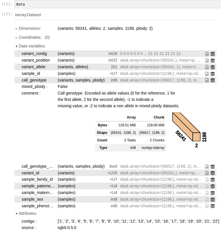
Figure 6.1 - An overview of the xarray data loaded by sgkit for our PLINK file
data is an xarray DataSet. An xarray DataSet is essentially a dictionary in which each value is a Dask array. For our purposes, you can assume it is a NumPy array. In this case, we can see that we have 56241 variants for 1198 samples. We have 2 alleles per variant and a ploidy of 2.
In the notebook, we can expand each entry. In our case, we expanded call_genotype. This is a three-dimensional array, with variants, samples, and ploidy dimensions. The type of the array is int8. After this, we can find some metadata relevant to the entry, mixed_ploidy, and comment. Finally, you have a summary of the Dask implementation. The Array column presents details about the size and shape of the array. For the Chunk column, see Chapter 11 – but you can safely ignore it for now.
- Another way to get summary information, which is especially useful if you are not using notebooks, is by inspecting the dims field:
print(data.dims)
The output should be self-explanatory:
Frozen({'variants': 56241, 'alleles': 2, 'samples': 1198, 'ploidy': 2})
- Let’s extract some information about the samples:
print(len(data.sample_id.values))
print(data.sample_id.values)
print(data.sample_family_id.values)
print(data.sample_sex.values)
The output is as follows:
1198
['NA19916' 'NA19835' 'NA20282' ... 'NA18915' 'NA19250' 'NA19124']
['2431' '2424' '2469' ... 'Y029' 'Y113' 'Y076']
[1 2 2 ... 1 2 1]
We have 1198 samples. The first one has a sample ID of NA19916, a family ID of 2431, and a sex of 1 (Male). Remember that, given PLINK as the data source, a sample ID is not enough to be a primary key (you can have different samples with the same sample ID). The primary key is a composite of the sample ID and sample family ID.
TIP
You might have noticed that we add .values to all the data fields: this is actually rendering a lazy Dask array into a materialized NumPy one. For now, I suggest that you ignore it, but if you revisit this chapter after reading Chapter 11, .values is akin to the compute method in Dask.
The .values call is no nuisance – the reason our code works is that our dataset is small enough to fit into memory, which is great for our teaching example. But if you have a very large dataset, the preceding code is too naive. Again, Chapter 11 will help you with this. For now, the simplicity is pedagogical.
- Before we look at the variant data, we have to be aware of how sgkit stores contigs:
print(data.contigs)
The output is as follows:
['1', '2', '3', '4', '5', '6', '7', '8', '9', '10', '11', '12', '13', '14', '15', '16', '17', '18', '19', '20', '21', '22']
The contigs here are the human autosomes (you will not be so lucky if your data is based on most other species – you will probably have some ugly identifier here).
- Now, let’s look at the variants:
print(len(data.variant_contig.values))
print(data.variant_contig.values)
print(data.variant_position.values)
print(data.variant_allele.values)
print(data.variant_id.values)
Here is an abridged version of the output:
56241
[ 0 0 0 ... 21 21 21]
[ 557616 782343 908247 ... 49528105 49531259 49559741]
[[b'G' b'A']
...
[b'C' b'A']]
['rs11510103' 'rs2905036' 'rs13303118' ... 'rs11705587' 'rs7284680'
'rs2238837']
We have 56241 variants. The contig index is 0, which if you look at the step from the previous recipe, is chromosome 1. The variant is in position 557616 (against build 36 of the human genome) and has possible alleles G and A. It has an SNP ID of rs11510103.
- Finally, let’s look at the genotype data:
call_genotype = data.call_genotype.values
print(call_genotype.shape)
first_individual = call_genotype[:,0,:]
first_variant = call_genotype[0,:,:]
first_variant_of_first_individual = call_genotype[0,0,:]
print(first_variant_of_first_individual)
print(data.sample_family_id.values[0], data.sample_id.values[0])
print(data.variant_allele.values[0])
call_genotype has a shape of 56,241 x 1,1198,2, which is its dimensioned variants, samples, and ploidy.
To get all variants for the first individual, you fixate the second dimension. To get all the samples for the first variant, you fixate the first dimension.
If you print the first individual’s details (sample and family ID), you get 2431 and NA19916 – as expected, exactly as in the first case in the previous sample exploration.
There’s more...
This recipe is mostly an introduction to xarray, disguised as a sgkit tutorial. There is much more to be said about xarray – be sure to check https://docs.xarray.dev/. It is worth reiterating that xarray depends on a plethora of Python data science libraries and that we are glossing over Dask for now.
Exploring a dataset with sgkit
In this recipe, we will perform an initial exploratory analysis of one of our generated datasets. Now that we have some basic knowledge of xarray, we can actually try to do some data analysis. In this recipe, we will ignore population structure, an issue we will return to in the following one.
Getting ready
You will need to have run the first recipe and should have the hapmap10_auto_noofs_ld files available. There is a Notebook file with this recipe called Chapter06/Exploratory_Analysis.py. You will need the software that you installed for the previous recipe.
How to do it...
Take a look at the following steps:
- We start by loading the PLINK data with sgkit, exactly as in the previous recipe:
import numpy as np
import xarray as xr
import sgkit as sg
from sgkit.io import plink
data = plink.read_plink(path='hapmap10_auto_noofs_ld', fam_sep=' ')
- Let’s ask sgkit for variant_stats:
variant_stats = sg.variant_stats(data)
variant_stats
The output is the following:
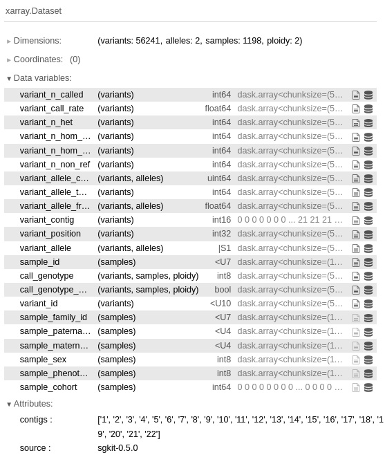
Figure 6.2 - The variant statistics provided by sgkit’s variant_stats
- Let’s now look at the statistic, variant_call_rate:
variant_stats.variant_call_rate.to_series().describe()
There is more to unpack here than it may seem. The fundamental part is the to_series() call. Sgkit is returning a Pandas series to you – remember that sgkit is highly integrated with Python data science libraries. After you get the Series object, you can call the Pandas describe function and get the following:
count 56241.000000
mean 0.997198
std 0.003922
min 0.964107
25% 0.996661
50% 0.998331
75% 1.000000
max 1.000000
Name: variant_call_rate, dtype: float64
Our variant call rate is quite good, which is not shocking because we are looking at array data – you would have worse numbers if you had a dataset based on NGS.
- Let’s now look at sample statistics:
sample_stats = sg.sample_stats(data)
sample_stats
Again, sgkit provides a lot of sample statistics out of the box:
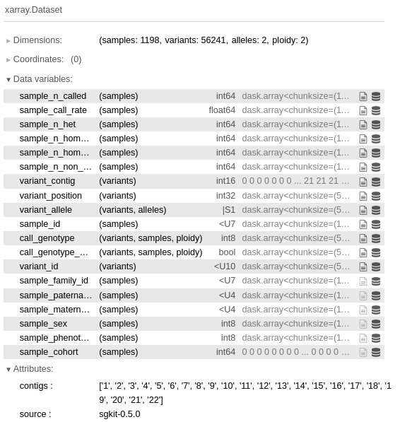
Figure 6.3 - The sample statistics obtained by calling sample_stats
This time, we plot a histogram of sample call rates. Again, sgkit gets this for free by leveraging Pandas:
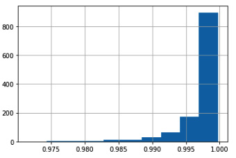
Figure 6.4 - The histogram of sample call rates
There’s more...
The truth is that for population genetic analysis, nothing beats R; you are definitely encouraged to take a look at the existing R libraries for population genetics. Do not forget that there is a Python-R bridge, which was discussed in Chapter 1, Python and the Surrounding Software Ecology.
Most of the analysis presented here will be computationally costly if done on bigger datasets. Indeed, sgkit is prepared to deal with that because it leverages Dask. It would be too complex to introduce Dask at this stage, but for large datasets, Chapter 11 will discuss ways to address those.
See also
- A list of R packages for statistical genetics is available at http://cran.r-project.org/web/views/Genetics.html.
- If you need to know more about population genetics, I recommend the book Principles of Population Genetics, by Daniel L. Hartl and Andrew G. Clark, Sinauer Associates.
Analyzing population structure
Previously, we introduced data analysis with sgkit ignoring the population structure. Most datasets, including the one we are using, actually do have a population structure. Sgkit provides functionality to analyze genomic datasets with population structure and that is what we are going to investigate here.
Getting ready
You will need to have run the first recipe, and should have the hapmap10_auto_noofs_ld data we produced and also the original population meta data relationships_w_pops_041510.txt file downloaded. There is a Notebook file with the 06_PopGen/Pop_Stats.py recipe in it.
How to do it...
Take a look at the following steps:
- First, let’s load the PLINK data with sgkit:
from collections import defaultdict
from pprint import pprint
import numpy as np
import matplotlib.pyplot as plt
import seaborn as sns
import pandas as pd
import xarray as xr
import sgkit as sg
from sgkit.io import plink
data = plink.read_plink(path='hapmap10_auto_noofs_ld', fam_sep=' ')
- Now, let’s load the data assigning individuals to populations:
f = open('relationships_w_pops_041510.txt')
pop_ind = defaultdict(list)
f.readline() # header
for line in f:
toks = line.rstrip().split(' ')
fam_id = toks[0]
ind_id = toks[1]
pop = toks[-1]
pop_ind[pop].append((fam_id, ind_id))
pops = list(pop_ind.keys())
We end up with a dictionary, pop_ind, where the key is the population code, and the value is a list of samples. Remember that a sample primary key is the family ID and the sample ID.
We also have a list of populations in the pops variable.
- We now need to inform sgkit about to which population or cohort each sample belongs:
def assign_cohort(pops, pop_ind, sample_family_id, sample_id):
cohort = []
for fid, sid in zip(sample_family_id, sample_id):
processed = False
for i, pop in enumerate(pops):
if (fid, sid) in pop_ind[pop]:
processed = True
cohort.append(i)
break
if not processed:
raise Exception(f'Not processed {fid}, {sid}')
return cohort
cohort = assign_cohort(pops, pop_ind, data.sample_family_id.values, data.sample_id.values)
data['sample_cohort'] = xr.DataArray(
cohort, dims='samples')
Remember that each sample in sgkit has a position in an array. So, we have to create an array where each element refers to a specific population or cohort within a sample. The assign_cohort function does exactly that: it takes the metadata that we loaded from the relationships file and the list of samples from the sgkit file, and gets the population index for each sample.
- Now that we have loaded population information structure into the sgkit dataset, we can start computing statistics at the population or cohort level. Let’s start by getting the number of monomorphic loci per population:
cohort_allele_frequency = sg.cohort_allele_frequencies(data)['cohort_allele_frequency'].values
monom = {}
for i, pop in enumerate(pops):
monom[pop] = len(list(filter(lambda x: x, np.isin(cohort_allele_frequency[:, i, 0], [0, 1]))))
pprint(monom)
We start by asking sgkit to calculate the allele frequencies per cohort or population. After that, we filter all loci per population where the allele frequency of the first allele is either 0 or 1 (that is, there is the fixation of one of the alleles). Finally, we print it. Incidentally, we use the pprint.pprint function to make it look a bit better (the function is quite useful for more complex structures if you want to render the output in a readable way):
{'ASW': 3332,
'CEU': 8910,
'CHB': 11130,
'CHD': 12321,
'GIH': 8960,
'JPT': 13043,
'LWK': 3979,
'MEX': 6502,
'MKK': 3490,
'TSI': 8601,
'YRI': 5172}
- Let’s get the minimum allele frequency for all loci per population. This is still based in cohort_allele_frequency – so no need to call sgkit again:
mafs = {}
for i, pop in enumerate(pops):
min_freqs = map(
lambda x: x if x < 0.5 else 1 - x,
filter(
lambda x: x not in [0, 1],
cohort_allele_frequency[:, i, 0]))
mafs[pop] = pd.Series(min_freqs)
We create Pandas Series objects for each population, as this permits lots of helpful functions, such as plotting.
- We will now print the MAF histograms for the YRI and JPT populations. We will leverage Pandas and Matplotlib for this:
maf_plot, maf_ax = plt.subplots(nrows=2, sharey=True)
mafs['YRI'].hist(ax=maf_ax[0], bins=50)
maf_ax[0].set_title('*YRI*')
mafs['JPT'].hist(ax=maf_ax[1], bins=50)
maf_ax[1].set_title('*JPT*')
maf_ax[1].set_xlabel('MAF')
We get Pandas to generate the histograms and put the results in a Matplotlib plot. The result is the following:
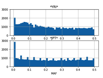
Figure 6.5 - A MAF histogram for the YRI and JPT populations
- We are now going to concentrate on computing the FST. The FST is a widely used statistic that tries to represent the genetic variation created by population structure. Let’s compute it with sgkit:
fst = sg.Fst(data)
fst = fst.assign_coords({"cohorts_0": pops, "cohorts_1": pops})
The first line computes fst, which, in this case, will be pairwise fst across cohorts or populations. The second line assigns names to each cohorts by using the xarray coordinates feature. This makes it easier and more declarative.
- Let’s compare fst between the CEU and CHB populations with CHB and CHD:
remove_nan = lambda data: filter(lambda x: not np.isnan(x), data)
ceu_chb = pd.Series(remove_nan(fst.stat_Fst.sel(cohorts_0='CEU', cohorts_1='CHB').values))
chb_chd = pd.Series(remove_nan(fst.stat_Fst.sel(cohorts_0='CHB', cohorts_1='CHD').values))
ceu_chb.describe()
chb_chd.describe()
We take the pairwise results returned by the sel function from stat_FST to both compare and create a Pandas Series with it. Note that we can refer to populations by name, as we have prepared the coordinates in the previous step.
- Let’s plot the distance matrix across populations based on the multi-locus pairwise FST. Before we do it, we will prepare the computation:
mean_fst = {}
for i, pop_i in enumerate(pops):
for j, pop_j in enumerate(pops):
if j <= i:
continue
pair_fst = pd.Series(remove_nan(fst.stat_Fst.sel(cohorts_0=pop_i, cohorts_1=pop_j).values))
mean = pair_fst.mean()
mean_fst[(pop_i, pop_j)] = mean
min_pair = min(mean_fst.values())
max_pair = max(mean_fst.values())
We compute all the FST values for the population pairs. The execution of this code will be demanding in terms of time and memory, as we are actually requiring Dask to perform a lot of computations to render our NumPy arrays.
- We can now do a pairwise plot of all mean FSTs across populations:
sns.set_style("white")
num_pops = len(pops)
arr = np.ones((num_pops - 1, num_pops - 1, 3), dtype=float)
fig = plt.figure(figsize=(16, 9))
ax = fig.add_subplot(111)
for row in range(num_pops - 1):
pop_i = pops[row]
for col in range(row + 1, num_pops):
pop_j = pops[col]
val = mean_fst[(pop_i, pop_j)]
norm_val = (val - min_pair) / (max_pair - min_pair)
ax.text(col - 1, row, '%.3f' % val, ha='center')
if norm_val == 0.0:
arr[row, col - 1, 0] = 1
arr[row, col - 1, 1] = 1
arr[row, col - 1, 2] = 0
elif norm_val == 1.0:
arr[row, col - 1, 0] = 1
arr[row, col - 1, 1] = 0
arr[row, col - 1, 2] = 1
else:
arr[row, col - 1, 0] = 1 - norm_val
arr[row, col - 1, 1] = 1
arr[row, col - 1, 2] = 1
ax.imshow(arr, interpolation='none')
ax.set_title('Multilocus Pairwise FST')
ax.set_xticks(range(num_pops - 1))
ax.set_xticklabels(pops[1:])
ax.set_yticks(range(num_pops - 1))
ax.set_yticklabels(pops[:-1])
In the following diagram, we will draw an upper triangular matrix, where the background color of a cell represents the measure of differentiation; white means less different (a lower FST) and blue means more different (a higher FST). The lowest value between CHB and CHD is represented in yellow, and the biggest value between JPT and YRI is represented in magenta. The value on each cell is the average pairwise FST between these two populations:
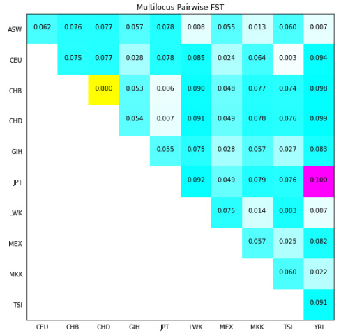
Figure 6.6 - The average pairwise FST across the 11 populations in the HapMap project for all autosomes
See also
- F-statistics is an immensely complex topic, so I will direct you firstly to the Wikipedia page at http://en.wikipedia.org/wiki/F-statistics.
- A very good explanation can be found in Holsinger and Weir’s paper (Genetics in geographically structured populations: defining, estimating, and interpreting FST) in Nature Reviews Genetics, at http://www.nature.com/nrg/journal/v10/n9/abs/nrg2611.html.
Performing a PCA
PCA is a statistical procedure that’s used to perform a reduction of the dimension of a number of variables to a smaller subset that is linearly uncorrelated. Its practical application in population genetics is assisting with the visualization of the relationships between the individuals that are being studied.
While most of the recipes in this chapter make use of Python as a glue language (Python calls external applications that actually do most of the work), with PCA, we have an option: we can either use an external application (for example, EIGENSOFT SmartPCA) or use scikit-learn and perform everything on Python. In this recipe, we will use SmartPCA – for a native machine learning experience with scikit-learn, see Chapter 10.
TIP
You actually have a third option: using sgkit. However, I want to show you alternatives on how to perform computations. There are two good reasons for this. Firstly, you might prefer not to use sgkit – while I recommend it, I don’t want to force it – and secondly, you might be required to run an alternative method that is not implemented in sgkit. PCA is actually a good example of this: a reviewer on a paper might require you to run a published and widely used method such as EIGENSOFT SmartPCA.
Getting ready
You will need to run the first recipe in order to make use of the hapmap10_auto_noofs_ld_12 PLINK file (with alleles recoded as 1 and 2). PCA requires LD-pruned markers; we will not risk using the offspring here because it will probably bias the result. We will use the recoded PLINK file with alleles as 1 and 2 because this makes processing with SmartPCA and scikit-learn easier.
I have a simple library to help with some genomics processing. You can find this code at https://github.com/tiagoantao/pygenomics. You can install it with the following command:
pip install pygenomics
For this recipe, you will need to download EIGENSOFT (http://www.hsph.harvard.edu/alkes-price/software/), which includes the SmartPCA application that we will use.
There is a Notebook file in the Chapter06/PCA.py recipe, but you will still need to run the first recipe.
How to do it...
Take a look at the following steps:
- Let’s load the metadata, as follows:
f = open('relationships_w_pops_041510.txt')
ind_pop = {}
f.readline() # header
for l in f:
toks = l.rstrip().split(' ')
fam_id = toks[0]
ind_id = toks[1]
pop = toks[-1]
ind_pop['/'.join([fam_id, ind_id])] = pop
f.close()
ind_pop['2469/NA20281'] = ind_pop['2805/NA20281']
In this case, we will add an entry that is consistent with what is available in the PLINK file.
- Let’s convert the PLINK file into the EIGENSOFT format:
from genomics.popgen.plink.convert import to_eigen
to_eigen('hapmap10_auto_noofs_ld_12', 'hapmap10_auto_noofs_ld_12')
This uses a function that I have written to convert from PLINK to the EIGENSOFT format. This is mostly text manipulation—not exactly the most exciting code.
- Now, we will run SmartPCA and parse its results, as follows:
from genomics.popgen.pca import smart
ctrl = smart.SmartPCAController('hapmap10_auto_noofs_ld_12')
ctrl.run()
wei, wei_perc, ind_comp = smart.parse_evec('hapmap10_auto_noofs_ld_12.evec', 'hapmap10_auto_noofs_ld_12.eval')
Again, this will use a couple of functions from pygenomics to control SmartPCA and then parse the output. The code is typical for this kind of operation, and while you are invited to inspect it, it’s quite straightforward.
The parse function will return the PCA weights (which we will not use, but you should inspect), normalized weights, and then the principal components (usually up to PC 10) per individual.
- Then, we plot PC 1 and PC 2, as shown in the following code:
from genomics.popgen.pca import plot
plot.render_pca(ind_comp, 1, 2, cluster=ind_pop)
This will produce the following diagram. We will supply the plotting function and the population information retrieved from the metadata, which allows you to plot each population with a different color. The results are very similar to published results; we will find four groups. Most Asian populations are located at the top, the African populations are located on the right-hand side, and the European populations are located at the bottom. Two more admixed populations (GIH and MEX) are located in the middle:
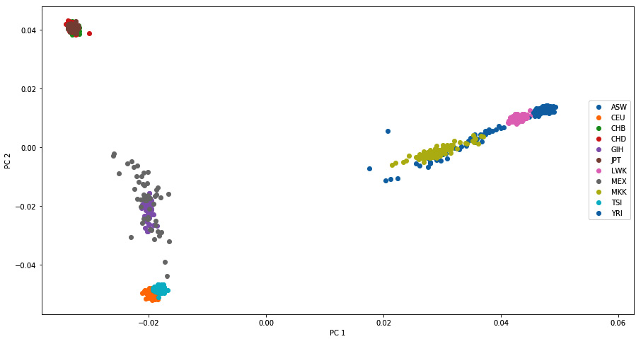
Figure 6.7 - PC 1 and PC 2 of the HapMap data, as produced by SmartPCA
Note
Note that PCA plots can be symmetrical in any axis across runs, as the signal does not matter. What matters is that the clusters should be the same and that the distances between individuals (and these clusters) should be similar.
There’s more...
An interesting question here is which method you should use – SmartPCA or scikit-learn, which we will use in Chapter 10. The results are similar, so if you are performing your own analysis, you are free to choose. However, if you publish your results in a scientific journal, SmartPCA is probably a safer choice because it’s based on the published piece of software in the field of genetics; reviewers will probably prefer this.
See also
- The paper that probably popularized the use of PCA in genetics was Novembre et al.’s Genes mirror geography within Europe on Nature, where a PCA of Europeans mapped almost perfectly to a map of Europe. This can be found at http://www.nature.com/nature/journal/v456/n7218/abs/nature07331.html. Note that there is nothing about PCA that assures it will map to geographical features (just check our PCA earlier).
- The SmartPCA is described in Patterson et al.’s Population Structure and Eigenanalysis, PLoS Genetics, at http://journals.plos.org/plosgenetics/article?id=10.1371/journal.pgen.0020190.
- A discussion of the meaning of PCA can be found in McVean’s paper on A Genealogical Interpretation of Principal Components Analysis, PLoS Genetics, at http://journals.plos.org/plosgenetics/article?id=10.1371/journal.pgen.1000686.
Investigating population structure with admixture
A typical analysis in population genetics was the one popularized by the program structure (https://web.stanford.edu/group/pritchardlab/structure.html), which is used to study population structure. This type of software is used to infer how many populations exist (or how many ancestral populations generated the current population), and to identify potential migrants and admixed individuals. The structure was developed quite some time ago, when far fewer markers were genotyped (at that time, this was mostly a handful of microsatellites), and faster versions were developed, including one from the same laboratory called fastStructure (http://rajanil.github.io/fastStructure/). Here, we will use Python to interface with a program of the same type that was developed at UCLA, called admixture (https://dalexander.github.io/admixture/download.html).
Getting ready
You will need to run the first recipe in order to use the hapmap10_auto_noofs_ld binary PLINK file. Again, we will use a 10 percent subsampling of autosomes that have been LD-pruned with no offspring.
As in the previous recipe, you will use the pygenomics library to help; you can find these code files at https://github.com/tiagoantao/pygenomics. You can install it with the following command:
pip install pygenomics
In theory, for this recipe, you will need to download admixture (https://www.genetics.ucla.edu/software/admixture/). However, in this case, I will provide the outputs of running admixture on the HapMap data that we will use, because running admixture takes a lot of time. You can either use the results available or run admixture yourself. There is a Notebook file for this in the Chapter06/Admixture.py recipe, but you will still need to run the recipe first.
How to do it...
Take a look at the following steps:
- First, let’s define our k (a number of ancestral populations) range of interest, as follows:
k_range = range(2, 10) # 2..9
- Let’s run admixture for all our k (alternatively, you can skip this step and use the example data provided):
for k in k_range:
os.system('admixture --cv=10 hapmap10_auto_noofs_ld.bed %d > admix.%d' % (k, k))
Note
This is the worst possible way of running admixture and will probably take more than 3 hours if you do it this way. This is because it will run all k from 2 to 9 in a sequence. There are two things that you can do to speed this up: use the multithreaded option (-j), which admixture provides, or run several applications in parallel. Here, I have to assume a worst-case scenario where you only have a single core and thread available, but you should be able to run this more efficiently by parallelizing. We will discuss this issue at length in Chapter 11.
- We will need the order of individuals in the PLINK file, as admixture outputs individual results in this order:
f = open('hapmap10_auto_noofs_ld.fam')
ind_order = []
for l in f:
toks = l.rstrip().replace(' ', ' ').split(' ')
fam_id = toks[0]
ind_id = toks[1]
ind_order.append((fam_id, ind_id))
f.close()
- The cross-validation error gives a measure of the “best” k, as follows:
import matplotlib.pyplot as plt
CVs = []
for k in k_range:
f = open('admix.%d' % k)
for l in f:
if l.find('CV error') > -1:
CVs.append(float(l.rstrip().split(' ')[-1]))
break
f.close()
fig = plt.figure(figsize=(16, 9))
ax = fig.add_subplot(111)
ax.set_title('Cross-Validation error')
ax.set_xlabel('K')
ax.plot(k_range, CVs)
The following graph plots the CV between a K of 2 and 9, the lower, the better. It should be clear from this graph that we should maybe run some more K (indeed, we have 11 populations; if not more, we should at least run up to 11), but due to computation costs, we stopped at 9.
It would be a very technical debate on whether there is such thing as the “best” K. Modern scientific literature suggests that there may not be a “best” K; these results are worthy of some interpretation. I think it’s important that you are aware of this before you go ahead and interpret the K results:
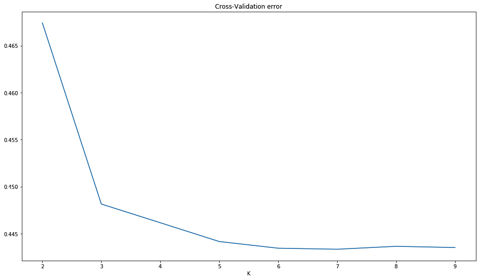
Figure 6.8 - The error by K
- We will need the metadata for the population information:
f = open('relationships_w_pops_041510.txt')
pop_ind = defaultdict(list)
f.readline() # header
for l in f:
toks = l.rstrip().split(' ')
fam_id = toks[0]
ind_id = toks[1]
if (fam_id, ind_id) not in ind_order:
continue
mom = toks[2]
dad = toks[3]
if mom != '0' or dad != '0':
continue
pop = toks[-1]
pop_ind[pop].append((fam_id, ind_id))
f.close()
We will ignore individuals that are not in the PLINK file.
- Let’s load the individual component, as follows:
def load_Q(fname, ind_order):
ind_comps = {}
f = open(fname)
for i, l in enumerate(f):
comps = [float(x) for x in l.rstrip().split(' ')]
ind_comps[ind_order[i]] = comps
f.close()
return ind_comps
comps = {}
for k in k_range:
comps[k] = load_Q('hapmap10_auto_noofs_ld.%d.Q' % k, ind_order)
Admixture produces a file with the ancestral component per individual (for an example, look at any of the generated Q files); there will be as many components as the number of k that you decided to study. Here, we will load the Q file for all k that we studied and store them in a dictionary where the individual ID is the key.
- Then, we cluster individuals, as follows:
from genomics.popgen.admix import cluster
ordering = {}
for k in k_range:
ordering[k] = cluster(comps[k], pop_ind)
Remember that individuals were given components of ancestral populations by admixture; we would like to order them per their similarity in terms of ancestral components (not by their order in the PLINK file). This is not a trivial exercise and requires a clustering algorithm.
Furthermore, we do not want to order all of them; we want to order them in each population and then order each population accordingly.
For this purpose, I have some clustering code available at https://github.com/tiagoantao/pygenomics/blob/master/genomics/popgen/admix/__init__.py. This is far from perfect but allows you to perform some plotting that still looks reasonable. My code makes use of the SciPy clustering code. I suggest you take a look (by the way, it’s not very difficult to improve upon it).
- With a sensible individual order, we can now plot the admixture:
from genomics.popgen.admix import plot
plot.single(comps[4], ordering[4])
fig = plt.figure(figsize=(16, 9))
plot.stacked(comps, ordering[7], fig)
This will produce two charts; the second chart is shown in the following diagram (the first chart is actually a variation of the third admixture plot from the top).
The first figure of K = 4 requires the components per individual and their order. It will plot all individuals, ordered and split by population.
The second chart will perform a set of stacked plots of admixture from K = 2 to 9. It requires a figure object (as the dimension of this figure can vary widely with the number of stacked admixtures that you require). The individual order will typically follow one of the K (we have chosen a K of 7 here).
Note that all K are worthy of some interpretation (for example, K = 2 separates the African population from others, and K = 3 separates the European population and shows the admixture of GIH and MEX):
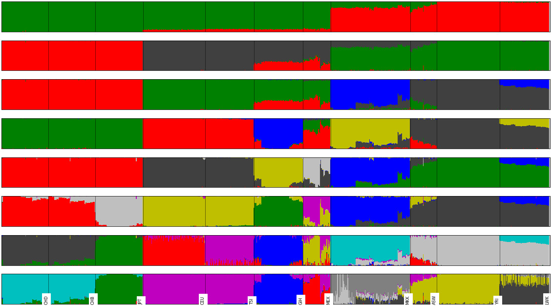
Figure 6.9 - A stacked admixture plot (between K of 2 and 9) for the HapMap example
There’s more...
Unfortunately, you cannot run a single instance of admixture to get a result. The best practice is to actually run 100 instances and get the one with the best log likelihood (which is reported in the admixture output). Obviously, I cannot ask you to run 100 instances for each of the 7 different K for this recipe (we are talking about two weeks of computation), but you will probably have to perform this if you want to have publishable results. A cluster (or at least a very good machine) is required to run this. You can use Python to go through outputs and select the best log likelihood. After selecting the result with the best log likelihood for each K, you can easily apply this recipe to plot the output.