
Chapter 8: Introducing Workbooks
Azure Sentinel workbooks are a way to create and show customizable and interactive reports that can display graphs, charts, and tables. Information can be presented from Log Analytics workspaces using the same Kusto Query Language (KQL) queries that you already know how to use. These workbooks are based on the workbook technology that has been in use with other Azure resources, including Azure Monitor and Log Analytics workspaces.
Azure Sentinel provides a number of templates that are ready for use. You can use these templates to create your own workbook that can then be modified as needed. Most of the data connectors that are used to ingest data come with their own workbooks, to allow you better insight into the data that is being ingested through the use of tables and visualizations, including bar and pie charts. You can also make your own workbooks from scratch, if required.
In this chapter, you will learn the following topics:
- An overview of the Workbooks page
- Walking through an existing workbook
- Creating workbooks
- Editing a workbook
- Managing workbooks
- Workbook step types
Note
You may come across old documentation and websites that discuss Azure Sentinel dashboards. Dashboards were replaced with workbooks to provide a more interactive user experience.
An overview of the Workbooks page
To go to the Workbooks page, select Workbooks from the Azure Sentinel navigation blade. A new screen will appear that will look similar to the one shown in the following screenshot:
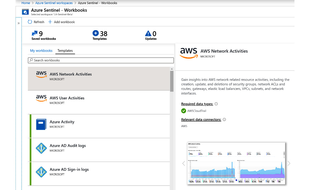
Figure 8.1 – Azure Sentinel Workbooks page
The header at the top of the page in the preceding screenshot shows the Refresh and Add workbook buttons. Adding a new workbook will be discussed in the Adding a new workbook from scratch section.
Let's discuss the different components of the Workbooks page in detail in the following sections.
The workbook header
Under the Refresh and Add workbook buttons is the total number of workbooks that have been saved. The number 9 in the following screenshot will include all the workbooks that have been saved, whether they are saved as a personal or as a shared workbook. So, this number can be different, depending on who is accessing the page:

Figure 8.2 – Workbook header
To the right of that is the total number of templates available to use. This number may change as new workbook templates are added.
On the far-right side is the total number of templates that can be updated. As new versions of the templates are added, this number will increment to inform you of this fact. The actual template that can be updated will have an icon to let you know it has an update.
Note
Note that this will update the template only. It will not update any saved versions of the workbook based on the template.
Let's take a look at the Templates view.
The Templates view
Below the workbook header are two tabs, My workbooks and Templates, as shown in the following screenshot. The My workbooks tab will show all the workbooks to which the user has access, including those that are shared and personal. The Templates tab shows all the templates that are available to be used:
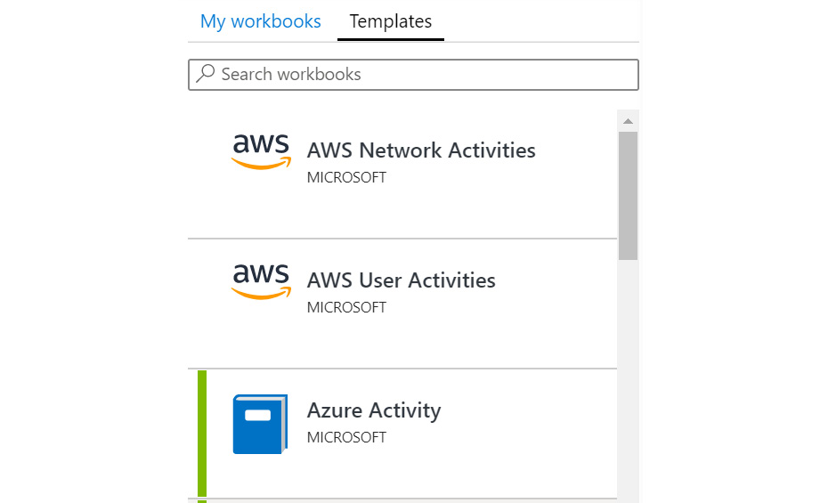
Figure 8.3 – Templates view
No matter which tab you select, each template or report will be shown on a single row. On the far left will be a green bar, indicating that this template has been saved previously and can be viewed under My workbooks. If you are looking at the My workbooks tab, then every report will have a green bar since every report is available to view. After that is an icon representing the company that created the template, followed by the template name, and the name of the company under this.
Looking at the first template listed in the preceding screenshot, you can see the icon for Amazon Web Services (AWS). This is followed by the template name, AWS Network Activities, with the company that created it, MICROSOFT, under the template name.
Workbook detail view
Selecting a workbook will show its information in the details window on the far-right side of the Workbooks page, as shown in the following screenshot:
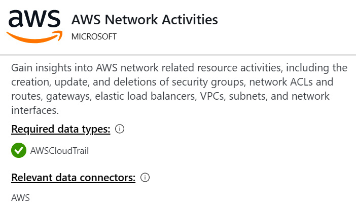
Figure 8.4 – Workbook detail view
This window will again show the icon, name, and company name at the top of the screen. Under that is a detailed description of the workbook.
Missing required data types
Below the workbook detail view is the list of required data types. This will list one or more data types that are needed for this workbook to function correctly. If your environment has the required data source, a green checkbox icon will show, but if it does not, then a cross check icon will show in its place, as shown in the following screenshot:
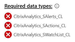
Figure 8.5 – Missing required data types
Unlike the Analytics query templates discussed in Chapter 7, Creating Analytic Rules, you can create a workbook from a template, even if you do not have the required data types. The only thing that will happen is that no information will be shown in the workbook, and there may be an error.
Workbook detail view (continued)
Below the Required data types field is the relevant data connectors that show which data connector(s) are used to ingest the needed data.
Scrolling down in the details pane will show one or more reports that represent how the report will look. This can be very useful to see what the workbook would look like, especially if you do not have the requisite data source populated yet, and an example of this can be seen in the following screenshot:
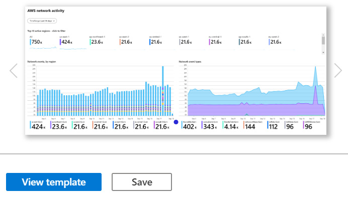
Figure 8.6 – Workbook detail view (continued)
Clicking on the left and right arrows will switch the displayed report if there is more than one available.
Saved template buttons
At the bottom of the screen are a series of buttons that change depending on whether you have saved the template or not. Figure 8.6 in the preceding section shows the buttons for a template that has not been used to create a workbook, and the following screenshot shows the buttons for a template that has been saved:
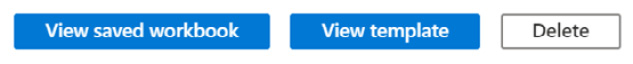
Figure 8.7 – Saved template buttons
Let's discuss each of these buttons in detail:
- If you have saved the template as a workbook, the first button that will be shown is View saved workbook. This will allow you to look at the workbook you have created from the template, including any changes that you have made to it. This activity will be discussed in the Creating workbooks section later. If you have not saved the template as a workbook, then the Save button will be displayed, as shown in figure 8.6. Clicking this will allow you to create a new workbook from a template. Refer to the Creating a workbook using a template section for more information.
- The next button is View template. This will show whether or not you have saved the template as a workbook already, as you can see in both figures 8.6 and 8.7. This will allow you to view the template. This is a fully interactive view of the template, although the only action you can perform is to refresh the template. You will not be able to save or modify the template from this view.
- The next button will depend on whether or not you have saved the template as a workbook. If you have saved the template, the Delete button will be displayed, as shown in figure 8.7. Clicking this will cause a validation popup to appear. If you confirm the deletion, the saved workbook, including any changes you have made, will be deleted.
The My workbooks tab will show the same information as the Templates tab, except that it will only show those workbooks that have been saved from a template or created from scratch. Also, at the bottom of the detailed description window, the buttons have changed.
If you have created a workbook from scratch, without creating it from an existing template, then the buttons will be shown as in the following screenshot. Since there is no template to view, the View template button will not be shown:
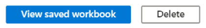
Figure 8.8 – Buttons for creating a workbook from scratch
You now have a good understanding of the workbook's overview page. You know how to look at a workbook template, determine whether you have the needed data sources, and create a new workbook using a template. Next, we will look at an existing workbook to give you an idea of what you can do with workbooks.
Walking through an existing workbook
We are going to take a look at an existing template that has most of the features available to workbooks. This may give you an idea of what you can do with your workbooks, or at least show you how to set up a workbook to do what you want.
The Azure Active Directory (Azure AD) Sign-in logs template has a wide variety of charts and graphs in it. In addition, it shows how to allow users to change parameters, and it shows how you can make columns in a table and display information in a more graphical way.
If you do not have the SigninLogs data type available, which the Azure AD Sign-in logs workbook uses to get its information, it is recommended that the Azure AD connector be enabled for your Azure Sentinel instance. Refer back to Chapter 3, Data Collection and Management, for guidance on how to do this. If you cannot get this connector activated, for whatever reason, you can follow along in the book. However, you will have a better experience if you can look at the workbook yourself.
Select the Azure AD Sign-in logs template and click the View template button. If you have created a workbook from this template, you can click the View saved workbook button. It will make no difference in this case. You will see a screen similar to the following. It is expected that the values are different, and some of the columns may not display the same graphics, as in the following screenshot:
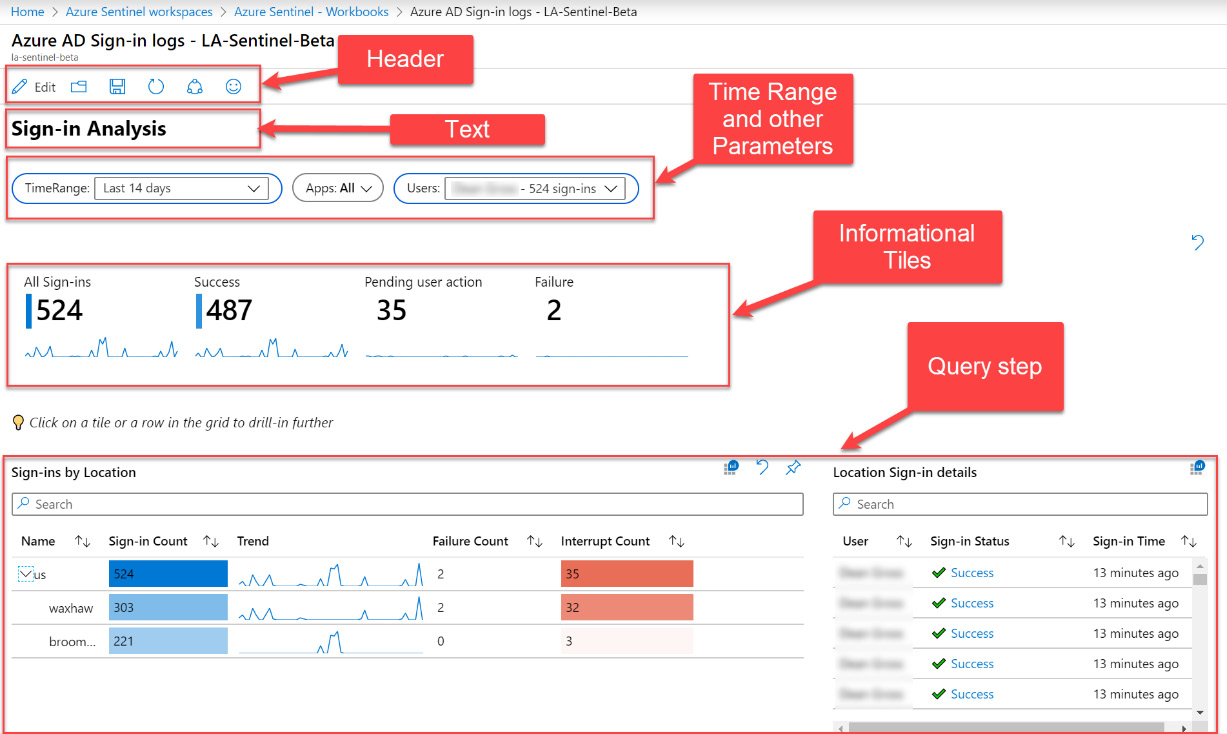
Figure 8.9 – Azure AD Sign-in logs workbook
A workbook is made up of small sections called steps. Each step has a unique name that can be pretty much anything, and this name can be referenced in other steps. Each step can run on its own, although some may require parameters either from a parameter step, as with the one discussed later, or from other steps.
The header at the top of the page does not concern us at this point. It will be explained in the Editing a workbook section later in this chapter. Notice that the page has a title called Sign-in Analysis. This is an example of straight text being shown.
Beneath that are some parameters that allow you to change what the workbook is looking at—in this case, TimeRange, Apps, and Users can be changed. In this way, the user can either select to look at the entire report, or narrow it down to a specific date, app, and user, or anything in between.
Under that is the first example of a query section. This is using a KQL query to obtain the data, and then displaying it in different ways. In this case, the information is being displayed as tiles; one tile per column is returned.
Below that is another example of a query section. In this case, the information is being displayed as a table, but individual columns have been modified to show graphical information, which others show as straight text. If you look at the second column from the left, it is showing a heatmap along with the textual value. The third column, called Trend, is showing a sparkle line instead of the text values.
Another interesting thing to note about these query sections is that they are shown side by side. Normally, when a new query is added to a workbook page, it is set to take up the entire width of the page. This can be modified so that the individual queries take up as much or as little width as desired. If another query can fit beside the first one, it will do so.
Remember that workbooks are interactive, meaning that they can be defined in such a way so that if you click on one value, others can change. In this workbook, if you select a row from the Sign-ins by Location query shown in the preceding screenshot, the Location Sign-in details will be filtered to show only those users who belong to the selected location.
The rest of the workbook's sections are pretty much the same as the ones already discussed. This should give you an idea of what you can do with your workbooks to display relevant information.
Go ahead and look at some of the other workbook templates available to see what else you can do. Remember: you can just click on the template and look at the provided report to get an idea of what the workbook will look like. You will see that you can show bar charts, pie charts, area charts, and more.
Creating workbooks
Now that you have an idea of what you can do with workbooks, it is time to see how to create your own. There are two ways of doing this:
- Using a workbook template
- Creating one from scratch
Either way, we will get a working workbook; however, you may find it easier to create workbooks from templates to begin with, to get a better understanding of how workbooks function and what you can do with them. There is no reason why you cannot create your own workbook, using the queries from a workbook created from a template as the starting point.
In order to be able to create a new workbook, you will need to have the proper rights. Refer to https://docs.microsoft.com/en-us/azure/sentinel/roles#roles-and-allowed-actions to see the rights that are required to create and edit workbooks.
Creating a workbook using a template
The following steps show how to create a workbook using a template. This makes it easier to create a new workbook, as you have a basis to start from:
- While looking at a template's details page, click on the Save button.
- A pop-up window, as shown in the following screenshot, will ask you which location to use to save the new workbook. Select the appropriate location. This should be the same location as the location where your Log Analytics workspace resides, so as to avoid egress charges:
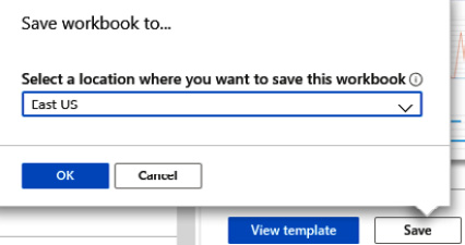
Figure 8.10 – Choosing your workbook location
- Click OK. This will cause a new workbook to be created under My workbooks, with the same name as the template.
You now know how to create a workbook using a template as the baseline. This is a very easy method to get a workbook created that you can then modify as needed. Next, we will discuss creating a workbook from scratch, without using a template as the baseline.
Creating a new workbook from scratch
Creating a workbook from scratch is a bit more complicated. It involves creating the workbook, and then you need to edit it, since the workbook created is already saved with a default query assigned to it. To create a workbook from scratch, perform the following steps:
- Click the Add workbook button in the header.
- This will create a workbook like the one shown in the following screenshot. Note that the actual values will most likely be different:
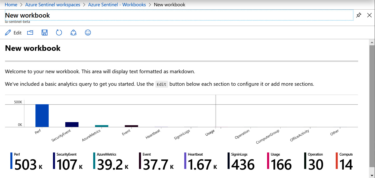
Figure 8.11 – A new workbook created from scratch
- Notice that it comes already populated with text and with a query step already included, to get you started.
- Click the Save icon in the header to save this workbook. Clicking it will open the Save dialog box, as follows:
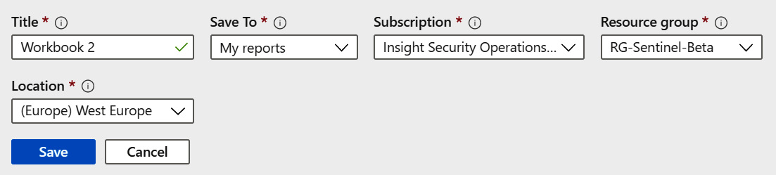
Figure 8.12 –Save workbook screen
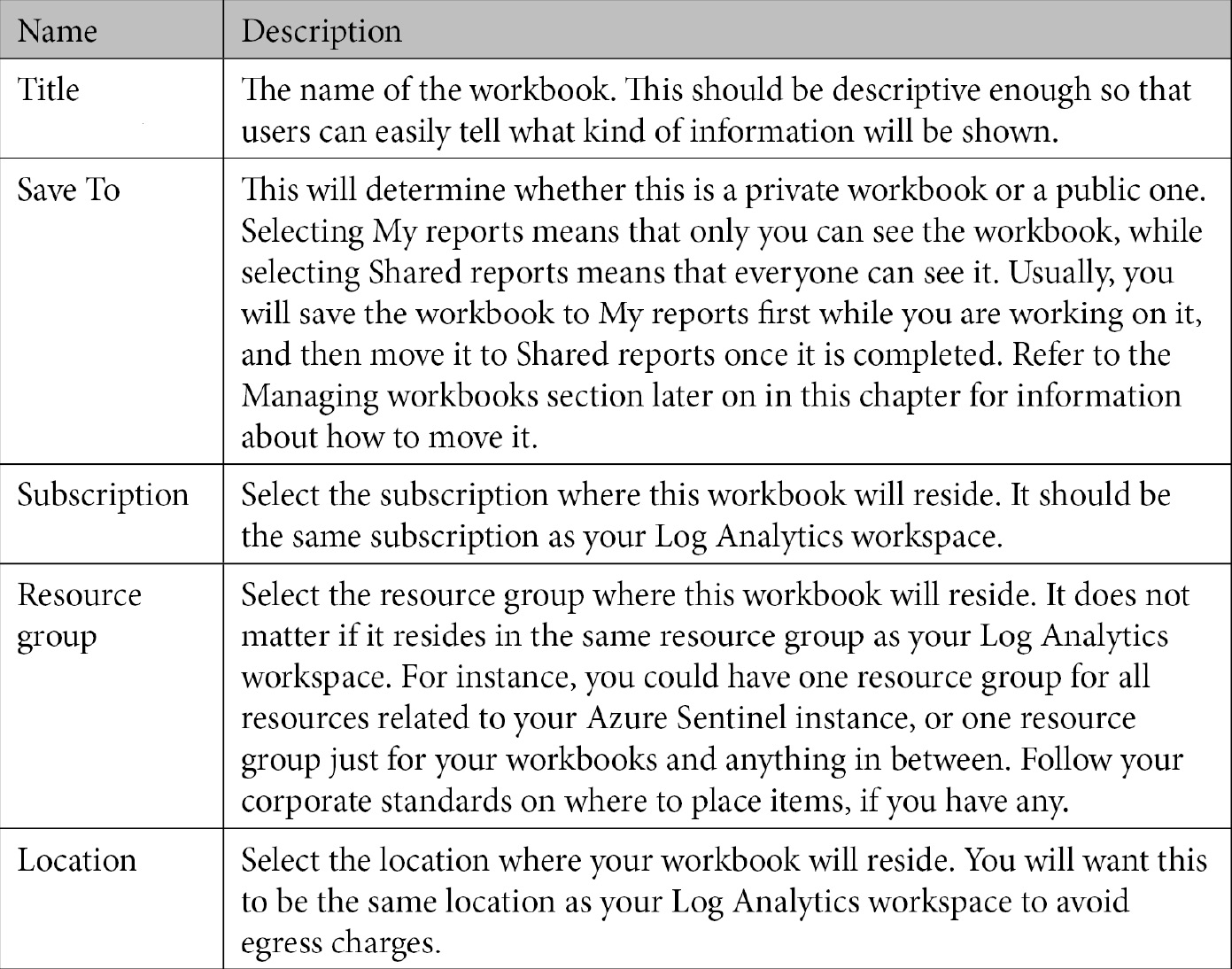
The relevant field options are discussed in the following table:
- Click Save to save the workbook.
Note
It is not actually necessary for you to save the new workbook before you edit it. It is generally recommended that you do so to make sure you have a saved copy of it that you can revert to, should your edits not work correctly.
That is all there is to it. Now, you will need to edit the workbook so that you can edit or remove the existing steps or add your own steps. Refer to the next section, where we will cover more details on what can be done to modify your workbook.
Editing a workbook
There will be times when you need to edit a workbook. As you saw in the previous section, you need to edit a workbook created from scratch in order to add what you need to it. You can also edit workbooks created from templates to modify them to suit your needs.
If you are not already viewing your workbook, you will need to view it first. If you are already viewing your workbook, you can skip this next step and move directly to the editing portion.
To edit a workbook, perform the following steps:
- Go to either of the tabs.
- Select the workbook in question.
- Then, select the View saved workbook button in the workbook's detail pane.
Note
You cannot edit a workbook template directly. It must be saved first, and then the saved workbook can be edited. If you have created a workbook from scratch, you must go to the My workbooks tab since these workbooks have not been created from a template and only show up there.
At the top of the page will be a header of buttons, shown as follows. The one we care about in this section is the first one on the left, called Edit:
Figure 8.13 – Saved workbook header bar
When you click the Edit button, the workbook view will change to edit mode, which will look like the following screenshot:
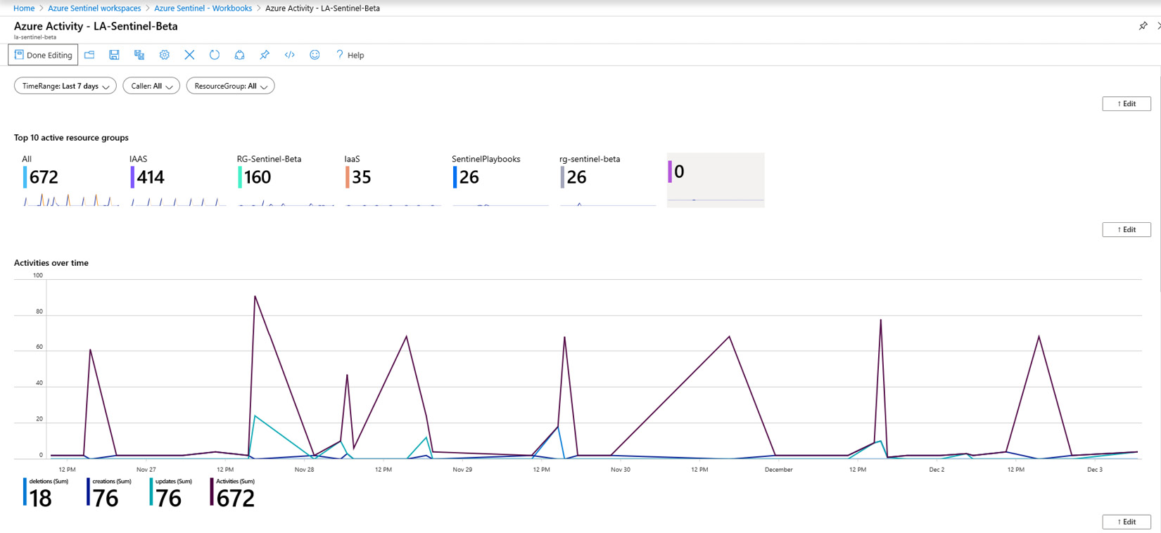
Figure 8.14 – Workbook in edit mode
Each step in the workbook will have its own Edit button so that you can make changes to that individual step. More information on the various types of steps can be found in the Workbook step types section. Note that all the steps will be displayed, even those that have been set to be hidden when viewing the workbook.
The list of buttons in the edit mode header changes is as follows:
Figure 8.15 – Edit mode header buttons
The following table briefly describes each button:
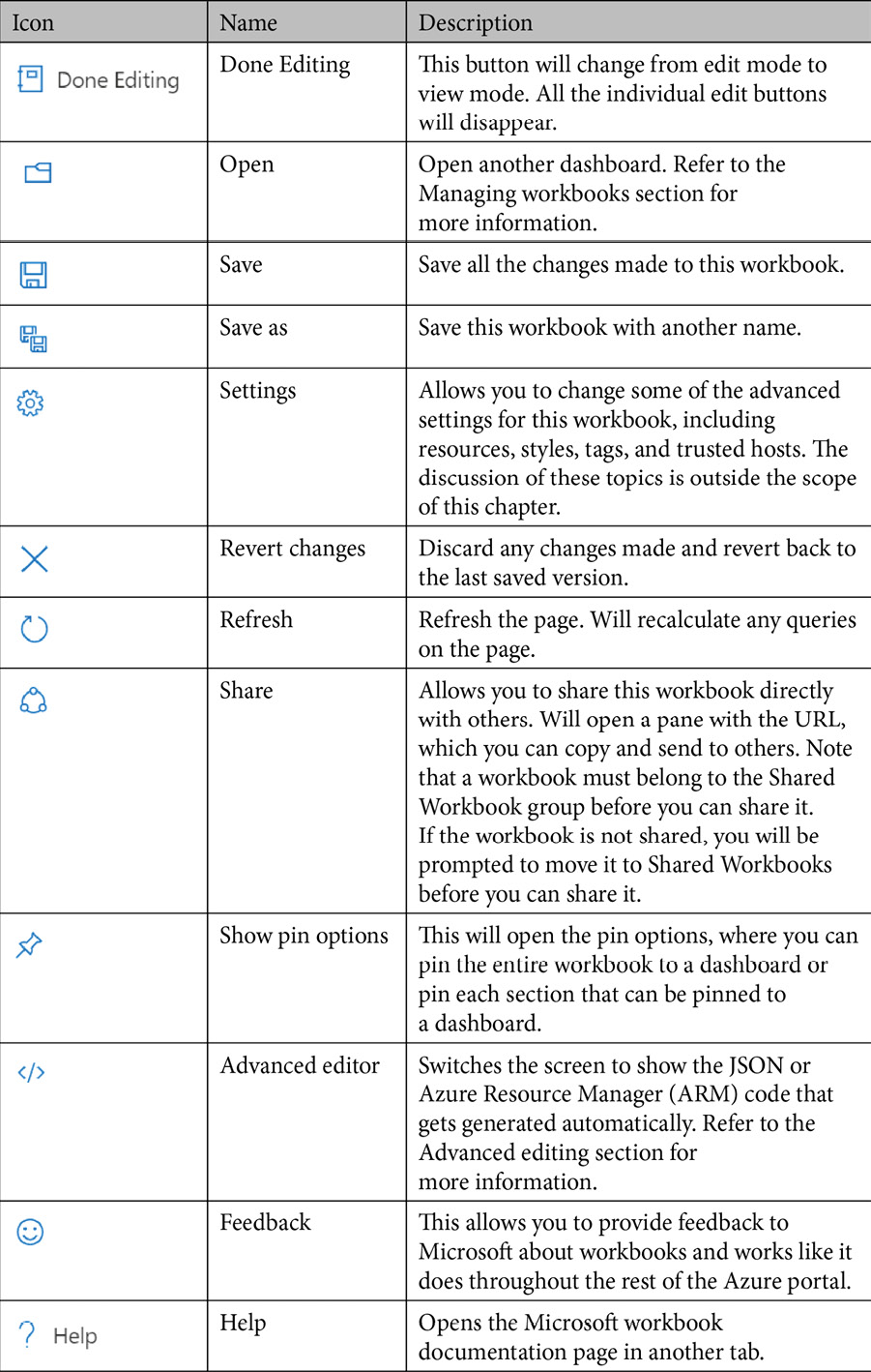
If you look at the bottom of the workbook you are editing, you will see a list of links matching the following screenshot. This is how you will add new steps, and each step will be described individually in the Workbook step types section:
Figure 8.16 – Edit mode add links
Once you have finished making all your changes, click on the Done Editing button in the header bar to revert to the view mode. All the individual edit buttons will disappear, as will any steps, parameters, or columns that have been set to be hidden.
Take a look at your workbook to make sure the edits you just made are working as desired. Once you are satisfied with your changes, click on the Save button to save your changes.
Advanced editing
While the workbook's editing graphical user interface (GUI) allows to you completely create and edit an Azure Sentinel workbook, there may be times when you need to tweak a setting directly in the code. You may also wish to get the ARM template, which will allow you to easily reproduce this workbook elsewhere or store it as part of your DevOps process.
In either case, clicking on the Advanced Editor button will allow you to do that. When you click on the button, you will be taken to the Gallery Template view of the advanced editor, as shown in the following screenshot. This view will allow you to directly modify the JSON code. When you are done making the changes, click the Apply button to apply your changes, or the Cancel button to return to the GUI without saving your changes:
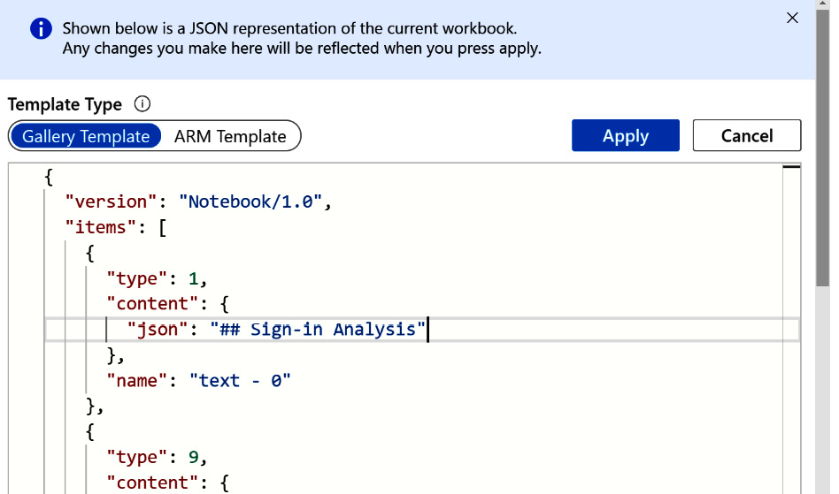
Figure 8.17 – Advanced Editor – Gallery Template view
Note
Do not modify the JSON code directly unless you are familiar with JSON and what needs to be changed. Any changes made here will apply to the GUI view as well, and if a mistake is made, you could render the workbook unusable.
If you want to see the ARM template that gets generated, click on the ARM Template button. This will switch the view to show you the ARM template that can be used to reproduce this. Copy the code and paste it into another file to use it, to recreate your workbook as needed. The ARM Template view can be seen in the following screenshot:
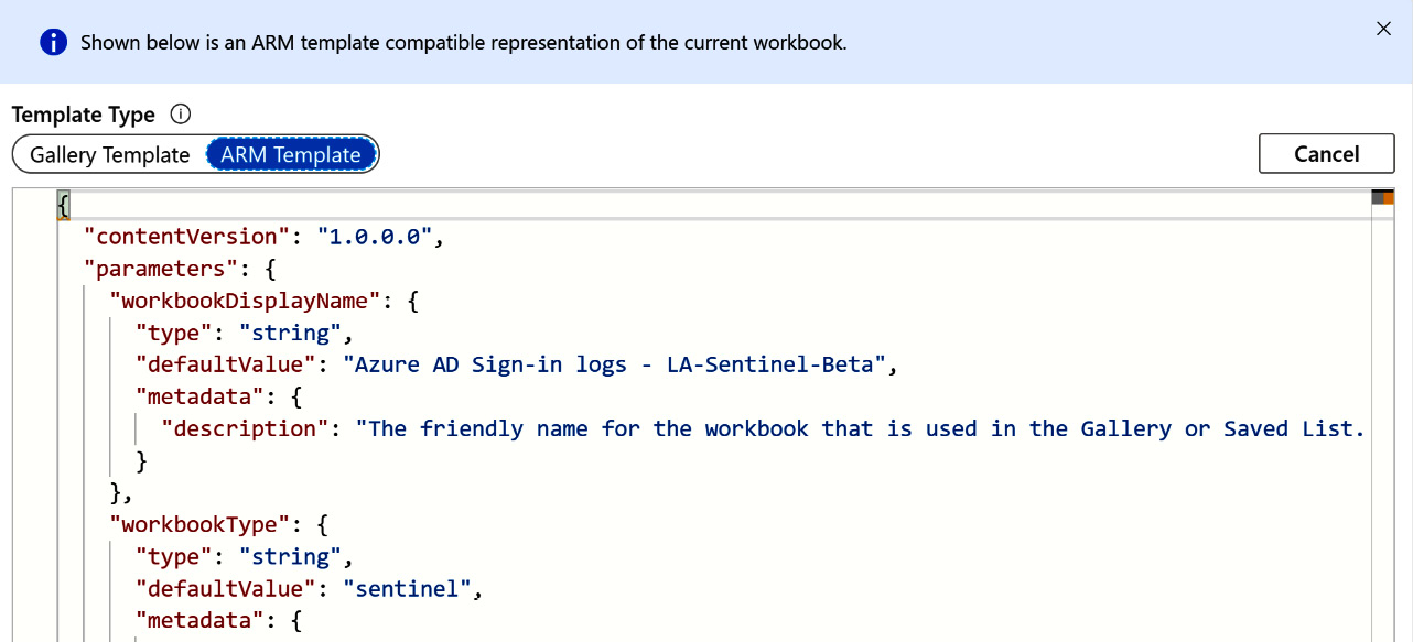
Figure 8.18 – Advanced Editor – ARM Template view
Tip
The discussion of ARM templates and how to use them is beyond the scope of this book. Go to https://docs.microsoft.com/en-us/azure/templates/ and https://docs.microsoft.com/en-us/azure/azure-monitor/platform/workbooks-automate to learn more about them.
When you are done, click the Cancel button to return to the GUI view.
You have now seen how to edit a workbook using both the GUI and the advanced view, where you can edit the underlying code directly. You have also learned how to copy the JSON code that can be used in an ARM template to recreate this workbook as needed. Next, we will look at managing your existing workbooks.
Managing workbooks
You have seen how to add a new workbook, and now, you will learn how to manage the ones you have. This will include deleting, moving, and sharing workbooks. As a reminder, go to https://docs.microsoft.com/en-us/azure/sentinel/roles#roles-and-allowed-actions to make sure you have the proper rights needed to manage workbooks.
As stated earlier, clicking on the Open button when looking at a saved workbook will allow you to manage workbooks. Clicking on it will open the Saved Workbooks blade, which will look similar to the following screenshot:
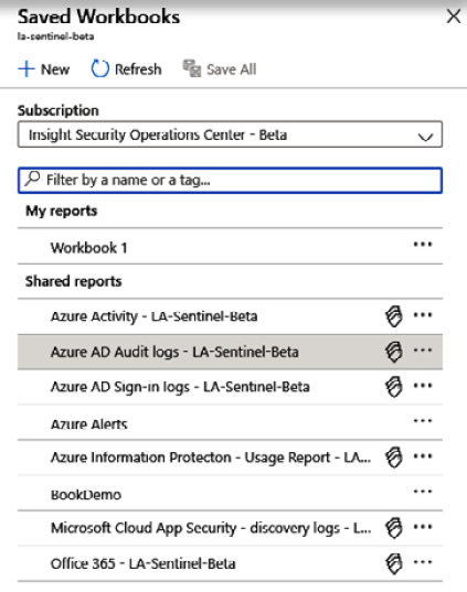
Figure 8.19 – Managing workbooks
At the top of the screen is the New button, which will allow you to create a new workbook; the Refresh button, which will refresh this view; and the Save All button, which will save all the changes made. Under that is the Subscription dropdown that will allow you to change the subscription you are looking at, followed by a search box where you can search for specific workbooks.
Below that is a listing of all the workbooks, separated into My reports, which only I can see, and Shared reports, which everyone can see. Clicking on any of the workbooks will change the workbook that you are viewing.
Each workbook will be shown in a separate row. It will display the name, and then an icon that will show whether the workbook has been created from a template, and then a context-sensitive menu. Clicking on the context-sensitive menu icon will show this menu.
This menu will allow you to delete this workbook, rename it, move it to Shared reports (if this workbook is already shared, it will allow you to move it to My reports), share it with others (if it is not a Shared report, you will be asked to make it a Shared report before you can share it), or pin it to a dashboard, which can provide a shortcut to get directly to this workbook. All of this can be seen in the following screenshot:
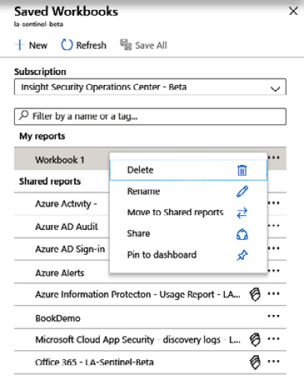
Figure 8.20 – Managing the workbook context menu
We have finished looking at how to manage your existing workbooks. You have learned about the Saved Workbooks pane, as well as the context-sensitive menu that will allow you to perform various management tasks on a workbook. Now, it is time to look at the various parts that make up a workbook, and how to use them.
Workbook step types
Each workbook is comprised of one or more steps. As stated earlier, a workbook is made up of small sections called steps. Each step has a unique name, which can be pretty much anything, and this name can be referenced in other steps. Each step can run on its own, although some may require parameters, either from a parameter step or from other steps.
There are five different types of steps: text, query, metric, parameters, and links/tabs. Each type of step will be discussed in more detail in the following sections. There will also be a section to discuss the Advanced Settings button, as the various step types have the same advanced settings.
To add a new step when editing a workbook, at the bottom of the screen is a list of links matching those shown in the following screenshot. Click on the appropriate link for the type of step you wish to add:
Figure 8.21 – Edit mode add links
No matter which link you click, the list will change to look like the following screenshot:
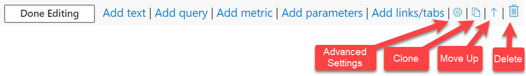
Figure 8.22 – Edit mode add links after adding a step
Clicking the Done Editing button will change the selected step to view mode so that you can see how your changes look.
The Go to advanced settings button will take you to the Advanced Settings page. This is discussed more in the Advanced settings section.
The Clone this item button will create a duplicate of the step you are editing. This can be useful if you need to have two steps that are very similar, with only a few changes between them. Rather than having to create the two steps individually, you can create one, click the Clone this item button, and then make the necessary changes on the second one.
The Move Up button will move this step up one in the listing of steps so that it is displayed higher in the page. If there is a step below the one that you are editing, the Move Down button will display to the left of the Move Up button. If this step is at the top of the page, the Move Up button will no longer show.
The Delete button will remove this step. Note that there is no verification that you want to perform this step. Clicking on it will automatically remove this step. It pays to save often, just in case you accidently delete a step you didn't intend to, so that you can revert to a saved version.
Now that you know how to add a step, let's discuss each type in detail.
Text
As you may have guessed from the name, clicking the Add text link will add a step that displays text using the Markdown language. Clicking the link will add a new step with an empty textbox where you can enter your text, as shown in the following screenshot:
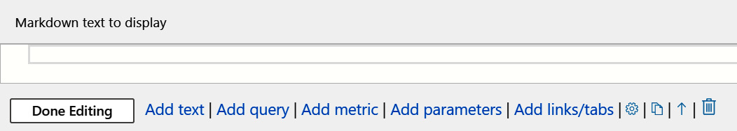
Figure 8.23 –New text step
Enter the text you want, along with any of the Markdown formatting commands, and then click the Done Editing button to see your changes with the formatting applied.
The Markdown language is a text-based language that is used in many different systems, most notably GitHub. It was developed to allow people to write plaintext documents that contain the same formatting you would see in HTML documents. To see the various formatting commands, go to https://www.markdownguide.org/. Note that not all the Markdown formatting has been tried, so there is no guarantee that all formatting commands will work.
Query
The query step is the mainstay of the workbook. By using KQL queries, you can display data from the logs in various formats, including grids (or tables), area charts, various types of bar charts, line charts, pie charts, scatter charts, time charts, and tiles.
Currently, most of the visualization types are supported, with two of them—graph and map—in preview. Microsoft may make changes from time to time, so please refer to the official workbook docs for up-to-date information. The graph format allows you to show information in a graph view, much like what you see when investigating an incident. Refer to the Investigating an incident section in Chapter 9, Incident Management, to see what this looks like. The map format will show information in a non-interactive map. This means that you cannot adjust the scale to zoom in or out.
After you click on the Add query link, you will see that a new step has been added, which looks as follows:
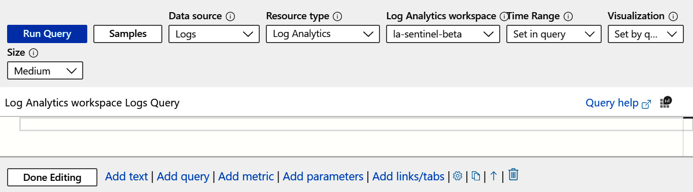
Figure 8.24 – New query step
Let's have a look at the different fields of the header bar:
- The Run Query button will run the query that has been added to the query window. In the preceding screenshot, there is no query, so clicking on the button will return an error.
- The Samples button will open a new pane and show some sample code. The code for the default query step that is added to a new workbook created from scratch is one of the samples available.
- The Data source dropdown will show a list of all the data sources that are available to query. Because of the other Azure technologies that use workbooks, there are more choices than just Logs available. However, for this chapter, that is the only data source we are concerned with.
- The Resource type dropdown will list what kind of resources can be used in the queries. Much like the Data source dropdown, this is used in other Azure resources, although we will only be concerned with using the Log Analytics entry.
- The Log Analytics workspace dropdown shows a listing of all the available workspaces that are available to use. The majority of the time, you should be using the one that your Azure Sentinel instance is using.
- The Time Range dropdown will show the various time ranges you can select, as shown next. If a value is selected here, it will tell your query to only look as far back as the value that has been set, with a few exceptions.
Most of the entries should be familiar to you already. However, the top one, Set in query, and the bottom one, TimeRange, need some explanation. You may not see the TimeRange value listed, and the reason is explained here.
The Set in query value will read the time span directly from the query itself. If you have a query such as Heartbeat| where TimeGenerated < ago(1d), then because the time is set in the code, any value in the dropdown will be ignored. A best practice in cases such as this is to set the dropdown to the Set in query value so that anyone needing to edit this step can easily tell that the time span is set in the code.
The TimeRange value is added because there is a parameter called TimeRange that is set to be a time-range picker. This is explained more in the Parameters section. If you do not see this value, then you do not have a time-range picker set up as a parameter.
Remember that TimeRange is just the name given to the parameter. It could be called something else in your case. If there is anything listed under the Time Range Pa… header (which is a shortened version of Time Range Parameter), then that can be used too as the time-range value.
Tip
It is a best practice to use a time-range picker parameter in your workbooks as much as possible so that the workbooks can be as flexible as possible.
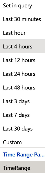
Figure 8.25 – Time Range dropdown
- The Visualization dropdown determines how the output will be displayed. The values have already been discussed, but another entry that is available is Set by query. If this value is selected, then it means that the code itself has determined how to visualize the data using the render command.
- The Size dropdown is used to determine how much vertical space the step will take up, with the values shown in the following screenshot. Select the value that makes the most sense to you, and notice that the actual amount of space may vary, depending on the type of visualization selected:
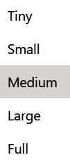
Figure 8.26 –Available sizes
There is one more button that can show on the header and that is based on the type of visualization selected, and it is used to change the settings of the visualization. The grid, pie chart, tiles, graph, and map each have their own button that is shown to change the settings for that specific visualization.
The book would be far larger if we were to discuss every individual setting for each of these visualizations, so you will need to play around to see what the different settings do. One we will discuss, since it is very useful and is used to create some of the visual representations discussed in the overview of the Azure AD Sign-in logs workbook, is the grid's column renderer.
To see this in action, perform the following steps:
- Enter Heartbeat into the Log Analytics workspace Logs Query area.
- Change the Time Range to Last 24 hours.
- The query should run automatically, but if it does not, click on the Run Query button to start the query.
- When the query has finished, select Grid from the Visualization dropdown.
- You will see a new button called Column Settings shown up in the header. Click it to open the Settings pane.
- Select any column, and then the Column renderer dropdown will activate.
- Click on it to see the listing of choices, including Automatic, Text, Right Aligned, Date/Time, and many others.
Most of the available entries will not make sense for an Azure Sentinel workbook, but others are useful. Some of the more useful ones are Heatmap and Spark line, which were used in the Azure AD Sign-in logs workbook, as well as Text, Date/Time, Thresholds, Timeline, Icon, and Link (which works like the Link/Tab step type described in the Links/tabs section).
Note
Depending on which one you select, other choices for settings can show up or disappear.
One other useful entry is Hidden. Selecting this will cause the column to not display in the grid. There may be times when you will need to have the column around, but do not want to show it. Set the column's renderer to Hidden for this to happen. It's outside the scope of the book to go into more detail on how to use these different renderers, but take a look at the Azure AD Sign-in logs workbook to get an idea of how to use the Heatmap and Spark line.
Beneath the header bar is the Log Analytics workspace Logs Query area. This is where you enter your KQL query to be run. On the right side of this screen are three icons, as shown here:
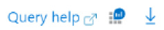
Figure 8.27 – Query step results buttons
The preceding list of buttons is explained as follows:
- The Query help icon will open a new tab and will take you to a page discussing how to write KQL queries.
- The icon next to it will open up the Logs page, in the same tab, and load the query you have in the Log Analytics workspace Logs Query area. This can be useful if you are having issues with your query and need to figure out what the problem is.
- The last icon will only show up once you have run a query. It will allow you to export your results into Excel for further processing.
The area directly under the Log Analytics workspace Logs Query area is where your results will show up. They will be displayed according to the value selected in the Visualization dropdown. Using the Heartbeat query we used earlier, run it, and then change the values in the Visualization dropdown to see how this area changes.
Metric
The metric step allows you to view metrics on different Azure resources. This step type is not that useful in regard to Azure Sentinel, so we will not discuss it in this chapter. To get more information on how to use the metric step, refer to https://docs.microsoft.com/en-us/azure/azure-monitor/app/usage-workbooks#adding-metrics-sections.
Parameters
As much as the query step is the mainstay of Azure Sentinel workbooks, they would not be as useful without parameters. A workbook that cannot change any of its inputs may just as well be an image rather than an interactive workbook that you can manipulate to query the results in different ways.
There are two types of parameters: those that get set in a parameter step, which we will discuss here, and those that are populated when an item in a query step is selected, which will be discussed in the Advanced settings section later in this chapter.
When you click the Add parameters link, you will see the following screen:
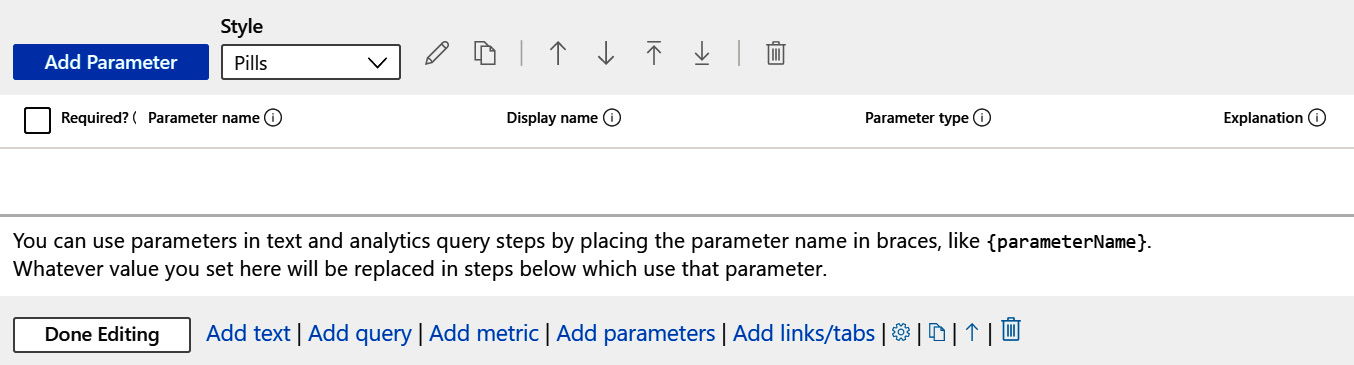
Figure 8.28 – New parameter step
Once you have parameters entered, they will be displayed in a table, one per row, as shown in the following screenshot. You can select a single checkbox to edit all the settings of an individual parameter. You can also change the Required?, Parameter name, and Display name fields directly from this screen. It will show the Parameter type and Explanation fields, although you cannot edit those fields from this screen. Refer to the Adding a new parameter section for an explanation of these fields:
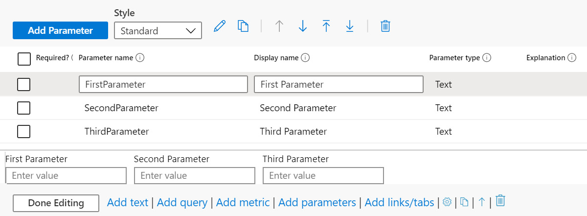
Figure 8.29 – Parameter step with sample parameters
Click on the Add Parameter button to add a new parameter. When you do, a new pane will open. This is where you will set up your new parameter. Refer to the Adding a new parameter section for more information.
The Style dropdown allows you to change how the parameters are displayed. By default, they are displayed as pills, as shown in the following screenshot.
When you click the Add parameters link, you will see the following. The parameters are displayed in a single line as much as possible. If they cannot fit on one line, then multiple lines will be used:

Figure 8.30 – Parameter inputs using the pill style
The other option is Standard, which will display the parameters as follows, with no border around them:
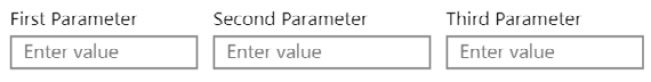
Figure 8.31 – Parameter inputs using Standard style
Notice that you do not need to click the Done Editing button to see the changes. The parameters will show right above the button. This will be true even if you change the Parameter name or Display name as well. The header buttons are shown as follows:
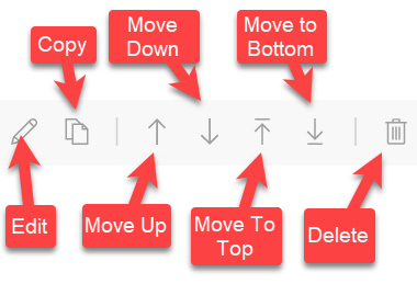
Figure 8.32 – Parameter header buttons
The header buttons are further discussed as follows, from left to right:
- The Edit button will allow all the entries to be edited in a single selected row.
- The Copy button will create a new copy of the parameter. This will open the same pane as adding a new parameter where the other fields are filled in from the original parameter except for the parameter's name. Fill in those details and click the Save button to create the copy.
- The Move Up and Move Down buttons will allow a parameter to be moved up and down in the list, respectively.
- The Move to Top and Move to Bottom buttons will move the parameter to the top of the list or the bottom of the list, respectively.
- The Delete button will delete the parameter.
Now that you have seen how the parameter step works, let's see how to add new parameters. These parameters will allow your users to have a more interactive experience with your workbooks.
Adding a new parameter
In order to add a new parameter, click the Add Parameter button. This will open the New Parameter screen with a description of fields, as shown in the following screenshot:
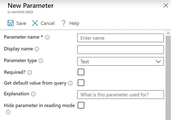
Figure 8.33 – New Parameter screen
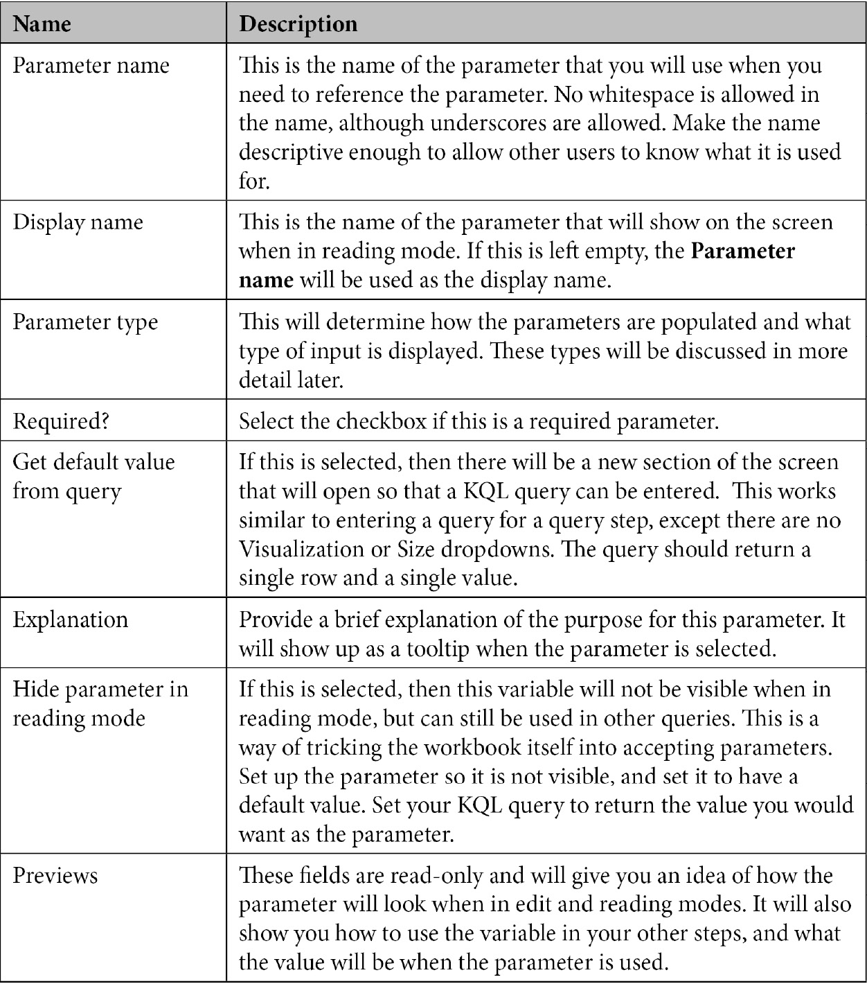
The different fields of the New Parameter window are described in the following table:
Let's take a look at the different parameter types.
Parameter types
There are seven different parameter types:
- Text
- Drop down
- Time-range picker
- Resource picker
- Subscription picker
- Resource-type picker
- Location picker
Each works differently and can have additional fields show up in the New Parameter pane when selected. For instance, the Text type is very basic and will show a textbox for input, while the Drop down type will show the KQL window so that its values can be populated from a query; there will be a new field asking whether multiple selections can be made.
- Text: This is the basic parameter type. It will allow you to enter text—for instance, an email address—that can then be used to filter other queries.
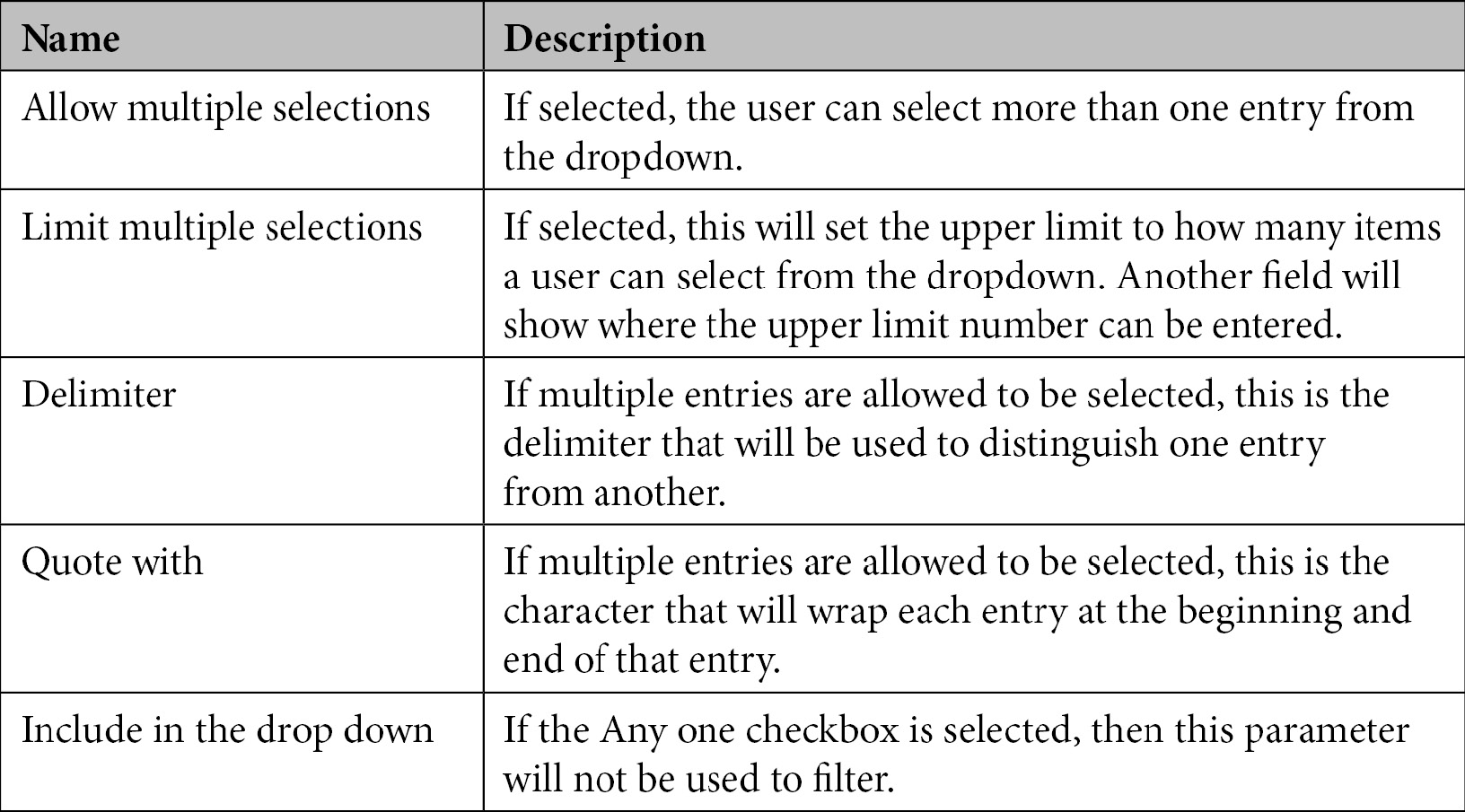
- Drop down: The Drop down type allows you to enter a KQL query, or a JSON string, to provide the choices for the dropdown. This type will also have five additional fields:
- Time Range: This is probably the most widely used parameter type, and one that you will see on most—if not all—workbooks. It allows you to select how far back in time to look for your information. This type will also show a number of time-range entries—ranging from 5 minutes to 90 days—that can be selected to show as available choices, as well as one that allows users to enter a custom range.
- Resource Picker: This type will allow you to choose what types of Azure resources to show, and then the user will be able to choose one or more of them. For instance, it could be set up to allow users to choose from virtual machines (VMs). This type will also have the same five additional fields as the Drop down type.
- Subscription Picker: This type will allow you to select one or more subscriptions from a list. This list can either be default subscriptions, all subscriptions, a KQL query, or a JSON string. This type will also have the same five additional fields as the Drop down type.
- Resource Type: This type will allow you choose a resource type from a list. This list can either be Known Resource Types, a KQL query, or a JSON string. This differs from the Resource Picker in that this one allows you to pick the type of the resource (that is, VMs, Virtual Networks, Logic Apps, and so on), while the Resource Picker selects individual resources from a given type. This type will also have the same five additional fields as the Drop down type.
- Location Picker: This type will allow you to pick Azure locations such as East US, East US 2, and West US, among many others. This type will also have the same five additional fields as the Drop down type.
Note
For those parameter types that have the Include in the drop down field, care must be taken in the KQL query that uses that parameter to account for the case where All is selected. The following code comes from the Azure AD Sign-in logs workbook and uses the Apps parameter. It can filter based on the selection, or can look for all apps:
|where AppDisplayName in ({Apps}) or ‘*’ in ({Apps})
It is the second part, after the or, that allows the code to use the All entry.
That is all the various parameter types that can be selected. Notice that when you change the parameter type, the Previews section will change to show how each type of parameter will look, and this is described next.
Previews section
The second part of the New Parameter blade, at the bottom of the screen, shows a preview of how the variable will be displayed and how to use the variable in code. The following screenshot shows a parameter with no values filled in:
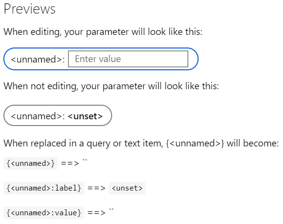
Figure 8.34 – New Parameter screen Previews section
The last part is very important as it shows how to use the variable in code. This is the Parameter name, not the Display name, surrounded by brackets, { }.
Links/tabs
The links/tabs step will allow you to either display links in different formats or tabs. This allows you to open a new website to show more information, show details about a selected cell, or display different tabs.
When you click on the Add links/tabs button, a new step will be added, as follows:
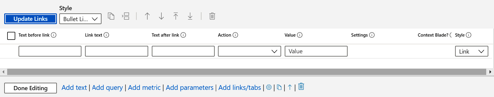
Figure 8.35 – New links/tabs step
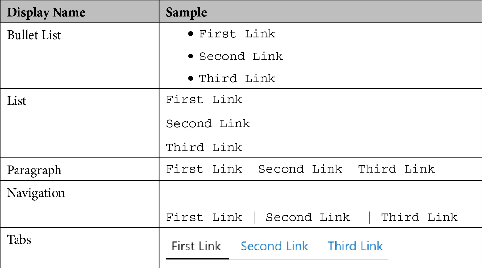
This screen will allow you to add, edit, delete, or change the order of the links that you have added. Keep in mind that as far as workbooks are concerned, tabs are links that are displayed differently.
The Update Links button will update the links with any modifications that have been made during the edit process. The Style dropdown will change how the links will be displayed in a list. The following table shows how the various styles will affect how the links are shown:
The rest of the header buttons are as follows:
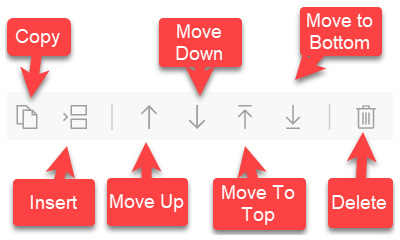
Figure 8.36 – Links/tabs step header buttons
The header buttons are discussed as follows, from left to right:
- The Copy button will create a duplicate of the selected link.
- The Insert button will insert a blank row above the selected row to allow for a new link to be created.
- The Move Up and Move Down buttons will allow a link to be moved up and down in the list, respectively.
- The Move to Top and Move to Bottom buttons will move the link to the top of the list or to the bottom of the list, respectively.
- The Delete button will delete the link.
Let's take a look at how to add a new link.
Adding a new link
To add a new link, start entering information in the blank row being shown in the listing. The different fields are described as follows:
- Text before link: Information entered into the Text before link textbox will be shown before the actual link. This field will not show if the selected Style is Tabs.
- Link text: The Link text is the actual text of the URL that will be shown.
- Text after link: Information entered into the Text after link textbox will be shown after the actual link. This field will not show if the selected Style is Tabs.
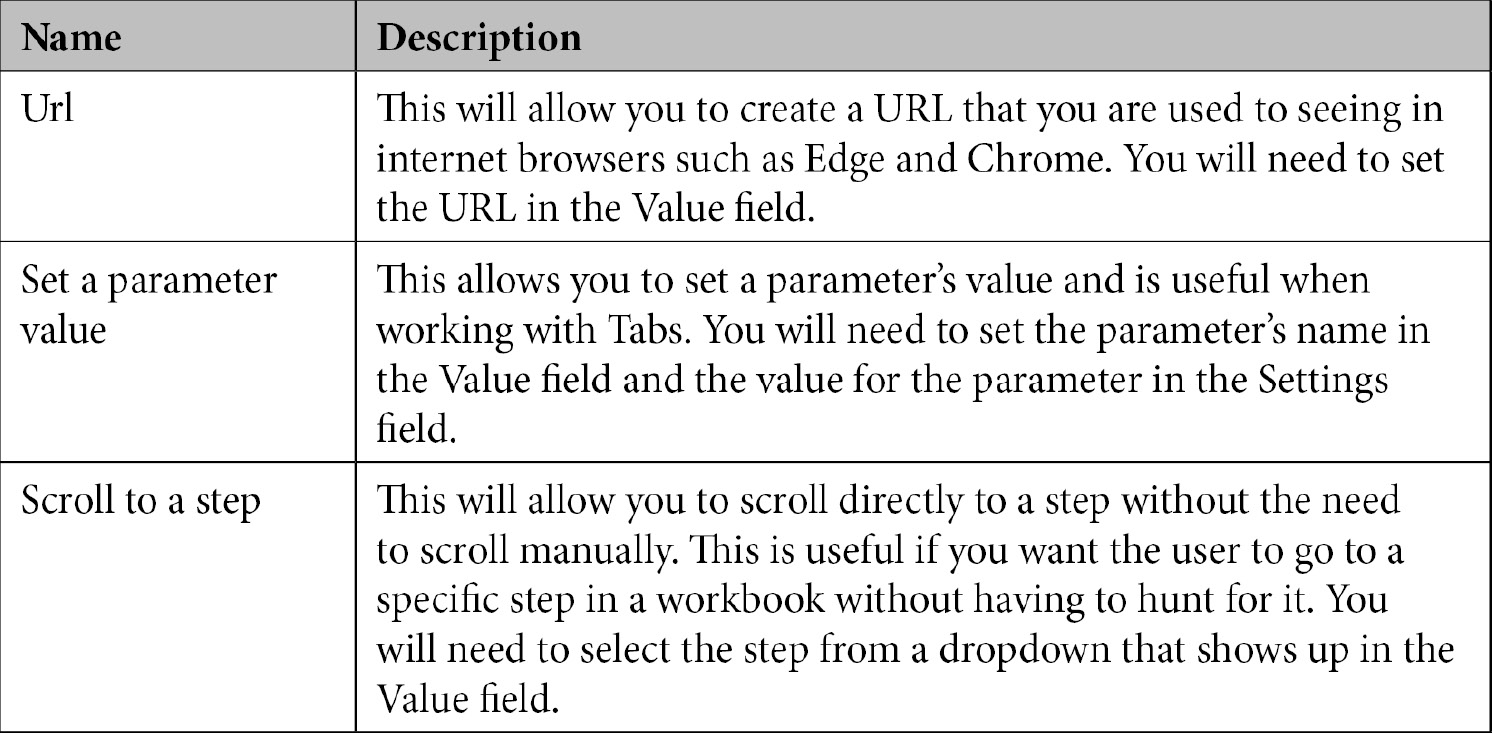
- Action: This is the action that will be performed when the link is selected. There are many different entries to choose from, but for this chapter, we will only look at Url, Set a parameter value, and Scroll to a step. Depending on which value you select, there may be a button or textbox showing up on the Settings field to provide more information, but a brief description of these fields is given in the following table:
- Value: As discussed previously, this field changes dynamically depending on which Action was selected.
- Settings: As discussed previously, this field changes dynamically depending on which Action was selected.
- Context Blade: This field is only available when certain values in the Action field are selected. If enabled, any action that would cause a new blade to show—that is, Cell Details and Generic Details—will show in a pop-up window rather than a new blade appearing up the left-hand side of the screen.
- Style: The style that is in the header of the step deals with how the links are shown in a list. This style determines how an individual link is presented. Only certain values selected in the Action field will allow for all the entries in the Style field to be selected. For instance, if the Url is selected in the Action field, then the only available style will be Link. However, if Set a parameter value is selected, then both the Button (primary) and Button (secondary) will be shown. The following screenshot shows how the selected value will change how the link is displayed:
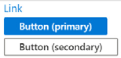
Figure 8.37 – Link formats
Now, let's take a look at how to add a new tab in the following section.
Adding a new tab
When adding a new tab, the Style field in the header needs to be set to Tabs. The only fields that will be shown are Tab Name, Action, Value, Settings, and Context Blade. You cannot set any text to show before or after the tab.
Note
There is no reason why you cannot use any of the other styles to do the same thing as the Tabs entry. The Tabs style is set up to minimize the amount of work needed to create a tab interface, including hiding unneeded fields and changing how the links are displayed to look like a traditional tabbed interface.
The value for the Action field for the tab will be Set a parameter value, as you will be using this value to either show or hide steps to make the tabs work. Enter the name of the parameter in the Value field and the value in the Settings field. It is recommended that you use the same parameter for all the tab entries, just changing the value to designate different tabs to show. This will be used along with the Make this item conditionally visible option in the advanced settings discussed in the following section.
Advanced settings
All steps have an Advanced Settings button in the step's footer that shows when the step is being edited. This will allow you to set items, including the step's name and visibility; if it exports parameters; what information to show when in view mode; as well as the step's width and other style settings. Not all step types will show the same fields, although all fields will be discussed here.
When you click the Go to Advanced Settings button, a new window will open up. The screen is broken into two tabs: Settings and Style. Settings is where you set the values that affect how the step will function, and Style is where you set the values that affect how the step will look. Let's have a look at them in the following sections.
Settings
This tab is where you set the values that affect how the step will function, including if the step is visible (and when); if the query shows; and if the step can be pinned to a dashboard. The following screenshot was taken from a query step window so it will show all the available fields, with the exception of the metrics step, which has two other fields discussed at the end of this section. Other steps will not have all the same entries:
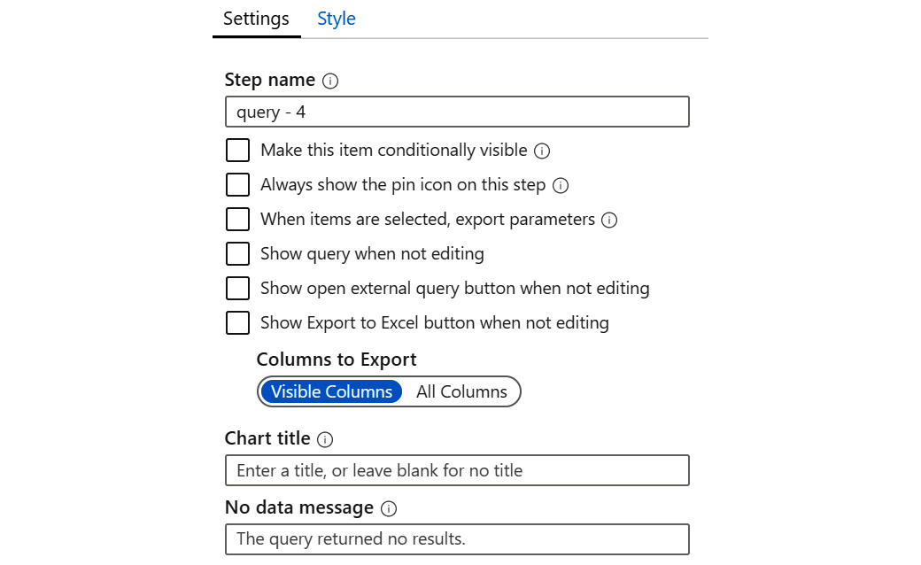
Figure 8.38 – Advanced Settings – Settings tab
The different fields from the Settings tab are explained as follows:
- Step name: This is where the name of the step is set. It can be any text, and should be descriptive enough so that users can easily tell what the step does. This is especially useful when used in dropdowns in links.
- Make this item conditionally visible: This will determine whether the step is always showing or just shows when certain conditions are met. If this is selected, a new button will show under it, called Add Condition. Clicking on that will open a new window where you can set the condition, as shown in the following screenshot:
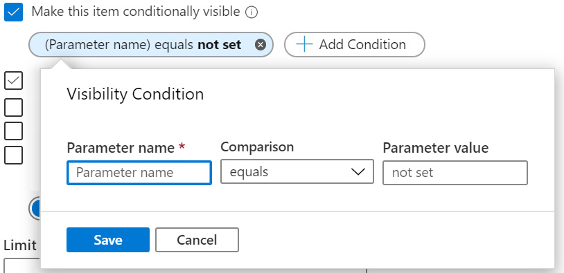
Figure 8.39 – Advanced settings – adding a conditionally visible condition
This is where you set the condition. You need to enter the Parameter name, the Comparison (equals to or not equals to), and then the Parameter value.
This is the field you will use when working with tabs. Each tab will have the Parameter name set to a different value, so when that tab is selected, the parameter will have a specific value, and that value will determine which step(s) to show.
You can have multiple conditions, and ALL of them must be met for the step to show.
- Always show the pin icon on this step: This will determine whether the pin icon will always show or whether it will follow the workbook's setting on showing the pin. Clicking on the pin icon will allow a user to pin this step to a dashboard so that a shortcut is created to this step.
- When items are selected, export parameters: If this is selected, when an item in this step is selected, a parameter will be set to the corresponding value. This allows for functionality such as filtering a listing of users based on status. If this is selected, a new button will show under it, called Add Parameter. Clicking on that button will open a new window, where you can set the parameter, as shown in the following screenshot:
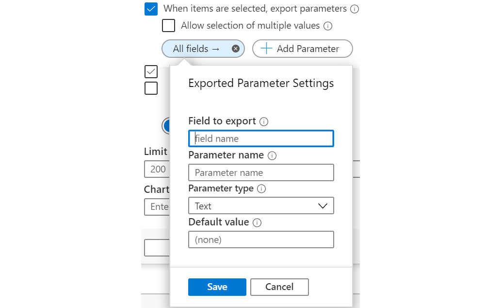
Figure 8.40 – Advanced settings – adding a new parameter to export
The Field to export is the name of the field from the query that will be used to populate the parameter's value. The Parameter name is the name of the parameter, and the Parameter type is the type of the parameter. For this book, we will always use text that includes integer, date/time, and Boolean values.
You can have multiple parameters exported at the same time. Remember to use the parameter in a query, surrounding the Parameter name with brackets { }.
- Show query when not editing: If this is selected, the KQL query will always show. This is not usually a good idea as it may confuse the casual user.
- Show open external query button when not editing: If this is selected, then the open external query button in the header will always show.
- Show Export to Excel button when not editing: If this is selected, the Export to Excel button will always show. This allows for the results to be exported into Excel for further analysis.
- Columns to Export: This will allow you to export only the columns that are shown in reader mode or all the columns, whether they are visible in reader mode or not.
- Chart title: This is the text that will appear at the top of a chart as its title.
- No data message: This is the text that will display if the query returns no results.
- Show filter field above grid or tiles: If this is selected, a search bar will appear above the results if the visualization type is a grid or tiles. Enter text into this field to filter based on that text.
- Limit grid rows to: This is how many rows will be displayed in a grid. You want this set to a high enough value that the user can get useful information, but not so high that it takes too long for the grid to display.
- Show open in Metrics Explorer button when not editing: This setting is only available when looking at a metric step and will determine whether the Metrics Explorer button will always show.
- Limit resources to: This setting is only available when looking at a metric step and will limit the number of resources that will be shown at one time. You want this set to a high enough value that the user can get useful information, but not so high that it takes too long for the grid to display.
That is everything you can do using the Settings tab. As you can see, each step in a workbook can be customized considerably. Next, we will look at the style changes you can make.
Style
The Style tab will allow you to change how the step will look when displayed. Unlike the Settings tab, all the fields are present in all the step types, as shown in the following screenshot:
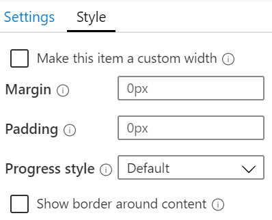
Figure 8.41 – Advanced settings – Style tab
The different fields from the preceding screenshot are explained as follows:
- Make this item a custom width: If this item is selected, two new fields show up under it: Percent width and Maximum width. The Percent width is how much of the overall width this step takes. If it is less than 100 and the previous or next step's width is also less than 100, the two steps will show side by side, assuming the sum of the widths is less than or equal to 100. Look at the Azure AD Sign-in logs workbook for examples of steps showing side by side. The Maximum width determines how wide a step can possibly be. It can either use a specific value, such as 150px, or a percentage.
- Margin: This specifies the margin that will show outside of the border of the step. Enter a value followed by a unit, such as px for pixels.
- Padding: This specifies the padding that will show inside the border of the step. Enter a value followed by a unit, such as px for pixels.
- Progress style: This determines which animated Graphics Interchange Format (GIF) file will show when the step is loading. While it is not possible to show the animation in a book, the following screenshot should give you an idea of what the various values will look like:
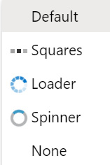
Figure 8.42 – Advanced settings – progress style choices
- Show border around content: This determines whether there will be a border shown around this step. Select it to show a border.
That ends our discussion of the step's advanced settings. As you have seen, these settings allow you to perform many actions, including stating when the step is visible, being able to export variables that other steps in the workbook can use, determining how much of the width of the page the step will take up, and more.
Summary
In this chapter, you learned about Azure Sentinel workbooks and how their interactive display is used to show information to users. Workbooks can be used to help determine if there is something in your environment that needs investigation.
You learned how to create and edit a new workbook, using the various step types provided. You learned how to define parameters using a new step, as well as coming from a query, and how to use those parameters to further filter your queries.
They can display a combination of texts, various graphs, metrics, and links including tabs. Using parameters, the workbooks can be made to change what information is presented, to help determine whether there is an incident that needs to be investigated.
Finally, you learned how to change the advanced settings on a step to change how it operates and how it looks. You learned how to get multiple steps to show up on the same row in a graph, and how one graph can communicate with another through parameters.
In the next chapter, you will learn about Azure Sentinel Incidents, which are generated from alerts and other queries, how to manage them, and how to investigate them.
Questions
- What are the two ways to create a new workbook?
- If I wanted to show the user instructions on how to use the workbook, what would be the best step type to use?
- If I want to allow a user of the workbook to be able to change how far back in time every query in the workbook looks, which two actions would I need to take? Hint: The second action would need to be performed on every query step.
- Is it possible to have a workbook step only show up when certain conditions are met?
- How can I have two steps in the same workbook show side by side?
Further reading
For more information, you can refer to the following links:
- Azure Monitor Workbooks: https://docs.microsoft.com/en-us/azure/azure-monitor/platform/workbooks-overview
- Create interactive reports with Azure Monitor workbooks: https://docs.microsoft.com/en-us/azure/azure-monitor/app/usage-workbooks
- Azure Monitor workbook visualizations: https://docs.microsoft.com/en-us/azure/azure-monitor/platform/workbooks-visualizations
- Application Insights workbooks (GitHub repository of sample workbooks): https://github.com/Microsoft/Application-Insights-Workbooks
- Adding text and Markdown sections: https://docs.microsoft.com/en-us/azure/azure-monitor/app/usage-workbooks#adding-text-and-markdown-sections