
6
CSS Selectors, Typography, Color Modes, and More
In the last few years, CSS has enjoyed a raft of new features. Some enable us to animate and transform elements. Others allow us to create multiple background images, gradients, and mask and filter effects, and others allow us to bring SVG elements to life.
We will get to all those capabilities in the next few chapters. Firstly, I think it will be useful to look at more recent improvements to some of the fundamentals of CSS.
No one can know every nuance, capability, and syntax in the CSS language. I've been working with CSS for two decades and on a weekly basis I still discover something new (or just as likely rediscover something I'd forgotten). As such, I don't feel that trying to know every possible CSS property and value permutation is actually a worthy pursuit. Instead, I think it's more sensible to develop a good grasp of what's possible and what capabilities exist that solve the most common problems.
As such, we are going to concentrate in this chapter on some of the techniques, units, and selectors I have found most useful when building responsive web designs. I'm hoping you'll then have the requisite knowledge to solve most problems that come your way when developing a responsive web design.
As there are quite a few topics to cover they have been grouped:
Selectors, units, and capabilities:
::beforeand::afterpseudo-elements- Attribute selectors and substring matching
- Structural pseudo-classes, including
:last-child,:nth-child,:empty, and:not - Combinator selectors, including child, next sibling, and subsequent sibling
- Viewport related length units: vh, vw, vmax, and vmin
- The
calc()function - CSS custom properties and environment variables
- Using
@supportsto fork CSS
Web typography:
@font-facerule- Font formats, including
.woffand.woff2 - Font loading control with the
font-displayproperty - Variable fonts and font features
Color:
- RGB
- HSL
- RGBA and HSLA
As you can see, we have a lot to get through. Let's begin.
Selectors, units, and capabilities
Although they may not seem like the most exciting of subjects, selectors, units, and capabilities are the "meat and potatoes" of CSS. Master these and your power to solve problems with CSS will increase substantially. So, skip this section at your peril!
Anatomy of a CSS rule
Before exploring some of the recent additions to CSS, to prevent confusion, let's establish the terminology we use to describe a CSS rule. Consider the following example:
.round {
  /* selector */
  border-radius: 10px; /* declaration */
}
This rule is made up of the selector (.round) and then the declaration (border-radius: 10px). The declaration is further defined by the property (border-radius) and the value (10px). Happy we're on the same page? Great, let's press on.
At the time of writing this, the Selectors Level 4 working draft details a host of new selectors such as is(), has(), and nth-col. Sadly, there is not a single implementation in any of the common browsers available. However, if you want to see how things are shaping up for the future, head to the draft at https://www.w3.org/TR/selectors-4/.
Pseudo-elements and pseudo-classes
There is potential for some confusion when we go on shortly to talk about "pseudo" selectors. The reason being is that, in CSS, there are both pseudo-selectors and pseudo-elements. Let's therefore take a moment to establish the difference.
The word "pseudo" in this context means something that is like something but not really it. So, a pseudo-element is something that is like an element but not really one, and a pseudo-selector is something that selects something that isn't really something. Wow, I'm sounding like the Riddler now from Batman! Let's clarify with some code. Here is how you create a pseudo-element in CSS:
.thing::before {
    content: "Spooky";
}
That inserts a ::before pseudo-element into the .thing element with the content "Spooky." A ::before behaves like a first child of the element and an ::after behaves like a last child.
The following image might help. It's showing a single element represented in the Firefox developer tools, containing text with both a ::before and an ::after pseudo-element added in CSS:

Figure 6.1: The Firefox developer tools will show you where pseudo-elements are in the DOM
The key thing to remember with pseudo-elements is that if you don't provide a value for content, nothing will show on the page. Notice the double colon before before? Officially, that is how you should code pseudo-elements as it helps differentiate them from pseudo-selectors, which only use one. However, a single colon worked with the first implementations of ::before and ::after and so you can still write them that way too.
You can't do the same with pseudo-selectors; they always have a single colon. For example, :hover, :active, and :focus are all pseudo-selectors and are written with a single colon.
At the risk of oversimplification, it might be useful to think of a pseudo-selector as one that selects a subpart of the original thing it is selecting.
Hopefully, the difference between pseudo-selectors and elements is now clear.
With that distinction made, let's move on and look at some of the powerful selectors available to us today in CSS.
CSS Level 3 selectors and how to use them
CSS now provides incredible power for selecting elements within a page. You may not think this sounds very glitzy but trust me, it will make your life easier and you'll love CSS for it! I'd better qualify that bold claim.
CSS attribute selectors
You've probably used CSS attribute selectors to create rules. For example, consider the following markup:
<img src="https://placeimg.com/640/480/any" alt="an inquisitive cat">
And this CSS:
img[alt] {
  border: 3px dashed #e15f5f;
}
This would select the img element in the preceding code, and any others on the page provided that they have an alt attribute.
In fact, to make something a little more useful, we could combine this with the :not negation selector (we will look at that in detail later in this chapter) to add a red border around any images that have no alt attribute or an alt attribute with no value:
img:not([alt]),
img[alt=""] {
    border: 3px solid red;
}
That would be useful from an accessibility point of view as it would visually highlight any images that didn't have alternate text included for assistive technology.
As another example, let's say we wanted to select all elements with a data-sausage attribute:
[data-sausage] {
  /* styles */
}
The key thing here is to use square brackets to specify the attribute you want to select.
The data-* type attribute was introduced in HTML5 to provide a place for custom data that can't be stored sensibly by any other existing mechanism. The specification description for these can be found here: http://www.w3.org/TR/2010/WD-html5-20101019/elements.html#embedding-custom-non-visible-data-with-the-data-attributes.
You can also narrow things down by specifying what the attribute value is. For example, consider the following rule:
img[alt="Sausages cooking"] {
  /* Styles */
}
This would only target images that have an alt attribute of "Sausages cooking"; for example:
<img src="img/sausages.png" alt="Sausages cooking" />
So far, so "big deal, we could do that in CSS2." What do CSS Level 3 selectors bring to the party?
CSS substring matching attribute selectors
CSS3 added the ability to select elements based upon the substring of their attribute selector. That sounds complicated. It isn't! The three options are whether the attribute:
- Begins with a certain substring
- Contains an instance of a certain substring
- Ends with a certain substring
Let's see what they look like.
The "beginning with" substring matching attribute selector
Consider the following markup:
<li data-type="todo-chore">Empty the bins</li>
<li data-type="todo-exercise">Play football</li>
Suppose that markup represents two items in a "todo" list application we are building. Even though they both have different data-type attribute values, we can select them both with the "beginning with" substring matching attribute selector, like this:
[data-type^="todo"] {
/* Styles */
}
The key character in all this is the ^ symbol. That symbol is called the "caret," although it is often referred to as the "hat" symbol too. In this instance, it signifies "begins with." Because both data-type attributes have values that begin with "todo," our selector selects them.
The "contains an instance of" substring matching attribute selector
The "contains an instance of" substring matching attribute selector has the following syntax:
[attribute*="value"] {
/* Styles */
}
Like all attribute selectors, you can combine them with a type selector (one that references the actual HTML element used) if needed, although I would only do that if I had to—in case you want to change the type of element used.
Let's try an example. Consider this markup:
<p data-ingredients="scones cream jam">Will I get selected?</p>
We can select that element like this:
[data-ingredients*="cream"] {
    color: red;
}
The key character in all this is the * symbol, which in this context means "contains."
The "begins with" selector would not have worked in this markup as the string inside the attribute didn't begin with "cream." It did, however, contain "cream," so the "contains an instance of" substring attribute selector finds it.
The "ends with" substring matching attribute selector
The "ends with" substring matching attribute selector has the following syntax:
[attribute$="value"] {
/* Styles */
}
An example should help. Consider this markup:
<p data-ingredients="scones cream jam">Will I get selected?</p>
<p data-ingredients="toast jam butter">Will I get selected?</p>
<p data-ingredients="jam toast butter">Will I get selected?</p>
Suppose we only want to select the element with scones, cream, and jam in the data-ingredients attribute (the first element). We can't use the "contains an instance of" (it will select all three) or "begins with" (it will only select the last one) substring attribute selector. However, we can use the "ends with" substring attribute selector:
[data-ingredients$="jam"] {
    color: red;
}
The key character in all this is the $ (dollar) symbol, which means "ends with."
Right, we have some pretty handy attribute related selectors now. It's also worth knowing that you can chain attribute selectors, just like you can class selectors.
Chaining attribute selectors
You can have even more possibilities for selecting items by grouping attribute selectors.
Suppose we had this markup:
<li
  data-todo-type="exercise"
  data-activity-name="running"
  data-location="indoor"
>
  Running
</li>
<li
  data-todo-type="exercise"
  data-activity-name="swimming"
  data-location="indoor"
>
  Swimming
</li>
<li
  data-todo-type="exercise"
  data-activity-name="cycling"
  data-location="outdoor"
>
  Cycling
</li>
<li
  data-todo-type="exercise"
  data-activity-name="swimming"
  data-location="outdoor"
>
  Swimming
</li>
Let's suppose I only wanted to select "indoor swimming." I can't use just data-location="indoor" as that would get the first element too. I can't use data-activity-name="swimming" as that would get me the first and the third, but I can do this:
[data-activity-name="swimming"][data-location="indoor"] {
    /* Styles */
}
This selects elements that have "swimming" as the activity name, as long as they also have "indoor" as the location.
Attribute selectors allow you to select IDs and classes that start with numbers. Before HTML5, it wasn't valid markup to start IDs or class names with a number. HTML5 removes that restriction. When it comes to IDs, there are still some things to remember. There should be no spaces in the ID name, and it must be unique on the page. For more information, visit http://www.w3.org/html/wg/drafts/html/master/dom.html#the-id-attribute. Now, although you can start ID and class values with numbers in HTML5, CSS still restricts you from using ID and class selectors that start with a number (http://www.w3.org/TR/CSS21/syndata.html#characters). Luckily for us, we can easily work around this by using an attribute selector; for example, [id="10"].
Right, I think our attribute selecting skills are now pretty tight. Let's move on to how we can deal with selecting elements based upon where they are in the document.
CSS structural pseudo-classes
CSS gives us more power to select elements based upon where they sit in the structure of the DOM. Let's consider a common design treatment; we're working on the navigation bar for a larger viewport and we want to have all but the last link over on the left. Historically, we would have needed to solve this problem by adding a class name to the last link so we could select it, like this:
<nav class="nav-Wrapper">
  <a href="/home" class="nav-Link">Home</a>
  <a href="/About" class="nav-Link">About</a>
  <a href="/Films" class="nav-Link">Films</a>
  <a href="/Forum" class="nav-Link">Forum</a>
  <a href="/Contact-Us" class="nav-Link nav-LinkLast">Contact Us</a>
</nav>
This in itself can be problematic. For example, sometimes, just getting a content management system to add a class to a final list item can be frustratingly difficult. Thankfully, in those eventualities, it's no longer a concern. We can solve this problem and many more with CSS structural pseudo-classes.
The :last-child selector
CSS 2.1 already had a selector applicable for the first item in a list; the :first-child selector:
div:first-child {
  /* Styles */
}
However, CSS Level 3 added a selector that can also match the last:
div:last-child {
  /* Styles */
}
Let's look how that selector could fix our prior problem if we didn't want to, or couldn't add, another class at the desired point in the markup:
.nav-Wrapper {
  display: flex;
}
.nav-Link:last-child {
  margin-left: auto;
}
There are also useful selectors for when something is the only item: :only-child and the only item of a type: :only-of-type.
The nth-child selectors
The nth-child selectors let us solve even more difficult problems. With the same markup as before, let's consider how nth-child selectors allow us to select any arbitrary link(s) we want within the list.
Firstly, what about selecting every other list item? We could select the odd ones like this:
.nav-Link:nth-child(odd) {
  /* Styles */
}
Or, if you wanted to select the even ones, you could do this:
.nav-Link:nth-child(even) {
  /* Styles */
}
Understanding what nth rules do
For the uninitiated, nth-based selectors can look pretty intimidating. However, once you've mastered the logic and syntax, you'll be amazed what you can do with them. Let's take a look.
Here are the nth-based selectors at our disposal:
nth-child(n)nth-last-child(n)nth-of-type(n)nth-last-of-type(n)
We've seen that we can use (odd) or (even) values already in an nth-based expression, but the (n) parameter can be used in another couple of ways:
- As an integer; for example,
:nth-child(2)would select the second item. Passing a number/integer into the nth selector is easy enough to understand; just enter the element number you want to select. - However, you can also pass a numeric expression. For example,
:nth-child(3n+1)would start at the first element, and then select every third element.
The numeric expression version of the selector is the part that can be a little baffling at first. Let's break it down.
Breaking down the math
Let's consider 10 spans on a page (you can play about with these by looking at example_06-05):
<span></span>
<span></span>
<span></span>
<span></span>
<span></span>
<span></span>
<span></span>
<span></span>
<span></span>
<span></span>
We will style them like this:
span {
  height: 2rem;
  width: 2rem;
  background-color: blue;
  display: inline-block;
}
As you might imagine, this gives us 10 squares in a line:

Figure 6.2: We will test our nth-child selection skills on these ten identical elements
OK, let's look at how we can select different ones with nth-based selections.
For practicality, when considering the expression within the parentheses, I start from the right. So, for example, if I want to figure out what (2n+3) will select, I start with the right-most number (the "3" here indicates the third item from the left) and know it will select every second element from that point on. So, adding this rule:
span:nth-child(2n + 3) {
  background-color: #f90;
  border-radius: 50%;
}
Results in this in the browser:

Figure 6.3: Anything that matches our nth-child selector gets turned round and orange
As you can see, our nth selector targets the third list item and then every subsequent second one after that too. If there were 100 list items, it would continue selecting every second one.
How about selecting everything from the second item onwards? Well, although you could write :nth-child(1n+2), you don't actually need the first number 1 as, unless otherwise stated, n is equal to 1. We can, therefore, just write :nth-child(n+2). Likewise, if we wanted to select every third element, rather than write :nth-child(3n+3), we could just write :nth-child(3n) as every third item would begin at the third item anyway, without needing to state it explicitly.
The expression can also use negative numbers; for example, :nth-child(3n-2) starts at minus 2 and then selects every third item.
You can also change the direction. By default, once the first part of the selection is found, the subsequent ones go down the elements in the DOM (and therefore from left to right in our example). However, you can reverse that with a minus; for example:
span:nth-child(-2n+3) {
    background-color: #f90;
    border-radius: 50%;
}
This example finds the third item again, but then goes in the opposite direction to select every two elements (up the DOM tree and therefore from right to left in our example):

Figure 6.4: With a minus symbol we can select in the opposite direction
Hopefully, the nth-based expressions are making more sense now. nth-child and nth-last-child differ in that the nth-last-child variant works from the opposite end of the document tree. For example, :nth-last-child(-n+3) starts at 3 from the end and then selects all the items after it. Here's what that rule gives us in the browser:

Figure 6.5: nth-last-child lets you start from the opposite end of the elements
Finally, let's consider :nth-of-type and :nth-last-of-type. While the previous examples count any children, regardless of type (always remember the nth-child selector targets all children at the same DOM level, regardless of classes), :nth-of-type and :nth-last-of-type let you be specific about the type of item you want to select. Consider the following markup (example_06-06), which is a mixture of div and span elements, albeit with the same class:
<span class="span-class"></span>
<span class="span-class"></span>
<span class="span-class"></span>
<span class="span-class"></span>
<span class="span-class"></span>
<div class="span-class"></div>
<div class="span-class"></div>
<div class="span-class"></div>
<div class="span-class"></div>
<div class="span-class"></div>
If we used the selector:
.span-class:nth-of-type(-2n+3) {
  background-color: #f90;
  border-radius: 50%;
}
Even though all the elements have the same span-class class, they don't get seen as one group. The selector applies once to the span elements, and then to the div elements. Here is what gets selected:

Figure 6.6: nth-of-type selectors work on each type of element they find
CSS doesn't count like JavaScript and jQuery! If you're used to using JavaScript and jQuery, you'll know that it counts from 0 upward (zero index-based). For example, if selecting an element in JavaScript or jQuery, an integer value of 1 would actually be the second element. CSS, however, starts at 1 so that a value of 1 is the first item it matches.
nth-based selection in responsive web designs
Just to close out this little section, I want to illustrate a real-life responsive web design problem and how we can use nth-based selection to solve it. Imagine we are building a page where we want to list the top grossing movies from a given year. Our content management system simply spits all the items out in a list, but we want to show them in a grid of sorts.
For some viewports, we will only be able to fit two items wide. However, as the viewport increases in width, we can show three items and at larger sizes still, we can show four. Here is the problem, though. Regardless of the viewport size, we want to prevent any items on the bottom row from having a border on the bottom.
You can view this code at example_06-09. Here is how it looks with four items wide:

Figure 6.7: Our task here is to remove the border on the bottom row, regardless of how many are showing
See that pesky border below the bottom two items? That's what we need to remove. However, I want a robust solution so that if there was another item on the bottom row (we want to go one better than other sites and show the top 11 top grossing films!), the border would also be removed from that too.
Now, because there are a different number of items on each row at different viewports, we will also need to change the nth-based selection at different viewport widths. But we can use media queries for that. For the sake of brevity, I'm not going to show you the selection for each media query. I'll just show you the selection that matches four items per row, as you can see in the preceding screenshot. However, you can open the code sample to see the selections for each different viewport:
@media (min-width: 55rem) {
  .Item {
    width: 25%;
  }
  /*  Get me every fourth item and of those, only ones that are in the last four items */
  .Item:nth-child(4n+1):nth-last-child(-n+4),
  /* Now get me every one after that same collection too. */
  .Item:nth-child(4n+1):nth-last-child(-n+4) ~ .Item {
    border-bottom: 0;
  }
}
You'll notice here that we are chaining the nth-based pseudo-class selectors, much like we chained attribute selectors earlier in this chapter. It's important to understand when you chain nth selectors like this that the first selector doesn't "filter" the selection for the next selector; rather, the element has to match each of the selections.
So, for the line like this:
.Item:nth-child(4n+1):nth-last-child(-n+4),
.Item has to be the first item of four and also be one of the last four:

Figure 6.8: Achievement unlocked—using nth-child selectors like some kind of nth-child wizard!
Nice! Thanks to nth-based selections, we have a defensive set of rules to remove the bottom border, regardless of the viewport size or number of items we are showing.
Now, one nifty bit of selection we are doing in that prior example is using the "subsequent sibling" selector. We haven't looked at that, so we will cover that next.
Combinator selectors – child, next sibling, and subsequent sibling
I'm making the assumption at this point that you understand the basic selector pattern where one class followed by another selects any descendant that matches. For example, .parent .descendant {} would select any element that was a descendant of the .parent element with a class of .descendant, no matter how many levels deep.
The child combinator
The child combinator only selects direct descendants. Consider this markup:
<div class="parent">
  <div class="descendant child">
    <div class="descendant grandchild"></div>
  </div>
</div>
We can select only the direct "child" of the parent element, like this:
.parent > .descendant {
  /* Styles */
}
Notice the right angle bracket between the two class names in the selector; that's the child combinator symbol.
The next sibling
<div class="item one">one</div>
<div class="item">two</div>
<div class="item">three</div>
<div class="item">four</div>
<div class="item">five</div>
<div class="item">six</div>
Let's suppose we wanted to select an item, but only if it is the next sibling of .one. With that markup, we could select the two elements like this:
.one + .item {
  border: 3px dashed #f90;
}
The + symbol there means "next sibling," so select the next sibling element of .one.
The subsequent sibling
With the same markup from the previous example, if we wanted to select all items after the third, we could do this:
.item:nth-child(3) ~ .item {
  border: 3px dashed #f90;
}
The ~ symbol, called "tilde," says "every subsequent sibling."
The negation (:not) selector
Another handy selector is the negation pseudo-class selector. This is used to select everything that isn't something else. Consider this:
<div class="a-div"></div>
<div class="a-div"></div>
<div class="a-div"></div>
<div class="a-div not-me"></div>
<div class="a-div"></div>
And then these styles:
div {
  display: inline-block;
  height: 2rem;
  width: 2rem;
  background-color: blue;
}
.a-div:not(.not-me) {
    background-color: orange;
    border-radius: 50%;
}
Our final rule will make every element with a class of .a-div orange and round, with the exception of the div that also has the .not-me class. You can find that code in the example_06-07 folder of the code samples (remember, you can grab them all at https://rwd.education):

Figure 6.9: The negation selector allows you to exclude elements from selection
So far, we have looked primarily at what's known as structural pseudo-classes (full information on this is available at http://www.w3.org/TR/selectors/#structural-pseudos). However, CSS has many more selectors. If you're working on a web application, it's worth looking at the full list of UI element states pseudo-classes (http://www.w3.org/TR/selectors/#UIstates) as they can, for example, help you target rules based on whether something is selected or not.
The empty (:empty) selector
I've encountered situations where I have an element that includes some padding on the inside and gets content dynamically inserted. Sometimes, it gets content inserted, while sometimes, it doesn't. The trouble is, when it doesn't include content, I still see the padding. Consider the HTML in example_06-08:
<div class="thing"></div>
And here's the CSS:
.thing {
  padding: 1rem;
  background-color: violet;
}
Without any content in that element, I still see the background color. Thankfully, we can easily hide it, like this:
.thing:empty {
  display: none;
}
However, just be careful with the :empty selector. For example, you might think this is empty:
<div class="thing"> </div>
It isn't! Look at the whitespace in there. Whitespace is not "no" space! And nor would something like a line break be either.
However, just to confuse matters, be aware that a comment doesn't affect whether an element is considered "empty" or not. For example, this is still considered empty:
<div class="thing"><!--I'm empty, honest I am--></div>
Remember to check support for your users. As we delve into CSS more and more, don't forget to visit http://caniuse.com, if you ever want to know what the current level of browser support is for a particular CSS or HTML5 feature. Alongside showing browser version support (searchable by feature), it also provides the most recent set of global usage statistics from http://gs.statcounter.com.
Let's change tack now. We've looked at how we can select items in our responsive world. But how about how we size them? We'll look at viewport-percentage lengths next.
Responsive viewport-percentage lengths (vmax, vmin, vh, and vw)
CSS Values and Units Module Level 3 (http://www.w3.org/TR/css3-values/#viewport-relative-lengths) ushered in viewport relative units. These are great for responsive web design, as each unit is a percentage length of the viewport:
- The vw unit, where each vw unit is 1% of the viewport width.
- The vh unit, where each vh unit is 1% of the viewport height.
- The vmin unit (for viewport minimum; equal to the smaller of either vw or vh).
- The vmax (viewport maximum; equal to the larger of either vw or vh).
Want a modal window that's 90% of the browser height? This is as easy as:
.modal {
    height: 90vh;
}
As useful as viewport relative units are, some browsers have curious implementations. Safari in iOS, for example, changes the viewable screen area as you scroll from the top of a page (it shrinks the address bar), but doesn't make any changes to the reported viewport height.
However, you can perhaps find more utility for these units when coupled with fonts. For example, it's now trivially easy to create text that scales in size, depending upon the viewport.
For example:
.Hero-text {
  font-size: 25vw;
}
Now, the text will always be sized as a percentage of the viewport width.
There is a new mathematical expression on the way to CSS called clamp(), which lets us specify a minimum, maximum, and variable size. For example, we might opt for a headline like this: .headline { font-size: clamp(20px, 40vw, 80px) }. And while our headline text might vary in size, depending upon the viewport, it would never be less than 20px or larger than 80px. You can read the specification for clamp() here: https://www.w3.org/TR/css-values-4/#calc-notation.
Right, we've dealt with selectors of various types, and some of the more recent length units that are particularly relevant to responsive designs. Before we move on to web typography, let's cover some important capabilities of CSS.
CSS calc
How many times have you been trying to code out a layout and thought something like, "it needs to be half the width of the parent element minus exactly 10px"? This is particularly useful with responsive web design, as we never know the size of the screen that will be viewing our web pages. Thankfully, CSS has a way to do this. It's called the calc() function. Here's that example in CSS:
.thing {
    width: calc(50% - 10px);
}
Just be careful to include whitespace around your symbols. If I had written calc(50% -10px), for example, missing the whitespace around the minus sign, the declaration would not have worked.
Addition, subtraction, division, and multiplication are supported, so it's possible to solve a bunch of problems that have been impossible without JavaScript in the past.
You can also use CSS custom properties in there too. If you don't know anything about CSS custom properties, you're in luck, because that's what we are going to talk about next.
CSS custom properties
CSS custom properties are often referred to as "CSS variables," although that is not necessarily their only use case.
You can find the full specification here: http://dev.w3.org/csswg/css-variables/.
CSS custom properties allow us to store information in our stylesheets that can then be utilized in that stylesheet or read/written to with JavaScript.
Let's start with a simple use case; storing a font-family name that we can then reference more simply later in the stylesheet:
:root {
  --MainFont: 'Helvetica Neue', Helvetica, Arial, sans-serif;
}
Here, we are using the :root pseudo-class to store the custom property in the document root (although you can store them inside any rule you like).
The :root pseudo-class always references the top-most parent element in a document structure. In an HTML document, this would always be the HTML tag, but for an SVG document (we will look at SVG in Chapter 8, Using SVGs for Resolution Independence), it would reference a different element.
A custom property always begins with two dashes, then the custom name, and then, at the end of the property, just like a normal CSS property, we terminate the property with a colon.
We can reference that value elsewhere in our stylesheet with the var() notation, like so:
.Title {
  font-family: var(--MainFont);
}
You could obviously store as many custom properties as you need in this manner. The main benefit of this approach is that you can change the value inside the variable and every rule that makes use of the variable gets the new value without having to amend them directly.
Let me show you a very simple example of using CSS custom properties with JavaScript. You can find this in example_06-11. We will make a page with the poem "If," by Rudyard Kipling. At the bottom is a simple light/dark mode toggle button. All the button will do is toggle the value of two CSS custom properties: --background and --foreground.
Here is our CSS:
body {
    background-color: var(--background);
    color: var(--foreground);
}
For the curious, here is the snippet of JavaScript we are using. Essentially, it just says that if the foreground variable is #eee (nearly white), then make it #333 (a dark grey); otherwise, make it #eee. And, if the background variable is #333, make it #eee; otherwise, make it #333:
var root = document.documentElement;
var btn = document.getElementById("colorToggle");
btn.addEventListener("click", e => {
    root.style.setProperty("--background", getComputedStyle(root).getPropertyValue('--background') === "#333" ? "#eee" : "#333");
    root.style.setProperty("--foreground", getComputedStyle(root).getPropertyValue('--foreground') === "#eee" ? "#333" : "#eee");
})
And here is a screenshot showing each state:

Figure 6.10: An example of each state side by side, colors easily swapped with custom properties
This example is in this chapter's code as example_06-12.
Custom properties also behave like other properties in terms of specificity. For example, we set our custom properties at the root level, but if they are redeclared closer to the element in question, the more specific value will override the first. Consider this CSS:
:root {
  --backgroundColor: red;
}
header {
  --backgroundColor: goldenrod;
}
The header and any elements within it that make use of the --backgroundColor custom property will have a "goldenrod" background color, whereas other elements will have a red background.
Setting a fallback value
There may be a situation where you want to protect against a custom property being unavailable. You can do that by providing a fallback value. The syntax is straightforward: simply provide your fallback value after the custom property name and a comma. For example, suppose I wanted to use the --backgroundColor custom property, but default to a dark gray color if that variable was unavailable. I could write it like this:
.my-Item {
     background-color: var(--backgroundColor, #555);
}
To be safe, it makes a lot of sense to get into the habit of supplying fallback values whenever you use custom properties.
env() environment variables
In addition to custom properties we might make for ourselves, there are occasionally properties that can be read in from the environment we are operating in. These are called "environment variables." The only solid example of these I'm currently aware of are the safe-area-inset properties applicable to notched mobile phones. Made famous by the iPhone X, the "safe-areas" relate to the sections at the top and bottom of the screen where areas of UI or physical buttons impinge upon the viewing area.
Environment variables are defined with the env() function. Values are passed into this function just like you would any other CSS function. For example, if we wanted to add padding to the top of our element equal to the height of the environments "safe area inset top," we could do this:
padding-top: env(safe-area-inset-top);
If the browser has that value available and it understands the env() function, it will apply the value; otherwise, it will skip over it to the next declaration.
You can read the current specification for environment variables here: https://drafts.csswg.org/css-env-1/#env-function.
There are a few extra peculiarities to the iPhone notched screens. For a full walkthrough of dealing with the iPhone notches, read https://benfrain.com/css-environment-variables-iphonex/.
I'm continually finding new use cases for CSS custom properties. The fact that they can update "on the fly" means they are useful in all manner of scenarios. The fact that they can be easily read and written to from script elevates them far beyond what was possible with the kind of variables made popular by CSS preprocessors like Sass, Less, and so on.
Custom properties, along with many of the features we have looked at and shall look at, cannot be guaranteed to work in every browser you might need to support. Thankfully, CSS has an elegant syntax for encapsulating code that pertains to the latest features. Let's look at that next.
Using @supports to fork CSS
When you're building out a responsive web design, attempting to provide a single design that works everywhere, on every device, it's a simple fact that you'll frequently encounter situations when features or techniques are not supported on certain devices. In these instances, you'll likely want to create a fork in your CSS. If the browser supports a feature, provide one chunk of code; if it doesn't, it gets different code.
This is the kind of situation that gets handled by if/else or switch statements in JavaScript. In CSS, we use the @supports at-rule.
Feature queries
The native solution to forking code in CSS is to use "feature queries," part of the CSS Conditional Rules Module Level 3 (http://www.w3.org/TR/css3-conditional/). Support was introduced in iOS and Safari 9, Firefox 22, Edge 12, and Chrome 28.
Feature queries follow a similar syntax to media queries. Consider this:
@supports (flashing-sausages: lincolnshire) {
  body {
    sausage-sound: sizzling;
    sausage-color: slighty-burnt;
    background-color: brown;
  }
}
Here, the styles will only get applied if the browser supports the flashing-sausages property in combination with the lincolnshire value. I'm quite confident that no browser is ever going to support a flashing-sausages: lincolnshire property/value combination (and if they do, I want full credit), so none of the styles inside the @supports block will be applied.
Let's consider a more practical example. How about we use Grid when browsers support it and fall back to another layout technique when they don't? Consider this example:
@supports (display: grid) {
  .Item {
    display: inline-grid;
  }
}
@supports not (display: grid) {
  .Item {
    display: inline-flex;
  }
}
Here, we are defining one block of code for when the browser supports a feature, and another lot for when it doesn't. This pattern is fine if the browser supports @supports (yes, I realize that is confusing), but if it doesn't, it won't apply any of those styles.
If you want to cover off devices that don't support @supports, you're better off writing your default declarations first and then your @supports-specific one after. That way, the prior rule will be overruled if support for @supports exists, and the @supports block will be ignored if the browser doesn't support it. Our prior example could, therefore, be reworked to:
.Item {
  display: inline-flex;
}
@supports (display: grid) {
  .Item {
    display: inline-grid;
  }
}
Sorry, that explanation was tough—hopefully you got through it!
Combining conditionals
You can also combine conditionals. Let's suppose we only wanted to apply some rules if both Flexbox and pointer: coarse were supported (in case you missed it, we covered the pointer interaction media feature back in Chapter 3, Media Queries – Supporting Differing Viewports). Here is what that might look like:
@supports ((display: flex) and (pointer: coarse)) {
  .Item {
    display: inline-flex;
  }
}
Here, we have used the and keyword but we could use or as well as, or instead of it. For example, if we were happy to apply styles if those two prior property/value combinations were supported, or 3D transforms were supported:
@supports ((display: flex) and (pointer: coarse)) or
  (transform: translate3d(0, 0, 0)) {
  .Item {
    display: inline-flex;
  }
}
Note the extra set of parentheses that separates the display and pointer conditional from the transform conditional.
And that really is all there is to feature queries. As with media queries, put your "default" styles first, and then your enhancement inside a feature query @supports at-rule. Remember, you can combine queries and also offer differing possibilities in which the enclosed code can apply.
Web typography
Typography on the web has come on tremendously in the last few years. Where once it was necessary to include a slew of different file formats, things have pretty much settled on .woff and the newer .woff2. In addition, we have more control over the particulars of our fonts in CSS and new variable fonts are popping up on a monthly basis.
If some of that introduction was lost on you, fear not. Let's try to get through the current state of the art in web typography.
First, however, let's talk about system fonts as they represent the best performing web typography choice you can opt for.
System fonts
Each operating system has its own set of fonts that come preinstalled. However, aside from a few exceptions, there aren't many fonts you can rely upon to be installed on every device a user might view your site with.
Subsequently, we've grown accustomed to writing font "stacks," which enable us to write a font "wish list" for the browser. For example:
font-family: -apple-system, BlinkMacSystemFont, Roboto, Ubuntu, 'Segoe UI', 'Helvetica Neue', Arial, sans-serif;
The browser reads this declaration and goes left to right until it finds a font it has available and then chooses that to render the associated text.
In our example system font stack here, macOS users will get San Francisco or Helvetica (-apple-system tells Safari to pick San Francisco and BlinkMacSystemFont tells Chrome to use Helvetica), Android will get "Roboto," the popular Ubuntu Linux distribution will get "Ubuntu," Windows users will see "Segoe UI," and then we have some last ditch attempts to get something nice with "Helvetica Neue" or "Arial." If all else fails, we tell the browser to use any sans-serif font it has.
Some font names contain whitespace, so it is necessary to surround those strings with single or double quotes. You can see in our previous example that both "Segoe UI" and "Helvetica Neue" are written this way.
For a lot of situations, using system fonts is a compelling choice. There is zero network overhead and you'll never have to worry about fonts not loading or seeing unsightly jumps on the page as one font is replaced with another.
The tradeoff is that with system fonts, you can never be entirely sure how your text is being rendered on the user's device. If specific typography is crucial to the project at hand, you'll want to look at web fonts with @font-face.
The @font-face CSS rule
The @font-face CSS rule has been around since CSS2 (but was subsequently absent in CSS 2.1). It was even supported partially by Internet Explorer 4 (no, really)! So, what's it doing here, when we're supposed to be talking about the latest CSS?
Well, as it turns out, @font-face was reintroduced for the CSS Fonts Module (http://www.w3.org/TR/css3-fonts). Due to the historic legal quagmire of using fonts on the web, it took years to gain traction as the de facto solution for web typography.
Like anything on the web that involves assets, in the beginning, there was no single file format for font delivery. The Embedded OpenType (files with an .eot extension) font was Internet Explorer's, and not anyone else's, preferred choice. Others favored the more common TrueType (the.ttf file extension), while there was also Scalable Vector Graphics (.svg) and then the Web Open Font Format (the.woff / .woff2 extension).
Thankfully, as of 2020, you really only need to consider WOFF (Web Open Font Format), although there are two types: WOFF and WOFF2. Where a user can use WOFF2, that will always be preferable as it is simply a more efficient way of compressing the font information.
However, the good news is that adding each custom font format for every browser is easy. Let's see how!
Implementing web fonts with @font-face
There are a number of online font services for getting beautiful typefaces onto the web. Google Fonts and Adobe Fonts are probably the two most popular. They each have their own variation of the required syntax for getting their fonts onto your websites. However, as it's not always possible or preferable to use an online font provider, we will look at how to do it for ourselves.
For this exercise, I'm going to use "Inter" by Rasmus Andersson. It's the font used for the majority of the https://rwd.education website. Not only that, it's also what's known as a "variable" font.
Before we look at variable fonts, let's look at the kind of web fonts that you will likely spend the majority of your time dealing with. If you grab the "Inter" font from https://rsms.me/inter/, you will have both the standard and variable fonts at your disposal.
If you can, download a "subset" of your font, specific to the language you intend to use. For example, if you are not going to be using Cyrillic or Greek characters, why include them? The resultant file size will be much smaller as it won't contain glyphs for languages you have no intention of using. You can often choose character sets when you are buying a font, but for an open source version, there are a growing number of services and utilities that can subset a font for you.
Having downloaded the "Inter" font, a look inside the ZIP file reveals folders of the different files available. I'm choosing the Inter-Regular.woff2 and Inter-Regular.woff files for our example.
To make a web font available for use in our CSS, we use the @font-face at-rule. This lets us provide a name for the font that we can then reference and also tells the browser where to go and fetch this file from. Let's look at the syntax:
@font-face {
  font-family: 'InterRegular';
  src: url('Inter-Regular.woff2') format('woff2'),
url('Inter-Regular.woff') format('woff');
  font-weight: normal;
  font-style: normal;
  font-display: fallback;
}
Inside the @font-face braces, we give our font the "InterRegular" name. I could have called it "FlyingBanana" had I wanted; it wouldn't affect anything other than I would then need to reference this font with that name when I wanted to use it. For example:
.hero-Image {
  font-family: 'FlyingBanana', sans-serif;
}
So, know that you can do this, but it makes sense to use a name similar to the font you are expecting to see!
You can then see two successive url() and format() sections within our src property. Each pair of these separated with a comma. As we noted previously, .woff2 is always our preference, as it is a better compressed version of the same font, so we list that first. As long as the browser can understand .woff2 and download the file, it will do so. If, however, the browser can't find that file, or can't understand .woff2, it will download the .woff file listed afterward.
Now, although this block of code is great for fans of copy and paste, it's important to pay attention to the paths the fonts are stored in. For example, if we were to place fonts in a folder inventively called fonts on the same level as a css folder, we would need to amend our paths. So, our @font-face block would become:
@font-face {
  font-family: 'InterRegular';
  src: url('../fonts/Inter-Regular.woff2') format('woff2'),
url('../fonts/Inter-Regular.woff') format('woff');
  font-weight: normal;
  font-style: normal;
  font-display: fallback;
}
Optimizing font loading with font-display
If your main font is a web font, it's a good idea to request the file up front by loading it with a link in the head section of your HTML with the rel attribute value as preload. For example:
<link
  rel="preload"
  href="fonts/inter.var.woff2"
  as="font"
  type="font/woff2"
  crossorigin
/>
You can read more about this font optimization technique here: https://developers.google.com/web/fundamentals/performance/resource-prioritization.
Adding a link with rel="preload" added in this way triggers a request for the web font early in the critical rendering path, without having to wait for the CSSOM to be created. While this technique is recommended by Google, even if other browsers don't do the same, it is unlikely to do any harm. It's only worth doing this for the .woff2 file. Browsers that support .woff2 also support the preload value in the rel attribute.
We can make further optimizations with web fonts by making use of the font-display property.
font-display
For browsers that support it, we can also make use of the relatively new font-display property of CSS (older browsers ignore it):
font-display: fallback;
You can also see this property being used in the previous examples. It provides some control over how fonts should get displayed.
The fallback value we have provided sets an extremely short "block" period and a short "swap" period.
To understand what terms like "block" and "swap" mean in this context, we need to consider what the browser does in terms of displaying fonts. I'm talking generically here, but the concepts work for our needs.
Imagine a browser loading our web page in which we have specified a web font for our text. The browser already has the HTML and is parsing the CSS, and learns it needs to download a font in order to display the text it has as intended. Before it draws any text to screen, it hangs on, waiting for the web font so it can paint the text onto the page as needed. This delay is referred to as a "FOIT," standing for "Flash of Invisible Text."
As soon as the font arrives, the browser parses it and paints the text to the screen accordingly.
The hope is that this delay is imperceptible. Where it is not, there are two schools of thought on how best to handle things.
One option is to wait for the font to be downloaded, usually for up to a few seconds but sometimes indefinitely; Safari is the most famous proponent of this option.
The second option is to render the text with a system font initially and then replace the font with the correct font when the browser has it.
This redraw of text from system font to actual intended font is known as a "Flash of Unstyled Text," or "FOUT" for short.
All the font-display setting does is allow us some control over what we would like to see happen.
The possible values are:
auto: Whatever the browser determines is most appropriate.block: Get a white screen for up to 3 seconds (but the delay is ultimately at the browser's discretion) and then the actual font can replace any system displayed one at any future point.swap: There is a very short blocking period (100 ms is the recommended amount) to let the web font load; otherwise, a system font shows and the web font can be swapped in whenever it is available.fallback: This option prevents a web font from replacing a system font if a set amount of time has passed (3 seconds is the recommendation). This option blocks for around 100 ms initially and allows a swap for up to 3 seconds, but after that, if the web font subsequently arrives, it doesn't get applied.optional: Here, the browser allows a very short duration for the web font to load (100 ms) but no swap period. The result of this is that the browser has the option of cancelling the font download if it hasn't arrived, or if it has, using it for subsequent page loads.
You can read the specification on this property here: https://www.w3.org/TR/css-fonts-4/#font-display-desc.
There are plenty of other font-related properties and values specified in the CSS Font Module Level 4 specification, but font-display is currently the widest implemented and has the most direct relevance to responsive web designs and performance.
So far, we have looked at how to get font files into our project and even considered how best to deal with them from a performance point of view.
However, the most recent development in web fonts, and probably the one that has most developers excited, is "variable" fonts. What new witchery is this? I hear you cry. Let's find out.
Variable fonts
As I write this in 2020, variable fonts are just gaining decent traction. There is a W3C specification and they are supported in the latest browsers. However, as support is limited to the latest browser versions and operating systems, while we will cover variable fonts here, be aware that the reality for the next few years is that you will need to consider fallback scenarios.
A "normal" font contains the information and glyphs for one variation of a typeface; the regular version of Roboto, for example. By comparison, a variable font, in a single file would contain everything needed for every variation of Roboto. Bold, Italic, Thin, Black, Medium, and more besides!
This new devilry is not without consequence. A variable version of a font is usually considerably larger in file size terms than a "normal" version. However, it can still make sense when you are making heavy use of a single typeface.
Caveats aside, let's look at what we can do with a variable font.
font-face changes
I'm working with the "Inter" font we used before, but instead using the variable version. First, let's consider how we tell the browser we are working with a variable font in the first place. It's the @font-face syntax again but with a few changes:
@font-face {
  font-family: 'Inter-V';
  src: url('fonts/inter.var.woff2') format('woff2-variations');
  font-weight: 100 900;
  font-style: oblique 0deg 10deg;
  font-display: fallback;
}
The first thing to note is the format. We are setting this to woff2-variations to tell the browser this is a font file that makes use of variations.
The next thing to keep in mind is that we are using a range for font-weight. The two-word value syntax we are using here is only understood by browsers that understand variable fonts. It is a way of telling the browser the range weights this font can use. While font-weight has a range limit of 0-999, other properties may have a different range. Others still simply accept a value of 1 or 0.
Another thing to remember is that we have font-style, which is also being provided with a multiple value syntax. The oblique keyword tells the browser the next values relate to how oblique the font can be, and the two values after that define the range. Be aware that although the range here is positive, you can pass in negative values. We will see that in use momentarily.
Finally, note that we have used the font-display property here to tell the browser how we want to handle the loading and display of this font, but that is no different than non-variable fonts.
You can look at this completed example at example_06-13.
Using a variable font
Variable fonts use what's termed a "variation axis."
A variation axis is just a way of defining two points at either end of a scale. You can then choose any point along the scale to display your font. The scale doesn't need to be vast; in fact, it can be as simple as "on" or "off" (not much of a scale, I know).
Variation axes are subdivided into two groups: registered and custom.
Registered axis
Registered axes are the most popular ones, which the specification has deemed worthy of their own CSS property:
- Weight: How heavy the text appears; for example,
font-weight: 200. - Width: How narrow (condensed) or wide the text appears; for example,
font-stretch: 110%. - Italic: Whether the font is being displayed as italic or not; for example,
font-style:italic. - Slant: Don't confuse this with italic. This simply alters the angle of the text; it doesn't substitute any glyphs; for example,
font-style: oblique 4deg. - Optical-size: This is the only one of the registered axes that has required a new font property. Using
font-optical-sizinglets you alter, yes, you guessed it, the optical sizing. But what is that? It's the practice of altering a glyph based upon the size it is displayed at to aid clarity. This means the same glyph displayed at a large size might enjoy thinner stems, for example.
The values you choose to use with these properties should fall within the capabilities of the variable font you are using. For example, there isn't much point specifying a font weight of 999 if the font you are using can only go up to 600.
There is also a low-level property that lets you bundle up your variable font settings into a single property/value combination:
font-variation-settings: 'wght' 300, 'slnt' -4;
Here, we have set font-weight to 300 and the angle of the slant to -4. However, the specification offers the following cautionary advice:
When possible, authors should generally use the other properties related to font variations (such as font-optical-sizing), and only use this property for special cases where its use is the only way of accessing a particular infrequently used font variation. For example, it is preferable to use font-weight: 700 rather than font-variation-settings: "wght" 700.
I'm not really sure why this advice is given. The specification doesn't explain the rationale. Hopefully, this detail will be added when the specification is complete. You can find the current version here: https://drafts.csswg.org/css-fonts-4/.
Font variation properties can be animated and transitioned, which can make for some fantastic effects!
Having covered the registered axis group, let's briefly take a look at the custom axis group.
Custom axis
Variable fonts can include their own axis. For example, the "FS Pimlico Glow VF" font has a "glow" axis. You can amend that like this:
font-variation-settings: 'GLOW' 500;
Notice how this custom axis is written in uppercase; that is, 'GLOW'? That's how to determine the difference between a registered and custom axis in variable font settings.
If your head isn't already hurting from the seemingly endless possibilities, I also need to tell you about font features, which are sort of similar to the two different axes we just looked at. Don't worry; it will make sense shortly.
Font features
Variable fonts can also include their own "features." These features can be literally anything the font designer decides to dream up! Take a look at the choices for Inter:

Figure 6.11: On the right of the Inter settings page is the enormous possibilities for the font
All of those "features" are settings that can be turned on with CSS. You can play about with these settings for yourself here: https://rsms.me/inter/lab/?varfont=1.
When we want to apply these custom features, we make use of the font-feature-settings property. This works very similarly to the font-variation-settings syntax. For example, to switch on "slashed zeroes," we can do this:
font-feature-settings: 'zero';
This "slashed zeroes" option is a binary choice, so it is not necessary to write 'zero' 1. However, if we wanted to toggle this setting off further into our styles, we could write:
font-feature-settings: 'zero' 0;
When you want to apply multiple font-feature settings, you can comma-separate them. So, if we wanted to have "Lowercase L with tail" and "Uppercase i with serif," we could write this:
font-feature-settings: 'cv08', 'cv05';
These are the options switched on in the completed example_06-13.
There is plenty more in the way of settings and features specified in CSS Fonts Module Level 4. We have just scratched the surface! To keep up with developments, read the specification as it happens here: https://drafts.csswg.org/css-fonts-4/#introduction.
Exercise
Have a look at the CSS from our example page:
:root {
  --MainFont: 'Helvetica Neue', Helvetica, Arial, sans-serif;
}
@font-face {
  font-family: 'Inter-V';
  src: url('fonts/inter.var.woff2') format('woff2-variations');
  font-weight: 100 900;
  font-display: fallback;
  font-style: oblique 0deg 10deg;
}
body {
  background-color: var(--background);
  color: var(--foreground);
  transition: all 0.35s;
  font-size: 1.2em;
  font-family: 'sans-serif';
  font-family: var(--MainFont);
  font-weight: 400;
}
@supports (font-variation-settings: 'wdth' 200) {
  body {
    font-family: 'Inter-V';
    font-variation-settings: 'wght' 300, 'slnt' -4;
    font-feature-settings: 'cv08', 'cv05';
  }
}
How much of that can you now understand? We have a CSS custom property defined for our system font-stack, a font-face loading a variable font, complete with ranges defined for weight and slant. We have sans-serif as the default font-stack, which we then overwrite with the font-stack defined in the custom property for browsers that understand it. Finally, we feature test for variable fonts and define settings for it, also adding in some additional font features we'd like to see.
This brings us to the end of our discussion on web typography. So far in this chapter, we have looked at how CSS has given us new powers of selection and the ability to add custom typography to our designs. Now, we'll look at ways CSS allows us to work with color.
CSS color formats and alpha transparency
When we start using CSS, we typically start by defining color as a hex value. However, CSS provides more powerful ways to declare color. We are going to explore another two: RGB and HSL. In addition, these two formats enable us to use an alpha channel alongside them (RGBA and HSLA, respectively). For the remainder of this chapter, we'll take a look at how these work.
RGB color
RGB (red, green, and blue) is a coloring system that's been around for decades. It works by defining different values for the red, green, and blue components of a color. For example, a red color might be defined in CSS as a hex (hexadecimal) value, #fe0208:
.redness {
    color: #fe0208;
}
For a great post describing how to understand hex values more intuitively, I can recommend this blog post at Smashing Magazine: http://www.smashingmagazine.com/2012/10/04/the-code-side-of-color/.
However, with CSS, that color can equally be described with an RGB notation:
.redness {
    color: rgb(254, 2, 8);
}
Most image editing applications show colors as both hex and RGB values in their color picker. The Photoshop color picker has R, G, and B boxes showing the values for each channel. For example, the R value might be 254, the G value 2, and the B value 8. This is easily transferable to the CSS color property value. In the CSS, after defining the color mode (for example, RGB), the values for red, green, and blue are comma-separated in that order within parentheses (as we have done in the previous code).
HSL color
Besides RGB, CSS also allows us to declare color values as hue, saturation, and lightness (HSL).
HSL isn't the same as HSB! Don't make the mistake of thinking that the hue, saturation, and brightness (HSB) value shown in the color picker of image editing applications such as Photoshop is the same as HSL—it isn't!
What makes HSL such a joy to use is that it's relatively simple to understand the color that will be represented based on the values given. For example, unless you're some sort of color picking ninja, I'd wager you couldn't instantly tell me what color rgb(255, 51, 204) is? Any takers? No, me neither.
However, show me the HSL value of hsl(315, 100%, 60%) and I could take a guess that it is somewhere between a magenta and a red color (it's actually a festive pink color). How do I know this? Simple: "Young Guys Can Be Messy Rascals!" This mnemonic will help you to remember the order of colors in an HSL color wheel, as you'll see shortly.
HSL works on a 360° color wheel. It looks like this:
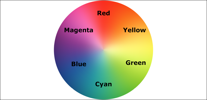
Figure 6.12: The HSL color wheel
The first figure in an HSL color definition represents hue. Looking at our wheel, we can see that yellow is at 60°, green is at 120°, cyan is at 180°, blue is at 240°, magenta is at 300°, and finally red is at 360°. So, as the aforementioned HSL color had a hue of 315, it's easy to know that it will be between magenta (at 300°) and red (at 360°).
The following two values in an HSL definition are for saturation and lightness, specified as percentages. These merely alter the base hue. For a more saturated or "colorful" appearance, use a higher percentage in the second value. The final value, controlling the lightness, can vary between 0 percent for black and 100 percent for white.
So, once you've defined a color as an HSL value, it's also easy to create variations of it, merely by altering the saturation and lightness percentages. For example, our red color can be defined in HSL values as follows:
.redness {
    color: hsl(359, 99%, 50%);
}
If we wanted to make a slightly darker color, we could use the same HSL value and merely alter the lightness (the final value) percentage value only:
.darker-red {
    color: hsl(359, 99%, 40%);
}
In conclusion, if you can remember the mnemonic "Young Guys Can Be Messy Rascals" (or any other mnemonic you care to memorize) for the HSL color wheel, you'll be able to approximately write HSL color values without resorting to a color picker, and also create variations upon it. Show that trick to the savant Ruby, Node.js, and .NET developers at the office party and earn some quick kudos!
Alpha channels
So far, you'd be forgiven for wondering why on earth we'd bother using HSL or RGB instead of our trusty hex values we've been using for years. Where HSL and RGB differ from hex is that they allow the use of an alpha transparency channel so that something beneath an element can "show through." An HSLA color declaration is similar in syntax to a standard HSL rule. However, in addition, you must declare the value as hsla (rather than merely hsl) and add an additional opacity value, given as a decimal value between 0 (completely transparent) and 1 (completely opaque). For example:
.redness-alpha {
    color: hsla(359, 99%, 50%, 0.5);
}
The RGBA syntax follows the same convention as the HSLA equivalent:
.redness-alpha-rgba {
    color: rgba(255, 255, 255, 0.8);
}
You may be wondering—why not just use opacity? As CSS allows elements to have opacity set with the opacity declaration.
When we apply opacity to an element, a value is set between zero and one in decimal increments (for example, opacity set to .1 is 10 percent). However, opacity differs from RGBA and HSLA in that setting an opacity value on an element affects the entire element, whereas setting a value with HSLA or RGBA allows particular parts of an element to have an alpha layer. For example, an element could have an HSLA value for the background but a solid color for the text within it.
What can we take from all this color talk? First, if you are given values as hex values, there's no need to convert them into anything else. Likewise, if RGB syntax makes perfect sense to you, that's a possibility and you can easily add an alpha channel with the RGBA syntax. For most of us, having some understanding of HSL is going to be very useful. I find it the most human friendly of all the ways to think about color in CSS; it's almost universally supported these days, and it also supports an alpha channel with HSLA.
Summary
In this chapter, we've learned how to select almost anything we need on the page with CSS's powerful selection capabilities. We now understand CSS's more powerful color capabilities and how we can apply colors with RGB and HSL, complete with transparent alpha layers for great aesthetic effects.
In this chapter, we've also learned how to add custom web typography to a design with the @font-face rule, freeing us from the shackles of the humdrum selection of web-safe fonts. We also took a dive into variable fonts and considered the possibilities they have to offer.
In among all that, we also found time to look at CSS custom properties and the @supports at-rule for providing feature forks in our code.
Despite all these great new features and techniques, we've only picked at the surface of what we can do with CSS.
See you in a moment for Chapter 7, Stunning Aesthetics with CSS. There, we will look at even more CSS with text shadows, box shadows, gradients, multiple backgrounds, and so much more!