
11
Bonus Techniques and Parting Advice
In my favorite stories and films, there's usually a scene where a mentor passes on valuable advice and some magical items to the hero. You know those items will prove useful; you just don't know when or how.
Well, I'd like to assume the role of mentor in this final chapter—besides, my hair has waned, and I don't have the looks for the hero role. I would like you, my fine apprentice, to spare me just a few more moments of your time while I offer up some final words of advice before you set forth on your responsive quest.
This chapter will be half philosophical musings and guidance, and half a grab bag of unrelated tips and techniques. I hope, at some point in your responsive adventures, these tips will prove useful.
Here's the grab bag of tips we'll cover:
- Breaking up long URLs
- Truncating text
- Creating horizontal scrolling panels
- Using CSS Scroll Snap
- Smooth scrolling with CSS scroll-behavior
- Communicating CSS breakpoints to JavaScript
And here are our suggestions for guidance:
- Get designs in the browser
- Test on real devices
- Embrace progressive enhancement
- Define a browser support matrix
- Avoid CSS frameworks in production
- Using the simplest solution possible
- Hiding, showing, and loading content at different viewports
- Validators and linting tools
- Performance
- The next big things
Right, now pay attention, 007...
In my day-to-day work, I've found that I use some CSS features constantly and others hardly ever. I thought it might be useful to share those I've used most often, especially those that pop up time and again with responsive projects.
These are in no particular order. None are more important than any other. Just dip in if and when you need them.
Breaking up long URLs
How many times have you had to add a big URL into a tiny space and then, well, despaired? Take a look at example_11-04. The problem can also be seen in the following screenshot; notice that the URL is breaking out of its allocated space:

Figure 11.1: Long URLs can present a problem
It's easy to fix this issue with a simple CSS declaration, which, as chance would have it, also works in older versions of Internet Explorer as far back as 5.5! Just add:
word-wrap: break-word;
to the containing element, which gives the following effect:

Figure 11.2: Using break-word, we can tame long URLs
Hey presto, the long URL now wraps perfectly!
Truncating text
Sometimes, you have a situation where, if space is limited, you would rather have text truncated rather than wrapped. We've been trained to spot this with the ellipsis symbol "...".
This is straightforward in CSS, even if a little long-winded.
Consider this markup (you can view this example in example_11-03):
<p class="truncate">
  OK, listen up, I've figured out the key eternal happiness. All you need to do is eat lots of scones.
</p>
However, we actually want to truncate the text to be 520px wide, so it looks like this:

Figure 11.3: Truncation is handy when keeping vertical height constant is of paramount importance
Here is the CSS to make that happen:
.truncate {
  width: 520px;
  overflow: hidden;
  text-overflow: ellipsis;
  white-space: nowrap;
}
Each one of those properties is needed to make the truncation occur.
You can read the specification for the text-overflow property here: https://drafts.csswg.org/css-overflow-3/#text-overflow.
Whenever the width of the content exceeds the width defined, it will be truncated. The width can just as happily be set as a percentage, such as 100% if it's inside a flexible container.
We set overflow: hidden to ensure that anything that overruns the box is hidden.
When the content does overrun, text-overflow: ellipsis creates the ellipsis symbol in the correct place to indicate the overrunning content. This could be set to clip if preferred. In that instance, the content just gets clipped where it overflows, possibly mid-character.
The white-space: nowrap property/value pair is needed to ensure that the content doesn't wrap inside the surrounding element, which is what it would do by default.
There still isn't a solid, cross browser way to do multiline truncation, although there is a specification: https://drafts.csswg.org/css-overflow-3/#propdef--webkit-line-clamp. Right now, you can use -webkit-line-clamp. However, I wouldn't advise that as it is only supported for compatibility reasons and is likely to be superseded as soon as a "real" version is widely implemented.
Creating horizontal scrolling panels
When I say horizontal scrolling panel, hopefully, you know the kind of thing I mean. Horizontal scrolling panels are common on the iOS App and Google Play Store for showing panels of related content (movies, albums, and more). Where there is enough horizontal space, all of the items are viewable. However, when space is limited (think mobile devices), the panel is scrollable from side to side.
I've created a scrolling panel of the top 10 grossing films of 2014. You'll remember this scenario from Chapter 6, and that there is no significance to the year; I just picked one!
It looks like this on an iPhone running iOS 13.3:

Figure 11.4: A horizontal scrolling panel
The markup pattern looks like this; note that I'm just showing the first item in the list for brevity:
<nav class="Scroll_Wrapper">
  <figure class="Item">
    <img src="f1.jpg" alt="Movie poster of Guardians of the Galaxy" />
    <figcaption class="Caption">Guardians of the Galaxy</figcaption>
  </figure>
</nav>
You can find the full code in example_11_02.
Ordinarily, if you add more and more items in a container, it will wrap onto the next line. The key to this technique is the white-space property, which has actually been around since CSS 2.1 (http://www.w3.org/TR/CSS2/text.html#white-space-prop). Additionally, we used it a moment ago for text truncation too. By setting it to nowrap, we can prevent the content from wrapping.
To get the scrolling working, we just need a wrapper that is narrower than the sum of its contents and set it to overflow automatically in the x axis. That way, it won't scroll if there is enough space, but it will if there isn't.
At its simplest, we need this CSS:
.Scroll_Wrapper {
  width: 100%;
  white-space: nowrap;
  overflow-x: auto;
  overflow-y: hidden;
}
.Item {
  display: inline-flex;
}
We're using inline-flex here for the child items of the wrapping element, but it could just as easily be inline, inline-block, or inline-table.
To make things a little more aesthetically pleasing, let's hide the scroll bar where we can.
Unfortunately, to do this, we need to apply a few different declarations to cover the different browser implementations. There is one for the very old Internet Explorer, one for Chrome, Safari, and Microsoft Edge, and one standardized in a new draft specification, which is the implementation that Firefox has. Now the updated .Scroll_Wrapper rule looks like this:
.Scroll_Wrapper {
  width: 100%;
  white-space: nowrap;
  overflow-x: auto;
  overflow-y: hidden;
  /*Remove the scrollbars in supporting versions of older IE*/
  -ms-overflow-style: none;
  /* Hide scrollbar in Firefox */
  scrollbar-width: none;
}
/*Stops the scrollbar appearing in Safari, Chrome and MS Edge browsers*/
.Scroll_Wrapper::-webkit-scrollbar {
  display: none;
}
The draft standard for the CSS Scrollbars Module Level 1 can be found at https://drafts.csswg.org/css-scrollbars-1/.
The rest of the code is simply aesthetic niceties and doesn't directly relate to the scrolling. However, it is a pattern we can remake with Grid.
Horizontal scrolling panels with Grid
While playing with Grid I realized it's possible to make a horizontal scrolling panel just as easily with CSS Grid. Let's suppose we want to take advantage of Grid. We can leave our existing pattern as it is and progressively enhance for Grid:
@supports (display: grid) {
  .Scroll_Wrapper {
    display: grid;
    grid-auto-flow: column;
    max-width: min-content;
    grid-template-rows: auto;
  }
}
In this instance, we are making the wrapping element a grid and letting it flow automatically into as many columns as needed. It is key to set max-width: min-content, otherwise, the columns would grow when more space was available, which, in this instance, isn't what we want.
Right, as we've come this far, we may as well "stick a cherry on top" by adding CSS Scroll Snap into the mix!
CSS Scroll Snap
CSS Scroll Snap snaps the scrolling of content to predefined points in the container. Again, it is a user interface pattern that is commonplace in the interfaces of native applications, app stores, and things like carousels, but historically required JavaScript to implement.
There have been different implementations and names for CSS Scroll Snap in browsers since 2014. However, it's taken time for a stable specification to emerge, along with compatible implementations. You can read the official specification at https://www.w3.org/TR/css-scroll-snap-1/.
Let's use CSS Scroll Snap to add scroll snap functionality to our horizontal "top-grossing films of 2014" container.
The scroll-snap-type property
First of all, we define the scroll-snap-type for our scrolling container. This is where we can decide whether we want the container to scroll snap in the x, y, or both, axes.
This property also allows us to define the strictness of the scroll snapping that is applied. The mandatory value is the one I always opt for unless I'm resetting scroll snapping, at which point you can use none. none will revert scroll snap to behave like a standard scroll container.
What mandatory does is ensure that if an item is partially scrolled within the container (for example, the left-hand side is off the viewport by a certain amount), then it will be "snapped" into or out of view.
There is also a proximity value. What this does is leave the snapping to the discretion of the browser.
It is important to understand why you may occasionally want and need to use proximity. Suppose you had items in a carousel that were always bigger than the viewport. Because, with mandatory, it would always snap, you may have trouble advancing the scroll panel. Setting it to proximity means that content will remain accessible as the browser will determine how much room should be left to accommodate scrolling.
Despite that, in our instance, since we know the width of our cells won't exceed the width of the viewport, we will apply mandatory for a consistent experience.
So, our container will be amended with this extra block. Note that we are wrapping it in a feature query:
@supports (scroll-snap-type: x mandatory) {
  .Scroll_Wrapper {
    scroll-snap-type: x mandatory;
  }
}
Now, if you refresh the browser and try the scroll panel, you will likely be disappointed. That, by itself, doesn't do anything. We now need to apply the scroll-snap-align property to the child items.
The scroll-snap-align property
The scroll-snap-align property controls where an item inside a scroll-snap container will snap to. The options are:
noneto reset an itemstartto snap the item to the beginning of a scroll snap areaendto snap the item to the end of a scroll snap areacenterto snap the item to the center of the scroll snap area
So, inside our feature query, let's add .Item and set it to snap to the start:
@supports (scroll-snap-type: x mandatory) {
  .Scroll_Wrapper {
    scroll-snap-type: x mandatory;
  }
  .Item {
    scroll-snap-align: start;
  }
}
Now, if you scroll, you'll see that the items snap within their container. However, there's one little problem. As the items are snapping to the beginning, and we have the number positioned absolutely in the top left of each film, it's getting cut off. See for yourself:

Figure 11.5: We need to fix that number from being cut off on the left side
The scroll-padding property
Thankfully, the specification authors have considered such an eventuality. On the container, we can add some padding to our scroll snap area. This means that this distance is taken into account when the browser decides where to snap the items to. It's added here to the .Scroll_Wrapper:
@supports (scroll-snap-type: x mandatory) {
  .Scroll_Wrapper {
    scroll-snap-type: x mandatory;
    scroll-padding: 0 20px;
  }
  .Item {
    scroll-snap-align: start;
  }
}
Now, when we scroll, it takes that padding into account as it snaps our scrolling to a stop:

Figure 11.6: Applying scroll-padding solves our problem
The scroll-snap-stop property
By default, an excessive scroll action can send several items past the scroll snap point. With scroll-snap-stop, it should be possible to make the browser stop at each snap point. There are just two values to choose from: normal, which is what the browser does by default; or always, which ensures that no scroll snap points are skipped.
The bad news is that as I write this, scroll-snap-stop is only supported in Chrome and Edge. So, check the browser support before adding it to a project and wondering why it isn't working as expected!
CSS Scroll Snap is a hugely satisfying piece of functionality to use! In just a few lines, we are able to achieve in CSS what used to take whole libraries of JavaScript to achieve. And the best part is that we can apply this as an enhancement. If the user's browser supports it, great. If not, no big deal.
Smooth scrolling with CSS scroll-behavior
One of the oldest capabilities of HTML is the ability to anchor to different points in a document. You set a link on the page, and rather than it sending the user to another webpage, the user is instead instantly taken to a different point on the same page.
Typically, such functionality is in the y axis, or down a page. However, it works just as well horizontally in the x axis.
Historically, jumping to an anchor link has always been a little jarring. As the user is instantly transported to the new point on the page, there is no affordance to communicate to the user what just occurred. People have solved this common issue over the years with the help of JavaScript, by effectively animating the scroll action.
Now CSS has provided us with a simpler alternative: the scroll-behavior property.
I'm going to add "start" and "end" anchor points to each end of the scroll panel we just made and add two links below the scrolling panel. As you might imagine, by default, clicking on "end" instantly scrolls the panel to the end. However, if we add scroll-behavior: smooth to our scroll panel, we get a silky-smooth scroll behavior instead. Nice!
Sadly, this is something that images just don't convey. However, if you open example_11-02, then you can have a play with it for yourself.
Linking CSS breakpoints to JavaScript
Typically, with something web-based involving any sort of interaction, JavaScript will be involved. When you're developing a responsive project, it's feasible that you will want to do different things at different viewport sizes. Not just in CSS but also in JavaScript.
Let's suppose we want to invoke a certain JavaScript function when we reach a certain breakpoint in the CSS (remember that "breakpoint" is the term used to define the point in which a responsive design should change significantly). Let's suppose the breakpoint is 47.5rem (with a 16px root font size that would equate to 760px), and we only want to run the function at that size. There is a JavaScript API called matchMedia, which allows you to test in JavaScript, exactly the same as you would in CSS. The obvious solution would be to use that and create a comparable test as you have in your media query.
However, it would still mean two places to update and change those values when we are changing viewport sizes.
Thankfully, there is a better way. I first came across this technique on Jeremy Keith's website: http://adactio.com/journal/5429/.
You can find the full code for this at example_10-01. However, the basic idea is that in CSS, we insert something that can be easily read and understood by JavaScript.
Consider this in the CSS:
@media (min-width: 20rem) {
  body::after {
    content: 'Splus';
    font-size: 0;
  }
}
@media (min-width: 47.5rem) {
  body::after {
    content: 'Mplus';
    font-size: 0;
  }
}
@media (min-width: 62.5rem) {
  body::after {
    content: 'Lplus';
    font-size: 0;
  }
}
For each breakpoint we want to communicate to JavaScript, we use the after pseudo-element (you could use before too, as either is just as good), and set the content of that pseudo-element to be the name of our breakpoint. In our example, I am using 'Splus' for small screens and bigger, 'Mplus' for medium screens and bigger, and 'Lplus' for large screens and bigger. You can use whatever name makes sense to you and change the value whenever it makes sense to you (for instance, different orientations, different heights, different widths, and so on).
Remember, the ::before and ::after pseudo-elements are inserted into the DOM as shadow DOM elements. The ::before pseudo-element is inserted as the first child of its parent, and ::after is inserted as the last child.
With that CSS set, we can browse the DOM tree and see our ::after pseudo-element:

Figure 11.7: We can use pseudo-elements to communicate to JavaScript
Then, in our JavaScript, we can read this value. Firstly, we assign the value to a variable:
var size = window
  .getComputedStyle(document.body, ':after')
  .getPropertyValue('content');
And then once we have it, we can do something with it. To prove this concept, I have made a simple self-invoking function (self-invoking simply means it is executed as soon as the browser parses it) that writes our media query label into the body on page load; this can be a different value depending on the viewport size:
var size = window
  .getComputedStyle(document.body, ':after')
  .getPropertyValue('content');
(function alertSize() {
  if (size.indexOf('Splus') != -1) {
    document.body.textContent =
      size + ' I will run functions for small screens';
  }
  if (size.indexOf('Mplus') != -1) {
    document.body.textContent =
      size + ' Run a different function at medium sizes';
  }
  if (size.indexOf('Lplus') != -1) {
    document.body.textContent =
      size + ' I will run functions for LARGE screens';
  }
})();
So, depending on your screen size when you open this example, you'll see something like this:
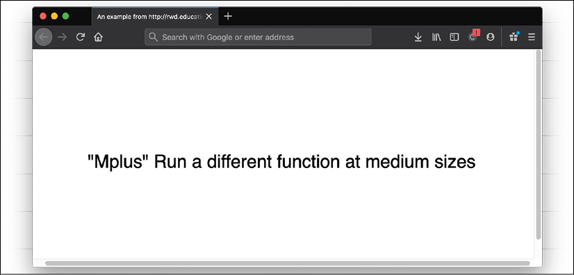
Figure 11.8: JavaScript can read in the value from CSS
Hopefully, you will find more interesting use cases for this technique. I think you will find great benefit in approaching the problem in this way. You'll never be in danger of your CSS media queries and your width dependent JavaScript functions going out of sync again.
You could also solve this problem using CSS Custom Properties, which we looked at in Chapter 6, CSS Selectors, Typography, Color Modes, and More, but I tend to stick with this older approach as it means it still works well in browsers like Internet Explorer 11, which lacks support for CSS Custom Properties.
Note that I've tried to employ as many of the techniques that we covered in this book for the single-page https://rwd.education website. Hopefully, it's not too indulgent to suggest that if you want to see some of the techniques together, go and take a poke around there.
We've reached the end of the bonus techniques section. Hopefully, you have a few more handy tricks in your arsenal for the next project you embark on.
All that is left, in our final section of the chapter, and indeed the book (please, don't cry—you'll start me off), is for me to offer what I feel are the most important considerations for any responsive web project. Here goes.
Get designs in the browser as soon as possible
The more responsive web work I have done, the more important I have found it to get designs up and running in a browser environment as soon as possible. If you are a designer as well as a developer, then that simplifies matters. As soon as you have enough of a feel, visually, for what you need, you can get it prototyped and develop the idea further in a browser environment.
If you are primarily a developer, then this can aid the design process hugely in order to get the design living and breathing in the browser. Without fail, every project that I work on gets revised in some way as a result of the designs being built in the browser. That isn't a failure of the original flat designs, it's a consequence of realizing that the design is just a step towards realizing an idea. And seeing it working in a browser is one step closer.
There is a slew of problems that can only be solved by seeing the design in a browser. What about all those device and browser window sizes? What about the interactivity that occurs when the user opens a menu? How long should that introductory animation run for? And is it too much anyway? These are the kind of design decisions that can only be made when the design is realized in a browser.
Test on real devices
If you can, start to build up a "device lab" of older devices (phones/tablets) to view your work on. Having a number of varied devices is hugely beneficial. Not only does it let you feel how a design actually works across different devices, but it also exposes layout/rendering peculiarities earlier in the process. After all, no one enjoys believing that they have finished on a project only to be told it doesn't work properly in a certain environment. Test early, and test often! Buying extra devices need not cost the earth. For example, you can pick up older phone and tablet models on eBay, or buy them from friends/relatives as they upgrade.
Use tools like BrowserSync to synchronize your work
One of the biggest time-saving tools to incorporate into your workflow is BrowserSync. Once configured, as you save your work, any changes to things like CSS are injected into the browser without you needing to refresh your screen constantly. If that wasn't good enough, any other browsers on the same Wi-Fi and viewing the same URL refresh too. This saves picking each of your testing devices up and clicking refresh with each change. It even synchronizes scrolling and clicks too. It is highly recommended: http://browsersync.io.
Embrace progressive enhancement
In previous chapters, we have considered the notion of progressive enhancement. It's an approach to development that I have found so useful in practice that I think it bears repeating. The fundamental idea with progressive enhancement is that you begin all your frontend code (HTML, CSS, or JavaScript) with the lowest common denominator in mind. Then, you progressively enhance the code for more capable devices and browsers. That may seem simplistic, and it is, but if you are used to working the other way around, then by designing the optimum experience and then figuring out a way of making that thing work on lesser devices/browsers, you'll find progressive enhancement an easier approach.
Imagine a low-powered, poorly featured device. It has no JavaScript, no Flexbox support, and no CSS3/CSS4 support. In that case, what can you do to provide a usable experience? Most importantly, you should write meaningful HTML5 markup that accurately describes the content. This is an easier task if you're building text- and content-based websites. In that instance, concentrate on using elements like main, header, footer, article, section, and aside correctly. Not only will it help you discern different sections of your code, but it will also provide greater accessibility for your users at no extra cost.
If you're building something like a web-based application or visual UI components (carousels, tabs, accordions, and the like), you'll need to think about how to distill the visual pattern down into an accessible markup.
The reason good markup is so crucial is that it provides a base-level experience for all users. The more you can achieve with HTML, the less you have to do in CSS and JavaScript to support older browsers. And nobody, and I really mean nobody, likes writing the code to support older browsers.
For further reading and great practical examples on the subject, I would recommend the following two articles. They provide great insight into how fairly complex interactions can be handled with the constructs of HTML and CSS: http://www.cssmojo.com/how-to-style-a-carousel/ and http://www.cssmojo.com/use-radio-buttons-for-single-option/.
It's by no means a simple feat to think in this manner. However, it is an approach that is likely to serve you well in your quest to do as little as possible to support ailing browsers. Now, about those browsers…
Define a browser support matrix
Knowing the browsers and devices a web project needs to support upfront can be crucial to developing a successful responsive web design. We've already considered why progressive enhancement is so useful in this respect. If done correctly, it means that the vast majority of your site will be functional on even the oldest browsers.
However, there may also be times when you need to start your experience with a higher set of prerequisites. Perhaps you are working on a project where JavaScript is essential, which is not an uncommon scenario. In that instance, you can still progressively enhance, but you are merely enhancing from a different start point.
Whatever your starting point, the key thing is to establish what your starting point is. Then, and only then, can you define and agree on what visual and functional experiences the different browsers and devices that you intend to support will get.
Functional parity, not visual parity
It's both unrealistic and undesirable to get any website looking and working the same in every browser. Besides quirks that are specific to certain browsers, there are essential functional considerations. For example, we have to consider things like touch targets for buttons and links on touch screens that aren't relevant to mouse-based devices.
Therefore, some part of your role as a responsive web developer is to educate whoever you are answerable to (your boss, client, or shareholders) that "supporting older browsers" does not mean it "looks the same in older browsers." The line I tend to run with is that all browsers in the support matrix will get functional parity, not visual parity. This means that if you have a checkout to build, all users will be able to go through the checkout and purchase goods. There may be visual and interaction flourishes afforded to the users of more modern browsers, but the core task will be achievable by all.
Choosing the browsers to support
Typically, when we talk about which browsers to support, we're talking about how far back we need to look. Here are a couple of possibilities to consider, depending on the situation.
If it's an existing website, take a look at the visitor statistics (for example, Google Analytics or similar). Armed with some figures, you can do some rough calculations. For example, if the cost of supporting browser X is less than the value produced by supporting browser X, then support browser X!
Also, consider that if there are browsers in the statistics that represent less than 10% of users, look further back and consider any trends. How has usage changed over the last 3, 6, and 12 months? If it's currently 6% and that value has halved over the last 12 months, then you have a more compelling argument to consider ruling that browser out for specific enhancements.
If it's a new project and statistics are unavailable, I usually opt for a "previous 2" policy. This would be the current version, plus the previous two versions of each browser. For example, if Safari 13 was the current version, look to offer your enhancements for that version plus Safari 12 and Safari 11 (the previous two). This choice is easier with the "evergreen" browsers, which is the term given to browsers that continually update on a rapid release cycle (Firefox, Chrome, and Microsoft Edge, for example).
Tiering the user experience
Let's assume your shareholders are educated and on board. Let's also assume you have a clear set of browsers that you would like to add enhanced experiences for. We can now set about tiering the experience. I like to keep things simple, so, where possible, I opt to define a simple "base" tier and a more "enhanced" tier.
Here, the base experience is the minimum viable version of the site, and the enhanced version is the most fully featured and aesthetically pleasing version. You might need to accommodate more granularity in your tiers, for example, forking the experience in relation to browser features; support for Grid or support for Scroll Snap, for example. Regardless of how the tiers are defined, ensure you define them and what you expect to deliver with each. Then you can go about coding those tiers. That's where techniques like feature queries, which we covered in Chapter 6, CSS Selectors, Typography, Color Modes, and More, will come in handy.
Avoid CSS frameworks in production
There are a plethora of free CSS frameworks available that aim to aid in the rapid prototyping and building of responsive websites. The two most common examples are Bootstrap (http://getbootstrap.com) and Foundation (http://foundation.zurb.com/). While they are great projects, particularly for learning how to build responsive visual patterns, I think they should be avoided in production.
I've spoken to plenty of developers who start all of their projects with one of these frameworks and then amend them to fit their needs. This approach can be incredibly advantageous for rapid prototyping (for example, to illustrate some interaction with clients), but I think it's the wrong thing to do for projects you intend to take through to production.
Firstly, from a technical perspective, it's likely that starting with a framework will result in your project having more code than it actually needs. Secondly, from an aesthetic perspective, due to the popularity of these frameworks, it's likely your project will end up looking very similar to countless others.
Finally, if you only copy and paste code into your project and tweak it to your needs, you're unlikely to fully appreciate what's going on "under the hood." It's only by defining and solving the problems you have that you can master the code you place into your projects.
Hiding, showing, and loading content across viewports
One of the commonly touted maxims regarding responsive web design is that if you don't have something on the screen in smaller viewports, you shouldn't have it there in larger ones either.
This means users should be able to accomplish all the same goals (such as buy a product, read an article, or accomplish an interface task) at every viewport size. This is common sense. After all, as users ourselves, we've all felt the frustration of going to a website to accomplish a goal and being unable to, because we're using a smaller screen.
This also means that as screen real estate is more plentiful, we shouldn't feel compelled to add extra things just to fill the space (widgets, adverts, or links, for example). If the user could live without those extras on smaller screen sizes, they'll manage just fine on bigger ones.
In broad terms, I think the preceding maxim is sound advice. If nothing else, it makes designers and developers question more thoroughly the content they display on screen. However, as ever in web design, there will be exceptions.
As far as possible, I resist loading in new markup for different viewports, but, occasionally, it's a necessity. Some complex user interfaces require different markup and designs at wider viewports. In that instance, JavaScript is typically used to replace one area of markup with another. It isn't the ideal scenario, but it is sometimes the most pragmatic.
By the same token, I think it's perfectly reasonable to have sections of markup hidden in CSS until they are appropriate. I'm thinking about things like headers. On more than one occasion, before Grid was well supported, I have wasted an inordinate amount of time trying to figure out how to convert one header layout for mobile into a different layout for larger screens, all while using the same markup. It was folly! The pragmatic solution is to have both pieces of markup and just hide each as appropriate with a media query. When the difference is a handful of elements and the associated styles, there are almost always more sensible savings to make elsewhere.
These are the choices you will probably face as you code more and more complex responsive web designs, and you'll need to use your own judgment as to what the best choice is in any given scenario. However, it's not a cardinal sin if you toggle the visibility of the odd bit of markup with display: none to achieve your goal.
Validators and linting tools
Generally speaking, writing HTML and CSS is pretty forgiving. You can nest the odd thing incorrectly, miss the occasional quotation mark or self-closing tag, and not always notice a problem. Despite this, on an almost weekly basis, I manage to befuddle myself with incorrect markup. Sometimes, it's a slip up, like accidentally typing an errant character. Other times, it's schoolboy errors like nesting a div inside a span (invalid markup as a span is an inline element and a div is a block-level element, which leads to unpredictable results). Thankfully, there are great tools to help out. At worst, if you're encountering a weird issue, head over to http://validator.w3.org/ and paste your markup in there. It will point out any errors along with line numbers, helping you to easily fix things up:
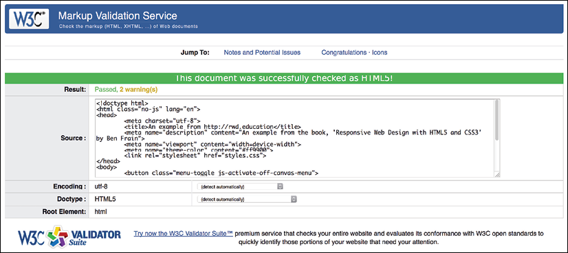
Figure 11.9: Skip the validation of HTML at your peril!
Better still, install and configure "linting" tools for your HTML, CSS, and JavaScript. Or, choose a text editor with some sanity checking built-in. Then problem areas are flagged up in your code as you go. Here's an example of a simple spelling error in CSS flagged up by Microsoft's Visual Studio Code editor:

Figure 11.10: Embrace tooling that saves you from basic problems
Like a clown, I've clumsily typed "widtth" instead of "width." The editor has spotted this fact and pointed out the error of my ways and offered some sensible alternatives. Embrace these tools where possible. There are better uses of your time than tracking down simple syntax errors in your code.
Performance
Considering the performance of your responsive web designs is as important as the aesthetics. However, performance presents something of a moving target. For example, browsers update and improve the way they handle assets, new techniques are discovered that supersede existing "best practices," and technologies eventually get enough browser support that they become viable for widespread adoption. The list goes on.
There are, however, some basic implementation details that are pretty solid advice. These are:
- Minimize the page weight. If you can compress images to a fraction of their original size, you should. This should always be your first task with optimizing. It's possible to double the file size savings by compressing one image compared to compressing and minifying all of your CSS and JavaScript.
- Defer non-essential assets. If you can load any additional CSS and JavaScript until the page has rendered, it can greatly reduce the perceived load time.
- Ensure the page is usable as soon as possible, which is often a by-product of doing all the preceding points.
Performance tools
There are great tools available to measure and optimize performance. My personal favorite is http://webpagetest.org. At its simplest, you can pick a URL and click on START TEST. It will show you a complete analysis of the page, but even more usefully, if you choose the visual comparison option, it shows a "filmstrip" view of the loaded page, allowing you to concentrate on getting the rendered page completed sooner. Here's an example of the "filmstrip" view of the BBC home page:
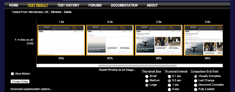
Figure 11.11: Seeing the page load as a filmstrip can really tell the story of performance
There are also increasingly powerful performance tools built into browser developer tools. Lighthouse is part of the Google Chrome developer tools, which you can run from the Audits tab. Point it at a site and it will give you a breakdown of where improvements can be made:

Figure 11.12: The Lighthouse tools not only tell you what you can improve, but they tell you how to do it
This is useful as every piece of advice has links to additional documentation, so you read more about the problem and potential ways of addressing it.
Whenever you try to optimize performance, ensure you take measurements before you begin (otherwise, you will not understand how effective your performance work has been). Then make amendments, test, and repeat.
The next big things
One of the interesting things about frontend web development is that things change rapidly. There is always something new to learn and the web community is always figuring out better, faster, and more effective ways of solving problems.
For example, when writing the first edition of this book, responsive images (srcset and the picture element, which are detailed in Chapter 4, Fluid Layout, Flexbox, and Responsive Images) simply didn't exist. Back then, we had to use clever third-party workarounds to serve up more appropriate images to different viewport sizes. Now common need has been rationalized into a W3C standard, which has been implemented across browsers.
Similarly, only a few years ago, Flexbox was just a twinkle in a specification writer's eyes. Even when the specification evolved, it was still difficult to implement until a super-smart developer called Andrey Sitnik, along with his colleagues at Evil Martians (https://evilmartians.com/) created Autoprefixer. This was a tool that allowed us to write a single syntax and have our CSS be processed into code that could work across multiple implementations as if by magic.
Progress on the web shows little sign of abating. Even now, things like WebAssembly, or WASM, as it is often referred to, are gaining more and more traction. WebAssembly is a means of having web code that runs far more akin to the speed of a compiled language. In short, it will make things on the web feel a whole lot faster. Lin Clark, a developer at the browser-maker Mozilla, has a very accessible series on WebAssembly here: https://hacks.mozilla.org/2017/02/a-cartoon-intro-to-webassembly/.
CSS Grid, which we covered in-depth in Chapter 5, Layout with CSS Grid, has a Level 2 version in the works that will allow subgrids. Variable fonts, which we looked at in Chapter 6, CSS Selectors, Typography, Color Modes, and More, are going to become more and more commonplace, so expect interesting things in that space too.
In short, expect change, and embrace it!
Summary
As we reach the end of our time together, your humble author hopes to have related all the techniques and tools you'll need to start building your next website or web application responsively.
It's my conviction that, by approaching web projects with a little forethought and by potentially making a few modifications to existing workflows and practices, it's possible to embrace modern techniques that provide fast, flexible, accessible, and maintainable websites that can look incredible, regardless of the device used to visit them.
We've covered a wealth of information in our time together: techniques, technologies, performance optimizations, specifications, workflow, tooling, and more. I wouldn't expect anybody to absorb it all in one read. Therefore, the next time you need to remember this or that syntax, or to refresh your mind about one of the responsive-related subjects we've covered, I hope you'll dip back into these pages. I'll be right here waiting for you.
Until then, I wish you good fortune in your responsive web design quests.
See you again sometime.