
9
Transitions, Transformations, and Animations
Historically, whenever elements needed to be moved or animated on screen, it was essential to call upon JavaScript. Nowadays, CSS can handle the majority of motion requirements using CSS transitions and CSS transforms, or CSS animations.
To clearly understand what transitions, transforms, and animations do, I will offer this, perhaps overly simplistic, summary:
- A CSS transition is used to define how one visual state should move (transition) to another, differing visual state.
- A CSS transform is used to take an existing element and transform it into something or someplace else without affecting any other elements on the page. For example, "make this twice as big" and "move this 100px to the right" are plain text descriptions of tasks we can achieve with CSS transforms. However, the transform doesn't control HOW the element makes that change; that is the job of the transition.
- A CSS animation is typically used to make a series of changes to an element at various key points over time.
If those differences seem a little vague at this point, hopefully, by the end of this chapter, they won't.
In this chapter, we'll cover:
- What CSS transitions are, and how to use them
- Writing CSS transitions and understanding the shorthand syntax
- CSS transition timing functions (
ease,cubic-bezier, and so on) - What CSS transforms are, and how to use them
- Understanding different 2D transforms (
scale,rotate,skew,translate) - Understanding 3D transforms
- How to animate with CSS using keyframes
Let's get started with an introduction to CSS transitions.
What CSS transitions are and how we can use them
Transitions are the simplest way to create some visual "effect" between one state and another with CSS. Let's consider a simple example: an element that transitions from one state to another when hovered over.
When styling hyperlinks in CSS, it's common practice to create a hover state; an obvious way to make users aware that the item they are hovering over can be interacted with. Hover states are of little relevance to the growing number of touch screen devices but for mouse users, they're a great and simple interaction between website and user. They're also handy for illustrating transitions, so that's what we will start with.
Traditionally, using only CSS, hover states are an on/off affair. There is one set of properties and values on an element as the default, and when a pointer is hovered over that element, the properties and values are instantly changed. However, CSS transitions, as the name implies, allow us to transition between one or more properties and values to other properties and values.
A couple of important things to know up front. Firstly, you can't transition from display: none;. When something is set to display: none; it isn't actually "painted" on the screen, so it has no existing state you can transition from.
Although you can't transition from display: none, it is possible to run an animation on an element at the same time its display property is changed. So, you could, for example, fade an element in from 0% opacity with an animation while changing its display property from display: none. We'll cover animations later in this chapter.
In order to create the effect of something fading in, you would have to transition opacity or position values. Secondly, not all properties can be transitioned. To ensure you're not attempting the impossible, here is the list of transitionable (I know, it's not even a word) properties: https://developer.mozilla.org/en-US/docs/Web/CSS/CSS_animated_properties.
Older versions of the specifications used to include a list of animatable properties. You can still view this older version of the specification at https://www.w3.org/TR/2017/WD-css-transitions-1-20171130/#animatable-properties but it's likely to be incomplete.
If you open up example_09-01, you'll see a few links in a nav. Here's the relevant markup:
<nav>
  <a href="#">link1</a>
  <a href="#">link2</a>
  <a href="#">link3</a>
  <a href="#">link4</a>
  <a href="#">link5</a>
</nav>
And here's the relevant CSS:
a {
  font-family: sans-serif;
  color: #fff;
  text-indent: 1rem;
  background-color: #ccc;
  display: inline-flex;
  flex: 1 1 20%;
  align-self: stretch;
  align-items: center;
  text-decoration: none;
  transition: box-shadow 1s;
}
a + a {
  border-left: 1px solid #aaa;
}
a:hover {
  box-shadow: inset 0 -3px 0 #cc3232;
}
And here are the two states, first the default:

Figure 9.1: Two links, in their default state
And then here's the hover state:

Figure 9.2: When hovered, we underline the link
Ordinarily, hovering over the link snaps from the first state (no red line) to the second (red line); it's an on/off affair. However, this line:
transition: box-shadow 1s;
adds a transition to the box-shadow from the existing state to the hover state over 1 second.
You'll notice in the CSS of the preceding example we're using the adjacent sibling selector +. You'll remember this selector from Chapter 6, CSS Selectors, Typography, Color Modes, and More. This means if an element (an anchor tag in our example) directly follows another element (another anchor tag), then apply the enclosed styles. It's useful here as we don't want a left border on the first element.
The transition property is applied on the "from" state, not the "to" state of a selector. In our case, we add the transition property and values on the element in its default state, not the hover state. You could add a transition property to the hover state too, but this would apply when you transition away from the hover state and back to default. This implementation is so that multiple different states such as :active, :focus, :hover, and more can also have different styles set and enjoy the same transition to them.
The properties of a transition
A transition can be declared using up to four properties:
transition-property: The name of the CSS property to be transitioned (such asbackground-color,text-shadow, orallto transition every possible property).transition-duration: The length of time over which the transition should occur (defined in seconds, for example,.3s,2s, or1.5s).transition-timing-function: How the transition changes speed during the duration (for example,ease,linear,ease-in,ease-out,ease-in-out, orcubic-bezier).transition-delay: An optional value to determine a delay before the transition commences. Alternatively, a negative value can be used to commence a transition immediately but part way through its transition "journey." It's defined in seconds, for example,.3s,1s, or2.5s.
For any duration defined in seconds with s in CSS, you can also define in milliseconds, if you prefer. For example, instead of 0.5s for half a second, you could write 500ms. It's purely a preference thing but for predictability, I would advise you choose one or the other and stick to it throughout a project.
Used separately, the various transition properties can be used to create a transition like this:
.style {
  /*...(more styles)...*/
  transition-property: all;
  transition-duration: 1s;
  transition-timing-function: ease;
  transition-delay: 0s;
}
The transition shorthand property
We can roll these individual declarations into a single, shorthand version:
transition: all 1s ease 0s;
One important point to note when writing the shorthand version is that the first time-related value provided is always parsed to be the transition-duration. The second time-related value is parsed to be the transition-delay. The shorthand version is the one I favor, as I generally only need to define the duration of the transition and the properties that should be transitioned.
Furthermore, the shorthand syntax is much easier to write as you can get away with only providing the property you want to transition and the duration it should transition over. To exemplify, suppose I wanted the background-color to transition over 2 seconds:
transition: background-color 2s;
If no timing function is provided, the default timing function of ease is applied.
I would also advise only defining the property or properties you actually need to transition. It's really handy to just set all, but if you only need to transition opacity, then only define opacity as the transition property. Otherwise, you're making the browser work harder than necessary. In most cases, this isn't a big deal, but if you're hoping to have the best performing site possible, even on lower powered devices, then every little helps.
Transitioning different properties over different periods of time
Where a rule has multiple properties declared, you don't have to transition all of them in the same way. Consider this rule:
.style {
  /* ...(more styles)... */
  transition-property: border, color, text-shadow;
  transition-duration: 2s, 3s, 8s;
}
Here, we have specified with transition-property that we'd like to transition the border, color, and text-shadow. Then, with the transition-duration declaration, we are stating that the border should transition over 2 seconds, the color over 3 seconds, and the text-shadow over 8 seconds. The comma-separated durations match the comma-separated order of the transition properties.
You can also perform the same job with the shorthand syntax, and again this is my preferred way to do it:
.style {
  transition: border 2s, color 3s, text-shadow 8s;
}
I think it is far easier to reason about each property and its timing when they are written next to each other.
So far, we have dealt with transitioning different properties over different durations. However, there is also a fairly limitless number of timing functions that change how an element property changes over a duration.
Understanding timing functions
When you declare a transition, the properties, durations, and delays are relatively simple to understand. However, understanding what each timing function does can be a little trickier. Just what do ease, linear, ease-in, ease-out, ease-in-out, and cubic-bezier actually do? Each of them is actually a predefined cubic-bezier curve, essentially the same as an easing function. Or, more simplistically, a mathematical description of how the transition should look. It's generally easier to visualize these curves, so I recommend you head over to http://cubic-bezier.com/ or http://easings.net.
Both these sites let you compare timing functions and see the difference each one makes. Here is a screenshot of http://easings.net—on the website you can hover over each line for a demonstration of the easing function:
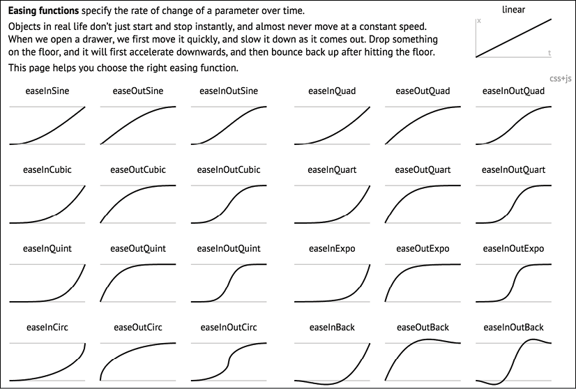
Figure 9.3: Easings.net provides a handy visualization of a number of different timing functions
However, even if you can write your own cubic-bezier curves blindfolded, the likelihood is, for most practical situations, it makes little difference. The reason for this is that like any enhancement, it's necessary to employ transition effects subtly. For "real-world" implementations, transitions that occur over too great a period of time tend to make a site feel slow. For example, navigation links that take 5 seconds to transition are going to frustrate rather than wow your users. The perception of speed is incredibly important for our users, and you and I must concentrate on making websites and applications feel as fast as possible.
Therefore, unless there is a compelling reason to do so, using the default transition (ease) over a short interval is often best; a maximum of 1 second is my own preference.
Fun transitions for responsive websites
Did you ever have one of those occasions growing up when one parent was out for the day and the other parent said something to the effect of, "OK, while your mom/dad is out, we're going to put sugar all over your breakfast cereal, but you have to promise not to tell them when they come back." I'm certainly guilty of that with my little ankle biters. So, here's the thing. While no one is looking, let's have a bit of fun. I don't recommend this for production, but try adding this to your responsive project:
* {
  transition: all 1s;
}
Here, we are using the CSS universal selector * to select everything and then setting a transition on all properties for 1 second (1s). As we have omitted to specify the timing function, ease will be used by default and there will be no delay as, again, a default of 0 is assumed if an alternative value is not added. The effect? Well, try resizing your browser window and most things (links, hover states, and the like) behave as you would expect. However, because everything transitions, it also includes any rules within media queries, so as the browser window is resized, elements sort of flow from one state to the next. Is it essential? Absolutely not! Is it fun to watch and play around with? Certainly! Now, remove that rule before your mom sees it!
Right, hopefully, we have transitions licked. Now, we can have some fun because we are going to learn how to effortlessly move elements around the screen with transforms. There are 2D and 3D variants; we will start with 2D and if that gets a bit flat (see what I did there? No? I'll see myself out) then we will move on to 3D.
CSS 2D transforms
Despite sounding similar to CSS transitions, CSS transforms are entirely different. As we already established, transitions deal with the transition from one state to another. Transforms, on the other hand, are a means of defining what the state should actually be.
My own (admittedly childish) way of remembering the difference is like this: Imagine a Transformer robot like Optimus Prime. When he has changed into a truck, he has transformed. However, the period between robot and truck is a transition (he's transitioning from one state to another). Obviously, if you have no idea who or what Optimus Prime even is, feel free to mentally discard the last few sentences. Hopefully, all will become clear when we get to the examples in a moment.
There are two groups of CSS transforms available: 2D and 3D. 2D variants are probably a little more straightforward, so let's look at those first. The CSS 2D Transforms Module allows us to use the following transforms:
scale: Scale an element (larger or smaller)translate: Move an element on the screen (up, down, left, and right)rotate: Rotate the element by a specified amount (defined in degrees or turns)skew: Skew an element with its X and Y coordinatesmatrix: Allows you to move and shape transformations in multiple ways
An essential concept to understand is that transforms occur outside of the document flow. More simply, any element that is transformed will not affect the position of any other element that is not a child of it. This is quite different to adding a transition to an element when you change the margin, height, or other transitionable/animatable property.
Open example_09-09 and you will see two sentences; the first has margin-left: 10px applied to the bold word "item" on hover, while the second sentence has transform: translateX(10px) applied to the same word on hover. Both have a transition of 1 second applied.
With nothing hovered over, they look like this:

Figure 9.4: Two paragraphs in their default state
Hover over "item" in the first paragraph and the following happens; notice the text after that word has been shunted along?

Figure 9.5: When the first paragraph is hovered over, "item" gets a margin applied, moving all the text after it too
Now, hover over "item" in the second paragraph and notice how just that word moves? The words around it are unaffected.

Figure 9.6: In the second paragraph, "item" is transformed, moving to the right without affecting anything else
So, transforms, either 2D or 3D, do not affect document flow.
Let's try out the various 2D transitions. You can test each of these out by opening example_09-02 in the browser. There's a transition applied to all of the transforms so that you get a better idea of what's happening.
Scale
.scale:hover {
  transform: scale(1.4);
}
Hovering over the "scale" link in our example produces this effect:
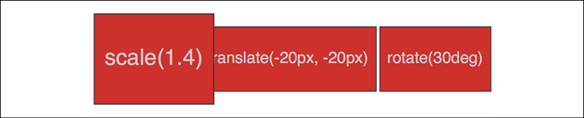
Figure 9.7: You can scale elements up or down in size
We've told the browser that when this element is hovered over, we want the element to scale to 1.4 times its original value.
Besides the values we've already used to enlarge elements, by using values below 1, we can shrink elements; the following will shrink the element to half its size:
transform: scale(0.5);
Translate
Here's the syntax for translate:
.translate:hover {
  transform: translate(-20px, -20px);
}
Here's the effect that rule has in our example:

Figure 9.8: Translate lets you move an element anywhere in the x or y axis
The translate property tells the browser to move an element by an amount, defined by a length (for example, vw, px, %, and so on). The first value is the x axis and the second value is the y axis. Positive values given within parentheses move the element right or down; negative values move it left or up. If you only pass one value, then it is applied to the x axis.
If you want to specify just one axis to translate an element, you can also use translateX(-20px), which, in this instance, would move the element left 20px, or you could use translateY(-20px), which, in this case, would move the element 20px up.
Using translate to center absolutely positioned elements
translate provides a really useful way to center absolutely positioned elements within a relatively positioned container. You can view this example at example_09-03.
Consider this markup:
<div class="outer">
  <div class="inner"></div>
</div>
And then this CSS:
.outer {
  position: relative;
  height: 400px;
  background-color: #f90;
}
.inner {
  position: absolute;
  height: 200px;
  width: 200px;
  margin-top: -100px;
  margin-left: -100px;
  top: 50%;
  left: 50%;
}
You've perhaps done something similar to this yourself. When the dimensions of the absolutely positioned element are known (200px × 200px in this case), we can use negative margins to "pull" the item back to the center. However, what happens when you want to include content and have no way of knowing how tall it will be?
For example, let's add some random content to the inner box:
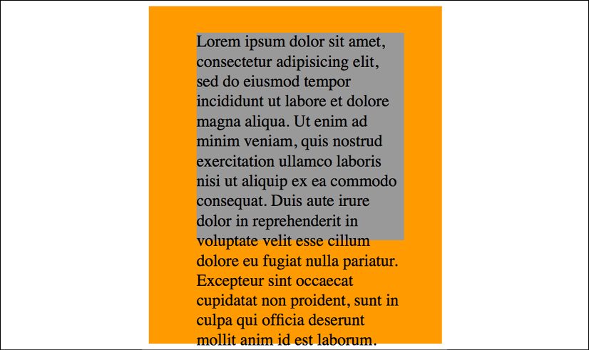
Figure 9.9: Text overflowing our box can be fixed with transform
Yes, that problem! Right, let's use transform to sort this mess out:
.inner {
  position: absolute;
  width: 200px;
  background-color: #999;
  top: 50%;
  left: 50%;
  transform: translate(-50%, -50%);
}
And here is the result:

Figure 9.10: With a smart application of transform, overflow issues are avoided
Here, top and left are positioning the inner box inside its container so that the top left corner of the inner box starts at a point 50% along and 50% down the outer box. Then, transform is working on the inner element and positioning it negatively in those axes by half (-50%) of its own width and height. Nice!
Rotate
The rotate transform allows you to rotate an element. Here's the syntax:
.rotate:hover {
  transform: rotate(30deg);
}
In the browser, here's what happens:

Figure 9.11: Rotating elements is straightforward with a transform
The value in parentheses should always be an angle. The angle can be expressed in degrees, gradians, radians, or turns. Personally, I default to using degrees (for example, 90deg), but all units are equally valid. While positive angle values always apply clockwise, using negative values will rotate the element counter-clockwise.
Pass an angle greater than a full revolution and the element will keep turning until it has turned around to the required degree. Therefore, you can also go crazy and make elements spin by specifying a value like the following:
transform: rotate(3600deg);
This will rotate the element 10 times in a complete circle. Practical uses for this particular value are few and far between but you know, if you ever find yourself designing websites for a windmill company, it may come in handy.
Skew
If you've spent any time working in Photoshop, you'll have a good idea what skew will do. It allows an element to be skewed on either or both of its axes. Here's the code for our example:
.skew:hover {
  transform: skew(40deg, 12deg);
}
Setting this on the hover state produces the following effect on hover:

Figure 9.12: Just like it sounds, a skew can produce some dramatic effects
The first value is the skew applied to the x axis (in our example, 40deg), while the second (12deg) is for the y axis. Omitting the second value means any value will merely be applied to the x axis (horizontal). For example:
transform: skew(10deg);
Just like with translate, you can apply skews to just one axis with skewX() and skewY().
Matrix
Did somebody mention a completely overrated film? No? What's that? You want to know about the CSS matrix, not the film? Oh, okay.
The matrix transform syntax looks rather impenetrable. Here's our example code:
.matrix:hover {
  transform: matrix(1.178, -0.256, 1.122, 1.333, -41.533, -1.989);
}
It essentially allows you to combine a number of other transforms (scale, rotate, skew, and so on) into a single declaration. The preceding declaration results in the following effect in the browser:

Figure 9.13: Not for the faint-hearted, the matrix value
If you find yourself doing work with animations in JavaScript without the help of an animation library, you'll probably need to become a little more acquainted with matrix. It's the syntax all the other transforms get computed into behind the scenes, so if you're grabbing the current state of an animation with JavaScript, it will be the matrix value you will need to inspect and understand.
Now, I like a challenge (unless, you know, it's sitting through the Twilight films), but I think the majority of us would agree that syntax is a bit testing. The specification doesn't exactly clear matters up: https://www.w3.org/TR/css-transforms-1/#mathematical-description.
However, the truth is I can count on the fingers of one hand how many times I've needed to write or understand a CSS transform described as a matrix, so it likely isn't something to concern yourself with.
If you do find yourself needing to create one, I'd suggest heading over to http://www.useragentman.com/matrix/.
The Matrix Construction Set website allows you to drag and drop the element exactly where you want it and includes good ol' copy and paste code for your CSS file.
Transform-origin property
Notice how, with CSS, the default transform origin—the point at which the browser uses as the center for the transform—is in the middle: 50% along the x axis and 50% along the y axis of the element. This differs from SVG, which defaults to the top left (or 0 0).
Using the transform-origin property, we can amend the point from which transforms originate.
Consider our earlier matrix transform. The default transform-origin is 50% 50% (the center of the element). The Firefox developer tools show how the transform is applied:

Figure 9.14: Default transform-origin applied
Now, if we adjust the transform-origin like this:
.matrix:hover {
  transform: matrix(1.678, -0.256, 1.522, 2.333, -51.533, -1.989);
  transform-origin: 270px 20px;
}
Then you can see the effect this has:
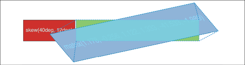
Figure 9.15: You can amend the origin of transforms as needed
The first value is the horizontal offset and the second value is the vertical offset. You can use keywords. For example, left is equal to 0% horizontal, right is equal to 100% horizontal, top is equal to 0% vertical, and bottom is equal to 100% vertical. Alternatively, you can use a length, using any of the CSS length units.
If you use a percentage for the transform-origin values, then the horizontal/vertical offset is relative to the height/width of the elements bounding box.
If you use a length, then the values are measured from the top left corner of the element's bounding box.
The specification for CSS Transforms Module Level 1 can be found here: https://www.w3.org/TR/css-transforms-1.
For more on the benefits of moving elements with transform, read this old but great post by Paul Irish, http://www.paulirish.com/2012/why-moving-elements-with-translate-is-better-than-posabs-topleft/, which provides some good data.
And, for a fantastic overview of how browsers actually deal with transitions and animations, and why transforms can be so effective, I highly recommend the following blog post: http://blogs.adobe.com/webplatform/2014/03/18/css-animations-and-transitions-performance/.
So far, we have dealt with transforming in two dimensions, the x and y axis. However, CSS can also handle elements in 3D space. Let's look at what extra fun we can have with 3D transforms.
CSS 3D transformations
As you've probably already realized, a 3D transform allows us to manipulate an element in an imaginary 3D space. Let's look at our first example. All we have in our example are two elements that each flip in 3D when hovered over. I've used hover here to invoke the flip as it's simple for the sake of illustration. However, the flipping action could just as easily be initiated with any other state change—a class change (via JavaScript) or when an element has received focus, for example.
The only difference between these two elements is that one flips horizontally and the other vertically. You can view them in a browser by opening example_09-04. Images fail to fully convey this technique, but the idea is that the element flips from the green "face" to the red "face," giving the illusion of doing so through 3D space with the aid of perspective. Here's a grab partway through the transition from green to red, which hopefully conveys some of the effect:

Figure 9.16: Halfway through a 3D transform
It's also worth knowing that while positioning an element absolutely with top/left/bottom/right values can only be calculated to whole pixels, a transform can interpolate at subpixel positions.
Here's the markup for the flipping element:
<div class="flipper">
  <span class="flipper-object flipper-vertical">
    <span class="panel front">The Front</span>
    <span class="panel back">The Back</span>
  </span>
</div>
The only difference with the horizontal one, markup wise, is the flipper-vertical class is replaced with flipper-horizontal.
As the majority of the styles relate to aesthetics, we'll merely look at the essential ingredients in our styles to make the flipping effect possible. Refer to the full style sheet in the example for the aesthetic styles.
When dealing with 3D transforms, the first essential ingredient required is to define some kind of 3D space.
For our example, we need to set some perspective for .flipper-object, whether horizontal or vertical, to flip within. For that, we use the perspective property. This takes a length value, attempting to simulate the distance from the viewer's screen to the edge of the elements' 3D space. We set this on the outer-most element to provide the 3D context for our nested elements to move within.
The value you assign to perspective is arguably counter-intuitive—if you set a low number like 20px for the perspective value, the 3D space of the element will extend right out to only 20px from your screen; the result being a more pronounced 3D effect.
Setting a high number, on the other hand, will mean the edge of that imaginary 3D space will be further away, and therefore produce a less pronounced 3D effect. I recommend opening the example in the browser and playing with the perspective in the developer tools to get a feel for it:
.flipper {
  perspective: 400px;
  position: relative;
}
We use position: relative on the outer flipper element to provide a positioning context for flipper-object to be absolutely positioned within:
.flipper-object {
  position: absolute;
  width: 100%;
  height: 100%;
  transition: transform 1s;
  transform-style: preserve-3d;
}
Besides positioning .flipper-object absolutely, we set the height and width to 100% so that it fills the same space as the outer container. We have also set a transition for the transform. If you remember from earlier in this chapter, when we dealt with transitions, you will know that by just setting the time for transition, the default timing function will be used.
The key thing here, 3D wise, is transform-style: preserve-3d. This declaration tells the browser that when we transform this element, we want any child elements to preserve any 3D effect.
If we didn't set preserve-3d on .flipper-object, we would never get to see the back (the red part) of the flipping element.
You can read the specification for this property here: http://www.w3.org/TR/2009/WD-css3-3d-transforms-20090320/#transform-style-property.
Each "panel" in our flipping element needs positioning at the top of its container, but we also want to make sure that, if rotated, we don't see the "rear" of it (otherwise we would never see the green panel as it sits "behind" the red one). To do that, we use the backface-visibility property. We set this to hidden so that the back face of the element is, you guessed it, hidden:
.panel {
  top: 0;
  position: absolute;
  backface-visibility: hidden;
}
Next, we want to make our back panel flipped by default (so that when we flip the whole thing, it will actually be in the correct position). To do that, we apply a rotate transform. Hopefully, having covered these in the previous section, you'll understand what they are doing here:
.flipper-vertical .back {
  transform: rotateX(180deg);
}
.flipper-horizontal .back {
  transform: rotateY(180deg);
}
Now that everything is in place, all we want to do is flip the entire inner element when the outer one is hovered over:
.flipper:hover .flipper-vertical {
  transform: rotateX(180deg);
}
.flipper:hover .flipper-horizontal {
  transform: rotateY(180deg);
}
As you can imagine, there are a bazillion (by the way, bazillion is definitely not a real amount, I just checked) ways you can use these techniques. If you're wondering what a fancy navigation effect, or off-canvas menu, might look like with a spot of perspective, I highly recommend paying Codrops a visit: http://tympanus.net/Development/PerspectivePageViewNavigation/index.html.
You can read the W3C specification for the CSS Transforms Module Level 1 at https://www.w3.org/TR/css-transforms-1/.
It turns out there is a very handy property when working with transforms that can do all your x, y, and z movement in one go. Let's take a look at that next.
The translate3d property
I've found great utility in the translate3d function. With this single function, it is possible to move an element in the x (left/right), y (up/down), and z (forward/backward) axes.
Let's amend our previous example and make use of the translate3d() function. You can view this example at example_09-06.
Besides setting the elements into the page a little more with padding, the only changes from our previous example can be seen here:
.flipper:hover .flipper-vertical {
  transform: rotateX(180deg) translate3d(0, 0, -120px);
  animation: pulse 1s 1s infinite alternate both;
}
.flipper:hover .flipper-horizontal {
  transform: rotateY(180deg) translate3d(0, 0, 120px);
  animation: pulse 1s 1s infinite alternate both;
}
We're still applying a transform, but this time, in addition to our rotate, we have also made use of translate3d(). The syntax for the comma-separated "arguments" you can pass into translate3d are x axis movement, y axis movement, and z axis movement.
In our two examples, I'm not moving the element in the x or y axis (left to right, and up and down); instead, I'm moving toward or further away from you as you look at it.
If you look at the top example, you will see it flip behind the bottom button and end 120px closer to the screen (minus values effectively pull it back toward you):
Figure 9.17: Elements can be moved forwards and backwards in the Z plane
On the other hand, the bottom button flips around horizontally and ends with the button 120px further away from you:

Figure 9.18: Here, the element ends "further away"
Although translate3d() is very well supported, it's now part of the CSS Transforms Module Level 2 specification. You can read that here: https://drafts.csswg.org/css-transforms-2/#three-d-transform-functions.
A progressive enhancement example using translate3d
An area I have found great utility with translate3d is in sliding panels on and off the screen, particularly "off-canvas" navigation patterns. If you open example_09-07, you'll see I have created a basic, progressively enhanced, off-canvas pattern.
Whenever you create interaction with JavaScript and modern CSS features like transforms, it makes sense to consider things from the lowest possible device you want to support. What about the two people that don't have JavaScript (yes, those guys), or if there is a problem with the JavaScript loading or executing? What if somebody's device doesn't support translate3d()? Don't worry. It's possible, with a little effort, to ensure a working interface for every eventuality.
When building these kinds of interface patterns, I find it most useful to start with the lowest set of features and enhance from there. First, establish what someone sees if they don't have JavaScript available. After all, it's no use parking a menu off-screen when JavaScript isn't available, if the method for displaying the menu relies upon JavaScript. Instead, in this case, we are relying upon markup to place the navigation area in the normal document flow. Worst case, whatever the viewport width, they can merely scroll down the page and click a link:
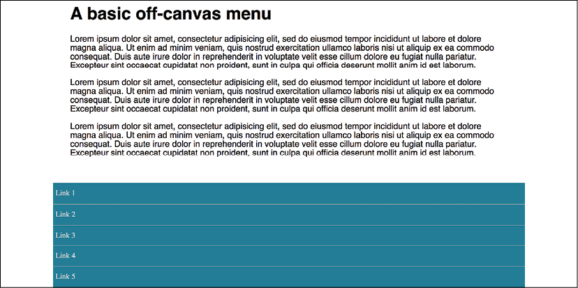
Figure 9.19: A basic but usable default layout
If JavaScript is available, for smaller screens, we "pull" the menu off to the left. When the menu button is clicked, we add a class onto the body tag (with JavaScript) and use this class as a hook to move the navigation back into view with CSS:

Figure 9.20: With a click, we slide over our menu
For larger viewports, we hide the menu button and merely position the navigation to the left and move the main content over to accommodate this:
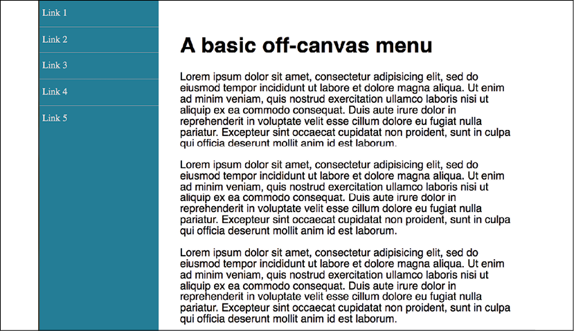
Figure 9.21: Where screen size allows, we can show the menu by default
So, that's the no-JavaScript eventuality handled. Now, what about the situation where a device can't handle translate3d?
First, for browsers that only support 2D translate transforms (very old Android phones, for example), we can use a simple translateX. Here is the relevant part of the code:
@supports (transform: translateX(-200px)) {
  .js .navigation-menu {
    left: auto;
    transform: translateX(-200px);
  }
  /*when transforms are supported and the menu button is clicked, reset the nav to default position*/
  .js .OffCanvas-Active .navigation-menu {
    transform: translateX(0);
  }
}
For browsers that support translate3d, we use translate3d instead. This will provide the best visual performance, where supported, as it's a process typically offloaded to the graphics processor, which excels at such tasks:
@supports (transform: translate3d(-200px, 0, 0)) {
  /*where transform3d is supported reset left and pull off screen with a translate3d instead*/
  .js .navigation-menu {
    left: auto;
    transform: translate3d(-200px, 0, 0);
  }
  /*when transform3d is supported and the menu button is clicked, reset the nav to default position*/
  .js .OffCanvas-Active .navigation-menu {
    transform: translate3d(0, 0, 0);
  }
}
If you open the example in the browser, you can simulate the different eventualities with the developer tools by changing the js class on the html element to no-js to see how it would look without JavaScript. Also, you can change the CSS @supports rules related to translate3d() in the CSS to something no browser supports, such as @supports (scones: delicious).
This is a simplified example, but hopefully it's apparent that embracing a progressive enhancement approach ensures the widest possible audience will get a workable experience from your design. Remember, your users don't need visual parity, but they might appreciate functional parity.
Animating with CSS
If you've worked with applications like Final Cut Pro or After Effects, you'll have an instant advantage when working with CSS animations. CSS employs animation keyframing conventions found in timeline-based applications.
If you have never worked with keyframes or even come across the term, here is all you need to know. When you are devising an animation, you will choose key moments where things need to be in a certain position. Imagine a bouncing ball. At first, it is in the air, which would be one "keyframe," and then it is on the floor, another keyframe. When you specify keyframes, the animation knows how to fill in the blanks between them and create the animation.
There are two components to a CSS animation; first, writing a set of keyframes inside an @keyframes "at-rule" declaration and then employing that keyframe animation with the animation property and associated values. Let's take a look.
In a previous example, we made a simple flip effect on elements that combined transforms and transitions. Let's bring together all the techniques we have learned in this chapter and add an animation to the previous example. In the following example, example_09-05, let's add a pulsing animation effect around our element once it has flipped.
Firstly, we will create a keyframes at-rule:
@keyframes pulse {
  100% {
    text-shadow: 0 0 5px #bbb;
    box-shadow: 0 0 3px 4px #bbb;
  }
}
As you can see, after writing @keyframes to define a new keyframes at-rule, we name this particular animation (pulse, in this instance). The @keyframes at-rule describes what you want to happen for each cycle of your animation loop.
It's generally best to use a name that represents what the animation does, not where you intend to use the animation, as a single @keyframes rule can be used as many times as you need throughout a project.
We have used a single "keyframe selector" here: 100%. However, you can set as many keyframe selectors (defined as percentage points) as you like within a @keyframes at-rule. Think of these as points along a timeline. For example, at 10%, make the background blue, at 30%, make the background purple, at 60%, make the element semi-opaque. On and on as you need.
There is also the keyword from, which is equivalent to 0% and to, which is equivalent to 100%. You can use the keywords like this:
@keyframes pulse {
  to {
    text-shadow: 0 0 5px #bbb;
    box-shadow: 0 0 3px 4px #bbb;
  }
}
However, WebKit browsers (iOS, Safari) don't always play happily with from and to values (preferring 0% and 100%), so I'd recommend sticking with percentage keyframe selectors.
You'll notice here that we haven't bothered to define a starting point. That's because the starting point is the state each of those properties is already at. Here's the part of the specification that explains that (http://www.w3.org/TR/css3-animations/#keyframes):
If a 0% or from keyframe is not specified, then the user agent constructs a 0% keyframe using the computed values of the properties being animated. If a 100% or to keyframe is not specified, then the user agent constructs a 100% keyframe using the computed values of the properties being animated.
In this @keyframes at-rule, we've added a text-shadow and box-shadow at 100%. We can then expect the keyframes, when applied to an element, to animate the text shadow and box shadow to the defined amount. But how long does the animation last? How do we make it repeat, reverse, and more? This is how we actually apply a keyframes animation to an element:
.flipper:hover .flipper-horizontal {
  transform: rotateY(180deg);
  animation: pulse 1s 1s infinite alternate both;
}
The animation property here is a shorthand for several animation-related properties. In this example, we are declaring (in order):
- The name of the keyframes declaration to use (
pulse); - The
animation-duration(1 second); - The
animation-delaybefore the animation begins (1 second, to allow time for our button to first flip); - The number of times the animation will run (infinitely);
- The direction of the animation (
alternate, so it animates first one way and then back the other); and - That we want the
animation-fill-modeto retain the values that are defined in the keyframes, whether going forward or backward (both).
The shorthand property can actually accept all seven animation properties. In addition to those used in the preceding example, it's also possible to specify animation-play-state. This can be set to running or paused to effectively play and pause an animation. Of course, you don't need to use the shorthand property; sometimes, it can make more sense (and help when you revisit the code in the future) to set each property separately. The following are the individual properties and example values. Where appropriate, alternate values have been listed with a comment:
.animation-properties {
  animation-name: warning;
  animation-duration: 1.5s;
  animation-timing-function: ease-in-out;
  animation-iteration-count: infinite;
  animation-play-state: running; /* could also be 'paused' */
  animation-delay: 0s;
  animation-fill-mode: none; /* could also be 'forwards', 'backwards' or 'both' */
  animation-direction: normal; /* could also be set to 'reverse', 'alternate' or 'alternate-reverse' */
}
You can read the full definition for each of these animation properties in the CSS Animations Level 1 specification at https://www.w3.org/TR/css-animations-1/.
You can run multiple animations on an element with the shorthand property by comma separating them. For example: animation: animOne 1s alternate both, animTwo 0.3s forwards.
As mentioned previously, it's simple to reuse a declared keyframes on other elements and with completely different settings:
.flipper:hover .flipper-vertical {
  transform: rotateX(180deg);
  animation: pulse 2s 1s cubic-bezier(0.68, -0.55, 0.265, 1.55) 5 alternate both;
}
Here, the pulse animation would run over 2 seconds and uses an ease-in-out-back timing function (defined as a cubic-bezier curve). It runs five times in both directions. This declaration has been applied to the vertically flipping element in the example file.
The animation-fill-mode property
The animation-fill-mode is worthy of a special mention. Consider an animation that starts with a yellow background and animates to a red background over 3 seconds. You can view this in example_09-08.
We apply the animation like this:
.background-change {
  animation: fillBg 3s;
  height: 200px;
  width: 400px;
  border: 1px solid #ccc;
}
@keyframes fillBg {
  0% {
    background-color: yellow;
  }
  100% {
    background-color: red;
  }
}
However, once the animation completes, the background of the div will return to nothing. That's because, by default, when an animation ends, the element goes back to exactly how it was before the animation ran. In order to override this behavior, we have the animation-fill-mode property. In this instance, we could apply this:
animation-fill-mode: forwards;
This makes the item retain any values that have been applied by the animation end. In our case, the div would retain the red background color that the animation ended on. More on the animation-fill-mode property here: https://www.w3.org/TR/css-animations-1/#animation-fill-mode.

Figure 9.22: Without animation-fill-mode set to forwards, animations run and then immediately reset
Exercises and training
At this point, you might find it useful to find a site using transitions, transforms, and animations and try playing with the settings in the developer tools. Inspect any moving elements and then tweak the relevant values and properties. Can you send elements in the opposite direction? Can you make transitions take longer or shorter? Are there any 2D transforms you can amend to use the transform3d() function?
You can make a start on https://rwd.education—I won't mind!
Summary
It would be entirely possible to fill multiple books covering the possibilities of CSS transforms, transitions, and animations. Hopefully, by dipping your toe in the water with this chapter, you've been able to pick up the basics and run with them.
In this chapter, we've learned what CSS transitions are and how to write them. We got a handle on timing functions like ease and linear, and then used them to create simple but fun effects. We then learned all about 2D transforms like scale and skew, and then how to use them in tandem with transitions. We also looked briefly at 3D transformations before learning all about the power and relative simplicity of CSS animations. You'd better believe our CSS muscles are growing!
However, if there's one area of site design that I always avoid where possible, it's making forms. I don't know why; I've just always found making them a tedious and largely frustrating task. Imagine my joy when I learned that HTML5 and CSS can make the whole form building, styling, and even validating (yes, validating!) process easier than ever before. I was quite joyous. As joyous as you can be about building web forms, that is. In the next chapter, I'd like to share this knowledge with you.