
4
Fluid Layout, Flexbox, and Responsive Images
At the end of the last chapter, we reminded ourselves that the three core tenets of responsive web design are fluid layout, media queries, and flexible media. We spent Chapter 3, Media Queries – Supporting Differing Viewports, learning all about media queries. Now we know how to wield them to change a layout at a particular "breakpoint."
In this chapter, we will focus on the other two pillars of responsive web design: fluid layout and flexible media. By the end of this chapter, we will be able to ensure any designs we code can flex easily between breakpoints, responding to the confines of their container.
Eons ago, in the mists of time (well, the late 1990s), websites were typically built with their widths defined as percentages. These percentage-based widths fluidly adjusted to the screen and were known as fluid layouts.
In the years after, in the mid-to-late 2000s, there was an intervening fixation on fixed-width designs (I blame those pesky print designers and their obsession with pixel-perfect precision). Nowadays, as we build responsive web designs, we need to look back to fluid layouts and remember all the benefits they offer.
Until fairly recently, web developers have used several CSS layout mechanisms to create great fluid layouts. If you've worked on the web for any length of time, you will be familiar with blocks, inline-blocks, tables, and other techniques to achieve any given layout. As I write this in 2020, there seems little benefit in giving those old techniques more than a cursory mention. We now have two powerful CSS layout mechanisms at our disposal: CSS Flexbox and CSS Grid.
This chapter will deal with CSS Flexbox. In Chapter 5, Layout with CSS Grid, I've got a feeling you can guess what we will be covering.
Flexbox is so useful because it can do more than merely provide a fluid layout mechanism. Do you want to center content easily, change the source order of markup, and generally create amazing layouts with ease? Flexbox has you covered.
In this chapter, we will:
- Learn how to convert fixed pixel layouts to proportional sizes
- Consider existing CSS layout mechanisms and their shortfalls
- Recognize Flexbox as a practical path beyond these limitations
- Understand the Flexible Box Layout Module and the benefits it offers
- Learn how to use responsive images and
srcsetfor resolution switching and art direction
Let's crack on with our first task: converting fixed designs into fluid relationships. This is a task that you'll need to perform constantly when building responsive web designs.
Converting a fixed pixel design to a fluid proportional layout
Graphic composites, or "comps," as they are often called, exported from a program such as Photoshop, Illustrator, or Sketch all have fixed pixel dimensions. At some point, the designs need to be converted to proportional dimensions when recreating the design as a fluid layout for the browser.
There is a beautifully simple formula for making this conversion that the father of responsive web design, Ethan Marcotte, set down in his 2009 article, Fluid Grids (http://alistapart.com/article/FLUIDGRIDS):
target / context = result
Put another way, divide the units of the thing you want by the thing it lives in. Let's put that into practice. Understanding it will enable you to convert any fixed dimension layouts into responsive/fluid equivalents.
Consider a very basic page layout intended for desktop. In an ideal world, we would always be moving to a desktop layout from a smaller screen layout; however, for the sake of illustrating the proportions, we will look at the two situations back to front.
Here's an image of the layout:
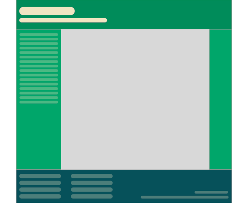
Figure 4.1: A basic "desktop" layout
The layout is 960px wide. Both the header and footer are the full widths of the layout. The left-hand area is 200px wide, and the right-hand area is 100px wide. That leaves 660px for the main content area. Our job is to convert this fixed-width design into a fluid layout that retains its proportions as it is resized. For our first task, we need to convert the middle and side sections into proportional dimensions.
We will begin by converting the left-hand side. The left-hand side is 200 units wide. This value is our target value. We will divide that target size by 960 units, our context, and we have a result: .208333333. Now, whenever we get our result with this formula, we need to shift the decimal point two points to the right. That gives us a value that is the target value described as a percentage of its parent. In this case, the left-hand section is 20.8333333% of its parent.
Let's practice the formula again on the middle section. Our target value is 660. Divide that by our context of 960 and we get .6875. Move the decimal two points to the right and we have 68.75%.
Finally, let's look at the right-hand section. Our target is 100. We divide that by the context of 960 and we get .104166667. Move the decimal point and we have a value of 10.4166667%.
That's as difficult as it gets. Say it with me: target, divided by context, equals result.
You can use values with long decimal values with no issues in the CSS. Or, if you would rather see more palatable numbers in your code, rounding them to two decimal points will work just as well for the browser.
To prove the point, let's quickly build that basic layout as blocks in the browser. To make it easier to follow along, I have added a class to the various elements that describes which piece of the "comp" they are referring to. It's not a good idea to name things based on their location ordinarily. The location can change, especially with a responsive design. In short, do as I say and not as I do here!
You can view the layout as example_04-01. Here is the HTML:
<div class="Wrap">
  <header class="Header"></header>
  <div class="WrapMiddle">
    <aside class="Left"></aside>
    <main class="Middle"></main>
    <aside class="Right"></aside>
  </div>
  <footer class="Footer"></footer>
</div>
And here is the CSS:
html,
body {
  margin: 0;
  padding: 0;
}
.Wrap {
  max-width: 1400px;
  margin: 0 auto;
}
.Header {
  width: 100%;
  height: 130px;
  background-color: #038c5a;
}
.WrapMiddle {
  width: 100%;
  font-size: 0;
}
.Left {
  height: 625px;
  width: 20.83%;
  background-color: #03a66a;
  display: inline-block;
}
.Middle {
  height: 625px;
  width: 68.75%;
  background-color: #bbbf90;
  display: inline-block;
}
.Right {
  height: 625px;
  width: 10.41%;
  background-color: #03a66a;
  display: inline-block;
}
.Footer {
  height: 200px;
  width: 100%;
  background-color: #025059;
}
If you open the example code in a browser and resize the page, you will see that the dimensions of the .Left, .Middle, and .Right sections remain proportional to one another. You can also play around with the max-width of the .Wrap values to make the bounding dimensions for the layout bigger or smaller (in the example, it's set to 1400px).
Now, let's consider how we would have the same content on a smaller screen that flexes to a point and then changes to the layout we have already seen. You can view the final code of this layout in example_04-02.
The idea is that, for smaller screens, we will have a single "tube" of content. The left-hand area will only be viewable as an "off-canvas" area; typically, an area for a menu or similar, which sits off the viewable screen area and slides in when a menu button is pressed. The main content sits below the header, then the right-hand section below that, and finally the footer area. In our example, we can expose the left-hand menu area by clicking anywhere on the header. Typically, when making this kind of design pattern for real, a menu button would be used to activate the side menu.
As you would expect, when combining this with our newly mastered media query skills, we can adjust the viewport and the design just "responds"—effortlessly moving from one layout to another and stretching between the two. I'm not going to list all the CSS properties here; it's all in example_04-02. However, here's an example—the left-hand section:
.Left {
  height: 625px;
  background-color: #03a66a;
  display: inline-block;
  position: absolute;
  left: -200px;
  width: 200px;
  font-size: 0.9rem;
  transition: transform 0.3s;
}
@media (min-width: 40rem) {
  .Left {
    width: 20.83%;
    left: 0;
    position: relative;
  }
}
You can see that, up first, without a media query, is the small screen layout. Then, at larger screen sizes, the width becomes proportional, the positioning relative, and the left value is set to zero. We don't need to rewrite properties such as height, display, or background-color as we aren't changing them.
This is progress. We have combined two of the core responsive web design techniques we have covered; converting fixed dimensions to proportions and using media queries to target CSS rules relevant to the viewport size.
In a real project, we should be making some provision if JavaScript isn't available and we need to view the content of the menu. We deal with this scenario in detail in Chapter 9, Transitions, Transformations, and Animations.
We have now covered the essentials of fluid design. To summarize, where needed, make the dimensions of elements proportional rather than fixed. This way, designs adapt to the size of their container. And you now have the simple target / context = result formula to make the necessary calculations.
Before we go on to flexible media, we'll cover the CSS Flexbox layout mechanism.
Why do we need Flexbox?
We are now going to explore using CSS Flexible Box Layout, or Flexbox as it is more commonly known. However, before we do that, I think it will be prudent to first consider the shortfalls of existing layout techniques, such as inline-block, floats, and tables. Now, if you have never used floats, CSS tables, or inline-blocks to achieve layouts before, I'd likely advise you to not bother. As we will see, there are better ways to do it now. However, if you have used any of those techniques, it's worth reminding ourselves of the pain points.
Inline-block and white-space
The biggest issue with using inline-block as a layout mechanism is that it renders a space between HTML elements. This is not a bug (although most developers would welcome a sane way to remove the space), but it does require a few hacks to remove the space when it's unwanted, which, for me, is about 95% of the time. There are a bunch of ways to do this. However, rather than list each possible workaround for removing the white-space when using inline-block, refer to this article by the irrepressible Chris Coyier: http://css-tricks.com/fighting-the-space-between-inline-block-elements/.
It's also worth pointing out that there is no simple way to vertically center content within an inline-block. Using inline-block, there is also no way of having two sibling elements where one has a fixed width and another fluidly fills the remaining space.
Floats
I hate using floats for layout. There, I said it. In their favor, they work everywhere fairly consistently. However, there are two major irritations.
Firstly, when specifying the width of floated elements in percentages, their computed widths don't get rounded consistently across browsers (some browsers round up, some down). This means that, sometimes, sections will drop down below others when not intended, and at other times they can leave an irritating gap at one side.
Secondly, you usually have to "clear" the floats so that parent boxes/elements don't collapse. It's easy enough to do this, but it's a constant reminder that floats were never intended to be used as a robust layout mechanism.
Table and table-cell
Don't confuse display: table and display: table-cell with the equivalent HTML elements. These CSS properties merely mimic the layout of their HTML-based brethren. They in no way affect the structure of the HTML.
In years gone by, I've found enormous utility in using CSS tables for layout. For one, using display: table with a display: table-cell child enabled consistent and robust vertical centering of elements. Also, table-cell elements inside table elements space themselves perfectly; they don't suffer rounding issues like floated elements. You also get browser support all the way back to Internet Explorer 7!
However, there are limitations. Generally, it's necessary to wrap an extra element around items—to get perfect vertical centering, a table-cell must live inside an element set as a table. It's also not possible to wrap items set as display: table-cell on to multiple lines.
In conclusion, all of the existing layout methods have severe limitations. Thankfully, Flexbox overcomes them all.
Cue the trumpets and roll out the red carpet. Here comes Flexbox.
Introducing Flexbox
Flexbox addresses the shortfalls in each of the aforementioned display mechanisms. Here's a brief overview of its superpowers:
- It can easily center contents vertically.
- It can change the visual order of elements.
- It can automatically space and align elements within a box, automatically assigning available space between them.
- Items can be laid out in a row, a row going in the reverse direction, a column down the page, or a column going in reverse order up a page.
- It can make you look 10 years younger (probably not, but in low numbers of empirical tests (me), it has been proven to reduce stress).
The bumpy path to Flexbox
Flexbox has been through a few major iterations before arriving at the stable version we have today. For example, consider the changes from the 2009 version (http://www.w3.org/TR/2009/WD-css3-flexbox-20090723/), the 2011 version (http://www.w3.org/TR/2011/WD-css3-flexbox-20111129/), and the 2014 version we are basing our examples on (http://www.w3.org/TR/css-flexbox-1/). The syntax differences are marked.
These differing specifications mean there have been three major implementations across browsers. How many of these you need to concern yourself with depends on the level of browser support you need.
However, given the differing versions, we need to take a brief but essential tangent.
Leave prefixing to someone else
Writing Flexbox code to gain the widest possible browser support is a tough task by hand. Here's an example; I'm going to set three Flexbox-related properties and values. Consider this:
.flex {
  display: flex;
  flex: 1;
  justify-content: space-between;
}
That's how the properties and values would look in the official syntax. However, if we want support for Android browsers (v4 and below) and IE 10, here is what would actually be needed:
.flex {
  display: -webkit-box;
  display: -webkit-flex;
  display: -ms-flexbox;
  display: flex;
  -webkit-box-flex: 1;
  -webkit-flex: 1;
  -ms-flex: 1;
  flex: 1;
  -webkit-box-pack: justify;
  -webkit-justify-content: space-between;
  -ms-flex-pack: justify;
  justify-content: space-between;
}
I don't know about you, but I'd rather spend my time doing something more productive than writing out that little lot each time! In short, if you want or need the broadest level of browser support for Flexbox, take the time to set up an autoprefixing solution.
Choosing your autoprefixing solution
For the sake of your sanity, to accurately and easily add vendor prefixes to CSS, use some form of automatic prefixing solution. Right now, I favor Autoprefixer (https://github.com/postcss/autoprefixer). It's fast, easy to set up, and very accurate.
There are versions of Autoprefixer for most setups; you don't necessarily need a command line-based build tool (such as Gulp or Grunt). For example, if you use Sublime Text, there is a version that will work straight from the command palette: https://github.com/sindresorhus/sublime-autoprefixer. There are also versions of Autoprefixer for Atom, Brackets, Visual Studio Code, and more.
From this point on, unless essential to illustrate a point, there will be no more vendor prefixes in the code samples.
Getting Flexy
Flexbox has four key characteristics: direction, alignment, ordering, and flexibility. We'll cover all of these characteristics and how they relate to each other by way of a few examples.
The examples are deliberately simplistic; we are just moving some boxes and their content around so that we can understand the principles of how Flexbox works.
Perfect vertically centered text
Note that this first Flexbox example is example_04-03:

Figure 4.2: Centering is simple with Flexbox
Here's the markup:
<div class="CenterMe">
  Hello, I'm centered with Flexbox!
</div>
Here is the entire CSS rule that's styling that markup:
.CenterMe {
  background-color: indigo;
  color: #ebebeb;
  font-family: 'Oswald', sans-serif;
  font-size: 2rem;
  text-transform: uppercase;
  height: 200px;
  display: flex;
  align-items: center;
  justify-content: center;
}
The majority of the property/value pairs in that rule are merely setting the colors and font sizes. The three properties we are interested in are:
.CenterMe {
  /* other properties */
  display: flex;
  align-items: center;
  justify-content: center;
}
If you have not used Flexbox or any of the properties in the related Box Alignment specification (http://www.w3.org/TR/css3-align/), these properties probably seem a little alien. Let's consider what each one does:
display: flex: This is the bread and butter of Flexbox. This merely sets the item to be a Flexbox, as opposed to a block or inline-block.align-items: This aligns the items within a Flexbox in the cross axis, vertically centering the text in our example.justify-content: This sets the main axis, centering the content. With a Flexbox row, you can think of it as the button in a word processor that sets the text to the left, right, or center (although there are additionaljustify-contentvalues we will look at shortly).
OK, before we get further into the properties of Flexbox, we will consider a few more examples.
In some of these examples, I'm making use of the Google-hosted font "Oswald" (with a fallback to a sans serif font). In Chapter 6, CSS Selectors, Typography, Color Modes, and More, we will look at how we can use the @font-face rule to link to custom font files.
Offset items
How about a simple list of navigation items, but with one offset to one side?
Here's what it looks like:

Figure 4.3: Flexbox makes it simple to offset one link in a list
Here's the markup:
<div class="MenuWrap">
  <a href="#" class="ListItem">Home</a>
  <a href="#" class="ListItem">About Us</a>
  <a href="#" class="ListItem">Products</a>
  <a href="#" class="ListItem">Policy</a>
  <a href="#" class="LastItem">Contact Us</a>
</div>
And here is the CSS:
.MenuWrap {
  background-color: indigo;
  font-family: 'Oswald', sans-serif;
  font-size: 1rem;
  min-height: 2.75rem;
  display: flex;
  align-items: center;
  padding: 0 1rem;
}
.ListItem,
.LastItem {
  color: #ebebeb;
  text-decoration: none;
}
.ListItem {
  margin-right: 1rem;
}
.LastItem {
  margin-left: auto;
}
When you set display: flex; on a wrapping element, the children of that element become flex items, which then get laid out using the flex layout model. The magical property here is margin-left: auto, which makes that item use all of the available margin on that side.
Reverse the order of items
Want to reverse the order of the items?
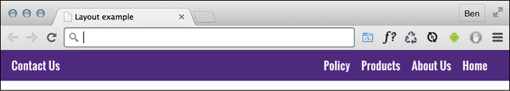
Figure 4.4: Reversing the visual order with Flexbox
It's as easy as adding flex-direction: row-reverse; to the wrapping element and changing margin-left: auto to margin-right: auto on the offset item:
.MenuWrap {
  background-color: indigo;
  font-family: 'Oswald', sans-serif;
  font-size: 1rem;
  min-height: 2.75rem;
  display: flex;
  flex-direction: row-reverse;
  align-items: center;
  padding: 0 1rem;
}
.ListItem,
.LastItem {
  color: #ebebeb;
  text-decoration: none;
}
.ListItem {
  margin-right: 1rem;
}
.LastItem {
  margin-right: auto;
}
How about if we want them laid out vertically instead?
Simple. Change to flex-direction: column; on the wrapping element and remove the auto margin:
.MenuWrap {
  background-color: indigo;
  font-family: 'Oswald', sans-serif;
  font-size: 1rem;
  min-height: 2.75rem;
  display: flex;
  flex-direction: column;
  align-items: center;
  padding: 0 1rem;
}
.ListItem,
.LastItem {
  color: #ebebeb;
  text-decoration: none;
}
Column reverse
Want them stacked in the opposite direction? Just change to flex-direction: column-reverse; and you're done.
There is a flex-flow property that is shorthand for setting flex-direction and flex-wrap in one go. For example, flex-flow: row wrap; would set the direction to a row and set the wrapping on. However, at least initially, I find it easier to specify the two settings separately. The flex-wrap property is also absent from the oldest Flexbox implementations, so it can render the whole declaration void in certain browsers.
Different Flexbox layouts with media queries
As the name suggests, Flexbox is inherently flexible, so how about we go for a column list of items at smaller viewports and a row style layout when space allows? It's a piece of cake with Flexbox. In fact, we have already used that technique in the last chapter. Do you remember the header of the https://rwd.education website we started?
Here is the relevant section again:
.rwd-MastHead {
  display: flex;
  flex-direction: column;
}
@media (min-width: 1200px) {
  .rwd-MastHead {
    flex-direction: row;
    justify-content: space-between;
    max-width: 1000px;
    margin: 0 auto;
  }
}
At the outset, we set the content to flow in a column down the page, with the logo and navigation links one below the other. Then, at a minimum width of 1200px, we make those elements display as a row, one at either side. The space between them is provided by the justify-content property. We will look at this in more detail very shortly.
Inline-flex
Flexbox has an inline variant to complement inline-block and inline-table. As you might have guessed, it is display: inline-flex;. Thanks to its beautiful centering abilities, you can do some wacky things with very little effort:
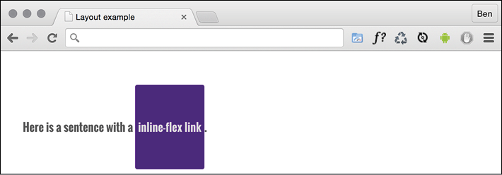
Figure 4.5: The inline equivalent of flex is the aptly named "inline-flex"
Here's the markup:
<p>
  Here is a sentence with a
  <a
    href="http://www.w3.org/TR/css-flexbox-1/#flex-containers"
    class="InlineFlex"
    >inline-flex link</a
  >.
</p>
And, using the same basic styles as the previous examples for the fonts, font size and colors, here is the CSS needed:
.InlineFlex {
  display: inline-flex;
  align-items: center;
  height: 120px;
  padding: 0 4px;
  background-color: indigo;
  text-decoration: none;
  border-radius: 3px;
  color: #ddd;
}
When items are set as inline-flex anonymously, which happens if their parent element is not set to display: flex, then they retain whitespace between elements, just like inline-block or inline-table do. However, if they are within a flex container, then whitespace is removed, much as it is with CSS table-cell items within a CSS table. Of course, you don't always have to center items within a Flexbox. There are a number of different options. Let's look at those now.
Flexbox alignment properties
If you want to play with this example, you can find it at example_04-07. Remember, the example code you download will be at the point where we finish this section, so if you want to "work along," you may prefer to delete all the HTML inside the <body> tag, and all the class based CSS rules in the example file, and start again.
The important thing to understand with Flexbox alignment is the concept of the axis. There are two axes to consider, the "main axis" and the "cross axis." What each of these represents depends on the direction the Flexbox is set to. For example, if the direction of your Flexbox is set to row, the main axis will be the horizontal axis and the cross axis will be the vertical axis.
Conversely, if your Flexbox direction is set to column, the main axis will be the vertical axis and the cross axis will be the horizontal axis.
The specification (http://www.w3.org/TR/css-flexbox-1/#justify-content-property) provides the following illustration to aid authors:

Figure 4.6: This image from the specification shows that the main axis always relates to the direction the flex container is heading
Here's the basic markup of our example:
<div class="FlexWrapper">
  <div class="FlexItem">I am content in the inner Flexbox.</div>
</div>
Let's set a few basic Flexbox-related styles:
.FlexWrapper {
  background-color: indigo;
  display: flex;
  height: 200px;
  width: 400px;
}
.FlexItem {
  background-color: #34005b;
  display: flex;
  height: 100px;
  width: 200px;
}
In the browser, that produces this:
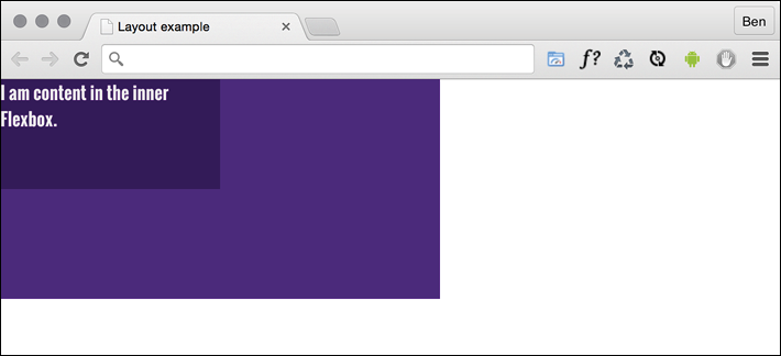
Figure 4.7: With no alignment properties set, child elements default to the top left
Right, let's test drive the effects of some of these properties.
The align-items property
The align-items property positions items in the cross axis. If we apply this property to our wrapping element, like so:
.FlexWrapper {
  background-color: indigo;
  display: flex;
  height: 200px;
  width: 400px;
  align-items: center;
}
As you would imagine, the item within that box gets centered vertically:
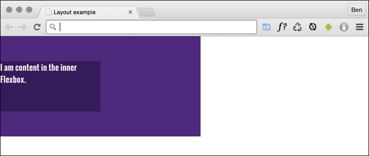
Figure 4.8: A one-liner provides cross-axis centering
The same effect would be applied to any number of children within.
The align-self property
Sometimes, you may want to pull just one item into a different alignment. Individual flex items can use the align-self property to align themselves. At this point, I'll remove the previous alignment properties in the CSS. I'll also add another two div elements to the markup, both also with a class of FlexItem. In the middle of these three items, I'll add an additional HTML class of AlignSelf. We'll use that class in the CSS to add the align-self property.
So, here's the HTML:
<div class="FlexWrapper">
  <div class="FlexItem">I am content in the inner Flexbox 1</div>
  <div class="FlexItem AlignSelf">I am content in the inner Flexbox 2</div>
  <div class="FlexItem">I am content in the inner Flexbox 3</div>
</div>
.FlexWrapper {
  background-color: indigo;
  display: flex;
  height: 200px;
  width: 400px;
}
.FlexItem {
  background-color: #34005b;
  display: flex;
  height: 100px;
  width: 200px;
}
.AlignSelf {
  align-self: flex-end;
}
Here is the effect in the browser:
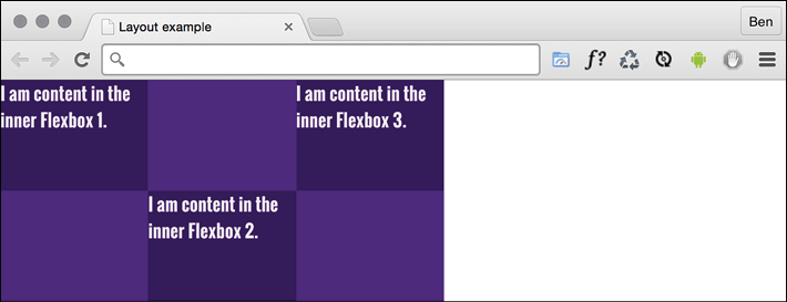
Figure 4.9: Individual items can be aligned in a different manner
Wow! Flexbox really makes these kinds of changes trivial. In that example, the value of align-self was set to flex-end. Let's consider the possible values we could use on the cross axis before looking at alignment in the main axis.
Possible alignment values
For cross-axis alignment, Flexbox has the following possible values:
flex-start: Setting an element toflex-startwould make it begin at the "starting" edge of its flex container.flex-end: Setting toflex-endwould align the element at the end of the flex container.center: This puts it in the middle of the flex container.baseline: This sets all the flex items in the container so that their baselines align.stretch: This makes the items stretch to the size of their flex container (in the cross axis).
There are some particulars inherent to using these properties, so if something isn't playing happily, always refer to the specification for any edge case scenarios: http://www.w3.org/TR/css-flexbox-1/#align-items-property.
The justify-content property
Alignment in the main axis is controlled with justify-content. Possible values for justify-content are:
flex-startflex-endcenterspace-betweenspace-around
The first three do exactly what you would now expect. However, let's take a look at what space-between and space-around do. Consider this markup:
<div class="FlexWrapper">
  <div class="FlexItem">I am content in the inner Flexbox 1.</div>
  <div class="FlexItem">I am content in the inner Flexbox 2.</div>
  <div class="FlexItem">I am content in the inner Flexbox 3.</div>
</div>
And then consider this CSS. We are setting the three div elements with a class of FlexItem to each be 25% width, wrapped by a flex container, with a class of FlexWrapper, set to be 100% width:
.FlexWrapper {
  background-color: indigo;
  display: flex;
  justify-content: space-between;
  height: 200px;
  width: 100%;
}
.FlexItem {
  background-color: #34005b;
  display: flex;
  height: 100px;
  width: 25%;
}
As the three items will only take up 75% of the available space, justify-content explains what we would like the browser to do with the remaining space. A value of space-between puts an equal amount of space between the items, and space-around puts it around the items. Perhaps a screenshot here will help – this is space-between:
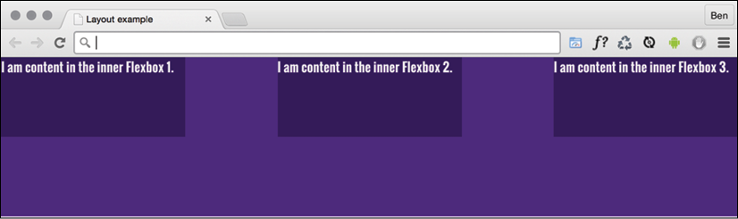
Figure 4.10: Main axis alignment is carried out with the justify-content property
And here is what happens if we switch to space-around:

Figure 4.11: Subtly different but notice the space around, not just between items
The other alignment property I find myself using from time to time is space-evenly. This takes the available space and adds an equal amount to every gap.
The various alignment properties of Flexbox are currently being specified in CSS Box Alignment Module Level 3. This should give the same fundamental alignment powers to other display properties, such as display: block; and display: table. The specification is still being worked on, so you can keep checking the status at http://www.w3.org/TR/css3-align/.
The flex property
We've used the width property on those flex items, but it's also possible to define the width, or "flexiness," if you will, with the flex property. To illustrate, consider another example with the same markup, but an amended CSS for the items:
.FlexItem {
  border: 1px solid #ebebeb;
  background-color: #34005b;
  display: flex;
  height: 100px;
  flex: 1;
}
The flex property is actually a shorthand way of specifying three separate properties: flex-grow, flex-shrink, and flex-basis. The specification covers these individual properties in more detail here: http://www.w3.org/TR/css-flexbox-1/#flex-components. However, the specification recommends that authors use the flex shorthand property, so that's what we will be learning here, capiche?

Figure 4.12: Understanding the three possible values of the flex property
For items within a flex container, if a flex property is present, it is used to size the item rather than a width or height value (if also present). Even if the width or height value is specified after the flex property, it will still have no effect.
However, it is important to note that if the item you are adding the flex property to is not a flex item, the flex property will have no effect.
Now, let's look at what each of these flex properties actually does:
flex-grow(the first value you can pass to flex) is the amount, in relation to the other flex items, the flex item can grow when free space is available.flex-shrinkis the amount the flex item can shrink, in relation to the other flex items, when there is not enough space available.flex-basis(the final value you can pass to flex) is the basis size the flex item is sized to.
Although it's possible to just write flex: 1, and have that interpreted to mean flex: 1 1 0, I recommend writing all the values into a flex shorthand property yourself. I think it's clearer to understand what you intend to happen that way. For example, flex: 1 1 auto means that the item will grow into one part of the available space. It will also shrink one part when space is lacking and the basis size for the flexing is the intrinsic width of the content (that is, the size the content would be if flex wasn't involved).
Let's try another: flex: 0 0 50px means this item will neither grow nor shrink, and its basis is 50px (so it will be 50px regardless of any free space). What about flex: 2 0 50%? That's going to take two "lots" of available space, it won't shrink, and its basis size is 50%. Hopefully, these brief examples have demystified the flex property a little.
If you set the flex-shrink value to zero, then the flex-basis value effectively behaves like a minimum width. You can think of the flex property as a way to set ratios. With each flex item set to 1, they each take up an equal amount of space:
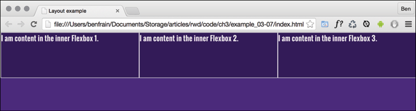
Figure 4.13: With the same flex values, all boxes are sized equally
Right, so to test the theory, let's amend the HTML classes in the markup. We're adding FlexOne, FlexTwo, and FlexThree to each item in turn:
<div class="FlexWrapper">
  <div class="FlexItem FlexOne">I am content in the inner Flexbox 1.</div>
  <div class="FlexItem FlexTwo">I am content in the inner Flexbox 2.</div>
  <div class="FlexItem FlexThree">I am content in the inner Flexbox 3.</div>
</div>
Now, let's remove the previous styles related to FlexItem and instead add this:
.FlexItem {
  border: 1px solid #ebebeb;
  background-color: #34005b;
  display: flex;
  height: 100px;
}
.FlexOne {
  flex: 1.5 0 auto;
}
.FlexTwo,
.FlexThree {
  flex: 1 0 auto;
}
In this instance, FlexOne takes up 1.5 times the amount of space that FlexTwo and FlexThree take up.
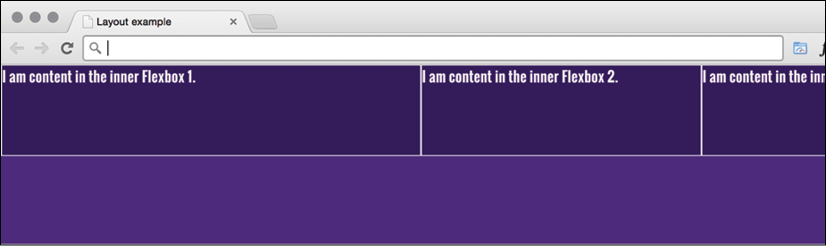
Figure 4.14: Alter the amount of free space elements take up with flex-grow
This shorthand syntax really becomes useful for quickly bashing out relationships between items. For example, if a request comes in, such as "that needs to be 1.8 times wider than the others," you could easily facilitate that request with the flex property.
Hopefully, the incredibly powerful flex property is starting to make a little sense now.
I could write chapters and chapters on Flexbox! There are so many examples we could look at. However, before we move on to the other main topic of this chapter (responsive images), there are just two more things I would like to share with you.
Simple sticky footer
Suppose you want a footer to sit at the bottom of the viewport when there is not enough content to push it there. This has always been a pain to achieve, but with Flexbox it's simple. Consider this markup:
<body>
  <div class="MainContent">
    Here is a bunch of text up at the top. But there isn't enough content to
    push the footer to the bottom of the page.
  </div>
  <div class="Footer">
    However, thanks to flexbox, I've been put in my place.
  </div>
</body>
And here's the CSS:
html,
body {
  margin: 0;
  padding: 0;
}
html {
  height: 100%;
}
body {
  font-family: 'Oswald', sans-serif;
  color: #ebebeb;
  display: flex;
  flex-direction: column;
  min-height: 100%;
}
.MainContent {
  flex: 1 0 auto;
  color: #333;
  padding: 0.5rem;
}
.Footer {
  background-color: violet;
  padding: 0.5rem;
}
Take a look at that in the browser and test by adding more content into MainContent div. You'll see that when there is not enough content, the footer is stuck to the bottom of the viewport. When there is enough, it sits below the content.
This works because our flex property is set to grow where space is available. As our body is a flex container of 100% minimum height, the main content can grow into all of that available space. Beautiful!
Changing the source order
Flexbox has visual source reordering built-in. Let's have a look at how it works.
Consider this markup:
<div class="FlexWrapper">
  <div class="FlexItem FlexHeader">I am content in the Header.</div>
  <div class="FlexItem FlexSideOne">I am content in the SideOne.</div>
  <div class="FlexItem FlexContent">I am content in the Content.</div>
  <div class="FlexItem FlexSideTwo">I am content in the SideTwo.</div>
  <div class="FlexItem FlexFooter">I am content in the Footer.</div>
</div>
You can see here that the third item within the wrapper has an HTML class of FlexContent—imagine that this div is going to hold the main content for the page.
OK, let's keep things simple. We will add some simple colors to more easily differentiate the sections, and just get these items one under another in the same order they appear in the markup:
.FlexWrapper {
  background-color: indigo;
  display: flex;
  flex-direction: column;
}
.FlexItem {
  display: flex;
  align-items: center;
  min-height: 6.25rem;
  padding: 1rem;
}
.FlexHeader {
  background-color: #105b63;
}
.FlexContent {
  background-color: #fffad5;
}
.FlexSideOne {
  background-color: #ffd34e;
}
.FlexSideTwo {
  background-color: #db9e36;
}
.FlexFooter {
  background-color: #bd4932;
}
That renders in the browser like this:

Figure 4.15: Here, our boxes are displayed in source order
Now, suppose we want to switch the order of FlexContent to be the first item, without touching the markup. With Flexbox, it's as simple as adding a single property/value pair:
.FlexContent {
  background-color: #fffad5;
  order: -1;
}
The order property lets us revise the order of items within a Flexbox simply and sanely. In this example, a value of -1 means that we want it to be before all the others.
If you want to switch items around quite a bit, I'd recommend being a little more declarative and add an order number for each item. This makes things a little easier to understand when you combine them with media queries.
Let's combine our new source order changing powers with some media queries to produce not just a different layout at different sizes but different ordering.
Note: you can view this finished example at example_04-09.
Let's suppose we want our main content at the beginning of a document. In this example, our markup looks like this:
<div class="FlexWrapper">
  <div class="FlexItem FlexContent">I am content in the Content.</div>
  <div class="FlexItem FlexSideOne">I am content in the SideOne.</div>
  <div class="FlexItem FlexSideTwo">I am content in the SideTwo.</div>
  <div class="FlexItem FlexHeader">I am content in the Header.</div>
  <div class="FlexItem FlexFooter">I am content in the Footer.</div>
</div>
First is the page content, then our two sidebar areas, then the header, and finally the footer. As I'll be using Flexbox, we can structure the HTML in the order that makes sense for the document, regardless of how things need to be laid out visually.
After some basic styling for each FlexItem, for the smallest screens (outside of any media query), I'll go with the following order:
.FlexHeader {
  background-color: #105b63;
  order: 1;
}
.FlexContent {
  background-color: #fffad5;
  order: 2;
}
.FlexSideOne {
  background-color: #ffd34e;
  order: 3;
}
.FlexSideTwo {
  background-color: #db9e36;
  order: 4;
}
.FlexFooter {
  background-color: #bd4932;
  order: 5;
}
That gives us this in the browser:
Figure 4.16: We can move the items in visual order with a single property
And then, at a breakpoint, I'm switching to this:
@media (min-width: 30rem) {
  .FlexWrapper {
    flex-flow: row wrap;
  }
  .FlexHeader {
    width: 100%;
  }
  .FlexContent {
    flex: 1 0 auto;
    order: 3;
  }
  .FlexSideOne {
    width: 150px;
    order: 2;
  }
  .FlexSideTwo {
    width: 150px;
    order: 4;
  }
  .FlexFooter {
    width: 100%;
  }
}
That gives us this in the browser:
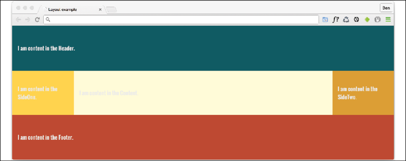
Figure 4.17: With a media query, we can change the visual order again
In that example, the shortcut flex-flow: row wrap has been used. flex-flow is actually a shorthand property of sorts that lets you set two properties in one: flex-direction and flex-wrap.
We've used flex-direction already to switch between rows and columns and to reverse elements. However, we haven't looked at flex-wrap yet.
Wrapping with flex
By default, items in a flex container will shrink to fit and, if they can't, they will overflow the container. For example, consider this markup:
<div class="container">
  <div class="items">Item 1</div>
  <div class="items">Item 2</div>
  <div class="items">Item 3</div>
  <div class="items">Item 4</div>
</div>
And this CSS:
.container {
  display: flex;
  width: 500px;
  background-color: #bbb;
  align-items: center;
  border: 1px solid #111;
}
.items {
  color: #111;
  display: inline-flex;
  align-items: center;
  justify-content: center;
  font-size: 23px;
  flex: 0 0 160px;
  height: 40px;
  border: 1px dashed #545454;
}
You may be wondering why the outer container is set with a width and not the flex shorthand property we looked at before. Remember, this is because unless the element is a flex item (inside a Flexbox itself), flex has no effect.
Because there is a width of only 500px on the flex container, those four elements don't fit:

Figure 4.18: By default Flexbox will always keep child elements from wrapping
However, those items can be set to wrap with flex-wrap: wrap. This wraps the items once they hit the edge of the container.
The likelihood is that there will be times when you want flex items to wrap and other times when you don't. Remember that the default is to not wrap, but you can easily make the change with a single line.
Also, remember that you can set the wrapping by itself with flex-wrap, or as part of the flex-flow direction and wrap shorthand.
Let's solve a real-world problem with flex-wrap. Consider this list of paragraphs in the following image. At this width, they are not easy to read.

Figure 4.19: This content is overstretched at this viewport width
Let's amend that layout with a media query and a few choice flex properties. I'm consolidating all of these changes into one media query here for brevity, but remember that you can use as many as you like to organize your code however you see fit. We covered the options extensively in Chapter 3, Media Queries – Supporting Differing Viewports:
@media (min-width: 1000px) {
  .rwd-Chapters_List {
    display: flex;
    flex-wrap: wrap;
  }
  .rwd-Chapter {
    flex: 0 0 33.33%;
    padding: 0 20px;
  }
  .rwd-Chapter::before {
    left: -20px;
  }
}
And that produces this effect in the browser:

Figure 4.20: Setting the flex container to wrap means the content can space out equally
We made the container of the chapters into a flex container. Then, to stop the elements scrunching up into one another, we set the container to wrap. To limit the chapter section widths to a third of the container, we used the flex shorthand to set 33.33% as the flex-basis and prevented the element from growing or shrinking. Padding was used to provide a little space between them. The final small tweak was to bring in the chapter numbers a little.
Wrapping up Flexbox
There are near endless possibilities when using the Flexbox layout system and, due to its inherent "flexiness," it's a perfect match for responsive design. If you've never built anything with Flexbox before, all the new properties and values can seem a little odd, and it's sometimes disconcertingly easy to achieve layouts that have previously taken far more work.
The other modern layout system we have in CSS is Grid, but that's a topic for Chapter 5, Layout with CSS Grid. Before we get there, let's tackle responsive images and media.
Responsive images
Serving the appropriate image to users based on the particulars of their device and environment has always been a tricky problem. This problem was accentuated with the advent of responsive web design, the very nature of which is to serve a single code base to each and every device.
The inherent problem of responsive images
As an author, you cannot know about every possible device that may visit your site now or in the future. Only a browser knows the particulars of the device viewing a website: its screen size and device capabilities, for example.
Conversely, only the people making the website know what versions of an image we have at our disposal. For example, we may have three versions of the same image: small, medium, and large; each with increasing dimensions to cover off the anticipated screen size and screen density eventualities. The browser does not know this. We have to tell it.
To summarize the conundrum, we, as the website authors, have only half of the solution, in that we know what images we have. The browser has the other half of the solution in that it knows what device is visiting the site and what the most appropriate image dimensions and resolution would be.
How can we tell the browser what images we have at our disposal so that it may choose the most appropriate one for the user?
In the first few years of responsive web design, there was no specified way. Thankfully, now we have the Embedded content specification: https://html.spec.whatwg.org/multipage/embedded-content.html.
The Embedded content specification describes ways to deal with the simple resolution switching of images—to facilitate a user on a higher resolution screen receiving a higher resolution version of images. It also facilitates "art direction" situations for when authors want users to see a totally different image, depending on a number of device characteristics (think media queries). For example, a close-up image of something on smaller viewports and then a wide-angle image of the same thing for larger viewports.
Demonstrating responsive image examples is tricky. It's not possible to appreciate on a single screen the different images that could be loaded with a particular syntax or technique. Therefore, the examples that follow will be mainly code, and you'll just have to trust me that's it's going to produce the result you need in supporting browsers.
Let's look at the two most common scenarios you're likely to need responsive images for. These are switching one image for another when a different resolution is needed and changing an image entirely depending on the available viewport space.
Simple resolution switching with srcset
Let's suppose you have three versions of the same image. One is a smaller size for smaller viewports, another caters for medium-sized viewports, and, finally, a larger version covers off every other viewport. Here is how we can let the browser know that we have these three versions available:
<img
  src="scones_small.jpg"
  srcset="scones_medium.jpg 1.5x, scones_large.jpg 2x"
  alt="a delicious looking baked scone"
/>
This is about as simple as things get with responsive images, so let's ensure that the syntax makes perfect sense.
First of all, the src attribute, which you will already be familiar with, has a dual role here; it's specifying the small 1x version of the image, and it also acts as a fallback image if the browser doesn't support the srcset attribute. That's why we are using it for the small image. This way, older browsers that will ignore the srcset information will get the smallest and best-performing image possible.
For browsers that understand srcset, with that attribute, we provide a comma-separated list of images that the browser can choose from. After the image name (such as scones_medium.jpg), we issue a simple resolution hint.
I've specifically called it a hint rather than an instruction or a command, and you will see why in a moment. In this example, 1.5x and 2x have been used but any integer would be valid. For example, 3x or 4x would work too (providing you can find a suitably high-resolution screen).
However, there is an issue here; a device with a 1440px wide, 1x screen will get the same image as a 480px wide, 3x screen. That may or may not be the desired effect.
Advanced switching with srcset and sizes
Let's consider another situation. In a responsive web design, it wouldn't be uncommon for an image to be the full viewport width on smaller viewports, but only half the width of the viewport at larger sizes. The main example in Chapter 1, The Essentials of Responsive Web Design, was a typical example of this. Here's how we can communicate these intentions to the browser:
<img
  srcset="scones-small.jpg 450w, scones-medium.jpg 900w"
  sizes="(min-width: 280px) 100vw, (min-width: 640px) 50vw"
  src="scones-small.jpg"
  alt="Lots of delicious scones"
/>
Inside the image tag, we are utilizing srcset again. However, this time, after specifying the images, we are adding a value with a w suffix. This tells the browser how wide the image is. In our example, we have a 450px wide image (called scones-small.jpg) and a 900px wide image (called scones-medium.jpg). It's important to note this w-suffixed value isn't a "real" size. It's merely an indication to the browser, roughly equivalent to the width in "CSS pixels."
What exactly defines a pixel in CSS? I wondered that myself. Then, I found the explanation at http://www.w3.org/TR/css3-values/#reference-pixel and wished I hadn't wondered.
This w-suffixed value makes more sense when we factor in the sizes attribute. The sizes attribute allows us to communicate the intentions for our images to the browser. In our preceding example, the first value is equivalent to "for devices that are at least 280px wide, I intend the image to be around 100vw wide."
If some of the units used, such as vh (where 1vh is equal to 1% of the viewport height) and vw (where 1vw is equal to 1% of the viewport width), don't make sense, be sure to read Chapter 6, CSS Selectors, Typography, Color Modes, and More.
The second part is, effectively, "Hi browser, for devices that are at least 640px wide, I only intend the image to be shown at 50vw." That may seem a little redundant until you factor in DPI (or DPR for device pixel ratio). For example, on a 320px wide device with a 2x resolution (effectively requiring a 640px wide image, if shown at full width), the browser might decide the 900px wide image is actually a better match as it's the first option it has for an image that would be big enough to fulfill the required size.
Did you say the browser "might" pick one image over another?
An important thing to remember is that the values given in the sizes attribute are merely hints to the browser. That doesn't necessarily ensure that the browser will always obey. This is a good thing. Trust me, it really is. It means that, in the future, if there is a reliable way for browsers to ascertain network conditions, it may choose to serve one image over another because it knows things at that point that we can't possibly know at this point as the author. Perhaps a user has a setting on their device to "only download 1x images" or "only download 2x images." In these scenarios, the browser can make the best call.
The alternative to the browser deciding is to use the picture element. Using this element ensures that the browser serves up the exact image you asked for. Let's take a look at how it works.
Art direction with the picture element
The final scenario you may find yourself in is one in which you have different images that are applicable at different viewport sizes. For example, consider our cake-based example again from Chapter 1. Maybe on the smallest screens we would like a close-up of the scone with a generous helping of jam and cream on top. For larger screens, perhaps we have a wider image we would like to use. Perhaps it's a wide shot of a table loaded up with all manner of cakes. Finally, for larger viewports still, perhaps we want to see the exterior of a cake shop on a village street with people sat outside eating cakes and drinking tea (I know, sounds like nirvana, right?).
We need three different images that are most appropriate at different viewport ranges. Here is how we could solve this with picture:
<picture>
  <source media="(min-width: 480px)" srcset="cake-table.jpg" />
  <source media="(min-width: 960px)" srcset="cake-shop.jpg" />
  <img src="scones.jpg" alt="Lots of cakes" />
</picture>
First of all, be aware that when you use the picture element, it is merely a wrapper to facilitate other images making their way to the img tag within. If you want to style the images in any way, it's the img tag that should get your attention.
Secondly, the srcset attribute here works exactly the same as the previous example.
Thirdly, the img tag provides your fallback image and also the image that will be displayed if a browser understands picture but none of the media definitions match. Just to be crystal clear, do not omit the img tag from within a picture element or things won't end well.
The key difference with picture is that we have a source tag. Here, we can use media query-style expressions to explicitly tell the browser which asset to use in a matching situation. For example, our first one in the preceding example is telling the browser, "Hey you, if the screen is at least 480px wide, load in the cake-table.jpg image instead." As long as the conditions match, the browser will dutifully obey.
Facilitate new image formats
As a bonus, picture also facilitates us providing alternate formats of an image. "WebP" is a newer image format, pushed by Google that Apple's Safari browser lacks support for (check whether that is still the case at http://caniuse.com/#search=WebP). It provides a comparable quality as a JPG, but in a far smaller payload. So, if a browser supports it, it makes sense to let them have that version of the image instead. For browsers that support it, we can offer a file in that format and a more common format for those that don't:
<picture>
  <source type="image/webp" srcset="scones-baby-yeah.webp" />
  <img src="scones-baby-yeah.jpg" alt="delicious cakes" />
</picture>
Hopefully, this is now a little more straightforward. Instead of the media attribute, we are using type, which, although more typically used to specify video sources (possible video source types can be found here: https://html.spec.whatwg.org/multipage/embedded-content.html#attr-source-type), allows us here to define WebP as the preferred image format. If the browser can display it, it will; otherwise, it will grab the default one in the img tag.
Summary
We've covered a lot of ground in this chapter. We started by understanding how to create fluid layouts that can flex between the media queries we set. We then spent considerable time getting acquainted with Flexbox, learning how to solve common layout problems with relative ease.
We have also covered how we can serve up any number of alternative images to our users depending on the problems we need to solve. By making use of srcset, sizes, and picture, our users should always get the most appropriate image for their needs—both now and in the future.
As luck would have it, two great layout mechanisms arrived in CSS in relatively quick succession. Hot on the heels of the Flexible Box Layout Module was Grid Layout Module Level 1: http://www.w3.org/TR/css3-grid-layout/.
Like Flexbox, CSS Grid means learning quite a bit of alien syntax. But don't let that put you off. The next chapter is completely dedicated to Grid: what it can do, how it does it, and how we can bend it to our will.